1. Introduction
This level is currently maintained as a diff spec over the level 1 module [CSS-GRID-1]. The main addition to Level 1 is the “subgrid” feature: a subgridded axis is one which matches up its grid lines to lines in the element’s parent’s grid, and which derives the sizes of its tracks through this integration with the parent grid.
The full text of the Grid specification will be folded in when this draft reaches CR.
2. Subgrids
A grid item can itself be a grid container by giving it display: grid; in this case the layout of its contents will be independent of the layout of the grid it participates in.
In some cases it might be necessary for the contents of multiple grid items to align to each other. A grid container that is itself a grid item can defer the definition of its rows and columns to its parent grid container, making it a subgrid. In this case, the grid items of the subgrid participate in sizing the grid of the parent grid container, allowing the contents of both grids to align.
< ul > < li >< label > Name:</ label > < input name = fn > < li >< label > Address:</ label > < input name = address > < li >< label > Phone:</ label > < input name = phone > </ ul >
We want the labels and inputs to align, and we want to style each list item with a border. This can be accomplished with subgrid layout:
ul {
  display: grid;
  grid: auto-flow / auto 1fr;
}
li {
  grid-column: span 2;
  display: grid;
  grid-template-columns: subgrid;
  border: solid;
}
label {
  grid-column: 1;
}
input {
  grid-column: 2;
}
2.1. Establishing a Subgrid
Subgrids provide the ability to pass grid parameters down through nested elements, and content-based sizing information back up to their parent grid.
| Name: | grid-template-rows, grid-template-columns |
|---|---|
| New values: | subgrid <line-name-list>? |
| New computed values: | The subgrid keyword followed by a <line-name-list>. |
- subgrid <line-name-list>?
-
The subgrid value
indicates that the grid will adopt the spanned portion of its parent grid in that axis.
Rather than being specified explicitly,
the sizes of the grid rows/columns
will be taken from the parent grid’s definition,
and the subgrid’s items will participate
in the intrinsic size calculations (CSS Grid Layout 1 §11.5 Resolve Intrinsic Track Sizes)
of any tracks shared with the parent grid.
The <line-name-list> argument allows local naming of the grid lines propagated from the parent grid: if a <line-name-list> is given, the specified <line-names>s are assigned to the subgrid’s explicit grid lines, one per line, starting with line 1. Excess <line-names> are ignored.
If there is no parent grid, this value is equivalent to the initial value, none.
Unlike those of a regular nested grid, a subgrid’s contents participate in its parent grid formatting context; thus a subgrid does not establish an independent formatting context.
The syntax of <line-name-list> is defined as follows:
<line-name-list> = [ <line-names> | <name-repeat> ]+
<line-names>     = '[' <custom-ident>* ']'
<name-repeat>    = repeat( [ <integer [1,∞]> | auto-fill ], <line-names>+)
The <name-repeat> variant of the repeat() notation can only be used with the subgrid keyword: it only repeats names. The auto-fill keyword is only valid once per <line-name-list>, and repeats enough times for the name list to match the subgrid’s specified grid span (falling back to 0 if the span is already fulfilled).
2.2. Characteristics of a Subgrid Item
A subgrid behaves just like a normal grid container except that:
- Placing the subgrid creates a correspondence between its subgridded tracks and those that it spans in its parent grid. The grid lines thus shared between the subgrid and its parent form the subgrid’s explicit grid, and its track sizes are governed by the parent grid.
-
The number of explicit tracks in the subgrid in a subgridded dimension
always corresponds to the number of grid tracks that it spans in its parent grid:
- If the subgrid’s grid span in the subgridded dimension is definite, then the number of explicit tracks in each subgridded dimension is taken from its used grid span in that dimension (regardless of its grid-template-* properties).
- If it has an indefinite grid span (i.e. either the -start or -end value of its grid-placement properties in the subgridded axis is auto) then its used grid span is taken from the number of explicit tracks specified for that axis by its grid-template-* properties, floored at one.
-
The grid-placement properties of the subgrid’s grid items and the line numbers they use
are scoped to the lines covered by the subgrid,
exactly consistent with the lines outside the subgrid
being excluded from its explicit grid.
E.g. numeric indices count starting from the first line of the subgrid
rather than the first line of the parent grid.
Line numbering and placement rules obey the subgrid’s own writing mode, just as they would for a nested independent grid.
-
Since subgrids can be placed before their contents are placed,
the subgridded lines
automatically receive the explicit line names
specified on the corresponding lines of the parent grid.
These names are in addition to any line names specified locally on the subgrid.
-
When a subgrid overlaps a named grid area in its parent
that was created by a grid-template-areas property declaration, implicit line names are assigned
to represent the parent’s named grid area within the subgrid.
Note: If a named grid area only partially overlaps the subgrid, its implicit names will be assigned to the first and/or last line of the subgrid such that a named grid area exists representing that partially overlapped area of the subgrid; thus the implicit named lines of the subgrid might not always correspond exactly to the implicit named lines of the parent grid.
These names are also in addition to any line names specified locally on the subgrid.
In the following example, the 4-column grand-parent grid has both explicit line names and implicit ones generated by grid-template-areas:<style type="css"> .outer { display: grid; grid-template-columns: [outer-edge] 20px [main-start] 1fr [center] 1fr max-content [main-end]; grid-template-areas: "gutter info info photos"; } .middle { grid-column: main-start / main-end; display: grid; grid: subgrid; } .inner { grid-column: center / -1; display: grid; grid: subgrid; } </style> <div class="outer"> <div class="middle"> <div class="inner">…</div> </div> </div>After all types of name resolution, the names for each grid will be:
.outer = [outer-edge gutter-start] [gutter-end info-start main-start] [center] [info-end photos-start] [main-end photos-end]
.middle = [info-start main-start] [center] [info-end photos-start] [main-end photos-end]
.inner = [center info-start] [info-end photos-start] [main-end photos-end]
Notice that all the explicit names inherit straight through to .inner, but the implicit names are calculated based on each subgrid’s overlap of the original named area.
-
The subgrid does not have any implicit grid tracks in the subgridded dimension(s).
Hypothetical implicit grid lines are used to resolve placement
as usual when the explicit grid does not have enough lines;
however
each grid item’s grid area is clamped to the subgrid’s explicit grid (using the same procedure as for clamping placement in an overly-large grid).
For example, if a span 1 subgrid has a grid item with grid-column: 2 / span 3;, then that item is instead forced into (and limited to) the first (only) track in the subgrid.
- The subgrid itself lays out as an ordinary grid item in its parent grid, but acts as if it was completely empty for track sizing purposes in the subgridded dimension.
-
The subgrid’s own grid items participate
in the sizing of its parent grid in the subgridded dimension(s)
and are aligned to it in those dimensions.
In this process, the sum of the subgrid’s margin, padding, and borders at each edge are applied as an extra layer of (potentially negative) margin to the items at those edges. This extra layer of “margin” accumulates through multiple levels of subgrids.
For example, if we have a 3×3 grid with the following tracks:#parent-grid { grid-template-columns: 300px auto 300px; }If a subgrid covers the last two tracks, its first two columns correspond to the parent grid’s last two columns, and any items positioned into those tracks participate in sizing the parent grid. Specifically, an item positioned in the first track of the subgrid influences the auto-sizing of the parent grid’s middle track.
#subgrid { grid-column: 2 / span 2; } /* cover parent’s 2nd and 3rd tracks */
#subgrid > :first-child { grid-column: 1; } /* subgrid’s 1st track, parent grid’s 2nd track */
If the subgrid has margins/borders/padding, the size of those margins/borders/padding also influences sizing. For example, if the subgrid has 100px padding:
#subgrid { padding: 100px; }Then a grid item in the subgrid’s first track acts as if it has an additional 100px of top, left, and bottom margin, influencing the sizing of the parent grid’s tracks and the grid item’s own position.
Meanwhile, half the size of the difference between the subgrid’s gutters (row-gap/column-gap) and its parent grid’s gutters is applied as an extra layer of (potentially negative) margin to the items not at those edges. This extra layer of “margin” also accumulates through multiple levels of subgrids. A value of normal indicates that the subgrid has the same size gutters as its parent grid, i.e. the applied difference is zero.
Note: The end result will be that the parent’s grid tracks will be sized as specified, and that the subgrid’s gaps will visually center-align with the parent grid’s gaps.
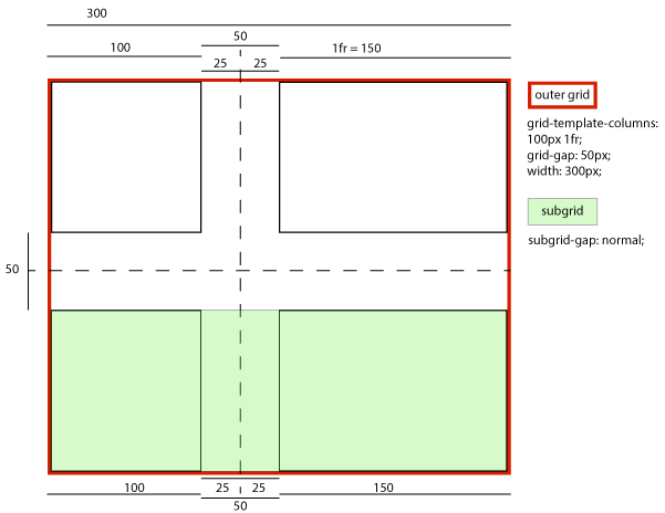
For example, suppose we have a 300px-wide outer grid with 50px gaps and its columns specified as 100px 1fr. A subgrid spanning both tracks would have…
- … if its column-gap were normal (or 50px):
-
- A grid item in its left column sized and laid out (and contributing its size to the parent grid’s sizing calculations) without any special adjustment, thus stretching to 100px wide while remaining aligned to the subgrid’s left edge.
- A grid item in its right column sized and laid out (and contributing its size to the parent grid’s sizing calculations) without any special adjustment, thus stretching to 150px wide, while remaining aligned to the subgrid’s right edge.
- An effective visual gutter between the items of 50px, exactly matching its parent grid.
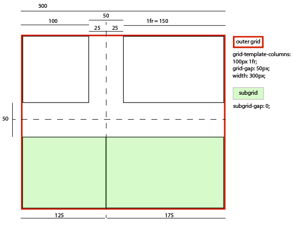
- … if its column-gap were 0:
-
- A grid item in its left column sized and laid out (and contributing its size to the parent grid’s sizing calculations) as if it had a -25px right margin, thus stretching to 125px wide while remaining aligned to the subgrid’s left edge.
- A grid item in its right column sized and laid out (and contributing its size to the parent grid’s sizing calculations) as if it had a -25px left margin, thus stretching to 175px wide, while remaining aligned to the subgrid’s right edge.
- An effective visual gutter between the items of zero, as specified by its column-gap.
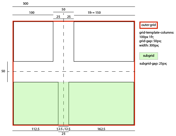
- … if its column-gap were 25px:
-
- A grid item in its left column sized and laid out (and contributing its size to the parent grid’s sizing calculations) as if it had a -12.5px right margin, thus stretching to 112.5px wide while remaining aligned to the subgrid’s left edge.
- A grid item in its right column sized and laid out (and contributing its size to the parent grid’s sizing calculations) as if it had a -12.5px left margin, thus stretching to 162.5px wide, while remaining aligned to the subgrid’s right edge.
- An effective visual gutter between the items of 25px, as specified by its column-gap.
- … if its column-gap were 75px:
-
- A grid item in its left column sized and laid out (and contributing its size to the parent grid’s sizing calculations) as if it had a 12.5px right margin, thus stretching to 87.5px wide while remaining aligned to the subgrid’s left edge.
- A grid item in its right column sized and laid out (and contributing its size to the parent grid’s sizing calculations) as if it had a 12.5px left margin, thus stretching to 137.5px wide, while remaining aligned to the subgrid’s right edge.
- An effective visual gutter between the items of 75px, as specified by its column-gap.

-
For each edge of a non-empty subgrid,
to account for the subgrid’s margin/border/padding at that edge,
a hypothetical item is contributed to the track sizing algorithm
for each span size
in the set of items spanning into
the occupied track closest to that edge of the subgrid.
This item’s sizes are taken from the sizes of the largest such item
of each span size,
and are additionally inflated by the subgrid’s own margin/border/padding
at that edge (or both edges,
if it happens to be the most extreme item on both sides
and is also the smallest span size).
Similarly, the hypothetical item’s span is taken
from that same real item’s span,
and inflated by the number of empty tracks between it
and the relevant subgrid’s edge(s).
Note: This step can be shortcut if the tracks closest to the subgrid’s edges contain real items, which would have already accounted for the subgrid’s margin/border/padding as described above.
For example, in the following subgrid layout:5px auto auto 5px . aaaaaaaaa . . bbbb cccc .
Assuming subgrid items a, b, and c occupying their corresponding grid areas and a subgrid padding of 25px, two hypothetical grid items would be contributed to the track sizing algorithm for the purpose of handling the subgrid’s inline-start padding: one with the size of b plus 25px, spanning the first two columns; and one with the size of a plus 25px, spanning the first three columns.
If only item a existed, which would make it both span into the closest occupied columns on both sides and be the smallest-spanning item on each side, then the hypothetical item it contributes would be its size inflated by 50px and would span all four columns.
- The subgrid is always stretched in its subgridded dimension(s: the align-self/justify-self properties on it are ignored, as are any specified width/height constraints.
- Layoutwise, the subgrid’s grid is always aligned with the corresponding section of the parent grid; the align-content/justify-content properties on it are also ignored in the subgridded dimension.
- The overflow property does apply to subgrids, so that overflowing contents of the subgrid can be scrolled into view. (Note: the act of scrolling does not affect layout.)
2.3. Resolved Value of a Track Listing
When an element generates a grid container box that is a subgrid, the resolved value of the grid-template-rows and grid-template-columns properties represents the used number of columns, serialized as the subgrid keyword followed by a list representing each of its lines as a line name set of all the line’s names explicitly defined on the subgrid (not including those adopted from the parent grid), without using the repeat() notation.
specified: subgrid [a] repeat(auto-fill, [b]) [c]
resolved:  subgrid [a] [b] [b] [b] [c]
specified: subgrid [a] [a] [a] [a] repeat(auto-fill, [b]) [c] [c]
resolved:  subgrid [a] [a] [a] [a] [c]
specified: subgrid [] [a]
resolved:  subgrid [] [a] [] [] []
specified: subgrid [a] [b] [c] [d] [e] [f]
resolved:  subgrid [a] [b] [c] [d] [e]
Note: This violates the general "shortest equivalent serialization" principle by serializing empty trailing line name sets, as the trailing line name sets provide potentially-useful information about how many tracks the subgrid is spanning.
2.4. Subgrid Sizing Algorithm
Note: Placement of all grid items, including subgrids and their sub-items, occurs before sizing.
Track sizing in a subgridded dimension treats each item in a given track in that axis as members of the parent grid. This interlacing requires that grid sizing drills down per axis into subgrids, rather than completing both axes in its recursion. Thus the Grid Sizing Algorithm is modified as follows:
- First, the track sizing algorithm is used to resolve the sizes of the grid columns.
In this process, any grid item which is subgridded in the grid container’s inline axis is treated as empty and its grid items (the grandchildren) are treated as direct children of the grid container (their grandparent). This introspection is recursive.
Items which are subgridded only in the block axis, and whose grid container size in the inline axis depends on the size of its contents are also introspected: since the size of the item in this dimension can be dependent on the sizing of its subgridded tracks in the other, the size contribution of any such item to this grid’s column sizing (see Resolve Intrinsic Track Sizes) is taken under the provision of having determined its track sizing only up to the same point in the Grid Sizing Algorithm as this parent grid itself. E.g. for the first pass through this step, the item will have its tracks sized only through this first step; if a second pass of this step is triggered then the item will have completed a first pass through steps 1-3 as well as the second pass of this step prior to returning its size for consideration in this grid’s column sizing. Again, this introspection is recursive.
If calculating the layout of a grid item in this step depends on the available space in the block axis, assume the available space that it would have if any row with a definite max track sizing function had that size and all other rows were infinite.
- Next, the track sizing algorithm resolves the sizes of the grid rows, using the grid column sizes calculated in the previous step.
In this process, any grid item which is subgridded in the grid container’s block axis is treated as empty and its grid items (the grandchildren) are treated as direct children of the grid container (their grandparent). This introspection is recursive.
As with sizing columns, items which are subgridded only in the inline axis, and whose grid container size in the block axis depends on the size of its contents are also introspected. (As with sizing columns, the size contribution to this grid’s row sizing is taken under the provision of having determined its track sizing only up to this corresponding point in the algorithm; and again, this introspection is recursive.)
- Then, if the min-content contribution of any grid items have changed based on the row sizes calculated in step 2, steps 1 and 2 are repeated with the new min-content contribution and max-content contribution (once only).
This cycle is necessary for cases where the inline size of a grid item depends on the block size of its grid area. Examples include wrapped column flex containers (flex-flow: column wrap), orthogonal flows (writing-mode), and multi-column containers.- Finally, the grid container is sized using the resulting size of the grid as its content size, and the tracks are aligned within the grid container according to the align-content and justify-content properties.
Note: This can introduce extra space between tracks, potentially enlarging the grid area of any grid items spanning the gaps beyond the space allotted to during track sizing.
Once the size of each grid area is thus established, the grid items are laid out into their respective containing blocks. The grid area’s width and height are considered definite for this purpose.
Note: Since formulas calculated using only definite sizes, such as the stretch fit formula, are also definite, the size of a grid item which is stretched is also considered definite.
Note, this means that a subgrid establishing an orthogonal flow would have the order of its track sizing inverted compared to a nested grid. We could simplify this by saying that an orthogonal flow cannot establish a subgrid; it can only be a nested grid.
Suppose we have a parent grid container A which contains an item B that has subgridded columns and contains a grandchild B that has subgridded rows and grandchild D that is simply a nested grid.
<grid-A>
  <grid-B subgrid=columns>
    <grid-C subgrid=rows/>
    <grid-D>
  </grid-B>
<grid-A>
When A sizes its columns it treats B’s items as slotted into to A’s corresponding columns, but when A sizes its rows it treats B as a single item (a grid container with its own rows and some items including items C and D). Similarly when B sizes its rows, it treats C’s items as slotted into B’s rows, but when B sizes its columns, it treats C as a single item, just as it does with D. There is no relationship between C’s rows and A’s rows, because the rows in B are nested, not subgridded.
At a high level, the grid algorithm is:
- Size the columns
- Size the rows
- Adjust the columns (if needed based on final row sizes)
The grid sizing algorithm in this example would thus look like this:
-
Resolve sizes of A’s grid columns,
using the sizes of A’s grid items,
treating B as empty
but treating its children
(including C and D)
as items in grid A.
The grid algorithm simply recurses into D. For C, it’s more complicated:
- Size C’s columns.
- Size C’s rows by sizing B’s rows.
- Adjust C’s columns.
- Return C’s final column sizes.
A correct size for B’s rows requires C’s final column sizes, because the row size depends on the column size, and thus B’s rows could very well depend on C’s final column sizes. To break this cyclic dependency, we need to split the algorithm to depend on the initial approximation of C’s final column sizes, and do the adjustment pass later. So for C, we need to recurse into column sizing only, and pass that initial size up to A for its initial column sizing.
When we size B’s rows later on, we will size C’s rows (which are subgridded), and finish up C’s sizing by finalizing its columns. If this resulted in a change, we have the opportunity to trigger an adjustment pass for A’s columns during its adjustment pass.
-
Next, resolve sizes of A’s rows,
using the sizes of A’s grid items,
treating B as a single item.
Since B, as a subgrid, has its sizing is split out into the multiple passes, the grid algorithm issues only a row-sizing recursion into B: Size B’s rows, treating D as a single item, requesting its final size, and treating C as an empty item and hoisting its children as items into grid B.
B returns its final row size, which factors into A’s row sizing pass.
- Last, finalize A’s column sizes. If C’s final size changes as a result of the row-sizing pass through B, this should trigger a resizing of B’s columns, which should trigger a resizing pass on A’s column.
3. Changes
Changes since the August 2018 CSS Grid Layout Level 2 Working Draft
- Adjusted the interaction of implicit named lines to be smarter about partially-overlapped areas. (Issue 4411)
- Defined resolved value of grid-template-rows and grid-template-columns for subgrids.
- Removed the aspect-ratio-controlled gutters feature (which will be moved to CSS Box Alignment Level 4 instead).
Changes since the June 2018 CSS Grid Layout Level 2 Working Draft
- Defined handling of the subgrid’s margins/borders/padding when the track closest to its edge is empty. (Issue 2592)
- Defined that subgrids with an automatic span use the number of explicit tracks from their grid-template-* properties rather than defaulting to one. (Issue 2565
Changes since the April 2018 CSS Grid Layout Level 2 Working Draft
- Added back syntax for specifying subgrid-local line names.
- Defined that subgrid’s own gap properties are honored, and how exactly that works.
- Clarified interactions of parent line names and subgrid line names.
4. Acknowledgements
Many thanks to Mats Palmgren of Mozilla, without whose support and feedback the subgrid feature would not be able to move forward. Thanks also to Daniel Tonon, who insisted on intelligent handling of gaps in subgrids and contributed illustrations; and Rachel Andrew and Jen Simmons who helped bridge the feedback gap between the CSS Working Group and the Web design/authoring community.
Lastly, the acknowledgements section of CSS Grid Level 2 would be incomplete without acknowledgement of everyone who made the monumental task of CSS Grid Level 1 possible.