CSS Masking Level 1
W3C Working Draft 20 June 2013
- This version:
- http://www.w3.org/TR/2013/WD-css-masking-20130620/
- Latest version:
- http://www.w3.org/TR/css-masking/
- Previous version:
- http://www.w3.org/TR/2012/WD-css-masking-20121115/
- Editor's draft:
- http://dvcs.w3.org/hg/FXTF/raw-file/default/masking/index.html
- Editors:
- Dirk Schulze, Adobe Systems, dschulze@adobe.com
- Brian Birtles, Mozilla Japan, bbirtles@mozilla.com
- Tab Atkins Jr., Google, Inc.
- Test suite:
- http://test.csswg.org/harness/test/CSS-MASKING_DEV/
Copyright © 2013 W3C® (MIT, ERCIM,
Keio, Beihang), All Rights Reserved. W3C liability,
trademark
and document
use rules apply.
Abstract
CSS Masking provides two means for partially or fully hiding portions of
visual elements: masking and clipping.
Masking describes how to use another graphical element or image as a
luminance or alpha mask. Typically, rendering an element via CSS or SVG
can conceptually described as if the element, including its children, are
drawn into a buffer and then that buffer is composited into the element's
parent. Luminance and alpha masks influence the transparency of this
buffer before the compositing stage.
Clipping describes the visible region of visual elements. The region can
be described by using certain SVG graphics elements or basic shapes.
Anything outside of this region is not rendered.
Status of this document
This section describes the status of this document at the time of
its publication. Other documents may supersede this document. A list of
current W3C publications and the latest revision of this technical report
can be found in the W3C technical reports
index at http://www.w3.org/TR/.
Publication as a Working Draft does not imply endorsement by the W3C
Membership. This is a draft document and may be updated, replaced or
obsoleted by other documents at any time. It is inappropriate to cite this
document as other than work in progress.
The (archived) public
mailing list public-fx@w3.org (see
instructions) is preferred
for discussion of this specification. When sending e-mail, please put the
text “css-masking” in the subject, preferably like this:
“[css-masking] …summary of comment…”
This document was produced by the CSS Working Group (part of
the Style Activity) and the SVG Working Group (part of the
Graphics Activity).
This document was produced by groups operating under the 5 February
2004 W3C Patent Policy. W3C maintains a public list of any patent disclosures (CSS) and a public list of any patent disclosures (SVG) made in
connection with the deliverables of each group; these pages also include
instructions for disclosing a patent. An individual who has actual
knowledge of a patent which the individual believes contains Essential
Claim(s) must disclose the information in accordance with section
6 of the W3C Patent Policy.
Table of contents
1. Introduction
With CSS Masking it is possible to specify another graphics element,
shape or image file to be used as clipping region or an luminance or alpha
mask for compositing the current object into the background.
The effect of applying a mask is as if the mask images or mask sources are rendered into an
off-screen image which has been initialized to transparent black. The
graphical object to which the mask is applied will be painted onto the
background through the mask, thus completely or partially masking out
parts of the graphical object.
Masks are applied using the ‘mask-image’ or ‘mask-box-image-source’ properties.
The ‘mask-image’ property may reference a <mask> element
as the mask source. Alternatively, for many simple uses, the ‘mask-image’ property
may refer directly to images to be used as mask forgoing the need for an
explicit <mask> element.
The ‘mask’ property
serves as a shorthand property for ‘mask-image’ and other characterizing
properties.
The ‘mask-box-image-source’ property splits a mask
image into 9 pieces. The pieces may be sliced, scaled and stretched in
various ways to fit the size of the mask image area.
The ‘mask-box-image’ property serves as a shorthand
property for ‘mask-box-image-source’ and other
characterizing properties.
Clipping path defines an outline (in the absence of anti-aliasing) of a
visual element where everything on the "inside" of the outline is allowed
to show through but everything on the outside is masked out. A clipping
path is specified by vector paths or shapes.
The ‘clip-path’
property can reference SVG graphics
element or use specified basic shapes as clipping path.
2. Module interactions
This specification defines a set of CSS properties that affect the
visual rendering of elements to which those properties are applied; these
effects are applied after elements have been sized and positioned
according to the Visual formatting model from [CSS21]. Some values of
these properties result in the creation of a stacking context. Furthermore, this
specification replaces the section Clipping: the
‘clip’ property from [CSS21].
The compositing model follows the SVG compositing model [SVG11]: first any filter effect [FILTER-EFFECTS] is applied,
then any clipping, masking and opacity [CSS3COLOR]. These effects all
apply after any other CSS effects such as ‘border’ [CSS3BG].
3. Values
This specification follows the CSS property
definition conventions from [CSS21]. Basic shapes are defined in
CSS Exclusions and Shapes Module Level 3 [CSS3-EXCLUSIONS]. Value
types not defined in these specifications are defined in CSS Values and
Units Module Level 3 [CSS3VAL].
In addition to the property-specific values listed in their definitions,
all properties defined in this specification also accept the inherit
keyword as their property value. For readability it has not been repeated
explicitly.
4. Terminology
When used in this specification, terms have the meanings assigned in
this section.
- bounding client
rect
-
The union of all border boxes for the element that has an associated
CSS layout box and is not in the http://www.w3.org/2000/svg
namespace and its descendant elements. Or the object bounding box [SVG11], if the
element does not have an associated CSS layout box and is in the
http://www.w3.org/2000/svg namespace. (See getBoundingClientRect
[CSSOM-VIEW].)
- local
coordinate system
- user
coordinate system
-
In general, a coordinate system defines locations and distances on
the current canvas. The current local coordinate system (also user
coordinate system) is the coordinate system that is currently active and
which is used to define how coordinates and lengths are located and
computed, respectively, on the current canvas [CSS3-TRANSFORMS].
For elements that have an associated CSS layout box, the current user
coordinate system has its origin at the top-left corner of the bounding client rect and one
unit equals one CSS pixel. The viewport for resolving percentage values
is defined by the width and height of the bounding client rect.
If the element does not have an associated CSS layout box and is in
the http://www.w3.org/2000/svg namespace, the current local
coordinate system has its origin at the top-left corner of the element's
nearest viewport.
- object
bounding box units
- The bounding client
rect defines the coordinate system in which to resolve values, as
defined in object
bounding box units [SVG11].
- mask
- An off-screen image which has been initialized to transparent black.
The graphical object to which the mask is applied will be painted onto
the background through the mask, thus completely or partially masking out
parts of the graphical object.
- mask source
- A mask defined by a
<mask> element.
- clipping path
- A combination of SVG graphics
element or basic shapes which serve as the outline of a
visual element where everything on the "inside" of the outline is allowed
to show through but everything on the outside is masked out. (See ‘
clip-path’.)
Definitions of CSS properties and values in this specification are
analogous to definitions in CSS Backgrounds and Borders [CSS3BG]. To avoid redundancy, this
specification relies on descriptions and definitions of CSS Backgrounds
and Borders. The following terms in CSS Backgrounds and Borders have the
following meaning in this specification:
| Term in CSS Masking
| Term in [CSS3BG]
|
| mask images
| background images
|
| mask painting area
| background painting area
|
| mask-size
| background-size
|
| mask-position
| background-position
|
| mask positioning area
| background positioning area
|
| mask box image area
| border image area
|
5. Layered Masks
This property sets the mask image(s) or the mask source of an element. Images are
drawn with the first specified one on top (closest to the user) and each
subsequent image behind the previous one. Where:
<mask-reference> = <mask-image># | <mask-source>
<mask-image> = <image> | none
<mask-source> = <url> | child | <child-selector>
<child-selector> = select(<compound-selector>#)
A <mask-source> can just be
specified as a single value and can not contribute to a list of <mask-reference> values.
Otherwise the specified value of the property is invalid. (See examples
below.)
- <url>
- A URL reference to a
<mask> element (for example ‘url(commonmasks.svg#mask)’).
- ‘
child’
- A keyword to indicate that the last direct child
<mask> element
of the element the ‘mask-image’ property is applied should be
used as the mask source. It is equivalent to ‘select(mask:last-of-type)’.
- <child-selector>
- A functional notation [CSS3VAL] accepting a
comma-separated list of compound selectors that represents first matching
child
<mask> element in tree
order (as defined in [DOM]).
- <compound-selector>
- A compound
selector as defined in [SELECTORS4].
-
- <image>
- A 2D image. (See [CSS3-IMAGES].)
- ‘
none’
- A value of ‘
none’ counts as an image layer
but does not mask the element.
If the URI in the ‘url()’ function
has a fragment identifier, the <mask-reference> is
treated as <mask-source>,
otherwise as <mask-image>.
A computed value of other than ‘none’ results
in the creation of a stacking context [CSS21] the same way
that CSS ‘opacity’ [CSS3COLOR] does.
If the URI reference of a mask source is not valid (e.g it points to an
object that doesn't exist or the object is not a <mask>
element), no masking is applied.
A mask image that is empty (zero width or zero height), that fails to
download, is non-existent, or that cannot be displayed (e.g. because it is
not in a supported image format) is ignored. No masking is applied.
See the section “Layering multiple mask
images” for how ‘mask-image’ interacts with other
comma-separated mask properties to form each mask image layer.
Some examples specifying mask images:
body { mask-image: linear-gradient(black 0%, transparent 100%) }
p { mask-image: none }
div { mask-image: url(tl.png), url(tr.png) }
Some examples of a specified mask source:
img { mask-image: url(#mask) }
span { mask-image: url(resources.svg#mask2) }
Examples of invalid mask source usages:
p { mask-image: url(#mask), url(tl.png) }
img { mask-image: url(#mask), url(resources.svg#mask2) }
A <mask-source> value
that is either used together with another <mask-source> value or an <mask-image> value makes the
whole specified ‘mask-image’ value list invalid.
The ‘mask-source-type’ property indicates whether
the <mask-reference> is
treated as luminance mask or alpha mask. (See Mask
Source values.)
<source-type> = alpha | luminance | auto
Values have the following meanings:
- ‘
alpha’
- A value of ‘
alpha’
indicates that the alpha values of the mask image should be used as the
mask values. See Calculating mask values.
- ‘
luminance’
- A value of ‘
luminance’ indicates that the luminance values of
the mask image should be used as the mask values. See Calculating mask values.
- ‘
auto’
-
If the <mask-reference> of the
‘mask-image’
property is of type <mask-source> the luminance
values of the mask image should be used as the mask values.
If the <mask-reference> of the
‘mask-image’
property is of type <mask-image> the alpha
values of the mask image should be used as the mask values.
In the following example, the ‘mask-type’ property sets the mask type value
for the <mask> element to ‘alpha’. The ‘mask-image’ property
has a reference to this <mask> element and the ‘mask-source-type’ property has a value of
‘luminance’. The
‘mask-source-type’ property will override the
definition of ‘mask-type’ to ‘luminance’.
<mask id="SVGMask" mask-type="alpha" maskContentUnits="objectBoundingBox">
  <radialGradient id="radialFill">
    <stop stop-color="white" offset="0"/>
    <stop stop-color="black" offset="1"/>
  </radialGradient>
  <circle fill="url(#radialFill)" cx="0.5" cy="0.5" r="0.5"/>
</mask>

<style>
  rect {
    mask-image: url(#SVGMask);
    mask-source-type: luminance;
  }
</style>

<rect width="200" height="200" fill="green"/>
| Name:
| mask-repeat
|
| Value:
| <repeat-style>#
|
| Initial:
| repeat
|
| Applies to:
| All elements. In SVG, it applies to container
elements without the <defs> element and all graphics
elements.
|
| Inherited:
| no
|
| Percentages:
| N/A
|
| Media:
| visual
|
| Computed value:
| A list, each item consisting of: two keywords, one per dimension
|
| Animatable:
| no
|
Specifies how mask images are tiled after they have been sized and positioned.
See Tiling
Images: the ‘background-repeat’
property [CSS3BG] for the definitions of the
property values.
Example(s):
body {
  background-color: blue;
  mask-image: url(dot-mask.png) luminance;
  mask-repeat: space;
}
See the section “Layering multiple mask
images” for how ‘mask-repeat’ interacts with other
comma-separated mask properties to form each mask image layer.
See Positioning
Images: the ‘background-position’
property [CSS3BG] for the definitions of the
property values.
In the example below, the (single) image is placed in the lower-right
corner of the viewport.
body {
  mask-image: url("logo.png");
  mask-position: 100% 100%;
  mask-repeat: no-repeat;
}
Mask positions can also be relative to other corners than the top left.
E.g., the following puts the background image 10px from the bottom and
3em from the right:
mask-position: right 3em bottom 10px
See the section “Layering multiple mask
images” for how ‘mask-position’ interacts with other
comma-separated mask properties to form each mask image layer.
5.5. The ‘mask-clip’ property
| Name:
| mask-clip
|
| Value:
| [ <box>
| no-clip ]#
|
| Initial:
| border-box
|
| Applies to:
| All elements. In SVG, it applies to container
elements without the <defs> element and all graphics
elements.
|
| Inherited:
| no
|
| Percentages:
| N/A
|
| Media:
| visual
|
| Computed value:
| as specified
|
| Animatable:
| no
|
Determines the mask painting area,
which determines the area that is affected by the mask. The painted
content of an element may be restricted to this area.
Values have the following meanings:
- ‘
border-box’
- The painted content is rectricted to (clipped to) the border
box respectively painting box for objects without
associated layout box.
-
‘
padding-box’
- The painted content is rectricted to (clipped to) the padding
box.
-
‘
content-box’
- The painted content is rectricted to (clipped to) the content
box respectively object bounding box [SVG11] for objects without
associated layout box.
- ‘
no-clip’
- The painted content is not restricted (not clipped). The mask painting area is set to the bounding client rect.
Note that there is no corresponding box for ‘padding-box’ on objects without associated layout box
and ‘content-box’
is choosen instead.
See the section “Layering multiple mask
images” for how ‘mask-clip’ interacts with other
comma-separated mask properties to form each mask image layer.
| Name:
| mask-origin
|
| Value:
| <box>#
|
| Initial:
| padding-box
|
| Applies to:
| All elements. In SVG, it applies to container
elements without the <defs> element and all graphics
elements.
|
| Inherited:
| no
|
| Percentages:
| N/A
|
| Media:
| visual
|
| Computed value:
| as specified
|
| Animatable:
| no
|
For elements rendered as a single box, specifies the mask positioning area. For elements
rendered as multiple boxes (e.g., inline boxes on several lines, boxes on
several pages) specifies which boxes ‘box-decoration-break’ operates on to determine the
mask positioning area(s).
-
‘
padding-box’
- The position is relative to the padding box. (For single boxes
‘
0 0’ is the upper left corner of the padding
edge, ‘100% 100%’ is the lower right corner.)
-
‘
border-box’
- The position is relative to the border box respectively painting
box for objects without associated layout box.
- ‘
content-box’
- The position is relative to the content box respectively object
bounding box [SVG11] for objects without
associated layout box.
Note that there is no corresponding box for ‘padding-box’ on objects without associated layout box
and ‘content-box’
is choosen instead.
Note that if ‘mask-clip’ is ‘padding-box’, ‘mask-origin’ is ‘border-box’, ‘mask-position’ is ‘top
left’ (the initial value), and the element has a non-zero border,
then the top and left of the mask image will be clipped.
See the section “Layering multiple mask
images” for how ‘mask-origin’ interacts with other
comma-separated mask properties to form each mask image layer.
5.7. The ‘mask-size’ property
Specifies the size of the mask images.
See Sizing
Images: the ‘background-size’ property [CSS3BG] for the definitions of the
property values.
See the section “Layering multiple mask
images” for how ‘mask-size’ interacts with other
comma-separated mask properties to form each mask image layer.
5.8. The ‘mask’ property
| Name:
| mask
|
| Value:
| <mask-layer>#
|
| Initial:
| see individual properties
|
| Applies to:
| All elements. In SVG, it applies to container
elements without the <defs> element and all graphics
elements.
|
| Inherited:
| no
|
| Percentages:
| see individual properties
|
| Media:
| visual
|
| Computed value:
| see individual properties
|
| Animatable:
| see individual properties
|
Where
<mask-layer> = <mask-reference> <source-type>? || <position> [ / <bg-size> ]? || <repeat-style> || <box> || [ <box> | no-clip ]
If one <box> value is present then it sets both ‘mask-origin’ and
‘mask-clip’ to
that value. If two <box> values are present, then the
first sets ‘mask-origin’ and the second ‘mask-clip’.
Note that the properties ‘mask-image’, ‘mask-repeat’, ‘mask-position’,
‘mask-clip’,
‘mask-origin’
and ‘mask-size’
have no affect on <mask> elements.
The ‘mask’ property does not influence the ‘mask-box-image’
properties. ‘mask: none’ does not remove any
masking defined by ‘mask-box-image’.
5.9. The ‘mask-type’ property
| Name:
| mask-type
|
| Value:
| luminance | alpha
|
| Initial:
| luminance
|
| Applies to:
| <mask>
elements
|
| Inherited:
| no
|
| Percentages:
| N/A
|
| Media:
| visual
|
| Computed value:
| as specified
|
| Animatable:
| no
|
The ‘mask-type’
property defines whether the content of the <mask> element is treated as as luminance
mask or alpha mask, as described in Calculating mask
values.
Values have the following meanings:
- ‘
luminance’
- Indicates that the luminance values of the mask should be used.
- ‘
alpha’
- Indicates that the alpha values of the mask should be used.
The ‘mask-type’
property allows the author of the <mask> element to specify the preferred
masking operation. However, the author can override this preference by
setting the ‘mask-source-type’ value to something different
than ‘auto’ on the masked
content.
In the following example the computed value of ‘mask-type’ is ‘luminance’ and the
computed value of ‘mask-source-type’ is ‘auto’. The UA must follow the preferred masking
operation defined on the <mask> element.
<svg>
  <mask style="mask-type: luminance;" id="mask">
    ...
  </mask>
</svg>

<p style="mask-image: url(#mask); mask-source-type: auto;">
  This is the masked content.
</p>
In the next example the computed value of ‘mask-source-type’ is ‘alpha’ and overrides the
preference on the <mask> element that is computed to ‘luminance’. The mask
source is used as an alpha mask.
<svg>
  <mask style="mask-type: luminance;" id="mask2">
    ...
  </mask>
</svg>

<p style="mask-image: url(#mask2); mask-source-type: alpha;">
  This is the masked content.
</p>
The ‘mask-type’
property is a presentation attribute for SVG elements.
5.10. The <mask> element
| Name:
| mask
|
| Categories:
| Container
element
|
| Content model:
| Any number of the following elements, in any order:
- animation
— <animate>, <animateColor>, <animateMotion>, <animateTransform>, <set>
- descriptive
— <desc>, <title>, <metadata>
- shape
— <circle>, <ellipse>, <line>, <path>, <polygon>, <polyline>, <rect>
- structural
— <defs>, <g>, <svg>, <symbol>, <use>
- gradient
— <linearGradient>, <radialGradient>
- <a>
- <clipPath>
- <color-profile>
- <cursor>
- <filter>
- <font>
- <font-face>
- <foreignObject>
- <image>
- <marker>
- <mask>
- <pattern>
- <script>
- <style>
- <switch>
- <view>
- <text>
- <altGlyphDef>
|
| Attributes:
|
- conditional
processing attributes — ‘requiredFeatures’, ‘requiredExtensions’, ‘systemLanguage’
- core
attributes — ‘id’, ‘xml:base’, ‘xml:lang’, ‘xml:space’
- presentation
attributes — ‘
alignment-baseline’, ‘baseline-shift’, ‘clip’, ‘clip-path’, ‘clip-rule’, ‘color’, ‘color-interpolation’, ‘color-interpolation-filters’, ‘color-profile’, ‘color-rendering’, ‘cursor’, ‘direction’, ‘display’, ‘dominant-baseline’, ‘enable-background’, ‘fill’, ‘fill-opacity’, ‘fill-rule’, ‘filter’, ‘flood-color’, ‘flood-opacity’, ‘font’, ‘font-family’, ‘font-size’, ‘font-size-adjust’, ‘font-stretch’, ‘font-style’, ‘font-variant’, ‘font-weight’, ‘glyph-orientation-horizontal’, ‘glyph-orientation-vertical’, ‘image-rendering’, ‘kerning’, ‘letter-spacing’, ‘lighting-color’, ‘marker’, ‘marker-end’, ‘marker-mid’, ‘marker-start’, ‘mask’, ‘opacity’, ‘overflow’, ‘pointer-events’, ‘shape-rendering’, ‘stop-color’, ‘stop-opacity’, ‘stroke’, ‘stroke-dasharray’, ‘stroke-dashoffset’, ‘stroke-linecap’, ‘stroke-linejoin’, ‘stroke-miterlimit’, ‘stroke-opacity’, ‘stroke-width’, ‘text-anchor’, ‘text-decoration’, ‘text-rendering’, ‘unicode-bidi’, ‘visibility’, ‘word-spacing’, ‘writing-mode’
- ‘class’
- ‘style’
- ‘x’
- ‘y’
- ‘width’
- ‘height’
- ‘maskUnits’
- ‘maskContentUnits’
|
| DOM Interfaces:
| SVGMaskElement
|
Attribute definitions:
- maskUnits =
"userSpaceOnUse | objectBoundingBox"
- Defines the coordinate system for attributes ‘
x’,
‘y’, ‘width’ and ‘height’.
If maskUnits="userSpaceOnUse", ‘x’, ‘y’,
‘width’ and ‘height’ represent values in the current user
coordinate system in place at the time when the <mask>
element is referenced (i.e., the user coordinate system for the element
referencing the <mask> element via the ‘mask’ property).
If maskUnits="objectBoundingBox", ‘x’, ‘y’,
‘width’ and ‘height’ represent fractions or percentages
of the bounding box of the element to which the mask is applied. (See object bounding box
units.)
If attribute ‘maskUnits’ is not specified, then the effect
is as if a value of ‘objectBoundingBox’ were specified.
Animatable: yes.
- maskContentUnits = "userSpaceOnUse |
objectBoundingBox"
- Defines the coordinate system for the contents of the
<mask>.
If maskContentUnits="userSpaceOnUse", the
user coordinate system for the contents of the <mask>
element is the current user coordinate system in place at the time when
the <mask>
element is referenced (i.e., the user coordinate system for the element
referencing the <mask> element via the ‘mask’ property).
If maskContentUnits="objectBoundingBox",
the user coordinate system for the contents of the <mask> is
established using the bounding box of the element to which the mask is
applied. (See object
bounding box units.)
If attribute ‘maskContentUnits’ is not specified, then the
effect is as if a value of ‘userSpaceOnUse’ were specified.
Animatable: yes.
- x =
"<length> | <percentage>"
- The x-axis coordinate of one corner of the rectangle for the largest
possible offscreen buffer. If the attribute is not specified but at
least one of the attributes ‘
y’,
‘width’ or ‘height’ are specified, the effect is as if a
value of ‘-10%’
were specified.
Animatable: yes.
- y =
"<length> | <percentage>"
- The y-axis coordinate of one corner of the rectangle for the largest
possible offscreen buffer.
If the attribute is not specified but at least one of the attributes ‘x’, ‘width’ or ‘height’ are specified, the effect is as if a
value of ‘-10%’
were specified.
Animatable: yes.
- width =
"<length> | <percentage>"
- The width of the largest possible offscreen buffer. A negative value
or a value of zero disables rendering of the element.
If the attribute is not specified but at least one of the attributes ‘x’, ‘y’ or
‘height’ are specified, the effect is as if a
value of ‘120%’
were specified.
Animatable: yes.
- height =
"<length> | <percentage>"
- The height of the largest possible offscreen buffer.
A negative value or a value of zero disables rendering of the
element.
If the attribute is not specified but at least one of the attributes ‘x’, ‘y’ or
‘width’ are specified, the effect is as if a
value of ‘120%’
were specified.
Animatable: yes.
If at least one of the attributes ‘x’, ‘y’, ‘width’ or ‘height’ are specified, the given object and
the rectangle defined by ‘x’, ‘y’, ‘width’ and ‘height’ establish a current clipping path. The
rendered content of the mask must be clipped by this current clipping
path.
CSS properties inherit into the <mask> element from its ancestors;
properties do not inherit from the element referencing the <mask> element.
<mask>
elements are never rendered directly; their only usage is as something
that can be referenced using the ‘mask’ property. The ‘opacity’, ‘filter’
and ‘display’ properties do not apply to
the <mask>
element; thus, <mask> elements are not directly rendered
even if the ‘display’ property is set to a
value other than ‘none’, and <mask> elements
are available for referencing even when the ‘display’ property on the <mask> element
or any of its ancestors is set to none.
5.11. The
Mask Image Rendering Model
The application of the ‘mask-image’ property to an element formatted
with the CSS box model establishes a stacking context in the same way that
CSS ‘opacity’ [CSS3COLOR] does, and all the
element's descendants are rendered together as a group with the masking
applied to the group as a whole.
The ‘mask-image’ property has no effect on the
geometry or hit-testing of any element's CSS boxes.
5.11.1. Layering Multiple Mask
Images
The mask of a box can have multiple layers. The number of layers is determined by the number
of comma-separated values in the ‘mask-image’ property. Note that a value of
‘none’ still creates a layer. See Layering Multiple
Background Images [CSS3BG].
All mask images are transformed to alpha masks (if necessary) and
combined by compositing on the mask.
5.11.2. Mask Source values
A mask may be interpreted using one of two different methods with
regards to calculating the mask values that will be multiplied with the
target alpha values.
The first and simplest method of calculating the mask values is to use
the alpha channel of the mask source. In this case the mask value at a
given point is simply the value of the alpha channel at that point. The
color channels do not contribute to the mask value.
The second method of calculating the mask values is to use the
luminance of the mask source. In this case the mask value at a given point
is computed from the color channel values and alpha channel value using
the following procedure.
- Compute a luminance value from the color channel values.
- If the computed value of ‘
color-interpolation’ on the <mask>
element is ‘linearRGB’, convert the
original image color values (potentially in the sRGB color space) to
the linear RGB color space.
- Then, using non-premultiplied RGB color values, apply the
luminance-to-alpha coefficients (as defined in the
<feColorMatrix> filter primitive [SVG11]) to convert
the RGB color values to luminance values.
- Multiply the computed luminance value by the corresponding alpha value
to produce the mask value.
Regardless of the method used, the procedure for calculating mask values
assumes the content of the mask is a four-channel RGBA graphics object.
For other types of graphics objects, special handling is required as
follows.
For a three-channel RGB graphics object that is used in a mask (e.g.,
when referencing a three-channel image file), the effect is as if the
object were converted into a four-channel RGBA image with the alpha
channel uniformly set to 1.
For a single-channel image that is used in a mask (e.g., when
referencing a single-channel grayscale image file), the effect is as if
the object were converted into a four-channel RGBA image, where the single
channel from the referenced object is used to compute the three color
channels and the alpha channel is uniformly set to 1.
Note that when referencing a grayscale image file, the
transfer curve relating the encoded grayscale values to linear light
values must be taken into account when computing the color channels.
Note that SVG graphics
elements (e.g., <circle> or <text>) are all treated as four-channel
RGBA images for the purposes of masking operations.
The effect of a mask is identical to what would have happened if there
were no mask but instead the alpha channel of the given object were
multiplied with the mask's resulting mask values.
6. Box-Image Masks
With ‘mask-box-image’ a mask can be split into nine
pieces: four corners, four edges and the middle piece as demonstrated in
the figure below.
These pieces may be sliced, scaled and stretched in various ways to fit
the size of the mask image
area. The usage of ‘mask-box-image’ corresponds to the ‘border-image’ property of CSS Background and
Borders [CSS3BG].
The mask image in the following example is split into four corners with
dimensions of 75 pixels, four edges and the middle piece that is
stretched and scaled.
div {
  background: linear-gradient(bottom, #F27BAA 0%, #FCC8AD 100%);
  mask-box-image-slice: 25 fill;
  mask-box-image-repeat: stretch;
  mask-box-image-source: url(mask.png);
}
| Name:
| mask-box-image-source
|
| Value:
| <mask-image>
|
| Initial:
| none
|
| Applies to:
| All elements. In SVG, it applies to container
elements and graphics
elements.
|
| Inherited:
| no
|
| Percentages:
| N/A
|
| Media:
| visual
|
| Computed value:
| ‘none’ or the image with its URI made
absolute
|
| Animatable:
| no
|
Specifies an image to be used as mask. If the value is ‘none’ or if the image cannot be displayed (or the
property doesn't apply), the content won't get masked.
A computed value of other than ‘none’ results
in the creation of a stacking context [CSS21] the same way
that CSS ‘opacity’ [CSS3COLOR] does.
| Name:
| mask-box-image-slice
|
| Value:
| [<number> | <percentage>]{1,4}
&& fill?
|
| Initial:
| 0 fill
|
| Applies to:
| All elements. In SVG, it applies to container
elements without the <defs> element and all graphics
elements.
|
| Inherited:
| no
|
| Percentages:
| refer to size of the mask image
|
| Media:
| visual
|
| Computed value:
| as specified
|
| Animatable:
| no
|
This property specifies inward offsets from the top, right, bottom, and
left edges of the mask image, dividing it into nine regions: four corners,
four edges and a middle. The middle image part is discarded (treated as
fully transparent black) unless the ‘fill’
keyword is present.
See Image
Slicing: the ‘border-image-slice’
property [CSS3BG] for the definitions of the
property values.
| Name:
| mask-box-image-width
|
| Value:
| [ <length> | <percentage> |
<number> | auto ]{1,4}
|
| Initial:
| auto
|
| Applies to:
| All elements. In SVG, it applies to container
elements without the <defs> element and all graphics
elements.
|
| Inherited:
| no
|
| Percentages:
| relative to width/height of the mask box image area
|
| Media:
| visual
|
| Computed value:
| all <length>s made absolute, otherwise as specified
|
| Animatable:
| no
|
The mask image is drawn inside an area called the mask box image area. This is an
area whose boundaries by default correspond to the mask box, see ‘mask-box-image-outset’.
See Drawing
Areas: the ‘border-image-width’ property [CSS3BG] for the definitions of the
property values.
Note that for SVG elements without an associated layout box
the ‘border-width’ is considered to be
‘0’.
| Name:
| mask-box-image-outset
|
| Value:
| [ <length> | <number> ]{1,4}
|
| Initial:
| 0
|
| Applies to:
| All elements. In SVG, it applies to container
elements without the <defs> element and all graphics
elements.
|
| Inherited:
| no
|
| Percentages:
| N/A
|
| Media:
| visual
|
| Computed value:
| all <length>s made absolute, otherwise as specified
|
| Animatable:
| no
|
The values specify the amount by which the mask box image area extends beyond the
border box. If it has four values, they set the outsets on the top, right,
bottom and left sides in that order. If the left is missing, it is the
same as the right; if the bottom is missing, it is the same as the top; if
the right is missing, it is the same as the top.
As with ‘mask-box-image-width’, a <number>
represents a multiple of the corresponding ‘border-width’. Negative values are not allowed for
any of the ‘mask-box-image-outset’ values.
Note that for SVG elements without associated layout box the
‘border-width’ is considered to be
‘0’.
| Name:
| mask-box-image-repeat
|
| Value:
| [ stretch | repeat | round | space ]{1,2}
|
| Initial:
| stretch
|
| Applies to:
| All elements. In SVG, it applies to container
elements without the <defs> element and all graphics
elements.
|
| Inherited:
| no
|
| Percentages:
| N/A
|
| Media:
| visual
|
| Computed value:
| as specified
|
| Animatable:
| no
|
This property specifies how the images for the sides and the middle part
of the mask image are scaled and tiled. The first keyword applies to the
horizontal sides, the second to the vertical ones. If the second keyword
is absent, it is assumed to be the same as the first.
See Image
Tiling: the ‘border-image-repeat’
property [CSS3BG] for the definitions of the
property values.
The exact process for scaling and tiling the mask box image parts is
given in the section Masking
with the mask-box-image.
This is a shorthand property for setting ‘mask-box-image-source’, ‘mask-box-image-slice’, ‘mask-box-image-width’, ‘mask-box-image-outset’ and ‘mask-box-image-repeat’. Omitted values are set
to their initial values.
6.7.
Masking with the mask-box-image
After the mask-box-image given by ‘mask-box-image-source’ is sliced by the ‘mask-box-image-slice’ values, the resulting
nine images are scaled, positioned, and tiled into their corresponding
mask image regions in four steps as described in the section Drawing
the Border Image [CSS3BG].
The application of the ‘mask-box-image-source’ property to an element
formatted with the CSS box model establishes a stacking context in the
same way that CSS ‘opacity’ [CSS3COLOR]
does, and all the element's descendants are rendered together as a group
with the masking applied to the group as a whole.
The ‘mask-box-image-source’ property has no effect
on the geometry or hit-testing of any element's CSS boxes.
7. Clipping paths
The clipping path restricts the region to which paint can be applied,
the so-called clipping region. Conceptually, any parts of the drawing that
lie outside of this region are not drawn. This includes any content,
background, borders, text decoration, outline and visible scrolling
mechanism of the element to which the clipping path is applied, and those
of its descendants.
An element's ancestors may also clip portions of their content (e.g.,
via their own ‘clip’ or ‘clip-path’ properties and/or if their ‘overflow’ property is not ‘visible’). What is rendered is the cumulative
intersection.
If the clipping region exceeds the bounds of the UA's document window,
content may be clipped to that window by the native operating environment.
7.1. The ‘clip-path’ property
Specifies a basic shape or references a <clipPath> element to create a
clipping path.
<clip-source> = <url> | child | <child-selector>
- <basic-shape>
- A basic
shape function as defined in CSS3 Exclusions. The origin of clipping
shapes is on the top left of the bounding client
rect. Percentage values are resolved against the bounding client
rect width and height. (See [CSS3-EXCLUSIONS].)
- ‘
child’
- A keyword to indicate that the last direct child
<clipPath>
element of the element the ‘clip-path’ property is applied should be used
as the clip source. It is equivalent to ‘select(clipPath:last-of-type)’.
- <child-selector>
- A functional notation [CSS3VAL] accepting a
comma-separated list of compound selectors that represents first matching
child
<clipPath> element in tree
order (as defined in [DOM]).
- ‘
none’
- No clipping path gets created.
A computed value of other than ‘none’ results
in the creation of a stacking context [CSS21] the same way
that CSS ‘opacity’ [CSS3COLOR] does.
If the URI reference is not valid (e.g it points to an object that
doesn't exist or the object is not a <clipPath> element), no clipping is
applied.
7.2. The ‘clip-rule’ property
| Name:
| clip-rule
|
| Value:
| nonzero | evenodd
|
| Initial:
| nonzero
|
| Applies to:
| graphics
elements within a <clipPath> element
|
| Inherited:
| yes
|
| Percentages:
| N/A
|
| Media:
| visual
|
| Computed value:
| as specified
|
| Animatable:
| no
|
- ‘
nonzero’
- See description of ‘
fill-rule’ property [SVG11].
- ‘
evenodd’
- See description of ‘
fill-rule’ property [SVG11].
The ‘clip-rule’
property only applies to graphics elements that are contained within a <clipPath>
element.
The following fragment of code will cause an evenodd clipping rule to
be applied to the clipping path because ‘clip-rule’ is specified on the <path> element that defines the clipping
shape:
<g clip-rule="nonzero">
  <clipPath id="MyClip">
    <path d="..." clip-rule="evenodd" />
  </clipPath>
  <rect clip-path="url(#MyClip)" ... />
</g>
whereas the following fragment of code will not cause an
evenodd clipping rule to be applied because the ‘clip-rule’ is
specified on the referencing element, not on the object defining the
clipping shape:
<g clip-rule="nonzero">
  <clipPath id="MyClip">
    <path d="..." />
  </clipPath>
  <rect clip-path="url(#MyClip)" clip-rule="evenodd" ... />
</g>
7.3. The ‘clip’ property
With this specification the ‘clip’ property is deprecated. Authors are
encouraged to use the ‘clip-path’ property instead. UAs must support
the ‘clip’
property.
The ‘clip’
property applies only to absolutely positioned elements. In SVG, it
applies to elements
which establish a new viewport, <pattern> elements and <marker> elements. Values have the
following meanings:
- ‘
auto’
- The element does not clip.
- <shape>
-
In CSS 2.1, the only valid <shape> value is: rect(<top>, <right>, <bottom>, <left>) where <top> and <bottom> specify offsets from
the top border edge of the box, and <right>, and <left> specify offsets from the
left border edge of the box. Authors should separate offset values with
commas. User agents must support separation with commas, but may also
support separation without commas (but not a combination), because a
previous revision of this specification was ambiguous in this respect.
<top>, <right>, <bottom>, and <left> may either have a
<length> value or ‘auto’. Negative lengths are permitted. The value
‘auto’ means that a given
edge of the clipping region will be the same as the edge of the
element's generated border box (i.e., ‘auto’ means the same as ‘0’ for <top>
and <left>, the same as the
used value of the height plus the sum of vertical padding and border
widths for <bottom>, and the
same as the used value of the width plus the sum of the horizontal
padding and border widths for <right>, such that four ‘auto’ values result in
the clipping region being the same as the element's border box).
When coordinates are rounded to pixel coordinates, care should be
taken that no pixels remain visible when <left> and <right> have the same value (or
<top> and <bottom> have the same value),
and conversely that no pixels within the element's border box remain
hidden when these values are ‘auto’.
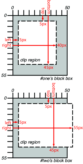
Example: The following two rules:
p#one { clip: rect(5px, 40px, 45px, 5px); }
p#two { clip: rect(5px, 55px, 45px, 5px); }
and assuming both Ps are 50 by 55 pixel, will create, respectively,
the rectangular clipping regions delimited by the dashed lines in the
following illustrations:
| Name:
| clipPath
|
| Categories:
| None.
|
| Content model:
| Any number of the following elements, in any order:
- descriptive
— <desc>, <title>, <metadata>
- animation
— <animate>, <animateColor>, <animateMotion>, <animateTransform>, <set>
- shape
— <circle>, <ellipse>, <line>, <path>, <polygon>, <polyline>, <rect>
- <text>
- <use>
|
| Attributes:
|
- conditional
processing attributes — ‘requiredFeatures’, ‘requiredExtensions’, ‘systemLanguage’
- core
attributes — ‘id’, ‘xml:base’, ‘xml:lang’, ‘xml:space’
- presentation
attributes — ‘
alignment-baseline’, ‘baseline-shift’, ‘clip’, ‘clip-path’, ‘clip-rule’, ‘color’, ‘color-interpolation’, ‘color-interpolation-filters’, ‘color-profile’, ‘color-rendering’, ‘cursor’, ‘direction’, ‘display’, ‘dominant-baseline’, ‘enable-background’, ‘fill’, ‘fill-opacity’, ‘fill-rule’, ‘filter’, ‘flood-color’, ‘flood-opacity’, ‘font’, ‘font-family’, ‘font-size’, ‘font-size-adjust’, ‘font-stretch’, ‘font-style’, ‘font-variant’, ‘font-weight’, ‘glyph-orientation-horizontal’, ‘glyph-orientation-vertical’, ‘image-rendering’, ‘kerning’, ‘letter-spacing’, ‘lighting-color’, ‘marker’, ‘marker-end’, ‘marker-mid’, ‘marker-start’, ‘mask’, ‘opacity’, ‘overflow’, ‘pointer-events’, ‘shape-rendering’, ‘stop-color’, ‘stop-opacity’, ‘stroke’, ‘stroke-dasharray’, ‘stroke-dashoffset’, ‘stroke-linecap’, ‘stroke-linejoin’, ‘stroke-miterlimit’, ‘stroke-opacity’, ‘stroke-width’, ‘text-anchor’, ‘text-decoration’, ‘text-rendering’, ‘unicode-bidi’, ‘visibility’, ‘word-spacing’, ‘writing-mode’
- ‘class’
- ‘style’
- ‘externalResourcesRequired’
- ‘transform’
- ‘clipPathUnits’
|
| DOM Interfaces:
| SVGClipPathElement
|
Attribute definitions:
- clipPathUnits = "userSpaceOnUse |
objectBoundingBox"
- Defines the coordinate system for the contents of the
<clipPath>.
If clipPathUnits="userSpaceOnUse", the
contents of the <clipPath> represent values in the
current user coordinate system in place at the time when the <clipPath> element is referenced (i.e.,
the user coordinate system for the element referencing the <clipPath> element via the ‘clip-path’ property).
If clipPathUnits="objectBoundingBox", then
the user coordinate system for the contents of the <clipPath> element is established using
the bounding box of the element to which the clipping path is applied
(see object bounding box units).
If attribute ‘clipPathUnits’ is not specified, then the
effect is as if a value of ‘userSpaceOnUse’ were specified.
Animatable: yes.
CSS properties inherit into the <clipPath> element from its ancestors;
properties do not inherit from the element referencing the <clipPath>
element.
<clipPath> elements are never rendered
directly; their only usage is as something that can be referenced using
the ‘clip-path’ property. The ‘display’ property does not apply to the <clipPath>
element; thus, <clipPath> elements are not directly
rendered even if the ‘display’ property is
set to a value other than none, and <clipPath>
elements are available for referencing even when the ‘display’ property on the <clipPath>
element or any of its ancestors is set to none.
A <clipPath> element can contain <path> elements, <text> elements, basic
shapes (such as <circle>) or a <use> element. If a <use> element is a child of a <clipPath>
element, it must directly reference <path>, <text> or basic
shapes elements. Indirect references are an error and the <clipPath>
element must be ignored.
The raw geometry of each child element exclusive of rendering properties
such as ‘fill’, ‘stroke’, ‘stroke-width’ within a <clipPath>
conceptually defines a 1-bit mask (with the possible exception of
anti-aliasing along the edge of the geometry) which represents the
silhouette of the graphics associated with that element. Anything outside
the outline of the object is masked out. If a child element is made
invisible by ‘display’ or ‘visibility’ it does not contribute to the clipping
path. When the <clipPath> element contains multiple
child elements, the silhouettes of the child elements are logically OR'd
together to create a single silhouette which is then used to restrict the
region onto which paint can be applied. Thus, a point is inside the
clipping path if it is inside any of the children of the <clipPath>.
For a given graphics element, the actual clipping path used will be the
intersection of the clipping path specified by its ‘clip-path’ property
(if any) with any clipping paths on its ancestors, as specified by the
‘clip-path’
property on the elements which establish a new viewport. (See [SVG11])
A couple of additions:
- The
<clipPath> element itself and its child
elements do not inherit clipping paths from the ancestors of the
<clipPath> element.
- The
<clipPath> element or any of its
children can specify property ‘clip-path’.
If a valid ‘clip-path’ reference is placed on a <clipPath>
element, the resulting clipping path is the intersection of the contents
of the <clipPath> element with the referenced
clipping path.
If a valid ‘clip-path’ reference is placed on one of the
children of a <clipPath> element, then the given child
element is clipped by the referenced clipping path before OR'ing the
silhouette of the child element with the silhouettes of the other child
elements.
- An empty clipping path will completely clip away the element that had
the ‘
clip-path’
property applied.
7.5. Clipping paths,
geometry, and pointer events
A clipping path is conceptually equivalent to a custom viewport for the
referencing element. Thus, it affects the rendering of an element, but not
the element's inherent geometry. The bounding client
rect of a clipped element (that is, an element which references a <clipPath>
element via a ‘clip-path’ property, or a child of the
referencing element) must remain the same as if it were not clipped.
By default, pointer
events must not be dispatched on the clipped (non-visible) regions of
a shape. For example, a circle with a radius of 10 which is clipped to a
circle with a radius of 5 will not receive ‘click’ events outside the smaller radius.
Later versions of this specification may define new properties to enable
fine-grained control over the interactions between hit testing and
clipping.
8. Security
The following description of the security model is not
sufficient and detailed enough. See public-fx
mailing list.
8.1. Origin
Restrictions
External references to resources like <mask> or <clipPath>
must not violate the same origin restrictions [CORS].
This restriction includes:
- Any images, either as content or via styling, that are not exposed
with CORS
- Any tainted canvas
- Any cross-origin content referenced by ‘
xlink:href’ or <use>
If content falls under this restriction, the resource must be rejected.
The element is drawn as if the resource was not specified (i.e. the ‘clip-path’ or ‘mask’ property were set to
‘none’).
9. DOM interfaces
9.1. Interface
SVGClipPathElement
The SVGClipPathElement
interface corresponds to the <clipPath> element.
interface SVGClipPathElement : SVGElement {
  readonly attribute SVGAnimatedEnumeration clipPathUnits;
  readonly attribute SVGAnimatedTransformList transform;
};

SVGClipPathElement implements SVGUnitTypes;
-
- clipPathUnits (readonly SVGAnimatedEnumeration)
-
- transform (readonly SVGAnimatedTransformList)
-
Corresponds to attribute
‘transform’ on the given element.
9.2. Interface
SVGMaskElement
The SVGMaskElement interface
corresponds to the <mask> element.
interface SVGMaskElement : SVGElement {
  readonly attribute SVGAnimatedEnumeration maskUnits;
  readonly attribute SVGAnimatedEnumeration maskContentUnits;
  readonly attribute SVGAnimatedLength x;
  readonly attribute SVGAnimatedLength y;
  readonly attribute SVGAnimatedLength width;
  readonly attribute SVGAnimatedLength height;
};

SVGMaskElement implements SVGUnitTypes;
-
- maskUnits (readonly SVGAnimatedEnumeration)
-
- maskContentUnits (readonly SVGAnimatedEnumeration)
-
- x (readonly SVGAnimatedLength)
-
Corresponds to attribute
‘x’
on the given
<mask> element.
- y (readonly SVGAnimatedLength)
-
Corresponds to attribute
‘y’
on the given
<mask> element.
- width (readonly SVGAnimatedLength)
-
- height (readonly SVGAnimatedLength)
-
Some property and element definitions in this specification require an
SVG 1.1 implementation [SVG11]. UAs without support for SVG
must not implement any of the following properties and elements: ‘mask-type’, ‘clip-rule’, <clipPath>
element, <mask> element. For UAs without support
for SVG, the ‘mask’
and ‘clip-path’
properties must neither support references to <mask> elements nor to <clipPath>
elements.
Document conventions
Conformance requirements are expressed with a combination of descriptive
assertions and RFC 2119 terminology. The key words “MUST”, “MUST
NOT”, “REQUIRED”, “SHALL”, “SHALL NOT”, “SHOULD”,
“SHOULD NOT”, “RECOMMENDED”, “MAY”, and “OPTIONAL” in the
normative parts of this document are to be interpreted as described in RFC
2119. However, for readability, these words do not appear in all uppercase
letters in this specification.
All of the text of this specification is normative except sections
explicitly marked as non-normative, examples, and notes. [RFC2119]
Examples in this specification are introduced with the words “for
example” or are set apart from the normative text with
class="example", like this:
This is an example of an informative example.
Informative notes begin with the word “Note” and are set apart from
the normative text with class="note", like this:
Note, this is an informative note.
Conformance to this is defined for three conformance classes:
- style
sheet
- A CSS
style sheet.
- renderer
- A UA
that interprets the semantics of a style sheet and renders documents that
use them.
- authoring tool
- A UA
that writes a style sheet.
A style sheet is conformant to this specification if all of its
statements that use syntax defined in this module are valid according to
the generic CSS grammar and the individual grammars of each feature
defined in this module.
A renderer is conformant to this specification if, in addition to
interpreting the style sheet as defined by the appropriate specifications,
it supports all the features defined by this specification by parsing them
correctly and rendering the document accordingly. However, the inability
of a UA to correctly render a document due to limitations of the device
does not make the UA non-conformant. (For example, a UA is not required to
render color on a monochrome monitor.)
An authoring tool is conformant to this specification if it writes style
sheets that are syntactically correct according to the generic CSS grammar
and the individual grammars of each feature in this module, and meet all
other conformance requirements of style sheets as described in this
module.
Partial implementations
So that authors can exploit the forward-compatible parsing rules to
assign fallback values, CSS renderers must treat as
invalid (and ignore as
appropriate) any at-rules, properties, property values, keywords, and
other syntactic constructs for which they have no usable level of support.
In particular, user agents must not selectively ignore
unsupported component values and honor supported values in a single
multi-value property declaration: if any value is considered invalid (as
unsupported values must be), CSS requires that the entire declaration be
ignored.
Experimental implementations
To avoid clashes with future CSS features, the CSS 2.1 specification
reserves a prefixed
syntax for proprietary and experimental extensions to CSS.
Prior to a specification reaching the Candidate Recommendation stage in
the W3C process, all implementations of a CSS feature are considered
experimental. The CSS Working Group recommends that implementations use a
vendor-prefixed syntax for such features, including those in W3C Working
Drafts. This avoids incompatibilities with future changes in the draft.
Non-experimental implementations
Once a specification reaches the Candidate Recommendation stage,
non-experimental implementations are possible, and implementors should
release an unprefixed implementation of any CR-level feature they can
demonstrate to be correctly implemented according to spec.
To establish and maintain the interoperability of CSS across
implementations, the CSS Working Group requests that non-experimental CSS
renderers submit an implementation report (and, if necessary, the
testcases used for that implementation report) to the W3C before releasing
an unprefixed implementation of any CSS features. Testcases submitted to
W3C are subject to review and correction by the CSS Working Group.
Further information on submitting testcases and implementation reports
can be found from on the CSS Working Group's website at http://www.w3.org/Style/CSS/Test/.
Questions should be directed to the public-css-testsuite@w3.org
mailing list.
Acknowledgments
Thanks to Elika J. Etemad, Liam R. E. Quin, Björn Höhrmann for their
careful reviews, comments, and corrections.
References
Normative references
-
- [CORS]
- Anne van Kesteren. Cross-Origin
Resource Sharing. 29 January 2013. W3C Candidate
Recommendation. (Work in progress.) URL: http://www.w3.org/TR/2013/CR-cors-20130129/
- [CSS21]
- Bert Bos; et al. Cascading Style
Sheets Level 2 Revision 1 (CSS 2.1) Specification. 7 June
2011. W3C Recommendation. URL: http://www.w3.org/TR/2011/REC-CSS2-20110607
- [CSS3-EXCLUSIONS]
- Vincent Hardy; Rossen Atanassov; Alan Stearns. CSS
Exclusions and Shapes Module Level 3. 3 May 2012. W3C Working
Draft. (Work in progress.) URL: http://www.w3.org/TR/2012/WD-css3-exclusions-20120503/
- [CSS3-IMAGES]
- Elika J. Etemad; Tab Atkins Jr. CSS Image
Values and Replaced Content Module Level 3. 17 April 2012. W3C
Candidate Recommendation. (Work in progress.) URL: http://www.w3.org/TR/2012/CR-css3-images-20120417/
- [CSS3BG]
- Bert Bos; Elika J. Etemad; Brad Kemper. CSS
Backgrounds and Borders Module Level 3. 24 July 2012. W3C
Candidate Recommendation. (Work in progress.) URL: http://www.w3.org/TR/2012/CR-css3-background-20120724/
- [CSS3VAL]
- Håkon Wium Lie; Tab Atkins; Elika J. Etemad. CSS
Values and Units Module Level 3. 4 April 2013. W3C Candidate
Recommendation. (Work in progress.) URL: http://www.w3.org/TR/2013/CR-css3-values-20130404/
- [DOM]
- Anne van Kesteren; et al. DOM4.
6 December 2012. W3C Working Draft. (Work in progress.) URL: http://www.w3.org/TR/2012/WD-dom-20121206/
- [RFC2119]
- S. Bradner. Key
words for use in RFCs to Indicate Requirement Levels. Internet
RFC 2119. URL: http://www.ietf.org/rfc/rfc2119.txt
- [SELECTORS4]
- Elika J. Etemad; Tab Atkins Jr. Selectors
Level 4. 2 May 2013. W3C Working Draft. (Work in progress.)
URL: http://www.w3.org/TR/2013/WD-selectors4-20130502/
- [SVG11]
- Erik Dahlström; et al. Scalable
Vector Graphics (SVG) 1.1 (Second Edition). 16 August 2011.
W3C Recommendation. URL: http://www.w3.org/TR/2011/REC-SVG11-20110816/
Other references
-
- [CSS3-TRANSFORMS]
- Simon Fraser; et al. CSS
Transforms. 11 September 2012. W3C Working Draft. (Work in
progress.) URL: http://www.w3.org/TR/2012/WD-css3-transforms-20120911/
- [CSS3COLOR]
- Tantek Çelik; Chris Lilley; L. David Baron. CSS Color
Module Level 3. 7 June 2011. W3C Recommendation. URL: http://www.w3.org/TR/2011/REC-css3-color-20110607
- [CSSOM-VIEW]
- Anne van Kesteren. CSSOM View
Module. 4 August 2011. W3C Working Draft. (Work in progress.)
URL: http://www.w3.org/TR/2011/WD-cssom-view-20110804/
- [FILTER-EFFECTS]
- Vincent Hardy; et al. Filter
Effects 1.0. 25 October 2012. W3C Working Draft. (Work in
progress.) URL: http://www.w3.org/TR/2012/WD-filter-effects-20121025/
Changes since last publication
The following significant changes were made since the 15 November 2012
Working Draft.
- Better integration with terms and definitions of CSS Backgrounds and
Borders module.
- Syntax changes on ‘
mask’ shorthand property to be conform with
‘background’ shorthand property.
- Define how the implementation can differ between an SVG resource (
<mask>, <clipPath>) and an image resource.
- Added ‘
mask-source-type’ property to alter between
luminance and alpha mask on ‘mask-image’.
- Adapt IDL definition of SVGMaskElement and SVGClipPathElement to
WebIDL.
- Further editorial changes.
See detailed list of changes in the ChangeLog.
Property index
| Property
| Values
| Initial
| Applies to
| Inh.
| Percentages
| Media
|
| clip
| <shape> | auto
| see individual properties
| Absolutely positioned elements. In SVG, it applies to elements which
establish a new viewport, <pattern> elements and <marker>
elements.
| no
| N/A
| visual
|
| clipPath
|
|
|
|
|
|
|
| clip-path
| <basic-shape> | <clip-source> | none
| none
| All elements. In SVG, it applies to container elements without the
<defs> element, all graphics elements and <clipPath>.
| no
| as specified
| visual
|
| clip-rule
| nonzero | evenodd
| nonzero
| graphics elements within a <clipPath> element
| yes
| N/A
| visual
|
| mask
|
|
|
|
|
|
|
| mask
| <mask-layer>#
| see individual properties
| All elements. In SVG, it applies to container elements without the
<defs> element and all graphics elements.
| no
| see individual properties
| visual
|
| mask-box-image
| <‘mask-box-image-source’> ||
<‘mask-box-image-slice’> [ /
<‘mask-box-image-width’> | /
<‘mask-box-image-width’>? /
<‘mask-box-image-outset’> ]? ||
<‘mask-box-image-repeat’>
| See individual properties
| See individual properties
| no
| N/A
| visual
|
| mask-box-image-outset
| [ <length> | <number> ]{1,4}
| 0
| All elements. In SVG, it applies to container elements without the
<defs> element and all graphics elements.
| no
| N/A
| visual
|
| mask-box-image-repeat
| [ stretch | repeat | round | space ]{1,2}
| stretch
| All elements. In SVG, it applies to container elements without the
<defs> element and all graphics elements.
| no
| N/A
| visual
|
| mask-box-image-slice
| [<number> | <percentage>]{1,4} && fill?
| 0 fill
| All elements. In SVG, it applies to container elements without the
<defs> element and all graphics elements.
| no
| refer to size of the mask image
| visual
|
| mask-box-image-source
| <mask-image>
| none
| All elements. In SVG, it applies to container elements and graphics
elements.
| no
| N/A
| visual
|
| mask-box-image-width
| [ <length> | <percentage> | <number> | auto ]{1,4}
| auto
| All elements. In SVG, it applies to container elements without the
<defs> element and all graphics elements.
| no
| relative to width/height of the mask box image area
| visual
|
| mask-clip
| [ <box> | no-clip ]#
| border-box
| All elements. In SVG, it applies to container elements without the
<defs> element and all graphics elements.
| no
| N/A
| visual
|
| mask-image
| <mask-reference>
| none
| All elements. In SVG, it applies to container elements without the
<defs> element and all graphics elements.
| no
| N/A
| visual
|
| mask-origin
| <box>#
| padding-box
| All elements. In SVG, it applies to container elements without the
<defs> element and all graphics elements.
| no
| N/A
| visual
|
| mask-position
| <position>#
| 0% 0%
| All elements. In SVG, it applies to container elements without the
<defs> element and all graphics elements.
| no
| refer to size of mask painting area minus size of mask image; see
text
| visual
|
| mask-repeat
| <repeat-style>#
| repeat
| All elements. In SVG, it applies to container elements without the
<defs> element and all graphics elements.
| no
| N/A
| visual
|
| mask-size
| <bg-size>#
| auto
| All elements. In SVG, it applies to container elements without the
<defs> element and all graphics elements.
| no
| see text
| visual
|
| mask-source-type
| <source-type>#
| auto
| All elements. In SVG, it applies to container elements without the
<defs> element and all graphics elements.
| no
| N/A
| visual
|
| mask-type
| luminance | alpha
| luminance
| <mask> elements
| no
| N/A
| visual
|
Index
- ‘
alpha’, 5.2.
- authoring tool, 10.1.
- ‘
auto’, 5.2.
- <basic-shape>, 7.1.
- ''border-box''
- 'mask-clip' value, 5.5.
- 'mask-origin' value, 5.6.
- <bottom>, 7.3.
- bounding client rect, 4., 7.1., 7.1., 7.5.
- <child-selector>, 5.1.
- clip, 7.3.
- clipPath, 7.4.
- clip-path, 7.1.
- clip-rule, 7.2.
- <clip-source>, 7.1.
- <compound-selector>, 5.1.
- ''content-box''
- ‘
content-box’, 5.6.
- ‘
evenodd’, 7.2.
- <image>, 5.1.
- layers, 5.11.1.
- <left>, 7.3.
- local coordinate system, 4.
- ‘
luminance’, 5.2.
- mask, 5.8., 5.10., 4.
- mask-box-image, 6.6.
- mask box image area, 4., 6.4.
- mask-box-image-outset, 6.4.
- mask-box-image-repeat, 6.5.
- mask-box-image-slice, 6.2.
- mask-box-image-source, 6.1.
- mask-box-image-width, 6.3.
- mask-clip, 5.5.
- <mask-image>, 5.1.
- mask-image, 5.1.
- mask image area, 6.
- mask images, 4.
- <mask-layer>, 5.8.
- mask-origin, 5.6.
- mask painting area, 5.5., 4.,
5.3., 5.4.
- mask-position, 4., 5.4.
- mask positioning area, 5.6., 4.
- <mask-reference>, 5.1.
- mask-repeat, 5.3.
- mask-size, 4., 5.7.
- <mask-source>, 5.1.
- mask source, 4.
- mask-source-type, 5.2.
- mask-type, 5.9.
- ''no-clip''
- ‘
nonzero’, 7.2.
- object bounding box units, 4., 7.4.
- ''padding-box''
- 'mask-clip' value, 5.5.
- 'mask-origin' value, 5.6.
- renderer, 10.1.
- <right>, 7.3.
- <source-type>, 5.2.
- style sheet
- as conformance class, 10.1.
- <top>, 7.3.
- <url>, 5.1.
- user coordinate system, 4.