details elementsummary element followed by flow content.openinterface HTMLDetailsElement : HTMLElement {
attribute boolean open;
};
The details element represents a
disclosure widget from which the user can obtain additional
information or controls.
The details element is not appropriate
for footnotes. Please see the section on
footnotes for details on how to mark up footnotes.
The first summary element
child of the element, if any, represents the summary or
legend of the details. If there is no child
summary element, the user agent should provide its own
legend (e.g. "Details").
The rest of the element's contents represents the additional information or controls.
The open
content attribute is a boolean attribute. If present,
it indicates that both the summary and the additional information is
to be shown to the user. If the attribute is absent, only the
summary is to be shown.
When the element is created, if the attribute is absent, the additional information should be hidden; if the attribute is present, that information should be shown. Subsequently, if the attribute is removed, then the information should be hidden; if the attribute is added, the information should be shown.
The user agent should allow the user to request that the
additional information be shown or hidden. To honor a request for
the details to be shown, the user agent must set the open attribute on the element to
the value open. To honor a request for the
information to be hidden, the user agent must remove the open attribute from the
element.
The open IDL
attribute must reflect the open content attribute.
The following example shows the details element
being used to hide technical details in a progress report.
<section class="progress window">
 <h1>Copying "Really Achieving Your Childhood Dreams"</h1>
 <details>
  <summary>Copying... <progress max="375505392" value="97543282"></progress> 25%</summary>
  <dl>
   <dt>Transfer rate:</dt> <dd>452KB/s</dd>
   <dt>Local filename:</dt> <dd>/home/rpausch/raycd.m4v</dd>
   <dt>Remote filename:</dt> <dd>/var/www/lectures/raycd.m4v</dd>
   <dt>Duration:</dt> <dd>01:16:27</dd>
   <dt>Color profile:</dt> <dd>SD (6-1-6)</dd>
   <dt>Dimensions:</dt> <dd>320×240</dd>
  </dl>
 </details>
</section>
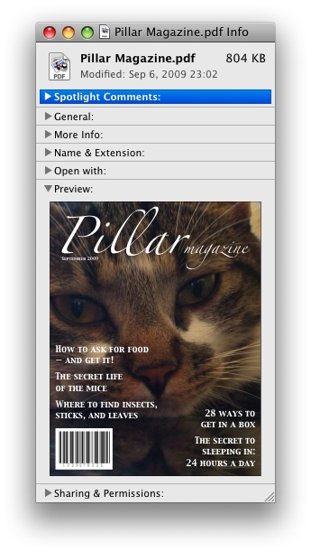
The following shows how a details element can be
used to hide some controls by default:
<details>
 <summary><label for=fn>Name & Extension:</label></summary>
 <p><input type=text id=fn name=fn value="Pillar Magazine.pdf">
 <p><label><input type=checkbox name=ext checked> Hide extension</label>
</details>
One could use this in conjunction with other details
in a list to allow the user to collapse a set of fields down to a
small set of headings, with the ability to open each one.
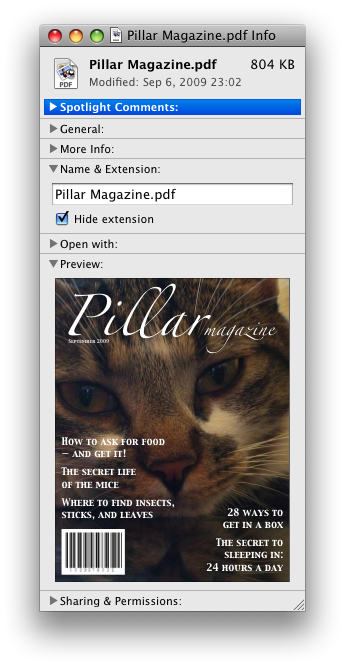
In these examples, the summary really just summarises what the controls can change, and not the actual values, which is less than ideal.
Because the open
attribute is added and removed automatically as the user interacts
with the control, it can be used in CSS to style the element
differently based on its state. Here, a stylesheet is used to
animate the color of the summary when the element is opened or
closed:
<style>
 details > summary { transition: color 1s; color: black; }
 details[open] > summary { color: red; }
</style>
<details>
 <summary>Automated Status: Operational</summary>
 <p>Velocity: 12m/s</p>
 <p>Direction: North</p>
</details>