Microsoft Silverlight, versions 3 and greater
Silverlight managed programming model and Silverlight XAML
This technique relates to:
See User Agents Supported for general information on user agent support.
The objective of this technique is to use the Silverlight Validation API.
The Validation API associates the validation logic with form input
elements that properly support accessible text both for the initial
entry and for any error identification and suggestion that is displayed
in the user interface.
Application authors can either associate Validation.Errors output
with specific UI elements, include an initially hidden ValidationSummary user
interface element, or both. The example shown in this technique uses
both ValidationSummary and Validation.Errors.
The ValidationSummary is the most appropriate technique
for providing text feedback after a form submission attempt, because
assistive technologies pick it up as a discrete focusable element in
the interface representation. The Validation.Errors technique
is perhaps a better cognitive user experience for sighted users, because
it presents the specific error suggestions in closer proximity to the
input items that are in error.
This technique relies on several Silverlight features: AutomationProperties,
the Name property for identifying specific UI elements,
the Validation and ValidationSummary API,
the ElementName variation of Silverlight data binding, and the general
behavior of TextBox elements.
Silverlight version 4's default visual styles have a bug where the
colors used to indicate an invalid field entry by changing the color
of the foreground text do not satisfy the 4.5:1 contrast ratio per
SC 1.4.1. To correct for this visual bug, application authors should
copy the control template for the Label control, and
adjust the color used for the validation state. This is shown in Example
1; the resource "LabelStyle1" was generated by copying
the default Label style using Microsoft Expression
Blend. Then, the value was changed in the copied template, and the
changed template was referenced and included in the application. The
specific changed line is indicated by a comment in the Example 1 sample
markup.
In this example, the form fields correspond to a data object that
implements a view model. Silverlight uses the view model and data annotations
to generate some of its UI, notably the names of the fields are bound
to the original view model names from the data. The ValidationSummary
API is defined in a "Client SDK" library System.Windows.Controls.Data.Input.dll,
which is included as part of the project and the distributable.
This example has a UI defined in XAML and logic defined in C#. The following is the XAML UI.
<UserControl x:Class="AccessibleValidation.MainPage"
 xmlns="http://schemas.microsoft.com/winfx/2006/xaml/presentation"
 xmlns:x="http://schemas.microsoft.com/winfx/2006/xaml"
 xmlns:sdk="http://schemas.microsoft.com/winfx/2006/xaml/presentation/sdk">
<UserControl.Resources>
 <Style x:Key="LabelStyle1" TargetType="sdk:Label">
 <Setter Property="IsTabStop" Value="False"/>
 <Setter Property="HorizontalContentAlignment" Value="Left"/>
 <Setter Property="Template">
  <Setter.Value>
   <ControlTemplate TargetType="sdk:Label">
    <Grid>
     <VisualStateManager.VisualStateGroups>
      <VisualStateGroup x:Name="CommonStates">
       <VisualState x:Name="Normal"/>
       <VisualState x:Name="Disabled"/>
      </VisualStateGroup>
      <VisualStateGroup x:Name="ValidationStates">
       <VisualState x:Name="Valid"/>
       <VisualState x:Name="Invalid">
        <Storyboard>
         <ColorAnimation Duration="0" To="#FFF00000"
         Storyboard.TargetProperty="(Control.Foreground).(SolidColorBrush.Color)"
         Storyboard.TargetName="ContentControl" d:IsOptimized="True"/>
         //above is the line where color was adjusted from default Red to FFF00000,
         //to satisfy the 4.5:1 contrast requirement
        </Storyboard>
       </VisualState>
      </VisualStateGroup>
      <VisualStateGroup x:Name="RequiredStates">
       <VisualState x:Name="NotRequired"/>
       <VisualState x:Name="Required">
         <Storyboard>
          <ObjectAnimationUsingKeyFrames Duration="0"
          Storyboard.TargetProperty="FontWeight"
          Storyboard.TargetName="ContentControl">
           <DiscreteObjectKeyFrame KeyTime="0" Value="SemiBold"/>
          </ObjectAnimationUsingKeyFrames>
         </Storyboard>
        </VisualState>
       </VisualStateGroup>
      </VisualStateManager.VisualStateGroups>
      <Border BorderBrush="{TemplateBinding BorderBrush}"
      BorderThickness="{TemplateBinding BorderThickness}" Background="{TemplateBinding Background}"
      CornerRadius="2" Padding="{TemplateBinding Padding}">
       <ContentControl x:Name="ContentControl" Cursor="{TemplateBinding Cursor}"
         ContentTemplate="{TemplateBinding ContentTemplate}" Content="{TemplateBinding Content}"
         Foreground="{TemplateBinding Foreground}" FontWeight="{TemplateBinding FontWeight}"
         FontStretch="{TemplateBinding FontStretch}" FontSize="{TemplateBinding FontSize}"
         FontFamily="{TemplateBinding FontFamily}" HorizontalAlignment="{TemplateBinding HorizontalAlignment}"
         HorizontalContentAlignment="{TemplateBinding HorizontalContentAlignment}"
         IsTabStop="False" VerticalAlignment="{TemplateBinding VerticalAlignment}"
         VerticalContentAlignment="{TemplateBinding VerticalContentAlignment}"/>
      </Border>
     </Grid>
    </ControlTemplate>
   </Setter.Value>
  </Setter>
 </Style>
</UserControl.Resources>
 <Grid x:Name="LayoutRoot" Background="White" Margin="10">
   <Grid.RowDefinitions>
     <RowDefinition Height="Auto"/>
     <RowDefinition Height="Auto"/>
     <RowDefinition Height="Auto"/>
     <RowDefinition Height="Auto"/>
     <RowDefinition Height="Auto"/>
   </Grid.RowDefinitions>
   <Grid.ColumnDefinitions>
     <ColumnDefinition Width="Auto"/>
     <ColumnDefinition Width="200"/>
     <ColumnDefinition Width="Auto"/>
   </Grid.ColumnDefinitions>
   <TextBlock Text="Validating Form" FontSize="16" FontWeight="Bold"
     Grid.Column="1" HorizontalAlignment="Center" />
   <sdk:ValidationSummary x:Name="ErrorSummary" IsTabStop="True"
     Grid.Row="1" Grid.ColumnSpan="2" Margin="3" />
   <sdk:Label x:Name="NameLabel" Target="{Binding ElementName=NameTextBox}"
     Grid.Row="2" Margin="3" HorizontalAlignment="Right" Style="{StaticResource LabelStyle1}"/>
   <TextBox x:Name="NameTextBox"
     AutomationProperties.Name="{Binding Content, ElementName=NameLabel}"
     Text="{Binding Name, Mode=TwoWay, UpdateSourceTrigger=Explicit,
     NotifyOnValidationError=True, ValidatesOnExceptions=True}"
     Grid.Column="1" Grid.Row="2" Margin="3" />
   <sdk:DescriptionViewer Target="{Binding ElementName=NameTextBox}"
     Grid.Column="2" Grid.Row="2" />
   <sdk:Label x:Name="AgeLabel" Target="{Binding ElementName=AgeTextBox}"
     Grid.Row="3" Margin="3" HorizontalAlignment="Right" Style="{StaticResource LabelStyle1}"/>
   <TextBox x:Name="AgeTextBox"
     AutomationProperties.Name="{Binding Content, ElementName=AgeLabel}"
     Text="{Binding Age, Mode=TwoWay, UpdateSourceTrigger=Explicit,
     NotifyOnValidationError=True, ValidatesOnExceptions=True}"
     Grid.Column="1" Grid.Row="3" Margin="3" />
   <sdk:DescriptionViewer Target="{Binding ElementName=AgeTextBox}"
     Grid.Column="2" Grid.Row="3" />
   <Button x:Name="SubmitButton" Content="Submit" Click="SubmitButton_Click"
     Grid.Column="1" Grid.Row="4" Width="50" Margin="3" />
 </Grid>
</UserControl>
The following is the C# logic for the page. Note the call to Focus in the logic; many assistive technologies use focus to determine what area of the interface to report to the user. If code calls Focus to reference the error summary once it is completed, the assistive technology can report the error summary immediately.
       public MainPage()
       {
           InitializeComponent();
           LayoutRoot.DataContext = new Product();
       }
       // Commits text box values when the user presses ENTER.
       private void TextBox_KeyDown(object sender,
           System.Windows.Input.KeyEventArgs e)
       {
           if (e.Key == System.Windows.Input.Key.Enter) (sender as TextBox)
               .GetBindingExpression(TextBox.TextProperty).UpdateSource();
       }
       private void SubmitButton_Click(object sender, System.Windows.RoutedEventArgs e)
       {
           NameTextBox.GetBindingExpression(TextBox.TextProperty).UpdateSource();
           AgeTextBox.GetBindingExpression(TextBox.TextProperty).UpdateSource();
           if (ErrorSummary.Errors.Count > 0) ErrorSummary.Focus();
           }
The following is the data class. Note how much of the validation logic is defined within this view model, rather than as part of Silverlight UI logic.
  public class Product
   {
       private string nameValue;
       private const string nameMessage = "Must be 10 characters or less.";
       [Display(Name = "Username", Description = "Required. " + nameMessage)]
       [StringLength(10, ErrorMessage = nameMessage)]
       [Required(ErrorMessage = "Required.")]
       public string Name
       {
           get { return nameValue; }
           set
           {
               if (nameValue != value)
               {
                   Validator.ValidateProperty(value, new ValidationContext(
                       this, null, null) { MemberName = "Name" });
                   nameValue = value;
               }
           }
       }
       private string ageValue;
       private const string ageMessage = "Must be in the 5 to 120 range.";
       [Display(Description = ageMessage)]
       [Range(5, 120, ErrorMessage = ageMessage)]
       [RegularExpression("\\d*", ErrorMessage = "Must be a number.")]
       public string Age
       {
           get { return ageValue; }
           set
           {
               if (ageValue != value)
               {
                   Validator.ValidateProperty(value, new ValidationContext(
                       this, null, null) { MemberName = "Age" });
                   ageValue = value;
               }
           }
       }
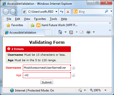
The following image is a screen shot of this simple UI, after two invalid values are entered in the form and Submit is activated:

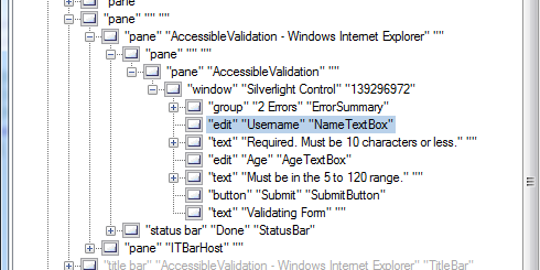
The following image is a screen shot of the UIAVerify tree view of this same application. Note the "Text" role items that appear as adjacent peer elements, which describe the validation errors. This Text is actually coming from sdk:DescriptionViewer, and in the visible UI in the screenshot is not currently visible. This text would be visible if any of the following occurs:
the user hovers the mouse over the red triangle in the input field corner
the user hovers over the "info i" icon
the user clicks (or tabs to) the relevant field, which focuses it

This example is shown in operation in the working example of Accessible Validation.
The default validation style for the Invalid state of Label does
not have adequate contrast by default. Application authors can restyle Label with
a new template that has a 4.5:1 contrast.
Resources are for information purposes only, no endorsement implied.
Using a browser that supports Silverlight, open an HTML page that references a Silverlight application through an object tag. The application is expected to contain form fields, and a Submit pattern for form interaction as described in SL10: Implementing a Submit-Form Pattern in Silverlight.
Navigate through the items of a form until an editable field is read. Enter a value that triggers the validation.
Navigate to Submit button and activate it to attempt to submit the form.
Verify that a Validation Summary now appears, and is focusable.
Verify that the Validation Summary provides enough information to correct any error.
Navigate back to input elements that have validation issues. Correct the errors as suggested.
Tab to Submit button. Press ENTER to resubmit.
Verify that Validation Summary is no longer displayed and that the screen reader does not focus to/read any further validation information.
#4, #5, and #8 are true.
If this is a sufficient technique for a success criterion, failing this test procedure does not necessarily mean that the success criterion has not been satisfied in some other way, only that this technique has not been successfully implemented and can not be used to claim conformance.