Accessible Rich Internet Applications (WAI-ARIA) 1.0

Skip to Content (Press Enter)

5. The Roles Model

This section is normative.

This section defines the WAI-ARIA role taxonomy and describes the characteristics and properties of all roles. A formal RDF/OWL representation of all the information presented here is available in Schemata Appendix.

The roles, their characteristics, the states and properties they support, and specification of how they may be used in markup, shall be considered normative. The RDF/OWL representation used to model the taxonomy shall be considered to be informative. The RDF/OWL taxonomy may be used as a vehicle to extend WAI-ARIA in the future or by tools manufacturers to validate states and properties applicable to roles per this specification.

Roles are element types and authors MUST NOT change role values over time or with user actions. Platform accessibility APIs typically do not provide a vehicle to notify assistive technologies that a role has changed. Due to this and document caching, assistive technologies are unlikely to process a change in role attribute value. In order to reflect the content in the DOM, user agents SHOULD map the role attribute to the appropriate value in the implemented accessibility API, and user agents SHOULD update the mapping when the role attribute changes. However, it is unlikely that assistive technologies will process this change, so authors wishing to change a role SHOULD do so by deleting the associated element and its children and replacing it with a new element with the appropriate role.

5.1. Relationships Between Concepts

The role taxonomy uses the following relationships to relate WAI-ARIA roles to each other and to concepts from other specifications, such as HTML and XForms.

5.1.1. Superclass Role

RDF Property
rdfs:subClassOf

The role that this role extends in the taxonomy. This extension causes all the properties and constraints of the superclass role to propagate to the subclass role. Other than well known stable specifications, inheritance may be restricted to items defined inside this specification so that items cannot be changed and affect inherited classes.

Inheritance is expressed in RDF using the RDF Schema subClassOf ([RDFS]) property.

5.1.2. Subclass Roles

RDF Property
<none>

Informative list of roles for which this role is the superclass. This is provided to facilitate reading of the specification but adds no new information.

5.1.3. Related Concepts

RDF Property
role:relatedConcept

Informative data about a similar or related idea from other specifications. Concepts that are related are not necessarily identical. Related concepts do not inherit properties from each other. Hence if the definition of a type changes, the properties, behavior, and definition of a related concept is not affected.

For example, a progress bar is like a status indicator. Therefore, the progressbar widget has a role:relatedConcept value which includes status. However if the definition of status is modified, the definition of a progressbar will not be affected.

5.1.4. Base Concept

RDF Property
role:baseConcept

Informative data about objects that are considered prototypes for the role. Base concept is similar to type, but without inheritance of limitations and properties. Base concepts are designed as a substitute for inheritance for external concepts. A base concept is like a relatedConcept except that base concepts are almost identical to each other.

For example, the checkbox defined in this document has similar functionality and anticipated behavior to a checkbox defined in HTML. Therefore, a checkbox has an HTML checkbox as a baseConcept. However, if the original HTML checkbox baseConcept definition is modified, the definition of a checkbox in this document will not be not affected, because there is no actual inheritance of the respective type.

5.2. Characteristics of Roles

Roles are defined and described by their characteristics. Characteristics define the structural function of a role, such as what a role is, concepts behind it, and what instances the role can or must contain. In the case of widgets this also includes how it interacts with the user agent based on mapping to HTML forms and XForms. States and properties from WAI-ARIA that are supported by the role are also indicated.

The Roles Taxonomy defines the following characteristics. These characteristics are implemented in RDF as properties of the OWL classes that describe the roles.

5.2.1. Abstract Roles

RDF Property
N/A
Values
Boolean

Abstract roles are the foundation upon which all other WAI-ARIA roles are built. Content authors MUST NOT use abstract roles because they are not implemented in the API binding. User agents MUST NOT map abstract roles to the standard role mechanism of the accessibility API. Conformance checkers SHOULD raise an error when abstract roles are used. Abstract roles are provided to help with the following:

  1. Organize the role taxonomy and provide roles with a meaning in the context of known concepts.
  2. Streamline the addition of roles that include necessary features.

5.2.2. Required States and Properties

RDF Property
role:requiredState
Values
Any valid RDF object reference, such as a URI or an RDF ID reference.

States and properties specifically required for the role and child roles. Content authors MUST provide values for required states and properties.

When an object inherits from multiple ancestors and one ancestor indicates that property is supported while another ancestor indicates that it is required, the property is required in the inheriting object.

Note: An element with the appropriate implicit ARIA semantic fulfills this requirement.

5.2.3. Supported States and Properties

RDF Property
role:supportedState
Values
Any valid RDF object reference, such as a URI or an RDF ID reference.

States and properties specifically applicable to the role and child roles. User agents MUST map all supported states and properties for the role to an accessibility API. Content authors MAY provide values for supported states and properties, but may not in all cases because default values are sufficient.

Note: An element with the appropriate implicit ARIA semantic fulfills this requirement.

5.2.4. Inherited States and Properties

Informative list of properties that are inherited onto a role from ancestor roles. States and properties are inherited from ancestor roles in the role taxonomy, not from ancestor elements in the DOM tree. These properties are not explicitly defined on the role, as the inheritance of properties is automatic. This information is provided to facilitate reading of the specification. Inherited states and properties that are required are indicated as such in this field as well. The set of supported states and properties combined with inherited states and properties forms the full set of states and properties supported by the role.

5.2.5. Required Owned Elements

RDF Property
role:mustContain
Values
Any valid RDF object reference, such as a URI or an RDF ID reference.

Any element that will be owned by the element with this role. For example, an element with the role list will own at least one element with the role group or listitem.

When multiple roles are specified as Required Owned Elements for a role, at least one instance of one required owned element is expected. This specification does not require an instance of each of the listed owned roles. For example, a menu should have at least one instance of a menuitem, menuitemcheckbox, or menuitemradio. The menu role does not require one instance of each.

There may be times that required owned elements are missing, for example, while editing or while loading a data set.

Note: A role that has 'required owned elements' does not imply the reverse relationship. While processing of a role may be incomplete without elements of given roles present as descendants, elements with roles in this list do not always have to be found within elements of the given role. See required context role for requirements about elements in which elements of a given role must be contained.

Note: An element with a subclass role of the 'required owned element' does not fulfill this requirement.

Note: An element with the appropriate implicit ARIA semantic fulfills this requirement.

5.2.6. Required Context Role

RDF Property
role:scope
Values
Any valid RDF object reference, such as a URI or an RDF ID reference.

The required context role defines the owning container where this role is allowed. If a role has a required context, authors MUST ensure that an element with the role is contained inside (or owned by) an element with the required context role. For example, an element with role listitem is only meaningful when contained inside (or owned by) an element with role list.

Note: A role that has 'required context role' does not imply the reverse relationship. While an element with the given role needs to appear within an element of the listed role(s) in order to be meaningful, elements of the listed roles do not always need descendant elements of the given role in order to be meaningful. See required owned elements for requirements about elements that require presence of a given descendant to be processed properly.

Note: An element with the appropriate implicit ARIA semantic fulfills this requirement.

5.2.7. Accessible Name Calculation

RDF Property
role:nameFrom
Values
One of the following values:
  1. author: name comes from values provided by the author in explicit markup features such as the aria-label attribute, aria-labelledby attribute, or the HTML title attribute.
  2. contents: name comes from the text value of the element node. Although this may be allowed in addition to "author" in some roles, this is used in content only if "author" features are not provided.

5.2.7.1. Name Computation

An accessible name is computed using a number of methods. Please refer to the WAI-ARIA User Agent Implementation Guide [ARIA-IMPLEMENTATION] Name Computation to determine how this computation is performed.

5.2.7.2. Description Computation

An accessible description may be computed by concatenating the text alternatives for nodes pointed to by an aria-describedby attribute on the current node.

5.2.7.3. Text Alternative Computation

The text alternative computation outlined below is a description of how user agents acquire a name or description that they then publish through the accessiblity API. User agent implementers are referred to the WAI-ARIA User Agent Implementation Guide [ARIA-IMPLEMENTATION] for a complete description of the algorithm. Authors can use the current section as a guide for creating names and descriptions in their markup. Checker tools can implement a name and/or description generator based on this algorithm such that authors can use the generated text equivalent to confirm that names and descriptions are as the author intended.

Note: Though a user agent may make efforts to compute a text alternative from CSS-generated text in the absence of text content determinable from the DOM, authors should not provide text through a style sheet, as a user agent may incorrectly determine the text alternative.

The text alternative is reused in both the name and description computation, as described above. There are different rules provided for several different types of nodes and combinations of markup. Text alternatives are built up, when appropriate, from all the relevant content contained within an element. This is accomplished via rule 2C (which is recursive), using the full set of rules to retrieve text from its own children.

The text alternative for a given node is computed as follows:

  1. Skip hidden elements unless the author specifies to use them via an aria-labelledby or aria-describedby being used in the current computation. By default, users of assistive technologies won't receive the hidden information, but an author will be able to explicitly override that and include the hidden information.
  2. For any non-skipped elements:
    1. Authors MAY specify an element's text alternative in content attributes, used in this order of preference:
      • The aria-label attribute, which defines an explicit text string, takes precedence as the element's text alternative.
      • If aria-label is empty or undefined, the aria-labelledby attribute is used unless this computation is already occurring as the result of a recursive aria-labelledby declaration (in other words, aria-labelledby is not recursive, so it will not cause loops). The text alternatives for all the elements referenced will be computed using this same set of rules. User agents will then trim whitespace and join the substrings using a single space character. Substrings will be joined in the order specified by the author (IDREF order in the aria-labelledby attribute).
      • If aria-label and aria-labelledby are empty or undefined, check for the presence of an equivalent host language attribute or element for associating a label, and use those mechanisms to determine a text alternative. For example, in HTML, the img element's alt attribute defines a label string and the label element references the form element it labels.
    2. Authors sometimes embed a control within the label of another widget, where the user can adjust the embedded control's value. For example, consider a check box label that contains a text input field: "Flash the screen [input] times". If the user has entered "5" for the embedded text input, the complete label is "Flash the screen 5 times". For such cases, include the value of the embedded control as part of the text alternative in the following manner:
      • If the embedded control is a text field, use its value.
      • If the embedded control is a menu, use the text alternative of the chosen menu item.
      • If the embedded control is a select or combobox, use the chosen option.
      • If the embedded control is a range (e.g. a spinbutton or slider), use the value of the aria-valuetext attribute if available, or otherwise the value of the aria-valuenow attribute.
    3. Otherwise, if the attributes checked in rules A and B didn't provide results, text is collected from descendant content if the current element's role allows "Name From: contents." The text alternatives for child nodes will be concatenated, using this same set of rules. This same rule may apply to a child, which means the computation becomes recursive and can result in text being collected in all the nodes in this subtree, no matter how deep they are. However, any given descendant subtree may instead collect their part of the text alternative from the preferred markup described in A and B above. These author-specified attributes are assumed to provide the correct text alternative for the entire subtree. All in all, the node rules are applied consistently as text alternatives are collected from descendants, and each containing element in those descendants may or may not allow their contents to be used. Each node in the subtree is consulted only once. If text has been collected from a child node, and is referenced by another IDREF in some descendant node, then that second, or subsequent, reference is not followed. This is done to avoid infinite loops.
    4. The last resort is to use text from a tooltip attribute (such as the title attribute in HTML). This is used only if nothing else, including subtree content, has provided results.
  3. Text nodes are often visited because they are children of an element that uses rule 2C to collect text from its children. However, because it is possible to specify textual content using the CSS :before and :after pseudo-elements, it is necessary for user agents to combine such content with the text referenced by the text nodes to produce a complete text alternative.

The purpose of the flat text alternative string is to create a perceivable label in alternative presentations. At each step of the algorithm, an implementation will trim the existing text equivalent string and the string to be added, then join those two strings with a single space. For example, a space character may be inserted between the text of two elements used one after the other in a description.

5.2.7.4. Text Alternative Computation Example #1

  • aria-labelledby (Rule 2A): The label of the first menuitem in the menubar example markup above is "File" based on rule 2A. The element has an aria-labelledby attribute that picks out the span element with id="fileLabel" The span contains the label text.
  • Namefrom: contents (Rule 2C): The label of the first item in the file menu is "New" based on rule 2C. Since menuitem elements can acquire their label by the "Namefrom: content" technique, the textual content of the menuitem element itself is sufficient. Note that this menuitem has no attributes such as aria-label, aria-labelledby, alt, or title from which to acquire a label.
<ul role="menubar">
 
 <!-- Rule 2A: "File" label via aria-labelledby -->
  <li role="menuitem" aria-haspopup="true" aria-labelledby="fileLabel"><span id="fileLabel">File</span>
    <ul role="menu">

      <!-- Rule 2C: "New" label via Namefrom:contents -->
      <li role="menuitem" aria-haspopup="false">New</li>
      <li role="menuitem" aria-haspopup="false">Open…</li></ul>
  </li></ul>

5.2.7.5. Text Alternative Computation Example #2

  • native label element (Rule 2A): Use of a native element, is illustrated in first checkbox where its label is defined by the HTML label element.
  • embedded input (Rule 2C): The third checkbox illustrates an embedded control adding to a larger label (Rule 2B). Here the label is "Flash the screen 3 times", where "3" is taken from the value of the embedded text input.
  • aria-label (Rule 2A): Rule 2A, using aria-label, is shown for this embedded text input. The rationale is to give a label to this element, but in a way that does not interfere with the enclosing label of the checkbox. The label is needed by a screen reader when focus is on the text input.
<fieldset>
  <legend>Meeting alarms</legend>

  <!-- Rule 2A: "Beep" label given by native HTML label element -->
  <input type="checkbox" id="beep"> <label for="beep">Beep</label> <br>
  <input type="checkbox" id="mtgTitle"> <label for="mtgTitle">Display the meeting title</label> <br>

  <!-- Rule 2B: Full label of checkbox includes value ("3") of embedded text input, "Flash the screen 3 times" -->
  <input type="checkbox" id="flash">
  <label for="flash">
    Flash the screen

    <!-- Rule 2A: label of text input given by aria-label, "Number of times to flash screen" -->
    <input type="text" value="3" size="2" id="numTimes" aria-label="Number of times to flash screen">
    times
  </label>
</fieldset>

5.2.8. Presentational Children

RDF Property
role:childrenArePresentational
Values

Boolean (true | false)

The DOM descendants are presentational. User agents SHOULD NOT expose tdescendants of this element through the platform accessibility API. If user agents do not hide the descendant nodes, some information may be read twice.

5.3. Categorization of Roles

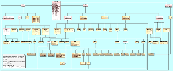
To support the current user scenario, this specification categorizes roles that define user interface widgets (sliders, tree controls, etc.) and those that define page structure (sections, navigation, etc.). Note that some assistive technologies provide special modes of interaction for regions marked with with role application or document.

Class diagram of the relationships described in the role data model

Class diagram of the relationships described in the role data model.

SVG class diagram | PNG class diagram | Class diagram description

Roles are categorized as follows:

  1. Abstract Roles
  2. Widget Roles
  3. Document Structure Roles
  4. Landmark Roles

5.3.1. Abstract Roles

The following roles are used to support the ARIA role taxonomy for the purpose of defining general role concepts.

Abstract roles are used for the ontology. Authors MUST NOT not use abstract roles in content.

5.3.2. Widget Roles

The following roles act as user interface widgets that do not provide a defined structure.

The following roles act as composite user interface widgets that provide a defined structure. These roles typically act as containers that manage other, contained widgets.

5.3.3. Document Structure

The following roles describe structures that organize content in a page. Document structures are not usually interactive.

5.3.4. Landmark Roles

The following roles are regions of the page intended as navigational landmarks. All of these roles inherit from the landmark base type and, with the exception of application, all are imported from the XHTML Role Attribute Module [XHTML-ROLES]. The roles are included here in order to make them clearly part of the WAI-ARIA Role taxonomy.

5.4. Definition of Roles

Below is an alphabetical list of WAI-ARIA roles to be used by rich internet application authors.

Abstract roles are used for the ontology. Authors MUST NOT not use abstract roles in content.

alert
A message with important, and usually time-sensitive, information. Also see alertdialog and status.
alertdialog
A type of dialog that contains an alert message, where initial focus goes to the dialog or an element within it. Also see alert and dialog.
application
A region declared as a web application, as opposed to a web document.
article
A section of a page that consists of a composition that forms an independent part of a document, page, or site.
banner
A region that contains mostly site-oriented content, rather than page-specific content.
button
An input that allows for user-triggered actions when clicked or pressed.
checkbox
A checkable input that has three possible values: true, false, or mixed.
columnheader
A cell containing header information for a column.
combobox
A presentation of a select; usually similar to a textbox where users can type ahead to select an option, or type to enter arbitrary text as a new item in the list. Also see listbox.
complementary
A supporting section of the document, designed to be complementary to the main content at a similar level in the DOM hierarchy, but remains meaningful when separated from the main content.
composite (abstract role)
A widget that may contain navigable descendants or owned children.
contentinfo
A large perceivable region that contains information about the parent document.
definition
A definition of a term or concept.
dialog
A dialog is an application window that is designed to interrupt the current processing of an application in order to prompt the user to enter information or require a response. Also see alertdialog.
directory
A list of references to members of a group, such as a static table of contents.
document
A region containing related information that is declared as document content, as opposed to a web application.
form
A region of the document that represents a collection of form-associated elements, some of which can represent editable values that can be submitted to a server for processing.
grid
A grid contains cells of tabular data arranged in rows and columns, like a table.
gridcell
A cell in a grid or treegrid.
group
A set of user interface objects which are not intended be included in a page summary or table of contents by assistive technologies.
heading
A heading for a section of the page.
img
A container for a collection of elements that form an image.
input (abstract role)
A generic type of widget that allows user input.
landmark (abstract role)
A region of the page intended as a navigational landmark.
link
An interactive reference to an internal or external resource that, when activated, causes the user agent to navigate to that resource.
list
A group of non-interactive list items. Also see listbox.
listbox
A widget that allows the user to select one or more items from a list of choices. Also see combobox and list.
listitem
A single item in a list or directory.
log
A type of live region where new information is added in meaningful order and old information may disappear. Also see marquee.
main
The main content of a document.
marquee
A type of live region where non-essential information changes frequently. Also see log.
math
An element that represents a mathematical expression.
menu
A type of widget that offers a list of choices to the user.
menubar
A presentation of menu that usually remains visible and is usually presented horizontally.
menuitem
An option in a group of choices contained by a menu or menubar.
menuitemcheckbox
A checkable menuitem that has three possible values: true, false, or mixed.
menuitemradio
A checkable menuitem in a group of menuitemradio roles, only one of which can be checked at a time.
navigation
A collection of navigational elements (usually links) for navigating the document or related documents.
note
A section whose content is parenthetic or ancillary to the main content of the resource.
option
A selectable item in a select list.
presentation
An element whose implicit native role semantics will not be mapped to the accessibility API.
progressbar
An element that displays the progress status for tasks that take a long time.
radio
A checkable input in a group of radio roles, only one of which can be checked at a time.
radiogroup
A group of radio buttons.
range (abstract role)
An input representing a range of values that can be set by the user.
region
A large perceivable section of a web page or document, that the author feels is important enough to be included in a page summary or table of contents, for example, an area of the page containing live sporting event statistics.
roletype (abstract role)
The base role from which all other roles in this taxonomy inherit.
row
A row of cells in a grid.
rowgroup
A group containing one or more row elements in a grid.
rowheader
A cell containing header information for a row in a grid.
scrollbar
A graphical object that controls the scrolling of content within a viewing area, regardless of whether the content is fully displayed within the viewing area.
search
A landmark region that contains one or more widgets used to define and execute a search.
section (abstract role)
A renderable structural containment unit in a document or application.
sectionhead (abstract role)
A structure that labels or summarizes the topic of its related section.
select (abstract role)
A form widget that allows the user to make selections from a set of choices.
separator
A divider that separates and distinguishes sections of content or groups of menuitems.
slider
A user input where the user selects a value from within a given range.
spinbutton
A form of range that expects a user to select from amongst discrete choices.
status
A container whose content is advisory information for the user but is not important enough to justify an alert. Also see alert.
structure (abstract role)
A document structural element.
tab
A grouping label providing a mechanism for selecting the tab content that is to be rendered to the user.
tablist
A list of tab elements, which are references to tabpanel elements.
tabpanel
A container for the resources associated with a tab, where each tab is contained in a tablist.
textbox
Input that allows free-form text as their value.
timer
A numerical counter which indicates an amount of elapsed time from a start point, or the time remaining until an end point.
toolbar
A collection of commonly used function buttons represented in compact visual form.
tooltip
A contextual popup that displays a description for an element.
tree
A type of list that may contain sub-level nested groups that can be collapsed and expanded.
treegrid
A grid whose rows can be expanded and collapsed in the same manner as for a tree.
treeitem
An option item of a tree. This is an element within a tree that may be expanded or collapsed if it contains a sub-level group of treeitems.
widget (abstract role)
An interactive component of a graphical user interface (GUI).
window (abstract role)
A browser or application window.

alert (role)

A message with important, and usually time-sensitive, information. Also see alertdialog and status.

Alerts are used to convey messages to alert the user. In the case of audio warnings this is an accessible alternative for a hearing-impaired user. The alert role goes on the node containing the alert message. Alerts are specialized forms of the status role, which will be processed as an atomic live region.

Alerts are assertive live regions and will be processed as such by assistive technologies. Neither authors nor user agents are required to set or manage focus to them in order for them to be processed. Since alerts are not required to receive focus, content authors SHOULD NOT require users to close an alert. If the operating system allows, the user agent MAY fire a system alert event through the accessibility API when the WAI-ARIA alert is created. If an alert requires focus to close the alert, then content authors SHOULD use alertdialog instead.

Note: Elements with the role alert have an implicit aria-live value of assertive.

Characteristics of alert
CharacteristicValue
Superclass Role:region
Subclass Roles:
Inherited States and Properties:
Name From:author
Implicit Value for Role:Default for aria-live is assertive.

alertdialog (role)

A type of dialog that contains an alert message, where initial focus goes to the dialog or an element within it. Also see alert and dialog.

Alert dialogs are used to convey messages to alert the user. The alertdialog role goes on the node containing both the alert message and the rest of the dialog. Content authors SHOULD make alert dialogs modal by ensuring that, while the alertdialog is shown, keyboard and mouse interactions only operate within the dialog.

Unlike alert, alertdialog can receive a response from the user. For example, to confirm that the user understands the alert being generated. When the alert dialog is displayed, authors SHOULD set focus to an active element within the alert dialog, such as a form edit field or an OK button. The user agent MAY fire a system alert event through the accessibility API when the alert is created, provided one is specified by the intended accessibility API.

Authors SHOULD use aria-describedby on an alertdialog to point to the alert message element in the dialog. If they do not, assistive technologies will resort to their internal recovery mechanism to determine the contents of an alert message.

Note: Elements with the role alertdialog have an implicit aria-live value of assertive.

Characteristics of alertdialog
CharacteristicValue
Superclass Role:
Inherited States and Properties:
Name From:author
Accessible Name Required:True
Implicit Value for Role:Default for aria-live is assertive.

application (role)

A region declared as a web application, as opposed to a web document.

When a user navigates an element assigned the role of application, assistive technology that typically intercepts standards keyboard events SHOULD switch to an application browsing mode, and pass keyboard events through to the web application. The intent is to hint to certain assistive technology to switch from normal browsing mode into a mode more appropriate for interacting with a web application; some user agents have a browse navigation mode where keys, such as up and down arrows, are used to browse the document, and this native behavior prevents the use of these keys by a web application.

Authors SHOULD set the role of application on the element that encompasses the entire application. If the application role applies to the entire web page, authors SHOULD set the role of application on the root node for content, such as the body element in HTML or svg element in SVG.

For example, an email application has a document and an application in it. The author would want to use typical application navigation mode to cycle through the list of emails, and much of this navigation would be defined by the application author. However, when reading an email message the content will appear in a region with a document role in order to use browsing navigation.

For all instances of non-decorative static text or image content inside an application, authors SHOULD either associate the text with a form widget or group (via aria-label, aria-labelledby, or aria-describedby) or separate the text into an element with role of document or article.

Authors SHOULD provide a title or label for applications. Authors SHOULD use label text that suitable for use as a navigation preview or table-of-contents entry for the page section. Content authors SHOULD provide the label through one of the following methods:

  • If the application includes the entire contents of the web page, use the host language feature for title or label, such as the title element in both HTML and SVG. This has the effect of labeling the entire application.
  • Otherwise, provide a visible label referenced by the application using aria-labelledby.

User agents SHOULD treat elements with the role of application as navigational landmarks.

Authors MAY use the application role on the main content element of the host language (such as the body element in HTML) to define entire page as an application. However, if the main content element is defined as having a role of application, user agents MUST NOT use the element as a navigational landmark. If assistive technology uses an interaction mode that intercepts standard keyboard events, when encountering the application role, assistive technology SHOULD switch to an interaction mode that passes keyboard events through to the web application.

Characteristics of application
CharacteristicValue
Superclass Role:landmark
Inherited States and Properties:
Name From:author
Accessible Name Required:True

article (role)

A section of a page that consists of a composition that forms an independent part of a document, page, or site.

An article is not a navigational landmark, but may be nested to form a discussions where an assistive technology could pay attention to article nesting to assist the user in following the discussion. An article could be a forum post, a magazine or newspaper article, a web log entry, a user-submitted comment, or any other independent item of content. It is independent in that its contents could stand alone, for example in syndication. However, the element is still associated with its ancestors; for instance, contact information that applies to a parent body element still covers the article as well. When nesting articles, the child articles represent content that is related to the content of the parent article. For instance, a web log entry on a site that accepts user-submitted comments could represent the comments as articles nested within the article for the web log entry. Author, heading, date, or other information associated with an article does not apply to nested articles.

When a user navigates an element assigned the role of article, assistive technology that typically intercepts standards keyboard events SHOULD switch to document browsing mode, as opposed to passing keyboard events through to the web application. Assistive technologies MAY provide a feature allowing the user to navigate the hierarchy of any nested article elements.

Characteristics of article
CharacteristicValue
Superclass Role:
Inherited States and Properties:
Name From:author


button (role)

An input that allows for user-triggered actions when clicked or pressed.

Buttons are mostly used for discrete, atomic actions. Standardizing the appearance of buttons enhances a user's recognition of the widgets as buttons and allows for a more compact display in toolbars.

Buttons support the optional attribute aria-pressed. Buttons with a non-empty aria-pressed attribute are toggle buttons. When aria-pressed is true the button is in a "pressed" state, when aria-pressed is false it is not pressed. If the attribute is not present, the button is a simple command button.

Characteristics of button
CharacteristicValue
Superclass Role:input
Base Concept:HTML button
Supported States and Properties:aria-pressed (state)
Inherited States and Properties:
Name From:
  • contents
  • author
Accessible Name Required:True
Children Presentational:True

checkbox (role)

A checkable input that has three possible values: true, false, or mixed.

The aria-checked attribute of a checkbox indicates whether the input is checked (true), unchecked (false), or represents a group of elements that have a mixture of checked and unchecked values (mixed). Many checkboxes do not use the mixed value, and thus are effectively boolean checkboxes.

Characteristics of checkbox
CharacteristicValue
Superclass Role:input
Subclass Roles:
Required States and Properties:aria-checked (state)
Inherited States and Properties:
Name From:
  • contents
  • author
Accessible Name Required:True

columnheader (role)

A cell containing header information for a column.

columnheader can be used as a column header in a table or grid. It could also be used in a pie chart to show a similar relationship in the data.

The columnheader establishes a relationship between it and all cells in the corresponding column. It is the structural equivalent to an HTML th element with a column scope.

Note: Because cells are organized into rows, there is not a single container element for the column. The column is the set of gridcell elements in a particular position within their respective row containers.

Characteristics of columnheader
CharacteristicValue
Superclass Role:
Base Concept:HTML th[scope="col"]
Required Context Role:row
Supported States and Properties:aria-sort
Inherited States and Properties:
Name From:
  • contents
  • author
Accessible Name Required:True

combobox (role)

A presentation of a select; usually similar to a textbox where users can type ahead to select an option, or type to enter arbitrary text as a new item in the list. Also see listbox.

combobox is the combined presentation of a single line text box with a list box popup. The combobox may be editable. Typically editable combo boxes are used for autocomplete behavior, and the aria-autocomplete property may be used on the child textbox.

Note: In XForms [XFORMS] the same select can have one of 3 appearances: combo-box, drop-down box, or group of radio-buttons. Many browsers allow users to type ahead to existing choices in a drop-down select widget. This specification does not constrain the presentation of the combo box.

To be keyboard accessible, authors SHOULD manage focus of descendants for all instances of this role, as described in Managing Focus.

Note: Elements with the role combobox have an implicit aria-haspopup value of true.

Characteristics of combobox
CharacteristicValue
Superclass Role:select
Required Owned Elements:
Required States and Properties:aria-expanded (state)
Supported States and Properties: aria-required
Inherited States and Properties:
Name From:author
Accessible Name Required:True
Implicit Value for Role:Default for aria-haspopup is true.

complementary (role)

A supporting section of the document, designed to be complementary to the main content at a similar level in the DOM hierarchy, but remains meaningful when separated from the main content.

There are various types of content that would appropriately have this role. For example, in the case of a portal, this may include but not be limited to show times, current weather, related articles, or stocks to watch. The complementary role indicates that contained content is relevant to the main content. If the complementary content is completely separable main content, it may be appropriate to use a more general role.

User agents SHOULD treat elements with the role of complementary as navigational landmarks.

Characteristics of complementary
CharacteristicValue
Superclass Role:landmark
Inherited States and Properties:
Name From:author

composite (abstract role)

A widget that may contain navigable descendants or owned children.

Authors SHOULD ensure that a composite widget exist as a single navigation stop within the larger navigation system of the web page. Once the composite widget has focus, authors SHOULD provide a separate navigation mechanism for users to navigate to elements that are descendants or owned children of the composite element.

Note: composite is an abstract role used for the ontology. Authors must not use this role in content.

Characteristics of composite
CharacteristicValue
Is Abstract:True
Superclass Role:widget
Subclass Roles:
Supported States and Properties:aria-activedescendant
Inherited States and Properties:
Name From:author
Children Presentational:False

contentinfo (role)

A large perceivable region that contains information about the parent document.

Examples of information included in this region of the page are copyrights and links to privacy statements.

User agents SHOULD treat elements with the role of contentinfo as navigational landmarks.

Within any document or application, the author SHOULD mark no more than one element with the contentinfo role.

Note: Because document and application elements can be nested in the DOM, they may have multiple contentinfo elements as DOM descendants, assuming each of those is associated with different document nodes, either by a DOM nesting (e.g., document within document) or by use of the aria-owns attribute.

Characteristics of contentinfo
CharacteristicValue
Superclass Role:landmark
Inherited States and Properties:
Name From:author

definition (role)

A definition of a term or concept.

The WAI-ARIA specification does not provide a role to specify the definition term, but host languages may provide such an element. If a host language has an appropriate element for the term (e.g. dfn or dt in HTML), authors SHOULD include the term in that element. Authors SHOULD identify the definition term by using an aria-labelledby attribute on each element with a role of definition.

Characteristics of definition
CharacteristicValue
Superclass Role:section
Inherited States and Properties:
Name From:author

dialog (role)

A dialog is an application window that is designed to interrupt the current processing of an application in order to prompt the user to enter information or require a response. Also see alertdialog.

Authors SHOULD provide a dialog label. Labels may be provided with the aria-label or aria-labelledby attribute if other mechanisms are not available. Authors SHOULD ensure each active dialog has a focused descendant element that has keyboard focus.

Characteristics of dialog
CharacteristicValue
Superclass Role:window
Subclass Roles:
Inherited States and Properties:
Name From:author
Accessible Name Required:True

directory (role)

A list of references to members of a group, such as a static table of contents.

Authors SHOULD use this role for a static table of contents, whether linked or unlinked. This includes tables of contents built with lists, including nested lists. Dynamic tables of contents, however, might use a tree role instead.

Characteristics of directory
CharacteristicValue
Superclass Role:list
Subclass Roles:
Inherited States and Properties:
Name From:
  • contents
  • author

document (role)

A region containing related information that is declared as document content, as opposed to a web application.

When a user navigates an element assigned the role of document, assistive technology that typically intercepts standards keyboard events SHOULD switch to document browsing mode, as opposed to passing keyboard events through to the web application. The document role informs user agents of the need to augment browser keyboard support in order to allow users to visit and read any content within the document region. In contrast, additional commands are not necessary for screen reader users to read text within an region with the application role, where if coded in an accessible manner, all text will be semantically associated with focusable elements. An important trait of documents is that they have text which is not associated with widgets or groups thereof.

Authors SHOULD set the role of document on the element that encompasses the entire document. If the document role applies to the entire web page, authors SHOULD set the role of document on the root node for content, such as the body element in HTML or svg element in SVG.

For example, an email application has a document and an application in it. The author would want to use typical application navigation mode to cycle through the list of emails, and much of this navigation would be defined by the application author. However, when reading an email message, the content will appear in a region with a document role in order to use browsing navigation.

Authors SHOULD provide a title or label for documents. Authors SHOULD use label text that suitable for use as a navigation preview or table-of-contents entry for the page section. Content authors SHOULD provide the label through one of the following methods:

  • If the document includes the entire contents of the web page, use the host language feature for title or label, such as the title element in both HTML and SVG. This has the effect of labeling the entire document.
  • Otherwise, provide a visible label referenced by the document using aria-labelledby.
Characteristics of document
CharacteristicValue
Superclass Role:structure
Subclass Roles:
Supported States and Properties:aria-expanded (state)
Inherited States and Properties:
Name From: author
Accessible Name Required:True

form (role)

A region of the document that represents a collection of form-associated elements, some of which can represent editable values that can be submitted to a server for processing.

Authors SHOULD provide a visible label for the form referenced with aria-labelledby. If an author uses a script to submit a form based on a user action that would otherwise not trigger an onsubmit event (for example, a form submission triggered by the user changing a form element's value), the author SHOULD provide the user with advance notification of the behavior.

User agents SHOULD treat elements with the role of form as navigational landmarks.

Characteristics of form
CharacteristicValue
Superclass Role:
Base Concept:HTML form
Inherited States and Properties:
Name From:author

grid (role)

A grid contains cells of tabular data arranged in rows and columns, like a table.

Grids do not necessarily imply presentation. The grid construct describes relationships between data such that it may be used for different presentations. Grids allow the user to move focus between cells using two dimensional navigation. For example, grid might be used as the invisible data model (hidden with CSS but still operable by assistive technologies) for a presentational chart.

Authors MUST ensure that elements with role gridcell are owned by elements with role row, which in turn are owned by an element with role rowgroup, grid or treegrid. If the author applies any non-global WAI-ARIA states or properties to a native markup element that is acting as a row (such as the tr element in HTML), the author MUST also apply the role of row, as stated in @@Host-Language-Integration. Authors MAY make cells focusable. Authors MAY define grids that are empty, containing no rows or cells. Authors MAY provide row and column headers for grids, by using rowheader and columnheader roles.

Since WAI-ARIA can augment an element in the host language, grids can reuse existing functionality of native table grids. When WAI-ARIA grid or gridcell roles overlay host language table elements they reuse the host language semantics for that table. For instance, WAI-ARIA does not specify general attributes for gridcell elements that span multiple rows or columns. When the author needs a gridcell to span multiple rows or columns, use the host language markup, such as the colspan and rowspan attributes in HTML.

Authors MAY determine the contents of a gridcell through calculation of a mathematical formula. Authors MAY make a cell's formula editable by the user. In a spreadsheet application for example, the text alternative of a cell may be the calculated value of a formula. However, when the cell is being edited, the text alternative may be the formula itself.

gridcell elements with the aria-selected attribute set can be selected for user interaction, and if the aria-multiselectable attribute of the grid is set to true, multiple cells in the grid may be selected. Grids may be used for spreadsheets like those in desktop spreadsheet applications.

A grid is considered editable unless otherwise specified. To make a grid read-only, set the aria-readonly attribute of the grid to true. The value of the grid element's aria-readonly attribute is implicitly propagated to all of its owned gridcell elements, and will be exposed through the accessibility API. An author may override an individual gridcell element's propagated aria-readonly value by setting the aria-readonly attribute on the gridcell.

To be keyboard accessible, authors SHOULD manage focus of descendants for all instances of this role, as described in Managing Focus.

Characteristics of grid
CharacteristicValue
Superclass Role:
Subclass Roles:
Base Concept:HTML table
Required Owned Elements:
Supported States and Properties:
Inherited States and Properties:
Name From:author
Accessible Name Required:True

gridcell (role)

A cell in a grid or treegrid.

Cells may be active, editable, and selectable. Cells may have relationships such as aria-controls to address the application of functional relationships.

If headers cannot be determined from the DOM structure, authors SHOULD explicitly indicate which header cells are relevant to the cell by referencing elements with role rowheader or columnheader using the aria-describedby attribute.

In a treegrid, authors MAY define cells as expandable by using the aria-expanded attribute. If the aria-expanded attribute is provided, it applies only to the individual cell. It is not a proxy for the container row, which also can be expanded. The main use case for providing this attribute on a cell is pivot table behavior.

Characteristics of gridcell
CharacteristicValue
Superclass Role:
Subclass Roles:
Base Concept:HTML td
Required Context Role:row
Supported States and Properties:
Inherited States and Properties:
Name From:
  • contents
  • author
Accessible Name Required:True

group (role)

A set of user interface objects which are not intended be included in a page summary or table of contents by assistive technologies.

Contrast with region which is a grouping of user interface objects that will be included in a page summary or table of contents.

Authors SHOULD use a group to form logical collection of items in a widget such as children in a tree widget forming a collection of siblings in a hierarchy, or a collection of items having the same container in a directory. However, when a group is used in the context of list, authors MUST limit its children to listitem elements. Therefore, proper handling of group by authors and assistive technology is determined by the context in which it is provided.

Authors MAY nest group elements. If the author believes a section is significant enough to warrant inclusion in the web page's table of contents, the author SHOULD assign the section a role of region or a standard landmark role.

Characteristics of group
CharacteristicValue
Superclass Role:section
Subclass Roles:
Supported States and Properties:aria-activedescendant
Inherited States and Properties:
Name From: author

heading (role)

A heading for a section of the page.

Often, heading elements will be referenced with the aria-labelledby attribute of the section for which they serve as a heading. If headings are organized into a logical outline, the aria-level attribute may be used to indicate the nesting level.

Characteristics of heading
CharacteristicValue
Superclass Role:sectionhead
Supported States and Properties:aria-level
Inherited States and Properties:
Accessible Name Required:True

img (role)

A container for a collection of elements that form an image.

An img can contain captions and descriptive text, as well as multiple image files that when viewed together give the impression of a single image. An img represents a single graphic within a document, whether or not it is formed by a collection of drawing objects. In order for elements with a role of img be perceivable, authors SHOULD provide alternative text or a label determined by the accessible name calculation.

Characteristics of img
CharacteristicValue
Superclass Role:section
Inherited States and Properties:
Name From:author
Accessible Name Required:True
Children Presentational:True

input (abstract role)

A generic type of widget that allows user input.

Characteristics of input
CharacteristicValue
Is Abstract:True
Superclass Role:widget
Subclass Roles:
Inherited States and Properties:
Name From:author

landmark (abstract role)

A region of the page intended as a navigational landmark.

Assistive technology SHOULD allow the user to quickly navigate to landmark regions. Mainstream user agents MAY allow the user to quickly navigate to landmark regions.

Note: landmark is an abstract role used for the ontology. Authors must not use this role in content.

Characteristics of landmark
CharacteristicValue
Is Abstract:True
Superclass Role:region
Subclass Roles:
Inherited States and Properties:
Name From:
  • contents
  • author
Accessible Name Required:False


list (role)

A group of non-interactive list items. Also see listbox.

Lists contain children whose role is listitem, or elements whose role is group which in turn contains children whose role is listitem.

Characteristics of list
CharacteristicValue
Superclass Role:region
Subclass Roles:
Base Concept:
Required Owned Elements:
Inherited States and Properties:
Name From:author

listbox (role)

A widget that allows the user to select one or more items from a list of choices. Also see combobox and list.

Items within the list are static and, unlike standard HTML select elements, may contain images. List boxes contain children whose role is option.

To be keyboard accessible, authors SHOULD manage focus of descendants for all instances of this role, as described in Managing Focus.

Although listbox inherits the aria-expanded attribute, if there is a valid reason to expand the listbox, the combobox role may be more appropriate.

Characteristics of listbox
CharacteristicValue
Superclass Role:
Required Owned Elements:option
Supported States and Properties:
Inherited States and Properties:
Name From:author
Accessible Name Required:True

listitem (role)

A single item in a list or directory.

Characteristics of listitem
CharacteristicValue
Superclass Role:section
Subclass Roles:
Base Concept:HTML li
Required Context Role:list
Supported States and Properties:
Inherited States and Properties:
Name From:
  • contents
  • author
Accessible Name Required:True

log (role)

A type of live region where new information is added in meaningful order and old information may disappear. Also see marquee.

Examples include chat logs, messaging history, game log, or an error log. In contrast to other live regions, in this role there is a relationship between the arrival of new items in the log and the reading order. The log contains a meaningful sequence and new information is added only to the end of the log, not at arbitrary points.

Note: Elements with the role log have an implicit aria-live value of polite.

Characteristics of log
CharacteristicValue
Superclass Role:region
Inherited States and Properties:
Name From: author
Accessible Name Required:True
Implicit Value for Role:Default for aria-live is polite.

main (role)

The main content of a document.

This marks the content that is directly related to or expands upon the central topic of the document. The main role is a non-obtrusive alternative for "skip to main content" links, where the navigation option to go to the main content (or other landmarks) is provided by the user agent through a dialog or by assistive technologies.

User agents SHOULD treat elements with the role of main as navigational landmarks.

Within any document or application, the author SHOULD mark no more than one element with the main role.

Note: Because document and application elements can be nested in the DOM, they may have multiple main elements as DOM descendants, assuming each of those is associated with different document nodes, either by a DOM nesting (e.g., document within document) or by use of the aria-owns attribute.

Characteristics of main
CharacteristicValue
Superclass Role:landmark
Inherited States and Properties:
Name From:author

marquee (role)

A type of live region where non-essential information changes frequently. Also see log.

Common usages of marquee include stock tickers and ad banners. The primary difference between a marquee and a log is that logs usually have a meaningful order or sequence of important content changes.

Note: Elements with the role marquee maintain the default aria-live value of off.

Characteristics of marquee
CharacteristicValue
Superclass Role:section
Inherited States and Properties:
Accessible Name Required:True

math (role)

An element that represents a mathematical expression.

The math role is used to indicate sections that represent math. Authors SHOULD use a formal mathematical language such as MathML to express mathematical concepts. However, since there exists significant amounts of legacy content that use images and textual approximations using ASCII art or HTML tags (eg, sub and sup) to represent mathematical expressions, the math role also allows assistive technologies to deliver to the user the text alternative provided which could be converted to Braille or text-to-speech. In order for images to be perceivable, authors SHOULD label them with text that describes the math formula as it would be spoken in plain language, using the aria-label or aria-labelledby attribute. If using the aria-label attribute, authors SHOULD NOT include any special markup used to control a speech device. When providing extended descriptions, either as the contents of the element or associated by use of the aria-describedby attribute, authors SHOULD use valid MathML or TeX as the description for images.

MathML example:

<div role="math" aria-label="6 divided by 4 equals 1.5">
  <math xmlns="http://www.w3.org/1998/Math/MathML">
    <mfrac>
      <mn>6</mn>
      <mn>4</mn>
    </mfrac>
    <mo>=</mo>
    <mn>1.5</mn>
  </math>
</div>

TeX example:

<div role="math" aria-label="6 divided by 4 equals 1.5">
  \frac{6}{4}=1.5
</div>
Characteristics of math
CharacteristicValue
Superclass Role:section
Inherited States and Properties:
Name From:author
Children Presentational:True


note (role)

A section whose content is parenthetic or ancillary to the main content of the resource.

Characteristics of note
CharacteristicValue
Superclass Role:section
Inherited States and Properties:
Name From:author

option (role)

A selectable item in a select list.

Authors MUST ensure elements with role option are contained in, or owned by, an element the role listbox. Options not associated with a listbox might not be correctly mapped to an accessibility API.

Characteristics of option
CharacteristicValue
Superclass Role:input
Subclass Roles:
Base Concept:HTML option
Required Context Role:listbox
Supported States and Properties:
Inherited States and Properties:
Name From:
  • contents
  • author
Accessible Name Required:True

presentation (role)

An element whose implicit native role semantics will not be mapped to the accessibility API.

The intended use is when an element is used to change the look of the page but does not have all the functional, interactive, or structural relevance implied by the element type, or may be used to provide for an accessible fallback in older browsers that do not support WAI-ARIA.

Example use cases:

  • An element whose content is completely presentational (like a spacer image, decorative graphic, or clearing element);
  • An image that is in a container with the img role and where the full text alternative is available and is marked up with aria-labelledby and (if needed) aria-describedby;
  • An element used as an additional markup "hook" for CSS; or
  • A layout table and/or any of its associated rows, cells, etc.

For any element with a role of presentation and which is not focusable, the user agent MUST NOT expose the implicit native semantics of the element (the role and its role-specific states and properties) to accessibility APIs. However, the user agent MUST expose content and descendant elements that do not have an explicit or inherited role of presentation. Thus, the presentation role causes a given element to be treated as having no role, but does not cause the content contained within the element to be removed from the accessible tree.

For example, according to an accessibility API, the following markup elements would appear to have identical role semantics (no role) and identical content.

<!-- 1. [role="presentation"] negates the implicit 'heading' role semantics but does not affect the contents. -->
<h1 role="presentation"> Sample Content </h1>

<!-- 2. There is no implicit role for span, so only the contents are exposed. -->
<span> Sample Content </span>

<!-- 3. This role declaration is redundant. -->
<span role="presentation"> Sample Content </span>

The presentation role is used on an element that has implicit native semantics, meaning that there is a default accessibility API role for the element. Some elements are only complete when additional descendant elements are provided. For example, in HTML, table elements (matching the grid role) require tr descendants (the row role), which in turn require th or td children (the gridcell, columnheader, rowheader roles). Similarly, lists require list item children. The descendant elements that complete the semantics of an element are described in WAI-ARIA as required owned elements.

When an explicit or inherited role of presentation is applied to an element with the implicit semantic of a WAI-ARIA role that has required owned elements, in addition to the element with the explicit role of presentation, the user agent MUST apply an inherited role of presentation to any owned elements that do not have an explicit role defined. For any element with an explicit or inherited role of presentation and which is not focusable, user agents MUST ignore role-specific WAI-ARIA states and properties for that element. For example, in HTML, a table element with a role of presentation will have the implicit native semantics of its tr element removed because the grid role to which the table corresponds has a required owned element of row. In turn, the implicit native semantics of the th and td elements will also be removed, because the row has required owned elements of role gridcell/columnheader/rowheader, which correspond to th and td elements. The same principle applies to list elements with required owned listitem elements: ul and ol elements with a role of presentation will have the implicit semantics of their li children removed as well.

Note: Only the implicit native semantics of elements that correspond to WAI-ARIA required owned elements are removed. All other content remains intact, including nested tables or lists, unless those elements also have a explicit role of presentation applied.

For example, according to an accessibility API, the following markup elements would appear to have identical role semantics (no roles) and identical content.

<!-- 1. [role="presentation"] negates the implicit 'list' and 'listitem' role semantics but does not affect the contents. -->
<ul role="presentation">
  <li> Sample Content </li>
  <li> More Sample Content </li>
</ul>

<!-- 2. There is no implicit role for span, so only the contents are exposed. -->
<span>
  <span> Sample Content </span>
  <span> More Sample Content </span>
</span>

Note: There are other WAI-ARIA roles with required children for which this situation is applicable (e.g., radiogroups and listboxes), but tables and lists are the most common real-world cases in which the presentation inheritance is likely to apply.

For any element with an explicit or inherited role of presentation, user agents MUST apply an inherited role of presentation to all host-language-specific labeling elements for the presentational element. For example, a table element with a role of presentation will have the implicit native semantics of its caption element removed, because the caption is merely a label for the presentational table.

For any element with an explicit or inherited role of presentation, user agents MUST ignore any non-global, role-specific WAI-ARIA states and properties. However, the user agent MUST always expose global WAI-ARIA states and properties to accessibility APIs, even if an element has an explicit or inherited role of presentation.

For example, aria-hidden is a global attribute and would always be applied; aria-level is not a global attribute and would therefore only apply if the element was not in a presentational state.

<!-- 1. [role="presentation"] negates the implicit 'heading' role semantics but does not affect the global hidden state. -->
<h1 role="presentation" aria-hidden="true"> Sample Content </h1>

<!-- 1. [role="presentation"] negates the both the implicit 'heading' and the non-global level. -->
<h1 role="presentation" aria-level="2"> Sample Content </h1>

If an element with a role of presentation is focusable, user agents MUST ignore the normal effect of the role and expose the element with implicit native semantics, in order to ensure that the element is both understandable and operable.

In the following code sample, the containing div element has a WAI-ARIA role of img and is appropriately labeled by the caption paragraph. In this example the img element can be marked as presentation because the role and the text alternatives are provided by the containing element.

<div role="img" aria-labelledby="caption">
  <img src="example.png" role="presentation" alt="">
  <p id="caption">A visible text caption labeling the image.</p>
</div>

In the following code sample, because the anchor (HTML a element) is acting as the treeitem, the list item (HTML li element) is assigned an explicit WAI-ARIA role of presentation to override the user agent's implicit native semantics for list items.

<ul role="tree">
  <li role="presentation">
    <a role="treeitem" aria-expanded="true">An expanded tree node</a> 
  </li></ul>
Characteristics of presentation
CharacteristicValue
Superclass Role:structure
Inherited States and Properties:

progressbar (role)

An element that displays the progress status for tasks that take a long time.

A progressbar indicates that the user's request has been received and the application is making progress toward completing the requested action. The author SHOULD supply values for aria-valuenow, aria-valuemin, and aria-valuemax, unless the value is indeterminate, in which case the author SHOULD omit the aria-valuenow attribute. Authors SHOULD update these values when the visual progress indicator is updated. If the progressbar is describing the loading progress of a particular region of a page, the author SHOULD use aria-describedby to point to the status, and set the aria-busy attribute to true on the region until it is finished loading. It is not possible for a user to alter the value of a progressbar because it is always readonly.

Characteristics of progressbar
CharacteristicValue
Superclass Role:widget
Supported States and Properties: aria-valuetext
Inherited States and Properties:
Name From:author
Accessible Name Required:True
Children Presentational:True

radio (role)

A checkable input in a group of radio roles, only one of which can be checked at a time.

Authors SHOULD ensure that elements with role radio are explicitly grouped in order to indicate which ones affect the same value. This is achieved by enclosing the radio elements in an element with role radiogroup. If it is not possible to make the radio buttons DOM children of the radiogroup, authors SHOULD use the aria-owns attribute on the radiogroup element to indicate the relationship to its children.

Characteristics of radio
CharacteristicValue
Superclass Role:
Subclass Roles:
Inherited States and Properties:
Name From:
  • contents
  • author
Accessible Name Required:True

radiogroup (role)

A group of radio buttons.

A radiogroup is a type of select list that can only have a single entry checked at any one time. Authors SHOULD enforce that only one radio button in a group can be checked at the same time. When one item in the group is checked, the previously checked item becomes unchecked (its aria-checked attribute becomes false).

Characteristics of radiogroup
CharacteristicValue
Superclass Role:select
list
Required Owned Elements:radio
Supported States and Properties: aria-required
Inherited States and Properties:
Name From:author
Accessible Name Required:True

range (abstract role)

An input representing a range of values that can be set by the user.

Note: range is an abstract role used for the ontology. Authors must not use this role in content.

Characteristics of range
CharacteristicValue
Is Abstract:True
Superclass Role:input
Subclass Roles:
Supported States and Properties: aria-valuetext
Inherited States and Properties:
Name From:author

region (role)

A large perceivable section of a web page or document, that the author feels is important enough to be included in a page summary or table of contents, for example, an area of the page containing live sporting event statistics.

The 'page summary' summary referenced above is a structure created dynamically from the page after it is loaded as a means of quickly describing its overall organization. It may be created by the author using a script, or by assistive technology.

Authors SHOULD ensure that a region has a heading referenced by aria-labelledby. This heading is provided by an instance of the standard host language heading element or an instance of an element with role heading that contains the heading text.

When defining regions of a web page, authors are advised to consider using standard document landmark roles. If the definitions of these regions are inadequate, authors can use the region role and provide the appropriate accessible name.

Characteristics of region
CharacteristicValue
Superclass Role:section
Subclass Roles:
Inherited States and Properties:
Name From: author

roletype (abstract role)

The base role from which all other roles in this taxonomy inherit.

Properties of this role describe the structural and functional purpose of objects that are assigned this role (known in RDF terms as "instances"). A role is a concept that can be used to understand and operate instances.

Note: roletype is an abstract role used for the ontology. Authors must not use this role in content.

Characteristics of roletype
CharacteristicValue
Is Abstract:True
Subclass Roles:
Supported States and Properties:Placeholder for global properties
Inherited States and Properties:

row (role)

A row of cells in a grid.

Rows contain gridcell elements, and thus serve to organize the grid.

In a treegrid, authors MAY mark rows as expandable, using the aria-expanded attribute to indicate the present status. This is not the case for an ordinary grid, in which the aria-expanded attribute is not present.

Characteristics of row
CharacteristicValue
Superclass Role:group
Base Concept:HTML tr
Required Context Role:
Required Owned Elements:
Supported States and Properties:
Inherited States and Properties:
Name From:
  • contents
  • author

rowgroup (role)

A group containing one or more row elements in a grid.

The rowgroup role establishes a relationship between owned row elements. It is a structural equivalent to the thead, tfoot, and tbody elements in an HTML table element.

Note: This role does not differentiate between types of row groups (e.g. thead vs. tbody), but an issue has been raised for WAI-ARIA 2.0.

Characteristics of rowgroup
CharacteristicValue
Superclass Role:group
Base Concept:HTML thead, tfoot, and tbody
Required Context Role:grid
Required Owned Elements:row
Inherited States and Properties:
Name From:
  • contents
  • author

rowheader (role)

A cell containing header information for a row in a grid.

Rowheader can be used as a row header in a table or grid. The rowheader establishes a relationship between it and all cells in the corresponding row. It is a structural equivalent to setting scope="row" on an HTML th element.

Characteristics of rowheader
CharacteristicValue
Superclass Role:
Base Concept:HTML th[scope="row"]
Required Context Role:row
Supported States and Properties:aria-sort
Inherited States and Properties:
Name From:
  • contents
  • author
Accessible Name Required:True


section (abstract role)

A renderable structural containment unit in a document or application.

Note: section is an abstract role used for the ontology. Authors must not use this role in content.

Characteristics of section
CharacteristicValue
Is Abstract:True
Superclass Role:structure
Subclass Roles:
Supported States and Properties:aria-expanded (state)
Inherited States and Properties:
Name From:
  • contents
  • author

sectionhead (abstract role)

A structure that labels or summarizes the topic of its related section.

Note: sectionhead is an abstract role used for the ontology. Authors must not use this role in content.

Characteristics of sectionhead
CharacteristicValue
Is Abstract:True
Superclass Role:structure
Subclass Roles:
Supported States and Properties:aria-expanded (state)
Inherited States and Properties:
Name From:
  • contents
  • author

select (abstract role)

A form widget that allows the user to make selections from a set of choices.

Authors SHOULD ensure elements with role option are contained in an element using one of the non-abstract child roles of select, such as combobox, listbox, menu, radiogroup, or tree. Selects may be empty, containing no rows or cells.

Note: select is an abstract role used for the ontology. Authors must not use this role in content.

Characteristics of select
CharacteristicValue
Is Abstract:True
Superclass Role:
Subclass Roles:
Inherited States and Properties:
Name From:author

separator (role)

A divider that separates and distinguishes sections of content or groups of menuitems.

This is a visual separator between sections of content. For example, separators are found between groups of menu items in a menu or as the moveable separator between two regions in a split pane.
Characteristics of separator
CharacteristicValue
Superclass Role:structure
Supported States and Properties:aria-expanded (state)
Inherited States and Properties:
Name From:author
Children Presentational:True

scrollbar (role)

A graphical object that controls the scrolling of content within a viewing area, regardless of whether the content is fully displayed within the viewing area.

A scrollbar represents the current value and range of possible values via the size of the scrollbar and position of the thumb with respect to the visible range of the orientation (horizontal or vertical) it controls. Its orientation represents the orientation of the scrollbar and the scrolling effect on the viewing area controlled by the scrollbar. It is typically possible to add or subtract to the current value by using directional keys such as arrow keys.

Authors MUST set the aria-controls attribute on the scrollbar element to reference the scrollable area it controls.

Characteristics of scrollbar
CharacteristicValue
Superclass Role:range
Required States and Properties:
Inherited States and Properties:
Name From:author
Accessible Name Required:False
Children Presentational:True

slider (role)

A user input where the user selects a value from within a given range.

A slider represents the current value and range of possible values via the size of the slider and position of the thumb. It is typically possible to add or subtract to the value by using directional keys such as arrow keys.

Characteristics of slider
CharacteristicValue
Superclass Role:range
Required States and Properties:
Inherited States and Properties:
Name From:author
Accessible Name Required:True
Children Presentational:True

spinbutton (role)

A form of range that expects a user to select from amongst discrete choices.

A spinbutton typically allows the user to select from the given range through the use of an up and down button on the keyboard. Visibly, the current value is incremented or decremented until a maximum or minimum value is reached. Authors SHOULD ensure this functionality is accomplished programmatically through the use of up and down arrows on the keyboard.

Although a spinbutton is similar in appearance to many presentations of select, it is advisable to use spinbutton when working with known ranges (especially in the case of large ranges) as opposed to distinct options. For example, a spinbutton representing a range from 1 to 1,000,000 would provide much better performance than a select widget representing the same values.

Characteristics of spinbutton
CharacteristicValue
Superclass Role:
Required States and Properties:
Supported States and Properties: aria-required
Inherited States and Properties:
Name From:author
Accessible Name Required:True

status (role)

A container whose content is advisory information for the user but is not important enough to justify an alert. Also see alert.

Authors MUST provide status information content within a status object. Authors SHOULD ensure this object does not receive focus.

Status is a form of live region. If another part of the page controls what appears in the status, authors SHOULD make the relationship explicit with the aria-controls attribute.

Assistive technologies MAY reserve some cells of a Braille display to render the status.

Note: Elements with the role status have an implicit aria-live value of polite.

Characteristics of status
CharacteristicValue
Superclass Role:
Subclass Roles:
Inherited States and Properties:
Implicit Value for Role:Default for aria-live is polite.

structure (abstract role)

A document structural element.

Roles for document structure support the accessibility of dynamic web content by helping assistive technologies determine active content versus static document content. Structural roles by themselves do not all map to accessibility APIs, but are used to create widget roles or assist content adaptation for assistive technologies.

Note: structure is an abstract role used for the ontology. Authors must not use this role in content.

Characteristics of structure
CharacteristicValue
Is Abstract:True
Superclass Role:roletype
Subclass Roles:
Inherited States and Properties:

tab (role)

A grouping label providing a mechanism for selecting the tab content that is to be rendered to the user.

If a tabpanel or item in a tabpanel has focus, the associated tab is the currently active tab in the tablist, as defined in Managing Focus. tablist elements, which contain a set of associated tab elements, are typically placed near a series of tabpanel elements, usually preceding it. See the WAI-ARIA Authoring Practices Guide [ARIA-PRACTICES] for details on implementing a tab set design pattern.

Authors SHOULD ensure the tabpanel associated with the currently active tab is perceivable to the user:

  • For a single-selectable tablist, authors SHOULD hide other tabpanel elements from the user until the user selects the tab associated with that tabpanel.
  • For a multi-selectable tablist, authors SHOULD ensure each visible tabpanel have its aria-expanded (state) attribute set to true, and that the remaining hidden tabpanel elements have their aria-expanded attributes are set to false.

In either case, authors SHOULD ensure that the currently active tab has its aria-selected attribute set to true, that other tab elements have their aria-selected attribute set to false, and that the currently selected tab provides a visual indication that it is selected. In the absence of an aria-selected attribute on the current tab, user agents SHOULD indicate to assistive technology through the platform accessibility API that the currently focused tab is selected.

Characteristics of tab
CharacteristicValue
Superclass Role:
Required Context Role:tablist
Supported States and Properties:aria-selected (state)
Inherited States and Properties:
Name From:
  • contents
  • author

tablist (role)

A list of tab elements, which are references to tabpanel elements.

To be keyboard accessible, authors SHOULD manage focus of descendants for all instances of this role, as described in Managing Focus.

tablist elements are typically placed near, usually preceeding, a series of tabpanel elements. See the WAI-ARIA Authoring Practices Guide [ARIA-PRACTICES] for details on implementing a tab set design pattern.

Characteristics of tablist
CharacteristicValue
Superclass Role:
Required Owned Elements:tab
Inherited States and Properties:
Name From:
  • author

tabpanel (role)

A container for the resources associated with a tab, where each tab is contained in a tablist.

Authors SHOULD associate a tabpanel element with its tab, either by using the aria-controls attribute on the tab to reference the tab panel, or by using the aria-labelledby attribute on the tab panel to reference the tab.

tablist elements are typically placed near, usually preceeding, a series of tabpanel elements. See the WAI-ARIA Authoring Practices Guide [ARIA-PRACTICES] for details on implementing a tab set design pattern.

Characteristics of tabpanel
CharacteristicValue
Superclass Role:region
Inherited States and Properties:
Name From:author
Accessible Name Required:True

textbox (role)

Input that allows free-form text as their value.

If the aria-multiline attribute is true, the widget accepts line breaks within the input, as in an HTML textarea. Otherwise, this is a simple text box. The intended use is for languages that do not have a text input element, or cases in which an element with different semantics is repurposed as a text field.

In most user agent implementations, the default behavior of the ENTER or RETURN key is different between the single-line and multi-line text fields in HTML. When user has focus in a single-line <input type="text"> element, the keystroke usually submits the form. When user has focus in a multi-line <textarea> element, the keystroke inserts a carriage return. The WAI-ARIA textbox role differentiates these types of boxes with the aria-multiline attribute, so authors are advised to be aware of this distinction when designing the field.

Characteristics of textbox
CharacteristicValue
Superclass Role:input
Supported States and Properties:
Inherited States and Properties:
Name From:author
Accessible Name Required:True

timer (role)

A numerical counter which indicates an amount of elapsed time from a start point, or the time remaining until an end point.

The text contents of the timer object indicate the current time measurement, and are updated as that amount changes. The timer value is not necessarily machine parsable, but authors SHOULD update the text contents at fixed intervals, except when the timer is paused or reaches an end-point.

A timer is a form of live region. The default value of aria-live for timer is off.

Characteristics of timer
CharacteristicValue
Superclass Role:status
Inherited States and Properties:
Name From:author
Accessible Name Required:True

toolbar (role)

A collection of commonly used function buttons represented in compact visual form.

The toolbar is often a subset of functions found in a menubar, designed to reduce user effort in using these functions.

To be keyboard accessible, authors SHOULD manage focus of descendants for all instances of this role, as described in Managing Focus.

Characteristics of toolbar
CharacteristicValue
Superclass Role:group
Inherited States and Properties:
Name From:author

tooltip (role)

A contextual popup that displays a description for an element.

The tooltip typically becomes visible in response to a mouse hover, or after the owning element receives keyboard focus. In each of these cases, authors SHOULD display the tooltip after a short delay. The use of a WAI-ARIA tooltip is a supplement to the normal tooltip behavior of the user agent.

Note: Typical tooltip delays last from one to five seconds.

Authors SHOULD ensure that elements with the role tooltip are referenced through the use of aria-describedby by the time the tooltip is displayed.

Characteristics of tooltip
CharacteristicValue
Superclass Role:section
Inherited States and Properties:
Accessible Name Required:True

tree (role)

A type of list that may contain sub-level nested groups that can be collapsed and expanded.

To be keyboard accessible, authors SHOULD manage focus of descendants for all instances of this role, as described in Managing Focus.

Characteristics of tree
CharacteristicValue
Superclass Role:select
Subclass Roles:
Required Owned Elements:
Supported States and Properties:
Inherited States and Properties:
Name From:
  • author
Accessible Name Required:True

treegrid (role)

A grid whose rows can be expanded and collapsed in the same manner as for a tree.

A treegrid is considered editable unless otherwise specified. To make a treegrid read-only, set the aria-readonly attribute of the treegrid to true. The value of the treegrid element's aria-readonly attribute is implicitly propagated to all of its owned gridcell elements, and will be exposed through the accessibility API. An author may override an individual gridcell element's propagated aria-readonly value by setting the aria-readonly attribute on the gridcell.

To be keyboard accessible, authors SHOULD manage focus of descendants for all instances of this role, as described in Managing Focus.

Characteristics of treegrid
CharacteristicValue
Superclass Role:
Required Owned Elements:row
Inherited States and Properties:
Name From:author
Accessible Name Required:True

treeitem (role)

An option item of a tree. This is an element within a tree that may be expanded or collapsed if it contains a sub-level group of treeitems.

A collection of treeitems to be expanded and collapsed are enclosed in an element with the group role.

Characteristics of treeitem
CharacteristicValue
Superclass Role:
Required Context Role:tree
Inherited States and Properties:
Name From:
  • contents
  • author
Accessible Name Required:True

widget (abstract role)

An interactive component of a graphical user interface (GUI).

Widgets are discrete user interface objects with which the user can interact. Widget roles map to standard features in accessibility APIs.

Note: widget is an abstract role used for the ontology. Authors must not use this role in content.

Characteristics of widget
CharacteristicValue
Is Abstract:True
Superclass Role:roletype
Subclass Roles:
Inherited States and Properties:

window (abstract role)

A browser or application window.

Elements with this role have a window-like behavior in a graphical user interface (GUI) context, regardless of whether they are implemented as a native window in the operating system, or merely as a section of the document styled to look like a window.

Note: window is an abstract role used for the ontology. Authors must not use this role in content.

Characteristics of window
CharacteristicValue
Is Abstract:True
Superclass Role:roletype
Subclass Roles:
Supported States and Properties:aria-expanded (state)
Inherited States and Properties:
Name From: author