This is revision 1.2852.
details elementStatus: Last call for comments
legend element followed by flow content.openinterface HTMLDetailsElement : HTMLElement {
attribute boolean open;
};
The details element represents additional
information or controls which the user can obtain on demand.
The details element is not appropriate
for footnotes. Please see the section on
footnotes for details on how to mark up footnotes.
The first element child of a details element, if it is a legend element,
represents the summary of the details.
If the first element is not a legend element, the
UA should provide its own legend (e.g. "Details").
The open
content attribute is a boolean attribute. If present,
it indicates that the details are to be shown to the user. If the
attribute is absent, the details are not to be shown.
If the attribute is removed, then the details should be hidden. If the attribute is added, the details should be shown.
The user agent should allow the user to request that the details
be shown or hidden. To honor a request for the details to be shown,
the user agent must set the open attribute on the element to
the value open. To honor a request for the
details to be hidden, the user agent must remove the open attribute from the
element.
command elementStatus: Working draft
typelabelicondisabledcheckedradiogrouptitle attribute has special semantics on this element.interface HTMLCommandElement : HTMLElement {
attribute DOMString type;
attribute DOMString label;
attribute DOMString icon;
attribute boolean disabled;
attribute boolean checked;
attribute DOMString radiogroup;
};
The command element represents a command that the user
can invoke.
The type
attribute indicates the kind of command: either a normal command
with an associated action, or a state or option that can be toggled,
or a selection of one item from a list of items.
The attribute is an enumerated attribute with three
keywords and states. The keyword "command"
maps to the Command state, the
checkbox"
maps to the Checkbox, and the
"radio"
keyword maps to the Radio state. The
missing value default is the Command state.
The element represents a normal command with an associated action.
The element represents a state or option that can be toggled.
The element represents a selection of one item from a list of items.
The label
attribute gives the name of the command, as shown to the user.
The title
attribute gives a hint describing the command, which might be shown
to the user to help him.
The icon
attribute gives a picture that represents the command. If the
attribute is specified, the attribute's value must contain a
valid URL. To obtain the
absolute URL of the icon, the attribute's value must be
resolved relative to the
element.
The disabled attribute
is a boolean attribute that, if present, indicates that
the command is not available in the current state.
The distinction between disabled and hidden is subtle. A command would be
disabled if, in the same context, it could be enabled if only
certain aspects of the situation were changed. A command would be
marked as hidden if, in that situation, the command will never be
enabled. For example, in the context menu for a water faucet, the
command "open" might be disabled if the faucet is already open, but
the command "eat" would be marked hidden since the faucet could
never be eaten.
The checked
attribute is a boolean attribute that, if present,
indicates that the command is selected. The attribute must be
omitted unless the type
attribute is in either the Checkbox state or
the Radio
state.
The radiogroup
attribute gives the name of the group of commands that will be
toggled when the command itself is toggled, for commands whose type attribute has the value "radio". The scope of the name is the child list of
the parent element. The attribute must be omitted unless the type attribute is in the Radio state.
The type, label, icon, disabled, checked, and radiogroup
DOM attributes must reflect the respective content
attributes of the same name.
The element's activation behavior depends on the
value of the type attribute
of the element, as follows:
type attribute is
in the Checkbox stateIf the element has a checked attribute, the UA must
remove that attribute. Otherwise, the UA must add a checked attribute, with the
literal value checked. The UA must then
fire a click event at the
element.
type attribute is
in the Radio stateIf the element has a parent, then the UA must walk the list
of child nodes of that parent element, and for each node that is a
command element, if that element has a radiogroup attribute whose
value exactly matches the current element's (treating missing radiogroup attributes as if
they were the empty string), and has a checked attribute, must remove
that attribute.
Then, the element's checked attribute attribute
must be set to the literal value checked and
the user agent must fire a click
event at the element.
The element has no activation behavior.
Firing a synthetic click event at the element does not cause
any of the actions described above to happen.
command elements are not rendered
unless they form part of a menu.
menu elementStatus: Working draft
type attribute is in the tool bar state: Interactive content.li elements.typelabelinterface HTMLMenuElement : HTMLElement {
attribute DOMString type;
attribute DOMString label;
};
The menu element represents a list of commands.
The type attribute
is an enumerated attribute indicating the kind of menu
being declared. The attribute has three states. The context keyword maps to the
context menu state, in which
the element is declaring a context menu. The toolbar keyword maps to the
tool bar state, in which the
element is declaring a tool bar. The attribute may also be
omitted. The missing value default is the list state, which indicates that the element is merely
a list of commands that is neither declaring a context menu nor
defining a tool bar.
If a menu element's type attribute is in the context menu state, then the
element represents the commands of a context menu, and
the user can only interact with the commands if that context menu is
activated.
If a menu element's type attribute is in the tool bar state, then the element
represents a list of active commands that the user can
immediately interact with.
If a menu element's type attribute is in the list state, then the element either
represents an unordered list of items (each represented
by an li element), each of which represents a command
that the user can perform or activate, or, if the element has no
li element children, flow content
describing available commands.
The label
attribute gives the label of the menu. It is used by user agents to
display nested menus in the UI. For example, a context menu
containing another menu would use the nested menu's label attribute for the submenu's
menu label.
The type and label DOM attributes must
reflect the respective content attributes of the same
name.
This section is non-normative.
The menu element is used to define context menus and
tool bars.
For example, the following represents a toolbar with three menu buttons on it, each of which has a dropdown menu with a series of options:
<menu type="toolbar">
 <li>
  <menu label="File">
   <button type="button" onclick="fnew()">New...</button>
   <button type="button" onclick="fopen()">Open...</button>
   <button type="button" onclick="fsave()" id="save">Save</button>
   <button type="button" onclick="fsaveas()">Save as...</button>
  </menu>
 </li>
 <li>
  <menu label="Edit">
   <button type="button" onclick="ecopy()">Copy</button>
   <button type="button" onclick="ecut()">Cut</button>
   <button type="button" onclick="epaste()">Paste</button>
  </menu>
 </li>
 <li>
  <menu label="Help">
   <li><a href="help.html">Help</a></li>
   <li><a href="about.html">About</a></li>
  </menu>
 </li>
</menu>
In a supporting user agent, this might look like this:
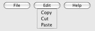
In a legacy user agent, the above would look like a bulleted list with three items, the first of which has four buttons, the second of which has three, and the third of which has two nested bullet points with two items consisting of links.
The following implements a similar toolbar, with a single button whose values, when selected, redirect the user to Web sites.
<form action="redirect.cgi">
 <menu type="toolbar">
  <label for="goto">Go to...</label>
  <menu label="Go">
   <select id="goto"
           onchange="if (this.options[this.selectedIndex].value)
                     window.location = this.options[this.selectedIndex].value">
    <option value="" selected="selected"> Select site: </option>
    <option value="http://www.apple.com/"> Apple </option>
    <option value="http://www.mozilla.org/"> Mozilla </option>
    <option value="http://www.opera.com/"> Opera </option>
   </select>
   <span><input type="submit" value="Go"></span>
  </menu>
 </menu>
</form>
The behavior in supporting user agents is similar to the example
above, but here the legacy behaviour consists of a single
select element with a submit button. The submit button
doesn't appear in the toolbar, because it is not a direct child of
the menu element or of its li
children.
A menu (or tool bar) consists of a list of zero or more of the following components:
The list corresponding to a particular menu element
is built by iterating over its child nodes. For each child node in
tree order, the required behavior depends on what the
node is, as follows:
hr elementoption element that has a value attribute set to the empty
string, and has a disabled attribute, and whose
textContent consists of a string of one or more
hyphens (U+002D HYPHEN-MINUS)li elementlabel elementmenu element with no label attributeselect elementmenu or select element, then
append another separator.menu element with a label attributeoptgroup element with a label attributelabel attribute as the label of the menu. The
submenu must be constructed by taking the element and creating a
new menu for it using the complete process described in this
section.Once all the nodes have been processed as described above, the user agent must the post-process the menu as follows:
The contextmenu
attribute gives the element's context
menu. The value must be the ID of a menu element
in the DOM. If the node that would be obtained by
the invoking the getElementById() method using the
attribute's value as the only argument is null or not a
menu element, then the element has no assigned context
menu. Otherwise, the element's assigned context menu is the element
so identified.
When an element's context menu is requested (e.g. by the user
right-clicking the element, or pressing a context menu key), the UA
must fire a simple event called contextmenu that bubbles and is
cancelable at the element for which the menu was requested.
Typically, therefore, the firing of the contextmenu event will be the
default action of a mouseup or keyup event. The exact sequence of events
is UA-dependent, as it will vary based on platform conventions.
The default action of the contextmenu event depends on
whether the element or one of its ancestors has a context menu
assigned (using the contextmenu attribute) or not. If
there is no context menu assigned, the default action must be for
the user agent to show its default context menu, if it has one.
If the element or one of its ancestors does have a
context menu assigned, then the user agent must fire a simple
event called show at the
menu element of the context menu of the nearest
ancestor (including the element itself) with one assigned.
The default action of this event is that the user agent
must show a context menu built from the menu element.
The user agent may also provide access to its default context menu, if any, with the context menu shown. For example, it could merge the menu items from the two menus together, or provide the page's context menu as a submenu of the default menu.
If the user dismisses the menu without making a selection, nothing in particular happens.
If the user selects a menu item that represents a command, then the UA must invoke that command's Action.
Context menus must not, while being shown, reflect changes in the
DOM; they are constructed as the default action of the show event and must remain like that until
dismissed.
User agents may provide means for bypassing the context menu
processing model, ensuring that the user can always access the UA's
default context menus. For example, the user agent could handle
right-clicks that have the Shift key depressed in such a way that it
does not fire the contextmenu
event and instead always shows the default context menu.
The contextMenu
attribute must reflect the contextmenu content attribute.
When a menu element has a type attribute in the tool bar state, then the user agent
must build the
menu for that menu element, and use the result in the
rendering.
The user agent must reflect changes made to the
menu's DOM, by immediately rebuilding the menu.
A command is the abstraction behind menu items, buttons, and links.
Commands are defined to have the following facets:
These facets are exposed on elements using the command API:
commandTypeExposes the Type facet of the command.
idExposes the ID facet of the command.
labelExposes the Label facet of the command.
titleExposes the Hint facet of the command.
iconExposes the Icon facet of the command.
accessKeyLabelExposes the Access Key facet of the command.
hiddenExposes the Hidden State facet of the command.
disabledExposes the Disabled State facet of the command.
checkedExposes the Checked State facet of the command.
click()Triggers the Action of the command.
The commandType
attribute must return a string whose value is either "command", "radio", or "checked", depending on whether the Type of the command defined by the
element is "command", "radio", or "checked" respectively. If the
element does not define a command, it must return null.
The label
attribute must return the command's Label, or null if the element
does not define a command or does not specify a Label. This attribute will be
shadowed by the label DOM attribute on
option and command elements.
The icon
attribute must return the absolute URL of the command's
Icon. If the element does
not specify an icon, or if the element does not define a command,
then the attribute must return null. This attribute will be shadowed
by the icon DOM attribute on
command elements.
The disabled
attribute must return true if the command's Disabled State is that
the command is disabled, and false if the command is not
disabled. This attribute is not affected by the command's Hidden State. If the
element does not define a command, the attribute must return
false. This attribute will be shadowed by the disabled attribute on button,
input, option, and command
elements.
The checked attribute
must return true if the command's Checked State is that the
command is checked, and false if it is that the command is not
checked. If the element does not define a command, the attribute
must return false. This attribute will be shadowed by the checked attribute on input and
command elements.
The ID facet
is exposed by the the id DOM attribute,
the Hint facet is exposed by
the title DOM attribute, the AccessKey facet is exposed by
the accessKeyLabel DOM
attribute, and the Hidden
State facet is exposed by the hidden DOM attribute.
commandsReturns an HTMLCollection of the elements in the
Document that define commands and have IDs.
The commands attribute
of the document's HTMLDocument interface must return an
HTMLCollection rooted at the Document
node, whose filter matches only elements that define commands and have IDs.
User agents may expose the commands whose Hidden State facet is false (visible), e.g. in the user agent's menu bar. User agents are encouraged to do this especially for commands that have Access Keys, as a way to advertise those keys to the user.
a element to define a commandAn a element with an href attribute defines a command.
The Type of the command is "command".
The ID of the command is
the value of the id attribute of the
element, if the attribute is present and not empty. Otherwise the
command is an anonymous command.
The Label of the command
is the string given by the element's textContent DOM
attribute.
The Hint of the command
is the value of the title attribute
of the element. If the attribute is not present, the Hint is the empty string.
The Icon of the command
is the absolute URL obtained from resolving the value of the src attribute of the first
img element descendant of the element, relative to that
element, if there is such an element and resolving its attribute is
successful. Otherwise, there is no Icon for the command.
The AccessKey of the command is the element's assigned access key, if any.
The Hidden State
of the command is true (hidden) if the element has a hidden attribute, and false
otherwise.
The Disabled State facet of the command is always false. (The command is always enabled.)
The Checked State of the command is always false. (The command is never checked.)
The Action of the
command is to fire a click event at the element.
button element to define a commandA button element always defines a command.
The Type, ID, Label, Hint, Icon, Access Key, Hidden State, Checked State, and Action facets of the command are
determined as for a
elements (see the previous section).
The Disabled State of the command mirrors the disabled state of the button.
input element to define a commandAn input element whose type attribute is in one of the Submit Button, Reset Button, Image Button, Button, Radio Button, or Checkbox states defines a command.
The Type of the command
is "radio" if the type
attribute is in the Radio
Button state, "checkbox" if the type attribute is in the Checkbox state, and
"command" otherwise.
The ID of the command is
the value of the id attribute of the
element, if the attribute is present and not empty. Otherwise the
command is an anonymous command.
The Label of the command depends on the Type of the command:
If the Type is "command",
then it is the string given by the value attribute, if any, and a
UA-dependent, locale-dependent value that the UA uses to label the
button itself if the attribute is absent.
Otherwise, the Type is
"radio" or "checkbox". If the element is a labeled
control, the textContent of the first
label element in tree order whose
labeled control is the element in question is the Label (in DOM terms, this is the
string given by element.labels[0].textContent). Otherwise,
the value of the value
attribute, if present, is the Label. Otherwise, the Label is the empty string.
The Hint of the command
is the value of the title attribute
of the input element. If the attribute is not present, the
Hint is the empty
string.
If the element's type
attribute is in the Image
Button state, and the element has a src attribute, and that attribute's
value can be successfully resolved relative to the element, then the Icon of the command is the
absolute URL obtained from resolving that attribute
that way. Otherwise, there is no Icon for the command.
The AccessKey of the command is the element's assigned access key, if any.
The Hidden State
of the command is true (hidden) if the element has a hidden attribute, and false
otherwise.
The Disabled State of the command mirrors the disabled state of the control.
The Checked State of the command is true if the command is of Type "radio" or "checkbox" and the element is checked attribute, and false otherwise.
The Action of the
command, if the element has a defined activation
behavior, is to run synthetic click activation
steps on the element. Otherwise, it is just to fire a
click event at the
element.
option element to define a commandAn option element with an ancestor
select element and either no value attribute or a value attribute that is not the
empty string defines a
command.
The Type of the command
is "radio" if the option's nearest ancestor
select element has no multiple attribute, and
"checkbox" if it does.
The ID of the command is
the value of the id attribute of the
element, if the attribute is present and not empty. Otherwise the
command is an anonymous command.
The Label of the command
is the value of the option element's label attribute, if there is one,
or the value of the option element's
textContent DOM attribute if there isn't.
The Hint of the command
is the string given by the element's title attribute, if any, and the empty
string if the attribute is absent.
There is no Icon for the command.
The AccessKey of the command is the element's assigned access key, if any.
The Hidden State
of the command is true (hidden) if the element has a hidden attribute, and false
otherwise.
The Disabled
State of the command is true (disabled) if the element is
disabled or if its
nearest ancestor select element is disabled, and false
otherwise.
The Checked State of the command is true (checked) if the element's selectedness is true, and false otherwise.
The Action of the
command depends on its Type. If the command is of Type "radio" then it must pick the option
element. Otherwise, it must toggle the option
element.
command element to define
a commandA command element defines a command.
The Type of the command
is "radio" if the command's type attribute is
"radio", "checkbox" if the attribute's value is
"checkbox", and "command" otherwise.
The ID of the command is
the value of the id attribute of the
element, if the attribute is present and not empty. Otherwise the
command is an anonymous command.
The Label of the command
is the value of the element's label attribute, if there is one,
or the empty string if it doesn't.
The Hint of the command
is the string given by the element's title attribute, if any, and the
empty string if the attribute is absent.
The Icon for the command
is the absolute URL obtained from resolving the value of the element's icon attribute, relative to the
element, if it has such an attribute and resolving it is
successful. Otherwise, there is no Icon for the command.
The AccessKey of the command is the element's assigned access key, if any.
The Hidden State
of the command is true (hidden) if the element has a hidden attribute, and false
otherwise.
The Disabled
State of the command is true (disabled) if the element has a
disabled attribute, and
false otherwise.
The Checked State
of the command is true (checked) if the element has a checked attribute, and false
otherwise.
The Action of the
command, if the element has a defined activation
behavior, is to run synthetic click activation
steps on the element. Otherwise, it is just to fire a
click event at the
element.
accesskey attribute on a label element to define a commandA label element that has an assigned access
key and a labeled control and whose
labeled control defines a
command, itself defines a
command.
The Type of the command is "command".
The ID of the command is
the value of the id attribute of the
element, if the attribute is present and not empty. Otherwise the
command is an anonymous command.
The Label of the command
is the string given by the element's textContent DOM
attribute.
The Hint of the command
is the value of the title attribute
of the element.
There is no Icon for the command.
The AccessKey of the command is the element's assigned access key.
The Hidden State, Disabled State, and Action facets of the command are the same as the respective facets of the element's labeled control.
The Checked State of the command is always false. (The command is never checked.)
accesskey attribute on a legend element to define a commandA legend element that has an assigned access
key and is a child of a fieldset element that
has a descendant that is not a descendant of the legend
element and is neither a label element nor a
legend element but that defines a command, itself defines a command.
The Type of the command is "command".
The ID of the command is
the value of the id attribute of the
element, if the attribute is present and not empty. Otherwise the
command is an anonymous command.
The Label of the command
is the string given by the element's textContent DOM
attribute.
The Hint of the command
is the value of the title attribute
of the element.
There is no Icon for the command.
The AccessKey of the command is the element's assigned access key.
The Hidden State,
Disabled State, and
Action facets of the
command are the same as the respective facets of the first element
in tree order that is a descendant of the parent of the
legend element that defines a command but is not a
descendant of the legend element and is neither a
label nor a legend element.
The Checked State of the command is always false. (The command is never checked.)
accesskey attribute to define a command on other elementsAn element that has an assigned access key defines a command.
If one of the other sections that define elements that define commands define that this element defines a command, then that section applies to this element, and this section does not. Otherwise, this section applies to that element.
The Type of the command is "command".
The ID of the command is
the value of the id attribute of the
element, if the attribute is present and not empty. Otherwise the
command is an anonymous command.
The Label of the command
depends on the element. If the element is a labeled
control, the textContent of the first
label element in tree order whose
labeled control is the element in question is the Label (in DOM terms, this is the
string given by element.labels[0].textContent). Otherwise, the
Label is the
textContent of the element itself.
The Hint of the command
is the value of the title attribute
of the element. If the attribute is not present, the Hint is the empty string.
There is no Icon for the command.
The AccessKey of the command is the element's assigned access key.
The Hidden State
of the command is true (hidden) if the element has a hidden attribute, and false
otherwise.
The Disabled State facet of the command is always false. (The command is always enabled.)
The Checked State of the command is always false. (The command is never checked.)
The Action of the
command, if the element has a defined activation
behavior, is to run synthetic click activation
steps on the element. Otherwise, if the element is
focusable, the Action of the command is to run
the focusing steps for the element and then to
fire a click event at
the element. Otherwise, Action of the command is just to
fire a click event at
the element.
legend elementStatus: Last call for comments
fieldset element.details element.figure element, if there are no other legend element children of that element.figure element: flow content, but with no descendant figure elements.interface HTMLLegendElement : HTMLElement {
readonly attribute HTMLFormElement form;
};
The legend element represents a title
or explanatory caption for the rest of the contents of the
legend element's parent element.
formReturns the element's form element, if any, or
null otherwise.
The form DOM
attribute's behavior depends on whether the legend
element is in a fieldset element or not. If the
legend has a fieldset element as its
parent, then the form DOM
attribute must return the same value as the form DOM attribute on that
fieldset element. Otherwise, it must return null.
div elementStatus: Implemented and widely deployed
formatBlock candidate.interface HTMLDivElement : HTMLElement {};
The div element has no special meaning at all. It
represents its children. It can be used with the class, lang, and title attributes to mark up semantics
common to a group of consecutive elements.
Authors are strongly encouraged to view the
div element as an element of last resort, for when no
other element is suitable. Use of the div element
instead of more appropriate elements leads to poor accessibility for
readers and poor maintainability for authors.
For example, a blog post would be marked up using
article, a chapter using section, a
page's navigation aids using nav, and a group of form
controls using fieldset.
On the other hand, div elements can be useful for
stylistic purposes or to wrap multiple paragraphs within a section
that are all to be annotated in a similar way. In the following
example, we see div elements used as a way to set the
language of two paragraphs at once, instead of setting the language
on the two paragraph elements separately:
<article lang="en-US">
 <h1>My use of language and my cats</h1>
 <p>My cat's behavior hasn't changed much since her absence, except
 that she plays her new physique to the neighbors regularly, in an
 attempt to get pets.</p>
 <div lang="en-GB">
  <p>My other cat, coloured black and white, is a sweetie. He followed
  us to the pool today, walking down the pavement with us. Yesterday
  he apparently visited our neighbours. I wonder if he recognises that
  their flat is a mirror image of ours.</p>
  <p>Hm, I just noticed that in the last paragraph I used British
  English. But I'm supposed to write in American English. So I
  shouldn't say "pavement" or "flat" or "colour"...</p>
 </div>
 <p>I should say "sidewalk" and "apartment" and "color"!</p>
</article>
Status: Working draft
There are a number of dynamic selectors that can be used with HTML. This section defines when these selectors match HTML elements.
:link:visitedAll a elements that have an href attribute, all
area elements that have an href attribute, and all
link elements that have an href attribute, must match one of
:link and :visited.
:activeThe :active pseudo-class
must match the following elements between the time the user begins
to activate the element and the time the user stops activating
the element:
a elements that have an href attributearea elements that have an href attributelink elements that have an href attributebutton elements that are not disabledinput elements whose type attribute is in the Submit Button, Image Button, Reset Button, or Button statecommand elements that do not have a disabled attributeFor example, if the user is using a keyboard to
push a button element by pressing the space bar, the
element would match this pseudo-class in between the time that the
element received the keydown
event and the time the element received the keyup event.
:enabledThe :enabled pseudo-class
must match the following elements:
a elements that have an href attributearea elements that have an href attributelink elements that have an href attributebutton elements that are not disabledinput elements whose type attribute are not in the
Hidden state and that
are not disabledselect elements that are not disabledtextarea elements that are not disabledoption elements that do not have a disabled attributecommand elements that do not have a disabled attributeli elements that are children of
menu elements, and that have a child element that
defines a command, if the
first such element's Disabled State facet
is false (not disabled):disabledThe :disabled
pseudo-class must match the following elements:
button elements that are disabledinput elements whose type attribute are not in the
Hidden state and that
are disabledselect elements that are disabledtextarea elements that are disabledoption elements that have a disabled attributecommand elements that have a disabled attributeli elements that are children of
menu elements, and that have a child element that
defines a command, if the
first such element's Disabled State facet
is true (disabled):checkedThe :checked pseudo-class
must match the following elements:
input elements whose type attribute is in the Checkbox state and whose
checkedness state is
trueinput elements whose type attribute is in the Radio Button state and whose
checkedness state is
truecommand elements whose type attribute is in the Checkbox state
and that have a checked
attributecommand elements whose type attribute is in the Radio state and that
have a checked
attribute:indeterminateThe :indeterminate
pseudo-class must match input elements whose type attribute is in the Checkbox state and whose
indeterminate DOM
attribute is set to true.
:defaultThe :default pseudo-class
must match the following elements:
button elements that are their form's
default buttoninput elements whose type attribute is in the Submit Button or Image Button state, and that
are their form's default button:validThe :valid pseudo-class
must match all elements that are candidates for constraint validation
and that satisfy their
constraints.
:invalidThe :invalid pseudo-class
must match all elements that are candidates for constraint validation
but that do not satisfy their
constraints.
:in-rangeThe :in-range
pseudo-class must match all elements that are candidates for
constraint validation and that are neither suffering
from an underflow nor suffering from an
overflow.
:out-of-rangeThe :out-of-range
pseudo-class must match all elements that are candidates for
constraint validation and that are suffering from an
underflow or suffering from an overflow.
:requiredThe :required
pseudo-class must match the following elements:
:optionalThe :optional
pseudo-class must match the following elements:
:read-only:read-writeThe :read-write
pseudo-class must match the following elements:
input elements to which the readonly attribute applies,
but that are not immutable
(i.e. that do not have the readonly attribute specified
and that are not disabled)textarea elements that do not have a readonly attribute, and
that are not disabledThe :read-only
pseudo-class must match all other HTML elements.
Another section of this specification defines the
target element used with the :target pseudo-class.
This specification does not define when an element
matches the :hover, :focus, or :lang() dynamic pseudo-classes, as
those are all defined in sufficient detail in a language-agnostic
fashion in the Selectors specification. [SELECTORS]