Writing systems are main part of cultures, together with languages and scripts. Each cultural community has its own language,
script and writing system. In that sense, the transfer of each writing system into cyber space is a task with very important
responsibility for information and communication technology.
As one of the basic work items of this task, this document describes issues of text layout in the Japanese writing system.
The goal of this task is not to propose solutions itself but describe important issues as the basic information for actual
implementations.
This document was created by the W3C Japanese Layout Task Force. This Task Force is organized with the following members,
and has discussed a lot of issues to harmonize the requirements from user communities and solutions from technological experts.
-
Experts of Japanese Text Layout (The editors of "JIS X 4051:Formatting rules for Japanese documents")
-
Experts of internationalization and standardization in Japan (from Microsoft, Antenna House, Justsystems)
-
Other members of the W3C CSS, i18n Core, SVG and XSL Working Groups.
This task force is also an outstanding effort as a bilingual methodology. Discussion is mainly conducted in Japanese, because
of the Japanese issues, but, minutes and mailing list are written in English. As a process of the development, the task force
held already one face-to-face meeting with the participating Working Groups.
This document itself was also developed bilingually, and is published bilingually. As for technical terms, we carefully avoided
to use jargon. Even if there are some English words corresponding to the Japanese words, we carefully studied the differences
of the actual meaning, and if there are some differences between corresponding concepts, we decided to provide the Japanese
jargon in ROMAJI (Latin transliteration) for future discussion. Moreover, we prepared as many figures as possible with clear
and understandable English for non Japanese readers.
Japanese Text Layout has several differences from Latin script based Text Layout. Major differences include:
-
In Japanese Text Layout, not only horizontal composition but also vertical composition is used.
-
The width of all KANJI and KANA characters are mostly full width, and there are no spaces between these characters.
Accordingly, this document mainly explains the characteristics of Japanese Text Layout using the following policy.
-
It does not fully cover all issues of the Japanese text layout system, but mainly discusses the differences from Western text
layout systems.
-
It focuses on requirements to be established as Japanese text layout presentation form. Technology-specific interpretations
of the requirements and/or how to implement them are out of scope of this document.
-
It explicitly refers to JIS X 4051 "Formatting rules for Japanese documents" as much as possible. Also, unless an issue is
not explained in JIS X 4051, this document is focused on basic issues of Japanese layout. Accordingly, some issues have only
reference to the corresponding clause of JIS X 4051. To implement a high quality Japanese text layout system, the implementers
have to refer to JIS X 4051, however, the description of this document is sufficient to recognize the basic characteristics
of Japanese text layout as basic knowledge. Also, some issues, which are not described in JIS X 4051, are described in detail.
With this policy, this document includes tutorial- or summary-like, supplemental explanation, related background, and additional
description of JIS X 4051. This document covers all basic issues of Japanese text layout, but JIS X 4051 has to be referred
to for advanced discussion.
-
It provides typical examples in actual use for key text layout features for better understanding of their usage.
-
For non Japanese readers, frequency of usage for each issue is indicated. These frequencies are not the outcome from any accurate
research, but from the long experience of the authors. These frequencies are easy to imagine for ordinary Japanese text readers,
however, it may be difficult to imagine without explicit information for non Japanese readers. These frequencies are only
rough information to prioritize the importance of issues. An example:
"WARICHU is not frequently used, but is useful to simply annotate persons, things, and so on, on the appeared place, especially in
classics or translations."
"RUBY is frequently used in modern documents including newspapers."
-
Considering non Japanese readers of this document, figures are used for explanation as much as possible.
-
Text layout rules and recommendations for readable design are different topics. However, these two issues are difficult to
discuss separately. In this document, these two aspects are carefully separated. The aesthetic design recommendations are
mainly described as notes.
-
The main target of this document is common books. The authors' experiences are mainly common books, and the required quality
of common books is the highest in the market. There are many kinds of books in the market, and the requirements are quite
diversified. The task force has a lot of accumulated experiences in requirements and solutions to Japanese layout. Also, the
issues, which have been discussed for a long time, are applicable for other kinds of publication.
In terms of frequency, the importance of magazine, manual, Web document have no difference from common books. Also there are
several characteristics in these publications which are different from common books. These issues should be treated in future
documents.
This document consists of three parts:
-
1 The basic specification of Japanese text layout
-
2 The processing of line layout
-
3 The method of HANMEN design
Section 1 explains the characteristics of letters and symbols, which are used in Japanese text layout, their differences in
vertical layout and horizontal layout, and the design and adaptation of KIHONHANMEN.
Section 2 explains line layout methods for KANJI, KANA, YAKUMONO, together with RUBY (inter line pronunciation and annotation) and mixture of Western letters.
Section 3 describes the construction method and layout method of headings, notes, illustrations and tables.
In principle, characters in Japanese layout are full-width, mono-spaced and positioned without spaces (solid setting). This
is taken as a premise for the design of KIHONHANMEN, the basis of book layout. Furthermore, following the design of KIHONHANMEN,
figures, characters, symbols etc. are placed in an actual page. For the understanding of Japanese layout it is an important
aspect to understand the design of the KIHONHANMEN and how to position figures, characters, symbols etc. following KIHONHANMEN.
Hence, section 1 describes the design of KIHONHANMEN and its application methods in detail. Especially section 1.5 "Pagewise
Arrangements of KIHONHANMEN Elements" provides prototypical patterns about the following three guidelines, what is strictly
recommended to be taken into account, and what exceptions are possible. The goal of this explanation is the understanding
of Japanese layout. Since detailed explanations of the various elements of "KIHONHANMEN" are given in section 2 and 3, some
explanations are being repeated.
-
Keep the basic size or column numbers, which is decided in KIHONHANMEN.
-
Keep the line positions, which are decided in KIHONHANMEN, with some exceptions.
-
Keep the letter positions, which are decided in KIHONHANMEN, with some exceptions.
The definitions of technical terms are described in a separate document. The notation of technical terms and reference to
the definitions are as follows:
TBD
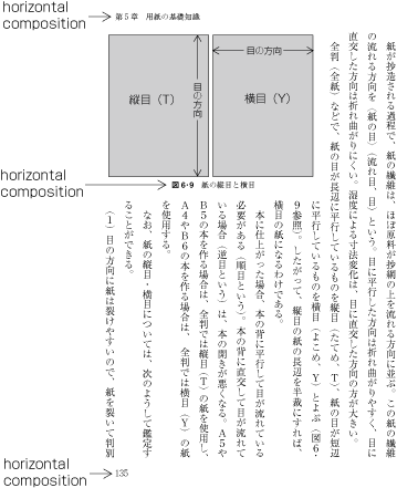
Page formats of a Japanese document shall be specified by:
-
Firstly, preparing the page templates which determine the basic appearance of pages of the document;
-
Then, specifying the details of actual Page elements based on the templates.
Generally, books use only one page template and magazines often use several templates.
As said before, although in books there is one pattern of page design, the basic pattern is adapted for e.g. the table of
contents. Furthermore, there are many examples of indices which have a different layout than the basic layout. And, in books
in vertical setting, often indices are in horizontal setting. It holds also for such cases where the goal is to make the size
of HANMEN for indices close to the size of HANMEN in the basic design.
Magazines gather articles of different kinds. Often the layout will differ depending on the content of the article, like one
part with 9 point character size and 3 columns, and another part with 8 point character size and 4 columns.
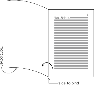
The following are the basic elements of page template (Figure 1-1 illustrates an example of a page template with Vertical composition).
-
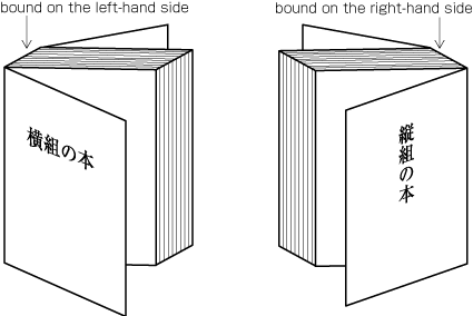
Trim size and binding side (Japanese documents with vertical composition are bound on the right-hand side, and documents with horizontal composition are bound on the left-hand side. See Fig.1-2. )
-
Principal Text direction (vertical composition or horizontal composition)
-
The appearance of KIHONHANMEN and its position relative to the trim size
-
The appearance of Running Heads and Folios and their positions relative to the trim size and KIHONHANMEN
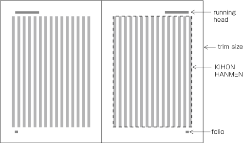
KIHONHANMEN is the HANMEN style designed as the basis of a book. The following are the basic elements of KIHONHANMEN (See Fig. 1-3).
|
(note 1)
|
The question of how the various elements of KIHONHANMEN are applied to a real page is an important aspect for the understanding
of the characteristics of Japanese type setting. Accordingly, the details of KIHONHANMEN will be explained later.
|
|
(note 2)
|
The normative definition of KIHONHANMEN is provided in JIS X 4051, sec. 7.5.
|
|
(note 3)
|
Design (including running head and folios) and type setting examples for KIHONHANMEN in different paper sizes are available
in JIS X 4051, annex 3 and 4.
|
-
Character size and Typeface name
-
Text direction (vertical composition or horizontal composition)
-
Number of columns and Column space when using multi-column formats
-
Number of characters per line
-
Number of lines per page (number of lines per column when using multi-column formats)
-
line-gap (or Line feed)
Below are several examples of how the basic style is created, and how then various elements are placed on a real text page
(This and other aspects of how the various elements of KIHONHANMEN are arranged on each page are explained in sec. 1.5 Pagewise Arrangements of KIHONHANMEN Elements.).
-
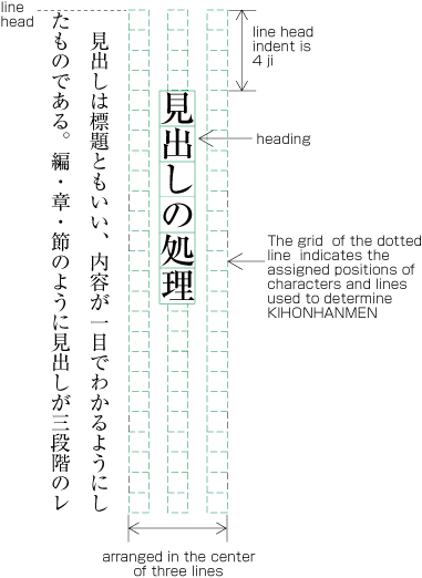
Space and position of headings
The space of line feed direction of headings is specified by using the line positions provided by KIHONHANMEN as a basis and by deciding how many times they
need to be used. (Details of this processing are defined in JIS X 4051, sec. 8.3.3. d). The Indentation of the text direction of the heading is normally specified by using the character position designed via KIHONHANMEN as a basis. The indentation
is then several times of that position. In the example in Figure A1-1, the heading is placed in the middle line of three lines which are provided via KIHONHANMEN. It is indented 4 characters
of the character size provided via KIHONHANMEN.
|
(note 1)
|
Details of the different types of headings, creation of headings, methods for placing headings etc. are explained in sec.
3.1 "Processing of Headings".
|
-
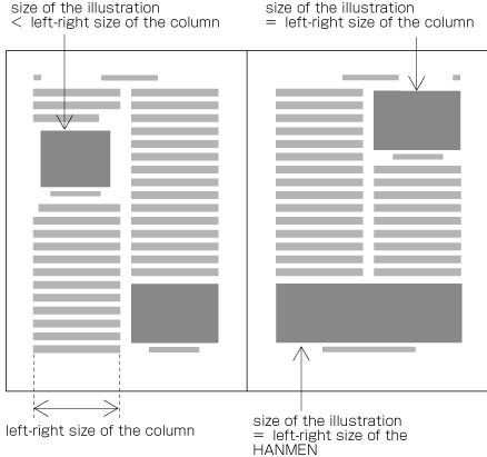
Size of illustrations
In horizontal setting with two columns, if at all possible, the width of illustrations should be either the width of one column
(which is provided via KIHONHANMEN) or the width of KIHONHANMEN (see Fig. A1-2). The position of illustrations is often the head or the Foot of the page (see Fig. A1-2).
|
(note 1)
|
Details of illustration positioning are explained in "sec. 3.3 Positioning of Figures, Photographs etc.".
|
-
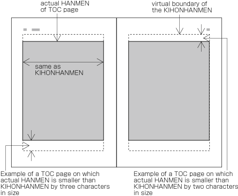
HANMEN size for the Table of contents
The HANMEN size for the table of contents of books is based on the size of KIHONHANMEN. There are many examples, for the table
of contents in vertical layout, in which the size of the left-to-right line feed is identical to the size of KIHONHANMEN,
and the text direction size for head and foot is a little bit smaller (see Fig. A1-3).
|
(note 1)
|
There are cases when a different HANMEN than KIHONHANMEN is used for positioning of running heads and folios. This will be
discussed in "sec. 1.6.2 Principles of positioning running head and folios" (see Fig. A1-17).
|
Japanese characters used for composing Japanese text mainly consist of KANJI and KANA (HIRAGANA and KATAKANA) (See Fig. 1-4).
|
(note 1)
|
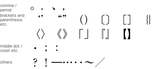
In addition to KANJI and KANA, various punctuation marks (See Fig. 1-5) as well as Arabic numerals, Latin characters and/or Greek characters may be used in Japanese text.
|
|
(note 2)
|
The details of characters and character classes used in this document will be explained in a separate document about terminology
of Japanese Layout. Also, the relation of the characters and symbols from each character class to Unicode code points will
be shown in an appendix to this document.
|
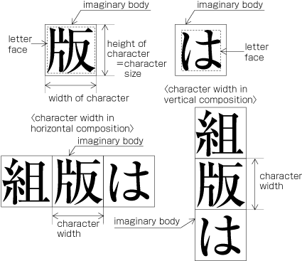
KANJI and KANA characters that are of the same size have square Imaginary bodies of equal dimensions (also known as the outer frame of a character). Aligned with the vertical and horizontal center of the
imaginary body, there is a smaller box called the Letter face which contains the actual symbol. Character size shall be measured by the size of the imaginary body (See Fig. 1-6). "Character width" is a term to describe the advance width of the imaginary body of a character in text direction (Direction of text advance). By definition it is equal to the "width" of a character in horizontal composition, while it's the height of a character
in vertical composition (See Fig. 1-6).
|
(note 1)
|
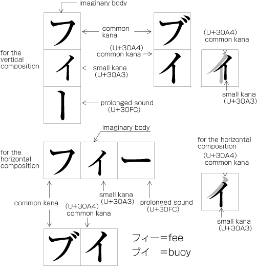
The letter face of Small KANA (っ, ょ, ュ, ァ, ィ, ゥ, etc) shall be placed at the vertical center and to the right of horizontal center of the imaginary body
in vertical composition, and at the horizontal center and below the vertical center in horizontal composition. (See Fig. 1-7). Also there are punctuation marks of which letter faces are not placed at the vertical and horizontal center of the imaginary
body.
|
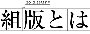
When composing a line with KANJI and KANA characters, in principle no extra space between their imaginary bodies is placed.
This is called Solid setting (See Fig. 1-8).
|
(note 1)
|
Since the Letterpress printing era, KANJI and KANA letters have been designed so that they are easy to read regardless of text direction and with the solid
setting. However, unlike the letterpress era when several sizes of the Original pattern of a letter was required to create Matrices, in today's digital era, because the same original pattern can be used for any size simply by enlargement or reduction, Inter-character spacing might be necessary when composing lines with large character size.
|
|
(note 2)
|
Depending on the contents, there are several settings in addition to the solid setting as shown below.
-
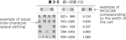
AKIGUMI (Fixed space setting): Text setting with a fixed size of Space between every two imaginary bodies (See Fig. 1-9).
AKIGUMI in books is used for the following reasons.
-
To achieve a balance between running heads with a few and with many characters. AKIGUMI is used for the running heads with
a few characters. Examples of AKIGUMI for running heads are given in JIS X 4051, annex 5.
-
To achieve a balance between headings with a few and with many characters. AKIGUMI is used for the headings with a few characters.
Examples of AKIGUMI for headings are given in JIS X 4051, annex 6.
-
For captions of illustrations and tables which only have a few characters. AKIGUMI is used to get a balance to the size of
illustration or table.
-
In some cases, AKIGUMI is used for Chinese and Japanese poetry with one line which has only a few characters.
|
(note 1)
|
AKIGUMI is defined in JIS X 4051, sec. 4.18.1 b, which includes also Tracking.
|
-
Equal inter-character space setting: Text setting with equal inter-character space per line so that each line is aligned on the same line head and line-end.
(See Fig. 1-10).
Equal inter-character space setting in books is used for unifying the length of table headings with Japanese text (see Fig. A1-4). There are also examples (e.g. lists of names) in which parts of person names receive equal spacing.
|
(note 1)
|
Equal spacing is defined in JIS X 4051, sec. 4.18.1, including processing of JIDORI.
|
-
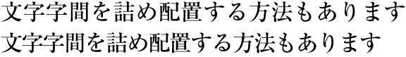
TSUMEGUMI (kerning / tracking) : Text setting with reduced inter-character space by arranging characters so that a portion of two imaginary bodies are laid
to overlap each other. This is divided further into two types depending on the methods of inter-character space reduction.
One method is to reduce the same amount of inter-character space (Tracking, See Fig. 1-11) and the other is to determine the amount of space to reduce based on the distance between two letter faces of adjacent characters
(Letter face kerning, See Fig. 1-12).
There are examples in books where kerning and letter face kerning is used for e.g. headings with large size characters. In
the main text, the most reader friendly approach is solid setting. However, if the character size is larger, it may happen
the distance between characters becomes unbalanced, and kerning or letter face kerning will be applied. These methods are
rarely used in books, for which easiness of reading is very important. But in magazines or advertisements there are examples
of kerning and letter face kerning. Probably for magazines the structuring of pages is very important, and characters on a
page need to be settled.
|
Japanese text is laid out either in a vertical direction (vertical writing) or in a horizontal direction (horizontal writing).
Depending on the content, either of the directions may be chosen.
|
(note 1)
|
KANJI and KANA characters for Japanese text layout have basically been designed to have the same dimensions of a square body,
and the same collection of types can be used in either vertical composition or horizontal composition simply by changing the
direction of text. (See Fig. 1-13). There were some attempts to develop Printing types designed exclusively for horizontal composition, but they were not widely accepted.
|
|
(note 2)
|
There is little market data comparing the number of pages with vertically and horizontally composed text, but it is said both are almost the same.
|
|
(note 3)
|
For official (e.g. governmental) publications, horizontal setting is recommended, educational material (with the exception
of certain topics) is mostly in horizontal setting, and furthermore, the readers of "mobile novels" are increasing, and it
is expected that in the future, horizontal setting will increase in this area as well. However, most of the large newspapers
are written completely in vertical setting, and most of the large journals for ordinary readers are almost completely in vertical
setting. In addition, novels, which are the most widely read kind of book publication, are almost completely in vertical setting
(some readers say that they cannot read a novel if it is not in vertical setting.). Hence it can be expected that the importance
of vertical setting for Japanese will not change for the time being.
|
|
注4)
|
There's usually only one direction for all text throughout a book, but there are cases where horizontal composition are partially
adopted in vertically composed books, for e.g. running heads composed horizontally (See Fig. 1-14).
|
(Example)
|
Tables, Captions for Graphics, running heads, and folios composed horizontally in a page with a vertical text layout.
|
|
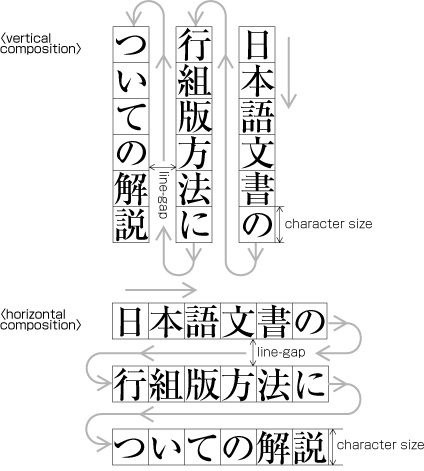
The following are major differences between vertical composition and horizontal composition.
-
Arrangement of characters, lines, columns and pages; Direction of page progression.
|
(note 1)
|
The positioning of characters, lines and paragraphs in vertical and horizontal setting is defined in JIS X 4051, sec. 7.4.4.
|
-
Vertical composition (See Fig. 1-15 for an example of vertical text layout with two columns per page)
-
Characters are arranged from top to bottom, lines are arranged from right to left.
-
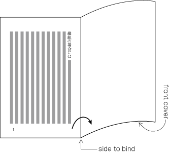
Columns are arranged from top to bottom. A book starts with the recto side and progresses from right to left (See Fig. 1-16).
-
Horizontal composition (See Fig. 1-17 for an example of horizontal text layout with two-columns per page)
-
Characters are arranged from left to right, and lines are arranged from top to bottom.
-
Columns are arranged from left to right. A book starts with the recto side and progresses from left to right (See Fig. 1-18).
-
Orientation of alphanumeric characters in a line
-
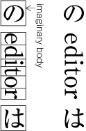
There are three ways to arrange alphanumerics in vertical composition.
-
Arranging one by one with the same Normal orientation as that of Japanese characters. Usually applied to one letter alphanumeric or capital abbreviations (See Fig. 1-19).
|
(note 1)
|
The alphanumeric characters used for this arrangement have different typographic features than those with Propotional width used for Latin scrip text. They are Monospace characters of Full width design, which have been used since the letterpress era.
|
-
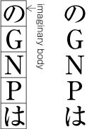
Arranging characters after rotating 90 degrees clockwise. Usually applied to English words or sentences (See Fig. 1-20).
|
(note 1)
|
In Figure 1-20, there is a gap before and after the imaginary body of “editor”. This gap is necessary for arrangement of mixed Japanese
and Latin script text. Details of its processing will be explained later.
|
-
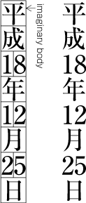
Setting horizontally without changing orientation (TATECHUYOKO (horizontal-in-vertical annotation), See Fig. 1-21). This is usually applied to two-digit numbers (see JIS X 4051, sec. 4.8 for the definition.).
-
There's only one arrangement with normal orientation in horizontal composition.
-
Arrangement of Tables and/or Figures with rotating 90 degrees clockwise or anti-clockwise for size considerations (This processing is defined in JIS X 4051, sec. 7.3.).
-
In vertical composition, align top of tables/figures to the right of page (See Fig. 1-22).
-
In horizontal composition, align top of tables/figures to the left of page (See Fig. 1-23).
|
(note 1)
|
The orientation is determined not to prevent reading flow of the book.
|
-
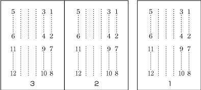
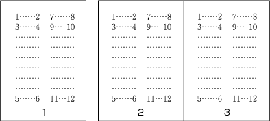
Arrangement of incomplete number of lines on a multi-column format page due to New recto, Page break or other reasons (The processing of new recto and each page is defined in JIS X 4051, sec. 8.1.1.).
-
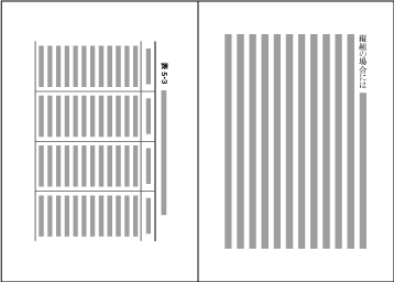
In vertical composition, just finish the line where it ends ("NARIYUKI"). The number of lines in each column is not uniform.
(See Fig. 1-24).
-
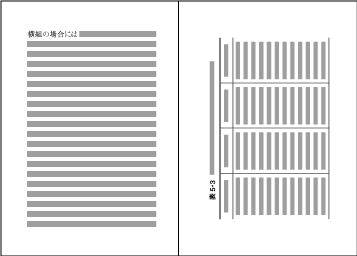
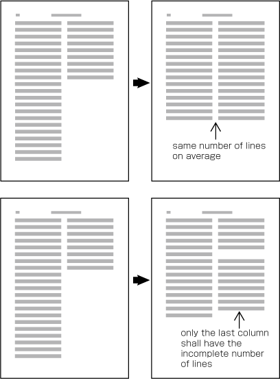
In horizontal composition, re-arrange columns so that each column has the same number of lines on average. In case the number
of lines is not divisible by the number of columns, add the smallest number to make it divisible and re-arrange columns using
the quotient as the number of lines so that only the last column shall have the incomplete number of lines. (See Fig. 1-25).
|
(note 1)
|
Neither Horizontal nor vertical balance of column arrangement would break the stability of vertical page layout very much,
while horizontal balance of column arrangement is determinant for horizontal page layout.
|
In Japanese layout, first the size of KIHONHANMEN is defined, using the square imaginary body of characters in solid setting.
Taken this as a base, the position of KIHONHANMEN with regards to the trim size is specified. Now, the following are procedures to determine KIHONHANMEN (See Fig. 1-26).
-
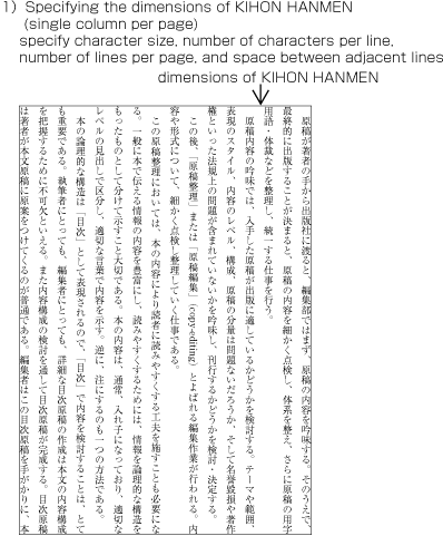
Specifying the dimensions of KIHONHANMEN.
-
For a document with a single column per page, specify character size, number of characters per line, number of lines per page,
and line-gap.
-
For a document with multiple columns per page, specify character size, number of characters per line, number of lines per
column, line-gap, number of columns, column space.
-
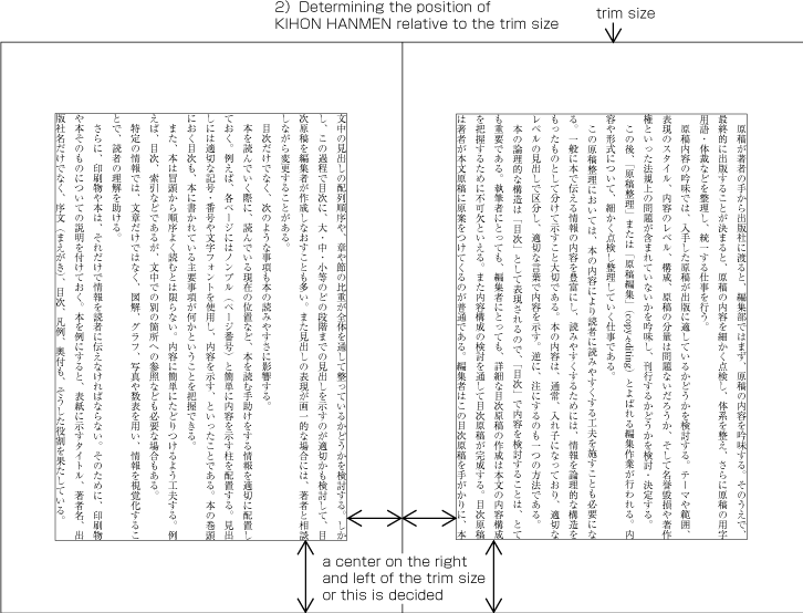
Determining the position of KIHONHANMEN relative to the trim size.
Various alternative methods for specifying the position of KIHONHANMEN relative to the trim size are as follows.
- Position top and bottom: center. Position left and right: center.
- Position top and bottom: specifying the space at the top (for horizontal setting) or space at the bottom (for vertical setting).
Left and right position: center.
- Top and bottom position: center. Left and right position: specifying the space of the gutter.
- Position top and bottom: Space at the top (for horizontal setting) or space at the bottom (for vertical setting). Position
left and right: specifying the space of the gutter (see Fig. 1-26-2).
|
(note 1)
|
In most cases KIHONHANMEN is set at the horizontal and vertical center of the trim size, which should be the default positioning,
but depending on the dimensions of KIHONHANMEN there may be a case where the default needs to be changed, for example, by
moving KIHONHANMEN up, down, to the left or to the right of the default position.
|
|
(note 2)
|
It's technically possible to determine the dimensions of KIHONHANMEN by specifying the trim size and margins of all sides,
but this method is not common in the Japanese text layout tradition. If this is the only way an implementation allows, the
margins of each side need to be measured in relation to the dimensions of KIHONHANMEN and its position in the trim size.
|
The following are the considerations that should be taken into account in designing KIHONHANMEN. (The items a) and b) of this topic are not about processing, but rather an explanation about how the design should be. The
definition of KIHONHANMEN is given in JIS X 4051, sec. 7.4.1.)
-
Trim size and margins. It would be best if KIHONHANMEN could be made similar to the trim size.
-
Character size. Generally 9 points (≒3.2mm), 8 points (≒2.8mm) at smallest for books targeted to adults but for special purpose
like dictionaries.
|
(note 1)
|
In western typography, 10 points (≒3.5mm) or 12 points (≒4.2mm) are commonly used. This is mainly because of a difference
of design principles between Japanese characters and Latin characters.
|
-
Line length.
-
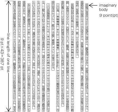
Line length should be multiples of the character size (See Fig. 1-27).
|
(note 1)
|
There are basically two reasons why line length should be multiples of the character size.
-
For Japanese text layout, all line lengths except that of the last line of the Paragraph should be the same in principle. Furthermore, only the first line of a paragraph is shorter, since as a matter of principle it is indented.
-
Japanese characters like KANJI or KANA for printing are uniformly designed in the same square and they are arranged solid
(no extra space between adjacent imaginary bodies) in principle.
|
|
(note 2)
|
The best line length (number of ZIZUME or number of characters per line) is around 52 characters at max in vertical composition
and 40 characters in horizontal composition. If it would go beyond the recommended length due to the trim size, consider multi-column
format and make the line length shorter.
|
-
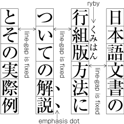
Use the same amount of line-gap across the book except special cases and each line should be aligned. With these two conditions,
the size of KIHONHANMEN in the line feed direction is specified with number of lines and line-gap (or line height, GYO-OKURI).
|
(note 1)
|
In Japanese layout, there are cases that RUBY, KENTEN, BOSEN, under lines etc. are inserted between lines. The inter-line
spacing is not changed and kept constant for these cases as well (see Fig. A1-5). It is also possible to insert references to notes between lines within the main text. This case is handled in the same
manner. Further explanation about the placement of RUBY will be given in sec. 2.
|
|
(note 2)
|
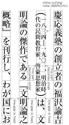
WARICHU juts out of the width of the line feed direction (the character size designed via KIHONHANMEN). Also for these cases,
the inter-line spacing is defined for the parts without WARICHU, and the passages with WARICHU are made narrower (see Fig. A1-18). Hence, for WARICHU, inter-line spacing is larger to some extend. The same is true for TATECHUYOKO or sub- and superscript.
Further explanations of the placement of WARICHU and other items is provided in sec. 2.
|
|
(note 3)
|
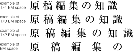
It is common that line-gap for KIHONHANMEN is set a value between 1/2 em space and full width (em) of the character size in KIHONHANMEN. 1/2 em space can be chosen in case the number of characters per
line is small, but full width (em) or close to it should be appropriate when it is larger than 35 characters.
|
|
(note 4)
|
Unless RUBY or other design elements are placed in the space between lines for books like classics with many annotations, there's no
need to make line-gap larger than full width, which would not improve legibility.
|
|
(note 5)
|
It is said that the standard line-gap in western typography is 1/3 em space, which is smaller than that in Japanese text layout. This difference again comes from the design difference between Latin
characters and Japanese characters.
|
If at all possible, the various elements of a page should be inside the HANMEN size. This is which is determined by KIHONHANMEN.
However, there are exceptions like the following ones.
-
If there is RUBY, BOSEN, KENTEN etc. at the right side (for vertical setting) or upper side (for horizontal setting) of the
HANMEN or the first paragraph of a page, the added item is put outside the HANMEN or the area of the paragraph (see Fig. A1-6). In cases where RUBY, under lines etc. are put on the left (in vertical setting) or bottom (horizontal composition), the
item is in contact with the HANMEN or the line at the end of the paragraph. Like for the handling of exceptions mentioned
below, the purpose here is to preserve the line positions which are provided via KIHONHANMEN. It is also possible to insert
references to notes between lines within the main text. This case is handled in the same manner.
-
In cases where there are elements in HANMEN, the first column or the last line (e.g. of a paragraph) which jut out of the
width of the line feed direction given by KIHONHANMEN (the character size specified via KIHONHANMEN), the parts of the item
which just out of the line width of the line feed direction given by KIHONHANMEN, are put jutting out of the HANMEN area or
outer side of the column (The processing of this item and item a) is defined in JIS X 4051, sec. 12.1.1.). For example this
is the case when the width of a sequence of characters which are set to TATECHUYOKO is larger than the width of characters
set for KIHONHANMEN. In addition, WARICHU or sub- and superscript are handled the same.
-
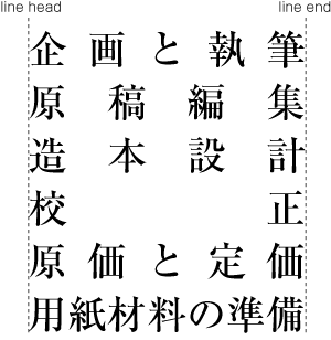
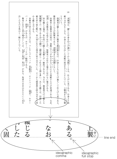
The processing of so-called hanging punctuation is only necessary for KUTEN (。) and TOUTEN (、) which need line head wrap:
The character is placed so that it touches the HANMEN of the line end or the outside area of the column (see Fig. A1-7). Furthermore, hanging punctuation is not defined in JIS X 4051, but there is an explanation in sec. 8.1, c).
|
(note 1)
|
Hanging punctuation is a method to reduce line adjustment processing, which relies on inter-character spacing.
|
|
(note 2)
|
There are a lot of books which apply hanging punctuation.
|
-
Illustrations and tables are normally placed inside the area which is defined via KIHONHANMEN. However, depending on the illustration
or table, there are also cases in which they jut outside the area of KIHONHANMEN.
-
Cases in which it is necessary to make the illustration or table larger than KIHONHANMEN.
-
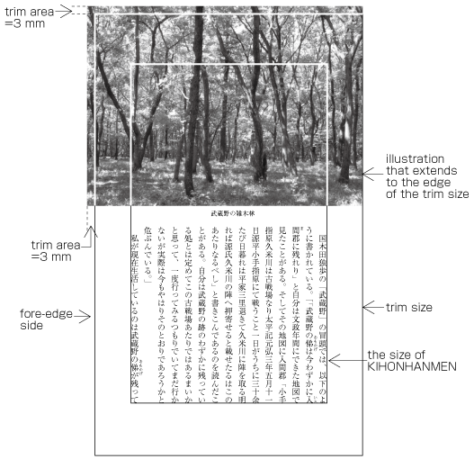
To achieve a visual effect, the illustration or table juts outside of KIHONHANMEN. Especially the "bleeds" method of using
the complete paper area is not used often books, but in magazines (see Fig. A1-8).
-
In addition, the method of placing the captions of figures outside the column area or between columns is used in journals
(Some people regard this as bad style.).
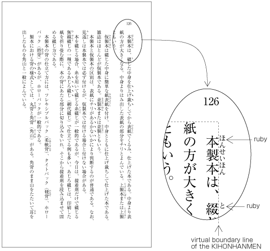
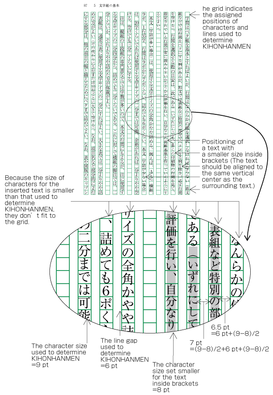
In principle, pagewise positioning of lines relies on the line positions given via KIHONHANMEN. This is also true for RUBY
or KENTEN like in Figure A1-5, and also with characters as shown in Figure A1-9. These characters within a line are smaller than the characters size provided by KIHONHANMEN. Nevertheless, the line positions
given by KIHONHANMEN is taken as a base, and the subsequent lines also use these positions.
|
(note 1)
|
The characters within brackets are made smaller since the text is an additional explanation. There are the following three
methods of handling such cases. The method c) of making only characters in restricted places smaller is the most commonly
used one.
-
Making all characters within brackets smaller (as it is shown in Figure A1-9).
-
Making all characters within brackets the same size as the character size given via KIHONHANMEN.
-
Making the characters only in restricted places smaller, for example for references.
|
There are the following exceptions of line position handling.
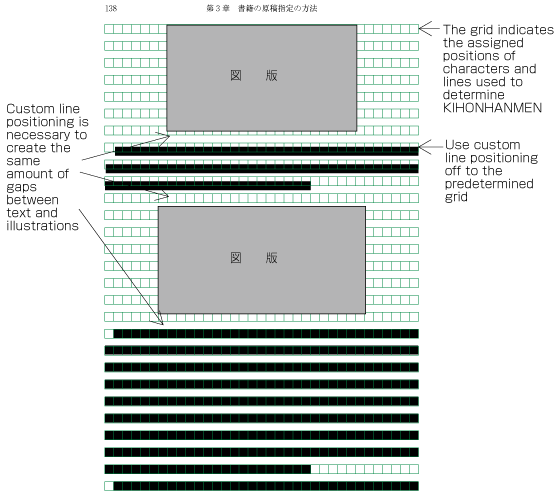
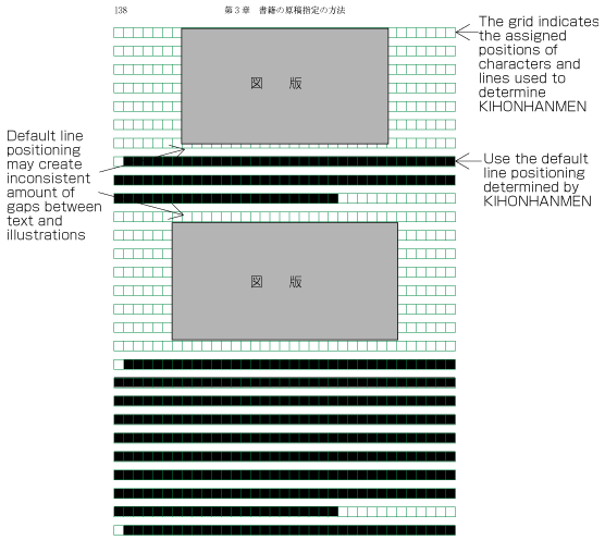
-
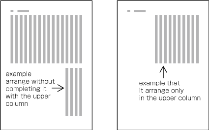
In horizontal composition, assuming that there is no text to the left or right of an illustration or table, it can happen
that when inserting more than one illustration or table, they slip of the lines given via KIHONHANMEN (see Fig. A1-10). But the illustration or table may also rely on the lines given via KIHONHANMEN (see Fig. A1-11). The former method is used to achieve equal space before and after illustrations or tables, if at all possible (This method
is often used in books.). This processing method is defined in JIS X 4051, sec. 10.3.2., d).
-
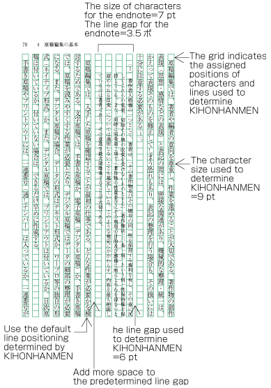
Notes which are inserted between paragraphs or at the bottom of the page (in horizontal composition) are smaller than the
character size given via KIHONHANMEN. As a result, the line distance becomes smaller, and the line positions are not identical
to the lines given via KIHONHANMEN. As an example, Figure A1-12 shows the position of an endnote between paragraphs in vertical composition. The processing of endnotes is defined in JIS
X 4051, sec. 9.3, and the processing of footnotes in sec. 9.4.
-
As mentioned above, it may happen that the position of headings is not identical with the lines given via KIHONHANMEN. Nevertheless,
the area of the line feed direction uses the lines given via KIHONHANMEN as a basis (see Fig. A1-1).
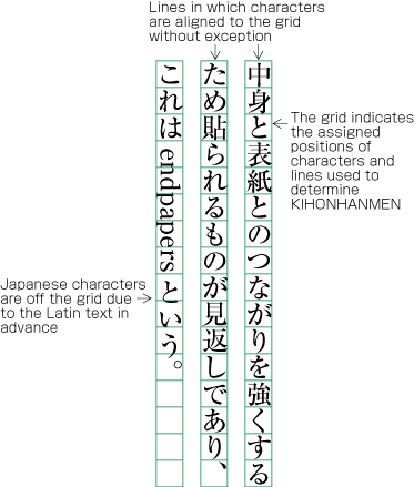
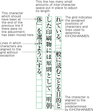
In principle, the characters in each line follow the solid setting positions of characters, which are given via KIHONHANMEN.
However, as already shown in some of the previous figures, there are examples in which the character positions do not follow
the positions given via KIHONHANMEN. Such cases are rather common, and here we will show some prototypical examples (details
will be given in sec. 2).
|
(note 1)
|
In cases when there are places which differ from the character size of solid setting given via KIHONHANMEN, it may happen
that line lengths are not identical; it will be necessary to unify the lengths of lines, with the exception of the last line
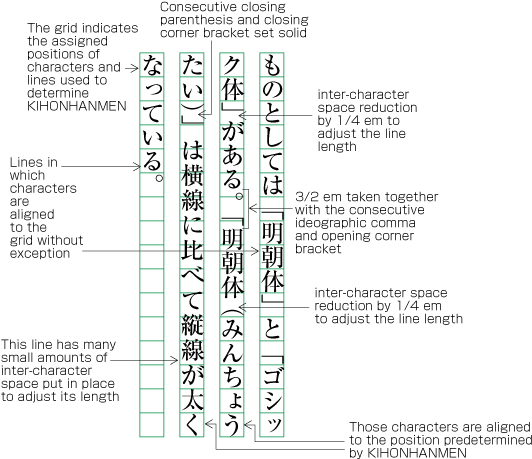
of a paragraph. This processing method is explained in sec. 2.8. "Characters Not Ending Line".
|
-
It may happen that in a part of a line, characters are inserted which are smaller than 9 points (see Fig. A1-9). This is a size provided via KIHONHANMEN. In such cases, the parts with 9 points given via KIHONHANMEN use solid setting
with an imaginary body of 9 points. In addition, the smaller parts with 8 points use solid setting with an imaginary body
of 8 points.
-
In cases with proportional, Latin script text (see Fig. 1-20) rotated clockwise 90 degrees, the proportional, Latin characters are placed in accordance with their width. Hence, they
do not follow the character positions given via KIHONHANMEN (see Fig. A1-13). The Japanese characters following the Latin characters slip of as well.
-
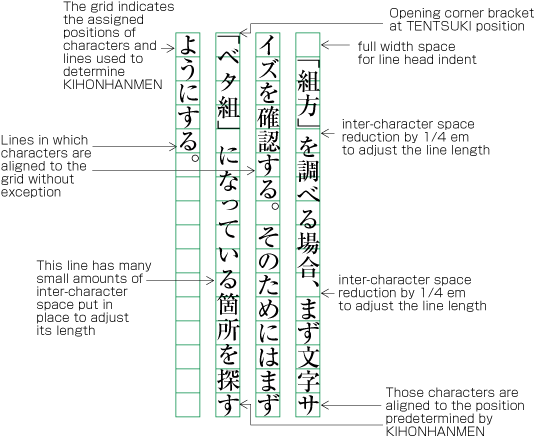
There are several methods for positioning brackets at the head of line feed lines or lines after the first line of a paragraph
(details are explained in sec. 2.1.5 "Positioning of Brackets at Line Head".). In cases where the indentation of line feed
lines is full width, or if the TENTSUKI position is used for the bracket (that is, there is no space at the line head), the
second character will be in a position which is not given via KIHONHANMEN (see Fig. A1-14). However, since adaptation processing for the unification of line lengths is applied, the characters at the end of the line
are at positions which are in accordance with the positions given via KIHONHANMEN.
-
Sec. 2 explains that punctuation marks and brackets are half width. If these punctuation marks and brackets are in continuation
with Kanji or Kana characters, in principle there is a 1/2 em space before or after the punctuation mark or brackets, so that
these are made in effect a full width size. However, if they are in continuation with other punctuation marks or brackets,
the 1/2 em space is not used. In such cases, the character positions are different than the positions given via KIHONHANMEN
(see Fig. A1-15). The purpose is to improve the visual appearance.
-
Sec. 2 explains the principle that closing brackets and punctuation marks must not be placed at the line head (so-called line
head wrap). If these characters appear at the line head, some kind of adaptation processing becomes necessary. As a result
of such adaptation processing, it may happen that characters are placed at positions which are different than the positions
given via KIHONHANMEN.
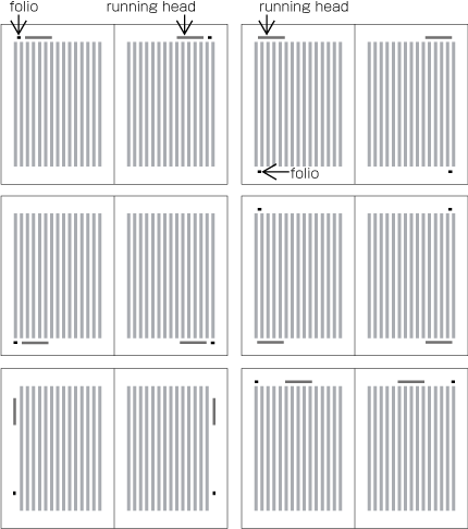
Typical positioning of running heads and folios in vertical composition is as shown in Fig. 1-28.
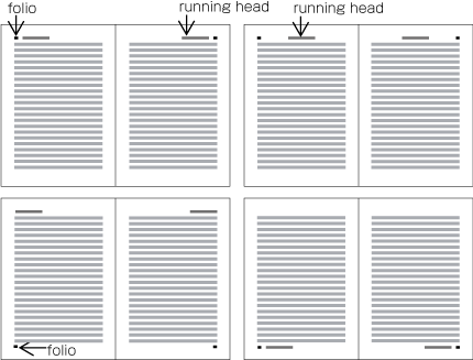
Typical positioning of running heads and folios in horizontal composition is as shown in Fig. 1-29.
In principle, positions of running heads and folios should be specified with relative positions to KIHONHANMEN, not with the
absolute coordinates in the trim size (Position of running heads are defined in JIS X 4051, sec. 7.6.4. Positions of folios are defined in JIS X 4051, sec. 7.5.4.).
|
(Example)
|
Positioning a running head above the top left corner ( to Head and Fore-edge) of KIHONHANMEN in vertical composition (See Fig. 1-30)
9 points above KIHONHANMEN (vertical space)
9 points from the left edge of KIHONHANMEN (horizontal space)
|
The following are those that should be taken into account in positioning running heads and folios with reference to KIHONHANMEN.
-
When positioning running heads and folios horizontally with reference to KIHONHANMEN in vertical composition, the amount of
vertical space is full width of character size in KIHONHANMEN. If KIHONHANMEN is horizontally set, make more vertical space
than the character size in KIHONHANMEN.
-
Regardless of direction of text in KIHONHANMEN, running heads and folios in horizontal composition on the left page should
be aligned either at the left edge of KIHONHANMEN or at the full width horizontal space off to the right from the left edge.
On the right page, the tail of the running heads or folios be aligned either at the right edge of KIHONHANMEN or at the full
width space off from the right edge.
-
When arranging a running head and a folio together horizontally, space between the running head and the folio should be double
or one and a half time of the character size for the running head.
-
When positioning running heads and folios vertically to the edge with reference to KIHONHANMEN in vertical composition (See
the bottom left spread in Fig. 1-28 for example) the minimum horizontal space should be the same amount as that of the line-gap of KIHONHANMEN. The start of
the running head should be placed with a space as large as around four times of the character size of KIHONHANMEN below off
the head, and with a space as large as around the five times above off the foot.
|
(note 1)
|
In general, Ideographic numerals are used for vertically set folios, and Arabic numerals for horizontal pagination. When giving Different pagination on the Front matter, small Roman Numerals are used for the horizontal pagination.
|
Positioning of all running heads and folios in the same book should be consistent.
|
(note 1)
|
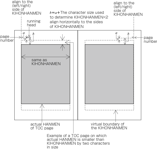
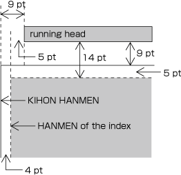
Even on a page with text area smaller than KIHONHANMEN in size such as for Table of contents or Index, positioning of running head and folio shall be the same. In other words, the positioning of running heads and folios with
reference to those areas smaller than KIHONHANMEN in size shall be changed. The following Figure A1-17 demonstrates the relations of the HANMEN for table of contents and running heads or folios. As shown in Figure A1-3, this HANMEN is smaller than KIHONHANMEN. Figure A1-31 demonstrates the relations of positions of running heads and folios for the HANMEN of indices. These HANMEN are not only
4 point smaller at the left and right, but also 5 point smaller at the top and bottom.
|
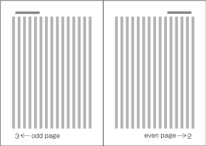
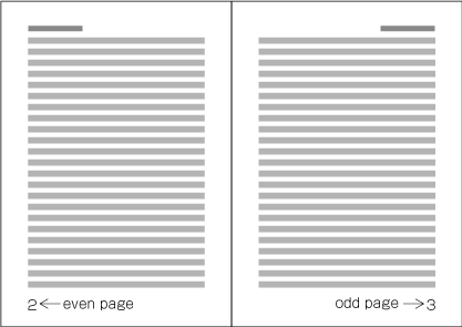
Because the start of page shall be on the recto side, the right-hand page of a Spread in vertical composition is always even page and the left-hand page is always odd page (See Fig. 1-32). Likewise, the left-hand page of a spread in horizontal composition is always even page and the right-hand page is always
odd page (See Fig. 1-33).
There are two methods to arrange running heads (Arrangement of running heads is defined in JIS X 4051, sec. 7.6.2. Folios are defined in sec. 7.5.2.).
|
(note 1)
|
In general, there will be only one running head per page. However there are some cases like dictionaries where multiple running
heads are printed to show contents.
|
|
(note 2)
|
In general, there will be only one folio per page. However there are some cases where multiple folios are printed as in the
following examples:
-
When placing horizontally set Index and/or Bibliography at the end of a volume in vertical composition, Reversal Pagination and Continuous pagination will be printed.
-
For Multivolume Work, serial Folios throughout the work and folios per volume will be printed.
|
-
In double running head scheme, main Headings with high-level title of contents or the title of book are printed on the even pages, and on odd pages the heading subordinate
to the main title or the heading one level below the heading from the even page is is printed. On pages with no subheadings
like pages for a table of contents, the same running heads are printed on both even and odd pages.
|
(note 1)
|
It depends on the content of a book what is printed in running heads. The main purpose of running heads is to help readers
to find what is written on each page, or to understand the content of the current page. For this purpose, it does not make
much sense to print the name of the book within the running head. The most common approach for headings with three levels
is to print the largest heading and the heading on the next level.
|
-
In single running head scheme, either of the above is selected and printed.
-
In principle, the contents of running heads will be the same as those of headings with the following differences;
-
Numbers and words in alphanumeric characters in vertically set headings should be changed to horizontal notation for horizontally
set running heads.
-
If headings are too long, make them shorter by paraphrasing them in fewer characters. Running heads with too many characters
will not give a good appearance.
-
For certain publications like a collection of monographs, the name of authors may be added at the end of headings in Parenthesis.
-
In principle, text direction of running heads and folios should be the same as that of KIHONHANMEN. In case of vertical composition,
however, it is more common to set running heads and folios horizontally.
-
In principle, running heads are printed on all odd pages in single running head scheme, and on all even and odd pages in double
running head scheme. However, for the sake of appearance, they may be omitted on pages like the following.
-
Pages on which running heads should be hidden
-
Divisional title and Simplified divisional title
-
A page where a running head overlaps with other elements like figures
-
A Blank page
-
Pages on which running heads may be hidden
-
A page where a figure or a table is positioned adjacent to the running head
-
A page with a heading right after new recto or new page
-
In principle, folios are printed on all pages. However, for the sake of appearance, they may be omitted on pages with the
following conditions.
-
Pages on which folios should be hidden
-
A page on which a figure or a table is positioned adjacent to the folio
-
A blank page
-
Pages on which folios may be hidden
-
Divisional title and simplified divisional title
-
A page in horizontal composition with a folio placed on the margin to the head and with a heading right after new recto or new page (In this case, there is also the method of moving the folios to the foot center.).
|
(note 1)
|
Cases in which there are pages which are not counted are for example as follows.
-
if the main title page is the enclosure;
-
if a frontispiece is inserted in the opening page of a book; or
-
if an illustration of the enclosure or a divisional title is inserted in the main text.
|
-
There are two types of folios. "Serial pagination" means that folios are continued through one complete book. "Different pagination"
means that folios are started from "1" separatley at the front matter and back matter. Also, for example in manuals, there
is also the method of starting from folio "1" for each chapter (In these cases, it is common that before the folio, the name
of the chapter is added as a prefix.).
|
(note 1)
|
If the front matter and the main text have different folios, each is starting with folio "1". In this case, it is common to
use Roman numerals for the front matter, in order to distinguish it from the main text.
|
|
(note 2)
|
For books in vertical setting with indices in horizontal setting, the following methods are available.
-
So-called reversal pagination. The index in horizontal setting is starting at the end of the book, and folios are added starting
with "1" in reverse order (viewed from the flow of the book).
-
So-called serial pagination. The index in horizontal setting is starting at the end of the book, and folios are added starting
with "1" in the same order as the flow of the book.
-
Usage of both reversal and serial pagination. In these cases, the folios of serial pagination are in the same position as
the folios of the main text, and folios in reversal pagination are in a different position (for example, if serial pagination
is at the foot, reversal pagination is at the head). Often methods to distinct the different paginations are applied, like
using Arabic numbers like for the main text, but adding brackets before and after.
|