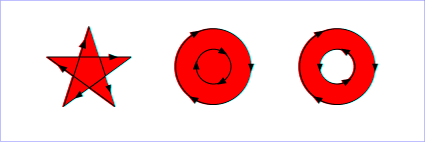
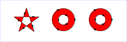
Graphics elements, including text content elements and shapes, can be filled (which means painting the interior of the object) and stroked (which means painting along the outline of the object). Filling and stroking both can be thought of in more general terms as painting operations.
With SVG, you can paint (i.e., fill or stroke) with:
SVG uses the general notion of a paint server. Apart from System Paint, paint servers are specified using a local IRI reference on a 'fill' or 'stroke' property. Gradients and colors are just specific types of paint servers.
Properties 'fill' and 'stroke' take on a value of type <paint>, which is specified as follows:
| <paint>: |
none | currentColor | <color> | <FuncIRI> [ none | currentColor | <color>] | <system paint> | inherit |
| Value: | <paint> | inherit (See Specifying paint) |
| Initial: | black |
| Applies to: | shapes and text content elements |
| Inherited: | yes |
| Percentages: | N/A |
| Media: | visual |
| Animatable: | yes |
| Computed value: | "none", system paint, specified <color> value or absolute IRI |
The 'fill' property specifies that the interior of the given graphical element must be painted. The area to be painted shall consist of any areas inside the outline of the shape. To determine the inside of the shape, all subpaths must be considered, and the interior shall be determined according to the rules associated with the current value of the 'fill-rule' property. The zero-width geometric outline of a shape must be included in the area to be painted.
Open subpaths must be filled by performing the fill operation as if an additional "closepath" command were added to the path to connect the last point of the subpath with the first point of the subpath. Thus, fill operations apply to both open subpaths within 'path' elements (i.e., subpaths without a closepath command) and 'polyline' elements.
| Value: | nonzero | evenodd | inherit |
| Initial: | nonzero |
| Applies to: | shapes and text content elements |
| Inherited: | yes |
| Percentages: | N/A |
| Media: | visual |
| Animatable: | yes |
| Computed value: | Specified value, except inherit |
The 'fill-rule' property indicates the algorithm which must be used to determine what parts of the canvas are included inside the shape. For a simple, non-intersecting path, it is intuitively clear what region lies "inside"; however, for a more complex path, such as a path that intersects itself or where one subpath encloses another, the interpretation of "inside" is not so obvious.
The 'fill-rule' property provides two options for how the inside of a shape is determined:


(Note: the above explanations do not specify what to do if a path segment coincides with or is tangent to the ray. Since any ray will do, one may simply choose a different ray that does not have such problem intersections.)
| Value: | <opacity-value> | inherit |
| Initial: | 1 |
| Applies to: | shapes and text content elements |
| Inherited: | yes |
| Percentages: | N/A |
| Media: | visual |
| Animatable: | yes |
| Computed value: | Specified value, except inherit |
'fill-opacity' specifies the opacity of the painting operation which shall be used to paint the interior the current object. (See Painting shapes and text.)
Related property: 'stroke-opacity'.
The following are the properties which affect how an element is stroked.
In all cases, strokes which are affected by directionality, such as those having dash patterns, must be rendered such that the stroke operation starts at the same point at which the graphics element starts. In particular, for 'path' elements, the start of the path is the first point of the initial "moveto" command.
For strokes, such as dash patterns whose computations are dependent on progress along the outline of the graphics element, distance calculations must use the SVG user agent's standard Distance along a path algorithms.
When stroking is performed using a complex paint server, such as a gradient, the stroke operation must be identical to the result that would have occurred if the geometric shape defined by the geometry of the current graphics element and its associated stroking properties were converted to an equivalent 'path' element and then filled using the given paint server.
| Value: | <paint> | inherit (See Specifying paint) |
| Initial: | none |
| Applies to: | shapes and text content elements |
| Inherited: | yes |
| Percentages: | N/A |
| Media: | visual |
| Animatable: | yes |
| Computed value: | "none", system paint, specified <color> value or absolute IRI |
The 'stroke' property shall paint along the outline of the given graphics element.
A subpath (see Paths) consisting of a single moveto shall not be stroked. A subpath consisting of a moveto and lineto to the same exact location or a subpath consisting of a moveto and a closepath shall not be stroked if the 'stroke-linecap' property has a value of butt and shall be stroked if the 'stroke-linecap' property has a value of round or square, producing respectively a circle or a square centered at the given point.
This property contributes to an element's decorated bounding box.
| Value: | <length> | inherit |
| Initial: | 1 |
| Applies to: | shapes and text content elements |
| Inherited: | yes |
| Percentages: | N/A |
| Media: | visual |
| Animatable: | yes |
| Computed value: | Specified value, except inherit |
This property contributes to an element's decorated bounding box.
| Value: | butt | round | square | inherit |
| Initial: | butt |
| Applies to: | shapes and text content elements |
| Inherited: | yes |
| Percentages: | N/A |
| Media: | visual |
| Animatable: | yes |
| Computed value: | Specified value, except inherit |
'stroke-linecap' specifies the shape which shall be used at the end of open subpaths when they are stroked.

View this example as SVG (SVG-enabled browsers
only)
This property contributes to an element's decorated bounding box.
| Value: | miter | round | bevel | inherit |
| Initial: | miter |
| Applies to: | shapes and text content elements |
| Inherited: | yes |
| Percentages: | N/A |
| Media: | visual |
| Animatable: | yes |
| Computed value: | Specified value, except inherit |
'stroke-linejoin' specifies the shape which shall be used at the corners of shapes when they are stroked.

View this example as SVG (SVG-enabled browsers
only)
This property contributes to an element's decorated bounding box.
| Value: | <miterlimit> | inherit |
| Initial: | 4 |
| Applies to: | shapes and text content elements |
| Inherited: | yes |
| Percentages: | N/A |
| Media: | visual |
| Animatable: | yes |
| Computed value: | Specified value, except inherit |
When two line segments meet at a sharp angle and miter joins have been specified for 'stroke-linejoin', it is possible for the miter to extend far beyond the thickness of the line stroking the path. The 'stroke-miterlimit' imposes a limit on the ratio of the miter length to the 'stroke-width'. When the limit is exceeded, the join must be converted from a miter to a bevel.
The ratio of miter length (distance between the outer tip and the inner corner of the miter) to 'stroke-width' is directly related to the angle (theta) between the segments in user space by the formula:
miterLimit = miterLength / stroke-width = 1 / sin ( theta / 2 )
For example, a miter limit of 1.414 converts miters to bevels for theta less than 90 degrees, a limit of 4.0 converts them for theta less than approximately 29 degrees, and a limit of 10.0 converts them for theta less than approximately 11.5 degrees.
This property contributes to an element's decorated bounding box.
| Value: | none | <list-of-lengths> | inherit |
| Initial: | none |
| Applies to: | shapes and text content elements |
| Inherited: | yes |
| Percentages: | N/A |
| Media: | visual |
| Animatable: | yes (non-additive) |
| Computed value: | Specified value, except inherit |
'stroke-dasharray' specifies the pattern of dashes and gaps that shall be used to stroke paths. The <list-of-lengths> contains the list of <length>s that specify the lengths of alternating dashes and gaps that must be used. If an odd number of values is provided, then the list of values shall be repeated to yield an even number of values. Thus, stroke-dasharray="5,3,2" is equivalent to stroke-dasharray="5,3,2,5,3,2". The computed value of the attribute stroke-linecap is applied to both sides of each dash. If a dash has zero length, linecaps are still added if the stroke-linecap values round and square are used.
Note: Certain cases regarding the behavior of stroke-dasharray are not fully specified because SVG Tiny implementations often rely on underlying graphics libraries with predetermined behaviors they cannot easily change. Examples include: rendering of stroke-linejoin and stroke-linecap in case a dash ends exactly at a corner of two path segments, continuation of stroke-dasharray in subpaths, and others. These cases may be fully specified in version SVG 1.2 Full. Additional attributes, such as dash-caps that can be defined separately from linecaps may be added. Authors are encouraged not to rely on a specific behavior of a specific viewer for stroke-dasharray regarding these currently unspecified cases.
| Value: | <length> | inherit |
| Initial: | 0 |
| Applies to: | shapes and text content elements |
| Inherited: | yes |
| Percentages: | N/A |
| Media: | visual |
| Animatable: | yes |
| Computed value: | Specified value, except inherit |
'stroke-dashoffset' specifies the distance into the dash pattern that must be used to start the dash. When rendering a <path /> element with multiple subpaths, the value of stroke-dashoffset should start from scratch with the original value of stroke-dashoffset for each subpath. SVG 1.2 Full may be stricter and also add an additional attribute to change this behavior.
| Value: | <opacity-value> | inherit |
| Initial: | 1 |
| Applies to: | shapes and text content elements |
| Inherited: | yes |
| Percentages: | N/A |
| Media: | visual |
| Animatable: | yes |
| Computed value: | Specified value, except inherit |
'stroke-opacity' specifies the opacity of the painting operation used to stroke the current object. (See Painting shapes and text.)
Related property: 'fill-opacity'.
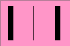
Sometimes it is of interest to let the outline of an object keep its original width no
matter which transforms are applied to it. E.g. in a map with a 2px wide line representing
roads it is of interest to keep the roads 2px wide even when the user zooms into the
map.
To achieve this SVGT1.2 introduces the 'vector-effect' property. Future versions of the SVG language will allow for more powerful vector
effects through this property but this version restricts it to the non-scaling stroke.
| Value: | non-scaling-stroke | none | inherit |
| Initial: | none |
| Applies to: | graphics elements |
| Inherited: | no |
| Percentages: | N/A |
| Media: | visual |
| Animatable: | yes |
| Computed value: | Specified value, except inherit |
Note: Future versions of SVG may allow ways to control host coordinate system.
Below is an example of a non-scaling-stroke 'vector-effect'.
<?xml version="1.0"?>
<svg width="6cm" height="4cm" viewBox="0 0 600 400" version="1.2" baseProfile="tiny"
     xmlns="http://www.w3.org/2000/svg" viewport-fill="rgb(255,150,200)">
  <desc>Example non-scaling stroke</desc>
  <rect x="1" y="1" width="598" height="398" fill="none" stroke="black" />

  <g transform="scale(9,1)">
    <line stroke="black" stroke-width="5" x1="10" y1="50" x2="10" y2="350"/>
    <line vector-effect="non-scaling-stroke" stroke="black" stroke-width="5"
        x1="32" y1="50" x2="32" y2="350"/>
    <line vector-effect="none" stroke="black" stroke-width="5"
        x1="55" y1="50" x2="55" y2="350"/>
  </g>

</svg>
Graphics elements are blended into the elements already rendered on the canvas using simple alpha compositing, in which the resulting color and opacity at any given pixel on the canvas must be the result of the following formulas (all color values use premultiplied alpha):
Er, Eg, Eb    - Element color value
     Ea            - Element alpha value
     Cr, Cg, Cb    - Canvas color value (before blending)
     Ca            - Canvas alpha value (before blending)
     Cr', Cg', Cb' - Canvas color value (after blending)
     Ca'           - Canvas alpha value (after blending)
     Ca' = 1 - (1 - Ea) * (1 - Ca)
     Cr' = (1 - Ea) * Cr + Er
     Cg' = (1 - Ea) * Cg + Eg
     Cb' = (1 - Ea) * Cb + Eb
The following rendering properties, which provide information about the color space in which to perform the compositing operations, apply to compositing operation:
The currentColor value may be assigned a color value that has an opacity component. This opacity value is used in the rendering operation using the alpha compositing method described above. That is, the opacity value in currentColor is used when compositing the color into a paint server (which may have its own values for opacity).
SVG enables the author to specify a solid color which will be used to fill the viewport of any element that creates a viewport, such as the 'svg' element.
The 'viewport-fill' property specifies the color which shall be used to fill the viewport created by a particular element. It must cause the entire canvas of the element that it applies to to be filled with the specified solid color. That canvas may then be clipped by that element's 'viewBox'.
| Value: | none | currentColor | <color> | inherit |
| Initial: | none |
| Applies to: | viewport-creating elements |
| Inherited: | no |
| Percentages: | N/A |
| Media: | visual |
| Animatable: | yes |
| Computed value: | "none" or specified <color> value, except inherit |
If the value of 'viewport-fill' is "none", then no paint operation is applied to the viewport.
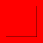
Below is an example of 'viewport-fill'.
<?xml version="1.0"?>
<svg xmlns="http://www.w3.org/2000/svg" version="1.2"
      viewport-fill="red" baseProfile="tiny">
      <desc>
      Everything here has a red background.
      The rectangle is not filled, so the red background will show through
      </desc>
      <rect x="20" y="20" width="100" height="100" fill="none" stroke="black"/>
</svg>
Here is a slightly more complex example. The 'viewBox' gives a coordinate system 300 units wide and 100 units high. The rendering shows what happens when this is displayed inside a square viewport.
<?xml version="1.0"?>
<svg xmlns="http://www.w3.org/2000/svg" version="1.2"
      viewport-fill="yellow" baseProfile="tiny" viewBox="0 0 300 100">
      <desc>
      The viewport has a yellow background.
      The rectangle is  filled and covers the viewport, so the yellow
       background will only show through in the "leftovers" if the
       aspect ratio of the viewport differs from that of the viewBox.
      </desc>
      <rect x="0" y="0" width="300" height="100" fill="red" fill-opacity="0.3" stroke="black"/>
</svg>

The filling of the viewport is the first operation in the rendering chain of an element. Therefore:
The 'viewport-fill-opacity' property specifies the opacity of the 'viewport-fill' that shall be used for a particular element.
| Value: | <opacity-value> | inherit |
| Initial: | 1.0 |
| Applies to: | viewport-creating elements |
| Inherited: | no |
| Percentages: | N/A |
| Media: | visual |
| Animatable: | yes |
| Computed value: | Specified value, except inherit |
SVG uses two properties, 'display' and 'visibility', to control the rendering of graphics elements or (in the case of the 'display' property) container elements. Neither of these two properties affects the objects existence in the DOM, i.e. no matter what value of these properties the object still remains in the DOM.
The differences between the two properties are as follows:
| Value: | inline | block | list-item | run-in | compact | marker | table | inline-table | table-row-group | table-header-group | table-footer-group | table-row | table-column-group | table-column | table-cell | table-caption | none | inherit |
| Initial: | inline |
| Applies to: | 'svg', 'g', 'switch', 'a', 'foreignObject', graphics elements (including the text content block elements) and text sub-elements (e.g., 'tspan' and 'a') |
| Inherited: | no |
| Percentages: | N/A |
| Media: | all |
| Animatable: | yes |
| Computed value: | Specified value, except inherit |
A value of display="none" indicates that the given element and its children shall not be rendered directly (i.e., those elements are not present in the rendering tree). Any computed value other than none indicates that the given element shall be rendered by the SVG user agent.
The 'display' property only affects the direct rendering of a given element, whereas it does not prevent elements from being referenced by other elements.
Elements with display="none" do not take up space in text layout operations, do not receive events and do not contribute to bounding box calculations.
Except for any additional information provided in this specification, the normative definition is the CSS2 definition of the 'display' property.
| Value: | visible | hidden | collapse | inherit |
| Initial: | visible |
| Applies to: | graphics elements (including the text content block elements) and text sub-elements (e.g., 'tspan' and 'a') |
| Inherited: | yes |
| Percentages: | N/A |
| Media: | visual |
| Animatable: | yes |
| Computed value: | Specified value, except inherit |
Note that if the 'visibility' property is set to hidden on a 'tspan' element, then the text is invisible but shall still takes up space in text layout calculations.
Depending on the value of property 'pointer-events', graphics elements which have their 'visibility' property set to hidden still might receive events.
Except for any additional information provided in this specification, the normative definition is the CSS2 definition of the 'visibility' property.
The creator of SVG content might want to provide a hint to the implementation about how to make speed vs. quality tradeoffs as it performs color interpolation and compositing. The 'color-rendering' property provides a hint to the SVG user agent about how to optimize its color interpolation and compositing operations.
| Value: | auto | optimizeSpeed | optimizeQuality | inherit |
| Initial: | auto |
| Applies to: | container elements, graphics elements and 'animateColor' |
| Inherited: | yes |
| Percentages: | N/A |
| Media: | visual |
| Animatable: | yes |
| Computed value: | Specified value, except inherit |
The creator of SVG content might want to provide a hint to the implementation about what tradeoffs to make as it renders vector graphics elements such as 'path' elements and basic shapes such as circles and rectangles. The 'shape-rendering' property provides these hints.
| Value: | auto | optimizeSpeed | crispEdges | geometricPrecision | inherit |
| Initial: | auto |
| Applies to: | shapes |
| Inherited: | yes |
| Percentages: | N/A |
| Media: | visual |
| Animatable: | yes |
| Computed value: | Specified value, except inherit |
The creator of SVG content might want to provide a hint to the implementation about what tradeoffs to make as it renders text. The 'text-rendering' property provides these hints.
| Value: | auto | optimizeSpeed | optimizeLegibility | geometricPrecision | inherit |
| Initial: | auto |
| Applies to: | text content block elements |
| Inherited: | yes |
| Percentages: | N/A |
| Media: | visual |
| Animatable: | yes |
| Computed value: | Specified value, except inherit |
The creator of SVG content might want to provide a hint to the implementation about how to make speed vs. quality tradeoffs as it performs image processing. The 'image-rendering' property provides a hint to the SVG user agent about how to optimize its image rendering.:
| Value: | auto | optimizeSpeed | optimizeQuality | inherit |
| Initial: | auto |
| Applies to: | images |
| Inherited: | yes |
| Percentages: | N/A |
| Media: | visual |
| Animatable: | yes |
| Computed value: | Specified value, except inherit |
In all cases, resampling must be done in a truecolor (e.g., 24-bit) color space even if the original data and/or the target device is indexed color.
The creator of SVG content might want to provide a hint to the implementation about how often an element is modified to make speed vs. memory tradeoffs as it performs rendering. The 'buffered-rendering' property provides a hint to the SVG user agent about how to buffer the rendering of elements.:
| Value: | auto | dynamic | static |
| Initial: | auto |
| Applies to: | container elements and graphics elements |
| Inherited: | no |
| Percentages: | N/A |
| Media: | visual |
| Animatable: | yes |
| Computed value: | Specified value |
The values of any of the painting properties described in this chapter can be inherited from a given object's parent. Painting, however, is always done on each graphics element individually, never at the container element (e.g., a 'g') level. Thus, for the following SVG, even though the gradient fill is specified on the 'g', the gradient is simply inherited through the 'g' element down into each rectangle, each of which is rendered such that its interior is painted with the gradient.
Example Inheritance
<?xml version="1.0"?>
<svg width="7cm" height="2cm" viewBox="0 0 700 200"
     xmlns="http://www.w3.org/2000/svg" version="1.2" baseProfile="tiny">
  <desc>Gradients apply to leaf nodes
  </desc>
  <g>
    <defs>
      <linearGradient xml:id="MyGradient" gradientUnits="objectBoundingBox">
        <stop offset="0" stop-color="#F60" />
        <stop offset="1" stop-color="#FF6" />
      </linearGradient>
    </defs>
    <rect x="1" y="1" width="698" height="198"
          fill="none" stroke="blue" stroke-width="2" />
    <g fill="url(#MyGradient)" >
      <rect x="100" y="50" width="200" height="100"/>
      <rect x="400" y="50" width="200" height="100"/>
   </g>
  </g>
</svg>

Any painting properties defined in terms of the object's bounding box use the bounding box of the graphics element to which the operation applies. Note that text elements are
defined such that any painting operations defined in terms of the object's bounding box use the bounding box
of the entire 'text' element. (See the discussion of object bounding box units and text elements.)
There are several opacity properties within SVG:
Except for object/group opacity (described just below), all other opacity properties are involved in intermediate rendering operations. Object/group opacity can be thought of conceptually as a postprocessing operation. Conceptually, after the object/group is rendered into an RGBA offscreen image, the object/group opacity setting specifies how to blend the offscreen image into the current background.
Object/group opacity can, if applied to container elements, be a resource intensive operation. Therefore this version of SVG restricts this property to only be set on, and only apply to, the 'image' element. Note: if the value is set to 'inherit', then the initial value of 1 for the opacity property will be used, meaning full opacity. This is the same as not specifying it at all.
| Value: | <opacity-value> | inherit |
| Initial: | 1 |
| Applies to: | 'image' element |
| Inherited: | no |
| Percentages: | N/A |
| Media: | visual |
| Animatable: | yes |
| Computed value: | Specified value, except inherit |
Below is an example of 'opacity' which illustrates the difference in behavior between SVG Basic/Full 1.1 and SVG Tiny 1.2.
<?xml version="1.0" encoding="UTF-8"?>
<svg version="1.2" baseProfile="tiny" xml:id="svg-root" width="100%" height="100%"
  viewBox="0 0 480 360" xmlns="http://www.w3.org/2000/svg" xmlns:ev="http://www.w3.org/2001/xml-events"
  xmlns:xlink="http://www.w3.org/1999/xlink">
  <!--======================================================================-->
  <!--=  Copyright 2007 World Wide Web Consortium, (Massachusetts          =-->
  <!--=  Institute of Technology, European Research Consortium for         =-->
  <!--=  Informatics and Mathematics (ERCIM), Keio University).            =-->
  <!--=  All Rights Reserved.                                              =-->
  <!--=  See http://www.w3.org/Consortium/Legal/.                          =-->
  <!--======================================================================-->
  <metadata>
      <p>
        This test shows the differences in opacity-handling between SVG Tiny 1.2 and SVG Full 1.1.
      </p>
	  <p>
		The test has passed if the leftmost column looks like either of the other two columns.
		SVG Tiny 1.2 requires only what is portrayed by the middle column, but does not require
		user agents that implement both SVG 1.1 and 1.2 Tiny to follow the more limited
		opacity-handling in 1.2 Tiny.
	  </p>
	  <p>
		In SVG Tiny 1.2 the opacity property is only allowed on the image element itself.
		If it's encountered anywhere else it must be treated as an unsupported value.

		NOTE: This test is not valid 1.2 Tiny because it's using opacity on something
		other than the image element.
	  </p>
</metadata>
  <title xml:id="test-title">$RCSfile: painting.html,v $</title>
  <defs>
    <font-face
      font-family="SVGFreeSansASCII"
      unicode-range="U+0-7F">
      <font-face-src>
        <font-face-uri xlink:href="SVGFreeSans.svg#ascii"/>
      </font-face-src>
    </font-face>
  </defs>
  <g xml:id="test-body-content" font-family="SVGFreeSansASCII,sans-serif" font-size="18">

	<text x="240" y="70" text-anchor="middle" font-size="32">Test opacity</text>

	<g id="test" transform="translate(-100 0)">
		<text x="240" y="120" text-anchor="middle">Test</text>
		<text x="240" y="130" text-anchor="middle" font-size="9">Mouseover to compare</text>
		<rect id="r1" x="200" y="135" height="20" width="80" fill="green"/>
		<rect id="r2" x="200" y="160" height="20" width="80" fill="green"/>
		<rect id="r3" x="200" y="185" height="20" width="80" fill="green"/>
		<rect id="r4" x="200" y="210" height="20" width="80" fill="green"/>

		<g pointer-events="none">
			<image width="460" height="20" x="10" y="135" xlink:href="1pixelwhite.png" preserveAspectRatio="none" opacity="0.25"/>
			<g opacity="0.5">
				<image width="460" height="20" x="10" y="160" xlink:href="1pixelwhite.png" preserveAspectRatio="none" opacity="0.5"/>
				<rect id="r5" x="200" y="185" height="20" width="80" fill="white" opacity="0.5"/>

			</g>
			<g opacity="0.75">
				<g opacity="inherit">
					<image width="460" height="20" x="10" y="210" xlink:href="1pixelwhite.png" preserveAspectRatio="none" opacity="inherit"/>
				</g>
			</g>
		</g>

		<ev:listener event="mouseover" observer="r1" handler="#handler"/>
		<ev:listener event="mouseout" observer="r1" handler="#handler"/>
		<ev:listener event="mouseover" observer="r2" handler="#handler"/>
		<ev:listener event="mouseout" observer="r2" handler="#handler"/>
		<ev:listener event="mouseover" observer="r3" handler="#handler"/>
		<ev:listener event="mouseout" observer="r3" handler="#handler"/>
		<ev:listener event="mouseover" observer="r4" handler="#handler"/>
		<ev:listener event="mouseout" observer="r4" handler="#handler"/>
		<handler id="handler">
			if(event.type == "mouseover")
			{
				event.target.setFloatTrait("width", 280);
				if(event.target.id == "r3")
					document.getElementById("r5").setFloatTrait("width", 280);
			}
			else
			{
				event.target.setFloatTrait("width", 80);
				if(event.target.id == "r3")
					document.getElementById("r5").setFloatTrait("width", 80);
			}
		</handler>
	</g>

	<g id="tiny12reference">
		<text x="240" y="120" text-anchor="middle">Tiny 1.2 ref</text>
		<rect x="200" y="135" height="20" width="80" fill="green"/>
		<rect x="200" y="160" height="20" width="80" fill="green"/>
		<rect x="200" y="185" height="20" width="80" fill="green"/>
		<rect x="200" y="210" height="20" width="80" fill="green"/>
		<rect x="200" y="135" height="20" width="80" fill="white" fill-opacity="0.25"/>
		<rect x="200" y="160" height="20" width="80" fill="white" fill-opacity="0.5"/>
		<rect x="200" y="185" height="20" width="80" fill="white" fill-opacity="1"/>
		<rect x="200" y="210" height="20" width="80" fill="white" fill-opacity="1"/>
	</g>

	<g id="full11reference" transform="translate(100 0)">
		<text x="240" y="120" text-anchor="middle">Full 1.1 ref</text>
		<rect x="200" y="135" height="20" width="80" fill="green"/>
		<rect x="200" y="160" height="20" width="80" fill="green"/>
		<rect x="200" y="185" height="20" width="80" fill="green"/>
		<rect x="200" y="210" height="20" width="80" fill="green"/>
		<rect x="200" y="135" height="20" width="80" fill="white" fill-opacity="0.25"/>
		<rect x="200" y="160" height="20" width="80" fill="white" fill-opacity="0.25"/>
		<rect x="200" y="185" height="20" width="80" fill="white" fill-opacity="0.25"/>
		<rect x="200" y="210" height="20" width="80" fill="white" fill-opacity="0.421875"/>
	</g>

  </g>
  <g font-family="SVGFreeSansASCII,sans-serif" font-size="32">
  <text xml:id="revision" x="10" y="340" stroke="none"
    fill="black">$Revision: 1.3 $</text>
  </g>
  <rect xml:id="test-frame" x="1" y="1" width="478" height="358" fill="none" stroke="#000"/>
</svg>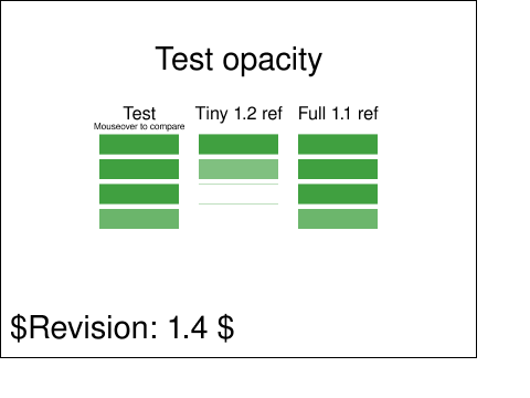
In SVG Tiny 1.2, all colors are specified in the sRGB color space (see [SRGB]). SVG Tiny 1.2 user agents are not required to, but may, support color management. However, SVG Tiny 1.2 user agents should apply gamma correction if the response curve of the display system differs from that of sRGB
Five syntactical forms are specified for SVG Tiny 1.2 All of them must be supported in a conforming SVG Interpreter:
|
|
black | rgb( 0, 0, 0) |
|
green | rgb( 0, 128, 0) |
|
|
silver | rgb(192, 192, 192) |
|
lime | rgb( 0, 255, 0) |
|
|
gray | rgb(128, 128, 128) |
|
olive | rgb(128, 128, 0) |
|
|
white | rgb(255, 255, 255) |
|
yellow | rgb(255, 255, 0) |
|
|
maroon | rgb(128, 0, 0) |
|
navy | rgb( 0, 0, 128) |
|
|
red | rgb(255, 0, 0) |
|
blue | rgb( 0, 0, 255) |
|
|
purple | rgb(128, 0, 128) |
|
teal | rgb( 0, 128, 128) |
|
|
fuchsia | rgb(255, 0, 255) |
|
aqua | rgb( 0, 255, 255) |
With SVG, you can fill (i.e., paint the interior) or stroke (i.e., paint the outline) of shapes and text using one of the following:
SVG uses the general notion of a paint server. Gradients and patterns are just specific types of built-in paint servers. The 'solidColor' element is another built-in paint server, described in Color.
Apart from System Paint, paint servers are referenced using an Local IRI reference on a 'fill' or 'stroke' property.
The following list of System Paint Servers must be supported. If a paint specification specifies one of the System Paint Servers, then the user agent must either paint using a system-provided paint server or paint with a substitute paint server, such as a color or gradient. System paint servers often depend on the operating system, user choices, and the implementation. Substitute paint servers should attempt to match the appearance of corresponding user interface elements on the platform, including user color choices. In environments which do not provide adequate system paint server APIs, a conformant user agent may use substitute paint servers which do not necessarily match the environment's system paint servers.
The computed value of a paint specified as a System Paint is the specified value.
The 'solidColor' element is a paint server that provides a single color with opacity. It can be referenced like the other paint servers (i.e. gradients).
    <define name='solidColor'>
      <element name='solidColor'>
        <ref name='solidColor.AT'/>
        <ref name='solidColor.CM'/>
      </element>
    </define>

    <define name='solidColor.CM'>
      <zeroOrMore>
        <choice>
          <ref name='svg.Desc.group'/>
          <ref name='svg.Animate.group'/>
          <ref name='svg.Handler.group'/>
          <ref name='svg.Discard.group'/>
        </choice>
      </zeroOrMore>
    </define>

    <define name='solidColor.AT' combine='interleave'>
      <ref name='svg.Properties.attr'/>
      <ref name='svg.Core.attr'/>
    </define>
The 'solid-color' property specifies the color that shall be used for this 'solidColor' element. The keyword currentColor can be specified in the same manner as within a <paint> specification for the 'fill' and 'stroke' properties.
| Value: | currentColor | <color> | inherit |
| Initial: | black |
| Applies to: | 'solidColor' elements |
| Inherited: | no |
| Percentages: | N/A |
| Media: | visual |
| Animatable: | yes |
| Computed value: | Specified <color> value, except inherit |
The 'solid-opacity' property defines the opacity of the 'solidColor'.
| Value: | <opacity-value> | inherit |
| Initial: | 1 |
| Applies to: | 'solidColor' elements |
| Inherited: | no |
| Percentages: | N/A |
| Media: | visual |
| Animatable: | yes |
| Computed value: | Specified value, except inherit |
The 'solidColor' paint server applies paint of the specified color using the opacity defined in 'solid-opacity'. The value of 'solid-opacity' is independent of the opacity used to render the paint via 'fill' or 'stroke' (see alpha compositing).
Properties shall inherit into the 'solidColor' element from its ancestors; properties shall not inherit from the element referencing the 'solidColor' element.
'solidColor' elements are never rendered directly; their only usage is as something that can be referenced using the 'fill' and 'stroke' properties. The 'display' property does not apply to the 'solidColor' element; thus, 'solidColor' elements are not directly rendered even if the 'display' property is set to a value other than none, and 'solidColor' elements are available for referencing even when the 'display' property on the 'solidColor' element or any of its ancestors is set to none.
Below is an example of the 'solidColor' element:
<?xml version="1.0" encoding="UTF-8"?>
<svg version="1.2" baseProfile="tiny" xmlns="http://www.w3.org/2000/svg" xmlns:xlink="http://www.w3.org/1999/xlink"
xml:id="svg-root" width="480" height="360" viewBox="0 0 480 360">
<title><solidColor> Example</title>
<defs>
<solidColor xml:id="solidMaroon" solid-color="maroon" solid-opacity="0.7"/>
</defs>
<g>
<circle transform="translate(100, 150)" fill="url(#solidMaroon)" r="30" />
<rect fill="url(#solidMaroon)" transform="translate(190, 150)" x="-30" y="-30" width="60" height="60" />
<path fill="url(#solidMaroon)" transform="translate(270, 150)" d="M 0 -30 L 30 30 L -30 30 Z" />
<text fill="url(#solidMaroon)" transform="translate(340, 150)" y="21" font-weight="bold" font-size="60">A</text>
</g>
</svg>

The 'color' property, which defined in CSS2 as the color of text, does not directly apply to SVG elements. The value of the SVG color property may however be used to provide an indirect value for those properties which allow the currentColor keyword: the 'fill', 'stroke', 'solid-color' and 'stop-color' properties.
| Value: | <color> | inherit |
| Initial: | depends on user agent |
| Applies to: | None. Indirectly affects other properties via currentColor |
| Inherited: | yes |
| Percentages: | N/A |
| Media: | visual |
| Animatable: | yes |
| Computed value: | Specified <color> value, except inherit |
Except for any additional information provided in this specification, the normative definition of the property is in [CSS2].
Gradients consist of continuously smooth color transitions along a vector from one color to another, possibly followed by additional transitions along the same vector to other colors. SVG provides for two types of gradients, 'linearGradient' and 'radialGradient'.
Once defined, gradients are then referenced using 'fill' or 'stroke' properties on a given graphics element to indicate that the given element shall be filled or stroked with the referenced gradient.
Linear gradients are defined by a 'linearGradient' element.
    <define name='linearGradient'>
      <element name='linearGradient'>
        <ref name='linearGradient.AT'/>
        <ref name='GradientCommon.CM'/>
      </element>
    </define>

    <define name='linearGradient.AT' combine='interleave'>
      <ref name='svg.Properties.attr'/>
      <ref name='svg.GradientCommon.attr'/>
      <ref name='svg.Core.attr'/>
      <ref name='svg.X12Y12.attr'/>
    </define>
Attribute definitions:
If 'x1' = 'x2' and 'y1' = 'y2', then the area to be painted shall be painted as a single color using the color and opacity of the last gradient stop.
If the gradient starts or ends inside the bounds of the target rectangle the terminal colors of the gradient shall be used to fill the remainder of the target region.
Properties shall inherit into the 'linearGradient' element from its ancestors; properties shall not inherit from the element referencing the 'linearGradient' element.
'linearGradient' elements are never rendered directly; their only usage is as something that can be referenced using the 'fill' and 'stroke' properties. The 'display' property does not apply to the 'linearGradient' element; thus, 'linearGradient' elements are not directly rendered even if the 'display' property is set to a value other than none, and 'linearGradient' elements are available for referencing even when the 'display' property on the 'linearGradient' element or any of its ancestors is set to none.
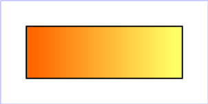
Example lingrad01 shows how to fill a rectangle by referencing a linear gradient paint server.
<?xml version="1.0"?>
<svg width="8cm" height="4cm" viewBox="0 0 800 400"
     xmlns="http://www.w3.org/2000/svg" version="1.2" baseProfile="tiny">
  <desc>Example lingrad01 - fill a rectangle using a
           linear gradient paint server</desc>
  <g>
    <defs>
      <linearGradient xml:id="MyGradient">
        <stop offset="0.05" stop-color="#F60" />
        <stop offset="0.95" stop-color="#FF6" />
      </linearGradient>
    </defs>
    <!-- Outline the drawing area in blue -->
    <rect fill="none" stroke="blue"
          x="1" y="1" width="798" height="398"/>
    <!-- The rectangle is filled using a linear gradient paint server -->
    <rect fill="url(#MyGradient)" stroke="black" stroke-width="5"
          x="100" y="100" width="600" height="200"/>
  </g>
</svg>
Radial gradients are defined by a 'radialGradient' element.
    <define name='radialGradient'>
      <element name='radialGradient'>
        <ref name='radialGradient.AT'/>
        <ref name='GradientCommon.CM'/>
      </element>
    </define>

    <define name='radialGradient.AT' combine='interleave'>
      <ref name='svg.Properties.attr'/>
      <ref name='svg.GradientCommon.attr'/>
      <ref name='svg.Core.attr'/>
      <ref name='svg.CxCy.attr'/>
      <ref name='svg.R.attr'/>
    </define>
Attribute definitions:
If the gradient starts or ends inside the bounds of the object(s) being painted by the gradient the terminal colors of the gradient shall be used to fill the remainder of the target region.
Properties shall inherit into the 'radialGradient' element from its ancestors; properties shall not inherit from the element referencing the 'radialGradient' element.
'radialGradient' elements must never be rendered directly; their only usage is as something that can be referenced using the 'fill' and 'stroke' properties. The 'display' property does not apply to the 'radialGradient' element; thus, 'radialGradient' elements are not directly rendered even if the 'display' property is set to a value other than none, and 'radialGradient' elements are available for referencing even when the 'display' property on the 'radialGradient' element or any of its ancestors is set to none.
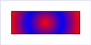
Example radgrad01 shows how to fill a rectangle by referencing a radial gradient paint server.
<?xml version="1.0"?>
<svg width="8cm" height="4cm" viewBox="0 0 800 400"
     xmlns="http://www.w3.org/2000/svg" version="1.2" baseProfile="tiny">
  <desc>Example radgrad01 - fill a rectangle by referencing a
           radial gradient paint server</desc>
  <g>
    <defs>
      <radialGradient xml:id="MyGradient" gradientUnits="userSpaceOnUse"
                      cx="400" cy="200" r="300">
        <stop offset="0" stop-color="red" />
        <stop offset="0.5" stop-color="blue" />
        <stop offset="1" stop-color="red" />
      </radialGradient>
    </defs>
    <!-- Outline the drawing area in blue -->
    <rect fill="none" stroke="blue"
          x="1" y="1" width="798" height="398"/>
    <!-- The rectangle is filled using a radial gradient paint server -->
    <rect fill="url(#MyGradient)" stroke="black" stroke-width="5"
          x="100" y="100" width="600" height="200"/>
  </g>
</svg>
The ramp of colors to use on a gradient is defined by the 'stop' elements that are child elements to either the 'linearGradient' element or the 'radialGradient' element.
    <define name='stop'>
      <element name='stop'>
        <ref name='stop.AT'/>
        <ref name='stop.CM'/>
      </element>
    </define>

    <define name='stop.CM'>
      <zeroOrMore>
        <choice>
          <ref name='svg.Desc.group'/>
          <ref name='svg.Animate.group'/>
        </choice>
      </zeroOrMore>
    </define>

    <define name='stop.AT' combine='interleave'>
      <ref name='svg.Properties.attr'/>
      <ref name='svg.Core.attr'/>
      <optional>
        <attribute name='offset' svg:animatable='true' svg:inheritable='false'>
          <ref name='Number.datatype'/>
        </attribute>
      </optional>
    </define>
Attribute definitions:
The 'stop-color' property specifies the color that shall be used at the gradient stop. The keyword currentColor can be specified in the same manner as within a <paint> specification for the 'fill' and 'stroke' properties.
| Value: | currentColor | <color> | inherit |
| Initial: | black |
| Applies to: | 'stop' elements |
| Inherited: | no |
| Percentages: | N/A |
| Media: | visual |
| Animatable: | yes |
| Computed value: | Specified <color> value, except inherit |
The 'stop-opacity' property specifies the opacity that shall be used for the gradient 'stop'.
| Value: | <opacity-value> | inherit |
| Initial: | 1 |
| Applies to: | 'stop' elements |
| Inherited: | no |
| Percentages: | N/A |
| Media: | visual |
| Animatable: | yes |
| Computed value: | Specified value, except inherit |
The gradient paint server applies paint of the specified gradient using the opacities defined by 'stop-opacity' values. The values of 'stop-opacity' are independent of the opacity used to render the paint via 'fill' or 'stroke' (see alpha compositing).
Some notes on gradients:
<stop offset="0" stop-color="white"/>
<stop offset=".2" stop-color="red"/>
<stop offset=".2" stop-color="blue"/>
<stop offset="1" stop-color="black"/>
will have approximately the same effect as:
<stop offset="0" stop-color="white"/>
<stop offset=".1999999999" stop-color="red"/>
<stop offset=".2" stop-color="blue"/>
<stop offset="1" stop-color="black"/>
which is a gradient that goes smoothly from white to red, then abruptly shifts from red
to blue, and then goes smoothly from blue to black.
<stop offset="0" stop-color="#F00" stop-opacity="0"/>
<stop offset="1" stop-color="#0F0" stop-opacity="1"/>
will produce a gradient from fully transparent red, via partly transparent dark yellow, to fully opaque lime.