Visual Presentation:
Understanding SC 1.4.8
1.4.8 Visual Presentation: For the visual presentation of blocks of text, a mechanism is available to achieve the following: (Level AAA)
Foreground and background colors can be selected by the user.
Width is no more than 80 characters or glyphs (40 if CJK).
Text is not justified (aligned to both the left and the right margins).
Line spacing (leading) is at least space-and-a-half within paragraphs, and paragraph spacing is at least 1.5 times larger than the line spacing.
Text can be resized without assistive technology up to 200 percent in a way that does not require the user to scroll horizontally to read a line of text on a full-screen window.
Intent of this Success Criterion
The intent of this Success Criterion is to ensure that visually rendered text is presented in such a manner that it can be perceived without its layout interfering with its readability. People with some cognitive, language and learning disabilities and some low vision users cannot perceive the text and/or lose their reading place if the text is presented in a manner that is difficult for them to read.
People with some visual or cognitive disabilities need to be able to select the color of text and the color of the background. They sometimes choose combinations that seem unintuitive to someone without that disability. Sometimes these combinations have very low contrast. Sometimes only very specific color combinations work for them. Control of color or other aspects of text presentation makes a huge difference to their comprehension.
For people with some reading or vision disabilities, long lines of text can become a significant barrier. They have trouble keeping their place and following the flow of text. Having a narrow block of text makes it easier for them to continue on to the next line in a block. Lines should not exceed 80 characters or glyphs (40 if CJK), where glyphs are the element of writing in the writing system for the text.. Studies have shown that Chinese, Japanese and Korean (CJK) characters are approximately twice as wide as non-CJK characters when both types of characters are displayed with characteristics that achieve the same readability, so the maximum line width for CJK characters is half that of non-CJK characters.
People with some cognitive disabilities find it difficult to track text where the lines are close together. Providing extra space between lines and paragraphs allows them to better track the next line and to recognize when they have reached the end of a paragraph. It is best if there are several different options, for instance, space-and-a-half and double spacing for line spacing. By space and a half within paragraphs we mean that top of one line is 150% further from the top of the line below it than would be true when the text is 'single spaced' (the default spacing for the font). By Paragraph spacing that is 1.5 times larger than the line spacing we mean that the spacing from the top of the last line of 1 paragraph is 250% farther from the Top of the first line of the next paragraph (i.e., that there is a blank line between the two paragraphs that is 150% of the single space blank line).
People with certain cognitive disabilities have problems reading text that is both left and right justified. The uneven spacing between words in fully justified text can cause "rivers of white" space to run down the page making reading difficult and in some cases impossible. Text justification can also cause words to be spaced closely together, so that it is difficult for them to locate word boundaries.
The resizing provision ensures that visually rendered text (text characters that have been displayed so that they can be seen [vs. text characters that are still in data form such as ASCII]) can be scaled successfully without requiring that the user scroll left and right to see all of the content. When the content has been authored so that this is possible, the content is said to reflow. This permits people with low vision and people with cognitive disabilities to increase the size of the text without becoming disoriented.
The scaling of content is primarily a user agent responsibility. User agents that satisfy UAAG 1.0 Checkpoint 4.1 allow users to configure text scale. The author's responsibility is to create Web content that does not prevent the user agent from scaling the content and that allows the reflow of the content within the current width of the viewport. See Understanding Success Criterion 1.4.4 Resize text for additional discussion of resizing text.
The horizontal scrolling requirement is not intended to apply to small-screen devices where long words may be displayed on a single line and require users to scroll horizontally. For the purposes of this requirement, authors should ensure that content meets this requirement on standard desktop/laptop displays with the browser window maximized. Since people generally keep their computers for several years, it is best not to rely on the latest desktop/laptop display resolutions but to consider the common desktop/laptop display resolutions over the course of several years when making this evaluation.
Wrapping should always be possible as long as words are not so long that a single word is more than half the width of a full screen. Very long URIs may run off the side of an enlarged screen, but they would not be considered text for "reading" and, therefore, would not violate this provision.
This provision does not mean that a user would never need to use horizontal scrolling. It only means that they would not need to use horizontal scrolling back and forth to read a line of text. For example, if a page consisted of two equal sized columns of text, it would automatically meet this provision. Enlarging the page would mean that the first column was completely on screen and the user could just scroll vertically down the page to read it. To read the second column, they would horizontally scroll to the right, where the right hand column would then fit entirely within the width of the screen, and read that column without further horizontal scrolling.
Specific Benefits of Success Criterion 1.4.8:
This Success Criterion helps low vision users by letting them see text without distracting presentational features. It lets them configure text in ways that will be easier for them to see by letting them control the color and size of blocks of text.
This Success Criterion helps people with cognitive, language and learning disabilities perceive text and track their location within blocks of text.
People with some cognitive disabilities can read text better when they select their own foreground and background color combinations.
People with some cognitive disabilities can track their locations more easily when blocks of text are narrow and when they can configure the amount of space between lines and paragraphs.
People with some cognitive disabilities can read text more easily when the spacing between words is regular.
Examples of Success Criterion 1.4.8
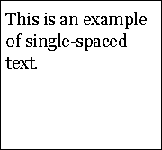
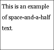
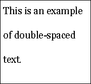
The following images show examples of single-spacing, space-and-a-half and double-spaced text in a paragraph.
Examples of glyphs include "A", "→" (an arrow symbol), and "さ" (a Japanese character).
Related Resources
Resources are for information purposes only, no endorsement implied.
Developing sites for users with Cognitive disabilities and learning difficulties
MULTIFUNK: Bringing computer-supported reading one step further, Date: April 2002, ISBN: 82-539-0491-6, Author: Gjertrud W. Kamstrup, Eva Mjøvik, Anne-Lise Rygvold og Bjørn Gunnar Saltnes
"Cognitive difficulties and access to information systems - an interaction design perspective", Peter Gregor and Anna Dickinson, Applied Computing, University of Dundee
"Case Study of a Dyslexic Person's Visual Perceptual Problems: A Fizz Effect", Nigel Beauchamp, IMPACT Research Group, Computer Science, Loughborough University
"A Dyslexic Perspective on e-Content Accessibility" Peter Rainger, Date of Publication: 20/01/03
Legge, G.E., Pelli, D.G., Rubin, G.S., & Schleske, M.M.:Psychophysics of reading. I. Normal Vision,Vision Research, 25, 239-252, 1985.
Legge, G.E., Rubin, G.S., Pelli, D.G., & Schleske, M.M.:Psychophysics of reading. II. Low Vision,Vision Research, 25, 253-266, 1985.
Osaka,N. and Oda, K. (1991). Effective visual field size necessary for vertical reading during Japanese text processing. Bulletin of Psychonomic Society,29(4),345-347.
Beckmann, P.J. & Legge, G.E. (1996). Psychophysics of reading. XIV. The page-navigation problem in using magnifiers. Vision Research, 36, 3723-3733.
川嶋英嗣・小田浩一(2003).読書におけるスクロール方向とウィンドウ幅の影響 日本心理学会第67回大会, 502.
小田浩一・今橋真理子(1995). 文字認知の閾値と読みの閾値. VISION, 7, 165-168.
Osaka,N. (1994). Size of saccade and fixation duration of eye movements during reading: psychophysics of Japanese text processing. Journal of Optical Society of America A, 9(1), 5-13.
山中今日子・小田浩一 (2007). 漢字の画数と書体のウェイトが視認性に及ぼす 影響. 視覚学会2007年夏季大会ポスター 1p1 Vision, P.167.
The Disability Discrimination Act, Developing an Accessible Information Policy (PDF)
Cognitive Disabilities and the Web: Where Accessibility and Usability Meet?
An Accessibility Frontier: Cognitive disabilities and learning difficulties
Techniques and Failures for Success Criterion 1.4.8 - Visual Presentation
Each numbered item in this section represents a technique or combination of techniques that the WCAG Working Group deems sufficient for meeting this Success Criterion. The techniques listed only satisfy the Success Criterion if all of the WCAG 2.0 conformance requirements have been met.
Sufficient Techniques
Instructions: Since this is a multi-part success criterion, you must satisfy one of the numbered items for each of the requirements below.
First Requirement: Techniques to ensure foreground and background colors can be selected by the user
Third Requirement: Techniques to ensure text is not justified (aligned to both the left and the right margins)
Fourth Requirement: Techniques to ensure line spacing (leading) is at least space-and-a-half within paragraphs, and paragraph spacing is at least 1.5 times larger than the line spacing
Fifth Requirement: Techniques to ensure text can be resized without assistive technology up to 200 percent in a way that does not require the user to scroll horizontally to read a line of text on a full-screen window
Not interfering with the user agent's reflow of text as the viewing window is narrowed (General, Future Link) OR
G146: Using liquid layout AND using measurements that are relative to other measurements in the content by using one or more of the following techniques:
Additional Techniques (Advisory) for 1.4.8
Although not required for conformance, the following additional techniques should be considered in order to make content more accessible. Not all techniques can be used or would be effective in all situations.
Using a hover effect to highlight a paragraph, list items, or table cells (HTML, CSS) (future link)
Presenting text in sans serif font or providing a mechanism to achieve this (CSS) (future link)
Using vertical (bulleted or numbered) lists rather than inline lists (future link)
Using upper and lower case according to the spelling conventions of the text language (future link)
Providing large fonts by default (future link)
Avoiding the use of text in raster images (future link)
Avoiding scaling font sizes smaller than the user-agent default (future link)
Providing sufficient inter-column spacing (future link)
Avoiding centrally aligned text (future link)
Avoiding chunks of italic text (future link)
Avoiding overuse of different styles on individual pages and in sites (future link)
Making links visually distinct (future link)
Providing expandable bullets (future link)
Show/hide bullet points (future link)
Putting an em-space or two spaces after sentences (future link)
Common Failures for SC 1.4.8
The following are common mistakes that are considered failures of Success Criterion 1.4.8 by the WCAG Working Group.
Key Terms
- blocks of text
more than one sentence of text
- mechanism
process or technique for achieving a result
Note 1: The mechanism may be explicitly provided in the content, or may be relied upon to be provided by either the platform or by user agents, including assistive technologies.
Note 2: The mechanism needs to meet all success criteria for the conformance level claimed.
- on a full-screen window
on the most common sized desktop/laptop display with the viewport maximized
Note: Since people generally keep their computers for several years, it is best not to rely on the latest desktop/laptop display resolutions but to consider the common desktop/laptop display resolutions over the course of several years when making this evaluation.