1. Introduction
This specification is a delta spec that extends [css-transforms-1] to allow authors to transform elements in three-dimensional space. New transform functions for the transform property allow three-dimensional transforms, and additional properties make working with three-dimensional transforms easier, and allow the author to control how nested three-dimensional transformed elements interact.
-
The perspective property allows the author to provide child elements with an extra perspective transformation. The perspective-origin property provides control over the origin at which perspective is applied, effectively changing the location of the "vanishing point".
-
The transform-style property allows 3D-transformed elements and their 3D-transformed descendants to share a common three-dimensional space, allowing the construction of hierarchies of three-dimensional objects.
-
The backface-visibility property comes into play when an element is flipped around via three-dimensional transforms such that its reverse side is visible to the viewer. In some situations it is desirable to hide the element in this situation, which is possible using the value of hidden for this property.
Note: While some values of the transform property allow an element to be transformed in a three-dimensional coordinate system, the elements themselves are not three-dimensional objects. Instead, they exist on a two-dimensional plane (a flat surface) and have no depth.
This specification also adds three convenience properties, scale, translate and rotate, that make it easier to describe and animate simple transforms.
1.1. Module Interactions
The 3D transform functions here extend the set of functions for the transform property.
Some values of perspective, transform-style and backface-visibility result in the creation of a containing block for all descendants, and/or the creation of a stacking context.
Three-dimensional transforms affect the visual layering of elements, and thus override the back-to-front painting order described in Appendix E of [CSS21].
1.2. Value Definitions
This specification follows the CSS property definition conventions from [CSS21] using the value definition syntax from [CSS-VALUES-3]. Value types not defined in this specification are defined in CSS Values & Units [CSS-VALUES-3]. Combination with other CSS modules may expand the definitions of these value types.
In addition to the property-specific values listed in their definitions, all properties defined in this specification also accept the CSS-wide keywords as their property value. For readability they have not been repeated explicitly.
2. Terminology
- 3D transformed element
-
An element whose computed value for the transform property includes one of the 3D transform functions
- 3D matrix
-
A 4x4 matrix which does not fulfill the requirements of an 2D matrix.
- identity transform function
-
In addition to the identity transform function in CSS Transforms, examples for identity transform functions include translate3d(0, 0, 0), translateZ(0), scaleZ(1), rotate3d(1, 1, 1, 0), rotateX(0), rotateY(0), rotateZ(0) and matrix3d(1, 0, 0, 0, 0, 1, 0, 0, 0, 0, 1, 0, 0, 0, 0, 1). A special case is perspective: perspective(none). The value of m34 becomes infinitesimal small and the transform function is therefore assumed to be equal to the identity matrix.
- perspective matrix
-
A matrix computed from the values of the perspective and perspective-origin properties as described below.
- accumulated 3D transformation matrix
-
A matrix computed for an element relative to the root of its 3D rendering context, as described below.
- 3D rendering context
-
A set of elements with a common ancestor which share a common three-dimensional coordinate system, as described below.
2.1. Serialization of the computed value of <transform-list>
A <transform-list> for the computed value is serialized to either one <matrix()> or one <matrix3d()> function by the following algorithm:
-
Let transform be a 4x4 matrix initialized to the identity matrix. The elements m11, m22, m33 and m44 of transform must be set to 1 all other elements of transform must be set to 0.
-
Post-multiply all <transform-function>s in <transform-list> to transform.
-
Chose between <matrix()> or <matrix3d()> serialization:
- If transform is a 2D matrix
- Serialize transform to a <matrix()> function.
- Otherwise
- Serialize transform to a <matrix3d()> function.
fix this text to add to the text in CSS Transforms 1.
3. Two Dimensional Subset
UAs may not always be able to render three-dimensional transforms and then just support a two-dimensional subset of this specification. In this case three-dimensional transforms and the properties transform-style, perspective, perspective-origin and backface-visibility must not be supported. Section 3D Transform Rendering does not apply. Matrix decomposing uses the technique taken from the "unmatrix" method in "Graphics Gems II, edited by Jim Arvo", simplified for the 2D case. Section Mathematical Description of Transform Functions is still effective but can be reduced by using a 3x3 transformation matrix where a equals m11, b equals m12, c equals m21, d equals m22, e equals m41 and f equals m42 (see A 2D 3x2 matrix with six parameter).
3x3 matrix for two-dimensional transformations.
Authors can easily provide a fallback if UAs do not provide support for three-dimensional transforms. The following example has two property definitions for transform. The first one consists of two two-dimensional transform functions. The second one has a two-dimensional and a three-dimensional transform function.
div {  transform: scale(2) rotate(45deg);
  transform: scale(2) rotate3d(0, 0, 1, 45deg);
}
With 3D support, the second definition will override the first one. Without 3D support, the second definition is invalid and a UA falls back to the first definition.
4. The Transform Rendering Model
This specification extends CSS Transforms 1 § 3 The Transform Rendering Model to account for the existence of three-dimensional transform functions, the Z value of transform-origin, the perspective property, and a new 3D rendering model that applies when the used value of the transform-style property is preserve-3d.
Three-dimensional transform functions conceptually extend the coordinate space into three dimensions, adding a Z axis perpendicular to the plane of the screen, that increases towards the viewer.

Demonstration of the initial coordinate space.
With 3D transforms, the Z component of transform-origin affects the result, so the transformation matrix is computed from the transform and transform-origin properties as follows:
-
Start with the identity matrix.
-
Translate by the computed X, Y and Z of transform-origin
-
Multiply by each of the transform functions in transform property from left to right
-
Translate by the negated computed X, Y and Z values of transform-origin
4.1. 3D Transform Rendering
Normally, elements render as flat planes, and are rendered into the same plane as their stacking context. Often this is the plane shared by the rest of the page. Two-dimensional transform functions can alter the appearance of an element, but that element is still rendered into the same plane as its stacking context.
An element with a three-dimensional transform that is not contained in a 3D rendering context renders with the appropriate transform applied, but does not intersect with any other elements. The three-dimensional transform in this case can be considered just as a painting effect, like two-dimensional transforms. Similarly, the transform does not affect painting order. For example, a transform with a positive Z translation may make an element look larger, but does not cause that element to render in front of elements with no translation in Z.
describe how nested 3d-transformed elements render (perhaps with math)
This example doesn’t follow from the previous text.
This example shows the effect of three-dimensional transform applied to an element.
<style>
div {
    height: 150px;
    width: 150px;
}
.container {
    border: 1px solid black;
}
.transformed {
    transform: rotateY(50deg);
}
</style>

<div class="container">
    <div class="transformed"></div>
</div>
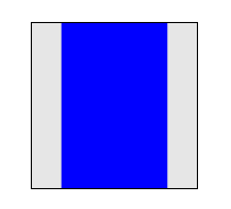
The transform is a 50° rotation about the vertical, Y axis. Note how this makes the blue box appear narrower, but not three-dimensional.
4.1.1. Perspective
Perspective can be used to add a feeling of depth to a scene by making elements higher on the Z axis (closer to the viewer) appear larger, and those further away to appear smaller. The scaling is proportional to d/(d − Z) where d, the value of perspective, is the distance from the drawing plane to the assumed position of the viewer’s eye.
The appearance of perspective can be applied to a 3d-transformed element in two ways. First, the element’s 'transform function list' can contain the perspective() function which computes into the element’s 'current transformation matrix'.
Second, the perspective and perspective-origin properties can be applied to an element to influence the rendering of its 3d-transformed children, giving them a shared perspective that provides the impression of them living in the same three-dimensional scene.
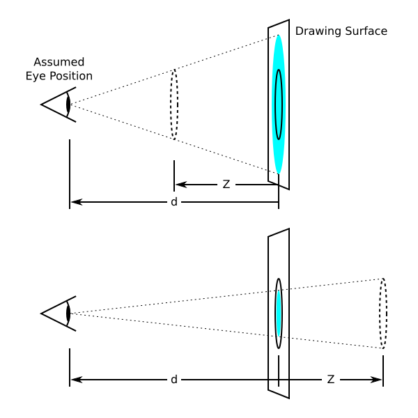
Diagrams showing how scaling depends on the perspective property and Z position. In the top diagram, Z is half of d. In order to make it appear that the original circle (solid outline) appears at Z (dashed circle), the circle is scaled up by a factor of two, resulting in the light blue circle. In the bottom diagram, the circle is scaled down by a factor of one-third to make it appear behind the original position.
Normally the assumed position of the viewer’s eye is centered on a drawing. This position can be moved if desired – for example, if a web page contains multiple drawings that should share a common perspective – by setting perspective-origin.
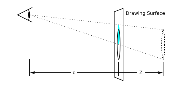
Diagram showing the effect of moving the perspective origin upward.
The perspective matrix is computed as follows:
-
Start with the identity matrix.
-
Translate by the computed X and Y values of perspective-origin
-
Multiply by the matrix that would be obtained from the perspective() transform function, where the length is provided by the value of the perspective property
-
Translate by the negated computed X and Y values of perspective-origin
This example shows how perspective can be used to cause three-dimensional transforms to appear more realistic.
<style>
div {
  height: 150px;
  width: 150px;
}
.container {
  perspective: 500px;
  border: 1px solid black;
}
.transformed {
  transform: rotateY(50deg);
}
</style>

<div class="container">
  <div class="transformed"></div>
</div>
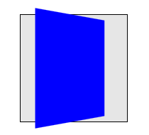
The inner element has the same transform as in the previous example, but its rendering is now influenced by the perspective property on its parent element. Perspective causes vertices that have positive Z coordinates (closer to the viewer) to be scaled up in X and Y, and those further away (negative Z coordinates) to be scaled down, giving an appearance of depth.
4.1.2. 3D Rendering Contexts
This section specifies the rendering model for content that uses 3D-transforms and the transform-style property. In order to describe this model, we introduce the concept of a "3D rendering context".
A 3D rendering context is a set of elements rooted in a common ancestor that, for the purposes of 3D-transform rendering, are considered to share a common three-dimensional coordinate system. The front-to-back rendering of elements in the a 3D rendering context depends on their z-position in that three-dimensional space, and, if the 3D transforms on those elements cause them to intersect, then they are rendered with intersection.
The position of each element in that three-dimensional space is determined by accumulating the transformation matrices up from the given element to the element that establishes the 3D rendering context.
Elements establish and participate in 3D rendering contexts as follows:
-
A 3D rendering context is established by a transformable element whose used value for transform-style is preserve-3d and which itself is not part of a 3D rendering context. An element that establishes a 3D rendering context also participates in that context.
-
An element whose used value for transform-style is preserve-3d and which itself participates in a 3D rendering context, extends that 3D rendering context rather than establishing a new one.
-
An element participates in a 3D rendering context if its parent establishes or extends a 3D rendering context.
Some CSS properties have values that are considered to force "grouping": they require that their element and its descendants are rendered as a group before being composited with other elements; these include opacity, filters and properties that affect clipping. The relevant property values are listed under grouping property values. Consequently, when used on an element with transform-style:preserve-3d, they change the used value to flat and prevent it from creating or extending a 3D rendering context.
In a 3D rendering context, rendering and sorting of elements is done as follows:
-
The element establishing the 3D rendering context, and each other 3D transformed element participating in the 3D rendering context, is rendered into its own plane. This plane includes the element’s backgrounds, borders, other box decorations, content, and descendant elements, excluding any descendant elements that have their own plane (and their descendants). This rendering is done according to CSS 2.1, Appendix E, Section E.2 Painting Order.
-
Intersection is performed between this set of planes, according to Newell’s algorithm, with the planes transformed by the accumulated 3D transformation matrix. Coplanar 3D transformed elements are rendered in painting order.
is it OK to not pop 2D-transformed elements into their own planes?
Note: This specification previously defined that the background, borders, and other box decorations of the establishing element were rendered behind the entire 3D scene. This was changed in #6238. However, if the definition of 3D Rendering Contexts is changed in the future, it may be worth considering changing back.
Note that elements with transforms which have a negative z-component will render behind the content and untransformed descendants of the establishing element, and that 3D transformed elements may interpenetrate with content and untransformed elements.
Note: Because the 3D-transformed elements in a 3D rendering context can all depth-sort and intersect with each other, they are effectively rendered as if they were siblings. The effect of transform-style: preserve-3d can then be thought of as causing all the 3D transformed elements in a 3D rendering context to be hoisted up into the establishing element, but still rendered with their accumulated 3D transformation matrix.
<style>
div {
  height: 150px;
  width: 150px;
}
.scene {
  background-color: rgba(0, 0, 0, 0.3);
  border: 1px solid black;
  perspective: 500px;
}
.container {
  transform-style: preserve-3d;
}
.container > div {
  position: absolute;
  left: 0;
}
.container > :first-child {
  transform: rotateY(45deg);
  background-color: orange;
  top: 10px;
  height: 135px;
}
.container > :last-child {
  transform: translateZ(40px);
  background-color: rgba(0, 0, 255, 0.6);
  top: 50px;
  height: 100px;
}
</style>

<div class="scene">
  <div class="container">
    Lorem ipsum dolor sit amet, consectetaur adipisicing elit…
    <div></div>
    <div></div>
  </div>
</div>
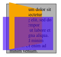
This example shows show elements in a 3D rendering context can intersect. The container element establishes a 3D rendering context for itself and its two children, and the scene element adds perspective to the 3D rendering context. The children intersect with each other, and the orange element also intersects with the container.
<style>
div {
  height: 150px;
  width: 150px;
}
.container {
  perspective: 500px;
  border: 1px solid black;
}
.transformed {
  transform: rotateY(50deg);
  background-color: blue;
}
.child {
  transform-origin: top left;
  transform: rotateX(40deg);
  background-color: lime;
}
</style>

<div class="container">
  <div class="transformed">
    <div class="child"></div>
  </div>
</div>
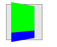
This example shows how nested 3D transforms are rendered. The blue div is transformed as in the previous example, with its rendering influenced by the perspective on its parent element. The lime element also has a 3D transform, which is a rotation about the X axis (anchored at the top, by virtue of the transform-origin). However, the lime element is being rendered into the plane of its parent because it is not a member of the same 3D rendering context. Thus the lime element only appears shorter; it does not "pop out" of the blue element.
4.1.3. Transformed element hierarchies
By default, transformed elements do not create a 3D rendering context and create a flattened representation of their content. However, since it is useful to construct hierarchies of transformed objects that share a common 3-dimensional space, this flattening behavior may be overridden by specifying a value of preserve-3d for the transform-style property. This allows descendants of the transformed element to share the same 3D rendering context. Non-3D-transformed descendants of such elements are rendered into the plane of the element in step C above, but 3D-transformed elements in the same 3D rendering context will "pop out" into their own planes.
<style>
div {
  height: 150px;
  width: 150px;
}
.container {
  perspective: 500px;
  border: 1px solid black;
}
.transformed {
  transform-style: preserve-3d;
  transform: rotateY(50deg);
  background-color: blue;
}
.child {
  transform-origin: top left;
  transform: rotateX(40deg);
  background-color: lime;
}
</style>
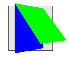
This example is identical to the previous example, with the addition of transform-style: preserve-3d on the blue element. The blue element now extends the 3D rendering context of its container. Now both blue and lime elements share a common three-dimensional space, so the lime element renders as tilting out from its parent, influenced by the perspective on the container.
4.1.4. Accumulated 3D Transformation Matrix Computation
The final value of the transform used to render an element in a 3D rendering context is computed by accumulating an accumulated 3D transformation matrix as follows:
-
Let transform be the identity matrix.
-
Let current element be the transformed element.
-
Let parent element be the parent element of the transformed element.
-
While current element is an element in the transformed element’s 3D rendering context:
-
If current element has a value for transform which is not none, pre-multiply current element’s transformation matrix with the transform.
-
Compute a translation matrix which represents the offset (including the scroll offset) of current element from its parent element, and pre-multiply that matrix into the transform.
-
If parent element has a value for perspective which is not none, pre-multiply the parent element’s perspective matrix into the transform.
-
Let current element be the parent element.
-
Let parent element be the current element’s parent.
-
Note: as described here, the accumulated 3D transformation matrix takes into account offsets (including the scroll offset) generated by the visual formatting model on the transformed element, and elements in its ancestor chain up to and including the element that establishes the its 3D rendering context.
4.1.5. Backface Visibility
Using three-dimensional transforms, it’s possible to transform an element such that its reverse side is visible. 3D-transformed elements show the same content on both sides, so the reverse side looks like a mirror-image of the front side (as if the element were projected onto a sheet of glass). Normally, elements whose reverse side is towards the viewer remain visible. However, the backface-visibility property allows the author to make an element invisible when its reverse side is towards the viewer. This behavior is "live"; if an element with backface-visibility: hidden were animating, such that its front and reverse sides were alternately visible, then it would only be visible when the front side were towards the viewer.
Visibility of the reverse side of an element is considered using the accumulated 3D transformation matrix, and is thus relative to the parent of the element that establishes the 3D rendering context.
Note: This property is useful when you place two elements back-to-back, as you would to create a playing card. Without this property, the front and back elements could switch places at times during an animation to flip the card. Another example is creating a box out of 6 elements, but where you want to see only the inside faces of the box.
This example shows how to make a "card" element that flips over when clicked. Note the "transform-style: preserve-3d" on #card which is necessary to avoid flattening when flipped.
<style>
.body { perspective: 500px; }
#card {
  position: relative;
  height: 300px; width: 200px;
  transition: transform 1s;
  transform-style: preserve-3d;
}
#card.flipped {
  transform: rotateY(180deg);
}
.face {
  position: absolute;
  top: 0; left: 0;
  width: 100%; height: 100%;
  background-color: silver;
  border-radius: 40px;
  backface-visibility: hidden;
}
.back {
  transform: rotateY(180deg);
}
</style>
<div id="card" onclick="this.classList.toggle('flipped')">
  <div class="front face">Front</div>
  <div class="back face">Back</div>
</div>
what is the impact of backface-visibility on non-transformed or 2D-transformed elements? Do they get popped into their own planes and intersect?
4.2. Processing of Perspective-Transformed Boxes
This is a first pass at an attempt to precisely specify how exactly to transform elements using the provided matrices. It might not be ideal, and implementer feedback is encouraged. See #912.
The accumulated 3D transformation matrix is affected both by the perspective property, and by any perspective() transform function present in the value of the transform property.
This accumulated 3D transformation matrix is a 4×4 matrix, while the objects to be transformed are two-dimensional boxes. To transform each corner (a, b) of a box, the matrix must first be applied to (a, b, 0, 1), which will result in a four-dimensional point (x, y, z, w). This is transformed back to a three-dimensional point (x′, y′, z′) as follows:
If w > 0, (x′, y′, z′) = (x/w, y/w, z/w).
If w = 0, (x′, y′, z′) = (x ⋅ n, y ⋅ n, z ⋅ n). n is an implementation-dependent value that should be chosen so that x′ or y′ is much larger than the viewport size, if possible. For example, (5px, 22px, 0px, 0) might become (5000px, 22000px, 0px), with n = 1000, but this value of n would be too small for (0.1px, 0.05px, 0px, 0). This specification does not define the value of n exactly. Conceptually, (x′, y′, z′) is infinitely far in the direction (x, y, z).
If w < 0 for all four corners of the transformed box, the box is not rendered.
If w < 0 for one to three corners of the transformed box, the box must be replaced by a polygon that has any parts with w < 0 cut out. This will in general be a polygon with three to five vertices, of which exactly two will have w = 0 and the rest w > 0. These vertices are then transformed to three-dimensional points using the rules just stated. Conceptually, a point with w < 0 is "behind" the viewer, so should not be visible.
.transformed {
  height: 100px;
  width: 100px;
  background: lime;
  transform: perspective(50px) translateZ(100px);
}
All of the box’s corners have z-coordinates greater than the perspective. This means that the box is behind the viewer and will not display. Mathematically, the point (x, y) first becomes (x, y, 0, 1), then is translated to (x, y, 100, 1), and then applying the perspective results in (x, y, 100, −1). The w-coordinate is negative, so it does not display. An implementation that doesn’t handle the w < 0 case separately might incorrectly display this point as (−x, −y, −100), dividing by −1 and mirroring the box.
.transformed {
  height: 100px;
  width: 100px;
  background: radial-gradient(yellow, blue);
  transform: perspective(50px) translateZ(50px);
}
Here, the box is translated upward so that it sits at the same place the viewer is looking from. This is like bringing the box closer and closer to one’s eye until it fills the entire field of vision. Since the default transform-origin is at the center of the box, which is yellow, the screen will be filled with yellow.
Mathematically, the point (x, y) first becomes (x, y, 0, 1), then is translated to (x, y, 50, 1), then becomes (x, y, 50, 0) after applying perspective. Relative to the transform-origin at the center, the upper-left corner was (−50, −50), so it becomes (−50, −50, 50, 0). This is transformed to something very far to the upper left, such as (−5000, −5000, 5000). Likewise the other corners are sent very far away. The radial gradient is stretched over the whole box, now enormous, so the part that’s visible without scrolling should be the color of the middle pixel: yellow. However, since the box is not actually infinite, the user can still scroll to the edges to see the blue parts.
.transformed {
  height: 50px;
  width: 50px;
  background: lime;
  border: 25px solid blue;
  transform-origin: left;
  transform: perspective(50px) rotateY(-45deg);
}
The box will be rotated toward the viewer, with the left edge staying fixed while the right edge swings closer. The right edge will be at about z = 70.7px, which is closer than the perspective of 50px. Therefore, the rightmost edge will vanish ("behind" the viewer), and the visible part will stretch out infinitely far to the right.
Mathematically, the top right vertex of the box was originally (100, −50), relative to the transform-origin. It is first expanded to (100, −50, 0, 1). After applying the transform specified, this will get mapped to about (70.71, −50, 70.71, −0.4142). This has w = −0.4142 < 0, so we need to slice away the part of the box with w < 0. This results in the new top-right vertex being (50, −50, 50, 0). This is then mapped to some faraway point in the same direction, such as (5000, −5000, 5000), which is up and to the right from the transform-origin. Something similar is done to the lower right corner, which gets mapped far down and to the right. The resulting box stretches far past the edge of the screen.
Again, the rendered box is still finite, so the user can scroll to see the whole thing if he or she chooses. However, the right part has been chopped off. No matter how far the user scrolls, the rightmost 30px or so of the original box will not be visible. The blue border was only 25px wide, so it will be visible on the left, top, and bottom, but not the right.
The same basic procedure would apply if one or three vertices had w < 0. However, in that case the result of truncating the w < 0 part would be a triangle or pentagon instead of a quadrilateral.
5. Individual Transform Properties: the translate, scale, and rotate properties
The translate, rotate, and scale properties allow authors to specify simple transforms independently, in a way that maps to typical user interface usage, rather than having to remember the order in transform that keeps the actions of translate(), rotate() and scale() independent and acting in screen coordinates.
| Name: | translate |
|---|---|
| Value: | none | <length-percentage> [ <length-percentage> <length>? ]? |
| Initial: | none |
| Applies to: | transformable elements |
| Inherited: | no |
| Percentages: | relative to the width of the reference box (for the first value) or the height (for the second value) |
| Computed value: | the keyword none or a pair of computed <length-percentage> values and an absolute length |
| Canonical order: | per grammar |
| Animation type: | by computed value, but see below for none |
The translate property accepts 1-3 values, each specifying a translation against one axis, in the order X, Y, then Z. When the second or third values are missing, they default to 0px.
If the third value is omitted or zero, this specifies a 2d translation, equivalent to the translate() function. Otherwise, this specifies a 3d translation, equivalent to the translate3d() function.
Note: The resolved value of the translate property
is the computed value,
and thus getComputedStyle() includes percentage values in its results.
| Name: | rotate |
|---|---|
| Value: | none | <angle> | [ x | y | z | <number>{3} ] && <angle> |
| Initial: | none |
| Applies to: | transformable elements |
| Inherited: | no |
| Percentages: | n/a |
| Computed value: | the keyword none, or an <angle> with an axis consisting of a list of three <number>s |
| Canonical order: | per grammar |
| Animation type: | as SLERP, but see below for none |
The rotate property accepts an angle to rotate an element, and optionally an axis to rotate it around.
The axis can be specified with either the x, y, or z keywords, which specify a rotation around that axis, equivalent to the rotateX(), rotateY(), and rotateZ() transform functions. Alternately, the axis can be specified explicitly by giving three numbers representing the x, y, and z components of an origin-centered vector, equivalent to the rotate3d() function.
There is no difference in behavior between a rotation specified as an <angle> alone and a rotation specified as being around the z-axis (whether by the z keyword or by a vector whose first two components are zero and third component is positive); they are all 2d rotations equivalent to the rotate() function. For example, rotate: 30deg, rotate: z 30deg, and rotate: 0 0 1 30deg are equivalent.
| Name: | scale |
|---|---|
| Value: | none | [ <number> | <percentage> ]{1,3} |
| Initial: | none |
| Applies to: | transformable elements |
| Inherited: | no |
| Percentages: | n/a |
| Computed value: | the keyword none, or a list of 3 <number>s |
| Canonical order: | per grammar |
| Animation type: | by computed value, but see below for none |
The scale property accepts 1-3 values, each specifying a scale along one axis, in order X, Y, then Z.
If the Y value is not given, then it defaults to being the same as the X value.
If the Z value is not given, then it defaults to 1.
If the third value is omitted, 1, or 100%, this specifies a 2d scaling, equivalent to the scale() function. Otherwise, this specifies a 3d scaling, equivalent to the scale3d() function.
There is no difference in behavior between the third value being omitted and the third value being 1 or 100%.
A <percentage> is equivalent to a <number>, for example scale: 100% is equivalent to scale: 1. Numbers are used during serialization of specified and computed values.
All three properties accept (and default to) the value none, which produces no transform at all. In particular, this value does not trigger the creation of a stacking context or containing block for all descendants, while all other values (including “identity” transforms like translate: 0px) create a stacking context and containing block for all descendants, per usual for transforms.
When translate, rotate or scale are animating or transitioning, and the from value or to value (but not both) is none, the value none is replaced by the equivalent identity value (0px for translate, 0deg for rotate, 1 for scale).
5.1. Serialization
Because these properties have two distinct modes of behavior (no transform versus transform), serialization must take this into account:
- for translate
-
If a translation is specified, the property must serialize with one through three values. (As usual, if the second and third values are 0px, the default, or if only the third value is 0px, then those 0px values must be omitted when serializing).
It must serialize as the keyword none if and only if none was originally specified. (An identity transform does not count; it must serialize as 0px.)
- for rotate
-
If a rotation about the z axis (that is, in 2D) is specified, the property must serialize as just an <angle>.
If any other rotation is specified, the property must serialize with an axis specified. If the axis is parallel with the x or y axes, it must serialize as the appropriate keyword.
It must serialize as the keyword none if and only if none was originally specified. (An identity transform does not count; it must serialize as 0deg.)
- for scale
-
If a scale is specified, the property must serialize with only one through three values. As usual, if the third value is 1, the default, then it is omitted when serializing. If the third value is omitted and the second value is the same as the first (the default), then the second value is also omitted when serializing.
It must serialize as the keyword none if and only if none was originally specified. (An identity transform does not count; it must serialize as 1.)
6. Current Transformation Matrix
The transformation matrix computation is amended to the following:
The transformation matrix is computed from the transform, transform-origin, translate, rotate, scale, and offset properties as follows:
-
Start with the identity matrix.
-
Translate by the computed X, Y, and Z values of transform-origin.
-
Translate by the computed X, Y, and Z values of translate.
-
Rotate by the computed <angle> about the specified axis of rotate.
-
Scale by the computed X, Y, and Z values of scale.
-
Translate and rotate by the transform specified by offset.
-
Multiply by each of the transform functions in transform from left to right.
-
Translate by the negated computed X, Y and Z values of transform-origin.
7. The transform-style Property
| Name: | transform-style |
|---|---|
| Value: | flat | preserve-3d |
| Initial: | flat |
| Applies to: | transformable elements |
| Inherited: | no |
| Percentages: | N/A |
| Computed value: | specified keyword |
| Canonical order: | per grammar |
| Animation type: | discrete |
| Used value: | flat if a grouping property is present, specified keyword otherwise |
A computed value of preserve-3d for transform-style on a transformable element establishes both a stacking context and a containing block for all descendants. If the used value is preserve-3d then it also establishes or extends a 3D rendering context.
7.1. Grouping property values
The following CSS property values require the user agent to create a flattened representation of the descendant elements before they can be applied, and therefore force the element to have a used style of flat for preserve-3d.
-
opacity: any value less than 1.
-
filter: any value other than none.
-
clip-path: any value other than none.
-
isolation: used value of isolate.
-
mask-image: any value other than none.
-
mask-border-source: any value other than none.
-
mix-blend-mode: any value other than normal.
-
contain: paint and any other property/value combination that causes paint containment. Note: this includes any property that affect the used value of the contain property, such as content-visibility: hidden.
8. The perspective Property
| Name: | perspective |
|---|---|
| Value: | none | <length [0,∞]> |
| Initial: | none |
| Applies to: | transformable elements |
| Inherited: | no |
| Percentages: | N/A |
| Computed value: | the keyword none or an absolute length |
| Canonical order: | per grammar |
| Animation type: | by computed value |
- <length [0,∞]>
-
Distance to the center of projection.
Verify that projection is the distance to the center of projection.
As very small <length> values can produce bizarre rendering results and stress the numerical accuracy of transform calculations, values less than 1px must be treated as 1px for rendering purposes. (This clamping does not affect the underlying value, so perspective: 0; in a stylesheet will still serialize back as 0.)
- none
-
No perspective transform is applied. The effect is mathematically similar to an infinite <length> value. All objects appear to be flat on the canvas.
The use of this property with any value other than none establishes a stacking context. It also establishes a containing block for all descendants, just like the transform property does.
We don’t really need to be a stacking context or containing block for perspective, but maybe webcompat means we can’t change this.
The values of the perspective and perspective-origin properties are used to compute the perspective matrix, as described above.
9. The perspective-origin Property
The perspective-origin property establishes the origin for the perspective property. It effectively sets the X and Y position at which the viewer appears to be looking at the children of the element.
| Name: | perspective-origin |
|---|---|
| Value: | <position> |
| Initial: | 50% 50% |
| Applies to: | transformable elements |
| Inherited: | no |
| Percentages: | refer to the size of the reference box |
| Computed value: | see background-position |
| Canonical order: | per grammar |
| Animation type: | by computed value |
The values of the perspective and perspective-origin properties are used to compute the perspective matrix, as described above.
The values for perspective-origin represent an offset of the perspective origin from the top left corner of the reference box.
- <percentage>
-
A percentage for the horizontal perspective offset is relative to the width of the reference box. A percentage for the vertical offset is relative to height of the reference box. The value for the horizontal and vertical offset represent an offset from the top left corner of the reference box.
- <length>
-
A length value gives a fixed length as the offset. The value for the horizontal and vertical offset represent an offset from the top left corner of the reference box.
- top
-
Computes to 0% for the vertical position if one or two values are given, otherwise specifies the top edge as the origin for the next offset.
- right
-
Computes to 100% for the horizontal position if one or two values are given, otherwise specifies the right edge as the origin for the next offset.
- bottom
-
Computes to 100% for the vertical position if one or two values are given, otherwise specifies the bottom edge as the origin for the next offset.
- left
-
Computes to 0% for the horizontal position if one or two values are given, otherwise specifies the left edge as the origin for the next offset.
- center
-
Computes to 50% (left 50%) for the horizontal position if the horizontal position is not otherwise specified, or 50% (top 50%) for the vertical position if it is.
The perspective-origin property is a resolved value special case property like height. [CSSOM]
10. The backface-visibility Property
| Name: | backface-visibility |
|---|---|
| Value: | visible | hidden |
| Initial: | visible |
| Applies to: | transformable elements |
| Inherited: | no |
| Percentages: | N/A |
| Computed value: | specified keyword |
| Canonical order: | per grammar |
| Animation type: | discrete |
The visibility of an element with backface-visibility: hidden is determined as follows:
-
Compute the element’s accumulated 3D transformation matrix.
-
If the component of the matrix in row 3, column 3 is negative, then the element should be hidden. Otherwise it is visible.
Backface-visibility cannot be tested by only looking at m33. See #917.
Note: The reasoning for this definition is as follows. Assume elements are rectangles in the x–y plane with infinitesimal thickness. The front of the untransformed element has coordinates like (x, y, ε), and the back is (x, y, −ε), for some very small ε. We want to know if after the transformation, the front of the element is closer to the viewer than the back (higher z-value) or further away. The z-coordinate of the front will be m13x + m23y + m33ε + m43, before accounting for perspective, and the back will be m13x + m23y − m33ε + m43. The first quantity is greater than the second if and only if m33 > 0. (If it equals zero, the front and back are equally close to the viewer. This probably means something like a 90-degree rotation, which makes the element invisible anyway, so we don’t really care whether it vanishes.)
11. SVG and 3D transform functions
This specification explicitly requires three-dimensional transform functions to apply to the container elements: a, g, svg, all graphics elements, all graphics referencing elements and the SVG foreignObject element.
Three-dimensional transform functions and the properties perspective, perspective-origin, transform-style and backface-visibility can not be used for the elements: clipPath, linearGradient, radialGradient and pattern. If a transform list includes a three-dimensional transform function, the complete transform list must be ignored. The values of every previously named property must be ignored. Transformable elements that are contained by one of these elements can have three-dimensional transform functions. The clipPath, mask, pattern elements require the user agent to create a flattened representation of the descendant elements before they can be applied, and therefore override the behavior of transform-style: preserve-3d.
If the vector-effect property is set to non-scaling-stroke and an object is within a 3D rendering context the property has no affect on stroking the object.
formally describe the syntax of the 3D transform functions in SVG, as is done for the 2-D functions.
12. The Transform Functions
The value of the transform property is a list of <transform-function>. The set of allowed transform functions is given below. Wherever <angle> is used in this specification, a <number> that is equal to zero is also allowed, which is treated the same as an angle of zero degrees. A percentage for horizontal translations is relative to the width of the reference box. A percentage for vertical translations is relative to the height of the reference box. A percentage in a scale function is equivalent to a number, and serializes as a number in specified values. For example, scale3d(50%, 100%, 150%) serializes as scale3d(0.5, 1, 1.5).
12.1. 2D Transform Functions
The scale functions defined in [css-transforms-1] now support percentages.
- scale() = scale( [ <number> | <percentage> ]#{1,2} )
- scaleX() = scaleX( [ <number> | <percentage> ] )
- scaleY() = scaleY( [ <number> | <percentage> ] )
- scaleX() = scaleX( [ <number> | <percentage> ] )
-
As defined in css-transforms-1, but also accepting percentages as described above.
12.2. 3D Transform Functions
In the following 3d transform functions, a <zero> behaves the same as 0deg. ("Unitless 0" angles are preserved for legacy compat reasons.)
- matrix3d() = matrix3d( <number>#{16} )
-
specifies a 3D transformation as a 4x4 homogeneous matrix of 16 values in column-major order.
- translate3d() = translate3d( <length-percentage> , <length-percentage> , <length> )
-
specifies a 3D translation by the vector [tx,ty,tz], with tx, ty and tz being the first, second and third translation-value parameters respectively.
- translateZ() = translateZ( <length> )
-
specifies a 3D translation by the vector [0,0,tz] with the given amount in the Z direction.
- scale3d() = scale3d( [ <number> | <percentage> ]#{3} )
-
specifies a 3D scale operation by the [sx,sy,sz] scaling vector described by the 3 parameters.
- scaleZ() = scaleZ( [ <number> | <percentage> ] )
-
specifies a 3D scale operation using the [1,1,sz] scaling vector, where sz is given as the parameter.
- rotate3d() = rotate3d( <number> , <number> , <number> , [ <angle> | <zero> ] )
-
specifies a 3D rotation by the angle specified in last parameter about the [x,y,z] direction vector described by the first three parameters. A direction vector that cannot be normalized, such as [0,0,0], will cause the rotation to not be applied.
Note: the rotation is clockwise as one looks from the end of the vector toward the origin.
- rotateX() = rotateX( [ <angle> | <zero> ] )
-
same as rotate3d(1, 0, 0, <angle>).
- rotateY() = rotateY( [ <angle> | <zero> ] )
-
same as rotate3d(0, 1, 0, <angle>).
- rotateZ() = rotateZ( [ <angle> | <zero> ] )
-
same as rotate3d(0, 0, 1, <angle>), which is a 3d transform equivalent to the 2d transform rotate(<angle>).
- perspective() = perspective( <length [0,∞]> | none )
-
specifies a perspective projection matrix. This matrix scales points in X and Y based on their Z value, scaling points with positive Z values away from the origin, and those with negative Z values towards the origin. Points on the z=0 plane are unchanged. The parameter represents the distance of the z=0 plane from the viewer. Lower values give a more flattened pyramid and therefore a more pronounced perspective effect. For example, a value of 1000px gives a moderate amount of foreshortening and a value of 200px gives an extreme amount.
If the depth value is less than 1px, it must be treated as 1px for the purpose of rendering, for computing the resolved value of transform, and when used as the endpoint of interpolation.
Note: The intent of the above rules on values less than 1px is that they cover the cases where the perspective() function needs to be converted into a matrix.
12.3. Transform function primitives and derivatives
Some transform functions can be represented by more generic transform functions. These transform functions are called derived transform functions, and the generic transform functions are called primitive transform functions. Three-dimensional primitives and their derived transform functions are:
- translate3d()
- for <translateX()>, <translateY()>, translateZ() and <translate()>.
- scale3d()
- for <scaleX()>, <scaleY()>, scaleZ() and <scale()>.
- rotate3d()
- for <rotate()>, rotateX(), rotateY() and rotateZ().
For derived transform functions that have a two-dimensional primitive and a three-dimensional primitive, the context decides about the used primitive. See Interpolation of primitives and derived transform functions.
13. Interpolation of Matrices
When interpolating between two matrices, each matrix is decomposed into the corresponding translation, rotation, scale, skew and (for a 3D matrix) perspective values. Each corresponding component of the decomposed matrices gets interpolated numerically and recomposed back to a matrix in a final step.
13.1. Interpolation of 3D matrices
13.1.1. Decomposing a 3D matrix
The pseudo code below is based upon the "unmatrix" method in "Graphics Gems II, edited by Jim Arvo", but modified to use Quaternions instead of Euler angles to avoid the problem of Gimbal Locks.
The following pseudocode works on a 4x4 homogeneous matrix:
Input:  matrix      ; a 4x4 matrix
Output: translation ; a 3 component vector
        scale       ; a 3 component vector
        skew        ; skew factors XY,XZ,YZ represented as a 3 component vector
        perspective ; a 4 component vector
        quaternion  ; a 4 component vector
Returns false if the matrix cannot be decomposed, true if it can


// Normalize the matrix.
if (matrix[3][3] == 0)
    return false

for (i = 0; i < 4; i++)
    for (j = 0; j < 4; j++)
        matrix[i][j] /= matrix[3][3]

// perspectiveMatrix is used to solve for perspective, but it also provides
// an easy way to test for singularity of the upper 3x3 component.
perspectiveMatrix = matrix

for (i = 0; i < 3; i++)
    perspectiveMatrix[i][3] = 0

perspectiveMatrix[3][3] = 1

if (determinant(perspectiveMatrix) == 0)
    return false

// First, isolate perspective.
if (matrix[0][3] != 0 || matrix[1][3] != 0 || matrix[2][3] != 0)
    // rightHandSide is the right hand side of the equation.
    rightHandSide[0] = matrix[0][3]
    rightHandSide[1] = matrix[1][3]
    rightHandSide[2] = matrix[2][3]
    rightHandSide[3] = matrix[3][3]

    // Solve the equation by inverting perspectiveMatrix and multiplying
    // rightHandSide by the inverse.
    inversePerspectiveMatrix = inverse(perspectiveMatrix)
    transposedInversePerspectiveMatrix = transposeMatrix4(inversePerspectiveMatrix)
    perspective = multVecMatrix(rightHandSide, transposedInversePerspectiveMatrix)
else
    // No perspective.
    perspective[0] = perspective[1] = perspective[2] = 0
    perspective[3] = 1

// Next take care of translation
for (i = 0; i < 3; i++)
    translate[i] = matrix[3][i]

// Now get scale and shear. 'row' is a 3 element array of 3 component vectors
for (i = 0; i < 3; i++)
    row[i][0] = matrix[i][0]
    row[i][1] = matrix[i][1]
    row[i][2] = matrix[i][2]

// Compute X scale factor and normalize first row.
scale[0] = length(row[0])
row[0] = normalize(row[0])

// Compute XY shear factor and make 2nd row orthogonal to 1st.
skew[0] = dot(row[0], row[1])
row[1] = combine(row[1], row[0], 1.0, -skew[0])

// Now, compute Y scale and normalize 2nd row.
scale[1] = length(row[1])
row[1] = normalize(row[1])
skew[0] /= scale[1];

// Compute XZ and YZ shears, orthogonalize 3rd row
skew[1] = dot(row[0], row[2])
row[2] = combine(row[2], row[0], 1.0, -skew[1])
skew[2] = dot(row[1], row[2])
row[2] = combine(row[2], row[1], 1.0, -skew[2])

// Next, get Z scale and normalize 3rd row.
scale[2] = length(row[2])
row[2] = normalize(row[2])
skew[1] /= scale[2]
skew[2] /= scale[2]

// At this point, the matrix (in rows) is orthonormal.
// Check for a coordinate system flip.  If the determinant
// is -1, then negate the matrix and the scaling factors.
pdum3 = cross(row[1], row[2])
if (dot(row[0], pdum3) < 0)
    for (i = 0; i < 3; i++)
        scale[i] *= -1;
        row[i][0] *= -1
        row[i][1] *= -1
        row[i][2] *= -1

// Now, get the rotations out
quaternion[0] = 0.5 * sqrt(max(1 + row[0][0] - row[1][1] - row[2][2], 0))
quaternion[1] = 0.5 * sqrt(max(1 - row[0][0] + row[1][1] - row[2][2], 0))
quaternion[2] = 0.5 * sqrt(max(1 - row[0][0] - row[1][1] + row[2][2], 0))
quaternion[3] = 0.5 * sqrt(max(1 + row[0][0] + row[1][1] + row[2][2], 0))

if (row[2][1] > row[1][2])
    quaternion[0] = -quaternion[0]
if (row[0][2] > row[2][0])
    quaternion[1] = -quaternion[1]
if (row[1][0] > row[0][1])
    quaternion[2] = -quaternion[2]

return true
13.1.2. Interpolation of decomposed 3D matrix values
Each component of the decomposed values translation, scale, skew and perspective of the source matrix get linearly interpolated with each corresponding component of the destination matrix.
Note: For instance, translate[0] of the source matrix and translate[0] of the destination matrix are interpolated numerically, and the result is used to set the translation of the animating element.
Quaternions of the decomposed source matrix are interpolated with quaternions of the decomposed destination matrix using the spherical linear interpolation (Slerp) as described by the pseudo code below:
Input:  quaternionA   ; a 4 component vector
        quaternionB   ; a 4 component vector
        t             ; interpolation parameter with 0 <= t <= 1
Output: quaternionDst ; a 4 component vector


product = dot(quaternionA, quaternionB)

// Clamp product to -1.0 <= product <= 1.0
product = min(product, 1.0)
product = max(product, -1.0)

if (abs(product) == 1.0)
   quaternionDst = quaternionA
   return

theta = acos(product)
w = sin(t * theta) / sqrt(1 - product * product)

for (i = 0; i < 4; i++)
  quaternionA[i] *= cos(t * theta) - product * w
  quaternionB[i] *= w
  quaternionDst[i] = quaternionA[i] + quaternionB[i]

return
13.1.3. Recomposing to a 3D matrix
After interpolation, the resulting values are used to transform the elements user space. One way to use these values is to recompose them into a 4x4 matrix. This can be done following the pseudo code below:
Input:  translation ; a 3 component vector
        scale       ; a 3 component vector
        skew        ; skew factors XY,XZ,YZ represented as a 3 component vector
        perspective ; a 4 component vector
        quaternion  ; a 4 component vector
Output: matrix      ; a 4x4 matrix

Supporting functions (matrix is a 4x4 matrix):
  matrix  multiply(matrix a, matrix b)   returns the 4x4 matrix product of a * b

// apply perspective
for (i = 0; i < 4; i++)
  matrix[i][3] = perspective[i]

// apply translation
for (i = 0; i < 4; i++)
  for (j = 0; j < 3; j++)
    matrix[3][i] += translation[j] * matrix[j][i]

// apply rotation
x = quaternion[0]
y = quaternion[1]
z = quaternion[2]
w = quaternion[3]

// Construct a composite rotation matrix from the quaternion values
// rotationMatrix is a identity 4x4 matrix initially
rotationMatrix[0][0] = 1 - 2 * (y * y + z * z)
rotationMatrix[0][1] = 2 * (x * y - z * w)
rotationMatrix[0][2] = 2 * (x * z + y * w)
rotationMatrix[1][0] = 2 * (x * y + z * w)
rotationMatrix[1][1] = 1 - 2 * (x * x + z * z)
rotationMatrix[1][2] = 2 * (y * z - x * w)
rotationMatrix[2][0] = 2 * (x * z - y * w)
rotationMatrix[2][1] = 2 * (y * z + x * w)
rotationMatrix[2][2] = 1 - 2 * (x * x + y * y)

matrix = multiply(matrix, rotationMatrix)

// apply skew
// temp is a identity 4x4 matrix initially
if (skew[2])
    temp[2][1] = skew[2]
    matrix = multiply(matrix, temp)

if (skew[1])
    temp[2][1] = 0
    temp[2][0] = skew[1]
    matrix = multiply(matrix, temp)

if (skew[0])
    temp[2][0] = 0
    temp[1][0] = skew[0]
    matrix = multiply(matrix, temp)

// apply scale
for (i = 0; i < 3; i++)
  for (j = 0; j < 4; j++)
    matrix[i][j] *= scale[i]

return
14. Interpolation of primitives and derived transform functions
Two transform functions with the same name and the same number of arguments are interpolated numerically without a former conversion. The calculated value will be of the same transform function type with the same number of arguments. Special rules apply to <matrix()>, <matrix3d()> and <perspective()>.
The transform functions <matrix()>, matrix3d() and perspective() get converted into 4x4 matrices first and interpolated as defined in section Interpolation of Matrices afterwards.
For interpolations with the primitive rotate3d(), the direction vectors of the transform functions get normalized first. If the normalized vectors are not equal and both rotation angles are non-zero the transform functions get converted into 4x4 matrices first and interpolated as defined in section Interpolation of Matrices afterwards. Otherwise the rotation angle gets interpolated numerically and the rotation vector of the non-zero angle is used or (0, 0, 1) if both angles are zero.
The two transform functions translate(0) and translate(100px) are of the same type, have the same number of arguments and therefore can get interpolated numerically. translateX(100px) is not of the same type and translate(100px, 0) does not have the same number of arguments, therefore these transform functions can not get interpolated without a former conversion step.
Two different types of transform functions that share the same primitive, or transform functions of the same type with different number of arguments can be interpolated. Both transform functions need a former conversion to the common primitive first and get interpolated numerically afterwards. The computed value will be the primitive with the resulting interpolated arguments.
The following example describes a transition from translateX(100px) to translateY(100px) in 3 seconds on hovering over the div box. Both transform functions derive from the same primitive translate() and therefore can be interpolated.
div {
transform : translateX ( 100 px );
}
div:hover {
transform : translateY ( 100 px );
transition : transform 3 s ;
}
For the time of the transition both transform functions get transformed to the common primitive. translateX(100px) gets converted to translate(100px, 0) and translateY(100px) gets converted to translate(0, 100px). Both transform functions can then get interpolated numerically.
If both transform functions share a primitive in the two-dimensional space, both transform functions get converted to the two-dimensional primitive. If one or both transform functions are three-dimensional transform functions, the common three-dimensional primitive is used.
In this example a two-dimensional transform function gets animated to a three-dimensional transform function. The common primitive is translate3d().
div {
transform : translateX ( 100 px );
}
div:hover {
transform : translateZ ( 100 px );
transition : transform 3 s ;
}
First translateX(100px) gets converted to translate3d(100px, 0, 0) and translateZ(100px) to translate3d(0, 0, 100px) respectively. Then both converted transform functions get interpolated numerically.
15. Addition and accumulation of transform lists
Vresult = Va + Vb - 1
div. animate( { transform: [ 'scale(1)' , 'scale(2)' ] }, { duration: 1000 , easing: 'ease' , } );
to produce the expected behavior when extended as follows:
div. animate( { transform: [ 'scale(1)' , 'scale(2)' ] }, { duration: 1000 , easing: 'ease' , iterations: 5 , iterationComposite: 'accumulate' , } );
15.1. Neutral element for addition
Some animations require a neutral element for addition. For transform functions this is a scalar or a list of scalars of 0. Examples of neutral elements for transform functions are translate(0), translate3d(0, 0, 0), translateX(0), translateY(0), translateZ(0), scale(0), scaleX(0), scaleY(0), scaleZ(0), rotate(0), rotate3d(vx, vy, vz, 0) (where v is a context dependent vector), rotateX(0), rotateY(0), rotateZ(0), skew(0, 0), skewX(0), skewY(0), matrix(0, 0, 0, 0, 0, 0), matrix3d(0, 0, 0, 0, 0, 0, 0, 0, 0, 0, 0, 0, 0, 0, 0, 0) and perspective(none).
Note: Animations to or from the neutral element of additions <matrix()>, matrix3d() and perspective() fall back to discrete animations (See § 13 Interpolation of Matrices).
16. Mathematical Description of Transform Functions
Mathematically, all transform functions can be represented as 4x4 transformation matrices of the following form:
$$\begin{bmatrix} m11 & m21 & m31 & m41 \\ m12 & m22 & m32 & m42 \\ m13 & m23 & m33 & m43 \\ m14 & m24 & m34 & m44 \end{bmatrix}$$
One translation unit on a matrix is equivalent to 1 pixel in the local coordinate system of the element.
-
A 3D translation with the parameters tx, ty and tz is equivalent to the matrix:
$$\begin{bmatrix} 1 & 0 & 0 & tx \\ 0 & 1 & 0 & ty \\ 0 & 0 & 1 & tz \\ 0 & 0 & 0 & 1 \end{bmatrix}$$
-
A 3D scaling with the parameters sx, sy and sz is equivalent to the matrix:
$$\begin{bmatrix} sx & 0 & 0 & 0 \\ 0 & sy & 0 & 0 \\ 0 & 0 & sz & 0 \\ 0 & 0 & 0 & 1 \end{bmatrix}$$
-
A 3D rotation with the vector [x,y,z] and the parameter alpha is equivalent to the matrix:
$$\begin{bmatrix} 1 - 2 \cdot (y^2 + z^2) \cdot sq & 2 \cdot (x \cdot y \cdot sq - z \cdot sc) & 2 \cdot (x \cdot z \cdot sq + y \cdot sc) & 0 \\ 2 \cdot (x \cdot y \cdot sq + z \cdot sc) & 1 - 2 \cdot (x^2 + z^2) \cdot sq & 2 \cdot (y \cdot z \cdot sq - x \cdot sc) & 0 \\ 2 \cdot (x \cdot z \cdot sq - y \cdot sc) & 2 \cdot (y \cdot z \cdot sq + x \cdot sc) & 1 - 2 \cdot (x^2 + y^2) \cdot sq & 0 \\ 0 & 0 & 0 & 1 \end{bmatrix}$$
where:
$$sc = \sin (\alpha/2) \cdot \cos (\alpha/2)$$ $$sq = \sin^2 (\alpha/2)$$
and where x, y, and z have been normalized (that is, where the x, y, and z values given have been divided by the square root of the sum of their squares).
Note that this means that a rotation around the X axis simplifies to:$$\begin{bmatrix} 1 & 0 & 0 & 0 \\ 0 & 1 - 2 \cdot sq & -2 \cdot sc & 0 \\ 0 & 2 \cdot sc & 1 - 2 \cdot sq & 0 \\ 0 & 0 & 0 & 1 \end{bmatrix}$$
a rotation around the Y axis simplifies to:
$$\begin{bmatrix} 1 - 2 \cdot sq & 0 & 2 \cdot sc & 0 \\ 0 & 1 & 0 & 0 \\ -2 \cdot sc & 0 & 1 - 2 \cdot sq & 0 \\ 0 & 0 & 0 & 1 \end{bmatrix}$$
and a rotation around the Z axis simplifies to:
$$\begin{bmatrix} 1 - 2 \cdot sq & -2 \cdot sc & 0 & 0 \\ 2 \cdot sc & 1 - 2 \cdot sq & 0 & 0 \\ 0 & 0 & 1 & 0 \\ 0 & 0 & 0 & 1 \end{bmatrix}$$
-
A perspective projection matrix with the parameter d is equivalent to the matrix:
$$\begin{bmatrix} 1 & 0 & 0 & 0 \\ 0 & 1 & 0 & 0 \\ 0 & 0 & 1 & 0 \\ 0 & 0 & -1/d & 1 \end{bmatrix}$$
If the parameter d is none it is treated as infinity (and the resulting matrix is the identity matrix).
17. The SVG transform Attribute
This specification will also introduce the new presentation attributes transform-origin, perspective, perspective-origin, transform-style and backface-visibility.
Values on new introduced presentation attributes get parsed following the syntax rules on SVG Data Types [SVG11].
18. SVG Animation
18.1. The animate and set element
The introduce presentation attributes perspective, perspective-origin, transform-style and backface-visibility are animatable. transform-style and backface-visibility are non-additive.
19. More Issues
Per https://lists.w3.org/Archives/Public/www-style/2015Mar/0371.html, the WG resolved to add a formula for decomposing a transform into a unified "scale" (the spec already defines how to decompose it into scaleX/Y/Z), for use by things like SVG’s non-scaling stroke spec. Formula is defined here.
20. Security and Privacy Considerations
This specification introduces no new security or privacy considerations.
Changes
Recent Changes
Substantive changes since 3 March 2020 WD:
-
The specification no longer requires maintaining state for whether individual transform properties have 2D or 3D values, but instead requires that any value that can be expressed as 2D is treated as 2D (see #3305).
Note: An analogous change is intended for transform functions, but it has not been made yet.
- The scale property and scale(), scaleX() and scaleY() functions now support percentages (see #3399).
-
Fix multiple definitions to be consistent with the spec’s definition for a 3D Rendering Context:
- Define that borders, backgrounds, and box decorations of an element establishing a 3D Rendering Context are rendered at z=0 in its 3D scene, rather than behind its 3D scene (see #6238).
- Define accumulated 3D transformation matrix to include the transform of the establishing element and the perspective of its parent (see #6191).
- Define that paint containment is a grouping property (see #6202).
- Add support for a none argument to perspective() (see #6488).
- Define that clamping of values of perspective() also applies to resolved values and interpolation (see #6320 and #6346).
- Clarify that the effects of preserve-3d only affect transformable elements (see #6430).
- Fixed the neutral element for addition for perspective() to be perspective(none)
- Added a note that the resolved value of translate includes percentages (see #2124).
- Describe 3D sorting more precisely, to explain which descendants are included, and not limit Appendix E reference to steps 1-7 (see #926).