1. Introduction
Everything on the web is a rectangle. For example, the window content area in a web browser is a rectangle. Each HTML element follows the W3C box model and thus is also a rectangle. New devices with a round display are now emerging. The current web standards lack some features to support the devices as follows:
- Lack of the capability to detect a round display
- Lack of layout mechanisms suitable for a round display
Current user agents are not capable of detecting the shape of a display so that authors cannot apply various layouts for a round display. To resolve the issue, we add the device-radius media feature to Media Queries. The feature informs the web page of the property regarding the shape of the display.
To apply the shape of a display to content area, we extend the shape-inside property of CSS Shapes. We also add the border-boundary property to CSS Borders and introduce polar positioning for a better web design suitable for a round display.
2. Terminology
This specification follows the CSS property definition conventions from [CSS21].The detailed description of Media Queries is defined in [MEDIAQUERIES-4]
The detailed description of CSS Shapes is defined in [CSS-SHAPES-1]
The detailed description of Borders is defined in [CSS3-BORDER]
The detailed description of Positioned Layout is defined in [CSS3-POSITIONING]
3. Extending Media Queries for a round display
Media Queries [MEDIAQUERIES-4] define mechanisms to support media-dependent style sheets, tailored for different environments. We propose to extend Media Queries by adding the device-radius media feature to support a round display. This will allow web authors to apply different styles to a web page on the rounded display.
3.1. The device-radius media feature
To use different style sheets for a rectangle display and for a round display, media queries should support some properties to identify the display shape. The device-radius media feature describes the property of rounded borders of a display.<link media="screen and (device-radius: 0%)" rel="stylesheet" href="rectangle.css" /> <link media="screen and (device-radius: 50%)" rel="stylesheet" href="round.css" />
By the mechanism of media queries, if the value of the device-radius media feature is less than 50%, 'rectangle.css' is applied. If it is 50%, 'round.css' is applied.
As in the 'border-radius' property, the device-radius media feature can describe various round shapes of displays, such as rectangle, regular circle, ellipse, and rectangle with round corners.
| Name: | device-radius |
|---|---|
| For: | @media |
| Value: | [ <length> | <percentage> ] |
| Percentage: | Refer to corresponding dimension of the display |
| Type: | range |
Note: To define a 'range' type media feature, the feature may be written as a normal media feature, but with a 'min-' or 'max-' prefix on the feature name. 'min-' or 'max-' prefixes express 'greater or equal to' or 'smaller or equal to' constraints respectively.
The length or percentage value of the 'device-radius' property defines a radius of a quarter ellipse in terms of the shape of the corner of the outer screen edge (This is similar to the 'border-radius' property. See the border-radius description). If the length is zero, the shape of screen is a rectangle, otherwise it is a rectangle with rounded corners or a regular circle. A percentage value of the 'device-radius' is proportional to the diameter of the screen. If the screen shape is the regular circle, 'device-radius': 50% has a true value, because a half of the diameter of the regular circle is the radius of the screen shape. A negative value is not allowed.
<!DOCTYPE html>
<html>
<head>
<link rel="stylesheet" href="rectangle.css" />
</head>
<body>
<div id="clockLayer">
<div id="clockLayer">
<div id="date">2015/02/28 (SAT)</div>
<div id="time">10:11</div>
<div id="weather"><img src="cloudy.png" /></div>
</div>
</div>
</body>
</html>
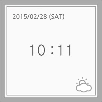
(A) Rectangle Display
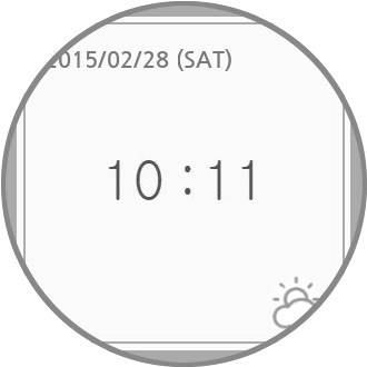
(B) Round Display
Devices where the device-radius media feature is not applicable
<!-- index.html -->
<head>
<link media="screen and (device-radius: 0%)" rel="stylesheet" href="rectangle.css" />
<link media="screen and (device-radius: 50%)" rel="stylesheet" href="round.css" />
</head>
If this example code is loaded in a regular round display, 'round.css' will be applied by the media queries mechanism. To render the clock properly, 'round.css' could be written as follows.
#clockLayer {
    border-radius: 50%;
}
#clockInset {
    border-radius: 50%;
}
#date {
    text-align: center;
}
...
(A) Rectangle Display
(w/ device-radius: 0%)
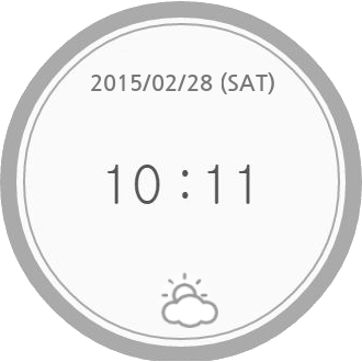
(B) Round Display
(w/ device-radius: 50%)
Devices where the device-radius media feature is applicable
Note: If the shapes of displays are various, such as polygons, we need to extend the media features more with additional parameters. The current features have limitations to support the diversity beyond round shapes. How can we express star-shaped polygons? (e.g. SVG syntax, etc.) Of course, there is a trade-off between simplicity and expressiveness.
Using device-radius with just a single value (e.g. device-radius: 50%) is enough (for simplicity)? Otherwise, do we need to support all possible values the same as border-radius?
4. Aligning content along the display border
4.1. The shape-inside property
CSS Shapes [CSS-SHAPES-2] define the shape-inside property that aligns contents along the edge of a possibly non-rectangular wrapping area. Web authors may use this feature to fit contents inside a round display. However, it could sometimes be hard to specify the wrapping area identical to the shape of a display. Thus, we add a new value 'display' to the shape-inside property to facilitate it. When the shape-inside property on an element is set to 'display', its content (or contained element) is aligned along the display border automatically.
| Name: | shape-inside |
|---|---|
| Value: | auto | outside-shape | [ <basic-shape> || shape-box ] | <image> | display
|
| Initial: | auto |
| Applies to: | block-level elements |
| Inherited: | no |
| Percentages: | n/a |
| Media: | visual |
| Computed value: | computed lengths for <basic-shape>, the absolute URI for <uri>, otherwise as specified |
| Animatable: | as specified for <basic-shape>, otherwise no |
The example below shows how the shape-inside property works when it is set to 'display'. Without using Media Queries, contents can be aligned within the display edge automatically.
<style>
    #container {
        shape-inside: display;
        // the same as circle(50% at 50%, 50%) in a regular round display
    }
    #green-box { float: left; }
    #blue-box { float: right; }
</style>
<div id="container">
    <p>
        Some inline content
        <img id="green-box" src="green-box.jpg" />
        with a float left and float right, in a
        <img id="blue-box" src="blue-box.jpg" />
        simple box with a circle shape-inside.
    </p>
</div>
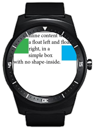
(A) Without 'shape-inside'
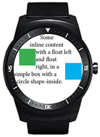
(B) With 'shape-inside: display'
Align the content along the display border
Even though the shape of the rounded display could be described by circle() or ellipse() as <basic-shape>, 'shape-inside: display' is useful that authors make contents to be aligned within the display edge conveniently. In case of complicated shaped displays like curved, stelliform, or polygonal shape, the availability of 'shape-inside: display' is more increased in comparison with a simple shaped display (e.g. regular rounded display).
When a containing block is placed on one end of the display and the containing block has 'shape-inside: display', the descendant blocks of the containing block are basically put on the overlapping region between the containing block and the display area. The overlapping region’s shape is mostly complicated shape, so it’s difficult to define the shape using previous method like basic-shape. The figure 4 describes these circumstances as follows.
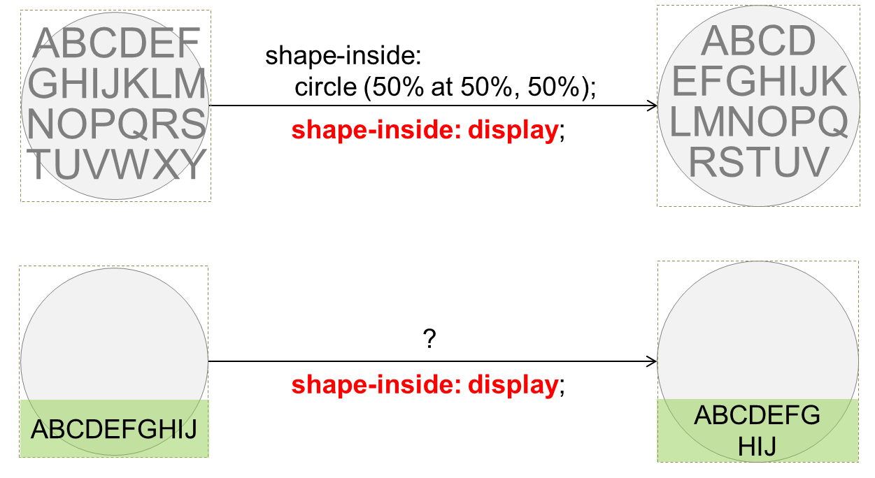
Align a part of the content along the display border
What if content overflows? Clipping or scrolling?
5. Drawing borders around the display border
5.1. The border-boundary property
We add the border-boundary property to set a boundary constraint that affects the borders of an element.
| Name: | border-boundary |
|---|---|
| Value: | none | parent | display |
| Initial: | none |
| Applies to: | all elements |
| Inherited: | yes |
| Percentages: | n/a |
| Media: | visual |
| Computed value: | as specified |
| Animatable: | no |
When the border-boundary property on an element is set to 'parent', additional borders of the element could be drawn where the element’s area and the borders of its parent are met. When it is set to 'display', additional borders could be drawn where the element’s area and the borders of screen are met. The default value is 'none', imposing no boundary constraint on the borders.
<style>
    #container {
        border-boundary: display;
    }
    #redBox {
        border: 5px red solid;
    }
    #greenBox {
        border: 5px green solid;
    }
    #blueBox {
        border: 5px blue solid;
    }
</style>
<div id="container">
    <div id="redBox"></div>
    <div id="greenBox"></div>
    <div id="blueBox"></div>
</div>
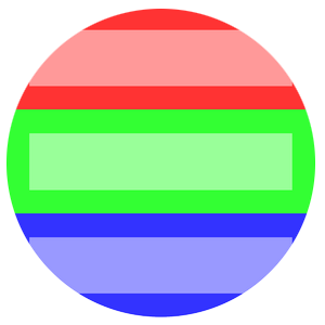
(A) Without 'border-boundary'
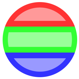
(B) With 'border-boundary: display'
Align the content along the display border
Note: If the value of border-boundary is parent or display, border lines of the element are actually just a visual effect. It triggers a layout for rendering in a general way, but in the above cases (border-boundary: parent|display), the layout doesn’t occur and it only draws the border lines inward from the containing block’s borders. With this situation, the borders might hide contents around the display edge.
6. Positioning content by using the polar coordinate system
Polar coordinate system is a two-dimensional coordinate system that describes the position of a point in a plane with a distance from a reference point and an angle from a reference direction. Elements could be placed along a circle or concentric circles, and the polar coordinate system is useful to handle such cases.
This section introduces polar positioning to support layout of elements in the polar coordinate system where the position of an element is determined by a distance from the center point within the containing element and an angle from the Y-axis.
We add 'polar' to the value of the position property to support the polar coordinates of an element itself. The polar-angle and polar-distance properties specify the position of an element.
Note: In the polar coordinate system, a point is described as being a certain distance from the pole and a certain angle from the polar axis. In the mathematical theory, the polar axis is commonly defined as the positive direction of the x-axis, but we consider the polar axis as the positive direction of the y-axis position as other CSS specifications usually do. Therefore, when the polar-angle value of an element is 0, the element is positioned on the y-axis. If the angle value of an element increases in the positive direction from 0, the element moves clockwise. The method to determine a direction using polar-angle works the same way in [CSS-VALUES], <angle> value.
6.1. The position property
When the position property on an element is set to 'polar', the element could be affected in polar coordinate system.
| Name: | position |
|---|---|
| Value: | static | relative | absolute | sticky | fixed | polar
|
| Initial: | static |
| Applies to: | all elements except table-column-group and table-column |
| Inherited: | no |
| Percentages: | N/A |
| Media: | visual |
| Computed value: | specified value |
| Animatable: | no |
Note: The center point of the containing block of an element indicates the origin of polar coordinate when the value of position property of the element is 'polar'.
In conventional coordinate system used in the web, the origin is positioned in the upper left corner of a containing block. In comparison, the origin of polar coordinates is the center point of a containing block. Therefore different methods are required to deploy and transform elements, or set margin/padding values when using polar coordinates.
An example as below shows the difference between the conventional coordinates and the polar coordinates when positioning elements.
Figure 6A might be the result of
<body>
  <div style="position: absolute; width: 100px; height: 100px; background-color: blue;"></div>
  <div style="position: absolute; width: 50px; height: 50px; background-color: green;"></div>
</body>
Figure 6B might be the result of
<body>
  <div style="position: polar; width: 100px; height: 100px; background-color: blue;"></div>
  <div style="position: polar; width: 50px; height: 50px; background-color: green;"></div>
</body>
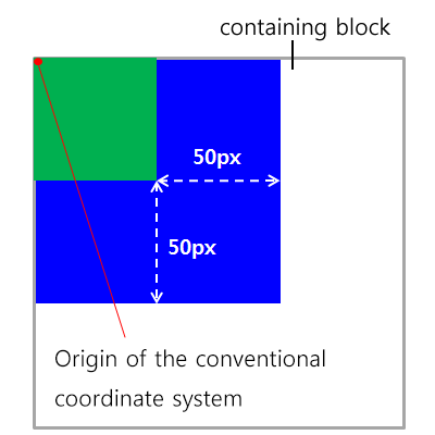
(A) With 'position: absolute'
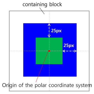
(B) With 'position: polar'
Positioning elements in conventional coordinate system and polar coordinate system
6.2. The polar-angle property
The polar-angle property specifies the angle from the Y-axis. This property is activated on condition of position: polar.| Name: | polar-angle |
|---|---|
| Value: | <angle> |
| Initial: | 0 |
| Applies to: | all elements |
| Inherited: | no |
| Percentages: | N/A |
| Media: | visual |
| Computed value: | as specified |
| Animatable: | as angle |
6.3. The polar-distance property
The polar-distance property specifies the distance from the center of the containing block. This property is activated on condition of position: polar.| Name: | polar-distance |
|---|---|
| Value: | [ <length> | <percentage> ] |
| Initial: | 0 |
| Applies to: | all elements |
| Inherited: | no |
| Percentages: | relative to distance from center to edge of containing block |
| Media: | visual |
| Computed value: | as specified |
| Animatable: | as length, percentage, or calc |
<body>
  <div id="circle1" style="position: polar; polar-angle: 0deg; polar-distance: 50%"></div>
  <div id="circle2" style="position: polar; polar-angle: 90deg; polar-distance: 20%"></div>
  <div id="circle3" style="position: polar; polar-angle: 225deg; polar-distance: 100%"></div>
</body>
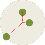
An example of polar positioning
How to rotate the element itself with an axis from the element position to the central point of containing block? Is new property needed to support that at one time in polar coordinate system?
How to position items to the edge of the containing block without overflowing it? (polar-anchor could be suggested)
One of the profits of polar coordinate system is performance improvement. The significant performance improvement can be seen in animation using the polar coordinates. How to define animation in the polar coordinates? Is there any difference between the conventional coordinates and the polar coordinates when animate elements?
By polar-distance property, a position of an element is specified based on the containing block’s center. In other way, is the method of positioning elements by the distance based on the edge of the containing block needed?