CSS Shapes describe geometric shapes for use in CSS. For Level 1, CSS Shapes can be applied to floats. A circle shape on a float will cause inline content to wrap around the circle shape instead of the float’s bounding box.
CSS is a language for describing the rendering of structured documents
(such as HTML and XML)
on screen, on paper, in speech, etc.
Status of this document
This section describes the status of this document at the time
of its publication. Other documents may supersede this document. A
list of current W3C publications and the latest revision of this
technical report can be found in the W3C technical reports index at
http://www.w3.org/TR/.
A Candidate Recommendation is a document that has been widely
reviewed and is ready for implementation. W3C encourages everybody to
implement this specification and return comments to the
(archived)
public mailing
list
www-style@w3.org
(see instructions). When
sending e-mail, please put the text “css-shapes-1” in the
subject, preferably like this: “[css-shapes-1]
…summary of comment…”
Publication as a Candidate Recommendation does not imply endorsement
by the W3C Membership. This is a draft document and may be updated,
replaced or obsoleted by other documents at any time. It is
inappropriate to cite this document as other than work in
progress.
Shapes define arbitrary geometries
that can be used as CSS values.
This specification defines properties
to control the geometry
of an element’s float area.
The shape-outside property uses shape values
to define the float area for a float.
Note: Future levels of CSS Shapes will allow use of shapes
on elements other than floats.
Other CSS modules can make use of shapes as well,
such as CSS Masking [CSS-MASKING]
and CSS Exclusions [CSS3-EXCLUSIONS].
Note: If a user agent implements both CSS Shapes
and CSS Exclusions,
the shape-outside property defines
the exclusion area for an exclusion.
Note: A future level of CSS Shapes will define a shape-inside property,
which will define a shape to wrap content within the element.
1.1
Module Interactions
This module extends the float features defined in [CSS21] chapter 9.
1.2 Values
This specification follows the CSS property definition conventions from [CSS21]. Value types not defined in these specifications are defined in CSS Values and Units Module Level 3 [CSS3VAL].
In addition to the property-specific values listed in their definitions, all properties defined in this specification also accept the inherit keyword as their property value. For readability it has not been repeated explicitly.
1.3 Animated Values
It is expected that CSS will include ways
to animate transitions between styles.
(The section
"Animation of property types"
of the CSS Transitions module [CSS3-TRANSITIONS]
is expected to define how different kinds
of values are interpolated during a transition.)
In anticipation of that,
this module includes a line "Animatable" for each property,
which specifies whether and how values
of the property can be animated.
1.4
Terminology
Wrap
This specification uses the term wrap
to refer to flowing content
around the sides of a float area,
defined in [CSS21] chapter 9.
Content wraps around the right side
of a left-floated box,
and content wraps around the left side
of a right-floated box.
One result of this wrapping
is that line boxes next to a float
are shortened as necessary
to avoid intersections with the float area.
Float area
The area used
for wrapping content
around a float element.
The rules for float behavior
use the sides of the float area
to determine where content flows.
By default,
the float area is the float element’s
margin box
(note this can be different than
the float area produced
by the margin-box value,
which includes border-radius curvature).
This specification’s shape-outside property
can be used to define an arbitrary,
non-rectangular float area.
2
Relation to the box model and float behavior
While the boundaries used
for wrapping inline flow content
outside a float
can be defined using shapes,
the actual box model does not change.
If the element has specified
margins, borders or padding
they will be computed and rendered
according to the [CSS3BOX] module.
Also, float positioning and stacking are not affected
by defining a float area with a shape.
When a shape is used to define
a float area,
the shape is clipped
to the float’s margin box.
In other words,
a shape can only ever reduce
a float area,
not increase it.
A reduced float area may have no effect
on some line boxes
that would normally be affected by the float.
An empty float area
(where the shape encloses no area)
has no effect on line boxes.
A float area defined by a shape
may reduce the normal float area on all sides,
but this does not allow content to wrap
on both sides of a float.
Left floats with a shape-outside still
only allow content wrapping on the right side,
and right floats only allow wrapping on the left.
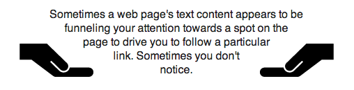
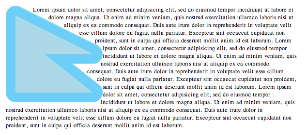
In the following example
the left and right floating
img elements
specify a triangular shape
using the shape-outside property.
  <img class="left" src="hand.svg"/>
  <img class="right" src="hand.svg"/>
  <p>
    Sometimes a web page’s text content appears to be
    funneling your attention towards a spot on the page
    to drive you to follow a particular link. Sometimes
    you don’t notice.
  </p>

  <style type="text/css">
    .left {
      shape-outside: polygon(0 0, 100% 100%, 0 100%);
      float: left;
      width: 40%;
      height: 12ex;
      transform: scaleX(-1);
    }

    .right {
      shape-outside: polygon(100% 0, 100% 100%, 0 100%);
      float: right;
      width: 40%;
      height: 12ex;
    }

    p {
      text-align: center;
    }
  </style>
Since shapes are clipped to the float’s margin box,
adding this shape to the left float above
would result in the same rendering.
shape-outside: polygon(0 0, 500% 500%, 0 500%);
A shape with no extent will create
a float area with no extent.
Because wrapping only considers the float area,
either shape below applied to a float
will allow inline content
to flow through all of the float’s box.
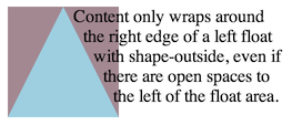
A shape-outside can create open areas
on both the left and right
of a float area.
Content still wraps only on one side
of a float in this case.
In the picture,
the shape is rendered in blue,
and the content area outside the shape in mauve.
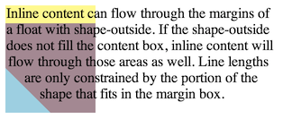
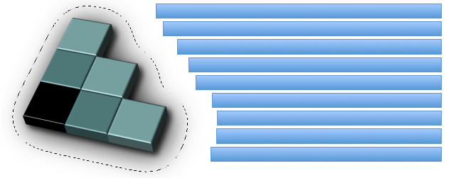
The following styling creates
a shape much smaller than
the float’s content area,
and adds a margin-top to the float.
In the picture,
the shape is rendered in blue,
the content area outside the shape in mauve,
and the margin area of the float box in yellow.
The inline content only wraps around the shape,
and otherwise overlays the rest
of the float margin box.
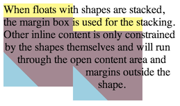
The next picture shows a possible result
if two of these floats
were stacked next to each other.
Note that the floats are positioned
using their margin boxes,
not the float area.
3
Basic Shapes
The <basic-shape> type
can be specified using basic shape functions.
When using this syntax
to define shapes,
the reference box is defined
by each property that uses
<basic-shape> values.
The coordinate system for the shape
has its origin on the top-left corner of the
reference box with the x-axis
running to the right
and the y-axis running downwards.
All the lengths expressed in percentages
are resolved from the used dimensions
of the reference box.
When all of the first four arguments
are supplied they represent the
top, right, bottom and
left offsets
from the reference box inward
that define the positions
of the edges
of the inset rectangle.
These arguments follow the syntax
of the margin shorthand,
that let you set all four insets
with one, two or four values.
The optional <‘border-radius’> argument(s)
define rounded corners for the inset rectangle
using the border-radius shorthand syntax.
A pair of insets in either dimension
that add up to more than the used dimension
(such as left and right insets of 75% apiece)
define a shape enclosing no area.
For this specification,
this results in an empty float area.
The shape-radius argument represents
r, the radius
of the circle.
Negative values are invalid.
A percentage value here
is resolved from the used width and height
of the reference box as sqrt(width2+height2)/sqrt(2).
The position argument defines
the center of the circle.
This defaults to center if omitted.
The shape-radius arguments represent
rx and
ry,
the x-axis and y-axis radii
of the ellipse,
in that order.
Negative values for either radius are invalid.
Percentage values here are resolved
against the used width (for the rx value)
and the used height (for the ry value)
of the reference box.
The position argument defines
the center of the ellipse.
This defaults to center if omitted.
<fill-rule> -
The filling rule used
to determine the interior
of the polygon.
See fill-rule property
in SVG for details.
Possible values are nonzero
or evenodd.
Default value when omitted is nonzero.
Each pair argument in the list represents xi and yi -
the x and y axis coordinates of the i-th vertex of the polygon.
The UA must close a polygon
by connecting the last vertex
with the first vertex of the list.
At least three vertices are required
to define a polygon with an area.
This means that (for this specification)
polygons with less than three vertices
(or with three or more vertices
arranged to enclose no area)
result in an empty float area.
The arguments not defined above are defined as follows:
Defines a radius for a circle or ellipse. If omitted it defaults to closest-side.
closest-side
uses the length from the center
of the shape to the closest side
of the reference box.
For circles,
this is the closest side
in any dimension.
For ellipses,
this is the closest side
in the radius dimension.
farthest-side
uses the length from the center
of the shape to the farthest side
of the reference box.
For circles,
this is the farthest side
in any dimension.
For ellipses,
this is the farthest side
in the radius dimension.
3.2
Computed Values of Basic Shapes
The values in a <basic-shape> function are computed as specified, with these exceptions:
Omitted values are included and compute to their defaults.
A <position> value in circle() or ellipse() is computed as a pair of offsets (horizontal then vertical) from the top left origin, each given as a combination of an absolute length and a percentage.
To serialize the <basic-shape> functions,
serialize as per their individual grammars,
in the order the grammars are written in,
avoiding calc() expressions where possible,
avoiding calc() transformations,
omitting components when possible without changing the meaning,
joining space-separated tokens with a single space,
and following each serialized comma with a single space.
The <position> values in ellipse() and circle()
serialize to their 2- and 4-value forms only,
preferring the 2-value form
when it can be expressed without calc(),
preferring left and top origins,
and preferring 0% over a zero length.
Since <position> keywords stand in for percentages, keywords without an offset turn into percentages.
  circle(at left bottom)

  serializes as "circle(at 0% 100%)"
Omitting components means that some default values do not show up in the serialization. But since <position> always uses the 2- or 4-value form, a default <position> is not omitted.
  circle(closest-side at center)

  serializes as "circle(at 50% 50%)"
Using grammar order means that <position> values always give horizontal components first, then vertical.
  circle(at bottom left)

  serializes as "circle(at 0% 100%)"
Avoiding calc() expressions means that some <position> values that could be simplified to the 2-value form must be serialized in 4-value form instead.
  circle(at right 5px bottom 10px)

  serializes as "circle(at right 5px bottom 10px)"

  not as "circle(at calc(100% - 5px) calc(100% - 10px))"
Avoiding calc() transformations means that if a specified (or computed) calc() must stay in calc() form, it will be used as-is, not reformulated with a different origin or reduced.
  bottom calc(10% + 5px)

  serializes as "bottom calc(10% + 5px)"

  not as "top calc(90% - 5px)" or "calc(90% - 5px)"
Preferring 0% over a zero length comes up when you must supply an omitted offset.
  circle(at right 5px top)

  serializes as "circle(at right 5px top 0%)"
Preferring left and top origins means that some percentage offsets will normalize to those origins (when calc can be avoided).
  circle(at right 5% top 0px)

  serializes as "circle(at 95% 0%)"
3.4
Interpolation of Basic Shapes
For interpolating between
one basic shape and a second,
the rules below are applied.
The values in the shape functions interpolate
as a simple list.
The list values interpolate as
length,
percentage, or calc where possible.
If list values are not one of those types
but are identical
(such as finding nonzero
in the same list position
in both lists)
those values do interpolate.
If both shapes are the same type,
that type is ellipse() or circle(),
and none of the radii use
the closest-side or farthest-side keywords,
interpolate between each value
in the shape functions.
If both shapes are of type inset(),
interpolate between each value
in the shape functions.
If both shapes are of type polygon(),
both polygons have the same number of vertices,
and use the same <fill-rule>,
interpolate between each value
in the shape functions.
In all other cases no interpolation is specified.
4
Shapes from Image
Another way of defining shapes
is by specifying a source <image>
whose alpha channel is used
to compute the shape.
The shape is computed to be the path or paths
that enclose the area(s)
where the opacity of the specified image
is greater than the shape-image-threshold value.
The absence of any pixels with an alpha value
greater than the specified threshold
results in an empty float area.
If the shape-image-threshold is not specified,
the initial value to be considered is 0.0.
The image is sized and positioned
as if it were a replaced element
whose specified width and height
are the same as the element’s
used content box size.
For animated raster image formats (such as
GIF),
the first frame of the animation sequence is used.
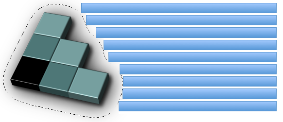
An image is floating to the left of a paragraph.
The image shows the 3D version of the
CSS logo over a transparent background.
The logo has a shadow using an alpha-channel.
The margin-box value defines the shape
enclosed by the outside margin edge.
The corner radii of this shape are determined
by the corresponding border-radius and margin values.
If the ratio of border-radius/margin is 1 or more,
then the margin box corner radius is
border-radius + margin.
If the ratio of border-radius/margin is less than 1,
then the margin box corner radius is
border-radius + (margin * (1 + (ratio-1)^3)).
The border-box value defines the shape
enclosed by the outside border edge.
This shape follows all
of the normal border radius shaping rules
for the outside of the border.
The padding-box value defines the shape
enclosed by the outside padding edge.
This shape follows all
of the normal border radius shaping rules
for the inside of the border.
The content-box value defines the shape
enclosed by the outside content edge.
Each corner radius of this box
is the larger of 0
or border-radius - border-width - padding.
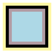
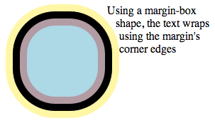
Given the 100px square below with
10px padding, border and margins,
the box values define these shapes:
margin-box: the shape containing all of the yellow pixels
border-box: the shape containing all of the black pixels
padding-box: the shape containing all of the mauve pixels
content-box: the shape containing all of the blue pixels
Simple CSS Box Model Edges
And the same definitions apply to a more complex example with the same 100px square, but with these border, padding and margin properties:
    border-radius: 20px 20px 20px 40px;
    border-width: 30px 10px 20px 10px;
    padding: 10px 20px 10px 10px;
    margin: 20px 10px 10px 10px;
Complex CSS Box Model Edges
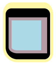
The difference between normal float wrapping
and wrapping around the shape defined
by the margin-box value is that
the margin-box shape includes corner shaping.
Take the 100px square with 10px padding,
border and margins,
but with a border-radius of 60px.
If you make a left float out of it,
content normally wraps in this manner:
Normal float wrapping
If you add a margin-box shape to the float,
then content wraps around the rounded margin-box corners.
The shape is extracted
and computed based
on the alpha channel
of the specified <image>
as defined by shape-image-threshold.
User agents must use the
potentially CORS-enabled fetch
method defined by the [HTML5] specification
for all URLs in a shape-outside value.
When fetching,
user agents must use "Anonymous" mode,
set the referrer source
to the stylesheet’s URL
and set the origin to the URL
of the containing document.
If this results in network errors
such that there is no valid fallback image,
the effect is as if
the value none
had been specified.
The shape-image-threshold
defines the alpha channel threshold
used to extract the shape
using an image.
A value of 0.5 means that
the shape will enclose
all the pixels
that are more than 50% opaque.
Sets the threshold used
for extracting a shape
from an image.
The shape is defined
by the pixels whose alpha value
is greater than the threshold.
A threshold value outside the range
0.0 (fully transparent)
to 1.0 (fully opaque)
will be clamped to this range.
Note: A future level of CSS Shapes may define
a switch to use the luminance data
from an image instead of the alpha data.
When this happens,
shape-image-threshold will be extended
to apply its threshold
to either alpha or luminance,
depending on the switch state.
6.3
Embiggening a Shape: the shape-margin property
The shape-margin property adds
a margin to a shape-outside.
This defines a new shape
that is the smallest contour
(in the shrink-wrap sense)
that includes all the points
that are the shape-margin distance outward
in the perpendicular direction
from a point on the underlying shape.
Note that at points where
a perpendicular is not defined
(e.g. sharp points)
take all points
on the circle centered at the point
and with a radius of shape-margin.
This property takes only non-negative values.
Sets the margin of the shape to a percentage
of the width of the element’s containing block.
A shape-margin creating an offset from a polygonal shape-outside. The lighter blue area shows the shape in a 100x100px float, and the darker blue area shows the 10px offset.
If shape-margin is added
to the CSS logo from example 6,
the line boxes wrapping
around the shape are shortened further.
    #CSSlogo {
      shape-margin: 35px;
    }
A float shape around an image using its alpha-channel with a 35-pixel shape-margin
Acknowledgments
This specification is made possible by input from
Andrei Bucur,
Alexandru Chiculita,
Elika Etemad,
Arron Eicholz,
Sylvain Galineau,
Daniel Glazman,
Arno Gourdol,
Zoltan Horvath,
Chris Jones,
Bem Jones-Bey,
Marcus Mielke,
Alex Mogilevsky,
Hans Muller,
Mihnea Ovidenie,
Virgil Palanciuc,
Robert Sanderson,
Dirk Schulze,
Peter Sorotokin,
Bear Travis,
Eugene Veselov,
Stephen Zilles
and the CSS Working Group members.
Clarified that an exclusion element establishes a new block formatting context.
Conformance
Document conventions
Conformance requirements are expressed with a combination of
descriptive assertions and RFC 2119 terminology. The key words "MUST",
"MUST NOT", "REQUIRED", "SHALL", "SHALL NOT", "SHOULD", "SHOULD NOT",
"RECOMMENDED", "MAY", and "OPTIONAL" in the normative parts of this
document are to be interpreted as described in RFC 2119.
However, for readability, these words do not appear in all uppercase
letters in this specification.
All of the text of this specification is normative except sections
explicitly marked as non-normative, examples, and notes. [RFC2119]
Examples in this specification are introduced with the words "for example"
or are set apart from the normative text with class="example",
like this:
This is an example of an informative example.
Informative notes begin with the word "Note" and are set apart from the
normative text with class="note", like this:
Note, this is an informative note.
Conformance classes
Conformance to this specification
is defined for three conformance classes:
A style sheet is conformant to this specification
if all of its statements that use syntax defined in this module are valid
according to the generic CSS grammar and the individual grammars of each
feature defined in this module.
A renderer is conformant to this specification
if, in addition to interpreting the style sheet as defined by the
appropriate specifications, it supports all the features defined
by this specification by parsing them correctly
and rendering the document accordingly. However, the inability of a
UA to correctly render a document due to limitations of the device
does not make the UA non-conformant. (For example, a UA is not
required to render color on a monochrome monitor.)
An authoring tool is conformant to this specification
if it writes style sheets that are syntactically correct according to the
generic CSS grammar and the individual grammars of each feature in
this module, and meet all other conformance requirements of style sheets
as described in this module.
Partial implementations
So that authors can exploit the forward-compatible parsing rules to
assign fallback values, CSS renderers must
treat as invalid (and ignore
as appropriate) any at-rules, properties, property values, keywords,
and other syntactic constructs for which they have no usable level of
support. In particular, user agents must not selectively
ignore unsupported component values and honor supported values in a single
multi-value property declaration: if any value is considered invalid
(as unsupported values must be), CSS requires that the entire declaration
be ignored.
Experimental implementations
To avoid clashes with future CSS features, the CSS2.1 specification
reserves a prefixed
syntax for proprietary and experimental extensions to CSS.
Prior to a specification reaching the Candidate Recommendation stage
in the W3C process, all implementations of a CSS feature are considered
experimental. The CSS Working Group recommends that implementations
use a vendor-prefixed syntax for such features, including those in
W3C Working Drafts. This avoids incompatibilities with future changes
in the draft.
Non-experimental implementations
Once a specification reaches the Candidate Recommendation stage,
non-experimental implementations are possible, and implementors should
release an unprefixed implementation of any CR-level feature they
can demonstrate to be correctly implemented according to spec.
To establish and maintain the interoperability of CSS across
implementations, the CSS Working Group requests that non-experimental
CSS renderers submit an implementation report (and, if necessary, the
testcases used for that implementation report) to the W3C before
releasing an unprefixed implementation of any CSS features. Testcases
submitted to W3C are subject to review and correction by the CSS
Working Group.
For this specification to be advanced to Proposed Recommendation,
there must be at least two independent, interoperable implementations
of each feature. Each feature may be implemented by a different set of
products, there is no requirement that all features be implemented by
a single product. For the purposes of this criterion, we define the
following terms:
independent
each implementation must be developed by a
different party and cannot share, reuse, or derive from code
used by another qualifying implementation. Sections of code that
have no bearing on the implementation of this specification are
exempt from this requirement.
interoperable
passing the respective test case(s) in the
official CSS test suite, or, if the implementation is not a Web
browser, an equivalent test. Every relevant test in the test
suite should have an equivalent test created if such a user
agent (UA) is to be used to claim interoperability. In addition
if such a UA is to be used to claim interoperability, then there
must one or more additional UAs which can also pass those
equivalent tests in the same way for the purpose of
interoperability. The equivalent tests must be made publicly
available for the purposes of peer review.
implementation
a user agent which:
implements the specification.
is available to the general public. The implementation may
be a shipping product or other publicly available version
(i.e., beta version, preview release, or "nightly build").
Non-shipping product releases must have implemented the
feature(s) for a period of at least one month in order to
demonstrate stability.
is not experimental (i.e., a version specifically designed
to pass the test suite and is not intended for normal usage
going forward).
The specification will remain Candidate Recommendation for at least
six months.