Abstract
Grid Layout contains features targeted at web application authors. The
Grid can be used to achieve many different layouts. It excels at dividing
up space for major regions of an application, or defining the
relationship in terms of size, position, and layer between parts of a
control built from HTML primitives.
Like tables, the Grid enables an author to align elements into columns
and rows, but unlike tables, the Grid doesn't have content structure, and
thus enables a wide variety of layouts not possible with tables. For
example, the children of the Grid can position themselves with Grid lines such that they overlap and layer
similar to positioned elements.
In addition, the absence of content structure in the Grid helps to
manage changes to layout by using fluid and source order independent
layout techniques. By combining media queries with the CSS properties
that control layout of the Grid and its children, authors can adapt their
layout to changes in device form factors, orientation, and available
space, without needing to alter the semantic nature of their content.
Status of This
Document
This section describes the status of this document at the time of
its publication. Other documents may supersede this document. A list of
current W3C publications and the latest revision of this technical report
can be found in the W3C technical reports
index at http://www.w3.org/TR/.
Publication as a Working Draft does not imply endorsement by the W3C
Membership. This is a draft document and may be updated, replaced or
obsoleted by other documents at any time. It is inappropriate to cite this
document as other than work in progress.
The (archived) public
mailing list www-style@w3.org (see
instructions) is preferred
for discussion of this specification. When sending e-mail, please put the
text “css3-grid-layout” in the subject, preferably like this:
“[css3-grid-layout] …summary of comment…”
This document was produced by the CSS Working Group (part of
the Style Activity).
This document was produced by a group operating under the 5 February
2004 W3C Patent Policy. W3C maintains a public list of any patent disclosures made in
connection with the deliverables of the group; that page also includes
instructions for disclosing a patent. An individual who has actual
knowledge of a patent which the individual believes contains Essential
Claim(s) must disclose the information in accordance with section
6 of the W3C Patent Policy.
See also the changes from the
previous version.
Table of contents
1.
Dependencies on other modules
This CSS3 module has normative references to the following other CSS3
modules:
This CSS3 module has non-normative (informative) references to the
following other CSS3 modules:
2. Introduction
2.1. Basic
Capabilities of the Grid
As websites evolved from simple documents into complex, interactive
applications, tools for document layout, e.g. floats, were not
necessarily well suited for application layout. By using a combination
of tables, JavaScript, or careful measurements on floated elements,
authors discovered workarounds to achieve desired layouts. Layouts that
adapted to the available space were often brittle and resulted in
counter-intuitive behavior as space became constrained. As an
alternative, authors of many web applications opted for a fixed layout
that cannot take advantage of changes in the available rendering space
on a screen.
The layout capabilities of the Grid address these problems. The Grid
provides a mechanism for authors to divide available space for layout
into columns and rows using a set of predictable sizing behaviors.
Authors can then precisely position and size the building block elements
of their application by referencing the Grid
lines between the columns and rows, or by defining and
referencing a Grid area, which
is a rectangular space covering an intersection of columns and rows.
Figure 1 illustrates a basic layout which can be achieved with the Grid.
2.2.
Adapting Layouts to Available Space
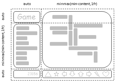
The Grid element can be used to
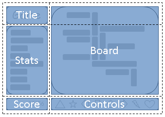
intelligently reflow elements within a webpage. Figure 2 represents a
game with five major areas in the layout: the game title, stats area,
game board, score area, and control area. The author's intent is to
divide the space for the game such that:
- The stats area always appears immediately under the game title.
- The game board appears to the right of the stats and title.
- The top of the game title and the game board should always align.
- The bottom of the game board and the stats area align when the game
has reached its minimum height, but otherwise the game board will
stretch to take advantage of all the screen real-estate available to
it.
- The score area should align into the column created by the game and
stats area, while the controls are centered under the board.
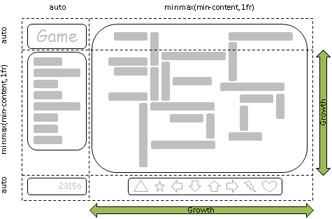
As an alternative to using script to control the absolute position,
width, and height of all elements, the author can use the Grid element, as shown in Figure 3. The
following example shows how an author might achieve all the sizing,
placement, and alignment rules declaratively.
Note that there are multiple ways to specify the structure of the Grid element and to position and size Grid items, each optimized for different
scenarios. This example illustrates one that an author may use to define
the position and space for each Grid
item using the ‘grid-definition-rows’ and ‘grid-definition-columns’ properties of the
Grid element, and the ‘grid-row-position’, ‘grid-column-position’, ‘grid-row-span’
and ‘grid-column-span’ properties on each Grid item.
<style type="text/css">
<style type="text/css">
    #grid {
        display: grid;

        /* Two columns: the first sized to content, the second receives the remaining space,   */
        /* but is never smaller than the minimum size of the board or the game controls, which */
        /* occupy this column. */
        grid-column-definition: auto minmax(min-content, 1fr);

        /* Three rows: the first and last sized to content, the middle row receives the        */
        /* remaining space, but is never smaller than the minimum height of the board or stats */
        /* areas. */
        grid-row-definition: auto minmax(min-content, 1fr) auto
    }

    /* Each part of the game is positioned between grid lines by referencing the starting grid */
    /* line and then specifying, if more than one, the number of rows or columns spanned to    */
    /* determine the ending grid line, which establishes bounds for the part. */
    #title    { grid-column-position: 1; grid-row-position: 1 }
    #score    { grid-column-position: 1; grid-row-position: 3 }
    #stats    { grid-column-position: 1; grid-row-position: 2; justify-self: start }
    #board    { grid-column-position: 2; grid-row-position: 1; grid-row-span: 2 }
    #controls { grid-column-position: 2; grid-row-position: 3; align-self: center }
</style>

<div id="grid">
    <div id="title">Game Title</div>
    <div id="score">Score</div>
    <div id="stats">Stats</div>
    <div id="board">Board</div>
    <div id="controls">Controls</div>
</div>
2.3. Source
Independence
Continuing the prior example, the author also wants the game to adapt
to the space available on traditional computer monitors, handheld
devices, or tablet computers. Also, the game should optimize the
placement of the components when viewed either in landscape or portrait
orientation (Figures 4 and 5). By combining the CSS markup for the Grid element with media queries, the
author is able to use the same semantic markup, but rearranged
independent of its source order, to achieve the desired layout in both
orientations.
The following example leverages the Grid
element’s ability to name the space which will be occupied by
a Grid item. This allows the author to
avoid rewriting rules for Grid items as
the Grid element’s definition
changes.
<style type="text/css">
    @media (orientation: portrait) {
        #grid {
            display: grid;

            /* The rows, columns and areas of the grid are defined visually using the */
            /* grid-template property.  Each string is a row, and each word an area.  */
            /* The number of words in a string determines the number of               */
            /* columns. Note the number of words in each string must be identical.    */
            grid-template: "title stats"
                           "score stats"
                           "board board"
                           "ctrls ctrls";

            /* Columns and rows created with the template property can be assigned a sizing */
            /* function with the grid-definition-columns and grid-definition-rows properties. */
            grid-definition-columns: auto minmax(min-content, 1fr);
            grid-definition-rows: auto auto minmax(min-content, 1fr) auto
        }
    }

    @media (orientation: landscape) {
        #grid {
            display: grid;

            /* Again the template property defines areas of the same name, but this time */
            /* positioned differently to better suit a landscape orientation.            */
            grid-template: "title board"
                           "stats board"
                           "score ctrls";

            grid-definition-columns: auto minmax(min-content, 1fr);
            grid-definition-rows: auto minmax(min-content, 1fr) auto
        }
    }

    /* The grid-area property places a grid item into named region (area) of the grid. */
    #title    { grid-area: title }
    #score    { grid-area: score }
    #stats    { grid-area: stats }
    #board    { grid-area: board }
    #controls { grid-area: ctrls }
</style>

<div id="grid">
    <div id="title">Game Title</div>
    <div id="score">Score</div>
    <div id="stats">Stats</div>
    <div id="board">Board</div>
    <div id="controls">Controls</div>
</div>
2.4. Grid
Layering of Elements
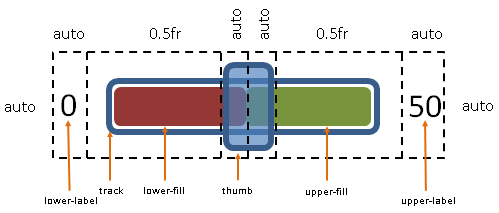
In the example shown in Figure 6, the author is creating a custom
slider control. The control has six parts. The lower and upper labels
align to the left and right edges of the control. The track of the
slider spans the area between the labels. The lower and upper fill parts
touch beneath the thumb, and the thumb is a fixed width and height that
can be moved along the track by updating the two fraction-sized columns.
Prior to the Grid element, the
author would have likely used absolute positioning to control the top
and left coordinates, along with the width and height of each HTML
element that comprises the control. By leveraging the Grid element, the author can instead
limit script usage to handling mouse events on the thumb, which snaps to
various positions along the track as the ‘grid-definition-columns’ property of the Grid element is updated.
<style type="text/css">
    #grid {
        display: grid;

        /* The grid-definition-columns and rows properties also support naming grid lines */
        /* which can then be used to position grid items.  The line names are assigned on    */
        /* either side of a column or row sizing function where the line would logically exist. */
        grid-definition-columns:
            "start"        auto
            "track-start"  0.5fr
            "thumb-start"  auto
            "fill-split"   auto
            "thumb-end"    0.5fr
            "track-end"    auto
            "end";
    }

    /* grid-column and grid-row accept a starting and optional ending line. */
    /* Below the lines are referred to by name. Beyond any semantic advantage, the names  */
    /* also allow the author to avoid renumbering the grid-row-position and      */
    /* column properties of the grid items.  This is similar to the concept demonstrated in the */
    /* prior example with the grid-template property during orientation changes, but    */
    /* grid lines can also work with layered grid items that have overlapping areas of    */
    /* different shapes like the thumb and track parts  in this example. */
    #lower-label { grid-column: "start" }
    #track       { grid-column: "track-start" "track-end"; align-self: center }
    #upper-label { grid-column: "track-end"; }

    /* Fill parts are drawn above the track so set z-index to 5. */
    #lower-fill  { grid-column: "track-start" "fill-split"; align-self: center; z-index: 5 }
    #upper-fill  { grid-column: "fill-split" "track-end"; align-self: center; z-index: 5 }

    /* Thumb is the topmost part; assign it the highest z-index value. */
    #thumb       { grid-column: "thumb-start" "thumb-end"; z-index: 10 }
</style>

<div id="grid">
    <div id="lower-label">Lower Label</div>
    <div id="upper-label">Upper Label</div>
    <div id="track">Track</div>
    <div id="lower-fill">Lower Fill</div>
    <div id="upper-fill">Upper Fill</div>
    <div id="thumb">Thumb</div>
</div>
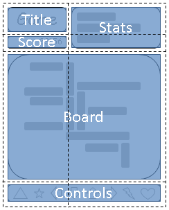
3. Core Concepts
of the Grid
A Grid element is declared in markup by
setting the display property of an element to ‘grid’ or ‘inline-grid’. Child elements of the Grid are
termed Grid items and may be positioned
and sized by the Grid element by
leveraging the following logical concepts.
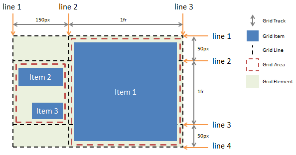
Figure 7 illustrates the relationship between these concepts and the
markup in the subsections that follow produce the result shown in the
figure.
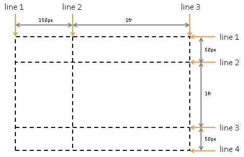
3.1. Grid Tracks
Grid Tracks are the columns and rows of the
Grid defined with the ‘grid-definition-rows’ and ‘grid-definition-columns’ properties on the
Grid element. Each Track is defined
by declaring a sequential list of sizing functions, one for each Track.
Tracks define the space between Grid
lines.
<style type="text/css">
    #grid {
        display: grid;
        grid-definition-columns: 150px 1fr; /* two columns */
        grid-definition-rows: 50px 1fr 50px /* three rows  */
    }
</style>
3.2. Grid Lines
Grid Lines are the horizontal or vertical
dividing lines that exist on either side of a column or row. Grid lines may be referred to by their Grid line number, or they may be named by
the author. Authors use one or more quoted strings to assign names to a
Grid line before or after a Grid track definition wherever the desired
Grid line would logically exist. A Grid item then uses the Grid lines to determine its position within
the Grid by referencing the Grid lines
using the properties ‘grid-row-position’ and ‘grid-column-position’.
The following two examples create three column Grid lines and four row Grid lines. The first example demonstrates
how an author would position a Grid item
using Grid line numbers. The second
example uses explicitly named Grid
lines.
<style type="text/css">
    #grid {
        display: grid;
        grid-definition-columns: 150px 1fr;
        grid-definition-rows: 50px 1fr 50px
    }

    #item1 { grid-column-position: 2; grid-row-position: 1; grid-row-span: 3 }
</style>
<style type="text/css">
    /* equivalent layout to the prior example, but using named lines */
    #grid {
        display: grid;
        grid-definition-columns: 150px "item1-start" 1fr "item1-end";
        grid-definition-rows: "item1-start" 50px 1fr 50px "item1-end"
    }

    #item1 {
        grid-column: "item1-start" "item1-end";
        grid-row: "item1-start" "item1-end"
    }
</style>
3.3. Grid Areas
Grid Areas are the logical space used
to lay out one or more Grid items. Grid areas may be defined
explicitly using the ‘grid-template’ property, or implicitly by
referencing a region of the Grid using the properties ‘grid-row-position’ and ‘grid-column-position’ on a Grid item.
Whether a Grid area is
created explicitly or implicitly, there is no difference in the layout
or drawing order of the Grid items which
are associated with that Grid
area. Grid areas cannot
be styled. Only the syntax used to refer to a region of space on the
Grid differs between the implicit and explicit approach to provide
authors with the tools to best suit their scenarios as illustrated in
prior examples.
<style type="text/css">
    /* using the template syntax */
    #grid  {
        display: grid;
        grid-template: ". a"
                       "b a"
                       ". a";
        grid-definition-columns: 150px 1fr;
        grid-definition-rows: 50px 1fr 50px
    }

    #item1 { grid-area: a }
    #item2 { grid-area: b }
    #item3 { grid-area: b }

    /* Align items 2 and 3 at different points in the Grid Area "b".  */
    /* By default, Grid Items are stretched to fit their Grid Area    */
    /* and these items would layer one over the other. */
    #item2 { align-self: head }
    #item3 { justify-self: end; align-self: foot }</style>
4. Defining the Grid
4.1. Grid Declaration
A Grid element is declared by
setting the display property.
| Name:
| display
|
| Value:
| [ ...existing values... | grid | inline-grid |
|
| Computed value:
| specified value
|
- grid
- A value of grid causes an element to display as a block-level Grid element.
- inline-grid
- A value of inline-grid causes an element to display as an
inline-level Grid element.
The baseline of an inline Grid
element is the bottom edge of the margin box.
4.2. Grid Rows and
Columns
Grid elements use Grid lines to divide their space. There are
two sets of Grid lines: one set defined
by the columns that run in the direction of block progression, and
another orthogonal set defined by rows. Block progression is a
writing-mode term that defines a logical direction. In English it means
vertical.
A Grid track is a generic term for a
column or row which separates two Grid
lines. Each Grid track is
assigned a sizing function, which controls how wide or tall the column
or row may grow, and thus how far apart two Grid
lines are. The sizing function specified can be a length, a
percentage of the Grid element’s
size, derived from the contents occupying the column or row, or a
proportion of the space which remains in the Grid element. In the last case,
remaining space refers to the width or height of the Grid element after accounting for space
already consumed by columns and rows sized with a length, percentage or
content. The size can also be specified as a range using a minmax
function, which can combine any of the previously mentioned mechanisms
to define a min and max size for the column or row.
In the following example there are two columns and three rows. The
first column is 150px wide beginning from the starting edge of the Grid element’s content box. The second
column uses fractional sizing, which is a function of the remaining
space in the Grid. Its size will vary as the width of the Grid element changes. If the used width
of the Grid element is 200px, then
the second column 50px wide. If the used width of the Grid element is 100px, then the second
column is 0px and any content positioned in the column will be
overflowing the Grid element. Sizing
occurs in a similar fashion for the rows.
<style type="text/css">
    #grid {
        display: grid;
        grid-definition-columns: 150px 1fr;
        grid-definition-rows: 50px 1fr 50px
    }
</style>
4.3. Named Grid Lines
A Grid line exists on either side of
a column or row. The Grid line may be
named using one or more quoted strings which are positioned in the ‘grid-definition-rows’ or ‘grid-definition-columns’ definitions where
the Grid line would logically occur (in
between the sizing functions that define the Grid's columns and rows).
Each name associated with a Grid line
must be unique for the set of columns or rows. If the name is specified
multiple times in the same column or row definition, it is associated
with the first Grid line to which the
name was assigned. When a name is not specified, Grid lines can be referred to in the order
which they occur. The first line is 1, the second 2 and so on. The next
example builds on the prior by assigning each line one or more names.
<style type="text/css">
    #grid {
        display: grid;
        grid-definition-columns: "first" "nav" 150px "main" 1fr "last";
        grid-definition-rows: "first" "header" 50px "main" 1fr "footer" 50px "last";
    }
</style>
Consider merging grid line names with grid field names.
See: http://lists.w3.org/Archives/Public/www-style/2012Sep/0047.html
for proposal.
4.4. Repeating
Columns and Rows
If there are large number of columns or rows that are the same or
exhibit a recurring pattern, a repeat function can be applied to define
the columns or rows in a more compact form.
The next two examples are equivalent. There is a single row, and a
pattern of repetitive column Grid lines:
a 250px column followed by a 10px column. Note that when the repeat
function is used with Grid line naming,
that the names are assigned to the first occurrence of the pattern.
<style type="text/css">
    #grid {
        display: grid;
        grid-definition-columns: 10px "content" 250px 10px 250px 10px 250px 10px 250px 10px;
        grid-definition-rows: 1fr;
    }

    /* Equivalent definition. */
    #grid {
        display: grid;
        grid-definition-columns: 10px repeat(4, "content" 250px 10px);
        grid-definition-rows: 1fr;
    }
</style>
4.5.
Grid-definition-columns and Grid-definition-rows Properties
The following grammar expresses the allowable values for the ‘grid-definition-rows’ and ‘grid-definition-columns’ properties.
<track-list>    => [ [ <string> ]* <track-group> [ <string> ]* ]+ | none
<track-group>   => <track-minmax> | [ repeat( <positive-integer> , [ [ <string> ]* <track-minmax> [ <string> ]* ]+ ) ]
<track-minmax>  => minmax( <track-breadth> , <track-breadth> ) | auto | <track-breadth>
<track-breadth> => <length> | <percentage> | <fraction> | min-content | max-content
Where:
- length is as defined by CSS3 Values. [CSS3VAL]
- percentage expresses a size for a Grid track as a percentage of the Grid element’s logical width (for
columns) or logical height (for rows). When the width or height of the
Grid element is dependent on
content, the result is undefined.
- fraction is a non-negative floating-point
number followed by ‘
fr’. Each ‘fraction’ value
takes a share of the remaining space proportional to its number. See fraction values for more details.
- max-content is a keyword which refers to
the maximum of the max sizes of Grid
items occupying the Grid
track.
- min-content is a keyword which refers to
the maximum of the min sizes of Grid
items occupying the Grid
track.
- minmax(min, max) defines a size range. The size
used should be greater than or equal to ‘
min’ and less than or equal to ‘max’. If ‘max’
< ‘min’, then ‘max’ is ignored and ‘minmax(min,max)’ is treated as ‘minmax(min,min)’.
- auto is equivalent to ‘
minmax(min-content, max-content)’.
Consider whether having undefined behavior for
percentage-sized tracks in content-sized grids is appropriate. CSS2.1
and CSS3 leave percentage width undefined, although there appears to be
consistency between browser implementations.
The current property names imply a grid model more akin
to tables than a traditional design grid. Consider adjusting terminology
to focus on grid lines rather than the spaces between the lines.
| Name:
| grid-definition-columns
|
| Value:
| see grammar above
|
| Initial:
| none
|
| Applies to:
| non-replaced elements with a computed value of ‘grid’ or ‘inline-grid’ for
display.
|
| Inherited:
| no
|
| Percentages:
| n/a
|
| Media:
| visual, paged
|
| Computed value:
| see text
|
| Name:
| grid-definition-rows
|
| Value:
| see grammar above
|
| Initial:
| none
|
| Applies to:
| non-replaced elements with a computed value of ‘grid’ or ‘inline-grid’ for
display.
|
| Inherited:
| no
|
| Percentages:
| n/a
|
| Media:
| visual, paged
|
| Computed value:
| see text
|
The following example:
- Adds one Grid line 100 pixels from
the starting edge of the grid.
- Adds another Grid line 1/2 of the
remaining space away.
- Adds another Grid line whose
distance from the prior Grid line will
be based on the maximum content size of elements occupying the column.
- Adds another Grid line whose
distance from the prior Grid line is
based on the minimum content size of all elements occupying the column,
or 1/2 the remaining space, whichever is greater.
div { grid-definition-columns: 100px 1fr max-content minmax(min-content, 1fr) }
Additional examples of valid Grid
track definitions:
    /* examples of valid track definitions */
    grid-definition-rows: 1fr minmax(min-content, 1fr);
    grid-definition-rows: 10px repeat(2, 1fr auto minmax(30%, 1fr));
    grid-definition-rows: (10px);
    grid-definition-rows: calc(4em - 5px)
4.5.1. Fraction
Values: ‘fr’
Fraction values are new units applicable
to the ‘grid-definition-rows’ and ‘grid-definition-columns’ properties:
- fr
- Fraction of available space.
The distribution of fractional space occurs after all ‘length’ or content-based row
and column sizes have reached their maximum. The total size of the rows
or columns is then subtracted from the available space and the remainder
is divided proportionately among the fractional rows and columns.
Each column or row's proportional share can be computed as the column
or row's <fraction> * <remaining space> / <sum of
all fractions>. Note that fractions occurring within a
‘minmax’ function are only counted in the sum
if in the ‘max’ position. Further, fractions
that occur in the ‘min’ position are treated
as an absolute length of 0px.
When remaining space cannot be determined because the width or height
of the Grid element is undefined,
fraction-sized Grid tracks are sized to
their contents while retaining their respective proportions. In such
cases the size of each fractional Grid
track can be computed by determining the ‘max-content’ size
of each fractional Grid track and
dividing that size by the respective ‘fraction’. The maximum value of those
results is treated as the 1fr value, which is then
multiplied by each Grid track’s ‘fraction’ to
determine its final size.
4.5.2.
Used Values for grid-definition-rows and grid-definition-columns
The used size of all Grid tracks as
returned for the ‘grid-definition-rows’ and ‘grid-definition-columns’ properties are
normalized to pixel values. All Grid
tracks are included in the used value reported for ‘grid-definition-rows’ and ‘grid-definition-columns’ regardless of how
the Grid tracks were created, e.g.
implicit tracks may be created by Grid
items referencing a Grid line
not explicitly defined by a ‘grid-definition-rows’ or ‘grid-definition-columns’ property. The used
value includes named lines; any duplicate names must be removed. User
agents may use the repeat syntax to avoid expansive string length due to
implicit Grid track creation, large
spanning values or high repeat counts specified by the author.
The algorithm used to apply repeat syntax to used Grid track values and Grid line names is user agent specific. See
below for example inputs and outputs.
<style type="text/css">
    #grid {
        width: 500px;
        grid-definition-columns:
            "a"         auto
            "b"         minmax(min-content, 1fr)
            "b" "c" "d" repeat(2, "e" 40px)
                        repeat(5, auto);
    }
</style>
<div id="grid">
    <div style="grid-column-position:1; width:50px"></div>
    <div style="grid-column-position:9; width:50px"></div>
</div>
<script type="text/javascript">
    // Returns '"a" 50px "b" 320px "c" "d" repeat(2, "e" 40px) repeat(4, 0px) 50px'.
    var gridElement = document.getElementById("grid");
    window.getComputedStyle(gridElement, null).getPropertyValue("grid-definition-columns");
</script>
4.6.
Defining Grid Areas with a Template
Grid areas can also be
defined explicitly using identifiers
via the ‘grid-template’ property. The ‘grid-template’
property provides a visualization of the Grid
element’s structure while simultaneously defining the Grid areas which can be used to
position and size the child elements of the Grid.
A row is created for every separate string listed for the
grid-template property, and a column is created for each identifier or
period in each string. Note that all strings must have the same number
of columns. A period represents an unnamed area in the grid element that cannot be used to
position or size a grid item. An
identifier creates a named grid
area that can be used to position and size grid items. No two grid areas may have the same
identifier. Duplicate identifiers define a grid area which spans multiple
tracks, and must therefore be geometrically adjacent to each other,
forming a rectangular shape. A declaration which fails to meet these
criteria will be dropped.
In the following example, a ‘grid-template’ property is used to create a
page layout where areas are defined for header content
head, navigational content nav, footer content
foot, and main content main. Accordingly, the
template creates three rows, two columns, and four areas. The
head area spans both columns and the first row of the grid.
Columns are the tracks that run in the inline direction and rows are the
tracks running in the direction of block progression. See Grid Writing
Modes for more details.
The ‘grid-area’ property, defined in further
detail below, is specified on Grid items
to position the Grid item inside an
explicitly named Grid area. The
‘grid-area’
property, defined in further detail below, is specified on Grid items to position the Grid item inside an explicitly named Grid area.
<style type="text/css">
    #grid {
        display: grid;
        grid-template: "head head"
                       "nav  main"
                       "foot ."
    }
    #grid > a {
        grid-area: "nav";
    }
</style>
| Name:
| grid-template
|
| Value:
| [ " [ <identifier> | . ]+ " ]+ | none
|
| Initial:
| none
|
| Applies to:
| Grid elements
|
| Inherited:
| no
|
| Percentages:
| n/a
|
| Media:
| visual, paged
|
| Computed value:
| specified value
|
5. Grid items
The contents of a grid element
consists of zero or more grid items: each child
of a grid element becomes a grid item, and each contiguous run of text
that is directly contained inside a grid
element is wrapped in an anonymous grid
item. However, an anonymous grid item that contains only white
space is not rendered, as if it were ‘display:none’.
This will place all of the contents of the grid on top
of each other in slot 1 1. Alternatives:
- Turn on auto-positioning by default (see ‘
grid-auto-flow’).
- Place all unpositioned elements in the grid into an anonymous grid
item in slot 1 1.
- Place all unpositioned elements in the grid into an anonymous grid
item whose position is given by a "*" template slot, else is in slot 1
1.
- Same as the previous, except if there is no "*" template slot,
auto-position the children.
A grid item establishes a new
formatting context for its contents. The type of this formatting context
is determined by its ‘display’ value, as
usual. The computed ‘display’ of a grid item is determined by applying the
table in CSS
2.1 Chapter 9.7. However, grid items are grid-level boxes, not
block-level boxes: they participate in the grid element’s formatting context, not
in a block formatting context.
Examples of grid items:
<div style="display:grid">

    <!-- grid item: block child -->
    <div id="item1">block</div>

    <!-- grid item: floated element; floating is ignored -->
    <div id="item2" style="float: left;">float</div>

    <!-- grid item: anonymous block box around inline content -->
    anonymous item 3

    <!-- grid item: inline child -->
    <span>
        item 4
        <!-- grid items do not split around blocks -->
        <div id=not-an-item>item 4</div>
        item 4
    </span>
</div>
Some values of ‘display’ trigger the
generation of anonymous boxes. For example, a misparented ‘table-cell’ child is fixed up by generating
anonymous ‘table’ and ‘table-row’ elements around it. [CSS21] This fixup must occur
before a grid element's children are promoted to grid items. For example, given two
contiguous child elements with ‘display:table-cell’, an anonymous table wrapper box
around them becomes the grid item.
Future display types may generate anonymous containers
(e.g. ruby) or otherwise mangle the box tree (e.g. run-ins). It is
intended that grid item determination run after these operations.
5.1. Grid-descendant
Items
This is a proposal to create the ability to have
descendants of a grid item participate in a grid layout, similar to the
behavior defined by the Template Layout module.
A descendant of the grid can be pulled out of flow and participate
directly in the grid by assigning it ‘position:
grid’. An element with ‘position:
grid’ is pulled out of flow and participates as a grid item
belonging to the first ancestor with ‘display:
grid’. If the element is positioned using named lines or slots,
it belongs to the first ancestor with ‘display:
grid’ that has all of the corresponding named lines/slots. If no
such ancestor exists, the item remains in flow.
Alternatively, the item can just go into the first grid,
and missing names are treated as ‘auto’.
5.2. Subgrids
This is a proposal to address the alignment of sub-items
across grid items
A grid item can itself be a grid element by giving it ‘display: grid’; in this case the layout of its
contents will be independent of the layout of the grid it participates
in.
In some cases it might be necessary for the contents of multiple grid
items to align to each other; in this case ‘display:
subgrid’ can be used. A grid item with ‘display: subgrid’ behaves just like one with ‘display: grid’ except that:
- The ‘
grid-column-definition’ and
‘grid-row-definition’ properties do not
apply. Instead the number of explicit tracks is given by its ‘grid-column-span’ and ‘grid-row-span’
properties, and their sizes are determined by the parent grid.
- The used ‘
grid-column-span’ and ‘grid-row-span’
of the item is determined by the number of grid rows and grid columns it
contains.
- Its own grid items participate in the sizing of its parent grid and
are aligned to it. In this process, the sum of the item's margin,
padding, and borders are applied as an extra layer of margin to the
items at those edges.
For example, suppose we have a form consisting of a list of inputs
with labels:
<ul>
<li><label>Name:</label> <input name=fn>
<li><label>Address:</label> <input name=address>
<li><label>Phone:</label> <input name=phone>
</ul>
We want the labels and inputs to align, and we want to style each
list item with a border. This can be accomplished with subgrid layout:
ul {
display: grid;
grid-auto-flow: rows;
grid-definition-columns: auto 1fr;
}
li {
display: subgrid;
margin: 0.5em;
border: solid;
padding: 0.5em;
}
label {
grid-column: 1;
}
input {
grid-column: 2;
}
6. Placing Grid Items
The properties ‘grid-row-position’ and ‘grid-column-position’ are used to place Grid items in the Grid. Numbers and strings
refer to Grid lines. A value of ‘auto’ will result in the
placement of the Grid item according to
the automatic placement algorithm described below. An <identifier>
refers to a named Grid area and
will compute to the Grid line associated
with the starting edge of the Grid
area. ‘grid-row-position’ and ‘grid-column-position’ properties that refer
to an undefined Grid line or an undefined
Grid area via an
<identifier> will compute to their initial values.
Rather than using properties of "column" and "row" and
associated spanning behavior, consider a grid item placement syntax based
on identifying the bounding grid lines. See: http://lists.w3.org/Archives/Public/www-style/2012Sep/0047.html
for proposal.
A common use of design grids is to allow content to flow
normally, but "snap" components to grid lines based on their normal flow
position. Consider adding a grid placement algorithm based on such
relative positioning. Note that this is a non-trivial issue as it impacts
the static flow of content. In addition, the grid's algorithm currently
depends on knowing the position of every grid item in advance to
determine the size of its tracks; when snapping to grid lines, however,
the line to which the grid item will snap is influenced by both the
item's size and the size of tracks the item covers.
| Name:
| grid-column-position
|
| Value:
| <integer> | <string> | <identifier> | auto
|
| Initial:
| auto
|
| Applies to:
| Grid Item elements
|
| Inherited:
| no
|
| Percentages:
| n/a
|
| Media:
| visual, paged
|
| Computed value:
| see text
|
| Name:
| grid-row-position
|
| Value:
| <integer> | <string> | <identifier> | auto
|
| Initial:
| auto
|
| Applies to:
| Grid Item elements
|
| Inherited:
| no
|
| Percentages:
| n/a
|
| Media:
| visual, paged
|
| Computed value:
| see text
|
6.1.
Grid-row-span and Grid-column-span
As an alternative to specifying an ending line for a Grid area or Grid item, ‘grid-row-span’
and ‘grid-column-span’ properties are available
to specify a distance (line count) from the starting line to the ending
line to define the dimensions of a Grid
area. An <identifier> refers to a named Grid area and will compute to the
row or column span associated with that Grid area. Note that when ‘grid-column-span’ and a ‘grid-column-position’ ending line are both
specified for a Grid item, that the
ending line has priority. In such cases the computed value of ‘grid-column-span’ will be the Grid line number of the specified column
ending line minus the Grid line number
of the specified column starting line. The same holds true for the
related row properties.
<style type="text/css">
#item {
/* the following two property definitions are equivalent */
/* both place the item between the first and third line */
/* which is covering the first and second row of the Grid */
grid-row-position: 1 3;
grid-row-position: 1; grid-row-span: 2;
}
</style>
| Name:
| grid-column-span
|
| Value:
| <integer> | <identifier>
|
| Initial:
| 1
|
| Applies to:
| Grid Item elements
|
| Inherited:
| no
|
| Percentages:
| n/a
|
| Media:
| visual, paged
|
| Computed value:
| specified value
|
| Name:
| grid-row-span
|
| Value:
| <integer> | <identifier>
|
| Initial:
| 1
|
| Applies to:
| Grid Item elements
|
| Inherited:
| no
|
| Percentages:
| n/a
|
| Media:
| visual, paged
|
| Computed value:
| specified value
|
6.2. Grid
shorthand properties
For all shorthand properties below, specifying an <identifier>
sets the values of all longhand properties associated with the shorthand
property to the values associated with the <identifier> .
The ‘grid-column-position’ and ‘grid-column-span’ properties can be
simultaneously specified with the ‘grid-column’ shorthand property. Likewise,
the ‘grid-row-position’ and ‘grid-row-span’
properties can be simultaneously specified with the ‘grid-row’ shorthand
property. Note that the first input refers to the starting grid line, while the second, optional input
refers to the span of the grid item if
an integer, and the ending grid line if
a string. Note also that the second input cannot be a string if the
first input is ‘auto’.
| Name:
| grid-row
|
| Value:
| [ [ <integer> | <string> | auto ] [ <string> |
<integer> ]? ] | <identifier>
|
| Initial:
| See individual properties
|
| Applies to:
| Grid Item elements
|
| Inherited:
| no
|
| Percentages:
| n/a
|
| Media:
| visual, paged
|
| Computed value:
| specified value
|
| Name:
| grid-column
|
| Value:
| [ [ <integer> | <string> | auto ] [ <string> |
<integer> ]? ] | <identifier>
|
| Initial:
| See individual properties
|
| Applies to:
| Grid Item elements
|
| Inherited:
| no
|
| Percentages:
| n/a
|
| Media:
| visual, paged
|
| Computed value:
| specified value
|
The ‘grid-column-position’ and ‘grid-row-position’ of an item can be
simultaneously specified with the ‘grid-position’ shorthand property. The
starting grid line for the row and
column, respectively, may be specified by an integer, a string, or an
‘auto’ value
which will be resolved by the automatic placement algorithm described
below.
| Name:
| grid-position
|
| Value:
| [ <integer> | <string> | auto ]{2} |
<identifier>
|
| Initial:
| See individual properties
|
| Applies to:
| Grid Item elements
|
| Inherited:
| no
|
| Percentages:
| n/a
|
| Media:
| visual, paged
|
| Computed value:
| specified value
|
The ‘grid-column-span’ and ‘grid-row-span’
properties can be simultaneously specified with the ‘grid-span’ shorthand
property. When only one integer is specified, the row and column spans
are both set to the integer value; when two integer values are
specified, the row and column spans are set, respectively.
| Name:
| grid-span
|
| Value:
| [ <integer> [ <integer> ]? ] | <identifier>
|
| Initial:
| See individual properties
|
| Applies to:
| Grid Item elements
|
| Inherited:
| no
|
| Percentages:
| n/a
|
| Media:
| visual, paged
|
| Computed value:
| specified value
|
The ‘grid-area’ property is a shorthand for the
‘grid-column-position’, ‘grid-row-position’, ‘grid-column-span’, and ‘grid-row-span’
properties. The first two inputs specify the row and column positions,
respectively, and may be set with integers or strings, or auto keywords
which will be resolved with the auto-positioning algorithm.
The next input may be a single integer which simultaneously specifies
both the row and column spans. Alternatively, the row and column
positions may be followed by two inputs, which may be either integers or
strings and specify the row and column spans, respectively. An integer
input sets the track span of a grid
item, while a string input sets the ending grid line of the grid item. Note that strings cannot be used
to specify the ending grid line if the
corresponding row or column position of the grid
item has been set to ‘auto’.
| Name:
| grid-area
|
| Value:
| <identifier> |
[ [ auto | <integer> | <string> ]{2} [ <integer> [
<integer> | <string> ]? ] | [ <string> [
<string> | <integer> ] ] ] |
auto
|
| Initial:
| none
|
| Applies to:
| Grid Item elements
|
| Inherited:
| no
|
| Percentages:
| n/a
|
| Media:
| visual, paged
|
| Computed value:
| specified value
|
Note that the use of a shorthand property resets all properties
covered by that property to their initial value, except for the
properties explicitly set by the shorthand property.
<style type="text/css">
#item {
/* Initial row and column positions are auto */
/* Initial row and column spans are 1 */
/* The following property will set row position to 3 */
grid-row-position: 3;
/* The following property will set row position to 3 */
/* and reset the row-span property to 1 */
grid-row: 3;
/* The following property will set column position to 3 */
/* And column span to 2 */
grid-column: 3 2;
/* The following property will set row span to 2 */
/* And column span to 3 */
/* Note that any previously set position is unaffected */
grid-span: 2 3;
/* The following property will set row and column position to 4 */
grid-position: 4 4;
/* The following property will set row and column position to 2 */
/* And set row and column span to 5 */
grid-area: 2 2 5;
/* The following property will set row and column position to 4 */
/* And reset row and column span to 1 */
grid-area: 4 4;
}
</style>
6.3. Anonymous Grid
Areas
Each Grid item is contained by a Grid area, i.e. the Grid area serves as the containing
block for the Grid item. The dimensions
of an anonymous Grid area are
determined by naming the starting and ending Grid lines using the ‘grid-row’ and ‘grid-column’
properties on the Grid item which the Grid area surrounds. The starting
and ending lines may be referred to by a string name, if one was defined
by the author, or the Grid line’s
number.
The following example positions the first Grid item to cover the first two rows and
columns of the Grid element. The
second Grid item is positioned to cover
the first row. Note that when only the starting Grid line of the ‘grid-row-position’ or ‘grid-column-position’ properties are
specified for the Grid area,
that the Grid area is assumed to
extend to the subsequent Grid line.
<style type="text/css">
/* covers the Grid element’s content box */
#item1 {
grid-row: 1 3;
grid-column: 1 3;
}
/* covers the first row */
#item2 {
grid-row-position: 1; /* extends to row Grid Line 2 */
grid-column-position: 1 3;
}
</style>
The next example defines rows for header and footer Grid items sized to content, as well as a
main region that receives all remaining space. A single column which
receives all horizontal space in the Grid's content box is also defined.
<style type="text/css">
#grid {
display: grid;
grid-definition-rows: "header" auto "main" 1fr "footer" auto;
grid-definition-columns: 1fr;
}
#header { grid-row-position: "header"; grid-column-position: start }
#main { grid-row-position: "main"; grid-column-position: start }
#footer { grid-row-position: "footer"; grid-column-position: start }
/* Equivalent to the above using grid line numbers instead of names. */
#header { grid-row-position: 1; grid-column-position: 1 }
#main { grid-row-position: 2; grid-column-position: 1 }
#footer { grid-row-position: 3; grid-column-position: 1 }
</style>
6.4. Implicit
Columns and Rows
Grid line numbers referred to by
‘grid-row-position’ or ‘grid-column-position’ properties on a Grid item are not required to refer to a Grid line that was defined using the ‘grid-definition-columns’ or ‘grid-definition-rows’ properties on the Grid element. In cases where the
specified position is outside those explicitly specified on the Grid element, implicit columns and rows
fill gaps added as needed to create additional Grid lines until the reference can be
resolved. Note also that quoted Grid
line names that don't resolve to an explicitly defined Grid line are treated as though the author
specified the first Grid line and don't
trigger implicit Grid track creation.
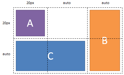
Figure 10 illustrates the placement of Grid
items resulting from the markup shown in the following example.
Note that Grid item B is
positioned on Grid line 5 which creates
a 5th column to contain Grid item
B. Further, columns 3 and 4 are created as implicit
auto-width columns without content resulting in a used column width of
0px.
<style type="text/css">
    #grid { display: grid; grid-definition-columns: 20px; grid-definition-rows: 20px }
    #A { grid-column-position: 1; grid-row-position: 1; justify-self: start; align-self: head }
    #B { grid-column-position: 5; grid-row-position: 1; grid-row-span: 2; }
    #C { grid-column-position: 1; grid-row-position: 2; grid-column-span: 2; }
</style>

<div id="grid">
    <div id="A">A</div>
    <div id="B">B</div>
    <div id="C">C</div>
</div>
6.4.1.
Defining a Default Size for Implicit Columns and Rows
By default, any implicit columns or rows created are auto sized to
content. The default size can be changed using the ‘grid-auto-columns’ and ‘grid-auto-rows’ properties. The properties
accept any valid single column or row sizing function.
6.5.
Automatic Placement of Grid Items
Grid items can be automatically
placed into an unoccupied space of the Grid. The ‘grid-auto-flow’
property controls the direction in which the search for unoccupied space
takes place, and whether rows or columns are added as needed to
accommodate the content.
A ‘grid-auto-flow’ value of ‘rows’ will place grid items in row-major order by searching
across columns and then rows for unoccupied space, and will create
additional rows as needed to accommodate content grid items. Similarly, a ‘grid-auto-flow’
value of ‘columns’
will place grid items in column-major
order, creating new columns as needed.
| Name:
| grid-auto-flow
|
| Value:
| none | rows | columns
|
| Initial:
| none
|
| Applies to:
| Grid elements
|
| Inherited:
| no
|
| Percentages:
| n/a
|
| Media:
| visual, paged
|
| Computed value:
| specified value
|
The search for unoccupied space is conducted one Grid item at a time. Grid items which have a constraint on their
major axis are placed first (the major axis being rows for a ‘grid-auto-flow’
value of ‘rows’ and
columns for a ‘grid-auto-flow’ value of ‘columns’). Note that
constraint means a value other than ‘auto’ for the applicable ‘grid-row-position’ or ‘grid-column-position’ property. After this
step, the number of minor-axis tracks must be determined for conducting
the second phase of the auto-placement algorithm.
For the purposes of operating the auto-placement algorithm on items
that have no constraint on their major axis, the number of tracks on the
minor axis must be determined. The number of tracks will be the largest
number implied by the ‘grid-template’ property, the ‘grid-row-definition’ and ‘grid-column-definition’ properties, the position
and size of any explicitly-defined grid
items, or any minor-axis ‘auto’ values resolved by the previous phase of
the algorithm. Note that any ‘auto’ values still unresolved will be treated as
1 for the purposes of this determination.
To position all remaining items that have ‘auto’ values left
unresolved, starting at position 1,1 on the grid, determine the minimum
value along the minor axis that a grid
item can be placed at while not overlapping the grid area of any other grid item, or exceeding the previously
determined maximum track along the minor axis. If no such value can be
found along the minor axis, increment the major axis value, creating new
major axis tracks as necessary.
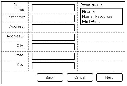
In the following example, there are three columns, each auto-sized to
their contents. No rows are explicitly defined. The ‘grid-auto-flow’
property is ‘rows’ which
instructs the grid to search across its three columns starting with the
first row, then the next, adding rows as needed until sufficient space
is located to accommodate the position of any auto-placed Grid item. Figure 11 illustrates the
result.
<style type="text/css">
form {
display: grid;
grid-definition-columns: "labels" auto "controls" auto "oversized" auto;
grid-auto-flow: rows
}
form > input, form > select {
/* Place all controls in the "controls" column and automatically find the */
/* next available row. */
grid-column-position: "controls";
grid-row-position: auto
}
form > label {
/* Place all labels in the "labels" column and automatically find the next
/* available row. */
grid-column-position: "labels";
grid-row-position: auto
}
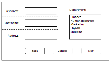
#department {
/* Auto place this item in the "oversized" column in the first row where an area that */
/* spans three rows won't overlap other explicitly placed items or areas or any items */
/* automatically placed prior to this area. */
grid-column-position: "oversized";
grid-row-position: auto;
grid-row-span: 3;
}
/* Place all the buttons of the form in the explicitly defined grid area. */
#buttons {
grid-row-position: auto;
/* Ensure the button area spans the entire grid element in the column direction. */
grid-column-span: 3;
justify-self: end
}
</style>
<form action="#">
<label for="firstname">First name:</label>
<input type="text" id="firstname" name="firstname" />
<label for="lastname">Last name:</label>
<input type="text" id="lastname" name="lastname" />
<label for="address">Address:</label>
<input type="text" id="address" name="address" />
<label for="address2">Address 2:</label>
<input type="text" id="address2" name="address2" />
<label for="city">City:</label>
<input type="text" id="city" name="city" />
<label for="state">State:</label>
<select type="text" id="state" name="state">
<option value="WA">Washington</option>
</select>
<label for="zip">Zip:</label>
<input type="text" id="zip" name="zip" />
<div id="department">
<label for="department">Department:</label>
<select id="department" name="department" multiple>
<option value="finance">Finance</option>
<option value="humanresources">Human Resources</option>
<option value="marketing">Marketing</option>
</select>
</div>
<div id="buttons">
<button id="cancel">Cancel</button>
<button id="back">Back</button>
<button id="next">Next</button>
</div>
</form>
6.5.1.
Automatic Grid Item Placement Algorithm
The following summarizes the algorithm for auto placement of Grid items:
- For each Grid item with a
major-axis position that is not ‘
auto’ in source order:
- Resolve the ‘
auto’ value for its minor-axis position to
the minimum value that ensures this item's grid area will not overlap the
grid area of any explicitly
or previously auto-placed item.
- Determine the maximum number of minor tracks based on maximum track
number implied by the ‘
grid-template’ property, the ‘grid-row-definition’ and ‘grid-column-position-definition’ properties,
the position and size of any explicitly-defined grid items, or any minor-axis ‘auto’ values resolved
by the step 1 of the algorithm. Note that this step must be run prior
to Calculating the size of
Grid tracks.
- Position the auto-placement cursor at position 1,1 in the
grid.
- For each grid item having an
unresolved value of ‘
auto’, in source order:
- If the minor-axis position is not ‘
auto’, then:
- Set the minor-axis position of the cursor to be equal to the
minor-axis position of the grid
item.
- Increment the auto-placement cursor along the major-axis
until a value is found where the grid
item does not overlap the grid area of any other grid item (creating new major-axis
tracks as necessary).
- If the minor and major-axis positions are both ‘
auto’, then:
- Increment the minor-axis position of the auto-placement
cursor until this item's grid
area does not overlap another item's grid area, or causes the grid area to exceed the
maximum number of minor-axis tracks previously determined in step
2.
- If this item's position is still unresolved after the previous
step, then increment the cursor's major-axis position and reset
the minor-axis position to 1 (creating new major-axis tracks if
necessary).
7. Grid Item
Alignment
A Grid item’s alignment within its
Area can be controlled by using the ‘justify-self’ and ‘align-self’ properties. Refer to the CSS Box Alignment Level 3
spec for more details about these properties.
7.1.
Impact of Alignment on Grid Item Size
The values ‘start’, ‘end’, and ‘center’ all
cause the Grid item to produce a box
sized shrink-to-fit for its area in accordance with the CSS3 Box Model.
Note that percentage lengths specified on a Grid
item resolve against the dimensions of the Grid area (i.e. the Grid area serves as the containing
block for the Grid item). Percentages
specified for margin-top, padding-top, margin-bottom, and padding-bottom
resolve against the height of the Grid
area, rather than the width of the Grid area.
A value of ‘stretch’ causes the Grid item’s width to shrink or grow in
accordance with the equation for calculating width described in section 9.3 of the CSS3
Box Model, with the following exception: the paragraph in 9.3 which
describes the behavior of items that are larger than their containing
block is not applicable for the purpose of calculating the size of Grid items. Note that this calculation is
symmetric for both the width and height of the Grid item.
8. Drawing
Order of Grid Items
Grid items do not directly affect each
other's placement in the Grid element.
A Grid item may affect the position of a
Grid line in a column or row that uses a
contents-based relative size, which in turn affects the position or size
of another Grid item, but there is no
direct interaction between Grid items. Grid items may overlap because the Grid item’s Area is defined to intersect
with the Area of another Grid item. Grid item boxes in non-intersecting Areas
may also overlap because of negative margins.
In cases where boxes overlap, ‘z-index’ provides control over the drawing
order of Grid items. Both Grid elements and Grid items generate a stacking context as
described for floats (step 5, section 14) in the CSS3 Box
Model.
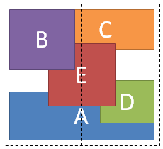
Figure 15 illustrates the drawing order of the markup shown in the
following example.
<style type="text/css">
    #grid { display: grid; grid-definition-columns: 1fr 1fr; grid-definition-rows: 1fr 1fr }
    #A { grid-column-position: 1; grid-row-position: 2; grid-column-span: 2; align-self: foot }
    #B { grid-column-position: 1; grid-row-position: 1; z-index: 10 }
    #C { grid-column-position: 2; grid-row-position: 1; align-self: head; margin-left: -20px }
    #D { grid-column-position: 2; grid-row-position: 2; justify-self: end; align-self: head }
    #E { grid-column-position: 1; grid-row-position: 1;
         grid-column-span: 2; grid-row-span: 2; z-index: 5;
         justify-self: center; align-self: center
    }
</style>

<div id="grid">
    <div id="A">A</div>
    <div id="B">B</div>
    <div id="C">C</div>
    <div id="D">D</div>
    <div id="E">E</div>
</div>
9.
Calculating the Size of Grid Tracks
9.1.
Definition of Terms for use in Calculating Grid Track Sizes
- AvailableSpace
- The Grid element’s content box
size in the applicable dimension.
- MaxTrackSizingFunction
- One of the <track-breadth>
sizing functions assigned as the maximum breadth of a Grid track.
- MinTrackSizingFunction
- One of the <track-breadth>
sizing functions assigned as the minimum breadth of a Grid track.
- RemainingSpace
- The max of zero and the AvailableSpace less the sum of all Grid track UsedBreadth values. This is
undefined if AvailableSpace is undefined (i.e. the Grid element is
shrink-to-fit or the height is auto.)
- SpanCount
- The number of Grid tracks crossed
by a Grid item in the applicable
dimension.
9.2. Grid
Track Sizing Algorithm
- Call ComputedUsedBreadthOfGridTracks for Grid Columns to resolve
their logical width.
- Call ComputedUsedBreadthOfGridTracks for Grid Rows to resolve their
logical height. The logical width of Grid Columns from the prior step
is used in the formatting of Grid items
in content-sized Grid Rows to determine their required height.
- If the minimum content size of any Grid
item has changed based on available height for the Grid item as computed in step 2, adjust
the min content size of the Grid item
and restart the Grid track Sizing
algorithm (once only).
- ComputeUsedBreadthOfGridTracks
-
This is the core Grid track sizing
algorithm. It is run for Grid columns and Grid rows. The goal of the
function is to ensure:
- That each Grid track satisfies
its MinTrackSizingFunction
- That each Grid track grows from
the breadth which satisfied its MinTrackSizingFunction to a breadth
which satisfies its MaxTrackSizingFunction, subject to
RemainingSpace.
For the purposes of resolving the breadth that satisfies the
MinTrackSizingFunction and MaxTrackSizingFunction, each Grid track falls into one of three
categories:
- A percentage or length value which can be trivially resolved.
- A min-content or max-content value which will be resolved based on
the measurements of the Grid items
which cover the Grid track.
- A fraction value which can only be resolved after determining the
RemainingSpace in the Grid
element’s content box after having considered all
contributions from the prior two categories of Grid tracks.
The breadths which satisfy MinTrackSizingFunctions and
MaxTrackSizingFunctions for the first category of Grid tracks are resolved in step 1
during Grid track variable
initialization. The breadths which satisfy the MinTrackSizingFunctions
and the MaxTrackSizingFunctions for the second category of
content-sized Grid tracks are
resolved in step 2. At the end of step 2, the first goal of
ComputeUsedBreadthOfGridTracks function has been satisfied: the
UsedBreadth variable of each GridTrack now satisfies its
MinTrackSizingFunction. The MaxBreadth variable for each Grid track now contains the resolved
value for its MaxTrackSizingFunction.
In step 3, the second goal of this function is satisfied as each
(non-fraction-sized) Grid track
attempts to grow from the UsedBreadth value to the MaxBreadth value,
subject to RemainingSpace.
Finally in step 4, the third category of fraction-sized Grid tracks can be resolved using what
is now the RemainingSpace having updated the UsedBreadth of each Grid track at the end of step 3.
- Inputs
-
- Algorithm
-
- Initialize per Grid track
variables
- For each Grid track t in
GridTracks
- If t.MinTrackSizingFunction is a percentage or length, then
t.UsedBreadth = resolved length
- If t.MinTrackSizingFunction is min-content, max-content, or
a fraction, then t.UsedBreadth = 0
- If t.MaxTrackSizingFunction is percentage or length, then
t.MaxBreadth = resolved length
- If the resolved length of the MaxTrackSizingFunction is
less than the MinTrackSizingFunction, t.MaxBreadth =
t.UsedBreadth.
- If t.MaxTrackSizingFunction is min-content, or max-content,
then t.MaxBreadth = Infinity
- If t.MaxTrackSizingFunction is a fraction, then t.MaxBreadth
= t.UsedBreadth
- t.SpanGroupInWhichMaxBreadthWasMadeFinite = null
- Resolve content-based TrackSizingFunctions
- Call ResolveContentBasedTrackSizingFunctions, with arguments:
- Grow all Grid tracks in
GridTracks from their UsedBreadth up to their MaxBreadth value
until RemainingSpace is exhausted.
- If RemainingSpace is defined
- Iterate over all GridTracks and assign UsedBreadth to
UpdatedTrackBreadth
- Call DistributeSpaceToTracks, with arguments:
- SpaceToDistribute: RemainingSpace
- TrackGrowthConstraint: A function which given a Grid track returns its
MaxBreadth.
- TracksForGrowth: All Grid
tracks
- SubsetOfTracksForGrowthBeyondTrackGrowthConstraint: The
empty set.
- CurrentBreadth: A function which given a Grid track returns the
UsedBreadth.
- Iterate over all GridTracks and assign UpdatedTrackBreadth
to UsedBreadth
- Else
- For each Grid track t in
GridTracks
- t.UsedBreadth = t.MaxBreadth
- Grow all Grid tracks having a
fraction as the MaxTrackSizingFunction
- normalizedFractionBreadth = 0
- If RemainingSpace is defined
- normalizedFractionBreadth = Call
ComputeNormalizedFractionBreadth, with arguments:
- GridTracks: GridTracks
- SpaceToFill: AvailableSpace
- Else
- For each Grid track t in
GridTracks having a fraction as the MaxTrackSizingFunction
- normalizedFractionBreadth = Max(
normalizedFractionBreadth, t.UsedBreadth /
t.MaxTrackSizingFunction.FractionValue )
- For each Grid item i, which
crosses a set of GridTracks s
- itemNormalizedFractionBreadth = Call
ComputeNormalizedFractionBreadth, with arguments:
- GridTracks: s
- SpaceToFill: max-content size of i
- normalizedFractionBreadth = Max(
normalizedFractionBreadth, itemNormalizedFractionBreadth )
- For each Grid track t in
GridTracks
- t.UsedBreadth = Max( t.UsedBreadth,
normalizedFractionBreadth *
t.MaxTrackSizingFunction.FractionValue )
- ResolveContentBasedTrackSizingFunctions
-
The purpose of this function is to resolve the contribution that
each Grid item makes to any
min-content or max-content TrackSizingFunctions for the Grid tracks it covers. There are four
permutations: min-content or max-content in either the
MinTrackSizingFunction or MaxTrackSizingFunction.
MinTrackSizingFunctions are resolved before MaxTrackSizingFunctions,
and min-content contributions are resolved before max-content
contributions. Note that when resolving min-content contributions they
may grow tracks that have either min-content or max-content keywords,
as seen in 3.a.i and 3.b.i below.
Currently this algorithm embodies several heuristics
which regulate the growth of spanning Grid
items to accommodate certain use cases. (E.g. the game example
in Figures 2 and 3 above.) These heuristics should be a normative part
of this specification to ensure interoperability. To the extent
additional use cases can be identified that cannot be satisfied by
following the current heuristics, the normative algorithm can be
updated, or additional mechanisms can be introduced for fine-grained
control of content-based TrackSizingFunction.
- Inputs
-
- GridItems: The set of Grid items
for which min-content or max-content keywords should be resolved.
- Algorithm
-
- Filter all Grid items into a set
g, such that each Grid item has
either a SpanCount of 1 or does not cross a fraction-sized Grid track
- Group all Grid items in set g by
their SpanCount ascending
- For each group of Grid items
- Resolve content-based MinTrackSizingFunctions
- Call ResolveContentBasedTrackSizingFunctionsForItems, with
arguments:
- GridItems: All Grid items
in the current group.
- AdditionalSpaceRequiredByItem: A function which given a Grid item returns the
min-content size of that Grid
item less the summed UsedBreadth of all Grid tracks it covers.
- TrackGrowthConstraint: A function which given a Grid track returns its
MaxBreadth.
- TracksForGrowth: A function which given a Grid item returns the set of Grid tracks covered by that Grid item that have a
min-content or max-content MinTrackSizingFunction.
- SubsetOfTracksForGrowthBeyondTrackGrowthConstraint: A
function which given a set of Grid
tracks returns the subset of Grid tracks having a
min-content or max-content MaxTrackSizingFunction. If that
set is the empty set, return the input set instead.
- Accumulator: A function which given a Grid track returns a reference
to its UsedBreadth variable.
- Call ResolveContentBasedTrackSizingFunctionsForItems, with
arguments:
- GridItems: All Grid items
in the current group.
- AdditionalSpaceRequiredByItem: A function which given a Grid item returns the
max-content size of that Grid
item less the summed UsedBreadth of all Grid tracks it covers.
- TrackGrowthConstraint: A function which given a Grid track returns its
MaxBreadth.
- TracksForGrowth: A function which given a Grid item returns the set of Grid tracks covered by that Grid item that have a
max-content MinTrackSizingFunction.
- SubsetOfTracksForGrowthBeyondTrackGrowthConstraint: A
function which given a set of Grid
tracks returns the subset of Grid tracks having a
max-content MaxTrackSizingFunction. If that set is the empty
set, return the input set instead.
- Accumulator: A function which given a Grid track returns a reference
to its UsedBreadth variable.
- Resolve content-based MaxTrackSizingFunctions
- Call ResolveContentBasedTrackSizingFunctionsForItems, with
arguments:
- GridItems: All Grid items
in the current group.
- AdditionalSpaceRequiredByItem: A function which given a Grid item returns the
min-content size of that Grid
item less the summed MaxBreadth (unless the
MaxBreadth is infinite, in which case use the UsedBreadth) of
all Grid tracks it covers.
- TrackGrowthConstraint: A function which given a Grid track returns its
MaxBreadth.
- TracksForGrowth: A function which given a Grid item returns the set of Grid tracks covered by that Grid item that have a
min-content or max-content MaxTrackSizingFunction.
- SubsetOfTracksForGrowthBeyondTrackGrowthConstraint: The
identity function.
- Accumulator: A function which given a Grid track returns a reference
to its MaxBreadth variable.
- Call ResolveContentBasedTrackSizingFunctionsForItems, with
arguments:
- GridItems: All Grid items
in the current group.
- AdditionalSpaceRequiredByItem: A function which given a Grid item returns the
max-content size of that Grid
item less the summed MaxBreadth (unless the
MaxBreadth is infinite, in which case use the UsedBreadth) of
all Grid tracks it covers.
- TrackGrowthConstraint: A function which given a Grid track returns infinity if
the Grid track’s
SpanGroupInWhichMaxBreadthWasMadeFinite is equal to the
current group; otherwise return the Grid track’s MaxBreadth.
- TracksForGrowth: A function which given a Grid item returns the set of Grid tracks covered by that Grid item that have a
max-content MaxTrackSizingFunction.
- SubsetOfTracksForGrowthBeyondTrackGrowthConstraint: The
identity function.
- Accumulator: A function which given a Grid track returns a reference
to its MaxBreadth variable.
- For each Grid track t from the
set of all Grid tracks
- If t.MaxBreadth == infinity then t.MaxBreadth = t.UsedBreadth
- ResolveContentBasedTrackSizingFunctionsForItems
-
The above function, ResolveContentBasedTrackSizingFunctions, groups
Grid items based on the number of Grid tracks each Grid item spanned.
ResolveContentBasedTrackSizingFunctionsForItems, below, then calls
DistributeSpaceToTracks for each Grid
item in the group to determine how much each Grid item needs to grow the Grid tracks that it covers. The maximum
contribution made by any Grid item is
accumulated into a temporary, per-Grid
track variable, and at the end of the group, the space is
recorded into a final Grid track
variable as determined by the Accumulator function.
- Inputs
-
- GridItems: The set of Grid items
which will contribute to the growth of Grid tracks.
- AdditionalSpaceRequiredByItem: A function which returns the
difference between either the min-content or max-content for the Grid item and the space already
allocated to the Grid tracks
covered by the Grid item in earlier
phases of the algorithm.
- TrackGrowthConstraint: A function which given a Grid track returns a value that
limits the amount by which it may be grown by the Grid items which cover it.
- TracksForGrowth: A function which given a Grid item identifies the set of Grid tracks to be grown in this phase
of the algorithm.
- SubsetOfTracksForGrowthBeyondTrackGrowthConstraint: A function
which identifies a subset of Grid
tracks from TracksForGrowth that may be grown in this phase
of the algorithm after all Grid
tracks in the TracksForGrowth set have already grown to
their TrackGrowthConstraint.
- Accumulator: A function which given a Grid track returns the variable used
to accumulate the results of the UpdatedTrackBreadth from
DistributeSpaceToTracks.
- Algorithm
-
- For each Grid track t
- t.UpdatedTrackBreadth = Accumulator( t )
- For each Grid item i in
GridItems
- Call DistributeSpaceToTracks, with arguments:
- SpaceToDistribute: AdditionalSpaceRequiredByItem( i )
- TrackGrowthConstraint: TrackGrowthConstraint
- TracksForGrowth: TracksForGrowth( i )
- SubsetOfTracksForGrowthBeyondTrackGrowthConstraint:
SubsetOfTracksForGrowthBeyondTrackGrowthConstraint(
TracksForGrowth( i ) )
- CurrentBreadth: A function which given a Grid track returns the
UsedBreadth of the Grid track
if Accumulator returns infinity; otherwise the value of the
Accumulator is returned.
- For each Grid track t
- If Accumulator( t ) == infinity and t.UpdatedTrackBreadth !=
infinity
- t.SpanGroupInWhichMaxBreadthWasMadeFinite = GridItems
- Accumulator( t ) = t.UpdatedTrackBreadth
- DistributeSpaceToTracks
-
Ensures that for each Grid track
in RecipientTracks, a value will be computed, UpdatedTrackBreadth,
that represents the Grid track’s
share of SpaceToDistribute.
There are two parts to this function. The first for loop in step 2
is giving each Grid track an equal
share of the space, but without exceeding their TrackGrowthConstraint
values. Because there are different MaxBreadths assigned to the
different Grid tracks, the first loop
can result in their uneven growth.
If the first loop completes having grown every Grid track to its TrackGrowthConstraint,
and there is still SpaceToDistribute, then
SubsetOfTracksForGrowthBeyondTrackGrowthConstraint are further grown
equally until SpaceToDistribute is exhausted.
Note that Grid tracks considered
by this function may have a TrackGrowthConstraint equal to Infinity,
which signals that these tracks have not yet been grown by a Grid item. These tracks can therefore be
grown without exceeding the TrackGrowthConstraint of the track. By
only growing tracks up to their TrackGrowthConstraint value, we can
ensure that the grid remains "tight" - that is, that track breadth is
as close to the content size of the Grid
items inside as possible. Only once all Grid tracks have a CurrentBreadth equal
to a TrackGrowthConstraint do we move to the second for loop and grow
tracks further, thereby making the Grid
element less tight.
- Inputs
-
- SpaceToDistribute: A length to be distributed among the supplied
set of Grid tracks.
- TrackGrowthConstraint: A function which given a Grid track returns the maximum
breadth of the track, unless the track is in the
SubsetOfTracksForGrowthBeyoundTrackGrowthConstraint.
- TracksForGrowth: A set of Grid
tracks to be grown up to their TrackGrowthConstraint while
SpaceToDistribute remains.
- SubsetOfTracksForGrowthBeyondTrackGrowthConstraint: A subset of
Grid tracks from TracksForGrowth
that may be grown beyond their TrackGrowthConstraint after all Grid tracks in the TracksForGrowth
set have already grown to their TrackGrowthConstraint if there is
remaining SpaceToDistribute.
- CurrentBreadth: A function which given a Grid track returns a value to use as
a starting point from which to grow this track.
- Algorithm
-
- Sort TracksForGrowth by TrackGrowthConstraint( t ) -
CurrentBreadth( t ) ascending (where t is an element in the
RecipientTrack set).
- For i = 0 to TracksForGrowth.length - 1
- t = TracksForGrowth[i]
- share = Min ((SpaceToDistribute / ( TracksForGrowth.length - i
)), (TrackGrowthConstraint( t ) - CurrentBreadth( t )))
- t.TempBreadth = CurrentBreadth( t ) + share
- SpaceToDistribute -= share
- If SpaceToDistribute > 0
- Let tracks =
SubsetOfTracksForGrowthBeyondTrackGrowthConstraint(
TracksForGrowth )
- For i = 0 to tracks.length - 1
- t = tracks[i]
- share = SpaceToDistribute / ( tracks.length - i )
- t.TempBreadth += share
- SpaceToDistribute -= share
- For each Grid track t in
TracksForGrowth
- If t.UpdatedTrackBreadth == infinity
- t.UpdatedTrackBreadth = t.TempBreadth
- Else
- t.UpdatedTrackBreadth = Max( t.UpdatedTrackBreadth,
t.TempBreadth )
- CalculateNormalizedFractionBreadth
- This method computes a ‘
1fr’ value,
referred to as the NormalizedFractionBreadth, for a set of Grid tracks. The value computed will
ensure that when the NormalizedFractionBreadth is multiplied by the
fractions associated with GridTracks, that the UsedBreadths of
GridTracks will increase by an amount equal to the maximum of zero and
the specified SpaceToFill less the sum of the current UsedBreadths.
- Inputs
-
- GridTracks: The set of Grid
tracks whose fraction sizing functions are considered for
the purposes of a computing a NormalizedFractionBreadth that will
cause GridTracks to fill SpaceToFill.
- SpaceToFill: The space to be filled by GridTracks.
- Returns
-
- The 1fr value required by GridTracks to fill SpaceToFill.
- Algorithm
-
- allocatedSpace = the sum of the UsedBreadth for each Grid track in GridTracks
- fractionTracks = the subset of GridTracks whose
MaxTrackSizingFunction is a fraction
- For each Grid track t in
fractionTracks
- t.NormalizedFractionValue = t.UsedBreadth /
t.MaxTrackSizingFunction.FractionValue
- Sort fractionTracks by their NormalizedFractionValue ascending
- spaceNeededFromFractionTracks = SpaceToFill - allocatedSpace
- currentBandFractionBreadth = accumulatedFractions = 0
- For each Grid track t in
fractionTracks
- If t.NormalizedFractionValue > currentBandFractionBreadth
- If t.NormalizedFractionValue * accumulatedFractions >
spaceNeededFromFractionTracks then break from for loop
- currentBandFractionBreadth = t.NormalizedFractionValue
- accumulatedFractions += t.MaxTrackSizingFunction.FractionValue
- spaceNeededFromFractionTracks += t.UsedBreadth
- return spaceNeededFromFractionTracks / accumulatedFractions
10.
Defining the Shrink-to-fit Behavior of Grid Elements
The CSS3 Box
Model defines the shrink-to-fit behavior of an element as
min(max(preferred minimum width, available width), preferred width), with
available width defined in the Box Model spec. Accordingly, for the Grid element we define the preferred
minimum width as the sum of the UsedBreadths of the Grid tracks just before step 3 in
ComputeUsedBreadthOfGridTracks, and the preferred width as the sum of the
UsedBreadths of the Grid tracks after
the entire track sizing algorithm has been run with infinite space.
Changes
made in 12 April 2012 Editor's Draft
- Section 4: Added the definition of the baseline of an inline grid.
- Section 6.4: Changed repeat syntax from using simple brackets to a
repeat() function. Also removed discussion of whitespace, which is not
needed under the new syntax.
- Section 6.5: Updated grammar to remove quotes from keywords, and
updated repeating syntax.
- Section 6.5: Removed "fit-content" as a synonym for "auto" value in
grid-row-position and grid-column-position properties
- Section 6.6 (was 7.2): Moved this section into Section 6, which
describes Defining the Grid.
- Section 6.6: Specified that non-rectangular grid-template regions are
not allowed, and that one column is created for each letter in a
template string.
- Section 6.6: Updated text describing grid-template and writing-mode
sensitivity.
- Section 10.2: Updated DistributeSpaceToTracks to us TracksForGrowth
in step 4, rather than all Grid Tracks.
- Section 10.2: Fixed minor spelling error "Constraint"
- Section 11: Added a definition of the preferred minimum width and the
preferred width of the Grid element.
Changes
made in 2 August 2012 Editor's Draft
- Section 2.2: Updated Example I, and other examples, to use the latest
Box Alignment Level 3 syntax.
- Section 3.3: Changed "Grid Cells to "Grid Areas" throughout the spec.
- Section 5: Updated this section to be in alignment with the Flexible
Box spec on anonymous items.
- Section 6.3: Removed this from the spec.
- Section 6.3: (was 6.4) Removed issue 1 about named lines in the
repeat syntax; will track the issue via Bugzilla.
- Section 6.4: (was 6.5) Renamed Grid-columns and Grid-rows to
Grid-column-definition and Grid-row-definition throughout the spec.
- Section 6.5: (was 6.6) Clarified usage and syntax of the
grid-template property, removed discussion of grid-cell property (now
grid-area) to section 7.
- Section 7: Updated usage and syntax of grid-row-position,
grid-column-position, grid-row-position-span and grid-column-span
properties to include the use of <identifier>s.
- Section 7.2: Updated usage and syntax of grid-area property (was
grid-cell) as a shorthand property for other grid sizing and positioning
properties.
- Section 7.5: Updated description and algorithm for automatic
placement of Grid Items.
- Section 8: Modified this section to point to the CSS Box Alignment
spec for a description of alignment properties.
- Section 10.2: Corrected typo in CalculateNormalizedFractionBreadth -
NormalizedFractionValue ==> NormalizedFractionBreadth.
- Section 10.2: Changed CalculateNormalizedFractionBreadth to sort by
NormalizedFractionValue ascending.
- Section 10.2: Changed syntax from "== defined" to "is defined".
- Section 10.2: Fixed ResolveContentBasedTrackSizingFunctionsForItems
to use GridItems instead of RecipientTracks.
Changes
made in 13 August 2012 Editor's Draft
- Section 3.3: Updated Example 7 to show that grid-area is specified
with <identifier>s, not strings. (Resolved bug# 18494)
- Section 4: (was section 6) Renamed the section to "Defining the
Grid".
- Section 4.1: (was section 4) Moved section on Grid Declaration inside
of "Defining the Grid".
- Section 4.5.2: (was 6.4.2) Changed "computed" to "used" values.
(Resolved bug# 16906)
- Section 4.6: (was 6.5) Updated grid-template property to accept
<identifier> instead of IDENT. (Resolved bug# 16038)
- Section 5: Moved section on Grid items to after "Defining the Grid".
- Section 6.2: Added shorthand properties for grid-row, grid-column,
grid-span and grid-position.
- Section 6.2: Updated description and syntax of grid-area.
- Section 6.4.1: Changed grid-column-sizing and grid-row-sizing to
grid-auto-columns and grid-auto-rows.
- Section 6.4: Changed grid-flow to grid-auto-flow.
- Section 6.5.1: Specified that part of the automatic placement
algorithm must be run before Grid Track size is calculated.
- Section 7.1: Added a new section to discuss the impact of alignment
on grid item size.
Acknowledgements
This specification is made possible by input from Erik Anderson, Rossen
Atanassov, Arron Eicholz, Sylvain Galineau, John Jansen, Chris Jones,
Kathy Kam, Veljko Miljanic, Peter Salas, Christian Stockwell, Eugene
Veselov, and the CSS Working Group members. Thanks to Eliot Graff for
editorial input.
References
Normative references
-
- [CSS21]
- Bert Bos; et al. Cascading Style
Sheets Level 2 Revision 1 (CSS 2.1) Specification. 7 June
2011. W3C Recommendation. URL: http://www.w3.org/TR/2011/REC-CSS2-20110607
- [CSS3-ALIGN]
- Elika J. Etemad. CSS Box
Alignment Module Level 3. 12 June 2012. W3C Working Draft.
(Work in progress.) URL: http://www.w3.org/TR/2012/WD-css3-align-20120612/
- [CSS3VAL]
- Håkon Wium Lie; Tab Atkins; Elika J. Etemad. CSS
Values and Units Module Level 3. 28 August 2012. W3C Candidate
Recommendation. (Work in progress.) URL: http://www.w3.org/TR/2012/CR-css3-values-20120828/
Other references
-
- [CSS3LAYOUT]
- Bert Bos; César Acebal. CSS
Template Layout Module. 29 April 2010. W3C Working Draft.
(Work in progress.) URL: http://www.w3.org/TR/2010/WD-css3-layout-20100429
Index
- Algorithm, 9.2., 9.2., 9.2., 9.2., 9.2.
- auto, 4.5., 6., 6., 6.2.
- AvailableSpace, 9.1.
- CalculateNormalizedFractionBreadth, 9.2.
- columns, 6.5.
- ComputeUsedBreadthOfGridTracks, 9.2.
- DistributeSpaceToTracks, 9.2.
- fraction, 4.5.
- Fraction values, 4.5.1.
- grid, 4.1.
- Grid Area, 3.3.
- grid-area, 6.2.
- grid-auto-columns, 6.4.1.
- grid-auto-flow, 6.5.
- grid-auto-rows, 6.4.1.
- grid-column, 6.2.
- grid-column-position, 6.
- grid-column-span, 6.1.
- grid-definition-columns, 4.5.
- grid-definition-rows, 4.5.
- Grid element, 3.
- grid item, 5.
- Grid Line, 3.2.
- grid-position, 6.2.
- grid-row, 6.2.
- grid-row-position, 6.
- grid-row-span, 6.1.
- grid-span, 6.2.
- grid-template, 4.6.
- Grid Track, 3.1.
- inline-grid, 4.1.
- Inputs, 9.2., 9.2., 9.2., 9.2., 9.2.
- length, 4.5.
- max-content, 4.5.
- MaxTrackSizingFunction, 9.1.
- min-content, 4.5.
- minmax(min, max), 4.5.
- MinTrackSizingFunction, 9.1.
- none, 6.5., 4.6.
- RemainingSpace, 9.1.
- ResolveContentBasedTrackSizingFunctions, 9.2.
- ResolveContentBasedTrackSizingFunctionsForItems, 9.2.
- Returns, 9.2.
- rows, 6.5.
- SpanCount, 9.1.
Property index
| Property
| Values
| Initial
| Applies to
| Inh.
| Percentages
| Media
|
| display
| [ ...existing values... | grid | inline-grid |
|
|
|
|
|
|
| grid-area
| <identifier> | [ [ auto | <integer> | <string>
]{2} [ <integer> [ <integer> | <string> ]? ] | [
<string> [ <string> | <integer> ] ] ] | auto
| none
| Grid Item elements
| no
| n/a
| visual, paged
|
| grid-auto-columns
| <track-minmax> (see Grid Columns and Grid Rows Properties)
| auto
| Grid elements
| no
| see Grid Columns and Grid Rows Properties
| visual, paged
|
| grid-auto-flow
| none | rows | columns
| none
| Grid elements
| no
| n/a
| visual, paged
|
| grid-auto-rows
| <track-minmax> (see Grid Columns and Grid Rows Properties)
| auto
| Grid elements
| no
| see Grid Columns and Grid Rows Properties
| visual, paged
|
| grid-column-position
| <integer> | <string> | <identifier> | auto
| auto
| Grid Item elements
| no
| n/a
| visual, paged
|
| grid-column-span
| <integer> | <identifier>
| 1
| Grid Item elements
| no
| n/a
| visual, paged
|
| grid-column
| [ [ <integer> | <string> | auto ] [ <string> |
<integer> ]? ] | <identifier>
| See individual properties
| Grid Item elements
| no
| n/a
| visual, paged
|
| grid-definition-columns
| see grammar above
| none
| non-replaced elements with a computed value of ‘grid’ or
‘inline-grid’ for display.
| no
| n/a
| visual, paged
|
| grid-definition-rows
| see grammar above
| none
| non-replaced elements with a computed value of ‘grid’ or
‘inline-grid’ for display.
| no
| n/a
| visual, paged
|
| grid-position
| [ <integer> | <string> | auto ]{2} | <identifier>
| See individual properties
| Grid Item elements
| no
| n/a
| visual, paged
|
| grid-row-position
| <integer> | <string> | <identifier> | auto
| auto
| Grid Item elements
| no
| n/a
| visual, paged
|
| grid-row-span
| <integer> | <identifier>
| 1
| Grid Item elements
| no
| n/a
| visual, paged
|
| grid-row
| [ [ <integer> | <string> | auto ] [ <string> |
<integer> ]? ] | <identifier>
| See individual properties
| Grid Item elements
| no
| n/a
| visual, paged
|
| grid-span
| [ <integer> [ <integer> ]? ] | <identifier>
| See individual properties
| Grid Item elements
| no
| n/a
| visual, paged
|
| grid-template
| [ " [ <identifier> | . ]+ " ]+ | none
| none
| Grid elements
| no
| n/a
| visual, paged
|