Abstract
CSS 2D Transforms allows elements rendered by CSS to be transformed in
two-dimensional space.
Status of this document
This will be the last published Working Draft of this
specification. Work will continue with a combined CSS and SVG Transforms
specification operating under the FX Taskforce. The latest Editors' Draft of the
new specification is available.
This section describes the status of this document at the time of
its publication. Other documents may supersede this document. A list of
current W3C publications and the latest revision of this technical report
can be found in the W3C technical reports
index at http://www.w3.org/TR/.
Publication as a Working Draft does not imply endorsement by the W3C
Membership. This is a draft document and may be updated, replaced or
obsoleted by other documents at any time. It is inappropriate to cite this
document as other than work in progress.
The (archived) public
mailing list www-style@w3.org (see
instructions) is preferred
for discussion of this specification. When sending e-mail, please put the
text “css3-2d-transforms” in the subject, preferably like
this: “[css3-2d-transforms] …summary of
comment…”
This document was produced by the CSS Working Group (part of
the Style Activity).
This document was produced by a group operating under the 5 February
2004 W3C Patent Policy. W3C maintains a public list of any patent disclosures made in
connection with the deliverables of the group; that page also includes
instructions for disclosing a patent. An individual who has actual
knowledge of a patent which the individual believes contains Essential
Claim(s) must disclose the information in accordance with section
6 of the W3C Patent Policy.
The list of changes made to this specification is
available.
Table of contents
1. Introduction
This section is not normative.
The CSS visual
formatting model describes a coordinate system within which each
element is positioned. Positions and sizes in this coordinate space can be
thought of as being expressed in pixels, starting in the upper left corner
of the parent with positive values proceeding to the right and down.
This coordinate space can be modified with the ‘transform’ property. Using
transform, elements can be translated, rotated and scaled in two
dimensional space. The coordinate space behaves as described in the coordinate
system transformations section of the SVG 1.1 specification. This is a
coordinate system with two axes: the X axis increases horizontally to the
right; the Y axis increases vertically downwards.
Transforms apply to block-level and atomic inline-level elements, but
do not apply to elements which may be split into multiple inline-level
boxes.
Specifying a value other than ‘none’ for the ‘transform’
property establishes a new local coordinate system at the element
that it is applied to. Transformations are cumulative. That is, elements
establish their local coordinate system within the coordinate system of
their parent. From the perspective of the user, an element effectively
accumulates all the ‘transform’ properties of its
ancestors as well as any local transform applied to it. The accumulation
of these transforms defines a current transformation matrix (CTM)
for the element.
The transform property does not affect the flow of the content
surrounding the transformed element. However, the value of the overflow
area takes into account transformed elements. This behavior is similar to
what happens when elements are translated via relative positioning.
Therefore, if the value of the ‘overflow’ property is ‘scroll’
or ‘auto’, scrollbars will appear as needed
to see content that is transformed outside the visible area.
Any value other than ‘none’ for
the transform results in the creation of both a stacking context and a
containing block. The object acts as a containing block for fixed
positioned descendants.
There are two roles for transformations in layout: (1)
transformations that adjust the position of the affected content without
changing the normal layout of that content (much like relative
positioning) and (2) transformation of the content prior to layout that
affects the layout of that content. See
http://lists.w3.org/Archives/Public/www-style/2007Oct/0209
for examples of both cases. The "transform" property (as defined in this
document) is equally useful for both roles. This document is focused on
satisfying the first role. There is, however, an architectural question
that arises because there needs to be a way to distinguish which role an
author of a stylesheet wants. The key question is which is the default
behavior/role for the "transform" property and how is the other
behavior/role indicated by a stylesheet author. If you have an opinion on
this topic, please send feedback.
What do fixed backgrounds do in transforms? They should
probably ignore the transform completely, since - even transformed - the
object should be acting as "porthole" through which the fixed background
can be viewed in its original form.
This property should also be applicable to SVG elements.
We also need to specify that SVG transforms *do* combine
with this transform, e.g., if a <foreignObject> is inside
transformed SVG and then defines a transform of its own. This means we may
potentially have to examine the current SVG transform and combine with it
to set the correct transform.
A two-dimensional transformation is applied to the coordinate system an
element renders in through the ‘transform’
property. This property contains a list of transform functions. The final
transformation value for a coordinate system is obtained by converting
each function in the list to its corresponding matrix (either defined in
this specification or by reference to the SVG specification), then
multiplying the matrices.
| Name:
| transform
|
| Value:
| none | <transform-function> [ <transform-function> ]*
|
| Initial:
| none
|
| Applies to:
| block-level and atomic inline-level elements
|
| Inherited:
| no
|
| Percentages:
| refer to the size of the element's border box
|
| Media:
| visual
|
| Computed value:
| Same as specified value.
|
The ‘transform-origin’ property
establishes the origin of transformation for a coordinate system. This
property is applied by first translating the element's coordinate system
by the negated value of the property, then applying the local transform,
then translating by the property value. This effectively moves the desired
transformation origin of the element to (0,0) in the local coordinate
system, then applies the local transform, then moves the element back to
its original position.
If only one value is specified, the second value is assumed to be
‘center’. If two values are given
and at least one value is not a keyword, then the first value represents
the horizontal position (or offset) and the second represents the vertical
position (or offset). <percentage> and
<length> values here represent an offset of the transform
origin from the top left corner of the element's border box.
If three or four values are given, then each
<percentage> or<length> represents an
offset and must be preceded by a keyword, which specifies from which edge
the offset is given. For example, ‘transform-origin:
bottom 10px right 20px’ represents a ‘10px’ vertical offset up from the bottom edge and a
‘20px’ horizontal offset leftward from
the right edge. If three values are given, the missing offset is assumed
to be zero.
Positive values represent an offset inward from the edge of the
border box. Negative values represent an offset outward from the
edge of the border box.
| Name:
| transform-origin
|
| Value:
| [ top | bottom ] |
[ <percentage> | <length> | left | center | right ] [
<percentage> | <length> | top | center | bottom ]? |
[ center | [ left | right ] [ <percentage> | <length> ]? ]
&& [ center | [ top | bottom ] [ <percentage> |
<length> ]? ]
|
| Initial:
| 50% 50%
|
| Applies to:
| block-level and atomic inline-level elements
|
| Inherited:
| no
|
| Percentages:
| refer to the size of the element's border box
|
| Media:
| visual
|
| Computed value:
| For <length> the absolute value, otherwise a percentage
|
The value of the transform
property is a list of <transform-functions> applied in the order
provided. The individual transform functions are separated by whitespace.
The set of allowed transform functions is given below. In this list the
type <translation-value> is defined as a <length> or
<percentage> value, and the <angle> type is defined by CSS Values and Units.
- matrix(<number>, <number>,
<number>, <number>, <number>, <number>)
- specifies a 2D transformation in the form of a transformation
matrix of six values. matrix(a,b,c,d,e,f) is equivalent to applying the
transformation matrix [a b c d e f].
- translate(<translation-value>[,
<translation-value>])
- specifies a 2D
translation by the vector [tx, ty], where tx is the first
translation-value parameter and ty is the optional second
translation-value parameter. If <ty> is not provided, ty
has zero as a value.
- translateX(<translation-value>)
- specifies a translation
by the given amount in the X direction.
- translateY(<translation-value>)
- specifies a translation
by the given amount in the Y direction.
- scale(<number>[, <number>])
- specifies a 2D scale
operation by the [sx,sy] scaling vector described by the 2 parameters. If
the second parameter is not provided, it is takes a value equal to the
first. For example, scale(1, 1) would leave an element unchanged, while
scale(2, 2) would cause it to appear twice as long in both the X and Y
axes, or four times its typical geometric size.
- scaleX(<number>)
- specifies a scale operation using the [sx,1] scaling vector, where sx
is given as the parameter.
- scaleY(<number>)
- specifies a scale operation using the [1,sy] scaling vector, where sy
is given as the parameter.
- rotate(<angle>)
- specifies a 2D
rotation by the angle specified in the parameter about the origin of
the element, as defined by the transform-origin property. For
example, rotate(90deg) would cause elements to appear rotated one-quarter
of a turn in the clockwise direction.
- skewX(<angle>)
- specifies a skew
transformation along the X axis by the given angle.
- skewY(<angle>)
- specifies a skew
transformation along the Y axis by the given angle.
The <translation-value> values are defined as [<percentage>
| <length>]. All other value types are described as CSS types. If
a list of transforms is provided, then the net effect is as if each
transform had been specified separately in the order provided. For
example,
<div style="transform:translate(-10px,-20px) scale(2) rotate(45deg) translate(5px,10px)"/>
is functionally equivalent to:
  <div style="transform:translate(-10px,-20px)">
    <div style="transform:scale(2)">
      <div style="transform:rotate(45deg)">
        <div style="transform:translate(5px,10px)">
        </div>
      </div>
    </div>
  </div>
That is, in the absence of other styling that affects position and
dimensions, a nested set of transforms is equivalent to a single list of
transform functions, applied from the outside in. The resulting transform
is the matrix multiplication of the list of transforms.
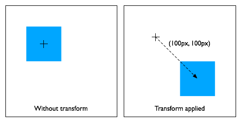
  div {
      transform: translate(100px, 100px);
  }
Move the element by 100 pixels in both the X and Y directions.
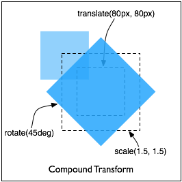
  div {
      height: 100px; width: 100px;
      transform: translate(80px, 80px) scale(1.5, 1.5) rotate(45deg);
  }
Move the element by 80 pixels in both the X and Y directions, then scale
the element by 150%, then rotate it 45 degrees clockwise about the Z axis.
Note that the scale and rotate operate about the center of the element,
since the element has the default transform-origin of 50% 50%.
6. Transitions and animations
between transform values
When animating or transitioning the value of a transform property the
rules described below are applied. The ‘from’ transform is the transform at the start
of the transition or current keyframe. The ‘end’ transform is the transform at the end of
the transition or current keyframe.
See the currently
open issue on what "of the same type" means.
- If the ‘
from’ and
‘to’ transforms are both single
functions of the same type:
- For translate, translateX, translateY, scale, scaleX, scaleY,
rotate, skew, skewX and skewY functions:
- the individual components of the function are interpolated
numerically.
- For matrix:
- the matrix is decomposed using the
method described by unmatrix into separate translation, scale,
rotation and skew matrices, then each decomposed matrix is
interpolated numerically, and finally combined in order to produce a
resulting 3x2 matrix.
- If both the ‘
from’ and
‘to’ transforms are "none":
- There is no interpolation necessary
- If one of the ‘
from’ or
‘to’ transforms is "none":
- The ‘
none’ is replaced by
an equivalent identity function list for the corresponding transform
function list.
For example, if the ‘from’
transform is "scale(2)" and the ‘to’ transform is "none" then the value
"scale(1)" will be used as the ‘to’ value, and animation will proceed
using the rule above. Similarly, if the ‘from’ transform is "none" and the
‘to’ transform is "scale(2)
rotate(50deg)" then the animation will execute as if the ‘from’ value is "scale(1) rotate(0)".
The identity functions are translate(0), translateX(0),
translateY(0), scale(1), scaleX(1), scaleY(1), rotate(0), skewX(0),
skewY(0) and matrix(1, 0, 0, 1, 0, 0).
- If both the ‘
from’ and
‘to’ transforms have the same
number of transform functions and corresponding functions in each
transform list are of the same type:
- Each transform function is animated with its corresponding
destination function in isolation using the rules described above. The
individual values are then applied as a list to produce resulting
transform value.
- Otherwise:
- The transform function lists are each converted into the equivalent
matrix value and animation proceeds using the rule for a single
function above.
In some cases, an animation might cause a transformation matrix to be
singular or non-invertible. For example, an animation in which scale moves
from 1 to -1. At the time when the matrix is in such a state, the
transformed element is not rendered.
7. Matrix
decomposition for animation
When interpolating between 2 matrices, each is decomposed into the
corresponding translation, rotation, scale and skew values. Not all
matrices can be accurately described by these values. Those that can't are
decomposed into the most accurate representation possible, using the
technique below. This technique is taken from The "unmatrix" method in
"Graphics Gems II, edited by Jim Arvo", simplified for the 2D case.
7.1. Unmatrix
  Input:  a, b, c, d ; 2x2 matrix (rotate, scale, shear) components
          tx, ty     ; translation components
  Output: translate  ; a 2 component vector
          rotate     ; an angle
          scale      ; a 2 component vector
          skew       ; skew factor
  Returns false if the matrix cannot be decomposed, true if it can

  Supporting functions (point is a 2 component vector):
    float  length(point)                returns the length of the passed vector
    point  normalize(point)             normalizes the length of the passed point to 1
    float  dot(point, point)            returns the dot product of the passed points
    float  atan2(float y, float x)      returns the principal value of the arc tangent of
                                        y/x, using the signs of both arguments to determine
                                        the quadrant of the return value

  Decomposition also makes use of the following function:
    point combine(point a, point b, float ascl, float bscl)
        result[0] = (ascl * a[0]) + (bscl * b[0])
        result[1] = (ascl * a[1]) + (bscl * b[1])
        return result

  // Make sure the matrix is invertible
  if ((a * d - b * c) == 0)
    return false

  // Take care of translation
  translate[0] = tx
  translate[1] = matrix[3][1]

  // Put the components into a 2x2 matrix 'mat'
  mat[0][0] = a
  mat[0][1] = b
  mat[1][0] = c
  mat[1][1] = d

  // Compute X scale factor and normalize first row.
  scale[0] = length(row[0])
  row[0] = normalize(row[0])

  // Compute shear factor and make 2nd row orthogonal to 1st.
  skew = dot(row[0], row[1])
  row[1] = combine(row[1], row[0], 1.0, -skew)

  // Now, compute Y scale and normalize 2nd row.
  scale[1] = length(row[1])
  row[1] = normalize(row[1])
  skew /= scale[1];

  // Now, get the rotation out
  rotate = atan2(mat[0][1], mat[0][0])

  return true;
7.2. Animating the
components
Once decomposed, each component of each returned value of the source
matrix is linearly interpolated with the corresponding component of the
destination matrix. For instance, the translate[0] and translate[1] values
are interpolated numerically, and the result is used to set the
translation of the animating element.
7.3. Recomposing the
matrix
This section is not normative.
After interpolation the resulting values are used to position the
element. One way to use these values is to recompose them into a 3x2
matrix. This can be done using the Transformation Functions of the transform property. The following JavaScript
example produces a string for this purpose. The values passed in are the
output of the Unmatrix function above:
function compose(translate, rotate, scale, skew, elementID)
{
    var s = " translate(" + translate[0] + ", " + translate[1] + ")";
    s += " rotate(" + rotate + ")";
    s += " skewX(" + skew + ")";
    s += " scale(" + scale[0] + ", " + scale[1] + ")";
    document.getElementById(elementID).style.transform = s;
}
8. DOM Interfaces
This section describes the interfaces and functionality added to the
DOM to support runtime access to the functionality described above.
8.1. CSSMatrix
- Interface CSSMatrix
-
The CSSMatrix interface represents a 3x2 homogeneous
matrix.
We actually describe a 3x2 matrix here, similar to
SVGMatrix.
- IDL Definition
-
  interface CSSMatrix {
      attribute float a;
      attribute float b;
      attribute float c;
      attribute float d;
      attribute float e;
      attribute float f;

      void        setMatrixValue(in DOMString string) raises(DOMException);
      CSSMatrix   multiply(in CSSMatrix secondMatrix);
      CSSMatrix   inverse() raises(DOMException);
      CSSMatrix   translate(in float x, in float y);
      CSSMatrix   scale(in float scaleX, in float scaleY);
      CSSMatrix   skewX(in float angle);
      CSSMatrix   skewY(in float angle);
      CSSMatrix   rotate(in float angle);
  };
- Attributes
-
-
a-f of type float
- Each of these attributes represents one of the values in the 3x2
matrix.
- Methods
-
-
setMatrixValue
-
The
setMatrixValue method replaces
the existing matrix with one computed from parsing the passed string
as though it had been assigned to the transform property in a CSS
style rule.
Parameters
-
string of type
DOMString
- The string to parse.
No Return Value
Exceptions
-
DOMException SYNTAX_ERR
- Thrown when the provided string can not be parsed into a
CSSMatrix.
-
multiply
-
The
multiply method returns a new
CSSMatrix which is the result of this matrix multiplied by the
passed matrix, with the passed matrix to the right. This matrix is
not modified.
Parameters
-
secondMatrix of type
CSSMatrix
- The matrix to multiply.
Return Value
-
CSSMatrix
- The result matrix.
No Exceptions
-
inverse
-
The
inverse method returns a new
matrix which is the inverse of this matrix. This matrix is not
modified.
No Parameters
Return Value
-
CSSMatrix
- The inverted matrix.
Exceptions
-
DOMException NOT_SUPPORTED_ERR
- Thrown when the CSSMatrix can not be inverted.
-
translate
-
The
translate method returns a new
matrix which is this matrix multiplied by a translation matrix
containing the passed values. This matrix is not modified.
Parameters
-
x of type
float
- The X component of the translation value.
-
y of type
float
- The Y component of the translation value.
Return Value
-
CSSMatrix
- The result matrix.
No Exceptions
-
scale
-
The
scale method returns a new matrix
which is this matrix multiplied by a scale matrix containing the
passed values. If the y component is undefined, the x component
value is used in its place. This matrix is not modified.
Parameters
-
scaleX of type
float
- The X component of the scale value.
-
scaleY of type
float
- The (optional) Y component of the scale value.
Return Value
-
CSSMatrix
- The result matrix.
No Exceptions
-
rotate
-
The
rotate method returns a new
matrix which is this matrix multiplied by a
rotation
matrix. The rotation value is in degrees. This matrix is not
modified.
Parameters
-
angle of type
float
- The angle of rotation.
Return Value
-
CSSMatrix
- The result matrix.
No Exceptions
-
skewX
-
The
skewX method returns a new matrix
which is this matrix multiplied by a matrix representing a
skew along
the x-axis. The rotation value is in degrees. This matrix is not
modified.
Parameters
-
angle of type
float
- The angle of skew along the X axis.
Return Value
-
CSSMatrix
- The result matrix.
No Exceptions
-
skewY
-
The
skewX method returns a new matrix
which is this matrix multiplied by a matrix representing a
skew along
the y-axis. The rotation value is in degrees. This matrix is not
modified.
Parameters
-
angle of type
float
- The angle of skew along the Y axis.
Return Value
-
CSSMatrix
- The result matrix.
No Exceptions
In addition to the interface listed above, the
getComputedStyle method of the Window object has
been updated. The transform property
of the style object returned by getComputedStyle contains a
DOMString of the form "matrix(a, b, c, d, e, f)" representing the 3x2
matrix that is the result of applying the individual functions listed in
the transform property.
9. References
Normative references
-
Other references
-
Property index
| Property
| Values
| Initial
| Applies to
| Inh.
| Percentages
| Media
|
| transform
| none | <transform-function> [ <transform-function> ]*
| none
| block-level and atomic inline-level elements
| no
| refer to the size of the element's border box
| visual
|
| transform-origin
| [ top | bottom ] | [ <percentage> | <length> | left |
center | right ] [ <percentage> | <length> | top | center |
bottom ]? | [ center | [ left | right ] [ <percentage> |
<length> ]? ] && [ center | [ top | bottom ] [
<percentage> | <length> ]? ]
| 50% 50%
| block-level and atomic inline-level elements
| no
| refer to the size of the element's border box
| visual
|
Index
- transform, 2.
- transform-origin, 3.