Abstract
This document presents a set of text formatting properties for CSS3. Many of
these properties already existed in CSS2 [CSS2]. Many of the new properties have been added to
address basic
requirements in international text layout, particularly for East Asian and bidirectional
text.
Status of This Document
This specification is one of the "modules" for the upcoming CSS
level 3 (CSS3) specification. It has been developed by the CSS
Working Group which is
part of the Style Activity (see summary). It contains
features to be included in CSS level 3.
This is a Candidate Recommendation, which
means W3C believes the specification is ready to be implemented.
All persons are encouraged to review and implement this
specification and send comments to the (archived) public
mailing list www-style (see instructions). W3C Members
can also send comments directly to the CSS Working Group.
For this specification to become a W3C Recommendation, the
following criteria must be met:
There must be at least two interoperable implementations for
every feature in the specification.
For the purposes of this criterion, we define the following
terms:
- feature
- a section or subsection in the specification
- interoperable
- passing the respective test case(s) in the test suite, or, if
the implementation is not a web browser, an equivalent test. Every
relevant test in the test suite should have an equivalent test
created if such a user agent (UA) is to be used to claim
interoperability. In addition if such a UA is to be used to claim
interoperability, then there must one or more additional UAs which
can also pass those equivalent tests in the same way for the
purpose of interoperability. The equivalent tests must be made
publically available for the purposes of peer review.
- implementation
- a user agent which:
- implements the feature.
- is available (i.e. publicly downloadable or available
through some other public point of sale mechanism). This is the
"show me" requirement.
- is shipping (i.e. development, private or unofficial
versions are insufficient).
- is not experimental (i.e. is intended for a wide audience
and could be used on a daily basis.)
- A minimum of six months of the CR period must have elapsed. This
is to ensure that enough time is given for any remaining major
errors to be caught.
The comments that the CSS WG received on the last working draft,
together with responses and resulting changes are listed in the disposition of
comments.
This document has been produced as a combined effort of the W3C Internationalization Activity, and the
Style Activity. It also includes extensive
contribution made by participants in the XSL Working
Group (members
only). Finally, some of the proposal surfaced first in the Scalable
Vector Graphics (SVG) 1.1 Specification [SVG1.1]. The text has been duplicated in this document
to reflect which properties and specification should eventually be referenced
in CSS itself.
Patent disclosures relevant to CSS may be found on the Working
Group's public patent disclosure
page.
To find the latest version of this Working Draft, please follow the
"Latest version" link above, or visit the list of W3C Technical Reports.
Contents
1. Dependencies on other
modules
This CSS3 module depends on the following CSS3 modules:
- Fonts
- Line
- Syntax and grammar
- Values and unit
It has non-normative (informative) references to the following CSS3
modules:
2. Introduction
In both CSS1 and CSS2, text formatting has been limited to simple effects
like: text decoration, text alignment and letter spacing.
However, international typography contains types of formatting that could not
be achieved without using special workarounds or graphics.
Along with already existing text-related properties, this document
presents a number of new CSS properties to represent such formatting. The features this proposal covers include two of the most important
features for East Asian typography: vertical text and layout grid.
There are a number of illustrations in this document for which the
following legend is used:

- - wide-cell glyph (e.g. Han) which is the n-th glyph in the text run,

- - narrow-cell glyph (e.g. Latin)
which is the n-th glyph in the text run,

- - connected glyph (e.g. Arabic)
which is the n-th glyph in the text run.
Many typographical properties in East Asian typography depends on the fact
that a character is typically rendered as either a wide or narrow glyph.
All characters described by the Unicode Standard [UNICODE] can be categorized by a width property. This
is covered by the Unicode Standard Annex #11, East Asian Width
[UAX-11].
The orientation which the above symbols assume in the diagrams corresponds
to the orientation that the glyphs they represent are intended to assume when
rendered in the UA (user agent). Spacing between these glyphs in the
diagrams is usually symbolic, unless intentionally changed to make a point.
Furthermore, all properties, in addition to the noted values, take
'initial' and 'inherit'. These values are not repeated in
property value enumerations.
This module uses extensively the 'before', 'after', 'start' and
'end' notation to specify the four edges of a box relative to its text
advance direction, independently of its absolute orientation in terms of
'top', 'bottom', 'left' and 'right' (corresponding respectively to the
'before', 'after', 'start' and 'end' positions in a typical Western text
layout). This notation is also used extensively in [XSL1.0] for the same purpose.
The term 'Latin' is used frequently in this document to designate behavior
shared among popular writing scripts in Europe and America based on the Latin,
Greek and Cyrillic scripts.
Finally, in this document, requirements are expressed using the key words
"MUST", "MUST NOT", "REQUIRED",
"SHALL" and "SHALL NOT". Recommendations are expressed
using the key words "SHOULD", "SHOULD NOT" and
"RECOMMENDED". "MAY" and "OPTIONAL" are used to
indicate optional features or behavior. These keywords are used in accordance
with [RFC2119]. For legibility these
keywords are used in small caps form.
3. Text layout
3.1. Text layout introduction
This section describes the text layout features supported by CSS, which
includes support for various international writing directions, such as
left-to-right (e.g., Latin scripts), right-to-left (e.g., Hebrew or Arabic),
bidirectional (e.g., mixing Latin with Arabic) and vertical (e.g., Asian
scripts).
The 'direction' property, already defined in CSS2,
determines an inline-progression. The 'block-progression' property determines a
block-progression. The 'writing-mode' shorthand combines inline and
block progression together. For example, Latin scripts are typically written
with a left to right inline-progression and a top to bottom block-progression.
The glyph orientation
is the
orientation of the rendered visual shape of characters relative to the
block-progression and the bottom of the block box.
Within a line, the inline-progression for characters is based on the
current glyph orientation, the metrics of the glyph just rendered, kerning
tables in the font, and the current values of various attributes and
properties, such as the spacing properties.
For many combinations of 'direction', 'block-progression' and glyph orientation values, the proper directionality
and ordering of text are determined the Unicode Bidirectional Algorithm [UAX9]. CSS relies on that algorithm to achieve proper bidirectional
text rendering and possible reordering. Furthermore, with the 'unicode-bidi' property, the style sheet can influence
the bidirectional algorithm by allowing new embedding levels and direction
overrides.
Note: The Unicode Standard Annex
#9, The Bidirectional Algorithm [UAX9]
defines a bidirectional algorithm that determines the character directionality for
bidirectional text. The display ordering of bidirectional text depends upon the
directional properties of the characters in the text.
The HTML 4.01 specification ([HTML401], section 8.2) defines bidirectionality
behavior for HTML elements. Conforming HTML user agents
MAY therefore ignore the 'direction' and 'unicode-bidi' properties in author and user
style sheets. The style sheet rules that would achieve the bidirectionality behavior
specified in HTML 4.01 are given in the sample style sheet. The HTML
4.01 specification also contains more information on bidirectionality issues.
Note: HTML 4.01
only allows the change of inline-progression whereas the 'block-progression' and the
'writing-mode'
properties allow the change of the block-progression.
3.2. Setting
the inline-progression and block-progression: the 'direction', 'block-progression' properties and the
shorthand 'writing-mode' property
| Name:
| direction
|
| Value:
| ltr | rtl
|
| Initial:
| ltr
|
| Applies to:
| all elements and generated content, but see prose
|
| Inherited:
| yes
|
| Percentages:
| N/A
|
| Media:
| visual
|
| Computed value:
| specified value (except for initial and inherit)
|
The 'direction' property sets the inline-progression
value. Possible values:
- ltr
- Left-to-right direction.
- rtl
- Right-to-left direction.
This property specifies the inline-progression and the
direction of embeddings and overrides (see 'unicode-bidi') for the Unicode Bidirectional
Algorithm [UAX9]. The values 'ltr' and 'rtl' are interpreted relative to the
'block-progression'. For example, a 'ltr'
inline-progression goes from the left to the right of the box when the
'block-progression' is set to 'tb'; the same 'ltr'
inline-progression goes from the top to the bottom of the box when 'block-progression' is set to 'rl'.
This property also affects the direction of table column layout, the direction of the
overflow when determined by
the inline-progression (such as the 'start' and 'end' values of
the 'text-align'
property), the initial alignment of text and the position of an incomplete
last line in a block in case of 'text-align:
justify' and many other properties affected by inline-progression changes.
Note: Even when the
inline-progression is
left-to-right or right-to-left, some or all of the character content within a given
element might advance in the opposite direction because of the Unicode Bidirectional Algorithm [UAX9] or because of explicit text
advance overrides due to the usage of this property and 'unicode-bidi' on children elements.
For the 'direction' property to have any effect on
inline-level elements, the following conditions must be met:
- the 'unicode-bidi' property's value MUST be:
- 'embed' or
- 'bidi-override'
and:
For more on bidirectional text, see the section about Embedding and override.
Note: The 'direction' property, when specified for table
column elements, is not inherited by cells in the column since column elements
are never the ancestors of their constituent cell elements. Thus, CSS cannot easily capture the "dir"
attribute inheritance rules described in [HTML4.01], section 11.3.2.
| Name:
| block-progression
|
| Value:
| tb | rl | lr |
| Initial:
| tb |
| Applies to:
| all elements and generated content
|
| Inherited:
| yes
|
| Percentages:
| N/A
|
| Media:
| visual
|
| Computed value:
| specified value (except for initial and inherit)
|
The 'block-progression' property sets the
block-progression value and the flow orientation. Possible values:
- tb
- Top-to-bottom direction. The flow orientation is horizontal.
- rl
- Right-to-left direction. The flow orientation is vertical.
- lr
- Left-to-right direction. The flow orientation is vertical.
An inline-level element that has a different 'block-progression' from its parent becomes
an 'inline-block' element[CSS3-box]. Two cases are possible:
- The two block-progressions are perpendicular to each other (for example, 'tb'
and 'lr'). In such cases, the content
height of the element within the line box height is determined by its maximum inline
progression dimension (advance width). However, the resulting line height is
determined by other properties such as the 'text-height' and the
'line-stacking-strategy' [CSS3-line].
- The two block-progressions are parallel to each other (for example, 'rl'
and 'lr'). In such cases, the content width of the element within the line box
width is determined by its maximum inline progression dimension.
In horizontal flow orientations, the top and bottom margins can be
collapsed. For vertical flow orientations, the left and right margin can be
collapsed. See "Collapsing margins" in the CSS3 Box module
[CSS3-box] for
the details of collapsing margins.
| Name:
| writing-mode
|
| Value:
| lr-tb | rl-tb | tb-rl | tb-lr |
| Initial:
| not defined for shorthand properties |
| Applies to:
| all elements and generated content
|
| Inherited:
| yes
|
| Percentages:
| N/A
|
| Media:
| visual
|
| Computed value:
| see individual properties
|
The 'writing-mode' property is a shorthand
property for the 'direction' property and the 'block-progression' property. Although
strictly speaking, the property has no initial value, it is equivalent to 'lr-tb'.
The definition of the property values are established by the following table,
which shows the setting of the constituent properties and example of common
usage.
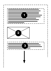
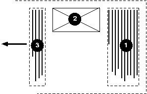
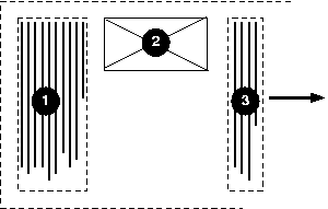
In the following example, two blocks elements (1 and 3) separated by an image
(2) are presented in various flow orientations.
Here is a diagram of a horizontal flow ("writing-mode: lr-tb"):
Here is a diagram for a vertical flow used in East Asia
("writing-mode: tb-rl"):
And finally, here is a diagram for another flow used for Uighur and
Mongolian ("writing-mode: tb-lr"):
In East Asian documents, it is often preferred to display certain
Latin-based strings, such as numerals in a year, always in a horizontal
flow orientation regardless of the flow orientation of the line of text these strings
appear in, as in:
In Japanese, this effect is known as "Tate-chu-yoko". In order to achieve it in an XHTML context, the Latin
string should be enclosed in a span element with a
horizontal flow orientation, as in:
.date {writing-mode: lr-tb;}
<span class="date">1996</span>
In some cases, it is required to alter the orientation of a sequence of
glyphs relative to the block-progression. The requirement is
particularly applicable to vertical layouts of East Asian documents, where
sometimes half-width Latin text is to be displayed horizontally and other
times vertically.
Two properties control the glyph orientation relative to the
block-progression. 'glyph-orientation-vertical'
controls glyph orientation when the flow orientation is
vertical. 'glyph-orientation-horizontal'
controls glyph orientation when the flow orientation is horizontal.
| Name:
| glyph-orientation-vertical
|
| Value:
| <angle> | auto | upright | inline |
| Initial:
| auto
|
| Applies to:
| all elements and generated content
|
| Inherited:
| yes
|
| Percentages:
| N/A
|
| Media:
| visual
|
| Computed value:
| specified value (except for initial and inherit)
|
- <angle>
- Although any angle value may be used, the behavior related to the value is
determined by rounding it to the nearest multiple of 90 degrees.
- A value of "0deg" indicates that all glyphs are
oriented with the bottom of the glyphs toward the bottom of the block, resulting in glyphs which are stacked vertically on top of each
other.
- A value of "90deg" indicates a rotation of 90
degrees from the "0deg" orientation -- clockwise in right-to-left
block-progression and counterclockwise in left-to-right block-progression.
- A value of "270deg" indicates a rotation of 270
degrees from the "0deg" orientation -- clockwise in
right-to-left block-progression and counterclockwise in left-to-right
block-progression.
- A value of "180deg" indicates that
all glyphs are oriented with the bottom of the glyphs toward the top of the
block.
- auto
- The glyph orientation is
determined automatically based on the Unicode character code of the
rendered character.
- Full-width ideographic and full-width Latin glyphs are oriented as if an <angle> of "0deg"
had been specified.
- Ideographic punctuation and other characters having alternate
horizontal and vertical glyphs MUST use the vertical glyph.
- Glyphs from the Mongolian script are also oriented as if an <angle> of "0deg"
had been specified.
- Other glyphs, including Hebrew and Arabic are set as if an <angle> of "90deg" had been
specified.
- upright
- Glyphs are oriented as if an <angle> of "0deg"
had been specified. However all vertical alternates of the glyphs should be
used. Enclosing punctuations such as parentheses should be oriented to face in
the text they enclose. The user agent may use heuristic to determine the best
orientation for symbols that are flow orientation dependent.
- inline
- All glyphs are laid out top to bottom
regardless of inherent direction. The embedding levels, as determined by the bidirectional algorithm [UAX9], are used to set the orientation of some
glyphs (see following prose).
- Full-width ideographic and full-width Latin glyphs are oriented as if an <angle> of "0deg"
had been specified.
- Ideographic punctuation and other ideographic characters having alternate
horizontal and vertical glyphs MUST use the vertical glyph.
- Glyphs from the Mongolian script are also oriented as if an <angle> of "0deg"
had been specified.
- Glyphs for all characters in even embedding levels are rotated 90
degrees clockwise from the "0deg" orientation.
- Glyphs for all characters in odd embedding levels are rotated 90 degrees
counter-clockwise from the "0deg" orientation.
For this value of 'glyph-orientation-vertical', the directionality of characters cannot be changed by the 'direction' property.
The bidirectional algorithm [UAX9] applies differently depending on
the value of the glyph vertical orientation, either specified as an <angle> value, or as
implied by one of the 'glyph-orientation-vertical'
keyword values. Possible effects:
- If the glyph orientation is 0 degree or 180 degree, the corresponding
characters are treated as 'L' (left-to-right) if the 'block-progression' value is 'rl', and 'R'
(right-to-left) if the 'block-progression' value is 'lr'.
- If the glyph orientation is 90 degree clockwise,
the corresponding characters are treated as normal (directionality derived
from character property) if the 'block-progression' value is 'rl', but 'R'
(right-to-left) if the 'block-progression' value is 'lr'.
- If the glyph orientation is 270 degree clockwise,
the corresponding characters are treated as 'L' (left-to-right) if the 'block-progression' value is 'rl', but normal
(directionality derived from character property) if the 'block-progression'
value is 'lr'.
Conforming user
agents MUST at least support the 'auto' and "90deg"
value. The user agent
MAY round the actual value of the angle to the values of glyph
rotation supported by the user agent. However, this does not affect the computed value.
The glyph orientation affects the amount that the current text position
advances as each glyph is rendered. It also affects how the glyph is aligned
relative to the baseline. When the flow orientation is vertical and the
'glyph-orientation-vertical' value
results in a glyph orientation angle which is a multiple of 180deg, then the
current text position is incremented according to the vertical metrics of the
glyph, and the glyph is aligned using the vertical alignment-point as described
in the CSS3 Line module [CSS3-line].
The diagrams below illustrate different uses of 'glyph-orientation-vertical'.
The diagram on the left shows the result of the mixing of full-width
ideographic characters with normal-width Latin characters when 'glyph-orientation-vertical'
for the span containing the Latin characters is either auto or "90deg". The diagram on the right show the result of mixing
full-width ideographic characters with normal-width Latin characters when the
span containing the Latin
characters is specified to have a 'glyph-orientation-vertical' of
"0deg".
Note: The effect on the right can be also
be achieved by using full-width Latin characters and using
'glyph-orientation-vertical: auto' for the span containing the ideographic
characters and the full-width Latin characters.
| Name:
| glyph-orientation-horizontal
|
| Value:
| <angle> | auto | inline |
| Initial:
| auto |
| Applies to:
| all elements and generated content
|
| Inherited:
| yes
|
| Percentages:
| N/A
|
| Media:
| visual
|
| Computed value:
| specified value (except for initial and inherit) |
- <angle>
- Although any angle value may be used, the behavior related to the value is
determined by rounding it to the nearest multiple of 90 degrees.
- A value of "0deg" indicates that all glyphs are
oriented with the bottom of the glyphs toward the bottom of the block, resulting in glyphs which are
positioned side by side.
- A value of "90deg" indicates a rotation
clockwise of 90
degrees from the "0deg" orientation.
- A value of "270deg" indicates a rotation
clockwise of 270
degrees from the "0deg" orientation.
- A value of "180deg" indicates that
all glyphs are oriented with the bottom of the glyphs toward the top of the
block.
- auto
- The glyph orientation relative to the inline-progression is
determined automatically based on the Unicode character code of the
rendered character.
- Full-width ideographic and full-width Latin glyphs (excluding some ideographic
punctuation and bracket symbols) are oriented as if an <angle> of "0deg"
had been specified.
- Ideographic punctuation and other characters having alternate
horizontal and vertical glyphs MUST use the
horizontal glyph.
- Glyphs from the Mongolian script are oriented as if an <angle> of "90deg"
had been specified.
- Other glyphs, including Hebrew and Arabic are set as if an <angle> of "0deg" had been
specified.
- inline
- All glyphs are laid out left to right regardless of inherent direction. The
embedding levels, as determined by the bidirectional algorithm [UAX9], are used to set the orientation of some
glyphs (see following prose).
- Full-width ideographic and full-width Latin glyphs are oriented as if an <angle> of "0deg"
had been specified.
- Ideographic punctuation and other ideographic characters having alternate
horizontal and vertical glyphs MUST use the
horizontal glyph.
- Glyphs for all characters in even embedding levels are oriented as if an
<angle> of "0deg" had been specified.
- Glyphs for all characters in odd embedding levels are rotated 180 degrees
from the "0deg" orientation.
For this value of 'glyph-orientation-horizontal', the directionality of characters cannot be changed by the 'direction' property.
The bidirectional algorithm [UAX9] applies differently depending on
the value of the glyph horizontal orientation, either specified as an <angle> value, or as
implied by one of the 'glyph-orientation-horizontal'
keyword values. Possible effects:
- If the glyph orientation is 0 degree, the corresponding characters are
treated as normal (directionality derived from
character property).
- If the glyph orientation is 90 degree, glyphs from
the Mongolian script are treated as 'R' (right to left), other characters are
treated as 'L' (left-to-right).
- If the glyph orientation is 180 degree or 270
degree clockwise, the corresponding characters are treated as 'L'
(left-to-right).
Conforming user
agents MUST at least support the 'auto' and "0deg"
value. The user agent
MAY round the actual value of the angle to the values of glyph
rotation supported by the user agent. However, this does not affect the computed value.
The glyph orientation affects the amount that the current text position
advances as each glyph is rendered. It also affects how the glyph is aligned
relative to the baseline. When the inline-progression is horizontal and the 'glyph-orientation-horizontal' value
results in a glyph orientation angle which is a multiple of "180deg", then the
current text position is incremented according to the horizontal metrics of the
glyph, and the glyph is aligned using the horizontal alignment-point as
described in the CSS3 Line module [CSS3-line].
3.4. Embedding and override:
the 'unicode-bidi'
property
| Name:
| unicode-bidi
|
| Value:
| normal | embed | bidi-override
|
| Initial:
| normal
|
| Applies to:
| all elements and generated content, but see prose
|
| Inherited:
| no
|
| Percentages:
| N/A
|
| Media:
| visual
|
| Computed value:
| specified (except for initial and inherit)
|
This property allows further control of the Unicode Bidirectional
Algorithm [UAX9] by allowing new embedding levels or direction overrides. Values for
this property have the following meanings:
- normal
- The element does not open an additional level of embedding with respect
to the bidirectional algorithm. For inline-level elements, implicit
reordering works across element boundaries.
- embed
- If the element is inline-level, this value opens an additional level of
embedding with respect to the bidirectional algorithm. The direction of this
embedding level is given by the 'direction' property. Inside the element,
reordering is done implicitly. This corresponds to adding a LRE (U+202A; for
'direction: ltr') or RLE (U+202B; for 'direction: rtl') at the start of the
element and a PDF (U+202C) at the end of the element.
- bidi-override
- For inline-level elements this creates an override. For
block-level elements this creates an override for inline-level
descendents not within another block. This
means that inside the element, reordering is strictly in sequence according
to the 'direction'
property; the implicit part of the bidirectional algorithm is ignored. This
corresponds to adding a LRO (U+202D; for 'direction: ltr') or RLO (U+202E;
for 'direction: rtl') at the start of the element and a PDF (U+202C) at the
end of the element.
The final order of characters in each block-level element is the same as
if the bidirectional control codes had been added as described above, mark-up had been
stripped, non-textual entities such as images treated as object replacement
characters (U+FFFC), and
the resulting character sequence had been passed to an implementation of the
Unicode Bidirectional Algorithm [UAX9] for plain text that produced the same
line-breaks as the styled text.
Note: In order to be able to flow inline boxes in a uniform
direction (either entirely left-to-right or entirely right-to-left), more
inline boxes (including anonymous inline boxes) may have to be created, and
some inline boxes may have to be split up and reordered before flowing.
Because the Unicode algorithm has a limit of 61 levels of embedding, care
should be taken not to use 'unicode-bidi' with a value other than
'normal' unless appropriate. In particular, a value of 'inherit' should be
used with extreme caution. However, for elements that are, in general,
intended to be displayed as blocks, a setting of 'unicode-bidi: embed' is preferred to keep the element
together in case display is changed to inline (see example below).
The following example shows an XML document with bidirectional text. It
illustrates an important design principle: DTD designers should take
bidirectionality into account both in the language proper (elements and attributes) and
in any accompanying style sheets. The style sheets should be designed so that
bidirectional rules are separate from other style rules. The bidirectional rules should not be
overridden by other style sheets so that the document language's or DTD's
bidirectional behavior is preserved.
Example(s):
In this example, lowercase letters in element contents stand for
inherently left-to-right characters and uppercase letters represent
inherently right-to-left characters:
<div xml:lang="he">
  <par>HEBREW1 HEBREW2 english3 HEBREW4 HEBREW5</par>
  <par>HEBREW6 <emph>HEBREW7</emph> HEBREW8</par>
</div>
<div xml:lang="en">
  <par>english9 english10 english11 HEBREW12 HEBREW13</par>
  <par>english14 english15 english16</par>
  <par>english17 <quo xml:lang=he">HEBREW18 english19 HEBREW20</quo></par>
</div>
Since this is XML, the style sheet is responsible for setting the writing
direction. This is the style sheet:
/* Rules for bidirectional */
div:lang(he)   {direction: rtl}
quo:lang(he)   {direction: rtl; unicode-bidi:  embed}
par:lang(en)   {direction: ltr}

/* Rules for presentation */
div, par  {display: block}
emph      {font-weight: bold}
The div element with xml:lang="he" is a block with a right-to-left base
direction, the div element with xml:lang="en" is a block with a left-to-right
base direction. The par elements are blocks that inherit the
base direction from their parents. Thus, the first two par elements
are read starting at the top right, the final three are read starting at the top
left.
The emph element is inline-level, and since its value for
'unicode-bidi' is
'normal' (the initial value), it has no effect on the ordering of the text.
The quo element, on the other hand, creates an embedding.
The formatting of this text might look like this if the line length is
long:
               5WERBEH 4WERBEH english3 2WERBEH 1WERBEH

                                8WERBEH 7WERBEH 6WERBEH

english9 english10 english11 13WERBEH 12WERBEH

english14 english15 english16

english17 20WERBEH english19 18WERBEH
Note that the quo embedding causes HEBREW18 to be to the
right of english19.
If lines have to be broken, it might be more like this:
       2WERBEH 1WERBEH
  -EH 4WERBEH english3
                 5WERB

   -EH 7WERBEH 6WERBEH
                 8WERB

english9 english10 en-
glish11 12WERBEH
13WERBEH

english14 english15
english16

english17 18WERBEH
20WERBEH english19
Because HEBREW18 must be read before english19, it is on the line above
english19. Just breaking the long line from the earlier formatting would not
have worked. Note also that the first syllable from english19 might have fit
on the previous line, but hyphenation of left-to-right words in a
right-to-left context, and vice versa, is usually suppressed to avoid having
to display a hyphen in the middle of a line.
3.5. Script character
classification: the 'text-script' property
Many text layout behaviors are relative to the script
classification of the text content. The Unicode Technical
Report [UAX-24]: "Script names" determines a script identifier
for all characters.
Note: There is also an ISO draft
standard [ISO15924] addressing script identification.
For some operations, such as baseline
alignment, a dominant script is required
to determine an alignment strategy for the whole element. A dominant script is
established by setting the 'text-script' property to an explicit script identifier
in conformance with [UAX-24], or by using the heuristic
determination computed by the user agent when the 'text-script' value is set to
'auto'.
In many other cases, such as white space handling or text
justification, the script property is used on a character by character basis. In
those cases, the 'text-script' property can be used to set an homogeneous value
for all characters of the element through the usage of an explicit script
identifier. But, if the 'text-script' is set to 'auto', the user agent will
establish a script property value for each character of the element.
| Name:
| text-script
|
| Value:
| auto | <script>
|
| Initial:
| auto
|
| Applies to:
| all elements and generated content
|
| Inherited:
| yes |
| Percentages:
| N/A
|
| Media:
| visual
|
| Computed value:
| specified value (except for initial and inherit)
|
Values have the following meanings:
- auto
- The user agent uses its own heuristic to determine the dominant script of the element's content.
In the absence of any textual components with an unambiguous script identifier
(or no textual content at all), the dominant script is 'LATIN'. An unambiguous
script identifier is any script value other than 'COMMON' or 'INHERITED'. For operations that do
not require a dominant script, but instead use a script determination on a
character by character basis within the element, the user agent will determine a
script value for each character based on its inherent script property as
established by [UAX-24]. In such cases, the values 'COMMON' or
'INHERITED' are valid.
Note: The heuristic determining
the dominant script may compare the script of the first character and last
character descendant which have unambiguous script identifiers [UAX-24]. If they are identical the script is determined,
otherwise a weighted method associated with the element's language setting or
any other hints may be used.
- <script>
- A script identifier in conformance with [UAX-24]. If the script identifier is either 'COMMON' or
'INHERITED' the dominant script value is 'LATIN', otherwise the dominant script
value is the specified value. All characters in the element are reclassified as
belonging to this dominant script. For example, setting 'text-script' to 'HAN'
makes the content behave as CJK content for line-breaking. Typically, an
explicit script value should be used only when the textual content is script
ambiguous and a specific behavior is sought.
Note: Script identifiers are not
case-sensitive.
4. Text alignment and
justification
4.1. Text alignment: the
'text-align' property
| Name:
| text-align
|
| Value:
| start | end | left | right | center | justify | <string>
|
| Initial:
| start
|
| Applies to:
| block-level and inline-block elements
|
| Inherited:
| yes
|
| Percentages:
| N/A
|
| Media:
| visual
|
| Computed value:
| specified value (except for initial, inherit and <string>, see prose for the
latter)
|
This property describes how inline content of a block is aligned. Values
have the following meanings:
- start
- The text is aligned on the start of the inline-progression.
- end
- The text is aligned on the end of the inline-progression.
- left, right
- In horizontal flow orientation, the text is aligned on the left or
right respectively. In vertical flow orientation, the alignment SHOULD be
interpreted relative to the 'block-progression'. That is, if the 'block-progression' value is 'rl', 'left'
means 'the top of the block' and 'right' means 'the bottom of the block'. If the 'block-progression' value is 'lr', 'left'
means 'the bottom of the block' and 'right' means 'the top of the block'. Unlike
the 'start' and 'end' values, 'left' and 'right' are not related to the
current inline-progression.
- center
- The text is center aligned.
- justify
- The text is justified. The justification algorithm can be further refined
by using the 'text-justify' property. Although
conforming CSS2 user agents
could interpret the value 'justify' as 'start',
conforming CSS3 user
agents may not, unless a profile specifies otherwise.
- <string>
- Specifies a string on which cells in a table column will align (see the
section on horizontal
alignment in a column for details and an example). This value applies
only to table cells. If set
on other elements, the computed value is 'start', otherwise it is as specified.
A block of text is a stack of line boxes. In the case of
'start', 'end', 'left', 'right' and 'center', this property specifies how the
inline boxes within each line box align with respect to the line box's start
and end sides; alignment is not with respect to the viewport. In the case of
'justify', the UA may stretch the inline boxes in addition to adjusting their
positions. (See also 'letter-spacing' and 'word-spacing'.)
Example(s):
In this example, note that since 'text-align' is inherited, all block-level
elements inside the div element with 'class=important' will have
their inline content centered.
div.important { text-align: center }
Note: The property's initial value has changed between
CSS2 and CSS3 from being UA dependent in CSS2 to be related to the current
inline-progression in CSS3
(through the usage of the 'start' value).
4.2. Justification:
the 'text-justify'
property
| Name:
| text-justify
|
| Value:
| auto | inter-word | inter-ideograph | distribute | newspaper |
inter-cluster | kashida
|
| Initial:
| auto
|
| Applies to:
| block-level and inline-block elements
|
| Inherited:
| yes
|
| Percentages:
| N/A
|
| Media:
| visual
|
| Computed value:
| specified value (except for initial and inherit)
|
This property selects the justification algorithm used when 'text-align' is set to 'justify'. Most values affects different type of writing systems in
different ways. Writing systems are grouped as follows:
- CJK and Hangul and by extension all 'wide' characters,
- Devanagari and all South Asian scripts using baseline connector (such as
Bengali and Gurmukhi),
- South Eastern Asian scripts that do not use space between words (such as Thai,
Lao, Khmer, Myanmar),
- Cursive scripts like Arabic,
- Scripts using space between word without connector (such as Latin, Greek,
Cyrillic, Hebrew,
etc...) and symbol characters.
Depending on script classification value (controlled by the 'text-script' property value) and the 'text-justify'
property value, spacing may be altered between words
or letters or both.
The possible values for the text-justify property are:
- auto
- The UA determines the justification algorithm to follow, based on a
balance between performance and adequate presentation quality. Inter-word
expansion is typically used for all scripts that use space as word delimiter.
The concept of a word is script dependent, although the user agent determines
the exact algorithm. If the
'text-kashida-space' property has a non zero
percent value it is recommended
to use kashida elongation for Arabic text. Inter-cluster spacing may also occur.
- inter-word
- Selects the simplest and fastest full justification behavior, which spreads
the text evenly across the line by increasing the width of the space between
words only. The concept of a word is script dependent, although the user agent
determines the exact algorithm. At minimum, justification is expected to occur
at each white space boundary. No expansion or compression
occurs within the words, i.e. no additional letter spacing is created. No kashida effect takes place.
Note: White space does not
include zero-width-space, therefore justification should not expand these
characters. However justification is expected to expand white space with explicit width set by the
'word-spacing'
property.
The diagram below illustrates this mode, by showing how the glyphs are
laid out in the last two lines of an element:
For example a viewer could render an 'inter-word' justified paragraph in
the following way:
- newspaper
- Selects the justification behavior in which both inter-word and inter-letter
spacing can be expanded or reduced to spread the text across the whole line.
Also, text distribution on any given line may depend on the layout or the
contents of the previous or the following several lines. This is the
significantly slower and more sophisticated type of the full justify behavior
preferred in newspaper and magazines, as it is especially useful for narrow
columns. For example, typically, compression is tried first. If unsuccessful,
expansion occurs: inter-word spaces are expanded up to a threshold, and finally
inter-letter expansion is performed. Inter-letter spacing is not applied to Devanagari and other South Asian writing systems
using baseline connectors. Kashida elongation and inter-cluster spacing may
occur. The threshold value may be related to the ratio of
column width to font size. The exact layout algorithm is determined by
the user agent. Further explanation about multi-column layout can be found in
the CSS3 Multi-column layout module.
The diagram below illustrates this mode:
Note: In CSS3 a value of 'letter-spacing: 0' no longer strictly inhibits spacing-out
of words for justification. The letter-spacing value is just an entry to the
letter-spacing process that occurs prior to the possible justification
process. Justification may alter the initial spacing between letters,
especially with the 'text-justify: newspaper' value.
- inter-ideograph
- In this mode, letter-spacing modification only occurs for the CJK group.
Others only use inter-word expansion. No kashida effect takes place. This is
the preferred justification in the context of the Japanese writing system,
but not Latin nor Korean.
The diagram below illustrates this mode:
Below is an example of how this mode would work:
- distribute
- Like 'newspaper' it allows letter spacing modification for most script
groups (except the Devanagari group), but unlike newspaper, it does not prioritize between
word spacing and letter spacing, i.e. the space character gets the same
letter spacing modification as others. And by consequence there are no
variations between narrow and wide columns. Kashida elongation and inter-cluster
spacing may occur. This value is best used in East
Asian context.
The diagram below illustrates this mode:
For example a viewer could render a 'distribute' justified paragraph in
the following way:
- inter-cluster
- This is the Southeast Asian
counterpart to 'inter-ideograph'. That is letter spacing only occurs between
script-defined grapheme clusters occurring in Southeast Asian scripts.
Note: A grapheme cluster is what a language user consider to be a character
or a basic unit of the language. The term is described in detail in the Unicode
Technical Report [UAX-29]: Text Boundaries.
- kashida
- This is the Arabic counterpart to 'inter-ideograph'. Letter spacing may be
increased between Arabic letters, the extra space being filled by kashida. The
amount of kashida elongation is controlled by the
'text-kashida-space' property. If 'text-kashida-space'
is set to '0%' (which is the initial value), there will be no kashida effect. No letter spacing occurs for other scripts.
The following table describes the expansion/compression strategy for the
combination of each script groups and the text-justify property value for
each relevant text-justify property value:
*The values shown for the auto column are only a
recommendation. The UAs might implement a different strategy.
**The Latin entry represents as well other scripts and writing systems used
in Europe and America that use the same typographic convention for justification
such as Greek, Cyrillic, etc.
***The Devanagari entry represents as well other scripts and writing systems
used in India that use baseline connectors (such as Bengali and Gurmukhi).
4.3. Last line
alignment: the 'text-align-last' property
| Name:
| text-align-last
|
| Value:
| start | end | center | left | right | justify | size
|
| Initial:
| start |
| Applies to:
| block-level and inline-block elements
|
| Inherited:
| yes
|
| Percentages:
| N/A
|
| Media:
| visual
|
| Computed value:
| specified value (except for initial and inherit)
|
This property describes how the last line of the inline content of a block
is aligned when 'text-align' is set to 'justify'. This also applies to the only line of a block if it contains a
single line, the line preceding a br element in a XHTML context, or
a hard line break in other languages, and to last lines of anonymous blocks. Possible values:
- start, end and center
- Start, end and center text respectively.
- left, right
- In horizontal flow orientation, the last line is aligned on the left or
right respectively. In vertical flow orientation, the alignment SHOULD be
interpreted relative to the 'block-progression'. That is, if the 'block-progression' value is 'rl', 'left'
means 'the top of the block' and 'right' means 'the bottom of the block'. If the 'block-progression' value is 'lr', 'left'
means 'the bottom of the block' and 'right' means 'the top of the block'. . Unlike the 'start' and 'end' values, the 'left' and 'right' are not related to the
current inline-progression.
- justify
- The last line will be justified according to the 'text-justify' property value. However, if
there is no expansion opportunity in the last line, the line might not appear
justified.
- size
- The line content is scaled to fit on the line. All the fonts on the line
MUST be scaled by the same factor. Typically this value is used for single
line element. Finally, this value, unlike the others, may change (i.e.
decrease) the number of lines in a block element.
The following XHTML example shows the usage of the alignment properties in
a case where all lines are justified in a distributed justification. This is
commonly found in East Asian typography:
p.distributealllines
 { text-align: justify;
   text-justify: distribute;
   text-align-last: justify }
The two following properties are only used in
conjunction with the 'text-align-last' property set to 'size'. They
control the font-size adjustments allowed to to fit the line content within the
line.
| Name:
| min-font-size
|
| Value:
| <'font-size'> | auto
|
| Initial:
| auto
|
| Applies to:
| all elements and generated content
|
| Inherited:
| yes
|
| Percentages:
| element's computed 'font-size'
|
| Media:
| visual
|
| Computed value:
| <font-size>
|
Possible values:
- <'font-size'>
- The font sizes of the last line of an element are not allowed to become
smaller than the smaller of the computed 'font-size'
value
and the <'font-size'> value set to 'min-font-size'.
- auto
- The user agent determine the minimum readable font-size for the media. For
example, a value of '8px' (relative to the viewing device) is recommended for
Latin scripts.
| Name:
| max-font-size
|
| Value:
| <'font-size'> | auto
|
| Initial:
| auto
|
| Applies to:
| all elements and generated content
|
| Inherited:
| yes
|
| Percentages:
| element's computed 'font-size'
|
| Media:
| visual
|
| Computed value:
| <font-size>
|
Possible values:
- <font-size>
- The font sizes of the last line of an element are not allowed to become
larger than the larger of the computed 'font-size'
value and the value <'font-size'> set to
'max-font-size'.
- auto
- There is no upper limit to the font sizes of the last line of an element.
4.5. Additional
compression: The 'text-justify-trim' property
| Name:
| text-justify-trim
|
| Value:
| none | punctuation | punctuation-and-kana
|
| Initial:
| punctuation
|
| Applies to:
| block-level and inline-block elements
|
| Inherited:
| yes
|
| Percentages:
| N/A
|
| Media:
| visual
|
| Computed value:
| specified value (except for initial and inherit)
|
This sets the individual font blank space compression permissions for the
text justification algorithm, when 'text-justify' is anything other than
'inter-word'. This special type of space compression occurs on the font
level, i.e. the blank space within the glyphs themselves may be reduced
without affecting the appearance of the filled parts of glyphs. This applies to wide-cell
glyphs only. Possible values:
- none
- No wide-cell font space compression is allowed.
- punctuation
- Space can be taken away only from wide-cell punctuation glyphs.
- punctuation-and-kana
- Space compression is allowed on wide-cell punctuation and wide-cell Kana glyphs.
| Name:
| text-kashida-space
|
| Value:
| <percentage>
|
| Initial:
| 0%
|
| Applies to:
| block-level and inline-block elements
|
| Inherited:
| yes
|
| Percentages:
| as described
|
| Media:
| visual
|
| Computed value:
| <percentage>
|
Kashida is a typographic effect used in Arabic writing systems that allows
glyph elongation at some carefully chosen points. Each
elongation can be accomplished using a number of kashida glyphs, a single graphic or character elongation
on each side of the kashida point. (The user agent
MAY use either mechanism
based on font or system capability). The
'text-kashida-space' property expresses the
ratio of the kashida expansion size to the white space expansion size. The value
'0%'
means no kashida expansion. The value '100%' means kashida expansion only. This property
has a visible effect with any justification style where kashida expansion is
allowed
(currently if the 'text-justify'
property is set to: auto, kashida, distribute or newspaper).
In the diagram below showing two identical paragraphs of Arabic text, the
blue line in the second line (not justified) shows the length that is used
for kashida and divided among
the elongation opportunities in the first line (justified), as indicated by
the red underlines:
The
'text-kashida-space' property is set to 100%
in this example, so all expansion occurs in the elongated glyphs and none
between the word themselves.
5. Text indentation: the 'text-indent' property
Text indentation is controlled by the 'text-indent' property.
| Name:
| text-indent
|
| Value:
| [ <length> | <percentage> ] hanging? |
| Initial:
| 0
|
| Applies to:
| block-level, inline-block elements and table cells
|
| Inherited:
| yes
|
| Percentages:
| refers to width of containing block
|
| Media:
| visual
|
| Computed value:
| absolute <length> or <percentage>, with the 'hanging' keyword is
specified |
This property specifies the indentation applied to lines of inline content in
a block. The indentation only affects the first line of inline content in the
block unless the 'hanging' keyword is specified, in which case it affects all
lines except the first. Possible values:
- <length>
- The indentation is a fixed length.
- <percentage>
- The indentation is a percentage of the containing block inline-progression
dimension.
-
- hanging
- When specified, the indentation affects all lines.
The amount of indentation is given by the length or
percentage value. Percentages are relative to the containing block, even in the
presence of floats. They are inherited as percentages, not as absolute lengths.
The box is indented
with respect to the starting edge of the line box. User agents should render
this indentation as blank space. When the 'text-align' property is not set to align the text
at the starting edge, this property only specifies a minimum indentation. When
the 'text-align' property is set to 'center', the content of the first line is
centered within the line box inline progression minus the indentation.
The value of 'text-indent' may be negative, but there may
be implementation-specific limits. If the value of 'text-indent' is negative,
the value of 'overflow' [CSS3-box] will affect whether
the text is visible.
Note: Since the 'text-indent' property inherits, when
specified on a block element, it will affect descendent inline-block elements.
For this reason, it is often wise to specify 'text-indent: 0' on elements that
are specified 'display: inline-block'.
Example(s):
The following example causes the first line of a XHTML p element
to be indented by '3em'.
p { text-indent: 3em; }
The following example causes the first line of a XHTML p element flush with the
content edge and the following lines to be indented by '3em'.
p { text-indent: 3em hanging; }
6. Line breaking
6.1. Types of line
breaking
In documents written in Latin-based languages, where runs of characters
make up words and words are separated by spaces or hyphens, line breaking is
relatively simple. In the most general case, (assuming no hyphenation
dictionary is available to the UA), a line break can occur only at white space
characters or hyphens, including U+00AD SOFT HYPHEN.
In ideographic typography, however, where what appears as a single glyph
can represent an entire word and no spaces nor any other word separating
characters are needed, a line breaking opportunity is not as obvious as a
space. It can occur after or before many other characters. Certain line
breaking restrictions still apply, but they are not as strict as they are in
Latin typography.
Thai is another interesting example with its own special line breaking
rules. Since Thai words are made up of runs of characters, it resembles Latin
in that respect. But the lack of spaces as word delimiters, or in fact any
consistent word delimiters, makes it similar to CJK. Thai, like Latin in the
absence of a hyphenating dictionary, never breaks inside of words. In fact, a
knowledge of the vocabulary is necessary to be able to correctly break a line
of Thai text. To specify an explicit line breaking opportunity, the character U+200B ZERO WIDTH SPACE can be
inserted in documents of Thai and similar scripts .
A number of levels of line-breaking strictness can be used in Japanese
typography. These levels add or remove line breaking restrictions. The model
presented in this specification distinguishes between two most commonly used
line breaking levels for Japanese text, using the 'line-break' property.
In ideographic typography, it is also possible, though not always
preferred, to allow line breaks to occur inside of quoted Latin and Hangul (Korean) words without following the line breaking
rules of those particular scripts. The model proposed in this document gives
the author control over that behavior through the 'word-break-cjk' property.
In addition, hyphenation is controlled by 'word-break-inside'.
The 'word-break' shorthand property sets 'word-break-cjk' and 'word-break-inside'.
Finally, there is an additional property 'wrap-option' which may influence
line-breaking, especially the property value 'wrap-option: emergency' which
provides for emergency word-breaking for long words.
Note: Line breaking is covered by the Unicode Standard Annex [UAX-14], available from the Unicode Web site. It contains a detailed
recommendation and corresponding data for each Unicode character. The line
breaking data for a character is formally independent from its inherent script
value, although both are tightly correlated. Consequently, the 'text-script' property has no influence on line breaking
and word breaking processing. The following properties descriptions
use commonly script classification because the classification conveniently
describes the specific cases of line breaking and word breaking.
6.2. Line breaking: the
'line-break' property
| Name:
| line-break
|
| Value:
| normal | strict
|
| Initial:
| normal
|
| Applies to:
| all elements and generated content
|
| Inherited:
| yes
|
| Percentages:
| N/A
|
| Media:
| visual
|
| Computed value:
| specified value (except for initial and inherit)
|
This property selects the set of line breaking rules to be used for text.
The values described below are especially useful to CJK authors, but the
property itself is open to other, not yet specified settings for non-CJK
authors as well. (This is an area for future expansion.)
- normal
- Selects the normal line breaking mode for CJK. While the UA is free to
define its own line breaking restrictions for the 'normal' mode, it is
recommended that breaks between a standard katakana or hiragana character and a small katakana or hiragana
(respectively) character be allowed. That is the preference
in modern Japanese typography, and is especially desirable for narrow
columns. Japanese kana words may be long, and
it is preferable to allow line breaks to occur among such characters than to
have excessive expansion due to justification.
- strict
- Selects a more restrictive line breaking mode for CJK text. While the UA
is free to define its own line breaking restrictions for the 'strict' mode,
it is recommended that the restrictions specified by the Unicode Standard Annex [UAX-14] be followed. That
implies that in this mode, small katakana and hiragana characters are not allowed to start a line if they
follow a standard katakana or hiragana character.
Note: In Japanese, a set of line breaking restrictions is referred to as "Kinsoku". JIS X-4051 [JIS-X-4051] is a popular source of
reference for this behavior using the strict set of rules.
The rules described by JIS X-4051 have been superseded by the Unicode Technical
Report #14.
Note: Both values: 'normal' and 'strict' imply that a set of
line-breaking restrictions is in use.
| Name:
| word-break-cjk
|
| Value:
| normal | break-all | keep-all
|
| Initial:
| normal
|
| Applies to:
| all elements and generated content
|
| Inherited:
| yes
|
| Percentages:
| N/A
|
| Media:
| visual
|
| Computed value:
| specified value (except for initial and inherit)
|
This property controls line-breaking behavior inside of words from a CJK
point of view. Possible values:
- normal
- Keeps non-CJK scripts together (according to their own rules), while Hangul and CJK ideographs (including the
Korean Hanja characters) break
according to the rules set by 'line-break' property. Typically CJK ideographs
and Hangul characters can break everywhere with a limited set of exception
controlled by the 'line-break' property. The
behavior of non-CJK scripts can also be superseded by using the value 'emergency'
in the 'wrap-option'
property, or the value 'hyphenate' in the 'word-break-inside' property.
- break-all
- Same as 'normal' for CJK ideographs and Hangul, but non-CJK scripts can break anywhere. This
option is used mostly in a context where the text is predominantly using CJK
characters with few non-CJK excerpts and it is desired that the text be
better distributed on each line. The UAs
MAY however limit the break
everywhere behavior for script using clusters such as Thai.
- keep-all
- Same as 'normal' for all non-CJK scripts. CJK ideographs and Hangul are kept together. This
removes line breaking opportunities between CJK ideographs and Hangul
characters. This
option should only be used in the context of CJK ideographs used in small clusters like
in the Korean writing system where the presence of white space characters still
create line breaking opportunities.
The following example shows a paragraph style where all non-CJK scripts
can break anywhere.
p.anywordbreaks { word-break: break-all }
| Name:
| word-break-inside
|
| Value:
| normal | hyphenate
|
| Initial:
| normal
|
| Applies to:
| all elements and generated content
|
| Inherited:
| yes
|
| Percentages:
| N/A
|
| Media:
| visual
|
| Computed value:
| specified value (except for initial and inherit)
|
This property controls the hyphenation behavior inside of words. Possible
values:
- normal
- A word should always stay in a single line. However, this can be
superseded by using the value 'break-all' in the 'word-break-cjk' property,
or the value 'emergency' in the 'wrap-option' property. Moreover, explicit
hyphenation characters (hyphen, soft hyphen, etc...) still create line
breaking opportunities.
- hyphenate
- Words can be broken at an appropriate hyphenation point. It requires that
the user agent have an hyphenation dictionary for the language of the text
being broken. Setting this value activates the hyphenation engine in the user
agent.
Note: Intra-word breaks may or may not be indicated by a visible hyphen,
depending on the language. The hyphenation glyph may appear at the end of the line
or at the start of the next line, and its actual shape may depend on the text language.
| Name:
| word-break
|
| Value:
| <'word-break-cjk'> || <'word-break-inside'>
|
| Initial:
| see individual properties
|
| Applies to:
| all elements and generated content
|
| Inherited:
| yes
|
| Percentages:
| N/A
|
| Media:
| visual
|
| Computed value:
| see individual properties
|
The 'word-break' property is a shorthand property for setting
'word-break-cjk', and 'word-break-inside', at the same place in the style
sheet.
The properties
'word-break-cjk' and 'word-break-inside' are first reset to their initial values
(all 'normal'). Then, those properties that are given explicit values in the
'word-break' shorthand are set to those values.
7. Text Wrapping,
White space Control and Text Overflow
The following section describes text wrapping, white space handling and
text overflow. Text wrapping and white space handling are interrelated
through the CSS2 'white-space' property combining these two effects together.
Text wrapping and text overflow both deal with situation where the text
reaches the flow after-edge of its containing box.
CSS3 clearly separates these three effects in different sets of property
while keeping the 'white-space' property for compatibility reasons.
The following section frequently uses the term line feed character to specify
the normalized newline indicator. In XML and HTML context, the line feed
character is the LINE FEED (U+000A). In other contexts, it may be represented
differently, for example by a CARRIAGE RETURN (U+000A). The term 'line feed
character' represents the normalized newline character native to a given
framework.
7.1. Text wrapping: the
'wrap-option'
property
| Name:
| wrap-option
|
| Value:
| wrap | no-wrap | soft-wrap | emergency
|
| Initial:
| wrap
|
| Applies to:
| all elements and generated content
|
| Inherited:
| yes
|
| Percentages:
| N/A
|
| Media:
| visual
|
| Computed value:
| specified value (except for initial and inherit)
|
This property controls whether or not text wraps when it reaches the flow
edge of its containing block box. Several value descriptions use the term preserved line feed
characters. A preserved line feed character (either from the
source content or from occurrence of "\A" in generated content) is maintained
for presentation purpose and may therefore influence text wrapping. The preserved status of line feed characters is determined by the 'linefeed-treatment' property. The 'wrap-option'
possible values are:
- wrap
- The text is wrapped at the best line-breaking opportunity (if required)
within the available block inline-progression dimension (block width in
horizontal text flow). The best line-breaking opportunity is determined in
priority by the existence of preserved line feed
characters, or by the line-breaking algorithm controlled by the 'line-break' and
word-break' properties.
- no-wrap
- The text is only wrapped where explicitly specified by preserved line
feed
characters. In the case when
lines are longer than the available block width, the overflow will be treated in
accordance with the 'overflow' property specified in the element.
- soft-wrap
- The text is wrapped after the last character which can fit before the
ending-edge of the line and where explicitly specified by preserved line feed
characters.
No line-breaking algorithm is invoked. The intended usage is the rendering of a
character terminal emulation.
- emergency
- The text is wrapped like for the 'wrap' case, except that the line-breaking
algorithm will allow as a last resort option a text wrap after the last
character which can fit before the ending edge of the line box, independently
of 'line-break',
'word-break-cjk' and 'word-break-inside' properties. For
example, this addresses the situation of very long words constrained in a
fixed-width container with no scrolling allowed.
White space processing in the context of CSS is the mechanism by which all
white space characters are interpreted for rendering purpose. The white space
set is determined by the XML [XML1.0]
specification as being a combination of one or more space characters (Unicode
value U+0020), carriage returns (U+000D), line feed characters (U+000A), or tabs
(U+0009).
Note: [HTML401] also defines the form feed character (U+000C) as
a white space character, but that character is not part of any XHTML
versions as they are all based on XML.
The amount of white space processing that can be achieved by a user agent
that supports CSS is directly related to the CSS processing model, especially
the document parsing and validation. After parsing and possible validation, the
document tree may contain text nodes that contain unprocessed white space
characters, or the document tree may already have been processed in a way that
white space characters have been collapsed and partially removed (white space normalization).
In that respect, the CSS properties related to white space processing can
only be effective if the CSS processor has access to the white space characters
that were originally encoded in the document. However, end-of-line characters
are typically handled (like by XML processors) in such a way that any arbitrary
combination of end-of-line characters is replaced by a single line feed
character.
Note: The first version of XML [XML1.0]
only normalizes two characters sequences of (U+000D U+000A) or any U+000D not
followed by U+000A to a single U+000A. The forthcoming version of XML [XML1.1]
adds U+0085 (NEL) and U+2028 (LINE SEPARATOR) to the line feed normalization
process. However the set of white space characters is unchanged. Notably, the
character U+2029 (PARAGRAPH SEPARATOR) is not part of that set. If the
characters U+2028 and U+2029 appears in text, they are treated as zero-width
characters without semantic meaning.
Note: XML Schema, through its 'whiteSpace'
facet can constrain exactly the type of white space characters still available to a
rendering process like CSS for elements containing string datatype. In
addition, some XML languages like [XHTML1.0] may have their own white space processing
rules when parsing and validating documents with white space characters.
Therefore, some of the behaviors described below may be affected by these
limitations and may be user agent dependent in these contexts.
In addition, line feed characters can be inserted in generated content by
using the '\A' string. The behavior of these inserted line feed characters is
identical to original line feed characters part of the source document and is
controlled by the same set of properties.
White space processing
Any text that is directly contained inside a block (not inside an inline)
should be treated as an anonymous inline element.
For each inline (including anonymous inlines), the following steps are
performed, ignoring bidirectional formatting characters as if they were not there:
- Each non-line feed white space character is treated as per the
'white-space-treatment' property.
- If 'all-space-treatment' is set to 'preserve', any sequence of spaces (U+0020)
unbroken by an element boundary is treated as a sequence of non-breaking spaces.
However, a line breaking opportunity exists at the end of the sequence.
- Each line feed character is treated as per the 'linefeed-treatment' property.
- If 'all-space-treatment' is set to 'collapse',
- every tab (U+0009) is converted to a space (U+0020)
- any space (U+0020) following another space (U+0020)--even a space before the
inline, if that space also has 'all-space-treatment' set to collapse--is removed.
Then, the entire block is rendered. Inlines are laid out, taking bidirectional
reordering into account, and wrapping as specified by the 'wrap-option',
'line-break' and 'word-break' properties.
As each line is laid out,
- If a space (U+0020) at the beginning of a line has all-space-treatment' set to 'collapse', it is removed.
- All tabs (U+0009) are rendered as a horizontal shift that lines up the
start edge of the next glyph with the next tab stop. Tab
stops occur at points that are multiples of 8 times the width of a space (U+0020)
rendered in the block's font from the block's starting content edge.
- If a space (U+0020) at the end of a line has 'all-space-treatment' set to
'collapse', it is also removed.
Note: Tab stops line up in the block regardless of font
change.
These rendering rules make no assumption about
the storage model of these white space character sequences. It is outside the
scope of CSS to determine the character code values accessible through
programming interface such as DOM. These rules do not apply to elements that
have an explicit white space rendering behavior (like the pre
element in XHTML).
When white space characters are collapsed for rendering purpose, the
text decoration style applied to the collapsed set is the one that would be applied to the first
white space character of the original sequence.
The 'white-space' property is a shorthand property
for 'linefeed-treatment',
'white-space-treatment', 'all-space-treatment' and 'wrap-option'.
| Name:
| linefeed-treatment
|
| Value:
| auto | ignore | preserve | treat-as-space | treat-as-zero-width-space |
ignore-if-after-linefeed
|
| Initial:
| auto |
| Applies to:
| all elements and generated content
|
| Inherited:
| yes
|
| Percentages:
| N/A
|
| Media:
| visual
|
| Computed value:
| specified value (except for initial and inherit)
|
This property specifies the treatment of line feed characters for
rendering purpose.
Values have the following meanings:
- auto
- The user agent either transforms each line feed character to a space
character (U+0020), transforms each line feed character to a zero width space character
(U+200B), or removes the line feed characters, following the line feed
conversion algorithm. The choice of the resulting
character is conditioned by the script value of the characters preceding
and following the line feed character which are part of the same inline text flow
in
the same block element. The script value of each character is determined by the 'text-script' property.
- ignore
- Line feed characters are ignored. They are removed and are not rendered.
- preserve
- Line feed characters indicate an end of line of boundary.
- treat-as-space
- Line feed characters are transformed for rendering purpose into a space
character (U+0020). The result of the transformation can be treated by
subsequent CSS processing (including white space collapsing).
- treat-as-zero-width-space
- Line feed characters are transformed for rendering purpose into a zero
width space character (U+200B). The result of the transformation can be
treated by subsequent CSS processing (including white space collapsing).
- ignore-if-after-linefeed
- Specifies that any line feed characters that immediately follow a line feed
character, SHALL be discarded. This collapses multiple consecutive line feed
characters into a single line feed.
Note: The Unicode Standard
[UNICODE] specifies that the zero
width space is considered a valid line-break point and that if two characters
with a zero width space in between are placed on the same line they are
placed with no space between them; and that if they are placed on two lines no
additional glyph area, such as for a hyphen, is created at the line-break.
Line feed conversion algorithm
This algorithm is used when 'linefeed-treatment' is set to 'auto'. In determining how to convert a line feed character, a
user agent should consider the following cases, whereby the scripts value of characters
preceding and following the line feed determine the choice of the replacement.
The script value of each character is determined by the 'text-script' property. (Note that if
'text-script' is set to 'auto', the determination is done character by character
within the element, otherwise all characters share the same script value within
the element.) Characters of COMMON script (such as punctuation) are treated as the same as the
script on the other side:
-
If the characters preceding and following the line feed
character have a script value in which the space character (U+0020) is used as a word
separator, the line feed character should be converted into a space character.
Examples of such scripts are Latin, Greek, and Cyrillic.
-
If the characters preceding and following the line feed
character have either a ideographic-based script value or a script value which
make them part of an ideographic-based writing system in which
there is no word separator, the line feed should be converted into no
character. Examples of such scripts or writing systems are Chinese, Japanese.
-
If the characters preceding and following the line feed
character have a non ideographic-based script vale in which there is no word
separator, the line feed should be converted into a zero width space character
(U+200B) or no character. Examples of such scripts are Thai, Khmer.
-
If none of the conditions in (1) through (3) are true, the
line feed character should be converted into a space character (U+0020).
| Name:
| white-space-treatment
|
| Value:
| ignore | preserve | ignore-if-before-linefeed | ignore-if-after-linefeed
|
ignore-if-surrounding-linefeed
|
| Initial:
| ignore-if-surrounding-linefeed
|
| Applies to:
| all elements and generated content
|
| Inherited:
| yes
|
| Percentages:
| N/A
|
| Media:
| visual
|
| Computed value:
| specified value (except for initial and inherit)
|
This property specifies the treatment for
rendering purpose of the space character (U+0020) and other white space characters
(except for line feed
characters, since their treatment is
determined by the 'linefeed-treatment' property). White space characters, when
rendered as an advance width, use the width of the empty glyph normally used for
the space character (U+0020).
Values have the following meanings:
- ignore
- White space characters, except for line feed characters, are ignored. They are
removed and are not rendered.
- preserve
- All white space characters other than line feed are rendered as they are
(with advance width).
- ignore-if-before-linefeed
- Specifies that any white space characters, except for line feed characters, that
immediately precedes a line feed character, SHALL be discarded. This action
SHALL take place regardless of the setting of the 'linefeed-treatment'
property.
- ignore-if-after-linefeed
- Specifies that any white space characters, except for line feed characters, that
immediately follows a line feed character, SHALL be discarded. This action SHALL
take place regardless of the setting of the 'linefeed-treatment'
property.
- ignore-if-surrounding-linefeed
- Specifies that any white space characters, except for line feed characters, that
immediately precedes or follows a line feed character, SHALL be discarded.
This action SHALL take place regardless of the setting of the 'linefeed-treatment' property.
| Name:
| all-space-treatment
|
| Value:
| preserve | collapse
|
| Initial:
| collapse
|
| Applies to:
| all elements and generated content
|
| Inherited:
| yes
|
| Percentages:
| N/A
|
| Media:
| visual
|
| Computed value:
| specified value (except for initial and inherit)
|
The 'all-space-treatment' property specifies the treatment of
all consecutive white space characters (with no exception for line feed characters,
unlike the 'white-space-treatment' property). Values have the
following meanings:
- preserve
- All white space characters are rendered as they are. The rendering of tab characters
(U+0009) is described in the white-space processing section.
- collapse
- The white space characters are collapsed according to the rules described in
White space processing.
| Name:
| white-space
|
| Value:
| normal | pre | nowrap | pre-wrap | pre-line |
| Initial:
| not defined for shorthand properties
|
| Applies to:
| all elements and generated content
|
| Inherited:
| yes
|
| Percentages:
| N/A
|
| Media:
| visual
|
| Computed value:
|
see individual properties
|
This property declares how 'white-space' inside the element is handled.
Setting a value on the 'white-space' property sets the respective values on
'wrap-option', 'linefeed-treatment', 'white-space-treatment' and 'all-space-treatment'. Although, strictly
speaking, the property has no initial value, it is equivalent to 'normal'. The
definition of the property values are established by the following table, which
shows the settings of the constituent properties.
| white-space:
| wrap-option:
| linefeed-treatment:
| white-space-treatment:
| all-space-treatment:
|
| normal
| wrap
| auto
| ignore-if-surrounding-linefeed
| collapse
|
| pre
| no-wrap
| preserve
| preserve
| preserve
|
| nowrap
| no-wrap
| auto
| ignore-if-surrounding-linefeed
| collapse
|
| pre-wrap
| wrap
| preserve
| preserve
| preserve
|
| pre-line | wrap | preserve | ignore-if-surrounding-linefeed |
collapse |
Example(s):
The following examples show what white-space behavior is expected from the pre
and p elements, the "nowrap" attribute in XHTML, and in generated content.
pre        { white-space: pre }
p          { white-space: normal }
td[nowrap] { white-space: nowrap }
:before, :after {white-space: pre-line }
In addition, the effect of a XHTML pre element with the non-standard "wrap"
attribute is demonstrated by the following example:
pre[wrap] {white-space: pre-wrap }
Text overflow deals with the situation where some textual content is
clipped when it overflows the element's box in its inline-progression direction as
determined by the 'direction' property value. This situation only occurs
when the 'overflow' property has the values: hidden, scroll or auto (in the
latter case only when the user agent introduces a scrolling mechanism).
Text overflow allows the author to introduce a visual hint at the two
ending boundaries of the text flow within the element box (after and end).
The hint is typically a horizontal ellipsis character (U+2026),
although the hint may be some other string or even an image. Setting
a non-empty string (or an URI for an image) for either text flow boundary
enables the presentation of the hint. If both hints are enabled, only the
'after' hint is rendered. Initially, only the end of line hint is shown
(correspond to the right of any over flown lines for left to right
inline-progression).
Control over text-overflow is divided among properties: 'text-overflow-mode' controls the
presence and position of the hint, 'text-overflow-ellipsis' controls what
constitutes the hint. The shorthand property 'text-overflow' sets the other text flow
properties.
| Name:
| text-overflow-mode
|
| Value:
| clip | ellipsis | ellipsis-word
|
| Initial:
| clip
|
| Applies to:
| block-level and inline-block elements
|
| Inherited:
| no
|
| Percentages:
| N/A
|
| Media:
| visual
|
| Computed value:
| specified value (except for initial and inherit)
|
- clip
- Clip text as appropriate for the text content. Glyphs representation of
the text may be only partially rendered.
- ellipsis
- A visual hint is inserted at each box boundary where text
overflow occurs. The
'text-overflow-ellipsis' property
determines the content of the hint. The insertions take place after the the last
letter that entirely fits on the line.
- ellipsis-word
- A visual hint is inserted at each box boundary where text
overflow occurs. The
'text-overflow-ellipsis' property
determines the content of the hint. The insertions take place after the last
word that entirely fits on the line.
The overflow hints are active only for textual content. That is, the user
agent MUST NOT render an overflow hint when only replaced content overflows.
Although the property is not inherited, overflowing children blocks that are
either statically or relatively positioned and do not have a specified width or
height will be hinted as specified by their parent text-overflow-mode property
value.
Consider the following example:
<blockquote>
<p class="sentence"><span class="nowrap">I didn't like the play,</span> but then I saw
it under adverse conditions - the curtain was up.
<div class="attributed-to">_Groucho_Marx_</div>
</p>
</blockquote>
Here is the style sheet controlling the overflow situations:
blockquote        { width:100px; border: thin solid red; overflow: hidden;
                    text-overflow-mode:ellipsis;font-size:14px }
span.nowrap       { white-space : nowrap; }
div.attributed-to { position: relative;left:8px }
This will result in the content of the span to be partially visible and
the ellipsis will be shown, the inner div which is relatively positioned will
only show a partial ellipsis as it is offset by few pixels: 
Other children blocks, like absolute positioned blocks, or blocks with
specified width or height won't show hinting. For example, setting the p
element of the previous figure with the following style:
p.sentence { width :100px; margin-top : 50px; margin-left : 50px; }
will result in the absence of a hint overflow (because the element has a
specified width). This would be shown like this: 
| Name:
| text-overflow-ellipsis
|
| Value:
| <ellipsis>{1,2}
|
| Initial:
| U+2026 (value of) |
| Applies to:
| block-level and inline-block elements
|
| Inherited:
| no
|
| Percentages:
| N/A
|
| Media:
| visual
|
| Computed value:
| specified value (except for initial and inherit)
|
The <ellipsis> value is defined as: [<string> | <uri>].
The <string> value determines a textual value for the overflow visual hint. The font-size used for the
<string> is the element computed font-size. An empty string disables the hint. The <uri>
value determines an image to be used for the overflow visual hint.
When only
one <ellipsis> value is set by
'text-overflow-ellipsis', it
determines the overflow visual hint at the end of the element box. If
two <ellipsis> values area provided, they determine the overflow visual hint at
the end and the overflow visual hint after the element box
respectively. The visual hint after the element box only appears if there is
content which is clipped because of the block-progression dimension of the
block, not because the last line cannot fit. If the visual hint after the
element box is enabled and would appear at the same location as the visual hint
at the end of the element box, only the visual hint after the element box is
rendered.
Note: Because the initial value (U+2026) of the
overflow visual hint after the element box may not be easily
rendered in some situations, the user agent may replace it by
a sequence of 3 FULL STOP characters (U+002E).
| Name:
| text-overflow
|
| Value:
| <'text-overflow-mode'> || <'text-overflow-ellipsis'>
|
| Initial:
| not defined for shorthand properties
|
| Applies to:
| block-level and inline-block elements
|
| Inherited:
| no
|
| Percentages:
| N/A
|
| Media:
| visual
|
| Computed value:
| see individual properties
|
This property is the shorthand for 'text-overflow-mode' and 'text-overflow-ellipsis'.
8.1. Letter spacing:
the 'letter-spacing' property
| Name:
| letter-spacing
|
| Value:
| normal | <length>
|
| Initial:
| normal
|
| Applies to:
| all elements and generated content
|
| Inherited:
| yes
|
| Percentages:
| N/A
|
| Media:
| visual
|
| Computed value:
| absolute <length> or 'normal'
|
This property specifies spacing behavior between grapheme clusters.
Note: A grapheme cluster is what a language user consider to be a character
or a basic unit of the language. The term is described in detail in the Unicode
Technical Report [UAX-29]: Text Boundaries. A white space character is a
grapheme cluster.
Values have the following
meanings:
- normal
- The spacing is the normal spacing for the current font. It is typically
zero-length. However, this value allows the user agent to alter the space
between grapheme clusters in order to justify text.
- <length>
- This value indicates spacing added between grapheme clusters in addition to
the default spacing between grapheme clusters. The spacing is not be added
to grapheme clusters that have a zero advance width but is added to all non
collapsed white space characters. For justification purposes, user agents should minimize effect on
letter-spacing as much as possible (priority to word-spacing
expansion/compression as opposed to character-spacing expansion/compression).
- Values may be negative, but there may be implementation-specific limits.
For justification purposes, user agents should minimize alteration of spacing
within words. The priority should be to alter spacing between words.
Because of the visually disruptive effect of modifying this spacing in
writing systems, such as Arabic, which use joined glyphs, the
usage of this property is discouraged in those cases.
There are cases, like in Japanese or Chinese writing systems, where
justification will change all spacing between grapheme clusters, as there is no
other opportunity in the line to expand or compress the textual content in order
to fit the line.
The user agent determines the exact algorithm for spacing between grapheme
clusters.
Furthermore this property should not be set to a <length> for scripts and/or fonts that
ligate glyphs with connecting strokes; such scripts and fonts include cursive
Latin fonts, Arabic, Devanagari. Spacing between grapheme clusters may
also be influenced by justification (see the 'text-align' property).
Example(s):
In this example, the space between grapheme clusters in blockquote
elements is increased by '0.1em'.
blockquote { letter-spacing: 0.1em }
In the following example, the user agent is requested not to alter
spacing within words:
blockquote { letter-spacing: 0cm } /* Same as '0' */
When the resultant spacing is not the
default, user agents should consider avoiding the use of ligatures.
(There are cases such as Arabic where ligatures may still be used)
8.2. Word spacing: the
'word-spacing'
property
| Name:
| word-spacing
|
| Value:
| normal | <length>
|
| Initial:
| normal
|
| Applies to:
| all elements and generated content
|
| Inherited:
| yes
|
| Percentages:
| N/A
|
| Media:
| visual
|
| Computed value:
| absolute <length>, 'normal'
|
This property specifies spacing behavior between words. Values have the
following meanings:
- normal
- The normal inter-word space, as defined by the current font and/or the
user agent. If the inter-word boundary is delimited by one or several
white space characters, they should be visible. If there are no word-separating characters,
the user agent doesn't have to create an additional character advance width
between words.
- <length>
- This value indicates inter-word space in addition to the default
space between words. If there are no word-separating characters, or if the
word-separating character have a zero advance width (such as the zero width
space U+200B) the user agent should not create an additional character advance
width between words. If there are several word-separating characters (for
example, multiple non collapsed white space characters), the added <length> can
only be applied once. Values may be negative, but there may be
implementation-specific limits.
Word spacing algorithms are user agent-dependent. Determining word
boundary is typically done by detecting white space characters. There are
however many scripts and writing systems that do not separate their words by
any character (like Japanese, Chinese, Thai, etc...), detecting word
boundaries in these cases require dictionary based algorithms that may not be
supported by all user agents. Applying word-spacing in those cases is not
recommended. Word spacing is also influenced by
justification (see the 'text-align' property).
The spacing values set by the 'letter-spacing' and the 'word-spacing'
properties are cumulative.
Example(s):
In this example, the word-spacing between each word in h1 elements is
increased by '1em'.
h1 { word-spacing: 1em }
8.3. Punctuation
trimming: the 'punctuation-trim' property
| Name:
| punctuation-trim
|
| Value:
| none | start
|
| Initial:
| none
|
| Applies to:
| block-level and inline-block elements
|
| Inherited:
| yes
|
| Percentages:
| N/A
|
| Media:
| visual
|
| Computed value:
| specified value (except for initial and inherit)
|
This property determines whether or not a full-width punctuation mark
character should be trimmed if it appears at the beginning of a line, so that
its "ink" lines up with the first glyph in the line above and below. In some
scenarios, it may be preferable for the author not to allow leading
punctuation marks to be trimmed, for example when it is more important that
the glyphs tend to line up vertically. In other scenarios such an effect is
desirable, for example when it is more important for the author that as much
text as possible fits on a single line.
Possible values:
- none
- Leading punctuation is not trimmed.
- start
- Leading punctuation is trimmed.
Note: This property may in the future be expanded to cover other
punctuation behaviors for other types of punctuation as well, not just
wide-cell.)
| Name:
| text-autospace
|
| Value:
| none | [ideograph-numeric || ideograph-alpha || ideograph-space ||
ideograph-parenthesis]
|
| Initial:
| none
|
| Applies to:
| all elements and generated content
|
| Inherited:
| yes
|
| Percentages:
| N/A
|
| Media:
| visual
|
| Computed value:
| specified value (except for initial and inherit)
|
When a run of non-ideographic or numeric characters appears inside of
ideographic text, a certain amount of space is often preferred on both sides
of the non-ideographic text to separate it from the surrounding ideographic
glyphs. This property controls the creation of that space when rendering the
text. That added width does not correspond to the insertion of additional
space characters, but instead to the width increment of existing glyphs.
(A commonly used algorithm for determining this behavior is specified in
JIS X-4051 [JIS-X-4051].)
This property is additive with the 'word-spacing' and 'letter-spacing' [CSS2] properties. That is, the amount of spacing
contributed by the 'letter-spacing' setting (if any) is added to the spacing
created by 'text-autospace'. The same applies to 'word-spacing'.
Possible values:
- none
- No extra space is created.
- ideograph-numeric
- Creates extra spacing between runs of ideographic text and numeric
glyphs.
- ideograph-alpha
- Creates extra spacing between runs of ideographic text and
non-ideographic text, such as Latin-based, Cyrillic, Greek, Arabic or Hebrew.
- ideograph-space
- Extends the width of the space character while surrounded by ideographs.
- ideograph-parenthesis
- Creates extra spacing between normal (non wide) parenthesis and
ideographs.
The following example:
span.autospace { text-autospace:none; }
<span class="autospace">[ideographs]1997[ideographs]</span>
would appear as:
while changing the style to the following:
span.autospace { text-autospace:ideograph-numeric; }
would make the same text appear more like:
| Name:
| kerning-mode
|
| Value:
| none | [pair || contextual]
|
| Initial:
| none
|
| Applies to:
| all elements and generated content
|
| Inherited:
| yes
|
| Percentages:
| N/A
|
| Media:
| visual
|
| Computed value:
| specified value (except for initial and inherit)
|
This property controls all kerning effects. Some kerning effects are based
on information located explicitly on fonts (pair-kerning). Others are based
on context and typical ink placement within characters and don't rely on font
information. Pair kerning is used mainly for Latin, Greek and Cyrillic
scripts, while contextual kerning is more common in East Asian context. A
typical example of pair kerning is the pair 'Wa'. A good example of
contextual kerning is the pair '[[' (when using the wide width variant).
Possible values:
- none
- no kerning is enabled
- pair
- enables pair kerning
- contextual
- enables contextual kerning
| Name:
| kerning-pair-threshold
|
| Value:
| auto | <'font-size'>
|
| Initial:
| auto
|
| Applies to:
| all elements and generated content
|
| Inherited:
| yes
|
| Percentages:
| N/A
|
| Media:
| visual
|
| Computed value:
| absolute <length> or 'auto'
|
This property controls the font size threshold for the pair kerning effect.
At the threshold value and above, pair kerning is active if enabled by the
'kerning-mode' property.
Because pair kerning is not very effective at small font sizes, this property can
be used to adjust the threshold.
Possible values:
- auto
- The user agent determines the font size threshold from which the kerning
takes place.
- <'font-size'>
- <'font-size'> threshold.
9. Text decoration
9.1. Introduction
In CSS1 and CSS2, the
'text-decoration' property controls text
decorations: underline, overline, line-through, and blinking. CSS2 adds text
shadows, which the 'text-shadow' property controls. However, the 'text-decoration' property has
limitations stemming from its syntax, precluding fine
control over each of those formatting effects. Specifically, it offers
no way to control the color or line style of the underline, overline or
line-through.
CSS3 extends the model by introducing new properties allowing additional
controls over those formatting effects. CSS3 also makes turning these
formatting effects on or off possible without affecting any other 'text-decoration'
settings.
Furthermore, to reflect the usage of underline in East Asian vertical
writing, a new control is offered for the underline positioning; this allows
the underline to appear before (on the right in vertical text flow) or after
(on the left in vertical text flow) the formatted text. The property is
called 'text-underline-position'.
Note: In East Asian typography it is typical to 'emphasize' text using
glyph elements such as an accent mark, a dot, a hollow circle, etc. This feature
is tightly connected to the rendered font and is therefore described in the font
module. See 'font-emphasis' [CSS3-fonts] for more details.
The 'text-decoration' property itself is now
a shorthand property for all these new properties. However, the
'text-decoration' values are not composites built from the values of constituent
properties. Rather, 'text-decoration' values come from a small set specific to
the 'text-decoration' shorthand property.
These properties describe decorations that are added to the text of an
element. If they are specified for a block-level element, they
affect the root inline box (the anonymous inline box which wraps all
the inline children of an element).
If they are specified
for (or affects) an inline-level element, they
affect all boxes generated by the element. If an element contains no text
(ignoring white space in elements that have 'all-space-treatment' set to 'collapse'), user agents MUST
refrain from rendering text decorations on the element. For example, elements
containing only images and white space will not be underlined .
Text decoration properties are not inherited, but descendant boxes
MUST be formatted
with the same decoration (e.g., they must all be underlined). The color of
decorations MUST remain the same even if descendant elements have different
'color' values.
When a text decoration
could result in text being unintentionally overdrawn by the text decoration
style, the user agents
MAY chose to skip the text decoration over the
intersecting area by using
'text-underline-mode', 'text-line-through-mode'
or
'text-overline-mode'
with the appropriate values.
In determining the position of and thickness of text decoration lines, user agents
MAY consider
the font sizes of and dominant baselines of children. Of course, user agents
MAY
ignore children in these determinations. Such an averaging is done on a line per line basis.
The following figure shows the averaging for
underline:
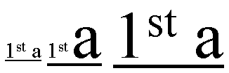
In the three fragments of underlined text, the underline is drawn
consecutively lower
and thicker as the ratio of large text to small text increases.
Note:
User agents typically consider superscript segments but ignore subscript segments.
The baseline-shift is not considered for superscript segments.
| Names:
| text-underline-style,
text-line-through-style,
text-overline-style
|
| Value:
| none | solid | double | dotted | dashed | dot-dash | dot-dot-dash
| wave
|
| Initial:
| none
|
| Applies to:
| all elements with and generated content with textual content |
| Inherited:
| no
|
| Percentages:
| N/A
|
| Media:
| visual
|
| Computed value:
| specified value (except for initial and inherit)
|
These properties specify the line style for underline, line-through and overline text decoration. Possible values:
- none
- Produces no line.
- solid
- Produces a solid line.
- double
- Produces a double line.
- dotted
- Produces a dotted line.
- dashed
- Produces a dashed line style.
- dot-dash
- Produces a line whose repeating pattern is a dot followed by a dash.
- dot-dot-dash
- Produces a line whose repeating pattern is two dots followed by a dash.
- wave
- Produces a wavy line.
The following figure shows the appearance of these various line styles.
| Names:
| text-underline-width,
text-line-through-width,
text-overline-width
|
| Value:
| auto | <normal> | <number> | <length> | <percentage>
| thin | medium |
thick |
| Initial:
| auto
|
| Applies to:
| all elements with and generated content with textual content |
| Inherited:
| no
|
| Percentages:
| computed 'font-size' |
| Media:
| visual
|
| Computed value:
| see prose |
These property specifies the line width for the underline, line-through and overline text decorations. Possible values:
- auto
- The user agent may use any algorithm to determine the text decoration width.
Implementers are encouraged to consider the font-sizes and baselines of all
affected text. The text decoration style should affect the resulting value (the
style 'double', for instance, would produce a width greater than the style
'solid' produces). The computed value is 'auto'.
- normal
- The text decoration width is the normal text decoration width for the
nominal font. If no font characteristic exists for the width of the text
decoration in question, the user agent should proceed as though 'auto' were
specified. The computed value is 'normal'.
- <number>
- The text decoration width is the product of the <number> and the computed
'font-size'. The computed value is '<number>'.
- <length>
- The text decoration width is the length. The computed value is the
corresponding absolute <length>.
- <percentage>
- The text decoration width is the product of the <percentage> and the
computed 'font-size'. The computed value is the absolute <length>.
- thin
- This value is equivalent to a <number> value kept by the user agent. The
<number> MUST be constant through a given view of a document and SHOULD yield a
thin line. The computed value is 'thin'.
- medium
- This value is equivalent to a <number> value kept by the user agent. The
<number> MUST be constant through a given view of a document, MUST be greater
than or equal to the 'thin' number and SHOULD yield a medium line.
- thick
- This value is equivalent to a <number> value kept by the user agent. The
<number> MUST be constant through a given view of a document, MUST be greater
than or equal to the 'medium' number and SHOULD yield a thick line.
| Names:
| text-underline-color,
text-line-through-color,
text-overline-color
|
| Value:
| <color>
|
| Initial:
| currentColor |
| Applies to:
| all elements with and generated content with textual content |
| Inherited:
| no
|
| Percentages:
| N/A
|
| Media:
| visual
|
| Computed value:
| <color>
|
These property specifies the line colors for the underline, line-through and overline text decorations. Possible values:
- <color>
- Specifies a color value.
The 'currentColor' value is specified in the
CSS3 module: color" [CSS3-color]
| Names:
| text-underline-mode, text-line-through-mode, text-overline-mode
|
| Value:
| continuous | skip-white-space |
| Initial:
| continuous
|
| Applies to:
| all elements with and generated content with textual content |
| Inherited:
| no
|
| Percentages:
| N/A
|
| Media:
| visual
|
| Computed value:
| specified value (except for initial and inherit)
|
These properties set the mode for the underline, line-through and overline
text decorations, determining whether the text decoration affects the
space characters or not. 'Space characters' are all characters classified by the
Unicode Standard [UNICODE] as category 'Zs', in addition to the white space
characters. Possible values:
- continuous
- This value means that the line is continuous.
- skip-white-space
- This means that space characters will not be lined.
| Name:
| text-underline-position
|
| Value:
| auto | before-edge | alphabetic | after-edge
|
| Initial:
| auto
|
| Applies to:
| all elements with and generated content with textual content |
| Inherited:
| no
|
| Percentages:
| N/A
|
| Media:
| visual
|
| Computed value:
| specified value (except for initial and inherit)
|
This property sets the position of the underline when set through the
'text-underline-style' property.
It can appear either 'before' (above in an
horizontal flow) or after (below in an horizontal flow) the run of text in
relation to its baseline orientation. This property is typically used in
vertical writing context where it may be desired to have the underline appear
'before' the run of text. This results in having the underline appearing on
the right side of the vertical writing column. Possible values:
- auto
- The user agent may use any algorithm to determine the underline position.
The following algorithm is recommended:
- In horizontal inline-progression, the
underline, if set, SHOULD be aligned with the alphabetic baseline. In vertical
inline-progression, if the language is set to Japanese or Korean, the underline,
if set, SHOULD be aligned with the 'before-edge' of the line box.
- before-edge
- the underline, if set, is aligned with the 'before-edge' of the line box.
- alphabetic
- the underline, if set, will appear after the alphabetic baseline. In this
case the underline may cross some descenders.
- after-edge
- the underline, if set, is aligned with the 'after-edge' baseline of the line box. In this
case the underline does not cross the descenders. This is sometimes called
'accounting' underline.
| Name:
| text-blink |
| Value:
| none | blink
|
| Initial:
| none
|
| Applies to:
| all elements with and generated content with textual content |
| Inherited:
| no
|
| Percentages:
| N/A
|
| Media:
| visual
|
| Computed value:
| specified value (except for initial and inherit)
|
This property specifies the blink mode. Possible values:
- none
- Produces no blinking.
- blink
- Blinks.
- Conforming CSS3 user agents
MAY
simply not blink the text.
The 'text-underline' property is the shorthand for 'text-underline-style',
'text-underline-width', 'text-underline-color', 'text-underline-mode' and 'text-underline-position'. Any
constituent properties not explicitly assigned values in a
'text-underline'
declaration take their respective initial values.
| Name:
| text-underline
|
| Value:
| <'text-underline-style'> || <'text-underline-color'> ||
<'text-underline-mode'> || <'text-underline-position'>
|
| Initial:
| not defined for shorthand properties
|
| Applies to:
| all elements with and generated content with textual content |
| Inherited:
| no
|
| Percentages:
| N/A
|
| Media:
| visual
|
| Computed value:
| specified value (except for initial and inherit)
|
The 'line-through' property is the shorthand for 'text-line-through-style',
'text-line-through-width', 'text-line-through-color' and
'text-line-through-mode'. Any
constituent properties not explicitly assigned values in a
'text-line-through'
declaration take their respective initial values.
| Name:
| text-line-through
|
| Value:
| <'text-line-through-style'> || <'text-line-through-color'> ||
<'text-line-through-mode'>
|
| Initial:
| not defined for shorthand properties
|
| Applies to:
| all elements with and generated content with textual content |
| Inherited:
| no
|
| Percentages:
| N/A
|
| Media:
| visual
|
| Computed value:
| see individual properties
|
The 'text-overline' property is the shorthand for 'text-overline-style',
'text-overline-width', 'text-overline-color' and 'text-overline-mode'. Any constituent
properties not explicitly assigned values in a
'text-overline'
declaration take their respective initial values.
| Name:
| text-overline
|
| Value:
| <'text-overline-style'> || <'text-overline-color'> ||
<'text-overline-mode'>
|
| Initial:
| not defined for shorthand properties
|
| Applies to:
| all elements with and generated content with textual content |
| Inherited:
| no
|
| Percentages:
| N/A
|
| Media:
| visual
|
| Computed value:
| see individual properties
|
The 'text-decoration' property is a shorthand that takes its
own set of values.
| Name:
| text-decoration
|
| Value:
| none | [ underline || overline || line-through || blink] |
| Initial:
| see individual properties
|
| Applies to:
| all elements with and generated content with textual content |
| Inherited:
| no (see prose)
|
| Percentages:
| N/A
|
| Media:
| visual
|
| Computed value:
|
see individual properties |
The 'text-decoration' shorthand sets the properties 'text-underline-style',
'text-underline-width', 'text-underline-color', 'text-underline-mode', 'text-underline-position', 'text-line-through-style',
'text-line-through-width', 'text-line-through-color', 'text-line-through-mode', 'text-overline-style',
'text-overline-width', 'text-overline-color', 'text-overline-mode' and 'text-blink'
to their initial values, and then the values of the shorthand change these
values as follows:
- none
- All the constituent properties maintain their initial values.
- underline
- The 'text-underline-style' value is 'solid' rather than
'none'.
- overline
- The 'text-overline-style' value is 'solid' rather than
'none'.
- line-through
- The 'text-line-through-style' value is 'solid' rather
than 'none'.
- blink
- The 'text-blink' value is 'blink' rather than 'none'.
Conforming user agents
MAY
simply not blink the text.
Although the property has no explicit initial value, it is equivalent to the
value 'none'.
Example(s):
In the following example for XHTML, the text content of all a
elements acting as hyperlinks will be underlined and blinking:
a[href] { text-decoration: underline blink }
| Name:
| text-shadow
|
| Value:
| none | [<shadow>, ] * <shadow> |
| Initial:
| none
|
| Applies to:
| all elements and generated content
|
| Inherited:
| no |
| Percentages:
| N/A
|
| Media:
| visual
|
| Computed value:
| specified values (except for initial and inherit)
|
<shadow> itself is defined as "[<color> <length> <length> <length>? | <length> <length>
<length>? <color>?]".
This property accepts a comma-separated list of shadow effects to be
applied to the text of the element. The shadow effects are applied in the
order specified and may thus overlay each other, but they will never overlay
the text itself. Shadow effects do not alter the size of a box, but may
extend beyond its boundaries. The stack level of the shadow
effects is the same as for the element itself.
Each shadow effect MUST specify a shadow offset and
MAY optionally specify
a blur radius and a shadow color.
A shadow offset is specified with two <length> terms that
indicate the distance from the text. The first length term specifies the
horizontal distance to the right of the text. A negative horizontal length
term places the shadow to the left of the text. The second length term
specifies the vertical distance below the text. A negative vertical length
term places the shadow above the text.
A blur radius
MAY be specified after the shadow offset. The
blur radius is a length value that indicates the boundaries of the blur
effect. The exact algorithm for computing the blur effect is not specified. If
no blur radius is specified, the treatment is as if a blur radius of zero were
specified and the shadow has the same size and shape as the glyphs that cast it. User
agents
MAY only implement only part of this property by ignoring blur effects.
Such user agents should consider declarations that specify the blur radius to be parser errors, as described in the Syntax module [link TBD].
A color
term may be specified before or after the length
terms of the shadow effect. The color term will be used as the basis for
the shadow effect. If no color is specified, the value of the 'color' property will be used instead.
Text shadows may be used with the ::first-letter and ::first-line
pseudo-elements.
Example(s):
The example below will set a text shadow to the right and below the
element's text. Since no color has been specified, the shadow will have the
same color as the element itself, and since no blur radius is specified, the
text shadow will not be blurred:
h1 { text-shadow: 0.2em 0.2em }
The next example will place a shadow to the right and below the element's
text. The shadow will have a 5px blur radius and will be red.
h2 { text-shadow: 3px 3px 5px red }
The next example specifies a list of shadow effects. The first shadow will
be to the right and below the element's text and will be red with no
blurring. The second shadow will overlay the first shadow effect, and it will
be yellow, blurred, and placed to the left and below the text. The third
shadow effect will be placed to the right and above the text. Since no shadow
color is specified for the third shadow effect, the value of the element's 'color' property will be used:
h2 { text-shadow: 3px 3px red, yellow -3px 3px 2px, 3px -3px }
Example(s):
Consider this example:
span.glow {
    background: white;
    color: white;
    text-shadow: black 0px 0px 5px;
}
Here, the 'background' and 'color' properties have the same value and the 'text-shadow' property is
used to create a "solar eclipse" effect:

Note: This property is not defined in CSS1. Some
shadow effects (such as the one in the last example) may render text
invisible in user agents that only support CSS1. The usage of this property is
discouraged as much better filter effects are available in SVG [SVG1.1].
10. Document grid
10.1. What is document grid?
It is very common for the glyphs in documents written in East Asian
languages, such as Chinese or Japanese, to be laid out on the page according
to a specified one- or two-dimensional grid. The concept of grid can also be
used in other, non-ideographic contexts such as Braille or monospaced layout.
The diagram below represents a fragment of horizontal text on a page with
mixed wide-cell and narrow-cell glyphs that a Japanese user intended to be
laid out on a grid which resulted in 9 glyphs per line (gray grid lines shown
for clarity):
The grid behavior can be set on the inline-progression, on the
block-progression or both. The grid on the block-progression dimension is determined by the
following properties:
- 'line-stacking-strategy' [CSS3-line] set to the 'grid-height' value,
- 'line-height' [CSS3-line] of the block element set to the desired grid
block-progression value,
- 'text-height' [CSS3-line] which defines the
block-progression value for inline boxes.
Depending on the content size, one or a multiple of 'line-height' will be
necessary to accommodate a given inline box.
The block-progression grid is not described in this section as it can be
achieved simply by using the properties mentioned above
and described in the CSS3 Line module.
The grid on the inline-progression dimension is obtained by altering the
glyphs
advance width (or inline-progression value) of inline elements. There are several
modes:
- Adding extra space between each grapheme cluster by using the
'letter-spacing'
property. This is sometimes called "loose" grid.
- Giving a fixed advance width to ideograph grapheme clusters only. Other
grapheme clusters are spaced normally. This is called "genko" in Japanese
typography.
- Giving a fixed advance width to all grapheme clusters, excepted connected
glyphs (like Arabic).
Two properties control this advance width modification:
'line-grid-mode'
enables it and 'line-grid-progression'
determines its value. The shorthand
'line-grid' allows setting both together.
10.2. Line grid mode: the
'line-grid-mode' property
| Name:
| line-grid-mode
|
| Value:
| none | ideograph | all |
| Initial:
| none |
| Applies to:
| block-level and inline-block elements
|
| Inherited:
| yes
|
| Percentages:
| N/A
|
| Media:
| visual
|
| Computed value:
| specified value (except for initial and inherit)
|
Specifies the line grid behavior. Each line grid mode value entails a different set
of rules for rendering inline contents (the term 'horizontal' is used in the
following description to indicate the inline-progression dimension).
Possible values:
- none
-
No line grid. Standard text alignments apply to the block element.
- ideograph
- Content is divided into units that we will call strips.
Each strip is horizontally centered within the smallest number of grid spaces
that contain the strip. The width of the grid space is determined by the 'line-grid-progression' setting.
Each grapheme cluster with a wide base character is a strip. Each grapheme
cluster with a narrow kana character as its base is a strip. Each non-breakable
object (e.g. an image) is a strip. Other grapheme clusters are treated as a
single strip bounded by the strips described prior. That single strip may be
decomposed in several strips if line breaking occurs within it.
The strips are arranged in the grid as follows:
- Each strip corresponding to wide base character (as well as narrow kana character) that can fit within a single grid space is
rendered in the horizontal center of the grid space.
- Each strip corresponding to other characters are placed in the center of the smallest number of grid spaces
necessary for it to fit. If a line break occurs
within such a strip, the strip is treated as two or more separate strips whose
individual placement follows the same rules as those for a single strip.
- Strips corresponding to non-breakable objects and strips corresponding to wide
base character (as well as narrow kana character) that are wider than a single grid space,
are each centered within the smallest number of grid cells necessary for them to
fit.
The 'ideograph' mode disables all special text justification and glyph width
adjustment normally applied to the contents of the block element.
If a line break opportunity cannot be found in a text run going over the
line boundary, then that text run will be pushed down to the next line and
the last part of the previous line will be left blank.
Here is an example of mixed text in 'ideograph' grid mode:
- all
- This type of grid can be used to achieve mono-spaced layout. As with
'ideograph', content is divided into strips and each strip is horizontally
centered within the smallest number of grid spaces that can contain the grid.
The rules for determining strips differs.
Each grapheme cluster with a
non-joining base character is a strip. Each non-breakable object (e.g. an image)
is a strip. Each run of grapheme clusters with joining base characters that join
to each other is a strip.
The 'letter-spacing'
property does not apply to characters in a grid but does
apply for all characters not in the grid (i.e. all characters for
'line-grid-mode: none', non-ideographs for 'line-grid-mode: ideograph' and all
non-connected glyphs for 'line-grid-mode: all').
| Name:
| line-grid-progression
|
| Value:
| text-height | line-height | <length>
|
| Initial:
| text-height |
| Applies to:
| block-level and inline-block elements
|
| Inherited:
| yes
|
| Percentages:
| N/A |
| Media:
| visual
|
| Computed value:
| <length> |
This property affects the inline-progression dimension of characters which
are subject to the fixed
advance width as determined by the
'line-grid-mode' property.
Possible values:
- text-height
- The computed value of the block element 'text-height' [CSS3-line] is used.
- line-height
- The computed value of the block element 'line-height' [CSS3-line] is used.
- <length>
- inline-progression dimension of the line grid's unit space.
For example:
div.section1 { line-grid-progression: .5in }
The rule set above would make grid spaces 0.5 inches long in a div element in
the section1 class. If the element has horizontal flow, it would like the
following (without the grid lines, which are shown for clarity).
If the element has vertical flow, then 0.5in is the vertical
measure of each grid space:
10.4. Line grid: the
'line-grid' shorthand property
| Name:
| line-grid
|
| Value:
| <'line-grid-mode'> || <'line-grid-progression'>
|
| Initial:
| not defined for shorthand properties
|
| Applies to:
| block-level and inline-block elements |
| Inherited:
| yes
|
| Percentages:
| N/A |
| Media:
| visual
|
| Computed value:
| see individual properties
|
The 'line-grid'
property is a shorthand property for setting 'line-grid-mode' and 'line-grid-progression'.
The following is an example of setting the grid in both progressions:
div.grid { line-height:20pt;
           text-height: max-size;
           line-stacking-strategy: grid-height;
           line-grid: ideograph line-height; }
This sets for the div element a grid with 20pt inline and
block-progression
dimensions. All ideographs will be set in cells sized in multiple of 20pt in
both directions.
11. Miscellaneous
text formatting
11.1. Capitalization: the 'text-transform'
property
| Name:
| text-transform
|
| Value:
| capitalize | uppercase | lowercase | none
|
| Initial:
| none
|
| Applies to:
| all elements and generated content
|
| Inherited:
| yes
|
| Percentages:
| N/A
|
| Media:
| visual
|
| Computed value:
| specified value (except for initial and inherit)
|
This property controls capitalization effects of an element's text. Values
have the following meanings:
- capitalize
- Puts the first letter of each word in uppercase.
- uppercase
- Puts all characters of each word in uppercase.
- lowercase
- Puts all characters of each word in lowercase.
- none
- No capitalization effects.
Although limited, the case mapping process has some language dependencies.
Some well known examples are Turkish and Greek. See HTML [HTML401] for ways to find the language of an HTML
element. XML, and consequently [XHTML1.0], uses an attribute called
xml:lang. There may be other ways, specific to certain document
languages, to determine the human
language.
The case mapping rules for the character repertoire specified by the
Unicode Standard can be found on the Unicode Consortium Web site at
[UNICODE-casing].
Conforming user
agents MUST support case mapping rules according to the Unicode
Standard for all characters specified by that standard.
Note: The
conformance rule is more stringent than the ones specified in lower levels of CSS.
Example:
In this example, all text in an h1 element is transformed to
uppercase text.
h1 { text-transform: uppercase }
| Name:
| hanging-punctuation
|
| Value:
| none | start | end | both
|
| Initial:
| none
|
| Applies to:
| block-level and inline-block elements
|
| Inherited:
| yes
|
| Percentages:
| N/A
|
| Media:
| visual
|
| Computed value:
| specified value (except for initial and inherit)
|
This property determines whether a punctuation mark, if one is present,
may be placed outside the content area at the
start or at the end of a full line of text. Allowing a punctuation to hang
at the end of a line is is a common practice in East Asian typography. It is
the responsibility of the designer to create meaningful padding and
margin areas to allow effective rendering of the punctuation. If the padding and
margin are of zero width or not wide enough to show the punctuation, the
punctuation may not be rendered.
Note: Compression, including compression of the
punctuation characters, may also occur in the line independently of this effect.
Possible values:
- none
- No punctuation marks are allowed to be placed outside the content area.
- start
- A leading punctuation mark, if present, may overhang at the start of the content
area.
- end
- A trailing punctuation mark, if present, may overhang at the end of the content
area.
- both
- A leading punctuation mark, if present, may overhang at the start of the content
area. A trailing punctuation mark, if present, may overhang at the end of the content
area.
In the following example 'hanging-punctuation' has the value 'none':
In the following example 'hanging-punctuation' has the value 'end'.
Note: User agents should follow the script-specific and
language-specific conventions about which lines allow which hanging punctuation. For example, in Latin
text, a leading punctuation mark may overhang only on the first line and a
trailing punctuation may overhang only on the last line. It would look improper in other
lines. The following figure shows an example of correct usage.
11.3. Combining text:
the 'text-combine'
property'
| Name:
| text-combine
|
| Value:
| none | letters | lines
|
| Initial:
| none
|
| Applies to:
| inline and inline-block elements and generated content
|
| Inherited:
| no
|
| Percentages:
| N/A
|
| Media:
| visual
|
| Computed value:
| specified value (except for initial and inherit)
|
This property controls the creation of grapheme clusters ("kumimoji") or lines ("warichu").
Possible values:
- none
- Glyphs arrange normally.
- letters
- Combines glyphs to fit within the space of a single wide-cell glyph, by
reducing them in size and stacking them next to and/or on top of each other.
This effect is commonly used in East Asian typography.
No more than five grapheme clusters can combine into a unit. If an element
with 'text-combine' set to 'letters' has more than five, only the first
five are combined. The rest is rendered as regular text. If the text to be
combined has only a single grapheme cluster, no special combination effect occurs. The
following texts shows the arrangement for two, three, four and five grapheme clusters:
The following styling rule:
span.kumimoji { text-combine: letters }
applied to the following fragment:
<span>くみもじ
<span class="kumimoji">くみもじ</span></span>
would make the 4 glyphs of the second span element appear as one (shown in blue for
clarity):
- lines
- Combines the glyphs so they fit into two lines of equal length and
height, whose combined height is equal to or slightly greater than the height
of the line in which they appear. The combined lines appear inline with the
surrounding text. The Japanese Standard [JIS-X-4051] describes recommended guidelines for this
feature. A summary of these guidelines is provided here:
- The combination should be preceded and followed by bracket or parenthesis
characters
- This combination is restricted to two lines and is rendered as a single
inline box or multiple inline boxes if it does not fit in a single line box .
- If the combination does not fit in a single line box, it can be split across
several line boxes, using multiple inline boxes. In that case, each inline box
represents its own character flow subset of the combination. That is, each of
these inline boxes is rendered as a two-lines inline block with characters
flowing from the ending edge of the first line to the starting edge of the
second line of the inline box.
The following figure shows a typical usage for this feature.
The following styling rule:
span.warichu { text-combine: lines }
applied to the following fragment:
<span>割注(
<span class="warichu">これは
わりちゅです。</span>
)です。</span>
would make the enclosed text look like the following (shown in blue for
clarity):
12. Properties index
In addition to the specified values, all properties take the initial and inherit values.
| Property | Values | Initial | Applies to | Inh. | Percentages | Media |
| all-space-treatment | preserve | collapse | collapse | all elements and generated content | yes | N/A | visual |
| block-progression | tb | rl | lr | tb | all elements and generated content |
yes | N/A | visual |
| direction | ltr | rtl | ltr | all elements and generated content, but see prose | yes | N/A | visual |
| glyph-orientation-horizontal | <angle>
| auto | inline | auto | all elements and generated content | yes | N/A | visual |
| glyph-orientation-vertical | <angle> | auto
| upright | inline | auto | all elements and generated content | yes | N/A | visual
|
| hanging-punctuation | none | start | end | both | none | block-level and inline-block elements | yes | N/A | visual |
| kerning-mode | none | [pair || contextual] | none | all elements and generated content | yes | N/A | visual |
| kerning-pair-threshold | auto | <'font-size'> | auto | all elements and generated content | yes | N/A | visual |
| letter-spacing | normal | <length> | normal | all elements and generated content | yes | N/A | visual |
| line-break | normal | strict | normal | all elements and generated content | yes | N/A | visual |
| linefeed-treatment | auto | ignore | preserve | treat-as-space | treat-as-zero-width-space |
ignore-if-after-linefeed | auto | all elements and generated content | yes | N/A | visual |
| line-grid | <'line-grid-mode'> || <'line-grid-progression'> | not defined for shorthand properties | block-level and inline-block elements | yes | N/A | visual |
| line-grid-mode | none | ideograph | all | none | block-level and inline-block elements | yes | N/A | visual |
| line-grid-progression | text-height | line-height | <length> | text-height | block-level and
inline-block elements | yes | N/A | visual |
| max-font-size | <'font-size'> | auto | auto | all elements and generated content | yes | element's computed 'font-size' | visual |
| min-font-size | <'font-size'> | auto | auto | all elements and generated content | yes | element's computed 'font-size' | visual |
| punctuation-trim | none | start | none | block-level and inline-block elements | yes | N/A | visual |
| text-align | start | end | left | right | center | justify | <string> | start | block-level and inline-block elements | yes | N/A | visual |
| text-align-last | start | end | center |
left | right | justify | size | start | block-level and inline-block elements | yes | N/A | visual |
| text-autospace | none | [ideograph-numeric || ideograph-alpha || ideograph-space ||
ideograph-parenthesis] | none | all elements and generated content | yes | N/A | visual |
| text-blink | none | blink | none | all elements and generated content | no | N/A | visual |
| text-combine | none | letters | lines | none | all elements and generated content | no | N/A | visual |
| text-decoration | none | [ underline || overline || line-through || blink] |
not defined for shorthand properties | all elements
with and generated content with textual content | no (see prose) | N/A | visual
|
| text-indent | [ <length> | <percentage>
] hanging? |
0 | block-level, inline-block elements and table cells | yes | refers to width of containing block | visual |
| text-justify | auto | inter-word | inter-ideograph | distribute | newspaper |
inter-cluster | kashida | auto | block-level and inline-block elements | yes | N/A | visual |
| text-justify-trim | none | punctuation | punctuation-and-kana | punctuation | block-level and inline-block elements | yes | N/A | visual |
| text-kashida-space | <percentage> | 0% | block-level and inline-block elements | yes | as described | visual |
| text-line-through | <'text-line-through-style'> || <'text-line-through-color'> ||
<'text-line-through-mode'> | not defined for shorthand properties | all elements with and generated content with textual content | no | N/A | visual |
| text-line-through-color | <color> |
currentColor | all elements with and generated content with textual content | no | N/A | visual |
| text-line-through-mode | continuous
| skip-white-space | continuous | all elements with and generated content with textual content | no | N/A | visual |
| text-line-through-style | none | solid | double | dotted | thick | dashed | dot-dash | dot-dot-dash
| wave | none | all elements with and generated content with textual content | no | N/A | visual |
|
text-line-through-width | auto |
<normal> | <number> | <length> | <percentage> thin | medium | thick | auto | all elements
with and generated content with textual content | no | computed 'font-size' |
visual |
| text-overflow | <'text-overflow-mode'> || <'text-overflow-ellipsis'> | not defined for shorthand properties | block-level and inline-block elements | no | N/A | visual |
| text-overflow-ellipsis | <ellipsis>{1,2} | U+2026 (value of) | block-level and inline-block elements | no | N/A | visual |
| text-overflow-mode | clip | ellipsis | ellipsis-word | clip | block-level and inline-block elements | no | N/A | visual |
| text-overline | <'text-overline-style'> || <'text-overline-color'> ||
<'text-overline-mode'> | not defined for shorthand properties | all elements with and generated content with textual content | no | N/A | visual |
| text-overline-color | <color> |
currentColor | all elements with and generated content with textual content | no | N/A | visual |
| text-overline-mode | continuous |
skip-white-space | continuous | all elements with and generated content with textual content | no | N/A | visual |
| text-overline-style | none | solid | double | dotted | thick | dashed | dot-dash | dot-dot-dash
| wave | none | all elements with and generated content with textual content | no | N/A | visual |
|
text-overline-width | auto |
<normal> | <number> | <length> | <percentage> thin | medium | thick | auto | all elements
with and generated content with textual content | no | computed 'font-size' |
visual |
| text-script | auto | <script> | auto | all elements and generated content | yes | N/A | visual |
| text-shadow | none | [<color> || <length> <length> <length>?
,]* [<color> || <length> <length> <length>?] | none | all elements and generated content | no (see prose) | N/A | visual |
| text-transform | capitalize | uppercase | lowercase | none | none | all elements and generated content | yes | N/A | visual |
| text-underline | <'text-underline-style'> || <'text-underline-color'> ||
<'text-underline-mode'> || <'text-underline-position'> | not defined for shorthand properties | all elements with and generated content with textual content | no | N/A | visual |
| text-underline-color | <color> |
currentColor | all elements with and generated content with textual content | no | N/A | visual |
| text-underline-mode | continuous |
skip-white-space | continuous | all elements with and generated content with textual content | no | N/A | visual |
| text-underline-position | auto | before-edge | alphabetic | after-edge | auto | all elements with and generated content with textual content | no | N/A | visual |
| text-underline-style | none | solid | double | dotted | dashed | dot-dash | dot-dot-dash
| wave | none | all elements with and generated content with textual content | no | N/A | visual |
|
text-underline-width | auto |
<normal> | <number> | <length> | <percentage> | thin | medium | thick | auto | all elements
with and generated content with textual content | no | computed 'font-size' |
visual |
| unicode-bidi | normal | embed | bidi-override | normal | all elements and generated content, but see prose | no | N/A | visual |
| white-space | normal | pre | nowrap | pre-wrap | pre-line | not defined for shorthand properties | all elements and generated content | yes | N/A | visual |
| white-space-treatment | ignore | preserve | ignore-if-before-linefeed | ignore-if-after-linefeed
| ignore-if-surrounding-linefeed | ignore-if-surrounding-linefeed | all elements and generated content | yes | N/A | visual |
| word-break | <'word-break-cjk'> || <'word-break-inside'> | not defined for shorthand properties | all elements and generated content | yes | N/A | visual |
| word-break-cjk | normal | break-all | keep-all | normal | all elements and generated content | yes | N/A | visual |
| word-break-inside | normal | hyphenate | normal | all elements and generated content | yes | N/A | visual |
| word-spacing | normal | <length> | normal | all elements and generated content | yes | N/A | visual |
| wrap-option | wrap | no-wrap | soft-wrap | emergency | wrap | all elements and generated content | yes | N/A | visual |
| writing-mode | lr-tb | rl-tb | tb-rl | tb-lr | not defined for shorthand properties | all elements and generated content | yes | N/A | visual |
The following properties are defined in other specifications:
13. Profiles
This document defines three modules: The CSS1 text module, the CSS2 text module
and the CSS3 text module.
The CSS1 text module has the following properties
and values:
Concerning the 'text-align' property, a conforming CSS1 user
agent
MAY interpret the value 'justify' as 'left' or 'right', depending on
whether the element's current text direction is left-to-right or right-to-left
respectively.
The following table describes the CSS2 text module. Because all
properties have added the 'inherit' value and have a media type, all CSS1
properties have been specified below as well. The properties added are 'direction', 'text-shadow' and 'unicode-bidi'. In
addition, the 'text-align' has a new value: <string>.
The CSS3 module adds the following properties:
- Text layout flow: 'block-progression', 'writing-mode', 'glyph-orientation-horizontal',
'glyph-orientation-vertical',
'text-script'.
- Text alignment and justification: 'min-font-size', 'max-font-size', 'text-align-last', 'text-justify', 'text-justify-trim',
'text-kashida-space'.
- Line breaking: 'line-break', 'word-break', 'word-break-cjk', 'word-break-inside'.
- Text wrapping, white space control and text overflow: 'all-space-treatment', 'linefeed-treatment', 'text-overflow', 'text-overflow-ellipsis', 'text-overflow-mode', 'white-space-treatment', 'wrap-option'.
- Text spacing: 'kerning-mode', 'kerning-pair-threshold', 'punctuation-trim',
'text-autospace'.
- Text decoration: 'text-line-through', 'text-line-through-color', 'text-line-through-mode', 'text-line-through-style',
'text-line-through-width', 'text-overline', 'text-overline-color', 'text-overline-mode', 'text-overline-style',
'text-overline-width', 'text-underline', 'text-underline-color', 'text-underline-mode', 'text-underline-position', 'text-underline-style', 'text-underline-width', text-blink.
- Document grid: 'line-grid',
'line-grid-mode', 'line-grid-progression'.
- Miscellaneous: 'hanging-punctuation', 'text-combine'.
It also modifies the following properties as described:
- 'text-align' has
two new values: 'start' and 'end'.
- 'text-indent' has a
new keyword: 'hanging'.
- 'text-decoration', in addition to its
CSS2 behavior, becomes a shorthand property for the following properties: 'text-line-through', 'text-line-through-color', 'text-line-through-mode', 'text-line-through-style',
'text-line-through-width', 'text-overline', 'text-overline-color', 'text-overline-mode', 'text-overline-style',
'text-overline-width', 'text-underline', 'text-underline-color', 'text-underline-mode', 'text-underline-position', 'text-underline-style', 'text-underline-width', text-blink.
- 'white-space' has two new values: 'pre-wrap' and 'pre-line' and becomes a
shorthand property for the following properties: 'wrap-option', 'all-space-treatment', 'linefeed-treatment'
and 'white-space-treatment'.
- all properties take the value 'initial'.
14. Glossary
- Hangul
- Subset of the Korean writing system in which a few letters combine to form syllables. Visually, each written syllable occupies the same amount of space.
- Hanja
- Subset of the Korean writing system that utilizes ideographic characters
borrowed or adapted from the Chinese writing system. Also see Kanji.
- Hiragana
- Japanese syllabic script, or character of that script. Rounded and
cursive in appearance. Subset of the Japanese writing system, used together
with kanji and katakana. In recent times, mostly used to write Japanese words
when kanji are not available or appropriate, and word endings and particles.
Also see Katakana.
- Ideograph
- A character that is used to represent an idea, word, or word component,
in contrast to a character from an alphabetic or syllabic script. The most
well-known ideographic script is used (with some variation) in East Asia
(China, Japan, Korea,...).
- Kana
- Collective term for hiragana and katakana.
- Kanji
- Japanese term for ideographs; ideographs used in Japanese. Subset of the
Japanese writing system, used together with hiragana and katakana. Also see
Hanja.
- Kashida
- Any of a number of elongation glyphs that sit on the alphabetic baseline; used in Arabic and Syriac.
Also a character (U+0640, Arabic tatweel) used to indicate the glyph.
- Katakana
- Subset of the Japanese writing system consisting of phonetic characters
used to represent mostly Latin words. Also see Hiragana.
- Kinsoku
- Japanese term for a set (or sets) of line breaking restrictions.
- Kumimoji
- Composition of two to five grapheme clusters that are reduced in size and arranged to fit
within the space of a single wide-cell glyph. Some of these compositions are encoded in the Unicode Standard.
- Logograph, Logogram
- Character
or glyph that represents an entire word. Common in the Han script used in East
Asia.
- Ruby
- A run of text that appears in the vicinity of another run of text and
serves as an annotation or a pronunciation guide for that text.
- Tate-chu-yoko
- Run of horizontal text inside of a column of vertical text; frequently
used in East Asian documents for displaying certain numbers, such as years.
- Warichu
- A run of text of reduced font size that appears inside of a line of text
as two lines of equal height and length
Appendix A: Vertical Layout Effect on CSS Properties
In general, the existing [CSS2] properties that imply directionality or position are absolute, i.e. "left"
means "left" and "top" means "top" regardless of the writing mode of the
page. The purpose of this appendix however is to list the exceptions to that
rule and clarify ambiguities. If a property does not appear in this list, it
is intended to be interpreted as absolute, i.e. it does not rotate when the
layout mode changes.
| CSS Property | Effect in vertical flow orientation |
| 'clear' | 'float' and 'clear' property values interpretation is absolute in
horizontal flow and logical in vertical flow (left is start, right is end). |
| 'direction' | relative (logical), i.e. ltr implies top-to-bottom character progression
in vertical layout. |
| 'display' | relative (logical), i.e. the values that are directional (table-) are
relative to the element orientation as specified by the writing mode. |
| 'float' | [see the
text about 'clear'] |
| 'line-height' | relative (logical), i.e. this controls the "height" of a line if
horizontal, or the "width", if vertical. In other words, this controls the
size of the line in the dimension perpendicular to the baseline. |
| 'quotes' | relative (logical), the concept of open-quotes and close-quotes is
already used in CSS. (Note that the quote glyph may vary depending on the
glyph-orientation.) |
| 'text-align' |
'left' and 'right' are physical in horizontal inline-progression and
depend on the user agent in vertical inline-progression. 'start' and 'end' are always relative. |
| 'unicode-bidi' | relative (logical), i.e. it affects glyph progression regardless of
layout. |
| 'vertical-align' | relative (logical),
i.e. 'top' and 'bottom' values maps to 'before-edge' and 'after-edge'
values in baseline alignment properties. |
Acknowledgments
This specification would not have been possible without the help from:
Ayman Aldahleh,
Bert Bos, Tantek Çelik, Stephen Deach, Martin Dürst, Laurie Anna Edlund, Ben Errez, Yaniv Feinberg, Arye Gittelman, Richard Ishida, Koji Ishii, Masayasu Ishikawa,
Elika Jalili Etemad (fantasai), Michael Jochimsen, Eric LeVine, Chris Lilley, Paul Nelson, Chris Pratley,
Martin Sawicki, Rahul Sonnad, Frank
Tang, Chris Thrasher, Etan Wexler, Chris Wilson, Masafumi Yabe and Steve Zilles.
References
Normative references
-
- [UAX9]
- Mark Davis. The Bidirectional Algorithm.
17 April 2003. Unicode
Standard Annex #9. URL: http://www.unicode.org/unicode/reports/tr9/tr9-11
- [UAX-24]
- Mark Davis. Script Names. 17 April 2003. Unicode
Standard Annex #24. URL:
http://www.unicode.org/unicode/reports/tr24/tr24-5.html
- [UNICODE-casing]
- Unicode Consortium. Case folding.
April 2003. Unicode
Character data base Version 4.0, case folding information. URLs:
http://www.unicode.org/Public/4.0-Update/UnicodeData-4.0.0.txt and
http://www.unicode.org/Public/4.0-Update/CaseFolding-4.0.0.txt
- [XML1.0]
- Tim Bray; Jean Paoli; C. M. Sperberg-McQueen; Eve Maler. Extensible
Markup Language (XML) 1.0 (Second Edition). October 2000. W3C
Recommendation. URL: http://www.w3.org/TR/2000/REC-xml-20001006
Other references
-
- [CSS2]
- Bert Bos; Håkon Wium Lie; Chris Lilley; Ian Jacobs. Cascading Style
Sheets, level 2. 1998. W3C Recommendation. URL: http://www.w3.org/TR/REC-CSS2
- [CSS3-background]
- Tim Boland; Bert Bos. CSS3 module: backgrounds. 19 February
2002. W3C Working Draft. (Work in progress.) URL: http://www.w3.org/TR/2002/WD-css3-background-20020219
- [CSS3-box]
- Bert Bos. CSS3 module: The box model. 24 October 2002. W3C
Working Draft.
(Work in progress.) URL: http://www.w3.org/TR/2002/WD-css3-box-20021024/
- [CSS3-color]
- Tantek Çelik; Chris Lilley. CSS3 module: color. 18 April 2002. W3C
Working Draft.
(Work in progress.) URL: http://www.w3.org/TR/2002/WD-css3-color-20020418/
- [CSS3-fonts]
- Michel Suignard; Chris Lilley. CSS3 module: fonts. 2 August 2002.
W3C Working Draft. (Work in progress.) URL:
http://www.w3.org/TR/2002/WD-css3-fonts-20020802/
- [CSS3-line]
- Michel Suignard; Eric A. Meyer. CSS3 module: line. 15 May 2002.
W3C Working Draft. (Work in progress.) URL:
http://www.w3.org/TR/2002/WD-css3-linebox-20020515/
- [HTML401]
- Dave Raggett; Arnaud Le Hors; Ian Jacobs. HTML 4.01
Specification. December 1999. W3C Recommendation. URL: http://www.w3.org/TR/1999/REC-html401-19991224
- [ISO15924]
- Code for the representation of names of scripts.
International Organization for Standardization.. 1998. ISO 15924:1998. Draft
International Standard
- [JIS-X-4051]
- Line composition rules for Japanese documents. Japanese
Standards Association. 1995. JIS X 4051-1995. In Japanese
- [RFC2119]
- Scott Bradner. Key words for use in RFCs to Indicate Requirement
Levels. Internet RFC 2119. URL: http://www.ietf.org/rfc/rfc2119.txt
- [SVG1.1]
- Dean Jackson. Scalable Vector Graphics (SVG) 1.1 Specification.
14 January 2003. W3C Recommendation. URL:
http://www.w3.org/TR/2003/REC-SVG11-20030114/
- [UAX-11]
- Asmus Freytag. East Asian Width. 7
April 2003. Unicode
Standard Annex #11. URL: http://www.unicode.org/unicode/reports/tr11/tr11-11
- [UAX-14]
- Asmus Freytag. Line Breaking Properties. 17 April 2003.
Unicode Standard Annex #14. URL: http://www.unicode.org/unicode/reports/tr14/tr14-14
- [UAX-29]
- Mark Davis. Text Boundaries. 17th April 2003. Unicode
Standard Annex #29. URL:
http://www.unicode.org/unicode/reports/tr29/tr29-4.html
- [UNICODE]
- The Unicode Consortium. Book version: The Unicode Standard: Version 4.0.
Addison Wesley Longman. 2003. ISBN 0-321-18578-1. (Available in Fall 2003) Online version: The Unicode
Standard: Version 4.0.0, URL:
http://www.unicode.org/unicode/standard/versions/enumeratedversions.html#Unicode_4_0_0
For more information, consult the Unicode Consortium's home page at
http://www.unicode.org/
- [XHTML1.0]
- Steven Pemberton; et al. XHTML 1.0: The Extensible HyperText Markup
Language. Jan 2000. W3C Recommendation. URL: http://www.w3.org/TR/2000/REC-xhtml1-20000126
- [XHTMLMOD]
- Robert Adams; Murray Altheim; et al. Modularization of
XHTML. April 2001. W3C Recommendation. URL: http://www.w3.org/TR/2001/REC-xhtml-modularization-20010410
- [XML1.1]
- John Cowan. Extensible
Markup Language (XML) 1.1. October 2002. W3C Candidate Recommendation. URL:
http://www.w3.org/TR/2002/CR-xml11-20021015
- [XSL1.0]
- Adler, Sharon; Berglund, Anders; et al. Extensible Stylesheet
Language (XSL) Version 1.0. October 2001. W3C Recommendation. URL: http://www.w3.org/TR/2001/REC-xsl-20011015
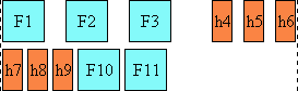
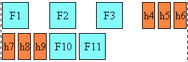
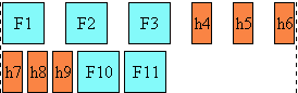
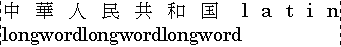
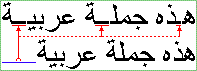


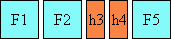
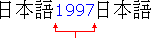
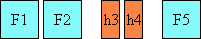
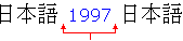
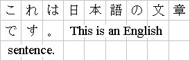
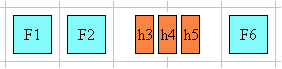
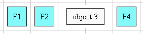
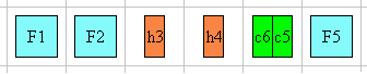
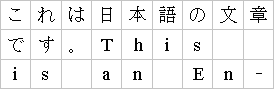
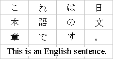
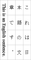
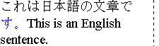
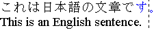
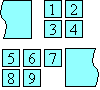
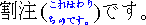