In some cases, authors may want user agents to render content
that does not come from the document
tree. One familiar example of this is a numbered list; the author
does not want to list the numbers explicitly, he or she wants the
user agent to generate them automatically. Similarly, authors
may want the user agent to insert the word
"Figure" before the caption of a figure, or "Chapter 7" before the
seventh chapter title. For audio or braille in particular, user agents
should be able to insert these strings.
In CSS 2.1, content may be generated by two mechanisms:
- The 'content'
property, in conjunction with the :before and :after pseudo-elements.
- Elements with a value of 'list-item'
for the 'display' property.
Authors specify the style and location of generated content with
the :before and :after pseudo-elements. As their names indicate, the
:before and :after pseudo-elements specify the location of content
before and after an element's document
tree content. The 'content'
property, in conjunction with these pseudo-elements, specifies what is
inserted.
Example(s):
For example, the following rule inserts the string "Note: "
before the content of
every P element whose "class" attribute has the value "note":
p.note:before { content: "Note: " }
The formatting objects (e.g., boxes) generated by an element include
generated content. So, for example, changing the above style sheet
to:
p.note:before { content: "Note: " }
p.note        { border: solid green }
would cause a solid green border to be rendered around the entire
paragraph, including the initial string.
The :before and :after pseudo-elements inherit any inheritable properties
from the element in the document tree to which they are attached.
Example(s):
For example, the following rules insert an open quote mark before every
Q element. The color of the quote mark will be red, but the font will
be the same as the font of the rest of the Q element:
q:before {
  content: open-quote;
  color: red
}
In a :before or :after pseudo-element declaration, non-inherited
properties take their initial
values.
Example(s):
So, for example, because the initial value of the 'display' property is 'inline', the
quote in the previous example is inserted as an inline box (i.e.,
on the same line as the element's initial text content).
The next example explicitly sets the
'display' property to
'block', so that the inserted text becomes a block:
body:after {
    content: "The End";
    display: block;
    margin-top: 2em;
    text-align: center;
}
The :before and :after pseudo-elements interact with other
boxes as if they were real elements inserted just
inside their associated element.
Example(s):
For example, the following document fragment and style sheet:
<p> Text </p> p:before { display: block; content: 'Some'; }
...would render in exactly the same way as the following document
fragment and style sheet:
<p><span>Some</span> Text </p> span { display: block }
Similarly, the following document fragment and style sheet:
<h2> Header </h2> h2:after { display: block; content: 'Thing'; }
...would render in exactly the same way as the following document
fragment and style sheet:
<h2> Header <span>Thing</span></h2>   h2 { display: block; }
                                      span { display: block; }
Note. This specification does not fully define the interaction of :before
and :after with replaced elements (such as IMG in HTML). This will
be defined in more detail in a future specification.
-
'content'
-
| Value: | normal | none | [ <string> | <uri> | <counter> | attr(<identifier>) | open-quote | close-quote | no-open-quote | no-close-quote ]+ | inherit
|
| Initial: | normal
|
| Applies to: | :before and :after pseudo-elements
|
| Inherited: | no
|
| Percentages: | N/A
|
| Media: | all
|
| Computed value: | On elements, always computes to 'normal'. On :before and :after, if
'normal' is specified, computes to 'none'. Otherwise, for URI
values, the absolute URI; for attr() values, the resulting string;
for other keywords, as specified.
|
This property is used with the :before and :after pseudo-elements
to generate content in a document. Values have the following
meanings:
- none
- The pseudo-element is not generated.
- normal
- Computes to 'none' for the :before and :after pseudo-elements.
- <string>
- Text content
(see the section on strings).
- <uri>
- The value is a URI that designates an external resource (such as an image).
If the user agent cannot display the resource it must either leave
it out as if it were not specified or display some indication that
the resource cannot be displayed.
- <counter>
- Counters may be specified
with two different functions: 'counter()' or 'counters()'.
The former has two forms:
'counter(name)' or 'counter(name,
style)'.
The generated text is the value of the innermost counter of the given
name in scope at this pseudo-element; it is formatted in the indicated
style ('decimal' by default). The latter
function also has two forms: 'counters(name,
string)' or 'counters(name, string,
style)'. The generated text is the value of all counters
with the given name in scope at this pseudo-element, from outermost to
innermost separated by the specified string. The counters are rendered
in the indicated style ('decimal' by
default). See the section on automatic counters
and numbering for more information.
The name must not be 'none', 'inherit' or 'initial'. Such a name
causes the declaration to be ignored.
- open-quote
and close-quote
- These values are replaced by the appropriate string
from the 'quotes' property.
- no-open-quote
and no-close-quote
- Introduces no content, but increments (decrements) the level of nesting for quotes.
- attr(X)
- This function returns as a string the value of attribute X
for the subject of the selector. The
string is not parsed by the CSS processor. If the subject of the selector
does not have an attribute X, an empty string is returned. The
case-sensitivity of attribute names depends on the document language.
Note. In CSS 2.1, it is not possible to refer to
attribute values for other elements than the subject of the selector.
The 'display' property
controls whether the content is placed in a block or inline box.
Example(s):
The following rule causes the string "Chapter: " to be generated before each H1 element:
H1:before {
  content: "Chapter: ";
  display: inline;
}
Authors may include newlines in the generated content by writing
the "\A" escape sequence in one of the strings after the 'content' property. This inserted line
break is still subject to the 'white-space' property. See "Strings" and "Characters and case" for
more information on the "\A" escape sequence.
Example(s):
h1:before {
    display: block;
    text-align: center;
    white-space: pre;
    content: "chapter\A hoofdstuk\A chapitre"
}
Generated content does not alter the document tree. In particular, it
is not fed back to the document language processor (e.g., for
reparsing).
In CSS 2.1, authors may specify, in a style-sensitive and
context-dependent manner, how user agents should render quotation
marks. The 'quotes' property
specifies pairs of quotation marks for each level of embedded
quotation. The 'content'
property gives access to those quotation marks and causes them to be
inserted before and after a quotation.
This property specifies quotation marks for any number of embedded
quotations. Values have the following meanings:
- none
- The 'open-quote' and 'close-quote' values of the
'content' property
produce no quotation marks.
- [<string>
<string>]+
- Values for the 'open-quote' and 'close-quote' values of the
'content' property are taken
from this list of pairs of quotation marks (opening and
closing). The first (leftmost) pair represents the outermost level of
quotation, the second pair the first level of embedding, etc. The user
agent must apply the appropriate pair of quotation marks according to
the level of embedding.
Example(s):
For example, applying the following style sheet:
/* Specify pairs of quotes for two levels in two languages */
q:lang(en) { quotes: '"' '"' "'" "'" }
q:lang(no) { quotes: "�" "�" '"' '"' }
/* Insert quotes before and after Q element content */
q:before { content: open-quote }
q:after { content: close-quote }
to the following HTML fragment:
<HTML lang="en">
  <HEAD>
  <TITLE>Quotes</TITLE>
  </HEAD>
  <BODY>
    <P><Q>Quote me!</Q>
  </BODY>
</HTML>
would allow a user agent to produce:
"Quote me!"
while this HTML fragment:
<HTML lang="no">
  <HEAD>
  <TITLE>Quotes</TITLE>
  </HEAD>
  <BODY>
    <P><Q>Trøndere gråter når <Q>Vinsjan på kaia</Q> blir deklamert.</Q>
  </BODY>
</HTML>
would produce:
�Trøndere gråter når "Vinsjan på kaia" blir deklamert.�
Note.
While the quotation marks specified by 'quotes' in the previous examples are
conveniently located on computer keyboards, high quality typesetting
would require different ISO 10646 characters. The following
informative table lists some of the ISO 10646 quotation
mark characters:
| Character | Approximate rendering | ISO 10646 code (hex) | Description
|
|---|
| " | " | 0022 | QUOTATION MARK [the ASCII double quotation mark]
|
| ' | ' | 0027 | APOSTROPHE [the ASCII single quotation mark]
|
| ‹ | < | 2039 | SINGLE LEFT-POINTING ANGLE QUOTATION MARK
|
| › | > | 203A | SINGLE RIGHT-POINTING ANGLE QUOTATION MARK
|
| « | � | 00AB | LEFT-POINTING DOUBLE ANGLE QUOTATION MARK
|
| » | � | 00BB | RIGHT-POINTING DOUBLE ANGLE QUOTATION MARK
|
| ‘ | ` | 2018 | LEFT SINGLE QUOTATION MARK [single high-6]
|
| ’ | ' | 2019 | RIGHT SINGLE QUOTATION MARK [single high-9]
|
| “ | `` | 201C | LEFT DOUBLE QUOTATION MARK [double high-6]
|
| ” | '' | 201D | RIGHT DOUBLE QUOTATION MARK [double high-9]
|
| „ | ,, | 201E | DOUBLE LOW-9 QUOTATION MARK [double low-9]
|
Quotation marks are inserted in appropriate places in a document
with the 'open-quote'
and 'close-quote' values of the
'content' property. Each
occurrence of 'open-quote' or 'close-quote' is replaced by one of the
strings from the value of 'quotes', based on the depth of
nesting.
'Open-quote' refers to the first of a pair of quotes, 'close-quote'
refers to the second. Which pair of quotes is used depends on the
nesting level of quotes: the number of occurrences of 'open-quote' in
all generated text before the current occurrence, minus the number of
occurrences of 'close-quote'. If the depth is 0, the first pair is
used, if the depth is 1, the second pair is used, etc. If the depth is
greater than the number of pairs, the last pair is repeated. A 'close-quote'
or 'no-close-quote' that would make the depth negative is in error and is
ignored (at rendering time): the depth stays at 0 and no quote mark is
rendered (although the rest of the 'content' property's value is still
inserted).
Note. The quoting depth is independent of the nesting
of the source document or the formatting structure.
Some typographic styles require open quotation marks to be repeated
before every paragraph of a quote spanning several paragraphs, but
only the last paragraph ends with a closing quotation mark. In CSS,
this can be achieved by inserting "phantom" closing quotes. The
keyword 'no-close-quote' decrements
the quoting level, but does not insert a quotation mark.
Example(s):
The following style sheet puts opening quotation marks on every
paragraph in a BLOCKQUOTE, and inserts a single closing quote at the
end:
blockquote p:before     { content: open-quote }
blockquote p:after      { content: no-close-quote }
blockquote p.last:after { content: close-quote }
This relies on the last paragraph being marked with a class "last".
For symmetry, there is also a 'no-open-quote' keyword,
which inserts nothing, but increments the quotation depth by one.
12.4 Automatic counters and numbering
Automatic numbering in CSS 2.1 is controlled with two properties,
'counter-increment'
and 'counter-reset'. The
counters defined by these properties are used with the counter() and
counters() functions of the the 'content' property.
The 'counter-increment' property
accepts one or more names of counters (identifiers), each one
optionally followed by an integer. The integer indicates by how much the
counter is incremented for every occurrence of the element. The
default increment is 1. Zero and negative integers are allowed.
The 'counter-reset'
property also contains a list of one or more names of counters, each
one optionally followed by an integer. The integer gives the value that
the counter is set to on each occurrence of the element. The default
is 0.
The keywords 'none', 'inherit' and 'initial' must not be used as
counter names. A value of 'none' on its own means no counters are
reset, resp. incremented. 'Inherit' on its own has its usual meaning
(see 6.2.1). 'Initial' is
reserved for future use.
Example(s):
This example shows a way to number chapters and sections with
"Chapter 1", "1.1", "1.2", etc.
BODY {
    counter-reset: chapter;      /* Create a chapter counter scope */
}
H1:before {
    content: "Chapter " counter(chapter) ". ";
    counter-increment: chapter;  /* Add 1 to chapter */
}
H1 {
    counter-reset: section;      /* Set section to 0 */
}
H2:before {
    content: counter(chapter) "." counter(section) " ";
    counter-increment: section;
}
If an element increments/resets a counter and also uses it (in the
'content' property of its
:before or :after pseudo-element), the counter is used after
being incremented/reset.
If an element both resets and increments a counter, the counter is
reset first and then incremented.
If the same counter is specified more than once in the value of the
'counter-reset' and 'counter-increment'
properties, each reset/increment of the counter is processed in the order
specified.
Example(s):
The following example will reset the 'section' counter to 0:
H1 { counter-reset: section 2 section }
The following example will increment the 'chapter' counter by 3:
H1 { counter-increment: chapter chapter 2 }
The 'counter-reset'
property follows the cascading rules. Thus, due to cascading, the
following style sheet:
H1 { counter-reset: section -1 }
H1 { counter-reset: imagenum 99 }
will only reset 'imagenum'. To reset both counters, they have to be
specified together:
H1 { counter-reset: section -1 imagenum 99 }
Counters are "self-nesting", in the sense that resetting a counter
in a descendant element or pseudo-element automatically creates a new
instance of the counter. This is important for situations like lists
in HTML, where elements can be nested inside themselves to arbitrary
depth. It would be impossible to define uniquely named counters for
each level.
Example(s):
Thus, the following suffices to number nested list items. The
result is very similar to that of setting 'display:list-item' and
'list-style: inside' on the LI element:
OL { counter-reset: item }
LI { display: block }
LI:before { content: counter(item) ". "; counter-increment: item }
The scope
of a counter starts at the first element in the document that has a
'counter-reset' for that
counter and includes the element's descendants and its following
siblings with their descendants. However, it does not include any
elements in the scope of a counter with the same name created by a 'counter-reset' on a
later sibling of the element or by a later 'counter-reset' on the same
element.
If 'counter-increment' or 'content' on an element or
pseudo-element refers to a counter that is not in the scope of any
'counter-reset',
implementations should behave as though a 'counter-reset' had reset the
counter to 0 on that element or pseudo-element.
In the example above, an OL will create a counter, and all children
of the OL will refer to that counter.
If we denote by item[n] the
nth instance of the "item"
counter, and by "{" and "}" the beginning and end of a
scope, then the following HTML fragment will use the indicated
counters. (We assume the style sheet as given in the example above).
<OL>                    <!-- {item[0]=0        -->
  <LI>item</LI>         <!--  item[0]++ (=1)   -->
  <LI>item              <!--  item[0]++ (=2)   -->
    <OL>                <!--  {item[1]=0       -->
      <LI>item</LI>     <!--   item[1]++ (=1)  -->
      <LI>item</LI>     <!--   item[1]++ (=2)  -->
      <LI>item          <!--   item[1]++ (=3)  -->
        <OL>            <!--   {item[2]=0      -->
          <LI>item</LI> <!--    item[2]++ (=1) -->
        </OL>           <!--                   -->
        <OL>            <!--   }{item[2]=0     -->
          <LI>item</LI> <!--    item[2]++ (=1) -->
        </OL>           <!--                   -->
      </LI>             <!--   }               -->
      <LI>item</LI>     <!--   item[1]++ (=4)  -->
    </OL>               <!--                   -->
  </LI>                 <!--  }                -->
  <LI>item</LI>         <!--  item[0]++ (=3)   -->
  <LI>item</LI>         <!--  item[0]++ (=4)   -->
</OL>                   <!--                   -->
<OL>                    <!-- }{item[0]=0       -->
  <LI>item</LI>         <!--  item[0]++ (=1)   -->
  <LI>item</LI>         <!--  item[0]++ (=2)   -->
</OL>                   <!--                   -->
Example(s):
Another example, showing how scope works when counters are used on
elements that are not nested, is the following. This shows how the
style rules given above to number chapters and sections would apply to
the markup given.
                     <!--"chapter" counter|"section" counter -->
<body>               <!-- {chapter=0      |                  -->
  <h1>About CSS</h1> <!--  chapter++ (=1) | {section=0       -->
  <h2>CSS 2</h2>     <!--                 |  section++ (=1)  -->
  <h2>CSS 2.1</h2>   <!--                 |  section++ (=2)  -->
  <h1>Style</h1>     <!--  chapter++ (=2) |}{ section=0      -->
</body>              <!--                 | }                -->
The 'counters()' function generates a string composed of all of the
counters with the same name that are in scope, separated by a given
string.
Example(s):
The following style sheet numbers nested list items
as "1", "1.1", "1.1.1", etc.
OL { counter-reset: item }
LI { display: block }
LI:before { content: counters(item, ".") " "; counter-increment: item }
By default, counters are formatted with decimal numbers, but all the
styles available for the 'list-style-type' property are
also available for counters. The notation is:
counter(name)
for the default style, or:
counter(name, <'list-style-type'>)
All the styles are allowed, including 'disc', 'circle', 'square',
and 'none'.
Example(s):
H1:before        { content: counter(chno, upper-latin) ". " }
H2:before        { content: counter(section, upper-roman) " - " }
BLOCKQUOTE:after { content: " [" counter(bq, lower-greek) "]" }
DIV.note:before  { content: counter(notecntr, disc) " " }
P:before         { content: counter(p, none) }
An element that is not displayed ('display' set to 'none') cannot
increment or reset a counter.
Example(s):
For example, with the following style sheet,
H2s with class "secret" do not increment 'count2'.
H2.secret {counter-increment: count2; display: none}
Pseudo-elements that are not generated also cannot increment or
reset a counter.
Example(s):
For example, the following does not increment 'heading':
h1::before {
    content: normal;
    counter-increment: heading;
}
Elements with 'visibility'
set to 'hidden', on the other hand, do increment counters.
CSS 2.1 offers basic visual formatting of lists. An element with
'display: list-item' generates a principal block box for the element's
content and, depending on the values of 'list-style-type' and
'list-style-image', possibly also a marker box as a visual indication
that the
element is a list item.
The list
properties describe basic visual formatting of lists:
they allow style sheets to specify the marker type (image, glyph, or
number), and the marker position with respect to the principal box
(outside it or within it before content). They do not allow authors to
specify distinct style (colors, fonts, alignment, etc.) for the list
marker or adjust its position with respect to the principal box; these
may be derived from the principal box.
The background
properties apply to the principal box only; an 'outside' marker
box is transparent.
-
'list-style-type'
-
| Value: | disc | circle | square | decimal | decimal-leading-zero |
lower-roman | upper-roman | lower-greek |
lower-latin | upper-latin | armenian | georgian |
lower-alpha | upper-alpha |
none | inherit
|
| Initial: | disc
|
| Applies to: | elements with 'display: list-item'
|
| Inherited: | yes
|
| Percentages: | N/A
|
| Media: | visual
|
| Computed value: | as specified
|
This property specifies appearance of the list item marker if
'list-style-image' has
the value 'none' or if the image pointed to by the URI cannot be
displayed. The value 'none' specifies no marker, otherwise there are
three types of marker: glyphs, numbering systems, and alphabetic
systems.
Glyphs are specified with
disc,
circle, and
square. Their exact
rendering depends on the user agent.
Numbering systems are specified with:
- decimal
- Decimal numbers, beginning with 1.
- decimal-leading-zero
- Decimal numbers padded by initial zeros (e.g., 01, 02, 03, ..., 98, 99).
- lower-roman
- Lowercase roman numerals (i, ii, iii, iv, v, etc.).
- upper-roman
- Uppercase roman numerals (I, II, III, IV, V, etc.).
- georgian
- Traditional Georgian numbering
(an, ban, gan, ..., he, tan, in, in-an, ...).
- armenian
- Traditional uppercase Armenian numbering.
Alphabetic systems are specified with:
- lower-latin or lower-alpha
- Lowercase ascii letters (a, b, c, ... z).
- upper-latin or upper-alpha
- Uppercase ascii letters (A, B, C, ... Z).
- lower-greek
- Lowercase classical Greek
alpha, beta, gamma, ... (α, β, γ, ...)
This specification does not define how alphabetic systems wrap at
the end of the alphabet. For instance, after 26 list items,
'lower-latin' rendering is undefined. Therefore, for long lists, we
recommend that authors specify true numbers.
CSS 2.1 does not define how the list numbering is reset and
incremented. This is expected to be defined in the CSS List Module
[CSS3LIST].
For example, the following HTML document:
<!DOCTYPE HTML PUBLIC "-//W3C//DTD HTML 4.01//EN">
<HTML>
   <HEAD>
     <TITLE>Lowercase latin numbering</TITLE>
     <STYLE type="text/css">
          ol { list-style-type: lower-roman }
     </STYLE>
  </HEAD>
  <BODY>
    <OL>
      <LI> This is the first item.
      <LI> This is the second item.
      <LI> This is the third item.
    </OL>
  </BODY>
</HTML>
might produce something like this:
  i This is the first item.
 ii This is the second item.
iii This is the third item.
The list marker alignment (here, right justified) depends on the user agent.
-
'list-style-image'
-
| Value: | <uri> | none | inherit
|
| Initial: | none
|
| Applies to: | elements with 'display: list-item'
|
| Inherited: | yes
|
| Percentages: | N/A
|
| Media: | visual
|
| Computed value: | absolute URI or 'none'
|
This property sets the image that will be used as the list item
marker. When the image is available, it will replace the marker set
with the 'list-style-type' marker.
The size of the image is calculated from the following rules:
- If the image has a intrinsic width and height, the used width and
height are the intrinsic width and height.
- Otherwise, if the image has an intrinsic ratio and either an
intrinsic width or an intrinsic height, the used width/height is the
same as the provided intrinsic width/height, and the used value of the
missing dimension is calculated from the provided dimension and the
ratio.
- Otherwise, if the image has an intrinsic ratio, the used width is
1em and the used height is calculated from this width and the
intrinsic ratio. If this would produce a height larger than 1em, then
the used height is instead set to 1em and the used width is calculated
from this height and the intrinsic ratio.
- Otherwise, the image's used width is its intrinsic width if it has
one, or else 1em. The image's used height is its intrinsic height if
it has one, or else 1em.
Example(s):
The following example sets the marker at the beginning of each list
item to be the image "ellipse.png".
ul { list-style-image: url("http://png.com/ellipse.png") }
-
'list-style-position'
-
| Value: | inside | outside | inherit
|
| Initial: | outside
|
| Applies to: | elements with 'display: list-item'
|
| Inherited: | yes
|
| Percentages: | N/A
|
| Media: | visual
|
| Computed value: | as specified
|
This property specifies the position of the marker box with
respect to the
principal block box. Values have the following meanings:
- outside
- The marker box is outside the principal block box. The
position of the list-item marker adjacent to floats is undefined in
CSS 2.1. CSS 2.1 does not specify the precise
location of the marker box or its position in the painting
order, but does
require that for list items whose 'direction' property is 'ltr' the
marker box be on the left side of the content and for elements whose
'direction' property is 'rtl' the marker box be on the right side of
the content.
The marker box is fixed with respect to the principal block box's
border and does not scroll with the principal block box's content.
In CSS 2.1, a UA may hide the marker if
the element's 'overflow' is other
than 'visible'. (This is expected to change in the future.)
The size or contents of the marker box may affect the height of the
principal block box and/or the height of its first line box, and in
some cases may cause the creation of a new line box. Note: This interaction may be more
precisely defined in a future level of CSS.
- inside
- The marker box is placed as the first inline box in the principal
block box, before the element's content and before any :before
pseudo-elements. CSS 2.1 does not specify
the precise location of the marker box.
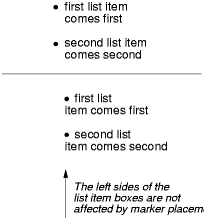
For example:
<HTML>
  <HEAD>
    <TITLE>Comparison of inside/outside position</TITLE>
    <STYLE type="text/css">
      ul         { list-style: outside }
      ul.compact { list-style: inside }
    </STYLE>
  </HEAD>
  <BODY>
    <UL>
      <LI>first list item comes first
      <LI>second list item comes second
    </UL>

    <UL class="compact">
      <LI>first list item comes first
      <LI>second list item comes second
    </UL>
  </BODY>
</HTML>
The above example may be formatted as:
In right-to-left text, the markers would have been on the right
side of the box.
The 'list-style' property
is a shorthand notation for setting the three properties 'list-style-type', 'list-style-image', and 'list-style-position' at
the same place in the style sheet.
Example(s):
ul { list-style: upper-roman inside }  /* Any "ul" element */
ul > li > ul { list-style: circle outside } /* Any "ul" child
                                             of an "li" child
                                             of a "ul" element */
Although authors may specify 'list-style' information directly
on list item elements (e.g., "li" in HTML), they should do so with
care. The following rules look similar, but the first declares a descendant selector
and the second a (more specific) child
selector.
ol.alpha li   { list-style: lower-alpha } /* Any "li" descendant of an "ol" */
ol.alpha > li { list-style: lower-alpha } /* Any "li" child of an "ol" */
Authors who use only the descendant selector may
not achieve the results they expect. Consider the following rules:
<HTML>
  <HEAD>
    <TITLE>WARNING: Unexpected results due to cascade</TITLE>
    <STYLE type="text/css">
      ol.alpha li  { list-style: lower-alpha }
      ul li        { list-style: disc }
    </STYLE>
  </HEAD>
  <BODY>
    <OL class="alpha">
      <LI>level 1
      <UL>
         <LI>level 2
      </UL>
    </OL>
  </BODY>
</HTML>
The desired rendering would have level 1 list items with
'lower-alpha' labels and level 2 items with 'disc' labels. However,
the cascading order will
cause the first style rule (which includes specific class information)
to mask the second. The following rules solve the problem by employing
a child
selector instead:
ol.alpha > li  { list-style: lower-alpha }
ul li   { list-style: disc }
Another solution would be to specify 'list-style' information only on
the list type elements:
ol.alpha  { list-style: lower-alpha }
ul        { list-style: disc }
Inheritance will transfer the 'list-style' values from OL and
UL elements to LI elements. This is the recommended way to
specify list style information.
Example(s):
A URI value may be combined with any other value, as in:
ul { list-style: url("http://png.com/ellipse.png") disc }
In the example above, the 'disc' will be used when the image is
unavailable.
A value of 'none' within the 'list-style' property sets
whichever of 'list-style-type' and 'list-style-image' are not
otherwise specified to 'none'. However, if both are otherwise
specified, the declaration is in error (and thus ignored).