
Diagram showing the three boxes, of which one is anonymous, for the example above
Contents
This chapter and the next describe the visual rendering model: how user agents process the document tree for visual media.
In the visual rendering model, each element in the document tree generates zero or more boxes according to the box model. The layout of these boxes is governed by:
The properties defined in this chapter and the next apply to both continuous media and paged media. However, the meanings of the margin properties vary when applied to paged media (see the page model for details).
The visual rendering model does not specify all aspects of formatting (e.g., it does not specify a letter-spacing algorithm). Conforming user agents may behave differently for those formatting issues not covered by this specification.
User agents for continuous media generally offer users a viewport (a window or other viewing area on the screen) through which users consult a document. User agents may change the document's layout when the viewport is resized (see the initial containing block). When the viewport is smaller than the document's initial containing block, the user agent should offer a scrolling mechanism. There is at most one viewport per canvas, but user agents may offer users several views of a document.
In CSS2, all box positions are calculated with respect to the edges of a rectangular box called a containing block. A box establishes reference edges for its descendants and is itself positioned with respect to its containing block. The phrase "a box's containing block" means "the containing block in which the box lives", not the one it generates.
Each box is positioned with respect to its containing block, but it is not confined by this containing block (it may overflow)
The root of the document tree generates a box that serves as the initial containing block for subsequent layout. If the 'width' property for the root element has the value 'auto', the user agent supplies an initial width (e.g., the user agent uses the current width of the viewport). The initial containing block cannot be positioned or floated (i.e., user agents ignore the 'position' 'float' properties for the root element).
The details of how a containing block's dimensions are calculated are described in the next chapter.
The following sections describe the types of boxes that may be generated in CSS2. A box's type affects, in part, its behavior in the visual rendering model. The 'display' property, described below, specifies a box's type.
Block-level elements are those elements of the source document language that are formatted visually as blocks (e.g., paragraphs). Several values of the 'display' property make an element block-level: 'block', 'list-item', 'compact' and 'run-in' (part of the time; see compact and run-in boxes), and 'table'.
Block-level elements generate a principal block box that contains block boxes. The principal block box establishes the containing block for descendant boxes and is also the box involved in any positioning scheme. Sibling block boxes participate in a block formatting context.
Some block-level elements generate additional boxes outside of the principal box: 'list-item' elements and those with markers. These additional boxes follow the principal box when it is positioned.
In a document like this:
<DIV>
  Some text
  <P>Some more text
</DIV>
(and assuming the DIV and the P both have 'display: block'), the DIV appears to have both inline content and block content. To make it easier to define the formatting, we assume that there is an anonymous block box around "Some text".
Diagram showing the three boxes, of which one is anonymous, for the example above
In other words: if a block box (such as that generated for the DIV above) has another block box inside it (such as the P above), then we force it to have only block boxes inside it, by wrapping any inline boxes in an anonymous block box.
The properties of these anonymous boxes are inherited from the enclosing non-anonymous box (in the example: the one for DIV). Non-inherited properties have their initial value. For example, the font of the anonymous box is inherited from the DIV, but the margins will be 0.
Inline-level elements are those elements of the source document that do not form new blocks of content; the content is distributed in lines (e.g., emphasized pieces of text within a paragraph, inline images, etc.). Several values of the 'display' property make an element inline: 'inline', 'inline-table', 'compact' and 'run-in' (part of the time; see compact and run-in boxes). Inline-level elements generate inline boxes.
An inline box participates in an inline formatting context with its siblings and children.
In a document like this:
<P>Some <EM>emphasized</em> text
The P generates a block box, with several inline boxes inside it. The box for "emphasized" is an inline box generated by an inline element (EM), but the other boxes ("Some" and "text") are inline boxes generated by a block-level element (P). The latter are called anonymous inline boxes, because they don't have an associated inline-level element.
Such anonymous inline boxes inherit inheritable properties from their block parent box. Non-inherited properties have their initial value.
In the example, the color of the anonymous initial boxes is inherited from the P, but the background is transparent.
If it is clear from the context which type of anonymous box is meant, both anonymous inline boxes and anonymous block boxes are simply called anonymous boxes in his specification.
There are more types of anonymous boxes in the table context.
A compact box behaves as follows:
The compact box is positioned in the margin as follows: it is outside (to the left or right) of the first line box of the block, but it affects the calculation of that line box's height. The 'vertical-align' property of the compact box determines the vertical position of the compact box relative to that line box. The horizontal position of the compact box is always in the margin of the block box.
An element that cannot be rendered on one line cannot be placed in the margin of the following block. For example, a 'compact' element in HTML that contains a <BR> element will always be rendered as a block box (assuming the default style for BR, which inserts a newline). For placing multi-line texts in the margin, the 'float' property is often more adequate.
The following example illustrates a compact box.
<!DOCTYPE HTML PUBLIC "-//W3C//DTD HTML 4.0 Transitional//EN">
<HTML>
  <HEAD>
    <TITLE>A compact box example</TITLE>
    <STYLE type="text/css">
      DT { display: compact }
      DD { margin-left: 4em }
    </STYLE>
  </HEAD>
  <BODY>
    <DL>
      <DT>Short
        <DD><P>Description goes here.
      <DT>too long for the margin
        <DD><P>Description goes here.
    </DL>
  </BODY>
</HTML>
This example might be rendered as:
short    Description goes here

too long for the margin
         Description goes here
The 'text-align' property can be used to align the compact element inside the margin: against the left edge of the margin ('left'), against the right edge ('right'), or centered in the margin ('center'). The value 'justify' doesn't apply, and is handled as either 'left' or 'right', depending on the 'direction' of the block-level element in whose margin the compact element is rendered. ('left' if the direction is 'ltr', 'right' if it is 'rtl'.)
Please consult the section on generated content for information about how compact boxes interact with generated content.
A run-in box behaves as follows:
A 'run-in' box is useful for run-in headers, as in this example:
<HTML>
  <HEAD>
    <TITLE>A run-in box example</TITLE>
    <STYLE type="text/css">
      H3 { display: run-in }
    </STYLE>
  </HEAD>
  <BODY>
    <H3>A run-in heading.</H3>
    <P>And a paragraph of text that
       follows it.
  </BODY>
</HTML>
This example might be rendered as:
  A run-in heading. And a
  paragraph of text that
  follows it.
The properties of the run-in element are inherited from its parent in the source tree, not from the block box it visually becomes part of.
Please consult the section on generated content for information about how run-in boxes interact with generated content.
| Value: | inline | block | list-item | run-in | compact | marker | table | inline-table | table-row-group | table-column-group | table-header-group | table-footer-group | table-row | table-cell | table-caption | none | inherit |
| Initial: | inline |
| Applies to: | all elements |
| Inherited: | no |
| Percentages: | N/A |
| Media: | all |
The values of this property have the following meanings:
Please note that a display of 'none' does not create an invisible box; it creates no box at all. CSS includes mechanisms that enable an element to generate boxes in the rendering structure that affect formatting but are not visible themselves. Please consult the section on visibility for details.
Note that although the initial value of 'display' is 'inline', rules in the user agent's default style sheet may override this value. See the sample style sheet for HTML 4.0 in the appendix.
Here are some examples of the 'display' property:
P   { display: block }
EM  { display: inline }
LI  { display: list-item }
IMG { display: none }      /* Don't display images */
Conforming HTML user agents may ignore the 'display' property when specified in author and user style sheets but must specify a value for it in the default style sheet.
In CSS2, a box may be laid out according to three positioning schemes
The 'position' and 'float' properties determine which CSS2 positioning algorithms are used to calculate the coordinates of a box.
| Value: | static | relative | absolute | fixed | inherit |
| Initial: | static |
| Applies to: | all elements (except generated content) |
| Inherited: | no |
| Percentages: | N/A |
| Media: | visual |
The values of this property have the following meanings:
@media screen {
  H1#first { position: fixed }
}
@media print {
  H1#first { position: static }
}
The position of a relatively or absolutely (including fixed) positioned box is established by four properties:
| Value: | <length> | <percentage> | auto | inherit |
| Initial: | auto |
| Applies to: | all elements |
| Inherited: | no |
| Percentages: | refer to height of containing block |
| Media: | visual |
This property specifies how far a box's top content edge is offset below the top edge of the box's containing block.
| Value: | <length> | <percentage> | auto | inherit |
| Initial: | auto |
| Applies to: | all elements |
| Inherited: | no |
| Percentages: | refer to width of containing block |
| Media: | visual |
This property specifies how far a box's right content edge is offset to the left of the right edge of the box's containing block.
| Value: | <length> | <percentage> | auto | inherit |
| Initial: | auto |
| Applies to: | all elements |
| Inherited: | no |
| Percentages: | refer to height of containing block |
| Media: | visual |
This property specifies how far a box's bottom content edge is offset above the bottom of the box's containing block.
| Value: | <length> | <percentage> | auto | inherit |
| Initial: | auto |
| Applies to: | all elements |
| Inherited: | no |
| Percentages: | refer to width of containing block |
| Media: | visual |
This property specifies how far a box's left content edge is offset to the right of the left edge of the box's containing block.
The values for the four properties have the following meanings:
For absolutely positioned boxes, the offsets are with respect to the box's containing block. For relatively positioned boxes, the offsets are with respect to the outer edges of the box itself (i.e., the box is normally positioned, then offset from that position according to these properties).
Boxes in the normal flow belong to a formatting context, which may be block or inline, but not both simultaneously. Block boxes participate in a block formatting context. Inline boxes participate in an inline formatting context.
In a block formatting context, boxes are laid out one after the other, vertically, beginning at the top of a containing block. The vertical distance between two sibling boxes is determined by the 'margin' properties. Vertical margins between adjacent block boxes in a block formatting context collapse.
In a block formatting context, each box's left outer edge touches the left edge of the containing block (for right-to-left formatting, right edges touch).
For information about page breaks in paged media, please consult the section on allowed page breaks.
In an inline formatting context, boxes are laid out horizontally, one after the other, beginning at the top of a containing block. Horizontal margins, borders, and padding are respected between these boxes. They may be aligned vertically in different ways: their bottoms or tops may be aligned, or the baselines of text within them may be aligned. The rectangular area that contains the boxes that form a line is called a line box. The margin between the first inline box in a line box and the near line box edge is respected; the same holds for the last inline box and the opposite line box edge.
The width of a line box is determined by a containing block. The height of a line box is determined by the rules given in the section on line height calculations. A line box is always tall enough for all of the boxes it contains. However, it may be taller than the tallest box it contains (if, for example, boxes are aligned so that baselines line up). When the height of a box B is less than the height of the line box containing it, the vertical alignment of B within the line box is determined by the 'vertical-align' property.
When several inline boxes cannot fit within a single line box, they are distributed among two or more vertically-stacked line boxes. Thus, a paragraph is a vertical stack of line boxes. Line boxes are stacked with no vertical separation and they never overlap.
In left-to-right formatting, the left edge of a line box generally touches the left edge of its containing block (right edges touch in right-to-left formatting). However, floating boxes may come between the containing block edge and the line box edge. Thus, although line boxes in the same inline formatting context generally have the same width (that of the containing block), they may vary in width if available horizontal space is reduced due to floats. Line boxes in the same inline formatting context generally vary in height (e.g., one line might contain a tall image while the others contain only text).
When the total width of the boxes on a line is less than the width of the line box containing them, their horizontal distribution within the line box is determined by the 'text-align' property. If that property has the value 'justify', the user agent may stretch the inline boxes as well.
Since an inline box may not exceed the width of a line box, long inline boxes are split into several boxes and these boxes distributed across several line boxes. When an inline box is split, margins, borders, and padding have no visual effect where the split occurs. Rendering of margins, borders, and padding may not be fully defined if the split occurs within a bidirectional embedding.
Inline boxes may also be split into several boxes within the same line box due to bidirectional text processing.
Here is an example of inline box construction. The following paragraph (created by the HTML block-level element P) contains anonymous text interspersed with the elements EM and STRONG:
<P>Several <EM>emphasized words</EM> appear
<STRONG>in this</STRONG> sentence, dear.</P>
The P element generates a block box that contains five inline boxes, three of which are anonymous:
To format the paragraph, the user agent flows the five boxes into line boxes. Since the parent box in normal flow acts as the containing block for an inline box, the width of the P box determines the width of these line boxes. If the width of P is sufficient, all the inline boxes will fit into a single line box:
Several emphasized words appear
in this sentence, dear.
If the boxes do not fit within a single line box, they will be split up and distributed across several line boxes. The previous paragraph might be split as follows:
Several emphasized
words appear in this
sentence, dear.
or like this:
Several emphasized words appear in this sentence, dear.
In the previous example, the EM box was split into two EM boxes (call them "split1" and "split2"). Margins, borders, padding, or text decorations have no visible effect after split1 or before split2.
Consider the following example:
<HTML>
  <HEAD>
    <TITLE>Example of inline flow on several lines</TITLE>
    <STYLE type="text/css">
      EM {
        padding: 2px;
        margin: 1em;
        border-width: medium;
        border-style: dashed;
        line-height: 2.4em;
      }
    </STYLE>
  </HEAD>
  <BODY>
    <P>Several <EM>emphasized words</EM> appear here.</P>
  </BODY>
</HTML>
Depending on the width of the P, the boxes may be distributed as follows:
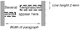
Note that with a small line height, the padding and borders around text in different lines may overlap.
Once a box has been assigned a position according to the normal flow, it may be shifted relative to this position. This is called relative positioning. Offsetting a box in this way has no effect on the following box: it is positioned as if the preceding box were not offset and it is not repositioned after the offset is applied. This implies that relative positioning may cause boxes to overlap.
Relatively positioned boxes keep their normal flow size, including line breaks and the space originally reserved for them. A relatively positioned box establishes a new containing block for descendant boxes.
A relatively positioned box is generated when the 'position' property for an element has the value 'relative'. The offset is specified by the 'top', 'bottom', 'left', and 'right' properties.
Dynamic movement of relatively positioned boxes can produce animation effects in scripting environments (see also the 'visibility' property). Relative positioning may also be used as a general form of superscripting and subscripting except that line height is not automatically adjusted to take the positioning into consideration. See the description of line height calculations for more information.
Examples of relative positioning are provided in the section comparing normal, relative, floating, and absolute positioning.
A float is a box that is shifted to the left or right on the current line. The most interesting characteristic of a floated box is that content may flow along its side (or be prohibited from doing so by the 'clear' property). Content flows down the right side of a left-floated box and down the left side of a right-floated box. The following is an introduction to float positioning and content flow; the exact rules governing float behavior are given in the description of the 'float' property.
A floated box must have an explicit width (assigned via the 'width' property, or its intrinsic width in the case of replaced elements). A floated box becomes a block box that is shifted to the left or right until its outer edge touches the containing block edge or the outer edge of another float. The top of the floated box is aligned with the top of the current line box (or bottom of the preceding block box if no line box exists). If there isn't enough horizontal room on the current line for the float, it is shifted downward, line by line, until a line has room for it.
Since a float is not in the flow, non-positioned block boxes created before and after the float box flow vertically as if the float didn't exist. However, line boxes created next to the float are shortened to make room for the float. Any content in the current line before a floated box is reflowed in the first available line on the other side of the float.
Several floats may be adjacent, and this model also applies to adjacent floats in the same line.
The following rule floats all IMG boxes with class="icon" to the left (and sets the left margin to '0'):
IMG.icon {
  float: left;
  margin-left: 0;
}
Consider the following HTML source and style sheet:
<HTML>
  <HEAD>
    <STYLE type="text/css">
      IMG { float: left }
      BODY, P, IMG { margin: 2em }
    </STYLE>
  </HEAD>
  <BODY>
    <P><IMG src=img.gif alt="This image will illustrate floats">
       Some sample text that has no other...
  </BODY>
</HTML>
The IMG box is floated to the left. The content that follows is rendered to the right of the float, starting on the same line as the float. The line boxes to the right of the float are shortened due to the float's presence, but resume their "normal" width (that of the containing block established by the P element) after the float. This document might be formatted as:

Rendering would have been exactly the same if the document had been:
  <BODY>
    <P>Some sample text
    <IMG src=img.gif alt="This image will illustrate floats">
             that has no other...
  </BODY>
because the content to the left of the float is displaced by the float and reflowed down its right side.
The margins of floating boxes never collapse with margins of adjacent boxes. Thus, in the previous example, vertical margins do not collapse between the P box and the floated IMG box.
A float can overlap other boxes in the normal flow (e.g., when a normal flow box next to a float has negative margins). When an inline box overlaps with a float, it is rendered in front of the float. When a block box overlaps, the background and borders of the block box are "clipped" by the non-transparent parts of the float, but the content is rendered in front of the float.
Here is another illustration, showing what happens when a float overlaps borders of elements in the normal flow.

The floating image is larger than the block that it is a child of, so it interrupts the border of the block, and also the border of the next block. Borders are "clipped" by floats".
The following example illustrates the use of the 'clear' property to prevent content from flowing next to a float.
This style rule means that no H1 element may have a floating element to its left; this means that H1 elements will be positioned below any left floating box.
H1 { clear: left }
Here is an example illustrating the effect of 'clear: left' on two paragraphs. Assuming a rule such as this:
P {clear: left }
a rendering might look like this:

Both paragraphs have set 'clear: left', which causes the second paragraph to be "pushed down" to a position below the float.
This property specifies whether a box should float to the left, right, or not at all. It may be set for elements that generate boxes that are not positioned absolutely (i.e., not 'absolute' or 'fixed'). The values of this property have the following meanings:
Here are the precise rules that govern the behavior of floats:
This property indicates which sides of an element's box(es) may not be adjacent to an earlier floating box. (It may be that the element itself has floating descendants; the 'clear' property has no effect on those.)
This property may only be specified for block-level elements (including floats). For compact and run-in boxes, this property applies to the final block box to which the compact or run-in box belongs.
Values have the following meanings when applied to non-floating block boxes:
When the property is set on floating elements, it results in a modification of the rules for positioning the float. An extra constraint (#9) is added:
In the absolute positioning model, a box is assigned explicit coordinates with respect to its containing block. It is removed from the normal flow entirely (it has no impact on later siblings). Like other boxes, an absolutely positioned box establishes a new containing block for descendant boxes. However, the contents of an absolutely positioned element do not flow around any other boxes. They may or may not obscure the contents of another box, depending on the stack levels of the overlapping boxes.
Fixed positioning is a variant of absolute positioning. The only difference is that for a fixed positioned box, the containing block is established by the viewport. For continuous media, fixed boxes do not move when the document is scrolled. In this respect, they are similar to fixed background images. For paged media, boxes with fixed positions are repeated on every page. This is useful for placing, for instance, a signature at the bottom of each page.
Authors may use fixed positioning to create frame-like presentations. Consider the following frame layout:

This might be achieved with the following HTML document and style rules:
<HTML>
  <HEAD>
    <TITLE>A frame document with CSS2</TITLE>
    <STYLE type="text/css">
      #header {
        position: fixed;
        width: 100%;
        height: 15%;
        top: 0;
        right: 0;
        bottom: auto;
        left: 0;
      }
      #sidebar {
        position: fixed;
        width: 10em;
        height: auto;
        top: 15%;
        right: auto;
        bottom: 100px;
        left: 0;
      }
      #main {
        position: fixed;
        width: auto;
        height: auto;
        top: 15%;
        right: 0;
        bottom: 100px;
        left: 10em;
      }
      #footer {
        position: fixed;
        width: 100%;
        height: 100px;
        top: auto;
        right: 0;
        bottom: 0;
        left: 0;
      }
    </STYLE>
  </HEAD>
  <BODY>
    <DIV id="header"> ...  </DIV>
    <DIV id="sidebar"> ...  </DIV>
    <DIV id="main"> ...  </DIV>
    <DIV id="footer"> ...  </DIV>
  </BODY>
</HTML>
When specified for the same elements, the three properties that affect box generation and layout -- 'display', 'position', and 'float' -- interact according to the following precedences (highest to lowest):
Note. CSS2 does not specify layout behavior when values for these properties are changed by scripts. For example, what happens when an element having 'width: auto' is repositioned? Do the contents reflow, or do they maintain their original formatting? The answer is outside the scope of this document, and such behavior is likely to differ in initial implementations of CSS2.
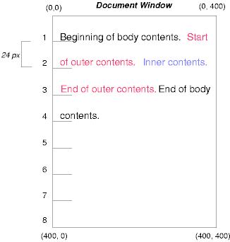
To illustrate the relationship between normal flow, relative positioning, floats, and absolute positioning, we provide a series of examples based on the following HTML fragment:
<HTML>
  <HEAD>
    <TITLE>Comparison of positioning schemes</TITLE>
  </HEAD>
  <BODY>
    <P>Beginning of body contents.
      <SPAN id="outer"> Start of outer contents.
      <SPAN id="inner"> Inner contents.</SPAN>
      End of outer contents.</SPAN>
      End of body contents.
    </P>
  </BODY>
</HTML>
The final positions of boxes generated by the outer and inner elements vary in each example. In each illustration, the numbers to the left of the illustration indicate the normal flow position of the double-spaced (for clarity) lines. (Note: the illustrations use different horizontal and vertical scales.)
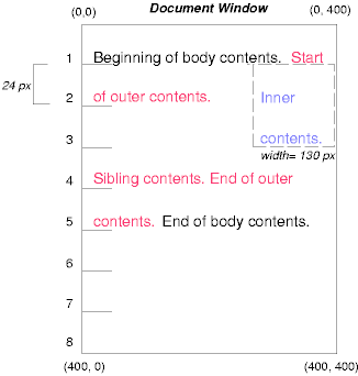
Consider the following CSS declarations for outer and inner that don't alter the normal flow of boxes:
#outer { color: red }
#inner { color: blue }
This results in something like the following:
To see the effect of relative positioning, consider the following CSS rules:
BODY { line-height: 200% }
#outer { position: relative; top: -12px; color: red }
#inner { position: relative; top: 12px; color: blue }
First, the outer text is flowed into its normal flow position and dimensions at the end of line 1. Then, the inline boxes containing the text (distributed over three lines) are shifted as a unit upwards by 12px.
The contents of inner, as a child of outer, would normally flow immediately after the words "of outer contents" (on line 1.5). However, the inner contents are themselves offset relative to the outer contents by 12px downwards, back to their original position on line 2.
Note that the content following outer is not affected by the relative positioning of outer.
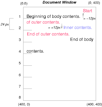
Note also that if the relative positioning of outer were -24px, the text of outer and the body text would have overlapped.
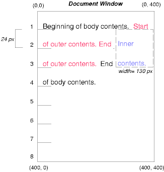
Now consider the effect of floating the inner element's text to the right by means of the following rules:
#outer { color: red }
#inner { float: right; width: 130px; text-align: top; color: blue }
First, the inner box (whose width has been set explicitly) is floated to the right margin. Then, the text of the outer element that follows the inner element text flows in the space vacated by the inner box. This flow respects the new right margin established by the left border of the inner box.
To show the effect of the 'clear' property, we add a sibling element to the example:
<HTML>
  <HEAD>
    <TITLE>Comparison of positioning schemes II</TITLE>
  </HEAD>
  <BODY>
    <P>Beginning of body contents.
      <SPAN id=outer> Start of outer contents.
      <SPAN id=inner> Inner contents.</SPAN>
      <SPAN id=sibling> Sibling contents.</SPAN>
      End of outer contents.</SPAN>
      End of body contents.
    </P>
  </BODY>
</HTML>
The following rules:
  #inner { float: right; width: 130px;
           text-align: top; color: blue }
  #sibling { color: red }
cause the inner box to float to the right and the text of the sibling element to flow in the vacated space:

However, if the 'clear' property on the sibling element is set to 'right' (i.e., the generated sibling box will not accept being positioned next to floating boxes to its right), the sibling box is moved below the float:
  #inner { float: right; width: 130px;
           text-align: top; color: blue }
  #sibling { clear: right; color: red }
Finally, we consider the effect of absolute positioning. Consider the following CSS declarations for outer and inner:
  #outer {
    position: absolute;
    top: 200px;
    left: 200px;
    width: 200px;
    color: red;
  }
  #inner { color: blue }
which cause the top of the outer box to be positioned with respect to the containing block (which we suppose is established by the initial containing block). The top side of the outer box is 200px from the top of the containing block and the left side is 200px from the left side. The child box of outer is flowed normally with respect to its parent.
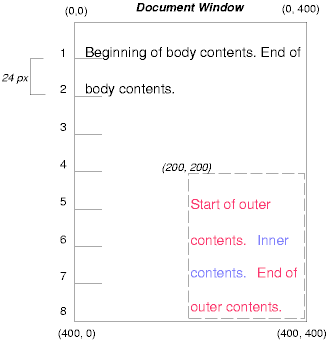
Note that because outer has been absolutely positioned, it establishes a new containing block for descendant boxes.
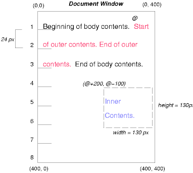
The following example shows an absolutely positioned box that is a child of a relatively positioned box. Although the parent outer box is not actually offset, setting its 'position' property to 'relative' causes its box to serve as the containing block for any descendant boxes. Since the outer box is an inline box that is split across several lines, only the first box (whose upper left-hand corner is designated by a "@" in the illustration below) establishes the containing block for the descendants.
  #outer {
    position: relative;
    color: red
  }
  #inner {
    position: absolute;
    top: 200px;
    left: -100px;
    height: 130px;
    width: 130px;
    color: blue;
  }
This results in something like the following:
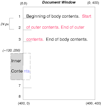
The following rules don't establish a new positioning context for inner:
  #outer { color: red }
  #inner {
    position: absolute;
    top: 200px;
    left: -100px;
    height: 130px;
    width: 130px;
    color: blue;
  }
but cause the inner box to be positioned with respect to the containing block (which we assume here is initial containing block).
Relative and absolute positioning may be used to implement change bars, as shown in the following example. We use a value of 'auto' for the 'top' property, which results in the box being placed at the "current" location, just as if the box were being flowed into that space. The following HTML text:
<P style="position: relative; margin-right: 10px; left: 10px;">
I used two red hyphens to serve as a change bar. They
will "float" to the left of the line containing THIS
<SPAN style="position: absolute; top: auto; left: 0px; color: red;">--</SPAN>
word.</P>
might result in something like:

In the following sections, the expression "in front of" means closer to the user as the user faces the screen.
In CSS2, each box has a position in three dimensions. In addition to their horizontal and vertical positions, boxes lie along a "z-axis" and are rendered one on top of the other. Z-axis positions are particularly relevant when boxes overlap visually. This section discusses how boxes may be positioned along the z-axis.
Each box belongs to one stacking context. Each box in a given stacking context has an integer stack level, which is its position on the z-axis relative to other boxes in the same stacking context. Boxes with greater stack levels are always rendered in front of boxes with lower stack levels. Boxes may have negative stack levels. Boxes with the same stack level in a stacking context are stacked bottom-to-top according to document tree order.
The root element creates a root stacking context, but other elements may establish local stacking contexts. Stacking contexts are inherited. A local stacking context is atomic; boxes in other stacking contexts may not come between any of its boxes.
An element that establishes a local stacking context generates a box that has two stack levels: one for the stacking context it creates (always '0') and one for the stacking context to which it belongs (given by the 'z-index' property).
An element's box has the same stack level as its parent's box unless given a different stack level with the 'z-index' property.
For an absolutely or relatively positioned box, the 'z-index' property specifies:
Values have the following meanings:
In the following example, the stack levels of the boxes (named with their "id" attributes) are: "text2"=0, "image"=1, "text3"=2, and "text1"=3. The "text2" stack level is inherited from the root box. The others are specified with the 'z-index' property.
<!DOCTYPE HTML PUBLIC "-//W3C//DTD HTML 4.0 Transitional//EN">
<HTML>
  <HEAD>
    <TITLE>Z-order positioning</TITLE>
    <STYLE type="text/css">
      .pile {
        position: absolute;
        left: 2in;
        top: 2in;
        width: 3in;
        height: 3in;
      }
    </STYLE>
  </HEAD>
  <BODY>
    <P>
      <IMG id="image" class="pile"
           src="butterfly.gif" alt="A butterfly image"
           style="z-index: 1">

    <DIV id="text1" class="pile"
         style="z-index: 3">
      This text will overlay the butterfly image.
    </DIV>

    <DIV id="text2">
      This text will be beneath everything.
    </DIV>

    <DIV id="text3" class="pile"
         style="z-index: 2">
      This text will underlay text1, but overlay the butterfly image
    </DIV>
  </BODY>
</HTML>
This example demonstrates the notion of transparency. The default behavior of a box is to allow boxes behind it to be visible through transparent areas in its content. In the example, each box transparently overlays the boxes below it. This behavior can be overridden by using one of the existing background properties.
The characters in certain scripts are written from right to left. In some languages, in particular those written with the Arabic or Hebrew script, and in some mixed-language contexts, text in a single (visually displayed) block can therefore appear with mixed directionality. This phenomenon is called bidirectionality, or "bidi" for short. For an introduction to bidirectionality issues, please consult the HTML 4.0 specification ([HTML40], section 8.2).
The Unicode ([UNICODE]) specification assigns directionality to characters and defines a complex algorithm for determining the proper directionality of text. The 'direction' and 'unicode-bidi' properties allow authors to specify how the elements and attributes of a document language correspond to units of the Unicode bidi algorithm.
Because the directionality of a text depends on the structure and semantics of the document language, these properties should in most cases be used only by designers of document type descriptions (DTDs), or authors of special documents. A typical exception would be to override bidi behavior in a user agent if that user agent transliterates Yiddish (usually written with Hebrew letters) to Latin letters at the user's request.
If a document contains right-to-left characters, and if the user agent displays these characters (with appropriate glyphs, not arbitrary substitutes such as a question mark, a hex code, a black box, etc.), the user agent must apply the bidirectional algorithm. This seemingly one-sided requirement reflects the fact that, although not every Hebrew or Arabic document contains mixed-directionality text, such documents are much more likely to contain left-to-right text (e.g., numbers, text from other languages) than are documents written in left-to-right languages.
Conforming HTML user agents may ignore the 'direction' and 'unicode-bidi' properties in author and user style sheets but must behave as if they used the style sheet fragment given below.
| Value: | ltr | rtl | inherit |
| Initial: | ltr |
| Applies to: | all elements, but see prose |
| Inherited: | yes |
| Percentages: | N/A |
| Media: | visual |
This property specifies the direction of inline box flow, embedded text direction (see 'unicode-bidi'), table column layout, and content overflow.
Values for this property have the following meanings:
| Value: | normal | embed | bidi-override | inherit |
| Initial: | normal |
| Applies to: | all elements, but see prose |
| Inherited: | no |
| Percentages: | N/A |
| Media: | visual |
The writing direction of text within an inline box depends on two factors:
User agents following the bidirectional algorithm will display characters in the correct writing direction automatically, except when elements with reversed writing direction are embedded more than one level deep. In such cases, authors must assist the user agent by signaling that an element opens a new level of embedding with respect to the bidirectional algorithm.
Thus, values for 'unicode-bidi' have the following meanings:
For the 'direction' property to have any effect on inline-level elements, the 'unicode-bidi' property must have as value either 'embed' or 'override'.
If a default style sheet specifies values for 'unicode-bidi', authors and users should not specify rules to override them.
The following example shows an XML document with bidirectional text. It illustrates an important design principle: DTD designers should take bidi into account both in the language proper (elements and attributes) and in any accompanying style sheets. The style sheets should be designed so that bidi rules are separate from other style rules. The bidi rules should not be overridden by other style sheets so that the document language's or DTD's bidi behavior is preserved.
In this example, lowercase letters stand for inherently left-to-right characters and uppercase letters represent inherently right-to-left characters:
<HEBREW>
  <PAR>HEBREW1 HEBREW2 english3 HEBREW4 HEBREW5</PAR>
  <PAR>HEBREW6 <EMPH>HEBREW7</EMPH> HEBREW8</PAR>
</HEBREW>
<ENGLISH>
  <PAR>english9 english10 english11 HEBREW12 HEBREW13</PAR>
  <PAR>english14 english15 english16</PAR>
  <PAR>english17 <HE-QUO>HEBREW18 english19 HEBREW20</HE-QUO></PAR>
</ENGLISH>
Since this is XML, the style sheet is responsible for setting the writing direction. This is the style sheet:
/* Rules for bidi */
HEBREW, HE-QUO  {direction: rtl; unicode-bidi: embed}
ENGLISH         {direction: ltr; unicode-bidi: embed}

/* Rules for presentation */
HEBREW, ENGLISH, PAR  {display: block}
EMPH                  {font-weight: bold}
The HEBREW element is a block with a right-to-left base direction, the ENGLISH element is a block with a left-to-right base direction. The PARs are blocks that inherit the base direction from their parents. Thus, the first two PARs are read starting at the top right, the final three are read starting at the top left.
The EMPH element is inline-level, and since its value for 'unicode-bidi' is 'normal' (the initial value), it has no effect on the ordering of the text. The HE-QUO element, on the other hand, creates an embedding.
The rendering of this text might look like this if the line length is long:
               5WERBEH 4WERBEH english3 2WERBEH 1WERBEH

                                8WERBEH 7WERBEH 6WERBEH

english9 english10 english11 13WERBEH 12WERBEH

english14 english15 english16

english17 20WERBEH english19 18WERBEH
Note that the HE-QUO embedding causes HEBREW18 to be to the right of english19.
If lines have to be broken, it might be more like this:
       2WERBEH 1WERBEH
  -EH 4WERBEH english3
                 5WERB

   -EH 7WERBEH 6WERBEH
                 8WERB

english9 english10 en-
glish11 12WERBEH
13WERBEH

english14 english15
english16

english17 18WERBEH
20WERBEH english19
Because HEBREW18 must be read before english19, it is on the line above english19. Just breaking the long line from the earlier rendering would not have worked. Note also that the first syllable from english19 might have fit on the previous line, but hyphenation of left-to-right words in a right-to-left context, and vice versa, is usually suppressed to avoid having to display a hyphen in the middle of a line.
Note that the default style sheet "states" that the HEBREW, HE-QUO, and ENGLISH elements all create embeddings. This bidi behavior should be preserved even if a user decides to change 'display: inline' for these elements. The rules that specify 'unicode-bidi: embed' achieve this as long as they are not overridden by user rules.
The 'direction' property determines the direction of several types of flow:
In order to ensure the proper application of the bidirectional algorithm, inline boxes (including anonymous inline boxes) must be constructed, split up if necessary, and flowed so that the final order of the characters on each line conforms to the Unicode bidirectional algorithm. This means that left-to-right character sequences and right-to-left character sequences can occur within an element's content, but inline boxes are constructed so that flow remains in one direction. Non-textual entities such as images are treated as neutral characters, unless their 'unicode-bidi' property has a value other than 'normal', in which case they are treated as strong characters in the 'direction' specified for the element.
For instance, suppose that in the middle of a paragraph of Hebrew (right-to-left) text, we embed an English quotation:
<P lang="he">WERBEH WERBEH WERBEH WERBEH WERBEH
WERBEH WERBEH WERBEH WERBEH WERBEH
WERBEH WERBEH WERBEH <SPAN lang="en">English
quote here</SPAN> WERBEH WERBEH</>
The right-to-left flow of Hebrew text stops at the asterisk (*) in the following diagram:
WERBEH WERBEH WERBEH WERBEH WERBEH
WERBEH WERBEH WERBEH WERBEH WERBEH
             *WERBEH WERBEH WERBEH
While inline flow continues right-to-left after the asterisk, the English text is laid out left-to-right. Thus, successive letters will fill in the available space as follows:
            E *WERBEH WERBEH WERBEH
           En *WERBEH WERBEH WERBEH
          Eng *WERBEH WERBEH WERBEH
         Engl *WERBEH WERBEH WERBEH
        Engli *WERBEH WERBEH WERBEH
       Englis *WERBEH WERBEH WERBEH
Etc., onto the following line:
English quote *WERBEH WERBEH WERBEH
                                  h

English quote *WERBEH WERBEH WERBEH
                                 he

English quote *WERBEH WERBEH WERBEH
                                her

English quote *WERBEH WERBEH WERBEH
                               here
Hebrew text continues to flow right-to-left at the end of the English text.
In order to preserve the expected behavior of HTML 4.0 elements, their bidirectionality must be preserved however they are rendered. For example, people expect paragraphs to behave like a block with respect to bidirectionality, so even if a paragraph is displayed as an 'inline' element, it must introduce a new level of bidi embedding.
The following rules capture the remaining bidi semantics of HTML 4.0:
  BDO[DIR="ltr"]  { direction: ltr; unicode-bidi: bidi-override }
  BDO[DIR="rtl"]  { direction: rtl; unicode-bidi: bidi-override }

  *[DIR="ltr"]    { direction: ltr; unicode-bidi: embed }
  *[DIR="rtl"]    { direction: rtl; unicode-bidi: embed }

  /* Block-level elements */
  ADDRESS, BLOCKQUOTE, BODY, DD, DIV, DL, DT, FIELDSET,
  FORM, FRAME, FRAMESET, H1, H2, H3, H4, H5, H6, IFRAME,
  NOSCRIPT, NOFRAMES, OBJECT, OL, P, UL, APPLET, CENTER,
  DIR, HR, MENU, PRE, LI, TABLE, TR, THEAD, TBODY, TFOOT,
  COL, COLGROUP, TD, TH, CAPTION
                  { unicode-bidi: embed }