Foreword (1/2)
This talk is about...
- mobileOK Basic to ground Web pages in the mobile world
- mobileOK Basic as a dev-friendly label: pages can be automatically checked!
- understanding W3C mobileOK Basic checker's reports, and some underlying best practices
- reminding people that the checker in itself is not enough!
This talk is not about...
-
formally presenting W3C, and the W3C Mobile Web Initiative
(although on-going related works within W3C will be mentioned)
- the Mobile Web specificities and constraints
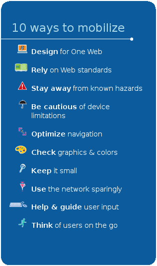
- how to mobilize an existing desktop Web site
- taking you through a comprehensive tour of the Mobile Web Best Practices
... although I would be happy to talk about these points, feel free to ask!
Foreword (2/2)
Best viewed with...
- a browser to view the slides
- a desktop browser to view the examples and the checker's reports
- a mobile browser to view the examples
- a source viewer to take a look at the underlying code
→ Switching between windows may turn out to be a perilous live exercise.
(the slides include some screenshots, just in case)
Menu page
Links to the examples are available from the following menu page:
The Web: tomorrow's Mobile platform (1/2)
Main choices available?
-
Native applications
- Hard to develop and maintain
- Difficult to install anything on mobile phones anyway
-
Java applications
- easier (still not easy!) to develop, hard to maintain
- Code signing may be a nightmare
-
Web Applications
- easy to develop and maintain
- can't access all the functionalities of the devices for the moment
There will always be a need for native/Java applications, but...
→ The Web will be the main mobile development plaform in the future!
The Web: tomorrow's Mobile platform (2/2)
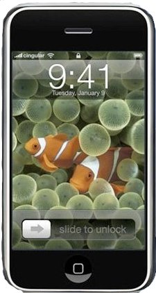
The iPhone is a perfect example of a mobile phone that promotes the use of the Mobile Web as the development platform for applications:
- the ergonomy promotes a rich browsing experience
- well... there was no other way to create applications anyway!
Introducing mobileOK Basic (1/3)
 Back to topic:
- Mobile Web Applications derive from...
- Mobile Web sites made of...
- Mobile Web pages
Mobile Web pages need to rely on solid foundations so that it's easier to build on top of them.
Introducing mobileOK Basic (2/3)
What is mobileOK Basic?
- (roughly) the set of machine-testable Mobile Web Best Practices
- a trustmark that says "I took mobile constraints into account"
- the solid foundation to create your Mobile Web pages
Introducing mobileOK Basic (3/3)
mobileOK applies to an hypothetical default delivery context (DDC)
NB: DDC is "the minimum delivery context specification necessary for a reasonable experience of the Web".
Do not target the DDC if you know better about the user's phone capacities!
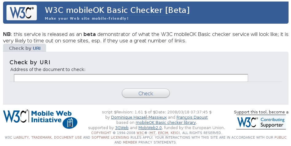
mobileOK Basic checkers
Several implementations of mobileOK Basic checkers already exist:
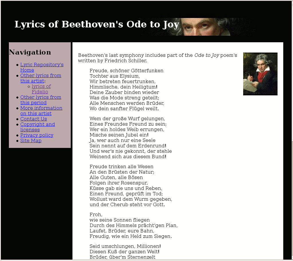
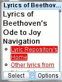
Example: Beethoven lyrics
- desktop -
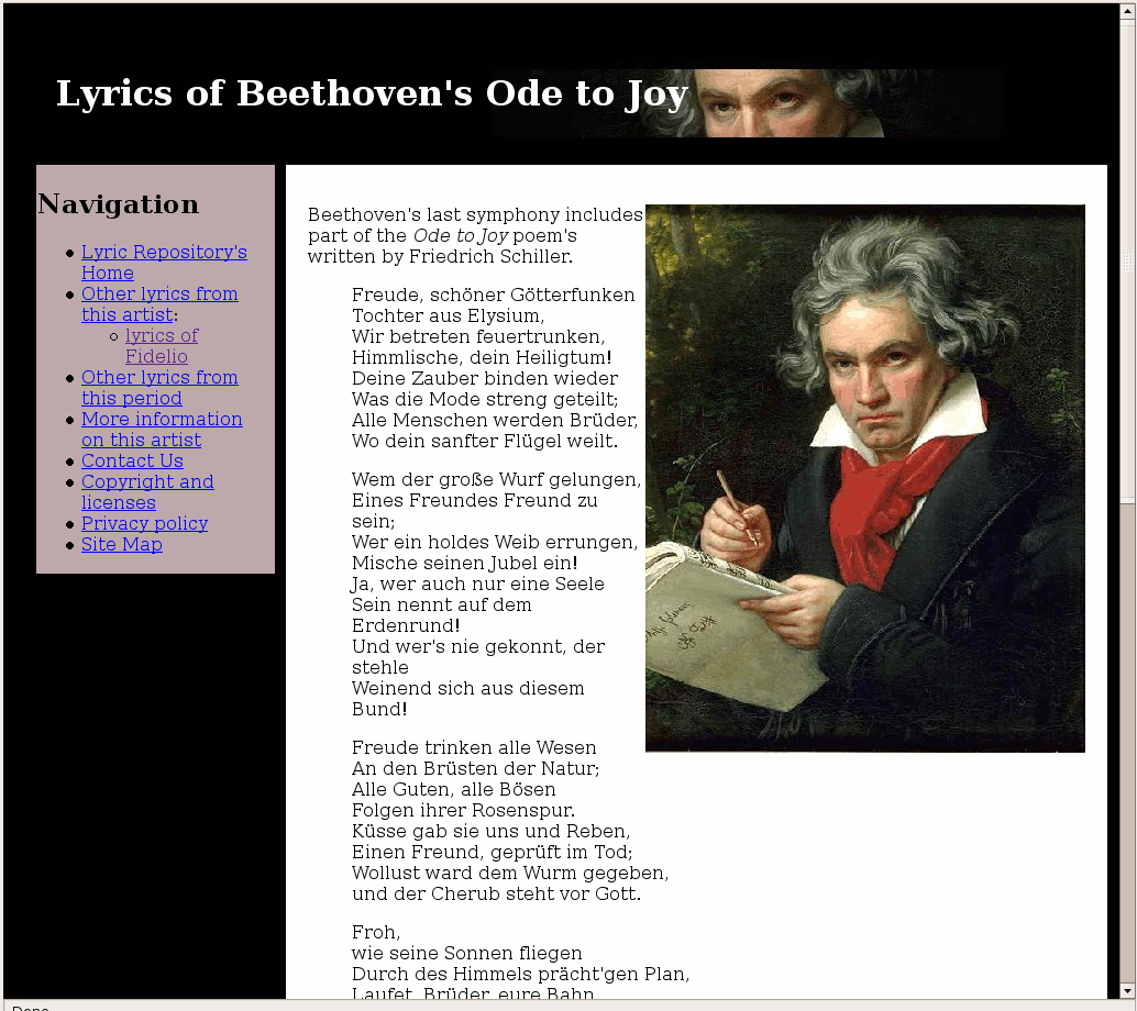
- phone -
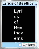
What does the checker have to say on a Web page that "looks" just fine?
View page, View checker's report
- Many failures!
- The page looks ugly on a mobile phone!
- "old-school" desktop design techniques are in use!
Before we come back and fix the page, let's:
- see what a mobileOK Basic template looks like
- learn a few best practices, and how the mobileOK checker helps addressing them
- remind ourselves that the checker helps, but thinking is still required!
Hello mobileOK! page (1/3)
- desktop -

- phone -
Let's build a mobileOK Basic template page from scratch
<html>
  <body>
    <p>
      Hello mobileOK!
    </p>
  </body>
</html>
View page, View checker's report
- The DOCTYPE declaration is missing
- The XHTML namespace is missing
→ We need to be explicit about the content of the page.
The more explicit, the easier for the browser to render the page.
Standards mode - as opposed to Quirks mode - is less CPU-intensive.
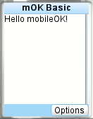
Hello mobileOK! page (2/3)
- The XML prolog to say it's an XML page, and that we're using UTF-8
- The DOCTYPE declaration to say we're "mobile"
- The XHTML namespace for a clear identification of our elements
<?xml version="1.0" encoding="utf-8"?>
<!DOCTYPE html PUBLIC
 "-//W3C//DTD XHTML Basic 1.1//EN"
 "http://www.w3.org/TR/xhtml-basic/xhtml-basic11.dtd">
<html xmlns="http://www.w3.org/1999/xhtml">
  <body>
    <p>
      Hello mobileOK!
    </p>
  </body>
</html>
View page, View checker report
→ The title is missing. It should be short and descriptive.
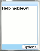
Hello mobileOK! page (3/3)
- desktop -
- phone -
<?xml version="1.0" encoding="utf-8"?>
<!DOCTYPE html PUBLIC
 "-//W3C//DTD XHTML Basic 1.1//EN"
 "http://www.w3.org/TR/xhtml-basic/xhtml-basic11.dtd">
<html xmlns="http://www.w3.org/1999/xhtml">
  <head>
    <title>mOK Basic</title>
  </head>
  <body>
    <p>
      Hello mobileOK!
    </p>
  </body>
</html>
- head and title are mandatory in XHTML Basic 1.1 anyway
- Short and descriptive usually need to be balanced!
View page, View checker report
- Yeepee! We're mobileOK Basic!
- Where's the CSS?
Stylesheets (1/3)
Internal vs. External
- for a small set of styles mostly used in one page
Internal
<style type="text/css">
  blah... blah...
</style>
- when many web pages use the same styles (CSS will be cached)
- when using different styles for different media...
External
<link rel="stylesheet"
 type="text/css"
 href="styles.css" />
Stylesheets (2/3)
The @media rules
<link rel="stylesheet" type="text/css"
 media="screen" href="screen.css" />
<link rel="stylesheet" type="text/css"
 media="handheld" href="handheld.css" />
- The mobile browser only downloads the handheld stylesheet
- The same page is served for all devices
- The desktop CSS may be as complex as you want it to be
- Background images can be embedded in the desktop CSS
- You can have specific styles for a few classes of devices
Warning: so-called full-web browsers usually download the screen stylesheet..
Use more specific @media queries in that case.
For instance, for the iPhone:
<link rel="stylesheet" type="text/css"
 media="only screen and (max-device-width: 480px)" href="handheld.css" />
Stylesheets (3/3)
The mobileOK Basic template with CSS
- desktop -
- phone -
template4.html
<?xml version="1.0" encoding="utf-8"?>
<!DOCTYPE html PUBLIC
 "-//W3C//DTD XHTML Basic 1.1//EN"
 "http://www.w3.org/TR/xhtml-basic/xhtml-basic11.dtd">
<html xmlns="http://www.w3.org/1999/xhtml">
  <head>
    <title>mOK Basic</title>
    <link rel="stylesheet" type="text/css"
          media="screen" href="screen.css" />
    <link rel="stylesheet" type="text/css"
          media="handheld" href="handheld.css" />
  </head>
  <body>
    <p>Hello mobileOK!</p>
  </body>
</html>
screen.css
p { font-size: 2em; }
body:after { content: url(W3C-MWI-large.png) }
handheld.css
p { font-size: 0.5em; }
View page, View checker report
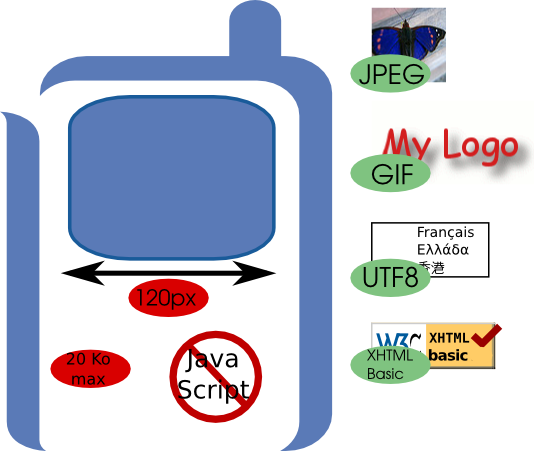
Images
- desktop -
Bad: View page, View checker report
-
Label the image with a text equivalent
<img src="MWI.gif" alt="MWI"> />
-
Precise image width and height:
- reflows confuse users on small screens
- reflows are CPU-intensive
<img src="MWI.gif" alt="MWI" width="151" height="63" />
-
Don't downscale!
<img src="MWI.gif" alt="MWI" width="50" height="21" />

→ Think bandwidth, latency, power saving... and cost!
Page size (1/2)
- desktop -
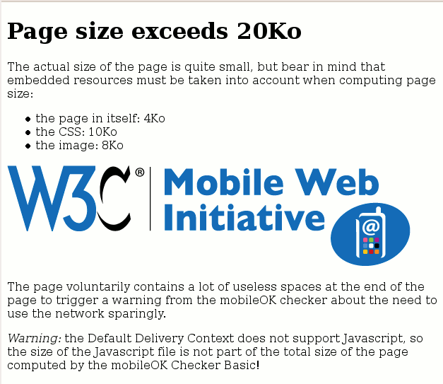
Bad: View page, View checker report
- Page size includes images, stylesheets and other embedded resources!
- Size matters... small is beautiful! Don't exceed 20Ko
- High latency, low bandwidth: 100Ko ~ 1mn
- Unlimited data plans are not the rule: 100Ko ~ 1€
- Make sure your content can be cached
Page size (2/2)
- desktop -
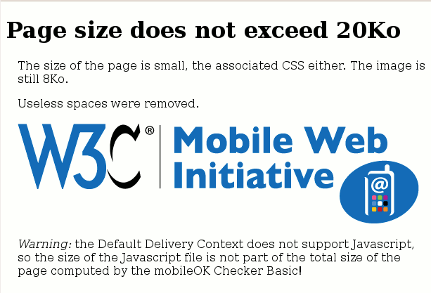
Good: View page, View checker report
- Focus on meaningful data
-
No support for scripting in the DDC
(→ script files not taken into account by the checker)
Tables for layout is bad
- desktop -
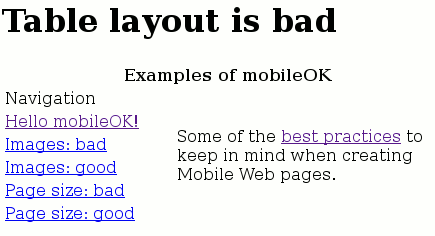
- phone -
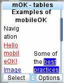
Bad: View page, View checker report
-
Do not use tables for layout!
- more markup, more CPU-intensive
- less accessible
- harder to maintain
- tables are to create relationships among data
- tables may not be supported at all!
- an image used for spacing = a useless additional HTTP request
- Use CSS!
- ... and your document should be readable without CSS anyway!
CSS layout is good
- desktop -
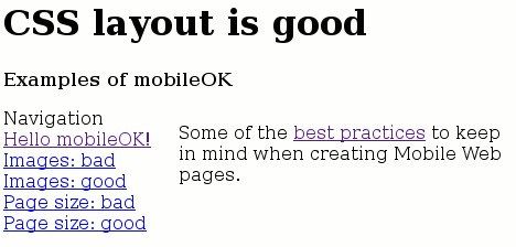
- phone -
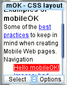
Good: View page, View checker report
- more accessible
- easier to maintain
- clean separation between content and layout
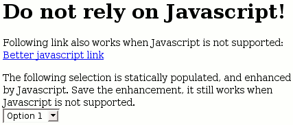
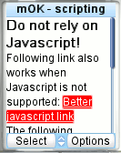
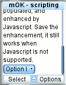
Dynamic content (1/2)
- desktop -
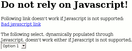
- phone -
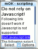
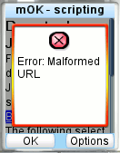
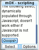
Bad: View page, View checker report
You may use scripting but don't rely on it!
-
Javascript links are bad:
<a href="javascript:submit();">Link</a>
Use events instead, and provide a default action:
<a href="page.html" onclick="submit();">Link</a>
-
Use Javascript reflection for determining support:
if (window.ActiveXObject) {
// Instantiate using new ActiveXObject
} else if (window.XMLHttpRequest) {
// Instantiate using new XMLHttpRequest
}
-
Degrade gracefully
Back to: Beethoven lyrics
- desktop -
- phone -
Remember the Beethoven lyrics page that "looked" just fine?
Using the checker's report and our knowledge of Best Practices, we may now fix the page by:
- removing tables used for layout and images used for spacing
- having one CSS for "screen" and one for "handheld"
- completing images definitions, resizing images when needed
- moving background image to CSS definition
Good: View page, View checker's report
- mobileOK Basic!
- Looks fine on a mobile phone!
-
Desktop version unchanged!
(save the resizing of the picture of Beethoven)
Related works within W3C (2/2)
In other working groups:
Conclusion