SVG Accessibility/Other Graphs
Graphs that are not classified as one of types listed...
UC-Airline

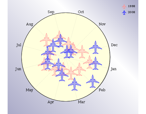
A circular graph I don't actually understand from visual inspection. There is a circle with months marked on radial lines dividing it into segments, and on each line there are two aeroplanes: a red one, and a blue one, which according to a key represent 1998 and 2008. Presumably the distance from the centre is significant, but of what isn't clear from the graph.
The underlying information here is easily represented as a 2 by 12 table, where the headers on the short axis are 1998 and 2008, and on the long axis the names of each month, and the values in each cell correspond to the meaning of the distance from the centre of the circle.
Problems
- There is insufficient information to understand the overall meaning of the graph
- There is no scale on the radii,
- It is impossible to tell exactly where on the diagram each point falls, and they seem to be only approximately positioned
- The aeroplanes used as point markers are raw paths, making re-styling for e.g. high contrast difficult
- There is no title or description at all, let alone information provided for each conceptual group
Navigating the graph should allow either moving around the circle - month to month, and getting the comparative figures for 2008 and 1998 for a given month, or navigating the relevant points for each of 1998 and 2008.
UC-Calendar

.
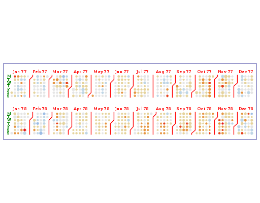
This is a calendar laid out as a graph. The Y axis lists the days as MTWTFSS twice, once for each year, and the X axis lists the months - it is repeated for each year, e.g. the first X axis starts jan77, the second jan78.
Each month is represented as a block of dots, representing days, in a grid 7 dots high, so if the first day of the month is thursday, the bottom 4 dots of the first column are present, with the next row complete, and so on until if the month ends on a monday there is only the top dot in that column. The dots vary by size and colour but there is no information as to what this means.
There is a dividing line drawn between each month. It looks very cool but doesn't do anything terribly useful, given there is also plenty of whitespace there.