SVG Accessibility/Cool Graphs
"complex" or less common graph types
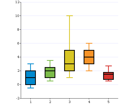
UC-Boxplot

Presumably this thing is known as a box plot. X axis goes from one to five (no units or meaning is provided for the example), and for each value there is a range covered on the Y axis by a vertical line with terminals. Within the range there is a highlighted range, represented by a box placed over the line, and within the box a horizontal dividing line may identify a particularly key value such as mean, median, or what we though made the box look nicer.
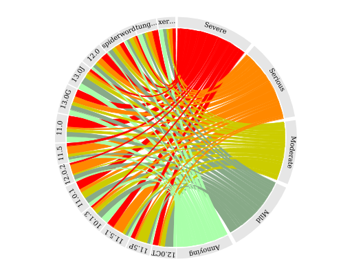
UC-Chord

Around the perimeter, each half of the circle essentially represents a set of things by dividing the arc into labeled pieces, and the tangle is made by connecting the things on the right half, where there are fewer, to the things on the left half. Each of the things on the right half has a colour associated, so there is a block that is then divided into strands which go across to the things on the left. The with of the connection is significant - different for each connection. For the things on the left instead of a block there are therefore multiple coloured strands, in effect like a stacked bar chart.
Moving around this is quite cool, because you get several pieces of information combined - for the things n the left, a distribution of different connections is more prominent - relative sizes are also visible - for the things on the right the overall size is more prominent. Moving from a connection is something that is a bit like an adventure game - "you started from X, you can also go to options A, B, C, D, E, F". We need to be able to describe the relative sizes of those paths, if the user wants to know.
An alternate form of this graph could be constructed using two parallel axes for the two main categories, but it would require staggering the distance from each side at which the lines cross or the information would be harder to separate out, and this would in turn require more space for the same representation.
At the highest level there are two groups of information, each of them a group of categories. For each category there are a set of connectors, which represent the proportion for each terminal point that is represented by that connector. If we describe the "left-hand set" as L1 through L15 - I don't understand the actual headings - and the right hand set as "severity" - they are
- severe
- serious
- moderate
- mild
- annoying
Then a typical connector may be described as something like "4% of 'moderate' or a raw value of 3 out of 75, connects to 9% of L1 or a raw value of 1 out of 11"