WAI R&D Symposia » Text Customization Home » Proceedings » This paper.
This paper is a contribution to the Text Customization for Readability Online Symposium. It was not developed by the W3C Web Accessibility Initiative (WAI) and does not necessarily represent the consensus view of W3C staff, participants, or members.
Optimal Colors to Improve Readability for People with Dyslexia
1. Problem Description
In this study we analyze how an specific aspect of text customization, text and background colors, can improve readability of people with dyslexia. Our user study compares two kinds of data, quantitative (user performance) and qualitative (user preferences), taking into consideration previous recommendations and the color luminosity ratio prescribed by the WCAG 2.0. (W3C, 2008).
2. Background
The role of colors in readability has been extensively discussed in relationship to dyslexia, a reading disability which occurs in around 10-17.5% of the English and 7.5-11.8% of the Spanish speaking population (Rello and Baeza-Yates, 2012). However, when reading the Web, poor colored text is one of the key problems encountered by people with dyslexia (McCarthy and Swierenga, 2010).
Previous user studies showed that specific text and background colors could be beneficial for reading on the screen (Gregor and Newell 2000; Rello, Baeza-Yates and Kanvinde, 2012). Moreover, text customization suggestions broadly agree that people with dyslexia normally prefer lower brightness and color differences among text and background compared to the average reader (Bradford, 2011; Pedley 2006; British Dyslexia Association, 2012). However, the relationship between this preference and the minimum color luminosity ratio prescribed by the W3C has not been studied.
In our study we empirically test previous recommendations and compare them with the W3C algorithm and the standard reading of a control group.
3. Approach
Our approach separates accessibility needs and personal preferences which are frequently mixed in the recommendations regarding colors and readability. Therefore, our tests were composed of two parts: (a) a set of texts to be read using eye-tracking to study the reading performance and (b) a questionnaire to collect the user preferences. Through this methodology we distinguish the aspects of text customization which allows readers with dyslexia to read more effectively and optional suggestions regarding their preferences. Each test was performed by 23 participants with dyslexia (Rello, Baeza-Yates and Kanvinde, 2012) and 92 participants without dyslexia (Rello and Marcos, 2012).
For the selection of the color pairs we took into consideration: (a) the previous literature, (b) the recommendations, (c) their frequency in the Web, and (d) their luminosity contrast ratio. The color pairs studied are given in Table 1.
| Text and background color | Color difference | Brightness difference |
|---|---|---|
| black (000000) & white (FFFFFF) | 765 | 255 |
| black (000000) & yellow (FFFF00) | 510 | 226 |
| black (000000) & creme (FAFAC8) | 700 | 244 |
| off-black (0A0A0A) & off-white (FFFFE5) | 735 | 245 |
| blue (00007D) & white (FFFFFF)> | 640 | 241 |
| dark brown (1E1E00) & light green (B9B900)> | 310 | 137 |
| brown (282800) & dark green (A0A000)> | 240 | 107 |
| blue (00007D) & yellow (FFFF00) | 635 | 212 |
Table 1: Color and brightness difference for the text and background color pairs. The RGB codes for the colors are presented in parenthesis and used for the cell text and background.
The pairs black & white and blue & white were chosen because they are the most commonly used. We selected off-black & off-white because it is recommended in Web accessibility for people with dyslexia (Bradford, 2011). The pairs brown & dark green and blue & yellow were included in the study because they were chosen by people with dyslexia in previous experiments (Gregor et al., 2003; Gregor and Newell, 2000). We chose black & creme because it is used —and recommended— by the British Dyslexia Association for their website and we selected black & yellow because of its high contrast.
Since the pair brown & dark green has a lower color contrast than the required by the WCAG 2.0, we created a dark brown & light green with the same color hue but following the W3C algorithm to compare both of the color pairs.
Each of the color pairs were presented in random order containing different comparable texts. The texts have the same length (22 syllables), belong to the same genre, and have the same metric and rhythm. They were written in sans serif arial (Al-Wabil, Zaphiris and Wilson, 2006), 20 points size, unjustified text (Pedley, 2006), and same line/word/character spacing.
The texts were presented to the participants to be read them in silence while they were recorded by the eye-tracker. Then, the participant filled a questionnaire regarding their personal preferences about the colors and their readability. The participants were trying to extract meaning from the text because they were expecting comprehension questions although the questionnaires were only about their preferences.
4. Challenges
There are three weaknesses in our methodology which will be addressed in future experiments. First, the color pairs were presented in random order but not in a counter-balanced order. Therefore we cannot be certain if some of the results could be affected by the position of the textual fragment in the screen and if the preference data is biased by order effects. Second, the texts are too small to draw strong conclusions. Third, the texts were presented alone in the screen, thus we cannot predict the color effect in other reading contexts such as Web browsing.
5. Outcomes
In Figure 1 we can see the comparison of the user performance and preferences, among the different color values across people with and without dyslexia. The performance is measured in reading time (mean of the fixation duration in seconds) and the preferences are represented by the percentage of the participants choice. Shorter fixations are preferred to longer ones, because according to previous studies (Just and Carpenter, 1980), readers make longer fixations at points where processing loads are greater.
The greatest difference among groups is on the black & white pair: while the majority of people without dyslexia prefer it (32.67%), only 13.64% of the participants with dyslexia chose black text on white background.
Participants without dyslexia tend to prefer color pairs with a higher color and brightness contrast while people with dyslexia read faster when color pairs have lower contrasts. For instance, the color pair which was the fastest to read by the participants with dyslexia was black & creme (mean of 0.214 for the fixation duration) while black text over yellow background presents the largest fixation duration mean (0.239 seconds). Although the pair off-black & off-white is the one recommended in Web design for dyslexics (Bradford, 2011), none of the users with dyslexia selected it. This pair presents the highest fixation duration mean for the participants without dyslexia (0.193 seconds).
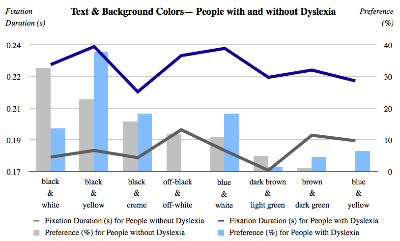
Figure 1: Fixation duration (s) and user preferences (%) for the people with and without dyslexia (detailed description is at the end of paper).
The W3C algorithm suggests to avoid brightness differences less than 125 and color differences less than 500. Our results are consistent with this threshold since the only pair which did not match the W3C algorithm (brown & dark green) presented high fixation durations for both groups (the second and the third highest for people without and with dyslexia, respectively) and were also hardly selected by the participants (4.55% for the participants without dyslexia and 0.99% for the participants with dyslexia). Surprisingly, the pair dark brown & light green which is very similar in terms of color hue but differ from the brown & dark green in term of brightness and color contrast presents the lowest and second lowest fixations duration for people with dyslexia and without dyslexia, respectively.
Our results suggest that text customization preferences needs to be complemented by quantitative data from actual reading performance since we found no correlation between the reading performance and the personal choice of the users. Colors shall be taken into consideration by interface developers. Even if people with dyslexia read faster using lower color contrasts than the control group these are not lower than the W3C algorithm.
6. Future Research
On-going experiments address the challenges presented in Section 4. We are currently carrying out more tests with more participants. These tests include (1) further randomization of the position of the texts, (2) longer texts, and (3) the insertion of the texts in frequent reading contexts in the Web such as the Wikipedia layout.
Acknowledgements
We would like to thank Shadi Abou-Zahra (W3C) for his valuable comments and feedback about this research. We are also indebted to Mari-Carmen Marcos (Universitat Pompeu Fabra) for her assistance with the eye tracker, to Joaquim Llisterri (Universidad Autónoma de Barcelona) for his help distributing our experiments announcement among experts, and to all the volunteers and people with dyslexia who performed the experiments.
References
- Al-Wabil, A., Zaphiris, P. & Wilson, S. (2007), 'Web navigation for individuals with dyslexia: an exploratory study', Universal Acess in Human Computer Interaction. Coping with Diversity pp. 593–602.
- Bradford, J. (2012) Designing web pages for dyslexic readers. Available: http://www.dyslexia-parent.com/mag35.html. Last accessed 20 September 2012.
- British Dyslexia Association. (2012) Dyslexia style guide. Available: http://www.bdadyslexia.org.uk/. Last accessed 20 September 2012.
- Gregor, P., Dickinson, A., Macaffer, A. & Andreasen, P. (2003), 'Seeword a personal word processing environment for dyslexic computer users', British Journal of Educational Technology 34(3), 341–355.
- Gregor, P. & Newell, A. F. (2000), An empirical investigation of ways in which some of the problems encountered by some dyslexics may be alleviated using computer techniques, in Proceedings of the fourth international ACM conference on Assistive technologies, ASSETS 2000, ACM, New York, NY, USA, pp. 85–91.
- Just, M. & Carpenter, P. (1980), 'A theory of reading: From eye fixations to comprehension', Psychological review 87, 329–354.
- McCarthy, J. E. & Swierenga, S. J. (2010), 'What we know about dyslexia and web accessibility: a research review', Universal Access in the Information Society 9, 147–152.
- Pedley, M. (2006), 'Designing for dyslexics: Part 3 of 3'. Available: http://accessites.org/site/2006/11/designing-for-dyslexics-part-3-of-3. Last accessed 20 September 2012.
- Rello, L. & Baeza-Yates, R. (2012b), 'The presence of english and spanish dyslexia in the web', New Review of Hypermedia and Multimedia pp. 1–28.
- Rello, L., Kanvinde, G. & Baeza-Yates, R. (2012), Layout guidelines for web text and a web service to improve accessibility for dyslexics, in International Cross Disciplinary Conference on Web Accessibility (W4A 2012), ACM Press, Lyon, France.
- Rello, L. & Marcos, M. (2012), An eye tracking study on text customization for user performance and preference, in 8th edition of the Latin American Web Congress (LA-WEB 2012), IEEE Press, Cartagena, Colombia.
- World Wide Web Consortium (2008) Web Content Accessibility Guidelines (WCAG) 2.0. Available from: http://www.w3.org/TR/WCAG/ Last accessed 20 October 2012.
Appendix: Description of Figure 1
Fixation duration values in seconds and percentages of the user preference for the people with a without dyslexia. The mostly prefered color pairs by people with dislexia were (ordered from the most favorited to the less favorited): black & yellow; black & creme; blue & white; black & white; blue & yellow; dark brown & light green; brown & dark green and off-black & off-white. The mostly prefered color pairs by people without dislexia were (ordered from the most favorited to the less favorited): black & white; black & yellow; black & creme; off-black & off-white; blue & white; dark brown & light green; brown & dark green and blue & yellow. In terms of performance, the color pairs read by people with dislexia were (ordered from the fastest to the slowest): black & creme; blue & yellow; dark brown & light green, brown & dark green, black & white; off-black & off-white; blue & white and black & yellow. In terms of performance, the color pairs read by people without dislexia were (ordered from the fastest to the slowest): dark brown & light green; black & creme; black & white; black & yellow; blue & yellow; brown & dark green and off-black & off-white.