Abstract
The Roles defined in this specification provides user interface designers with the ability to add extra semantic role
information.
The goal is to make static and interactive content of Web pages more usable and accessible to their users and their
assistive technologies. This goal is achieved by providing a cross-platform role model for dynamic Web content that allows
for content adaptations based on role information. The result is to provide an interoperable way for associating behaviors
with document-level markup.
Request for Comments
The PF working group has developed a roadmap on making dynamic web content more accessible to people with
disabilities. To assure these technologies will interoperate in a manner that improves accessibility for the widest range
of web technologies, the PF wokring group asks for comments and suggestions on how this specification can be improved for
use in the technologies that you or your working group are developing. In general we prefer public comments so that all people (includig the general public) reviewing the document
can be aware of your comments, but you may also send member confidential comments
that will be available only to the working group and other W3C members.
Status of This Document
This section describes the status of this document at the time of its publication. Other documents may supersede
this document. A list of current W3C publications can be found in the W3C technical reports
index at http://www.w3.org/TR/. This report has not been published to the W3C technical reports
index.
Publication as a Working Draft does not imply endorsement by the W3C Membership. This is a draft document and may be updated, replaced or obsoleted by other documents at any time. It is inappropriate to cite this document as other than work in progress.
This document is an internal Working Draft by the Protocols & Formats Working Group of
the Web Accessibility Initiative.
This specification adds semantics to content to improve the accessibility and interoperability of Web Content and
Applications. This document and the States and Adaptable Properties Module
are the result of the gap analysis of the DHTML accessibility roadmap to enable accessible dynamic Web
content and applications. The Working Group expects to advance this document to a Working Draft and Recommendation.
This document is for review purposes only. The web address, URL and file name of this document may/will change.
Publication as a Draft does not imply endorsement by the W3C Membership. This is a draft document and may be updated,
replaced or obsoleted by other documents at any time. It is inappropriate to cite this document as other than work in
progress.
This document was produced under the 5 February 2004 W3C Patent Policy. The Working Group maintains a public list of patent disclosures made in connection with this document; that page also includes instructions for disclosing a patent. An individual who has actual knowledge of a patent which the individual believes contains Essential Claim(s) with respect to this specification must disclose the information in accordance with section 6 of the W3C Patent Policy.
Contents
1.Introduction
This section is informative.
Roles are a simple way for an author to make custom widgets (new interactive elements) accessible and interoperable by
encapsulating the functional substructures in a page. The user agent or operating system then knows how to handle the
element by mapping the role to an adaptive interface or to the accessibility API (Accessible Programmable Interfaces) of
the operating system.
Web applications typically rely on standard web markup (HTML) with code called JavaScript (also known as dynamic HTML or
DHTML) running on top of them. Each platform (Windows, Linux, Sun) has an operating accessibility API (application
programmable interface) with the notion of a role for interface (GUI) objects. However, JavaScript needs an accessibility
architecture to write to that map to the accessibility frameworks on the native platform by the user agent. Further,
authors of JavaScript generated content do not want to tie themselves to the standard tag elements that define the actual
user interface element (such as tables and ordered lists) that can easily be understood and manipulated accessibly.
Adaptive technologies, that need to provide alternative access to complex user interfaces authored via HTML, are often left
guessing at the semantics behind portions of HTML documents.
Using this specification you can assign a role name to an object that maps the object to the accessibility framework on
the native platfom and provides semanitcs needed by adaptive technologies. For assigning meaningful properties that change
with time and events see the WAI States and Adaptable Properties
Module.
This draft currently handles two aspects of roles - GUI functionality and structural relationships of the element. For
more information see the Dynamic Accessible Web Content Roadmap Roadmap and
implementation examples for the use of roles making
dynamically generated content accessible.
This taxonomy is designed in-part to support the common roles found in platform accessibility API (Accessible
Programmable Interfaces) frameworks. Reference to roles found in this taxonomy by dynamic Web content may be used to
support dynamic accessible content authoring, interoperability with assistive technologies.
The schema to support this standard has been designed to be extended so that custom roles can be created while providing a
common schema for describing how to interact accessibly with a custom role. See extending accessible roles.
At some point the working group intends to add roles for A, Adding concepts in the type of content for adaptation to
the user scenario and B, Knowledge representation of Web content.In future versions of this specification the
working group intend to add roles in support of individualized content adaptation and knowledge representation of Web
content.
1.1 Example
This section is informative.
This example shows a role being used to make a simple widget known to the user agent, so that the user agent knows how
to handle it.
Roles can be embedded in any host language, e.g. [XHTML] 1.1. In this example, a table has been
assigned the role of a spread sheet.
<table id="table1" x2:role="wairole:spreadsheet" >
Encapsulated in the role information is information for the operating system that enables it to be properly treated. (In
this case that multiselectable is supported.)
A full spreadsheet example is available online at http://www.mozilla.org/access/dhtml/spreadsheet
In many case Roles will work well with other supporting technologies, such as XHTML 1.1 For Accessible Adaptable Applications and xml-events.
1.2 Terms and Definitions
This section is informative.
While some terms are defined in place, the following definitions are used throughout this document. Familiarity with W3C
XHTML 1.1 Recommendation [XHTML] and the W3C XML 1.0 Recommendation [XML] is highly recommended.
- accessibility API
- This is the accessibility API for a given platform. Examples of this are the Java Accessibility API (JAPI), Microsoft
Active Accessibility (MSAA), and the Gnome Accessibility Toolkit (ATK).
2.Conformance Requirements
This section is normative.
The keywords "MUST", "MUST NOT", "REQUIRED", "SHALL", "SHALL NOT", "SHOULD", "RECOMMENDED", "MAY", and "OPTIONAL" in
this document are to be interpreted as described in [RFC2119].
2.1.Document Conformance
Roles for RDF and XML is not a stand-alone document type. It is intended to be integrated into other host languages such
as XHTML. A conforming document requires only the facilities described as mandatory in this specification and the
facilities described as mandatory in its host language. Such a document must meet all the following criteria:
-
The document must conform to the constraints expressed in Appendix a - RDF Schema combined with the
constraints expressed in its host language implementation.
-
The document must contain an xmlns declaration for the Role namespace. The namespace for Roles is
defined to be
http://www.w3.org/2005/01/wai-rdf/GUIRoleTaxonomy#
An example start tag of a root element might look like:
<html xmlns="http://www.w3.org/2002/06/xhtml2" xml:lang="en"

      xmlns:wairole="http://www.w3.org/2005/01/wai-rdf/GUIRoleTaxonomy#" >
Note: In XML languages without the Role attribute name included, the Role attribute name can be added from the XHTML2
namespace.
For example:
<html xmlns="http://www.w3.org/1999/xhtml" xmlns:x2="http://www.w3.org/2002/06/xhtml2" xmlns:wairole="http://www.w3.org/2005/01/wai-rdf/GUIRoleTaxonomy#">
2.2.Host Language Conformance
When Roles are included in a host language, all of the facilities required in this specification must be included in the
host language.
2.3.User Agent Conformance
A conforming user agent must reference the role information reference in the DOM.
However it is advised that a conforming user agent also allows for roles to be extended via a RDF . When a role from a
different specification extends or inherits from a role in this specification, then that role should also be supported at
least to the extent that the original role is supported.
3.The RDF Roles Model
This section is normative.
This specification defines a Taxonomy called Role. The Roles Taxonomy uses the XML namespace [XMLNAMES] identifier
http://www.w3.org/2005/01/wai-rdf/GUIRoleTaxonomy#
All examples are informative. Examples in this document that use the namespace prefix "wairoles" all assume a valid
xmlns declaration
xmlns:wairoles="

http://www.w3.org/2005/01/wai-rdf/GUIRoleTaxonomy#"
in the document involved.
The remainder of this section describes the classes instances and properties in this taxonomy, the semantics, and
provides an RDF Schema as required in [RDF ].
Example
In this example a div has been used in place of a standard form element checkbox. A role is used to make the behavior of
the simple widget known to the user agent.
   <span class="checkbox" id="chbox1" x2:role="wairole:checkbox"  tabindex="0"

                        onkeydown="return checkBoxEvent(event);" onclick="return checkBoxEvent(event);" >

                    A checkbox label

  </span>
The schema may look something like the following:
<rdf:Description rdf:ID="Checkbox">
<rdf:type rdf:resource="#Select"/>
<baseConcept>http://www.w3.org/MarkUp/HTML#checkbox</baseConcept>
<supportedState>waistates:multiselect</supportedState>
</rdf:Description>
In this example a Checkbox is defined as a type of select, but represents the same concept
Checkbox as in the [HTML] specification. Although it inherits all the supported states of a select,
we also expect it to support multiselect. Note that much of this could be formalized in XML schema of XSD. However being
able to define similarities between roles, such as baseConcepts and more descriptive definitions
would not be available in XSD.
3.1 Role Properties
Roles are defined and described by their properties. Properties define the structural function of a role, such as: What
a roles is, concepts behind it , what it can contain, what it must contain.
In the case of widgets this also includes how it interacts with the user agent based on mapping to [HTML] forms and XFORMS, allowed states and required states.
Relationships between concepts
The are three properties that describe the relationship between concepts. They are:
-
Type and subclasses- (from RDFS) this implies inheritance, which means, among other
things, the inheritance of limitations and properties. Other than well known stable specifications, inheritance may be
restricted to items defined inside this specification so that items that can not be changed and affect inherited
classes.
For example: Buttonundo is a subclass or type of a button. If we change the properties and expected behavior of a
button then the properties and behavior of buttonundo will also change.
-
relatedConcept - A relatedConcept is a similar or related idea from other specifications Concepts that that are
related are not necessarily identical. relatedConcepts do not inherit properties from each other. Hence if the
definition of a type changes, the properties, behavior and definition of a relatedConcept is not affected.
For example: A grid is like a table. Therefore, a grid has a relatedConcept of a table as defined at
http://www.w3.org/TR/html4/struct/tables.html#edef-TABLE. However if the definition of table is modified our definition
of a grid will not be affected.
-
baseConcept - A baseConcept is like a
relatedConcept except that a baseConsepts are almost identical. BaseConcept is similar to type, but without inheritance
of limitations and properties. baseConcepts are designed as a substitute for inheritance for
external concepts.
For example: the checkbox defined in this document has the same functionality and anticipated behavior as a checkbox
defined in http://www.w3.org/MarkUp/HTML#checkbox.
Therefore, a checkbox has a baseConcept of a checkbox as defined at http://www.w3.org/MarkUp/HTML#checkbox. However
if http://www.w3.org/MarkUp/HTML#checkbox is modified, the definition of a checkbox in this document will not be not
affected.
The Roles Taxonomy supports the following additional properties:
Additional Role Taxonomy Properties
|
Property
|
Description
|
Values
|
Related Concepts
|
|
supportedState
|
a supportedState must be supported by this role. Typically refers to
states from the SAP namespace
|
Any valid RDF object reference, such as a URI.
|
|
|
mustContain
|
A child element that must be contained by this role. For example a list must contain a listitem.
|
Any valid RDF object reference, such as a URI or RDF ID.
|
http://www.w3.org/2004/02/skos/core#subject
OWL Cardinality
http://www.w3.org/TR/owl-ref/#CardinalityRestriction
|
|
scope
|
Context, where this role is allowed. For example a list item is allowed inside a list.
|
Any valid RDF object reference, such as a URI or RDF ID.
|
http://www.w3.org/2004/02/skos/core#Concept |
|
media
|
The media type, where the Role is allowed - a type of scope
|
Any valid RDF object reference, such as a URI or RDF ID. |
baseConcept: DC: Format
XFORMS media type |
|
importance
|
Estimated importance of a role to completion of the main tasks of a delivery unit. For example a main menu is
typically required for a user to beale to completer the main tasks of a site. A secondary side menu is typically
less important. Hence a main menu has an importance level of one and secondary side menu may have an importance
level of 0.6.
|
0 (min)
1 (max)
|
|
|
nameRef
|
How a role type name is extracted and referenced inside a document. For example the DOM might reference a role
by it's title.
|
Any valid RDF object reference, such as a URI or RDF ID.
Recomended values: Child, title, content.
|
|
3.2 Roles
To support the current user scenario this specification defines roles that A, help define Widgets (For example, a
tristate Checkbox) and B, help define page structure (for example, a section header).
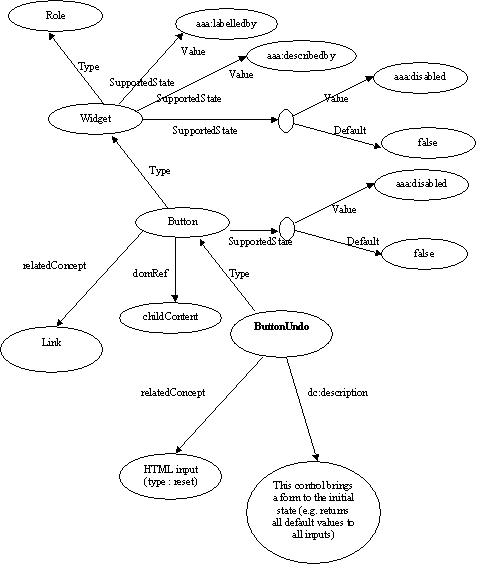
Graph of the data model-Picture of the relationships described in the role data model (large)
3.1.1 Roles: Abstract and Base Classes
*note: More base types will be added as the working group adds user cases
The following roles are used as base types for applied roles. They are not used by Web Authors and would not be exposed
as role definitions for incorporation into a Web page. Base classes are referenced within the taxonomy and are used to
build a picture of the role taxonomy class hierarchy within the taxonomy.
Role Descriptions and Inheritance
|
Role
|
Description
|
Inherited Category
|
Base and Related Concepts
|
Supported states and properties (beyond inherited states) (all
support disabled and zoom)
|
Inherited states
(Widgets only)
|
nameRef
|
|
roletype
|
Describes the structural and functional purpose of an element.
A Role is also a concept.
|
DC:Type
skos:Concept
|
[HTML] role
[HTML] Link rel
[HTML] Link rev
|
DC:Label (required)
DC:Description (required)
importance -
relatedConcept
ContentType
CanContain
HasTask ?
baseConcept:
relatedConcept
|
|
|
|
widget
|
A component of a GUI
|
role
|
|
State
|
|
|
| input |
Generic type for widgets that can have a value |
widget |
|
|
Disable, zoom |
Title |
|
textbox
|
Generic type for the inputs that allow free-form text, as their value
|
input
|
XFORMS input
|
|
Disable, zoom
|
Title |
|
select
|
A form control that allows the user to make selections from a set of choices
|
input
list (see structure)
|
|
Multiselectable
|
Disable, zoom
|
Title |
|
range
|
Represents a range of values that can be set by the user.
|
input
|
|
|
Disable, zoom
|
Title
|
|
section
|
A logical part of a DeliveryUnit (page or a document)
|
|
document,
[DTB],
NIMAS,
[HTML] link rel
|
|
Disable, zoom
|
Child content or title attribute
|
|
sectionhead
|
A heading without level
|
heading
|
[HTML]/[DTB]/NIMAS h1, h2...
|
|
Disable, zoom
|
Child content or title attribute
|
|
window
|
Browser or application window
|
application
|
|
|
Disable, zoom
|
Child content or title attribute
|
3.1.2 Widget Roles
Widget Roles all map to accessibility API's.
Widget Role Mapping to Accessibility APIs
|
Widget Role
|
Description
|
Inherited Concepts
|
Base and Related Concepts
|
New supported states(beyond inherited states)
|
Inherited states
|
nameRef
|
|
link
|
Interactive reference to a resource
(note, that in [HTML] 2 any element can have an href attribute and thus be a link)
|
widget
|
HTML Link
|
|
Disable, zoom
|
Child content
title |
|
combobox
|
Combobox is a presentation of a select, where you can type to locate a selected item.
NOTE: In XForms the same select can have one of 3 appearances: combo-box, drop-down box or group of radio-buttons.
Besides, many browsers (if not all of them) allow users to type in a drop-down select as well.
|
select
|
HTML select (multiple)
|
|
Disable, zoom
multiselectable
|
Title |
|
option
|
A selectable item in a list represented by a Select.
|
input
listItem (see structure)
|
ListItem(see structure),
HTML option,
XForms item
|
Selected
|
Disable, zoom |
Child content
title |
|
checkbox
|
A control that has two possible states, an equivalent to a
boolean
|
option
|
HTML input (type : checkbox)
|
Checked="true"|"false"
|
Disable, zoom
selected
|
Child content
title
|
|
checkboxtristate
|
A control that has three possible states, (1 0 -1) Often found in installer where an option has been partially
installed
|
checkbox
|
|
Checked="true"|"false"|"mixed"
|
Disable, zoom
selected
|
Child content
title |
|
radio
|
A radio is an option in single-select list.
|
checkbox
|
HTML input (type : radio)
|
|
Disable, zoom
selected
checked="true"|"false"
|
Child content
title |
|
radiogroup
|
Maybe, we would rather have a generic "group of choices" type.
|
select
|
|
|
Disable, zoom
selected
multiselectable
|
Title
|
|
button
|
Allows for user-triggered actions. Buttons are mostly used for discrete, atomic actions. Its value is cognitive;
the idea that this is a user action opportunity is made very clear by making it look like a front-panel button on a
device. The animation of the button in response to indirect (by mouse) manipulation fosters the illusion of direct
manipulation and keeps user cognition in sync with the UI perception of user action events. Standardizing the
appearance of buttons enhances recognition as buttons and arraying them compactly in toolbars, for example.
|
widget
link
|
XFORMS trigger
|
Pressed
|
Disable, zoom |
Child conteny
title
|
|
menuitemradio
|
Indicates that you have a menu item which is part of a group of menuitermradio roles which the checking of one
unchecks the rest. Furthermore, when implementing these menuitems should be separate into a group by a
separator.
|
menuitem (see structure)
radio
|
|
|
Disable, zoom
selected
checked="true"|"false"
|
Child content
title |
|
menuitemcheckbox
|
Defines a menuitem which is checkable (tri-state).
|
menuitem
checkbox
|
|
|
Disable, zoom
selected
checked="true"|"false"
|
Child content
title
|
|
progressbar
|
Used by applications for tasks that take a long time to execute, to show the execution progress.
User understands that the user's action request has been accepted and that the application continues (or ceases,
in the case of a static display) to make progress toward completing the requested action.
|
widget
|
|
|
Disable, zoom |
Title |
|
secret
|
Provides the user with the ability to supply information to the system in a manner that makes it difficult for
someone, other than the user, who may be observing the process to discern the value that is being supplied.
Uses: passwords on login
Benefits: password not exposed to others within visual range of the display device, or who walk by before the
display is cleared.
Detriments: passwords have to be typed blind, without the usual echo to the screen. Web users get used to having
their input echoed, type badly, and in particular not having people with tremor etc. able to confirm what is
entered runs risk such as having account locked if three non-accepted tries happen in some time window.
Detriment: policy not to display is usually taken to be absolute; whereas a user with screen blank and earphone in
use can get the typing echoed privately not subject to having a lurker purloin the password.
|
input
|
[HTML] input (type : password)
|
|
Disable, zoom |
Title |
|
separator
|
A line or bar that separates and distinguishes sections of content. This is a visual separator between sections
of content. Separators are found between lists of menu items in a menu.
|
widget
|
[HTML] hr
|
|
Disable, zoom
|
Title
|
|
slider
|
A user input where the user selects an input in a given range. It is a form of Range that expects an analog
keyboard interface.
This is is a range type for which with the added functionality of being able to select a value from the given
range through the use of a visible slider. The slider would be keyboard accessible and provide a visible thumb
position that represents the current position within the slider.
|
range
|
|
|
Disable, zoom |
Title |
|
spinbutton
|
A form of Range that expects a user selecting from discreet choices.
This is another range type with the added functionality of being able to select from the given range through the
use of an up and down button. Visibly, the current value is incremented or decremented to a maximum or minimum
value correspondingly. This functionality should be accomplished programmatically through the use of up and down
arrows on the keyboard.
|
range
|
|
|
Disable, zoom |
Title |
|
textarea
|
This is a multi-line editable text box. If a standard form element exists with this functionality it should be
used.
Intended use is in languages that do not have a textarea object (such as SVG). The user would use this role when
additional states or properties are applied to a standard textarea control. This is to indicate to the user agent
that it must process additional states and properties such as invalid and required.
|
textbox
|
[HTML] textarea
|
|
Disable, zoom
|
Title
|
|
textfield
|
Free-form data entry for short on-line content.
Intended use is in languages that do not have a textfield object (such as SVG). The user would use this role
when additional states or properties are applied to a standard textarea control. This is to indicate to the user
agent that it must process additional states and properties such as invalid and required.
|
textbox
|
[HTML] input (type : text)
|
|
Disable, zoom |
Child content
title
|
|
tree
|
A form of a Select (or, generally, of a list having groups inside groups) - where sub trees can be collapsed and
expanded
|
select
chart
|
|
Expanded
|
Disable, zoom multiselectable |
Child
content title
|
|
treegroup
|
This is a group of sibling tee items that have a common parent. Intended use is for creating groups of treeitems
within a tree container.
|
group
chart
|
|
Expanded
|
Disable, zoom multiselectable |
Child
content title
|
|
treeitem
|
An option item of a tree. This is an element within a tree which may be expanded or collapsed
|
option
|
|
|
Disable, zoom selected
|
Content
child title |
|
status
|
Process--advisory information. This is a container for process advisory information information to give feedback
to the user. It must have a subtree. This object typically does not receeive focus. Some cells of a Braille display
may be reserved to render the status.
|
|
|
|
|
|
|
alert
|
A message with an alert or error information. Alerts are used to convey messages to alert the user. In the case
of audio warnings this is an accessible alternative for a hearing impaired user. The Alert role goes on the
container of the subtree containing the alert message.
|
status
|
XFORMS alert
|
|
Disable, zoom |
Title |
|
alertdialog
|
A window with an alert or error information. Alerts are used to convey messages to alert the user. In the case
of audio warnings this is an accessible alternative for a hearing impaired user. The Alert role goes on the
container of the subtree containing the alert message.
|
alert
dialog
|
XFORMS alert
|
|
Disable, zoom |
Title |
|
dialog
|
A dialog is a small application window that sits above the application and is designed to interrupt the current
processing of an application in order to prompt the user to enter information or require a response. Dialog boxes
should have a title. They must have a focused item.
|
window
|
|
|
Disable, zoom |
Title
|
3.1.3 Structural Roles
Roles for document structure are also required to support the accessibility of dynamic Web content to assist adaptive
technology in determining active content vs. static document content. Structural Roles, by themselves do not all map to
accessibility API's, but are used to create widget roles or assist content adaptation.
This schema is likely to evolve as new use cases are added to the scope of this specification.
Structural Role Descriptions
|
Roles
|
Description
|
Inherited Category
|
Base and Related Concepts
|
domRef or
Not Mapped to Accessibility API's
|
New support states(beyond inherited states)
(all support disabled and zoom)
|
scope
|
|
presentation
|
An element who's role is Presentational does not need to be mapped to the accessibility API.
Intended use is when an element is used to change the look of the page but does not have all the functional,
interactive, or structural relevance implied by the element type.
Example use cases:
- A layout table is a presentation.
- An ojbect tag whose content is decorative like a white space image or decorative flasth object
- An image used for white space
The user agent may remove all structural aspects of the element being repurposed. For example a table marked as
presentation would remove the table, td, th, tr, etc. elements while preserving the individual text elements within
it. Because the AT knows to ignore the structural aspects implied in a table, no harm is done by using a table for
layout.
|
deliveryunit/task
|
|
Not Mapped |
|
|
|
application
|
A software unit executing a set of tasks for its users
Intended is to hint to the assistive technology to switch its normal browsing mode functionality to one in which
they would for an application.
Use case: In an email application it has a document and an application in it. The author would want to use
typical application navigation mode to cycle through the list of emails. Much of this navigation would be defined
by the application author. However, when reading an email message the ATV will want to switch to a document mode
where it controls browsing navigation.
|
deliveryunit/task
|
|
Name from title attribute |
|
|
|
document
|
Content that contains information, such as a book. The document role is used to tell the screen reader to switch
back to its normal document browsing mode. Screen readers consume most of the keyboard navigation keys to provide
its own keyboard UI for this type of navigation.
|
deliveryunit
|
|
Name from title attribute |
|
|
|
frame
|
This is a window in a browser capable of holding a document. It must have a title.
|
window
|
|
Name from title attribute |
|
|
|
group
|
Group is a collection of sections, and is itself a section. It defines a set or sub set. It has a broad
scope.
|
section
|
DC: Collection, Dataset
|
Name from title attribute |
|
mustContain sections
|
|
imgroup
|
An imgroup is a container for a collection elements that form an image. An imgroup can captions, and descriptive
text as well as multiple image files that when viewed together give the impression of a single image.
|
group
|
DAISY , DTB imgroup |
Name from title attribute |
|
mustContain sections
|
|
grouplist
|
A list of names or short descriptions of items/elements contained in a Group
|
list,
|
DAISY :ToC
|
Name from child content or title attribute |
|
scope: Sectionheaders
|
|
accordion
|
A visual presentation of a group of sections
|
group
|
|
Name from title attribute |
|
|
|
tilegroup
|
A group of tiles
|
group
|
|
Name from title attribute |
|
scope: Tile
|
|
tile
|
A visual presentation of section
|
section
|
|
Name from child content or title attribute |
|
|
|
tilelist
|
List of names or short descriptions of tiles in a TileGroup
|
groupList
|
|
Name from title attribute |
|
scope: Tile
|
|
chart
|
A graphic representation of some data.
|
group
|
[HTML] table ?
|
Name from title attribute |
|
|
|
chartsection
|
A section inside a chart
|
section
|
[HTML] td
|
Name from child content or title attribute |
name, start value, effect, has header (or literal),stack, tile
|
|
|
grid
|
A grid is a table type that may be editable. Grids contain cells that may be focusable. Grids allow the user to
move focus between grid cells with 2-D navigation. Grids may have have row and column headers which also have
functional value based on the implementation. Grid cells may have values determined by an equation.
Grids are single selectable or mutliselectable. Properties for selectable or mulitselectable must be provided by
the authro. Grids may be used for spreadsheets suchas in Open Office, Microsoft Office, etc.
|
table
|
[HTML] table ?
|
Name from title attribute |
|
scope: Gridcells
|
|
gridcell
|
A cell in a grid. Cells may have relastionhips such as (controller_for controlled_by) to address the application
of functional relationships.
|
section
|
[HTML] td
|
Name from child content or title attribute |
|
|
|
tabpanel
|
A visual presentation of a section. Tabpanels are commonly used in applications that have a large number of
options that can be categorized in logical groups. The Tabpanels serve three functional components, including a
menu bar of groupings, a selected grouping and set of resources associated with that group. Each tab in a tablist
serves as both a menu item and as a title for the tab content associated with the tab. In graphical renderings the
selected Tab and TabContent usually share the same background color and the non-selected tabs have a different
background color to make the selected Tab and TabContent stand out visually and provide a visual association with
the Tab and TabContent. Only one tabpanel's contents is visible at a time.
|
section
|
|
Name from title attribute |
|
|
|
tab
|
A tab is a tabpanel header. Tab is used as a grouping label, providing a link for selecting the resources
associated with the group to be rendered to the user. One of the tabs in tablist must be the current tab and the
tabpanel, associated with the tab, must be rendered to the user. Other tabpanels are typically hidden from the
user, until the user selects the tab associated with that tabpanel. The currently selected tab should be marked
with selected=true.tablist is the container for a set of elements with the role attribute set to tab. Only one tab
may be selected at a time. At any time, one tab must selected.
|
sectionhead
|
|
Name from child content or title attribute |
|
scope: tabPanel
|
|
tabcontent
|
Tabcontent is a container for the resources associated with a tab. Note: There must be a means to associate
abcontent container element with its associated tab in a tablist.
|
section
|
|
Name from title attribute |
|
|
|
table
|
A table contains cells of tabular data arranged in rows and columns.
The table role is used as a container for tabular data. The table construct describes relationships between data
such that it may also be used for different presentations. For example, the role of a table could be added to a pie
chart. This does not imply presentation. It is structural equivalent to an XHTML table. In XHTML, a user should use
table.
|
group
|
[HTML] table
|
Name from title attribute |
|
|
|
td
|
A table cell containing data.
|
section
|
[HTML] td
|
Name from child content or title attribute |
|
|
|
th
|
A table cell containing header information.
|
sectionhead
td
|
[HTML] th
|
Name from child content or title attribute |
|
scope: TD
|
|
rowheader
|
A table cell containing header information for a row. The rowheader establishes a relationship between it and
all cells in the corresponding row. It is a structual equivalent to an HTML th with a row scope. This would be used
as a row header in a table or grid. It also could be used in a pie chart to show a similar relationship in the
data.
|
th
|
[HTML] th with scope=row
|
Name from child content or title attribute |
|
scope: TD
|
|
columnheader
|
A table cell containing header information for a column. The columnheader establishes a relationship between it
and all cells in the corresponding row. It is a structual equivalent to an HTML th with a column scope. This would
be used as a column header in a table or grid. It also could be used in a pie chart to show a similar relationship
in the data.
|
th
|
[HTML] th with scope=column
|
Name from child content or title attribute |
|
scope: TD
|
|
list
|
Group of small items
|
group
|
[HTML] list
|
Name from title attribute |
|
|
|
listitem
|
An entry in a list.
|
section
|
XForms item
|
Name from child content or title attribute |
|
|
|
linkblock
|
A list of related links.
|
list
|
|
Name from title attribute |
|
|
|
menu
|
A list of links to important sections of a Document or a Site.
|
linkblock
|
navigation in [HTML] roles
see
http://www.w3.org/
TR/2005/WD-xhtml2-20050527
/mod-role.html#col_Role
|
Name from title attribute |
menuLevel ??
|
|
|
toolbar
|
A toolbar is a type of menu where icons are often toggle-able or they are not focusable.
ToolBars do not have drop down menus
|
menu
|
|
Name from title attribute |
|
|
|
menuitem
|
A link in a menu. This is an option in a group of choices contained in a menu. It may be disabled or active. It
may also have a popup.
|
listitem
|
[XForms] option
|
Name from child content or title attribute |
|
|
<?xml version="1.0" encoding="UTF-8"?>

       <!DOCTYPE rdf:RDF [

      <!ENTITY xsd "http://www.w3.org/2001/XMLSchema#">

      <!ENTITY dc "http://dublincore.org/2003/03/24/dces#">

      <!ENTITY owl "http://www.w3.org/2002/07/owl#">

      <!ENTITY rdfs "http://www.w3.org/2000/01/rdf-schema#">

      <!ENTITY rdf "http://www.w3.org/1999/02/22-rdf-syntax-ns#">

      <!ENTITY states "http://www.w3.org/2005/01/aaa#">

      <!ENTITY skos "http://www.w3.org/2004/02/skos/core#">

      ]>


       <rdf:RDF xmlns:rdf="http://www.w3.org/1999/02/22-rdf-syntax-ns#" xmlns:rdfs="http://www.w3.org/2000/01/rdf-schema#"
      xmlns:dc="http://purl.org/dc/elements/1.1/#" xmlns:owl="http://www.w3.org/2002/07/owl#"
      xmlns:role="http://www.w3.org/2005/01/wai-rdf/GUIRoleTaxonomy#"

      xmlns:skos="http://www.w3.org/2004/02/skos/core#"

      xml:base="http://www.w3.org/2005/01/wai-rdf/GUIRoleTaxonomy">


      <owl:ObjectProperty rdf:ID="relatedConcept">

      <rdfs:comment xml:lang="en">The URI of similar/related types from other specifications (See
      SKOS)</rdfs:comment>

      <rdfs:domain rdf:resource="&xsd;anyURI"/>

       </owl:ObjectProperty>


      <owl:ObjectProperty rdf:ID="baseConcept">

      <rdfs:comment xml:lang="en">This is similar to type but without inheritance of limitations and properties.
      role:baseConcepts are designed as a substitute for inheritance for external concepts. </rdfs:comment>


      <rdfs:sub propertyOf rdf:resource="#role:relatedConcept"/>

      </owl:ObjectProperty>
<owl:ObjectProperty rdf:ID="scope">

       <rdfs:comment xml:lang="en">Context where this role is allowed</rdfs:comment>

      <rdfs:domain rdf:resource="#role"/>


      </owl:ObjectProperty>

      <owl:ObjectProperty rdf:ID="mustContain">

      <rdfs:comment xml:lang="en">A child that must be contained by this role</rdfs:comment>

      <rdfs:sub propertyOf rdf:resource="#role:scope"/>

       </owl:ObjectProperty>


      <owl:ObjectProperty rdf:ID="media">

      <rdfs:comment xml:lang="en">The media type, where the Role is allowed - a type of role:scope, simmilar to DC:
      Format or media type</rdfs:comment>

      <rdfs:sub propertyOf rdf:resource="#role:scope"/>

      </owl:ObjectProperty>


      <owl:ObjectProperty rdf:ID="canSupportState">

      <rdfs:comment xml:lang="en">A state that can be supported for this a Role</rdfs:comment>

       <rdfs:domain rdf:resource="#Widget"/>

      </owl:ObjectProperty>


      <owl:ObjectProperty rdf:ID="default">

      <rdfs:comment>Default value of a supported state in the context of this role</rdfs:comment>

      </owl:ObjectProperty>


      <owl:ObjectProperty rdf:ID="importance">

       <rdfs:comment>relative importance of a role (0 - 1)</rdfs:comment>

      <rdfs:domain rdf:resource="&xsd;anyURI"/>

      </owl:ObjectProperty>
<owl:ObjectProperty rdf:ID="nameRef">

      <rdfs:comment>How a role type name is extracted and referenced inside a document. For example the DOM might
      reference a role by it's title.</rdfs:comment>

       <rdfs:domain rdf:resource="#Widget"/>

      <rdfs:Range/>

      </owl:ObjectProperty>


      <owl:Class rdf:ID="roletype">

      <rdfs:comment>This is a draft resource for adding semantic annotations and information to Web resources. Knowing
      what the types of content are in a Web page allows for better customized renderings. Including want to allow information
      hiding, or rendering common types of content in a consistent way - it makes the Web easer to use and more accessibility.
      You can also use this for device independence so that content is better formatted to fit on the device.
      </rdfs:comment>

      <rdfs:subClassOf>

      <owl:Restriction>

       <owl:onProperty rdf:resource="dc:description"/>

      <owl:cardinality rdf:datatype="&xsd;string">1</owl:cardinality>

      </owl:Restriction>

      </rdfs:subClassOf>

      <rdfs:comment>You have to give each content type a title and description sorry folks (just be glad I did not put a
      min length on the description</rdfs:comment>

      <rdfs:comment>These are the required properties - however we recommend also using role:importance.
      </rdfs:comment>


       </owl:Class>

      <owl:Class rdf:ID="widget">

      <rdfs:subClassOf rdf:resource="#roletype"/>

      <dc:description xml:lang="en">A widget is a base class for widgets. </dc:description>

      <role:supportedState rdf:parseType="Resource">

      <rdfs:value>states:disabled</rdfs:value>

       <role:default>false</role:default>

      </role:supportedState>


      <role:supportedState rdf:resource="&states;describedby"/>

      <role:supportedState rdf:resource="&states;labelledby"/>

      </owl:Class>

      <owl:Class rdf:ID="input">

       <rdfs:subClassOf rdf:resource="#widget"/>

      <role:baseConcept rdf:resource="http://www.w3.org/TR/html4/interact/forms.html#edef-INPUT"/>

      <dc:description xml:lang="en">An input is a base class for widgets that have a value. </dc:description>

      <role:domRef rdf:resource="&states;title"/>

      </owl:Class>


      <owl:Class rdf:ID="textbox">

      <rdfs:subClassOf rdf:resource="#input"/>

       <dc:description xml:lang="en">A textbox is a base class for widgets that have a free-form text value.
      </dc:description>

      <role:domRef rdf:resource="&states;Child conten"/>

      </owl:Class>


      <owl:Class rdf:ID="link">

      <rdfs:subClassOf rdf:resource="#widget"/>

      <dc:description xml:lang="en">Interactive reference. </dc:description>

       <role:domRef rdf:resource="&states;title"/>

      <role:domRef rdf:resource="&states;Child content"/>

      </owl:Class>


      <owl:Class rdf:ID="select">

      <rdfs:subClassOf rdf:resource="#input"/>

      <role:baseConcept rdf:resource="http://www.w3.org/TR/html4/interact/forms.html#edef-SELECT"/>

      <role:relatedConcept rdf:resource="#list"/>

       <role:mustContain rdf:resource="#option"/>

      <dc:description xml:lang="en">A select is an Input that allows the user to make selections from a set of choices.
      </dc:description>

      <role:supportedState rdf:resource="&states;multiselectable"/>

      </owl:Class>


      <owl:Class rdf:ID="combobox">

      <rdfs:subClassOf rdf:resource="#select"/>

      <role:baseConcept rdf:resource="http://www.w3.org/TR/html4/interact/forms.html#edef-SELECT"/>

       <role:relatedConcept rdf:resource="#list"/>

      <role:mustContain rdf:resource="#option"/>

      <dc:description xml:lang="en">A combobox is a sellect with a specific presentation. </dc:description>

      </owl:Class>


      <owl:Class rdf:ID="radiogroup">

      <rdfs:subClassOf rdf:resource="#select"/>

      <role:baseConcept rdf:resource="http://www.w3.org/TR/html4/interact/forms.html#edef-SELECT"/>

       <role:relatedConcept rdf:resource="#list"/>

      <role:mustContain rdf:resource="#radio"/>

      <dc:description xml:lang="en">A select containing radio-buttons, instead of options. </dc:description>

      </owl:Class>


      <owl:Class rdf:ID="Option">

      <rdfs:subClassOf rdf:resource="#input"/>

      <role:baseConcept rdf:resource="http://www.w3.org/TR/html4/interact/forms.html#edef-OPTION"/>

       <role:relatedConcept rdf:resource="#listitem"/>

      <role:scope rdf:resource="#select"/>

      <dc:description xml:lang="en">An option is a selectable item in a list represented by a Select.
      </dc:description>

      <role:supportedState rdf:parseType="Resource">

      <rdfs:value>states:selected</rdfs:value>

      <role:default>false</role:default>

       </role:supportedState>

      <role:domRef rdf:resource="&states;Child conten"/>

      </owl:Class>
<owl:Class rdf:ID="checkbox">

      <rdfs:subClassOf rdf:resource="#option"/>

      <dc:description xml:lang="en">A checkbox is an input that has two possible values, an equivalent to a boolean.
      </dc:description>

       <role:supportedState rdf:parseType="Resource">

      <rdfs:value>states:checked</rdfs:value>

      <role:default>false</role:default>

      </role:supportedState>

      <rdfs:comment xml:lang="en">checked="true"|"false"</rdfs:comment>

      <role:domRef rdf:resource="&states;Child content"/>

       </owl:Class>


      <owl:Class rdf:ID="checkboxtristate">

      <rdfs:subClassOf rdf:resource="#Checkbox"/>

      <dc:description xml:lang="en">A checkboxtristate is a control that has three possible states.
      </dc:description>

      <rdfs:comment xml:lang="en">checked="true"|"false"|"mixed"</rdfs:comment>

      </owl:Class>

       <owl:Class rdf:ID="radio">

      <rdfs:subClassOf rdf:resource="#checkbox"/>

      <dc:description xml:lang="en">An option in single-select list. </dc:description>

      </owl:Class>


      <owl:Class rdf:ID="menuitemcheckbox">

      <rdfs:subClassOf rdf:resource="#checkbox"/>

      <role:relatedConcept rdf:resource="#menuitem"/>

       <role:scope rdf:resource="#menu"/>

      <dc:description xml:lang="en">A menuitemcheckbox is a checkbox that is inside a menu, next to a menu item.
      </dc:description>

      </owl:Class>

      <owl:Class rdf:ID="menuitemradio">

      <rdfs:subClassOf rdf:resource="#radio"/>

      <role:relatedConcept rdf:resource="#menuitem"/>

      <role:scope rdf:resource="#menu"/>

      <dc:description xml:lang="en">A menuitemradio is a radio-button that is inside a menu, next to a menu item.
      </dc:description>

       </owl:Class>


      <owl:Class rdf:ID="button">

      <rdfs:subClassOf rdf:resource="#widget"/>

      <role:baseConcept rdf:resource="http://www.w3.org/TR/html4/interact/forms.html#edef-BUTTON"/>

      <role:relatedConcept rdf:resource="#link"/>

      <dc:description xml:lang="en">A button is a widget that allows for user-triggered actions.
      </dc:description>

      <role:supportedState rdf:parseType="Resource">

       <rdfs:value>states:pressed</rdfs:value>

      <role:default>false</role:default>

      </role:supportedState>

      <role:domRef rdf:resource="&states;Child content"/>

      </owl:Class>


      <owl:Class rdf:ID="progressbar">

       <rdfs:subClassOf rdf:resource="#widget"/>

      <dc:description xml:lang="en">Progressbar is a widget used by applications to show the execution progress for tasks
      that take a long time to execute. </dc:description>

      </owl:Class>


      <owl:Class rdf:ID="separator">

      <rdfs:subClassOf rdf:resource="#widget"/>

      <dc:description xml:lang="en">A separator is a line or bar that separates and distinguishes sections of content.
      </dc:description>

       </owl:Class>


      <owl:Class rdf:ID="secret">

      <rdfs:subClassOf rdf:resource="#input"/>

      <dc:description xml:lang="en">A secret input provides the user with the ability to supply information to the system
      in a manner that makes it difficult for someone, other than the user, who may be observing the process to discern the
      value that is being supplied.</dc:description>

       </owl:Class>
<owl:Class rdf:ID="range">

      <rdfs:subClassOf rdf:resource="#input"/>

      <dc:description xml:lang="en">A range is an input that restricts the user to a range of
      values.</dc:description>

      </owl:Class>


      <owl:Class rdf:ID="slider">

      <rdfs:subClassOf rdf:resource="#range"/>

      <dc:description xml:lang="en">A slider is a range input thatthat restricts the user to a range of values and
      expects an analog keyboard interface.</dc:description>

       </owl:Class>


      <owl:Class rdf:ID="spinbutton">

      <rdfs:subClassOf rdf:resource="#range"/>

      <dc:description xml:lang="en">A spinbutton is a range input that restricts the user to a range of values, and
      expects discreet choices..</dc:description>

      </owl:Class>


      <owl:Class rdf:ID="textarea">

      <rdfs:subClassOf rdf:resource="#textbox"/>

       <role:baseConcept rdf:resource="http://www.w3.org/TR/html4/interact/forms.html#edef-TEXTAREA"/>

      <dc:description xml:lang="en">A textarea is a textbox input intended for use in entering multi-line
      content.</dc:description>

      </owl:Class>


      <owl:Class rdf:ID="textfield">

      <rdfs:subClassOf rdf:resource="#textbox"/>

      <dc:description xml:lang="en">A textfield is a textbox input intended for free-form data entry for short on-line
      content.</dc:description>

       </owl:Class>


      <owl:Class rdf:ID="tree">

      <rdfs:subClassOf rdf:resource="#select"/>

      <role:baseConcept rdf:resource="#chart"/>

      <role:mustContain rdf:resource="#treeitem"/>

      <dc:description xml:lang="en">A tree is a select, where groups of options (sub-trees) can be collapsed and
      expanded.</dc:description>

      <role:supportedState rdf:resource="&states;expanded"/>

       </owl:Class>


      <owl:Class rdf:ID="treegroup">

      <rdfs:subClassOf rdf:resource="#group"/>

      <role:mustContain rdf:resource="#treeitem"/>

      <role:scope rdf:resource="#tree"/>

      <dc:description xml:lang="en">This is a group of sibling tee items that have a common parent. Intended use is for
      creating groups of treeitems within a tree container.</dc:description>

      </owl:Class>
<owl:Class rdf:ID="treeitem">

      <rdfs:subClassOf rdf:resource="#option"/>

      <role:scope rdf:resource="#tree"/>
<dc:description xml:lang="en">A treeitem is an option item of a tree.</dc:description>

      </owl:Class>


       <owl:Class rdf:ID="dialog">

      <rdfs:subClassOf rdf:resource="#window"/>

      <dc:description xml:lang="en">A dialog is a (small) application window.</dc:description>

      </owl:Class>
<owl:Class rdf:ID="alert">

      <rdfs:subClassOf rdf:resource="#status"/>

       <dc:description xml:lang="en">An alert is a dialog with inportant alert or error
      information.</dc:description>

      </owl:Class>
<owl:Class rdf:ID="alertdialog">

      <rdfs:subClassOf rdf:resource="#dialog"/>

      <rdfs:subClassOf rdf:resource="#alert"/>

      <dc:description xml:lang="en">An alert is a dialog with inportant alert or error
      information.</dc:description>

       </owl:Class>
<owl:Class rdf:ID="status">

      <rdfs:subClassOf rdf:resource="#widget"/>

      <dc:description xml:lang="en">Process--advisory information. This is a container for process advisory information
      information to give feedback to the user.</dc:description>

      </owl:Class>


      <owl:Class rdf:ID="deliveryunit">

      <rdfs:subClassOf rdf:resource="#roletype"/>

       <dc:description xml:lang="en">A deliveryunit is structure that is delivered to the client
      </dc:description>

      <role:supportedState rdf:resource="&states;describedby"/>

      <role:supportedState rdf:resource="&states;labelledby"/>

      </owl:Class>


      <owl:Class rdf:ID="task">

      <rdfs:subClassOf rdf:resource="#deliveryunit"/>

       <dc:description xml:lang="en">A task is a delivery unit that is delivered to the client to perform a specific task
      </dc:description>

      </owl:Class>


      <owl:Class rdf:ID="presentation">

      <rdfs:subClassOf rdf:resource="#task"/>

      <dc:description xml:lang="en">An element who's role is Presentational does not need to be mapped to the
      accessibility API</dc:description>

      </owl:Class>


       <owl:Class rdf:ID="application">

      <rdfs:subClassOf rdf:resource="#task"/>

      <dc:description xml:lang="en">An application is a software unit task executing a set of sub tasks for its
      users</dc:description>

      </owl:Class>


      <owl:Class rdf:ID="document">

      <rdfs:subClassOf rdf:resource="#deliverunit"/>

      <dc:description xml:lang="en">A document is a unit of content, such as text, that together conveys information. The
      document role is used to tell the screen reader to switch back to its normal document browsing
      mode.</dc:description>

       </owl:Class>


      <owl:Class rdf:ID="section">

      <role:relatedConcept rdf:resource="http://www.loc.gov/nls/z3986/v100/dtbook110doc.htm#frontmatter"/>

      <role:relatedConcept rdf:resource="http://www.loc.gov/nls/z3986/v100/dtbook110doc.htm#level"/>

      <role:relatedConcept rdf:resource="http://www.w3.org/TR/REC-smil/#par"/>

      <dc:description xml:lang="en">A section is a logical part of a DeliveryUnit (page or a item)
      </dc:description>

       </owl:Class>


      <owl:Class rdf:ID="window">

      <rdfs:subClassOf rdf:resource="#application"/>

      <dc:description xml:lang="en">A window refers to a browser or application window</dc:description>

      </owl:Class>


      <owl:Class rdf:ID="frame">

      <rdfs:subClassOf rdf:resource="#window"/>

       <dc:description xml:lang="en">A frame is a sub window in a Web page that displays a HTML
      document.</dc:description>

      </owl:Class>


      <owl:Class rdf:ID="group">

      <rdfs:subClassOf rdf:resource="#section"/>

      <role:mustContain rdf:resource="#section"/>

      <dc:description xml:lang="en">A group is a collection of sections, and is also itself a section. It defines a set
      or sub set. </dc:description>

       </owl:Class>


      <owl:Class rdf:ID="imggroup">

      <rdfs:subClassOf rdf:resource="#group"/>

      <dc:description xml:lang="en">A img group is a container for a collection elements that form an
      image.</dc:description>

      </owl:Class>
<owl:Class rdf:ID="list">

      <rdfs:subClassOf rdf:resource="#group"/>

       <dc:description xml:lang="en">a list is a group of small items</dc:description>

      <role:mustContain rdf:resource="listitem"/>

      <role:baseConcept rdf:resource="http://www.w3.org/TR/html4/struct/lists.html#edef-UL"/>

      </owl:Class>


      <owl:Class rdf:ID="listitem">

      <rdfs:subClassOf rdf:resource="#section"/>

      <dc:description xml:lang="en">A listitem is an entry or item in a list.</dc:description>

       <role:scope rdf:resource="list"/>

      <role:baseConcept rdf:resource="http://www.w3.org/TR/html4/struct/lists.html#edef-LI"/>

      </owl:Class>


      <owl:Class rdf:ID="grouplist">

      <rdfs:subClassOf rdf:resource="#list"/>

      <role:scope rdf:resource="group"/>

      <dc:description xml:lang="en">A grouplist is a list of the names or short descriptions of elements contained in a
      Group</dc:description>

       </owl:Class>


      <owl:Class rdf:ID="accordion">

      <rdfs:subClassOf rdf:resource="#group"/>

      <dc:description xml:lang="en">An accordion is visual presentation of a group of </dc:description>

      </owl:Class>


      <owl:Class rdf:ID="tilegroup">

      <rdfs:subClassOf rdf:resource="#group"/>

       <role:mustContain rdf:resource="tiles"/>

      <dc:description xml:lang="en">A tilegroup is a visual presentation of a group of </dc:description>

      </owl:Class>


      <owl:Class rdf:ID="tile">

      <rdfs:subClassOf rdf:resource="#section"/>

      <dc:description xml:lang="en">A tile is visual presentation of section found inside a
      tilegroup.</dc:description>

       </owl:Class>


      <owl:Class rdf:ID="tilelist">

      <rdfs:subClassOf rdf:resource="#grouplist"/>

      <role:scope rdf:resource="tile"/>

      <dc:description xml:lang="en">A tilelist ia a list of names or short descriptions of tiles a
      tilegroup</dc:description>

      </owl:Class>


      <owl:Class rdf:ID="chart">

       <rdfs:subClassOf rdf:resource="#group"/>

      <role:relatedConcept rdf:resource="http://www.w3.org/TR/html4/struct/tables.html#edef-TABLE"/>

      <dc:description xml:lang="en">A chart is a visual presentation of a group of data. </dc:description>

      </owl:Class>


      <owl:Class rdf:ID="chartsection">

      <rdfs:subClassOf rdf:resource="#section"/>

      <role:relatedConcept rdf:resource="http://www.w3.org/TR/html4/struct/tables.html#edef-TD"/>

       <dc:description xml:lang="en">A chartsection is a section of a chart</dc:description>

      <role:scope rdf:resource="chart"/>

      </owl:Class>


      <owl:Class rdf:ID="grid">

      <rdfs:subClassOf rdf:resource="#table"/>

      <role:relatedConcept rdf:resource="http://www.w3.org/TR/html4/struct/tables.html#edef-TABLE"/>

      <dc:description xml:lang="en">A grid is a visual presentation of a group of data.  A grid is a table
      type that may be editable. Grids contain cells that may be focusable. Grids allow the user to move focus between grid
      cells with 2-D navigation. Grids may have have row and column headers which also have functional value based on the
      implementation. Grid cells may have values determined by an equation. </dc:description>

       </owl:Class>


      <owl:Class rdf:ID="gridcell">

      <rdfs:subClassOf rdf:resource="#section"/>

      <role:relatedConcept rdf:resource="http://www.w3.org/TR/html4/struct/tables.html#edef-TD"/>

      <dc:description xml:lang="en">A gridcell is a section inside a grid</dc:description>

      <role:scope rdf:resource="grid"/>

      </owl:Class>


       <owl:Class rdf:ID="tab">

      <rdfs:subClassOf rdf:resource="#sectionhead"/>

      <dc:description xml:lang="en">A tab is the header for a tabpanel.</dc:description>

      <role:scope rdf:resource="tabpanel"/>

      </owl:Class>


      <owl:Class rdf:ID="tabpanel">

      <rdfs:subClassOf rdf:resource="#section"/>

       <dc:description xml:lang="en">A tabpanel is a section of a group with a tab. </dc:description>

      </owl:Class>
<owl:Class rdf:ID="tabcontent">

      <rdfs:subClassOf rdf:resource="#section"/>

      <dc:description xml:lang="en">tabcontent is a container for the resources associated with a tab.
      </dc:description>

      </owl:Class>


       <owl:Class rdf:ID="tablist">

      <rdfs:subClassOf rdf:resource="#grouplist"/>

      <role:scope rdf:resource="tab"/>

      <dc:description xml:lang="en">A tablist is a list of names or short descriptions of tabs in a
      group.</dc:description>

      </owl:Class>


      <owl:Class rdf:ID="table">

      <rdfs:subClassOf rdf:resource="#group"/>

       <role:relatedConcept rdf:resource="http://www.w3.org/TR/html4/struct/tables.html#edef-TABLE"/>

      <dc:description xml:lang="en">A table is avisual presentation of a group of data. A table contains cells of tabular
      data arranged in rows and columns.</dc:description>

      </owl:Class>


      <owl:Class rdf:ID="td">

      <rdfs:subClassOf rdf:resource="#section"/>

      <role:relatedConcept rdf:resource="http://www.w3.org/TR/html4/struct/tables.html#edef-TD"/>

      <dc:description xml:lang="en">A td is a table cell containing data and is a small section a
      table.</dc:description>

       <role:scope rdf:resource="#table"/>

      </owl:Class>


      <owl:Class rdf:ID="th">

      <rdfs:subClassOf rdf:resource="#td"/>

      <rdfs:subClassOf rdf:resource="#sectionheader"/>

      <role:relatedConcept rdf:resource="http://www.w3.org/TR/html4/struct/tables.html#edef-TH"/>

      <dc:description xml:lang="en">A th is a table cell containing data that acts as a heading for a group of table
      cells.</dc:description>

       <role:scope rdf:resource="#table"/>

      </owl:Class>


      <owl:Class rdf:ID="columnheader">

      <rdfs:subClassOf rdf:resource="#th"/>

      <role:relatedConcept rdf:resource="http://www.w3.org/TR/html4/struct/tables.html#edef-COL"/>

      <dc:description xml:lang="en">A table cell containing header information for a column.
      </dc:description>

      </owl:Class>


       <owl:Class rdf:ID="rowheader">

      <rdfs:subClassOf rdf:resource="#th"/>

      <role:relatedConcept rdf:resource="http://www.w3.org/TR/html4/struct/tables.html#edef-COL"/>

      <dc:description xml:lang="en">A table cell containing header information for a row. </dc:description>

      </owl:Class>


      <owl:Class rdf:ID="linkblock">

      <rdfs:subClassOf rdf:resource="#list"/>

       <dc:description xml:lang="en">A linkblock is a group or list of links</dc:description>

      <role:mustContain rdf:resource="#link"/>

      </owl:Class>


      <owl:Class rdf:ID="menu">

      <rdfs:subClassOf rdf:resource="#linkblock"/>

      <dc:description xml:lang="en">A menu is a block of links.</dc:description>

       <role:relatedConcept>See navigation in XHTML roles,
      See://www.w3.org/TR/2005/WD-xhtml2-20050527/mod-role.html#col_Role</role:relatedConcept>

      <role:relatedConcept rdf:resource="http://www.loc.gov/nls/z3986/v100/dtbook110doc.htm#sidebar"/>

      </owl:Class>


      <owl:Class rdf:ID="menuitem">

      <rdfs:subClassOf rdf:resource="#listitem"/>

      <role:scope rdf:resource="#menu"/>

      <dc:description xml:lang="en">A menu item is an item or link inside a menu.</dc:description>

       </owl:Class>


      <owl:Class rdf:ID="toolbar">

      <rdfs:subClassOf rdf:resource="#menu"/>

      <role:importance>0.8</role:importance>

      <dc:description xml:lang="en">A toolbar is a type of menu where icons are toggle-able or menu items and icons are
      not focusable</dc:description>

      </owl:Class>


       <owl:Class rdf:ID="sectionheader">


      <rdfs:subClassOf rdf:resource="#section"/>

      <dc:description xml:lang="en">A sectionheader is the header od a section.</dc:description>

      <role:relatedConcept>See HTML Headings -
      ://www.w3.org/TR/html4/struct/global.html#edef-H1</role:relatedConcept>

      <role:relatedConcept rdf:resource="http://www.loc.gov/nls/z3986/v100/dtbook110doc.htm#levelhd"/>

      </owl:Class>


       </rdf:RDF>
References
- [RFC2119]
- "Key words for use in RFCs to indicate requirement
levels", RFC 2119, S. Bradner, March 1997.
Available at: http://www.rfc-editor.org/rfc/rfc2119.txt
- [XML]
- "Extensible Markup Language (XML) 1.0 (Second
Edition)", W3C Recommendation, T. Bray et al., eds., 6 October 2000.
Available at: http://www.w3.org/TR/2000/REC-xml-20001006
The latest version is available at: http://www.w3.org/TR/REC-xml
- [XHTMLMOD]
- "Modularization of
XHTML™", W3C Recommendation, M. Altheim et al., eds., 10 April 2001.
Available at: http://www.w3.org/TR/2001/REC-xhtml-modularization-20010410
The latest version is available at:
http://www.w3.org/TR/xhtml-modularization
- [MSAA]
- "Microsoft
Active Accessibility (MSAA) state information™".
Available at: http://msdn.microsoft.com/library/default.asp?url=/library/en-us/msaa/msaaccrf_8y2b.asp
- [GAP]
- "Gnome
Accessibility Project (GAP) State and StateSets™".
Available at: http://developer.gnome.org/projects/gap/tech-docs/at-spi-docs/at-spi-cspi-state-and-statesets.html
- [AAC]
- "Apple
Accessibility for CocoaTM".
Available at: http://developer.apple.com/documentation/Cocoa/Conceptual/Accessibility/index.html
- [SKOS]
- SKOS is an area of work developing specifications and
standards to support the use of knowledge organisation systems (KOS) such as thesauri, classification schemes, subject
heading lists, taxonomies, terminologies, glossaries and other types of controlled vocabulary within the framework of the
semantic web.
- [DAISY]
- DAISY denotes the Digital Accessible Information SYstem
- [NIMAS]
- NIMAS the National Instructional Materials
Accessibility Standard (NIMAS), is a voluntary standard to guide the production and electronic distribution of flexible
digital instructional materials, such as textbooks, so that they can be more easily converted to Braille, text-to-speech,
and other accessible formats.
- [DTB]
- standard that defines the format and content of the electronic file set that comprises a digital talking book (DTB)
and establishes a limited set of requirements for DTB playback devices.
- [HTML/XHTML]
- HTML/XHTML standard for building Web pages.
Temporary Appendix: Removed Roles
The following roles were removed until structural roles are fully considered
Potential Structural Roles to be Considered in the Future
|
Widget Role
|
Description
|
Inherited Concepts
|
Base and Related Concepts
|
New supported states(beyond inherited states)
|
Inherited states
|
nameRef
|
|
buttonsubmit
|
This form control initiates submission of all or part of the instance data to which it is bound
|
Button
|
HTML input (type :submit)
|
|
Disable, zoom
pressed
|
Child conteny
title
|
|
buttoncancel
|
This button initiates closing a window or leaving a form (e.g. To another page) without submission
|
Button
|
|
|
Disable, zoom
pressed
|
Child content
title |
|
buttonundo
|
This control brings a form to the initial state (e.g. returns
all default values to all inputs)
|
Button
|
HTML input (type : reset)
|
|
Disable, zoom pressed |
Child content
title |
|
buttonback
|
Brings user-agent to the previous page or state
|
Button
|
HTML Link
|
|
Disable, zoom pressed |
Child content
title |
|
hidden
|
A form control that is never displayed to the user, but is always submitted to the server with the form.
NOTE: In XForms, unless bound to form controls, instance data nodes are not presented to the user; consequently,
there is no need for a form control corresponding to [HTML] input
type="hidden".
|
Input
|
[HTML] input (type : hidden)
|
|
Disable, zoom
|
Title
|
|
spreadsheet
|
Interactive table where the user can enter the values
|
Widget
Table
|
|
Multiselectable
|
Disable, zoom
|
Title |
|
col
|
Description of a table column.
|
Group
|
|
Name from title attribute |
|
scope: TD
|
|
row
|
Defines a table row.
|
Group
|
[HTML] tr
|
Name from title attribute |
|
scope: TD
|
|
menubar
|
A Visual presentation of a menu
|
Menu
|
|
Name from title attribute |
|
|
|
mainmenu
|
A menu containing the most important links on this page/document
|
Menu
|
|
Name from title attribute |
|
|
|
submenu1
|
Main submenu
|
Menu
|
|
Name from title attribute |
|
|
|
submenu2
|
Secondary submenu
|
Menu
|
|
Name from title attribute |
|
|
|
submenutrivia
|
Unimportant submenu
|
Menu
|
|
Name from title attribute |
|
|
|
footer
|
Small text at the end of a page - typically contains copyright and similar information
|
|
[HTML] roles : contentinfo, copyright
|
Not mapped
|
|
|
|
footermenusite
|
A menu found at the bottom of a page containing important site links. Typically includes a link to a "contact
us" page and other important site's pages.
|
Menu
Footer
|
|
Not mapped
|
|
|
|
heading1
|
Level 1 heading
|
Sectionhead
|
[HTML]/[DTB]/NIMAS h1
|
Name from child content or title attribute |
|
|
|
heading2
|
Level 2 heading
|
Sectionhead
|
[HTML]/[DTB]/NIMAS h2
|
Name from child content or title attribute |
|
level=2
|
|
heading3
|
Level 3 heading
|
Sectionhead
|
[HTML]/[DTB]/NIMAS h3
|
Name from child content or title attribute |
|
level=3
|
|
heading4
|
Level 4 heading
|
Sectionhead
|
[HTML]/[DTB]/NIMAS h4
|
Name from child content or title attribute |
|
level=4
|
|
heading5
|
Level 5 heading
|
Sectionhead
|
[HTML]/[DTB]/NIMAS h5
|
Name from child content or title attribute |
|
level=5
|
|
heading6
|
Level 6 heading
|
Sectionhead
|
[HTML]/[DTB]/NIMAS h6
|
Name from child content or title attribute |
|
level=6
|