
Testing Non-Text Contrast
The visual presentation of the following have a contrast ratio of at least 3:1 against adjacent color(s):
User Interface Components: Visual information used to indicate and boundaries of user interface components, except for inactive components or where the appearance of the component is determined by the user agent and not modified by the author;
Graphical Objects: Parts of graphics required to understand the content, except when a particular presentation of graphics is essential to the information being conveyed.
Tested by Jim, Laura, Scott. JohnR was not able to see the graphics, the contrast was too low.
| Image URL | Applicable Area(s) - Location | Which Specific Ojects | SC Pass/Fail @3.0:1 | Pass WCAG20 text contrast & color alone | Comments |
|---|---|---|---|---|---|
| Growth of Fair Trade | Very Bottom Bar Chart | Bars in the Chart | Pass - all bars | Pass - text contrast in bar chart | Jim: No text for value of bar. Graphic is required for understanding.
Laura: Bars in graph are a SC 1.4.11 Pass. Green bars on brown #3B2314 is at 9.1:1. Teal bars #43B4C7 on brown #3B2314 is at 6.0:1. White bars #FFFFFF on brown #3B2314 is at 14.6:1. |
| Anti-Smoking Programs in the US | Graph on right side under 12.5 billion circle | data line in graph | pass | pass text in graph, fail text in the map at the bottom | Jim: line graph is fine. the state map at the bottom has many issues.
Laura: Line on line graph is a SC 1.4.11 Pass. Black line #00000 on white background #ffffff is 21.0:1. Agree state map is a mess. |
| BioFuel | graph on right side - ethanol vs food | dataline | dataline passes | darker test fails (4.1:1) | Laura: Line on line graph a SC 1.4.11 Pass. Light green line #8CC63F on olive green background #2F4A21 is 4.8:1 |
| Postal Service | left side bottom half - Postal Service Net Profit/Loss | data line | data line fails | text pass | Laura: Line graph a SC 1.4.11 Fail. Gold line ##FCB040 on blue background ##286DAE is 2.9:1. |
| Stress vs Productivity | entire graph | red and blue data lines | data lines pass | pass | Laura: Data lines on line graph a SC 1.4.11 Pass. Lavender line ##6366AE on white background #FFFFFF is 5.2.1. Melon color #FF4D4Dline on white background #FFFFFF is 3.3:1. Gray arrows #414141 on white background #FFFFFF are 10.2:1. |
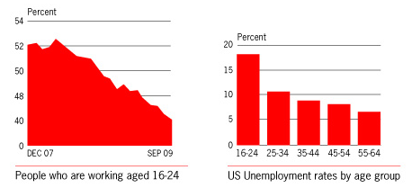
| Unemployment | two charts center at bottom | red graphs | Red sections pass | pass | Laura: the Red #FE0000 on white #FFFFFF passes. If considered essential, the Gray #BFBFBF gridlines on white #FFFFFF gridlines fails Jim Question: Are the GRAY lines in the charts essential? Laura: I think we need to ask if the gray horizontal lines were removed, would it fundamentally change the info? Are they visual aids? If data points are too far from the quantitative axis, gridlines help to to align the data to the right value. Maybe some of our low vision folks could compare this employment gridline screenshot with the employment no gridlines screenshot. References: |
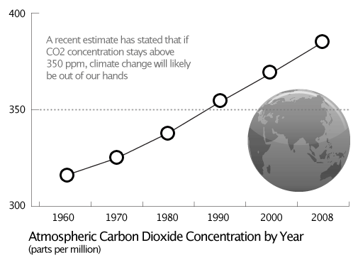
| Climate Change | Graph - lower right | data line with circles, and threshold line at 350 | data line with circles -pass Threshold line at 350 - fail |
pass | Jim Question: Is threshold line at 350 essential? Laura: I think the threshold line at 350 is essential. It would be very difficult to align the years with the PPM CO2 scale on the left without the assistance of the gridline. Compare: climate gridline screenshot with the climate no gridlines screenshot. I would fail it. |
| Cars sold in 2012 | Graph at bottom | cars against background | pass - used the winshield against car boundaries | pass | Jim: What is essential? Car roof and side of windshield failed on several cars. Grills did not provide accurate information. Windshields themselves worked. Laura: For no loss of content in the graph I think it is essential and required for understanding to be able to differentiate between each type of car in the legend and relate it to each "bar" in the graph. If we were to consider the windshields the graphical objects, how would a person tell the difference between the Chevrolet Malibu, Honda Accord, Honda Civic, Toyota Camry, and Ford windshields? I would fail it. An easy fix would be to eliminate the legend and have the car models in text under each bar. |