CVD
Color Vision Deficiency, or CVD, is when a person's vision has limited color sensation. Also know as color limited vision, and commonly though incorrectly referred to as color blind.
What is Color Vision Deficiency?
CVD is a condition wherein some of the "color sensing" cells of the retina are impaired or missing, resulting in difficulty discriminating between certain colors. Some variation of this condition affects an estimated 6% of the population, primarily males. However, it is important to know that the vast majority of CVD individuals can still see _some_ colors.
Poor Choice of Words: "Color Blind"
"Color Blind" is not accurate in terms of what CVD to those with some variation of this condition.
99.998% of those with CVD are not color blind
They only have a _reduced_ color discrimination. Even the most profound deuteranope or protanope can still see hundreds of thousands of colors (far shy of the many millions of normal vision, but not devoid of color perception).
Is there an "actual" color "blind"?
Only the very rare achromatopsia types are monochromatic, and that very small group often has other more serious vision problems that require assistive technologies, regardless of their lack of color discrimination. (For instance, blue cone monochromacy is co-morbid with a low vision of 20/70 and severe photophobia. There is even some discussion regarding taking blue cone monochromacy out of the CVD classification all together.)
What is it really like?
You can see various forms of CVD based on clinical research at the Myndex CVD Simulator page The protanopia, deuteranopia, and tritanopia simulations are based on the Brettel models which use the cone response functions and are generally accepted as clinically accurate. The Blue Cone Monochromacy I created using the Brettel concepts, however the current blue cone simulator does nto also simulate the central field loss or low vision aspects of BCM.
Like most things in perception, CVD is not an absolute, but a wide spectrum of subtle variations from a mild reduction in discrimination ability, to a complete inability to discern between reds and greens for instance (deuteranopia/protanopia). But these most common types do see blue, and related colors that stimulate the S cone (blue).
In short, the _vast majority_ of individuals with Color Vision Deficiency have these characteristics::
- They see the opponent colors yellow/blue.
- They have difficulty distinguishing between colors that rely on differential stimulation of the M and L cones.
- The M and L cones are often (albeit inaccurately) called the green and red cones.
- In fact, **both** the M and L cones have peak sensitivity in green, close to each other.
- Both the M and L cones almost completely overlap
- Only the L cone really extends down into deep "red"
- The overlap means that deuteranopia (missing the M cone) sees *all* the light of normal vision, but colors from green down to red all seem the "same" hue.
- They have generally normal luminance perception
- However, protanopia see the "red" on a sRGB monitor but as 30% to 50% darker.
- Protanopia _can't_ see the red on a Rec2020 wide gamut monitor.
- With than in mind, contrast sensitivity and visual acuity are otherwise normal.
A More Accurate Term is Needed
Instead of Color Blind, we need a new term that is not so completely incorrect (not to mention a bit ableist.) The medical terms for some disabilities are changed every so often for similar reasons, It should not be too difficult to change "colorblind" to a better and more correct/inclusive term with the appropriate promotion.
Candidate Term:
- Color Limited used as:
- "he's color limited, sometimes (but inaccurately) referred to as 'color blind'"
- "They have color limited vision"
- "Some people with color limited vision may not be able to distinguish between some hues, which is some cases gives them a better ability to identify "camouflage"ª.
Color Limited Vision is neutral and descriptive of the actual condition.
- Footnote:** ª camouflage being more visible due to a greater ability to discern luminance variations irrespective of hue among some CVD types. _see: https://www.nature.com/articles/news051205-1_
CVD By The Numbers
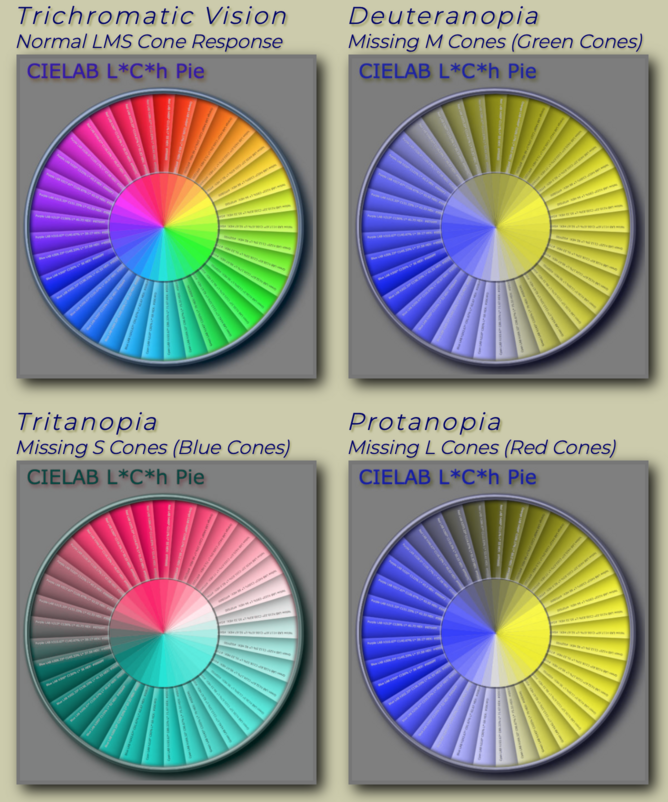
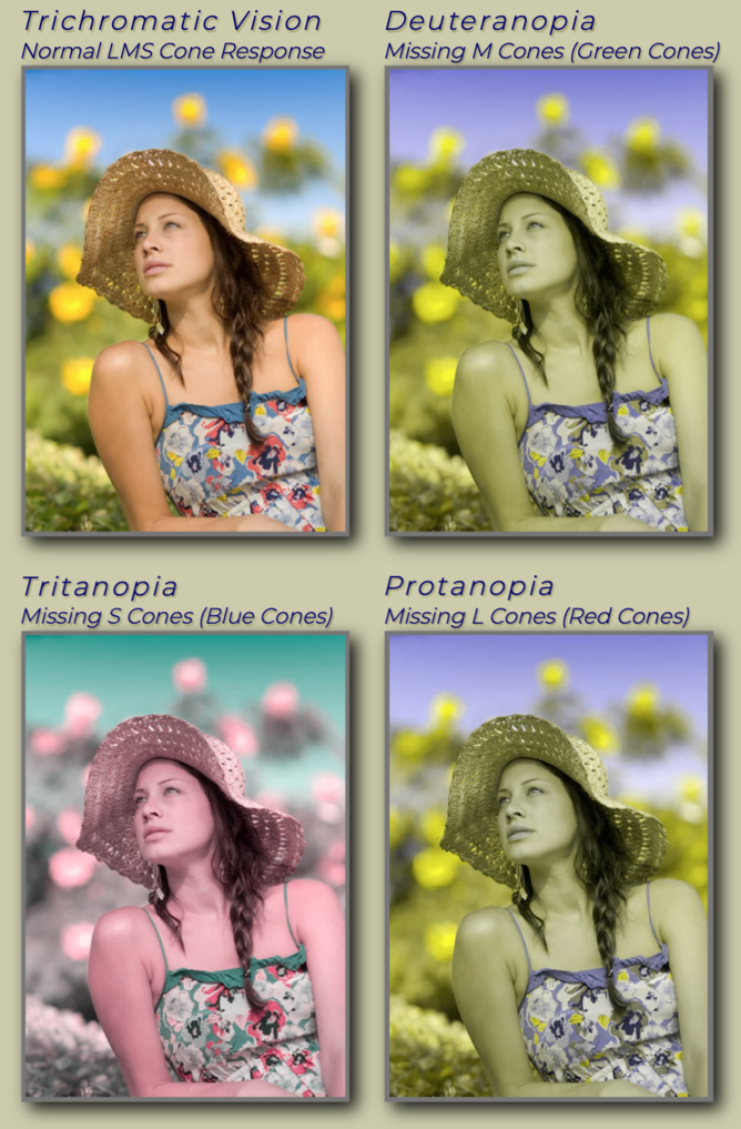
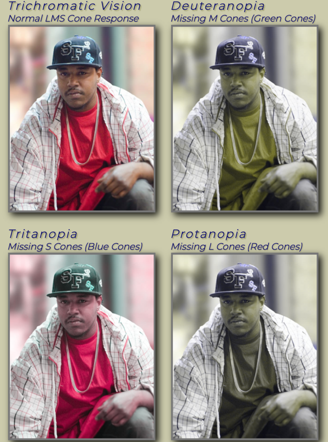
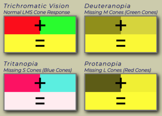
As for "accuracy" or "descriptive" here are some illustrative slides of simulated CVD, using a clinically accurate vision model of the -opia types (missing cone function). Top left image is standard, then clockwise is deuteranopia, protanopia, and tritanopia.
CIELAB based color wheel
Girl in a straw hat
Rapper Des
Simple Green Red Yellow Target
READABILITY
As should be clear, tritanopia is nearly the same as the standard LMS response — and as we know for readability, blue is generally not helpful. We have no blue photo receptors (S cones) in the foveal central vision. Pure blues should never be the brightest or lightest stimuli (no blue on black)
Perhaps the most important thing we learn looking at these simulations is how protanopia perceives red-ish colors as darker. Here we see the results of viewing an sRGB monitor, the "red" is much darker — but on sRGB it's actually a red orange, and still a little visible as it still stimulated the M cone. On a newer technology Rec2020 display, the red is farther up the spectral locus and protanopia will not see it at all. So for reds, like blue, pure reds should never be the lightest color, no red on black.
This leads to the following axiom:
For Readability, The lightest color of a color pair should always have a substantial green-light component, and the darkest color must always have less green light.
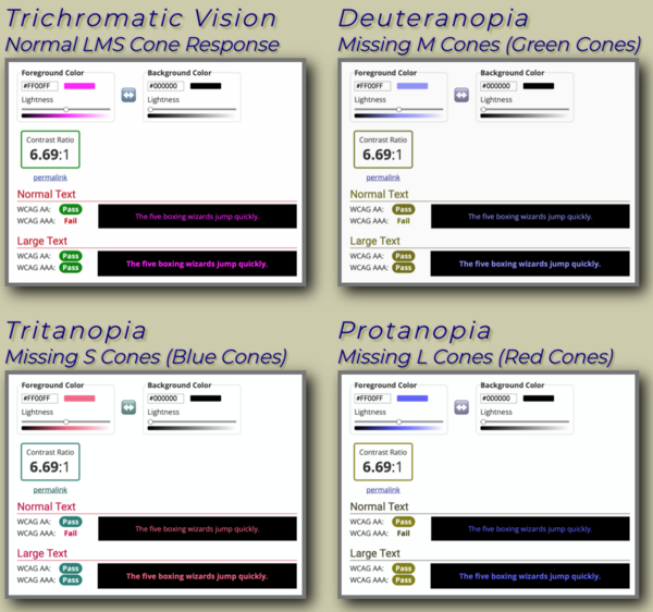
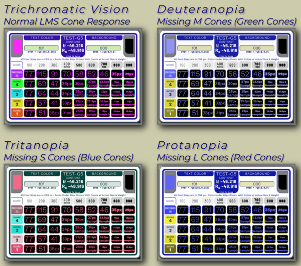
An example extreme case is #F0F for the lightest color against black. As you can see here, WCAG 2 contrast math rates it as nearly 7:1
The SAPC and APCA rates this as under the fluent text value of 60, though it passes for large text. I do have an unreleased technology (pending IP protection) that is a minimally invasive way to definitively reject edge cases like this. Regardless, even this edge case is a demonstratively massive improvement over WCAG 2.
..... Images and text on this page copyright © 2021 by Andrew Somers. All Rights Reserved. Used by permission.
