See Understanding Techniques for WCAG Success Criteria for important information about the usage of these informative techniques and how they relate to the normative WCAG 2.0 success criteria. The Applicability section explains the scope of the technique, and the presence of techniques for a specific technology does not imply that the technology can be used in all situations to create content that meets WCAG 2.0.
Microsoft Silverlight, versions 3 and greater
Silverlight managed programming model and Silverlight XAML
This technique relates to:
See User Agent Support Notes for SL8. Also see Silverlight Technology Notes.
The objective of this technique is to provide a long text alternative that replaces content when a short text alternative is not sufficient for a given user, and the user specifically requests that the application should provide more context or more information through the application user interface. The technique could also apply for providing a long text alternative for a nontext object, for example for an image that contains a level of detail that is difficult to capture in a standard visible-in-UI image caption.
Silverlight supports a UI Automation property named HelpText,
to connote its possible usage to provide imperative instructions for
interactive elements. HelpText is not always forwarded
to users by existing assistive technologies, which is an issue discussed
in the technique SL19: Providing User Instructions With AutomationProperties.HelpText in
Silverlight.
Rather than relying on a particular assistive technology's support
for enabling users to access the UIA HelpText, application
authors can introduce user interface elements into their design that
databind directly to the HelpText property, but where
the interface element is not necessarily displayed by default. An interface
update might be designed to occur if the application user specifically
activates a "Get Help" action that is presented in the initial
user interface.
This technique emphasises a "HelpText" model as a factoring
practice. Silverlight application authors can use the HelpText as
a data source that centralizes such information, because it already
exists and has that intended purpose in accessibility frameworks. For
example, the HelpText could be shown in a tooltip,
a popup, a separate user interface element that is deliberately rendered
in close proximity, etc. For accessibility support, a recommended display
option for HelpText is to add or dynamically alter
a Silverlight text element in the primary user interface. Silverlight
supports an adaptive layout metaphor. Adding text to the runtime elements
in the application generally causes an interface redraw, which in turn
informs assistive technologies (through UIA properties and events)
that content might have changed.
To set the UIA HelpText in Silverlight, you set the
attached property AutomationProperties.HelpText. AutomationProperties.HelpText can
be set in code, but is typically set in XAML that defines a Silverlight
UI.
The same information that is used for AutomationProperties.HelpText long
text alternatives could also be useful to sighted users. In this case,
the same text could be displayed in a Silverlight ToolTip control.
The reason that application authors should use both AutomationProperties.HelpText AND Tooltip in
conjunction is because the Tooltip information is
not introduced into the runtime accessibility framework information
set by UI Automation, because that information set does not anticipate
the mouse action triggers that cause tooltips to display. In Silverlight
programming, a useful technique for sharing the same resource is to
combine the Silverlight data binding feature with the .NET Framework
embedded resource feature. For more information on combining Silverlight
data binding and resources for common string sources, see How
to Make XAML Content Localizable.
Application authors can specify the AutomationProperties.HelpText attribute
on the Image element. The value provided for the attribute
should be a meaningful long text alternative for the image content.
The value of AutomationProperties.HelpText should
augment rather than duplicate any AutomationProperties.Name or
an associated Label or LabeledBy caption.
One or both of these is also typically specified to provide the basic
(short-text) accessibility support for an image.
<StackPanel x:Name="imgContainer">
 <Image
   Height="400" Width="600"
   Source="/office.png"
   x:Name="imgOffice"
   AutomationProperties.HelpText=”The standard office layout
includes one corner desk unit in the corner farthest from the
door, and one file cabinet against the same wall as the door.”/>
 <sdk:Label x:Name="lblimgOffice" Target="{Binding ElementName=imgOffice}">Diagram of standard office layout</sdk:Label>
 <Button x:Name="HelpButton" Click="HelpButton_Click">Provide text-only alternative description of the previous image</Button>
</StackPanel>
The following event handler removes the Help button and replaces
it in UI with a TextBox that displays the long text
alternative.
       private void HelpButton_Click(object sender, RoutedEventArgs e)
       {
           imgContainer.Children.Remove(HelpButton);
           TextBox tb = new TextBox();
           tb.IsReadOnly=true;
           tb.Text = AutomationProperties.GetHelpText(imgOffice);
           imgContainer.Children.Add(tb);
           tb.Focus();
       }
This example provides instructions for two form fields. The same text
is also displayed for mouse users as a Tooltip and
the AutomationProperties.HelpText string is used as
a common source for both display options. In this example, the form
submission does not perform client-side validation (although server-side
validation following a data round trip might still exist, or validation
could be added similar to the technique shown in SL35: Using the Validation and ValidationSummary APIs to Implement Client
Side Forms Validation in Silverlight).
The following is the XAML UI:
<UserControl xmlns:sdk="http://schemas.microsoft.com/winfx/2006/xaml/presentation/sdk"
   x:Class="HelpTextAndToolTip.MainPage"
   xmlns="http://schemas.microsoft.com/winfx/2006/xaml/presentation"
   xmlns:x="http://schemas.microsoft.com/winfx/2006/xaml"
>
       <Grid x:Name="LayoutRoot" Background="White" Margin="10">
           <Grid.RowDefinitions>
               <RowDefinition Height="Auto"/>
               <RowDefinition Height="Auto"/>
               <RowDefinition Height="Auto"/>
               <RowDefinition Height="Auto"/>
               <RowDefinition Height="Auto"/>
           </Grid.RowDefinitions>
           <Grid.ColumnDefinitions>
               <ColumnDefinition Width="Auto"/>
               <ColumnDefinition Width="200"/>
               <ColumnDefinition Width="Auto"/>
           </Grid.ColumnDefinitions>
           <TextBlock Text="Form With Tooltips" FontSize="16" FontWeight="Bold"
     Grid.Column="1" HorizontalAlignment="Center" />
           <sdk:Label x:Name="NameLabel" Target="{Binding ElementName=NameTextBox}"
     Grid.Row="2" Margin="3"/>
           <TextBox x:Name="NameTextBox"
     AutomationProperties.Name="{Binding Content, ElementName=NameLabel}"
     Text="{Binding Name, Mode=TwoWay, UpdateSourceTrigger=Explicit}"
     Grid.Column="1" Grid.Row="2" Margin="3"
                    AutomationProperties.HelpText="{Binding NameTextBoxToolTipString,Source={StaticResource TooltipStrings}}">
           <ToolTipService.ToolTip>
               <ToolTip Content="{Binding NameTextBoxToolTipString,Source={StaticResource TooltipStrings}}" />
           </ToolTipService.ToolTip>
           </TextBox>
           <sdk:Label x:Name="AgeLabel" Target="{Binding ElementName=AgeTextBox}"
     Grid.Row="3" Margin="3" HorizontalAlignment="Right"/>
           <TextBox x:Name="AgeTextBox"
     AutomationProperties.Name="{Binding Content, ElementName=AgeLabel}"
     Text="{Binding Age, Mode=TwoWay, UpdateSourceTrigger=Explicit}"
     Grid.Column="1" Grid.Row="3" Margin="3"
    AutomationProperties.HelpText="{Binding AgeTextBoxToolTipString,Source={StaticResource TooltipStrings}}">
           <ToolTipService.ToolTip>
               <ToolTip Content="{Binding AgeTextBoxToolTipString,Source={StaticResource TooltipStrings}}" />
           </ToolTipService.ToolTip>
       </TextBox>
       <StackPanel Orientation="Horizontal">
           <Button x:Name="SubmitButton" Content="Submit" Click="SubmitButton_Click" Grid.Column="1" Grid.Row="4" Width="50" Margin="3" />
           <Button x:Name="HelpButton" Click="HelpButton_Click">Get Help</Button>
       </StackPanel>
       </Grid>
</UserControl>
The following is the resource definition in app.xaml:
       <ResourceDictionary>
           <resources:Resource1 x:Key="TooltipStrings"/>
       </ResourceDictionary>
The generated resource code that defines the "Resource1" class is not shown here because it is mostly infrastructure that is produced by a generation task in Visual Studio. For more information about embedded resources in Silverlight, see Resources Overview on MSDN. The resources here contain just two strings:
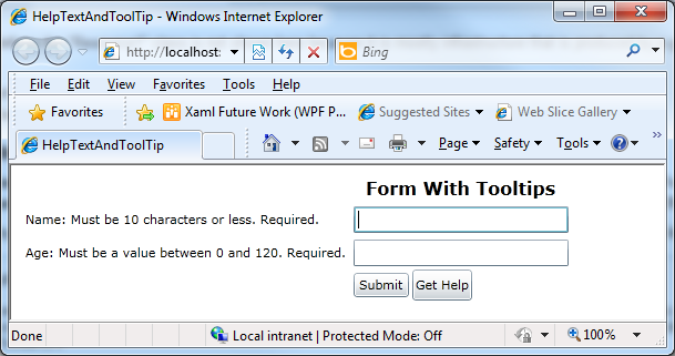
NameTextBoxToolTipString: Must be 10 characters or less. Required.
AgeTextBoxToolTipString Must be a value between 0 and 120. Required.
The following is the event handler code, which changes the interface.
       private void HelpButton_Click(object sender, RoutedEventArgs e)
       {
           AgeLabel.Content = AgeLabel.Content + ": " + AutomationProperties.GetHelpText(AgeTextBox);
           NameLabel.Content = NameLabel.Content + ": " + AutomationProperties.GetHelpText(NameTextBox);
           NameTextBox.Focus();
       }
Note the call to Focus() - this puts the screen reader focus on
the first form element so that the added text can be read. The very
same text source as used for the Tooltip is added
programmatically to the existing Label controls.
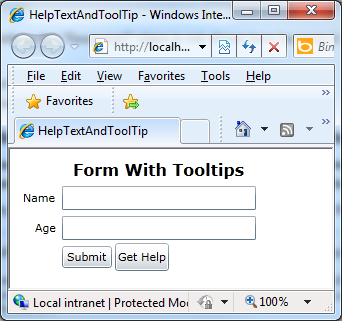
After the Get Help button is clicked, the visual appearance of the application is modified:
Before activating Get Help
After activating Get Help
This example is shown in operation in the working example of HelpText and Tooltip.
Resources are for information purposes only, no endorsement implied.
Using a browser that supports Silverlight, open an HTML page that references a Silverlight application through an object tag. To see UI Automation, use Microsoft Windows as platform.
For a control where this technique is used to provide a long text alternative, verify that an identifiable and usable "Get Help" control is present in the initial user interface or assistive technology representation of that interface.
Verify that activating the "Get Help" control changes the user interface, and the changed user interface now displays or reports long text alternatives that better address the user's information needs.
If using a screen reader, verify that the long text alternative can be read aloud.
#2 and #3 are true. If testing with a screen reader, #4 is true.
If this is a sufficient technique for a success criterion, failing this test procedure does not necessarily mean that the success criterion has not been satisfied in some other way, only that this technique has not been successfully implemented and can not be used to claim conformance.