A topic
This new topic is added…
Notes for slide 1 can be put here.
Notes for slide 2 can be put here.
 Metro pole
 Straw pole
Notes for slide 3 can be put here.
It seems the famous ‘lorem ipsum’ is based on a text by Cicero, but with the lines mixed up. On a Cicero by the text, it seems the ‘ipsum lorem’ is famous based with lines but mixed up.
And again, with class slide side right.
It seems the famous ‘lorem ipsum’ is based on a text by Cicero, but with the lines mixed up. On a Cicero by the text, it seems the ‘ipsum lorem’ is famous based with lines but mixed up.
![[Top view of four pairs of hand holding each other crosswise]](https://www.w3.org/2018/Talks/TPAC-2018/ceo-update/diversity.jpg)
Adding class cover to the image makes it stretch to
the edges of the slide.
And also on the right side…
Hint: Add class=clear on the slide to omit the banner and slide number.
It seems the famous ‘lorem ipsum’ is based on a text by Cicero, but with the lines mixed up. On a Cicero by the text, it seems the ‘ipsum lorem’ is famous based with lines but mixed up.
And again, with class ‘slide side right big’.
It seems the famous ‘lorem ipsum’ is based on a text by Cicero, but with the lines mixed up. On a Cicero by the text, it seems the ‘ipsum lorem’ is famous based with lines but mixed up.
It seems the famous ‘lorem ipsum’ is based on a text by Cicero, but with the lines mixed up. On a Cicero by the text, it seems the ‘ipsum lorem’ is famous based with lines but mixed up.
And on the right side…
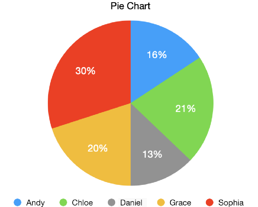
The description of the pie chart, here as a table:
| Name | Percentage |
|---|---|
| Andy | 16% |
| Chloe | 21% |
| Daniel | 13% |
| Grace | 20% |
| Sophia | 30% |

Careful, some images make the text hard to read!
Careful, some images make the text hard to read!
![[photo with a beach, cliffs, buildings, dark clouds and a surfer]](https://www.w3.org/2020/Talks/ac-slides/template/coast.jpg)
slide darkmode for
white-on-black(Photo ‘Surfer and the stormy sea’ by Xavier Nohet)
This is a template for slides using the b6+ framework with a W3C style. The b6+ JavaScript code manages the slide progression, while the style sheet provides the W3C look and some useful predefined layout styles.
If you write slides with this style, you can either put them online or download a zip with everything needed to present offline, as explained below.
Note: The same slides and the same style can also be used with the Shower framework. Look in the HTML source for how to change the script.
If you develop your slides on the W3C web site (with HTTP PUT, WebDav or CVS), then make a directory under https://www.w3.org/Talks/2021/ or https://www.w3.org/2021/Talks/ (or whatever the current year is). The former will be public, the latter requires setting an ACL. Copy b6plus-humaaans.html (this file) from https://www.w3.org/Talks/Tools/ into your directory and edit the content, or just use it as an example.
If you develop your slides offline (or plan to present them without a network), then download this zip file. Unpacking it creates the following directories and files:
Make a directory for your own slides under slides. (A good name is MMDD-Theme, where MM is the month in which you give the talk, DD the date and Theme the topic, e.g., ‘Legal’, ‘W3C’ or ‘SVG’.) You can copy the b6plus-humaaans.html file there as a starting point, or just use it as an example. If you make any images, put them in that directory as well.
If you are able to upload your slides, put your directory with all that it contains under https://www.w3.org/Talks/2021/ or https://www.w3.org/2021/Talks/ (replace 2021 by the current year). There is no need to upload the Tools directory. It is is already there.
(Uploading requires HTTP PUT, WebDav or CVS. To set an ACL, you will need ,access.)
Each slide is a section element* with a class of slide:
<section class="slide">
  ... slide content here...
</section>
Inside the slides, use normal HTML elements (p, ul, em, etc.).
*) Note for advanced users: Although not shown in this template, it is in fact possible to use other elements than section. One common choice is div.
You can add additional text, such as speaker notes or explanations, between the slides. They will be visible in index mode but not in slide mode. Use elements with a class of comment:
<section class="comment">
  ... text here...
</section>
If a slide should not have a slide number and an image banner, add the class clear:
<section class="slide clear">
  ... slide content here...
</section>
On title slides and final slides (see below), this only removes the number, not the banner.
Adding the class clear on the body element omits the slide number and the side banner from all slides.
For cover slides (the title slide or separator slides between parts of a presentation), add a class cover. You can combine cover and clear. E.g.:
<section class="slide cover clear">
  <h1>My presentations<h1>
  <address>Peter W. Slidemaker</address>
</section>
The class final is meant for a last slide, e.g., for conclusions or thanks (but it may be used elsewhere, too):
<section class="slide final clear">
  <h2>Conclusions<h2>
  …
</section>
Slides with narrower text and an illustration on the left or right can be made by adding the class side to the slide. Inside the slide there should be exactly one element that also has a class of side (an image or some other element). Two sizes are possible: normal (about 1/3 of the slide) and big (about 2/3 of the slide).
To put an image on the left:
<section class="slide side">
  <img src="..." alt="..." class="side">
  ... slide content here...
</section>
To put the image on the right instead, add class right (which may be abbreviated to r):
<section class="slide side r">
  <img src="..." alt="..." class="side">
  ... slide content here...
</section>
Add class big to the slide for a bigger image. To put the image on the left:
<section class="slide side big">
  <img src="..." alt="..." class="side">
  ... slide content here...
</section>
And on the right:
<section class="slide side r big">
  <img src="..." alt="..." class="side">
  ... slide content here...
</section>
The image can be stretched to the edges of the slide by adding a class cover. The image is not deformed. It is scaled to be big enough to cover the image area and then either the sides are cropped (if it is too wide) or the top and bottom*.
<section class="slide side big">
  <img src="..." alt="..." class="side cover">
  ... slide content here...
</section>
*) Note for advanced users: It is possible to indicate which sides should be cropped: add an attribute like style="object-position: 20% 60%" to indicate that, of the amount to be cropped from the sides, 20% should be cropped on the left and the remaining 80% on the right; and of the amount to be cropped from the top and bottom, 60% should come from the top and the remaining 40% from the bottom. Thus, e.g., ‘0% 100%’ says never to crop anything from the left (0%) if the image is too wide, and only to crop from the top (100%) if the image is too tall. (The default corresponds to ‘50% 50%’, i.e., crop equal amounts from both sides.)
When information is in the form of an image (a diagram, a chart, a screenshot, etc.), put it inside a figure element. Add a figcaption if needed.
<figure><img src="..." alt="..."><figure>
If the image is not accessible, use a details element instead and add a description, like this:
<details>
 <summary><img src="..." alt="..."></summary>
 ... the same data as in the image, but as text...
</details>
The description becomes visible when the user clicks on the image. (The slide above shows an image of a pie chart that is described by a table with the same data.)
If you want a progress bar during the slide presentation, add an empty div with a class of progress. It can be put before the first slide or after the last, but there should be at most one such element in the file:
<div class="progress"></div>
The progress bar will show as a thin red line along the top of the slides. Its length increases from zero on the first slide to 100% on the last.
B6+ also sets a custom style variable --progress with a value between 0 and 1 on the body. This may be useful if you write your own style rules for a progress indicator.
To progressively reveal elements on a slide, put a class of next on all elements that should not be visible right away. They will become visible one by one as you press the space bar or an arrow key. E.g.:
<ul>
  <li>This item is visible when the slide appears
  <li class="next">This item is not immediately visible
  <li class="next">This is the third item to appear
</ul>
<p class="next">This is the last element to appear
By default, each new element appears with a short animation as if it unfolds from left to right. Two alternative animations are available: emerge makes the elements fade in and quick omits the animation. The class can be set on each incremental element:
<li class="next emerge">...
or on an ancestor, e.g.:
<ul class="emerge">
  <li class="next">...
Three optional modifiers change how elements look before, after or while they are the currently active element: Strong makes the currently active element red. Greeked replaces the elements that are not yet visible by a gray bar. (Useful to show how many elements are still invisible.) And dim grays out the elements that are no longer the active element.
Like the animation, these modifiers can be set on the incremental element itself or on an ancestor. The modifiers can also be combined, e.g.:
<ul class="emerge strong dim">
  <li class="next">...
Slides can be made to advance automatically after a given time, by setting a data-timing attribute on them with a value of MM:SS (minutes and seconds), or a number followed by an s (seconds), m (minutes) or h (hours), e.g.:
<section class="slide" data-timing="1:03">
<section class="slide" data-timing="20.5s">
<section class="slide" data-timing="0.33m">
E.g., the last one means that the slide is shown for a maximum of 0.33 minutes (about 20 seconds) before the next slide appears. (You can still advance the slide by hand before that.)
If the slide contains incremental elements, the time is distributed equally over those elements. E.g., if there are three incremental elements, the time is divided by four so that the first incremental appears after a quarter of the given time, the second after half the given time, and the last one after three quarters. You can also set a time on an individual incremental element, in which case that time is used for that element. E.g.:
<section class=slide data-timing="8s">
  <p>This slide has 3 incremental elements.
  <ol>
    <li class=next data-timing="10s">Shown after 8/4 = 2 seconds
    <li class=next data-timing="15s">Shown 10 seconds later
    <li class=next>An additional 15 seconds later
  </ol>
</section>
After 29 seconds (= 2 + 10 + 15 + 2), the next slide will appear.
You can set a default time on the body element, e.g.:
<body data-timing="20.2s">
This sets the time for all slides that do not have a data-timing attribute of their own.
Setting the data-timing attribute to 0 indicates that the slide or element does not automatically advance.
To put elements side by side in two columns, make an element (a div, ul or any other element) with class columns. The first child of that element will be put in the left column, the second child in the right column. If there are more children, the third will be in the left column again, the fourth in the right, etc.
<ul class="columns">
  <li>First goes on the left</li>
  <li>Second goes on the right</li>
</ul>
Less important text can be shown in a smaller font by giving it a class of note:
<p class="note">Note that this is harder to read</p>
To make text extra big, give it a class of shout, e.g.:
<p class=shout>Hurray!
(Sometimes this is referred to as the ‘Takahashi method’: Instead of sentences or graphics, a slide only contains one or two keywords. The narrative comes from the speaker.)
To draw extra attention to some text or an image, it can be animated. Adding a class of grow to it will make it appear slowly. It will start small and one second after the slide appears it will begin to grow and reach its normal size three seconds later.
<p class=grow>See?
B6+ can automatically reduce the font size of a slide to fit long text. To request this, add the class textfit on a slide (or on the body, if all slides need this). See the example slide.
(The way this works is that b6+ wraps the contents of the slide in a div with the right font size. If you have added your own style rules, make sure they still work.)
Be careful! The textfit feature can easily result in text that is too small to read.
Pre-formatted text (in a pre) can be given line numbers by adding the class numbered:
<pre class="numbered">
No more than 20 lines will be numbered. (In the normal font size, a slide fits 13 lines.)
To replace the list bullets with icons, emojis, or images, make a ul with a class of with-icons. The first element of each li will be used instead of the list bullet.
<ul class=with-icons>
 <li><span>♪</span> North pole</li>
 <li><img src="../Icons/toc.png" alt="toc button"> Metro pole</li>
</ul>
It is possible to treat the slide as a 3×3 grid and put elements in the four corners, in the middle of each edge, or in the center of the slide. This is done by giving the elements a class of place. On its own, place puts the element in the center. By adding classes top, right, bottom and left the element can be placed in one of the eight other positions.
<div class="place">Put this in the center</div>
<div class="place bottom">Put this bottom center</div>
<div class="place top right">In the top right</div>
The direction classes can also be abbreviated to t, r, b and l.
To put an image behind the text of a slide, use an img with a class of cover:
<img class="cover" src="..." alt="...">
The image will be stretched to fill the whole of the text area. If the image doesn't fit exactly (wrong aspect ratio), the image will be cropped.
With a class of fit instead of cover, the image will be scaled but without cropping. Instead there may be white bands on the sides or above/below the image, if it doesn't fit exactly.
<img class="fit" src="..." alt="...">
This works both for normal slides and title slides (slides with a class of cover). The logo and slide number on the right are not obscured by the image. (But you can use clear on the slide to hide them.)
It is advisable to add a class of darkmode or lightmode to a slide with an image overlay. See the next section.
The colors of the slides depend on whether ‘dark mode’ is in effect in the operating system: black text on a white background if dark mode is off and white on black if it is on. But when text is overlaid on an image, it may be better to force the text to always be white (if the image is dark) or black (on a lighter image). You do that by setting a class on the slide: darkmode (for white-on-black) or lightmode (for white-on-black). E.g.:
<section class="slide darkmode">
Other colors (titles, list bullets, links, etc.) also become fixed on such slides.
To make all slides white on black, set the class darkmode on the body element. In that case you can use the class lightmode on individual slides to give them black-on-white text.
Some images, such as diagrams, can be color-inverted and still look good. You can give such images a class can-invert and when the slides are displayed in dark mode, the image colors will be inverted. (Try it on the slide with a figure.)
<img class="can-invert" src="..." alt="...">
This also works for SVG images and other things.
Videos (with the video element) and audios (with the audio element) on a slide can be made to play automatically when the slide opens, by giving them an autoplay attribute, e.g.:
<video src="myvideo.mp4" autoplay></video>
Videos can be used as background for the slide with the cover or fit classes. (See their description under ‘Image overlays’.) The class fit is also useful simply to make the video as large as possible if it is the only thing on the slide.
However, if you do use one of those classes, it is best to use the autoplay attribute and to avoid the controls attribute, because the video controls will capture all key presses and mouse clicks and thus you can't use those to advance to the next slide anymore. (If you do want to use controls, either present with a second window (see below) or set a data-timing attribute on the slide, so that it advances to the next slide automatically after a given time.)
By default, each slide just replaces the previous one, but there are several predefined slide transitions. You can set a transition on the body element to apply it to all slides:
<body class="shower fade-in">
Or you can set it on individual slides, to apply only to the transition between that slide and the next. (I.e., it doesn't determine how the slide appears, but how it disappears.)
<section class="slide wipe-left">
You can set both a global transition and local ones. The global transition applies to slides that do not have an explicit transition set locally.
You can make a ‘watermark’, a text or an image that is overlaid on every slide, by making an element with a class of watermark. It can be placed before or after the slides.
<p class=watermark><strong>DRAFT!</strong>
By default, the watermark is slightly rotated and placed in the center of each slide. Any text will be red.
When you present while using a screen reader, you cannot use the screen reader's usual keystrokes to navigate, only the keystrokes defined by the b6+ script. However, the screen reader will speak each slide as soon as it appears. The script creates an element with attributes role=region and aria-live=assertive for that purpose.
When you leave slide mode, the screen reader will say ‘stopped’. To make it say something else (e.g., because you want a different language than English), create an element with role=region and aria-live=assertive yourself and put the text to speak in it. E.g.:
<div role="region" aria-live="assertive">
  Terminé.
</div>
The slides can be exported to PDF (or printed) in two ways: multiple slides per page with comments interleaved, or one slide per page without any comments. The latter may be useful to create a PDF suitable for presenting, when it is not possible to use an HTML browser.
Note: In landscape mode, the style sheet tries to set the size of the output page to exactly the size of a slide, but not all user agents that produce PDF respect that. (And, obviously, a printer is limited to the available paper.) There may be some black margin to the right and below each slide. Prince does respect the size. W3C team can also use the ",pdfui" tool online.
To present the slides, load them into a browser that supports JavaScript and CSS and then either click the play (▶) button, press the A key, double-click on a slide or touch the screen with three fingers (on certain devices).
Navigate though the slides by clicking the left mouse button, pressing the spacebar, the arrow keys or Page-up/Page-Down. The Home and End keys jump to the first, resp. last slide. F1 or F toggles full screen mode. C shows a clicakble table of contents. The ? (question mark) key shows a list of available commands.
If you have automatically advancing slides, you can pause the slide show with the P key or the Play/Pause key, if your keyboard has it. You can also navigate to a different slide and resume from there.
To exit the presentation, press the A key or the Esc key.
While in slide mode, you can press the D key to switch between black-on-white and white-on-black. (This temporarily adds or removes the darkmode class on body, see ‘Forcing white text or black text’.) When the computer is already in dark mode, the key has no effect.
B6+ can show the slides in a second window. The first window can then be used to control the slide show and view notes and next slides. If you have two screens that can show different content (e.g., your computer's screen and a projector), you can thus present the slides on one screen, and see the current and next slides, and any notes, on the other.
Open the second window by pressing the 2 key, or the ⧉ button in index mode.
After pressing the W key, you can draw on the current slide with the mouse. Press W again to clear the drawing.
The drawing is not permanent and there is always only one slide with a drawing: As soon as you start drawing on another slide, the previous slide is cleared.
The color of the drawing can be set with style rules,e.g., like this:
.b6-canvas {color: red}
When using a second screen, it is possible to show clocks on the first screen with the remaining time, the time used so far, and the real (wall clock) time. (The clocks are normally only shown on the first screen, but they can be included in slides or overlaid on slides, with suitable CSS rules.)
By default, the clocks will count down from 30 minutes and show a warning 5 minutes before the end. (In the style used for this document, the clock turns from green to orange.) You can set different times with the following classes:
To set the duration to, e.g., 45 minutes,
add duration=45 to the class attribute of
the body. Example:
<body class="duration=45">
To set the warning to, e.g., one minute, put this in the class of the body:
<body class="warn=1">
B6+ has two kinds of clocks built-in, but also provides primitive elements with which to build your own clock.
To get one of the built-in clocks, make an empty element with a class of either fullclock or clock. The former will display the real (wall clock) time, the number of minutes so far, the number of minutes left, a small ‘pie-chart’ showing the proportion of time used, and four buttons: subtract one minute, add one minute, pause the clock, and reset the clock. The simple clock will display the pie chart and the four buttons (somewhat smaller) and the remaining minutes.
When you make your own clock, you can make use of the following classes and attributes:
B6+ will fill all elements with a class of hours-real with the current hour (wall-clock time) and keep them up to date. The hour will always be two digits and use a 24-hour clock: 00 to 23.
Similarly, all elements with a class of minutes-real or seconds-real will contain the current minutes or seconds, respectively, also always as two digits, 00 to 59. E.g.:
<b class=hours-real>00</b>:<b class=minutes-real>00</b>
Elements with these classes will contain the time since the slides where loaded (or since the clock was reset, see timereset below). E.g.:
<b class=minutes-used>00</b>'<b class=seconds-used>00</b>"
Ditto, but for the time still remaining. If the used time exceeds the duration, these times will be shown as 00.
An element with a class of timeinc will act as a button that increments the duration, and thus the remaining time, by one minute. timedec decrements the duration by one minute. E.g.:
<button class=timeinc>+1 min</button>
<button class=timedec>−1 min</button>
An element with this class acts as a toggle to pause & resume the clocks. When the clocks are paused, the used time does not progress and the remaining time does not diminish. (The real time clocks continue, of course.) When the element is clicked again, the clocks resume. E.g.:
<button class=timepause>pause</button>
An element with this class acts as a button to restart the clocks, i.e., to set the used time to zero. Example:
<button class=timereset>reset</button>
In addition to setting the time in elements with the classes mentioned above, b6+ also updates the style property, the class and a data- attribute on the body. This is useful for style rules to change the styles of elements based on the progress of the slide show. In particular, b6+ sets the following:
Add ‘?full’ at the end of the URL (but before any fragment ID) to open the slides in slide mode instead of index mode.
To open in slide mode at a specific slide, add ‘?full’ and the ID or the number of the slide, e.g., Overview.html?full#place or Overview.html?full#20.
When you don't want the mouse pointer to remain on the screen in slide mode, add the class hidemouse on the body element. If the mouse does not move for 5 seconds, the pointer is made invisible. It comes back as soon as the mouse is moved.
<body class="hidemouse">
You can also set a different timeout in seconds. E.g, to set a short timeout of 1.5 seconds:
<body class="hidemouse=1.5">
Normally, a mouse click anywhere on a slide (other than on a hyperlink or form element) has the effect of advancing to the next slide or incremental element. If you don't want that, add the class noclick on the body element.
<body class="noclick">
The complete list of key strokes and gestures is in the b6+ documentation, which also shows what else b6+ can do.
You can embed a single slide in another document with the help of an object, iframe or embed element. To avoid that a keypress or click accidentally changes the slide, you can disable navigation and index mode: add ‘?full&static’ at the end of the URL, followed by ‘#’ and the ID or number of the desired slide. E.g.:
<object data="Overview.html?full&static#18">...</object>
or
<iframe src="Overview.html?full&static#18"></iframe>
Adding ‘?static’ on its own to the URL is also possible: It shows all slides in index mode and disables switching to slide mode.
Note that using ‘?full&static’ on an automatic slide show plays the whole slide show without the possiblility to pause it.
This is a template for slides using the b6+ JavaScript framework with a style based on Humaaans. For usage instructions, see at the end.
To start the slide show, turn on JavaScript and press ‘A’. Return to the index by pressing ‘A’ or ‘Esc’. On a touch screen, use a 3-finger touch. Double click to open a specific slide. In slide mode, press ‘?’ (question mark) to get a list of available commands.