Bert Bos & Eva Kasal | CSS3 in Style
.container{
    	perspective: 500px;
}
.container .transformed_rotate_x{
	transform: rotatex(50deg);
}
The value of the perspective represents the distance beetween the user and the screen.From the demo:
.transformed_rotate_y:target{
  transform: rotateY(50deg);
 }
 .transformed_rotate_x:target {
  transform: rotateX(50deg);
 }
 .transformed_rotate_x_y:target {
  transform:rotateX(50deg) rotateY(50deg);
 }
From the demo:
.parent{
	transform: rotateY(50deg);
  	transform-style: preserve-3d;
}
.yellow_child{
	transform:rotateX(50deg);
}
From the demo:
.transformed_translate_y:target{
	transform:translateY(40px);
}
.transformed_translate_x:target {
  transform: translateX(40px);
}
.transformed_translate_xy:target {
  transform:translateY(40px) translateX(20px);
}
.transformed_translate_z{
  transform:translateZ(40px);
}
.transformed_translate_z_negative{
  transform:translateZ(-40px);
}
From the demo:
.container.un {
		perspective-origin: 50% 50%; (by default)
}
.container.deux {
	perspective-origin: 0 50%;
}
From the demo:
.container{
	perspective:500px;
	transform-style: preserve-3d;
	perspective-origin:65% 10%;
}
.child{
	transform-origin:top left;
	transform: rotateX(90deg);

    transition:height 1s ease; (for the mouvement)
}
.container:hover .child{
	height:472px;
	transition:height 1s ease;
}
transform-origin:top right;
transform-origin:top left;
translateZ:200px;
.rotated {
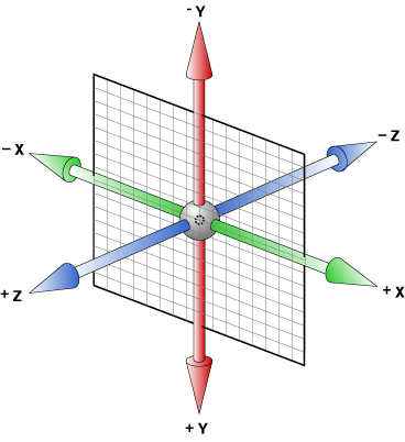
transform: rotate3d (1, -1, 0, 60deg);
/* x axis, y axis, z axis, rotation degree */
}