Bert Bos |
New typography for Web applications

New typography for Web applications
●
●
●
●
●
●
●
●
●
●
●
●
●
●
●
●
●
●
●
●
●
●
●
●
●
●
●
●
●
●
●
●
Latest developments for CSS level 3 in W3C
Bert Bos (W3C) <bert@w3.org>
Presented at:
University of Groningen
Groningen, Netherlands
April 14, 2011
Where I work
●
●
●
●
●
●
●
●
●
●
●
●
●
●
●
●
●
●
●
●
●
●
●
●
●
●
●
●
●
●
●
●
W3C (World Wide Web Consortium) is a Standards
Organization organized as a Consortium
Its standards are called W3C Recommendations
They are made by Working Groups
W3C team
●
●
●
●
●
●
●
●
●
●
●
●
●
●
●
●
●
●
●
●
●
●
●
●
●
●
●
●
●
●
●
●
- 65
- Hosts
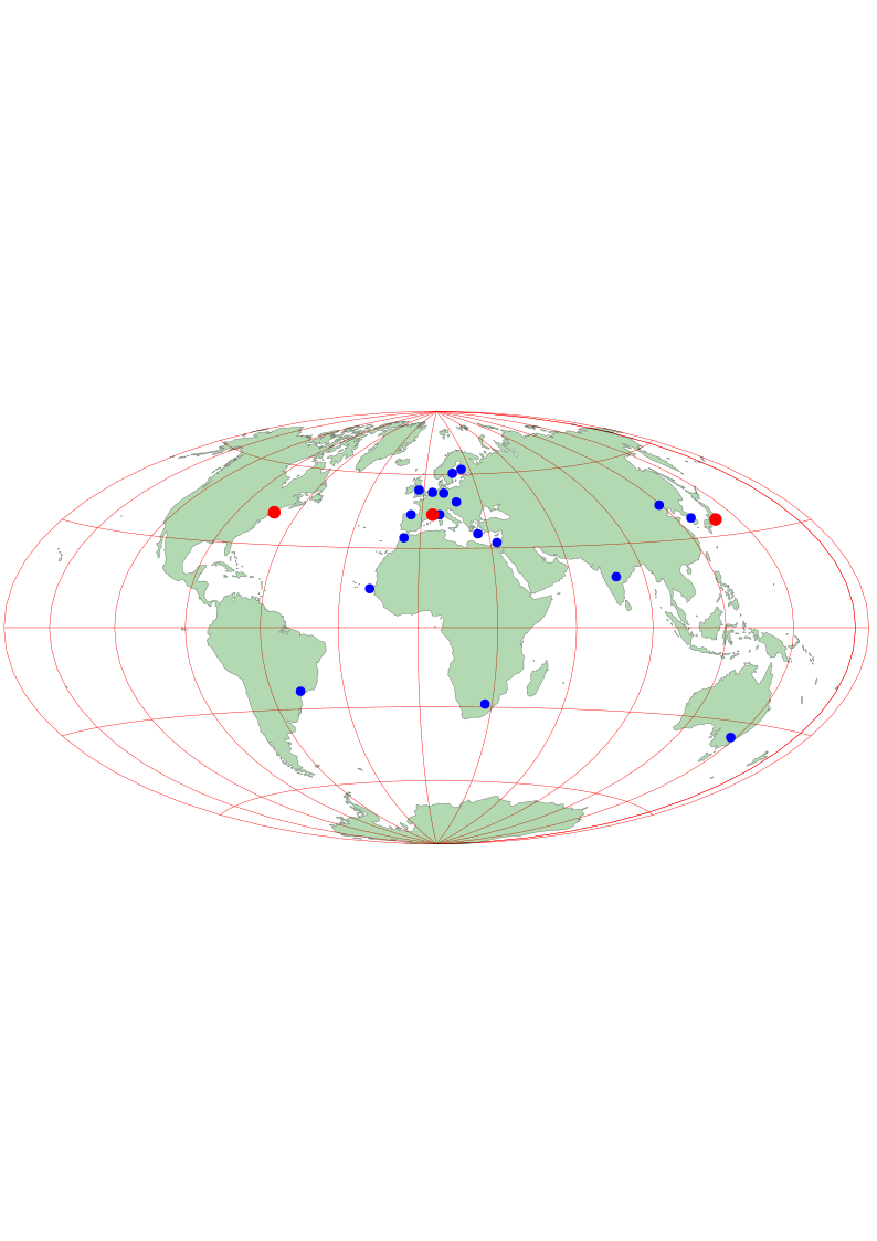
- France – Sophia-Antipolis (ERCIM) ← me 43.617221° 7.068066°
- USA – Cambridge, MA (MIT)
- Japan – Tokyo (Keio Univ.)
- … and colleagues all over the world
- Technical, administrative/management, systems support
W3C offices
●
●
●
●
●
●
●
●
●
●
●
●
●
●
●
●
●
●
●
●
●
●
●
●
●
●
●
●
●
●
●
●

- 18
- Europe: Amsterdam, Berlin, Budapest,
Gijón, Heraklion (Greece), Oxford, Pisa,
Stockholm, Tampere (Finland); Australia:
Canberra; S. America: São Paulo;
Asia: Beijing, New-Delhi, Tel-Aviv, Daejeon
(South Korea); Africa: Rabat, Dakar,
Pretoria
- Member relations, translations, seminars…
W3C members
●
●
●
●
●
●
●
●
●
●
●
●
●
●
●
●
●
●
●
●
●
●
●
●
●
●
●
●
●
●
●
●
- ± 350
- Companies
- computer, telecom, documents, finance,
healthcare…
- Universities
- Research laboratories
- Government departments
- …
Public
●
●
●
●
●
●
●
●
●
●
●
●
●
●
●
●
●
●
●
●
●
●
●
●
●
●
●
●
●
●
●
●
- Mailing lists
- Workshops, seminars, tutorials…
- Web site
W3C is a forum for users and implementers, as well as a source
of information
Working Groups, etc.
●
●
●
●
●
●
●
●
●
●
●
●
●
●
●
●
●
●
●
●
●
●
●
●
●
●
●
●
●
●
●
●
- Workshops
- Incubator Groups
- Working Groups
- HTML WG
- CSS WG ← me
- XML Core WG
- … ±40 more
- Interest Groups
- Coordination Groups
Liaisons
●
●
●
●
●
●
●
●
●
●
●
●
●
●
●
●
●
●
●
●
●
●
●
●
●
●
●
●
●
●
●
●
IETF, ISO, Open Mobile Alliance, ICTSB (European board of ICT
standards organizations), ETSI, etc.
Copyrights & patents
●
●
●
●
●
●
●
●
●
●
●
●
●
●
●
●
●
●
●
●
●
●
●
●
●
●
●
●
●
●
●
●
Copyright:
- Specifications – free to copy, not allowed to modify
- Software – Open Source (free to copy and
modify)
Patents:
- Royalty Free…
- … as far as in our power
Vision and principles
●
●
●
●
●
●
●
●
●
●
●
●
●
●
●
●
●
●
●
●
●
●
●
●
●
●
●
●
●
●
●
●
- For all (a11y,
i18n)
- On everything (devices)
- Semantic Web (re-usable)
- Trust (privacy, security)
- Symmetric (read & write)
- Maintainable, durable, stable
- Modular, extensible
- Easy to learn, to implement
- Efficient, robust
- Backward compatible
- …
Testing vs flexibility
●
●
●
●
●
●
●
●
●
●
●
●
●
●
●
●
●
●
●
●
●
●
●
●
●
●
●
●
●
●
●
●
Many implementations
⇒ difficult to change
No implementations
⇒ not sure the specification works
Usability challenges
●
●
●
●
●
●
●
●
●
●
●
●
●
●
●
●
●
●
●
●
●
●
●
●
●
●
●
●
●
●
●
●
Often two solution (“80-20”), e.g,:
- CSS vs XSL
- HTML (+ microformats) vs RDF
- Media Queries vs server-side adaptation
- HTML's
<audio>/<audio> vs SMIL
But still difficult questions…
Backgrounds level 3
●
●
●
●
●
●
●
●
●
●
●
●
●
●
●
●
●
●
●
●
●
●
●
●
●
●
●
●
●
●
●
●
From the demo:
p {
  background-image: url(CSS-logo1s), url(sea);
  background-size: 2em auto, 100% 100%;
  background-position: bottom right, 0 0;
  background-repeat: no-repeat, no-repeat
}
Borders level 3
●
●
●
●
●
●
●
●
●
●
●
●
●
●
●
●
●
●
●
●
●
●
●
●
●
●
●
●
●
●
●
●
From the demo:
span {
  border: double orange 1em;
  border-image: url(border.png) 27 round stretch;
}

Not stable
●
●
●
●
●
●
●
●
●
●
●
●
●
●
●
●
●
●
●
●
●
●
●
●
●
●
●
●
●
●
●
●
Tables, Grid
Layout, Positioning, Generated & Replaced
Content, Image Values, 3D
Transformations, Lists, Animations…
(Apart from the properties that were already in level 2, of
course)
Grid – history (1/2)
●
●
●
●
●
●
●
●
●
●
●
●
●
●
●
●
●
●
●
●
●
●
●
●
●
●
●
●
●
●
●
●
1996: idea to flow text into a 2D template: “frame-based
layout” (nothing to do with Netscape's FRAME
element)
1998: too advanced for browsers; compromise is “absolute
positioning”
div { position: absolute;
  top: 100px; left: 25px }
Grid – history (2/2)
●
●
●
●
●
●
●
●
●
●
●
●
●
●
●
●
●
●
●
●
●
●
●
●
●
●
●
●
●
●
●
●
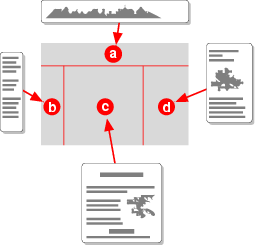
Now: renewed interest. New name: “grid
layout” [demo]
body {display: "a b"
               "c d"}
div {position: b}
(Syntax may change)
Regions: connected flows
●
●
●
●
●
●
●
●
●
●
●
●
●
●
●
●
●
●
●
●
●
●
●
●
●
●
●
●
●
●
●
●
div {
  display:
    "@@..ff...." / 3.6em
    ".aa..gg..." / 3.6em
    "..bb..hh.." / 3.6em
    "...cc..ii." / 3.6em
    "....dd..jj" / 3.6em
    ".........." / 0.6em
    "eeee..kkkk" / auto;
  chains: @ a b c d e, f g h i j k }
(
Regions, very early work)
Regions: shapes
●
●
●
●
●
●
●
●
●
●
●
●
●
●
●
●
●
●
●
●
●
●
●
●
●
●
●
●
●
●
●
●
Shape text inside a path:
div {
  wrap-shape:
   polygon(...) }
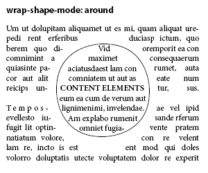
Shape a floating image:
img {
  float: left;
  wrap-shape-image: attr(src);
}
The transparent parts implicitly define a shape.
Grid future
●
●
●
●
●
●
●
●
●
●
●
●
●
●
●
●
●
●
●
●
●
●
●
●
●
●
●
●
●
●
●
●
In development:
- Grid Positioning
- Grid Layout
- Template Layout
- Flexible Box Layout
Merge from 4 to 1? 2?