Advanced layout in CSS
▸ ▸ ▸ ▸ ▸ ▸ ▸ ▸ ▸ ▸ ▸ ▸ ▸ ▸ ▸ ▸ ▸ ▸
▸ ▸ ▸ ▸ ▸ ▸
▸ ▸ ▸

Bert Bos | Advanced layout in
CSS

From level 2 to level 3, experimental new
layout features in CSS
Bert Bos (W3C)
Magyarországi Web Konferencia 2008
Budapest, April 26, 2008
About CSS, W3C & me
▸ ▸ ▸ ▸ ▸ ▸ ▸ ▸ ▸ ▸ ▸ ▸ ▸ ▸ ▸ ▸ ▸ ▸
▸ ▸ ▸ ▸ ▸ ▸
▸ ▸ ▸
- CSS – Cascading Style Sheets
- level 1 (1996)
- level 2 (1998) [revision under way]
- level 3 (in development)
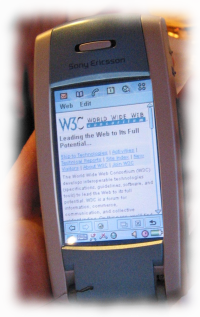
Problem 1: screen size
▸ ▸ ▸
▸ ▸
▸ ▸ ▸
▸ ▸ ▸ ▸ ▸ ▸ ▸ ▸ ▸ ▸ ▸ ▸ ▸ ▸ ▸
▸ ▸ ▸ ▸
- Screens get bigger
- Use more columns
- But not all screens (mobile phone…)
- Screen ≠ window
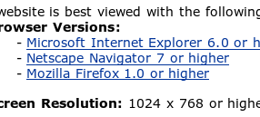
“Best viewed with…”?
Problem 2: CSS level 2
▸ ▸ ▸
▸ ▸
▸ ▸ ▸ ▸ ▸ ▸ ▸ ▸ ▸ ▸ ▸ ▸ ▸
▸ ▸ ▸ ▸ ▸ ▸
▸ ▸ ▸
- CSS level 2 designed for one column
- … some floats…
- … some positioning…
- … some tables…
- … difficult!
Multi-column module (cont'd)
▸ ▸ ▸
▸ ▸
▸ ▸ ▸
▸ ▸ ▸ ▸ ▸ ▸ ▸ ▸ ▸ ▸
▸ ▸ ▸ ▸ ▸ ▸
▸ ▸ ▸
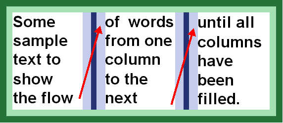
- Fixed # of columns:
div { columns: 2 }
- Variable # of columns:
div { columns: 15em }
- + gaps, rules, spans…
Grid module
▸ ▸ ▸
▸ ▸
▸ ▸ ▸
▸ ▸ ▸ ▸ ▸ ▸ ▸ ▸ ▸ ▸ ▸ ▸ ▸ ▸ ▸
▸ ▸ ▸ ▸
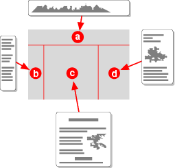
Columns imply a grid
… number the edges of the grid
… and you have a coordinate system
Grid module (cont'd)
▸ ▸ ▸
▸ ▸
▸ ▸ ▸
▸ ▸ ▸ ▸ ▸ ▸ ▸ ▸ ▸ ▸ ▸ ▸ ▸ ▸ ▸
▸ ▸ ▸ ▸
img { float: page bottom left;
      width: 3gr }
(float to bottom left, make as wide as 2 columns + 1 gap)
Template layout module
▸ ▸ ▸
▸ ▸
▸ ▸ ▸
▸ ▸ ▸ ▸ ▸ ▸ ▸ ▸ ▸ ▸ ▸ ▸ ▸ ▸ ▸
▸ ▸ ▸ ▸

 A grid provides:
- alignment (←tables)
- positioning (←absolute positioning)
- consistency (across pages)
Template layout module (cont'd)
▸ ▸ ▸
▸ ▸
▸ ▸ ▸
▸ ▸ ▸ ▸ ▸ ▸ ▸ ▸ ▸ ▸ ▸ ▸ ▸ ▸ ▸ ▸
▸ ▸ ▸
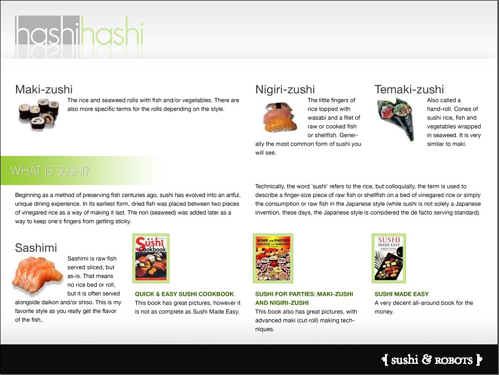
(image © Jina Bolton)
Expressing it in CSS:
- Describe grid, name the parts
- Bind elements to locations
- Assign properties to (parts of) grid
- Relation of size to available space and content
Template layout – describe
▸ ▸ ▸
▸ ▸
▸ ▸ ▸
▸ ▸ ▸ ▸ ▸ ▸ ▸ ▸ ▸ ▸ ▸ ▸ ▸ ▸ ▸
▸ ▸ ▸ ▸
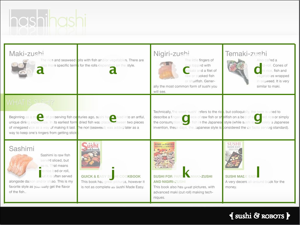
(image © Jina Bolton)
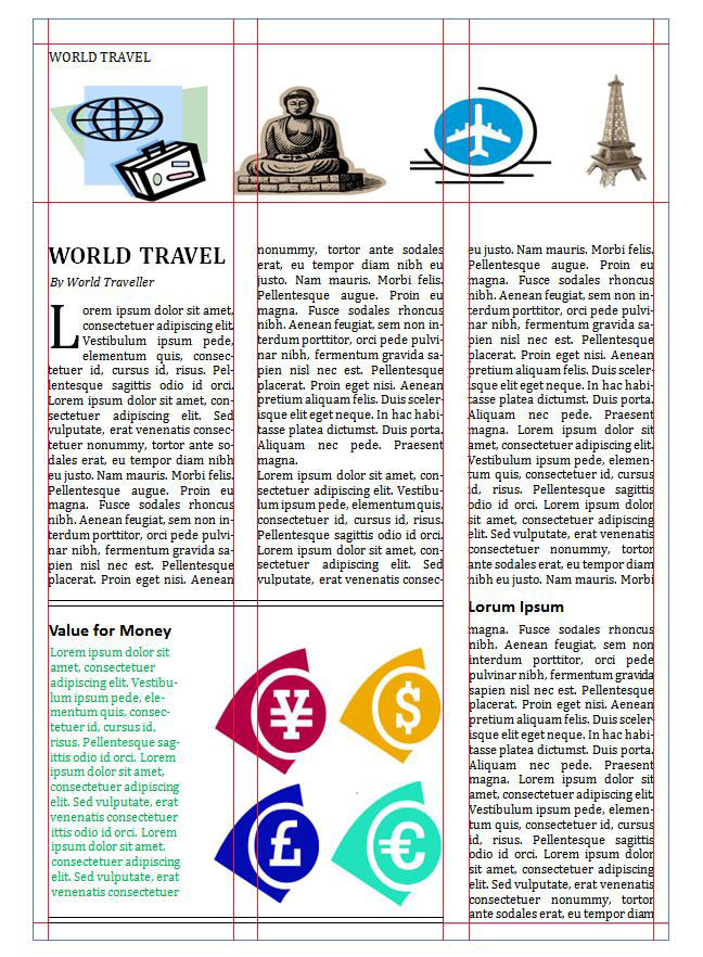
Describe the grid & name the parts:
- 3 rows
- 4 columns
- 3 double-width slots
… let's give them names
Template layout – describe (cont'd)
▸ ▸ ▸
▸ ▸
▸ ▸ ▸
▸ ▸ ▸ ▸ ▸ ▸ ▸ ▸ ▸ ▸ ▸ ▸ ▸ ▸ ▸
▸ ▸ ▸ ▸
(image © Jina Bolton)
… and in CSS:
display:
    "a a c d"
    "e e g g"
    "i j k l"
Template layout – bind
▸ ▸ ▸
▸ ▸
▸ ▸ ▸
▸ ▸ ▸ ▸ ▸ ▸ ▸ ▸ ▸ ▸ ▸ ▸ ▸ ▸ ▸
▸ ▸ ▸ ▸
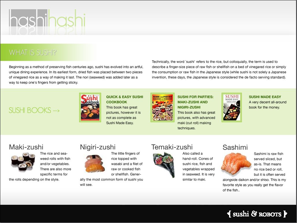
Bind elements to locations
#intro { position: p }
#maki { position: v }
#sashimi { position: y }
...
Template layout – properties
▸ ▸ ▸
▸ ▸
▸ ▸ ▸
▸ ▸ ▸ ▸ ▸ ▸ ▸ ▸ ▸ ▸ ▸ ▸ ▸ ▸ ▸
▸ ▸ ▸ ▸
Properties of slots:
- backgrounds
- content alignment: top, middle, bottom
- size: fixed, fraction, content
- overflow: clip or scroll
:slot(r) { background: green }
 Myself: at
W3C in France
Myself: at
W3C in France
 Screen size
![[image: page viewed on desktop]](senate2.png)
![[image: page viewed on cellphone is very long]](senate3.png)
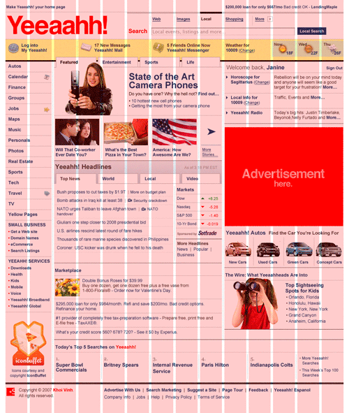
 CSS level 2
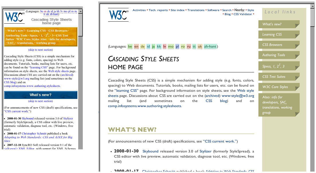
 Multiple styles for same page
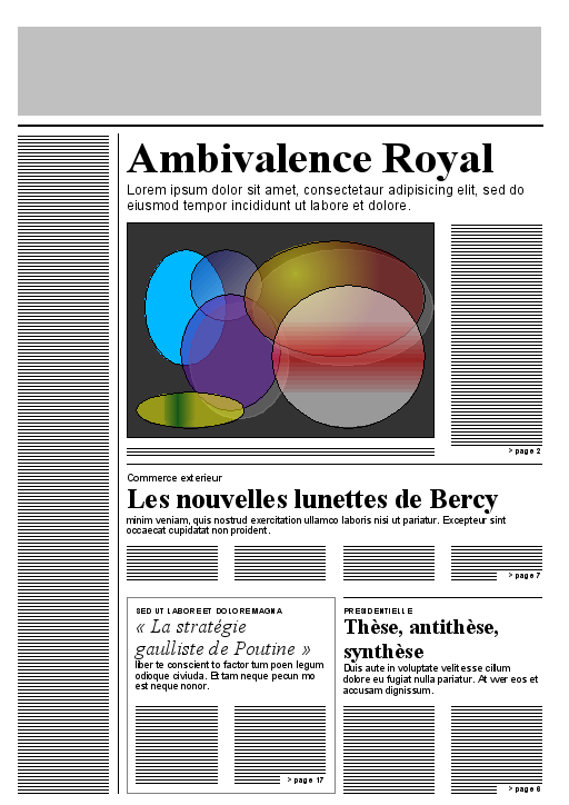
 Columns
 Grids
Grids
This presentation is about how we are trying to deal with the problem of increasing screen size, or rather: of the increasing difference between the biggest and the smallest screens. CSS2 was made when all screens were small (and when browsers weren't capable of dealing with complex documents), but now there are screens that can show much more information at once. And it seems CSS needs to acquire some new features.