jump
input element
attributes
autocomplete attributedirname attributelist attributereadonly attributesize attributerequired attributemultiple attributemaxlength attributepattern attributemin and max attributesstep attributeplaceholder attributeinput element attributesautocomplete attributeUser agents sometimes have features for helping users fill forms in, for example prefilling the user's address based on earlier user input.
The autocomplete attribute
is an enumerated attribute. The
attribute has three states. The on keyword maps to the on state, and the
off keyword maps
to the off state. The attribute
may also be omitted. The missing value default is the
default state.
The off state indicates either that the control's input data is particularly sensitive (for example the activation code for a nuclear weapon); or that it is a value that will never be reused (for example a one-time-key for a bank login) and the user will therefore have to explicitly enter the data each time, instead of being able to rely on the UA to prefill the value for him; or that the document provides its own autocomplete mechanism and does not want the user agent to provide autocompletion values.
Conversely, the on state indicates that the value is not particularly sensitive and the user can expect to be able to rely on his user agent to remember values he has entered for that control.
The default state indicates
that the user agent is to use the autocomplete attribute on the
element's form owner instead. (By default, the
autocomplete attribute of
form elements is in the on state.)
Banks frequently do not want UAs to prefill login information:
<p><label>Account: <input type="text" name="ac" autocomplete="off"></label></p>
<p><label>PIN: <input type="password" name="pin" autocomplete="off"></label></p>
dirname attributeThe dirname attribute, when it
applies, is a form control dirname attribute.
In this example, a form contains a text field and a submission button:
<form action="addcomment.cgi" method=post>
 <p><label>Comment: <input type=text name="comment" dirname="comment.dir" required></label></p>
 <p><button name="mode" type=submit value="add">Post Comment</button></p>
</form>
When the user submits the form, the user agent includes three fields, one called "comment", one called "comment.dir", and one called "mode"; so if the user types "Hello", the submission body might be something like:
comment=Hello&comment.dir=ltr&mode=add
If the user manually switches to a right-to-left writing direction and enters "مرحبًا", the submission body might be something like:
comment=%D9%85%D8%B1%D8%AD%D8%A8%D9%8B%D8%A7&comment.dir=rtl&mode=add
list attributeThe list attribute is used to
identify an element that lists predefined options suggested to the
user.
If present, its value must be the ID of a datalist element in the same
document.
This URL field offers some suggestions.
<label>Homepage: <input name=hp type=url list=hpurls></label>
<datalist id=hpurls>
 <option value="http://www.google.com/" label="Google">
 <option value="http://www.reddit.com/" label="Reddit">
</datalist>
Other URLs from the user's history might show also; this is up to the user agent.
This example demonstrates how to design a form that uses the autocompletion list feature while still degrading usefully in legacy user agents.
If the autocompletion list is merely an aid, and is not
important to the content, then simply using a datalist element with children
option elements is enough. To prevent the
values from being rendered in legacy user agents, they need to be
placed inside the value attribute instead of inline.
<p>
 <label>
  Enter a breed:
  <input type="text" name="breed" list="breeds">
  <datalist id="breeds">
   <option value="Abyssinian">
   <option value="Alpaca">
   <!-- ... -->
  </datalist>
 </label>
</p>
However, if the values need to be shown in legacy UAs, then
fallback content can be placed inside the datalist element, as follows:
<p>
 <label>
  Enter a breed:
  <input type="text" name="breed" list="breeds">
 </label>
 <datalist id="breeds">
  <label>
   or select one from the list:
   <select name="breed">
    <option value=""> (none selected)
    <option>Abyssinian
    <option>Alpaca
    <!-- ... -->
   </select>
  </label>
 </datalist>
</p>
The fallback content will only be shown in UAs that don't
support datalist. The options, on the other
hand, will be detected by all UAs, even though they are not
children of the datalist element.
Note that if an option element used in a datalist is selected, it will be selected by default
by legacy UAs (because it affects the select), but it will not have any effect
on the input element in UAs that support
datalist.
readonly attributeThe readonly attribute is a
boolean attribute that controls
whether or not the user can edit the form control.
The difference between disabled and readonly is that read-only controls are
still focusable, so the user can still select the text and interact
with it, whereas disabled controls are entirely non-interactive.
(For this reason, only text controls can be made read-only: it
wouldn't make sense for checkboxes or buttons, for instances.)
In the following example, the existing product identifiers cannot be modified, but they are still displayed as part of the form, for consistency with the row representing a new product (where the identifier is not yet filled in).
<form action="products.cgi" method="post" enctype="multipart-form-data">
 <table>
  <tr> <th> Product ID <th> Product name <th> Price <th> Action
  <tr>
   <td> <input readonly="readonly" name="1.pid" value="H412">
   <td> <input required="required" name="1.pname" value="Floor lamp Ulke">
   <td> $<input required="required" type="number" min="0" step="0.01" name="1.pprice" value="49.99">
   <td> <button formnovalidate="formnovalidate" name="action" value="delete:1">Delete</button>
  <tr>
   <td> <input readonly="readonly" name="2.pid" value="FG28">
   <td> <input required="required" name="2.pname" value="Table lamp Ulke">
   <td> $<input required="required" type="number" min="0" step="0.01" name="2.pprice" value="24.99">
   <td> <button formnovalidate="formnovalidate" name="action" value="delete:2">Delete</button>
  <tr>
   <td> <input required="required" name="3.pid" value="" pattern="[A-Z0-9]+">
   <td> <input required="required" name="3.pname" value="">
   <td> $<input required="required" type="number" min="0" step="0.01" name="3.pprice" value="">
   <td> <button formnovalidate="formnovalidate" name="action" value="delete:3">Delete</button>
 </table>
 <p> <button formnovalidate="formnovalidate" name="action" value="add">Add</button> </p>
 <p> <button name="action" value="update">Save</button> </p>
</form>
size attributeThe size attribute gives the
number of characters that, in a visual rendering, the user agent is
to allow the user to see while editing the element's value.
The size attribute, if specified, must have a
value that is a valid non-negative integer
greater than zero.
required attributeThe required attribute is a
boolean attribute. When specified,
the element is required.
The following form has two required fields, one for an e-mail address and one for a password. It also has a third field that is only considered valid if the user types the same password in the password field and this third field.
<h1>Create new account</h1>
<form action="/newaccount" method=post
      oninput="up2.setCustomValidity(up2.value != up.value ? 'Passwords do not match.' : '')">
 <p>
  <label for="username">E-mail address:</label>
  <input id="username" type=email required name=un>
 <p>
  <label for="password1">Password:</label>
  <input id="password1" type=password required name=up>
 <p>
  <label for="password2">Confirm password:</label>
  <input id="password2" type=password name=up2>
 <p>
  <input type=submit value="Create account">
</form>
multiple attributeThe multiple attribute is a
boolean attribute that indicates
whether the user is to be allowed to specify more than one
value.
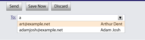
The following extract shows how an e-mail client's "Cc" field could accept multiple e-mail addresses.
<label>Cc: <input type=email multiple name=cc></label>
If the user had, amongst many friends in his user contacts database, two friends "Arthur Dent" (with address "art@example.net") and "Adam Josh" (with address "adamjosh@example.net"), then, after the user has typed "a", the user agent might suggest these two e-mail addresses to the user.
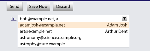
The page could also link in the user's contacts database from the site:
<label>Cc: <input type=email multiple name=cc list=contacts></label>
...
<datalist id="contacts">
 <option value="hedral@damowmow.com">
 <option value="pillar@example.com">
 <option value="astrophy@cute.example">
 <option value="astronomy@science.example.org">
</datalist>
Suppose the user had entered "bob@example.net" into this text
field, and then started typing a second e-mail address starting
with "a". The user agent might show both the two friends mentioned
earlier, as well as the "astrophy" and "astronomy" values given in
the datalist element.
The following extract shows how an e-mail client's "Attachments" field could accept multiple files for upload.
<label>Attachments: <input type=file multiple name=att></label>
maxlength attributeThe maxlength attribute is a
form control
maxlength attribute .
If the input element has a maximum allowed value
length, then the code-unit length of the value of the
element's value attribute must be equal to or less
than the element's maximum allowed value
length.
The following extract shows how a messaging client's text entry could be arbitrarily restricted to a fixed number of characters, thus forcing any conversation through this medium to be terse and discouraging intelligent discourse.
<label>What are you doing? <input name=status maxlength=140></label>
pattern attributeThe pattern attribute specifies
a regular expression against which the control's value, or, when the multiple attribute applies and is set,
the control's values, are to be
checked.
If specified, the attribute's value must match the JavaScript Pattern production. [ECMA262]
When an input element has a pattern attribute specified, authors
should include a title attribute to give a description of the
pattern. User agents may use the contents of this attribute, if it
is present, when informing the user that the pattern is not
matched, or at any other suitable time, such as in a tooltip or
read out by assistive technology when the control gains focus.
For example, the following snippet:
<label> Part number:
 <input pattern="[0-9][A-Z]{3}" name="part"
        title="A part number is a digit followed by three uppercase letters."/>
</label>
...could cause the UA to display an alert such as:
A part number is a digit followed by three uppercase letters.
You cannot submit this form when the field is incorrect.
When a control has a pattern attribute, the title attribute, if used, must describe the
pattern. Additional information could also be included, so long as
it assists the user in filling in the control. Otherwise, assistive
technology would be impaired.
For instance, if the title attribute contained the caption of the control, assistive technology could end up saying something like The text you have entered does not match the required pattern. Birthday, which is not useful.
UAs may still show the title in non-error situations (for example,
as a tooltip when hovering over the control), so authors should be
careful not to word titles as if an error has necessarily
occurred.
min and max attributesThe min and max
attributes indicate the allowed range of values for the
element.
The max attribute's value (the maximum) must not be less than the
min attribute's value (its minimum).
An element has range limitations if it has a defined minimum or a defined maximum.
The following date control limits input to dates that are before the 1980s:
<input name=bday type=date max="1979-12-31">
The following number control limits input to whole numbers greater than zero:
<input name=quantity required="" type="number" min="1" value="1">
step attributeThe step attribute indicates the
granularity that is expected (and required) of the value, by limiting the allowed
values.
The step attribute, if specified, must either have
a value that is a valid floating-point number
that parses
to a number that is greater than zero, or must have a value that is
an ASCII case-insensitive match for
the string "any".
The following range control only accepts values in the range 0..1, and allows 256 steps in that range:
<input name=opacity type=range min=0 max=1 step=0.00392156863>
The following control allows any time in the day to be selected, with any accuracy (e.g. thousandth-of-a-second accuracy or more):
<input name=favtime type=time step=any>
Normally, time controls are limited to an accuracy of one minute.
placeholder attributeThe placeholder attribute
represents a short hint (a word or short phrase) intended
to aid the user with data entry when the control has no value. A
hint could be a sample value or a brief description of the expected
format. The attribute, if specified, must have a value that
contains no "LF" (U+000A) or "CR" (U+000D) characters.
The placeholder attribute should not be
used as an alternative to a label. For a longer hint or other advisory
text, the title attribute is more appropriate.
These mechanisms are very similar but subtly
different: the hint given by the control's label is shown at all times; the short
hint given in the placeholder attribute is shown
before the user enters a value; and the hint in the title attribute is shown when the user
requests further help.
Here is an example of a mail configuration user interface that
uses the placeholder attribute:
<fieldset>
 <legend>Mail Account</legend>
 <p><label>Name: <input type="text" name="fullname" placeholder="John Ratzenberger"></label></p>
 <p><label>Address: <input type="email" name="address" placeholder="john@example.net"></label></p>
 <p><label>Password: <input type="password" name="password"></label></p>
 <p><label>Description: <input type="text" name="desc" placeholder="My Email Account"></label></p>
</fieldset>
In situations where the control's content has one directionality but the placeholder needs to have a different directionality, Unicode's bidirectional-algorithm formatting characters can be used in the attribute value:
<input name=t1 type=tel placeholder="‫ رقم الهاتف 1 ‮"> <input name=t2 type=tel placeholder="‫ رقم الهاتف 2 ‮">
For slightly more clarity, here's the same example using numeric character references instead of inline Arabic:
<input name=t1 type=tel placeholder="‫رقم الهاتف 1‮"> <input name=t2 type=tel placeholder="‫رقم الهاتف 2‮">