Contents
This chapter describes the visual rendering model, how user agents process the document tree for visual media.
In the visual rendering model, each element in the document tree generates zero or more rectangular boxes that are then rendered. Some boxes belong to the "normal flow" of boxes while others are "outside the flow". A box in the normal flow has a preceding box in the normal flow (unless it is the first box) and a following box in the normal flow (unless it is the last box).
Most boxes establish a containing block whose edges serve as references for the layout of descendant boxes (see the next chapter for details). in the CSS visual rendering model, a box establishes reference edges for its descendants and is itself positioned with respect to its containing block. A box is not confined by its containing block -- it is positioned with respect to its edges and may even overflow those edges. When a box is floated inside a containing block, layout of boxes in the containing block is also affected by the edges of those floating boxes.
The box model describes the generation of boxes. The layout of these boxes is governed by:
The properties defined in this chapter apply to both continuous media and paged media. However, the meanings of the margin properties vary when applied to paged media (see the page model for details).
The next chapter supplies the details of the visual rendering model. However, the model does not specify all aspects of formatting (e.g., it does not specify a letter-spacing algorithm). Conforming user agents may behave differently for those formatting issues not covered by this specification.
User agents for continuous media generally offer users a viewport (a window or other viewing area on the screen) through which users consult a document. User agents may change the document's layout when the viewport is resized (see the initial containing block). When the viewport is smaller than the document's containing block, the user agent should offer a scrolling mechanism. There is at most one viewport per canvas, but user agents may offer users several views of a document.
The CSS box model describes how rectangular boxes are generated for elements in the document tree. The page box is a special kind of box that is described in detail on the section on paged media.
| Property name: | 'display' |
|---|---|
| Value: | inline | block | list-item | none | run-in | compact | table | inline-table| table-row-group | table-column-group | table-header-group | table-footer-group | table-row | table-cell | table-caption | inherit |
| Initial: | inline |
| Applies to: | all elements |
| Inherited: | no |
| Percentage values: | N/A |
| Media groups: | visual |
Block-level elements are those elements of the document language that, by default, are formatted visually as blocks (e.g., paragraphs). Several values of the 'display' property make an element block-level: 'block', 'list-item', 'compact' and 'run-in' (part of the time; see compact and run-in boxes), and 'table'.
Most block-level elements generate block-level boxes, but some elements also produce inline anonymous boxes.
Inline elements are those elements of the document language that do not cause paragraph breaks (e.g., pieces of text, inline images, etc.). Several values of the 'display' property make an element inline: 'inline', 'inline-table', 'compact' and 'run-in' (part of the time; see compact and run-in boxes). Inline elements generate inline boxes.
A block-level box acts as a containing block for its descendant boxes, which are either block-level boxes or inline boxes (but not both). Sibling block-level boxes participate in a block formatting context.
An inline box participates in an inline formatting context with its siblings and children.
The values of this property have the following meanings:
Please note that a display of 'none' does not create an invisible box; it creates no box at all. CSS includes mechanisms that enable an element to generate boxes in the rendering structure that affect formatting but are not visible themselves. Please consult the section on visibility for details.
Note that although the initial value of 'display' is 'inline', the user agent's default style sheet may override this value for each element of the document language. See the sample style sheet for HTML 4.0 in the appendix.
Here are some examples of the 'display' property:
  P   { display: block }
  EM  { display: inline }
  LI  { display: list-item }
  IMG { display: none }      /* Don't display images */
Conforming HTML user agents may skip the 'display' property when specified in author and user style sheets but must specify a value for it in the default style sheet.
A compact box behaves as follows:
The compact box is positioned in the margin as follows: it is outside (to the left or right) of the first line box of the block, but it affects the calculation of that line box's height. The 'vertical-align' property of the compact box determines the vertical position of the compact box relative to that line box. The horizontal position of the compact box is always in the margin of the block-level box, as far to the outside as possible.
The following example illustrates a compact box.
<!DOCTYPE HTML PUBLIC "-//W3C//DTD HTML 4.0 Transitional//EN">
<HTML>
<HEAD>
<TITLE>A compact box example</TITLE>
<STYLE type="text/css">
  DT {display: compact}
  DD {margin-left: 4em}
</STYLE>
</HEAD>
<BODY>
<DL>
  <DT>Short
    <DD><P>Description goes here.
  <DT>too long for the margin
     <DD><P>Description goes here.
</DL>
</BODY>
</HTML>
This example might be rendered as:
short    Description goes here

too long for the margin
         Description goes here
A run-in box behaves as follows:
A 'run-in' box, on the other hand, is useful for run-in headers, as in this example:
<HTML>
<HEAD>
<TITLE>A run-in box example</TITLE>
<STYLE type="text/css">
  H3 {display: run-in}
  H3:after {content: ". "}
</STYLE>
</HEAD>
<BODY>
<H3>A run-in heading</H3>
<P>And a paragraph of text that
follows it.
</BODY>
</HTML>
This example might be rendered as:
A run-in heading. And a
paragraph of text that
follows it.
Properties apply to run-in and compact boxes based on their final status (inline or block-level). For example, the 'white-space' property only applies if the box behaves like a block-level box.
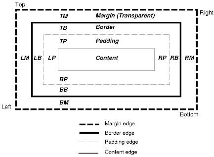
Each box has a content area (e.g., text, an image, etc.) and optional surrounding padding, border, and margin areas; the size of each area is specified by properties defined in the next chapter. The following diagram shows how these areas relate and the terminology used to refer to pieces of margin, border, and padding:
The padding, border, and padding can be broken down into left, right, top, and bottom segments (e.g., in the diagram, "LM" for left margin, "RM" for right margin, "TM" for top margin, "BM" for bottom margin, etc.).
The perimeter of each of the four areas (content, padding, border, and margin) is called an "edge", so each box has four edges:
Each edge may be broken down into a left, right, top, and bottom edge.
The dimensions of the content area of a box -- the content width and content height -- may be established in one of several ways:
The box width (resp., box height) is given by the sum of the content width (resp., content height), the padding, the border, and the margin.
If an inline element generates boxes over several lines (i.e., for more than one line box), the margin, border, and padding properties do not affect line height calculations (see the section on line height calculations for details). However, margin, border, and padding areas remain visible.
Note that there are no properties to set the color of margins and padding; margins are always transparent and padding areas always use the background of the element itself.
    <HTML>
    <HEAD>
    <STYLE type="text/css">
      UL {
        background: orange;
        margin: 12px 12px 12px 12px;
        padding: 3px 3px 3px 3px;
                                     /* No borders set */
      }
      LI {
        color: white;                /* text color is white */
        background: blue;            /* Content, padding will be blue */
        margin: 12px 12px 12px 12px;
        padding: 12px 0px 12px 12px; /* Note 0px padding right */
        list-style: none             /* no glyphs before a list item */
                                     /* No borders set */
      }
      LI.withborder {
        border-style: dashed;
        border-width: medium;        /* sets border width on all sides */
        border-color: green;
      }
    </STYLE>
    </HEAD>
    <BODY>
    <UL>
      <LI>First element of list
      <LI class="withborder">Second element of list is longer
           to illustrate wrapping.
    </UL>
    </BODY>
    </HTML>
results in a document tree with (among other relationships) a UL element that has two LI children.
The first of the following diagrams illustrates what this example would produce. The second illustrates the relationship between the margins, padding, and borders of the UL elements and those of its children LI elements.
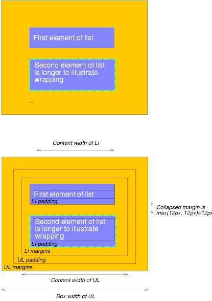
Note that:
In CSS2, a box may be laid out according to three positioning schemes
The primary difference between a floating box and one that is absolutely positioned is that absolute positioning has no impact on the flow of later siblings; later siblings are laid out as though their absolutely positioned sister did not exist at all. Later siblings of floating boxes flow with respect to the final position of the floating box.
The 'position', and 'float' properties determine which CSS2 positioning algorithms are used to calculate the coordinates of a box.
| Property name: | 'position' |
|---|---|
| Value: | normal | relative | absolute | fixed | inherit |
| Initial: | normal |
| Applies to: | elements that generate absolutely positioned and floated boxes |
| Inherited: | no |
| Percentage values: | N/A |
| Media groups: | visual |
The values of this property have the following meanings:
Note. The value 'normal' causes some user agents to skip the 'left' and 'top' properties. To ensure that values of 'left' and 'top' are taken into account, authors should explicitly set the value of the 'position' property to 'relative'.
The position of an relatively or absolutely (including fixed) positioned boxes is established by four properties:
| Property name: | 'top' |
|---|---|
| Value: | <length> | <percentage> | auto | inherit |
| Initial: | auto |
| Applies to: | all elements |
| Inherited: | no |
| Percentage values: | refer to height of containing block |
| Media groups: | visual |
This property specifies how far a box's top content edge is offset below the top edge of the box's containing block.
| Property name: | 'right' |
|---|---|
| Value: | <length> | <percentage> | auto | inherit |
| Initial: | auto |
| Applies to: | all elements |
| Inherited: | no |
| Percentage values: | refer to width of containing block |
| Media groups: | visual |
This property specifies how far a box's right content edge is offset to the left of the right edge of the box's containing block.
| Property name: | 'bottom' |
|---|---|
| Value: | <length> | <percentage> | auto | inherit |
| Initial: | auto |
| Applies to: | all elements |
| Inherited: | no |
| Percentage values: | refer to height of containing block |
| Media groups: | visual |
This property specifies how far a box's bottom content edge is offset above the bottom of the box's containing block.
| Property name: | 'left' |
|---|---|
| Value: | <length> | <percentage> | auto | inherit |
| Initial: | auto |
| Applies to: | all elements |
| Inherited: | no |
| Percentage values: | refer to width of containing block |
| Media groups: | visual |
This property specifies how far a box's left content edge is offset to the right of the left edge of the box's containing block.
The values for the four properties have the following meanings:
For absolutely positioned boxes, the offsets are with respect to the box's containing block. For relatively positioned boxes, the offsets are with respect to the outer edges of the box itself before the offset is applied.
For absolutely positioned boxes, the values of the 'left', 'right', 'top', and 'bottom' properties replace the roles of the corresponding margin properties (i.e., absolutely positioned boxes do not have margins but do have padding and borders).
For more information about the width and height of boxes, please consult the sections on box width calculations and box height calculations respectively.
Boxes in the normal flow belong to a formatting context, which may be block or inline, but not both simultaneously.
Block-level boxes participate in an block formatting context.
Inline boxes participate in an inline formatting context.
Block-level elements whose rendered content contains text that is not the content of an inline element have anonymous children in the document tree. These anonymous elements inherit property values (colors, fonts, etc.). They generate boxes that contain chunks of text as content. By default, anonymous boxes act like inline boxes. However, they may act like block-level boxes if context demands (e.g., an inline run-in box that behaves like a block-level box). Decisions about the construction of anonymous inline boxes depend on many factors (language, hyphenation, etc.) and lie outside the scope of this specification.
In a block formatting context, boxes are laid out one after the other, vertically. The vertical distance between two sibling boxes is determined by the 'margin' properties. Vertical margins between adjacent block-level boxes collapse.
To lay out boxes horizontally in CSS2, authors may declare them to be inline, or position them (floating or absolute positioning).
For information about page breaks in paged media, please consult the section on allowed page breaks.
In an inline formatting context, boxes are laid out horizontally, one after the other. Horizontal margins, borders, and padding are respected between these boxes. They may be aligned vertically in different ways: their bottoms or tops may be aligned, or the baselines of text within them may be aligned. The rectangular area that contains the boxes that form a line is called a line box.
The width of a line box is determined by a containing block. The height of a line box is determined by the rules given in the section on line height calculations. A line box is always tall enough for all of the boxes it contains. However, it may be taller than the tallest box it contains (if, for example, boxes are aligned so that baselines line up). When the height of a box B is less than the height of the line box containing it, the vertical alignment of B within the line box is determined by the 'vertical-align' property.
When several inline boxes cannot fit within a single line box, they are distributed among two or more vertically-stacked line boxes. Thus, a paragraph is a vertical stack of line boxes. Line boxes are stacked with no vertical separation and they never overlap.
Line boxes in the same inline formatting context generally have the same width (that of the containing block) but may vary in width if available horizontal space is reduced due to floats. Line boxes in the same inline formatting context generally vary in height (e.g., one line might contain an image while the others contain only text). When a box is less wide than the width of the line box containing it, its horizontal alignment within the line box is determined by the 'text-align' property. When a box is wider than a line box, it may be split into several boxes and these boxes distributed across several line boxes. When a box is split, margins, borders, and padding have no visual effect at the end of the first line box or at the beginning of the next line box.
For example, the following paragraph (created by the HTML block-level element P) contains anonymous text interspersed with the elements EM and STRONG:
  <P>Several <EM>emphasized words</EM> appear
  <STRONG>in this</STRONG> sentence, dear.</P>
In terms of the document tree, P has five children:
To format the paragraph, the user agent creates a box for each child and flows the boxes into line boxes. Since the parent box in normal flow acts as the containing block for an inline box, the width of the P box determines the width of these line boxes. If the width of P is sufficient, all the inline boxes will fit into a single line box:
  Several emphasized words appear
  in this sentence, dear.
If the boxes do not fit within a single line box, they will be split up and distributed across several line boxes. The previous paragraph might be split as follows:
  Several emphasized
  words appear in this
  sentence, dear.
or like this:
Several emphasized words appear in this sentence, dear.
In the previous example, the EM box was split into two EM boxes (call them "split1" and "split2"). Therefore, margins, borders, padding, or text decorations have no visible effect after split1 or before split2.
Consider the following example:
  <HTML>
  <HEAD>
  <TITLE>Example of inline flow on several lines</TITLE>
  <STYLE type="text/css">
  EM {
    padding: 2px ;
    margin: 1em ;
    border-width: medium;
    border-style: dashed;
    line-height: 2.4em;
  }
  </STYLE>
  </HEAD>
  <BODY>
  <P>Several <EM>emphasized words</EM> appear here.</P>
  </BODY>
  </HTML>
Depending on the width of the P, the boxes may be distributed as follows:
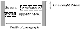
Note that with a small line height, the padding and borders around text in different lines may overlap.
| Property name: | 'direction' |
|---|---|
| Value: | ltr | rtl | ltr-override | rtl-override | inherit |
| Initial: | ltr |
| Applies to: | all elements |
| Inherited: | yes |
| Percentage values: | N/A |
| Media groups: | visual |
This property determines whether the direction of flow in an inline formatting context is left-to-right or right-to-left. It also specifies the direction of table layout.
Values have the following meanings:
For a left-to-right inline formatting context, the horizontal distance between the right side of a box and the left side of the following box (or right side of the parent box if no following box exists) is determined by the source element's 'margin' properties. For right-to-left flow, the horizontal distance between the left side of a box and the right side of the preceding box (or left side of the parent box is no preceding box exists) is similarly determined by the source element's 'margin' properties.
Once a box has been assigned a position according to the normal flow, it may be shifted relative to this position. This is called relative positioning. Offsetting a box in this way has no effect on the following box: it is positioned as if the preceding box were not offset and it is not repositioned after the offset is applied. This implies that relative positioning may cause boxes to overlap.
Relatively positioned boxes keep their normal flow size, including line breaks and the space originally reserved for them. A relatively positioned box establishes a new containing block for descendant boxes.
A relatively positioned box is generated when the 'position' property for an element has the value 'relative'. The offset is specified by the 'top', 'bottom', 'left', and 'right' properties.
Dynamic movement of relatively positioned boxes can produce animation effects in scripting environments (see the 'visibility' property). Relative positioning may also be used as a general form of superscripting and subscripting except that line height is not automatically adjusted to take the positioning into consideration. See the description of line height calculations for more information.
Examples of relative positioning are provided in the section comparing normal, relative, floating, and absolute positioning.
A floating box has two interesting qualities:
| Property name: | 'float' |
|---|---|
| Value: | left | right | none | inherit |
| Initial: | none |
| Applies to: | elements that are not positioned absolutely |
| Inherited: | no |
| Percentage values: | N/A |
| Media groups: | visual |
This property specifies whether a box should float to the left, right, or not at all. It may be set for elements that generate boxes that are not positioned absolutely (including fixed boxes). A floating box is given a position and height according to the normal flow (the computed value of the 'width' is '0' unless assigned explicitly), then taken out of the flow and shifted to the left or right until its outer edge is flush with the current left or right edge (which may be established by a containing block or another floated box).
User agents take the outer edge of a floating box into account when positioning subsequent boxes; the outer edge of a float becomes the current edge for flowed or floated boxes to the left or right side. The margins of floating boxes never collapse with margins of adjacent boxes.
The values of this property have the following meanings:
The following rule positions all IMG elements with class="icon" along the left side of the parent element:
  IMG.icon {
    float: left;
    margin-left: 0;
  }
The following HTML source:
  <HTML>
  <HEAD>
  <STYLE type="text/css">
    IMG { float: left }
    BODY, P, IMG { margin: 2em }
  </STYLE>
  </HEAD>
  <BODY>
    <P>
      <IMG src=img.gif alt="This image will illustrate floats">
      Some sample text that has no other...
  </BODY>
  </HTML>
might be formatted as:
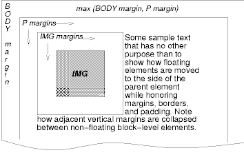
Note that the margin of the P element encloses the floating IMG element and that the vertical margins do not collapse.
| Property name: | 'clear' |
|---|---|
| Value: | none | left | right | both | inherit |
| Initial: | none |
| Applies to: | block-level elements |
| Inherited: | no |
| Percentage values: | N/A |
| Media groups: | visual |
When set for an element generating a box B, this property indicates which sides of B may not be adjacent to a floating box. This property may only be specified for block-level elements. For compact and run-in boxes, this property applies to the final block-level box to which the compact or run-in box belongs.
Values have the following meanings:
The following style rule means that no H1 element may have a floating element to its left; this means that H1 elements will be positioned below any floating box.
H1 { clear: left }
A floating box B is subject to several constraints:
Please consult the section on floating constraints for additional constraints.
Like other boxes, an absolutely positioned element is positioned with respect to a containing block. It also establishes a new containing block for descendant boxes. However, the contents of an absolutely positioned element do not flow around any other boxes. They may or may not obscure the contents of another box, depending on the z-order of the overlapping boxes.
Fixed positioning is a variant of absolute positioning. The only difference is that for a fixed positioned box, the containing block is established by the viewport.
For continuous media, fixed boxes do not move when the document is scrolled. In this respect, they are similar to fixed background images.
For paged media, boxes with fixed positions are repeated on every page. This is useful for placing, for instance, a signature at the bottom of each page.
Authors may use fixed positioning to create frame-like presentations. Consider the following frame layout:
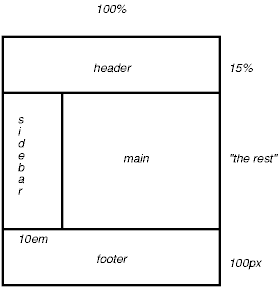
This might be achieved with the following HTML document and style rules:
  <HTML>
  <HEAD>
  <TITLE>A frame document with CSS2</TITLE>
  <STYLE type="text/css">
    #header {
       position: fixed;
       width: 100%;
       height: 15%;
       top: 0;
       right: 0;
       bottom: auto;
       left: 0;
    }
    #sidebar {
       position: fixed;
       width: 10em;
       height: auto;
       top: 15%;
       right: auto;
       bottom: 100px;
       left: 0;
    }
    #main {
       position: fixed;
       width: auto;
       height: auto;
       top: 15%;
       right: 0;
       bottom: 100px;
       left: 10em;
    }
    #footer {
       position: fixed;
       width: 100%;
       height: 100px;
       top: auto;
       right: 0;
       bottom: 0;
       left: 0;
    }
  </STYLE>
  </HEAD>
  <BODY>
    <DIV id="header"> ...  </DIV>
    <DIV id="sidebar"> ...  </DIV>
    <DIV id="main"> ...  </DIV>
    <DIV id="footer"> ...  </DIV>
  </BODY>
  </HTML>
When specified for the same elements, the three properties that affect box generation and layout -- 'display', 'position', and 'float' -- interact according to the following precedences (highest to lowest):
Note on scripting and layout. CSS2 does not specify layout behavior when values for these properties are changed by scripts. For example, what happens when an element having 'width: auto' is repositioned? Do the contents reflow, or do they maintain their original formatting? The answer is outside the scope of this document, and such behavior is likely to differ in initial implementations of CSS2.
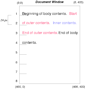
To illustrate the relationship between normal flow, relative positioning, floats, and absolute positioning, we provide a series of examples based on the following HTML fragment:
<HTML>
<HEAD>
<TITLE>Comparison of positioning schemes</TITLE>
</HEAD>
<BODY>
  <P>Beginning of body contents.
  <SPAN id="outer"> Start of outer contents.
  <SPAN id="inner"> Inner contents.</SPAN>
  End of outer contents.</SPAN>
  End of body contents.
  </P>
</BODY>
</HTML>
The final positions of boxes generated by the outer and inner elements vary in each example. In each illustration, the numbers to the left of the illustration indicate the normal flow position of the double-spaced (for clarity) lines.
Consider the following CSS declarations for outer and inner that don't alter the normal flow of boxes:
  #outer { color: red }
  #inner { color: blue }
This results in something like the following:
To see the effect of relative positioning, consider the following CSS rules:
  BODY { line-height: 200% }
  #outer { position: relative; top: -12px; color: red }
  #inner { position: relative; top: 12px; color: blue }
First, the outer text is flowed into its normal flow position and dimensions at the end of line 1. Then, the entire box (distributed over three lines) is shifted upwards by 12px.
The contents of inner, as a child of outer, would normally flow immediately after the words "of outer contents" (on line 1.5). However, the inner contents are themselves offset relative to the outer contents by 12px downwards, back to their original position on line 2.
Note that the content following outer is not affected by the relative positioning of outer.
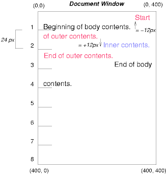
Note also that if the relative positioning of outer were -24px, the text of outer and the body text would have overlapped.
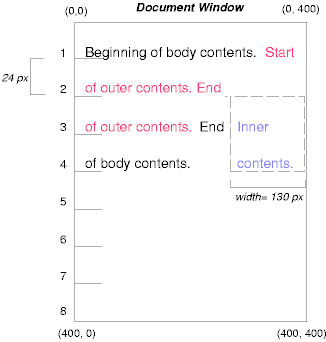
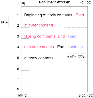
Now consider the effect of floating the inner element's text to the right by means of the following rules:
  #outer { color: red }
  #inner { float: right; width: 130px; color: blue }
First, the inner box (whose width has been set explicitly) is floated to the right margin. Then, the text of the outer element that follows the inner element text flows in the space vacated by the inner box. This flow respects the new right margin established by the left border of the inner box.
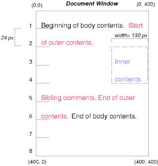
To show the effect of the 'clear' property, we add a sibling element to the example:
<HTML>
<HEAD>
<TITLE>Comparison of positioning schemes II</TITLE>
</HEAD>
<BODY>
  <P>Beginning of body contents.
  <SPAN id=outer> Start of outer contents.
  <SPAN id=inner> Inner contents.</SPAN>
  <SPAN id=sibling> Sibling contents.</SPAN>
  End of outer contents.</SPAN>
  End of body contents.
  </P>
</BODY>
</HTML>
The following rules:
  #inner { float: right; width: 130px; color: blue }
  #sibling { color: red }
cause the inner box to float to the right and the text of the sibling element to flow in the vacated space:
However, if the 'clear' property on the sibling element is set to 'right' (i.e., the generated sibling box will not accept being positioned next to floating boxes to its right), the sibling box is moved below the float:
  #inner { float: right; width: 130px; color: blue }
  #sibling { clear: right; color: red }
Finally, we consider the effect of absolute positioning. Consider the following CSS declarations for outer and inner:
  #outer { position: absolute;
           top: 200px;
           left: 200px;
           width: 200px;
           color: red }
  #inner { color: blue }
which cause the top of the outer box to be positioned with respect to the containing block (which we suppose is established by the initial containing block). The top side of the outer box is 200px from the top of the containing block and the left side is 200px from the left side. The child box of outer is flowed normally with respect to its parent.
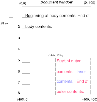
Note that because outer has been absolutely positioned, it establishes a new containing block for descendant boxes (there aren't any in this example).
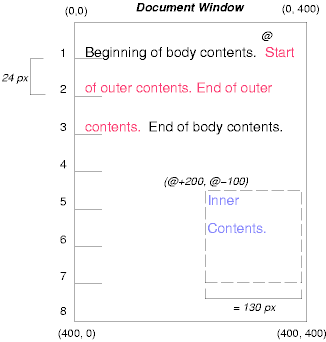
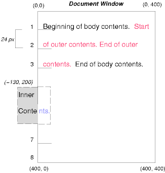
The following example shows an absolutely positioned box that is a child of a relatively positioned box. Although the parent outer box is not actually offset, setting its 'position' property to 'relative' causes its box to serve as the containing block for any descendant boxes. Since the outer box is an inline box that is split across several lines, only the first box (whose upper left-hand corner is designated by a "@" in the illustration below) establishes the containing block for the descendants.
  #outer { position: relative; color: red }
  #inner { position: absolute;
           top: 200px;
           left: -100px;
           height: 130px;
           width: 130px;
           color: blue }
This results in something like the following:
The following rules don't establish a new positioning context for inner:
  #outer { color: red }
  #inner {position: absolute; top: 200px; left: -100px; height:
    130px; width: 130px; color: blue;}
but cause the inner box to be positioned with respect to the containing block (which we assume here is initial containing block).
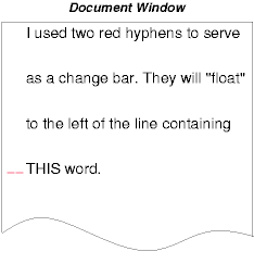
Relative and absolute positioning may be used to implement change bars, as shown in the following example. We use a value of 'auto' for the 'top' property, which results in the box being placed at the "current" location, just as if the box were being flowed into that space. The following HTML text:
<P style="position: relative; margin-right: 10px; left: 10px;">
I used two red hyphens to serve as a change bar. They
will "float" to the left of the line containing THIS
<SPAN style="position: absolute; top: auto; left: 0px; color: red;">--</SPAN>
word.</P>
might result in something like:
In the following sections, the expression "in front of" means closer to the user as the user faces the screen.
CSS allows authors to specify the position of a box in three dimensions. The stack level of an element refers to the position of boxes it generates in front of or behind other boxes. The stack level is particularly relevant to boxes that overlap visually.
The stack level of an element may be determined in two ways:
| Property name: | 'z-index' |
|---|---|
| Value: | auto | <integer> | inherit |
| Initial: | auto |
| Applies to: | elements that generate absolutely and relatively positioned boxes |
| Inherited: | no |
| Percentage values: | N/A |
| Media groups: | visual |
The 'z-index' property is used to specify the stacking order of boxes outside the normal flow. An element for which this property is set establishes a stacking context in which its own 'z-index' is 0.
The values of this property have the following meanings:
Elements for which the 'z-index' property has been given an integer value behave as follows:
The relative z-order of two elements that are neither siblings nor parent/child can be determined by evaluation of the previous rules for both elements' ancestors.
By default, an element will be placed just in front of its parent.
In the following example, the order of the elements, listed back-to-front is: "image", "text2", and "text1".
<!DOCTYPE HTML PUBLIC "-//W3C//DTD HTML 4.0 Transitional//EN">
<HTML>
<HEAD>
<TITLE>Z-order positioning</TITLE>
<STYLE type="text/css">
.pile { position: absolute; left: 2in; top: 2in; width: 3in; height: 3in; }
</STYLE>
</HEAD>
<BODY>
<P>
<IMG alt="A butterfly image"
     src="butterfly.gif"
     class="pile"
     id="image"
     style="z-index: 1">

<DIV class="pile" id="text1" style="z-index: 3">
   This text will overlay the butterfly image.
</DIV>

<DIV class="pile" id="text2" style="z-index: 2">
   This text will underlay text1, but overlay the butterfly image
</DIV>
</BODY>
</HTML>
This example demonstrates the notion of transparency. The default behavior of a box is to allow boxes behind it to be visible through transparent areas in its content. In the example, each box transparently overlays the boxes below it. This behavior can be overridden by using one of the existing background properties.