Tables are used to show the relations between pieces of data, by
arranging them into visual rows, columns, and cells. CSS2 can create
and control the presentation of these visual elements, but is not
intended to allow the arrangement of the structure itself.
Most CSS properties apply to table elements in the same manner as
they apply to block-level elements. However, because table columns in
the HTML model do not contain strictly, some properties behave
differently for tables. A few properties apply only to
tables.
A visual table is composed of a single element designated as the
"table", which contains any number of table columns, column groups,
rows and row groups. This will allow XML data, for example, to be
visually presented as a table through CSS, without requiring any other
semantics to be attached to the XML element types in the document.
There are ten values for the 'display' property that create tables
and parts of tables:
'table' - a 'table' is the outer container for all
tables. It defines a rectangular block element that contains any
number of row groups, rows, column groups, columns, and/or captions,
all arranged in an irregular grid pattern. Any rendering objects other
than these should be displayed outside the rectangular grid. (HTML
analog: TABLE)
'inline-table' - an 'inline-table' is identical to a
'table' element, except that it is treated as an inline replaced
element in the context surrounding the 'inline-table' element.
'table-column-group' - a 'table-column-group' is a
container for a number of table columns. This allows the designer to
set presentation properties on a group of columns, for example
by placing
borders around a group of columns. (HTML analog:
COLGROUP)
'table-column' - a 'table-column' is a grouping of all
cells in a particular vertical column. (HTML analog: COL)
'table-row-group' - a 'table-column-group' is a container
for a number of table rows. This allows the designer to set
presentation properties on a group of rows, for example by placing
borders around a group of rows. (HTML analog: TBODY)
'table-header-group' - A 'table-header-group' is a
special type of 'table-row-group' that is always displayed at the top
of the table, above all other rows and rowgroups, but below any
captions. (HTML analog: THEAD)
'table-footer-group' - A 'table-footer-group' is a
special type of 'table-row-group' that is always displayed at the
bottom of the table, below all other rows and rowgroups, but above any
captions. (HTML analog: TFOOT)
'table-row' - a 'table-row' groups all cells in
a particular horizontal row. (HTML analog: TR)
'table-cell' - a 'table-cell' is the rectangular object
to be arranged in the table grid. Table cells are only allowed
inside rows. (HTML analog: TD)
'table-caption' - a 'table-caption' is a special type of
table cell that appears as a row or column of its own in a table.
(HTML analog: CAPTION) [Need better description; caption
is not really a row or column]
Elements designated as 'inline-table' are considered to be replaced
elements; the others are to be treated as block-level elements for the
purposes of classification of interaction with other CSS properties -
that is, other CSS properties that are defined as applying to
block-level elements will apply to these elements. Some of the
semantics of these other properties may change, as defined
below.
Throughout this specification, "table
elements" refers to any element designated as one of these ten
types; "'table' elements" refers to only those designated as
display type 'table'. Similarly, unless single-quoted, "row
groups" refers to elements of type 'table-row-group',
'table-header-group' or 'table-footer-group', "row elements"
refers to row group elements or elements of type 'table-row', and
'columns' refers to elements of type 'table-column' or
'table-column-group'.
Tables are row-primary; that is, a branch of a structured document
is displayed as a visual table by designating one element as a
'table', with one or more of its child elements designated as 'rows',
and one or more elements inside each row designated as 'cells'.
'Row-groups' are optional structures used to group rows, and
potentially create specific margin, border or padding space around
them. 'Columns' and 'column-groups' are optional structures that
allow borders to be placed around specific rows and allow
CSS selectors to select cells and their children based on the columns
they appear in. The visual interactions of columns and rows are
described below in the table layout model.
"Missing" elements are inserted as anonymous elements. In other words:
any table element will automatically generate a whole table tree
around itself, consisting of at least a 'table'/'inline-table', a
'table-row' and a 'table-cell'.
In particular, if the parent a 'table-cell' is not a 'table-row',
an anonymous 'table-row' element will be assumed as its parent, and
this anonymous element will span all consecutive 'table-cell'
siblings.
Similarly, if the parent of a 'table-row' is not a
'table'/'inline-table' nor a row group element, an anonymous 'table'
will be assumed as its parent, spanning all consecutive siblings that
also need an anonymous 'table' parent.
Analogously for a row group element.
In this XML example, an anonymous 'table' is inserted to
contain the HBOX element:
Anonymous 'table-cell' elements are inserted as children of
'table-rows', to contain consecutive children that are not
'table-cell' elements.
In this example, three anonymous 'table-cell' elements are inserted
to contain the text in the ROWs. Note that the text is further
encapsulated in anonymous inline boxes, as explained in "Visual rendering model.":
<STACK>
  <ROW>This is the <D>top</D> row.</ROW>
  <ROW>This is the <D>middle</D> row.</ROW>
  <ROW>This is the <D>bottom</D> row.</ROW>
</STACK>
Elements with 'display' set to 'table-column' or
'table-column-group' are not rendered (exactly as if they had
'display: none'), but they are useful, because they may have
attributes which induce a certain style for the columns they
represent.
This property specifies the number of grid columns spanned by a
cell, column, or column group. A cell box occupies a rectangle of
'column-span' by 'row-span' grid cells in a table.
[Need description of how to determine the row/column
coordinates of cells and how to count column elements; or refer to
HTML 4.0?]
The layout of tables is a fundamentally different algorithm than
that used to lay out regular block-level elements. Cells are laid out
on a two-dimensional grid-based pattern, unlike block elements, which
are laid on in a one-dimensional flow. This is further complicated by
the interactions of rows and columns.
The most important difference between the layout model of tables in
CSS and the layout model of other elements (e.g., inline and
block-level elements) is that margins collapse horizontally as well as
vertically on elements inside tables (margins on the table element
itself function as expected on a replaced element). This collapsing
uses the same algorithm as vertical collapsing on regular block
elements in CSS. This is designed to allow easy duplication of the
HTML "cell spacing" effect - that is, to easily design
evenly spaced table cells in a table.
[Can this work? Maybe it is better to say that table elements
(other than 'table' and 'inline-table') have no margins at all, and
instead use a single 'cell-spacing' property for the whole table, or a
single horizontal and a single vertical spacing (see below)]
Row and Column elements (and row-groups and column-groups) inside
tables essentially exist in two different layout planes. They both
constrain and are constrained by the layout of the cells they contain,
but rows and columns are not considered to interact with each other
directly when laying out the table. This means that widths on columns
may change the layout of the cell (due to word-breaking occurring with
different constraints), which may affect the height of the cell (and
hence the row), but the columns do not directly affect the row height
(and vice versa).
This property selects between two different models of border
behavior. The HTML table behavior is that borders are drawn separately
for each cell, and cell spacing separates the borders. Another common
model in document publishing (and used in most popular word
processors) is a collapsing border model. In this model, adjacent
borders are collapsed into one border when drawn. If the border is
collapsed, any margin or column/row padding separating the two borders
is ignored.
The question of which
border to draw is determined by the following algorithm. If any border
side on an element is set to 'none', it is considered to have the
lowest possible precedence - in other words, any other non-'none'
values that may apply to that edge from other coincident border sides
will apply. (This does not apply to borders with style of 'hidden',
which has highest precedence - see the following section on border
style values for more information.)
Borders on 'table' elements take precedence over borders on any
other table elements.
Borders on 'row-groups' take precedence over borders on 'rows',
and likewise borders on 'column-groups' take precedence over borders
on 'columns'.
Borders on any other type of table element take precedence over
'table-cell' elements.
If the adjacent elements are of the same type, the wider of the
two borders is used. "Wider" takes into account the
border-style of 'none', so a "1px solid" border will take precedence
over a "20px none" border.
If the borders are of the same width, the border on the element
occurring first is used.
[A possible other rule, that tries to make sure thinner
borders never interrupt thicker ones: if any of the
coincident border is 'hidden', use that; otherwise, if all of
the coincident borders are 'none', use that; otherwise take the widest
border among the non-'none' styles; if there is more than one, prefer
'double' over 'solid' over 'dashed' over 'dotted ' over 'inset' over
'outset' over 'ridge over 'groove'. If there is still a conflict
(which must be in the color), the result is undefined.]
The chosen border is drawn using its normal width, style and
color. Other coincident border edges are not drawn underneath,
in the case of partially transparent border styles (e.g. 'double'
borders, which have a transparent gap).
Note. [If the margins around
table elements are dropped in favor of a single 'cell-spacing'
property, as suggested above, the cell spacing and 'border-collapse' can be
combined according to 'cell-spacing']
If borders are drawn non-collapsed: the border makes the entire
box look as though it were embedded in the canvas. If borders are
collapsed: same as 'groove'.
The opposite of 'inset'. If borders are drawn non-collapsed: the
border makes the entire box look as though it were coming out of the
canvas. If borders are collapsed: same as 'ridge'.
The 'table-layout'
property controls the algorithm used to lay out the table (that is, to
determine the widths and heights of the table and its individual
cells, rows and columns). A value of 'auto' denotes the
existing-practice HTML layout algorithm, which requires multiple
passes through the data and determines the width of a column of cells
based on the largest unbreakable element in a cell in the column. This
algorithm can be inefficient - not only does it require multiple
passes, it also requires the layout engine to have access to all the
content in the table before determining the final layout.
The 'fixed' layout algorithm is a much faster algorithm. The
horizontal layout of the table is not dependent on the content
contained in the cells, it is dependent entirely on the widths set on
the table and its columns and first row of cells. If the table has a
'width' of 'auto', the entire available space is used. The cell's
width is determined by any width value set on the column, overridden
by any value other than 'auto' set on the cell itself. All cells that
have a 'width' of 'auto' in the row are collected by the layout
engine, and when the end of the row is reached, all remaining
available space is evenly distributed among them.
In this manner, the engine lays out the first row of the table
immediately upon receiving the content. All subsequent rows have the
same widths of columns of cells - nothing in subsequent rows can
affect the widths of the columns. Any cell that has content that
overflows its dimensions uses the 'overflow' property to determine how
to handle the overflow content. Using the 'overflow' value of
'visible' will not grow the cell dimensions, but will slop the content
into the next cell. The height of the row of cells may be computed
(the 'auto' value), or may be set explicitly, in which case overflow
is handled in the same manner as with the width dimension.
17.3.2 The 'collapse' value for the 'visibility' property
The 'visibility' property
should take an additional value -- 'collapse'. This value works identically to
the 'hidden' value, except when it is applied to a 'table-row',
'table-row-group', 'table-column' or 'table-column-group'. When
applied to an entire table row or column, the 'collapse' property will
cause the entire row or column to be removed from the display, and the
space normally taken up by the row or column will be available for
other content - in this context only, it is similar to setting the
'display' property to 'none', except the cells that are no longer
displayed will continue to affect the horizontal layout of the table
columns (if a row is being collapsed) or vertical layout of table rows
(if a column is being collapsed). This allows dynamic effects to
remove table rows or columns without forcing a re-layout of the table
in order to account for the potential change in column
constraints.
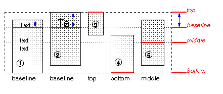
The CSS 'vertical-align' property also
applies to 'table-cell' elements. Only the 'top', 'middle', 'bottom',
'baseline' and percentage values are applicable - all other values
function as 'middle'. The property sets the vertical alignment of the
content inside the table cell, in the same manner as the HTML VALIGN
attribute on table cells (TD elements) does.
The baseline of a cell is the baseline of the first line of text in
the cell. If there is no text, the baseline is the baseline of
whatever object is displayed in the cell, or, if it has none, the
bottom of the cell. The maximum distance between the top of the cell
and the baseline over all cells that have 'vertical-align:baseline' is
used to set the baseline of the row. Here is an example:
Cells 1 and 2 are aligned at their baselines. Cell 2 has the largest
height above the baseline, so that determines the baseline of the row.
Note that if there is no cell aligned at its baseline, the row will
not have (not need) a baseline.
To avoid ambiguous situations, the alignment of cells proceeds in a
certain order. First the cells that are aligned on their baseline are
positioned. This will establish the baseline of the row. Next the
cells with alignment 'top' are positioned.
The row now has a top, possibly a baseline, and a provisional
height, which is the distance from the top to the lowest bottom of the
cells positioned so far. (See conditions on the cell padding
below.)
If any of the remaining cells, those aligned at the bottom or the
middle, have a height that is larger than the current height of the
row, the height of the row will be increased to the maximum of those
cells, by lowering the bottom.
Finally the remaining cells are positioned.
The area between the cell content and the border is part of the
cell's padding. The padding at the top and bottom of each cell after
positioning must be at least as large as the 'padding' property
specifies. The height of the row must be as small as possible without
violating this rule.
Due to the uniqueness of the table structure, there are several
additional semantics and pseudo-classes for table cells.
[The implementation cost of this feature may be high. It requires
two passes over the style sheet: first to determine the 'display',
'float' and 'position' properties using the normal element hierarchy,
than again searching for selectors that match cell element inside
column elements. In the second kind of rules, 'display', 'position'
and 'float' may not appear.]
Due to their two-dimensional visual structure, cells have a unique
feature in CSS selectors - they have a dual inheritance chain for
contextual selectors, both from columns and from rows. This means a
stylesheet author can easily write a CSS rule that applies to all the
cells "contained" in a column, as well as all the cells contained in a
row. The columns are treated as a second parent to the cell, not
intermingled with the row inheritance chain.
CSS source:
TR.foo TD { color: red }
COL.bar TD { color: blue }
COL.foo TR.bar TD { color: green }
TR.bar COL.bar TD { color: yellow }
Cell "one" will be red, cell "two" will be
blue. Since the row and column inheritance chains are not
intermingled, the second two rules in the stylesheet will not apply to
any of the content, and therefore cell "three" will be
default color, and cell "four" will be blue.
If a cell appears in multiple columns (e.g. the cell has a
column-span of more than 1), all column parents will apply in the
selector.
There are several new row and column pseudo-classes available for
table formatting.
[The implementation cost of this feature is probably
even higher than the one in the previous section. Not only does it
require two passes, it also precludes the use of hash tables for quick
access to rules.]
Row pseudo-classes:
:row[n], :row[%n], :row[%n+m] - This pseudo-class allows
the author to specify "the third row" (":row[3]"), "every third row"
(":row[%3]"), or "every third row, starting with the second row"
(":row[%3 + 1") (rows are zero-indexed).
:row-even - This is a shortcut for a pseudo-class of
":row[%2]".
:row-odd - This is a shortcut for a pseudo-class of
":row[%2+1.
Column pseudo-classes:
:column[n], :column[%n], :column[%n+m] - This pseudo-class
allows the author to specify (for example) "the third column"
(":column[3]"), "every third column" (":column[%3]"), or "every third
column, starting with the second column" (":column[%3 + 1") (columns
are zero-indexed).
:column-even - This is a shortcut for a pseudo-class of
":column[%2]".
:column-odd - This is a shortcut for a pseudo-class of
":column[%2+1]".
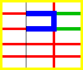
A table is made up of one table element, several columns possibly
grouped into column groups, and several rowgroups, containing rows,
which in turn contain cells. (For speech style sheets, the cells are
further subdivided into header and data cells.) The spatial layout is
governed by a grid. All boxes that make up the table have to align
with the grid.
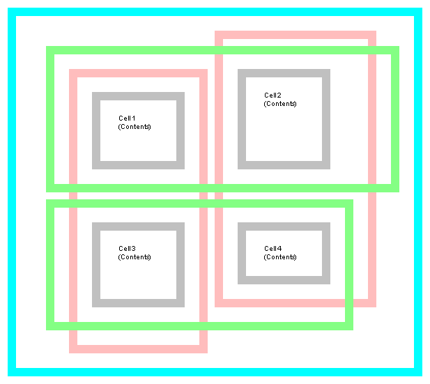
One can think of a table as built from six layers. Each layer hides
the lower layers from view, unless it is transparent (or has
transparent parts). See Figure 1.
The lowest layer is a single plane, representing the table box
itself. (Note that like all boxes, it may be transparent).
The next layer contains the column groups. The columns groups are
as tall as the table, but they need not cover the whole table
horizontally.
On top of the column groups are the areas representing the column
boxes. Like column groups, columns are as tall as the table, but need
not cover the whole table horizontally.
Next is the layer containing the row groups. Each row group is as
wide as the table. Together, the row groups completely cover the table
from top to bottom.
The last but one layer contains the rows. The rows also cover the
whole table.
The topmost layer contains the cells themselves, and the borders in
between them. As the figure shows, the cells don't have to cover the
whole table, but may leave "holes."
To position the table elements, we assume a hypothetical grid,
consisting of an infinite number of columns and rows of "grid cells."
All table elements (table box, row boxes, cell boxes, etc.) are
rectangular and are aligned with the grid: they occupy a whole number
of grid cells, determined according to the following rules.
Columns are placed next to each other in the order they occur. Each
one occupies the number of grid columns given by its 'column-span' property. A column
group occupies the same columns as the columns contained in it. The
first column may be either on the left or on the right, depending on
the value of the 'direction'
property of the table.
Each row box occupies one row of grid cells. Together, the row
boxes fill the table from top to bottom in the order they occur in the
source document, or, stated differently: the table occupies exactly as
many grid rows as there are row elements.
A row group occupies the same grid cells as the rows inside the row
group together.
Each cell occupies a rectangle of 'column-span' grid cells wide and
'row-span' grid cells high. The
top row of this rectangle of grid cells must be in the row occupied by
the cell's parent. The rectangle must be as far to the left as
possible, but may not overlap with any other cell, and must be to the
right of all cells in the same row that are earlier in the source
document. (If the 'direction'
of the table is 'right-to-left', interchange "left" and "right" in the
previous sentence.)
Cells are 'row-span' high
only if there are enough rows: a cell cannot extend below the last row
box; it is made shorter until it fits.
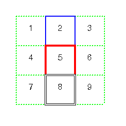
Note that there may be "holes" left between the cells. These holes
are transparent, and the lower layers of the table are visible through
them. Example:
The principle for determining the width of each column is as
follows:
The width is determined by the 'width' property of the column box.
However, if there is no column box, or its 'width' is 'auto', the
width is given by the width requirements of the cells in the
column.
If the value of 'width' for the
first cell in the column is 'auto', the UA finds the "optimal" width
of the column, based on some heuristics.
More details are given below.
The width of the table is given by its 'width' property. If that is 'auto', the
width is the sum of the column widths. More precisely: the sum of the
columns and the borders between them. See "Placement of the borders" below.
Finding the optimal width is complicated. In many cases, what is
optimal is a matter of taste. CSS therefore doesn't define what the
optimal width of each column is; a UA is free to use whatever
heuristics is has, and is also free to prefer speed over precision.
There are a few implementation hints in chapter [???].
The width computation is complicated by cells that span columns and
by widths that are specified as percentages. The problem of finding
the widths can be regarded as a constraint resolution system, that
may be over- or under-constrained.
A percentage is relative to the table width. If the table's width
is 'auto', a percentage represents a constraint on the column's width,
which a UA should try to satisfy. (Obviously, this is not always
possible: if the column's width is '110%', the constraint cannot be
satisfied inside a table whose 'width' is 'auto'.)
A cell that spans columns, provides a constraint on the sum of the
widths of the columns it spans.
If a cell's content doesn't "fit" the width of the column, the
'overflow' property
determines what happens to it. Similarly, if the 'width' of the table is not 'auto',
and the sum of the columns is not equal to the table's width, the
'overflow' property of the
table determines what happens.
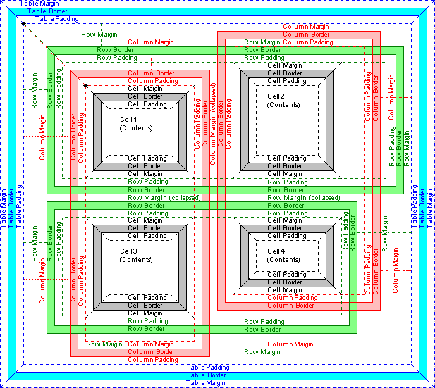
For block-level and inline elements, the position of the border
relative to the content of the element is determined by the margin
and the padding. But in a table, the positions of the borders are
constrained by the fact that they have to line up from one row to the
next and from one column to the next.
There are two distinct models for setting borders on table
cells. One is most suitable for so-called "2½D" borders (ridge,
groove, inset, and outset) around individual
cells, the other is suitable for borders that are continuous from one
and of the table to the other. Many border styles can be achieved with
either model, so it is often a matter of taste which model is used.
The 'cell-spacing' property only applies to elements with 'display:
table'.
If the value is a length, that amount of space is kept open between
the borders of all cells. It may not be negative. The space is filled
with the background of the table element.
If there are two length values, the first one is the horizontal
spacing, and the second one is the vertical spacing. If there is just
one length value, it gives both the horizontal and vertical
spacing.
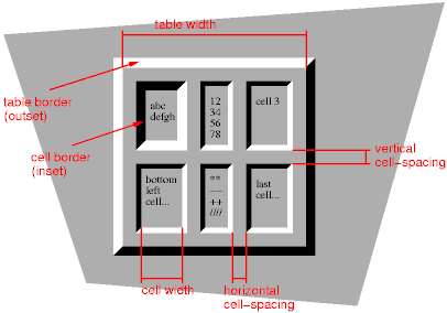
Each cell has its own borders, and the overall width of the table
is the sum of the cells, plus the cell-spacing between all borders
(see figure 3).
Figure 3. A table with 'cell-spacing' set to a length
value. Note that each cell has its own border, and the table has a
separate border as well.
In this mode, rows, columns, row-groups and column groups cannot
have borders (i.e., user agents must skip the border
properties for those elements.
The table in figure 3 could be the result of a style sheet like
this:
If the value of 'cell-spacing' is 'none', the model is more
complicated. In this mode it is possible to set borders on rows and
row-groups that extend all the way from one end of the table to the
other, and it is possible, e.g., to create tables with rules between
the cells, and no rules on the outside of the table.
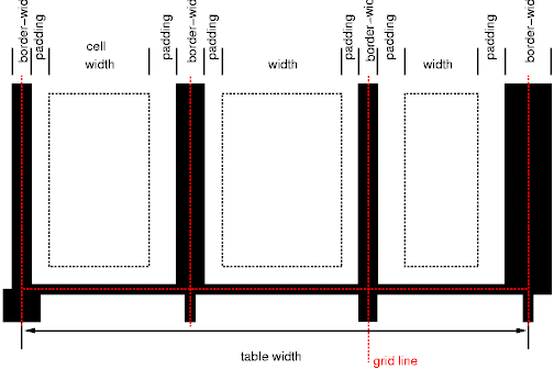
The borders are centered on the grid lines between the cells. A
renderer has to find a consistent rule for rounding off in the case of
an odd number of discrete units (screen pixels, printer dots).
The diagram below shows how the width of the table, the widths of
the borders, the padding and the cell width interact. Their relation
is given by the following equation, which holds for every row of the
table:
Here n is the number of cells in the row, and
border-widthi refers to the border
between cells i and i + 1.
Note that for a table element, using 'cell-spacing' 'none', the
width of the table includes half the border, and that a table doesn't
have a padding. It does have a margin, however.
If 'cell-spacing' is 'none', the style of the borders between the
cells is found by comparing the border properties of all the boxes
(cells, columns, the table itself, etc.) that meet at that
border. Columns and rows can also have borders, but they are only
drawn when they coincide with a cell border.
To find the border style at each side of a grid cell, the following
properties have to be compared:
Those of the one or two cells that have an edge here. Less than two
can occur at the edge of the table, but also at the edges of "holes"
(unoccupied grid cells).
Those of the columns that have an edge here.
Those of the column groups that have an edge here.
Those of the rows that have an edge here.
Those of the row groups that have an edge here.
Those of the table, if this is the edge of the table.
This will give between 0 and 8 'border' values. Each value is made
up of a 'border-width',
'border-color' and 'border-style'. The border
with the largest width will be drawn. If there are two or more with
the same width, but different style, then the one with a style near
the start of the following list will be drawn:
If the style is 'outset', it will be drawn as 'ridge' instead, and
'inset' will be drawn as 'groove'.
If the borders only differ in color, a color different from the
'color' property of the two cells
on either side will be preferred over a color that only differs from
one of the cells, which in turn will be chosen over a border that
doesn't differ in color from the cells.
If none of these rules determine the color of the border, the UA is
free to choose one of the colors.
Here is an example:
TD.blue {border: medium solid blue} TD.thick {border: thick solid red}
TD.double {border: thick double black} TR {border: medium dotted
green}
Here is a table with horizontal rules between the rows. The top
border of the table is set to 'blank' to suppress the top border of
the first row.
TR {border-top: solid}
TABLE {border-top: blank}
In this case the same effect can also be achieved without setting a
'blank' border on TABLE, by addressing the first row separately. Which
method is preferred is a matter of taste.
Only four properties apply to a column box or column-group box:
'border', 'background', 'width', and 'column-span'. The first two are
actually shorthand properties, so all the border properties and all
the background properties apply.
Only 'border' and 'background' apply to a row or
row-group. But note that you can set inherited properties on rows and
row-groups, and they will be inherited by the cells.
The cells in a row are aligned somewhat like letters on a line.
Each cell, or rather each cell's content, has a baseline, a top, a
middle and a bottom, and so does the row itself. The value of the
'vertical-align' property
of the cells determines on which of these lines they are aligned:
baseline
the baseline of the cell is put at the same height as the baseline
of the row (see below for the definition of baselines of cells and
rows)
top
the top of the cell is aligned with the top of the row
bottom
the bottom of the cell is aligned with the bottom of the row
middle
the center of the cell is aligned with the center of the row
sub, super, text-top, text-bottom
these values do not apply to cells; the cell is aligned at the
baseline instead
The baseline of a cell is the baseline of the first line of text in
the cell. If there is no text, the baseline is the baseline of
whatever object is displayed in the cell, or, if it has none, the
bottom of the cell. The maximum distance between the top of the cell
and the baseline over all cells that have 'vertical-align:baseline' is
used to set the baseline of the row. Here is an example:
Cells 1 and 2 are aligned at their baselines. Cell 2 has the largest
height above the baseline, so that determines the baseline of the row.
Note that if there is no cell aligned at its baseline, the row will
not have (not need) a baseline.
To avoid ambiguous situations, the alignment of cells proceeds in a
certain order. First the cells that are aligned on their baseline are
positioned. This will establish the baseline of the row. Next the
cells with alignment 'top' are positioned.
The row now has a top, possibly a baseline, and a provisional
height, which is the distance from the top to the lowest bottom of the
cells positioned so far. (See conditions on the cell padding
below.)
If any of the remaining cells, those aligned at the bottom or the
middle, have a height that is larger than the current height of the
row, the height of the row will be increased to the maximum of those
cells, by lowering the bottom.
Finally the remaining cells are positioned.
The area between the cell content and the border is part of the
cell's padding. The padding at the top and bottom of each cell after
positioning must be at least as large as the 'padding' property
specifies. The height of the row must be as small as possible without
violating this rule.
A cell is similar to a block in the way its contents are rendered,
that means, in particular, that 'text-align' applies to
it. However, tables also allow a way of aligning text that does not
apply to other blocks, and that is aligning the contents of several
cells so that they all align on, e.g., a decimal point (".")
More precisely, if the value of 'alignment' for a certain cell is
a string, that cell has an alignment point, which is the
start of that string. The alignment point must be straight above or
below the alignment points of all other cells in the same column that
have an alignment point. (Note that the other cells do not need to
have the same value for 'text-align'; as long as they are
aligned on a string, they have an alignment point.)
Aligning text in this way is only useful if the text is short
enough not to be broken over several lines. The result is undefined if
the text is broken.
If the string occurs more than once in the cell's content, the
alignment point is the start of the first occurrence.
If the string doesn't occur, the alignment point is the end of the
content.
[Values top-left, bottom-left, top-right and bottom-right also
proposed. They would make the caption into something similar to a
float.]
['top' means caption is a block above the table, 'bottom' means it is
a block after the table]
When a table is spoken by a speech generator, the relation between
the data cells and the header cells must be expressed in a different
way than by horizontal and vertical alignment. Some speech browsers
may allow a user to move around in the 2-dimensional space, thus
giving them the opportunity to map out the spatially represented
relations. When that is not possible, the style sheet must specify at
which points the headers are spoken.
CSS supports two possibilities: the headers are spoken before every
cell, or only before a cell when that cell is associated with a
different header than the previous cell.
[Add speak:header-cell|data-cell, and some way to mirror the
axis/headers attributes? BB]
It is assumed that a speech UA analyzes the table as specified in
the HTML 4.0 specification, to find for each data cell the header
cells with which it is associated. In summary, the algorithm is to go
up in the column and find all header cells, and to go towards the
start of the row to find all header cells there. If a data cell is
found above a header cell, then the search for header cells in the
column stops there. Similarly, if a data cell is found in front of a
header cell, the search in that row stops.
Since sometimes header cells are not put in the column or row to
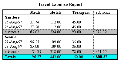
which they apply (see e.g., the cells "San Jose" and "Seattle" in the
example below), an explicit association using the "axis" and "headers"
attributes must be made. The example below shows the required
mark-up
This presents the money spent on meals, hotels and transport in two
locations (San Jose and Seattle) for successive days. Conceptually,
you can think of the table in terms of a n-dimensional space. The headers
of this space are: location, day, category and subtotal. Some cells
define marks along an axis while others give money spent at points
within this space. The HTML markup for this table is:
By providing the data model in this way, authors make it
possible for speech enabled-browsers to explore the table in
rich ways, e.g. each cell could be spoken as a list, repeating the
applicable headers before each data cell:
  San Jose, 25-Aug-97, Meals:  37.74
  San Jose, 25-Aug-97, Hotels:  112.00
  San Jose, 25-Aug-97, Transport:  45.00
 ...
The browser could also speak the headers only when they change:
The 'speak-header' property of a header cell determines when
it is spoken: before every data cell, or only when the previous cell
spoken wasn't associated with this header.