16 Lists
16.1 Visual formatting of lists
CSS allows authors to control the visual presentation of lists in a
number of ways:
- Authors may specify a marker that appears before each list item.
- Markers may be placed outside or inside the list item's
content.
- Markers may be represented by predefined shapes (bullets,
circles, squares), numerals (arabic, roman, letters, etc.), or
images.
- With descendant selectors
and child selectors,
it's possible to specify different marker types depending on the depth
of embedded lists.
An element with a 'display'
property value of 'list-item' generates two boxes: a block-level box that contains its
content and an inline box that contains a marker. Only the content box
is involved with positioning (e.g, in the normal flow). The position of the
marker box (see the 'list-style-position'
property) does not affect the position of the content box. CSS
properties allow authors to specify the marker type (image, glyph, or
number) and its position with respect to the content box (outside the
content or at the beginning of content).
The background
properties apply to the content box only; the marker box is
transparent.
The declaration in the following HTML program causes LI elements to
generated 'list-item' boxes. The 'list-style' value 'none' suppresses
preceding markers.
<HTML>
<HEAD>
   <STYLE type="text/css">
      LI { display: list-item; list-style: none }
   </STYLE>
</HEAD>
<BODY>
   <UL>
      <LI> This is the first list item, formatted as a block.
      <LI> This is the second list item.
      <LI> This is the third.
   </UL>
</BODY>
</HTML>
The list might be formatted as follows:
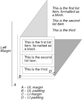
The illustration shows the relationship between the current left
margin and the margins and padding of the list (UL) box and the list
item (LI) boxes. (The lines delimiting the margins and padding are not
rendered).
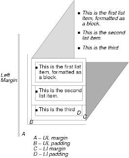
If we change the 'list-style' to "square":
LI { display: list-item; list-style: square }
each list item will be preceded by a small square. However, the
placement of the square does not affect the block formatting of the list
item box:
Note.
- CSS2 does not include a property to adjust the separation between a
list marker and the content of its list item.
- There is no "list" presentation for other types of list structures
(e.g., "definition lists" declared by DL, DT, and DD in HTML). Each
part of a definition list is simply a block element.
'list-style-type'
| Property name: | 'list-style-type' |
|---|
| Value: | disc | circle | square | decimal | lower-roman | upper-roman |
lower-alpha | upper-alpha | none | inherit |
|---|
| Initial: | disc |
|---|
| Applies to: | elements with the 'display' property set to 'list-item' |
|---|
| Inherited: | yes |
|---|
| Percentage values: | N/A |
|---|
| Media groups: | visual |
|---|
This property specifies appearance of the list item marker if
'list-style-image' has
the value 'none' or if the image pointed to by the URI cannot be
displayed.
Values have the following meanings:
- disc
- A disc (exact presentation is UA-dependent)
- circle
- A circle (exact presentation is UA-dependent)
- square
- A square (exact presentation is UA-dependent)
- decimal
- Decimal numbers, beginning with 1.
- lower-roman
- Lower case roman numerals (i, ii, iii, iv, v, etc.)
- upper-roman
- Upper case roman numerals (I, II, III, IV, V, etc.)
- lower-alpha
- Lower case ascii letters (a, b, c, ... z)
- upper-alpha
- Upper case ascii letters (A, B, C, ... Z)
- none
- No marker
For example, the following HTML document:
<HTML>
   <HEAD>
   <STYLE type="text/css">
        OL { list-style-type: lower-roman }
   </STYLE>
</HEAD>
<BODY>
   <OL>
      <LI> This is the first item.
      <LI> This is the second item.
      <LI> This is the third item.
   </OL>
</BODY>
</HTML>
might produce something like this:
  i This is the first item.
 ii This is the second item.
iii This is the third item.
This property sets the image that will be used as the list item
marker. When the image is available, it will replace the marker set
with the 'list-style-type' marker.
The following example sets the marker at the beginning of each list
item to be the image "ellipse.png".
UL { list-style-image: url(http://png.com/ellipse.png) }
This property specifies the position of the marker
box with respect to line item content box. Values have the
following meanings:
- outside
- The list item marker is outside the box that is generated for the
list item.
- inside
- The list item marker is the first inline box generated for the
list item. The list item's contents flow after the marker box.
For example:
  <HTML>
  <HEAD>
  <STYLE type="text/css">
    UL         { list-style: outside }
    UL.compact { list-style: inside }
  </STYLE>
  </HEAD>
  <BODY>
  <UL>
    <LI>first list item comes first
    <LI>second list item comes second
  </UL>

  <UL class="compact">
    <LI>first list item comes first
    <LI>second list item comes second
  </UL>
  </BODY>
  </HTML>
The above example may be formatted as:
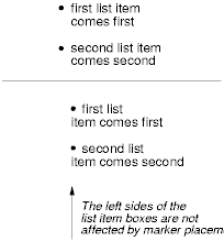
In right-to-left text, the markers would have been on the right
side of the box.
The 'list-style' property
is a shorthand notation for setting the three properties 'list-style-type', 'list-style-image', and 'list-style-position' at
the same place in the style sheet.
  UL { list-style: upper-roman inside }  /* Any UL*/
  UL + UL { list-style: circle outside } /* Any UL child of a UL*/
Although authors may specify 'list-style' information directly
on list item elements (e.g., LI in HTML), they should do so with
care. The following rules look similar, but the first declares a descendant selector
and the second a (more specific) child
selector.
OL.alpha LI  { list-style: lower-alpha } /* Any LI descendant of an OL */
OL.alpha + LI  { list-style: lower-alpha } /* Any LI child of an OL */
Authors who only use the descendant selector may
not achieve the results they expect. Consider the following rules:
  <HTML>
  <HEAD>
  <STYLE type="text/css">
    OL.alpha LI  { list-style: lower-alpha }
    UL LI        { list-style: disc }
  </STYLE>
  </HEAD>
  <BODY>
    <OL class="alpha">
      <LI>level 1
      <UL>
         <LI>level 2
      </UL>
    </OL>
  </BODY>
  </HTML>
The desired rendering would have level 1 list items with
'lower-alpha' labels and level 2 items with 'disc' labels. However,
the cascading order will
cause the first style rule (which includes specific class information)
to mask the second. The following rules solve the problem by employing
a child
selector instead:
    OL.alpha + LI  { list-style: lower-alpha }
    UL LI   { list-style: disc }
Another solution would be to specify 'list-style' information only on
the list type elements:
    OL.alpha  { list-style: lower-alpha }
    UL        { list-style: disc }
Inheritance will transfer the 'list-style' values from OL and
UL elements to LI elements. This is the recommended way to
specify list style information.
A URI value may be combined with any other value, as in:
UL { list-style: url(http://png.com/ellipse.png) disc }
In the example above, the 'disc' will be used when the image is
unavailable.