Requirements for Chinese Text Layout
中文排版需求

W3C Group Draft Note

More details about this document
This version:
https://www.w3.org/TR/2022/DNOTE-clreq-20220501/
Latest published version:
https://www.w3.org/TR/clreq/
Latest editor's draft:
https://w3c.github.io/clreq/
History:
https://www.w3.org/standards/history/clreq
Commit history
Editors:
(特邀专家 / Invited Expert)
(W3C)
(W3C)
Former editors:
(W3C)
(特邀专家 / Invited Expert)
(W3C)
(中国移动通信集团公司 / China Mobile)
Feedback:
GitHub w3c/clreq (pull requests, new issue, open issues)
public-i18n-chinese@w3.org with subject line [clreq] … message topic … (archives)

Abstract

This document summarizes text composition requirements in the Chinese writing system. One of the goals of the task force is to describe issues for Chinese layout, another is to describe correspondences with existing standards (such as Unicode), as well as to encourage vendors to implement relevant features correctly.

本文整理了中文(汉字)书写系统于排版上的需求。一方面说明需求事项以明确描述中文排版之需求与问题;另一方面也提出与既有标准(如Unicode)的对应,冀求本文能更有效地促进实现。

本文整理了中文(漢字)書寫系統於排版上的需求。一方面說明需求事項以明確描述中文排版之需求與問題;另一方面也提出與既有標準(如Unicode)的對應,冀求本文能更有效地促進實作。

Status of This Document

This section describes the status of this document at the time of its publication. A list of current W3C publications and the latest revision of this technical report can be found in the W3C technical reports index at https://www.w3.org/TR/.

This document was created by the Chinese Layout Task Force within the W3C Internationalization Interest Group, and in collaboration with the W3C HTML5 Chinese Interest Group. The Internationalization Working Group has been a great help during the writing of this document. The Chinese Layout Task Force will work with the Internationalization Working Group to publish Group Draft Notes of this document, and to widen the exposure and review of the document.

本文档由W3C国际化兴趣组下的中文布局任务团编写而成,W3C HTML5中文兴趣组为本文档提供了审阅支持,W3C国际化工作组为文档的编写提供了诸多帮助。中文排版布局任务小组将与W3C国际化工作组联合发布该文档的草案,并邀请业界进行审阅。

本文檔由W3C國際化興趣組下的中文布局任務團編寫而成,W3C HTML5中文興趣組為本文檔提供了審閱支持,W3C國際化工作組為文檔的編寫提供了諸多幫助。中文排版布局任務小組將與W3C國際化工作組聯合發布該文檔的草案,並邀請業界進行審閱。

本章节描述了本文档的发布状态。其他更新版本可能会覆盖本文档。W3C的文档列表和最新版本可通过W3C技术报告索引访问。

以编辑草稿方式发布的文档还没有通过W3C会员流程的认可。这是一份文档草稿并且会不断更新。请暂时不要正式引用本文档。

本文档遵循W3C专利政策W3C为工作组的产出成果维护着一份公开专利披露列表,此页面也同时涵盖了专利披露说明。若个人发现其有包含必须声明的专利信息,必须按照W3C专利政策第六章节披露此信息。

本文档遵循W3C流程文档(2021年11月2日版)。

本章節描述了本文檔的發布狀態。其他更新版本可能會覆蓋本文檔。W3C的文檔列表和最新版本可通過W3C技術報告索引訪問。

以編輯草稿方式發布的文檔還沒有通過W3C會員流程的認可。這是一份文檔草稿並且會不斷更新。請暫時不要正式引用本文檔。

本文檔遵循W3C專利政策W3C為工作組的產出成果維護著一份公開專利披露列表,此頁面也同時涵蓋了專利披露說明。若個人發現其有包含必須聲明的專利信息,必須按照W3C專利政策第六章節披露此信息。

本文檔遵循W3C流程文檔(2021年11月2日版)。

This document was published by the Internationalization Working Group as a Group Draft Note using the Note track.

Group Draft Notes are not endorsed by W3C nor its Members.

This is a draft document and may be updated, replaced or obsoleted by other documents at any time. It is inappropriate to cite this document as other than work in progress.

The W3C Patent Policy does not carry any licensing requirements or commitments on this document.

This document is governed by the 2 November 2021 W3C Process Document.

1. Introduction 绪论 緒論

1.1 Basic Features of Chinese Script 中文排版的主要特色 中文排版的主要特色

Chinese composition exhibits several differences from other writing systems. The major features include:

中文排版有别于其他书写体系,主要特点如下:

中文排版有別於其他書寫體系,主要特點如下:

  1. The Chinese writing system can be broadly classified into either Traditional Chinese or Simplified Chinese. Chinese communities in different regions (e.g. Mainland China, Taiwan, Hong Kong, Macau, Singapore, Malaysia etc.) may have their own regional standards. These differ with respect to which glyph represents a canonical vs. a variant shape, or how many strokes are contained in a given character. They may also have typographic layout rules specific to their own region.

    中文的书写系统可以大致分为“繁体字”“简体字”系统,但是,使用中文的各个地区(中国大陆、台湾、香港、澳门、新加坡、马来西亚等)对汉字各自分别有不同的规范化形式,其具体字形、笔画多少存在差异,也会采用与其他地区不尽相同的排版规则。

    中文的書寫系統可以大致分為「繁體字」「簡體字」系統,但是,使用中文的各個地區(中國大陸、台灣、香港、澳門、新加坡、馬來西亞等)對漢字各自分別有不同的規範化形式,其具體字形、筆劃多少存在差異,也會採用與其他地區不盡相同的排版規則。

  2. There are two writing modes: vertical and horizontal. The former is often seen in publications from Taiwan, Hong Kong etc.

    中文的书写方向有直排及横排两种,其中,前者多见于台湾、香港等地的中文出版品。

    中文的書寫方向有直排及橫排二種,其中,前者多見於台灣、香港等地的中文出版品。

  3. In principal, the characters, including Chinese (hanzi) characters and punctuation, used in Chinese composition are squares with the ratio of 1:1, and are seamlessly arranged with one another.

    原则上,中文排版所使用的汉字和标点符号比例皆为1:1的正方形,将其无缝隙并列排成版面。

    原則上,中文排版所使用的漢字與標點符號比例皆為1:1的正方形,將其無縫隙並列排成版面。

Note

For most of the typographic rules described in this document, "regional differences" are more than "differences between Simplified and Traditional Chinese". For example, although most publications in Mainland China use Simplified Chinese characters in horizontal writing mode, a few publications use Traditional Chinese characters in horizontal or vertical writing mode, or Simplified characters in vertical writing mode. The typographical rules in Mainland China, such as the punctuation position rules specified in General Rules for Punctuation (GB/T 15834—2011) also apply to vertical or Traditional Chinese publications published in Mainland China. For vertical and Traditional Chinese publications published in Taiwan, Taiwan's typographic rules are used. Therefore, it is recommended that the user agents distinguish typographical rules by "region" rather than "Traditional or Simplified".

对于本文叙述重点的排版规则来说,“地区差异”大于“繁简差异”。比如,虽然中国大陆的大多数出版物均采用简体字、横排,但仍有少数采用繁体字横排、直排或者简体字直排;中国大陆的排版规则,如 GB/T 15834—2011《标点符号用法》中规定的标点符号位置同时也适用于中国大陆出版的直排、繁体字出版物。而台湾出版的直排、繁体字出版物则采用台湾的排版规则。因此建议各种用户代理处理排版规则时,应通过“区域”设置,而非“繁简”文本设置进行区分。

對於本文敘述重點的排版規則來說,「地區差異」大於「繁簡差異」。比如,雖然中國大陸的大多數出版物均採用簡體字、橫排,但仍有少數採用繁體字橫排、直排或者簡體字直排;中國大陸的排版規則,如 GB/T 15834—2011《標點符號用法》中規定的標點符號位置同時也適用於中國大陸出版的直排、繁體字出版物。而臺灣出版的直排、繁體字出版物則採用臺灣的排版規則。因此建議各種用戶代理處理排版規則時,應通過「區域」設置,而非「繁簡」文本設置進行區分。

1.2 Purpose of this document 目的 目的

Each cultural community has its own language, script, and writing system. The transfer of each and every writing system into cyberspace is a task of utmost importance for information and communication technology.

每一个文化群体都拥有独自的语言、文字、书写系统。将个别书写系统在虚拟空间再现,对文化资产的承继而言,是信息传播技术的重要责任。

每一個文化群體都擁有獨自的語言、文字、書寫系統。將個別書寫系統在虛擬空間再現,對文化資產的承繼而言,是資訊傳播技術的重要責任。

As one of the basic work items of this task force, this document summarizes text composition requirements in the Chinese writing system. One of the goals of the task force is to describe issues for Chinese layout, another is to describe correspondences with existing standards (such as Unicode), as well as to encourage vendors to implement relevant features correctly.

作为实现这个责任的基础,本文整理了中文(汉字)书写系统在排版上的需求。一方面说明需求事项以明确描述中文排版之需求与问题;另一方面也提供与既有标准(如Unicode)的对应,冀求通过本文有效地促进实现。

作為實現這個責任的基礎,本文整理了中文(漢字)書寫系統在排版上的需求。一方面說明需求事項以明確描述中文排版之需求與問題;另一方面也提供與既有標準(如Unicode)的對應,冀求透過本文有效地促進實作。

1.3 How This Document Was Created 撰写方针 撰寫方針

1.3.1 Languages Used in this Document 本文档所使用的中文语言 本文檔所使用的中文語言

This document was developed by people working in different areas, using both Simplified and Traditional Chinese. We very much appreciate the contributions of the editors and collaborators from different linguistic backgrounds, and their willingness to collaborate across linguistic boundaries. In this early version of the Group Draft Note, the version of the script used for the Chinese text depends on the person who contributed the text. We plan to create separate translations of the Chinese text in future versions of this document, but at this early stage, the original contributions are kept as is to enable rapid development of the text.

本文的作者来自各个地区,包含繁体中文使用者和简体中文使用者。我们感谢来自不同语言文化背景的编辑们及合作者们对本文档的贡献,并对他们跨越文化差异、共同致力完善本文档的美好愿景表示钦佩。在本草稿的早期阶段,文中汉语所使用的版本取决于贡献此内容的编写者。未来的版本会逐步改善整理此混合文本,但在本阶段,原始文本将被保留以快速完成和修正本文档。

本文的作者來自各個地區,包含繁體中文使用者和簡體中文使用者。我們感謝來自不同語言文化背景的編輯們及合作者們對本文檔的貢獻,並對他們跨越文化差異、共同致力完善本文檔的美好願景表示欽佩。在本草稿的早期階段,文中漢語所使用的版本取決於貢獻此內容的編寫者。未來的版本會逐步改善整理此混合文本,但在本階段,原始文本將被保留以快速完成和修正本文檔。

You can view the document in a single language using the buttons at the top right corner of the page.

您可通过本页面右上方的按钮选择阅读文档的单一语言版本。

您可通過本頁面右上方的按鈕選擇閱讀文檔的單一語言版本。

1.3.2 Design Approach 设计原则 設計原則

This document mainly adopts the following policies to explain the features of Chinese composition:

本文基于上述前提,主要将中文排版的特征以下列方针解说。

本文基於上述前提,主要將中文排版的特徵以下列方針解說。

  • It does not fully cover all details of the Chinese composition system, but mainly describes the differences from Western Typesetting and Requirements for Japanese Text Layout.

    不列举中文排版的各项细节,主要处理与西文排版、日文排版需求有所不同之处。

    不列舉中文排版的各項細節,主要處理與西文排版、日文排版需求有所不同之處。

  • It explains in detail the similarities and differences among different areas and Traditional/Simplified Chinese composition.

    详细说明各个地区使用繁、简中文排版规则间的差异与相同之处。

    詳細說明各個地區使用繁、簡中文排版規則間的差異與相同之處。

  • It describes presentational results and considers these results as issues and requirements for Chinese text layout. Meanwhile, it offers principles or methods for handling these issues, without describing particular technological solutions.

    说明中文排版所表现的结果,以及将其结果视为问题,即中文排版之需求。同时提供处理原理或方式,但不提出具体处理技术。

    說明中文排版所表現的結果,以及將其結果視為問題,即中文排版之需求。同時提供處理原理或方式,但不提出具體處理技術。

  • It suggests solutions for, or explains, present-day issues that people face in Chinese composition.

    针对目前中文排版上所遇到的不明确问题,试图提出处理方法,或以列举的方式提出说明。

    針對目前中文排版上所遇到的不明確問題,試圖提出處理方法,或以列舉的方式提出說明。

  • It provides typical instances of Chinese composition and their actual use cases as much as possible.

    我们也尽可能地提供中文排版的实际范例,并且在注释中说明该排版方式会应用于何种状况。

    我們也盡可能地提供中文排版的實際範例,並且在注釋中說明該排版方式會應用於何種狀況。

  • In consideration of non-Chinese readers of this document, figures are used for explanation wherever possible.

    考虑到未曾接触过中文排版的读者,尽可能地以图解来呈现。

    考慮到未曾接觸過中文排版的讀者,盡可能地以圖解來呈現。

  • It mainly explains modern Chinese publications, going back as far as the introduction of moveable type for Chinese printing. Although there are some differences between those early printed publications and current day publications, they are still considered part of Chinese composition. The document does not yet fully cover ancient books. Future editions may be revised to cover composition of such ancient publications.

    本文所提出的中文排版以近代为主,并追溯至金属活字印刷的成熟期,与现今流通的书籍排版也许有所不同,但依然属于中文排版规则。至于古籍排版,非本文件所及,待日后再依状况增修。

    本文所提出的中文排版以近代為主,並追溯至金屬活字印刷的成熟期,與現今流通的書籍排版也許有所不同,但依然屬於中文排版規則。至於古籍排版,非本文件所及,待日後再依狀況增修。

  • For non-Chinese readers, frequency of use is indicated for each requirement. These frequencies are not the outcome of any accurate research, but arise from the long experience of the authors. Non-Chinese readers should understand that they are intuitive for ordinary Chinese readers. These frequencies serve to provide a general guidance for the prioritization of issues.

    我们也对日常上不会接触到中文排版的读者简单说明各排版需求的使用频率。但频率并非实际调查的结果,而是作者依经验所做的判断。即日常的中文读者可能做出的判断,让非中文读者理解其使用频率。简单而言,表示该排版处理的重要性,而并非信息的准确性。

    我們也對日常上不會接觸到中文排版的讀者簡單說明各排版需求的使用頻率。但頻率並非實際調查之結果,而是作者依經驗所做的判斷。即日常的中文讀者可能做出的判斷,讓非中文讀者理解其使用頻率。簡單而言,表示該排版處理的重要性,而並非資訊的準確性。

  • The main target of this document is common books. But other publications, such as magazines or newspapers, are also included.

    本文以书籍作为主要描述对象,但也包括杂志、报纸等不同排版方式。

    本文以書籍作為主要描述對象,但也包括雜誌、報紙等不同排版方式。

2. Basics of Chinese Composition 中文排版基础 中文排版基礎

2.1 Characters and Principles for Arranging Characters in Chinese Composition 中文排版所使用的文字和基本原则 中文排版所使用的文字和基本原則

2.1.1 Characters used for Chinese Composition 中文排版所使用的文字 中文排版所使用的文字

The majority of the text used in Chinese composition consists of Han characters (Hanzi).

中文排版主要使用的文字为汉字。

中文排版主要使用的文字為漢字。

Chinese characters include Traditional Chinese and Simplified Chinese alternatives. The former is commonly used in Taiwan, Hong Kong and Macao while the latter is commonly used in Mainland China, Singapore and Malaysia.

依照各地的通行标准,中文所使用的汉字主要分为繁体字与简体字。前者又称正体字、传统汉字等,主要通行于台湾、香港、澳门等地;后者又作简化字,主要通行于中国大陆、新马地区。本文依笔画多寡与部件结构为区别,分别称为繁体字与简体字。

依照各地的通行標準,中文所使用的漢字主要分為繁體字與簡體字。前者又作正體字、傳統漢字等,主要通行於台灣、香港、澳門等地;後者又作簡化字,主要通行於中國大陸、星馬地區。本文依筆畫多寡與部件結構為區別,分別稱為繁體字與簡體字。

Different glyphs are used in different regions. One Unicode code point of a Chinese character may have more than one valid glyph, depending on operating system and typeface used. The focus of this document is Chinese composition and will not cover glyph variations in detail.

不同地区所使用的字形有差异,各种字形与Unicode码位并非一一对应关系,需要依赖处理系统和字体来呈现。本文主要探究中文排版,对此不做详述。

不同地區所使用的字形有差異,各種字形與Unicode碼位並非一一對應關係,需要依賴處理系統和字體來呈現。本文主要探究中文排版,對此不做詳述。

In addition to Chinese characters (Hanzi), various punctuation marks, as well as Western characters such as European numerals, Latin letters and/or Greek letters, may be used in Chinese text.

中文排版除了汉字外,也使用标点符号,也会与阿拉伯数字、拉丁文字、希腊文字等外文混排。

中文排版除了漢字外,也使用標點符號。也會與阿拉伯數字、拉丁文字、希臘文字等外文混排。

Note

One Simplified Chinese character may have more than one corresponding Traditional form. For example, the Simplified Chinese character can be mapped to either the Traditional Chinese character or . By contrast, the circumstances where one Traditional Chinese character corresponds to more than one Simplified Chinese character are fairly rare but still worth noting. For example, the Traditional Chinese character may be mapped to either the Simplified Chinese character or . The mapping relationship between Traditional and Simplified Chinese is not one-to-one and particular character conversion depends on its context.

一个简体字可能对应多个繁体字,如简体字“”,其相应的繁体字可能为“”或“”;一个繁体汉字对应多个简体汉字的情况与前者相比数量极少但仍需注意,如繁体字“”可能对应简体字“”或“”。繁简汉字的对应关系具体应由上下文决定。

一個簡體字可能對應多個繁體字,如簡體字「」,其相應的繁體字可能為「」或「」;一個繁體漢字對應多個簡體漢字的情況與前者相比數量極少但仍需注意,如繁體字「」可能對應簡體字「」或「」。繁簡漢字的對應關係具體應由上下文決定。

2.1.2 Chinese Characters 汉字 漢字

Chinese characters have square character frames of equal dimensions. Aligned with the vertical and horizontal center of the character frame, there is a smaller box called the character face, which contains the actual symbol. (There should be some space left between the character face and the character frame).

汉字有着正方形的文字外框。文字外框的正中央,有着比文字外框小的字面(反过来说,字面的上下左右与文字外框之间有若干空白。根据不同的字面设计,空白的大小会有所不同)。

漢字有著正方形的文字外框。文字外框的正中央,有著比文字外框小的字面(反過來說,字面的上下左右與文字外框之間有若干空白。根據不同的字面設計,空白的大小會有所不同)。

Character size is measured by the size of the character frame. Character advance is a term used to describe the advance width of the character frame of a character, which should be the same as the width of the character.

文字尺寸则为文字外框的尺寸。此外,字幅则是依照文字排列方向的文字外框大小,为文字的宽度。

文字尺寸則為文字外框的尺寸。此外,字幅則是依照文字排列方向的文字外框大小,為文字的寬度。

2.1.3 Principles for Arranging Characters during Chinese Composition 汉字的配置原则 漢字的配置原則

In principle, when composing a line with Chinese characters, no extra space appears between their character frames. This is called solid setting.

汉字依行排列文字,原则上文字外框彼此紧贴配置,称作密排。

漢字依行排列文字,原則上文字外框彼此緊貼配置,稱作密排。

Note

From the advent of moveable type, each character was set to be flush with one another without any gaps, regardless of vertical or horizontal writing mode. However back then, several sizes of the original pattern of a letter were required to create matrices, while in today's digital era, the same original pattern can be used for any size simply by enlargement or reduction. Because of this, it might be necessary to adjust inter-character spacing when composing lines at large character sizes. When composing lines at small character sizes in outline fonts, hinting data is used to ensure that the width of the strokes that make up a character look correct. When only a small portion of the fonts are smaller, they will be displayed in bitmaps, and there is no need to make extra adjustments.

从活字排版时代起,汉字无论直、横文字外框彼此紧贴配置适于阅读。但活字排版依照文字尺寸不同,各号数之字型原模不同,字面也随之不同。目前数字字体多仅采取单一原型,当文字尺寸放大时,有时需要调整字距。然而,中文汉字的字面率一般较日文字体小,除非在特殊状况下,不需特别处理。另当文字尺寸缩小时,若为向量字体,则需要补正信息来调整文字线幅;但有部分字体在文字尺寸较小时,会以点阵字体呈现,此时就不需另外调整。

從活字排版時代起,漢字無論直、橫文字外框彼此緊貼配置適於閱讀。但活字排版依照文字尺寸不同,各號數之字型原模不同,字面也隨之不同。目前數位字體多僅採取單一原型,當文字尺寸放大時,有時需要調整字距。然而,中文漢字字體面率一般較日文字體小,除非在特殊狀況下,不需特別處理。另當文字尺寸縮小時,若為向量字體,則需要補正訊息來調整文字線幅;但有部分字體在文字尺寸較小時,會以點陣字體呈現,此時就不需另外調整。

Depending on the context, in addition to solid setting, several alternative setting methods can be used, as described below.

依照内容的不同,也会采用以下方式排列。

依照內容的不同,也會採用以下方式排列。

2.1.3.1 Increased inter-character spacing 增加字距 增加字距
Examples of loose setting in horizontal writing mode.
Figure 1 Examples of loose setting in horizontal writing mode. 疏排 疏排

It is common in books to increase the tracking between each character frame (i.e. loose setting) for the following cases:

在各字之间加入固定量的空白来排列文字,称作疏排。书籍排版上,遇到以下状况时,会采用这种排列方式。

在各字之間加入固定量的空白來排列文字,稱作疏排。書籍排版上,遇到以下狀況時,會採用這種排列方式。

  1. To achieve a balance between running heads with different numbers of characters, increased inter-character spacing is used for running heads with few characters.

    为使字数不同的标题间能取得平衡,而加大字距。

    為使字數不同的標題間能取得平衡,而加大字距。

  2. For captions of illustrations and tables, which only have a few characters, increased inter-character spacing is used to achieve balance with the size of the illustration or table.

    图片与表格之说明文字字数较少时,为取得平衡,而加大字距。

    圖片與表格之說明文字字數較少時,為取得平衡,而加大字距。

  3. In some cases, increased inter-character spacing is used for poetry with lines of only a few characters, so as to maintain the balance of the layout.

    应用于字数少的诗词时,为与版面取得平衡,而加大字距。

    應用於字數少的詩詞時,為與版面取得平衡,而加大字距。

  4. For publications whose main audience is children, inter-character spacing is increased to make it easier for them to read.

    针对儿童书籍等,为提高易读性,而加大字距。

    針對兒童書籍等,為提升易讀性,而加大字距。

2.1.3.2 Even inter-character spacing 均排 均排

Text may be set with equal inter-character spacing between all characters on a given line, so that each line is aligned to the same line head and line end. Since the Chinese characters and punctuation marks are all in square frames with almost the same dimensions, it is natural that each line is aligned to the same line head and line end. Even inter-character spacing is mainly used in the following cases:

平均分配字距,使文字两端能够对齐行首与行尾。中文排版时,由于使用的汉字与标点符号皆为正方形,自然会使得文字列对齐行首与行尾。这种排列方式主要应用于以下情况:

平均分配字距,使文字兩端能夠對齊行首與行尾。中文排版時,由於使用的漢字與標點符號皆為正方形,自然會使得文字列對齊行首與行尾。這種排列方式主要應用於以下情況:

  1. To deal with rules that forbid certain characters at the beginning or end of a line. When a punctuation mark which is not supposed to be positioned at the end of a line happens to appear there, even inter-character space setting is used to move the character before the punctuation mark to the next line together with the punctuation mark. When a punctuation mark, which is not supposed to be positioned at the beginning of a line, happens to appear there, it is necessary to move the last character from the previous line to the beginning of the next line, and there will be one or two (sometimes more) empty spaces left in the previous line. Even inter-character space setting is used to unify the length of each line and justify them.

    行首行尾禁则。当该行行尾遇到不能置于行尾的标点符号,而必须将标点符号与前一汉字移至次行时;或次行行首遇到不能置于行首的标点符号,而必须将移动前一行汉字于次行时,就会在行尾产生一到两字(甚至以上)的空白。由于中文书籍各行首尾对齐是重要的排版规则,此时就会利用均排将两字(以及以上)空白均分至该行各字字距。

    行首行尾禁則。當該行行尾遇到不能置於行尾的標點符號,而必須將標點符號與前一漢字移至次行時;或次行行頭遇到不能置於行頭的標點符號,而必須將移動前一行漢字於次行時,就會於行尾產生一到二字(甚至以上)的空白。由於中文書籍各行首尾對齊是重要的排版規則,此時就會利用均排將二字(以及以上)空白均分至該行各字字距。

  2. Even inter-character space setting is used when the number of characters in a table head differs from the table content, such as for person names, so as to justify the table.

    表格标题、名单等求呈现一致时,会采用均排的方式处理。

    表格標題、名單等求呈現一致時,會採用均排的方式處理。

2.1.3.3 Reduced inter-character spacing 减少字距 減少字距
Example of reduced inter-character spacing in horizontal writing mode.
Figure 2 Reduced inter-character spacing 紧排 緊排

By reducing the inter-character spacing, a portion of two character frames overlap each other (i.e. solid setting). This method is mainly used in the following cases:

减少字距,使得文字外框一部分重叠,称作紧排。这种处理方式,主要应用于:

減少字距,使得文字外框一部分重疊,稱作緊排。這種處理方式,主要應用於:

  1. For characters in headings of magazines or advertisements, reduced inter-character spacing can be used to keep the characters on one line, or it can also be used to achieve a special effect for presentation.

    杂志标题及广告文案字数较多,为使其排列于一行,或为求特殊表现时使用。

    雜誌標題及廣告文案字數較多,為使其排列於一行,或為求特殊表現時使用。

  2. Since Chinese characters are all square-shaped, this method does not apply to headings and content in books produced by letterpress printing.

    由于汉字皆为正方形,此方式并不适用于活字排版,故不应用于书籍标题与内文的排列上。

    由於漢字皆為正方形,此方式並不適用於活字排版,故不應用於書籍標題與內文的排列上。

2.2 Typefaces for Chinese Characters 中文排版常用字体 中文排版常用字體

2.2.1 Four frequently-used Typefaces for Chinese Characters 中文排版经常使用的四种字体 中文排版經常使用的四種字體

There are many types of typefaces used in Chinese composition, but the following four typefaces are the most important ones:

中文排版使用的字体种类繁多,但有四种字体最为重要:

中文排版使用的字體種類繁多,但有四種字體最為重要:

  • Song 宋体 宋體
  • Kai 楷体 楷體
  • Hei 黑体 黑體
  • Fangsong 仿宋体 仿宋體

These four typefaces can be used alone in the main text of books, or they can be mixed as well. The following sections introduce their usage scenarios respectively.

这四种字体均既可单独用于图书的长篇正文排版,也可以混合搭配使用。下列各节分别介绍其使用情境。

這四種字體均既可單獨用於圖書的長篇正文排版,也可以混合搭配使用。下列各節分別介紹其使用情境。

2.2.2 Song 宋体 宋體

Samples of Song
Figure 3 Song 宋体 宋體

Song, also known as Songti or Ming, is currently the most common typeface used in Chinese printing. As seen in Figure 3.

宋体,又称为明体或明朝体,是中文排版最常使用的字体。如Figure 3所示。

宋體,又稱為明體或明朝體,是中文排版最常使用的字體。如Figure 3所示。

Song is commonly used in text, headings and annotations. When used in headings, the characters will appear in a bold face, so as to distinguish the heading from the text.

普遍使用于内文文字、标题与注释。当应用于标题时,通常会特别加强字重,使其与内文有所差异。

普遍使用於內文文字、標題與注釋。當應用於標題時,通常會特別加強字重,使其與內文有所差異。

2.2.3 Kai 楷体 楷體

Samples of Kai
Figure 4 Kai 楷体 楷體

Kai also known as Kaiti or regular script, is another major typeface, which provides calligraphic styles for Chinese characters. It shows notable handwriting features. As seen in Figure 4.

楷体又称正书、真书,为中文排版常用的字体。字体特性为带有书法形态、手写笔触。如Figure 4所示。

楷體又稱正書、真書,為中文排版常用的字體。字體特性為帶有書法形態、手寫筆觸。如Figure 4所示。

Kai is commonly used in official documents and textbooks. Most official documents in Taiwan use Kai in full text.

楷体普遍用于公文书、教科书。台湾的公文书多全文使用楷体。

楷體普遍用於公文書、教科書。臺灣的公文書多全文使用楷體。

Kai can also be combined with other typefaces to be used in text that needs to be differentiated from the rest of the content, for example, headlines, references, quotations, and dialogs.

楷体也可与其他字体搭配,用于标题、引言、摘句、对话、内容出处等与内文有所不同的段落上。

楷體也可與其他字體搭配,用於標題、引言、摘句、對話、內容出處等與內文有所不同的段落上。

2.2.4 Hei 黑体 黑體

Samples of Hei
Figure 5 Hei 黑体 黑體

Hei, also known as Heiti or Gothic, is a type style characterized by strokes of even thickness and less decoration, as seen in Figure 5.

黑体又作方体,字体特性为笔画宽度平均,较少装饰。如Figure 5所示。

黑體又作方體,字體特性為筆畫寬度平均,較少裝飾。如Figure 5所示。

Traditionally, publications rarely apply the Hei style for content, but with the growing influence of the World Wide Web and the digital publishing industry, some publications are starting to experiment Hei in this context.

传统印刷品少使用黑体作为内文文字,但受到万维网、数字出版的影响,也有少数书籍开始使用黑体作为内文字体。

傳統印刷品少使用黑體作為內文文字,但受到萬維網、數位出版的影響,也有少數書籍開始使用黑體作為內文字體。

Hei can also be used with other typefaces. It is commonly used in headlines, signs, and personal names in dialogs. In body text, characters in Hei style with thicker strokes typically indicate emphasis.

黑体也可与其他字体搭配,用于标题、图说、对话之人名。内文中也会使用字重较粗的黑体作为特定文字的强调、着重。

黑體也可與其他字體搭配,用於標題、圖說、對話之人名。內文中也會使用字重較粗的黑體作為特定文字的強調、著重。

2.2.5 Fangsong 仿宋体 仿宋體

Samples of Fangsong
Figure 6 Fangsong (Imitation Song) 仿宋体 仿宋體

The Fangsong (Imitation Song) style lies between Song and Kai. As seen in Figure 6.

仿宋体的字体形态介于宋体与楷体之间。如Figure 6所示。

仿宋體的字體形態介於宋體與楷體之間。如Figure 6所示。

Fangsong is often used in literary works and ancient books, while Mainland China stipulates that the official documents of the government should use Fangsong in principle.

仿宋体常用于文艺作品和古籍,而中国大陆则规定政府公文原则上应使用仿宋体。

仿宋體常用於文藝作品和古籍,而中國大陸則規定政府公文原則上應使用仿宋體。

Fangsong can also be used with other typefaces. It is commonly used in secondary titles and isolated paragraphs such as quotations or highlighted sentences.

仿宋体也可与其他字体搭配,常用于副标题和引言、摘句等区别于内文的部分上。

仿宋體也可與其他字體搭配,常用於副標題和引言、摘句等區別於內文的部分上。

2.3 Page design 中文排版的页面设计 中文排版的頁面設計

Books are usually designed in the following sequence.

中文书籍排版依以下顺序设计:

中文書籍排版依以下順序設計:

Books usually use one basic template for page format, whereas magazines often use several templates.

书籍多数仅使用一种排版样式,杂志则会使用上数种。

書籍多數僅使用一種排版樣式,雜誌則會使用上數種。

The type area, sometimes called the printing area, is the rectangle in the middle of the page that contains the main body of the text. The text in the type area can be divided into two or more independent parts according to the reading direction of the text. Each independent part is called a "column", and this type of division is called a "multi-column layout".

版心是页面中间包含文本的主体的矩形区域。版心里的文字,可以按照文字阅读方向分割成两个或者更多的独立部分,每个独立部分称为“栏”,而这种分割版式叫“分栏”,根据一页里栏数,可以具体地称为“双栏”“三栏”等各种方式;相对地,将文字直接按照基本版式填满版心、不分栏的方式也可成为“通栏”。

版心是頁面中間包含文本的主體的矩形區域。版心裏的文字,可以按照文字閱讀方向分割成兩個或者更多的獨立部分,每個獨立部分稱為“欄”,而這種分割版式叫“分欄”,根據一頁裏欄數,可以具體地稱為“雙欄”“三欄”等各種方式;相對地,將文字直接按照基本版式填滿版心、不分欄的方式也可成為“通欄”。

Although books tend to use one template for their page format, some further design effort will be needed to extend that template for pages such as the table of contents and indexes. Furthermore, there are many examples of indexes with a different page format than the basic page format, and vertically set books often have indexes in horizontal writing mode, and sometimes multiple columns. This still holds true where the goal is to make the size of the basic page template for indexes close to the size of basic page template in the basic page format.

尽管书籍通常仅使用一种排版样式(即“基本版式”),在实际页面的设计上,如目录、索引等页面,会基于基本版式重新设计。索引等页面采用不同排版样式设计的案例也相当多,直排书索引也会以横排或者多栏排版等方式设计。尽管如此,索引的版心尺寸仍应与基本版式近似。

盡管書籍通常僅使用一種排版樣式(即“基本版式”),在實際頁面的設計上,如目錄、索引等頁面,會基於基本版式重新設計。索引等頁面採用不同排版樣式設計的案例也相當多,直排書索引也會以橫排或者多欄排版等方式設計。盡管如此,索引的版心尺寸仍應與基本版式近似。

Magazines usually contain various kinds of content, which naturally leads to a variety of template designs, different sizes of characters, and varying numbers of columns.

杂志则因内容不同,排版样式多变,文字大小、栏数依照内容不同会有所变化。

雜誌則因內容不同,排版樣式多變,文字大小、欄數依照內容不同會有所變化。

2.3.1 Basic Elements of Page Formatting 排版样式的主要元素 排版樣式的主要元素

The following are the basic elements of a page format.

排版样式的主要元素如下:

排版樣式的主要元素如下:

  • Trim size and binding side (vertically set Chinese documents are bound on the right-hand side, and horizontally set documents are bound on the left-hand side.)

    完成尺寸与装订线(中文书籍直排为右侧装订、横排为左侧装订)

    完成尺寸與裝訂邊(中文書籍直排為右側裝訂、橫排為左側裝訂)

  • Principal text direction (vertical writing mode or horizontal writing mode).

    文字书写方向(直排或横排)

    文字書寫方向(直排或橫排)

  • Appearance of the type area and its position relative to the trim size.

    基本版式,及其与完成尺寸的相对位置

    基本版式,及其與完成尺寸的相對位置

  • Appearance of running heads and page numbers, and their positions relative to the trim size and type area.

    页眉与页码位置

    頁眉與頁碼位置

Note

Establishing a type area may be seen as defining not only a rectangular area on a page, but also within that area, an underlying, logical grid to guide the placement of such things as characters, headings, and illustrations. Once the grid is established according to the principles of composition, the setting of the characters must align with the grid. If the content contains Chinese characters only, it is important that the first and last characters on a line should align with the border of the type area. When both Chinese characters and Western text are mixed in the content, or forbidden locations of punctuation marks need to be taken into consideration, the setting of the content may not align with the grid.

基本版式设定步骤不仅是在页面中设定一个长方形空间,还需要为内文、标题、图片配置等做出一个基础的格子设定。其格子设定于中文排版原则下,内文必须依照格子进行配置。在文章仅由汉字构成的状况下,行首、行尾对齐版心边界是中文书排版重要的原则。但在与西文混排、或配置标点禁则处理时,为遵从本项原则,内文可不按照格子排列。

基本版式設定步驟不僅是在頁面中設定一個長方形空間,還需要為內文、標題、圖片配置等做出一個基礎的格子設定。其格子設定於中文排版原則下,內文必須依照格子進行配置。在文章僅由漢字構成的狀況下,行首、行尾對齊版心邊界是中文書排版重要的原則。但在與西文混排、或配置標點禁則處理時,為遵從本項原則,內文可不按照格子排列。

2.3.2 Design of the Type Area 基本版式的设计元素 基本版式的設計元素

The type area defines the basic printing style of a book. The following are the basic elements of the type area.

基本版式的设计元素如下:

基本版式的設計元素如下:

  • Character size and typeface name

    所使用的文字尺寸及字体种类

    所使用的文字尺寸及字體種類

  • Text direction (vertical writing mode or horizontal writing mode)

    文字书写方向(直排或横排)

    文字書寫方向(直排或橫排)

  • Number of columns and column gap when using a multi-column format

    分栏时,栏数以及栏距

    分欄時,欄數以及欄距

  • Length of a line

    一行的长度(字数)

    一行的長度(字數)

  • Number of lines per page (number of lines per column when using a multi-column format)

    一页的行数(分栏时为一栏的行数)

    一頁的行數(分欄時為一欄的行數)

  • Line gap

    行距

    行距

  • Letter-spacing

    字距

    字距

2.3.3 From the Template of the Page Format to the Actual Page Format 从基本版式到实际版面的定版设计 從基本版式到實際版面的定版設計

This section explains how to create an actual page format based on the type area.

本部分说明如何以基本版式为起点来为实际的各页面确定版式,这个步骤称做具体页面的“定版”。

本部分說明如何以基本版式為起點來為實際的各頁面確定版式,這個步驟稱做具體頁面的「定版」。

  1. Realm and position of headings: The spacing of the heading in the block direction (i.e., height of the heading in horizontal writing mode or width of the heading in vertical writing mode) should be calculated from the position of the body text, and set to a multiple of the number of lines. If indent of the heading space is required, the starting point should be from the body text position set by the type area, and the amount of indent should be a multiple of the body text size.

    标题的地位:标题摆放的位置及其所占空间,应以基本版式设定中行的位置为基准,以“占几行空间”方式来设计,这个方式称作“占行”。实际定版工作中为计算方便,通常设置为行的整数倍。定版要求通常写成“单行标题占三行”或“双行标题占五行”等方式,“单行”“双行”指标题文字本身的行数,而“三行”“五行”则指的是基本版式中行所占的空间。标题缩排时,也应以基本版式所设定的文字尺寸为基准,决定要缩排的量。具体方法可见4.1 Headings & Page Breaks 标题处理(包含换页处理) 標題處理(包含換頁處理)

    標題的地位:標題擺放的位置及其所占空間,應以基本版式設定中行的位置為基準,以「占幾行空間」方式來設計,這個方式稱作「占行」。實際定版工作中為計算方便,通常設置為行的整數倍。定版要求通常寫成「單行標題占三行」或「雙行標題占五行」等方式,「單行」「雙行」指標題文字本身的行數,而「三行」「五行」則指的是基本版式中行所占的空間。標題縮排時,也應以基本版式所設定的文字尺寸為基準,決定要縮排的量。具體方法可見4.1 Headings & Page Breaks 标题处理(包含换页处理) 標題處理(包含換頁處理)

  2. Size of illustrations: In horizontal writing mode, the width of illustrations should, if at all possible, be the width of the type area; in horizontal writing mode with multiple columns, the width of illustrations should, if at all possible, be the width of one type area column. The illustrations are usually set at the head or the foot of the page. Likewise, in vertical writing mode, the height of illustrations should, if at all possible, be either the height of one type area column or the height of the type area. The illustrations are usually set at the right or left of the type area.

    图片的尺寸:图片宽度尽可能地与基本版式中的版心宽度一致;若基本版式为分栏排版,则尽可能与基本版式所设定的栏宽(直排为栏高)一致。图片的摆放位置则多与版心的天头地脚对齐。

    圖片的尺寸:圖片寬度盡可能地與基本版式中的版心寬度一致;若基本版式為分欄排版,則盡可能與基本版式所設定的欄寬(直排為欄高)一致。圖片的擺放位置則多與版心的天頭地腳對齊。

  3. Pages for table of contents, index, and bibliography: These pages’ layout is also based on the type area of body text. In practice, additional paddings might be attached onto the start and the end of the lines. Furthermore, these pages might be set in multiple columns while the body text is single column.

    目录、索引、参考文献:以基本版式为基准设计。但有不少案例会于内文采单栏横排时,目录等页采多栏设计。而目录页有时天地侧会对文字进行缩排。

    目錄、索引、參考文獻:以基本版式為基準設計。但有不少案例會於內文采單欄橫排時,目錄等頁采多欄設計。而目錄頁有時天地側會對文字進行縮排。

2.3.4 Procedure for Defining the Type Area 设计基本版式的步骤 設計基本版式的步驟

  1. Specifying the dimensions of the type area

    决定版心尺寸

    決定版心尺寸

    1. For a document with a single column per page, specify the character size, the line length (the number of characters per line), the number of lines per page, and the line gap.

      无分栏时,需决定文字尺寸、一行的字数(即行长)、一页的行数以及行距。

      無分欄時,需決定文字尺寸、一行的字數(即行長)、一頁的行數以及行距。

    2. For a document with multiple columns per page, specify the character size, the line length (the number of characters per line), the number of lines per column, the line gap, the number of columns and the column gap.

      当分栏时,需决定文字尺寸、一行的字数(即行长)、一栏的行数、行距、栏数以及栏距。

      當分欄時,需決定文字尺寸、一行的字數(即行長)、一欄的行數、行距、欄數以及欄距。

  2. For determining the position of the type area relative to the trim size, there are various alternative methods available:

    决定相对于完成尺寸,版心的配置位置。版心配置位置的设计顺序有着以下方式。

    決定相對於完成尺寸,版心的配置位置。版心配置位置的設計順序有著以下方式。

    1. Set the type area at the horizontal and vertical center of the trim size.

      将版心置于完成尺寸的正中央,天地等高、左右等宽。

      將版心置於完成尺寸的正中央,天地等高、左右等寬。

    2. Position vertically by specifying the size of the space at the head (for horizontal writing mode) or the space at the foot (for vertical writing mode). Position horizontally by centering the type area.

      横排时指定天的留白量、直排时则指定地的留白量,左右等宽。

      橫排時指定天的留白量、直排時則指定地的留白量,左右等寬。

    3. Position vertically by centering the type area. Position horizontally by specifying the size of the space for the gutter.

      天地等高,指定装订线的留白量。

      天地等高,指定裝訂邊的留白量。

    4. Position vertically by specifying the space at the head (for horizontal writing mode) or the space at the foot (for vertical writing mode). Position horizontally by specifying the size of the space for the gutter.

      指定装订线的留白量,横排时指定天的留白量、直排时则指定地的留白量。

      指定裝訂邊的留白量,橫排時指定天的留白量、直排時則指定地的留白量。

Note

In most cases the type area is set at the horizontal and vertical center of the trim size, and can then be adjusted depending on its dimensions. This design method is mainly inherited from letterpress printing technology. For desktop publishing, the dimensions of the type area are usually calculated based on the space between the type area and the trim size.

一般而言,版心多置于完成尺寸的的正中央,后依照版心尺寸不同,向上下、左右调整。这种设计方式主要承袭自活字印刷,但在桌面排版中,则多以完成尺寸计算与版心尺寸四方边界之差为之。

一般而言,版心多置於完成尺寸的的正中央,後依照版心尺寸不同,向上下、左右調整。這種設計方式主要承襲自活字印刷,但在桌面排版中,則多以完成尺寸計算與版心尺寸四方邊界之差為之。

2.3.5 Considerations when Designing the Type Area 基本版式设计的注意事项 基本版式設計的注意事項

The following are considerations that need to be taken into account when designing the type area:

设计基本版式时需考虑以下事项:

設計基本版式時需考慮以下事項:

  1. When deciding the dimensions of the type area, it is necessary to consider both the trim size and the margin. Generally speaking, the shape of the type area could be made similar to that of the trim size.

    决定版心尺寸时,须先考量到完成尺寸与留白后进行。一般而言,版心与完成尺寸会呈相似形的设计。

    決定版心尺寸時,須先考量到完成尺寸與留白後進行。一般而言,版心與完成尺寸會呈相似形的設計。

  2. There have been different size systems for Chinese characters. The size system in traditional metal type utilized hào (literally number) units, while in the phototypesetting era, Q was used as the sizing unit instead. When it came to desktop publishing, font sizes were determined by the DTP point system which was built into the software itself. Currently, the traditional hào-system is still used for typesetting in many Chinese publications.

    中文活字大小有不同单位。在金属活字时代,传统中文活字尺寸以“号”为单位,故称作“字号”;在照相排版时代沿用照排机尺寸的单位“级”,故称作“字级”;在桌面排版时代,直接使用桌面排版软件中的“点”(DTP point)。目前,很多场合的中文排版依旧习惯沿用“号”。

    中文活字大小有不同單位。在金屬活字時代,傳統中文活字尺寸以「號」為單位,故稱作「字號」;在照相排版時代沿用照排機尺寸的單位「級」,故稱作「字級」;在桌面排版時代,直接使用桌面排版軟件中的「點」(DTP point)。目前,很多場合的中文排版依舊習慣沿用「號」。

    These hào-systems were not standardized by the various foundries in the past. In addition, point-systems were also different in Anglo-American point systems, Europe Continental point systems, DTP point systems and other systems, which resulted in numerous conversion methods between the hào-system and the point-system. The following table lists their most common corresponding conversions as a reference. It is not normative information.

    “号”由于当年金属活字各地厂家的规范不一而不尽相同,“号”也有英美、欧陆、DTP等多种制式,导致“号”与“点”的换算有不同方法。下表仅列出常见的一些换算数值,仅供参考,不作为规范性规定:

    「號」由於當年金屬活字各地廠家的規範不一而不盡相同,「號」也有英美、歐陸、DTP等多種制式,導致「號」與「點」的換算有不同方法。下表僅列出常見的一些換算數值,僅供參考,不作為規範性規定:

    Chinese size system Western point system
    Size 0 42 pt
    Size 1 27.5/28 pt
    Size Small 1 24 pt
    Size 2 21/22 pt
    Size Small 2 18 pt
    Size 3 15.75/16 pt
    Size 4 13.75/14 pt
    Size Small 4 12 pt
    Size 5 10.5 pt
    Size Small 5 9 pt
    Size 6 7.875/8 pt
    Size 7 5.25 pt
    号数 点数
    初号 42 pt
    一号 27.5/28 pt
    小(新)一号 24 pt
    二号 21/22 pt
    小(新)二号 18 pt
    三号 15.75/16 pt
    四号 13.75/14 pt
    小(新)四号 12 pt
    五号 10.5 pt
    小(新)五号 9 pt
    六号 7.875/8 pt
    七号 5.25pt
    號數 點數
    初號 42 pt
    一號 27.5/28 pt
    小(新)一號 24 pt
    二號 21/22 pt
    小(新)二號 18 pt
    三號 15.75/16 pt
    四號 13.75/14 pt
    小(新)四號 12 pt
    五號 10.5 pt
    小(新)五號 9 pt
    六號 7.875/8 pt
    七號 5.25pt

    Size 5 is usually used for body text. Newspapers and magazines use both Size 5 and New Size 5. The acceptable minimum size for the text in content is Size 6 (7.875pt≒2.8mm). If a smaller size is used, it will be difficult to read due to the complex structure of Chinese characters.

    一般内文主要使用五号字(10.5pt≒3.7mm),而报纸、杂志则使用新五号字(9pt≒3.2mm),两种皆常用。而一般内文字最小使用到六号字(7.875pt≒2.8mm),若小于此尺寸,由于汉字结构复杂,较难阅读。

    一般內文主要使用五號字(10.5pt≒3.7mm),而報紙、雜誌則使用新五號字(9pt≒3.2mm),兩種皆常用。而一般內文字最小使用到六號字(7.875pt≒2.8mm),若小於此尺寸,由於漢字結構複雜,較難閱讀。

  3. Line length should be multiples of the character size and the line ends should be aligned with each other.

    一行的行长应为文字尺寸的整数倍,各行的位置尽可能头尾对齐。

    一行的行長應為文字尺寸的整數倍,各行的位置盡可能頭尾對齊。

    For Chinese composition without intermixed Western scripts, the characters all have a square-shaped frame, so all line lengths except that of the last line of the paragraph should, in principle, be the same.

    中文在不与西文混排的状况下,所使用的文字外框皆为正方形,除段落最后一行不对齐外,各行行首、行尾皆需对齐,这是重要的排版原则。

    中文在不與西文混排的狀況下,所使用的文字外框皆為正方形,除段落最後一行不對齊外,各行行首、行尾皆需對齊,這是重要的排版原則。

  4. The line gaps between each line should be the same throughout the book, except for special cases.

    行与行之间的空白(行距)除特别状况外,需保持一致。

    行與行之間的空白(行距)除特別狀況外,需保持一致。

    In Traditional Chinese composition, there are cases where pronunciation marks, referred to as 'ruby' in the Japanese Layout Requirements, are inserted between lines. In such cases the line gap is not changed but kept constant. If these elements are likely to occur in the text, the line gap established during type area design needs to be of an adequate size to accommodate them.

    繁体中文排版中,字间的注音符号可能会超入行距空间,而翻译书籍也可能使用类似日文排版的ruby文字,此时行距仍需保持一致。当文中需要配置这些元素时,于设计版心的阶段就须考量到这些要素来决定行距。

    繁體中文排版中,字間的注音符號可能會超入行距空間,而翻譯書籍亦可能使用類似日文排版的ruby文字,此時行距仍需保持一致。當文中需要配置這些元素時,於設計版心的階段就須考量到這些要素來決定行距。

    Note

    The line gap for the type area is commonly set to a value between 50% and 100% of the height of the character frame used for the type area. A shorter line gap can be chosen in cases where the line length is short or the character size of the type area is relatively small. On the other hand, the line gap usually does not exceed the character size. Increasing the line gap beyond the character size does not improve the reading experience.

    版心的行距多半介于文字尺寸的50%–100%之间,当行长较短或文字尺寸较小时,行距设定也会相对较小。反之,行距一般不会超过文字尺寸,就算超过文字尺寸,也不会因而增加易读性。

    版心的行距多半介於文字尺寸的50%–100%之間,當行長較短或文字尺寸較小時,行距設定也會相對較小。反之,行距一般不會超過文字尺寸,就算超過文字尺寸,也不會因而增加易讀性。

    Note

    There is another method of specifying the type area that uses line height rather than line gaps. Line height is the distance between two adjacent lines measured from their reference points. The reference point differs from implementation to implementation. For example, in vertical writing mode, the horizontal center of the character frame can be used, and in horizontal writing mode, the vertical center of the character frame can be used. When the character size is the same for every character, the following calculation is used:

    指定版心的方法中,有着不以行距,而是依行高来设定的方法。行高就是彼此邻接的两行之基准点间的距离。基准点依照处理方式而会有所不同。比如,在直排时可以行左右的中央线为基准点,横排时可以行上下的中央线为基准点。当配置的文字全部尺寸相同时,有着以下关系:

    指定版心的方法中,有著不以行距,而是依行高來設定的方法。行高就是彼此鄰接的兩行之基準點間的距離。基準點依照處理方式而會有所不同。比如,在直排時可以行左右的中央線為基準點,橫排時可以行上下的中央線為基準點。當配置的文字全部尺寸相同時,有著以下關係:

    • line height = character size / 2 + line gap + character size / 2 = character size + line gap

      行高=文字尺寸÷2+行距+文字尺寸÷2=文字尺寸+行距

      行高=文字尺寸÷2+行距+文字尺寸÷2=文字尺寸+行距

    • line gap = line height - character size

      行距=行高-文字尺寸

      行距=行高-文字尺寸

2.4 Writing Modes 文字书写方向 文字書寫方向

2.4.1 Writing Modes in Chinese 中文的文字书写方向 中文的文字書寫方向

Chinese composition has two text directions, vertical writing mode and horizontal writing mode. Publications from Taiwan and Hong Kong are composed in vertical writing mode or horizontal writing mode; while publications from Chinese Mainland are mostly composed in horizontal writing mode, only some are composed in vertical writing mode.

中文的文字书写方向分为直排与横排。其中,台湾、香港的中文出版品适用直排与横排;中国大陆的出版品则多为横排,直排书籍的案例较少。

中文的文字書寫方向分為直排與橫排。其中,台灣、香港的中文出版品適用直排與橫排;中國大陸的出版品則多為橫排,直排書籍的案例較少。

Note

Ever since the letterpress printing period, the characters and punctuation marks used for Chinese composition have basically been designed to have a square character frame. Thus the same collection of printing types can be used in either vertical writing mode or horizontal writing mode, simply by changing the direction of text. However, some adjustments will be needed for the punctuation marks so as to match the writing direction of the characters and their composition. This is described in more detail in 3.1.2 Sizes and positions of Punctuation Marks 标点符号的字形、尺寸与字面分布 標點符號的字形、尺寸與字面分布.

中文所使用的汉字与标点符号,原则上都是正方形的文字,自活字排版时代起,无论直、横排,都能使用相同的活字排列。但部分标点符号需配合文字书写方向调整字面分布及方向,见3.1.2 Sizes and positions of Punctuation Marks 标点符号的字形、尺寸与字面分布 標點符號的字形、尺寸與字面分布节之詳述。

中文所使用的漢字與標點符號,原則上都是正方形的文字,自活字排版時代起,無論直、橫排,都能使用相同的活字排列。但部分標點符號需配合文字書寫方向調整字面分布及方向,見3.1.2 Sizes and positions of Punctuation Marks 标点符号的字形、尺寸与字面分布 標點符號的字形、尺寸與字面分布節之詳述。

Note

Traditionally, Chinese publications were composed mainly in vertical writing mode, and this tradition has been largely preserved in Taiwan and Hong Kong. However, with the increasing amount of translated publications and mixed-text publications, and the default mode of writing in word processors, horizontal writing mode is becoming more and more popular. In Taiwan, government departments, educational materials and books on natural science mainly use horizontal writing mode while literary works such as poetry and novels still use vertical writing mode. Vertical writing mode still stands as an important cultural characteristic of regions where Traditional Chinese is used.

传统上,中文书籍以直排为主,台湾、香港较大程度地保留了这项传统。然而,近年随着翻译或中、西文混排等书籍的数量增加,加上文字处理软件的预设文字书写方向的影响,横排也逐渐成为主流。在台湾,公文、自然科学类书籍等使用横排居多;而文学作品,如诗、小说等,仍以直排为主。直排仍为繁体中文通行地区的重要文化表征之一。

傳統上,中文書籍以直排為主,台灣、香港較大程度地保留了這項傳統。然而,近年隨著翻譯或中、西文混排等書籍的數量增加,加上文書處理軟體的預設文字書寫方向的影響,橫排也逐漸成為主流。在台灣,公文、自然科學類書籍等使用橫排居多;而文學作品,如詩、小說等,仍以直排為主。直排仍為繁體中文通行地區的重要文化表徵之一。

Note

There is usually only one direction for all text throughout a book, but there are cases where horizontal writing mode is used in certain parts of vertically composed books. Tables, captions for illustrations, running heads, and page numbers are usually composed horizontally in a page with a vertical writing mode.

一份印刷品中,原则上会选用统一的文字书写方向进行排版。但直排印刷品中,页眉、图说、表格等多会混用横排。同时,部分页面,如参考书目、注释等亦可能使用横排呈现。

一份印刷品中,原則上會選用統一的文字書寫方向進行排版。但直排印刷品中,頁眉、圖說、表格等多會混用橫排。同時,部分頁面,如參考書目、註釋等亦可能使用橫排呈現。

2.4.2 Major Differences Between Horizontal and Vertical Writing Modes 横排与直排的主要差异点 橫排與直排的主要差異點

The following are the major differences between vertical writing mode and horizontal writing mode:

直排与横排的主要差异点,列举如下:

直排與橫排的主要差異點,列舉如下:

  1. Arrangement of characters, lines, columns and pages; direction of page progression.

    文字、行、栏以及页面配置、装订方向

    文字、行、欄以及頁面配置、裝訂方向

    1. Vertical composition.

      直排时

      直排時

      • Characters are arranged from top to bottom, lines are arranged from right to left.

        文字由上向下,行由右向左排列。

        文字由上而下,行由右而左排列。

      • Columns are arranged horizontally from top to bottom.

        栏水平切割,上下分栏。

        欄水平切割,上下分欄。

      • A book starts with the left (recto) side and progresses from right to left.

        页面由左页(正面)开始,由右向左进行配置(由左向右翻页)。

        頁面由左頁(正面)開始,由右向左進行配置(由左向右翻頁)。

    2. Horizontal composition.

      横排时

      橫排時

      • Characters are arranged from left to right, and lines are arranged from top to bottom.

        文字由左向右,行由上向下排列。

        文字由左而右,行由上而下排列。

        Chinese traditionally only uses vertical writing mode. When horizontal lines are used in content that is set vertically, such as on stone inscriptions or headings for newspapers and magazines. In such cases, characters should be ordered from right to left. but now this has largely been replaced by the horizontal lines that are read from left to right.

        中文传统上仅使用直排,当横排文字使用于直排文字时,如匾额、报纸、杂志的标题,文字应为由右向左排列。但目前多为由左而右的横排书写方向取代。

        中文傳統上僅使用直排,當橫排文字使用於直排文字時,如匾額、報紙、雜誌的標題,文字應為由右向左排列。但目前多為由左而右的橫排書寫方向取代。

      • Columns are arranged vertically from left to right.

        栏垂直切割,左右分栏。

        欄垂直切割,左右分欄。

      • A book starts with the right (recto) side and progresses from left to right.

        页面由右页(正面)开始,由左而右进行配置(由右向左翻页)。

        頁面由右頁(正面)開始,由左而右進行配置(由右向左翻頁)。

  2. When the text contains Western text or European numerals, the typesetting method is as follows:

    文中包含西文、阿拉伯数字时,配置如下:

    文中包含西文、阿拉伯數字時,配置如下:

    1. In vertical writing mode, there are 3 methods for arranging Western text or European numerals:

      直排时,西文或阿拉伯数字有以下三种配置方式:

      直排時,西文或阿拉伯數字有以下三種配置方式:

      • One by one, with the same normal orientation as Chinese characters. This is usually applied to one-letter alphanumerics or acronyms.

        与汉字采相同的书写方向,依字母逐个排列,主要用于单一西文字母或阿拉伯数字、首字母缩写等。

        與漢字採相同的書寫方向,依字母逐個排列,主要用於單一西文字母或阿拉伯數字、首字母縮寫等。

        Arrangement of alphanumerics in vertical writing mode - normal orientation. 直排中的西文排版示例1 直排中的西文排版示例1
        Figure 7 Arrangement of alphanumerics in vertical writing mode - normal orientation. 直排中的西文排版示例1 直排中的西文排版示例1
        Note

        Western text or European numerals used for this arrangement should have the same fixed size and width as the Chinese characters, rather than a proportional width.

        西文字母或阿拉伯数字,采用此配置时,需使用与汉字相同尺寸、字幅固定的等宽字体,而非比例字体。

        西文字母或阿拉伯數字,採用此配置時,需使用與漢字相同尺寸、字幅固定的等寬字體,而非比例字體。

      • Rotated 90 degrees clockwise. This is usually applied to English words or sentences.

        文字以顺时针方向旋转90°,主要用于西文的单词、语句等(见Figure 8)。

        文字以順時針方向旋轉90°,主要用於西文的單詞、語句等(見Figure 8)。

        Arrangement of alphanumerics in vertical writing mode - rotated 90 degrees clockwise. 直排中的西文排版示例2 直排中的西文排版示例2
        Figure 8 Arrangement of alphanumerics in vertical writing mode - rotated 90 degrees clockwise. 直排中的西文排版示例2 直排中的西文排版示例2
      • Set horizontally without changing orientation (like tate-chu-yoko in Japanese). This is usually applied to numbers comprising two to three digits.

        保持正常方向,横排处理(如日文的纵中横排)。主要应用于二至三位数字。

        保持正常方向,橫排處理(如日文的縱中橫排)。主要應用於二至三位數字。

        In principle, if numbers are arranged horizontally in a vertical writing mode, the width of the numbers should not exceed one character width. This rule originated in the letterpress printing era due to the fixed width of each line. Therefore, in vertical writing mode, Western text or European numerals are not limited to two digits, but the width should not exceed one character width. Some commonly seen examples include "3.0", "A+" and "2B".

        数字在直排行内横排,原则上不超过一个汉字的字幅。这是从活字印刷时代起,每行宽度固定所致。故直排时,西文字母与阿拉伯数字横排不限于两位数,但原则上不能超过一个汉字。现代常见的用法还包括[3.0]、[A+]、[2B]等。

        數字於直排行內橫排,原則上不超過一個漢字的字幅。這是從活字印刷時代起,每行寬度固定所致。故直排時,西文字母與阿拉伯數字橫排不限於二位數,但原則上不能超過一個漢字。現代常見的用法還包括[3.0]、[A+]、[2B]等。

    2. In horizontal writing mode there is only one way of arranging alphanumerics, i.e. the normal orientation.

      横排时,以正常方向配置。

      橫排時,以正常方向配置。

  3. Titles or captions of tables and illustrations.

    图片、表格的标题或说明文字

    圖片、表格的標題或說明文字

    1. In vertical writing mode, put the title or caption of tables or illustrations at the left or right side.

      直排时,图片、表格的标题或说明文字,放在图、表的左侧或右侧。

      直排時,圖片、表格的標題或說明文字,放在圖、表的左側或右側。

    2. In horizontal writing mode, put the title or caption of tables or illustrations at the top or bottom.

      横排时,图片、表格的标题或说明文字,放在图、表的上方或下方。

      橫排時,圖片、表格的標題或說明文字,放在圖、表的上方或下方。

      Note

      The title or caption of tables refers to the text outside the table, which is different from the header row/column and header column in the table.

      标题或说明文字通常是表格之外的文本内容,与表格内的标题行、标题列不同。

      標題或說明文字通常是表格之外的文本內容,與表格內的標題行、標題列不同。

  4. Arrangement of the table header row/column.

    表格标题行、标题列的位置

    表格標題行、標題列的位置

    1. In vertical writing mode, put the header row of the table on the right and the header column on the top.

      直排时,表格的标题行(直行)位于右侧,标题列(横列)位于上方。

      直排時,表格的標題行(直行)位於右側,標題列(橫列)位於上方。

    2. In horizontal writing mode, put the header row of the table on the top and the header column on the left.

      横排时,表格的标题行(横行)位于上方,标题列(直列)位于左侧。

      橫排時,表格的標題行(橫行)位於上方,標題列(直列)位於左側。

      Note

      In different regions, the arrangement direction of cells described by row (Chinese: 行 háng) and column (Chinese: 列 liè) in Chinese terminology may be different. For example, 行 in mainland China usually refers to a horizontal arrangement of cells, and 列 refers to a vertical arrangement of cells; while 行 in Taiwan and Hong Kong usually refers to a vertical arrangement of cells, and 列 (or 栏) refers to a horizontal arrangement of cells.

      在不同的地区,中文术语中的“行”háng“列”liè所描述的单元格排列方向,可能是不同的。例如,中国大陆的“行”通常指一组水平排列的单元格,“列”指一组垂直排列的单元格;而台湾、香港地区的“行”通常指一组垂直排列的单元格,“列”(或“栏”)指一组水平排列的单元格。

      在不同的地區,中文術語中的「行」háng「列」liè所描述的單元格排列方向,可能是不同的。例如,中國大陸的「行」通常指一組水平排列的單元格,「列」指一組垂直排列的單元格;而臺灣、香港地區的「行」通常指一組垂直排列的單元格,「列」(或「欄」)指一組水平排列的單元格。

      This document uses row/column in logical directions consistently, i.e., "row" is vertical in vertical writing mode and horizontal in horizontal writing mode, and "column" is horizontal in vertical writing mode and vertical in horizontal writing mode.

      本文档采用“逻辑行”“逻辑列”来统一表述,也即,“行”在直排模式下垂直、在横排模式下水平,“列”在直排模式下水平、在横排模式下垂直。

      本文檔采用「邏輯行」「邏輯列」來統一表述,也即,「行」在直排模式下垂直、在橫排模式下水平,「列」在直排模式下水平、在橫排模式下垂直。

  5. Arrangement of an incomplete number of lines on a multi-column format page due to new recto, page break, or other reason.

    换页、换章时最末页采多栏排列、行于页面结束时,依以下方式处理:

    換頁、換章時最末頁採多欄排列、行於頁面結束時,依以下方式處理:

    1. In vertical writing mode, just finish the line where it ends. The number of lines in each column is not uniform.

      直排时,顺其行文结束,各栏左右行数可不一致。

      直排時,順其行文結束,各欄左右行數可不一致。

    2. In horizontal writing mode, columns can be re-arranged so that each column has the same number of lines. In case the number of lines is not divisible by the number of columns, add the smallest number to make it divisible and re-arrange columns using the quotient as the number of lines so that only the last column shall have the incomplete number of lines.

      横排时,各栏的行数可平均。但因字数不足,行数无法与栏数配合时,不足的行数在最后一栏末尾留空。

      橫排時,各欄的行數可平均。但因字數不足,行數無法與欄數配合時,不足的行數於最後一欄末尾留空。

3. Line composition 行内文字排版处理 行內文字排版處理

3.1 Line Composition Rules for Punctuation Marks 标点符号与其排版 標點符號與其排版

The usage of Chinese punctuation marks differs across different regions. One major difference is how the character face is handled and positioned relative to the character frame. Punctuation marks are usually center-aligned in the character frame in Taiwan and Hong Kong, while punctuation marks are positioned in the corner of the character frame on the side closest to the preceding text in the Chinese Mainland. The differences and the correct way to layout punctuation marks in different areas will be introduced in detail later.

中文标点符号的排版在各地区有不同的处理方式,其中较显著的差异是其字面分布——台湾、香港多使用符号居中的字形样式,而中国大陆多使用符号尾随受注文字端的字形样式,并依直、横排有不同的处理。下文将详述各地中文标点的异同及准确的配置方式。

中文標點符號的排版在各地區有不同的處理方式,其中較顯著的差異係其字面分布——台灣、香港多使用符號居中的字形樣式,而中國大陸多使用符號尾隨受注文字端的字形樣式,並依直、橫排有不同的處理。下文將詳述各地中文標點的異同及準確的配置方式。

Major typesetting differences between Traditional Chinese and Simplified Chinese include the positioning of punctuation and terminological variations. (See more at 3.1.2 Sizes and positions of Punctuation Marks 标点符号的字形、尺寸与字面分布 標點符號的字形、尺寸與字面分布).

在繁、简中文排版中,标点符号于字面上的位置与形状差异为二者主要的分歧点(详见3.1.2 Sizes and positions of Punctuation Marks 标点符号的字形、尺寸与字面分布 標點符號的字形、尺寸與字面分布节)。进行版式配置时,需要多加留意。

在繁、簡中文排版中,標點符號於字面上的位置與形狀差異為二者主要的分歧點(詳見3.1.2 Sizes and positions of Punctuation Marks 标点符号的字形、尺寸与字面分布 標點符號的字形、尺寸與字面分布節)。進行版式配置時,需要多加留意。

Note

CJKV punctuation marks use different glyphs which are visually distinct between languages. Unicode currently does not distinguish each of them with unique codepoints. Usually, we use typefaces corresponding to the locale of the written text or have the layout engines adjust the punctuation marks according to the languages automatically.

中日韩越意音文字标点符号有地区上的字形与形态差异,但Unicode并未对其区分码位,标点多有共用。通常,排版时使用相应的字体进行配置,或由排版引擎自动调适。

中日韓越意音文字標點符號有地區上的字形與形態差異,但Unicode並未對其區分碼位,標點多有共用。通常,排版時使用相應的字體進行配置,或由排版引擎自動調適。

The content of the following section is mainly based on the content of General Rules for Punctuation (GB/T 15834—2011) issued in Mainland China, as well as the Punctuation Guidance (2008 revised edition) issued by the Ministry of Education in Taiwan. The former is a recommended national standard while the latter is not mandatory for general publications but mainly used to regulate education materials like textbooks.

本节主要基于中国大陆的《标点符号用法》(GB/T 15834—2011)及台湾教育部的《重订标点符号手册》(2008年修订版)。前者属推荐标准,后者主要用于规范教科书等教育书籍,对一般出版品不具强制性。

本節主要基於中國大陸的《標點符號用法》(GB/T 15834—2011)及台灣教育部的《重訂標點符號手冊》(2008年修訂版)。前者屬推薦標準,後者主要用於規範教科書等教育書籍,對一般出版品不具強制性。

3.1.1 Categories and Usage of Punctuation Marks 标点符号的分类及用法 標點符號的分類及用法

3.1.1.1 Pause or Stop Punctuation Marks 点号 點號

Pause or stop punctuation marks are used to indicate pauses or the end of a sentence. Some of the pause or stop punctuation marks appear within a sentence, such as secondary commas, commas, semicolons, colons, etc., while others appear at the end of a sentence, such as periods, question marks and exclamation marks.

点号相对于标号,用于表示语句的停顿或暂停。分为句内点号,如顿号、逗号、分号、冒号等;以及句末点号,如句号、问号、感叹号等。

點號相對於標號,用於表示語句的停頓或暫停。分為句內點號,如頓號、逗號、分號、冒號等;以及句末點號,如句號、問號、驚嘆號等。

  1. Periods, commas and secondary commas.

    句号、逗号与顿号

    句號、逗號與頓號

    Periods U+3002 IDEOGRAPHIC FULL STOP [。] are punctuation marks placed at the end of a sentence. Commas U+FF0C FULLWIDTH COMMA [,] are mainly used for separating parts of a sentence such as clauses. Secondary commas (also known as slight-pause commas or enumeration commas) U+3001 IDEOGRAPHIC COMMA [、] are usually used to separate items in lists, particularly when there are three or more items listed.

    句号U+3002 IDEOGRAPHIC FULL STOP [。]表示语句结束,逗号U+FF0C FULLWIDTH COMMA [,]表示语气停顿,顿号U+3001 IDEOGRAPHIC COMMA [、]使用于并列连用、表示次序的字词之间。

    句號U+3002 IDEOGRAPHIC FULL STOP [。]表示語句結束,逗號U+FF0C FULLWIDTH COMMA [,]表示語氣停頓,頓號U+3001 IDEOGRAPHIC COMMA [、]使用於並列連用、表示次序的字詞之間。

    Note

    In many college textbooks, science and technology literature, and grammar books of Western languages for example, most of which are in horizontal writing mode, where Western language are heavily used. In these cases, U+FF0E FULLWIDTH FULL STOP [.] can be used as periods, while U+002C COMMA [,] or U+FF0C FULLWIDTH COMMA [,] can be used as commas or secondary commas.

    许多理工书籍、科技文献、西文教科书、语法书籍等内含大量西文词句,并采用横排,为求标点符号体例一致,也有采用U+FF0E FULLWIDTH FULL STOP [.]为句号、采U+002C COMMA [,]或U+FF0C FULLWIDTH COMMA [,]为逗号与顿号的案例。详见3.1.3 Atypical punctuation marks and their composition 非典型的标点符号及其配置 非典型的標點符號及其配置节。

    許多理工書籍、科技文獻、西文教科書、語法書籍等內含大量西文詞句,並採用橫排,為求標點符號體例一致,也有採用U+FF0E FULLWIDTH FULL STOP [.]為句號、採U+002C COMMA [,]或U+FF0C FULLWIDTH COMMA [,]為逗號與頓號的案例。詳見3.1.3 Atypical punctuation marks and their composition 非典型的标点符号及其配置 非典型的標點符號及其配置節。

  2. Colons and semicolons.

    冒号与分号

    冒號與分號

    U+FF1A FULLWIDTH COLON [:] consists of two equally sized dots centered on the same vertical line. It is used to start an explanation or a list. U+FF1B FULLWIDTH SEMICOLON [;] is a punctuation mark that separates major sentence elements. A semicolon can be used between two closely related independent clauses, provided they are not already joined by a coordinating conjunction.

    冒号U+FF1A FULLWIDTH COLON [:]、分号U+FF1B FULLWIDTH SEMICOLON [;]。冒号表示引述语句开始;分号用于语句间,表示意义转折。

    冒號U+FF1A FULLWIDTH COLON [:]、分號U+FF1B FULLWIDTH SEMICOLON [;]。冒號表示引述語句開始;分號用於語句間,表示意義轉折。

  3. Exclamation marks and question marks.

    叹号与问号

    驚嘆號與問號

    U+FF01 FULLWIDTH EXCLAMATION MARK [!] is a punctuation mark usually used after an interjection or exclamation to indicate strong feelings or high volume (shouting), and often marks the end of a sentence. U+FF1F FULLWIDTH QUESTION MARK [?] casually known as the interrogation point, query, or eroteme, is a punctuation mark that indicates an interrogative clause, or phrase in many languages. The question mark is not used for indirect questions.

    叹号U+FF01 FULLWIDTH EXCLAMATION MARK [!]与问号U+FF1F FULLWIDTH QUESTION MARK [?]。叹号及问号用于句末,前者表示惊讶,后者表示质疑。

    驚嘆號U+FF01 FULLWIDTH EXCLAMATION MARK [!]與問號U+FF1F FULLWIDTH QUESTION MARK [?]。驚嘆號及問號用於句末,前者表示驚訝,後者表示質疑。

3.1.1.2 Indicator Punctuation Marks 标号 標號

In contrast with pause or stop punctuation marks, indicator punctuation marks usually indicate a specific feature of the phrase or sentence. They include quotation marks, brackets, parentheses, two-em dashes, ellipses, emphasis dots, connector marks, interpuncts, book title marks, proper noun marks, and solidi.

标号相对于点号,有标示词组或语句特定性质的作用。包含引号、括号(夹注号)、破折号、省略号(删节号)、着重号、连接号、间隔号、书名号、专名号、分隔号。

標號相對於點號,有標示詞組或語句特定性質的作用。包含引號、括號(夾注號)、破折號、刪節號(省略號)、著重號、連接號、間隔號、書名號、專名號、分隔號。

  1. Quotation Marks

    引号

    引號

    Quotation marks, usually used in pairs, are commonly used to emphasize certain characters or words, or to indicate the beginning and ending of the dialog or quoted content. If there is a need to use a pair of quotation marks inside a pair of quotation marks, the shape of the inner quotation marks will differ from the parent quotation marks. Quotation marks are a kind of bracket.

    引号用于强调字词,或作为引用话语、文献的起讫边界。引号中再次使用引号时,使用内引号。外引号与内引号有字形上的差异以便识别。引号属于夹注符号。

    引號用於強調字詞,或作為引用話語、文獻的起訖邊界。引號中再次使用引號時,使用內引號。外引號與內引號有字形上的差異以便識別。引號屬於夾注符號。

    When there is a need for quotation marks, Taiwan will apply single quotation marks first, followed by double quotation marks. Single quotation marks include U+300C LEFT CORNER BRACKET [「] and U+300D RIGHT CORNER BRACKET [」]; double quotation marks include U+300E LEFT WHITE CORNER BRACKET [『] and U+300F RIGHT WHITE CORNER BRACKET [』].

    在台湾,采用先单、后双的引号体例。单引号,包含开始单直角引号U+300C LEFT CORNER BRACKET [「]与结束单直角引号U+300D RIGHT CORNER BRACKET [」];双引号,包含开始双直角引号U+300E LEFT WHITE CORNER BRACKET [『]与结束双直角引号U+300F RIGHT WHITE CORNER BRACKET [』]。

    在台灣,採用先單、後雙的引號體例。單引號,包含開始單直角引號U+300C LEFT CORNER BRACKET [「]與結束單直角引號U+300D RIGHT CORNER BRACKET [」];雙引號,包含開始雙直角引號U+300E LEFT WHITE CORNER BRACKET [『]與結束雙直角引號U+300F RIGHT WHITE CORNER BRACKET [』]。

    On the other hand, Chinese Mainland will apply double quotation marks first, followed by single quotation marks. In Chinese Mainland, double quotation marks include U+201C LEFT DOUBLE QUOTATION MARK [“], U+300E LEFT WHITE CORNER BRACKET [『], U+201D RIGHT DOUBLE QUOTATION MARK [”], U+300F RIGHT WHITE CORNER BRACKET [』]; single quotation marks include U+2018 LEFT SINGLE QUOTATION MARK [‘], U+300C LEFT CORNER BRACKET [「], U+2019 RIGHT SINGLE QUOTATION MARK [’] and U+300D RIGHT CORNER BRACKET [」]. In horizontal writing, quotation marks are usually used. But in vertical writing, use corner brackets instead.

    在中国大陆,采用先双、后单的引号体例,弯引号用于横排、直角引号用于直排。双引号,包含开始双弯引号U+201C LEFT DOUBLE QUOTATION MARK [“]、开始双直角引号U+300E LEFT WHITE CORNER BRACKET [『]、结束双弯引号U+201D RIGHT DOUBLE QUOTATION MARK [”]、结束双直角引号U+300F RIGHT WHITE CORNER BRACKET [』];单引号,包含开始单弯引号U+2018 LEFT SINGLE QUOTATION MARK[‘]、开始单直角引号U+300C LEFT CORNER BRACKET[「]、结束单弯引号U+2019 RIGHT SINGLE QUOTATION MARK [’]、结束单直角引号U+300D RIGHT CORNER BRACKET [」]。

    在中國大陸,採用先雙、後單的引號體例,彎引號用於橫排、直角引號用於直排。雙引號,包含開始雙彎引號U+201C LEFT DOUBLE QUOTATION MARK [“]、開始雙直角引號U+300E LEFT WHITE CORNER BRACKET [『]、結束雙彎引號U+201D RIGHT DOUBLE QUOTATION MARK [”]、結束雙直角引號U+300F RIGHT WHITE CORNER BRACKET [』];單引號,包含開始單彎引號U+2018 LEFT SINGLE QUOTATION MARK [‘]、開始單直角引號U+300C LEFT CORNER BRACKET [「]、結束單彎引號U+2019 RIGHT SINGLE QUOTATION MARK [’]、結束單直角引號U+300D RIGHT CORNER BRACKET [」]。

    When there is a need for multiple-paragraph quotation marks, opening quotation marks should be given to the first and every subsequent paragraph, and closing quotation marks are only used in the final paragraph of the quotation.

    当引文不只一段时,应在每段开头使用开始引号,并且只在最后一段末尾使用结束引号。

    當引文不只一段時,應在每段開頭使用開始引號,並且只在最後一段末尾使用結束引號。

    Note

    There are vertical bracket codepoints such as U+FE41 PRESENTATION FORM FOR VERTICAL LEFT CORNER BRACKET in Unicode. But they are not suitable for authors to use directly. They should be replaced via some other mechanism.

    Unicode编码中有如U+FE41 PRESENTATION FORM FOR VERTICAL LEFT CORNER BRACKET等直立的符号,但作者不适宜直接使用该符号,而是通过其他机制替代使用。

    Unicode編碼中有如U+FE41 PRESENTATION FORM FOR VERTICAL LEFT CORNER BRACKET等直立的符號,但作者不適宜直接使用該符號,而是透過其他機制替代使用。

    Note

    Some Traditional Chinese publications in Taiwan might also apply double quotation marks first, followed by single quotation marks.

    某些台湾的繁体中文出版物也会采用先双、后单的引号体例。

    某些台灣的繁體中文出版物亦會採用先雙、後單的引號體例。

    Note

    Traditional Chinese might also use quotation marks, but it is hardly ever used in vertical writing mode.

    繁体中文也有使用弯引号者,但很少用于直排。

    繁體中文也有使用彎引號者,但鮮少用於直排。

  2. Parentheses.

    括号

    括號

    Parentheses, also known as brackets, round brackets, or curved brackets, contain material that serves to clarify, or is aside from the main point.

    括号用于行内注释、说明。

    括號用於行內注釋、說明。

    According to Punctuation Guidance (2008 revised edition) issued by the Ministry of Education in Taiwan, parentheses used in Chinese include U+FF08 FULLWIDTH LEFT PARENTHESIS [(], U+FF09 FULLWIDTH RIGHT PARENTHESIS [)] and U+2E3A TWO-EM DASH [⸺] or U+2014 EM DASH [—]. In the latter case, either one two-em dash (U+2E3A TWO-EM DASH [⸺]) or two consecutive em dashes can be used.

    台湾教育部的《重订标点符号手册》(2008年修订版)称括号为夹注号,分甲式及乙式,甲式为U+FF08 FULLWIDTH LEFT PARENTHESIS [(]与U+FF09 FULLWIDTH RIGHT PARENTHESIS [)],乙式则为一对各占二个汉字空间的U+2E3A TWO-EM DASH[⸺]或一组两个U+2014 EM DASH[—]。括号属于夹注符号。

    台灣教育部的《重訂標點符號手冊》(2008年修訂版)稱括號為夾注號,分甲式及乙式,甲式為U+FF08 FULLWIDTH LEFT PARENTHESIS [(]與U+FF09 FULLWIDTH RIGHT PARENTHESIS [)],乙式則為一對各佔二個漢字空間的U+2E3A TWO-EM DASH[⸺]或一組兩個U+2014 EM DASH[—]。括號屬於夾注符號。

    The description of parentheses in General Rules for Punctuation (GB/T 15834—2011), the national standard issued by China Central Government, is basically the same as above, but it lists two-em dash as one type of dash.

    中国大陆《标点符号用法》(GB/T 15834—2011)的括号基本与上述一致,但将乙式括号视为破折号的一种形式。

    中國大陸《標點符號用法》(GB/T 15834—2011)的括號基本與上述一致,但將乙式括號視為破折號的一種形式。

    Note

    There are other brackets and quotation marks which include: U+3010 LEFT BLACK LENTICULAR BRACKET [【], U+3011 RIGHT BLACK LENTICULAR BRACKET [】], U+3016 LEFT WHITE LENTICULAR BRACKET [〖], U+3017 RIGHT WHITE LENTICULAR BRACKET [〗], left U+3014 LEFT TORTOISE SHELL BRACKET [〔], U+3015 RIGHT TORTOISE SHELL BRACKET [〕], U+FF3B FULLWIDTH LEFT SQUARE BRACKET [[], U+FF3D FULLWIDTH RIGHT SQUARE BRACKET []], U+FF5B FULLWIDTH LEFT CURLY BRACKET [{], U+FF5D FULLWIDTH RIGHT CURLY BRACKET [}]. These brackets and quotation marks are rarely used in Chinese publications.

    其余括号类则有:开始方头括号U+3010 LEFT BLACK LENTICULAR BRACKET [【]、结束方头括号U+3011 RIGHT BLACK LENTICULAR BRACKET [】]、开始空心方头括号U+3016 LEFT WHITE LENTICULAR BRACKET [〖]、结束空心方头括号U+3017 RIGHT WHITE LENTICULAR BRACKET [〗]、开始六角括号U+3014 LEFT TORTOISE SHELL BRACKET [〔]、结束六角括号U+3015 RIGHT TORTOISE SHELL BRACKET [〕]、开始方括号U+FF3B FULLWIDTH LEFT SQUARE BRACKET [[]、结束方括号U+FF3D FULLWIDTH RIGHT SQUARE BRACKET []]、开始花括号U+FF5B FULLWIDTH LEFT CURLY BRACKET [{]、结束花括号U+FF5D FULLWIDTH RIGHT CURLY BRACKET [}]。

    其餘括號類則有:開始方頭括號U+3010 LEFT BLACK LENTICULAR BRACKET [【]、結束方頭括號U+3011 RIGHT BLACK LENTICULAR BRACKET [】]、開始空心方頭括號U+3016 LEFT WHITE LENTICULAR BRACKET [〖]、結束空心方頭括號U+3017 RIGHT WHITE LENTICULAR BRACKET [〗]、開始六角括號U+3014 LEFT TORTOISE SHELL BRACKET [〔]、結束六角括號U+3015 RIGHT TORTOISE SHELL BRACKET [〕]、開始方括號U+FF3B FULLWIDTH LEFT SQUARE BRACKET [[]、結束方括號U+FF3D FULLWIDTH RIGHT SQUARE BRACKET []]、開始花括號U+FF5B FULLWIDTH LEFT CURLY BRACKET [{]、結束花括號U+FF5D FULLWIDTH RIGHT CURLY BRACKET [}]。

  3. Two-Em Dashes.

    破折号

    破折號

    Two-em dashes show a continuation of tone or sound, an abrupt change in thought, or adding new content to the context, appearing as a horizontally and vertically centered line, and take two character widths. Using U+2E3A TWO-EM DASH [⸺] is recommended, but two adjacent U+2014 EM DASH [—] are also often used.

    破折号表示语气或声音的延续、语意的转换或行文的补充。呈现上为一条在水平和垂直方向均位于字面正中的直线,占两个汉字空间。推荐使用占两个汉字宽度的U+2E3A TWO-EM DASH [⸺],但通常也使用两个连续的U+2014 EM DASH [—]来实现。

    破折號表示語氣或聲音的延續、語意的轉換或行文的補充。呈現上為一條在水平和垂直方向均位於字面正中的直線,占兩個漢字空間。推薦使用占兩個漢字寬度的U+2E3A TWO-EM DASH [⸺],但通常也使用兩個連續的U+2014 EM DASH [—]來實現。

  4. Ellipses.

    省略号/删节号

    刪節號/省略號

    Ellipses are used to indicate a truncation of text, an unfinished sentence or a break in speech. An ellipsis in Chinese consists of six dots, takes up the space of two Hanzi characters, and is horizontally and vertically centered within its character frame. This is normally achieved using two U+2026 HORIZONTAL ELLIPSIS characters, side-by-side.

    省略号又作删节号,表示节略原文、语句未完或语气的不连续。删节号呈现上占两个汉字空间、包含六个省略点且在水平和垂直方向均位于字面正中,通常使用两个连续的U+2026 HORIZONTAL ELLIPSIS […]来实现。

    刪節號又作省略號,表示節略原文、語句未完或語氣的不連續。刪節號呈現上佔兩個漢字空間、包含六個居中的刪節點且在水平和垂直方向均位於字面正中,通常使用兩個連續的U+2026 HORIZONTAL ELLIPSIS […]來實現。

    Note

    Chapter 6.2 of v14 of the Unicode Standard suggests using U+22EF MIDLINE HORIZONTAL ELLIPSIS [⋯] for ellipses.

    在Unicode标准第14版的6.2章中,也推荐使用U+22EF MIDLINE HORIZONTAL ELLIPSIS [⋯]作为省略号。

    在Unicode標準第14版的6.2章中,亦推薦使用U+22EF MIDLINE HORIZONTAL ELLIPSIS [⋯]作為刪節號。

    This code point, with appropriate rotation and replacement mechanism, will be centered within its character frame regardless of whether it is in vertical or horizontal writing mode, which is more in line with the Chinese typesetting requirements.

    此符号配合适当的转向与取代机制,在显示上无论直横排,省略点皆居中,更符合排版需求。

    此符號配合適當的轉向與取代機制,在顯示上無論直橫排,刪節點皆居中,更符合排版需求。

  5. Emphasis Dots.

    着重号

    着重號

    Emphasis dots are symbols placed above or beneath characters to emphasize the text, strengthen the tone, or avoid ambiguity. For horizontal writing mode, emphasis dots are placed under the characters, whereas in vertical writing mode, they are usually placed to the right side of the characters. Both U+25CF BLACK CIRCLE [●] or U+2022 BULLET [•] can work as emphasis dots.

    着重号用于表示相应文本的强调、着重语气或避免歧义。其形态为标注于文字底端或顶端(横排多在下方〔底端〕、直排多在右侧〔顶端〕)的圆形中黑点,可以为U+25CF BLACK CIRCLE [●]或U+2022 BULLET [•]。

    着重號用於表示相應文本的強調、着重語氣或避免歧義。其形態為標注於文字底端或頂端(橫排多在下方〔底端〕、直排多在右側〔頂端〕)的圓形中黑點,可以為U+25CF BLACK CIRCLE [●]或U+2022 BULLET [•]。

    Punctuation Guidance (revised edition) issued by The Ministry of Education in Taiwan does not include this mark but it can still be seen in some publications.

    台湾教育部的《重订标点符号手册》(2008年修订版)中未收录此符号,但仍可见于部分台湾的出版物。

    台灣教育部的《重訂標點符號手冊》(2008年修訂版)中未收錄此符號,但仍可見於部分台灣的出版物

  6. Connector Marks.

    连接号

    連接號

    Connector marks are used to indicate the beginning and end of time or space, to indicate quantity, to express the name of a chemical compound, to label a table or illustration, to connect a house number in an address, for a phone number, to separate digits which indicate the year, month and date, or to connect compound nouns and for the romanization, as well as the foreign text in the content.

    连接号用于连结时空起讫或数量多寡,还可以用于化合物的名称或表格、插图的标号,门牌号码、电话号码等号码的连接,阿拉伯数字表示日期时年月日的区隔,复合名词中的连接,以及罗马拼音、外来语内部的分合等。

    連接號用於連結時空起訖或數量多寡,還可以用於化合物的名稱或表格、插圖的標號,門牌號碼、電話號碼等號碼的連接,阿拉伯數字表示日期時年月日的區隔,複合名詞中的連接,以及羅馬拼音、外來語內部的分合等。

    According to the Punctuation Guidance (revised edition) issued by the Ministry of Education in Taiwan, connector symbols include U+2013 EN DASH [–] and U+FF5E FULLWIDTH TILDE [~] or U+007E TILDE [~].

    根据台湾教育部的《重订标点符号手册》,连接号分为甲式及乙式,甲式为U+2013 EN DASH [–]、乙式为U+FF5E FULLWIDTH TILDE [~]或U+007E TILDE [~]。

    根據台灣教育部的《重訂標點符號手冊》,連接號分為甲式及乙式,甲式為U+2013 EN DASH [–]、乙式為U+FF5E FULLWIDTH TILDE [~]或U+007E TILDE [~]。

    According to the General Rules for Punctuation (GB/T 15834—2011), there are three types of connector marks, namely, the short connector mark [–], the long connector mark [—], and tilde [~].

    根据中国大陆的《标点符号用法》(GB/T 15834—2011),连接号的形式有短横线[–]、一字线[—]和浪纹线[~]三种。

    根據中國大陸的《标点符号用法》(GB/T 15834—2011),連接號的形式有短橫線[–]、一字線[—]和浪紋線[~]三種。

    Note

    The General Rules for Punctuation (GB/T 15834—2011) does not state the corresponding Unicode code point for the three types of connector marks. However, we can make the deduction that the long connector mark [—] is U+2014 EM DASH [—] and the tilde [~] is U+FF5E FULLWIDTH TILDE [~]. Since the short connector mark should take half the width of the long connector mark, it should be U+2013 EN DASH [–]. The actual length of these connector marks may depend on the writing system as well as the typeface.

    《标点符号用法》(GB/T 15834—2011)中没有指定这三个符号的码位,但是基本上可以推断一字线是U+2014 EM DASH [—],浪纹线是U+FF5E FULLWIDTH TILDE [~]。但是对于“短横线”,该标准5.1.6节规定“短横线比汉字『一』略短,占半个字位置”,因此可以是 U+2013 EN DASH [–]。这些连接号的实际长短根据所用处理系统和使用字体会有区别。

    《標點符號用法》(GB/T 15834—2011)中沒有指定這三個符號的碼位,但是基本上可以推斷一字線是U+2014 EM DASH [—],浪紋線是U+FF5E FULLWIDTH TILDE [~]。但是對於「短橫線」,該標準5.1.6節規定「橫短線比漢字『一』略短,佔半個字位置」,因此可以是U+2013 EN DASH [–]。這些連接號的實際長短根據所用處理系統和使用字體會有區別。

  7. Interpuncts.

    间隔号

    間隔號

    Interpuncts U+00B7 MIDDLE DOT [·], also known as interpoints, middots or centered dots, are punctuation marks consisting of a vertically-centered dot, and are used to mark the boundaries between certain related components, such as mark divisions in transliterated foreign words or the month and day of a date. They are also used with book title marks to separate chapters, articles, and volumes in publications.

    间隔号为U+00B7 MIDDLE DOT [·]。用于标示某些相关联成分之间的分界,如双书名号(书名号乙式)中分隔篇、章、卷,分隔外国人名中文译名、少数民族音译名,分隔日期的月和日等。

    間隔號為U+00B7 MIDDLE DOT [·]。用於標示某些相關聯成分之間的分界,如書名號乙式(雙書名號)中分隔篇、章、卷,分隔外國人名中文譯名、少數民族音譯名,分隔日期的月和日等。

    Interpuncts apply to Chinese only. When a translated foreign name contains a Latin character, a western period should be used rather than a interpunct. For example, 比尔·盖茨 but B. 盖茨.

    间隔号为中文标点,当外语姓名包含西文首字母缩写作为单节时,原则上西文字母后面应该使用西文句点,如“比尔·盖茨”、“B. 盖茨”。

    間隔號為中文標點,當外語姓名包含西文首字母縮寫作為單節時,原則上西文字母後面應該使用西文句點,如「比爾·蓋茨」、「B. 蓋茨」。

    The width of interpuncts varies in different regions. In principle, in Hong Kong and Taiwan, interpuncts should have the same dimensions as a Hanzi in both vertical writing mode and horizontal writing mode. In Mainland China, interpuncts take up half the space of a Hanzi.

    间隔号在各个地区排版时宽度有所不同,原则上港台地区无论直排或横排,都占用一个汉字的大小,在中国大陆则占用半个汉字的大小。

    間隔號在各個地區排版時寬度有所不同,原則上港台地區無論直排或橫排,都占用一個漢字的大小,在中國大陸則占用半個漢字的大小。

    Note

    Due to the fact that Big5 code does not give a detailed definition of interpuncts, sometimes U+FF0E FULLWIDTH FULL STOP [.], U+2027 HYPHENATION POINT [‧] or U+2022 BULLET [•] are used. It is recommended to use U+00B7 MIDDLE DOT [·] altogether. U+30FB KATAKANA MIDDLE DOT [・] is from JIS code, and is therefore not recommended.

    过去因大五码未有详细的语意定义,所以有时混用U+FF0E FULLWIDTH FULL STOP [.]、U+2027 HYPHENATION POINT [‧]、U+2022 BULLET [•]等字符作为间隔号的例子,建议使用U+00B7 MIDDLE DOT [·]。而U+30FB KATAKANA MIDDLE DOT [・]来自日文JIS编码,并非中文编码,不建议使用。

    過去因大五碼未有詳細的語意定義,所以時有混用U+FF0E FULLWIDTH FULL STOP [.]、U+2027 HYPHENATION POINT [‧]、U+2022 BULLET [•]等字元作為間隔號的例子,建議使用U+00B7 MIDDLE DOT [·]。而U+30FB KATAKANA MIDDLE DOT [・]來自日文JIS編碼,並非中文編碼,不建議使用。

  8. Book title marks.

    书名号

    書名號

    According to Punctuation Guidance (revised edition in 2008) issued by the Ministry of Education in Taiwan, book title marks are used to indicate the names of works which usually include books, articles, songs, movies, files, calligraphy and paintings. Generally, there are two types of book title marks, wavy low lines or angle brackets. Book title mark type A U+FE4F WAVY LOW LINE [﹏] has a wavy line appearance and is positioned at the foot end of the annotated text. When two works are listed adjacent to each other, their wavy lines should be visually separated. Book title mark type B includes U+300A LEFT DOUBLE ANGLE BRACKET [《], U+300B RIGHT DOUBLE ANGLE BRACKET [》], U+3008 LEFT ANGLE BRACKET [〈] and U+3009 RIGHT ANGLE BRACKET [〉]. The former pair is used for the names of books while the latter pair is used for the names of articles.

    根据台湾教育部的《重订标点符号手册》(2008年修订版),书名号分为甲式及乙式,甲式为波浪底线U+FE4F WAVY LOW LINE [﹏],标注在相应文本底端,二个作品名称相邻时,甲式书名号间须在视觉上分离予以辨别。乙式有双书名号U+300A LEFT DOUBLE ANGLE BRACKET [《]与U+300B RIGHT DOUBLE ANGLE BRACKET [》]、单书名号U+3008 LEFT ANGLE BRACKET [〈]与U+3009 RIGHT ANGLE BRACKET [〉],前一对用于标示书名号、后一对用于标示篇名。

    根據台灣教育部的《重訂標點符號手冊》(2008年修訂版),書名號分為甲式及乙式,甲式為波浪底線U+FE4F WAVY LOW LINE [﹏],標注在相應文本底端,二個作品名稱相鄰時,甲式書名號間須在視覺上分離予以辨別。乙式有雙書名號U+300A LEFT DOUBLE ANGLE BRACKET [《]與U+300B RIGHT DOUBLE ANGLE BRACKET [》]、單書名號U+3008 LEFT ANGLE BRACKET [〈]與U+3009 RIGHT ANGLE BRACKET [〉],前一對用於標示書名號、後一對用於標示篇名。

    Book title marks are used to indicate titles of books, articles, songs, films, documents, artworks and so on.

    书名号用于标示书名、篇名、歌曲名、影剧名、文件名、字画名等各种作品名称。

    書名號用於標示書名、篇名、歌曲名、影劇名、文件名、字畫名等各種作品名稱。

    According to the General Rules for Punctuation (GB/T 15834—2011) in Mainland China, the names of books as well as chapters should be quoted using double angle brackets [《》]. When there is a need to indicate the name of another book within the double angle brackets [《》], the ordinary angle brackets [〈〉] should be used. Book title mark type A is rarely used in modern publications, but can still be seen in some textbooks and ancient publications.

    根据中国大陆的《标点符号用法》(GB/T 15834—2011),無論書名、篇章名都應該使用雙書名號[《》],只有在書名號中還需要書名號時,裏面一層用單書名號,外面一層用雙書名號。甲式书名号(波浪底线)已甚少出现于现代的出版品,但仍可见于教科书或古籍的标示。

    根據中國大陸的《标点符号用法》(GB/T 15834—2011),無論書名、篇章名都應該使用雙書名號[《》],只有在書名號中還需要書名號時,裏面一層用單書名號,外面一層用雙書名號。甲式書名號(波浪底線)已甚少出現於現代的出版品,但仍可見於教科書或古籍的標示。

    Book title mark type B is a kind of brackets.

    书名号乙式属于夹注符号。

    書名號乙式屬於夾注符號。

  9. Proper noun marks.

    专名号

    專名號

    U+FF3F FULLWIDTH LOW LINE [_] is positioned underneath proper nouns such as a person's name, the name of a place, etc. As with book title mark type A (wavy low lines), proper noun marks are rarely used in modern publications, but they can still be seen in some textbooks and ancient publications.

    专名号为U+FF3F FULLWIDTH LOW LINE [_],标示专有名词——如人名、地名等——底端的符号。同甲式书名号,专名号已甚少出现于现代书籍,但仍可见于教科书或古籍的标示。

    專名號為U+FF3F FULLWIDTH LOW LINE [_],標示專有名詞——如人名、地名等——底端的符號。同甲式書名號,專名號已甚少出現於現代書籍,但仍可見於教科書或古籍的標示。

    When two proper nouns are adjacent to each other, the lines of the marks should be visually separated.

    在两个专有名词相邻时,专名号间须在视觉上分离予以辨别。

    在二個專有名詞相鄰時,專名號間須在視覺上分離予以辨別。

  10. Solidi.

    分隔号

    分隔號

    Both U+002F SOLIDUS [/] and U+FF0F FULLWIDTH SOLIDUS [/] are used to indicate the separation of lines in poetry, syllable beats, and characters which should be separated.

    分隔号为U+002F SOLIDUS [/]、U+FF0F FULLWIDTH SOLIDUS [/],用于标示诗的分行、音节节拍及相关文字的分隔。

    分隔號為U+002F SOLIDUS [/]、U+FF0F FULLWIDTH SOLIDUS [/],用於標示詩的分行、音節節拍及相關文字的分隔。

    Note

    Punctuation Guidance (revised edition in 2008) issued by The Ministry of Education in Taiwan does not include the SOLIDUS, but it is frequently used in Taiwan's publications, including textbooks.

    台湾教育部的《重订标点符号手册》(2008年修订版)中未收录此符号,但台湾的出版物中多有使用,其中包含教科书。

    台灣教育部的《重訂標點符號手冊》(2008年修訂版)中未收錄此符號,但台灣的出版物中多有使用,其中包含教科書。

3.1.2 Sizes and positions of Punctuation Marks 标点符号的字形、尺寸与字面分布 標點符號的字形、尺寸與字面分布

Please find a description of the glyphs and usage of punctuation marks at 3.1.1 Categories and Usage of Punctuation Marks 标点符号的分类及用法 標點符號的分類及用法 and A. Punctuation marks in Chinese 中文标点符号表 中文標點符號表. There are no notable differences among different regions in the glyphs of punctuation marks. The major differences are their size and where the character face is positioned relative to the character frame.

标点符号的字形及用法请见3.1.1 Categories and Usage of Punctuation Marks 标点符号的分类及用法 標點符號的分類及用法节及A. Punctuation marks in Chinese 中文标点符号表 中文標點符號表。各地的标点符号在字形上未有显著差异,区别主要是符号的尺寸与字面分布。

標點符號的字形及用法請見3.1.1 Categories and Usage of Punctuation Marks 标点符号的分类及用法 標點符號的分類及用法節及A. Punctuation marks in Chinese 中文标点符号表 中文標點符號表。各地的標點符號在字形上未有顯著差異,區別主要係符號的尺寸與字面分布。

Punctuation marks used in Taiwan and Hong Kong are usually positioned in the vertical and horizontal center of the square space left for them; while in vertical writing mode and horizontal writing mode, some of the punctuation marks are positioned in different directions so as to mark the corresponding characters more accurately. In Chinese Manland, the punctuation marks are usually positioned following the characters they are supposed to mark; while some punctuation marks might be positioned in different directions due to the vertical or horizontal writing mode. Also, different writing modes might require different punctuation marks to fulfill the same function, e.g. horizontal writing mode requires curved quotation marks while vertical writing mode requires corner brackets.

港台的标点多位于字面正中,部分标号在直、横排中使用不同的方向以准确地标注文字;中国大陆的标点多位于被标注文字的末端、字面始端,部分标号在直、横排中除了使用不同的方向外,亦有需要因文字书写方向替换符号形式的需求,如引号(横排使用弯引号,直排使用直角引号)。

港台的標點多位於字面正中,部分標號在直、橫排中使用不同的方向以準確地標注文字;中國大陸的標點多位於受注文字的末端、字面始端,部分標號在直、橫排中除了使用不同的方向外,亦有需要因文字書寫方向替換符號形式的需求,如引號(橫排使用彎引號,直排使用直角引號)。

Pause or stop punctuation marks include the slight-pause comma, comma, semicolon, colon, period, question mark, exclamation mark, etc. They take the same dimensions as well as the direction as a character in their respective writing modes does. In Taiwan and Hong Kong, pause or stop punctuation marks are usually positioned in the vertical and horizontal center of the square space left for them. In Chinese Mainland, they are positioned in the top or bottom side in the space left for them following the marked characters. In horizontal writing mode, the pause or stop punctuation marks are placed at the lower left corner in the square space while in vertical writing mode, they are placed in the right upper corner.

点号,包括:顿号、逗号、分号、冒号、句号、问号、叹号等,占一个汉字的大小,直、横排方向一致。港台的排版位于字面正中;中国大陆的排版则位于文字末端、字面始端偏顶端或底端一侧(横排时位于字面左下角,直排时位于字面右上角)。

點號,包括:頓號、逗號、分號、冒號、句號、問號、驚嘆號等,佔一個漢字的大小,直、橫排方向一致。港台的排版位於字面正中;中國大陸的排版則位受注文字末端、字面始端偏頂端或底端一側(橫排時位字面左下角,直排時位字面右上角)。

GB/T 15834規定的標點位置
Figure 9 An example punctuation position for vertical writing mode in Mainland China 中国大陆竖排标点位置示例。 中國大陸直排標點位置範例。

Bracket marks include quotation marks, parentheses, book title mark type B, etc. They should be positioned in pairs at either side of the marked character(s), have the same dimensions as a character, and the same direction as the characters. Bracket quotation marks have different positioning rules in different areas. In Taiwan, single quotation marks will be used first and then double quotation marks, whereas in Chinese Mainland, double quotation marks will be used first and then single quotation marks. Also, the writing mode should be taken into consideration as well. Horizontal writing mode requires curved quotation marks while vertical writing mode requires corner brackets.

夹注符号,包括:引号、括号及双书名号(书名号乙式)等,位于文本的两侧,占一个汉字的大小、依文字书写方向使用相应的标注方向。其中,引号在各地分别采用不同的形式,台湾多使用先单、后双(依此类推)的配对形式;中国大陆则使用先双、后单(依此类推)的配对形式,并按照文字书写方向采用相应的符号(横排使用弯引号,直排使用直角引号)。

夾注符號,包括:引號、括號及書名號乙式(雙書名號)等,位受注文本的二側,佔一個漢字的大小、依文字書寫方向使用相應的標注方向。其中,引號在各地別採用不同的形式,台灣多使用先單、後雙(依此類推)的配對形式; 中國大陸則使用先雙、後單(依此類推)的配對形式,並依文字書寫方向採用相應的符號(橫排使用彎引號,直排使用直角引號)。

Ellipses and two-em dashes, should be vertically and horizontally centered within their square frame, and should be one character in height and two characters in width. They are not supposed to be separated from one line to the next and should be positioned in the same direction as the characters.

省略号、破折号等标号,位字面正中,占两个汉字的空间,并不得以适配分行之由断开或拆至两行,依文字书写方向使用相应的标注方向。

刪節號、破折號等標號,位字面正中,佔兩個漢字的空間,並不得以適配分行之由斷開或拆至兩行,依文字書寫方向使用相應的標注方向。

Connector marks should take up the same dimensions as a single character, and be vertically and horizontally centered within its square frame. Among the connector marks, the EN DASH should have a short length to distinguish it from the Chinese character [一], which means one. And they should be positioned in the same direction as the characters they mark.

连接号位于字面正中,占一个汉字的大小,其中,甲式连接号在横排时,符号的直线长度应稍小于汉字“一”以避免歧义,按照文字书写方向使用相应的标注方向。

連接號位字面正中,佔一個漢字的大小,其中,甲式連接號在橫排時,符號的直線長度應稍小於漢字「一」以避免歧義,依文字書寫方向使用相應的標注方向。

Middle dots should be vertically and horizontally centered within their square frame. To make more economical use of the available space, or to tighten the overall spacing, sometimes the solidus can have a half character width.

间隔号位于字面正中,占一个汉字的大小,直、横排方向一致。为了节省排版空间、使词组或数字较紧凑地排列,可以使用半个汉字大小的间隔号。

間隔號位於字面正中,佔一個漢字的大小,直、橫排方向一致。為了節省排版空間、使詞組或數字較緊湊地排列,可以使用半個漢字大小的間隔號。

Interlinear marks like proper noun marks, book title mark type A, and emphasis dots should be positioned underneath the marked characters in horizontal writing mode. In vertical writing mode, emphasis dots should be positioned to the right side of the marked characters so as not to affect the characters above and beneath them.

标注在行间的标号需以不影响上下行文字为原则进行配置。包括:专名号、甲式书名号等两个符号,位于被标注文字底端(横排位于文字下方、直排位于文字左侧);着重号横排时位于文字底端(下方)、直排时位于文字顶端(右侧)。

標注於行間的標號需以不影響上下行文字為原則進行配置。包括:專名號、甲式書名號等二個符號,位受注文字底端(橫排位文字下方、直排位文字左側);着重號橫排時位受注文字底端(下方)、直排時位在受注文字頂端(右側)。

Solidi should be vertically and horizontally centered within their square frame. As GB rules, it should take half a character width, whereas in Taiwan, there is no clear rule about its dimensions but most publications will give them the same dimensions as a single character.

分隔号位于字面正中,中国大陆的国标规定排版时占半个汉字的大小;而在台湾则未有相关的规定,但多数出版品使用一个汉字的大小。

分隔號位於字面正中,中國大陸的國標規定排版時佔半個漢字的大小;而在台灣則未有相關的規定,但多數出版品使用一個漢字的大小。

Book title mark A (wavy low line) is positioned to the bottom of the marked characters in horizontal writing mode, and to the left of the marked characters in vertical writing mode.

甲式书名号(波浪线﹏)横排时标注于文字底部,直排时标注于文字左侧。

甲式書名號(波浪線﹏)橫排時標注於文字底部,直排時標注於文字左側。

Proper noun marks are positioned to the bottom of the marked characters in horizontal writing mode, and to the left of the marked characters in vertical writing mode.

专名号横排时标注于文字底部,直排时标注于文字左侧。

專名號橫排時標注於文字底部,直排時標注於文字左側。

Emphasis dots are positioned to the bottom of the marked characters in horizontal writing mode, and to the right of the marked characters in vertical writing mode.

着重号横排时标注于文字底部,直排时标注于文字右侧。

著重號橫排時標注於文字底部,直排時標注於文字右側。

3.1.3 Atypical punctuation marks and their composition 非典型的标点符号及其配置 非典型的標點符號及其配置

3.1.3.1 Science and technology literature 科技文献 科技文獻

Science and technology literature prefer U+FF0E FULLWIDTH FULL STOP [.] to U+3002 IDEOGRAPHIC FULL STOP [。] so as to make a clear distinction from the letter [o] or digit [0].

科技文献中的“句号”多使用U+FF0E FULLWIDTH FULL STOP [.]替代U+3002 IDEOGRAPHIC FULL STOP [。],以避免同拉丁字母“o”或数字“0”混淆。

科技文獻中的「句號」多使用U+FF0E FULLWIDTH FULL STOP [.]替代U+3002 IDEOGRAPHIC FULL STOP [。],以避免同拉丁字母「o」或數字「0」混淆。

3.1.3.2 Special cases in publications from Taiwan and Hong Kong 港台中文出版品的特殊情况 港台中文出版品的特殊情況

In Traditional Chinese publications such as ancient books, science and technology literature, textbooks, or books that have quotations in Western languages, some pause or stop punctuation marks, including the slight-pause comma, colon and period, are positioned following the marked characters. The same applies for Simplified Chinese as well as Japanese so as to unify punctuation styles for both Chinese and Western languages.

在港台的古籍、科技文献、科学类教科书或常引西文的书籍中,也可见使用于被标注文字末端、字面始端的点号(顿号、逗号、句号),类似简体中文或日文标点符号,以保持中、西文标点体例一致。

在港台的古籍、科技文獻、科學類教科書或常引西文的書籍中,亦可見使用位受注文字末端、字面始端的點號(頓號、逗號、句號),類似簡體中文或日文標點符號,以保持中、西文標點體例一致。

3.1.3.3 Exclamatory question mark, repeating question marks and repeating exclamation marks 叹问号与问、叹号叠加 嘆問號與問、嘆號疊加

Exclamatory question marks are defined in the General Rules for Punctuation (GB/T 15834—2011) as an extended usage of exclamation marks. For questions with a strong exclamatory tone of voice, it is appropriate to add an exclamation mark after the question mark (?!). However, it is common to see a question mark added after an exclamation mark (!?) in numerous publications as well. In addition, GB rules indicate that it is acceptable to chain up to 3 exclamation marks or question marks in succession (!!!, ???) for exclamatory statements or interrogative sentences which require greater emphasis.

叹问号于中国大陆《标点符号用法》(GB/T 15834—2011)中作为叹号的延伸用法,当语气同时具备强烈的疑问与感叹时,可于问号后加上叹号(?!)。然而在许多作品中,也常见在叹号后加上问号(!?)的用法。此外,在同标准的问号与叹号用法也指明在语气加重时可叠用问号或者叹号,最多可叠用到三个(!!!、???)。

嘆問號於中國大陸《標點符號用法》(GB/T 15834—2011)中作為嘆號的延伸用法,當語氣同時具備強烈的疑問與感嘆時,可於問號後加上嘆號(?!)。然而在許多作品中,也常見在嘆號後加上問號(!?)的用法。此外,在同標準的問號與嘆號用法也指明在語氣加重時可疊用問號或者嘆號,最多可疊用到三個(!!!、???)。

In print publications, GB rules state that when question marks and exclamation marks are chained, they are considered one character width. Double question marks or double exclamation marks also one character width. Triple question marks or triple exclamation marks are two character widths. In addition, for vertical writing mode in Taiwan, chained question marks or exclamation marks are upright and take up one character width.

排版上,《标点符号用法》规定问号与叹号连用时,占一个字位置;两个问号或叹号叠用时,占一个字位置;三个问号或叹号叠用时,占两个字位置。此外,在台湾直排的习惯中,叹问号连用与问号、叹号叠用时,符号多直立,并且占一个字的位置。

排版上,《標點符號用法》規定問號與嘆號連用時,佔一個字位置;兩個問號或嘆號疊用時,佔一個字位置;三個問號或嘆號疊用時,佔兩個字位置。此外,在台灣直排的習慣中,嘆問號連用與問號、嘆號疊用時,符號多直立,並且佔一個字的位置。

Note

The following punctuation marks already exist in Unicode: U+2047 DOUBLE QUESTION MARK [⁇]、U+203C DOUBLE EXCLAMATION MARK [‼ ]、U+2048 QUESTION EXCLAMATION MARK [⁈]、U+2049 EXCLAMATION QUESTION MARK [⁉]. They should be used with discretion.

在Unicode中已编有U+2047 DOUBLE QUESTION MARK [⁇]、U+203C DOUBLE EXCLAMATION MARK [‼ ]、U+2048 QUESTION EXCLAMATION MARK [⁈]、U+2049 EXCLAMATION QUESTION MARK [⁉]等符号,在考量字体支持下可斟酌使用。

在Unicode中已編有U+2047 DOUBLE QUESTION MARK [⁇]、U+203C DOUBLE EXCLAMATION MARK [‼]、U+2048 QUESTION EXCLAMATION MARK [⁈]、U+2049 EXCLAMATION QUESTION MARK [⁉]等符號,在考量字體支援下可斟酌使用。

3.1.3.4 Symbol of death 示亡号 示亡號

The symbol of death is not defined in the GB rules, but is a punctuation mark which is widely used by the commons. The symbol of death is a solid black border outside the character frame of a person's name to indicate the person is deceased. Its Western counterpart would be the dagger punctuation mark (U+2020 DAGGER † and U+2021 DOUBLE DAGGER ‡).

示亡号并未列于标点符号相关标准文件,但却是民间经常使用的俗用符号。示亡号亦称示殁号,为在人名文字外框描上实心的黑色边线表示已经过世,类似西文中剑标(U+2020 DAGGER †与U+2021 DOUBLE DAGGER ‡)之用法。

示亡號並未列於標點符號相關標準文件,但卻是民間經常使用的俗用符號。示亡號亦稱示殁號,為在人名文字外框描上實心的黑色邊線表示已經過世,類似西文中劍標(U+2020 DAGGER †與U+2021 DOUBLE DAGGER ‡)之用法。

示亡号示例
Figure 10 An example of the usage of symbol of death 示亡号用法的示例。 示亡號用法的示例。

The symbol of death is used to indicate a person who had been recently deceased, and is often seen in name lists, official reports, genealogy records and so on. It is not used for people who have passed away for some time or well-known deceased individuals.

示亡号主要标示于近年过世的人名,常出现在名单、公报、族谱等人名列表上,用以告知此人已亡殁。而过世已久或众所皆知的历史人物不再加注。

示亡號主要標示於近年過世的人名,常出現在名單、公報、族譜等人名列表上,用以告知此人已亡歿。而過世已久或眾所皆知的歷史人物不再加註。

3.1.4 Prohibition Rules for Line Start and Line End 行首行尾禁则 行首行尾禁則

In order to maintain a smooth reading experience and consistency of style, there are certain constraints for the positioning of most punctuation marks. In most cases, according to its function, a punctuation mark is prohibited from appearing at the line start or line end. This rule was first implemented during the time of letterpress printing. In Mainland China, the national standard General Rules for Punctuation (GB/T 15834—2011) sets clear rules about the positioning of punctuation marks. In Taiwan and Hong Kong, there is not yet a standard for the usage and positioning of punctuation marks, but most of the publications apply the rules described in this document.

为了保持阅读顺畅、体例一致,多数标点符号的位置有限制,通常一个标点符号依其性质,禁止出现在行首或行尾。这项规则自活字排版时代开始通行。在中国大陆,《标点符号用法》(GB/T 15834—2011)规定了简体中文标点在行间的位置;在港台,虽没有相应的规范,但多数出版品皆按照此处所述规则对标点符号进行配置。

為了保持閱讀順暢、體例一致,多數標點符號的位置有其限制,通常一個標點符號依其性質,禁止出現在一行之首或之末。這項規則自活字排版時代開始通行。在中國大陸,《標點符號用法》(GB/T 15834—2011)規定了簡體中文標點在行間的位置;在港台,雖未有相應的規範,但多數出版品皆以此處所述規則對標點符號進行配置。

There are four sets of line-breaking rules with different strictness:

具体地,可以分为四种级别:

具體地,可以分為四種級別:

none 不处理 不處理

Ignore all prohibition against line breaks. Commonly used in newspapers in Taiwan and Hong Kong.

完全不处理行首行尾禁则。常见于台湾香港等地报刊。

完全不處理行首行尾禁則。常見於台灣香港等地報刊。

basic 基本处理 基本處理

Pause or stop punctuation marks (secondary commas, commas, semicolons, colons, periods, exclamation marks, and question marks), closing quotation marks, closing parentheses, closing angle brackets, connector marks, and interpuncts should not appear at the line start. Opening quotation marks, opening parentheses, and opening angle brackets should not appear at the line end. This is the most recommended method.

点号(顿号、逗号、句号、冒号、分号、叹号、问号)、结束引号、结束括号、结束双书名号(书名号乙式)、连接号、间隔号、分隔号不能出现在一行的开头。开始引号、开始括号、开始单双书名号等符号,不能出现在一行的结尾。这是最推荐的方法。

點號(頓號、逗號、句號、冒號、分號、嘆號、問號)、結束引號、結束括號、結束書名號乙式(雙書名號)、連接號、間隔號、分隔號不能出現在一行的開頭。開始引號、開始括號、開始單雙書名號等符號,不能出現在一行的結尾。這是最推薦的方法。

GB-style GB GB

The set of rules in basic, and solidi should not appear at the line end.

在执行基本处理的基础上增加规定分隔号也不能出现在一行的结尾。

在執行基本處理的基礎上增加規定分隔號也不能出現在一行的結尾。

strict 严格处理 嚴格處理

The set of rules in GB-style, and two-em dashes and ellipses should not appear at the line start.

在执行GB法的基础上再增加规定破折号、省略号不能出现在一行的开头。

在執行GB法的基礎上再增加規定破折號、省略號不能出現在一行的開頭。

Prior to processing the prohibition rules, 3.1.6 Punctuation Width Adjustment 标点符号的宽度调整 標點符號的寬度調整 according to the typesetting style should be processed first, because compression of the punctuation marks will affect the line break position.

在处理禁则之前,应优先按照排版风格处理3.1.6 Punctuation Width Adjustment 标点符号的宽度调整 標點符號的寬度調整,因为标点挤压处理会影响换行位置。

在處理禁則之前,應優先按照排版風格處理3.1.6 Punctuation Width Adjustment 标点符号的宽度调整 標點符號的寬度調整,因為標點擠壓處理會影響換行位置。

排版时如果进行禁则处理,应遵守“先挤进,后推出”原则,即不希望标点符号出现在行首时,应在已经标点挤压的基础上再次检讨是否有机会将其挤到前一行,最后没有挤压机会再从前一行取最后一个字至下一行。前行多出来的空间需按照优先顺序拉伸,最后没有拉伸机会再按平均拉大字距的方式处理。

Note

In principle, line-breaking rules within a single document should be consistent. However, in the case where three punctuation marks appear together, such as [。』」], prohibition against line break can be ignored to keep a reasonable spacing between characters in each line. This should be considered as a remedial measure and is not recommended generally.

原则上,一份文档内的级别应该统一。但若遇连续三个标点符号,如[。』」]等个别特殊状况局部采用“不处理”以避免字距过松造成体例不良,应该视为救济措施的个例,不作为推荐。

原則上,一份文檔內的級別應該統一。但若遇連續三個標點符號,如[。』」]等個別特殊狀況局部採用「不處理」以避免字距過松造成體例不良,應該視為救濟措施的個例,不作為推薦。

Note

Prohibition rules for line start and line end are styling issues. The user agent can choose or customize the rules to become more or less restrictive when needed.

行首行尾禁则规定属于排版风格,用户代理实现时可以根据自身实际情况,选择或者自定义适合自己的、更宽松或者严格的禁则。

行首行尾禁則規定屬於排版風格,用戶代理實現時可以根據自身實際情況,選擇或者自定義適合自己的、更寬松或者嚴格的禁則。

3.1.5 Prohibition Rules for Unbreakable Marks 符号分离禁则 符號分離禁則

3.1.5.1 Punctuation Marks 标点符号 標點符號

The following punctuation marks should be considered as one unit and take two character widths. They should not be separated into two lines. In cases where multiples of such punctuation marks appear together, it is allowed to separate them into two lines as described in 3.2.4 Handling Western Text in Chinese Text Using Proportional Western Fonts 西文使用比例字体时的混排处理 西文使用比例字體時的混排處理. If they were forced to remain on one line, it might cause too much space between the characters in the previous line and decrease the aesthetics of the entire composition.

以下标点符号占用两个汉字的空间,在行间应为一体,视作一个字符存在,不能为了适配分行而拆成两行。

以下標點符號佔用二個漢字的空間,在行間應為一體,視作一個字元存在,不得以適配分行之由拆至二行。

  1. Two-em dash.

    乙式括号与破折号

    乙式括號與破折號

    Two-em dashes [——] can be created using U+2E3A TWO-EM DASH [] or two adjacent U+2014 EM DASH [] characters. Both alternatives should take two character widths.

    乙式括号与破折号是占两个汉字空间的U+2E3A TWO-EM DASH [⸺] 或连续使用两个U+2014 EM DASH [—]。

    乙式括號與破折號為佔二個漢字空間的U+2E3A TWO-EM DASH [⸺] 或連續使用兩個U+2014 EM DASH [—]。

  2. Ellipsis.

    省略号

    刪節號

    When two U+2026 HORIZONTAL ELLIPSIS [] or U+22EF MIDLINE HORIZONTAL ELLIPSIS [⋯] characters are used together for ellipsis, they take up the space of two Hanzi characters, are horizontally and vertically centered within their character frames, and consist of six dots.

    省略号使用连续两个U+2026 HORIZONTAL ELLIPSIS […]或U+22EF MIDLINE HORIZONTAL ELLIPSIS [⋯],占两个汉字空间、包含六个居中省略点[……]。

    刪節號使用連續兩個U+2026 HORIZONTAL ELLIPSIS […]或U+22EF MIDLINE HORIZONTAL ELLIPSIS [⋯],佔二個漢字空間、包含居中六個刪節點[……]。

    According to section 5.1.5 of the General Rules for Punctuation (GB/T 15834—2011), when two ellipses are used together, they should be four characters wide and occupy an independent line.

    《标点符号用法》(GB/T 15834—2011)5.1.5节还规定,两个省略号/删节号连用时,占四个汉字位置并须单独占一行。

    《標點符號用法》(GB/T 15834—2011)5.1.5節還規定,兩個刪節號/省略號連用時,佔四個漢字位置並須單獨佔一行。

3.1.5.2 Digits and their Prefix and Suffix 数字及其相应的前后缀单位符号 數字及其相應的前後綴單位符號
3.1.5.3 Annotation Marks 注释符号 注釋符號

3.1.6 Punctuation Width Adjustment 标点符号的宽度调整 標點符號的寬度調整

Punctuation marks between characters (except for two-em dash and horizontal ellipsis) usually occupy two character widths, making it easy to recognize and lay out. Some layout styles do not adjust the punctuation width at all. However, in order to make the the composition tighter and more readable, and when implementing 3.1.4 Prohibition Rules for Line Start and Line End 行首行尾禁则 行首行尾禁則, the width of the punctuation marks needs to be adjusted. Whether to adjust depends on the judgment of the typesetting style. Many publications in Taiwan do not adjust punctuation width, while most publications in Mainland China and Hong Kong do adjust punctuation width. Punctuation width adjustment is usually divided into two situations: 1) when consecutive punctuation marks appear 2) when the punctuation mark appears at the beginning or end of a line. There are more than one style of width adjustment, and only the basic principles are explained below.

标注在字间的标点符号(除乙式括号、破折号、省略号以外)通常占一个汉字宽度,使其易于识别、适合配置及排版,有些排版风格完全不对标点宽度进行任何调整。但是为了让文字体裁更加紧凑易读,以及执行3.1.4 Prohibition Rules for Line Start and Line End 行首行尾禁则 行首行尾禁則时,就需要对标点符号的宽度进行调整。是否调整取决于对排版风格的判断,台湾的很多印刷品都采用不调整的风格;而在中国大陆和香港的出版物中,多数采取调整的风格。标点符号宽度调整通常分为两种情形:1. 标点符号连续出现 2.标点出现在行首或行尾。调整时的风格不尽相同,下文仅阐述基本原则。

標註在字間的標點符號(除乙式括號、破折號、省略號以外)通常占一個漢字寬度,使其易於識別、適合配置及排版,有些排版風格完全不對標點寬度進行任何調整。但是為了讓文字體裁更加緊湊易讀,以及執行3.1.4 Prohibition Rules for Line Start and Line End 行首行尾禁则 行首行尾禁則時,就需要對標點符號的寬度進行調整。是否調整取決於對排版風格的判斷,臺灣的很多印刷品都採用不調整的風格;而在中國大陸和香港的出版物中,多數採取調整的風格。標點符號寬度調整通常分為兩種情形:1. 標點符號連續出現 2.標點出現在行首或行尾。調整時的風格不盡相同,下文僅闡述基本原則。

3.1.6.1 Punctuation Adjustment Space 标点符号的调整空间 標點符號的調整空間

Punctuation marks are divided into two types: "unadjustable" and "adjustable", and "adjustable" is divided into six categories according to the position of the adjustable space: left of character face in horizontal writing mode, right of character face in horizontal writing mode, left and right of character face in horizontal writing modes; top of character face in vertical writing mode, bottom of character face in vertical writing mode, top and bottom of character face in vertical writing mode.

标点符号分为“不可调整”和“可调整”两类,“可调整”再根据调整空间分为六类:横排字面左、横排字面右、横排左右两侧;直排字面上、直排字面下、直排上下两侧。

標點符號分為「不可調整」和「可調整」兩類,「可調整」再根據調整空間分為六類:橫排字面左、橫排字面右、橫排左右兩側;直排字面上、直排字面下、直排上下兩側。

Punctuation adjustment space 标点符号的调整空间 標點符號的調整空間
Figure 11 Adjustment space of punctuation marks. 标点符号的调整空间。 標點符號的調整空間。

Unadjustable punctuations include: GB-style short connector marks, interpuncts, and solidi, because these punctuation points always take half the width of a character; exclamation marks and question marks in horizontal writing mode in Hong Kong and Taiwan, and colons, semicolons, question marks, exclamation marks in vertical writing mode in Chinese Mainland, Hong Kong, and Taiwan, because these punctuations always take the width of a character.

不可调整的标点包括:中国大陆GB式的半字连接号、间隔号、分隔号,因为这几个标点固定半个字宽;横排的港台式问号、感叹号和直排的冒号、分号、问号、感叹号(包括GB偏靠式和港台居中式),因为这几个标点固定一个字宽。

不可調整的標點包括:中國大陸GB式的半字連接號、間隔號、分隔號,因為這幾個標點固定半個字寬;橫排的港台式問號、驚嘆號和直排的冒號、分號、問號、驚嘆號(包括GB偏靠式和港台居中式),因為這幾個標點固定一個字寬。

3.1.6.2 Adjustment of adjacent punctuation marks 连续标点符号的调整 連續標點符號的調整

Regardless of the style of the text as a whole, adjustments should be made in principle when brackets appear next to other punctuations, or when brackets appear repeatedly (such as opening & opening, closing & closing, or closing & opening) to make the text more compact and easy to read.

无论文本整体采用何种风格,当夹注符号与其他符号连续排列时,或者夹注符号重复出现(如开始+开始,结束+结束,或者结束+开始)时,都应该进行原则上的调整,以使文字体裁更加紧凑、易读。

無論文本整體採用何種風格,當夾注符號與其他符號連續排列時,或者夾注符號重復出現(如開始+開始,結束+結束,或者結束+開始)時,都應該進行原則上的調整,以使文字體裁更加緊湊、易讀。

The adjustment in principle should be: if any two adjacent punctuation marks take 2 character widths, they should be reduced to 1.5 characters wide. Based on this principle, the typography style is allowed to be further adjusted so that the two punctuation marks take only 1 character width.

原则上的调整度应为:如果任意两个相邻标点符号占用2个字宽,应当缩减成1.5个字宽。在此原则上,允许排版风格进一步调整让两个符号只占1个字宽。

原則上的調整度應為:如果任意兩個相鄰標點符號占用2個字寬,應當縮減成1.5個字寬。在此原則上,允許排版風格進一步調整讓兩個符號只占1個字寬。

In principle, the compression should let the opening and closing bracket be close to the isolated segment of text.

挤压方向判定原则上应该让开始、结束夹注符号应紧靠被夹注的内容。

擠壓方向判定原則上應該讓開始、結束夾注符號應緊靠被夾注的內容。

3.1.6.3 Compression of punctuation marks at line start or line end 行首行尾标点挤压 行首行尾標點擠壓

When a punctuation mark appears at line start or line end, the following rules for space adjustment will make the composition tighter and more readable.

当标点符号出现在行首或行尾时,以下的空隙调整规则使文字体裁更加紧凑、易读。

標點符號出現在一行之首或之末時,以下的空隙調整規則得以使文字體裁更加緊湊、易讀。

  1. For the case of first-line indent, if an opening bracket is set at the beginning of the first line of the paragraph, half a character space can be trimmed before the bracket.

    在使用段首缩进格式的排版中,若首行行首出现开始夹注符号,可以缩减该符号始侧二分之一个汉字大小的空白。

    使用段首縮進格式的排版中,若首行行首出現開始夾注符號,可以縮減該符號始側二分之一個漢字大小的空白。

  2. When an opening bracket appears at the beginning of a line, half a character space can be trimmed before the bracket.

    当行首出现开始夹注符号,可以缩减该符号始侧二分之一个汉字大小的空白。

    當行首出現開始夾注符號,可以縮減該符號始側二分之一個漢字大小的空白。

  3. According to section 5.1.10 of the General Rules for Punctuation (GB/T 15834—2011), when a full-width punctuation character appears at the end of a line, it SHALL be trimmed to half-width.

    依照中国大陆国标GB/T 15834—2011《标点符号用法》第5.1.10条的规定,原本占一个字宽的标点出现在行尾时,应缩减该符号末侧二分之一个汉字大小的空白。

    依照中國大陸國標GB/T 15834—2011《標點符號用法》第5.1.10條的規定,原本佔一個字寬的標點出現在行尾時,應縮減該符號末側二分之一個漢字大小的空白。

3.1.7 Hanging Punctuation at Line End 行尾点号悬挂 行尾點號懸掛

Most Chinese publications do not use hanging punctuation at line end. According to the Japanese Layout Requirements document, hanging punctuation at the line end is a kind of extension of the prohibition rules at line start. This rule helps to avoid moving characters or punctuation marks between lines and avoids inconsistency of space between the characters in different lines.

绝大多数的中文出版物没有悬挂行尾点号的惯例。参考日文排版的做法,点号悬挂是行首标点禁则处理方式的延伸,可以避免文字及点号在前后行的移动,甚而导致前行字距不一的问题。

絕多數的中文出版品沒有懸掛行尾點號的慣例。參考日文排版的做法,點號懸掛是行首標點禁則處理方式的延伸,可以避免文字及點號在前後行的移動,甚而導致前行字距不一的問題。

In general, the punctuation marks that can be hung at the line end include slight-pause comma, comma and period. In Simplified Chinese, all the pause or stop punctuation marks overhang the line end since they are positioned at the starting point of the character frame.

通常,行尾只可悬挂一个点号;适合行尾悬挂的点号有顿号、逗号及句号。简体中文排版中,其余点号因其字面分布偏向被标注文字的一侧、字面始端,也可进行行尾悬挂配置。

通常,行尾只可懸掛一個點號;適合行尾懸掛的點號有頓號、逗號及句號三者。簡體中文排版中,其餘點號因其字面分布偏向受注文字一側、字面始端,亦可進行行尾懸掛配置。

If a punctuation mark (slight-pause comma, comma or period) is expected to be at the start of a line, it should be placed at the end of the previous line, to fit in the type area.

若点号(顿号、逗号或句号)将出现于行首,可将其置于前一行的行尾端、突出版心。

若點號(頓號、逗號或句號)將出現於一行之首,可將其置於前一行的行尾端、突出版心。

However, in Taiwan and Hong Kong, since punctuation marks are positioned in the vertical and horizontal center, hanging the punctuation marks might make an abrupt affect on the composition. Therefore, Traditional Chinese does not apply hanging punctuation in horizontal writing mode but only in vertical writing mode.

然而,由于港台地区的点号位于字面正中,若在横排时使用行尾悬挂,体例可能显得突兀、不良,故横排时不做行尾悬挂配置;但可用于直排。

然而,由於港台地區的點號位於字面正中,若在橫排時使用行尾懸掛,體例可能顯得突兀、不良,故橫排時不做行尾懸掛配置;但可用於直排。

In the case of a succession of punctuation marks, punctuation hanging should not be applied.

3.2 Composition of Chinese and Western Mixed Texts 中、西文混排处理 中、西文混排處理

3.2.1 Composition of Chinese and Western Mixed Text 中文与西文的混排 中文與西文的混排

There are many examples in Chinese text where Western characters, such as Latin letters, Greek letters, or European numerals, are found alongside Han characters. The following are just a few examples:

中文排版中,汉字与拉丁字母、希腊字母或阿拉伯数字等西文混排的状况经常出现,以下列举部分范例。

中文排版中,漢字與拉丁字母、希臘字母或阿拉伯數字等西文混排的狀況經常出現,以下列舉部分範例。

  1. One Western letter used as a symbol for something, such as 'A' or 'B'.

    使用西文字母作为记号使用,如“A”“B”。

    使用西文字母作為記號使用,如「A」「B」。

  2. A Western word is used in a Chinese context, such as 'editor'.

    直接使用如“editor”的西文单词。

    直接使用如「editor」的西文單字詞。

  3. Acronyms, such as 'DTP' or 'GDP'.

    使用如DTP、GDP等,与组织名、专有名词等的首字母缩写。

    使用如DTP、GDP等與組織名、專有名詞等首字母縮寫。

  4. Book titles or authors in references to Western books that use the original spelling.

    呈现西文文献等的作者名、书名等采用原本表记的方式呈现。

    呈現西文文獻等之作者名、書名等採原本表記的方式呈現。

  5. European numerals used to express years or other numbers, such as '1999年'.

    使用阿拉伯数字表示纪年、数量值、编号等,如“1999年”。

    使用阿拉伯數字表示紀年、數量詞、編號等,如「1999年」。

Western numeric characters are also used in itemized lists and numbered headings, or as symbols for chemical elements or mathematical formulae. It can be seen from these examples that it is an everyday occurrence to find Western characters mixed with Han characters in Chinese composition.

项目符号与标题编号、单位符号、元素符号、数学符号等也多有西文,由此可知,日常使用上中、西文的混排非常常见。

項目符號與標題編號、單位符號、元素符號、數學符號等也多有西文,由此可知,日常使用上中、西文的混排非常常見。

Note

Western numerals, sometimes called arabic, or arabic-indic numerals, are referred to as European numerals in the context of this document, unless notes indicate otherwise.

若无特别提示,本文使用的“阿拉伯数字”皆指西方语言或欧洲形式的印度-阿拉伯数字。

若無特別提示,本文使用之「阿拉伯數字」皆指西方語言或歐洲形式的印度-阿拉伯數字。

Formerly, fullwidth ASCII characters were often used, either to make the presentation look orderly, or simply due to the poorly developed computer technologies available for text layout. Nowadays, typesetting engines allow for proportional or monospace fonts, as required, rather than forcing the user to resort to the old fullwidth blocks of Latin letters and European numerals.

过去,由于计算机排版技术不精良,多使用“全角ASCII字符”以达到整齐等视觉排版效果。现今在文本储存时,应避免使用该区段的拉丁字母及数字字符,交由排版引擎处理比例字体、等宽字体等显示需求。

過去,因計算機排版技術不甚精良,多使用「全形ASCII字元」以達整齊等視覺排版效果。現今在文本儲存時,應避免使用該區段之拉丁字母及數字字元,交由排版引擎處理比例字體、等寬字體等顯示需求。

When Western texts are mixed with Han characters, Chinese style punctuation and its common usage should be used in principle since the main text is Chinese. However, in the case of technical documents, if plenty of formulae are contained in the text, the full stop can be unified with the western-style period, U+002E FULL STOP [.], and the ellipsis can be unifed with the western-style ellipsis, U+2026 HORIZONTAL ELLIPSIS […]. The way glyphs are positioned relative to the character frame follows the Western convention for both Simplified and Traditional text. Also in textbooks on the grammar of Western languages, which contain plenty of example sentences mixed with Chinese, the aforementioned western-style periods can be used.

中西混排中,由于正文是中文,原则上应该使用中文标点,遵守中文标点的习惯用法。但是,涉及公式较多的科学技术中文图书,句号可以统一使用西文句号U+002E FULL STOP [.],省略号可以使用西文省略号U+2026 HORIZONTAL ELLIPSIS […],字面分布按西文习惯;又或西文例句较多且多与中文混排的中文版西文语法教材,亦可使用前述的西文句号。

中西混排中,由於正文是中文,原則上應該使用中文標點,遵守中文標點的習慣用法。但是,涉及公式較多的科學技術中文圖書,句號可以統一使用西文句號U+002E FULL STOP [.],刪節號可以使用西文刪節號U+2026 HORIZONTAL ELLIPSIS […],字面分布按西文習慣;又或西文例句較多且多與中文混排的中文版西文語法教材,亦可使用前述的西文句號。

3.2.2 Mixed Text Composition in Horizontal Writing Mode 横排的中、西文混排配置 橫排的中、西文混排配置

In horizontal writing mode, the basic approach uses proportional fonts to represent Western text and uses proportional or monospace fonts for European numerals. In principle, there is tracking or spacing between an adjacent Han character and a Western character of up to one quarter of a Han character width, except at the line start or end.

横排时,西文使用比例字体;阿拉伯数字则常用比例字体或等宽字体。原则上,汉字与西文字母、数字间使用不多于四分之一个汉字宽的字距或空白。但西文出现在行首或行尾时,则无须加入空白。

橫排時,西文使用比例字體;阿拉伯數字則常用比例字體或等寬字體。原則上,漢字與西文字母、數字間使用不多於四分之一個漢字寬的字距或空白。但西文出現在行頭或行尾時,則毋須加入空白。

Note

Another approach is to use a Western word space (U+0020 SPACE), in which case the width depends on the font in use.

或可使用西文词间空格(U+0020 SPACE [ ],其宽度随不同字体有所变化)。

或可使用西文詞間空格(U+0020 SPACE [ ],其寬度隨不同字體有所變化)。

3.2.3 Mixed Text Composition in Vertical Writing Mode 直排的中、西文混排配置 直排的中、西文混排配置

For vertical writing mode, the following list describes methods of setting Western letters and European numerals:

直排时,西文与阿拉伯数字的配置有以下三种方法:

直排時,西文與阿拉伯數字的配置有以下三種方法:

  1. Setting Western letters with Han character width monospace fonts. Letters or European numerals follow each other, one at a time, in the same direction and orientation as the Han characters. This arrangement is usually adopted where the text contains a single letter or digit, or an acronym (such as GDP).

    采用与汉字等宽的字体或全角文字,使用与汉字相同的书写方向按照字母排列,无须转向。当文中的西文字母与阿拉伯数字为单独一字或为首字母缩写时(如GDP),多使用这种方式配置。

    採用與漢字等寬之字體或全形字元,使用與漢字相同的書寫方向依字母排列,毋須轉向。當文中的西文字母與阿拉伯數字為單獨一字、或為首字母縮寫時(如GDP),多使用這種方式配置。

    Example of Latin letters in normal orientation. 没有转向的西文字母示例 沒有轉向的西文字母示例
    Figure 12 Example of Latin letters in normal orientation. 没有转向的西文字母示例 沒有轉向的西文字母示例
  2. Setting Western letters with proportional fonts, rotated 90 degrees clockwise. This approach is usually adopted where Latin letters compose a word or sentence. There is tracking or spacing between a Han character and an adjacent Western letter or European numeral, up to a width of one quarter of a Han character, except at the line start or end.

    采用比例字体,将文字顺时针旋转90°配置。当文中的西文为一般单词、语句或四位数以上的阿拉伯数字时,采用此方法配置。汉字与西文字母、数字间使用不多于四分之一个汉字宽的字距或空白。但西文出现在行首或行尾时,则无须加入空白。

    採用比例字體,將文字順時針旋轉90度配置。當文中的西字為一般單字詞、語句,或阿拉伯數在四位數以上時,採用此方法配置。漢字與西文字母、數字間使用不多於四分之一個漢字寬的字距或空白。但西文出現在行頭或行尾時,則毋須加入空白。

    Example of Latin letters rotated 90 degrees clockwise. 顺时针旋转90°的西文字母示例 順時針旋轉90°的西文字母示例
    Figure 13 Example of Latin letters rotated 90 degrees clockwise. 顺时针旋转90°的西文字母示例 順時針旋轉90°的西文字母示例
  3. Setting European numerals with proportional fonts in horizontal-in-vertical orientation. This style is usually adopted when dealing with a two to three digit number whose width is equal to the default line advance or slightly wider (within an acceptable range).

    阿拉伯数字使用比例字体,以纵中横排(保持正常方向,横排)方式配置。主要应用于两至三位数的阿拉伯数字,其宽度与行幅相当,或稍微切出行幅。

    阿拉伯數字使用比例字體,以縱中橫排(保持正常方向,橫排)方式配置。主要應用於二至三位數的阿拉伯數字,其寬度與行幅相當,或稍微切出行幅。

Note

Han numerals are usually used in vertical writing mode, however, in recent years it is becoming more common to see fullwidth European numerals and proportional numerals set as horizontal-in-vertical.

直排时多使用汉字数字,然而近年使用西文数字的情况渐有增长,纵中横排亦颇为常见。

直排時多使用漢字數字,然而近年使用西文數字的情況漸有增長,縱中橫排亦頗為常見。

Note

Quotation marks are usually not used in vertical writing mode (corner brackets are used instead). However, when quoting Western text, quotation marks are sometimes used to match Western style. In this case, the orientation of the quotation marks must follow the quoted Western text (rotated 90° clockwise).

直排时通常不使用弯引号,但在直排中引用西文内容时,可采用与西文样式更匹配的弯引号。该情况下,弯引号的书写方向需跟随被引用的西文内容转向。

直排時通常不使用彎引號,但在直排中引用西文內容時,可採用與西文樣式更匹配的彎引號。該情況下,彎引號的書寫方向需跟隨被引用的西文內容轉向。

3.2.4 Handling Western Text in Chinese Text Using Proportional Western Fonts 西文使用比例字体时的混排处理 西文使用比例字體時的混排處理

The following provides composition rules for handling Western characters and European numerals in horizontal writing mode or for situations in vertical writing mode where the Western words/phrases or European numerals are rotated 90 degrees clockwise:

横排中混排的西文、阿拉伯数字,及直排中将文字采顺时针旋转90°配置的西文、阿拉伯数字,其配置方式如下:

橫排中混排的西文、阿拉伯數字,及直排中將文字採順時針旋轉90度配置的西文、阿拉伯數字,其配置方式如下:

  1. A sequence of Western characters in a Western word should not break across a line-break, except where hyphenation is allowed.

    西文单字词在可使用连字符处外,不得分隔为两行。

    西文單字詞在可使用連字符處之外,不得分隔為兩行。

  2. Tracking or spacing between a Han character and a Western letter or numeral is up to a quarter of the width of a Han character.

    汉字与西文字母之间,原则上使用不多于四分之一个汉字宽的字距或空白。

    漢字與西文字母之間,原則上使用不多於四分之一個漢字寬的字距或空白。

  3. Justified text alignment is an important feature of Chinese composition. It is harder to align text as expected when a line contains Western characters. Typically, spacing or tracking is applied equally across the line, but such adjustments are only applied between Han characters or between Han and Western letters. The spacing is not equally distributed between characters in Western words and/or European numerals.

    由于中文排版强调行首与行尾对齐,当行内包含西文时,较难对齐,这时多使用均排的方式处理。均排时,各西文词组间、阿拉伯数字间的空格,以及西文字母与阿拉伯数字之间不使用均排,仅调整汉字、汉字与西文间的字距或空白。

    由於中文排版強調行頭與行尾對齊,當行內包含西文時,較難對齊,這時多使用均排的方式處理。均排時,各西文詞組間、阿拉伯數字間之空格,以及西文字母與阿拉伯數字之間不使用均排,僅調整漢字、漢字與西文間的字距或空白。

Exceptions are made in the following cases:

以下情况例外:

以下情況例外:

  1. Tracking or spacing of Western letters or European numerals before the line start or after the line end are not justified.

    位于行首的西文与阿拉伯数字之前、位于行尾的西文与阿拉伯数字之后不调整字距或加入空白。

    位於行頭的西文與阿拉伯數字之前、位於行尾的西文與阿拉伯數字之後不調整字距或加入空白。

  2. Tracking or spacing of Western letters or European numerals is not adjusted before or after Chinese commas or full stops, nor after Chinese opening and before Chinese closing brackets.

    在中文点号前后、中文开始夹注符号之后、结束夹注符号之前的西文,不调整字距或加入空白。

    於中文點號前後、中文開始夾注符號之後、結束夾注符號之前的西文,不調整字距或加入空白。

3.2.5 Handling of Grid Alignment in Chinese and Western Mixed Text Composition 纵横对齐下的中西文混排处理 縱橫對齊下的中西文混排處理

Due to the fact that each Han character is of the same width, not only should characters at the start and end of a line be aligned but it is also a requirement for characters within blocks of Han text to be aligned both vertically and horizontally, whether in vertical or horizontal writing mode. When Western text or European numerals are present, this principle is harder to achieve. Possible approaches are listed below:

由于汉字各字等宽的性质,无论在直排或横排的情况下,除了行齐首尾对齐外,也要求各行间的各个汉字能够纵横对齐。若遇西文或阿拉伯数字采用比例字体,难以满足这项原则时,处理方式如下:

由於漢字各字等寬的性質,無論在直排或橫排的情況下,除了行齊頭尾對齊外,亦求各行間的各個漢字能夠縱橫對齊。若遇西文或阿拉伯數字採用比例字體,便難以滿足這項原則,處理方式如下:

  1. Instead of a quarter Han-width tracking between Han and Western letters, it is possible to use flexible spacing of up to half a Han character width. This brings the space occupied by Western characters to a multiple of the width of a Han character. In this way, both the Han character before and after the Western language span snaps to the grid lines.

    汉字与西文字母间不使用四分之一汉字宽的字距,而是加入大于零、小于等于二分之一汉字宽的弹性空白,使西文所占的空间为汉字的整数倍,确保西文前后的汉字都能纵横对齐。

    漢字與西文字母間不使用四分之一漢字寬之字距,而是加入大於零、小於等於二分之一漢字寬的彈性空白,使西文所佔之空間為漢字的整數倍,確保西文前後之漢字都能縱橫對齊。

  2. When a Western word appears at the line end and needs to be broken, rather than breaking the word at a syllable boundary per the Western convention, the word may be forced to break at the line end, in order to ensure correct alignment.

    当西文位于行尾必须断行时,不需遵照西文从音节断行的惯例,在行尾强制断行,以确保行尾对齐。

    當西文位於行尾必須斷行時,不遵照西文從音節斷行的慣例,於行尾強制斷行,以確保行尾對齊。

Note

When using grid alignment, it is recommended to deal with line end punctuation marks by hanging the first of them outside the type area as mentioned in section 3.1.7 Hanging Punctuation at Line End 行尾点号悬挂 行尾點號懸掛. In situations that involve consecutive punctuation marks, the second and following punctuation marks are allowed to appear at the line start.

纵横对齐时,可配合3.1.7 Hanging Punctuation at Line End 行尾点号悬挂 行尾點號懸掛节的行尾点号悬挂方式处理标点禁则,若遇两个以上连续标点时,第二个及其后之标点可令其出现于行首。

縱橫對齊時,可配合3.1.7 Hanging Punctuation at Line End 行尾点号悬挂 行尾點號懸掛節的行尾點號懸掛方式處理標點禁則,若遇兩個以上連續標點時,第二個及其後之標點可令其出現於行首。

Note

Grid alignment is adopted more often in Traditional Chinese typesetting, whereas use in Simplified Chinese is rare.

纵横对齐多使用于繁体中文排版,简体中文较为少见。

縱橫對齊多使用於繁體中文排版,簡體中文較為少見。

3.3 Interlinear annotations 行间注 行間注

3.3.1 Usage of Interlinear Annotations 行间注的用途 行間注的用途

Chinese interlinear annotation, also known as ruby, refers to small, supplementary text attached to certain characters or words in the main text. Chinese interlinear annotation is usually set in the interlinear space and aligned to the corresponding base text which it annotates. In Chinese typesetting, Chinese interlinear annotation is mainly used to indicate pronunciation or meaning.

行间注是标注在字词旁侧的小字号补充文本。行间注的注文通常位于行间,与其所标注的基文对齐,因这一性质而又名为行间注。行间注在中文排版里的用途主要为标音与释义。

行間注是標注於字詞旁側的小字號補充文本。行間注的注文通常位於行間,與其所標注的基文對齊,因這一性質而又名為行間注。行間注在中文排版里的用途主要為標音與釋義。

3.3.1.1 Indicating the Pronunciation for Chinese characters 为汉字标注读音 為漢字標注讀音

In Chinese, interlinear annotation is most commonly used to indicate the pronunciation of Han characters. Presenting the pronunciation alongside the characters is a great help to beginners, especially to children who are native speakers, or to foreigners intending to study Chinese. Therefore, it is rare to annotate isolated Han characters. Instead, phonetic annotations tend to cover the full text. Also, it is not regular practice in Chinese layout to use interlinear annotation for pronunciation outside these educational contexts, even for the pronunciation of rarely used characters, although sometimes pronunciation is provided inline, possibly within brackets.

行间注最常见的用途是为汉字标注读音。汉字标音针对的是汉语初学者,包括母语为汉语的幼儿以及学习汉语的外国人士,因此对个别字标音的情况较少,多为全文标音。常规排版中没有行间注标音的习惯,对生僻字也几乎从不标音,即便标音也只是用行内括号标注。

行間注最常見的用途係為漢字標注讀音。漢字標音針對的是漢語初學者,包括母語為漢語的幼兒以及學習漢語的外國人士,因此對個別字標音的情況較少,多為全文標音。常規排版中沒有行間注標音的習慣,對生僻字也幾乎從不標音,即便標音也只是用行內括號標注。

There are two major annotation systems for indicating Chinese pronunciation: Zhuyin and Romanization.

中文的标音方案有注音符号与罗马拼音两大类:

中文的標音方案有注音符號與羅馬拼音兩大類:

  1. Zhuyin.

    注音符号

    注音符號

    Mandarin Phonetic Symbols (國語注音符號) or Taiwanese Dialect Phonetic Symbols (台灣方音符號), hereinafter referred to as ‘Zhuyin’, are systems for phonetic annotation mainly used in Taiwan, although other areas may also include Zhuyin in certain dictionaries or textbooks. In most cases, Zhuyin appears on the right side of its corresponding base text. Exceptions are very rare.

    国语注音符号及台湾方音符号(以下统称注音或注音符号)标音系统多用于台湾,其他地区仅见于特定的辞典或教科书中。绝大多数的情况下,注音符号标注于相应汉字(基文)的右侧,例外情况非常少见。

    國語注音符號及台灣方音符號(以下統稱注音或注音符號)標音系統多用於台灣,其他地區僅見於特定的辭典或教科書中。絕大多數的情況下,注音符號標注於相應漢字(基文)的右側,例外情況非常少見。

    文字直排下,注音符號行間注排版示例 文字橫排下,注音符號行間注排版示例
    Figure 14 An example of positioning for Zhuyin in vertical and horizontal writing modes. 注音符号在直、横排下的行间注排版示例。 注音符號在直、橫排下的行間注排版示例。
  2. Romanization.

    罗马拼音

    羅馬拼音

    Hanyu Pinyin (汉语拼音), now the official standard in Mainland China, uses the Latin alphabet to transcribe the Modern Standard Chinese (Mandarin) pronunciations of Chinese characters. The most common use case in Mainland China is to indicate the pronunciation for all characters of the full text with Hanyu Pinyin. In Taiwan and areas that use Chinese dialects in China, the arrangement of the Taiwanese Romanization System for Minnan (台灣閩南語羅馬字), or romanization systems of other Chinese dialects are similar to those of Hanyu Pinyin.

    使用拉丁字母的汉语拼音是中国大陆推行的现代标准汉语(普通话)标音与拉丁转写方案,汉语拼音的全文标音也是中国大陆现代最常见的行间注用例。在中国大陆与台湾,台湾闽南语罗马字拼音等各种汉语方言的拉丁字母标音方案也有与汉语拼音情况类似的行间注用例。

    使用拉丁字母的漢語拼音是中國大陸推行的現代標準漢語(普通話)標音與拉丁轉寫方案,漢語拼音的全文標音也是中國大陸現代最常見的行間注用例。在台灣與中國大陸漢語方言使用地區,台灣閩南語羅馬字拼音等各種漢語方言的拉丁字母標音方案也有與漢語拼音情況類似的行間注用例。

    Due to the characteristics of the Latin alphabet, such annotations appear in horizontal writing mode only. Texts for children who are native speakers usually provide reading assistance for each individual character, while texts for those who are learning Chinese as a second language mainly indicate pronunciation for whole words, but occasionally, both of them are set almost the same. There is space between the base text when whole words are annotated, and the interlinear annotation characters will have unique requirements such as sentence case, or punctuation marks corresponding to base characters. The composition of early publications using pinyin was quite variable and not consistent. In general, both character-based and word-based annotations were quite common. No further description of the early pinyin will be found in this document.

    因拉丁字母的特质,此类标音文本仅横排。针对幼儿母语者的文本以单字作为基文进行标音。针对双语学习者的文本除偶有与前者一致的格式外,大多分词连写,以词作为基文进行标音,基文之间如西文书写一般用空格隔开,并且注文有句首大写、专名首字母大写等格式以及与正文对应的标点符号,自成一体。汉语拼音早期印刷品的格式较为多变,一致性不强。大体上,单字标音与分词连写标音都常见,不作详细述。

    因拉丁字母的特質,此類標音文本僅橫排。針對幼兒母語者的文本以單字作為基文進行標音。針對二語學習者的文本除偶有與前者一致的格式外,大多分詞連寫,以詞作為基文進行標音,基文之間如西文書寫般用空格隔開,並且注文有句首大寫、專名首字母大寫等格式以及與正文對應的標點符號,自成一體。漢語拼音早期印刷品的格式較為多變,一致性不強。大體上,單字標音與分詞連寫標音都常見,不作詳細描述。

    羅馬拼音行間注的排版示例
    Figure 15 An example of positioning for Romanization. 罗马拼音行间注的排版示例。 羅馬拼音行間注的排版示例。
3.3.1.2 Indicating Meaning or Other Additional Information 标注释义等非语音信息 標注釋義等非語音信息
  1. Bilingual Annotations.

    中外文对照

    中外文對照

    Bilingual annotations aim to provide a Chinese translation of text in foreign languages or acronyms, or to offer the original text for words that have been translated into Chinese. This is mainly used for proper nouns, titles or those terms whose concepts are difficult to convey after translation. It is commonly found in translated works, mainly in light novels.

    为外来语、首字母缩略词标注其中译,或对翻译名词标注其原文,多见于专有名词、作品名及译后概念较难传达的词汇。常见于译作,尤以轻小说为主。

    為外來語、首字母縮略詞標注其中譯,或對翻譯名詞標注其原文,多見於專有名詞、作品名及譯後概念較難傳達的詞彙。常見於譯作,尤以輕小說為主。

    中外文對照行間注的排版示例
    Figure 16 An example of positioning for billingual annotations. 中外文对照行间注的排版示例。 中外文對照行間注的排版示例。
  2. Interlinear Comments.

    行间批语

    行間批語

    Interlinear comments are ways to annotate the meaning of text fragments or a single word, and are so named for their interlinear positioning. They usually lie in the interlinear space and co-exist with the body text. Compared to other annotation methods, i.e. headnotes or footnotes, interlinear comments are more compact and stick better to the body. These kinds of comments are often found in ancient books, such as Rouge Inkstone, an early commentary of the novel Dream of the Red Chamber.

    行间批语是为一段文本片段或单个词汇标注解释的排版方式,因共存于正文文本,显示于其行间而得名。行间批语比眉批、脚注等注释方法更具紧凑、依附性,多见于如《红楼梦》早期抄本的脂砚斋批语等古籍。

    行間批語是為一段文本片段或單個詞彙標注解釋的排版方式,因共存於正文文本,顯示於其行間而得名。行間批語較眉批、腳注等注釋方法更具緊湊、依附性,多見於如《紅樓夢》早期抄本的脂硯齋批語等古籍。

3.3.2 Overview of Interlinear Annotation Positioning 行间注排版概述 行間注排版概述

In vertical writing mode, Zhuyin, Romanization or bilingual annotations are usually placed on the right side of the base text (Han characters), while interlinear comments are often placed on the left side. In horizontal writing mode, Zhuyin can be placed above the base text, but in most cases they are still set to the right side of the base text. On the other hand, Romanization and bilingual annotations can appear both above or below the base text, and the interlinear comments are usually placed at the bottom of the base text.

直排时,注音符号或罗马拼音、中外文对照常位于(汉字)右侧,行间批语则多位于基文片段左侧;横排时,注音符号可置于(汉字)的上方及右侧,但多见于右侧,而罗马拼音及中外文对照上下皆可,行间批语则位于基文片段的后方。

直排時,注音符號或羅馬拼音、中外文對照常位於受注基文(漢字)右側,行間批語則多位於基文片段左側;橫排時,注音符號可置於受注基文(漢字)的上方及右側,但多見於右側,而羅馬拼音及中外文對照上下皆可,行間批語則位於基文片段的後方。

In principle, Zhuyin Phonetic Symbols are of the same size, and the number of Zhuyin symbols for one Han character is never more than three, which is quite easily manageable. Romanization, however, uses Latin letters whose sizes are proportional, their composed lengths are varied and there should be spaces between the words. Thus, these two kinds of phonetic annotations differ greatly in positioning.

注音符号等宽且每个汉字标音的注音符号字数不超过三个,较为可控;而拉丁字母非等宽,拼式长短不一,且相邻拼式相连时应当有词间空格隔开。两类标音行间注的排版差异较大。

注音符號等寬且每个漢字標音的注音符號字數不超過三個,較為可控;而拉丁字母非等寬,拼式長短不一,且相鄰拼式相連時應當有詞間空格隔開。兩類標音行間注的排版差異較大。

Annotating with both Romanization and Zhuyin is a practical way to indicate the reading to readers who know only one of these systems, as well as helping study of or enquiries about the other one. Normally, when Romanization and Zhuyin are both provided, the Zhuyin are placed on the right side of the Han character while Romanization is set at the bottom of the Han character in horizontal writing mode and to the left side in vertical writing mode.

拼注音共同标注是一种可行的作法,能同时为仅熟悉单一标音系统的两种读者提供汉字标音,并作为学习、査询另一种系统拼写的有效方式。一般情况下,“拼注音共同标注”的注音符号位于汉字右侧,横排时罗马拼音位于汉字下方,直排时位于汉字左侧。

拼注音共同標注是一種可行的作法,能同時為僅熟悉單一標音系統的二種讀者提供漢字標音,並作為學習、査詢另一種系統拼寫的有效方式。一般情況下,「拼注音共同標注」的注音符號位漢字右側,橫排時羅馬拼音位漢字下方,直排時位漢字左側。

拼注音共同標注排版示例
Figure 17 An example of positioning for both Romanization and Zhuyin 拼注音共同标注排版示例。 拼注音共同標注排版示例。

3.3.3 Positioning of Zhuyin Interlinear Annotations 注音符号标音的排版 注音符號標音的排版

3.3.3.1 Positioning of Zhuyin Symbols 注音符号的位置 注音符號的位置

According to the Handbook of Mandarin Phonetic Symbols (國語注音符號手冊) released by the Ministry of Education in Taiwan, there are two standard ways of positioning Zhuyin: above the corresponding Han character (horizontal Zhuyin), or on the right side of the corresponding Han character (vertical Zhuyin). The use cases for putting Zhuyin above the base characters are rarely found in today's textbooks or other publications, and it is rarely used by the public at large. Therefore, it's always better practice to place Zhuyin annotations on the right side of their corresponding Han character, whether in horizontal or vertical writing mode.

根据台湾教育部制订的《国语注音符号手册》,将注音符号标注在汉字上方(横式注音)及右方(直式注音)的二种排版格式皆属官方标准,但在现今的教科书或其他印刷品中,将注音标注在汉字上方的格式非常罕见,一般大众也不易接受,因此,无论在直排或横排中,将注音符号标注在汉字右方都是较佳的作法。

根據台灣教育部制訂的《國語注音符號手冊》,將注音符號標注於漢字上方(橫式注音)及右方(直式注音)的二種排版格式皆屬官方標準,但在現今的教科書或其他印刷品中,將注音標注於漢字上方的格式非常罕見,一般大眾也不易接受,因此,無論在直排或橫排中,將注音符號標注在漢字右方都是較佳的作法。

3.3.3.2 Choice of Size and Ratio for Zhuyin Symbols 注音符号的比例与大小 注音符號的比例與大小
注音符號行間注下,基字與注文的比例
Figure 18 The ratios of base characters and their Zhuyin annotations. 注音符号行间注下,基字与注文的比例。 注音符號行間注下,基字與注文的比例。
  1. The size of Zhuyin annotation marks, including the phonetic symbols and their tones, should not exceed the size of the corresponding base characters. When Zhuyin annotation marks are placed above or to the right side of the base characters, the width of the Zhuyin annotation marks should not exceed the size of the corresponding base characters.

    为汉字标注注音时,注文(注音及其调号)尺寸原则上不大于其受注汉字(基文)。注文位基字上方时的宽度或位基字右方时的高度,原则上不应超过基字的宽高。

    為漢字標注注音時,注文(注音及其調號)尺寸原則上不大於其受注漢字(基文)。注文位基字上方時的寬度或位基字右方時的高度,原則上不應超過基字之寬高。

  2. When Zhuyin annotations are placed to the right side of base characters, in principle they should take half of the space of the corresponding base characters. The space should include the phonetic symbols as well as the tone marks. Zhuyin annotations without tone marks, such as the level tone in Mandarin, should take the same amount of space as annotations with tone marks.

    当注音标注在基字右侧时,原则上占用文字尺寸一半的空间。该空间包含字音与调号,无调号的注音(如国语阴平调)所占的注文空间与包含调号者一致。

    當注音標注於基字右側時,原則上佔用文字尺寸一半的空間。該空間包含字音與調號,無調號的注音(如國語陰平調)所佔的注文空間與包含調號者一致。

    Note

    In vertical writing mode, when Zhuyin annotations are placed to the right side of the base characters (vertical Zhuyin), the line gap of the paragraph, where the Zhuyin annotations should be placed, needs more than 1.5 times that of the base characters. The type area should be designed to allow the proper space for the line gap. If the line gap is more than 1.5 times that of the height of the base character, the line gap should not be affected, whether there are Zhuyin annotations between the lines or not.

    文字直排、注音置于基字右侧时,段落通常需要基字尺寸1.5倍以上的行距,注文应标注在此行距间,设计版心时须先取适当行距值。段落行距在基字尺寸1.5倍以上时,行距不应受注音标注与否的影响。

    文字直排、注音置於基字右側時,段落通常需要基字尺寸1.5倍以上的行距,注文應標注於此行距間,設計版心時須先取適當行距值。段落行距在基字尺寸1.5倍以上時,行距不應受注音標注與否的影響。

    Note

    In horizontal writing mode, when Zhuyin annotations are placed to the right side of the base characters (vertical Zhuyin), the spaces between the base characters, where the Zhuyin annotations are placed, should be at least half of the width of those characters. To achieve grid alignment, the characters without Zhuyin annotations, such as punctuation marks, Western words and indented space should keep the same space as well.

    文字横排、注音置于基字右侧时,段落间的汉字皆须预留基字尺寸一半以上的字距,每字皆然,注文应标注在此字距间。在纵横对齐的原则下,未标注注文的文字(如标点符号、西文词组、首行缩进的字数等)也会预留相同的空间。

    文字橫排、注音置於基字右側時,段落間的漢字皆須預留基字尺寸一半以上的字距,每字皆然,注文應標注於此字距間。在縱橫對齊的原則下,未標注注文的文字(如標點符號、西文詞組、首行縮進的字數等)也會預留相同的空間。

  3. In principle, the size of Zhuyin annotations (including the phonetic symbols and the tone marks) to that of base characters ratio should be 3:10. In vertical Zhuyin, Zhuyin annotations should be vertically center-aligned to the base character, while in horizontal Zhuyin, Zhuyin annotations should be center-aligned over the base character beneath them.

    原则上,注文中各个符号(注音及调号)的尺寸与基字比3:10。直排注音时,注文整体垂直向基字置中对齐;横排注音时,注文整体水平向基字居中对齐。

    原則上,注文中各個符號(注音及調號)的尺寸與基字比3:10。直排注音時,注文整體垂直向基字置中對齊;橫排注音時,注文整體水平向基字置中對齊。

    Note

    The percentage rules above assume that all the tone marks (ˊˇˋ˪˫ㆴㆵㆶㆷ) and the neutral tone mark (˙) are set with the same font size as that of the base characters.

    所用字体中,平上去入声(ˊˇˋ˪˫ㆴㆵㆶㆷ)及轻声(˙)等调号皆应与汉字尺寸一致,方适用以上比例。

    所用字體中,平上去入聲(ˊˇˋ˪˫ㆴㆵㆶㆷ)及輕聲(˙)等調號皆應與漢字尺寸一致,方適用以上比例。

    Note

    In vertical Zhuyin, the width of the space taken by the neutral tone mark does not change but the height ratio to the base character should be 1:15. In horizontal Zhuyin, the height of the space taken by the neutral tone mark does not change but the width ratio to the base character should be 1:15.

    直排注音时,轻声符宽度不变,高度与基字比1:15;横排注音时,轻声符的高度不变,宽度与基字比1:15。

    直排注音時,輕聲符寬度不變,高度與基字比1:15;橫排注音時,輕聲符的高度不變,寬度與基字比1:15。

  4. When annotating Zhuyin for paragraphs with characters in larger sizes, the size of the Zhuyin annotations can be adjusted accordingly.

    为字号较大的段落(如标题)标注注音时,可视情况调整注音符号的比例与大小。

    為字號較大的段落(如標題)標注注音時,可視情況調整注音符號的比例與大小。

3.3.3.3 Positioning of the Tones in Zhuyin Symbols 注音符号的声调号位置 注音符號的聲調號位置
  1. Mandarin non-neutral tones and dialectal non-checked tones, are placed outside the upper right corner of the last phonetic symbol. In vertical Zhuyin, half the space taken by a tone mark will be above the top of the adjacent phonetic character; in horizontal Zhuyin, half the space taken by a tone mark will appear to the right of the phonetic character. As seen in Figure 19.

    平上去等调号标注在字音最后一个符号右上方。直式注音向上回返半个符号空间;横式注音向右突出半个符号空间。如Figure 19所示。

    平上去等調號標注於字音最後一個符號右上方。直式注音向上回返半個符號空間;橫式注音向右突出半個符號空間。如Figure 19所示。

    一個注音符號及其調號(平上去聲)的排版 二個注音符號及其調號(平上去聲)的排版 三個注音符號及其調號(平上去聲)的排版
    Figure 19 The positioning for Zhuyin in Mandarin non-neutral tones and dialectal non-checked tones. 各种注音符号组合及其调号(平上去声)的排版。 各種注音符號組合及其調號(平上去聲)的排版。
  2. The dialectal checked tones are set outside the lower right corner of the phonetic symbols. As seen in Figure 20.

    入声调号标注在字音整体外侧右下方,如Figure 20所示。

    入聲調號標注於字音整體外側右下方,如Figure 20所示。

    一個注音符號及其調號(入聲)的排版 二個注音符號及其調號(入聲)的排版 三個注音符號及其調號(入聲)的排版
    Figure 20 The positioning for Zhuyin in dialectal checked tones. 各种注音符号组合及其调号(入声)的排版。 各種注音符號組合及其調號(入聲)的排版。
  3. The Mandarin neutral tone comes before the phonetic symbols. In vertical Zhuyin, the height of the tone mark is 10% of that of its base character, while its width is the same as that of the phonetic characters. In horizontal Zhuyin, the width of the tone mark is 10% of that of its base characters, while its height is the same as that of the phonetic characters. As seen in Figure 21.

    轻声调号标在字音前方。直排注音的轻声符宽度不变,高度与基字比1:15;横排注音的轻声符的高度不变,宽度为基字的10%。如Figure 21所示。

    輕聲調號標於字音前方。直排注音的輕聲符寬度不變,高度與基字比1:15;橫排注音的輕聲符的高度不變,寬度為基字的10%。如Figure 21所示。

    一個注音符號及其調號(輕聲)的排版 二個注音符號及其調號(輕聲)的排版 三個注音符號及其調號(輕聲)的排版
    Figure 21 The positioning for Zhuyin in Mandarin neutral tones. 各种注音符号组合及其调号(轻声)的排版。 各種注音符號組合及其調號(輕聲)的排版。
3.3.3.4 Examples of Zhuyin annotations 注音标音排版用例 注音標音排版用例
  1. 「安」字的國語注音符號拼式 「哦」字的國語注音符號拼式 「壹」字的閩南語注音符號拼式 「啊」字的國語注音符號拼式
    Figure 22 Examples of annotations with a single Zhuyin phonetic symbol and how they cooperate with different kinds of tones. 单个注音符号构成的拼式及其搭配各种声调的示例。 單個注音符號構成的拼式及其搭配各種聲調的示例。
  2. 「西」字的國語注音符號拼式 「我」字的國語注音符號拼式 「力」字的閩南語注音符號拼式 「了」字的國語注音符號拼式
    Figure 23 Examples of annotations with two Zhuyin phonetic symbols and how they cooperate with different kinds of tones. 两个注音符号构成的拼式及其搭配各种声调的示例。 兩個注音符號構成的拼式及其搭配各種聲調的示例。
  3. 「心」字的國語注音符號拼式 「嘴」字的國語注音符號拼式 「著」字的閩南語注音符號拼式 「作」字的國語注音符號拼式
    Figure 24 Examples of annotations with three Zhuyin phonetic symbols and how they cooperate with different kinds of tones. 三个注音符号构成的拼式及其搭配各种声调的示例。 三個注音符號構成的拼式及其搭配各種聲調的示例。
3.3.3.5 Line Prohibition Rules for Zhuyin 注音标音分离禁则 注音標音分離禁則

Like the line prohibition rules for punctuation, vertical Zhuyin annotations should stick to their base characters in horizontal writing mode. They must not appear in the line head, and must be placed on the right side of their corresponding Han character.

如同标点禁则,直式注音在横排文本中应注意其紧随汉字的原则,注音标音不得单独出现在行首,而需永远紧随其标注的汉字右侧。

如同標點禁則,直式注音在橫排文本中應注意其緊隨漢字的原則,注音標音不得單獨出現在行首,而需永遠緊隨其標注的漢字右側。

3.3.4 Positioning of Romanized Interlinear Annotations 罗马拼音标音的排版 羅馬拼音標音的排版

3.3.4.1 Basic Requirements 基本规则 基本規則
  1. Romanization is only available in horizontal writing mode. These phonetic annotations are usually placed on top of the base text. Regardless of the length of the base text and the phonetic annotations, the annotations should set solid and center-aligned with the basic text.

    仅横排。注文通常置于基文上方。不论两者宽窄关系如何,注文应密排,并与基文居中对齐。

    僅橫排。注文通常置於基文上方。不論二者寬窄關系如何,注文應密排,並與基文居中對齊。

  2. In special cases where Romanization is needed in vertical writing mode, the annotations are usually set to the right side of their corresponding base text, but it is difficult to read anyway.

    被迫用于直排文本标音时,注文通常置于标音文本右侧,但难以阅读。

    被迫於直排文本標音時,注文通常置於標音文本右側,但難以閱讀。

  3. If a Romanized annotation is longer than its base text and is at the line head or end, both the annotation and the base text can be aligned with line head or end.

    若注文长于基文且位于行端,两者可向行端对齐。

    若注文長於基文且位於行端,二者可向行端對齊。

  4. The space between two adjacent annotations should not be smaller than the size of a normal Western-language space, which is about 1/4 em. Due to the limitation of typesetting technologies, there is usually no space between the rather long phonetic annotations in many printed publications. Luckily, this is not likely to lead to ambiguity because each Han character contains one syllable and most Pinyin fragments are easy to tell apart. However, these annotations can be misleading sometimes. For example, character-based phonetic annotations may result in the false impression that they are word-based. Also, the accidentally concatenated annotations may disrupt word boundaries, which alters the semantic meanings of the words.

    相邻注文的间距不应小于西文词间空格的宽度(约 1/4em)。但受排版技术限制,许多出版物中过长的相邻注文都会紧密相连。因汉字为单音节文字且多数汉语拼音音节都容易辨认界限,并不容易出现标音的歧义,但由于每个汉字的标音都已隔开,意外的相连易造成分词连写的假象,且相连的标音时常横跨词界,打乱语义。

    相鄰注文的間距不應小於西文詞間空格的寬度(約1/4em)。但受排版技術限制,許多出版物中過長的相鄰注文都會緊密相連。因漢字為單音節文字且多數漢語拼音音節都容易辨認界限,並不容易出現標音的歧義,但由於每個漢字的標音都已隔開,意外的相連易造成分詞連寫的假象,且相連的標音時常橫跨詞界,打亂語義。

  5. Annotations are allowed to extend over the top of the adjacent base text as long as the minimum spacing is ensured.

    只要不侵犯最小间距,可允许注文伸展到相邻基字上方。

    只要不侵犯最小間距,可允許注文伸展到相鄰基字上方。

  6. As most target readers are beginners to Chinese, the body text is usually in larger sizes and in the Kai typeface.

    因针对汉语初学者,正文通常用较大字号的楷体。

    因針對漢語初學者,正文通常用較大字號的楷體。

  7. Due to the fact that Latin letters are proportional (width unknown) and that the advance widths in different typefaces deviate greatly from one another, the relationship between the sizes of annotations and their base text is somewhat undetermined. Under the influence of the typesetting of Japanese furigana, however, annotations are usually of half size of the base text.

    因拉丁字母为变宽文字,同等字号下使用不同字体时的视觉大小也差异较大,注文与基文的字号关系并无定数。但受振假名的排版习惯影响,注文常使用基文1/2的字号。

    因拉丁字母為變寬文字,同等字號下使用不同字體時的視覺大小也差異較大,注文與基文的字號關係並無定數。但受振假名的排版習慣影響,注文常使用基文1/2的字號。

  8. Annotations usually use a sans-serif typeface which is rather thin and plump. It is generally the opinion in publishing and in education that Hanyu Pinyin must use those typefaces in which ‘a’ and ‘g’ are single story and the second tone mark is thick on the lower part and thin on the upper, as in the handwritten style of the stroke. Actually there have never been any national standards specifying the typefaces and the glyphs for Hanyu Pinyin.

    注文常用较细、较饱满的无衬线体。出版与教育界普遍认为汉语拼音排版必须使用a与g为单层设计的、二声调号下粗上细的字体。但其实没有任何国家标准对汉语拼音的字体及字母形态做出过具体规定。

    注文常用較細、較飽滿的無襯線體。出版與教育界普遍認為漢語拼音排版必須使用a與g為單層設計的、二聲調號下粗上細的字體。但其實未有任何國家標準對漢語拼音的字體及字母形態作出過具體規定。

  9. The General Association of Chinese Culture in Taiwan once wrote to the Ministry of Education in Mainland China about the rules for the glyphs of Hanyu Pinyin, and received the response that the glyphs of the letter ‘a’ and ‘g’ correspond to those of Latin. There is no requirement demanding the handwritten glyphs.

    台湾中华文化总会曾去信大陆教育部询问汉语拼音字形相关事宜,大陆教育部响应表示,汉语拼音字母a、g 对应相应的拉丁字母,呈现方式不需拘泥于手写字形。

    台灣「中華文化總會」曾去信大陸教育部詢問漢語拼音字形相關事宜,部門回應表示,漢語拼音字母a、g對應相應的拉丁字母,呈現方式不需拘泥於手寫字形。

What follows is a detailed description of the difference between two typical use cases.

下文述两类典型用例之间的差异。

下文描述兩類典型用例之間的差異。

3.3.4.2 Characters as the Basic Units for Annotating Pronunciation 单字标音 單字標音
  1. The base text is a single Han character. Only Han characters are annotated: European numerals or punctuation marks are excluded.

    基文为单个汉字。仅标注汉字,不标注阿拉伯数字、标点等字符。

    基文為單個漢字。僅標注漢字,不標注阿拉伯數字、標點等字符。

  2. The phonetic annotations are always on the top.

    注文总是在上方。

    注文總是在上方。

  3. As the phonetic annotations are often wider than their base text, the tracking of the body text should be larger, to allow annotations to expand and to avoid irregular adjustments within the base text.

    因注文宽度经常超过基文,通常为正文设定较大的字距以供给注文足够的横向伸展空间,避免基文间距频繁被过宽的注文撑大。

    因注文寬度經常超過基文,通常為正文設定較大的字距以供給注文足夠的橫向伸展空間,避免基文間距頻繁被過寬的注文撐大。

  4. The phonetic annotations are all in lowercase. Proper nouns are sometimes capitalized.

    注文全小写,有时专名首字母大写。

    注文全小寫,有時專名首字母大寫。

3.3.4.3 Words as the Basic Units for Annotating Pronunciation 分词连写标音 分詞連寫標音
  1. The base text contains one or more Han characters. Rules for separating terms can be found in Basic Rules of Hanyu Pinyin Orthography (GB/T 16159—2012).

    基文为一个或多个汉字构成的词语。分词连写规则可依据《汉语拼音正词法基本规则》(GB/T 16159—2012)。

    基文為一個或多个漢字構成的詞語。分詞連寫規則可依據《汉语拼音正词法基本规则》(GB/T 16159—2012)。

  2. Annotations sometimes appear below the Han characters.

    注文有时在下方。

    注文有時在下方。

  3. Both the phonetic annotations and the base text are separated at word boundaries. The adjacent annotations are separated by an approximately 1/2 em wide space, while the tracking inside the base text is usually normal.

    正文与标音双方皆分词连写。相邻基文之间有约1/2em的空格隔开,基文内部字距通常正常。

    正文與標音雙方皆分詞連寫。相鄰基文之間有約1/2em的空格隔開,基文內部字距通常正常。

  4. Many word-based annotations indicate the logic of the whole sentence, rather than merely the pronunciation: these phonetic annotations have capitalized sentences and capitalized proper names. Punctuation may also be included in these annotations, but is kept with a preceding annotation, as shown in Figure 25, and doesn't appear over the punctuation in the base text.

    许多分词连写标音用例体现出对整个句子标音的逻辑,而非简单对词语标音:注文有句首大写、专名首字母大写。有标点,标点跟随左侧(前方)注文,如Figure 25所示。

    許多分詞連寫標音用例體現出對整個句子標音的邏輯,而非簡單對詞語標音:注文有句首大寫、專名首字母大寫。有標點,標點跟隨左側(前方)注文,如Figure 25所示。

分詞連寫標音示例
Figure 25 An example of words as the basic units for annotating pronunciation. 分词连写标音的排版示例。 分詞連寫標音的排版示例。

3.3.5 Atypical Cases for Han character Phonetic Annotations 汉字标音的非典型情况 漢字標音的非典型情況

3.3.5.1 Erhuayin 儿化音 兒化音

Erhuayin, also known as rhotacization of syllable finals, is a special phonetic phenomenon in Modern Standard Chinese (Mandarin). Due to the limitations of annotating single Han characters, the Zhuyin annotations fail to indicate the continuity of Erhuayin and the change of the final sound, while Romanization shows the features of Erhuayin effectively.

对现代标准汉语的特殊语音现象——儿化,注音符号受制于其标注单个汉字的局限,难以准确表达儿化音节的连续性及韵母变音,需要在正文或附注中额外说明;罗马拼音则可有效标注此现象。

對現代標準漢語的特殊語音現象——兒化,注音符號受制於其標注單個漢字的局限,難以準確表達兒化音節的連續性及韻母變音,需要在正文或附注中額外說明;羅馬拼音則可有效標注此現象。

兒化音的排版示例
Figure 26 An example of positioning for Zhuyin in Mandarin rhotacization of syllable finals. 儿化音的排版示例。 兒化音的排版示例。

3.3.6 Positioning of Bilingual Annotations 中外文对照的排版 中外文對照的排版

Typesetting of bilingual annotations is actually quite similar to that of Romanization. Annotations are usually placed to the right of the base text in vertical writing mode, or above the base text in horizontal writing mode.

中外文对照的排版方式与罗马拼音标音类似,多位于受注文本片段顶端——直排时在基文右侧,横排时在基文上方。

中外文對照的排版方式與羅馬拼音標音類似,多位於受注文本片段頂端——直排時位基文右側,橫排時位基文上方。

3.3.6.1 Word Alignment 词的对齐 詞的對齊

In order to maintain the integrity of annotations, when the lengths of annotations and their base text are different it is necessary to adjust the alignment between them to avoid misunderstandings.

为了保证词汇的整体性,在注文总长与其基文的长度不一时,需要调整相互间的对齐关系,以求体例清晰并避免误会。

為了保證詞彙的整體性,在注文總長與其基文的長度不一時,需要調整相互間的對齊關係,以求體例清晰並避免誤會。

  1. When the length of an annotation is shorter than that of its base text, the annotation can be center-aligned (in the case of Western script) or use larger tracking (in the case of Han characters). There are two methods to satisfy the latter, one is to equally distribute the spacing while the other is to align justified.

    当注文总长小于其基文的长度时,将注文设置居中(适用西文)或加大注文字距(适用汉字),后者更有“间隔平均分配”及“始末端对齐”两种方式。

    當注文總長小於其基文的長度時,將注文設置居中(適用西文)或加大注文字距(適用漢字),後者更有「間隔平均分配」及「始末端對齊」二種方式。

  2. When the length of an annotation is longer than that of its base text, the base text can be center-aligned (in the case of Western script) or use a larger tracking (in the case of Han characters).

    当注文总长大于其基文的长度时,将基文设置居中(适用西文)或加大基文字距(适用汉字)。

    當注文總長大於其基文的長度時,將基文設置居中(適用西文)或加大基文字距(適用漢字)。

3.3.7 Positioning of Interlinear Comments 行间批语的排版 行間批語的排版

Interlinear comments can have very varied layouts and lengths. They are usually placed at the foot side of the annotated text — to the left side of the base text in vertical writing mode or below the base text in horizontal writing mode. Sometimes the interlinear comments are in other colors to help the reader tell the difference from the body text.

行间批语的格式多变且内容长度不一,通常位于受注的文本片段底端——直排时位基文左侧,横排时位基文下方。为与正文区隔,有时以不同于正文文字的颜色来显示。

行間批語的格式多變且內容長度不一,通常位於受注的文本片段底端——直排時位基文左側,橫排時位基文下方。為與正文區隔,有時以不同於正文文字的顏色來顯示。

Interlinear comments are also used to explain the context and details of a longer text fragment. In such cases, due to the ambiguity of the base text, the annotation can find a suitable place as an anchor and flow down. There's no strict requirement for its length, and sometimes it can be longer than one line.

行间批语可用于解释一段长文本的整体语境。这种情况下,由于没有明确的基文,其注文常从一个合适的锚点位置展开并向后延伸,长度不拘,有时可超过一行。

行間批語可用於解釋一段長文本的整體語境。這種情況下,由於沒有明確的基文,其注文常自一個合適的錨點位置展開並向後延伸,長度不拘,時可超過一行。

3.4 Paragraph Adjustment Rules 段落调整 段落調整

3.4.1 First-line Indents 段首缩排 段首縮排

A paragraph, a section of a document which consists of one or more sentences to indicate a distinct idea, usually begins on a new line. For the related first-line indents, the following methods are available.

为使不同的文本形成意义上的区隔、构成段落,呈现上,会使用断行以标示一个段落的起始,同时也会在段落首行加上空白进行缩排(也称为缩进),原则上以文本的汉字大小作为缩排单位,主要呈现方法如下。

為使不同的文本形成意義上的區隔、構成段落,呈現上,會使用斷行以標示一個段落的起始,同時也會在段落首行加上空白進行縮排(也稱為縮進),原則上以文本的漢字大小作為縮排單位,主要呈現方法如下。

Note

For Chinese publications, a first-line indent usually uses two character width spaces. Publications like magazines, with multi-column content and less text in each column, might apply single character width first-line indents as well.

中文出版品上,段首缩排以两个汉字的空间为标准。若遇到杂志等多栏排版的情况,每栏字数较少时,视觉上缩排两字将显突兀,时有改用缩排一字的做法。

中文出版品上,段首縮排以兩個漢字的空間為標準。若遇到雜誌等多欄排版的情況,每欄字數較少時,視覺上縮排兩字將顯突兀,時有改用縮排一字的做法。

  1. First-line indents are applied to all paragraphs. Nearly all books and magazines make use of this method.

    所有段落首行皆缩排。几乎所有的书籍与杂志皆使用此方法。

    所有段落首行皆縮排。幾乎所有的書籍與雜誌皆使用此方法。

  2. First-line indents do not apply to the first paragraph but to the rest of the paragraphs. This method is mostly seen in Western publications.

    篇章最初段落的首行不缩排,其余段落首行缩排。此方法多见于西文书籍。

    篇章最初段落的首行不縮排,其餘段落首行縮排。此方法多見於西文書籍。

  3. No first-line indent is applied to any paragraph. A certain amount of space is inserted between the paragraphs so as to indicate the distinction between different paragraphs. In some books and magazines this method is applied.

    所有段落首行皆不缩排,在段落与段落间加入一定程度的间距,作为间隔。部分书籍与杂志使用这种方式。

    所有段落首行皆不予縮排,在段落與段落間加入一定程度的間距,以為區隔。部分書籍與雜誌使用這種方式。

  4. In principle, some unfinished paragraphs should be broken rather than apply the first-line indents for the following paragraph. Dialogs, quotations or subtitles that the editor inserted might appear before the unfinished paragraph.

    原则上,部分语气未完的段落予以断行、而不缩排。语气未完的段落前可能出现对话、引言以及为与正文有所区隔,由编辑所下的标题等。

    原則上,部分語氣未完的段落予以斷行、而不縮排。語氣未完的段落前可能出現對話、引言,及為與正文有所區隔,由編輯所下的標題等。

In principle, there is no extra space between paragraphs in Chinese books. The space between the last line of the previous paragraph and the first line of the next paragraph stays the same as the space between the rest of the lines in the paragraph. If a blank line is inserted after a paragraph, usually it indicates the end of the section or chapter. If there is no indent but extra space is added among the lines as an indication of separation, no blank line should be inserted to indicate the end of the section or chapter.

原则上,在中文书籍排版中各段落间不使用间距,前段落末行、后段落首行与段落内行距一致。若段落间加入空白行,则表示一节的结束。但段落首行不缩排时所加入的段落间距则与传统排版有所差异,不适合加入空行做节的区分,避免过多的留空造成体例不良。

原則上,在中文書籍排版中各段落間不使用間距,前段落末行、後段落首行與段落內行距一致。若段落間加入空白行,則表示一節的結束。但段落首行不縮排時所加入的段落間距則與傳統排版有所差異,不適合加入空行做節的區分,避免過多的留空造成體裁不良。

Alongside the case of applying indents to the beginning of all lines, there is also the method that indents the second and following lines of the paragraph, called tupai [凸排] or itemization, used in cases such as dramatic script lines and lines starting with the name of a person. Numbered lists of items, questions and answers (Q&A), and legal provisions utilise this method as well. Though called tupai [凸排] or itemization, the beginning of the line should not go beyond the type area.

除缩排外,也有首行不缩排、次行起至末行缩排的状况,称为凸排。例如剧本中的对白,首行以人名开头不缩排,第二行起缩排。编号列表、问答、法律条文等也使用此种方式处理。虽称为凸排,但首行开始处不超过版心所设定的范围。

除縮排外,也有首行不縮排、次行起至末行縮排的狀況,稱為凸排。例如劇本中的對白,首行以人名開頭不縮排,第二行起縮排。編號列表、問答、法律條文等也使用此種方式處理。雖稱為凸排,但首行開始處不超過版心所設定的範圍。

When the tupai [凸排] or itemization method is used, the indent of the second line and the rest usually takes a fixed amount of space such as three characters plus one colon which takes four-character space. When the name of a person is less than three characters, a certain amount of space should be inserted between the characters so as to keep the same width as four.

凸排时,次行起缩排通常为固定量的空白,例如人名三个字加冒号共四字,凡遇对话时次行皆缩排四个全角空白。当人名少于三个字时,则在姓与名间加入空白,以保持体例一致。

凸排時,次行起縮排通常為固定量的空白,例如人名三字加冒號共四字,凡遇對話時次行皆縮排四個全形空白。遇人名少於三字時,則於姓與名間加入空白,以保持體例一致。

3.4.2 Paragraph Indent 段落缩排 段落縮排

The paragraph indent is the indentation of the line head by a fixed amount, starting from the line head side of the type area (in the case of one column) or of the column area (in the case of several columns). This method is usually applied for quotations, poetry or subtitles in a paragraph or between the paragraphs.

段落缩排是指将版心(单栏排版时)以及栏的范围(多栏排版时)由行头侧以指定的量,将文字开始位置向后移动的处理。此种缩排方式多应用于段落内或段落间引用文章、诗词及标题等。

段落縮排係指將版心(單欄排版時)以及欄的範圍(多欄排版時)由行頭側以指定的量,將文字開始位置向後移動的處理。此種縮排方式多應用於段落內或段落間引用文章、詩詞及標題等。

Note

Generally speaking, the characters in the paragraphs which apply paragraph indent should be the same as the characters in the body content. Sometimes, due to the different typefaces, the size of characters in the paragraphs which apply paragraph indent differ from the characters in the body content. In this case, a certain amount of space might be added before and after the indent paragraph so as to make a clear distinction from other paragraphs. The space added is usually an integer times the height of paragraphs in the body content

一般而言以缩排处理的段落,文字尺寸与内文相同。有时会调整字体,与内文做出差异。或在前后段落间加入段落间距,使该段落与内文段落差异更为明显。加入间距所占空间应为内文行的整数倍。

一般而言以縮排處理的段落,文字尺寸與內文相同。有時會調整字體,與內文做出差異。或/及於前後段落間加入段落間距,使該段落與內文段落差異更為明顯。加入間距所佔空間應為內文行的整數倍。

3.4.3 Single Line Alignment Processing 单行对齐处理 單行對齊處理

Line alignment method is a process for setting the alignment of each line of text so that the actual position of the text can be matched with their preset position. "Single line alignment" is a process for setting alignment for a run of text that is shorter than a given line length. This method is frequently used for items, headings, and poems. The following methods are available.

对齐系指使段落间各行文字实际配置位置能够与默认的文字配置位置符合。此处的“单行对齐”是指针对行长比预定行长更短的单行文字进行对齐的处理。这种方法常用于并排项目、标题和诗词等等。有着以下作法:

對齊係指使段落間各行文字實際配置位置能夠與預設的文字配置位置符合。此處的「單行對齊」是指針對行長比預定行長更短的單行文字進行對齊的處理。這種方法常用於並排項目、標題和詩詞等等。有著以下作法:

  1. Centering

    居中对齐

    置中對齊

    The space between adjacent characters is, in principle, set solid, but the Han-Western spacing and the spacing around brackets can be adjusted according to the typesetting style. The center of the character sequence is unified with the center of the line, and the amount of spacing at the line head and line end is made equal.

    行内文字原则上密排,但可以依据排版风格对中西间距和夹注符号进行调整。文字列的中央与行的中央对齐排列,行首与行尾的空白量均等。

    行內文字原則上密排,但可以依據排版風格對中西間距和夾註符號進行調整。文字列的中央與行的中央對齊排列,行首與行尾的空白量均等。

  2. Line head alignment

    行首对齐

    行首對齊

    The space between adjacent characters is, in principle, set solid, but the Han-Western spacing and the spacing around brackets can be adjusted according to the typesetting style. The start of the character sequence is unified with the line head, and if the line is not full, the line end is kept empty.

    行内文字原则上密排,但可以依据排版风格对中西间距和夹注符号进行调整。文字列开头与预设行首位置对齐,该行末字至行尾使用空白。

    行內文字原則上密排,但可以依據排版風格對中西間距和夾註符號進行調整。文字列開頭與預設行首位置對齊,該行末字至行尾使用空白。

  3. Line end alignment

    行尾对齐

    行尾對齊

    The space between adjacent characters is, in principle, set solid, but the Han-Western spacing and the spacing around brackets can be adjusted according to the typesetting style. The end of the character sequence is unified with the line end, and if the line is not full, the line head is kept empty.

    行内文字原则上密排,但可以依据排版风格对中西间距和夹注符号进行调整。该行首字至行首使用空白。

    行內文字原則上密排,但可以依據排版風格對中西間距和夾註符號進行調整。該行首字至行首使用空白。

  4. Even inter-character spacing

    均排

    均排

    The space between adjacent characters is, in principle, set solid, but the Han-Western spacing and the spacing around brackets can be adjusted according to the typesetting style. Using the spacing made available during line adjustment processing, equal character spacing is applied where possible. The start of the character sequence is aligned to the position of the line head, and the end of the character sequence to the position of the line end.

    行内文字原则上密排,但可以依据排版风格对中西间距和夹注符号进行调整。文字列开头与行首位置对齐然后按照行调整的拉伸处理原则,将空白平均置于该行各字间,让文字列末尾与行尾位置对齐。

    行內文字原則上密排,但可以依據排版風格對中西間距和夾註符號進行調整。文字列開頭與行首位置對齊然後按照行調整的拉伸處理原則,將空白平均置於該行各字間,讓文字列末尾與行尾位置對齊。

    Two use cases for even inter-character spacing:

    均排多见于以下两种状况:

    均排多見於以下兩種狀況:

    1. A frequently seen case of even inter-character spacing is that, after applying the punctuation prohibition rules to each line, some lines will have more than one character space left, so in order to align the beginning and ending with the rest of the lines, this line should apply even inter-character spacing.

      此种情况较常见。各行套用标点禁则处理后,部分行行内将剩余一个字以上的空白,为符合中文排版段落头尾对齐的规则,该行以均排处理;段落末行或段落仅有一行时则不使用均排。

      此種情況較常見。各行套用標點禁則處理後,部分行行內將剩餘一字以上的空白,為符合中文排版段落頭尾對齊的規則,該行以均排處理;於段落末行或段落僅有一行時則不使用均排。

    2. Even inter-character spacing is often used for listing names of people or objects. The last line of a paragraph or a paragraph with only one line can have even inter-character spacing applied as well.

      在列表中,如列举人名、物品名时,采均排以求体例一致,当段落末行或段落仅有一行时,亦使用均排。

      於列表,如列舉人名、物品名時,採均排以求體例一致,於段落末行或段落僅有一行時,亦使用均排。

3.4.4 Handling of Widows and Orphans 孤行与孤字处理 孤行與孤字處理

In the tradition of Chinese composition, an orphan does not make a line, nor does a widow make a page. The principles are as described below.

中文排版传统上有着“孤字不成行、孤行不成页”的规则。实际原则如下:

中文排版傳統上有著「孤字不成行、孤行不成頁」的規則。實際原則如下:

  1. If there is only one character or one character with a punctuation mark left in the last line of a paragraph, this character is called an orphan. An orphan can be processed using the following methods, so that more than two characters can be positioned in the last line of a paragraph.

    若段落末行仅有一个汉字,或一个汉字加上标点符号,即为孤字。孤字可以以下方法处理,使段落末行能有两个汉字以上:

    若段落末行僅有一個漢字,或一個漢字加上標點符號,即為孤字。孤字可以以下方法處理,使段落末行能有兩個漢字以上:

    1. Similar to the handling for the prohibition rule that punctuation marks should not appear at the line start, the last character of the previous line can be moved to the next line, and the previous line should apply even inter-character spacing.

      按照避头点的处理方式,由前一行取一字至末行,前一行采均排。

      比照避頭點的處理方式,由前一行取一字至末行,前一行採均排。

    2. Delete some character(s) from the previous paragraph so that there will be enough space to move the orphan back to the previous line.

      删减该段落文字,使孤字缩进段落前一行。

      刪減該段落文字,使孤字縮進段落前一行。

    3. Add more characters to the last line.

      在该段落增加文字。

      於該段落增加文字。

    Note

    The definition of orphan in Chinese typesetting has some similarity with the definition of orphan in Latin typesetting. Refer to section 5.2 of Requirements for Latin Text Layout and Pagination.

    孤字的定义近似于拉丁文字排版中orphan的概念,可参考《拉丁文字排版与分页需求》5.2节,其定义也随排版者有所不同。

    孤字之定義近似於拉丁文字排版中orphan的概念,可參考《拉丁文字排版與分頁需求》5.2節,其定義也隨排版者有所不同。

  2. If the first line of a paragraph in a page is the last line of a paragraph from the previous page, it is called a widow. A widow can be handled via the following methods.

    若页面中第一行为前一页最后一个段落的末行,即为孤行。孤行可以以下方法处理。

    若頁面中第一行為前一頁最後一個段落的末行,即為孤行。孤行可以以下方法處理:

    1. Move the widow line to the previous page and it can go beyond the type area.

      将孤行移至前一页,使其突出版心。

      將孤行移至前一頁,使其突出版心。

    2. Move the last line of the previous page to join the widow.

      前一页最后段落取一行置于该页。

      前一頁最後段落取一行置於該頁。

    3. Delete some characters from the paragraph so that there will be enough space for the widow to be moved back to the previous page.

      删除该段落文字,使该行能纳入前一页的段落。

      刪除該段落文字,使該行能納入前一頁之段落。

    4. Add more characters to the widow so that there will be more than two lines on the page.

      在该段落增加文字,让该行文字能够超过一行以上。

      於該段落增加文字,讓該行文字能夠超過一行以上。

    Note

    The definition of widow in Chinese typesetting has some similarity with the definition of widow in Latin typesetting. Refer to section 5.1 of Requirements for Latin Text Layout and Pagination.

    孤行之定义近似于拉丁文字排版中widow的概念,可参考《拉丁文字排版与分页需求》5.1 节

    孤行之定義近似於拉丁文字排版中widow的概念,可參考《拉丁文字排版與分頁需求》5.1節

Orphans and widows might differ in the cases below:

孤字孤行有着程度差异,如:

孤字孤行有著程度差異,如:

  1. There is only one line in a page and the line consists of one character and a punctuation mark, which makes the text an orphan and widow at the same time.

    一页仅有一行,该行仅有一个字与标点。即孤字孤行同时出现。

    一頁僅有一行,該行僅有一字與標點。即孤字孤行同時出現。

  2. There are multiple paragraphs in a page but the first line is a widow and the first line consists of one character and a punctuation mark, which makes the orphan and widow appear together.

    一页有复数段落,第一行为孤行,且该行仅有一字与标点。即孤字孤行同时出现。

    一頁有複數段落,第一行為孤行,且該行僅有一字與標點。即孤字孤行同時出現。

  3. There is only one line in a page, which makes the line a widow.

    一页仅有一行,该行为孤行。

    一頁僅有一行,該行為孤行。

  4. There are multiple paragraphs in a page but the first line is a widow.

    一页有复数段落,第一行为孤行。

    一頁有複數段落,第一行為孤行。

  5. There are multiple paragraphs in a page but one of the lines consists of one character only, which make the only character an orphan.

    一页有复数段落,其中某一段落末行仅有一字,该字为孤字。

    一頁有複數段落,其中某一段落末行僅有一字,該字為孤字。

There are different viewpoints on how the orphans and widows should be handled in the cases above due to differences between publishers. Case (a) and case (b) have a bigger affect on typesetting while case (c) affects it less. Cases (d) and (e) are rarely seen.

以上状况是否需进行处理,各排版者有不同的标准。其中(a)与(b)对体裁的影响较 为严重,(c)次之,(d)与(e)的处理则较少见。

以上狀況是否需進行處理,各排版者有不同的標準。其中a.與b. 對體裁的影響較為嚴重,c.次之,d.與e.之處理則較少見。

3.5 Line Adjustment 行内调整 行內調整

3.5.1 Necessity for Line Adjustment 行内调整的必要性 行內調整的必要性

There are numerous reasons, e.g. 3.1.4 Prohibition Rules for Line Start and Line End 行首行尾禁则 行首行尾禁則, that result in line lengths being uneven. Under such circumstances, line adjustment is required. With the exception of 3.1.5 Prohibition Rules for Unbreakable Marks 符号分离禁则 符號分離禁則, a run of text may be broken at the specified line length, allowing the text to be arranged into even rows. Other than the last line of a paragraph, the start and end of a line must be placed at the specified line start and line end position respectively. The last line of the paragraph will be adjusted accordingly to the overall flow of the text with adjustments made to the width of its punctuation. It is not necessary for the end of the last line to be aligned with the rest of the text. Please refer to 3.4.4 Handling of Widows and Orphans 孤行与孤字处理 孤行與孤字處理. If the text only comprises of 1 line, please refer to 3.4.3 Single Line Alignment Processing 单行对齐处理 單行對齊處理.

由于3.1.4 Prohibition Rules for Line Start and Line End 行首行尾禁则 行首行尾禁則等原因造成行的长度长短不一,这时需要进行“行内调整”。在除了3.1.5 Prohibition Rules for Unbreakable Marks 符号分离禁则 符號分離禁則以外的的地方,先将整段文字按照指定的行长断开,排列成行。对于除了段落最后一行以外的各行,其行首、行尾必须分别放到指定行长的位置。对于段落最后一行,原则上按照排版风格进行标点宽度调整即可,末尾没有必要与指定行长的行尾对齐;最后一行需要调整的特殊情况,请参照3.4.4 Handling of Widows and Orphans 孤行与孤字处理 孤行與孤字處理。而当段落有且仅有一行时,请参照3.4.3 Single Line Alignment Processing 单行对齐处理 單行對齊處理

由於3.1.4 Prohibition Rules for Line Start and Line End 行首行尾禁则 行首行尾禁則等原因造成行的長度長短不一,這時需要進行「行內調整」。在除了3.1.5 Prohibition Rules for Unbreakable Marks 符号分离禁则 符號分離禁則以外的的地方,先將整段文字按照指定的行長斷開,排列成行。對於除了段落最後一行以外的各行,其行首、行尾必須分別放到指定行長的位置。對於段落最後一行,原則上按照排版風格進行標點寬度調整即可,末尾沒有必要與指定行長的行尾對齊;最後一行需要調整的特殊情況,請參照3.4.4 Handling of Widows and Orphans 孤行与孤字处理 孤行與孤字處理。而當段落有且僅有一行時,請參照3.4.3 Single Line Alignment Processing 单行对齐处理 單行對齊處理

There are a number of reasons for line adjustment, mainly:

造成需要行内调整的原因有很多,主要有:

造成需要行內調整的原因有很多,主要有:

  1. Lines which are interspersed with many European numerals, Latin letters or other non-full width characters;

    行内夹杂了阿拉伯数字、西文等非一个汉字字宽的字符;

    行內夾雜了阿拉伯數字、西文等非一個漢字字寬的字符;

  2. Instances where punctuation marks occur consecutively and still remain uneven after 3.1.6.2 Adjustment of adjacent punctuation marks 连续标点符号的调整 連續標點符號的調整;

    标点符号连续出现,且按照3.1.6.2 Adjustment of adjacent punctuation marks 连续标点符号的调整 連續標點符號的調整的原则性调整之后与事先设定的行长不一致;

    標點符號連續出現,且按照3.1.6.2 Adjustment of adjacent punctuation marks 连续标点符号的调整 連續標點符號的調整的原則性調整之後與事先設定的行長不一致;

  3. Lines containing characters of different font sizes;

    行内混用不同字号,比如该行有“行内夹注”并使用了小一些的字号;

    行內混用不同字號,比如該行有「行內夾註」並使用了小一些的字號;

  4. After the processing of punctuation in accordance with 3.1.4 Prohibition Rules for Line Start and Line End 行首行尾禁则 行首行尾禁則.

    标点符号依照3.1.4 Prohibition Rules for Line Start and Line End 行首行尾禁则 行首行尾禁則进行了处理。

    標點符號依照3.1.4 Prohibition Rules for Line Start and Line End 行首行尾禁则 行首行尾禁則進行了處理。

In contrast to Western typesetting, the body text in Chinese books are rarely left-aligned, and instead should be justified. Justification of Western texts hinges on the adjustment of space between the words on a line, whereas there are more options for line justification when it comes to Chinese typesetting.

与西文排版不同,中文排版特别是书籍正文排版极少使用左齐右不齐,原则上应该进行两端对齐。西文排版两端对齐(justification)时,主要是调整单词之间的间隙(词距),而中文排版在两端对齐时,能调整的地方更多,具体如下所述。

與西文排版不同,中文排版特別是書籍正文排版極少使用左齊右不齊,原則上應該進行兩端對齊。西文排版兩端對齊(justification)時,主要是調整單詞之間的間隙(詞距),而中文排版在兩端對齊時,能調整的地方更多,具體如下所述。

3.5.2 Reduction and Expansion of Inter-Character Spacing 挤压处理和拉伸处理 擠壓處理和拉伸處理

Line adjustments are predicated upon the amount of available space, for example, spacing between Western words, 3.1.6.1 Punctuation Adjustment Space 标点符号的调整空间 標點符號的調整空間, and so on. There are two methods for line adjustment:

行内调整的对象是需要按照预先定义的可调整空间,如西文词距、3.1.6.1 Punctuation Adjustment Space 标点符号的调整空间 標點符號的調整空間等等。行内调整有以下两种方法:

行內調整的對象是需要按照預先定義的可調整空間,如西文詞距、3.1.6.1 Punctuation Adjustment Space 标点符号的调整空间 標點符號的調整空間等等。行內調整有以下兩種方法:

  1. Reduction of Inter-Character Spacing: Inter-character spacing like those between Western words, mixed texts, or as described in 3.1.6.1 Punctuation Adjustment Space 标点符号的调整空间 標點符號的調整空間, should be reduced in accordance to the prevailing typesetting style.

    挤压处理:“挤压处理”是指按照预先规定的排版风格,压缩西文词距、中西间距和3.1.6.1 Punctuation Adjustment Space 标点符号的调整空间 標點符號的調整空間等处的做法。

    擠壓處理:「擠壓處理」是指按照預先規定的排版風格,壓縮西文詞距、中西間距和3.1.6.1 Punctuation Adjustment Space 标点符号的调整空间 標點符號的調整空間等處的做法。

  2. Expansion of Inter-Character Spacing: Inter-character spacing like those between Western words, mixed texts or scenarios that are not limited by prohibition rules should be added in accordance to the prevailing typesetting style.

    拉伸处理:“拉伸处理”是指按照预先规定的排版风格,拉伸西文词距、中西间距以及其他未被特殊规定禁止调整等处的做法。

    拉伸處理:「拉伸處理」是指按照預先規定的排版風格,拉伸西文詞距、中西間距以及其他未被特殊規定禁止調整等處的做法。

In order to make the composition tighter and more readable, the guiding principle is to attempt to implement space reduction first. In the event that is insufficient, then space can be added where acceptable to achieve justification.

出于紧凑易读、节约版面的思路,行内调整要遵循“先挤压、后拉伸”的原则,即应该先挤压处理,仍旧无法满足需求之后再进行拉伸处理。

出於緊湊易讀、節約版面的思路,行內調整要遵循「先擠壓、後拉伸」的原則,即應該先擠壓處理,仍舊無法滿足需求之後再進行拉伸處理。

Note

The word spacing in Western texts described here only pertains to situations which involve compositions of mixed Western and Han characters. The expected behaviour is different from that for purely Western texts, which will take into account the typeface, font size and letter spacing when doing text justification. In general, Western texts will add to word spacing and rarely uses space reduction.

本文涉及到行内的“西文词距”调整,仅是针对“在中文排版内混排的西文”,因此,与纯西文排版的习惯不尽相同。一般的西文排版中的词距,需要依照所用字体、字号、字距进行不同判断,而且一般只拉伸、不挤压。

本文涉及到行內的「西文詞距」調整,僅是針對「在中文排版內混排的西文」,因此,與純西文排版的習慣不盡相同。一般的西文排版中的詞距,需要依照所用字體、字號、字距進行不同判斷,而且一般只拉伸、不擠壓。

3.5.3 Procedures for Inter-Character Spacing Reduction 挤压处理的优先顺序 擠壓處理的優先順序

Inter-character spacing reduction should be processed according to the following steps, in order of precedence:

行内调整的挤压处理,应该按照下述步骤,确定挤压的优先顺序后依次进行处理:

行內調整的擠壓處理,應該按照下述步驟,確定擠壓的優先順序後依次進行處理:

  1. At the end of a line: adjusted to fixed half a character width.

    位于行末的标点。调成固定的半个汉字宽。

    位於行末的標點。調成固定的半個漢字寬。

    Note
  2. Spacing between Western texts: for lines with numerous instances of Western text, their spacing should be processed at the same time, with equal treatment. The minimum space between each Western text should be quarter of a character width.

    位于行内的西文词距。一行内若有多处西文词距,应该同时、同等量处理,每个西文词距最小可以挤压到四分之一汉字宽。

    位於行內的西文詞距。一行內若有多處西文詞距,應該同時、同等量處理,每個西文詞距最小可以擠壓到四分之一漢字寬。

  3. Interpuncts: space reduction must take place equally on both sides of the character. The minimum space is 0, whereby the interpunct ends up being half a character width.

    位于行内的间隔号。挤压时必须同时从字面两侧、同等量处理,最小挤到0,即变成半个汉字字宽。

    位於行內的間隔號。擠壓時必須同時從字面兩側、同等量處理,最小擠到0,即變成半個漢字字寬。

  4. Brackets: space reduction can take place before the opening bracket and after the closing bracket. If multiple brackets occur within the same line, their space reduction should be processed at the same time, with equal treatment. Space can be reduced until the bracket is half a character width.

    位于行内的夹注符号。可以对开始夹注符号的前侧、结束夹注符号的后侧进行挤压,最小可以挤压到半个汉字字宽。一行内如有多处,应该同时、同等量处理。

    位於行內的夾註符號。可以對開始夾註符號的前側、結束夾註符號的後側進行擠壓,最小可以擠壓到半個漢字字寬。壹行內如有多處,應該同時、同等量處理。

  5. Commas, secondary commas and semi-colons: space reduction should follow 3.1.6.1 Punctuation Adjustment Space 标点符号的调整空间 標點符號的調整空間. Spacing can be reduced at the end of the punctuation mark or equally on either side. If multiple of such punctuations occur within the same line, their space reduction should be processed at the same time, with equal treatment. Space can be reduced until the punctuation mark is half a character width.

    位于行内的逗号、顿号、分号。挤压空间依照3.1.6.1 Punctuation Adjustment Space 标点符号的调整空间 標點符號的調整空間,可以是后侧,也可以是字面两侧同时,最小可以挤压到半个汉字字宽。一行内如有多处,应该同时、同等量处理。

    位於行內的逗號、頓號、分號。擠壓空間依照3.1.6.1 Punctuation Adjustment Space 标点符号的调整空间 標點符號的調整空間,可以是後側,也可以是字面兩側同時,最小可以擠壓到半個漢字字寬。一行內如有多處,應該同時、同等量處理。

  6. Spacing between Han characters and Western texts: if there are numerous instances of mixed texts, space reduction should be processed at the same time, with equal treatment, with the minimum space being one-eighth of a character width.

    行内的中西间距,最小挤为八分之一汉字宽。一行内若有多处,应该同时、同等量处理。

    行內的中西間距,最小擠為八分之一漢字寬。一行內若有多處,應該同時、同等量處理。

    Note
  7. Periods, question marks and exclamation marks: in accordance to 3.1.6.1 Punctuation Adjustment Space 标点符号的调整空间 標點符號的調整空間, if there is available space, spacing can be reduced up until the minimum size of half a character width.

    位于行内的句号、问号、感叹号。依照3.1.6.1 Punctuation Adjustment Space 标点符号的调整空间 標點符號的調整空間,如果有调整空间则可以挤压,最小挤为半个汉字字宽。

    位於行內的句號、問號、驚嘆號。依照3.1.6.1 Punctuation Adjustment Space 标点符号的调整空间 標點符號的調整空間,如果有調整空間則可以擠壓,最小擠為半個漢字字寬。

    Note

3.5.4 Procedures for Inter-Character Space Expansion 拉伸处理的优先顺序 拉伸處理的優先順序

Inter-character space expansion should be processed according to the following steps, in order of precedence:

行内调整的拉伸处理,应该按照下述步骤,确定拉伸的优先顺序后依次进行处理:

行內調整的拉伸處理,應該按照下述步驟,確定拉伸的優先順序後依次進行處理:

  1. Word spacing between Western texts: for lines with several Western word spaces, these should be processed at the same time, with equal treatment. Each word space can be expanded to a maximum of half a character width.

    西文词距。一行内若有多处西文词距,应该同时、同等量处理,每个西文词距最大可以拉伸到半个汉字字宽。

    西文詞距。一行內若有多處西文詞距,應該同時、同等量處理,每個西文詞距最大可以拉伸到半個漢字字寬。

  2. Space between Han characters and Western texts can be expanded from the default width (e.g., a quarter character width). They should be processed at the same time, with equal treatment.

    行内的中西间距,从默认宽度(如四分之一汉字宽)开始拉伸,一行内若有多处,应该同时、同等量处理,最大可拉大到半个汉字字宽。

    行內的中西間距,從默認寬度(如四分之一漢字寬)開始拉伸,一行內若有多處,應該同時、同等量處理,最大可拉大到半個漢字字寬。

    Note

If all the aforementioned adjustments are not applicable, or the desired line length cannot be achieved, only the remaining inter-character spacing may be expanded at the same time, with equal treatment, to achieve text justification. However, there are two exceptions:

若上述所有项目均无法调整,或调整之后依旧无法达到预设行长,则只能针对剩余所有字符间距,进行同时、同等量拉伸,但是:

若上述所有項目均無法調整,或調整之後依舊無法達到預設行長,則只能針對剩餘所有字符間距,進行同時、同等量拉伸,但是:

  1. Spacing should not be added to characters stated in 3.1.5 Prohibition Rules for Unbreakable Marks 符号分离禁则 符號分離禁則.

    禁止对3.1.5 Prohibition Rules for Unbreakable Marks 符号分离禁则 符號分離禁則规定的字间距进行拉伸处理。

    禁止對3.1.5 Prohibition Rules for Unbreakable Marks 符号分离禁则 符號分離禁則規定的字間距進行拉伸處理。

  2. Avoid adding spacing to connector marks, solidi, and the characters immediately before and after these marks.

    避免对连接号、分隔号与其前后的字符进行拉伸处理。

    避免對連接號、分隔號與其前後的字符進行拉伸處理。

4. Positioning of Headings, Notes, Illustrations, Tables and Expressions 标题、注释与图片、表格的排版处理 標題、注釋與圖片、表格的排版處理

4.1 Headings & Page Breaks 标题处理(包含换页处理) 標題處理(包含換頁處理)

4.1.1 Types of Headings 标题的种类 標題的種類

In terms of text composition, there are three types of headings.

标题依照排版处理方式,可分为三种:

標題依照排版處理方式,可分為以下三種:

  • Whole-page headings

    全页标题

    全頁標題

  • Block headings

    内文标题

    內文標題

  • Run-in headings

    同行标题

    同行標題

Note

Due to the composition requirements, magazines usually handle headings in a variety of ways, while most books have their headings set up in a simpler way. Methods for handling of headings for magazines will not be described in this document.

杂志因为排版需求,标题会使用相当多种多样的方式处理,但书籍排版较为单纯,故不将杂志使用的标题配置方式列于本文件之中。

雜誌因為排版需求,標題會使用相當多種多樣的方式處理,但書籍排版較為單純,故不將雜誌使用的標題配置方式列於本文件之中。

Whole page headings are used when there is a need to separate sections in a book, usually on a separate page with the following page left blank. Sometimes subheadings, selected sentences, names of the authors or selected paragraphs will also appear with the heading. The back side of the heading page is not necessarily always blank, for example, consider the Han-tobira in Japanese books, whose following even page is not blank, and is used for the main text.

全页为书籍中需要大幅区分时使用,为了标题而使用一整页,背面为空白。有时还会有副标、摘句、作者名以及图片、部分段落等元素配置其上。有时也有背面不为空白的使用方式。通常在书籍内文开始处,会以扉页标注书名。

全頁為書籍中需要大幅區分時使用,為了標題而使用一整頁,背面為空白。有時還會有副標、摘句、作者名以及圖片、部分段落等元素配置其上。有時也有背面不為空白的使用方式。通常在書籍內文開始處,會以扉頁標注書名。

A block heading is the heading occupying a whole, independent line. The main text is set on the very next line. Top level headings and medium level headings are of this type.

内文标题是以独立一行呈现标题的作法。在标题后换行,直接接续本文。大标与中标等使用这种形式配置。

內文標題是以獨立一行呈現標題的作法。於標題後換行,直接接續本文。大標與中標等使用這種形式配置。

Note

Headings are subtitles, which separate and indicate sub-parts with one coherent set of content. Headings are usually classified into several levels such as top level headings, medium level headings and low level headings.

标题是为了区分内容而添加,依照阶层构造,由上而下分别为扉页、大标、中标、小标。

標題是為了區分內容而添加,依照階層構造,由上而下分別為扉頁、大標、中標、小標。

Note

The sequence of headings on a page should be the name of the book, the section heading, the top level heading, the medium level heading followed by the low level heading.

扉页通常指一本书的蝴蝶页,如果依照放标题顺序,依序是:书名页、章名页、大标、中标、小标。

扉頁通常指一本書的蝴蝶頁,如果依照放標題順序,依序是:書名頁、章名頁、大標、中標、小標。

Note

The structure of a heading depends on the detailed context of the book. It is suggested not to set too many levels for headings.

标题构造结构为何,依照书籍内容而定。有人认为标题层级不应该过多。

標題構造結構為何,依照書籍內容而定。有人認為標題層級不應該過多。

Note

In a multi-column format, block headings sometimes span multiple columns. These are called cross-column headings.

多栏排列时,有着将换行标题置于复数栏的配置方法。称为“跨栏标题”。

多欄排列時,有著將換行標題置於複數欄的配置方法。稱為「跨欄標題」。

A run-in heading is a heading immediately followed by main text without a line break, and is usually used as a low level heading. Note that a low level heading can also appear as a block heading.

同行标题为标题后接的文章不予换行,而以接续在标题后面继续排列的形式呈现。同行标题主要用于小标。此外,小标也会使用换行标题。

同行標題為標題後接的文章不予換行,而以接續在標題後面繼續排列的形式呈現。同行標題主要利用於小標。此外,小標也會使用換行標題。

4.1.2 Font Selection and Heading Font Size 突显标题的方式 突顯標題的方式

Since they aim to indicate the structural level, most of the time headings have some special way to indicate their level. Here are some rules for the headings:

标题主要是为了呈现阶层结构,所以需要以特别的表现体裁来显示其阶层。标题的表现体裁包含以下几种方式:

標題主要是為了呈現階層結構,所以需要以特別的表現體裁來顯示其階層。標題的表現體裁包含以下幾種方式:

  1. Character size for the heading: The character size of headings should be selected in accordance with the level of headings. For example, when the character size of main text is 9 point, the small headings are usually set in 10 points, medium headings are usually set in 12 points and large headings are usually set in 14 points.

    使用不同的文字尺寸呈现标题的阶层,例如,有着大标、中标、小标时,小标比本文文字尺寸(例如:9pt)大一阶段(例如:10pt),中标则比小标大一阶段(例如:12pt),大标则比中标大一阶段(例如:14pt)。

    使用不同的文字尺寸呈現標題的階層,例如,有著大標、中標、小標時,小標比本文文字尺寸(例如:9pt)大一階段(例如:10pt),中標則比小標大一階段(例如:12pt),大標則比中標大一階段(例如:14pt)。

    Note

    The character size of headings is usually larger than that of the main text. When this rule is applied, the characters in the heading should be 10% to 20% larger. And the character size of higher level headings is larger than the size of smaller size headings.

    也有采用将本文文字尺寸依照比例放大的方式,使用这方式时,以10%–20%上下,依阶层放大为佳。

    也有採用將本文文字尺寸依照比例放大的方式,使用這方式時,以10%–20%上下,依階層放大為佳。

  2. Type faces for headings: Both Hei or bold Song are usually used. Other type face designs like Yuan and Kai are sometimes used as well.

    字体使用黑体,或者采用宋体加粗。此外,也有使用圆体、楷体的案例。

    使用的字體使用黑體,或者採用宋體但加粗。此外,也有使用圓體、楷體的案例。

    Note

    In letterpress printing, when Song is used as the type face of the heading, it is always designed with a larger size; while in digital printing, due to its special typography, simply increasing the font size is not enough, the characters usually use bold style to indicate emphasis.

    活版印刷使用作为标题的宋体字,其活字设计时都会因为供标题使用而字重偏重。但使用数字字体时由于是采内文字设计,放大字级后显得过轻,几乎都会加重字重为粗体。

    活版印刷使用作為標題的宋體字,其活字設計時都會因為供標題使用而字重偏重。但使用數位字體時由於是採內文字設計,放大字級後顯得過輕,幾乎都會加重字重為粗體。

    Note

    When Hei is used as the type face of low level headings, the font-weight should be increased to emphasize the heading.

    使用黑体作为小标时,也都会加重字重,令标题突显。

    使用黑體作為小標時,也都會加重字重,令標題凸顯。

  3. Alignment of headings (inline direction): In the case of horizontal writing mode, large headings and medium headings are in most cases center-aligned. In the case of vertical writing mode, headings are usually aligned to the line head with some indent.

    对齐横排的大标与中标使用置中对齐的案例相当多,但直排时,则多使用对齐行首或下字。

    對齊橫排的大標與中標使用置中對齊的案例相當多,但直排時,則多使用對齊行頭或下字。

    Note

    The number of characters of line head indent for a heading depends on the heading level. If the heading level is higher, the indent character number is less, if the heading level is lower, the number of indent characters is more. The character size is based on the main text of the type area. The difference in character numbers is usually around two characters.

    下字时,下字的量一般使用版心设定文字尺寸的两倍汉字的长宽。大标、中标、小标下字量,由各排版者决定,无一定规则。

    下字時,下字的量一般使用版心設定文字尺寸的二倍漢字之長寬。大標、中標、小標下字量,由各排版者決定,無一定規則。

  4. Whether to decorate with solid lines, images, or give a symbol on the top of the heading.

    其它加上框线、图片、记号等。

    其他加上框線、圖片、記號等。

4.1.3 How to Handle Headings with New Recto and Page Break 单页起、换页处理 單頁起、換頁處理

A large heading sometimes starts with a new page following a page break, to clearly demarcate the separation between sections, in which case the process below should be followed:

标题为了做出明确区分,而会使用在新页面开始的方法,此时按照以下原则处理。

標題為了作出明確區分,而會使用於新頁面開始的方法,此時以以下原則處理:

  1. Always begin with odd pages, i.e. new recto.

    一定要出现于奇数页称为单页起,主要应用于扉页、大标等。

    一定要出現於奇數頁稱為單頁起,主要應用於扉頁、大標等。

    Note

    Vertical writing mode and books bound on the right-hand side begin with a left page, horizontal writing mode and books bound on the left-hand side begin with a right page after a new recto.

    直排右翻书,由左页开始(称为左页起),横排左翻书,由右页开始(称为右页起)。

    直排右翻書,由左頁開始(稱為左頁起),橫排左翻書,由右頁開始(稱為右頁起)。

  2. Always begin with new pages, regardless of even pages or odd pages, i.e. page breaking. Used for large headings.

    不分奇数页还偶数页,从新页面开始称为换页。主要用于大标。

    不分奇數頁還偶數頁,從新頁面開始稱為換頁。主要用於大標。

  3. When medium headings or small headings appear on the last line of a page and there is no space left for the following paragraphs, the medium headings or small headings should be moved to the next page.

    当中标、小标出现在某一页的最末尾,其后没有空间以至于无法接续内文段落时,由于这样的呈现会使得体裁不良,也会让中标、小标换页,在下一页开头呈现。

    當中標、小標出現於某一頁的最末尾,其後沒有空間以至於無法接續內文段落時,由於這樣的呈現會使得體裁不良,也會讓中標、小標換頁,於下一頁開頭呈現。

4.1.4 Handling of Spaces just before the New Recto, Page Breaks and New Edges 单页起、换页处理时,前一页的处理 單頁起、換頁處理時,前一頁的處理

Spaces just before new rectos, page breaks and new columns are treated as follows (the last pages are treated as the same):

单页起、换页处理时,前一页的排版处理会是问题(最终页的处理亦同),按照以下原则处理:

單頁起、換頁處理時,前一頁的排版處理會是問題(最終頁的處理亦同),以以下原則處理:

  1. In the case of single column typesetting, the spaces just before the new rectos and page breaks are left as they are.

    不分栏排版遇到单页起与换页时,前一页末尾后面留空即可。

    不分欄排版遇到單頁起與換頁時,前一頁末尾後面留空即可。

  2. In the case of multiple columns, the remaining space of preceding columns is left as it is.

    换栏时,前一栏末尾后面留空即可。

    換欄時,前一欄末尾後面留空即可。

  3. In the case of vertical writing mode, columns are filled with text lines from upper right to lower left. There is no need to align line numbers of the upper column and lower column, and remaining spaces are left as they are.

    直排多栏排版时,由上栏往下栏,各行依序排列,行数可不齐。

    直排多欄排版時,由上欄往下欄,各行依序排列,行數可不齊。

  4. In horizontal writing mode and multi-column format, the number of lines for each column is set to be the same, but where the result of the total number of lines divided by the column number chosen for the type area results in an odd number, the last column may have a smaller number of lines and may be followed by a blank space.

    横排多栏排版时,各栏行数原则上需对齐。若无法对齐时,不足的行数在最右栏末尾留空。

    橫排多欄排版時,各欄行數原則上需對齊。若無法對齊時,不足的行數於最右欄末留空。

4.1.5 Processing of Run-in Headings 同行标题的处理方式 同行標題的處理方式

Run-in headings are usually used for low level headings. The following are some examples of run-in headings. Inter-character space between the run-in heading and following main text is usually a one character space of the base character size decided for the type area. Note that the run-in heading may be set at the last line of the page, or of the column in multi column style.

同行标题主要用于小标,以下介绍几个同行标题的配置范例。同行标题与之后接续内文的空白量,一般为版心设定文字尺寸的全角空白。此外,同行标题可以配置于页末。

同行標題主要用於小標,以下介紹幾個同行標題的配置範例。同行標題與之後接續內文的空白量,一般為版心設定文字尺寸的全形空白。此外,同行標題可以配置於頁末。

  1. The run-in heading is set with the same character size as the main text and in Hei or Kai.

    与内文采相同文字尺寸,字体改为黑体或者楷体。

    與內文採相同文字尺寸,字體改為黑體或者楷體。

  2. Set the run-in heading in a character size not smaller than the main text and use Hei or Kai.

    不比内文文字尺寸较小,字体改为黑体或者楷体。

    不比內文文字尺寸較小,字體改為黑體或者楷體。

    Note

    The space that the run-in headings take is not an integer times larger than the characters in the body content, and the space between the run-in headings and body content can be adjusted so as to align the body content as well as the line start and line end.

    此时同行标题所占空间并非内文文字尺寸的整数倍,所以可调整与内文间的空白量,以避免内文文字无法纵横对齐,或者无法齐行首、行尾。

    此時同行標題所占空間並非內文文字尺寸的整數倍,所以可調整與內文間的空白量,以避免內文文字無法縱橫對齊,或者無法齊行首、行尾。

  3. Set the run-in heading with the same character size and typeface as the main text, but add heading numbers or Western characters in front of the heading.

    与内文采用相同文字尺寸与字体,但在前面添加汉字数字或阿拉伯数字。

    與內文採用相同文字尺寸與字體,但於前面添加漢字數字或阿拉伯數字。

A. Punctuation marks in Chinese 中文标点符号表 中文標點符號表

A.1 Pause or stop punctuation marks 点号 點號

Name (TC) 名称(繁) 名稱(繁) Name (SC) 名称(简) 名稱(簡) Character 字符 字符 Unicode Unicode Unicode Name Unicode名称 Unicode名稱 Note
句號 句号 3002 IDEOGRAPHIC FULL STOP
FF0E FULLWIDTH FULL STOP
逗號 逗号 FF0C FULLWIDTH COMMA
頓號 顿号 3001 IDEOGRAPHIC COMMA
冒號 冒号 FF1A FULLWIDTH COLON
分號 分号 FF1B FULLWIDTH SEMICOLON
驚嘆號 叹号 FF01 FULLWIDTH EXCLAMATION MARK

Three exclamation marks used sequentially should take space of two characters.

三个叹号叠用时应占二个汉字大小。

三個驚嘆號疊用時應佔二個漢字大小。

203C DOUBLE EXCLAMATION MARK

Takes one character width.

占一个汉字大小。

佔一個漢字大小。

問號 问号 FF1F FULLWIDTH QUESTION MARK

Three exclamation marks used sequentially should take space of two characters.

三个问号叠用时应占二个汉字大小。

三個問號疊用時應佔二個漢字大小。

2047 DOUBLE QUESTION MARK

Takes one character width.

占一个汉字大小。

佔一個漢字大小。

  1. Although pause or stop punctuation marks may be positioned differently within the character square in vertical writing mode and horizontal writing mode, neither need to be rotated. Refer to the main text for details on the differences between them.

    分别于直排、横排时,点号的字面分布可能有所差异,但皆毋需转向。具体差别详见正文。

    分別於直排、橫排時,點號的字面分布可能有所差異,但皆毋需轉向。具體差別詳見正文。

A.2 Non-bracket indication punctuation marks 非夹注型标号 非夾注型標號

Name (TC) 名称(繁) 名稱(繁) Name (SC) 名称(简) 名稱(簡) Character 字符 字符 Unicode Unicode Unicode Name Unicode名称 Unicode名稱 Note
破折號 破折号 2E3A TWO-EM DASH

Takes space of two characters, in the shape of a single line without a break.

占二个汉字大小,呈一直线、中间不断开。

佔二個漢字大小,呈一直線、中間不斷開。

—— 2014 EM DASH
刪節號 省略号 …… 2026 HORIZONTAL ELLIPSIS

Takes space of two characters, in the shape of a single line without a break, center-aligned both vertically and horizontally.

占二个汉字大小,呈一点线、中间不断开,应将省略点置于字面中央。

佔二個漢字大小,呈一點線、中間不斷開,應將省略點置於字面中央。

⋯⋯ 22EF MIDLINE HORIZONTAL ELLIPSIS
連接號 连接号 FF5E FULLWIDTH TILDE
- 002D HYPHEN-MINUS
2013 EN DASH
2014 EM DASH
間隔號 间隔号 · 00B7 MIDDLE DOT
30FB KATAKANA MIDDLE DOT
2027 HYPHENATION POINT

From Big5 encoding.

来自大五码。

來自大五碼。

分隔號 分隔号 / 002F SOLIDUS

Mainly used in Mainland China.

主要用于中国大陆。

主要用於中國大陸。

FF0F FULLWIDTH SOLIDUS

Mainly used in Traditional Chinese.

主要用于繁体中文。

主要用於繁體中文。

  1. Two-em dashes, ellipses, and connector marks need to be rotated 90 degrees clockwise in vertical writing mode.

    破折号、省略号及连接号于直排时,需顺时针旋转90°。

    破折號、刪節號及連接號於直排時,需順時針旋轉90°。

A.3 Bracket indication punctuation marks 夹注符号 夾注符號

Name (TC) 名称(繁) 名稱(繁) Name (SC) 名称(简) 名稱(簡) Character 字符 字符 Unicode Unicode Unicode Name Unicode名称 Unicode名稱 Note
引號 引号 300C LEFT CORNER BRACKET

Mainly used in Traditional Chinese.

主要用于繁体中文。

主要用於繁體中文。

300D RIGHT CORNER BRACKET
300E LEFT WHITE CORNER BRACKET
300F RIGHT WHITE CORNER BRACKET
201C LEFT DOUBLE QUOTATION MARK

Takes space of one character, and usually used in Simplified Chinese. Corner brackets (『』「」) are usually used in vertical writing mode.

占一个汉字大小,主要用于简体中文。文字直排时通常改用角引号(『』「」)。

佔一個漢字大小,主要用於簡體中文。文字直排時通常改用角引號(『』「」)。

201D RIGHT DOUBLE QUOTATION MARK
2018 LEFT SINGLE QUOTATION MARK
2019 RIGHT SINGLE QUOTATION MARK
夾注號 括号 FF08 FULLWIDTH LEFT PARENTHESIS
FF09 FULLWIDTH RIGHT PARENTHESIS
書名號乙式 书名号 300A LEFT DOUBLE ANGLE BRACKET
300B RIGHT DOUBLE ANGLE BRACKET
篇名號 书名号 3008 LEFT ANGLE BRACKET
3009 RIGHT ANGLE BRACKET
其他 其他 3010 LEFT BLACK LENTICULAR BRACKET
3011 RIGHT BLACK LENTICULAR BRACKET
3016 LEFT WHITE LENTICULAR BRACKET
3017 RIGHT WHITE LENTICULAR BRACKET
3014 LEFT TORTOISE SHELL BRACKET
3015 RIGHT TORTOISE SHELL BRACKET
FF3B FULLWIDTH LEFT SQUARE BRACKET
FF3D FULLWIDTH RIGHT SQUARE BRACKET
FF5B FULLWIDTH LEFT CURLY BRACKET
FF5D FULLWIDTH RIGHT CURLY BRACKET
  1. Brackets need to be rotated 90 degrees clockwise in vertical writing mode.

    夹注符号于直排时,需顺时针旋转90°。

    夾注符號於直排時,需順時針旋轉90°。

A.4 Interlinear indication punctuation marks 行间标号 行間標號

Name (TC) 名称(繁) 名稱(繁) Name (SC) 名称(简) 名稱(簡) Character 字符 字符 Unicode Unicode Unicode Name Unicode名称 Unicode名稱
專名號 专名号 _ FF3F LOW LINE
書名號甲式 书名号 FE4F WAVY LOW LINE
著重號 着重号 25CF BLACK CIRCLE
2022 BULLET
  1. Interlinear indication punctuation marks need to be rotated 90 degrees clockwise in vertical writing mode.

    行间标号于直排时,需顺时针旋转90°。

    行間標號於直排時,需順時針旋轉90°。

A.5 Table of punctuation marks 标点符号全表 標點符號全表

Character 字符 字符 Unicode Unicode Unicode Name Unicode名称 Unicode名稱 Unbreakable 不可分离 不可分離 Rotated 90° clockwise in vertical writing mode 直排时右旋90° 直排時右旋90°
3002 IDEOGRAPHIC FULL STOP
FF0E FULLWIDTH FULL STOP
FF0C FULLWIDTH COMMA
3001 IDEOGRAPHIC COMMA
FF1A FULLWIDTH COLON
FF1B FULLWIDTH SEMICOLON
FF01 FULLWIDTH EXCLAMATION MARK
203C DOUBLE EXCLAMATION MARK
FF1F FULLWIDTH QUESTION MARK
2047 DOUBLE QUESTION MARK
2E3A TWO-EM DASH
—— 2014 EM DASH
…… 2026 HORIZONTAL ELLIPSIS
⋯⋯ 22EF MIDLINE HORIZONTAL ELLIPSIS
FF5E FULLWIDTH TILDE
- 002D HYPHEN-MINUS
2013 EN DASH
2014 EM DASH
· 00B7 MIDDLE DOT
30FB KATAKANA MIDDLE DOT
2027 HYPHENATION POINT
/ 002F SOLIDUS
FF0F FULLWIDTH SOLIDUS
300C LEFT CORNER BRACKET
300D RIGHT CORNER BRACKET
300E LEFT WHITE CORNER BRACKET
300F RIGHT WHITE CORNER BRACKET
201C LEFT DOUBLE QUOTATION MARK
201D RIGHT DOUBLE QUOTATION MARK
2018 LEFT SINGLE QUOTATION MARK
2019 RIGHT SINGLE QUOTATION MARK
FF08 FULLWIDTH LEFT PARENTHESIS
FF09 FULLWIDTH RIGHT PARENTHESIS
300A LEFT DOUBLE ANGLE BRACKET
300B RIGHT DOUBLE ANGLE BRACKET
3008 LEFT ANGLE BRACKET
3009 RIGHT ANGLE BRACKET
3010 LEFT BLACK LENTICULAR BRACKET
3011 RIGHT BLACK LENTICULAR BRACKET
3016 LEFT WHITE LENTICULAR BRACKET
3017 RIGHT WHITE LENTICULAR BRACKET
3014 LEFT TORTOISE SHELL BRACKET
3015 RIGHT TORTOISE SHELL BRACKET
FF3B FULLWIDTH LEFT SQUARE BRACKET
FF3D FULLWIDTH RIGHT SQUARE BRACKET
FF5B FULLWIDTH LEFT CURLY BRACKET
FF5D FULLWIDTH RIGHT CURLY BRACKET
_ FF3F LOW LINE
FE4F WAVY LOW LINE
25CF BLACK CIRCLE
2022 BULLET

B. Glossary 词汇表 詞彙表

Term (TC) 詞彙(繁) 词汇(繁) Term (SC) 詞彙(簡) 词汇(简) Pinyin 漢語拼音 汉语拼音 English 英語 英语 Definition 定義 定义
阿拉伯數字 阿拉伯数字 Ālābó shùzì European numerals/Arabic numerals/Hindu–Arabic numerals/European digits (in Unicode)

A general name of Hindu–Arabic numeral system. Hindu–Arabic numerals, also called Arabic numerals or European digits (in Unicode) are the ten digits: 0, 1, 2, 3, 4, 5, 6, 7, 8, 9, based on the Hindu–Arabic numeral system, the most common system for the symbolic representation of numbers in the world today. [Definition from Wikipedia]

印度-阿拉伯数字的统称。阿拉伯数字是西方语言或欧洲形式的印度-阿拉伯数字,以十进制为基础,采用0、1、2、3、4、5、6、7、8、9共10个计数符号。采取位值法,高位在左,低位在右,从左往右书写。

印度-阿拉伯數字的統稱。阿拉伯數字是西方語言或歐洲形式的印度-阿拉伯數字,以十進位為基礎,採用0、1、2、3、4、5、6、7、8、9共10個計數符號。採取比特值法,高位在左,低位在右,從左往右書寫。

版心 版心 bǎnxīn type area

The area, usually in the center of a printed page but without bleed and images, works as the main area for content printing.

印刷成品版面中的图文印刷区域(不含出血图像)(GB 9851.2-2008, 3.3)。

印刷成品版面中的圖文印刷區域(不含出血圖像)(GB 9851.2-2008, 3.3)。

半形/半角 半形/半角 bànxíng/bànjiǎo halfwidth
  1. A relative index for the length which is equal to 1/2 of a given character size.
  2. A square character frame that has a character advance of 1/2 character size.

排字的度量单位,宽度等于同样字号全角的一半。

排字的度量單位,寬度等於同樣字號全形的一半。

標點符號 标点符号 biāodiǎn fúhào punctuation marks

The marks that aid texts to record language, and are an organic part of the written language. They are used to indicate pause, mood and special nature and functions of some parts (mainly words) in a sentence. (GB/T 15834—2011)

辅助文字记录语言的符号,是书面语的有机组成部分,用来表示语句的停顿、语气以及表示某成分(主要是词语)的特定性质和作用。(GB/T 15834—2011)

輔助文字記錄語言的符號,是書面語的有機組成部分,用來表示語句的停頓、語氣以及表示某成分(主要是詞語)的特定性質和作用。(GB/T 15834—2011)

標點符號擠壓 标点符号挤压 biāodiǎn fúhào jǐyā compression rules for consecutive punctuation marks

The rules for type setting by compressing the space for the punctuation marks in the beginning or ending of a line or the space between consecutive punctuation marks.

对位于行首、行尾或连续存在标点符号的富余空间进行调整的排版方式。

對位於行首、行尾或連續存在標點符號的富餘空間進行調整的排版方式。

標號 标号 biāohào indication punctuation marks

Puctuation marks for indication, mainly for marking the special nature and function of a part (mainly words) of a sentence. (GB/T 15834—2011)

标号的作用是标明,主要标示某些成分(主要是词语)的特定性质和作用。(GB/T 15834—2011)

標號的作用是標明,主要標示某些成分(主要是詞語)的特定性質和作用。(GB/T 15834—2011)

標音 标音 biāoyīn phonetic annotation

The way to indicate the pronunciation of the Chinese characters, e.g. interlinear annotations.

为汉字标注发音的方式,主要有行间注等。

為漢字標注發音的方式,主要有行間注等。

比例字體 比例字体 bǐlì zìtǐ proportional type

A proportional typeface contains glyphs of varying widths in order to make the glyphs properly related in size. It is widely used in Latin characters.

西文字体的一种分类,此类字体中各字符的字幅大小不一。

西文字體的一種分類,此類字體中各字元的字幅大小不一。

出血 出血 chūxiě bleed

The part of graphics that goes beyond the edge of final page that will be trimmed off.

超出成品幅面范围而被裁切掉的图像。(GB 9851.2-2008, 3.8)

超出成品幅面範圍而被裁切掉的圖像。(GB 9851.2-2008, 3.8)

大五碼 大五码 Dàwǔmǎ Big5

Big-5 or Big5 is a Chinese character encoding method used in Taiwan, Hong Kong, and Macau for Traditional Chinese characters. A total of 13060 Traditional Chinese characters are encoded with Big5. [Definition from Wikipedia]

繁体中文常用的汉字编码字符集标准之一,共收录13,060个汉字。

繁體中文常用的漢字編碼字符集標準之一,共收錄13,060個漢字。

地/地腳 地/地脚 dì/dìjiǎo footer/foot/bottom margin

The bottom margin between the edge of a trimmed page and the type area.

版心下沿至成品幅面下沿之间的空白区域。(GB 9851.2-2008, 3.5)。

版心下沿至成品幅面下沿之間的空白區域。(GB 9851.2-2008, 3.5)。

diǎn point (pt)

In typography, the point is the smallest unit of measure, used for measuring font size, leading, and other items on a printed page. The DTP point (desktop publishing point) as the de facto standard point is defined as 1⁄72 of an international inch (about 0.35146mm) and, as with earlier American point sizes, is considered to be 1⁄12 of a pica. [Definition from Wikipedia]

字号的一种计量单位,常用的英美点制下1点约为0.35146mm,也被音译作“磅(因)”。

字號的一種計量單位,常用的英美點制下1點約為0.35146mm,也被音譯作「磅(因)」。

點號 点号 diǎnhào pause or stop punctuation marks

Punctuation marks for breaking, mainly for pause and mood, including marks at end-sentence and in-sentence.

点号的作用是点断,主要表示停顿和语气。分为句末点号和句内点号。(GB/T 15834—2011)

點號的作用是點斷,主要表示停頓和語氣。分為句末點號和句內點號。(GB/T 15834—2011)

底端 底端 dǐduān foot side

The closing side of the content in a type area. Usually, for vertical writing, it is on the left side while for horizontal writing, it is in the bottom.

文本或文字靠近版面结尾的一端。通常,文字直排时底端在左,横排在下。

文本或文字靠近版面結尾的一端。通常,文字直排時底端在左,橫排在下。

頂端 顶端 dǐngduān head side

The beginning side of the content in a type area. Usually, for vertical writing, it is on the right side while for horizontal writing, it is in the upper side.

文本或文字靠近版面近起始的一端。通常,文字直排时顶端在右,横排在上。

文本或文字靠近版面近起始的一端。通常,文字直排時頂端在右,橫排在上。

段落 段落 duànlùo paragraph

A paragraph is a self-contained unit of a discourse in writing dealing with a particular point or idea. A paragraph consists of more than one sentence. [Definition from Wikipedia]

由语句组成的句群,一个段落由一至多个语句组成。

由語句組成的句群,一個段落由一至多個語句組成。

對齊方式 对齐方式 duìqí fāngshì alignment

In typesetting and page layout, alignment or range is the setting of text flow or image placement relative to a page, column (measure), table cell, or tab. The type alignment setting is sometimes referred to as text alignment, text justification, or type justification. [Definition from Wikipedia]

对字、行等各种元素的分布进行整理的方法。

對字、行等各種元素的分布進行整理的方法。

兒化音 儿化音 érhuàyīn rhotacization of syllable finals

In standard Chinese and certain dialects, some words have rhotacized endings that result in phonetic changes to how the word sounds.

在现代汉语以及一些方音里,一些词汇字音的韵母因卷舌动作而发生的音变现象。

在現代漢語以及一些方音裡,一些詞彙字音的韻母因捲舌動作而發生的音變現象。

繁體中文 繁体中文 fántǐ Zhōngwén Traditional Chinese

The writing system of Chinese using characters that are relatively more complex in structure and stroke count. Known as Traditional Chinese because of its long history of use. Cf. Simplified Chinese.

字形及笔画相对较复杂的汉字体系。因使用时间较长,又名传统汉字或正体汉字,与之对应者为简体中文。

字形及筆畫相對較複雜的漢字體系。因使用時間較長,又名傳統漢字或正體漢字,與之對應者為簡體中文。

分詞連寫 分词连写 fēncí liánxiě words as the base units

The usage of words as the segmentation unit for the romanisation of Chinese.

以汉语词为单位拼写罗马拼音的方式。

以漢語詞為單位拼寫羅馬拼音的方式。

分字連寫 分字连写 fēnzì liánxiě characters as the base units

The usage of characters as the segmentation unit for the romanisation of Chinese.

以字为单位拼写罗马拼音的方式。

以字為單位拼寫羅馬拼音的方式。

符號分離禁則 符号分离禁则 fúhào fēnlí jìnzé prohibition rules for unbreakable punctuation

The rules for certain punctuation marks that do not allow any spaces between them.

特定的符号里不得加入空隙的原则。

特定的符號里不得加入空隙的原則。

孤行 孤行 gūháng widow

Literally "orphan line", the paragraph-ending line that falls at the beginning of a new page or column, or the paragraph-opening line that appears by itself at the end of a page or column; both separated from the rest of the text.

页面中首行为前页最后一个段落的末行者为孤行。

頁面中首行為前頁最後一個段落的末行者為孤行。

孤字 孤字 gūzì orphan

Literally "orphan character", the paragraph-ending single character, with or without punctuation, became the last line of a paragraph.

段落末行仅有一个汉字,或一个汉字加上标点符号,该字即为孤字。

段落末行僅有一個漢字,或一個漢字加上標點符號,該字即為孤字。

行高 行高 hánggāo line-height

The height of a single line. Western scripts refer to this as the vertical distance between lines of text measured from base line to base line.

一行的高度,西文里通常指基线到基线的距离。

一行的高度,西文裡通常指基線到基線的距離。

行間批語 行间批语 hángjiān pīyǔ interlinear comments

Comments included between lines, generally free-form with no restrictions on line length. These can exceed the length of a single line.

位于行间的批注,形态自由、长度不拘,时可超过一行。

位於行間的批注,形態自由、長度不拘,時可超過一行。

行間注 行间注 hángjiānzhù interlinear annotations

Annotations between lines used to indicate the pronounciation of a word or an explanation of a word.

标注于行间的说明或文字读音。

標注於行間的說明或文字讀音。

行內調整 行内调整 hángnèitiáozhěng line adjustment

A method of aligning both edges of all lines (except the last line) in paragraph to be the same given length by removing or adding pre-defined adjustable spacing.

通过挤压或拉伸预先定义的可调整空间,将段落中每行(最后一行除外)首尾对齐的方法。

通過擠壓或拉伸預先定義的可調整空間,將段落中每行(最後一行除外)首尾對齊的方法。
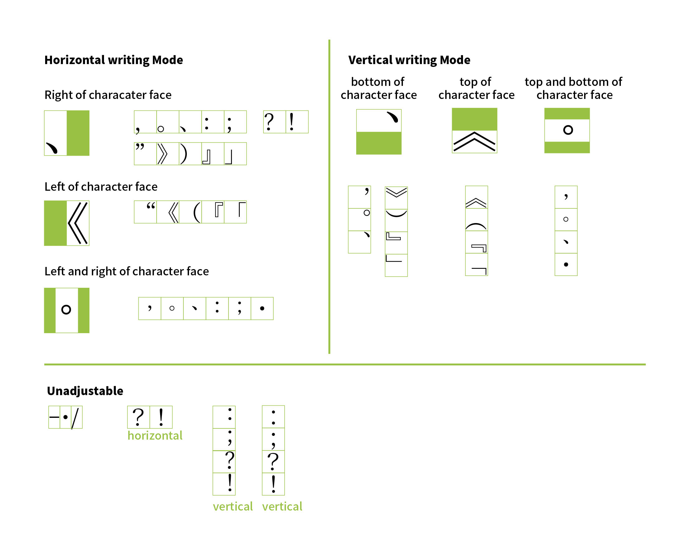
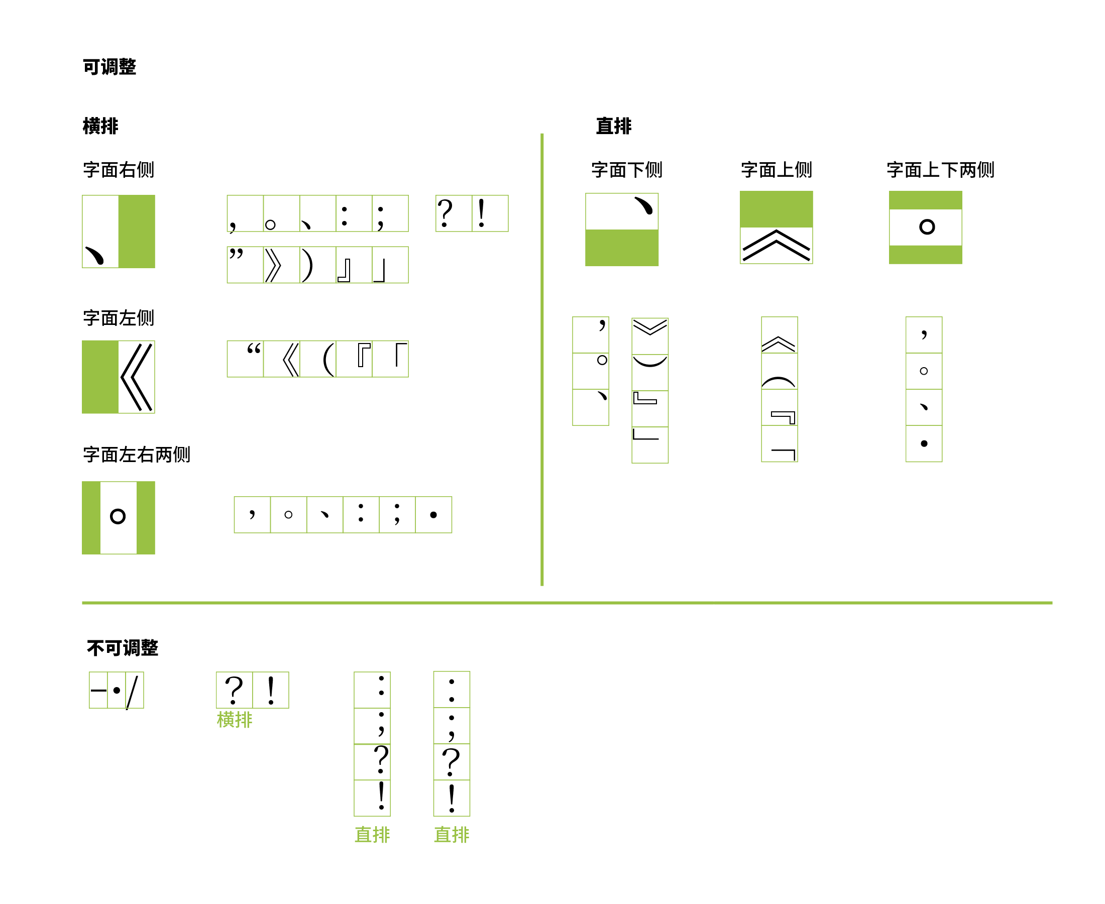
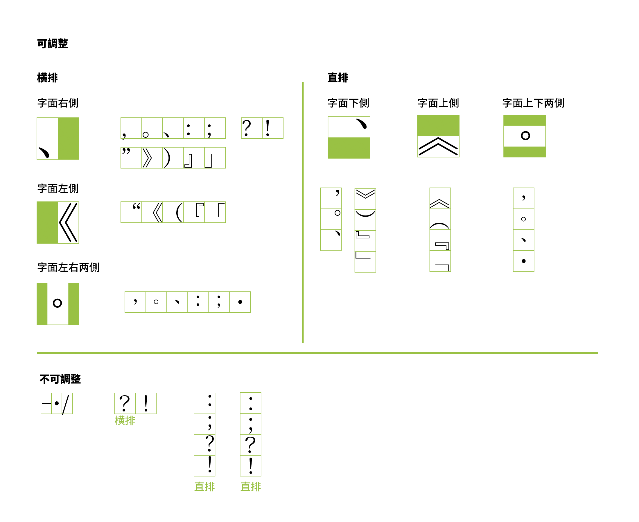
行首行尾禁則 行首行尾禁则 hángshǒu hángwěi jìnzé prohibition rules for line start/end

Due to the varied nature of the different punctuation marks, punctuation rules for the start of a line differ from that for the end of a line.

不同的标点依其性质,不得出现于行首或行尾的排版规则。

不同的標點依其性質,不得出現於行首或行尾的排版規則。

行尾點號懸掛 行尾点号悬挂 hángwěi diǎnhào xuánguà hanging punctuation marks for line end

Typesetting punctuation for line endings outside the margin of alignment, also known as hanging punctuation or exdentation.

将行尾的点号悬挂于版心之外的排版方式。

將行尾的點號懸掛於版心之外的排版方式。

漢語拼音 汉语拼音 Hànyǔ pīnyīn Hanyu Pinyin

Hanyu Pinyin provides a method of using Latin characters with diacritics to indicate tone. It is often used to teach Standard Chinese and encourage its use as a common language for communication.

《汉语拼音方案》给汉字注音和拼写普通话的一种方案,采用拉丁字母,并用附加符号表示声调,是帮助学习汉字和推广普通话的工具。

《漢語拼音方案》給漢字注音和拼寫普通話的一種方案,採用拉丁字母,並用附加符號表示聲調,是幫助學習漢字和推廣普通話的工具。

漢字 汉字 Hànzì Chinese characters/Han characters

Characters that form the basis of the Chinese language.

中文的基本文字。

中文的基本文字。

橫排 横排 héngpái horizontal writing mode

The process or the result of arranging characters on a line from left to right, of lines on a page from top to bottom, and/or of columns on a page from left to right.

行内每字按水平方向由左至右,页内每行从上至下、每栏由左至右的排列方法,或者按此方法的排列状态。

行內每字按水平方向由左至右,頁內每行從上至下、每欄由左至右的排列方法,或者按此方法的排列狀態。

合文 合文 héwén ligature

A glyph form that combines two or more letters or ideographs.

将二字以上的词组写作一个汉字书写单位的形式。

將二字以上的詞組寫作一個漢字書寫單位的形式。

活字排版 活字排版 huózì páibǎn letterpress printing

The traditional printing method using movable type.

使用可以移动的字块进行文字排版及印刷的方式。

使用可以移動的字塊進行文字排版及印刷的方式。

簡體中文 简体中文 jiǎntǐ Zhōngwén Simplified Chiense

The writing system of Chinese using characters that are relatively simpler in structure and stroke count, mainly refer to Jianhuazi (Simplified Character) published and revised in 1960s in Mainland China. Cf. Traditional Chinese.

字形及笔画相对较简单的汉字体系,主要指中国大陆于20世纪60年代左右公布修订的简化汉字,与之对应者为繁体中文。

字形及筆畫相對較簡單的漢字體系,主要指中國大陸於20世紀60年代左右公布修訂的簡化漢字,與之對應者為繁體中文。

夾注符號 夹注符号 jiázhù fúhào brackets

General term for a pair of punctuation marks that isolate a segment of text from its surroundings and include additional information for clarification or for emphasis.

为提示或突显将文本夾注起来的一类成对符号的总称。

為提示或突顯將文本夾注起來的一類成對符號的總稱。

結束夾注符號 结束夹注符号 jiéshù jiázhù fúhào closing bracket(s)

The ending character of the paired brackets, which includes quotation marks, parentheses, book title marks etc.

成对的夹注符号(引号、括号、书名号)中,标注结束的字符。

成對的夾注符號(引號、括號、書名號)中,標注結束的字元。

介音 介音 jièyīn medial

The semivowel between initial and main vowel in Chinese syllable.

汉语音节的构成中,位于辅音和主要元音之间的过渡音。

漢語音節的構成中,位於輔音和主要元音之間的過渡音。

緊排 紧排 jǐnpái reduced inter-character spacing

Adjustment of inter-character spacing by making the distance between the character face of adjacent characters shorter than that produced by solid setting.

减少字距,使文字外框一部分重叠的排版方式。

減少字距,使文字外框一部分重疊的排版方式。

基文 基文 jīwén base text

Text to be annotated by ruby, ornament characters, or emphasis dots.

行间注排版中,受标注的原文字词或语句。

行間注排版中,受標注的原文字詞或語句。

開始夾注符號 开始夹注符号 kāishǐ jiázhù fúhào opening bracket(s)

The opening character of the paired brackets, which includes quotation marks, parentheses, book title marks etc.

成对的夹注符号(引号、括号、书名号)中,标注起始的字符。

成對的夾注符號(引號、括號、書名號)中,標注起始的字元。

拉丁字母 拉丁字母 lādīng zìmǔ Latin letters

The letters of Latin alphabet.

西文常用的字母。

西文常用的字母。

lán column

A partition on a page in multi-column format.

将连续一系列的文章放在一页里,按照文字阅读方向分割成两个以上的每一个独立部分。

將連續一系列的文章放在一頁里,按照文字閱讀方向分割成兩個以上的每一個獨立部分。

欄間距 栏间距 lán jiānjù column gap

Amount of space between columns on a page.

栏与栏之间的间距。

欄與欄之間的間距。

羅馬拼音 罗马拼音 luómǎ pīnyīn Romanization

The conversion system of writing from Chinese pronunciation into Roman/Latin script.

将汉字依语言将其发音转写为拉丁字母的方式。

將漢字依語言將其發音轉寫為拉丁字母的方式。

密排 密排 mìpái Solid setting

To arrange characters with no inter-character space between adjacent character frames.

将文字依其外框紧密排列的排版方式。

將文字依其外框緊密排列的排版方式。

末端 末端 mòduān end point

The ending point of a line, meaning the bottom side in vertical writing mode, or the right side in horizontal writing mode.

文本或文字靠近其所在行行尾的一端。通常,文字直排时末端在下,横排在右。

文本或文字靠近其所在行行尾的一端。通常,文字直排時末端在下,橫排在右。

排版樣式 排版样式 páibǎn yàngshì page format

The layout and presentation of a page with text, graphics and other elements for a publication such as a book.

书籍等出版物上图、文及其他元素的版式布局及表现形式。

書籍等出版物上圖、文及其他元素的版式布局及表現形式。

輕聲 轻声 qīngshēng neutral tone

A kind of special tone phenomenon in modern standard Chinese, with no fixed tone.

现代标准汉语的特殊变调现象,无固定调值。

現代標準漢語的特殊變調現象,無固定調值。

齊頭尾對齊 齐头尾对齐 qítóuwěi duìqí justified alignment

The alignment method to align on both the left and right ends of each line of one paragraph text.

一种段落每行的行头行尾分别对齐的排版方式。

一種段落每行的行頭行尾分別對齊的排版方式。

全形/全角 全形/全角 quánxíng/quánjiǎo fullwidth
  1. A relative index for the length which is equal to a given character size.
  2. A square character frame that has a character advance of character size.

排字的一种相对度量单位,宽度等于所使用的字号,用做排版宽度水平方向的度量。

排字的一種相對度量單位,寬度等於所使用的字號,用做排版寬度水平方向的度量。

入聲 入声 rùshēng checked tone

One of four tones in Historical Chinese phonology, which has short and brief pitch.

汉语及汉语方言的音节结构,属四声之一,其调值之调型短而急促。

漢語及漢語方言的音節結構,屬四聲之一,其調值之調型短而急促。

聲調 声调 shēngdiào tone

The pitch contours in language to distinguish lexical or grammatical meaning in one syllable. There are 4 tones, e.g. Ping (level), Shang (rising), Qu (departing), Ru (entering) in Historical Chinese phonology.

音节的高低升降变化。汉语传统音韵学里分为平、上、去、入等四声。

音節的高低升降變化。漢語傳統音韻學裡分為平、上、去、入等四聲。

聲母 声母 shēngmǔ initial

The initial consonant of a Chinese syllable.

汉语字音音节开头的辅音。

漢語字音音節開頭的輔音。

始端 始端 shǐduān starting point

The text or character that is near the beginning of the line. Normally, when the text is in vertical writing mode, the starting point is on the top; in horizontal writing mode, the starting point is on the left.

文本或文字靠近该行行首的一端。通常,文字直排时始端在上,横排在左。

文本或文字靠近該行行首的一端。通常,文字直排時始端在上,橫排在左。

疏排 疏排 shūpái Loose setting

Text setting with extra even inter-character spacing in addition to the default spacing between characters, achieved by applying positive tracking to the text.

于各字之间加入均匀空白的排版方式。

於各字之間加入均勻空白的排版方式。

天/天頭 天/天头 tiān/tiāntóu head/top margin

The top margin between the top edge of a trimmed page and the type area.

版心上沿至成品幅面上沿之间的空白区域 (GB/T 9851.2-2008, 3.4)

版心上沿至成品幅面上沿之間的空白區域 (GB/T 9851.2-2008, 3.4)

文字設計/字體排印 文字设计/字体排印 wénzìshèjì/zìtǐpáiyìn typography

The art and technique of arranging type to make written language legible, readable, and appealing when displayed. [Definition from Wikipedia]

对文字进行合适地排版让书面语言易认、易读、有吸引力地展现出来的一种工艺。

對文字進行合適地排版讓書面語言易認、易讀、有吸引力地展現出來的一種工藝。

西文 西文 Xīwén Western scripts

Writing systems derived from Greek and Latin.

欧洲、美洲和大洋洲通行的文字。

歐洲、美洲和大洋洲通行的文字。

以連字符斷行 以连字符断行 yǐ liánzìfú duànháng hyphenation

Use of the hyphen to join words and to separate syllables of a single word.

在西文词组音节间插入连字符来断行的方式。

在西文詞組音節間插入連字符來斷行的方式。

韻母 韵母 yùnmŭ final

The part in a Chinese syllable without initial and tone.

汉语字音中一个音节中除声母、声调外的部分。

漢語字音中一個音節中除聲母、聲調外的部分。

製表定位字元 制表定位字元 zhìbiǎodìngwèizìyuán tab

Characters with the feature of tabulation.

提供按列对齐文本功能的字元。

提供按列對齊文本功能的字元。

直排/豎排 直排/竖排 zhípái (shùpái) vertical writing mode

The process or the result of arranging characters on a line from top to bottom, of lines on a page from right to left, and/or of columns on a page from top to bottom.

行内每字按垂直方向由上至下,页内每行从右至左、每栏由上至下的排列方法,或者按此方法的排列状态。

行內每字按垂直方向由上至下,頁內每行從右至左、每欄由上至下的排列方法,或者按此方法的排列狀態。

中外文對照 中外文对照 Zhōng-wàiwén duìzhào bilingual annotations

To prompt a Chinese term with its original or translation in the form of annotation text or base text, an instance of interlinear annotation.

以注文或基文的形式为汉语词组提示原文或译文,系行间注排版的一种实现方式。

以注文或基文的形式為漢語詞組提示原文或譯文,係行間注排版的一種實作方式。

中、西文混排處理 中、西文混排处理 Zhōng-Xīwén hùnpái chǔlǐ Chinese and Western mixed text composition

The process of interleaving Chinese text with Western text.

在中文文本中,包含部分西文時的處理方式。

在中文文本中,包含部分西文時的處理方式。

注文 注文 zhùwén annotation text

Interlinear text run indicating pronunciation or definitions.

行间注排版中,标注于行间(原文字词或语句旁侧)以标注发音或释义的文字。

行間注排版中,標注於行間(原文字詞或語句旁側)以標注發音或釋義的文字。

注音符號 注音符号 zhùyīn fúhào Zhuyin (Bopomofo)

The general name of Mandarin Phonetic Symbols and Taiwanese Phonetic Symbols.

“国语注音符号”及“台湾方音符号”的统称。

「國語注音符號」及「台灣方音符號」的統稱。

字幅 字幅 zìfú character advance

Size of a character frame in the inline direction.

字符在行方向上的大小。

字符在行方向上的大小。

字號 字号 zìhào type size

Dimensions of a character.

区别单个字符大小的表示方法。(GB 9851.2-2008, 3.3)

區別單個字符大小的表示方法。(GB 9851.2-2008, 3.3)

字距 字距 zìjù tracking

The space between characters.

字符之间的空隙。

字符之間的空隙。

字面 字面 zìmiàn character face

Area in which glyph is drawn.

文字的字身框中,字图实际分布的空间。

文字的字身框中,字圖實際分布的空間。

字體 字体 zìtǐ typeface

A set of letters, characters or symbols, which are designed to have coherent patterns to be used for printing or rendering to a computer screen.

字母、文字或符号的一组集合,一个字体通常有一贯的笔画与字形风格,用于印刷或屏幕渲染中。

字母、文字或符號的一組集合,一個字體通常有一貫的筆畫與字形風格,用於印刷或螢幕渲染中。

字型 字型 zìxíng font

A set of glyphs with the same design, often referred to as typeface nowadays.

具有相同基本设计的字形图像集合(GB/T 16964.1-1997, 3.6),现多与字体混用。

具有相同基本設計的字形圖像集合(GB/T 16964.1-1997, 3.6),現多與字體混用。

字形 字形 zìxíng glyph

A symbol of identifiable abstraction, depending on no specific design.

字母、文字或符号在书写、印刷上的形体。

字母、文字或符號在書寫、印刷上的形體。

縱橫對齊 纵横对齐 zònghéng duìqí grid alignment

The process, under the premise of justification, of arranging characters within grids to make sure that they are aligned in both horizontal and vertical axes.

头尾对齐的前提下,保证各行文字在横、纵轴二方向皆相互对齐排列于网格中的排版方式。

頭尾對齊的前提下,保證各行文字在橫、縱軸二方向皆相互對齊排列於網格中的排版方式。

縱中橫排 纵中横排 zòngzhōnghéngpái horizontal-in-vertical setting

To typeset a (small) group of characters horizontally within a vertical line of main text.

在直排文本中,将成(小)组的字符横排插入排版方式。

在直排文本中,將成(小)組的字符橫排插入排版方式。

C. References 参考文献 參考文獻

D. Revision Log 修订记录 修訂記錄

The following changes were made since the previous publication.

对上一次发布进行了如下变更:

對上一次發佈進行了如下變更:

A detailed list of changes, including diffs, can be found in the github commit log.

变更的具体内容列表,包括差异比较可以查询 github commit log

變更的具體內容列表,包括差異比較可以查詢 github commit log

E. Acknowledgements 致谢 致謝

Special thanks to the following people who contributed to this document (contributors' names listed in in alphabetic order).

感谢以下参与者对本文档的建议与补充(依字母及拼音顺序排列):

感謝以下參與者對本文檔的建議與補充(依字母及拼音順序排列):

Addison Phillips, Buernia, 陳穎青, Du Yuang, Hao Chen, Hawkeyes Wind, 贺师俊 John Hax (百姓网), 侯迈 MieMie (豆瓣), NFSL2001, Jiang Jiang (Opera), 吕康豪 Kang-hao Lu (BGI), 李喆明 Austin Lee, Percy Ma, 权循真 Xidorn Quan (Mozilla), SyaoranHinata, technommy, Virgil Ming, and Zhengyu Qian.

Please find the latest info of the contributors at the GitHub contributors list.

欲了解最新的参与者信息,请参看GitHub贡献者列表

欲了解最新的參與者信息,請參看GitHub貢獻者列表