This document summarizes the text composition requirements in the Chinese writing system. One of the goals of the task force is to describe the issues in the Chinese layout requirements, another one is to provide satisfactory equivalent to the current standards (i.e. Unicode), also to promote vendors to implement those relevant features correctly.
This section describes the status of this document at the time of its publication. Other documents may supersede this document. A list of current W3C publications and the latest revision of this technical report can be found in the W3C technical reports index at https://www.w3.org/TR/.
This document was created by the Chinese Layout Task Force within the W3C Internationalization Interest Group, and in collaboration with the W3C HTML5 Chinese Interest Group. The Internationalization Working Group has been a great help during the writing of this document. The Chinese Layout Task Force will work with Internationalization Working Group to publish Working Drafts of this document, and to widen the exposure and review of the document.
If you wish to make comments regarding this document, please raise them as github issues. Only send comments by email if you are unable to raise issues on github (see links below). All comments are welcome.
To make it easier to track comments, please raise separate issues or emails for each comment, and point to the section you are commenting on using a URL for the dated version of the document.
Publication as a Working Draft does not imply endorsement by the W3C Membership. This is a draft document and may be updated, replaced or obsoleted by other documents at any time. It is inappropriate to cite this document as other than work in progress.
This document was produced by a group operating under the
5 February 2004 W3C Patent
Policy. The group does not expect this document to become a W3C Recommendation.
W3C maintains a public list of any patent
disclosures made in connection with the deliverables of the group; that page also includes instructions for disclosing a patent. An individual who has actual knowledge of a patent which the individual believes contains
Essential
Claim(s) must disclose the information in accordance with
section
6 of the W3C Patent Policy.
1.1 Basic Features of Chinese Script中文排版的主要特色中文排版的主要特色
Chinese composition exhibits several differences from other writing systems. The major features include:
中文排版有别于其它书写体系,主要特点如下:
中文排版有別於其他書寫體系,主要特色在於以下各點:
There are two written scripts in Chinese, using traditional and simplified characters. Apart from the differences between glyphs and strokes, the composition rules can be different as well.
中文版本分为繁体字版本和简体字版本,两者除文字字形、笔画多少等差异外,各项排版规则也有所区别。
中文分為繁體字與簡體字,兩者除文字字形、筆畫多寡等差異外,各項排版規則也有所區別。
There are two writing modes: vertical and horizontal. The former is often seen in Traditional Chinese publications.
中文的书写方向有直排及横排两种,其中,前者多见于繁体中文出版物。
中文的書寫方向有直排及橫排二種,其中,前者多見於繁體中文出版品。
In principal, the characters, including Chinese (hanzi) characters and punctuation, used in Chinese composition are squares with the ratio of 1:1, and are seamlessly arranged with one another.
原则上,中文排版所使用的汉字和标点符号的比例皆为1:1的正方形,将其无缝隙并列排成版面。
原則上,中文排版所使用的漢字與標點符號之比例皆為1:1的正方形,將其無縫隙並列排成版面。
1.2 Purpose of this document目的本文書之目的
Each cultural community has its own language, script and writing system. The transfer of each writing system into cyberspace is a task with very high importance for information and communication technology.
As one of the basic work items of this task force, this document summarizes the text composition requirements in the Chinese writing system. One of the goals of the task force is to describe the issues in Chinese layout requirements, another is to provide satisfactory equivalents to the current standards (i.e. Unicode), and another is to prompt vendors to implement those relevant features correctly.
1.3.1 Languages Used in this Document本文档所使用的中文语言本文档所使用的中文语言
This document was developed by people working in both Simplified and Traditional Chinese. We very much appreciate the contributions of the editors and collaborators from different linguistic backgrounds, and their willingness to collaborate across linguistic boundaries. In this early version of the Working Draft, the version of the script used for the Chinese text depends on the person who contributed the text. We expect to create separate translations of the Chinese text in future versions of this document, but at this early stage the original contributions are kept as is to enable rapid development of the text.
It describes presentational results and considers these results as issues and requirements for Chinese text layout. Meanwhile, it offers principles or methods for for handling these issues, without describing particular technological solutions.
It suggests solutions for, or explains, present-day issues that people face in Chinese composition.
针对目前中文排版上所遇到不明确的问题,试图提出处理方法,或以列举的方式提出说明。
針對目前中文排版上所遇到不明確的問題,試圖提出處理方法,或以列舉的方式提出說明。
It provides typical instances of Chinese composition and their actual use cases as much as possible.
我们也尽可能地提供中文排版的实际范例,并且在批注中说明该排版方式会应用于何种状况。
我們也盡可能地提供中文排版的實際範例,並且在註解中說明該排版方式會應用於何種狀況。
In consideration of non-Chinese readers of this document, figures are used for explanation wherever possible.
考虑到未曾接触过中文排版的读者,尽可能地以图解来呈现。
考慮到未曾接觸過中文排版的讀者,盡可能地以圖解來呈現。
It mainly explains modern Chinese publications. Looking back to the publications in the time of movable type, there may be some differences, but they are still considered part of Chinese composition. The document does not yet fully cover ancient books. Future editions may be revised with such features in mind.
For non-Chinese readers, frequency of use is indicated for each requirement. These frequencies are not the outcome of any accurate research, but arise from the long experience of the authors. Non-Chinese readers should understand that they are intuitive for ordinary Chinese readers. These frequencies provide only rough information to prioritize the importance of issues.
The main target of this document is common books. Other publications, such as magazines or newspapers, are also included.
本文以书籍作为主要描述对象,但也包括杂志、报纸等不同排版方式。
本文以書籍作為主要描述對象,但也包括雜誌、報紙等不同排版方式。
2. Basics of Chinese Composition中文排版基础中文排版基礎
2.1 Characters and Principles for Setting them in Chinese Composition中文排版所使用的文字和基本原则中文排版所使用的文字和基本原则
2.1.1 Characters used for Chinese composition中文排版所使用的文字中文排版所使用的文字
The majority of the text used in Chinese composition consists of Han characters (hanzi).
中文排版主要使用的文字為漢字。
中文排版主要使用的文字為漢字。
Chinese characters include Traditional Chinese and Simplified Chinese alternatives. The former, which is also known as Upright Characters or Traditional Han, is commonly used in Taiwan, Hong Kong and Macao while the latter is commonly used in Mainland China, Singapore and Malaysia. In this document, the number of strokes and the compositional nature of a character are considered to be the major differences between Simplified Chinese characters and Traditional Chinese characters.
Different glyphs are used in different regions. One unicode code point does not match just one glyph, but rather depends on the operating system and fonts. The focus of this document is Chinese composition and we will not discuss glyph variations.
In addition to the Chinese (hanzi) characters, various punctuation marks, as well as Western characters such as European numerals, Latin letters and/or Greek letters, may be used in Chinese text.
中文排版除了汉字外,也使用标点符号,也会与阿拉伯数字、拉丁文字、希腊文字等外文混排。
中文排版除了漢字外,也使用標點符號。也會與阿拉伯數字、拉丁文字、希臘文字等外文混排。
Note
One Simplified Chinese character may have more than one corresponding Traditional form. For example, the Simplified Chinese character 发 can be matched to either the Traditional Chinese character 發 or 髮. By contrast, the circumstances where one Traditional Chinese character corresponds to more than one Simplified Chinese character are rare, but still need attention. For example, the Traditional Chinese character 乾 may be matched to either the Simplified Chinese character 干 or 乾. The relationships between Traditional and Simplified characters depend on their particular context.
Chinese characters have square character frames of equal dimensions. Aligned with the vertical and horizontal center of the character frame, there is a smaller box called the letter face, which contains the actual symbol. (There should be some space left between the letter face and the frame). Most of the punctuation marks for Chinese characters share the same size as the other characters, however some of them differ, such as the ellipsis, which is one-character high and two-characters wide.
Character size is measured by the size of the character frame. Character advance is a term used to describe the advance width of the character frame of a character, which should be the same as the width of the character.
文字尺寸则为文字外框的尺寸。此外,字间距则是依照文字排列方向的文字外框大小,为文字的宽度。
文字尺寸則為文字外框的尺寸。此外,字幅則是依照文字排列方向的文字外框大小,為文字的寬度。
2.1.3 Principles for Arranging Characters during Chinese Composition汉字的配置原则漢字的配置原則
In principle, when composing a line with Chinese characters, no extra space appears between their character frames. This is called solid setting.
汉字按照行排列文字,原则上文字外框彼此紧贴配置,称作密排。
漢字依行排列文字,原則上文字外框彼此緊貼配置,稱作密排。
Note
Unlike the letterpress printing era, when several sizes of the original pattern of a letter were required to create matrices, in today's digital era the same original pattern is used for any size simply by enlargement or reduction. Because of this, it might be necessary to adjust the inter-character space when composing lines at large character sizes. When composing lines at small character sizes in outline fonts, hinting data is used to ensure that the width of the strokes that make up a character look correct. When only a small portion of the fonts are smaller, they will be displayed as bitmaps, and there is no need to make extra adjustments.
Depending on the context, in addition to solid setting several alternative setting methods can be used, as described below.
依照内容的不同,也会采用以下方式排列。
依照內容的不同,也會採用以下方式排列:
2.1.3.1 Increased inter-character spacing增加字距增加字距
It is common in books to increase the space between each character frame (i.e. loose setting) for the following cases:
在各字之间加入固定量的空白来排列文字,称作疏排。书籍排版上,遇到以下状况时,会采用这种排列方式。
於各字之間加入固定量的空白來排列文字,稱作疏排。書籍排版上,遇到以下狀況時,會採用此排列方式:
To achieve a balance between running heads with different numbers of characters, increased inter-character spacing is used for running heads with few characters.
为使字数不同的标题间能取得平衡,需要加大字距。
為使字數不同的標題間能取得平衡,而加大字距。
For captions of illustrations and tables, which only have a few characters, increased inter-character spacing is used to balance with the size of an illustration or table.
图片与表格的说明文字字数少时,为取得平衡,需要加大字距。
圖片與表格之說明文字字數少時,為取得平衡,而加大字距。
In some cases, increased inter-character spacing is used for poetry where one line has only a few characters, so as to maintain the balance of the layout.
应用在字数少的诗词时,为与版面取得平衡,需要加大字距
應用於字數少的詩詞時,為與版面取得平衡,而加大字距。
For publications whose main audience is children, inter-character spacing is increased to make it easier for the children to read.
针对儿童书籍等,为提升易读性时,需要加大字距。
針對兒童書籍等,為提升易讀性時,而加大字距。
2.1.3.2 Even inter-character spacing平均排列平均排列
Text may be set with equal inter-character spacing between all characters on a given line, so that each line is aligned to the same line head and line end. Since the Chinese characters and punctuation marks are all in square shapes with almost the same dimensions, it is natural that each line is aligned to the same line head and line end. Even inter-character spacing is mainly used in the following cases:
To deal with rules that forbid certain characters at the beginning or end of a line. When a punctuation mark which is not supposed to be positioned at the end of a line happens to appear there, even inter-character space setting is used to move the character before the punctuation mark to the next line together with the punctuation mark. When a punctuation mark which is not supposed to be positioned at the beginning of a line happens to appear there it is necessary to move the last character from the previous line to the beginning of the next line, and there will be one or two (or sometimes more) empty spaces left in the previous line. Even inter-character space setting is used to unify the length of each line and justify them.
Even inter-character space setting is used when the number of characters in a table head differs from the table content, such as for person names, so as to justify the table.
表格标题、名单等要求呈现上一致时,会采用平均排列的方式处理。
表格标题、人名名单等求呈現上一致時,會採用平均排列的方式處理。
2.1.3.3 Reduced inter-character spacing减少字距減少字距
By reducing the inter-character spacing, a portion of two character frames overlap each other (i.e. solid setting). This method is mainly used in the following cases:
减少字距,使得文字外框一部份重叠,称作紧排。这种处理方式,主要应用于以下情况:
減少字距,使得文字外框一部份重疊,稱作紧排。這種處理方式,主要應用於:
For characters in headings in magazines or advertisements, reduced inter-character spacing can be used to keep the characters on one line, or it can also be used to achieve a special effect for presentation.
杂志标题以及广告文案字数较多,为使其排列在一行,或为求特殊表现时使用。
雜誌標題以及廣告文案字數較多,為使其排列於一行,或為求特殊表現時使用。
Since Chinese characters are all square-shaped, this method does not apply to headings and content in books produced by letterpress printing.
由于汉字皆为正方形,此方式并不适用于活字排版,故不应用于书籍标题与内文的排列上。
由於漢字皆為正方形,此方式並不適用於活字排版,故不應用於書籍標題與內文的排列上。
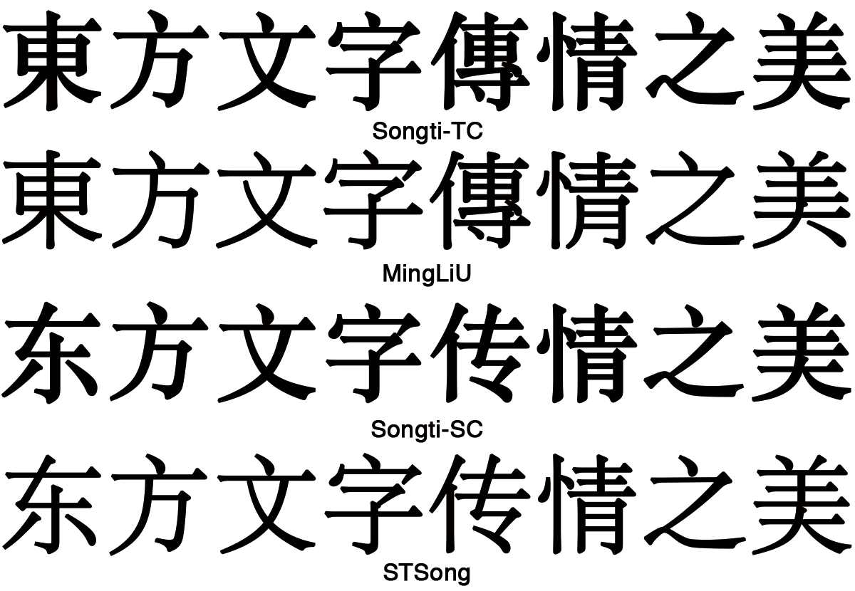
2.2 Typefaces for Chinese Characters中文排版常用字体中文排版常用字體
2.2.1 Four Frequently-used Typefaces for Chinese Characters中文排版经常使用的四种字体中文排版經常使用的四種字體
There are four main typefaces in use for Chinese characters:
中文排版时,主要使用的四种字体为:
中文排版時,主要使用的四種字體為:
Song (Ming)宋体(明体、明朝体)宋體(明體、明朝體)
Kai楷体楷體
Hei黑体黑體
Fangsong (Imitation Song)仿宋体仿宋體
The following sections describe common practice and contexts for use of these four typefaces.
这四种字体在书籍排版上有其常见的使用方式,下列各节分别介绍其使用情境。
這四種字體於書籍排版上有其常見之使用方式,下列各節分別敘述其使用情境。
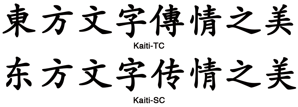
2.2.2 Song/Ming宋体(明体、明朝体)宋體(明體、明朝體)
Fig. 1Song宋体(明体、明朝体)宋體(明體、明朝體)
Song, also known as Songti or Ming, is currently the most common style of type in print for Chinese.
Song is commonly used in text, headings and annotations. When used in headings, the characters will appear in a bold face, so as to distinguish the heading from the text.
普遍使用于内文文字、标题与注释。当应用于标题时,通常会特别加强字重,使其与内文有所差异。
普遍使用於內文文字、標題與注釋。當應用於標題時,通常會特別加強字重,令其與內文有所差異。
2.2.3 Kai楷体楷體
Fig. 2Kai楷体楷體
Kai also known as Kaiti or regular script, is another of the major typefaces, and provides calligraphic styles for Chinese characters. It is also the most easily and widely recognized style and shows notable handwriting features.
Kai is mainly used in text that needs to be differentiated from the rest of the content, for example, headlines, references, quotations, and dialogs. It is rarely used for emphasis, because of its similarity with Song.
Since Kai retains some calligraphic features, it is widely used in office documents and textbooks.
由于楷体保留了书法笔触,普遍用于公文书、教科书的内文。
由於楷體保留了書法筆觸,普遍用於公文書、教科書之內文字。
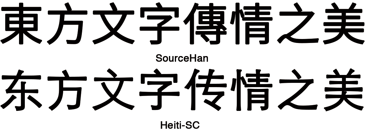
2.2.4 Hei黑体黑體
Fig. 3Hei黑体黑體
Hei, also known as Heiti or Gothic, is a type style characterized by strokes of even thickness, reduced curves, and a lack of decoration. It is commonly used in headlines, signs, and personal names in dialogs. In body text, characters in Hei style with thicker strokes typically indicate emphasis.
Traditional publications rarely apply the Hei style for content, but with the growing influence of the World Wide Web and the digital publishing industry, some publications are starting to experiment Hei in this context.
The type area, sometimes called the printing area, is designed in the following sequence. There is no actual definition of what the type area is. I suggest we change the foregoing to something like: The type area, sometimes called the printing area, is the rectangle in the middle of the page that contains the main body of the text. It is surrounded by space containing headers, footers, notes, etc.
中文书籍排版按照以下顺序设计:
中文書籍排版依以下順序設計:
First, prepare a template of the page format, which determines the basic appearance of document pages.
首先,设计版心。
首先,設計版心。
Then, specify the details of actual page elements based on the template.
其次,以版心为基准进行实际页面的设计。
其次,以版心為基準進行實際頁面的設計。
Books usually use one basic template for page format, whereas magazines often use several templates.
书籍多数仅使用一种基础版式设计,杂志则会使用上数种。
書籍多數僅使用一種基礎排版體裁,雜誌則會使用上數種。
Although in books, there tends to be one template for the page format, some further design effort based around the basic page format will be needed for pages such as the table of contents and indexes. Furthermore, there are many examples of indexes with a different page format than the basic page format, and vertically set books often have indexes in horizontal writing mode, and sometimes multiple columns. However, while doing actual design for the page, the size of the type area should not exceed the basic page template. (some doubts about the translation of 版面 here).
Magazines usually contain various kinds of content, which naturally leads to various designs of templates, different sizes of characters, and varying numbers of columns.
杂志则因为内容不同,版式设计多变,文字大小、栏数依照内容不同会有所变化。
雜誌則因為內容不同,排版體裁多變,文字大小、欄數依照內容不同會有所變化。
2.3.1 Basic Elements of Page Format基础版式设计的主要元素基礎排版體裁的主要元素
The following are the basic elements of a page format.
基础版式设计的主要元素如下:
基礎排版體裁的主要元素如下:
Trim size and binding side (vertically set Chinese documents are bound on the right-hand side, and horizontally set documents are bound on the left-hand side.)
版面与装订线(中文书籍直排为右侧装订、横排为左侧装订)
完成尺寸與裝訂邊(中文書籍直排為右側裝訂、橫排為左側裝訂)
Principal text direction (vertical writing mode or horizontal writing mode).
文字书写方向(直排或横排)
文字書寫方向(直排或橫排)
Appearance of the type area and its position relative to the trim size.
版心与版面的相对位置
版心與完成尺寸的相對位置
Appearance of running heads and page numbers, and their positions relative to the trim size and type area.
页眉与页数位置
頁眉與頁數位置
Note
Establishing a type area may be seen as defining not only a rectangular area on a page, but also within that area an underlying, logical grid, to guide the placement of such things as characters, headings, and illustrations. Once the grid is established according to the principles of composition, the setting of the characters must align with the grid. If the content contains Chinese characters only, it is an important principle that the first and last characters on a line should align with the border of the type area. When both Chinese characters and Western text are mixed in the content, or forbidden locations of punctuation marks need to be taken into consideration, the setting of the content may not align with the grid.
The type area defines the basic printing style of a book. The following are the basic elements of the type area.
作为书籍基本设计而成的版式设计称为版心,版心的设计元素如下:
作為書籍基本設計而成的排版體裁稱為版心,版心的設計元素如下:
Character size and typeface name
所使用的文字尺寸以及字体种类
所使用的文字尺寸以及字體種類
Text direction (vertical writing mode or horizontal writing mode)
文字书写方向(直排或者横排)
文字書寫方向(直排或者橫排)
Number of columns and column gap when using multi-column format
分栏时,栏数以及栏距
分欄時,欄數以及欄距
Length of a line
一行的长度(字数)
一行的長度(字數)
Number of lines per page (number of lines per column when using multi-column format)
一页的行数(分栏时为一栏的行数)
一頁之行數(分欄時為一欄之行數)
Line gap
行距
行距
Letter-spacing
字距
字距
2.3.3 Type Area and Real Page Format以版心作为实际页面的排版体裁以版心作為實際頁面的排版體裁
This section explains how to create a real page format based on the type area.
本部分说明如何以版心作为基本版式来设计各页面。
本部分說明如何以版心作為基本排版體裁來設計各頁面。
Realm and position of headings: The direction and size of the characters of the heading should be based on a number of lines in the type area. The size of the indent is usually specified as a number of characters in the type area.
Size of illustrations: In horizontal writing mode, the width of illustrations should, if at all possible, be the width of the type area; in horizontal writing mode with multiple columns, the width of illustrations should, if at all possible, be the width of one type area column. The illustrations are usually set at the head or the foot of the page. Likewise, in vertical writing mode, the height of illustrations should, if at all possible, be either the height of one type area column or the height of the type area. The illustrations are usually set at the right side or left side of the type area.
Page for Table of Contents, Indexes and References: The size of the type area for the table of contents, indexes and references of books is based on the size of the type area for the main body content. There are many examples of tables of contents in vertical writing mode where the left-to-right size is identical to that of the type area, but the top-to-bottom size is a little bit smaller.
2.3.4 Procedure for Defining the Type Area设计版心的顺序設計版心的順序
Specifying the dimensions of the type area
决定版心尺寸
決定版心尺寸
For a document with a single column per page, specify the character size, the line length (the number of characters per line), the number of lines per page, and the line gap.
无分栏时,需决定文字尺寸、一行的字数(即为行长)、一页的行数以及行距。
無分欄時,需決定文字尺寸、一行的字數(即為行長)、一頁的行數以及行距。
For a document with multiple columns per page, specify the character size, the line length (the number of characters per line), the number of lines per column, the line-gap, the number of columns and the column gap.
当分栏时,需决定文字尺寸、一行的字数(即为行长)、一栏的行数、行距、栏数以及栏距。
當分欄時,需決定文字尺寸、一行的字數(即為行長)、一欄的行數、行距、欄數以及欄距。
Determining the position of the type area relative to the trim size. There are various alternative methods for specifying the position of the type area relative to the trim size:
决定相对于印刷版面,版心的配置位置。版心配置位置的设计顺序有着以下方式。
決定相對於印刷版面,版心的配置位置。版心配置位置的設計順序有著以下方式。
Set the type area at the horizontal and vertical center of the trim size.
将版心置于印刷版面的正中央,天地等高、左右等宽。
將版心置於印刷版面的正中央,天地等高、左右等寬。
Position vertically by specifying the size of the space at the head (for horizontal writing mode) or the space at the foot (for vertical writing mode). Position horizontally by centering the type area.
横排时指定天的留白量、直排时则指定地的留白量,左右等宽。
橫排時指定天的留白量、直排時則指定地的留白量,左右等寬。
Position vertically by centering the type area. Position horizontally by specifying the size of the space for the gutter.
天地等高,指定装订线的留白量。
天地等高,指定裝訂邊的留白量。
Position vertically by specifying the space at the head (for horizontal writing mode) or the space at the foot (for vertical writing mode). Position horizontally by specifying the size of the space for the gutter.
指定装订线的留白量,横排时指定天的留白量、直排时则指定地的留白量。
指定裝訂邊的留白量,橫排時指定天的留白量、直排時則指定地的留白量。
Note
In most cases the type area is set at the horizontal and vertical center of the trim size, and then it can be adjusted depending on its dimensions. This design method is mainly inherited from the letter press printing technology. For desktop publishing, the dimensions of the type area are usually calculated based on the space between the type area and the trim size.
2.3.5 Considerations when Designing the Type Area设计版心的注意事项設計版心的注意點
The following are considerations that need to be taken into account when designing the type area:
在设计版心时需考虑以下事项:
版心於設計時需考量以下事項:
When deciding the dimensions of the type area, it is necessary to consider both the trim size and the margin. Generally speaking, the shape of the type area could be made similar to that of the trim size.
决定版心尺寸时,要先考虑到印刷版面尺寸与留白后进行。一般而言,版心与印刷版面会呈相似形的设计。
決定版心尺寸時,得先考量到印刷版面尺寸與留白後進行。一般而言,版心與印刷版面會呈近於相似形的設計。
Character size. For the main target audience of publications, i.e. the adult population, most commonly the character size is 10.5pt (≒3.7mm) or 9pt (≒3.2mm). The minimum acceptable size of type is 8pt (≒2.8mm), except for specialized publications.
There are two traditional size systems for Chinese characters, and old one and a new one. The following shows the equivalence in the Western point system. In the Old size system, Size 0 = 42pt, Size 1 = 27.5pt, Size 2 = 21pt, Size 3 = 15.75pt, Size 4 = 13.75pt, Size 5 = 10.5pt, Size 6 = 7.875pt, and Size 7 = 5.25pt; in the new size system, New Size 0 = 36pt, New Size 1 = 24pt, New Size 2 = 18pt, New Size 3 = 16pt, New Size 4 = 12pt, New Size 5 is 9pt.
Size 5 is usually used for text content. Newspapers and magazines use both Size 5 and New Size 5. The acceptable minimal size for the text in content is Size 6 (7.875pt≒2.8mm). If a smaller size is used, it will be difficult to read due to the complex structure of the Chinese characters.
Line length should be multiples of the character size and each line should be in alignment with each other.
一行的行长应为文字尺寸的整数倍,各行的位置尽可能头尾对齐。
一行的行長應為文字尺寸的整數倍,各行的位置盡可能頭尾對齊。
Note
For Chinese composition without intermixed Western scripts, the characters all have a square-shaped frame, so all line lengths except that of the last line of the paragraph should, in principle, be the same.
The line gaps between each line should be the same throughout the book, except for special cases. It would probably help, at this point, to define what the line gap is, since it initially sounds like the same thing as line height. What are the reference points for measuring the line gap?
行与行之间的空白(行距)除特别状况外,皆需保持一致。
行與行之間的空白(行距)除特別狀況外,皆需保持一致。
Note
In Traditional Chinese composition, there are cases where pronunciation marks, referred to as 'ruby' in the Japanese Layout Requirements, are inserted between lines. In such cases the line gap is not changed but is kept constant . If these elements are likely to occur in text, the line gap established during the type area design needs to be of an adequate size to accommodate them.
The line gap for the type area is commonly set to a value between 50% and 100% of the height of the character frame used for the type area. A shorter line gap can be chosen in cases where the line length is short or the character size of the type area is relatively small. On the other hand, the line gap usually does not exceed the character size. Increasing the line gap beyond the character size does not improve the reading experience.
There is another method of specifying the type area that uses line height rather than line gaps. Line height is the distance between two adjacent lines measured from their reference points. The reference point differs from implementation to implementation, however, in vertical writing mode the horizontal center of the character frame is usually used, and with horizontal writing mode, the vertical center of the character frame is used. When the character size is the same for every character, the following calculation is used:
line height = character size / 2 + line gap + character size / 2 = character size + line gap
行高=文字尺寸÷2+行距+文字尺寸÷2=文字尺寸+行距
行高=文字尺寸÷2+行距+文字尺寸÷2=文字尺寸+行距
line gap = line height - character size
行距=行高-文字尺寸
行距=行高-文字尺寸
2.4 Writing Modes文字书写方向文字書寫方向
2.4.1 Writing Modes in Chinese中文的文字书写方向中文的文字書寫方向
Chinese composition has two text directions, vertical writing mode and horizontal writing mode. Traditional Chinese can be composed both in vertical writing mode or horizontal writing mode, while Simplified Chinese is mostly composed in horizontal writing mode. There are rare cases where Simplified Chinese is composed in vertical writing mode.
Ever since the letter-press printing period, the characters and punctuation marks used for Chinese composition have basically been designed to have a square character frame. Thus the same collection of printing types can be used in either vertical writing mode or horizontal writing mode, simply by changing the direction of text. However, some adjustments will be needed for the punctuation marks so as to match the writing direction of the characters and their composition. This is described in more detail in 3.1Line Composition Rules for Punctuation Marks
标点符号与其排版
標點符號與其排版.
Traditionally, Chinese publications were composed mainly in vertical writing mode, and this tradition has been largely preserved in the regions using Traditional Chinese. However, with the increasing amount of translated publications and mixed-text publications, and the default mode of writing modes in the character processing software, horizontal writing mode is becoming more and more popular. In the Taiwan area, government departments, educational materials and books of natural science mainly use horizontal writing mode while literary works such as poetry and novels still use vertical writing mode. Vertical writing mode still stands as an important cultural characteristic of regions where Traditional Chinese is used.
There is usually only one direction for all text throughout a book, but there are cases where horizontal writing mode is used in certain parts of vertically composed books. Tables, captions for illustrations, running heads, and page numbers are usually composed horizontally in a page with a vertical writing mode.
2.4.2 Major Differences Between Horizontal and Vertical Writing Modes横排与直排的主要差异点橫排與直排的主要差異點
The following are major differences between vertical writing mode and horizontal writing mode:
直排与横排的主要差异点,列举如下:
直排與橫排的主要差異點,列舉如下:
Arrangement of characters, lines, columns and pages; direction of page progression.
文字、行、栏以及页面布局、装订方向
文字、行、欄以及頁面配置、裝訂方向
Vertical composition.
直排时
直排時
Characters are arranged from top to bottom, lines are arranged from right to left.
文字由上向下,行由右向左排列。
文字由上而下,行由右而左排列。
Columns are arranged horizontally from top to bottom.
水平切割,上下分栏。
欄水平切割,上下分欄。
A book starts with the left (recto) side and progresses from right to left.
页面由封面开始,由右向左进行配置(由左向右翻页)。
頁面由封面開始,由右向左進行配置(由左向右翻頁)。
Horizontal composition.
横排时
橫排時
Characters are arranged from left to right, and lines are arranged from top to bottom.
文字由左向右,行由上向下排列。
文字由左而右,行由上而下排列。
Note
Traditional Chinese mainly uses vertical writing mode. When characters need to be composed horizontally, each line will contain one character and lines will be arranged from right to left, and no columns will be applied. As a special case for vertical writing mode, this can be seen in stone inscriptions and headings in newspapers and magazines, but now it has been replaced by horizontal writing mode arranged from left to right.
Columns are arranged vertically from left to right.
垂直切割,左右分栏。
欄垂直切割,左右分欄。
A book starts with the right (recto) side and progresses from left to right.
页面由封面开始,由左而右进行配置(由右向左翻页)。
頁面由封面開始,由左而右進行配置(由右向左翻頁)。
Orientation of Western Text and Latin alphanumeric characters in a line.
文中包含西文、阿拉伯数字时的配置方式:
文中包含西文、阿拉伯數字時,如下配置:
In vertical writing mode, there are 3 methods for arranging Western text and Latin alphanumeric characters:
直排时,西文或阿拉伯数字有以下三种配置方式:
直排時,西文或阿拉伯數字有以下三種配置方式:
One by one, with the same normal orientation as that of the other characters. This is usually applied to one-letter alphanumerics or capitalized abbreviations.
与汉字的书写方向相同,按照字母顺序逐个排列,主要用于单一西文字母或阿拉伯数字、首字母缩写等。
與漢字採相同的書寫方向,依字母字字排列,主要用於單一西文字母或阿拉伯數字、首字母縮寫等。
Note
Western text or alphanumeric characters used for this arrangement should have the same fixed size and width as the Chinese characters, rather than using the proportional width.
西文字母或阿拉伯数字,采用此配置时,需使用与汉字相同尺寸、间距固定的等宽字体,而非比例 字体。
西文字母或阿拉伯數字,採用此配置時,需使用與漢字相同尺寸、字幅固定的等寬字體,而非比例字體。
Rotated 90 degrees clockwise. This is usually applied to English words or sentences.
文字以顺时针方向旋转90°,主要用于西文的单词、语句等。
文字以順時鐘方向旋轉90度。主要用於西文的單字詞、語句等。
Set horizontally without changing orientation. This is usually applied to two-digit numbers or numbers with more than two digits.
保持正常方向,横排处理(如日文的纵中横排)。主要应用于两到三位数字。
保持正常方向,橫排處理(如日文的縱中橫排)。主要應用於二至三位數字。
Note
In principle, if numbers are arranged horizontally in a vertical writing mode, the width of the numbers should not exceed one character width. This rule originated in the letterpress printing era due to the fixed width of each line. Therefore, in vertical writing mode, Western text and alphanumeric characters are not limited to two digits, but the width should not exceed one character width. Some commonly seen examples include "3.0", "A+" and "2B".
In horizontal writing mode there is only one way of arranging alphanumerics, i.e. the normal orientation.
横排时,以正常方向配置。
橫排時,以正常方向配置。
Arrangement of tables and/or illustrations.
表格、图片等标题栏的位置
表格、圖片等標題列的位置
In vertical writing mode, align the top of tables/illustrations to the right of the page but list the headers on the right side.
直排时,表格横列的标题栏为上方,但直行的标题栏位于右侧。
直排時,表格橫列之標題列為上方,但直行之標題列位於右側。
In horizontal writing mode, align the top of tables/illustrations to the left of the page but list the headers on the left side.
横排时,表格横列的标题栏为上方,但直行的标题栏位于左侧。
橫排時,表格橫列之標題列為上方,但直行之標題列位於左側。
Arrangement of an incomplete number of lines on a multi-column format page due to new recto, page break, or other reason.
换页、换章时最末页采用多栏排列、行在页面结束时,按照以下方式处理:
換頁、換章時最末頁採多欄排列、行於頁面中結束時,依以下方式處理:
In vertical writing mode, just finish the line where it ends. The number of lines in each column is not uniform.
直排时,顺延至行文结束,各栏左右行数可以不一致。
直排時,順其行文結束,各欄左右行數可以不一致。
In horizontal writing mode, re-arrange columns so that each column has the same number of lines. In case the number of lines is not divisible by the number of columns, add the smallest number to make it divisible and re-arrange columns using the quotient as the number of lines so that only the last column shall have the incomplete number of lines.
横排时,各栏的行数需平均。但因字数不足,行数无法与栏数配合时,不足的行数在最后一栏末尾留空。
橫排時,各欄的行數需平均。但因字數不足,行數無法與欄數配合時,不足的行數於最後一欄末尾留空。
Note
For most publications in Chinese, no columns are arranged either in vertical writing mode or horizontal writing mode. This arrangement, referring to the Japanese composition method, is more for books with translated content.
3.1 Line Composition Rules for Punctuation Marks标点符号与其排版標點符號與其排版
The usage of Chinese punctuation marks differs across different regions in China. One of the major differences is their behavior for composition. Punctuation marks in Traditional Chinese are usually positioned center-aligned with adjacent Han characters, while punctuation marks in Simplified Chinese should be aligned with the character they follow, and this alignment varies according to whether the composition uses vertical or horizontal writing mode. The differences of composition for punctuation in Traditional Chinese and Simplified Chinese, as well as the correct way to position them, will be introduced in more detail later.
There are differences between the punctuation marks used in China, Japan, Korea and Vietnam, but Unicode does not distinguish them using different codes. A number of punctuation marks are shared among Traditional Chinese, Simplified Chinese and Japanese. Usually the font used for the Han characters will determine the style of the punctuation marks, or they will be adjusted by the composition engine automatically.
The content of the following section is mainly based on the content of General Rules for Punctuation (GB/T 15834—2011) issued in Mainland China, as well as the Punctuation Guidance (2008 revised edition) issued by The Ministry of Education in Taiwan. The former is a recommended national standard while the latter is not mandatory for general publications but mainly used to regulate education materials like textbooks.
3.1.1 Categories and Usage of Punctuation Marks标点符号的分类及用法標點符號的分類及用法
3.1.1.1 Pause or Stop Punctuation Marks點號点号
Pause or stop punctuation marks are used to indicate pauses or the end of a sentence. Some of the pause or stop punctuation marks appear within a sentence, such as the slight-pause comma, comma, semicolon, colon, etc., while others appear at the end of a sentence, such as period, question mark and exclamation mark.
Ideographic full stops, fullwidth commas and ideographic comma.
句号、逗号与顿号
句號、逗號與頓號
U+3002 IDEOGRAPHIC FULL STOP [。] is the punctuation mark placed at the end of a sentence. U+FF0C FULLWIDTH COMMA [,] is mainly used for separating parts of a sentence such as clauses, and items in lists, particularly when there are three or more items listed. U+3001 IDEOGRAPHIC COMMA [、] (slight-pause comma) is usually used to separate items in lists, as a way to show sequence.
In many college books, science and technology literature, and grammar books of Western languages, most of which are in horizontal writing mode, Western language text is heavily used. In this case, U+FF0E FULLWIDTH FULL STOP [.] can be used as period, while U+002C COMMA [,] or U+FF0C FULLWIDTH COMMA [,] can be used as comma and slight-pause comma.
U+FF1A FULLWIDTH COLON [:] consists of two equally sized dots centered on the same vertical line. It is used to start an enumeration. U+FF1B FULLWIDTH SEMICOLON [;] is a punctuation mark that separates major sentence elements. A semicolon can be used between two closely related independent clauses, provided they are not already joined by a coordinating conjunction.
Fullwidth Exclamation Mark and Fullwidth Question Mark.
惊叹号与问号
驚嘆號與問號
U+FF01 FULLWIDTH EXCLAMATION MARK [!] is a punctuation mark usually used after an interjection or exclamation to indicate strong feelings or high volume (shouting), and often marks the end of a sentence. U+FF1F FULLWIDTH QUESTION MARK [?] casually known as the interrogation point, query, or eroteme, is a punctuation mark that indicates an interrogative clause, or phrase in many languages. The question mark is not used for indirect questions.
惊叹号 U+FF01 FULLWIDTH EXCLAMATION MARK [!]与问号 U+FF1F FULLWIDTH QUESTION MARK [?],用于句末,前者表示惊讶,后者表示质疑。
驚嘆號U+FF01 FULLWIDTH EXCLAMATION MARK [!]與問號U+FF1F FULLWIDTH QUESTION MARK [?]。驚嘆號及問號用於句末,前者表示驚訝,後者表示質疑。
3.1.1.2 Indicator Punctuation Marks标号標號
In contrast with pause or stop punctuation marks, indicator punctuation marks usually indicate a specific feature of the phrase or sentence. They include brackets, parentheses, em dashes, horizontal ellipsis, black circles or bullets, tildes, middle dots, angle brackets, low lines, and solidus.
Quotation marks, usually used in pairs, are commonly used to emphasize certain characters or words, or to indicate the beginning and ending of the dialog or quoted content. If there is a need to use a bracket within a pair of brackets, the shape of the inner quotation marks will differ from the parenting quotation marks. Quotation marks are a kind of bracket.
When there is a need for quotation marks, Traditional Chinese will apply single quotation marks first and then double quotation marks. Single quotation marks include U+300C LEFT CORNER BRACKET [「] and U+300D RIGHT CORNER BRACKET [」]; double quotation marks include U+300E LEFT WHITE CORNER BRACKET [『] and U+300F RIGHT WHITE CORNER BRACKET [』].
繁体中文采用先单、后双的引号体例。单引号,包含开始单直角引号U+300C LEFT CORNER BRACKET [「]与结束单直角引号 U+300D RIGHT CORNER BRACKET [」];双引号,包含开始双 直角引号 U+300E LEFT WHITE CORNER BRACKET [『]与结束双直角引号 U+300F RIGHT WHITE CORNER BRACKET [』]。
繁體中文採用先單、後雙的引號體例。單引號,包含開始單直角引號U+300C LEFT CORNER BRACKET [「]與結束單直角引號U+300D RIGHT CORNER BRACKET [」];雙引號,包含開始雙直角引號U+300E LEFT WHITE CORNER BRACKET [『]與結束雙直角引號U+300F RIGHT WHITE CORNER BRACKET [』]。
On the other hand, Simplified Chinese will apply double quotation marks first and then single quotation marks. For Simplified Chinese, double quotation marks include U+201C LEFT DOUBLE QUOTATION MARK [“], U+300E LEFT WHITE CORNER BRACKET [『], U+201D RIGHT DOUBLE QUOTATION MARK [”], U+300F RIGHT WHITE CORNER BRACKET [』]; the single quotation marks include U+2018 LEFT SINGLE QUOTATION MARK [‘], U+300C LEFT CORNER BRACKET [「], U+2019 RIGHT SINGLE QUOTATION MARK [’] and U+300D RIGHT CORNER BRACKET [」].
简体中文采用先双、后单的引号体例,弯引号用于横排、直角引号用于直排。双引号,包含开始双弯引号 U+201C LEFT DOUBLE QUOTATION MARK [“]、开始双直角引号 U+300E LEFT WHITE CORNER BRACKET [『]、结束双弯引号 U+201D RIGHT DOUBLE QUOTATION MARK [”]、 结束双直角引号U+300F RIGHT WHITE CORNER BRACKET [』];单引号,包含开始单弯引号 U+2018 LEFT SINGLE QUOTATION MARK[‘]、开始单直角引号 U+300C LEFT CORNER BRACKET[「]、 结束单弯引号 U+2019 RIGHT SINGLE QUOTATION MARK [’]、结束单直角引号 U+300D RIGHT CORNER BRACKET [」]。
簡體中文採用先雙、後單的引號體例,彎引號用於橫排、直角引號用於直排。雙引號,包含開始雙彎引號U+201C LEFT DOUBLE QUOTATION MARK [“]、開始雙直角引號U+300E LEFT WHITE CORNER BRACKET [『]、結束雙彎引號U+201D RIGHT DOUBLE QUOTATION MARK [”]、結束雙直角引號U+300F RIGHT WHITE CORNER BRACKET [』];單引號,包含開始單彎引號U+2018 LEFT SINGLE QUOTATION MARK [‘]、開始單直角引號U+300C LEFT CORNER BRACKET [「]、結束單彎引號U+2019 RIGHT SINGLE QUOTATION MARK [’]、結束單直角引號U+300D RIGHT CORNER BRACKET [」]。
Note
There are vertical blacket codepoints such like U+FE41 PRESENTATION FORM FOR VERTICAL LEFT CORNER BRACKET in Unicode. But they are not suitable for author to use directly. They should be replaced by other mechanism.
万国码编码中有如U+FE41 PRESENTATION FORM FOR VERTICAL LEFT CORNER BRACKET等直立的符号,但不适宜作者直接使用该符号,而是透过其他机制替代使用。
萬國碼編碼中有如U+FE41 PRESENTATION FORM FOR VERTICAL LEFT CORNER BRACKET等直立的符號,但不適宜作者直接使用該符號,而是透過其他機制替代使用。
Note
Some publications in Traditional Chinese might also apply double quotation marks first and then single quotation marks.
某些繁体中文出版物也会采用先双、后单的引号体例。
某些繁體中文出版物亦會採用先雙、後單的引號體例。
Note
Traditional Chinese might also use quotation marks, but it is hardly ever used in vertical writing mode.
繁体中文也有使用弯引号者,但很少用于直排。
繁體中文也有使用彎引號者,但鮮少用於直排。
Parentheses.
括号
括號
Parentheses, also called simply brackets, round brackets, or curved brackets, contain material that serves to clarify, or is aside from the main point.
括号用于行内注释、说明。
括號用於行內注釋、說明。
According to Punctuation Guidance (2008 revised edition) issued by The Ministry of Education in Taiwan, parentheses used in Chinese include U+FF08 FULLWIDTH LEFT PARENTHESIS [(], U+FF09 FULLWIDTH RIGHT PARENTHESIS [)] and U+2E3A TWO-EM DASH [⸺] or U+2014 EM DASH [—]. Either one two-em dash (U+2E3A TWO-EM DASH [⸺]) or two consecutive em dashes can be used.
台湾教育部的《重订标点符号手册》(2008年修订版)称括号为夹注号,分甲式及乙式,甲式为 U+FF08 FULLWIDTH LEFT PARENTHESIS [( ]与 U+FF09 FULLWIDTH RIGHT PARENTHESIS [)], 乙式则为一对各占两个汉字空间的 U+2014 EM DASH [—](或使用连续两个「——」)。括号 属于括注符号。
台灣教育部的《重訂標點符號手冊》(2008年修訂版)稱括號為夾注號,分甲式及乙式,甲式為U+FF08 FULLWIDTH LEFT PARENTHESIS [(]與U+FF09 FULLWIDTH RIGHT PARENTHESIS [)],乙式則為一對各佔二個漢字空間的U+2E3A TWO-EM DASH [⸺]或U+2014 EM DASH [—]。括號屬於括注符號。
General Rules for Punctuation (GB/T 15834–2011), the national standard issued by China Central Government, lists em dash as a kind of dash.
There are other brackets and quotation marks which include: U+3010 LEFT BLACK LENTICULAR BRACKET [【], U+3011 RIGHT BLACK LENTICULAR BRACKET [】], U+3016 LEFT WHITE LENTICULAR BRACKET [〖], U+3017 RIGHT WHITE LENTICULAR BRACKET [〗], left U+3014 LEFT TORTOISE SHELL BRACKET [〔], U+3015 RIGHT TORTOISE SHELL BRACKET [〕], U+FF3B FULLWIDTH LEFT SQUARE BRACKET [[], U+FF3D FULLWIDTH RIGHT SQUARE BRACKET []], U+FF5B FULLWIDTH LEFT CURLY BRACKET [{], U+FF5D FULLWIDTH RIGHT CURLY BRACKET [}]. These brackets and quotation marks are rarely used in Chinese publications.
其它类括号则有:前方头括号 U+3010 LEFT BLACK LENTICULAR BRACKET [【]、后方头括号 U+3011 RIGHT BLACK LENTICULAR BRACKET [】]、前空心方头括号 U+3016 LEFT WHITE LENTICULAR BRACKET [〖]、后空心方头括号 U+3017 RIGHT WHITE LENTICULAR BRACKET [〗]、前六角括号 U+3014 LEFT TORTOISE SHELL BRACKET [〔]、后六角括号 U+3015 RIGHT TORTOISE SHELL BRACKET [〕]、前方括号 U+FF3B FULLWIDTH LEFT SQUARE BRACKET [[]、后方括号 U+FF3D FULLWIDTH RIGHT SQUARE BRACKET []]、前花括号 U+FF5B FULLWIDTH LEFT CURLY BRACKET [{]、后花括号 U+FF5D FULLWIDTH RIGHT CURLY BRACKET[}]。
其餘括號類則有:前方头括号U+3010 LEFT BLACK LENTICULAR BRACKET [【]、后方头括号U+3011 RIGHT BLACK LENTICULAR BRACKET [】]、前空心方头括号U+3016 LEFT WHITE LENTICULAR BRACKET [〖]、后空心方头括号U+3017 RIGHT WHITE LENTICULAR BRACKET [〗]、前六角括号U+3014 LEFT TORTOISE SHELL BRACKET [〔]、后六角括号U+3015 RIGHT TORTOISE SHELL BRACKET [〕]、前方括号U+FF3B FULLWIDTH LEFT SQUARE BRACKET [[]、后方括号U+FF3D FULLWIDTH RIGHT SQUARE BRACKET []]、前花括号U+FF5B FULLWIDTH LEFT CURLY BRACKET [{]、后花括号U+FF5D FULLWIDTH RIGHT CURLY BRACKET [}]。
Em Dash.
破折号
破折號
U+2E3A TWO-EM DASH [⸺] or U+2014 EM DASH [—] sometimes shows a continuation of tone or sound, an abrupt change in thought, or adding new content to the context. This punctuation takes one-character height and two-character width.
破折号表示语气或声音的延续、语意的转换或行文的补充。是占两个汉字空间的U+2E3A TWO-EM DASH [⸺]或U+2014 EM DASH [—]。
破折號表示語氣或聲音的延續、語意的轉換或行文的補充。為佔二個漢字空間的U+2E3A TWO-EM DASH [⸺]或U+2014 EM DASH [—]。
Horizontal ellipsis.
删节号/省略号
刪節號/省略号
In Chinese, the horizontal ellipsis usually consists of 3 dots, U+2026 HORIZONTAL ELLIPSIS […], or 6 dots (in two groups of three dots, occupying the same horizontal space as two characters, i.e. "……"). They usually indicate an intentional omission of a word, sentence, or whole section from a text. Depending on their context and placement in a sentence, ellipses can also indicate an unfinished thought, a slight pause, or echoing voice.
Emphasis dots are symbols placed above or beneath characters to emphasize the text, strengthen the tone, or avoid ambiguity. For horizontal writing mode, the emphasis dots are placed under the characters, whereas in vertical writing mode, they are usually placed to the right side of the characters. Both U+25CF BLACK CIRCLE [●] or U+2022 BULLET [•] can work as emphasis dots.
着重号用于表示相应文本的强调、着重语气或避免歧义。其形态是标注在文字底端或顶端(横排多在下方〔底端〕、直排多在右侧〔顶端〕)的圆形中黑点,可以为 U+25CF BLACK CIRCLE [●]或 U+2022 BULLET [•]。
着重號用於表示相應文本的強調、着重語氣或避免歧義。其形態為標注於文字底端或頂端(橫排多在下方〔底端〕、直排多在右側〔頂端〕)的圓形中黑點,可以為U+25CF BLACK CIRCLE [●]或U+2022 BULLET [•]。
Punctuation Guidance (revised edition) issued by The Ministry of Education in Taiwan does not include this mark but it is still seen in some publications.
台湾教育部的《重订标点符号手册》(2008年修订版)中未收录此符号,但仍可见于部分繁体中文出版品。
台灣教育部的《重訂標點符號手冊》(2008年修訂版)中未收錄此符號,但仍可見於部分繁體中文出版品。
Connector Marks.
连接号
連接號
Connector marks are used to indicate the beginning and end of time or space, to indicate quantity, to express the name of a chemical compound, to label a table or illustration, to connect a house number in an address, for a phone number, to separate digits which indicate the year, month and date, or to connect compound nouns, for the romanization as well as the foreign text in the content.
According to the Punctuation Guidance (revised edition) issued by The Ministry of Education in Taiwan, connector symbols include U+2013 EN DASH [–] and U+FF5E FULLWIDTH TILDE [~] or U+007E TILDE [~].
根据台灣教育部的《重訂標點符號手冊》,連接號分為甲式及乙式,甲式為U+2013 EN DASH [–]、乙式為U+FF5E FULLWIDTH TILDE [~]或U+007E TILDE [~]。
According to the General Rules for Punctuation (GB/T 15834—2011), there are three types of connector mark, which are the short connector mark [–], the long connector mark [—], and tilde [~].
The General Rules for Punctuation (GB/T 15834—2011) does not state the corresponding Unicode code point for the three types of connector marks. However, we can make the deduction that the long connector mark [—] is U+2014 EM DASH [—] and the tilde [~] is U+FF5E FULLWIDTH TILDE [~] . Since the short connector mark should take half the width of the long connector mark, it should be U+2013 EN DASH [–]. The actual length of these connector marks may depend on the writing system as well as the typeface.
《标点符号用法》(GB/T 15834—2011)中没有指定这三个符号的码位,但是基本上可以推断一字线是 U+2014 EM DASH [—],浪纹线是 U+FF5E FULLWIDTH TILDE [~]。但是对于短横线,该标准5.1.6节规定:短横线比汉字『一』略短,占半个字位置,因此可以是 U+2013 EN DASH [–]。这些连接号的实际长短根据所用处理系统和使用字体会有区别。
《标点符号用法》 (GB/T 15834—2011)中没有指定这三个符号的码位,但是基本上可以推断一字线是U+2014 EM DASH [—],浪纹线是U+FF5E FULLWIDTH TILDE [~]。但是对于「短横线」,该标准5.1.6節规定「横短线比汉字『一』略短,占半个字位置」,因此可以是U+2013 EN DASH [–]。这些连接号的实际长短根据所用处理系统和使用字體会有区别。
Middle Dot.
间隔号
間隔號
U+00B7 MIDDLE DOT [·], also known as interpoint, middot or centered dot, is a punctuation mark consisting of a vertically-centered dot, and is used to separate the first name and family name in names translated from a foreign language, or minority groups names. It is also used with double quotation marks to separate chapters, articles and volumes in publications.
Middle dot is applied to Chinese only. When a translated foreign name contains a Latin counter, the full stop should be used rather than the middle dot. For example, 「比尔·盖茨」 but 「B. 盖茨」.
The usage of middle dot differs between Traditional Chinese and Simplified Chinese. In principle, the middle dot, either in vertical writing mode or horizontal writing mode, should have the same dimensions as a character; while in Simplified Chinese, the middle dot sometimes has half the width of a character when it is used to separate the month and the date, e.g. 9·11.
Due to the fact that BIG-5 Code does not give a detailed definition of the middle dot, sometimes U+FF0E FULLWIDTH FULL STOP [.], U+2027 HYPHENATION POINT [‧] and U+2022 BULLET [•] are used as replacement for the middle dot. U+30FB KATAKANA MIDDLE DOT [・] is tightly connected to the JIS code system, it is not recommended to use this.
过去因大五码未有详细的语意定义,所以有时混用 U+FF0E FULLWIDTH FULL STOP [.]、U+2027 HYPHENATION POINT [‧]、U+2022 BULLET [•]等字符作为间隔号的例子,建议使用U+00B7 MIDDLE DOT [·]。而 U+30FB KATAKANA MIDDLE DOT [・]来自日文JIS编码,并非中文编码,不建议使用。
過去因大五碼未有詳細的語意定義,所以時有混用U+FF0E FULLWIDTH FULL STOP [.]、U+2027 HYPHENATION POINT [‧]、U+2022 BULLET [•]等字元作為間隔號的例子,建議使用U+00B7 MIDDLE DOT [·]。而U+30FB KATAKANA MIDDLE DOT [・]來自日文JIS編碼,並非中文編碼,不建議使用。
Book Title Mark.
书名号
書名號
The book title mark is used to indicate the names of works which usually include books, articles, songs, movies, files, calligraphy and paintings. Generally there are two types of book title marks, wavy low lines or angle brackets. U+FE4F WAVY LOW LINE [﹏] is positioned beneath the corresponding characters. When two works are listed next to each other, the wavy lines for each should be clearly separated. The angle bracket includes U+300A LEFT DOUBLE ANGLE BRACKET [《], U+300B RIGHT DOUBLE ANGLE BRACKET [》], U+3008 LEFT ANGLE BRACKET [〈] and U+3009 RIGHT ANGLE BRACKET [〉].The former pair is used for the names of books while the latter pair is used for the names of the articles.
根据台湾教育部的《重订标点符号手册》(2008 年修订版),书名号分为甲式及乙式,甲式为波浪底线 U+FE4F WAVY LOW LINE [_],标注在相应文本底端,两个作品名称相邻时, 甲式书名号间须在视觉上分离予以辨别。乙式有双书名号 U+300A LEFT DOUBLE ANGLE BRACKET [《]与 U+300B RIGHT DOUBLE ANGLE BRACKET [》]、单书名号 U+3008 LEFT ANGLE BRACKET [〈]与 U+3009 RIGHT ANGLE BRACKET [〉],前者用于标示书名号、后者用于标示篇名。
根据台灣教育部的《重訂標點符號手冊》(2008年修訂版),書名號分為甲式及乙式,甲式為波浪底線U+FE4F WAVY LOW LINE [﹏],標注在相應文本底端,二個作品名稱相鄰時,甲式書名號間須在視覺上分離予以辨別。乙式有雙書名號U+300A LEFT DOUBLE ANGLE BRACKET [《]與U+300B RIGHT DOUBLE ANGLE BRACKET [》]、單書名號U+3008 LEFT ANGLE BRACKET [〈]與U+3009 RIGHT ANGLE BRACKET [〉],前者用於標示書名號、後者用於標示篇名。
When two book title marks are positioned next to each other, there should be a clear separation to indicate the difference names.
书名号用于标示书名、篇名、歌曲名、影剧名、文件名、字画名等各种作品名称。
書名號用於標示書名、篇名、歌曲名、影劇名、文件名、字畫名等各種作品名稱。
According to the General Rules for Punctuation (GB/T 15834―2011), the names of books as well as chapters should be quoted using double angle brackets [《》]. When there is a need to indicate the name of another book within the double angle brackets [《》], the ordinary angle brackets [〈〉] should be used.
The wavy low line is rarely used in modern publications, but can still be seen in some textbooks and ancient publications.
甲式书名号已经很少出现于现代的出版品,但仍可见于教科书或古籍的标示。
甲式書名號已甚少出現於現代的出版品,但仍可見於教科書或古籍的標示。
Fullwidth low line.
专名号
專名號
U+FF3F FULLWIDTH LOW LINE [_] is positioned underneath proper nouns such as a person's name, the name of a place, etc.
专名号为 U+FF3F FULLWIDTH LOW LINE [_],标示专有名词——如人名、地名等——底端的符号。
專名號為U+FF3F FULLWIDTH LOW LINE [_],標示於專有名詞——如人名、地名等——底端之符號。
When two proper nouns are listed together, the FULLWIDTH LOW LINE should provide a visual distinction for them.
在两个专有名词相邻时,专名号间须在视觉上分离予以辨别。
在二個專有名詞相鄰時,專名號間須在視覺上分離予以辨別。
Note
As with WAVY LOW LINE, the FULLWIDTH LOW LINE is rarely used in modern publications, but it can still be seen in some textbooks and ancient publications.
同甲式书名号,专名号已甚少出现于现代书籍,但仍可见于教科书或古籍的标示。
同甲式書名號,專名號已甚少出現於現代書籍,但仍可見於教科書或古籍的標示。
Solidus.
分隔号
分隔號
Both U+002F SOLIDUS [/] and U+FF0F FULLWIDTH SOLIDUS [/] are used to indicate the separation of lines in poetry, syllable beats, and characters which should be separated.
Punctuation Guidance (revised edition in 2008) issued by The Ministry of Education in Taiwan does not include the SOLIDUS, but it is frequently used in traditional publications, including textbooks.
Punctuation marks used in Traditional Chinese are usually positioned in the vertical and horizontal center of the square space left for them; while in vertical writing mode and horizontal writing mode, some of the punctuation marks are positioned in different directions so as to mark the corresponding characters more accurately. For Simplified Chinese, the punctuation marks are usually positioned following the characters they are supposed to mark; while some punctuation marks might be positioned in different directions due to the vertical or horizontal writing mode. Also, different writing modes might require different punctuation marks to fulfill the same function, e.g. horizontal writing mode requires curved quotation marks while vertical writing mode requires angle brackets.
Pause or stop punctuation marks include the slight-pause comma, comma, semicolon, colon, period, question mark, exclamation mark, etc. In Traditional Chinese, they take the same dimensions as well as the direction as a character does. Traditional Chinese pause or stop punctuation marks are usually positioned in the vertical and horizontal center of the square space left for them. In Simplified Chinese, they are positioned in the top or bottom side in the space left for them following the marked characters. In horizontal writing mode, the pause or stop punctuation marks are placed at the lower left corner in the square space while in vertical writing mode, they are placed in the right upper corner.
Brackets marks include quotation marks, parentheses, title marks, etc. They should be positioned in pairs at each side of the marked character and have the same dimensions as a character, and the same direction as the characters. Bracket quotation marks have different positioning rules in Traditional Chinese and Simplified Chinese. In Traditional Chinese, single quotation marks will be used first and then double quotation marks, whereas in Simplified Chinese, double quotation marks will be used first and then single quotation marks. Also, the writing mode should be taken into consideration too. Horizontal writing mode requires curved quotation marks while vertical writing mode requires angle brackets.
Ellipsis and long dash, in the vertical and horizontal center of the square space for them, should be one character in height and two-characters in width. They are not supposed to be separated from one line to the next and should be positioned in the same direction as the characters.
Dashes, with the same dimensions as one character, should be positioned in the vertical and horizontal center of the square space for it. Among the dash marks, EN DASH should have a short length to make a clear distinction from the Chinese character [一], which means one. And they should be positioned in the same direction as the characters they mark.
Solidus, with the same dimensions and direction as the character it follows, should be positioned in the vertical and horizontal center of the square space for it. To make a more economical use of the space, or to set the members or characters more solid, sometimes the solidus can have a half character width.
Inline marks like title marks, wavy low lines, and emphasis dots should be positioned underneath the marked characters in horizontal writing mode. In vertical writing mode, emphasis dots should be positioned to the right side of the marked characters so as not to affect the characters above and beneath them.
Solidus should be positioned in the vertical and horizontal center of the square space for it. In Simplified Chinese, it should take half a character width, whereas in Traditional Chinese, there is no clear rule about its dimension but most publications will give them the same dimensions as one character.
3.1.3 Atypical punctuation marks and their composition非典型的标点符号及其配置非典型的標點符號及其配置
3.1.3.1 Science and technology literature科技文献科技文獻
Science and technology literature prefers U+FF0E FULLWIDTH FULL STOP [.] to U+3002 IDEOGRAPHIC FULL STOP [。] so as to make a clear distinction from letter [o] or digit [0].
科技文献中的句号多使用U+FF0E FULLWIDTH FULL STOP [.]替代U+3002 IDEOGRAPHIC FULL STOP [。],以避免同拉丁字母“o”或数字“0”混淆。
科技文獻中的「句號」多使用U+FF0E FULLWIDTH FULL STOP [.]替代U+3002 IDEOGRAPHIC FULL STOP [。],以避免同拉丁字母「o」或數字「0」混淆。
3.1.3.2 Special cases in Traditional Chinese publications繁体中文出版物的特殊情况繁體中文出版品的特殊情況
In Traditional Chinese publications such as ancient books, science and technology literatures, textbooks, or the books that have quotations in Western languages, some pause or stop punctuation marks, including slight-pause comma, colon and period, are positioned following the marked characters. The same applies for Simplified Chinese as well as Japanese so as to make the same style for the punctuation marks in both Chinese and Western languages.
3.1.4 Prohibition Rules for Line Start and Line End行首行尾禁则行首行尾禁則
In order to maintain a smooth reading experience and consistency of the style, there are certain constraints for the positioning of most punctuation marks. In most cases, according to its function, a punctuation mark is prohibited from appearing at the line start or line end. This rule was first implemented during the time of letterpress printing. In Mainland China, the national standard General Rules for Punctuation (GB/T 15834–2011) sets clear rules about the positioning of punctuation marks. In the regions that use Traditional Chinese, there is not yet a standard for the usage and positioning of punctuation marks, but most of the publications apply the rules described in this document.
In Traditional Chinese, there is no strict rule indicating that a punctuation mark must not appear at the line start. In the time of letterpress printing, there were quite a few publications which ignored the prohibition rules for punctuation marks.
In Traditional Chinese publications like newspapers and magazines, columns are often used in the layout, which leads to fewer characters in each line, and prohibition rules of punctuation marks are sometimes ignored under these circumstances.
In order to avoid a punctuation mark appearing at the line start, the last character from the previous line can be moved to the beginning of next line and the extra space left for the previous line should be divided and inserted equally between the characters of previous line. However, in the case where several punctuation marks appear together, for example [。』」], moving one character from previous line might cause too much space left between the characters. In this case, the punctuation marks might be allowed to appear at the line start so as to keep a reasonable space between characters in each line.
Pause or stop punctuation marks including slight-pause comma, comma, semicolon, colon, period, question mark, exclamation mark, as well as right quotation marks, right parentheses, right angle brackets, ellipsis, dash, etc, should not appear at the line start.
3.1.5 Prohibition Rules for Unbreakable Marks符号分离禁则符號分離禁則
3.1.5.1 Punctuation Marks标点符号標點符號
The following punctuation marks should be considered as one unit and take two-character widths. They should not be separated into two lines. In cases where multiples of these punctuation marks appear together, it is allowed to separate them into two lines as described in 3.2.4Handling Western Text in Chinese Text Using Proportional Western Fonts
西文使用比例字体时的混排处理
西文使用比例字體時的混排處理. If they were forced to remain on one line, it might cause too much space between the characters in the previous line and decrease the aesthetics of the entire composition.
以下标点符号占用两个汉字的空间,在行间应为一体,视作一个字符存在,不能为了适配分行而拆成两行。
以下標點符號佔用二個漢字的空間,在行間應為一體,視作一個字元存在,不得以適配分行之由拆至二行。
Note
In the digital era, these punctuation marks usually take the width of 2 characters but are still considered as one unit.
在数字出版时代,这些标点符号通常占用两个字符的宽度,但是被认做一个整体单元。
在数字出版时代,这些标点符号通常占用两个字符的宽度,但是被认做一个整体单元。
Em dash and long dash.
乙式括号与破折号
乙式括號與破折號
U+2E3A TWO-EM DASH [⸺] or U+2014 EM DASH [—] should take one-character height and two-character widths, and long dash [——] can be used created by using two adjacent em dashes.
乙式括号与破折号是占两个汉字空间的U+2014 EMDASH [—(]或使用连续两个「——」)。
乙式括號與破折號為佔二個漢字空間的U+2E3A TWO-EM DASH [⸺] 或U+2014 EM DASH [—]。
Horizontal ellipsis.
删节号/省略号
刪節號/省略号
U+2026 HORIZONTAL ELLIPSIS […] takes one-character height and two-characters in width. Two horizontal ellipses can be used together 「……] .
According to section 5.1.5 of General Rules for Punctuation (GB/T 15834―2011), when two horizontal ellipses are used together, they should be four characters wide and occupy an independent line.
3.1.5.2 Digits and their Prefix and Suffix数字及其相应的前后缀单位符号數字及其相應的前後綴單位符號
3.1.5.3 Annotation Marks注释符号注釋符號
3.1.6 Compression Rules for Punctuation Marks标点符号的挤压標點符號的擠壓
Punctuation marks in Chinese usually have the dimensions of one character (or more). This provides a clear distinction between characters and leaves some room for compositional adjustment. However, if there is no character before or after the punctuation mark(s), the empty space around the punctuation mark(s) will seem a bit abrupt. In this case, proper compression for the punctuation mark(s) will make the composition more tightly-knit and readable.
Usually there are two ways to compress punctuation mark(s). First, when multiple punctuation marks appear together, the space between the punctuation marks can be adjusted; second, when multiple punctuation marks appear at the line start or line end, the space at the line start or line end can be adjusted.
3.1.6.1 Compression of adjacent punctuation marks连续标点符号的挤压連續標點符號的擠壓
When opening bracket(s), closing bracket(s), slight-pause comma, comma, period or interpunct appear together, the following rules for space adjustment will make the composition more solid and readable.
In Simplified Chinese, when one or more closing brackets appear behind a slight-pause comma, comma or period, a space of half a character width can be reduced. This rule does not apply to Traditional Chinese.
When a slight-pause comma, comma or period appears after a closing bracket, a space of half a character width can be reduced.
当顿号、逗号、句号出现在结束括注符号之后时,缩减其间二分之一个汉字大小的空白。
當頓號、逗號、句號出現在結束括注符號之後,縮減其間二分之一個漢字大小的空白。
When an opening bracket appears after a slight-pause comma, comma or period, a space of half a character width can be reduced.
当开始括注符号出现在顿号、逗号、句号之后时,缩减其间二分之一个汉字大小的空白。
當開始括注符號出現於頓號、逗號、句號之後,縮減其間二分之一個漢字大小的空白。
When an opening bracket appears after a closing bracket, a space of half a character width can be reduced.
当开始括注符号出现在结束括注符号之后时,缩减其间二分之一个汉字大小的空白。
當開始括注符號出現於結束括注符號之後,縮減其間二分之一個漢字大小的空白。
When two or more opening brackets appear together, a space of half a character width can be reduced.
当两个(或以上)开始括注符号连续排列时,缩减其间二分之一个汉字大小的空白。
當二個(或以上)開始括注符號連續排列時,縮減其間二分之一個漢字大小的空白。
When two or more closing brackets appear together, a space of half a character width can be reduced.
当两个(或以上)结束括注符号连续排列时,缩减其间二分之一个汉字大小的空白。
當二個(或以上)結束括注符號連續排列時,縮減其間二分之一個漢字大小的空白。
When a solidus appears after a closing bracket, a space of a quarter of a character width can be reduced.
当间隔号出现于结束括注符号之后时,缩减其间四分之一个汉字大小的空白。
當間隔號出現於結束括注符號之後,縮減其間四分之一個漢字大小的空白。
When a solidus appears before an opening bracket, a space of a quarter of a character width can be reduced.
当间隔号出现于开始括注符号之前时,缩减其间四分之一个汉字大小的空白。
當間隔號出現於開始括注符號之前,縮減其間四分之一個漢字大小的空白。
3.1.6.2 Compression of punctuation marks at line start行首行尾标点挤压行首行尾標點擠壓
When a punctuation mark appears at line start or line end, the following rules for space adjustment will make the composition more solid and readable.
标点符号出现在行首或行尾时,以下的空隙调整规则使文字体裁更加紧凑、易读。
標點符號出現在一行之首或之末時,以下的空隙調整規則得以使文字體裁更加緊湊、易讀。
For the case of line head indent, if a bracket is set at the beginning of a line, half a character space can be reduced ahead of the bracket.
使用段首缩进格式的排版中,若首行行首出现开始括注符号,可以缩减该符号始侧二分之一个汉字大小的空白。
使用段首縮進格式的排版中,若首行行首出現開始括注符號,可以縮減該符號始側二分之一個漢字大小的空白。
When an opening bracket appears at the beginning of a line, half a character space can be reduced ahead of the bracket.
当行首出现开始括注符号,可以缩减该符号始侧二分之一个汉字大小的空白。
當行首出現開始括注符號,可以縮減該符號始側二分之一個漢字大小的空白。
When a closing bracket appears at the end of a line, half a character space can be reduced behind the bracket.
当行尾出现结束括注符号时,可以缩减其末侧二分之一个汉字大小的空白。
當行尾出現結束括注符號時,可以縮減其末側二分之一個漢字大小的空白。
In Simplified Chinese, when a slight-pause comma, comma or period appears at the end of a line, half a character space can be reduced behind the bracket.
Most Chinese publications do not use hanging punctuation at line end. According to the Japanese Layout Requirements document, hanging punctuation at the line end is a kind of extension of the prohibition rules at line start. This rule helps to avoid moving characters or punctuation marks between lines and avoids inconsistency of space between the characters in different lines.
In general, the punctuation marks that can be hung at the line end include slight-pause comma, comma and period. In Simplified Chinese, the rest of the pause or stop punctuation marks can be hung at line end since they are set at at the side of the marked characters or in front of the marked characters.
If a punctuation mark (slight-pause comma, comma or period) is expected to be at the start of a line, it should be placed at the end of the line before, to fit in the type area.
若点号(顿号、逗号或句号)将出现于行首,可将其置于前一行的行尾端、突出版心。
若點號(頓號、逗號或句號)將出現於一行之首,可將其置於前一行的行尾端、突出版心。
However, for Traditional Chinese, which sets the punctuation marks at the center of the square space for it, hanging the punctuation marks might make an abrupt affect on the composition. Therefore, Traditional Chinese does not apply hanging punctuation in horizontal writing mode but only in vertical writing mode.
In the case of a succession of punctuation marks, punctuation hanging should not be applied.
连续多个标点符号的情况下,不作行尾点号悬挂的配置。
連續多個標點符號的情況下,不作行尾點號懸掛的配置。
3.2 Composition of Chinese and Western Mixed Texts中、西文混排处理中、西文混排處理
3.2.1 Composition of Chinese and Western Mixed Text中文与西文的混排中文與西文之混排
There are many examples in Chinese text where Western characters, such as Latin letters, Greek letters, or European numerals, are found alongside Han characters. The following are just a few examples:
中文排版中,汉字与拉丁字母、希腊字母或阿拉伯数字等西文混排的状况经常出现,以下列举部分范例。
中文排版中,漢字與拉丁字母、希臘字母或阿拉伯數字等西文混排的狀況經常出現,以下列舉部分範例。
One Western letter used as a symbol for something, such as 'A' or 'B'.
使用西文字母作为记号使用,如 A、B。
使用西文字母作為記號使用,如「A」「B」。
A Western word is used in a Chinese context, such as 'editor'.
直接使用如“editor”的西文单词。
直接使用如「editor」的西文單字詞。
Acronyms, such as 'DTP' or 'GDP'.
使用如DTP、GDP等,与组织名、专有名词等的首字母缩写。
使用如DTP、GDP等與組織名、專有名詞等首字母縮寫。
Book titles or authors in references to Western books that use the original spelling.
呈现西文文献等的作者名、书名等采用原本表计的方式呈现。
呈現西文文獻等之作者名、書名等採原本表計的方式呈現。
European numerals used to express years or other numbers, such as '1999年'.
使用阿拉伯数字表示纪年、数量值、编号等,如“1999年”。
使用阿拉伯數字表示紀年、數量詞、編號等,如「1999年」。
Western numeric characters are also used in itemized lists and numbered headings, or as symbols for chemical elements or mathematical formulae. It can be seen from these examples that it is an everyday occurrence to find Western characters mixed with Han characters in Chinese composition.
Western numerals, sometimes called arabic, or arabic-indic numerals, are referred to as European numerals in the context of this document, unless notes indicate otherwise.
若无特别示,本文使用的“阿拉伯数字”皆指西方语言或欧洲形式的印度-阿拉伯数字。
若無特別提示,本文使用之「阿拉伯數字」皆指西方語言或歐洲形式的印度-阿拉伯數字。
Formerly, fullwidth ASCII characters were often used, either to make the presentation look orderly, or simply due to the poorly developed computer technologies available for text layout. Nowadays, typesetting engines allow for proportional or monospace fonts, as required, rather than forcing the user to resort to the old fullwidth blocks of Latin letters and European numerals.
When Western texts are mixed with Han characters, Chinese style punctuation and its common usage should be used in principle since the main text is Chinese, However, in the case of technical documents, if plenty of formula are contained in the text, the full stop can be unified with the western-style period, U+002E FULL STOP [.]. Also in text books on grammar of Western languages etc., which contain plenty of example sentences mixed with Chinese, western-style periods [.] can be used.
中西混排中,由于正文是中文,原则上应该使用中文标点,遵守中文标点的习惯用法。 但是,科学技术中文图书,如果涉及公式较多,句号可以统一使用西文句号 U+002E FULL STOP [.],省略号使用英文的三点省略号;中文版西文语法教材之类的图书,西文例句较多且多与中文混排时,句号可以统一使用西文句号[.]。
中西混排中,由于正文是中文,原则上应该使用中文标点,遵守中文标点的习惯用法。但是,科学技术中文图书,如果涉及公式较多,句号可以统一使用西文句号U+002E FULL STOP [.],省略号使用英文的三点省略号;中文版西文语法教材之类的图书,西文例句较多且多与中文混排时,句号可以统一使用西文句号[.]。
3.2.2 Mixed Text Composition in Horizontal Writing Mode横排的中、西文混排配置橫排的中、西文混排配置
In horizontal writing mode, the basic approach uses proportional fonts to represent Western text and uses proportional or monospace fonts for European numerals. In principle, there is tracking or spacing between an adjacent Han character and Western character of up to one quarter of a Han character width, except at the line head or end.
Another approach is to use a Western word space (U+0020 SPACE), in which case the width depends on the font in use.
或可使用西文词间空格(U+0020 SPACE [ ],其宽度随不同字体有所变化)。
或可使用西文詞間空格(U+0020 SPACE [ ],其寬度隨不同字體有所變化)。
3.2.3 Mixed Text Composition in Vertical Writing Mode直排的中、西文混排配置直排的中、西文混排配置
For vertical writing mode, the following list describes methods of setting Western letters and European numerals:
直排时,西文与阿拉伯数字的配置有以下三种方法:
直排時,西文與阿拉伯數字的配置有以下三種方法:
Setting Western letters with Han character-width monospace fonts. Letters or European numerals follow each other, one at a time, in the same direction and rotation as the Han characters. This arrangement is usually adopted where the text contains a single letter or digit, or an acronym (such as GDP).
Setting Western letters with proportional fonts, rotated 90 degrees clockwise. This approach is usually adopted where Latin letters compose a word or sentence. There is tracking or spacing between a Han character and an adjacent Western letter or European numeral, up to a width of one quarter of a Han character, except at the line head or end.
Setting European numerals with proportional fonts in horizontal-in-vertical orientation. This style is usually adopted when dealing with a two to three digit number whose width is equal to the default line advance or slightly wider (within an acceptable range).
Han numerals are usually used in vertical writing mode, however in recent years it is becoming more common to see fullwidth European numerals and proportional numerals set as horizontal-in-vertical.
直排时多使用汉字数字,然而近年使用西文数字的情况渐有增长,纵中横排亦颇为常见。
直排時多使用漢字數字,然而近年使用西文數字的情況漸有增長,縱中橫排亦頗為常見。
3.2.4 Handling Western Text in Chinese Text Using Proportional Western Fonts西文使用比例字体时的混排处理西文使用比例字體時的混排處理
The following provides composition rules for handling Western characters and European numerals in horizontal writing mode or in situations in vertical writing mode where the Western words/phrases or European numerals are rotated 90 degrees clockwise:
A sequence of Western characters in a Western word should not break across a line-break, except where hyphenation is allowed.
西文单字词在可使用连字符处外,不得分隔为两行。
西文單字詞在可使用連字符處之外,不得分隔為兩行。
Tracking or spacing between a Han character and a Western letter or numeral is up to a quarter of the width of a Han character.
汉字与西文字母之间,原则上使用不多于四分之一个汉字宽的字距或空白。
漢字與西文字母之間,原則上使用不多於四分之一個漢字寬的字距或空白。
Justified text alignment is an important feature of Chinese composition. It is harder to align text as expected when a line contains Western characters. Typically, spacing or tracking is applied equally across the line, but such adjustments are only applied between Han characters or between Han and Western letters. The spacing is not equally distributed between characters in Western words and/or European numerals.
Tracking or spacing of Western letters or European numerals before the line head or after the line end are not justified.
位于行首的西文与阿拉伯数字之前、位于行尾的西文与阿拉伯数字之后不调整字距或加入空白。
位於行頭的西文與阿拉伯數字之前、位於行尾的西文與阿拉伯數字之後不調整字距或加入空白。
Tracking or spacing of Western letters or European numerals is not adjusted before or after Chinese commas or full stops, nor after Chinese opening and before Chinese closing brackets.
在中文点号前后、中文开始括注符号之后、结束括注符号之前的西文,不调整字距或加入空白。
於中文點號前後、中文開始括注符號之後、結束括注符號之前的西文,不調整字距或加入空白。
3.2.5 Handling of Grid Alignment in Chinese and Western Mixed Text Composition纵横对齐下的中西文混排处理縱橫對齊下的中西文混排處理
Due to the fact that each Han character is of the same width, not only should characters at the start and end of a line be aligned but it is also a requirement for characters within blocks of Han text to be aligned both vertically and horizontally, whether in vertical or horizontal writing mode. When Western text or European numerals intervene, this principle is harder to achieve. Possible approaches are listed below:
Instead of a quarter Han-width tracking between Han and Western letters, it is possible to use flexible spacing of up to half a Han character width. This brings the space occupied by Western characters to a multiple of the width of a Han character. In this way, both the Han character before and after the Western language span snaps to the grid lines.
When a Western word appears at the line end and needs to be broken, rather than breaking the word at a syllable boundary per the Western convention, the word may be forced to break at the line end, in order to ensure correct alignment.
当西文位于行尾必须断行时,不需遵照西文从音节断行的惯例,在行尾强制断行,以确保行尾对齐。
當西文位於行尾必須斷行時,不遵照西文從音節斷行的慣例,於行尾強制斷行,以確保行尾對齊。
Note
When using grid alignment, it is recommended to deal with line end punctuation marks by hanging the first of them outside the type area as mentioned in section 3.1.7Hanging Punctuation at Line End
行尾点号悬挂
行尾點號懸掛. In situations that involve consecutive punctuation marks, the second and following punctuation marks are allowed to appear at the line start.
Grid alignment is adopted more often in Traditional Chinese typesetting, whereas use in Simplified Chinese is rare.
纵横对齐多使用于繁体中文排版,简体中文较为少见。
縱橫對齊多使用於繁體中文排版,簡體中文較為少見。
3.3 Interlinear annotations行间注行间注
3.3.1 Usage of Interlinear Annotations行间注的用途行间注的用途
Chinese interlinear annotation, also known as ruby, is small, supplementary text attached to certain characters or words in the main text. Chinese interlinear annotation is usually set in the interlinear space and aligned to the corresponding base text which it annotates. In Chinese typesetting, Chinese interlinear annotation is mainly used to indicate pronunciation or meaning.
3.3.1.1 Indicating the Pronunciation for Chinese characters为汉字标注读音为汉字标注读音
In Chinese, interlinear annotation is most commonly used to indicate the pronunciation of Han characters. Presenting the pronunciation alongside the characters is a great help to beginners, especially to children who are native speakers, or to foreigners intending to study Chinese. Therefore, it is rare to annotate isolated Han characters. Instead, phonetic annotations tend to cover the full text. Also, it is not regular practice in Chinese layout to use interlinear annotation for pronunciation outside these educational contexts, even for the pronunciation of rarely used characters, although sometimes pronunciation is provided inline, possibly inside brackets.
There are two major annotation systems for indicating Chinese pronunciation: Zhuyin and Romanization.
中文的标音方案有注音符号与罗马拼音两大类:
中文的标音方案有注音符号与羅馬拼音两大类:
Zhuyin.
注音符号
注音符号
Mandarin Phonetic Symbols (國語注音符號) or Taiwanese Dialect Phonetic Symbols (台灣方音符號), hereinafter referred to as ‘Zhuyin’, are systems for phonetic annotation mainly used in Taiwan, although other areas may also include Zhuyin in certain dictionaries or textbooks. In most cases, Zhuyin appears on the right side of its corresponding base text. Exceptions are very rare.
Fig. 5An example of positioning for Zhuyin in vertical and horizontal writing modes.注音符號在直、橫排下的行間注排版示例。注音符號在直、橫排下的行間注排版示例。
Romanization.
罗马拼音
羅馬拼音
Hanyu Pinyin (汉语拼音), now the official standard in Mainland China, uses the Latin alphabet to transcribe the Modern Standard Chinese (Mandarin) pronunciations of Chinese characters. The most common use case in Mainland China is to indicate the pronunciation for all characters of the full text with Hanyu Pinyin. In Taiwan and areas that use Chinese dialects in China, the arrangement of the Taiwanese Romanization System for Minnan (台灣閩南語羅馬字), or romanization systems of other Chinese dialects are similar to those of Hanyu Pinyin.
Due to the characteristics of the Latin alphabet, such annotations appear in horizontal writing mode only. Texts for children who are native speakers usually provide reading assistance for each individual character, while texts for those who are learning Chinese as a second language mainly indicate pronunciation for whole words, but occasionally, both of them are set almost the same. There is space between the base text when whole words are annotated, and the interlinear annotation characters will have unique requirements such as sentence case, or punctuation marks corresponding to base characters. Early publications using Pinyin are very varied and lack consistency. Both character-based and word-based annotations are quite common. No further description of the early pinyin will be found in this document.
Fig. 6An example of positioning for Romanization.羅馬拼音行間注的排版示例。羅馬拼音行間注的排版示例。
3.3.1.2 Indicating Meaning or Other Additional Information标注释义等非语音信息标注释义等非语音信息
Bilingual Annotations.
中外文对照
中外文對照
Bilingual annotations aim to provide a Chinese translation of text in foreign languages or acronyms, or to offer the original text for words that have been translated into Chinese. This is mainly used for proper nouns, titles or those terms whose concepts are difficult to convey after translation. It is commonly found in translated works, mainly in light novels.
Fig. 7An example of positioning for billingual annotations.中外文對照行間注的排版示例。中外文對照行間注的排版示例。
Interlinear Comments.
行间批语
行間批語
Interlinear comments are ways to annotate the meaning of text fragments or a single word, and are so named for their interlinear positioning. They usually lie in the interlinear space and co-exist with the body text. Compared to other annotation methods, i.e. headnotes or footnotes, interlinear comments are more compact and stick better to the body. These kinds of comments are often found in ancient books, such as Rouge Inkstone, an early commentary of the novel Dream of the Red Chamber.
3.3.2 Overview of Interlinear Annotation Positioning行间注排版概述行间注排版概述
In vertical writing mode, Zhuyin, Romanization or bilingual annotations are usually placed on the right side of the base text (Han characters), while interlinear comments are often placed on the left side. In horizontal writing mode, Zhuyin can be placed above the base text, but in most cases they are still set to the right side of the base text. On the other hand, Romanization and bilingual annotations can appear both above or below the base text, and the interlinear comments are usually placed at the bottom of the base text.
In principle, Zhuyin Phonetic Symbols are of the same size, and the number of Zhuyin symbols for one Han character is never more than three, which is quite easily manageable. Romanization, however, uses Latin letters whose sizes are proportional, their composed lengths are varied and there should be spaces between the words. Thus, these two kinds of phonetic annotations differ greatly in positioning.
Annotating with both Romanization and Zhuyin is a practical way to indicate the reading to readers who know only one of these systems, as well as helping study of or enquiries about the other one. Normally, when Romanization and Zhuyin are both provided, the Zhuyin are placed on the right side of the Han character while Romanization is set at the bottom of the Han character in horizontal writing mode and to the left side in vertical writing mode.
Fig. 8An example of positioning for both Romanization and Zhuyin拼注音共同標注排版示例。拼注音共同標注排版示例。
3.3.3 Positioning of Zhuyin Interlinear Annotations注音符号标音的排版注音符号標音的排版
3.3.3.1 Positioning of Zhuyin Symbols注音符号的位置注音符號的位置
According to the Handbook of Mandarin Phonetic Symbols (國語注音符號手冊) released by the Ministry of Education in Taiwan, there are two standard ways of positioning Zhuyin: above the corresponding Han character (horizontal Zhuyin), or on the right side of the corresponding Han character (vertical Zhuyin). The use cases for putting Zhuyin above the base characters are rarely found in today's textbooks or other publications, and it is rarely used by the public at large. Therefore, it's always better practice to place Zhuyin annotations on the right side of their corresponding Han character, whether in horizontal or vertical writing mode.
3.3.3.2 Choice of Size and Ratio for Zhuyin Symbols注音符号的比例与大小注音符號的比例與大小
Fig. 9The ratios of base characters and their Zhuyin annotations.注音符號行間注下,基字與注文的比例。注音符號行間注下,基字與注文的比例。
The size of Zhuyin annotation marks, including the phonetic symbols and their tones, should not exceed the size of the corresponding base characters. When Zhuyin annotation marks are placed above or to the right side of the base characters, the width of the zhuyin annotation marks should not exceed the size of the corresponding base characters.
When zhuyin annotations are placed to the right side of base characters, in principle they should take half of the space of the corresponding base characters. The space should include the phonetic symbols as well as the tone marks. Zhuyin annotations without tone marks, such as the level tone in Mandarin, should take the same amount of space as annotations with tone marks.
In vertical writing mode, when Zhuyin annotations are placed to the right side of the base characters (vertical Zhuyin), the line gap of the paragraph, where the Zhuyin annotations should be placed, needs more than 1.5 times that of the base characters. The type area should be designed to allow the proper space for the line gap. If the line gap is more than 1.5 times that of the height of the base character, the line gap should not be affected, whether there are Zhuyin annotations between the lines or not.
In horizontal writing mode, when Zhuyin annotations are placed to the right side of the base characters (vertical Zhuyin), the spaces between the base characters, where the Zhuyin annotations are placed, should be at least half of the width of those characters. To achieve grid alignment, the characters without Zhuyin annotations, such as punctuation marks, Western words and indented space should keep the same space as well.
In principle, the size of Zhuyin annotations, including the phonetic symbols and the tone marks, should be 25% of the size of the base characters. In vertical Zhuyin, Zhuyin annotations should be placed center-aligned vertically to the base character while in horizontal Zhuyin, Zhuyin annotations should be placed center-aligned over the base character beneath.
The percentage rules above assume that all the tone marks (ˊˇˋ˪˫ㆴㆵㆶㆷ) and the neutral tone mark (˙) are set with the same font size as that of the base characters.
In vertical Zhuyin, the width of the space taken by the neutral tone mark does not change but the height should be 10% of the height of the base character. In horizontal Zhuyin, the height of the space taken by the neutral tone mark does not change but the width should be 10% of the height of the base character.
When annotating Zhuyin for paragraphs with characters in larger sizes, the size of the Zhuyin annotations can be adjusted accordingly.
为字号较大的段落(如标题)标注注音时,可视情况调整注音符号的比例与大小。
為字號較大的段落(如標題)標注注音時,可視情況調整注音符號的比例與大小。
3.3.3.3 Positioning of the Tones in Zhuyin Symbols注音符号的声调号位置注音符號的聲調號位置
Mandarin non-neutral tones and dialectal non-checked tones, are placed outside the upper right corner of the last phonetic symbol. In vertical Zhuyin, half the space taken by a tone mark will be above the top of the adjacent phonetic character; in horizontal Zhuyin, half the space taken by a tone mark will appear to the right of the phonetic character.
Fig. 11The positioning for Zhuyin in dialectal checked tones.各種注音符號組合及其調號(入聲)的排版。各種注音符號組合及其調號(入聲)的排版。
The Mandarin neutral tone comes before the phonetic symbols. In vertical Zhuyin, the height of the tone mark is 10% of that of its base character, while its width is the same as that of the phonetic characters. In horizontal Zhuyin, the width of the tone mark is 10% of that of its base characters, while its height is the same as that of the phonetic characters.
Fig. 12The positioning for Zhuyin in Mandarin neutral tones.各種注音符號組合及其調號(輕聲)的排版。各種注音符號組合及其調號(輕聲)的排版。
Note
In Mandarin Chinese there are syllables that, when part of certain words or sentences, are intentionally read in a shorter and less-emphasized way, therefore losing their original tone. When any syllable is read in this way, we say that it has a neutral tone or “toneless”.
3.3.3.4 Examples of Zhuyin annotations注音标音排版用例注音標音排版用例
Fig. 13Examples of annotations with a single Zhuyin phonetic symbol and how they cooperate with different kinds of tones.单个注音符号构成的拼式及其搭配各种声调的示例。單個注音符號構成的拼式及其搭配各種聲調的示例。
Fig. 14Examples of annotations with two Zhuyin phonetic symbols and how they cooperate with different kinds of tones.两个注音符号构成的拼式及其搭配各种声调的示例。兩個注音符號構成的拼式及其搭配各種聲調的示例。
Fig. 15Examples of annotations with three Zhuyin phonetic symbols and how they cooperate with different kinds of tones.三个注音符号构成的拼式及其搭配各种声调的示例。三個注音符號構成的拼式及其搭配各種聲調的示例。
3.3.3.5 Line Prohibition Rules for Zhuyin注音标音分离禁则注音標音分離禁則
Like the line prohibition rules for punctuation, vertical Zhuyin annotations should stick to their base characters in horizontal writing mode. They must not appear in the line head, and must be placed on the right side of their corresponding Han character.
3.3.4 Positioning of Romanized Interlinear Annotations罗马拼音标音的排版羅馬拼音標音的排版
3.3.4.1 Basic Requirements基本规则基本规则
Romanization is only available in horizontal writing mode. These phonetic annotations are usually placed on top of the base text. In general, phonetic annotations and their base text stick to each other regardless of space, and both of them are centered-aligned.
仅横排。注文通常置于基文上方。两者不论宽窄关系如何皆密排,居中对齐。
仅横排。注文通常置于基文上方。二者不论宽窄关系如何皆密排,居中对齐。
In special cases where Romanization is needed in vertical writing mode, the annotations are usually set to the right side of their corresponding base text, but it is difficult to read anyway.
被迫用于直排文本标音时,注文通常置于标音文本右侧,但难以阅读。
被迫於直排文本標音时,注文通常置于标音文本右侧,但难以阅读。
If a Romanized annotation is longer than its base text and is at the line head or end, both the annotation and the base text can be aligned to the beginning of the line head or end.
若注文长于基文且位于行端,两者可向行端对齐。
若注文长于基文且位于行端,二者可向行端对齐。
The space between two adjacent annotations should not be smaller than the size of a normal Western-language space, which is about 1/4 em. Due to the limitation of the typesetting technologies, there is usually no space between the rather long phonetic annotations in many printed publications. Luckily, this is not likely to lead to ambiguity because each Han character contains one syllable and most Pinyin fragments are easy to tell apart. However, these annotations can be misleading sometimes. For example, character-based phonetic annotations may result in the false impression that they are word-based. Also, the accidentally concatenated annotations may disrupt word boundaries, which alters the semantic meanings of the words.
Annotations are allowed to extend to the top of adjacent base text as long as the minimum spacing is ensured.
只要不侵犯最小间距,可允许注文伸展到相邻基字上方。
只要不侵犯最小間距,可允許注文伸展到相鄰基字上方。
As most target readers are beginners to Chinese, the body text is usually in larger sizes and in the Kai typeface.
因针对汉语初学者,正文通常用较大字号的楷体。
因針對漢語初學者,正文通常用較大字號的楷體。
Due to the fact that Latin letters are proportional (width unknown) and that the advance widths in different typefaces deviate greatly from one another, the relationship between the sizes of annotations and their base text is somewhat undetermined. Under the influence of the typesetting of Japanese furigana, however, annotations are usually of half size of the base text.
Annotations usually use a sans-serif typeface which is rather thin and plump. It is generally the opinion in publishing and in education that Hanyu Pinyin must use those typefaces in which ‘a’ and ‘g’ are single story and the second tone mark is thick on the lower part and thin on the upper, as in the handwritten style of the stroke. Actually there have never been any national standards specifying the typefaces and the glyphs for Hanyu Pinyin.
The General Association of Chinese Culture in Taiwan once wrote to the Ministry of Education in Mainland China about the rules for the glyphs of Hanyu Pinyin, and received the response that the glyphs of the letter ‘a’ and ‘g’ correspond to those of Latin. There is no requirement demanding the handwritten glyphs.
What follows is a detailed description of the difference between two typical use cases.
下文述两类典型用例之间的差异。
下文描述两类典型用例之间的差异。
3.3.4.2 Characters as the Basic Units for Annotating Pronunciation单字标音单字标音
The base text is a single Han character. Only Han characters are annotated: European numerals or punctuation marks are excluded.
基文为单个汉字。仅标注汉字,不标注阿拉伯数字、标点等字符。
基文为单个汉字。仅标注汉字,不标注阿拉伯数字、标点等字符。
The phonetic annotations are always on the top.
注文总是在上方。
注文总是在上方。
As the phonetic annotations are often wider than their base text, the tracking of the body text should be larger, to allow annotations to expand and to avoid irregular adjustments within the base text.
Annotations sometimes appear below the Han characters.
注文有时在下方。
注文有时在下方。
Both the phonetic annotations and the base text are separated at word boundaries. The adjacent annotations are separated by a space approximately 1/2 em wide, while the tracking inside the base text is usually normal.
正文与标音双方皆分词连写。相邻基文之间有约1/2em的空格隔开,基文内部字距通常正常。
正文与标音双方皆分词连写。相邻基文之间有约1/2em的空格隔开,基文内部字距通常正常。
Many word-based annotations indicate the logic of the whole sentence, rather than merely the pronunciation: these phonetic annotations have sentence case, as well as punctuation marks which follow the previous annotations.
3.3.5 Atypical Cases for Han character Phonetic Annotations汉字标音的非典型情况漢字標音的非典型情況
3.3.5.1 Erhuayin儿化音兒化音
Erhuayin, also known as rhotacization of syllable finals, is a special phonetic phenomenon in Modern Standard Chinese (Mandarin). Due to the limitations of annotating single Han character, the Zhuyin annotations fail to indicate the continuity of Erhuayin and the change of the final sound, while Romanization shows the features of Erhuayin effectively.
Fig. 16An example of positioning for Zhuyin in Mandarin rhotacization of syllable finals.兒化音的排版示例。兒化音的排版示例。
3.3.5.2 Ligatures合文合文
Ligatures are special for their multisyllabic nature, thus its interlinear annotation may be typeset incorrectly. The pronunciation of ligatures should be bracketed inline or given in notes instead. Ligatures are rare in the modern Chinese writing system.
Fig. 17An example of positioning Zhuyin inline, suitable for circumstances such as ligatures.注音符號位行間時的排版示例,適用於合文等情況。注音符號位行間時的排版示例,適用於合文等情況。
3.3.6 Positioning of Bilingual Annotations中外文对照的排版中外文對照的排版
Typesetting of bilingual annotations is actually quite similar to that of Romanization. Annotations are usually placed to the right of the base text in vertical writing mode, or above the base text in horizontal writing mode.
In order to maintain the integrity of annotations, when the lengths of annotations and their base text are different it is necessary to adjust the alignment between them to avoid misunderstandings.
When the length of an annotation is shorter than that of its base text, the annotation can be center-aligned (in the case of Western script) or use larger tracking (in the case of Han characters). There are two methods to satisfy the latter, one is to equally distribute the spacing while the other is to align justified.
When the length of an annotation is longer than that of its base text, the base text can be center-aligned (in the case of Western script) or use a larger tracking (in the case of Han characters).
当注文总长大于其基文的长度时,将基文设置居中(适用西文)或加大基文字距(适用汉字)。
當注文總長大於其基文的長度時,將基文設置居中(適用西文)或加大基文字距(適用漢字)。
3.3.7 Positioning of Interlinear Comments行间批语的排版行間批語的排版
Interlinear comments can have very varied layouts and lengths. They are usually placed at the foot side of the annotated text — to the left side of the base text in vertical writing mode or below the base text in horizontal writing mode. Sometimes the interlinear comments are in other colors to help the reader tell the difference from the body text.
Interlinear comments are also used to explain the context and details of a longer text fragment. In such cases, due to the ambiguity of the base text, the annotation can find a suitable place as an anchor and flow down. There's no strict requirement for its length, and sometimes it can be longer than one line.
3.4.1 Line Head Indent at the Beginning of Paragraphs段首缩排段首縮排
A paragraph, a section of a document which consists of one or more sentences to indicate a distinct idea, usually begins on a new line. For the related line head indent at the beginning of paragraphs, the following methods are available.
For Chinese publications, line head indent at the beginning of a paragraph usually uses two character-width spaces. Publications like magazines, with multi-column content and less text in each column, might apply a single character-width line head indent at the beginning of paragraph as well.
Line head indent at the beginning of a paragraph is applied to all paragraphs. Nearly all books and magazines make use of this method.
所有段落首行皆缩排。几乎所有的书籍与杂志皆使用此方法。
所有段落首行皆縮排。幾乎所有的書籍與雜誌皆使用此方法。
Line head indent does not apply to the first paragraph but to the rest of the paragraphs. This method is mostly seen in Western publications.
篇章最初段落的首行不缩排,其余段落首行缩排。此方法多见于西文书籍。
篇章最初段落的首行不縮排,其余段落首行縮排。此方法多見於西文書籍。
Line head indent at the beginning of a paragraph is not applied for any paragraph at all. A certain amount of space is inserted between the paragraphs so as to indicate the distinction of different paragraphs. In some books and magazines this method is applied.
所有段落首行皆不缩排,在段落与段落间加入一定程度的间距,作为间隔。部分书籍与杂志使用这种方式。
所有段落首行皆不予縮排,在段落與段落間加入一定程度的間距,以為區隔。部分書籍與雜誌使用這種方式。
In principle, some unfinished paragraphs should be broken rather than apply the line head indent for the following paragraph. Dialogs, quotations or subtitles that the editor inserted might appear before the unfinished paragraph.
In principle, there is no extra space between the paragraphs in Chinese books. The space between the last line of the previous paragraph and the first line of the next paragraph stays the same as the space between the rest of the lines in the paragraph. If a blank line is inserted after a paragraph, usually it indicates the end of the session or chapter. If there is no indent but extra space is added among the lines as an indication of separation, no blank line should be inserted so as to avoid unnecessary amounts of space between the lines.
Alongside the case of applying indents to the beginning of all lines, there is also the method that indents the second and following lines of the paragraph, called aopai [凸排] or itemization, used in cases such as dramatic script lines and lines starting with the name of a person. Numbered list of items, questions and answers (Q&A), and legal provision apply this method as well. Though called aopai [凸排] or itemization, the beginning of the line should not go beyond the type area.
When the aopai [凸排] or itemization method is used, the indent of the second line and the the rest usually takes a fixed amount of space such as three characters plus one colon which takes four-character space. When the name of a person is less than three characters, a certain amount of space should be inserted between the characters so as to keep the same width as four.
The paragraph indent is the indentation of the line head by a fixed amount, starting from the line head side of the type area (in the case of one column) or of the column area (in the case of several columns).This method is usually applied for quotations, poetry or subtitles in a paragraph or between the paragraphs.
Generally speaking, the characters in the paragraphs which apply paragraph indent should be the same as the characters in the body content. Sometimes, due to the different typefaces, the size of characters in the paragraphs which apply paragraph indent differ from the characters in the body content. In this case, a certain amount of space might be added before and after the indent paragraph so as to make a clear distinction from other paragraphs. The space added is usually an integer times the height of paragraphs in the body content
Line alignment method is a process for setting the alignment of each line of text so that the actual position of the text can be matched with their preset position. The following methods are available.
对齐系指使段落间各行文字实际配置位置能够与默认的文字配置位置符合。有着以下作法:
對齊係指使段落間各行文字實際配置位置能夠與預設的文字配置位置符合。有著以下作法:
Centering
居中对齐
置中對齊
The space between adjacent characters is, in principle, set solid. Also, if there is an explicit instruction to insert spaces, such spaces are inserted. If there is not solid setting but a fixed space between characters, this is used; the amount of space at the line head and line end is made equal, and the center of the character sequence is unified with the center of the line.
The space between adjacent characters is, in principle, set solid. Also, if there is an explicit instruction to insert spaces, such spaces are inserted. If there is not solid setting but a fixed space between characters, this is used; the start of the character sequence is unified with the line head, and if the line is not full, the line end is kept empty.
行内文字原则上紧贴配置,文字列开头与行首位置对齐,未满一行时,该行末字至行尾使用空白。
行內文字原則上緊貼配置,文字列開頭與行首位置對齊,未滿一行時,該行末字至行尾使用空白。
Line end alignment
行尾对齐
行尾對齊
The space between adjacent characters is, in principle, set solid. Also, if there is an explicit instruction to insert spaces, such spaces are inserted. If there is not solid setting but a fixed space between characters, this is used; the end of the character sequence is unified with the line end, and if the line is not full, the line head is kept empty.
行内文字原则上紧贴配置,文字列末尾与行尾位置对齐,未满一行时,该行首字至行首使用空白。
行內文字原則上緊貼配置,文字列末尾與行尾位置對齊,未滿一行時,該行首字至行首使用空白。
Even inter-character spacing
均等排列
均等排列
The space between adjacent characters is, in principle, set solid. Also, if there is an explicit instruction to insert spaces, such spaces are inserted. In addition, using the space made available during line adjustment processing, equal character spacing is applied where possible. The start of the character sequence is aligned to the position of the line head, and the end of the character sequence to the position of the line end.
A frequently seen case of even inter-character spacing is that, after applying the punctuation prohibition rules to each line, some lines will have more than one character space left, so in order to align the beginning and ending with the rest of the lines, this line should apply even inter-character spacing.
Even inter-character spacing is often used for listing names of people or objects. The last line of a paragraph or a paragraph with only one line can have even inter-character spacing applied as well.
3.4.4 Handling of Widows and Orphans孤行与孤字处理孤行與孤字處理
In the tradition of Chinese composition, an orphan does not make a line, nor does a widow make a page. The principles are as described below.
中文排版传统上有着“孤字不成行、孤行不成页”的规则。实际原则如下:
中文排版傳統上有著「孤字不成行、孤行不成頁」的規則。實際原則如下:
If there is only one character or one character with a punctuation mark left in the last line of a paragraph, this character is called an orphan. An orphan can be processed using the following methods, so that more than two characters can be positioned in the last line of a paragraph.
Similar to the handling for the prohibition rule that a punctuation marks should not appear at the line start, the last character of the previous line can be moved the next line, and the previous line should apply even inter-character spacing.
按照避头点的处理方式,由前一行取一字至末行,前一行采均等排列。
比照避頭點的處理方式,由前一行取一字至末行,前一行採均等排列。
Delete some character(s) of the previous paragraph so that there will be enough space to move the orphan to the previous line.
删减该段落文字,使孤字缩进段落前一行。
刪減該段落文字,使孤字縮進段落前一行。
Adding more characters to the last line.
在该段落增加文字。
於該段落增加文字。
Note
The definition of orphan in Chinese typesetting has some similarity with the definition of orphan in Latin typesetting. See more content in section 5.2 of Requirements for Latin Text Layout and Pagination.
If the first line of a paragraph in a page is the last line of a paragraph from the previous page, it is called a widow. A widow can be handled via the following methods.
若页面中第一行为前一页最后一个段落的末行,即为孤行。孤行可以以下方法处理。
若頁面中第一行為前一頁最後一個段落的末行,即為孤行。孤行可以以下方法處理:
Move the widow line to the previous page and it can go beyond the tape area.
将孤行移至前一页,使其突出版心。
將孤行移至前一頁,使其突出版心。
Move the last line of the previous page to join the widow.
前一页最后段落取一行置于该页。
前一頁最後段落取一行置於該頁。
Delete some characters of the paragraph so that there will be enough space for the widow to be moved to the previous page.
删除该段落文字,使该行能纳入前一页的段落。
刪除該段落文字,使該行能納入前一頁之段落。
Add more characters to the widow so that there will be more than two lines on the page.
Orphans and widows might differ in the cases below:
孤字孤行有着程度差异,如:
孤字孤行有著程度差異,如:
There is only one line in a page and the line consists of one character and a punctuation mark, which makes the text an orphan and widow at the same time.
一页仅有一行,该行仅有一个字与标点。即孤字孤行同时出现。
一頁僅有一行,該行僅有一字與標點。即孤字孤行同時出現。
There are multiple paragraphs in a page but the first line is a widow and the first line consists of one character and a punctuation mark, which makes the orphan and widow appear together.
一页有复数段落,第一行为孤行,且该行仅有一字与标点。即孤字孤行同时出现。
一頁有複數段落,第一行為孤行,且該行僅有一字與標點。即孤字孤行同時出現。
There is only one line in a page, which makes the line a widow.
一页仅有一行,该行为孤行。
一頁僅有一行,該行為孤行。
There are multiple paragraphs in a page but the first line is a widow.
一页有复数段落,第一行为孤行。
一頁有複數段落,第一行為孤行。
There are multiple paragraphs in a page but one of the lines consists of one character only, which make the only character an orphan.
一页有复数段落,其中某一段落末行仅有一字,该字为孤字。
一頁有複數段落,其中某一段落末行僅有一字,該字為孤字。
There are different viewpoints about how the orphans and widows should be handled in the cases above due to differences between publishers. Case (a) and case (b) have a bigger affect on the typesetting while case (c) affects it less. Cases (d) and (e) are seem more rarely.
In terms of text composition, there are three types of headings.
标题依照排版处理方式,可分为三种:
標題依照排版處理方式,可分為以下三種:
Whole-page headings
全页标题
全頁標題
Block headings
内文标题
內文標題
Run-in headings
同行标题
同行標題
Note
Due to the composition requirements, magazines usually handle headings in a variety of ways, while most books have their headings set up in a simpler way. Methods for handling of headings for magazines will not be described in this document.
Whole page headings are used when there is a need to separate sections in a book, usually on a separate page with the following page left blank. Sometimes subheadings, selected sentences, names of the authors or selected paragraphs will also appear with the heading. The back side of the whole page heading page is not necessarily always blank, for example, consider the Han-tobira in Japanese books, whose following even page is not blank, and is used for the main text.
A block heading is the heading occupying a whole, independent line. The main text is set from the very next line. Top level headings and medium level headings are of this type.
内文标题是以独立一行呈现标题的作法。在标题后换行,直接接续本文。大标与中标等使用这种形式配置。
內文標題是以獨立一行呈現標題的作法。於標題後換行,直接接續本文。大標與中標等使用這種形式配置。
Note
Headings are subtitles, which separate and indicate sub-parts with one coherent set of content. Headings are usually classified into several levels such as top level heading, medium level heading and low level heading.
标题是为了区分内容而添加,依照阶层构造,由上而下分别为扉页、大标、中标、小标。
標題是為了區分內容而添加,依照階層構造,由上而下分別為扉頁、大標、中標、小標。
Note
The sequence of the headings on a page should be the name of the book, section heading, top level heading, medium level heading and then low level heading.
扉页通常指一本书的蝴蝶页,如果依照放标题顺序,依序是:书名页、章名页、大标、中标、小标。
扉頁通常指一本書的蝴蝶頁,如果依照放標題順序,依序是:書名頁、章名頁、大標、中標、小標。
Note
The structure of a heading depends on the detailed context of the book. It is suggested not to set too many levels for the headings.
标题构造结构为何,依照书籍内容而定。有人认为标题层级不应该过多。
標題構造結構為何,依照書籍內容而定。有人認為標題層級不應該過多。
Note
In multi-column format, block headings sometimes span multiple columns. These are called cross-column headings.
多栏排列时,有着将换行标题置于复数栏的配置方法。称为跨栏标题。
多欄排列時,有著將換行標題置於複數欄的配置方法。稱為「跨欄標題」。
A run-in heading is a heading immediately followed by main text without a line break, and is usually used as a low level heading. Note that a low level heading can also appear as a block heading.
4.1.2 Font Selection and Heading Font Size使标题得以突显的方式使標題得以突顯的方式
Since they aim to indicate the structural level, most of the time headings have some special way to indicate their level. Here are some rules for the headings:
标题主要是为了呈现阶层结构,所以需要以特别的表现体裁来显示其阶层。标题的表现体裁包含以下几种方式:
標題主要是為了呈現階層結構,所以需要以特別的表現體裁來顯示其階層。標題的表現體裁包含以下幾種方式:
Character size for the heading: The character size of headings should be selected as appropriate in accordance with the level of headings. For example, when the character size of main text is 9 point, the small-headings are usually set with 10 points, medium-headings are usually set with 12 points and large-headings are usually set with 14 points.
The character size of headings is usually larger than that of the main text. When this rule is applied, the characters in the heading should be 10% to 20% larger. And the character size of higher level headings is larger than the size of smaller size headings.
也有采用将本文文字尺寸依照比例放大的方式,使用这方式时,以10%–20%上下,依阶层放大为佳。
也有採用將本文文字尺寸依照比例放大的方式,使用這方式時,以10%–20%上下,依階層放大為佳。
Type faces for headings: Both Hei or bold Song are usually used. Other type face designs like Yuan and Kai are sometimes used as well.
字体使用黑体,或者采用宋体加粗。此外,也有使用圆体、楷体的案例。
使用的字體使用黑體,或者採用宋體但加粗。此外,也有使用圓體、楷體的案例。
Note
In letterpress printing, when Song is used as the type face of the heading, it is always designed with a larger size; while in digital printing, due to its special typography, simply increasing the font size is not enough, the characters usually use bold style to produce emphasis.
When Hei is used for the type face of low level headings, font-weight should be increased to emphasis the heading.
使用黑体作为小标时,也都会加重字重,令标题突显。
使用黑體作為小標時,也都會加重字重,令標題凸顯。
Alignment of headings (inline direction): In the case of horizontal writing mode, large-headings and medium-headings are in most cases centre-aligned. In the case of vertical writing mode, headings are usually aligned to the line head with some indent.
对齐横排的大标与中标使用置中对齐的案例相当多,但直排时,则多使用对齐行首或下字。
對齊橫排的大標與中標使用置中對齊的案例相當多,但直排時,則多使用對齊行頭或下字。
Note
The number of characters of line head indent for a heading depends on the heading level. If the heading level is higher, the indent character number is less, if the heading level is lower, the number of indent characters is more. The character size is based on the main text of the type area. The differences of character numbers are usually around two characters.
Whether to decorate with solid lines, images, or give a symbol on the top of the heading.
其它加上框线、图片、记号等。
其他加上框線、圖片、記號等。
4.1.3 How to Handle Headings with New Recto and Page Break单页起、换页处理單頁起、換頁處理
A large heading sometimes starts with a new page following a page break, to clarify the separation between sections, in which case the process below should be followed:
标题为了做出明确区分,而会使用在新页面开始的方法,此时按照以下原则处理。
標題為了作出明確區分,而會使用於新頁面開始的方法,此時以以下原則處理:
Always begin with odd pages, i.e. new recto.
一定要出现于奇数页称为单页起,主要应用于扉页、大标等。
一定要出現於奇數頁稱為單頁起,主要應用於扉頁、大標等。
Note
Books usually begin with page 1. Accordingly, vertical writing mode and books bound on the right-hand side begin with a left page, horizontal writing mode and books bound on the left-hand side begin with a right page after a new recto.
Always begin with new pages, regardless of even pages or odd pages, i.e. page breaking. Used for large-heading.
不分奇数页还偶数页,从新页面开始称为换页。主要用于大标。
不分奇數頁還偶數頁,從新頁面開始稱為換頁。主要用於大標。
When medium-headings or small-headings appear at the last line of a page and there is no space left for the following paragraphs, the medium-headings or small-headings should be moved to the next page so as to make a proper composition.
4.1.4 Handling of Spaces just before the New Recto, Page Breaks and New Edges单页起、换页处理时,前一页的处理單頁起、換頁處理時,前一頁的處理
Spaces just before new rectos, page breaks and new columns are treated as follows (the last pages are treated as the same):
单页起、换页处理时,前一页的排版处理会是问题(最终页的处理亦同),按照以下原则处理:
單頁起、換頁處理時,前一頁的排版處理會是問題(最終頁的處理亦同),以以下原則處理:
In the case of single column typesetting, the spaces just before the new rectos and page breaks are left as they are.
不分栏排版遇到单页起与换页时,前一页末尾后面留空即可。
不分欄排版遇到單頁起與換頁時,前一頁末尾後面留空即可。
In the case of multiple columns, the remaining space of preceding columns is left as it is.
换栏时,前一栏末尾后面留空即可。
換欄時,前一欄末尾後面留空即可。
In the case of vertical writing mode, columns are filled with text lines from upper right to lower left. There is no need to align line numbers of the upper column and lower column, and remaining spaces are left as they are.
直排多栏排版时,由上栏往下栏,各行依序排列,行数可不齐。
直排多欄排版時,由上欄往下欄,各行依序排列,行數可不齊。
In horizontal writing mode and multi-column format, the number of lines for each column is set to be the same, but where the result of the total number of lines divided by the column number chosen for the type area results in an odd number, the last column may have a smaller number of lines and may be followed by blank space.
横排多栏排版时,各栏行数原则上需对齐。若无法对齐时,不足的行数在最右栏末尾留空。
橫排多欄排版時,各欄行數原則上需對齊。若無法對齊時,不足的行數於最右欄末留空。
4.1.5 Processing of Run-in Headings同行标题的处理方式同行標題的處理方式
Run-in headings are usually used for low level headings. The following are some examples of run-in headings. Inter-character space between the run-in heading and following main text is usually a one character space of the base character size decided for the type area. Note that the run-in heading may be set at the last line of the page, or of the column in multi column style.
The run-in heading is set with the same character size as the main text and with Hei or Song.
与内文采相同文字尺寸,字体改为黑体或者楷体。
與內文採相同文字尺寸,字體改為黑體或者楷體。
Set the run-in heading with one level smaller character size than the main text and use Hei or Song.
不比内文文字尺寸较小,字体改为黑体或者楷体。
不比內文文字尺寸較小,字體改為黑體或者楷體。
Note
The space that the run-in headings take is not an integer times larger than the characters in the body content, and the space between the run-in headings and body content can be adjusted so as to align the body content as well as the line start and line end.
Set the run-in heading with the same character size and type-face as the main text. Note that heading numbers or Western characters are added in front of the heading.
与内文采用相同文字尺寸与字体,但在前面添加汉字数字或阿拉伯数字。
與內文採用相同文字尺寸與字體,但於前面添加漢字數字或阿拉伯數字。
A. Punctuation marks in Chinese中文标点符号表中文標點符號表
Name in Chinese
Character
Unicode
Name
Rotated 90° clockwise in vertical writing mode
Prohibited at line start
Prohibited at line end
Unbreakable
Notes
句號
。
3002
IDEOGRAPHIC FULL STOP
N
Y
N
.
FF0E
FULLWIDTH FULL STOP
Y
N
逗號
,
FF0C
FULLWIDTH COMMA
N
Y
N
頓號
、
3001
IDEOGRAPHIC COMMA
N
Y
N
冒號
:
FF1A
FULLWIDTH COLON
N
Y
N
分號
;
FF1B
FULLWIDTH SEMICOLON
N
Y
N
驚嘆號
!
FF01
FULLWIDTH EXCLAMATION MARK
N
Y*1
N
Three exclamation marks used sequentially should take a two-character width.
‼
203C
N
Y
N
Takes one character width.
問號
?
FF1F
FULLWIDTH QUESTION MARK
N
Y*1
N
Three question marks used sequentially should take a two-character width.
⁇
2047
DOUBLE QUESTION MARK
N
Y*1
N
Takes one character width.
引號
「
300C
LEFT CORNER BRACKET
Y
N
Y
Mainly used in Traditional Chinese.
」
300D
RIGHT CORNER BRACKET
Y
Y
N
『
300E
LEFT WHITE CORNER BRACKET
Y
N
Y
』
300F
RIGHT WHITE CORNER BRACKET
Y
Y
N
“
201C
LEFT DOUBLE QUOTATION MARK
Y*2
N
Y
Takes one character width, and usually used with Traditional Chinese.
”
201D
RIGHT DOUBLE QUOTATION MARK
Y*2
Y
N
‘
2018
LEFT SINGLE QUOTATION MARK
Y*2
N
Y
’
2019
RIGHT SINGLE QUOTATION MARK
Y*2
Y
N
括號
(
FF08
FULLWIDTH LEFT PARENTHESIS
Y
N
Y
)
FF09
FULLWIDTH RIGHT PARENTHESIS
Y
Y
N
破折號
⸺ or ——
2E3A or 2014
TWO-EM DASH or EM DASH
Y
N
N
Y*3
Takes a two-character width, in the shape of a single line without a break.
書名號
《
300A
LEFT DOUBLE ANGLE BRACKET
Y
N
Y
》
300B
RIGHT DOUBLE ANGLE BRACKET
Y
Y
N
〈
3008
LEFT ANGLE BRACKET
Y
N
Y
〉
3009
RIGHT ANGLE BRACKET
Y
Y
N
刪節號/省略號
……
2026
HORIZONTAL ELLIPSIS
Y
N
N
Y*3
Two-character width, center-aligned both vertically and horizontally.
連接號
~
FF5E
FULLWIDTH TILDE
Y
Y*1
N
-
002D
HYPHEN-MINUS
Y
Y*1
N
–
2013
EN DASH
Y
Y*1
N
—
2014
EM DASH
Y
Y*1
N
間隔號
·
00B7
MIDDLE DOT
N
Y*1
N
Takes one character width, and can be adjusted to half a character width in some cases.
‧
2027
HYPHENATION POINT*4
N
Y*1
N
分隔號
/
002F
SOLIDUS
Y
Y
Mainly used in Traditional Chinese.
/
FF0F
FULLWIDTH SOLIDUS
N
Y
N
Mainly used in Traditional Chinese.
括號類
【
3010
LEFT BLACK LENTICULAR BRACKET
Y
N
Y
】
3011
RIGHT BLACK LENTICULAR BRACKET
Y
Y
N
〖
3016
LEFT WHITE LENTICULAR BRACKET
Y
N
Y
〗
3017
RIGHT WHITE LENTICULAR BRACKET
Y
Y
N
〔
3014
LEFT TORTOISE SHELL BRACKET
Y
N
Y
〕
3015
RIGHT TORTOISE SHELL BRACKET
Y
Y
N
[
FF3B
FULLWIDTH LEFT SQUARE BRACKET
Y
N
Y
]
FF3D
FULLWIDTH RIGHT SQUARE BRACKET
Y
Y
N
{
FF5B
FULLWIDTH LEFT CURLY BRACKET
Y
N
Y
}
FF5D
FULLWIDTH RIGHT CURLY BRACKET
Y
Y
N
名称
字符
万国码
万国码 名称
直排时 顺时针旋转90度
禁止出现 在行首
禁止出现 在行尾
不可 分离
说明
句号
。
3002
IDEOGRAPHIC FULL STOP
否
是
否
.
FF0E
FULLWIDTH FULL STOP
是
否
逗号
,
FF0C
FULLWIDTH COMMA
否
是
否
顿号
、
3001
IDEOGRAPHIC COMMA
否
是
否
冒号
:
FF1A
FULLWIDTH COLON
否
是
否
分号
;
FF1B
FULLWIDTH SEMICOLON
否
是
否
惊叹号
!
FF01
FULLWIDTH EXCLAMATION MARK
否
是*1
否
3 个惊叹号迭用 时应占 2 个汉字 大小
‼
203C
否
是
否
占一个汉字大小
问号
?
FF1F
FULLWIDTH QUESTION MARK
否
是*1
否
3 个问号迭用时 应占 2 个汉字大 小
⁇
2047
DOUBLE QUESTION MARK
否
是*1
否
占一个汉字大小
引号
「
300C
LEFT CORNER BRACKET
是
否
是
主要用于繁体
」
300D
RIGHT CORNER BRACKET
是
是
否
『
300E
LEFT WHITE CORNER BRACKET
是
否
是
』
300F
RIGHT WHITE CORNER BRACKET
是
是
否
“
201C
LEFT DOUBLE QUOTATION MARK
是*2
否
是
占一个汉字大 小,主要用于简 体
”
201D
RIGHT DOUBLE QUOTATION MARK
是*2
是
否
‘
2018
LEFT SINGLE QUOTATION MARK
是*2
否
是
’
2019
RIGHT SINGLE QUOTATION MARK
是*2
是
否
括号
(
FF08
FULLWIDTH LEFT PARENTHESIS
是
否
是
)
FF09
FULLWIDTH RIGHT PARENTHESIS
是
是
否
破折号
⸺或——
2E3A或2014
TWO-EM DASH或EM DASH
是
否
否
是*3
占二个汉字大 小,呈一直线、 中间不断开
书名号
《
300B
LEFT DOUBLE ANGLE BRACKET
是
否
是
》
300B
RIGHT DOUBLE ANGLE BRACKET
是
是
否
〈
3009
LEFT ANGLE BRACKET
是
否
是
〉
3009
RIGHT ANGLE BRACKET
是
是
否
删节号/省略号
……
2026
HORIZONTAL ELLIPSIS
是
否
否
是*3
占二个汉字大 小,应将省略点 置于字面中央
连接号
~
FF5E
FULLWIDTH TILDE
是
是*1
否
-
002D
HYPHEN-MINUS
是
是*1
否
–
2013
EN DASH
是
是*1
否
—
2014
EM DASH
是
是*1
否
间隔号
·
00B7
MIDDLE DOT
否
是*1
否
占一个汉字大 小,可视情况改 用半个汉字大小
‧
2027
HYPHENATION POINT*4
否
是*1
否
分隔号
/
002F
SOLIDUS
是
是
主要用于简体
/
FF0F
FULLWIDTH SOLIDUS
否
是
否
主要用于繁体
括号类
【
3010
LEFT BLACK LENTICULAR BRACKET
是
否
是
】
3011
RIGHT BLACK LENTICULAR BRACKET
是
是
否
〖
3016
LEFT WHITE LENTICULAR BRACKET
是
否
是
〗
3017
RIGHT WHITE LENTICULAR BRACKET
是
是
否
〔
3014
LEFT TORTOISE SHELL BRACKET
是
否
是
〕
3015
RIGHT TORTOISE SHELL BRACKET
是
是
否
[
FF3B
FULLWIDTH LEFT SQUARE BRACKET
是
否
是
]
FF3D
FULLWIDTH RIGHT SQUARE BRACKET
是
是
否
{
FF5B
FULLWIDTH LEFT CURLY BRACKET
是
否
是
}
FF5D
FULLWIDTH RIGHT CURLY BRACKET
是
是
否
名稱
字符
萬國碼
萬國碼 名稱
直排時 順時針旋轉90度
禁止出現 於行首
禁止出現 於行尾
不可 分離
說明
句號
。
3002
IDEOGRAPHIC FULL STOP
否
是
否
.
FF0E
FULLWIDTH FULL STOP
是
否
逗號
,
FF0C
FULLWIDTH COMMA
否
是
否
頓號
、
3001
IDEOGRAPHIC COMMA
否
是
否
冒號
:
FF1A
FULLWIDTH COLON
否
是
否
分號
;
FF1B
FULLWIDTH SEMICOLON
否
是
否
驚嘆號
!
FF01
FULLWIDTH EXCLAMATION MARK
否
是*1
否
三驚嘆號疊用時應佔二個漢字大小
‼
203C
否
是
否
佔一個漢字大小
問號
?
FF1F
FULLWIDTH QUESTION MARK
否
是*1
否
三問號疊用時應佔二個漢字大小
⁇
2047
DOUBLE QUESTION MARK
否
是*1
否
佔一個漢字大小
引號
「
300C
LEFT CORNER BRACKET
是
否
是
主要用於繁體
」
300D
RIGHT CORNER BRACKET
是
是
否
『
300E
LEFT WHITE CORNER BRACKET
是
否
是
』
300F
RIGHT WHITE CORNER BRACKET
是
是
否
“
201C
LEFT DOUBLE QUOTATION MARK
是*2
否
是
佔一個漢字大小,主要用於簡體
”
201D
RIGHT DOUBLE QUOTATION MARK
是*2
是
否
‘
2018
LEFT SINGLE QUOTATION MARK
是*2
否
是
’
2019
RIGHT SINGLE QUOTATION MARK
是*2
是
否
括號
(
FF08
FULLWIDTH LEFT PARENTHESIS
是
否
是
)
FF09
FULLWIDTH RIGHT PARENTHESIS
是
是
否
破折號
⸺或——
2E3A或2014
TWO-EM DASH或EM DASH
是
否
否
是*3
佔二個漢字大小,呈一直線、中間不斷開
書名號
《
300B
LEFT DOUBLE ANGLE BRACKET
是
否
是
》
300B
RIGHT DOUBLE ANGLE BRACKET
是
是
否
〈
3009
LEFT ANGLE BRACKET
是
否
是
〉
3009
RIGHT ANGLE BRACKET
是
是
否
刪節號/省略號
……
2026
HORIZONTAL ELLIPSIS
是
否
否
是*3
佔二個漢字大小,應將省略點置於字面中央
連接號
~
FF5E
FULLWIDTH TILDE
是
是*1
否
-
002D
HYPHEN-MINUS
是
是*1
否
–
2013
EN DASH
是
是*1
否
—
2014
EM DASH
是
是*1
否
間隔號
·
00B7
MIDDLE DOT
否
是*1
否
佔一個漢字大小,可視情況改用半個漢字大小
‧
2027
HYPHENATION POINT*4
否
是*1
否
分隔號
/
002F
SOLIDUS
是
是
主要用於簡體
/
FF0F
FULLWIDTH SOLIDUS
否
是
否
主要用於繁體
括號類
【
3010
LEFT BLACK LENTICULAR BRACKET
是
否
是
】
3011
RIGHT BLACK LENTICULAR BRACKET
是
是
否
〖
3016
LEFT WHITE LENTICULAR BRACKET
是
否
是
〗
3017
RIGHT WHITE LENTICULAR BRACKET
是
是
否
〔
3014
LEFT TORTOISE SHELL BRACKET
是
否
是
〕
3015
RIGHT TORTOISE SHELL BRACKET
是
是
否
[
FF3B
FULLWIDTH LEFT SQUARE BRACKET
是
否
是
]
FF3D
FULLWIDTH RIGHT SQUARE BRACKET
是
是
否
{
FF5B
FULLWIDTH LEFT CURLY BRACKET
是
否
是
}
FF5D
FULLWIDTH RIGHT CURLY BRACKET
是
是
否
In some special circumstances, in Traditional Chinese the punctuation marks might sometimes appear at the beginning of a line.
依照出现的状况不同,也有允许出现在行首的案例,以繁体中文出版品为主。
依照出現的狀況不同,也有允許出現於行首的案例,以繁體中文出版品為主。
Corner brackets (『』「」) are usually used in vertical writing mode.
文字直排时通常改用角引号[『』「」]。
文字直排時通常改用角引號[『』「」]。
Punctuation marks should not be broken or separated onto two lines. Only if there is no way to avoid the breaking or separation, can they can be placed across two lines.
符号不可断开、分行,只有无法避免时,可视状况拆至两行。
符號不可斷開、分行,唯無法避免時,可視狀況拆至二行。
The content above is from Big-5 code.
来自大五码。
來自大五碼。
B. Glossary詞彙表詞彙表
Term詞彙詞彙
Pinyin漢語拼音漢語拼音
English英語英語
阿拉伯數字
Ālābó shùzì
European numerals
版心
bǎnxīn
type area
半形/半角
bànxíng/bànjiǎo
half-width
標點符號
biāodiǎn fúhào
punctuation marks
標點符號擠壓
biāodiǎn fúhào jǐyā
compression rules for consecutive punctuation marks
標號
biāohào
indicator punctuation marks
標音
biāoyīn
phonetic annotation
比例字體
bǐlì zìti
proportional fonts
出血
chūxiě
bleed
大五碼
Dàwǔmǎ
Big 5
地/地腳
dì/dìjiǎo
foot/bottom margin
點
diǎn
point (pt)
點號
diǎnhào
pause or stop punctuation marks
底端
dǐduān
foot side
頂端
dǐngduān
head side
逗號
dòuhào
comma
段落
duànlùo
paragraph
對齊方式
duìqí fāngshì
alignment
頓號
dùnhào
slight-pause comma
兒化音
érhuàyīn
rhotacization of syllable finals
仿宋體
fǎngsòngtǐ
Imitation Song (Fangsong)
繁體中文
fántǐ Zhōngwén
Traditional Chinese
分詞連寫
fēncí liánxiě
words as the base units
分隔號
fēngéhào
solidus
分號
fēnhào
semicolon
分字連寫
fēnzì liánxiě
characters as the base units
符號分離禁則
fúhào fēnlí jìnzé
prohibition rules for unbreakable characters
括號
guāhào
parenthesis
括注符號
guāzhù fúhào
brackets
孤行
gūháng
widows
國標碼
guóbiāomǎ
GB 18030-2005
行
háng
line
行高
hánggāo
line-height
行間批語
hángjiān pīyǔ
interlinear comments
行間注
hángjiānzhù
interlinear annotations
行首行尾禁則
hángshǒu hángwěi jìnzé
prohibition rules for line start/end
行尾點號懸掛
hángwěi diǎnhào xuánguà
hanging punctuation marks for line end
漢語拼音
Hànyǔ Pīnyīn
Hanyu Pinyin
漢字
Hànzì
Chinese characters (Han characters/Hanzi)
黑體
hēitǐ
Heiti
橫排
héngpái
horizontal writing mode
合文
héwén
ligature
活字排版
huózì páibǎn
letterpress printing
間隔號
jiàngéhào
interpunct
簡體中文
jiǎntǐ Zhōngwén
Simplified Chiense
結束括注符號
jiéshù guāzhù fúhào
closing bracket(s)
介音
jièyīn
medial
驚嘆號
jīngtànhào
exclamation marks
基文
jīwén
base text
句號
jùhào
period
句末點號
jùmò diǎnhào
post-sentence pause punctuation marks
句中點號
jùzhōng diǎnhào
inter-sentence pause punctuation marks
開始括注符號
kāishǐ guāzhù fúhào
opening bracket(s)
楷體
kǎitǐ
Kai
拉丁字母
lādīng zìmǔ
Latin letters
欄
lán
column
欄間距
lán jiānjù
column gap
連接號
liánjiēhào
connector mark
羅馬拼音
luómā pīnyīn
Romanization
冒號
màohào
colon
密排
mìpái
seamless arrangement
末端
mòduān
end point
破折號
pòzhéhào
long dash
輕聲
qīngshēng
neutral tone
齊頭尾對齊
qítóuwěi duìqí
justified alignment
全形/全角
quánxíng/quánjiao
full-width
入聲
rùshēng
checked tone
刪節號/省略號
shānjiéhào/shěnglüèhào
ellipsis
聲調
shēngdiào
tone
聲母
shēngmǔ
initial
始端
shǐduān
starting point
書名號
shūmínghào
title mark
疏排
shūpái
distributed arrangement
宋體(明體/明朝體)
Sòngtǐ (Míngtǐ/Míngcháotǐ)
Song
天/天頭
tiān/tiāntóu
head/top margin
跳格
tiàogé
tab
彎引號
wān-yǐnhào
curve quotation mark
萬國碼/Unicode
wànguómǎ
Unicode
文本
wénběn
text
問號
wènhào
question mark
文字設計/字體排印
wénzìshèjì/zìtǐpáiyìn
typography
現代標準漢語(普通話、國語、華語)
xiàndài biāozhǔn Hànyǔ
Modern Standard Chinese (Mandarin)
希臘字母
xīlà zìmǔ
Greek letters
西文
xīwén
Western languages
西文字母
xīwén zìmǔ
Western alphabet
以連字符斷行
yǐ liánzìfú duànháng
hyphenation
引號
yǐnhào
quotation
意音文字
yìyīn wénzì
ideographs
韻母
yùnmŭ
final
直角引號
zhíjiǎo yǐnhào
corner quotation mark
直排(豎排)
zhípái (shùpái)
vertical writing mode
中外文對照
Zhōng-wàiwén duìzhào
bilingual annotations
中、西文混排處理
Zhōng-xīwén hùnpái chùlǐ
Chinese and Western mixed text composition
中日韓越意音文字
Zhōng-Rì-Hán-Yuè yìyīn wénzì
CJKV Ideographs
中文
Zhōngwén
Chinese
專名號
zhuānmínghào
proper name mark
著重號
zhuózhònghào
emphasis dot
注文
zhùwén
annotation text
注音符號
zhùyīn fúhào
Zhuyin (Bopomofo)
字幅
zìfú
character advance
字距
zìjù
tracking
字面
zìmiàn
character face
字體
zìtǐ
typeface
字型
zìxíng
font
字形
zìxíng
glyph
縱橫對齊
zònghéng duìqí
grid alignment
縱中橫排
zòngzhōnghéngpái
horizonal-in-vertical setting
C. References参考文献參考文獻
《重訂標點符號手冊》(2008年修訂版)— The Revised Handbook of Punctuation (2008 edition)
《标点符号用法》— General Rules for Punctuation (GB/T 15834―2011)
《出版物上数字用法》— General Rules for writing numerals in public texts (GB/T 15834―2011)
《國語注音符號手冊》— The Handbook of Mandarin Phonetic Symbols
《汉语拼音正词法基本规则》— Basic Rules for Chinese Phonetic Alphabet Orthography(GB/T 16159—2012)
D. Revision LogRevision LogRevision Log
The following changes were made since the previous publication.
对上一次发布进行了如下变更:
對上一次發佈進行了如下變更:
Simplified Chinese translation added.
Added note for vertical punctuation replacement.
Various editorial and source fixes, and translation improvements.
A detailed list of changes, including diffs, can be found in the github commit log.