Abstract
This CSS Image Values and Replaced Content module has two parts: First,
it defines the syntax for <image> values
in CSS. <image> values can be a single
URI to an image, a list of URIs denoting a series of fallbacks, a
reference to an element in the document, or gradients. Second, it defines
properties used to control the interaction of replaced content and the CSS
layout algorithms. These properties can affect the used image resolution
for bitmaps, the replaced object's orientation, and whether and how to
preserve the object's aspect ratio.
Status of this document
This section describes the status of this document at the time of
its publication. Other documents may supersede this document. A list of
current W3C publications and the latest revision of this technical report
can be found in the W3C technical reports
index at http://www.w3.org/TR/.
Publication as a Working Draft does not imply endorsement by the W3C
Membership. This is a draft document and may be updated, replaced or
obsoleted by other documents at any time. It is inappropriate to cite this
document as other than work in progress.
The (archived) public
mailing list www-style@w3.org (see
instructions) is preferred
for discussion of this specification. When sending e-mail, please put the
text “css3-images” in the subject, preferably like this:
“[css3-images] …summary of
comment…”
This document was produced by the CSS Working Group (part of
the Style Activity).
This document was produced by a group operating under the 5 February
2004 W3C Patent Policy. W3C maintains a public list of any patent disclosures made in
connection with the deliverables of the group; that page also includes
instructions for disclosing a patent. An individual who has actual
knowledge of a patent which the individual believes contains Essential
Claim(s) must disclose the information in accordance with section
6 of the W3C Patent Policy.
Table of contents
1. Introduction
This section is non-normative.
In CSS Levels 1 and 2, image values, such as those used in the
‘background-image’ property, could
only be given by a single URI value. This module introduces additional
notations that allow a 2D image to be given as a list of URIs denoting
fallbacks, as a reference to an element in the document, and as a
gradient.
A document or implementation cannot conform to CSS Image Values &
Replaced Content Level 3 alone, but can claim conformance to CSS Image
Values & Replaced Content Level 3 if it satisfies the conformance
requirements in this specification when implementing CSS or another host
language that normatively references this specification.
Conformance to CSS Image Values & Replaced Content Level 3 is defined
for three classes:
- minimal
- A device that does not implement CSS Transitions, CSS Animations, nor
CSSOM may ignore the chapters on Serializing and Interpolating values for
the purpose of claiming conformance.
- transition-capable
- A device that implements CSS Transitions or CSS Animations must
conform to the minimal class, and
additionally must implement the chapter on Interpolation.
- CSSOM-capable
- A device that implements CSSOM must conform to the minimal class, and additionally must implement
the chapter on Serialization.
The conformance requirements are expressed with a combination of
descriptive assertions and RFC 2119 terminology. The key words "MUST",
"MUST NOT", "REQUIRED", "SHALL", "SHALL NOT", "SHOULD", "SHOULD NOT",
"RECOMMENDED", "MAY", and "OPTIONAL" in the normative parts of this
document are to be interpreted as described in RFC 2119. However, for
readability, these words do not appear in all uppercase letters in this
specification. All of the text of this specification is normative except
sections explicitly marked as non-normative, examples, and notes. [RFC2119]
Examples in this specification are introduced with the words "for
example" or are set apart from the normative text with
class="example", like this:
This is an example of an informative example.
Informative notes begin with the word "Note" and are set apart from the
normative text with class="note", like this:
Note, this is an informative note.
3. Resolution Units: the
<resolution> value type
This specification defines the following units as part of the <resolution> value type:
- dpi
- dots per inch
- dpcm
- dots per centimeter
- dppx
- dots per ‘
px’ unit
The <resolution> unit represents the size of a single "dot" of an
image. For raster images, a dot is an image pixel. A <resolution>
defines how many of these dots fit in a CSS ‘in’, ‘cm’, or ‘px’ so that images can be sized accordingly.
The default resolution of raster images in CSS is ‘1dppx’, which is equivalent to ‘96dpi’. The concept of "resolution" does not apply
to vector image formats like SVG; generally, this means that any attempt
to change the resolution of a vector image is simply meaningless.
Individual uses of the <resolution> value define precisely what effects
they have on raster and vector images.
Printers tend to have substantially higher resolution than computer
monitors; due to this, an image that looks fine on the screen may look
pixellated when printed out. A <resolution> may be used in the
‘image-resolution’ property to embed a
high-resolution image into the document that maintains an appropriate
size, ensuring attractive display both on screen and on paper:
img.high-res {
	image-resolution: 300dpi;
}
With this set, an image meant to be 5 inches wide that was saved at
300dpi will actually display as 5 inches wide; without this set, the
image would display as approximately 15.6 inches wide since the image is
15000 image pixels across, and by default there are 96 image pixels per
inch.
4. Image Values: the <image>
value type
The <image> value type denotes a 2D image. It is defined as
<image> = <url> | <image-list> | <element-reference> | <image-combination> | <gradient>
Image values can be used in many CSS properties, including the
‘background-image’, ‘list-style-image’, ‘cursor’ properties [CSS21].
4.1. Image References and Image
Slices: the ‘url()’ notation
The simplest way to indicate an image is to reference an image file by
URI. This is done with the ‘url()’ notation, defined in [CSS21].
In the example below, a background image is specified with ‘url()’ syntax:
background-image: url(wavy.png);
A portion of an image may be referenced (clipped out and used as a
standalone image) by use of media fragment
identifiers. [MEDIA-FRAGS]
For example, given the following image* and CSS:
![[9 circles, with 0 to 8 eighths filled in]](sprites.svg)
background-image: url('sprites.svg#xywh=40,0,20,20')
...the background of the element will be the portion of the image that
starts at (40px,0px) and is 20px wide and tall, which is just the circle
with a quarter filled in.
* SVG-in-<img> support required. Click the picture to view
the SVG directly.
Note that a legacy UA that doesn't understand the media
fragments notation will ignore the fragment and simply display the
entirety of an image specified with ‘url’. However, since URLs with media fragment
identifiers can also be used in the ‘image()’ notation defined below, authors can take
advantage of CSS's forward-compatible parsing rules to provide a fallback
when using an image fragment URL:
In the example below, the ‘image()’
notation is used together with the media fragment syntax, so that UAs
that don't support media fragments fail to parse the second declaration
and use the first.
background-image: url('swirl.png'); /* old UAs */
background-image: image('sprites.png#xywh=10,30,60,20'); /* new UAs */
4.2. Image Annotations and
Fallbacks: the ‘image()’ notation
The ‘image()’ notation allows an
author to tag an image with a few types of useful processing instructions
which can affect the rendering of the image and to declare fallback images
to be used if the original image can't be decoded or is a type that the
browser doesn't recognize. The author can specify the desired resolution
the image should be rendered at, declare the directionality of an image so
that it can be automatically be reversed if used in text with a different
directionality.
So that authors can take advantage of CSS's forwards-compatible parsing
rules to provide a fallback for image slices, implementations that support
the ‘image()’ notation must
support the xywh=#,#,#,# form of media fragment identifiers
for images. [MEDIA-FRAGS]
The ‘image()’ notation is defined as:
<image-list> =
	image( [ <image-decl> , ]* [ <image-decl> | <color> ] )
where <image-decl> is given by:
<image-decl> =
	<string> [ [ snap? && <resolution> ] || [ ltr | rtl ] ]
Each <image-decl> represents the
external image referenced by the URI given as the <string> argument.
If the image is a raster image and a <resolution> is given, the image
must be rendered at that resolution. This must override the default
resolution given by the ‘image-resolution’ property. Recall that the default resolution of raster images is
‘1dppx’, so that one image pixel
corresponds to one CSS ‘px’
unit. If the ‘snap’ keyword is
also specified, and the specified resolution would make one image pixel
larger than one device pixel, the image must be rendered at the specified
resolution, rounded to the nearest value that would map one image pixel to
an integer number of device pixels; if the specified resolution would make
one image pixel smaller than one device pixel, the image must be rendered
at the specified resolution, rounded to the nearest value that would map
an integer number of image pixels to one device pixel. If the image is a
vector image, specifying a resolution has no effect.
If a directional keyword (‘ltr’ or
‘rtl’) is given, the image itself gains
that directionality. If the image is used in a property on an element with
opposite directionality, is must be mirrored in the inline dimension when
rendered.
Multiple arguments can be given separated by commas, in which case the
function represents the first <image-decl> representing an image that
the browser can successfully load and display. The final argument can
specify a <color> to serve as an ultimate fallback; this can be used,
e.g. for ‘background-image’, to
ensure adequate contrast if none of the preceding <image-decl>s can be
used. If the final argument is a <color>, it represents a solid-color
image of the given color with no intrinsic dimensions.
The rule below would tell the UA to load ‘wavy.svg’ if it can; failing that to load
‘wavy.png’ and display it at 150dpi;
failing that to display ‘wavy.gif’;
and finally, if none of the images can be loaded and displayed, to use
the color ‘rgba(0,0,255,0.5)’ to
create a dimensionless background image. For example, the browser might
not understand how to render SVG images, the PNG may be malformed, and
the GIF might not exist on the server and return 404 error instead of an
image.
background-image: image(url(wavy.svg), 'wavy.png' 150dpi, "wavy.gif", rgba(0,0,255,0.5));
The ‘background-size’ property
specifies that dimensionless images by default stretch to cover the
entire background positioning area [CSS3BG], so if none of the
specified images can be displayed the background will be painted
semi-transparent blue. As with any image, this fallback will be painted
over the ‘background-color’ (if
any).
4.3. Using Elements as
Images: the ‘element()’ notation
The ‘element()’ function allows an
author to reference an element in the document that should be used as an
image. As the referenced element changes, for example, by the user typing
into a <textarea> element or a script drawing into a <canvas>
element in HTML, the image produced by the ‘element()’ function stays in sync, allowing dynamic
effects such as script-animated background images or previews of the next
slide in a slideshow. The syntax for ‘element()’ is defined as:
<element-reference> = element( [<id-selector> | <identifier> ] )
where <id-selector> is an ID selector [SELECT], and <identifier> is an
identifer [CSS3VAL].
If the argument to the ‘element()’
function is an ID selector, the function references the element matched by
the selector. If it's an identifier, the function references the element
whose CSS element reference
identifier is the given identifier. (CSS does not define how an
element acquires a CSS
element reference identifier; that is determined by the host
language.) If no element in the document matches the selector, or no
element has the identifier as its CSS element reference
identifier, the function represents a fully transparent image with
no intrinsic dimensions, equivalent to image(transparent). If
the document changes so that which element is matched, or whether an
element is matched at all, changes, the image represented by the function
must change accordingly.
If the ‘element()’ function refers to
an element, then it represents an image with width and height equal to the
width and height of the margin box of the referenced element. The image
must be constructed by rendering the referenced element and its
descendants at the same size that the element would be in its document,
over an infinite transparent black background, positioned so that the
edges of the margin box of the element is flush with the edges of the
image. If the element has decorations or descendants that
extend outside the margin box, these will be clipped to the margin box in
the generated image by default. ‘background-repeat:extend’ may allow the author to
override this behavior so that decorations and descendants outside the
margin box are still painted. If the referenced element or an
ancestor of the referenced element has a transform applied to it, the
transform must be ignored for the purpose of constructing this image
(transforms on descendants must be unaffected).
If the argument passed to ‘element()’
isn't an ID selector or an ident, it is a syntax error.
Implementations may either re-use existing bitmap data generated for the
referenced element or regenerate the display of the element to maximize
quality at the image's size (for example, if the implementation detects
that the referenced element is an SVG fragment); in the latter case, the
layout of the referenced element in the image must not be changed by the
regeneration process. That is, the image must look identical to the
referenced element, modulo rasterization quality.
TODO: copy an example from the MozHacks article
Detecting and Resolving
Circular Relationships Introduced by ‘element()’
The ‘element()’ function can produce
nonsensical circular relationships, such as an element using itself as its
own background. These relationships can be easily and reliably detected
and resolved, however, by keeping track of a dependency graph and using
common cycle-detection algorithms.
Populate the dependency graph initially by having every element depend
on each of its children. Then, whenever a property on an element A uses
the ‘element()’ function to refer to an
element B, add an edge to the graph by having A depend on B. If a
dependency cycle is detected, any ‘element()’ functions that produced a dependency in
the cycle represent a fully transparent image with no intrinsic
dimensions.
Someone else needs to review this and make sure that I'm not
missing any cycles.
4.4. Combining images:
the ‘cross-fade()’ notation
When transitioning between images, CSS requires a way to explicitly
refer to the intermediate image that is a combination of the start and end
images. This is accomplished with the ‘cross-fade()’ function, which indicates the two
images to be combined and how far along in the transition the combination
is.
Authors can also use the ‘cross-fade()’ function for many simple image
manipulations, such as tinting an image with a solid color or highlighting
a particular area of the page by combining an image with a radial
gradient.
The syntax for ‘cross-fade()’ is
defined as:
<image-combination> = cross-fade( <image>, <image>, <percentage> )
The function represents an image generated by combining the first and
second image (referred to in this section as the "start" and "end" images,
respectively). The percentage represents how far along the transformation
is, with 0% representing the start image, 100% representing the end image,
and percentages between that representing corresponding combinations of
the two images. The <percentage> must be between 0% and
100% inclusive; any other value is invalid.
More precisely, given ‘cross-fade(A,B,p)’, where A and
B are images and p is a percentage between 0% and
100%, the function represents an image with width equal to
widthA × (1-p) + widthB
   × p
and height equal to heightA ×
(1-p) + heightB × p. The contents of
the image must be constructed by first scaling A and
B to the size of the generated image, then applying
dissolve(A,1-p) plus
   dissolve(B,p)
. The
"dissolve()" function and "plus" compositing operator are defined in the
literature by Porter-Duff.
5. Gradients
A gradient is an image that smoothly fades from one color to another.
These are commonly used for subtle shading in background images, buttons,
and many other things. The two functions described in this section allow
an author to specify such an image in a terse syntax, so that the UA can
generate the image automatically when rendering the page. The syntax of a
<gradient> is:
<gradient> = [ <linear-gradient> | <radial-gradient> | <repeating-linear-gradient> | <repeating-radial-gradient> ]
where <linear-gradient>, <radial-gradient>, <repeating-linear-gradient>,
and <repeating-radial-gradient>
are defined in their applicable sections below.
Gradients are a type of image, and can be used anywhere an image can,
such as in the ‘background-image’
or ‘list-style-image’ properties.
As with the other <image> types
defined in this specification, gradients can be used in any property that
accepts images. For example:
background: linear-gradient(white, gray);
list-style-image: radial-gradient(circle, #006, #00a 90%,
     #0000af 100%, white 100%)
A gradient is drawn into a box with the dimensions of the concrete object size. Elsewhere in
this section this rectangle is simply called the "box".
A gradient has no intrinsic
dimensions. This means that, for example, if you use a gradient in
the ‘background-image’ property
(with ‘background-size’ at the
default value and ‘background-repeat’ not equal to ‘round’), the box will simply be the size of
the background sizing area. Similarly, for a gradient used as a
list-style-image, the box would be a 1em square.
It has been suggested that several of the controls offered
by gradients are unnecessary. Repeating gradients could potentially be
done by hooking into ‘background-repeat’, sizing and positioning
radial gradients could be done by hooking into ‘background-size’ and
‘background-position’, etc.
5.1. Linear Gradients
A linear gradient is created by specifying a gradient-line and then
several colors placed along that line. The image is constructed by
creating an infinite canvas and painting it with lines perdendicular to
the gradient-line, with the color of the painted line being the color of
the gradient-line where the two intersect. This produces a smooth fade
from each color to the next, progressing in the specified direction.
5.1.1.
linear-gradient() syntax
<linear-gradient> = linear-gradient(
	[[
		[ [ top | bottom ] || [ left | right ] ]
		|
		<angle>
	],]?
	<color-stop>[, <color-stop>]+
	);
The first argument to the function specifies the gradient-line, which gives the gradient a direction
and determines how color-stops are positioned. It may be omitted; if so,
it defaults to ‘bottom’.
The gradient-line may be specified
in two different ways. The first is by specifying the angle the gradient-line should assume; for the
purposes of this argument, 0deg points upwards, 90deg points toward the
right, and positive angles go clockwise. The starting-point and
ending-point of the gradient-line are
determined by extending a line in both directions from the center of the
box at the angle specified. In the direction of the angle, the
ending-point is the point on the gradient-line where a line drawn
perpendicular to the gradient-line
would intersect the corner of the box in that direction. The
starting-point is determined identically, except in the opposite direction
of the angle.
The second way is to simply provide one or two keywords representing the
side or corner of the box that the gradient-line should point towards.
Similar to the previous case, the starting-point and ending-point of the
gradient-line are determined by
extending a line in both directions from the center of the box. If a
single keyword is specified, the line assumes the necessary angle to place
the starting-point of the gradient-line in the center of the side
specified by the keyword; if two keywords are specified, the line assumes
the necessary angle to place the starting-point of the gradient-line in the specified corner of
the box. The ending-point of the gradient-line is then where the line
intersects the opposite side or corner of the box.
This usage of keywords appears to be subtly confusing. When
you ask solely about how keywords should work, most people prefer the
above model (keyword denotes starting point). Similarly, most people
prefer the way angles currently work. When you ask about whether "bottom"
and "0deg" should be the same direction or opposite, though, most people
prefer them to be opposite, despite that being contradictory with one of
their previous answers. I am exploring alternate solutions that resolve
this problem of expectations.
![[An image showing a box with a
background shading gradually from white in the bottom-left corner to
black in the top-right corner. There is a line, illustrating the
gradient-line, angled at 45 degrees and passing through the center of the
box. The starting-point and ending-point of the gradient-line are
indicated by the intersection of the gradient-line with two additional
lines that pass through the bottom-left and top-right corners of the
box.]](gradient-diagram.png)
This example illustrates visually how to calculate the gradient-line from the rules above.
This shows the starting and ending-point of the gradient-line, along with the actual
gradient, produced by an element with ‘background:
linear-gradient(45deg, white, black);’.
Notice how, though the starting-point and ending-point are outside of
the box, they're positioned precisely right so that the gradient is pure
white exactly at the corner, and pure black exactly at
the opposite corner. That's intentional, and will always be true for
linear gradients.
The gradient's color stops are typically placed between the
starting-point and ending-point on the gradient-line, but this isn't required -
the gradient-line extends infinitely
in both directions. The starting-point and ending-point are merely
arbitrary distance markers - the starting-point defines where 0%, 0px, etc
are located when specifying color-stops, and the ending-point defines
where 100% is located. Color-stops are allowed to have positions before 0%
or after 100%.
5.1.2.
Linear Gradient Examples
All of the following ‘linear-gradient()’ examples are presumed to be
backgrounds applied to a box that is 200px wide and 100px tall.
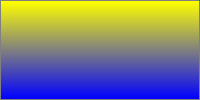
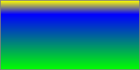
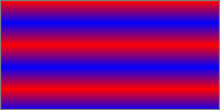
Below are various ways of specifying a basic vertical gradient:
linear-gradient(yellow, blue);
linear-gradient(top, yellow, blue);
linear-gradient(180deg, yellow, blue);
linear-gradient(bottom, blue, yellow);
linear-gradient(top, yellow 0%, blue 100%);
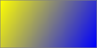
This gradient goes from the top-left to the bottom-right corner.
linear-gradient(top left, yellow, blue);
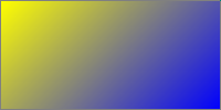
This demonstrates the use of an angle in the gradient. Compare this
image with the previous example. In both gradients, the top-left of the
box is pure yellow, and the bottom-right of the box is pure blue. The
difference is in the angle that the gradient follows.
linear-gradient(135deg, yellow, blue);
linear-gradient(-45deg, blue, yellow);
This demonstrates a 3-color gradient, and how to specify the location
of a stop explicitly:
linear-gradient(yellow, blue 20%, #0f0);
5.2. Radial Gradients
In a radial gradient, rather than colors smoothly fading from one side
of the box to the other as with linear gradients, they instead emerge from
a single point and smoothly spread outward in a circular or elliptical
shape.
A radial gradient is specified by first pinpointing the center of the
gradient, where the 0% ellipse will be, then specifying the size and shape
of the 100% ellipse, ending with a list of color-stops just like a
linear-gradient. Between the center and the ending-ellipse, and past the
ending-ellipse, concentric ellipses are drawn and colored according to the
specified color-stops.
5.2.1.
radial-gradient() Syntax
<radial-gradient> = radial-gradient(
	[<bg-position>,]?
	[[
		[<shape> || <size>]
		|
		[<length> | <percentage>]{2}
	],]?
	<color-stop>[, <color-stop>]+
)
The first argument to the function specifies the center of the ellipse.
<bg-position> is taken from the Backgrounds and Borders Module,
and has the same definition. It specifies the center of the gradient. If
omitted, it defaults to ‘center’.
Color-stop positions are measured along an imaginary line extending from
the center of the gradient to the right.
The second argument to the function specifies the size and shape of the
ending-ellipse. This can be specified in two ways, with different
characteristics:
- Implicitly
-
The size and shape of the ending-ellipse can be defined
implicitly with a size and shape keyword. The <shape> is defined as
<shape> = [ circle | ellipse ]
‘circle’ indicates that the
ending-ellipse will be a circle with a constant radius. ‘ellipse’ indicates that the gradient-shape will
be an axis-aligned ellipse (that is, its major and minor radiuses will
be horizontal and vertical, not necessarily in that order).
The <size> keyword is defined as
<size> = [ closest-side | closest-corner | farthest-side | farthest-corner | contain | cover ]
If <shape> is ‘circle’ and <size> is ‘closest-side’, the ending-shape is a circle sized
so that it exactly meets the side of the box closest to its center. For
example, if the box was 100px wide and 200px tall, and the center of the
gradient was ‘10% 10%’, then the
closest side is the left side of the box (it is 10px from the
starting-point, while the top is 20px from it, and the right and bottom
sides are much further). The gradient-shape would thus be a circle with
a radius of 10px. If <shape> is
‘ellipse’ and <size> is ‘closest-side’, the gradient-shape is an ellipse
sized so that it exactly meets the vertical and horizontal sides of the
box closest to its center. Using the same box and starting-point as the
previous example, the gradient-shape would be an ellipse with a 20px
vertical radius and a 10px horizontal radius. (If necessary, such as if
the starting-point is outside of the box, extend the sides of the box so
that there is a line the ellipse can meet.)
‘farthest-side’ is identical to
‘closest-side’, except that the
gradient-shape is sized to meet the side of the box that is farthest
from its center (or the farthest vertical and horizontal sides, if the
shape is ‘ellipse’). ‘closest-corner’ and ‘farthest-corner’ size the gradient-shape so that
it exactly meets the closest or farthest corner of the box from its
center, respectively. If <shape> is
‘ellipse’, the gradient-shape has the
same ratio of width to height that it would if ‘closest-side’ or ‘farthest-side’ were specified, as appropriate.
‘contain’ is a synonym for
‘closest-side’, and ‘cover’ is a synonym for ‘farthest-corner’.
- Explicitly
-
Alternately, the ending-shape's size and shape can be defined
explicitly, by providing two lengths or percentages. These measure the
length of the horizontal and vertical axes of the ellipse, respectively.
(The axis length is the length from the center of the ellipse to the
edge, similar to the radius of a circle, not the diameter.)
Percentages used in the first value are relative to the width of the
box, while percentages used in the second value are relative to the
height of the box.
Both of the values must be non-negative. Specifying either as
‘0’ is allowed, but produces a
degenerate shape. The handling of degenerate ending-shapes is specified
later in this specification.
If this argument is omitted, it defaults to ‘ellipse cover’.
If only one argument is provided before the color-stops, and it could be
interpreted as either a position or an explicit size (for example, in
‘radial-gradient(10% 10%, red, blue)’),
it must be interpreted as a position.
In certain circumstances the given parameters may define a degenerate
shape - a circle or ellipse with a radius of 0. In these instances the
gradient image is just a solid color equal to the color of the last
color-stop in the rule. The following combinations of values will trigger
this: ‘closest-side’ if the
starting-point is on a box edge, ‘closest-corner’ if the starting-point is on a box
corner, and ‘ellipse closest-corner’ if
the starting-point is on a box edge.
Color-stops are placed on an imaginary line extending from the center of
the gradient toward the right, with the 0% point at the center of the
gradient, and 100% at the point where the line intersects the
ending-ellipse. The color of each ellipse is equal to the color of the
line where the ellipse intersects it. Distances past 100% can be
specified, and simply indicate a color-stop placed on the line a
corresponding distance from the center. Negative distances are allowed in
a radial gradient and work the same as in linear gradients with respect to
setting the color of the gradient-line, but colors before the
starting-point of the gradient-line
are not displayed. For example, ‘radial-gradient(red
-50px, yellow 100px)’ would produce an elliptical gradient
which starts with a reddish-orange color in the center (the color 1/3
between red and yellow) and transitions to yellow at 100px wide.
5.2.2.
Radial Gradient Examples
All of the following examples are applied to a box that is 200px wide
and 100px tall.
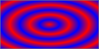
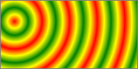
These examples demonstrate the basic syntax for radial gradients:
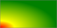
radial-gradient(yellow, green);
radial-gradient(center, ellipse cover, yellow 0%, green 100%);
radial-gradient(50% 50%, farthest-corner, yellow, green);
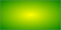
radial-gradient(circle, yellow, green);
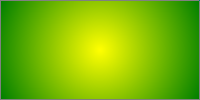
radial-gradient(red, yellow, green);
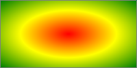
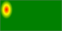
This image shows a gradient originating from somewhere other than the
center of the box:
radial-gradient(bottom left, farthest-side, red, yellow 50px, green);
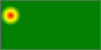
Here we illustrate a ‘contain’
gradient.
radial-gradient(20px 30px, contain, red, yellow, green);
radial-gradient(20px 30px, 20px 30px, red, yellow, green);
radial-gradient(20px 30px, circle contain, red, yellow, green);
radial-gradient(20px 30px, 20px 20px, red, yellow, green);
5.3. Repeating
Gradients
In addition to the ‘linear-gradient()’ and ‘radial-gradient()’ functions, this specification
defines ‘repeating-linear-gradient()’
and ‘repeating-radial-gradient()’
functions. These two functions take the same values and are interpreted
the same as their respective non-repeating siblings defined previously:
<repeating-linear-gradient> = repeating-linear-gradient(
	[[
		[ [top | bottom] || [left | right] ]
		||
		<angle>
	],]?
	<color-stop>[, <color-stop>]+
)
<repeating-radial-gradient> = repeating-radial-gradient(
	[<bg-position>,]?
	[[
		[<shape> || <size>]
		|
		[<length> | <percentage>]{2}
	],]?
	<color-stop>[, <color-stop>]+
)
When rendered, however, the color-stops are repeated infinitely in both
directions, with their positions shifted by multiples of the difference
between the last specified color-stop's position and the first specified
color-stop's position. For example, ‘repeating-linear-gradient(red 10px, blue 50px)’ is
equivalent to ‘linear-gradient(..., red -30px, blue
10px, red 10px, blue 50px, red 50px, blue 90px, ...)’. Note
that the last color-stop and first color-stop will always coincide at the
boundaries of each group, which will produce sharp transitions if the
gradient does not start and end with the same color.
Repeating gradient syntax is basically identical to that of
non-repeating gradients:
repeating-linear-gradient(red, blue 20px, red 40px)
repeating-radial-gradient(red, blue 20px, red 40px)
repeating-radial-gradient(20px 30px, circle contain, red, yellow, green 100%, yellow 150%, red 200%)
If the difference in the positions of the first and last color-stops is
less than 1px, the actual value of the position of the last
color-stop must be the position of the first color-stop, plus 1px. This behavior is different from a previous version of the spec
and does not match implementations; the change was made to avoid
non-continuous behavior in this case.
5.4. Gradient
Color-Stops
<color-stop> = <color> [ <percentage> | <length> ]?
Color-stops are points placed along the line defined by the gradient-line at the beginning of the
rule. Color-stops must be specified in order. Percentages refer to the
length of the gradient-line, with 0% being at the starting point and 100%
being at the ending point. Lengths are measured from the starting-point in
the direction of the ending-point. Color-stops are usually placed between
the starting-point and ending-point, but that's not required; the
gradient-line extends infinitely in both directions, and a color-stop can
be placed at any position on the line.
At each color-stop, the line is the color of the color-stop. Between two
color-stops, the line's color is linearly interpolated between the colors
of the two color-stops, with the interpolation taking place in
premultiplied RGBA space. Before the first color-stop, the line is the
color of the first color-stop. After the last color-stop, the line is the
color of the last color-stop.
The following steps must be applied in order to process the
list of color-stops. After applying these rules, all color-stops will have
a definite position and they will be in ascending order:
- If the first color-stop does not have a position, its position
defaults to 0%. If the last color-stop does not have a position, its
position defaults to 100%.
- If a color-stop has a position that is less than the specified
position of any color-stop before it in the list, its position is changed
to be equal to the largest specified position of any color-stop before
it.
- If any color-stop still does not have a position, then, for each run
of adjacent color-stops without positions, set their positions so that
they are evenly spaced between the preceding and following color-stops
with positions.
If multiple color-stops have the same position, they produce an
infinitesimal transition from the one specified first in the rule to the
one specified last. In effect, the color suddenly changes at that position
rather than smoothly transitioning.
It is recommended that authors not mix different types of
units, such as px, em, or %, in a single rule, as this can cause a
color-stop to unintentionally try to move before an earlier one. For
example, the rule ‘background-image:
linear-gradient(red, yellow 100px, blue 50%)’ would work as
expected as long as the background area is at least 200px tall. If it was
150px tall, however, the blue color-stop's position would be equivalent to
"75px", which precedes the yellow color-stop, and would be corrected to a
position of 100px.
The definition and implications of "premultiplied" color
spaces are given elsewhere in the technical literature, but a quick primer
is given here to illuminate the process. Given a color expressed as an
rgba() 4-tuple, one can convert this to a premultiplied representation by
multiplying the red, green, and blue components by the alpha component.
For example, a partially-transparent blue may be given as
rgba(0,0,255,.5), which would then be expressed as (0,0,127.5,.5) in its
premultiplied representation. Note that fully opaque colors have the same
representation in rgba and premultiplied-rgba (you multiply the components
by 1), and all fully transparent colors are expressed the same way in the
premultiplied representation (you multiply each component by 0, so no
matter what the source color was in rgba, the premultiplied representation
is (0,0,0,0)). Interpolating colors using the premultiplied
representations rather than the plain rgba representations tends to
produce more attractive transitions, particularly when transitioning from
a fully opaque color to fully transparent.
6. Sizing Images and Objects in CSS
Images used in CSS may come from a number of sources, from defined image
formats (such as gif, jpeg, etc), dedicated markup formats (such as SVG),
and CSS-specific formats (such as the linear-gradient() value type defined
in this specification). As well, a document may contain many other types
of objects, such as video, plugins, or nested documents. These images and
objects (just objects hereafter) may offer many
types of sizing information to CSS, or none at all. This section defines
generically the size negotiation model between the object and the CSS
layout algorithms.
6.1. Object-Sizing
Terminology
In order to define this handling, we define a few terms, to make it
easier to refer to various concepts:
- intrinsic dimensions
-
An object's intrinsic dimensions are its preferred, natural width,
height, and aspect ratio, if they exist. There can be an intrinsic height and intrinsic width, defining a definite rectangle.
(Most bitmap images fall into this category.) There can be an intrinsic aspect ratio defining the
relation of the width to the height, but no definite size. (SVG images
designed to scale may fall into this category.) There can be just an
intrinsic height or width. Or there can be no intrinsic dimensions at
all, implying that the object has no preferred size or aspect ratio.
(Embedded documents are often assumed to have no intrinsic size, as are
CSS gradients, defined in this specification.)
If an object (such as an icon) has multiple sizes, then the largest
size is used. If it has multiple aspect ratios of that size (or of no
size), then the aspect ratio closest to the aspect ratio of the default object size is used.
- specified size
- The specified size of an object is given by CSS, such as through the
‘
object-fit’ or ‘background-size’ properties. The specified
size can be a definite width and height, a set of constraints, or a
combination thereof.
- concrete object size
- The concrete object size is
the result of transforming the intrinsic dimensions into a
concrete size, based on the specified
size and the default object
size. A concrete object
size always has a definite height and width.
- default object size
-
The default object size is a
rectangle with a definite height and width used to determine the concrete object size when both
the intrinsic dimensions and
specified size are missing
dimensions. It varies based on the context in which that the image is
being laid out.
6.2. CSS⇋Object
Negotiation
Objects in CSS are sized and rendered as follows:
- When an image or object is specified in a document, such as through a
url() value in a ‘
background-image’ property or a @src
attribute on an <img> element, CSS queries the object for its intrinsic dimensions.
- Using the intrinsic
dimensions and the specified
size, CSS then computes a concrete object size that defines
the size and position of the region the object will render in (specified
in the following section).
- CSS asks the object to render itself at the concrete object size. CSS does
not define how objects render when the concrete object size is different
from the object's intrinsic
dimensions. The object may adjust itself to match the concrete object size in some way,
or even render itself larger or smaller than the concrete object size to satisfy
sizing constraints of its own.
- Unless otherwise specified by CSS, the object is then clipped to the
concrete object size.
6.3. Concrete Object Size
Resolution
In the absence of more specific rules, an object's intrinsic dimensions are resolved
to a concrete object size as
follows:
- If the specified size is a
definite width and height, the concrete object size is given
that width and height.
- If the specified size has only a
width or height, but not both, then the concrete object size is given
that specified width or height. The other dimension is calculated as
follows:
- If the object has an intrinsic
aspect ratio, the missing dimension of the concrete object size is
calculated using the intrinsic aspect-ratio and the present
dimension.
- Otherwise, if the missing dimension is present in the object's intrinsic dimensions, the
missing dimension is taken from the object's intrinsic dimensions.
- Otherwise, the missing dimension of the concrete object size is taken
from the default object size.
- If the specified size has neither
a definite width nor height, and has no additional contraints, the
dimensions of the concrete object
size are calculated as follows:
- If the object has only an intrinsic aspect ratio, the
concrete object size must
have that aspect ratio, and additionally be as large as possible
without either its height or width exceeding the height or width of the
default object size.
Otherwise, the width and height of the concrete object size is the
same as the object's intrinsic
width and intrinsic
height, if they exist.
- If the concrete object
size is still missing a width or height, and the object has an
intrinsic aspect ratio,
the missing dimension is calculated from the present dimension and the
intrinsic aspect ratio.
Otherwise, the missing dimensions is taken from the default object size.
If the specified size has
additional constraints, the concrete
object size must be sized to satisfy those constraints. For
example, the ‘min-width’,
‘min-height’, ‘max-width’, and ‘max-height’ properties specify slightly more
complex handling for sizing replaced elements, and ‘background-repeat: round’ can further adjust the
size calculated by ‘background-size’ so that the image fits a
whole number of times into the background positioning area.
6.4. Sizing Objects: the
‘object-fit’ property
| Name:
| object-fit
|
| Value:
| fill | contain | cover | none | scale-down
|
| Initial:
| fill
|
| Applies to:
| replaced elements
|
| Inherited:
| no
|
| Percentages:
| N/A
|
| Media:
| visual
|
| Computed value:
| specified value
|
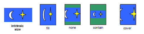
The ‘object-fit’ property specifies how the
contents of a replaced element should be scaled relative to the box
established by its used height and width. It also enables scaling a
replaced element's contents up to a specified maximum size or down to a
specified minimum size while preserving its aspect ratio. This property
never affects the size of the replaced element; it only affects the size
of the contents of the replaced element.
Not all replaced elements can be scaled, but images typically can.
If the replaced element's content do not have an intrinsic aspect ratio
(which may be derived from an intrinsic width and height), all of the
values for ‘object-fit’ are treated as ‘fill’. Otherwise, the contents are scaled as
follows:
- fill
-
Set the content's size to the concrete object size obtained by
running the object sizing algorithm with a
specified size and a default object size equal to the
replaced element's used width and height.
This will make the contents exactly fill the replaced element.
- contain
-
Determine the used ‘height’ and ‘width’ of the element as
usual, except if both ‘height’ and ‘width’ are ‘auto’, and
the used value of at least one of ‘max-width’ and ‘max-height’
is not ‘none’, then compute the element's used width and used height
as though the intrinsic dimensions of the contents were infinitely large
numbers whose ratio is the actual intrinsic ratio of the contents.
Set the content's size to the largest width and height that has the
same aspect ratio as the content's intrinsic aspect ratio, and
additionally has neither width nor height larger than the replaced
element's used width and height, respectively.
- cover
-
Determine the used ‘height’ and ‘width’ of the element as
usual, except if both ‘height’ and ‘width’ are ‘auto’, and
the used value of at least one of ‘min-width’ and ‘min-height’
is not ‘none’, then compute the element's used width and used height
as though the intrinsic dimensions of the contents were infinitely small
numbers whose ratio is the actual intrinsic ratio of the contents.
Set the content's size to the smallest width and height that has the
same aspect ratio as the content's intrinsic aspect ratio, and
additionally has neither width nor height smaller than the replaced
element's used width and height, respectively.
- none
-
Set the content's size to the concrete object size obtained by
running the object sizing algorithm with no
specified size, and a default object size equal to the
replaced element's used width and height.
- scale-down better name?
-
Size the content as if ‘none’
or ‘contain’ were specified,
whichever would result in a smaller size.
Note that both ‘none’ and ‘contain’ respect the content's intrinsic
aspect ratio, so the concept of "smaller" is well-defined.
If the content does not completely fill the replaced element, the
unfilled space shows the replaced element's background. Replaced elements
always clip their contents, similar to the effects of ‘overflow:hidden’ on non-replaced elements, so any
content that would extend beyond the edges of the box are simply not
displayed. See the ‘object-position’ property for positioning
the object with respect to the element's box.
Note: the ‘object-fit’ property has similar semantics
to the fit attribute in [SMIL10].
Note: Per the CSS⇋Object
Negotiation algorithm, the concrete
object size (or, in this case, the size of the content) does not
directly scale the object itself - it is merely passed to the object as
information about the size of the visible canvas. How to then draw into
that size is up to the image format. In particular, raster images always
scale to the given size, while SVG uses the given size as the size of the
"SVG Viewport" (a term defined by SVG) and then uses the values of several
attributes on the root <svg> element to determine how to draw itself.
User agents MAY accept ‘image-fit’ as an alias for ‘object-fit’, as
a previous version of this specification used that name. Authors must not
use ‘image-fit’ in their
stylesheets.
6.5. Positioning Objects:
the ‘object-position’ property
| Name:
| object-position
|
| Value:
| [ [ <percentage> | <length> | left | center | right ] [
<percentage> | <length> | top | center | bottom ]? ] | [ [ left |
center | right ] || [ top | center | bottom ] ]
|
| Initial:
| 50% 50%
|
| Applies to:
| replaced elements
|
| Inherited:
| no
|
| Percentages:
| refer to width and height of box itself
|
| Media:
| visual
|
| Computed value:
| specified value
|
The ‘object-position’ property determines the
alignment of the replaced element inside its box. The values have the same
meaning as the values for the ‘background-position’ property, using the
image as the image and the content box as the positioning area. [CSS21]
Note that areas of the box not covered by the replaced
element will show the element's background.
User agents MAY accept ‘image-position’ as an alias for ‘object-position’, as a previous version of
this specification used that name. Authors must not use ‘image-position’ in their stylesheets.
7. Image Processing
7.1. Overriding Image
Resolutions: the ‘image-resolution’ property
The image resolution is defined as the number of image pixels per
unit length, e.g., pixels per inch. Some image formats can record
information about the resolution of images. This information can be
helpful when determining the actual size of the image in the formatting
process. However, the information can also be wrong, in which case it
should be ignored. By default, CSS assumes a resolution of one image pixel
per CSS ‘px’ unit; however, the
‘image-resolution’ property allows using
some other resolution.
| Name:
| image-resolution
|
| Value:
| from-image || <resolution>
|
| Initial:
| 1dppx
|
| Applies to:
| all elements
|
| Inherited:
| yes
|
| Media:
| visual
|
| Computed value:
| specified value
|
The ‘image-resolution’ property specifies the
resolution of all images used in or on the element: images in content
(e.g. replaced elements and generated content), background images, list
markers, etc. Values have the following meanings:
- <resolution>
- The value sets the resolution of the image. In combination with
‘
from-image’, the specified resolution
is only used if the image does not have a resolution.
- from-image
- The UA must look for the resolution in the image itself. If the image
does not have a resolution, the specified <resolution> value is used,
or ‘
1dppx’ if none is given.
This property must have no effect on vector images, as vector images do
not have a concept of "resolution".
Note that for all images other than the contents of replaced
elements, the ‘image()’ function may be
used to override the resolution set here.
This rule specifies that the UA should use the image resolution found
in the image itself, falling back to 1 image pixel per CSS ‘px’ unit.
img { image-resolution: from-image }
Using this rule, the image resolution is set to 300dpi and the
resolution in the image, if any, is ignored.
img { image-resolution: 300dpi }
These rules both specify that the UA should use the image resolution
found in the image itself. If the image has no resolution, the resolution
is set to 300dpi.
img { image-resolution: from-image 300dpi }
img { image-resolution: 300dpi from-image }
7.2. Orienting an Image
on the Page: the ‘image-orientation’ property
Images from camera phones, digital cameras or scanners may be encoded
sideways. For example, the first row of image data may represent the
leftmost or rightmost column of image pixels. Furthermore, often such
devices have limited resources, and do not have the capability to rotate
the image into an upright orientation. However, this type of device may
have internal knowledge or can accept input from its user as to the
rotational correction to perform.
The image-orientation property provides a way to specify an
"out-of-band" rotation to be applied to image source data. This facility
is not intended to specify layout transformations such as arbitrary
rotation or flipping the image in the horizontal or vertical direction. It
is not needed to correctly orient an image when printing in landscape
versus portrait orientation, as that rotation is done as part of layout.
It should only be used to correct incorrectly-oriented images.
| Name:
| image-orientation
|
| Value:
| <angle>
|
| Initial:
| 0deg
|
| Applies to:
| images
|
| Inherited:
| no
|
| Media:
| visual
|
| Computed value:
| specified value, rounded and normalized (see text)
|
‘image-orientation’ specifies an orthogonal
rotation to be applied to an image before it is laid out. CSS layout
processing applies to the image after rotation. This implies, for
example:
- The intrinsic height and width are derived from the rotated rather
than the original image dimensions;
- The height (width) property applies to the vertical (horizontal)
dimension of the image, after rotation.
Positive values cause the image to be rotated to the right (in a
clockwise direction), while negative values cause a rotation to the left.
The computed value of the property is calculated by rounding the specified
angle to the nearest quarter-turn (90deg, 100grad, .25turn, etc.),
rounding away from 0 (that is, 45deg is rounded to 90deg, while -45deg is
rounded to -90deg), then moduloing the value by 1 turn (360deg, 400grad,
etc.).
The following example rotates the image 90 degrees clockwise:
img.ninety     { image-orientation: 90deg }
...
<img class="ninety" src=... />
The same effect could be achieved with, for example, an angle of
-270deg or 450deg.
7.3. Determining How to
Scale an Image: the ‘image-rendering’ property
| Name:
| image-rendering
|
| Value:
| auto | crisp-edges
|
| Initial:
| auto
|
| Applies to:
| images
|
| Inherited:
| yes
|
| Media:
| visual
|
| Computed Value:
| specified value
|
The ‘image-rendering’ property provides a hint
to the user-agent about what aspects of an image are most important to
preserve when the image is scaled, to aid the user-agent in the choice of
an appropriate scaling algorithm. When specified on an element, it applies
to all images given in properties for the element, such as background
images, list-style images, or the content of replaced elements when they
represent an image that must be scaled. The values of the ‘image-rendering’ property are interpreted
as follows:
- auto
- The image should be scaled with an algorithm that maximizes the
appearance of the image. In particular, scaling algorithms that
‘
smooth’ colors are acceptable,
such as bilinear interpolation. This is intended for images such as
photos.
- crisp-edges
- The image must be scaled with an algorithm that preserves contrast and
edges in the image, and which does not smooth colors or introduce blur to
the image in the process. This is intended for images such as pixel art.
This property does not dictate any particular scaling algorithm
to be used. For example, with ‘image-rendering:auto’, a user agent might scale
images with bilinear interpolation by default, switch to nearest-neighbor
interpolation in high-load situations, and switch to a high-quality
scaling algorithm like Lanczos interpolation for static images that aren't
moving or changing. Similarly, with ‘image-rendering:crisp-edges’, a user agent might
scale images with nearest-neighbor interpolation by default, and switch to
EPX interpolation in low-load situations.
This property previously accepted the values ‘optimizeSpeed’ and ‘optimizeQuality’. These are now deprecated; a user
agent may accept them as valid values, but must treat them as aliases for
the ‘auto’ value.
8. Serialization
This section describes the serialization of all new properties and value
types introduced in this specification, for the purpose of interfacing
with the CSS Object Model [CSSOM].
All of these algorithms refer to a variable "s". For each, let s
initially be the empty string, run the steps described, and then return s.
8.1. Serializing a
<resolution>
The serialization of the <resolution> value type is defined in
the CSSOM spec.
This spec defines several new units for resolutions. These
can all be converted to the canonical "dpcm" unit that CSSOM defines the
serialization in terms of.
8.2. Serializing
the ‘url()’ notation
The serialization of the url() function is defined in the CSSOM spec.
8.3.
Serializing the ‘image()’ / <image-list> notation
To serialize an <image-list>:
- Append "image(" to s.
- For each argument, serialize the argument as an <image-decl> or
<color> as appropriate, and append it to s. Then, if it is not the
final argument, append a comma and a space ", " to s.
- Append a close parenthesis ")" to s.
To serialize an <image-decl>:
- Serialize the first part of the value (the <string>) as a string.
- If a <resolution> was provided, append a space " " to s. Then
serialize the <resolution> and append it to s.
- If the ‘
snap’ keyword was
provided, append a space " " and the literal string "snap" to s.
- If a directional keyword was provided, append a space " " to s, then
append the keyword to s.
8.4.
Serializing the ‘element()’ / <element-reference> notation
To serialize an <element-reference>:
- Append "element(" to s.
- Serialize the argument as a selector or identifier, as appropriate,
and append it to s.
- Append a close parenthesis ")" to s.
8.5. Serializing
the ‘cross-fade()’ / <image-combination> notation
To serialize an <image-combination>:
- Append "cross-fade(" to s.
- Serialize the first argument to the function as an <image>, and append it to s.
- Append a comma and a space ", " to s.
- Serialize the second argument to the function as an <image>, and append it to s.
- Append a comma and a space ", " to s.
- Serialize the third argument to the function as a <percentage>, and
append it to s.
- Append a close parenthesis ")" to s.
8.6. Serializing
Gradients
To serialize a <linear-gradient>:
- Append "linear-gradient(" to s.
-
- If the first argument to the gradient function was a single keyword,
serialize the keyword and append it to s.
- Otherwise, if the first argument to the gradient function was two
keywords, serialize the vertical keyword (‘
top’ or ‘bottom’) and append it to s, then append a space
" " to s, then serialize the horizontal keyword (‘left’ or ‘right’) and append it to s.
- Otherwise, if the first argument to the gradient function was an
<angle>, serialize the <angle> and append it to s.
- Otherwise, append "top" to s.
- Append a comma and a space ", " to s.
- For each color-stop in the gradient, serialize the color-stop, and
append it to s. Then, if it is not the final color-stop, append a comma
and a space ", " to s.
- Append a close parenthesis ")" to s.
To serialize a <radial-gradient>:
- Append "radial-gradient(" to s.
- If a <bg-position> was specified in the first argument to the
gradient function, serialize it and append it to s. Otherwise, append
"center" to s.
- Append a comma and a space ", " to s.
-
- If a <shape> and/or <size> was specified in the second
argument to the gradient function:
- If a <shape> was specified, serialize it as a keyword and
append it to s. Otherwise, append "ellipse" to s.
- Append a space " " to s.
- If a <size> was specified, serialize it as a keyword and append
it to s. Otherwise, append "cover" to s.
- Otherwise, if two <length>s or <percentage>s were specified in
the second argument to the gradient function:
- Serialize the first <length> or <percentage> and append it
to s.
- Append a space " " to s.
- Serialize the second <length> or <percentage> and append it
to s.
- Otherwise, append "ellipse cover" to s.
- Append a comma and a space ", " to s.
- For each color-stop in the gradient, serialize the color-stop, and
append it to s. Then, if it is not the final color-stop, append a comma
and a space ", " to s.
- Append a close parenthesis ")" to s.
To serialize a <repeating-linear-gradient>:
- Append "repeating-linear-gradient(" to s.
- Follow the steps for serializing a <linear-gradient>, except skip
step 1.
To serialize a <repeating-radial-gradient>:
- Append "repeating-radial-gradient(" to s.
- Follow the steps for serializing a <radial-gradient>, except skip
step 1.
To serialize a <color-stop>:
- Serialize the <color>, and append it to s.
- If a <length> or <percentage> was specified, append a space " "
to s, then serialize the <length> or <percentage> and append it to
s.
8.7. Serializing
new properties
To serialize the ‘image-resolution’ property:
- If the ‘
from-image’ keyword is
specified in the property value, append "from-image" to s.
- If both the ‘
from-image’ keyword
and a <resolution> are specified, append a space " " to s.
- If a <resolution> is specified, serialize it and append it to s.
To serialize the ‘image-orientation’ property:
- Serialize the <angle> and append it to s.
To serialize the ‘image-rendering’ property:
- Serialize the keyword and append it to s.
To serialize the ‘object-fit’ property:
- Serialize the keyword and append it to s.
To serialize the ‘object-position’ property:
- Serialize the value as a <bg-position> and append it to s.
9. Interpolation
This section describes how to interpolate between new value types
defined in this specification, for use with modules such as CSS
Transitions and CSS Animations.
If an algorithm below simply states that two values should be
"interpolated" or "transitioned" without further details, then the value
should be interpolated as described by the Transitions spec. Otherwise,
the algorithm may reference a variable "t" in its detailed description of
the interpolation. This is a number which starts at 0% and goes to 100%,
and is set to a value that represents the progress through the transition,
based on the duration of the transition, the elapsed time, and the timing
function in use. For example, with a linear timing function and a 1s
duration, after .3s t is equal to 30%.
9.1. Interpolating <image>
All images can be interpolated, though some special types of images
(like some gradients) have their own special interpolation rules. In
general terms, images are interpolated by scaling them to the size of the
start image and cross-fading the two while they transition to the size of
the end image.
In specific terms, at each point in the interpolation the image is equal
to cross-fade(<start image>, <end image>, t).
Combinations of the same images at different progress points can be
smoothly animated by simply animating the progress. Theoretically, this
produces the same visual effect as the generic <image> interpolation
would; in practice, implementations may have slight differences due to how
they scale or rasterize images. Additionally, the generic <image>
interpolation produces nested cross-fade() functions, which is undesirable
if it can be avoided.
If both the starting and ending images are <image-combination>s with
the same image arguments, they must be interpolated by interpolating their
third argument, the percentage. Otherwise, they must be interpolated as
generic <image>s.
Gradient images can be interpolated directly in CSS transitions and
animations, smoothly animating from one gradient to another. There are
only a few restrictions on what gradients are allowed to be interpolated:
- Both the starting and ending gradient must be expressed with the same
function. (For example, you can transition from a linear-gradient() to a
linear-gradient(), but not from a linear-gradient() to a
radial-gradient() or a repeating-linear-gradient().)
- Both the starting and ending gradient must have the same number of
color-stops. For this purpose, a repeating gradient is considered to have
infinite color-stops, and thus all repeating gradients have the same
number of color-stops. (Note that one may pad a gradient with additional
color-stops placed atop each other, if necessary to make two gradients
have the same number of color-stops.)
If the two gradients satisfy both of those constraints, they must be
interpolated as described below. If not, they must be interpolated as a
generic image.
- Convert both the start and end gradients to their explicit forms:
- For linear gradients:
-
- If the direction is specified as an <angle>, it is already in
its explicit form.
- Otherwise, if the direction is specified as a single keyword,
change ‘
bottom’ to
‘0deg’, ‘left’ to ‘90deg’, ‘top’ to ‘180deg’, or ‘right’ to ‘270deg’.
- Otherwise, if the direction is specified as two keywords, change
the direction to an <angle> in the following ranges that would
produce an equivalent gradient: for ‘
bottom
        left
’ or ‘left
bottom’, the angle must be between 0deg and 90deg; for
‘top left’ or ‘left top’, the angle must be between 90deg and
180deg; for ‘top right’ or
‘right top’, the angle must be
between 180deg and 270deg; for ‘bottom
right’ or ‘right
bottom’, the angle must be between 270deg and 360deg.
- If both the start and end gradients had their direction specified
with keywords, and the absolute difference between the angles their
directions mapped to is greater than 180deg, add 360deg to the
direction of the gradient with the smaller angle. This ensures that a transition from, for example, "right"
(270deg) to "bottom" (0deg) rotates the gradient a quarter-turn
clockwise, as expected, rather than rotating three-quarters of a turn
counter-clockwise.
- For radial gradients:
-
- If the size is specified as two <length>s or <percentage>s,
it is already in its explicit form.
- Otherwise, the size must be changed to a pair of <length>s that
would produce an equivalent ending-shape.
- Interpolate each component and color-stop of the gradients
independently. For linear gradients, the only component is the angle. For
radial gradients, the components are the horizontal and vertical position
of the center and the horizontal and vertical axis lengths.
- To interpolate a color-stop, first match each color-stop in the start
gradient to the corresponding color-stop at the same index in the end
gradient. For repeating gradients, the first specified color-stop in the
start and end gradients are considered to be at the same index, and all
other color-stops following and preceding are indexed appropriately.
Then, for each pair of color-stops, interpolate the position and color
independently.
Changes Since the 17 February 2011 Working
Draft
The following changes were made to this specification since the 17 February 2011
Working Draft:
- 3.
Resolution Units
-
- Defined the resolution unit more precisely. In particular, clarified
what it means for a vector image.
- 4.2.
Image Fallbacks: the ‘
image()’
notation
-
- Simplified the ultimate fallback back to just <color>, as that
was the ultimate point - when you absolutely can't display an image,
you may still need to display a color for constrast purposes.
- Dropped the <url-token> production for the non-ultimate
arguments. This was fundamentally ambiguous with the keywords, and is
unnecessary complexity.
- Added the ability to declare the directionality of an image, so it's
automatically inline-direction flipped when placed in an
opposite-directional context.
- Added a requirement that impls must support the #xywh form of Media
Queries as part of image() support.
- 4.4.
Combining Images: The ‘
cross-fade()’
notation
-
- Defined the algorithm formally in PD terms.
- Changed the compositing operation from "over" to "plus".
- 5.1.
Linear Gradients
-
- Changed the meaning of angles in the first argument to being bearing
angles.
- 5.3.
Repeating Gradients
-
- Changed the results of a degenerate repeating gradient (where the
first and last stop have the same position). Previously, it generated a
solid-color image matching the last color-stop. Now, it moves the last
color-stop to be 1px away from the first. This was done so that
repeating gradients had continuous behavior.
- 6.4.
Sizing Objects: The ‘
object-fit’
property
-
- Added ‘
none’ and
‘scale-down’ values.
- Specified that contents are always clipped, and ‘
overflow’ on the element has no effect.
- 7.
Overriding Image Resolutions: the ‘
image-resolution’ property
-
- Specified that image-resolution works on *all* the images for the
element it's specified on, both the content of replaced elements and
the various <image>-using properties.
- 9.
Determining How to Scale an Image: The ‘
image-rendering’ Property
-
- Changed the ‘
optimize-contrast’ value to ‘crisp-edges’, and rewrote the description
slightly to reduce confusion in what it does.
- 11.
Interpolation
-
- Added special rules for interpolating cross-fade(), to avoid nested
cross-fade()s when possible.
- 11.2.
Interpolating <gradient>
-
- Fixed a bug in interpolation so transitioning between linear
gradients specified with keywords takes the shortest path.
Acknowledgments
References
Normative references
-
- [CSS21]
- Bert Bos; et al. Cascading Style
Sheets Level 2 Revision 1 (CSS 2.1) Specification. 7 June
2011. W3C Recommendation. URL: http://www.w3.org/TR/2011/REC-CSS2-20110607
- [CSS3VAL]
- Håkon Wium Lie; Chris Lilley. CSS3
Values and Units. 19 September 2006. W3C Working Draft. (Work
in progress.) URL: http://www.w3.org/TR/2006/WD-css3-values-20060919
- [MEDIA-FRAGS]
- Raphaël Troncy; et al. Media
Fragments URI 1.0. 17 March 2011. W3C Working Draft. (Work in
progress.) URL: http://www.w3.org/TR/2011/WD-media-frags-20110317
- [RFC2119]
- S. Bradner. Key
words for use in RFCs to Indicate Requirement Levels. Internet
RFC 2119. URL: http://www.ietf.org/rfc/rfc2119.txt
- [SELECT]
- Tantek Çelik; et al. Selectors
Level 3. 15 December 2009. W3C Proposed Recommendation. (Work
in progress.) URL: http://www.w3.org/TR/2009/PR-css3-selectors-20091215
-
- [CSS3BG]
- Bert Bos; Elika J. Etemad; Brad Kemper. CSS
Backgrounds and Borders Module Level 3. 15 February 2011. W3C
Candidate Recommendation. (Work in progress.) URL: http://www.w3.org/TR/2011/CR-css3-background-20110215
- [CSSOM]
- Anne van Kesteren. CSSOM. (forthcoming). W3C Working
Draft. (Work in progress.)
- [SMIL10]
- Philipp Hoschka. Synchronized
Multimedia Integration Language (SMIL) 1.0 Specification. 15
June 1998. W3C Recommendation. URL: http://www.w3.org/TR/1998/REC-smil-19980615