Abstract
CSS is a simple, declarative language for creating style sheets that
specify the rendering of HTML and other structured documents. This
specification is part of level 3 of CSS (“CSS3”)
and contains features to describe layouts at a high level, meant for tasks
such as the positioning and alignment of “widgets” in a graphical user
interface or the layout grid for a page or a window, in particular when
the desired visual order is different from the order of the elements in
the source document. Other CSS3 modules contain properties to specify
fonts, colors, text alignment, list numbering, tables, etc.
The features in this module are described together for easier reading,
but are usually not implemented as a group. CSS3 modules often depend on
other modules or contain features for several media types. Implementers
should look at the various “profiles” of CSS, which list consistent
sets of features for each type of media.
Status of this document
This section describes the status of this document at the time of
its publication. Other documents may supersede this document. A list of
current W3C publications and the latest revision of this technical report
can be found in the W3C technical reports
index at http://www.w3.org/TR/.
Publication as a Working Draft does not imply endorsement by the W3C
Membership. This is a draft document and may be updated, replaced or
obsoleted by other documents at any time. It is inappropriate to cite this
document as other than work in progress.
The (archived) public
mailing list www-style@w3.org (see
instructions) is preferred
for discussion of this specification. When sending e-mail, please put the
text “css3-layout” in the subject, preferably like this:
“[css3-layout] …summary of
comment…”
This document was produced by the CSS
Working Group (part of the Style Activity).
This document was produced by a group operating under the 5 February 2004 W3C Patent
Policy. W3C maintains a public list of any patent disclosures made in
connection with the deliverables of the group; that page also includes
instructions for disclosing a patent. An individual who has actual
knowledge of a patent which the individual believes contains Essential
Claim(s) must disclose the information in accordance with section 6 of the
W3C Patent Policy.
The contents of this document are still highly experimental.
Table of contents
1. Dependencies on other
modules
This specification uses “CSS3” as an alias for “CSS
level 3.”
This CSS3 module depends on the following other CSS3
modules:
It has non-normative (informative) references to the following other
CSS3 modules:
See section 1.4.2
of CSS level 2 [CSS21] for the grammar and other
notations that this specification uses in property definitions.
2. Introduction
(This section is not normative.)
The styling of a Web page, a form or a graphical user
interface can roughly be divided in two parts: (1) defining the overall
“grid” of the page or window and (2) specifying the fonts, indents,
colors, etc., of the text and other objects. The two are not completely
separate, of course, because indenting or coloring a text influences the
perceived grid as well. Nevertheless, when one separates the parts of a
style that should change when the window gets bigger from the parts that
stay the same, one often finds that the grid changes (room for a sidebar,
extra navigation bar, big margins, larger images…), while fonts, colors,
indents, numbering styles, and many other things don't have to change,
until the size of the window becomes extreme.
The properties in this specification work by associating a layout
policy with an element. Rather than letting an element lay out its
descendants in their normal order as inline text or as blocks of text (the
policies available in CSS level 1), these policies give an element an
invisible grid for aligning descendant elements. One policy also allows
elements to be stacked similar to tabbed cards, of which only one is
visible at any time.
Since layouts on the Web have to adapt to different window and paper
sizes, the rows and columns of the grid can be made fixed or flexible in
size.
The typical use cases for these properties include:
- Complex Web pages, with multiple navigation bars in fixed positions,
areas for advertisements, etc.
- Complex forms, where the alignment of labels and form fields may be
easier with the properties of this module than with the properties for
tables and margins.
- GUIs, where buttons, toolbars, labels, icons, etc., are aligned in
complex ways and have to stay aligned (and not wrap, for example) when
the window is resized.
- Tabbed dialog boxes, with only one “card” visible at any one time.
3. Template-based
positioning
Template-based positioning is an alternative to absolute positioning,
which, like absolute positioning, is especially useful for aligning
elements that don't have simple relationships in the source (parent-child,
ancestor-descendant, immediate sibling). But in contrast to absolute
positioning, the elements are not positioned with the help of horizontal
and vertical coordinates, but by mapping them into slots in a table-like
template. The relative size and alignment of elements is thus governed
implicitly by the rows and columns of the template. It doesn't allow
elements to overlap, but it provides layouts that adapt better to
different widths.
The mapping is done with the ‘position’ property, which specifies in this
case into which slot of the template the element goes. The template itself
is specified on the ‘display’ (or
display-model) property of some ancestor of the elements to remap.
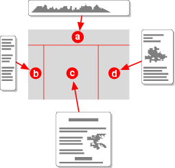
In this example, the four children of an element are assigned to four
slots (called a, b, c and d) in a 2×2 template. (All mark-up examples in
this specification are HTML fragments, unless otherwise stated.)
<style type="text/css">
  dl { display: "ab"
                "cd" }
  #sym1 { position: a }
  #lab1 { position: b }
  #sym2 { position: c }
  #lab2 { position: d }
</style>
<dl>
  <dt id=sym1>A
  <dd id=lab1>A is een aapje
  <dt id=sym2>B
  <dd id=lab2>B is de bakker
</dl>
Templates can also help with device-independence. This example uses
Media Queries [MEDIAQ] to change the overall
layout of a page from 3-column layout for a wide screen to a 1-column
layout for a narrow screen. It assumes the page has been marked-up with
logical sections with IDs.
@media all
{
  body { display: "aaa"
                  "bcd" }
  #head { position: a }
  #nav { position: b }
  #adv { posiiton: c }
  #body { position: d }
}
@media all and (max-width: 500px)
{
  body { display: "a"
                  "b"
                  "c" }
  #head { position: a }
  #nav { position: b }
  #adv { display: none }
  #body { position: c }
}
Elements can be positioned this way, but not made to overlap, unless
with negative margins. Here is how the
“zunflower” design of the Zen Garden could be done:
#container { display: "abc" }
#intro { position: a; margin-right: -2em; box-shadow: 0.5em 0.5em 0.5em }
#supportingText { position: b; box-shadow: 0.5em 0.5em 0.5em }
#linkList { position: c }
Template-based positioning borrows some concepts from table layout, in
particular the idea of aligning elements in rows and columns, so that
they constrain each other's size. But there are also differences. This
example shows some of them. Assume this document fragment:
<div class=group>
 <div>aa aa aa aa aa aa</div>
 <div>bbb</div>
 <div class=menu>ccccc</div>
</div>
We can lay it out as three columns, as the following illustrations
show. The style sheet would contain the following.
.group {display: table}
.group > div {display: table-cell}
We can also use a template, in which case the style sheet would contain
this:
.group {display: "abc"}
.group > div {position: a}
.group > div + div {position: b}
.group > div + div + div {position: c}
By default, the table is shrink-wrapped. To make sure it is as wide as
its containing block, we need to add
.group {display: table; width: 100%}
That is not needed for the template, but, on the other hand, if we want
the template to be shrink-wrapped, we would need to say so:
.group {display: "abc"; width: shrink-wrap}
The columns of the template are by default all the same size. The
columns of the table satisfy certain constraints, but the exact size is
not defined. We can make them all the same by adding a rule:
.group {display: table; width: 100%; table-layout: fixed}
In both styles, we can set a column to a certain size:
div.menu {width: 3em}
resp.,
.group {display: "abc" * * 3em}
If there is an unknown number of columns (children of the div.group
element), the style sheet for the table model will automatically take
them into account. The style sheet for the template model, however,
creates a template of exactly three columns and can't handle tables with
an unknown number of columns. The extra elements will be added into the
default slot (in this case the ‘a’
slot).
In both models, elements can have borders, but only in the table model
can borders be collapsed, which makes setting borders a little easier in
the table model:
.group {display: table; border-collapse: collapse}
.group > div {border: solid}
resp.,
.group > div {border: solid; border-left: none}
.group > div:first-child {border-left: solid}
In the template model, the order of the elements is explicit, and thus
it is possible to reverse the order of the columns:
.group > div {position: c}
.group > div + div {position: b}
.group > div + div + div {position: a}
In the table model, the order of the rows and columns is given by the
document source and thus can't be changed.
3.1. Declaring templates: the
‘display’ property
An element with this ‘display’ is similar to a table element, in that
its content is laid out in rows and columns. The two main differences are
that the number of rows and columns doesn't depend on the content, but is
fixed by the value of the property; and that the order of the descendants
in the source document may be different from the order in which they
appear in the rendered template.
If ‘display’ becomes a shorthand for display-model
and display-role, explain that the former gets the template and the latter
is ‘block’
Each string consist of one or more letters (see <letter> below), at signs (“@”),
periods (“.”) and spaces. Each string represents one row in the
template, each character other than a space represents one column in that
row. Spaces have no meaning. They may be added for readability.
The symbols in the template have the following meaning
- a letter
- slot for content.
- @
- (at sign) default slot for content.
- .
- (period) whitespace.
Multiple identical letters in adjacent rows or columns form a single
slot that spans those rows and columns. Ditto for
multiple “@”s. Uppercase and lowercase are considered to be the same
letter (i.e., the template is case-insensitive).
Non-rectangular slots are illegal. A template without any letter or
“@” is illegal. A template with more than one “@” slot is illegal.
These errors cause the declaration to be ignored.
Non-rectangular regions can be tricky to implement (constraint-solving
in case there is any part with intrinsic size instead of fixed size) but
could be interesting. Here is a nice layout for text and images that you
can't get with floating:
body { display: "a@@"
                "@@@"
                "@@b"
                "@@@"
                "c@@"
                "@@@"
                "@@d" }
img { width: 100%; fit: meet; fit-position: 50% 50% }
img#a { position: a }
img#b { position: b }
img#c { position: c }
img#d { position: d }
Without a fixed height for the body element, the UA will have to try
various heights until the smallest one is found that causes the content
of the body to fit without vertical overflow…
Rows with fewer columns than other rows are implicitly padded with
periods (“.”) (that will thus not contain any elements).
Each slot (letter or “@”) acts as a block element for its contents.
Each <row-height> sets the
height of the preceding row. The default is ‘*’. The values can be as follows:
- <length>
- An explicit height for that row. Negative values make the template
illegal.
- intrinsic
- The row's height is determined by its contents. See the algorithm below.
- *
- (asterisk) All rows with an asterisk will be of equal height. See the
algorithm below.
Each <col-width> sets the
width of a column. If there are more <col-width>s then columns, the last
ones are ignored. If there are fewer, the missing ones are assumed to be
‘*’. Each <col-width> can be one of the
following:
- <length>
- An explicit width for that column. Negative values make the template
illegal.
- *
- (asterisk.) All columns with a ‘
*’
have the same width. See the algorithm below.
- intrinsic
- The column's width is determined by its contents. See the algorithm below.
Note that it is legal to specify no widths at all. In that
case, all columns have the same width.
The orientation of the template is independent of the writing mode
(‘direction’ and
‘writing-mode’
properties): the first string is the topmost row and the first symbol in
each string is the leftmost column.
<style type="text/css">
  div { display: ".aa..bb." }
  p.left { position: a }
  p.right { position: b }
</style>
<div>
  <p class=left>Left column
  <p class=right>Right column
</div>
An element with a template value for its ‘display’ property is called a template element. An element's template ancestor is defined (recursively) as follows:
- if the element has ‘
position:
    fixed
’, ‘position:
absolute’, a value of ‘float’ that is not ‘none’ or the element is the root element, than it
has no template ancestor. [Check if this is a “flow
root”.]
- else, if the element's parent has a template as its ‘display’, then that parent is
the element's template ancestor.
- else, the element's template ancestor is the same as its parent's
template ancestor.
3.2. Computing the width of the
slots
First, the minimum and maximum intrinsic widths are defined as
follows:
-
A column with a <col-width> of a given
<length> has minimum and maximum intrinsic widths both
equal to that <length>.
-
A column with a <col-width> of ‘*’ has an infinite maximum intrinsic width. Its
minimum intrinsic width is 0.
-
A column with a <col-width> of ‘intrinsic’ has a minimum intrinsic width equal to
the maximum over the minimum intrinsic widths of all the slots in that
column:
- The minimum intrinsic width of a “.” is 0.
- The minimum intrinsic width of a letter or “@ is 0 if that slot
spans two or more columns; it is the minimum intrinsic width of the
contents of the slot if it spans only one column.
The column has a maximum intrinsic width equal to the largest of the
maximum intrinsic widths of all the slots in that column:
- The maximum intrinsic width of a “.” is 0.
- The maximum intrinsic width of a letter or “@” is the maximum
intrinsic width of the contents of that slot (which may span multiple
columns).
-
Each span of two or more columns that each have a <col-width> of ‘intrinsic’ has a minimum intrinsic width equal to
the largest of the minimum intrinsic widths of all slots that span
exactly those columns. (Note that a “.” is not a slot.)
The span has a maximum intrinsic width equal to the largest of the
maximum intrinsic widths of all slots that span exactly those columns.
Next, the layout algorithm distinguishes the case
of an element of a-priori known width and a shrink-wrapped element.
The width isn't known a-priori, if, e.g., ‘width’ is ‘auto’ and the element is floating, absolutely
positioned, inline-block or a child of a block with vertical writing mode.
Note that the widths of the columns can be completely
determined before laying out any of the contents as long as there are no
columns with a <col-width>
of ‘intrinsic’.
3.3. Computing the height of the
slots
The height of the template is the smallest possible under the following
constraints:
- Rows with a height set to <length> have that height.
- [If rows have some sort of flex value, the item above is
replaced by:] Rows with a height set to <length> have a
height that is (<length> + flex *
S, where flex is the row's flex value and
S is a value that is the same for all rows and that is chosen
so that the following constraints are true.
- No row has a negative height.
- All rows with a height set to ‘
*’
are the same height.
- Every sequence of one or more rows of which at least one has a height
set to ‘
intrinsic’ is at least as high
as every letter or “@” slot that spans exactly that sequence of rows.
- If the computed value of the element's ‘height’ is ‘
auto’, then every sequence of one or more rows of
which at least one has a height set to ‘*’ is at least as high as every letter or “@”
slot that spans exactly that sequence of rows.
- The whole template is at least as high as the computed value of the
element's ‘height’,
unless that value is ‘
auto’, or unless
all rows have a height set to <length>.
- [If rows have some sort of flex value, the item above is
replaced by:] If all rows have a height set to <length>
and a flex value of ‘
0’; or if the
element's height is ‘auto’, then the
constraints above determine the height; otherwise, the following
constraint also holds: the whole template is at least as high as the
computed value of the element's ‘height’.
The height of a slot is measured from the top margin edge of the topmost
element to the bottom margin edge of the bottommost element, exactly as if
the slot was the root of a block formatting context and the elements
positioned in it its children. [Make a link to block
formatting context in CSS 2.1 or in the Box model.]
This example divides the window in three rows and three columns,
separated by 1em of white space. The middle row and the middle column are
flexible, the others are fixed at a specific size. The first column is
5em wide, the last one 10em.
<style type="text/css">
  body {
    height: 100%;
    display: "a   .   b   .   c"  /2em
             ".   .   .   .   ."  /1em
             "d   .   e   .   f"
             ".   .   .   .   ."  /1em
             "g   .   h   .   i"  /2em
             5em 1em  *  1em 10em}
  #logo {position: a}
  #motto {position: b}
  #date {position: c}
  #main {position: e}
  #adv {position: f}
  #copy {position: g}
  #about {position: h}
</style>
<p id=logo><img src=...
<p id=motto>Making Web pages since 1862
<p id=date>August 2, 2004
...
3.4. Flowing content into the
template: the ‘position’ property
This value of the ‘position’ property specifies into which row
and column of a template the element is placed. The <letter> must be a single letter, with category
Lu, Ll or Lt in Unicode [UNICODE]), or a “@” symbol.
- <letter>
- The element is taken out of the flow of its parent and put into the
specified slot in its template
ancestor. If there is no slot of that name, the computed value
is ‘
static’.
- same
- A value of ‘
same’ instead of a
letter computes to the same letter as the most recent element with a
letter as position that has the same template ancestor. If there is no such element, the value
computes to ‘static’.
The containing block of an element with one
of these values for ‘position’ is the slot in the template into
which it is flowed.
Multiple elements may be put into the same slot. They will be layed-out
according to their ‘display-role’
property in the order they occur in the source document.
The content of a template element is
put in the slot marked with “@”s. If there is no such slot, the
content is put in the first (leftmost) slot on the first row that doesn't
consist of only “.”.
A common markup in HTML for illustrations with captions is as follows:
<div class=figure>
 <p><img src="paul.jpg" alt="...">
 <p class=caption>A pond in a playground in Amsterdam
</div>
The caption can be put above the image by using a template as follows:
div.figure {display: "aaa"
                     ".b."
                     * intrinsic *}
div.figure p {position: b}
div.figure p.caption {position: a; text-align: center}
The caption can be wider than the image and the image will be centered.
When the figure is floating, it is probably better to not let the
caption become wider than the image:
div.figure {float: right; display: "a" "b" intrinsic}
div.figure p {position: b}
div.figure p.caption {position: a; text-align: center}
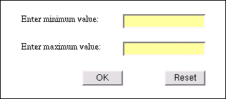
In this example, a form is laid out on a grid, with two labels and two
input boxes and a submit and a reset button:
form {
  border: thin solid;
  display: "aaaa.bbbb"
           "........."
           "cccc.dddd"
           "........."
           "...ee..ff" }
label[for=minv] { position: a }
input#minv { position: b; display: block }
label[for=maxv] { position: c }
input#maxv { position: d; display: block }
input[type=submit] { position: e; display: block }
input[type=reset] { position: f; display: block }
Here is the fragment of HTML that the style is applied to:
<form action="./">
  <label for=minv>Enter minimum value:</label>
  <input id=minv name=minv>
  <label for=maxv>Enter maximum value:</label>
  <input id=maxv name=maxv>
  <input type=submit value="OK">
  <input type=reset value="Reset">
</form>
The addition of ‘display: block’
causes the form controls to use the width computation of blocks, in other
words: they will be as wide as their containing block, which in this case
means that they will be as wide as the slot they are assigned to. Without
it, they would be inline elements and just be left-aligned in their
slots.
This example shows that templates can be nested. The body has two
columns. The #content element that goes into the second column has itself
another template, into which the various “modules” are
placed.
For clarity, the inner template uses different letters for the slots
than the outer template. This is not required.
<style type="text/css">
body {
     display: "a   b"
              10em *;
}

#nav {
     position: a;
}

#content {
     position: b;
     display: "c   .   d   .   e   "
              ".   .   .   .   .   "/1em
              ".   .   f   .   .   "
               *  1em  *  1em  *;
}

.module.news {
     position: c;
}

.module.sports {
     position: d;
}

.module.personal {
     position: e;
}

#foot {
     position: f;
}
</style>
<body>
<ul id="nav">
     <li>navigation</li>
</ul>
<div id="content">
    <div class="module news">
         <h3>Weather</h3>
         <p>There will be weather</p>
    </div>
    <div class="module sports">
         <h3>Football</h3>
         <p>People like football.</p>
    </div>
    <div class="module sports">
         <h3>Chess</h3>
         <p>There was a brawl at the chess tournament</p>
    </div>
    <div class="module personal">
         <h3>Your Horoscope</h3>
         <p>You're going to die (eventually).</p>
    </div>
    <p id="foot">Copyright some folks</p>
</div>

</body>
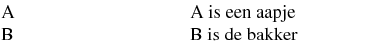
This example shows the use of ‘same’
to put DD elements in the same slot as the preceding
DT.
...
DL {display: "a.b.c"  * 2em * 2em *}
DT.mineral {position: a}
DT.animal {position: b}
DT.plant {position: c}
DD {position: same; margin-left: 1em}
...
<DL>
 <DT class=animal>falcon
 <DD>This bird of prey...
 <DT class=animal>rabbit
 <DD>Local restaurants...
 <DT class=mineral>granite
 <DD>This rock occurs...
 <DT class=plant>olive
 <DD>The fruit of...
 <DT class=mineral>limestone
 <DD>A rock composed of...
 <DT class=plant>pine
 <DD>The western half...
</DL>
3.5. Vertical alignment
The ‘vertical-align’ property can be used to
align elements vertically in a slot. It only applies to an element that is
block-level, that is the first (or the only) element in the slot and that
doesn't float. In that case, the values have the following meaning:
- bottom
- The element(s) in this slot is (are) aligned to the bottom of the
slot: the top padding of this element is stretched, so that the height
from the top margin edge of this element to the bottom margin edge of the
last element in this slot is equal to the height of the row. [Borrow from
10.6.7 in CSS 2.1 for a more precise formulation, including floats]
- middle
- The element(s) in this slot is (are) vertically centered in the slot:
the top padding of this element and the bottom padding of the last
element are increased by the same amount, so that the height from the top
margin edge of this element to the bottom margin edge of the last element
in this slot is equal to the height of the row.
- baseline
- The top padding of this element is increased just enough that the
baseline of the element's first line box is level with the baseline of
the first line box of of all other slots in this row that have a first
element with ‘
vertical-align:
    baseline
’. The bottom padding of the last element is
increased so that its bottom margin edge is flush with the bottom of the
row.
For all other values and other cases, the elements are top aligned,
i.e., the bottom padding of the last element in the slot is increased, so
that the height from the top margin edge of the element to the bottom
margin edge of the last element in this slot is equal to the height of the
row.
Other options: (1) define something like a block-align
property to replace ‘vertical-align’; (2) ditto, but call it
display-align as in XSL; (3) add flexible padding and/or margin
(‘padding-top: auto’ or ‘margin-top: auto’); (4) indicate the alignment with
different letters in the template, use a, m and z instead of x. (The
latter will maybe be too many letters to remember…)
Do we need templates that automatically grow to the required
number of rows and columns? Could they also grow to the left and up? Have
the template automatically orient according to the ‘direction’ or ‘writing-mode’ property of
the template element?
If the element(s) in a slot are vertical, they should be
aligned to the left, right or center of the slot. How?
3.6. Overflow
If content overflows a slot, it is displayed. The effect is as if the
slot had an ‘overflow’
property of ‘visible’. The section “Stacking order” (below) specifies
which element is in front if two elements overlap.
3.7. Templates in paged media
In paged media, designers often want a layout grid that is constrained
by the width and height of the page, rather than the width of the viewport
and the amount of content. Therefore, CSS allows a layout template for a
page as well as for an element. Such a template is called a page-based template to distinguish it from normal,
element-based templates.
The difference between page-based layout templates and element-based
ones is that content that overflows a slot in a page-based template causes
a page break: the rest of the content is put on another page.
Another difference is that page-based layout templates always have a
fixed width and height (viz., the page size), while element-based
templates may also have a size based on the content (intrinsic size).
The syntax of a page-based template is the same as that of an
element-based one, but the declaration appears in a ‘@page’ rule.
@page :first { display: "abc" "def" }
@page { display: "def" }

body {position: e}
h1 {position: b}
The default ‘display’
value of a page is ‘display:
@’.
The following rule is typically not needed, because it is the default:
@page { display: "@" }
The height of the slots in a template is computed as in the section “Computing the height of the slots,” except that
the page area's height [CSS3PAGE] is used instead of the
element's height. Similarly, the width of the slots is computed as in the
section “Computing the width of the slots,”
but with the page area's width replacing the element's width.
Note that the page area's width and height are always known
a-priori. Some of the rules in the quoted sections thus don't apply to
page-based templates.
For page breaking purposes, each slot is considered as a page and the
page break properties on the elements in that slot determine where the
content for that slot is broken. Content after the page break is put in
the slot of the same name on the next page that has such a slot. If there
is no such page the content after the page break is not
displayed(?)
This example shows how the first page may have a different layout from
the other pages. The slot ‘a’ only
occurs on the first page. If the content for that slot (in this case: all
H1 elements) is too long, the remaining content of that slot will not be
displayed. The slot ‘@’ occurs on
normal pages and all its content can thus be displayed by adding
additional pages.
@page :first { display: "a" "@" }
@page { display: "@" /* This is the default */ }
h1 {position: a}
Element-based templates in paged media may be broken across pages,
subject to the page break properties. In addition to the break points
listed in the Paged Media module [CSS3PAGE], a page break may occur
between two rows in a template, if there is possible break point at the
same height or higher in all slots that span those two rows; and a page
break may occur inside a row if there is a possible break point in all
slots in that row.
Try to be more precise?
If ‘page-break-before’ or ‘page-break-after’ is
‘right’, ‘left’ or ‘always’ on an element inside a slot in an
element-based template, the value is treated as ‘auto’ instead.
The ‘page’ property does
not apply to elements inside a slot of an element-based template.
Any other forced page break (see section 5.5 of Paged Media [CSS3PAGE]) causes
a new page to be created and all content in the document after this page
break will be put in slots on the new page or on later pages: slots on any
previous pages will not be further filled.
A slide presentation can be made with a template for each page (i.e.,
slide) and forced page break between the slides:
@page	{ display: "a" / 5em
	           "@"
	           "b" / intrinsic }
h1	{ page-break-before: always;
	  position: a }
p.note	{ position: b }
With a document similar to this: (fragment)
<h1>Slide 1 title</h1>
<ul>
 <li>Topic one
</ul>
<h1>Slide 2 title</h1>
<ul>
 <li>More topics
</ul>
<p class=note>Note the note
The document in the example above doesn't have an element that
corresponds to a slide; a slide simply starts at an H1 and ends before
the next H1. But if there is a DIV around each slide (as is the case in
many slide formats in practice), the same effect can also be achieved
without page-based templates, by using the ‘vh’ unit [CSS3VAL]:
div.slide {height: 100vh; display: "a"/5em "@" "b"/intrinsic;
    page-break-before: always}
h1 {position: a}
p.note {position: b}
With a document similar to this: (fragment)
<div class=slide>
 <h1>Slide 1 title</h1>
 <ul>
  <li>Topic one
 </ul>
</div>
<div class=slide>
 <h1>Slide 2 title</h1>
 <ul>
  <li>More topics
 </ul>
 <p class=note>Note the note
</div>
The main difference between the two approaches is the way overflow is
handled. If the content of a slide is too long for one page (which an
author normally tries to avoid, of course), the page-based templates will
cause a new page to be created for the content that didn't fit, while
element-based templates will display the extra content overlapping
another slot.
Both page-based and element-based templates can be used in the same
document.
@page { display: "a@" }
:lang(fr} {position: a}
div.special {display: "abc" "abd"}
If UA's memory is limited, it may be that the UA runs out of
memory while buffering content whose slot on the first page is full. It
may then have to print the first page even though some other slots aren't
filled yet.
Here is a page as one might find it in a newspaper. It combines a
layout template with multicolumn layout.
@page :first {
  display: "A  A  A  A  A  A  A  A  A" / 5cm
           ".  .  .  .  .  .  .  .  ." / 0.25cm
           "B  .  C  C  C  C  C  C  C"
           "B  .  C  C  C  C  C  C  C"
           "B  .  C  C  C  C  C  C  C"
           "B  .  C  C  C  C  C  C  C"
           "B  .  C  C  C  C  C  C  C"
           "B  .  D  D  D  D  D  D  D"
           "B  .  D  D  D  D  D  D  D"
           "B  .  E  E  E  .  F  F  F"
           "B  .  E  E  E  .  F  F  F"
           "B  .  E  E  E  .  F  F  F"
            * 3em * 3em * 3em * 3em *
}
h1 {position: a; vertical-align: bottom; border-bottom: thick;
  margin-bottom: 1.5em}
#toc {position: b; margin-right: -1.5em; border-right: thin;
  padding-right: 1.5em}
#leader {position: c; columns: 4; column-gap: 3em}
#art1 {position: d; columns: 4; column-gap: 3em; border-top: thin}
#art2 {position: e; columns: 2; column-gap: 3em}
#art3 {position: f; columns: 2; column-gap: 3em}
If a slot on a page is full and the content continues on the
next page, it may be useful to insert something like “continued on page
X.” This is useful at any page break, but more important if there are
multiple “flows” of content on each page. Maybe a page-break-content
property? ''page-break-content: "▶ cont'd on p. " targetcounter(???,
page)''
3.8. Stacking order
An element with a computed value of a letter for its ‘position’ is a positioned
element (see [CSS3POS]) and thus the ‘z-index’ property applies to it.
The general rules for stacking contexts
[ref in CSS3?] apply.
Note that an element can only have such a computed value if
it has an ancestor that is a template
element.
This example uses ‘z-index’ and negative margins to make the
element in the middle slot partly overlap the elements in the other
slots:
body { display: "a.b"
                ".c."
                "d.e";
       height: 240px;
       width: 240px }
#a { background: #0C0; position: a }
#b { background: #C00; position: b }
#c { background: #FD0; position: c; margin: -20px; z-index: 1 }
#d { background: #00C; position: d }
#e { background: #A0A; position: e }
3.9. Floating elements inside
templates
An element may be positioned inside a template (computed value of
'<letter>‘ for its ‘position’ property) and be a floating element
at the same time (computed value of its ‘float’ property is other than
’'none''). The following cases must be distinguished:
- Page-based floats – In paged media (see [CSS3PAGE]), if the value of
‘float’ specifies that
the element floats to the top or bottom of the page (in a horizontal
writing mode) or the left or right of the page (in a vertical writing
mode), the ‘position’
property doesn't apply.
- Normal floats – In other cases, the element floats normally
within its containing block, which in this case is its slot in the
template (as defined above).
3.10. The ‘::slot()’ pseudo-elements
Do we need this? If accepted, the rules above about how
‘vertical-align’
and ‘background’
propagate from elements to slots should be removed.
The slots of a template element can be
individually addressed with the ‘slot()’ pseudo-element.
For example, the following sets the color and vertical alignment of
some of the slots in a template:
body { display: "aaa"
                "bcd" }
body::slot(b) { background: #FF0 }
body::slot(c), body::slot(d) { vertical-align: bottom }
A ''::slot(X)'' pseudo-element selects the slot with name
X (a letter or “@”) of the subject of a selector.
If that subject is not a template
element, or if it has no such slot, the pseudo-element selects
nothing. (I.e., these cases are legal selectors, they just happen to
match nothing.)
Only the following properties apply to the ‘slot()’ pseudo-element:
- All background-* properties (including the ‘background’ shorthand).
- ‘vertical-align’
- The ‘overflow’
property.
- min-width, max-width, min-height and max-height?
- Some sort of flex property to change the distribution of space?
- Border and padding properties?
The background of a slot is drawn immediately on top of the background
of the template element itself.
The flexibility of a row's height is the maximum over all vertical
flexibility properties that are > 0 of all slots in that row. The
flexibility of a column's width is the maximum over all horizontal
flexibilities that are > 0 of all slots in that columns.
3.11. Possible other approaches
Another approach might look like this:
@template form1 {
  @row {}
  @row {
    @slot {}
    @slot {colspan: 4}
    @slot {}
    @slot {colspan: 4}
    @slot {}
  }
  @row {}
  @row {
    @slot {}
    @slot {colspan: 4}
    @slot {}
    @slot {colspan: 4}
    @slot {}
  }
  @row {}
  @row {
    @slot {colspan: 4}
    @slot {colspan: 2}
    @slot {colspan: 2}
    @slot {colspan: 2}
  }
  @row {}
}
Instead of specifying the layout in CSS, one could also use a third
file, possibly in XML, e.g.:
body {template: url(panes.xml)}
where “panes.xml” looks like this:
<?xml-stylesheet href="panes.css"?>
<template>
  <row>
    <main rowspan="2" colspan="2"/>
    <side1/>
    <side2/>
  </row>
  <row>
    <bottom rowspan="2"/>
  </row>
<template>
The above template is equivalent to (main=a, side1=b, side2=c,
bottom=d):
display: "aabc"
         "aadd"
The extra indirection might allow the template to have a style sheet of
its own.
Yet another approach is XBL, but that requires XML and
additional downloads. XBL also has elements relating to events and
scripts, that are not needed for layout.
Pseudo-elements for the grid slots can also allow properties
to be attached to the template independent from the elements in it:
body::slot(b) { background: url(waves.png); hflex: 2; vflex: 1.5 }
4. Tabbed (stacked) displays
An element with a ‘display-model’ of ‘stack’ displays only one of its children, all of
which have a role of ‘card’. (Elements
may be wrapped in anonymous boxes to ensure this, see below.) The user can interactively change
which child is shown. Initially, the first child is visible (but see “fragment IDs” below). In non-interactive,
visual media, which child is visible is undefined. Descendants with a role
of ‘tab’ are shown along the top (or
side) of the stack.
An interactive UA should allow the user to select a card to show by
selecting (clicking, etc.) the associated
tab.. A UA may also allow users to select cards that don't have a
tab, but this is not required.
The following document displays three tabs corresponding to three
cards. The user can select the card to show:
<style type="text/css">
  body {background: silver; color: black}
  div.records {display: stack; border: outset}
  div.record {display: card}
  h2 {display: tab; width: 5em; border: outset; text-align: center}
  h2:current {border-bottom: solid silver}
</style>
<div class=records>
  <div class=record>
    <h2>Men's fashion</h2>
    <ul>
      <li>Oversized jeans, 4 pockets.
      <li>…
    <ul>
  </div>
  <div class=record>
    <h2>Women's fashion</h2>
    …
  </div>
  <div class=record>
    <h2>Children's fashion</h2>
    …
  </div>
</div>
The result might look like this:
The same example with XHTML2 markup (syntax as proposed in 26 July 2007 draft of XHTML2).
<style type="text/css">
  body {background: silver; color: black}
  ul.records {display: stack; border: outset}
  ul.record {display: card}
  label {display: tab; width: 5em; border: outset; text-align: center}
  h2:current {border-bottom: solid silver}
</style>
...
<ul class="records">
 <li>
  <ul class="record"><label>Men's fashion</label>
   <li>
    <ul>
     <li>Oversized jeans, 4 pockets.</li>
     <li>...
    </ul>
   </li>
  </ul>
 </li>
 <li>
  <ul class="record"><label>Women's fashion</label>
   <li>...
  </ul>
 </li>
 <li>
  <ul class="record"><label>Children's fashion</label>
   <li>...
  </ul>
 </li>
</ul>
‘display: stack’ is a shorthand for a
role of ‘block’ and a model of
‘stack’. ‘display: card’ is a shorthand for a role of
‘card’ and a model of ‘block-inside’. ‘display:
tab’ is a shorthand for a role of ‘tab’ and a model of ‘block-inside’.
An element with a model of ‘stack’
has two parts, that are laid out as two (anonymous) boxes with roles of
‘block’ inside a box with a model of
‘block-inside’. The first part has a
model of ‘inline-inside’, the second a
model of ‘block-inside’. The second
part establishes a stacking
context [def'd where in CSS3?] and a block formatting context [def'd
where in CSS3?] for the element's descendants.
The second part has a width and height equal to the maximum width and
height over all the element's children (real or anonymous) with a role of
‘card’. It is also the containing
block for these children (of which only one is displayed at any
time).
All associated tab elements are
flowed into the first part, as if they had a role of ‘inline’. Their order is the same as the document
order. They are thus taken out of the flow of their parent.
One variant of a tabbed display may be where not the labels
of the contents are shown, but only buttons to go forward and backward.
This style is sometimes referred to as a “wizard” interface.
Maybe select it with ‘display: cards’.
4.1. Anonymous card and
stack boxes
If any child of an element with a model of ‘stack’ has a role other than ‘none’ or ‘card’,
that child is wrapped in an anonymous box with a role of ‘card’. The other properties of the anonymous box
are inherited or have their initial values.
If any sequence of one or more sibling elements with roles of
‘card’ or ‘none’ has a parent with a model other than
‘stack’, an anonymous box is wrapped
around the sequence. The sequence must begin and end with a ‘card’ element. The anonymous box has a model of
‘stack’. The other properties of the
anonymous box are inherited or have their initial values.
Although the following document fragment has no explicit stack element,
the section elements are still displayed as a stack, because an anonymous
stack box is automatically created.
<style type="text/css">
  section {display: card}
  h {display: tab}
</style>
<section>
  <h>Introduction</h>
  <p>…</p>
</section>
<section>
  <h>Quick start</h>
  <p>…</p>
</section>
…
4.2. Tab elements
A tab element is the associated tab of its
nearest ancestor of type card, if it is the first tab inside that card (in
document source order). An associated tab element has a computed value for
‘display-role’ of ‘tab’. If the tab element is not associated with any
card, its computed value is ‘inline’.
Note that the ‘appearance’ property also has a value
‘tab’. The two can be used together
(‘display: tab; appearance: tab’), to
ensure that an element that functions as a tab looks like a
platform-native tab. The two properties are independent, however, and can
be used on their own.
Note also that the Borders and Backgrounds
module [CSS3BG] allows more control over the
look of the borders and backgrounds.
4.3. Relation of position, float,
tab and card
If an element has a computed ‘position’ of ‘fixed’, ‘absolute’ or '<letter>‘, then a
specified ’'display-role‘ of
’tab‘ or ’card‘ results in a computed value of ’block''.
If an element has a computed value for ‘display-role’ of ‘card’ or ‘tab’,
the ‘float’ property does
not apply and its computed value is ‘none’.
4.4. :Active and :current tabs
A tab element matches the ‘:active’ pseudo-class while a user activates
the element to make the associated card visible. This is typically a
transient state, which lasts as long as the user holds a mouse button
pressed over the element or presses some other key.
A tab element matches the ‘:current’ pseudo-class if it is the associated tab of the currently visible card
element.
h2 {display: tab; background: silver}
h2:current {background: white}
h2:active {color: red}
4.5. Borders, padding and stacking
order within a stack
The border and padding of a stack element are only drawn around its
second part, not around the box with the tabs. Furthermore, at the
boundary between the first and second part, the border is not drawn
between the parts, but overlapping the first part. More precisely: the
border edge of the first part (which is the same as its padding and
content edge) touches the padding edge of the second box.
The stacking order inside a stack element is from
bottom (away from the user) to top (closest to the user):
- All tab elements in document order, except for the one ‘
:current’ tab.
- The background and border of the stack element.
- The currently visible card element.
- The ‘
:current’ tab.
The border of the stack is thus in front of all tabs, except the one
matching ‘:current’.
The border of the stack where it overlaps the element's first part is
clipped to the height of that part. The border will not extend outside the
stack element.
4.6. Dynamic reordering of tabs
Some platforms render platform-native tabbed dialog boxes with many tabs
in such a way, that the current default tab is always on the last line,
directly adjacent to the card. They reorder
the tabs if needed. UAs running on such platforms may reorder tabs
in this way. However, for usability reasons, tab reordering is not
recommended.
Also for usability reasons, we recommend that designers limit the number
of cards and tabs so that all tabs fit on one line.
4.7. Fragment IDs
UAs should attempt to make elements visible that match the ‘:target’ pseudo-class. (Typically, this is an
element with an ID equal to the fragment ID at the end of the URL of the
page, see Selectors [SELECT].) If such an element is a
card element, or inside a card element, the UA should make that card
element the initially visible card of the stack.
Note that this provides an alternative way for users to
select a card to show: if the UA supports hyperlinking and if each card
(or at least some element inside the card) has an ID, activating a link to
that ID makes that card the default. (But often, it also scrolls the page,
so that the stack is at the top of the window, which may be an undesired
side-effect.)
5. Row and column layouts
This is an alternative to the layout policy above. Probably
we don't need both. Maybe the best parts can be combined: layout that is
independent from the document structure in one case and arbitrary levels
of stretchability in the other.
| Name:
| box-orient
|
| Value:
| horizontal | vertical | inline-axis | block-axis
|
| Initial:
| inline-axis
|
| Applies to:
| box elements
|
| Inherited:
| no
|
| Percentages:
| n/a
|
| Media:
| visual
|
| Computed value:
| specified value
|
| Name:
| box-direction
|
| Value:
| normal | reverse
|
| Initial:
| normal
|
| Applies to:
| box elements
|
| Inherited:
| yes
|
| Percentages:
| n/a
|
| Media:
| visual
|
| Computed value:
| specified value
|
To make this document fragment (in the XUL markup language):
<box>
  <button>Child 1</button>
  <button>Child 2</button>
  <button>Child 3</button>
</box>
look like a row of buttons at their intrinsic size, you could use this
rule:
box {display: box}
(and properties to give the buttons the proper border.)
With templates, it would be like this:
box {display: "abc"}
button {position: a}
button + button {position: b}
button + button + button {position: c}
To make two buttons in a row and give each a specific size, it is
enough to add a width. (Markup in XUL.)
<box>
  <button style="width: 200px">Child 1</button>
  <button style="width: 100px">Child 2</button>
</box>
| Name:
| box-sizing
|
| Value:
| content-box | padding-box | border-box | margin-box
|
| Initial:
| content-box
|
| Applies to:
| box and block elements
|
| Inherited:
| no
|
| Percentages:
| n/a
|
| Media:
| visual
|
| Computed value:
| specified value
|
| Name:
| box-align
|
| Value:
| start | end | center | baseline | stretch
|
| Initial:
| stretch
|
| Applies to:
| box elements
|
| Inherited:
| no
|
| Percentages:
| n/a
|
| Media:
| visual
|
| Computed value:
| specified value
|
| Name:
| box-flex
|
| Value:
| <number>
|
| Initial:
| 0.0
|
| Applies to:
| children of box elements
|
| Inherited:
| no
|
| Percentages:
| n/a
|
| Media:
| visual
|
| Computed value:
| specified value
|
| Name:
| box-pack
|
| Value:
| start | end | center | justify
|
| Initial:
| start
|
| Applies to:
| box elements
|
| Inherited:
| no
|
| Percentages:
| n/a
|
| Media:
| visual
|
| Computed value:
| specified value
|
Assume again this mark-up (fragment of XUL):
<box>
  <button>Child 1</button>
  <button>Child 2</button>
  <button>Child 3</button>
</box>
To make the three buttons appear clustered in the center of the row:
box {display: box; box-pack: center}
Or, with a template that includes whitespace before and after the row
and marks it as flexible:
box {display: ".abc." * intrinsic intrinsic intrinsic *}
button {position: a}
button + button {position: b}
button + button + button {position: c}
To align them to the right:
box {display: box; box-pack: end}
Or, with a template that includes whitespace after the row and marks it
as flexible:
box {display: "abc." intrinsic intrinsic intrinsic *}
button {position: a}
button + button {position: b}
button + button + button {position: c}
To align the first one to the left and the other two to the right:
box {display: "a.bc" intrinsic * intrinsic intrinsic}
With ‘box-flex’, you
can make boxes that grow at different speeds:
<box>
  <button id=b1>Cat</button>
  <button id=b2>Piranha</button>
  <button id=b3>Canary</button>
</box>
with style:
box {display: box; box-orient: vertical}
#b1 {box-flex: 1}
#b2 {box-flex: 2}
#b3 {box-flex: 3}
Without an explicit height for the BOX, there will be a stack of three
buttons with the same height. But when the height is set to larger and
larger values, the heights of the buttons will approach 1/6, 1/3 and 1/2
of the BOX's height, respectively. This cannot be done with templates.
On the other hand, with a template like this:
box {display: "a *"
              ". "
              "b *"
              "b *"
              ". "
              "c *"
              "c *"
              "c *"}
#b1 {position: a}
#b2 {position: b}
#b3 {position: c}
The second button will always be twice the height of the first and the
third button three times. This cannot be done with ‘box-flex’.
| Name:
| box-flex-group
|
| Value:
| <integer>
|
| Initial:
| 1
|
| Applies to:
| children of box elements
|
| Inherited:
| no
|
| Percentages:
| n/a
|
| Media:
| visual
|
| Computed value:
| specified value
|
| Name:
| box-lines
|
| Value:
| single | multiple
|
| Initial:
| single
|
| Applies to:
| box elements
|
| Inherited:
| no
|
| Percentages:
| n/a
|
| Media:
| visual
|
| Computed value:
| specified value
|
6. Profiles & UA conformance
[…]
7. CR exit criteria
[…]
8. History
(This section is not normative.)
The following types of use cases were considered for
template-based layout. Not all of them may be possible with CSS3.
-
Standard Web pages.
-
Grids and other table-like layouts. This includes Grid layouts, Frame
layouts and table-like subdivision of a rectangular area.
-
A layout structure with “flex”ing information. The flexing
is represented by constraints that specify how the cells are to relate
to one another. Which cells are to be allowed to grow or shrink and how
much. There may also be a priority ordering, which determines, based on
the size of the allowed display window, which cells shrink, which grow
and under which conditions.
-
Layout structures with absolutely positioned (fixed-size) elements;
for example a block of text into which several illustrations intrude at
fixed positions within the block. This is like a float with respect to
tightly wrapping the text around the intrusion, but the position of the
intrusion is determined by the layout structure, not the content flowed
into that structure.
An example of this is a multicolumn layout with one or more absolutely
positioned “floats” that intrude on the columns: [make graphic]
+-------------------------------+
| +-Cell-0---------+            |
| |                |            |
| |                |            |
| +----------------+            |
|                               |
| +-Cell-s1---+   +-Cell-2----+ |
| |           |   |           | |
| |           |   |           | |
| |           |   |           | |
| |           |   |           | |
| |       *Intrusion**        | |
| |       *  |    |  *        | |
| |       *  |    |  *        | |
| |       *  |    |  *        | |
| |       ************        | |
| |           |   |           | |
| |           |   |           | |
| |           |   |           | |
| |           |   |           | |
| +-----------+   +-----------+ |
|                               |
+-------------------------------+
Here there are three cells: Cell-0, Cell-1 and Cell-2 and one
intrusion, Intrusion. Cell-0 would be filled by a heading, Cells -1 and
-2 would be columns that would be filled by a two column story and the
Intrusion could be filled by a “pull quote” from the story
or a graphic that illustrates the story. The two columns would
“wrap around” the Intrusion.
-
Multiple, disconnected, fixed-size areas on a page that are chained
together, each one receiving the content that doesn't fit in the
previous slot. In combination with page breaks, this may give the layout
of some newspaper: the first few lines of each story on the first page,
the rest of the story in other areas on subsequent pages. (It will
probably need a way to conditionally insert “continued on
page 7” or similar text.)
For comparing proposals for template-based layouts, the working group
identified four important aspects of each proposal:
-
the physical layout structures – the way of structuring the
“cells” (slots) into which content is flowed. This includes
a way to identify the various layout containers.
-
the binding mechanism – the way to specify that a given element
(and its descendants) are to be placed in a given layout cell.
-
the property distribution mechanism – the way to put properties
onto the layout structure and the cells within it.
-
the flexing mechanism – the way to describe how the layout
structure should adapt itself to the higher level container (window) in
which it is placed. This includes statements about which cells should
grow and when they should grow.
In the first proposal above, which specifies the template inside the
‘display’ property,
these aspects are as follows:
-
A character matrix is used to show the layout structure and the cells
are named by the character used to show where they are positioned.
-
The binding of content to cells is handled by the ‘position’ property which
identifies a cell to which the content is bound.
-
It is difficult to attach properties to the layout structure. Only the
shape, size and flexibility of the layout are specified explicitly. Some
properties (background, border and vertical alignment) are attached
indirectly, by attaching them to the element that occupies a slot.
-
There is no “flexing” information, in the sense of some
slots being more flexible than others. The choice is between fixed size,
a fraction of the available size or the content's intrinsic size. (The
latter is further subject to min/max sizes specified on that content.)
It is not possible to say, e.g., that some column can only become wider
if all other columns are at their maximum size.
Acknowledgments
[acknowledgments]
Based on ideas by
Dave Raggett [member-only link],
Ian Hickson [member-only link], Håkon Lie and Bert Bos.
References
Normative references
-
- [CSS3SYN]
- L. David Baron. CSS3 module: Syntax. 13 August 2003. W3C
Working Draft. (Work in progress.) URL: http://www.w3.org/TR/2003/WD-css3-syntax-20030813
- [CSS3VAL]
- Håkon Wium Lie; Chris Lilley. CSS3 module: Values and
Units. 13 July 2001. W3C Working Draft. (Work in progress.) URL:
http://www.w3.org/TR/2001/WD-css3-values-20010713
- [UNICODE]
- The Unicode Consortium. The Unicode Standard. 2003.
Defined by: The Unicode Standard, Version 4.0 (Boston, MA,
Addison-Wesley, ISBN 0-321-18578-1), as updated from time to time by the
publication of new versions URL: http://www.unicode.org/unicode/standard/versions/enumeratedversions.html
Other references
-
- [CSS21]
- Bert Bos; et al. Cascading Style Sheets, level 2 revision
1. 11 April 2006. W3C Working Draft. (Work in progress.) URL: http://www.w3.org/TR/2006/WD-CSS21-20060411
- [CSS3BG]
- Tim Boland; Bert Bos. CSS3 Backgrounds and Borders
Module. 16 February 2005. W3C Working Draft. (Work in progress.)
URL: http://www.w3.org/TR/2005/WD-css3-background-20050216
- [CSS3BOX]
- Bert Bos. CSS3 module: The box model. 24 October 2002.
W3C Working Draft. (Work in progress.) URL: http://www.w3.org/TR/2002/WD-css3-box-20021024
- [CSS3PAGE]
- Håkon Wium Lie; Melinda Grant. CSS3 Paged Media
Module. 25 February 2004. W3C Candidate Recommendation. (Work in
progress.) URL: http://www.w3.org/TR/2004/CR-css3-page-20040225
- [CSS3POS]
- Bert Bos. CSS3 Positioning Module. (forthcoming). W3C
Working Draft. (Work in progress.)
- [CSS3TBL]
- Bert Bos; David Hyatt. CSS3 Tables Module. (forthcoming).
W3C Working Draft. (Work in progress.)
- [CSS3TEXT]
- Elika J. Etemad. CSS3 Text Module. 27 June 2005. W3C
Working Draft. (Work in progress.) URL: http://www.w3.org/TR/2005/WD-css3-text-20050627
- [CSS3UI]
- Tantek Çelik. CSS3 Basic User Interface Module. 3
July 2003. W3C Working Draft. (Work in progress.) URL: http://www.w3.org/TR/2003/WD-css3-ui-20030703
- [MEDIAQ]
- Håkon Wium Lie; Tantek Çelik; Daniel Glazman. Media
Queries. 8 July 2002. W3C Candidate Recommendation. (Work in
progress.) URL: http://www.w3.org/TR/2002/CR-css3-mediaqueries-20020708
- [SELECT]
- Daniel Glazman; Tantek Çelik; Ian Hickson (eds).
Selectors. 15 December 2005. W3C Working Draft. (Work in
progress.) URL: http://www.w3.org/TR/2005/WD-css3-selectors-20051215
Index
- anonymous, #
- appearance, #
- associated tab, #
- background, #
- box-align, #
- box-direction, #
- box-flex, #
- box-flex-group, #
- box-lines, #
- box-orient, #
- box-pack, #
- box-sizing, #
- direction, #
- display, #, #
- float, #
- height, #
- layout algorithm, #
- ‘
:active’, #
- ‘
:current’, #
- ‘
slot()’ pseudo-element., #
- <letter>, #
- maximum intrinsic width, #
- minimum intrinsic width, #
- overflow, #
- page, #
- page-based template, #
- page-break-after, #
- page-break-before, #
- position, #
- reorder the tabs, #
- slot, #
- stacking order, #
- tab-side, #
- template ancestor, #
- template element., #
- <col-width>, #
- <row-height>, #
- vertical-align, #
- width, #
- writing-mode, #
- z-index, #
Property index
| Property
| Values
| Initial
| Applies to
| Inh.
| Percentages
| Media
|
| box-align
| start | end | center | baseline | stretch
| stretch
| box elements
| no
| n/a
| visual
|
| box-direction
| normal | reverse
| normal
| box elements
| yes
| n/a
| visual
|
| box-flex
| <number>
| 0.0
| children of box elements
| no
| n/a
| visual
|
| box-flex-group
| <integer>
| 1
| children of box elements
| no
| n/a
| visual
|
| box-lines
| single | multiple
| single
| box elements
| no
| n/a
| visual
|
| box-orient
| horizontal | vertical | inline-axis | block-axis
| inline-axis
| box elements
| no
| n/a
| visual
|
| box-pack
| start | end | center | justify
| start
| box elements
| no
| n/a
| visual
|
| box-sizing
| content-box | padding-box | border-box | margin-box
| content-box
| box and block elements
| no
| n/a
| visual
|
| tab-side
| top | bottom | left | right
| top
| elements with ‘display: stack’
| yes
| n/a
| visual
|
The following properties are defined elsewhere:
![[Three unequal cells]](table1.png)
![[Three equal cells]](table2.png)
![[Two equal cells, third is 3em wide]](table3.png)
![[Different contents for the cells]](table4.png)
![[Screendump with nested templates]](table5.png)
![[rendering of three tabs]](tab1.png)