Abstract
This document presents a set of CSS text formatting properties. In
addition to what was already existing in CSS 2 [CSS2],
many new properties are addressing basic requirements in international
context (mostly East Asian and Bidirectional). However, their usage is not
limited to those instances.
Status of This Document
This document is a working draft of the CSS working group which is part of
the Style activity. It contains a proposal for features
to be included in CSS level 3.
This document has been produced as a combined effort of the W3C Internationalization Activity, and the
Style Activity. It also includes extensive
contribution made by members of the XSL Working
Group (members
only). Finally, some of the proposal surfaced first in the Scalable
Vector Graphics (SVG) 1.0 Specification [SVG1.0]. The text has been duplicated in this document
to reflect which properties and specification should be eventually referenced
in CSS itself.
The previous title of this draft was "International Layout."
Feedback is very much welcomed. Comments can be sent directly to the
editor, but the mailing list www-style@w3.org (see instructions) is also open and is preferred for
discussion of this and other drafts in the Style area.
This working draft may be updated, replaced or rendered obsolete by other
W3C documents at any time. It is inappropriate to use W3C Working Drafts as
reference material or to cite them as other than "work in progress". Its
publication does not imply endorsement by the W3C membership or the CSS & FP Working Group (members only).
To find the latest version of this working draft, please follow the
"Latest version" link above, or visit the list of W3C Technical Reports.
Contents
- 1. Dependencies on
other modules
- 2. Introduction
- 3. Text layout
- 4. Text alignment
and justification
- 5. Baseline alignment
- 6. Indentation: the
'text-indent' property
- 7. Line breaking
- 8. Text Wrapping,
Whitespace Control and Text Overflow
- 9. Text spacing
- 10. Text
decoration
- 10.1.
Introduction
- 10.2.
Underline control: the 'text-underline-style', 'text-underline-color', 'text-underline-mode', 'text-underline-position' properties and the
shorthand 'text-underline' property
- 10.3. Line-through
control: the 'text-line-through-style', 'text-line-through-color', 'text-line-through-mode', properties and the
shorthand 'text-line-through' property
- 10.4. Overline
control: the 'text-overline-style', 'text-overline-color', 'text-overline-mode' properties and the shorthand
'text-overline' property
- 10.5. Underlining,
overlining, lining through, and blinking: the 'text-decoration' shorthand property
- 10.6. Text shadows:
the 'text-shadow' property
- 11. Document grid
- 12.
Miscellaneous text formatting
- 13. Properties index
- 14. Profiles
- 15. Glossary
- Appendix A: Vertical Layout Effect on CSS Properties
- Appendix B: Usage of baseline alignment
(informative)
- Acknowledgements
- References
- Changes from Previous Working Draft
1. Dependencies on other
modules
This CSS3 module depends on the following other CSS3 modules:
It has non-normative (informative) references to the following other CSS3
modules:
2. Introduction
In both CSS1 and CSS2, text formatting has been limited to simple effects
like for example: text decoration, text alignment and character spacing.
However, International typography contains types of formatting that could not
be achieved without using special workarounds or graphics.
Along with already existing text related properties, this document
presents a number of new CSS properties to represent such formatting. For
example, the features this proposal covers include two of the most important
features for East Asian typography: vertical text and layout grid.
There is a number of illustrations in this document for which the
following legend is used:
 - wide-cell glyph (e.g. Han)
which is the n-th character in the text run,
- wide-cell glyph (e.g. Han)
which is the n-th character in the text run,
 - narrow-cell glyph (e.g. Roman)
which is the n-th glyph in the text run,
- narrow-cell glyph (e.g. Roman)
which is the n-th glyph in the text run,
 - connected glyph (e.g. Arabic)
which is the n-th glyph in the text run.
- connected glyph (e.g. Arabic)
which is the n-th glyph in the text run.
Many typographical properties in East Asian typography depends on the fact
that a character is typically rendered as either a wide or narrow character.
All characters described by the Unicode Standard can be categorized by a
width property. This is covered by a Unicode Technical report (TR#11)
available from the Unicode Web site.
The orientation which the above symbols assume in the diagrams corresponds
to the orientation that the glyphs they represent are intended to assume when
rendered in the UA. Spacing between these characters in the diagrams is
usually symbolic, unless intentionally changed to make a point.
3. Text layout
3.1. Text layout introduction
This section describes the text layout features supported by CSS, which
includes support for various international writing directions, such as
left-to-right (e.g., Roman scripts), right-to-left (e.g., Hebrew or Arabic),
bidirectional (e.g., mixing Roman with Arabic) and vertical (e.g., Asian
scripts).
The 'writing-mode' property determines an inline
progression and a line to line progression, also called block progression.
For example, Roman scripts are typically written left to right and top to
bottom. The glyph orientation determines the
orientation of the rendered visual shape of characters relative to the
primary text advance direction.
Within a line, the adjustment to the current text position is based on the
current glyph orientation relative to the
text advance direction, the metrics of the glyph just rendered, kerning
tables in the font and the current values of various attributes and
properties, such as the spacing properties.
Bi-directionality introduces another level of complexity in text layout,
as in many combinations of 'writing-mode' and glyph orientation values the proper
directionality of text will be determined by an algorithm. The Unicode
standard ([UNICODE], section 3.12) defines such an
algorithm consisting of an implicit part based on character properties, as
well as explicit controls for embeddings and overrides. It is also possible
to override the inherent directionality of the content characters by using of
combination of the 'writing-mode' and 'unicode-bidi' properties.
CSS3 relies on this algorithm to achieve proper text bidirectional
rendering. However reordering of characters only occurs for specific values
of the glyph orientation properties. See
their description for the exact conditions.
CSS2 specified the 'direction' property which is a subset of the
'writing-mode'
property as it only determines an inline progression. The 'direction' property may
still be used when no line to line progression change is desired.
The HTML 4.0 specification ([HTML40], section 8.2) defines
bi-directionality behavior for HTML elements. Conforming HTML user agents
may therefore ignore the 'direction' and 'unicode-bidi' properties in author and user
style sheets. The style sheet rules that would achieve the bidi behavior
specified in [HTML40] are given in the sample style sheet. The HTML 4.0
specification also contains more information on bidirectionality issues. Note
that HTML 4.0 does not cover the more general case described by the 'writing-mode' property.
Finally, this module uses extensively the 'before', 'after', 'start' and
'end' notation to specify the four edge of a box relative to its text advance
direction, independently of its absolute positioning in terms of 'top',
'bottom', 'left' and 'right' (corresponding respectively to the 'before',
'after', 'start' and 'end' positions in a typical Western text layout). This
notation is also used extensively in [XSL] for the same
purpose.
3.2. Setting
the primary text advance direction: the 'writing-mode' and 'direction' properties
The 'writing-mode' property specifies whether the
primary text advance direction shall be left-to-right, right-to-left, or
top-to-bottom. (Note that even when the primary text advance direction if
left-to-right or right-to-left, some or all of the content within a given
element might advance in the opposite direction because of the Unicode [UNICODE] bidirectional algorithm or because of
explicit text advance overrides due to this property or 'direction' and 'unicode-bidi'. This
property also changes the 'direction' property for the element. For more
on bidirectional text, see the section about Embedding and override.
'writing-mode'
| Value:
| lr-tb | rl-tb | tb-rl | tb-lr | bt-rl | bt-lr | lr | rl | tb | inherit
|
| Initial:
| lr-tb
|
| Applies to:
| all elements
|
| Inherited:
| yes
|
| Percentages:
| N/A
|
| Media:
| visual
|
- lr-tb | lr
- Sets the primary text advance direction to left-to-right, and the line
progression direction to top-to-bottom as is common in most Roman-based
documents. For most characters, the current text position is
advanced from left to right after each glyph is rendered. The 'direction' property is set
to 'ltr'.
- rl-tb | rl
- Sets the primary text advance direction to right-to-left, and the line
progression direction to top-to-bottom as is common in Arabic or Hebrew
scripts. The direction property is set to 'rtl'.
- tb-rl | tb
- Sets the primary text advance direction to top-to-bottom, and the line
progression direction to right-to-left as is common in Asian scripts. The
baseline alignment may be different in this context. Typically, the dominant
baseline runs through the center of the upright glyphs. The direction
property is set to 'ltr'.
- tb-lr
- Sets the primary text advance direction to top-to-bottom, and the line
progression direction to left-to-right. Though hardly as frequent as
horizontal, this type of vertical layout also occurs in Latin based
documents, particularly in table column or row labels. The baseline alignment
may be different in this context. Typically, the dominant baseline runs
through the center of the upright glyphs. The direction property is set to
'ltr'.
- bt-rl
- Sets the primary text advance direction to bottom-to-top, and the line
progression direction to right-to-left. This value only exists to cover the
case of the direction property value 'rtl' applied to an element where the
current writing-mode property value is 'tb-rl' or 'tb'. The direction
property is set to 'rtl'.
- bt-lr
- Sets the primary text advance direction to bottom-to-top, and the line
progression direction to left-to-right. This value only exists to cover the
case of the direction property value 'rtl' applied to an element where the
current writing-mode property value is 'tb-lr'. The direction property is set
to 'rtl'.
The combination of primary text advance direction and line progression
direction set by the writing-mode property is also referred as a flow
orientation. In such contexts, the values: lr-tb, lr, rl-tb and rl correspond
to horizontal flow orientations, and the others (tb-rl, tb, tb-lr, bt-rl,
bt-lr) correspond to vertical flow orientations.
For horizontal flow orientations, the top and bottom margins can be
collapsed. For vertical flow orientations, the left and right margin can be
collapsed. See Collapsing margins in the CSS3 Box module [forthcoming] for
the details of collapsing margins.
This property also specifies the direction of table column layout, the direction of the
overflow oriented in the same
way as the primary text advance direction (e.g. for writing-mode: lr-tb a
block element will overflow horizontally on the right) , the initial
alignment of text and the position of an incomplete last line in a block in
case of 'text-align: justify'.
For the 'writing-mode' property to have any effect on
inline-level elements, one or both of the following conditions must be met:
- the new text advance direction is perpendicular to the parent's direction
or
- the glyph orientation of the characters
within the element is 'auto' or 90/-90 degree in vertical layout or 0/180
degree in horizontal layout and the 'unicode-bidi' property's value is 'embed' or
'bidi-override'.
An inline-level element that has a different writing-mode value than its
parent becomes an inline-block element.
Editor's note: The 'width' and 'height'
property descriptions in the CSS3 Box module need to be updated to describe
the algorithm for vertical flow orientations in more details. For example, in
vertical flow orientations, it is expected that the height will be no more
than the minimum of the parent layout height (minus margin and border) and
the element optimum height. The element optimum height is typically
determined as being 10 ideographic characters 'advance width' long. This
mechanism is required to avoid 'infinitely' long vertical lines or single
line vertical flow (would look like rtl horizontal Japanese). In particular
section 7.2 of the box module should discuss the case of 'auto' for vertical
flow element contained in an horizontal flow element.
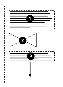
Here is a diagram of a horizontal flow (writing-mode: lr-tb):
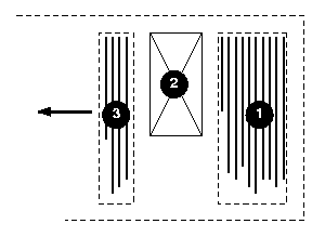
Here is a diagram for a vertical flow used in East Asia
(writing-mode: tb-lr) :
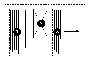
And finally, here is a diagram for another flow used for Uyghur and
Mongolian (writing-mode: tb-lr):
In East Asian documents, it is often preferred to display certain
Latin-based strings, such as numerals in a year, always in a horizontal
layout flow regardless of the flow mode of the line of text these strings
appear in, as in:

Figure 2.2.1: Horizontal in vertical (a.k.a
"Tate-chu-yoko")
This effect is known as "Tate chu
yoko". In order to achieve it, the Latin string should be enclosed
within a SPAN element with an horizontal flow orientation, as
in:
<span STYLE="writing-mode: lr-tb">1996</span>
This is an application of changing the flow of an inline element as
described earlier. Line breaking is normally disabled for such runs of text.
This can be accomplished using the CSS 'white-space:
nowrap' setting.
'direction'
| Value:
| ltr | rtl | inherit
|
| Initial:
| ltr
|
| Applies to:
| all elements, but see prose
|
| Inherited:
| yes
|
| Percentages:
| N/A
|
| Media:
| visual
|
Values for this property have the following meanings:
- ltr
- Left-to-right direction.
- rtl
- Right-to-left direction.
This property specifies the line direction component of the text advance direction and the
direction of embeddings and overrides (see 'unicode-bidi') for the Unicode bidirectional
algorithm. The values 'ltr' and 'rtl' have to be interpreted 'relatively' to
the line direction. In addition, it specifies the direction of table column layout, the direction of the
overflow oriented in the same
way as the primary text advance direction (e.g. for writing-mode: lr-tb a
block element will overflow horizontally on the right) , the initial
alignment of text and the position of an incomplete last line in a block in
case of 'text-align: justify'. For the 'direction' property to have
any effect on inline-level elements, the 'unicode-bidi' property's value must be
'embed' or 'bidi-override' and the glyph
orientation of the characters within the element must be 'auto' or 90/-90
degree in vertical layout or 0/180 degree in horizontal layout.
The usage of the 'direction' property for block-level elements is
discouraged in CSS3 as the 'writing-mode' property supersedes it.
Note. The 'writing-mode' and 'direction' properties, when specified for table
column elements, are not inherited by cells in the column since columns don't
exist in the document tree. Thus, CSS cannot easily capture the "dir"
attribute inheritance rules described in [HTML40], section
11.3.2.1.
Note. The 'writing-mode' and 'direction' properties interact with each other.
As such, 'writing-mode' resets the 'direction' value.
Similarly, modifying 'direction' after 'writing-mode' changes effectively the 'writing-mode' value to
the opposite inline progression. For example, 'direction:rtl' applied to an element with 'writing-mode:lr-tb' effectively makes 'writing-mode:rl-tb'. This is one of the main reason why
the mixed usage of these two properties is discouraged or at least they
should be used with great caution.
Note. These properties do not affect the positioning of
background images.
In some cases, it is required to alter the orientation of a sequence of
characters relative to the primary text advance direction. The requirement is
particularly applicable to vertical layouts of East Asian documents, where
sometimes half-width Roman text is to be displayed horizontally and other
times vertically.
Two properties control the glyph orientation relative to the primary text
advance direction. 'glyph-orientation-vertical'
controls glyph orientation when the primary text advance direction is
vertical. 'glyph-orientation-horizontal'
controls glyph orientation when the primary text advance direction is
horizontal. It is necessary to distinguish between vertical and horizontal
for the following reasons:
- When the primary text advance direction is vertical the typical glyph
orientation depends on the related character. See the description of the
'auto' value. This value is not necessary in horizontal layout.
- The initial value is different for the two properties.
'glyph-orientation-vertical'
| Value:
| <angle> | auto | inherit
|
| Initial:
| auto
|
| Applies to:
| all elements
|
| Inherited:
| yes
|
| Percentages:
| N/A
|
| Media:
| visual
|
- <angle>
- The User Agent may round the value of the angle to the values of glyph
rotation supported by the user agent. Conforming user agents may only support
the following values: 0deg, 90deg, 180deg and 270deg.
- A value of "0deg" indicates that all glyphs are
oriented with the bottom of the glyphs toward the primary text advance
direction, resulting in glyphs which are stacked vertically on top of each
other. A value of "90deg" indicates a rotation of 90
degrees clockwise from the "0deg" orientation. For characters which have this
property set to 90 or 270 degree, reordering is first applied according to
the Unicode Bidi algorithm and then the resulting glyphs are rotated
according to the <angle> value.
- auto
- The glyph orientation relative to the primary text advance direction is
determined automatically based on the Unicode character number of the
rendered character.
Full-width ideographic and full-width Roman glyphs (excluding ideographic
punctuation) are oriented as if an <angle> of "0deg" had been specified
(i.e., glyphs are oriented with the bottom of the glyphs toward the primary
text advance direction, resulting in glyphs which are stacked vertically on
top of each other).
Ideographic punctuation and other ideographic characters having alternate
horizontal and vertical glyph shapes shall use the vertical shape of the
glyph.
Text which is not full-width will be set as if an <angle> of "90deg"
had been specified; thus, half-width Roman text will be rotated 90 degree
clockwise versus full-width ideographic and full-width Roman text.
Hebrew and Arabic text are also rotated 90 degree clockwise. The visual order
of this text is determined by the bidirectional algorithm applied prior to
the rotation.
Note. A value of auto will generally
produce the expected results in common uses of mixing Japanese with European
characters; however, the exact algorithms are based on complex interactions
between many factors, including font design, and thus different algorithms
might be employed in different processing environments. For precise control,
specify explicit <angle> values.
This property specifies the orientation of glyphs relative to the inline
progression determined by the 'writing-mode' property. This property is
applied only to text written in a vertical writing-mode. Conforming user
agents may do the following in increasing levels of supports:
- support only the 90deg value,
- support the 0deg, 90deg, 180deg and 270deg values.
The value of this property affects both the alignment and height of the
glyph area generated for the affected glyphs. If a glyph is oriented so that
the normal orientation of the glyph is parallel to the dominant-baseline,
then the vertical alignment-point of the rotated glyph is aligned with the
alignment-baseline appropriate to that glyph. The baseline to which the
rotated glyph is aligned is the vertical baseline identified by the
"alignment-baseline" for the script to which the glyph belongs. The height of
the glyph area is determined from the height font characteristic for the
glyph.
The horizontal alignment points, baselines and heights (computed as glyph
advance width) are used if the normal orientation of the glyph is
perpendicular to the dominant-baseline.
The diagrams below illustrate different uses of 'glyph-orientation-vertical'.
The diagram on the left shows the result of the mixing of full-width
ideographic characters with half-width Roman characters when 'glyph-orientation-vertical'
for the Roman characters is either auto or "90deg". The diagram on the right show the result of mixing
full-width ideographic characters with half-width Roman characters when Roman
characters are specified to have a 'glyph-orientation-vertical' of
"0deg".
The bidi algorithm and the 'glyph-orientation-vertical'
property have the following interaction:
- The bidi algorithm is applied separately to each contiguous text range
having the same glyph-orientation-vertical value. In other words a change in
the property value reset the bidi algorithm.
- When the glyph-orientation-vertical value is 270 degree, all mirroring
symbols after all due bidi processing are mirrored (that is, their glyph is
inverted along the 'horizontal' axis) before being rotated 270 degree
clockwise. This is done to achieve the desired rendering result, which is to
have the mirroring characters pointing 'inward' the text they are enclosing.
'glyph-orientation-horizontal'
| Value:
| <angle> | inherit
|
| Initial:
| 0deg
|
| Applies to:
| all inline-level elements
|
| Inherited:
| yes
|
| Percentages:
| N/A
|
| Media:
| visual
|
- <angle>
- The user agent may round the value of the angle to the values of glyph
rotation supported by the user agent. A value of "0deg" indicates that all glyphs are oriented with the
right edge of the glyphs toward the primary text advance direction, resulting
in glyphs which are positioned side by side. A value of "90deg" indicates an orientation of 90 degrees clockwise
from the "0" orientation. For characters which have this property set to 0 or
180 degree, reordering is first applied according to the Unicode Bidi
algorithm and then the resulting glyphs are rotated clockwise according to
the <angle> value.
This property specifies the orientation of glyphs relative to the inline
progression determined by the 'writing-mode' property. This property is
applied only to text written in a horizontal writing-mode. Conforming user
agents may do the following in increasing levels of supports:
- support only the 0deg value,
- support the 0deg, 90deg, 180deg and 270deg values.
The value of this property affects both the alignment and width of the
glyph area generated for the affected glyphs. If a glyph is oriented so that
the normal orientation of the glyph is parallel to the dominant-baseline,
then the vertical alignment-point of the rotated glyph is aligned with the
alignment-baseline appropriate to that glyph. The baseline to which the
rotated glyph is aligned is the horizontal baseline identified by the
"alignment-baseline" for the script to which the glyph belongs. The width of
the glyph area is determined from the vertical width font characteristic for
the glyph.
The horizontal alignment points, baselines and widths are used if the
normal orientation of the glyph is perpendicular to the dominant-baseline.
3.4. Embedding and override:
the 'unicode-bidi'
property
'unicode-bidi'
| Value:
| normal | embed | bidi-override | inherit
|
| Initial:
| normal
|
| Applies to:
| all elements, but see prose
|
| Inherited:
| no
|
| Percentages:
| N/A
|
| Media:
| visual
|
This property allows further control of the Unicode bidirectional
algorithm by allowing new embedding level or direction override. Values for
this property have the following meanings:
- normal
- The element does not open an additional level of embedding with respect
to the bidirectional algorithm. For inline-level elements, implicit
reordering works across element boundaries.
- embed
- If the element is inline-level, this value opens an additional level of
embedding with respect to the bidirectional algorithm. The direction of this
embedding level is given by the 'direction' property. Inside the element,
reordering is done implicitly. This corresponds to adding a LRE (U+202A; for
'direction: ltr') or RLE (U+202B; for 'direction: rtl') at the start of the
element and a PDF (U+202C) at the end of the element.
- bidi-override
- If the element is inline-level or a block-level element that contains
only inline-level elements, this creates an override. This means that inside
the element, reordering is strictly in sequence according to the 'direction' property; the
implicit part of the bidirectional algorithm is ignored. This corresponds to
adding a LRO (U+202D; for 'direction: ltr') or RLO (U+202E; for 'direction:
rtl') at the start of the element and a PDF (U+202C) at the end of the
element.
The final order of characters in each block-level element is the same as
if the bidi control codes had been added as described above, mark-up had been
stripped, and the resulting character sequence had been passed to an
implementation of the Unicode bidirectional algorithm for plain text that
produced the same line-breaks as the styled text. In this process,
non-textual entities such as images are treated as neutral characters, unless
their 'unicode-bidi' property has a value other
than 'normal', in which case they are treated as strong characters in the
'direction' specified
for the element.
Note. In order to be able to flow inline boxes in a uniform
direction (either entirely left-to-right or entirely right-to-left), more
inline boxes (including anonymous inline boxes) may have to be created, and
some inline boxes may have to be split up and reordered before flowing.
Because the Unicode algorithm has a limit of 61 levels of embedding, care
should be taken not to use 'unicode-bidi' with a value other than
'normal' unless appropriate. In particular, a value of 'inherit' should be
used with extreme caution. However, for elements that are, in general,
intended to be displayed as blocks, a setting of 'unicode-bidi: embed' is preferred to keep the element
together in case display is changed to inline (see example below).
The following example shows an XML document with bidirectional text. It
illustrates an important design principle: DTD designers should take
bidi into account both in the language proper (elements and attributes) and
in any accompanying style sheets. The style sheets should be designed so that
bidi rules are separate from other style rules. The bidi rules should not be
overridden by other style sheets so that the document language's or DTD's
bidi behavior is preserved.
Example(s):
In this example, lowercase letters stand for inherently left-to-right
characters and uppercase letters represent inherently right-to-left
characters:
<HEBREW>
  <PAR>HEBREW1 HEBREW2 english3 HEBREW4 HEBREW5</PAR>
  <PAR>HEBREW6 <EMPH>HEBREW7</EMPH> HEBREW8</PAR>
</HEBREW>
<ENGLISH>
  <PAR>english9 english10 english11 HEBREW12 HEBREW13</PAR>
  <PAR>english14 english15 english16</PAR>
  <PAR>english17 <HE-QUO>HEBREW18 english19 HEBREW20</HE-QUO></PAR>
</ENGLISH>
Since this is XML, the style sheet is responsible for setting the writing
direction. This is the style sheet:
/* Rules for bidi */
HEBREW, HE-QUO  {direction: rtl; unicode-bidi: embed}
ENGLISH         {direction: ltr; unicode-bidi: embed}

/* Rules for presentation */
HEBREW, ENGLISH, PAR  {display: block}
EMPH                  {font-weight: bold}
The HEBREW element is a block with a right-to-left base direction, the
ENGLISH element is a block with a left-to-right base direction. The PARs are
blocks that inherit the base direction from their parents. Thus, the first
two PARs are read starting at the top right, the final three are read
starting at the top left. Please note that HEBREW and ENGLISH are chosen as
element names for explicitness only; in general, element names should convey
structure without reference to language.
The EMPH element is inline-level, and since its value for 'unicode-bidi' is
'normal' (the initial value), it has no effect on the ordering of the text.
The HE-QUO element, on the other hand, creates an embedding.
The formatting of this text might look like this if the line length is
long:
               5WERBEH 4WERBEH english3 2WERBEH 1WERBEH

                                8WERBEH 7WERBEH 6WERBEH

english9 english10 english11 13WERBEH 12WERBEH

english14 english15 english16

english17 20WERBEH english19 18WERBEH
Note that the HE-QUO embedding causes HEBREW18 to be to the right of
english19.
If lines have to be broken, it might be more like this:
       2WERBEH 1WERBEH
  -EH 4WERBEH english3
                 5WERB

   -EH 7WERBEH 6WERBEH
                 8WERB

english9 english10 en-
glish11 12WERBEH
13WERBEH

english14 english15
english16

english17 18WERBEH
20WERBEH english19
Because HEBREW18 must be read before english19, it is on the line above
english19. Just breaking the long line from the earlier formatting would not
have worked. Note also that the first syllable from english19 might have fit
on the previous line, but hyphenation of left-to-right words in a
right-to-left context, and vice versa, is usually suppressed to avoid having
to display a hyphen in the middle of a line.
3.5. Script character
classification: the 'script' property
In text layout, many of the behaviors are related to a character
classification based on scripts. For example, line breaking or text
justification behaviors depend on the 'dominant' script of the textual
content of an element. This can be heuristically determined by finding the
first character that has an unambiguous script identifier in an element. It
can also be explicitly specified by using the 'script' property.
'script'
| Value:
| auto | none | <script> | inherit
|
| Initial:
| auto
|
| Applies to:
| all elements
|
| Inherited:
| yes
|
| Percentages:
| N/A
|
| Media:
| visual
|
Values have the following meanings:
- auto
- Use the first character descendant[, after any reordering due to character direction and
bi-directionality,] which has an unambiguous script identifier to
determine the dominant script of the element's content. This determines the
computed script value. Each textual component of the element may however
behave in typographical related behaviors as dictated by its script
identifier. In the absence of any textual components with a clear script
identifier (or no textual content at all), the computed value is 'Latin'.
- none
- Indicates the script is unknown or is not significant to the proper
formatting of this element.
- <script>
- A script definition in conformance with [ISO15924]. All textual components of the element must
behave in typography related behaviors as dictated by this script value, not
the inherent script value of these textual components.
4. Text alignment and
justification
4.1. Text alignment:the
'text-align' property
'text-align'
| Value:
| start | end | left | right | center | justify | <string> | inherit
|
| Initial:
| start
|
| Applies to:
| block-level elements
|
| Inherited:
| yes
|
| Percentages:
| N/A
|
| Media:
| visual
|
This property describes how inline content of a block is aligned. Values
have the following meanings:
- start
- The text is aligned on the start of the inline progression as determined
by the current text advance
direction.
- end
- The text is aligned on the end of the inline progression as determined by
the current text advance
direction.
- left, right
- In horizontal inline progression, the text is aligned on the left or
right respectively. In vertical inline progression, the alignment is UA
dependent. The values 'start' and 'end' should be used instead. The usage of
'left' and 'right' is deprecated in CSS3.
- center
- The text is center aligned.
- justify
- The text is justified. The justification algorithm can be further refined
by using the 'text-justify' property. Conforming user
agents may interpret the value 'justify'
as 'start'
- <string>
- Specifies a string on which cells in a table column will align (see the
section on horizontal
alignment in a column for details and an example). This value applies
only to table cells. If set
on other elements, it will be treated as 'start'.
A block of text is a stack of line boxes. In the case of
'start', 'end', 'left', 'right' and 'center', this property specifies how the
inline boxes within each line box align with respect to the line box's start
and end sides; alignment is not with respect to the viewport. In the case of
'justify', the UA may stretch the inline boxes in addition to adjusting their
positions. (See also 'letter-spacing' and 'word-spacing'.)
Example(s):
In this example, note that since 'text-align' is inherited, all block-level
elements inside the DIV element with 'class=center' will have their inline
content centered.
DIV.center { text-align: center }
4.2. Justification:
the 'text-justify'
property
'text-justify'
| Value:
| auto | inter-word | inter-ideograph | distribute | newspaper |
inter-cluster | kashida | inherit
|
| Initial:
| auto
|
| Applies to:
| block-level elements
|
| Inherited:
| yes
|
| Percentages:
| N/A
|
| Media:
| visual
|
This property selects the type of justify alignment. It affects the text
layout only if 'text-align' is set to 'justify'. That way, UA's that do not support this
property will still render the text as fully justified, which most of the
time is at least partially correct. Typically the text-justify property does
not affect the last line, unless the last line itself is justified. Most of
the text-justify values affects writing systems in very specific ways. These
writing systems (or group of) are:
- CJK and Hangul and by extension all 'wide' characters,
- Devanagari and all South Asian scripts using baseline connector like
Bengali and Gurmukhi,
- South Eastern Asian scripts that do not use space between words (Thai,
Lao, Khmer, Myanmar),
- Cursive scripts like Arabic,
- Scripts using space between word without connector (Latin-based, Hebrew,
etc...) and symbol characters.
The text-justification behavior of textual components is guided by the
script classification of the characters. The 'script' property allows to modify the behavior of
these components.
Depending on the text-justify value, spacing may be altered between words
or letters.
The possible values for the text-justify property are:
- auto
- The UA determines the justification algorithm to follow, based on a
balance between performance and adequate presentation quality. Inter-word
expansion is typically used for all scripts that use space as word delimiter.
However, if the kashida-space property has a non zero value it is recommended
to use kashida elongation for Arabic text.
- inter-word
- Selects the simplest and fastest full justification behavior, which
spreads the text evenly across the line by increasing the width of the space
between words only. The concept of a word is script dependent, the exact
algorithm is determined by the User Agent. A minimum, justification is
expected to occur at each white space boundary. No expansion or compression
occurs within the words, i.e. no additional letter spacing is created. No
kashida effect takes place.
The diagram below illustrates this mode, by showing how the characters are
laid out in the last two lines of an element:
For example a viewer could render an 'inter-word' justified paragraph in
the following way:
- newspaper
- Selects the justification behavior in which both inter-word and
inter-letter spacing can be expanded or reduced to spread the text across the
whole line. Also, text distribution on any given line may depend on the
layout or the contents of the previous or the following several lines. This
is the significantly slower and more sophisticated type of the full justify
behavior preferred in newspaper and magazines, as it is especially useful for
narrow columns. For example, typically, compression is tried first. If
unsuccessful, expansion occurs: inter-word spaces are expanded up to a
threshold, and finally inter-letter expansion is performed. This is applied
to all scripts groups except Devanagari and other South Asian writing systems
using baseline connectors. The threshold value may be related to the column
width (in number of characters). The exact layout algorithm is determined by
the User Agent.
The diagram below illustrates this mode:
- inter-ideograph
- In this mode, letter-spacing modification only occurs for the CJK group.
Others only use inter-word expansion. No kashida effect takes place. This is
the preferred justification in the context of the Japanese writing system,
but not Latin nor Korean.
The diagram below illustrates this mode:
Below is an example of how this mode would work:
- distribute
- Like 'newspaper' it allows letter spacing modification for most script
groups (except Hindi), but unlike newspaper, it does not prioritize between
word spacing and letter spacing, i.e. the space character gets the same
letter spacing modification as others. And by consequence there are no
variation between narrow and wide column. This value is best used in East
Asian context.
The diagram below illustrates this mode:
For example a viewer could render a 'distribute' justified paragraph in
the following way:
- inter-cluster
- Plays the same role as inter-ideograph but for South Eastern Asian
scripts. That is letter spacing only occurs for clusters belonging to those
scripts. A cluster is defined as a group of characters formatted as a single
unit.
- kashida
- Plays the same role as inter-ideograph but for Arabic through the Kashida
effect. That is, no letter spacing occurs for other scripts.
The following table describes the expansion/compression strategy for the
combination of each script groups and the text-justify property value for
each relevant text-justify property value:
*The values shown for the auto column are only a
recommendation. The UAs might implement a different strategy.
*The Devanagari entry represents as well other scripts and writing systems
used in India that use baseline connectors like Bengali and Gurmukhi.
4.3. Last line
alignment: the 'text-align-last' property'
'text-align-last'
| Value:
| auto | start | end | center | justify | size | inherit
|
| Initial:
| auto
|
| Applies to:
| block-level elements
|
| Inherited:
| yes
|
| Percentages:
| N/A
|
| Media:
| visual
|
This property describes how the last line of the inline content of a block
is aligned. This also applies to the only line of a block if it contains a
single line, the line preceding a BR element and to last lines of anonymous
blocks. Typically the last line is aligned like the other lines of the block
element, this is set by the 'text-align' property. However, in some
situations like when the 'text-align' property is set to 'justify', the
last line may be aligned differently.
Values have the following meanings:
- auto
- The last line will be aligned like the other lines, that is determined by
the value of the 'text-align' property. However, if the 'text-align' property is
set to the value 'justify', the last line will be aligned to the start of the
inline progression.
- start, end and center
- Start, end and center text respectively.
- justify
- The last line will be justified like the other lines, using the
justification type set by the 'text-justify' property. Note however that if
there is no expansion opportunity in the last line, the line might not
appeared justified.
- size
- The line content is scaled to fit on the line. All the fonts on the line
must be scaled by the same factor, and that factor must be as small as
possible (i.e. fit as much on a line as possible). Typically this value is
used for single line element.
The following example shows the usage of the alignment properties in a
case where all lines are justified in a distributed justification. This is
commonly found in East Asian typography:
P.distributealllines
 { text-align: justify; text-justify: distribute; text-align-last: justify }
'min-font-size'
| Value:
| <font-size> | inherit
|
| Initial:
| 0
|
| Applies to:
| all elements
|
| Inherited:
| yes
|
| Percentages:
| element's computed 'font-size'
|
| Media:
| visual
|
If 'text-align-last' is 'size', the fonts of
the last line of an element are not allowed to become smaller than the
smaller of 'font-size' and 'min-font-size'.
'max-font-size'
| Value:
| <font-size> | auto | inherit
|
| Initial:
| auto
|
| Applies to:
| all elements
|
| Inherited:
| yes
|
| Percentages:
| element's computed 'font-size'
|
| Media:
| visual
|
If 'text-align-last' is 'size', the fonts of
the last line of an element are not allowed to become larger than the larger
of 'font-size' and 'max-font-size'. 'auto' means that there is
no limit.
4.5. Additional
compression: The 'text-justify-trim' property
'text-justify-trim'
| Value:
| none | punctuation | punct-and-kana | inherit
|
| Initial:
| punctuation
|
| Applies to:
| block-level elements
|
| Inherited:
| yes
|
| Percentages:
| N/A
|
| Media:
| visual
|
This sets the individual font blank space compression permissions for the
text justification algorithm, when 'text-justify' is anything other than
'inter-word'. This special type of space compression occurs on the font
level, i.e. the blank space within the character area itself may be reduced
without affecting the appearance of the glyph. This applies to wide-cell
glyphs only. Possible values:
- none
- No wide-cell font space compression is allowed.
- punctuation
- Space can be taken away only from wide-cell punctuation glyphs.
- punct-and-kana
- Space compression is allowed on wide-cell punctuation and wide-cell Kana glyphs.
'text-kashida-space'
| Value:
| <percentage> | inherit
|
| Initial:
| 0%
|
| Applies to:
| block-level elements
|
| Inherited:
| yes
|
| Percentages:
| as described
|
| Media:
| visual
|
Kashida is a typographic effect used in Arabic writing systems that allows
character elongation at some carefully chosen points in Arabic. Each
elongation can be accomplished using a number of kashida glyphs, a single graphic or character elongation
on each side of the kashida point. (The UA may use either mechanism based on
font or system capability). The text-kashida-space property expresses the
ratio of the kashida expansion size to the white space expansion size, 0%
means no kashida expansion, 100% means kashida expansion only . This property
can be used with any justification style where kashida expansion is used
(currently text-justify: auto, kashida, distribute and newspaper).
In the diagram below showing two identical paragraphs of Arabic text, the
blue line in the second line (not justified) shows the length that is used
for kashida and divided among
the elongation opportunities in the first line (justified), as indicated by
the red underlines:
In that example no expansion occurs between the word themselves,
indicating that the text-kashida-space property is set to 100%.
5. Baseline alignment
5.1. Baseline information
provided by fonts
The glyphs of a given script are positioned so that a particular point on
each glyph, the alignment-point, is aligned with the alignment-points
of the other glyphs in that script. The glyphs of different scripts are
typically aligned at different points on the glyph. For example, Western
glyphs are aligned on the bottoms of the capital letters, certain Indic
glyphs (including glyphs from the Devanagari, Gurmukhi and Bengali scripts)
are aligned at the top of a horizontal stroke near the top of the glyphs and
East Asian glyphs are aligned either at the bottom or center of the EM box of
the glyph. Within a script and within a line of text having a single
font-size, the sequence of alignment-points defines, in the
inline-progression-direction, a geometric line called a baseline.
Western and most other alphabetic and syllabic glyphs are aligned to an
"alphabetic" baseline, the above Indic glyphs are aligned to a "hanging"
baseline and the East Asian glyphs are aligned to an "ideographic" baseline.
A baseline-table specifies the position of one or more baselines in
the design space coordinate system. The function of the baseline table is to
facilitate the alignment of different scripts with respect to each other when
they are mixed on the same text line. Because the desired relative alignments
may depend on which script is dominant in a line (or block), there may be a
different baseline table for each script. In addition, different alignment
positions are needed for horizontal and vertical writing modes. Therefore,
the font may have a set of baseline tables: typically, one or more for
horizontal writing-modes and zero or more for vertical writing-modes.
The font tables for a font include font characteristics for the individual
glyphs in the font. CSS assumes that the font tables include, for each glyph
in the font, one width value, one alignment-baseline and one alignment-point
for the horizontal writing-modes. If vertical writing-modes are supported,
then each glyph must have another width value, alignment-baseline and
alignment-point for the vertical writing-modes. (Even though it is specified
as a width, for vertical writing-modes the width is used in the vertical
direction.)
The script to which a glyph belongs determines an alignment-baseline to
which the glyph is to be aligned. The position of this baseline in the design
space coordinate system determines the default block progression direction
position of the alignment-point. The inline progression direction position of
the alignment-point is on the start-edge of the glyph.
5.2. Baseline
identifiers
The baseline alignment properties control the alignment of child element
with respect to their parent. The positions of these baselines are
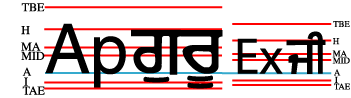
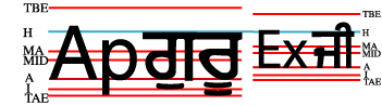
illustrated in the following figure:
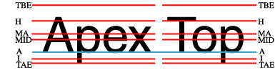
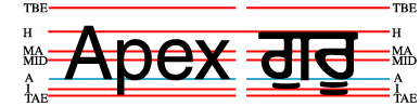
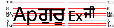
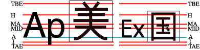
The baseline-identifiers below are used in this specification. Some of
these are determined by baseline-tables contained in a font as described in
the section describing the baseline information
provided by fonts. Others are computed from other font characteristics as
described below.
- alphabetic
-
This identifies the baseline used by most alphabetic and syllabic scripts.
These include, but are not limited to, many Western, Southern Indic,
Southeast Asian (non-ideographic) scripts.
- ideographic
-
This identifies the baseline used by ideographic scripts. For historical
reasons, this baseline is at the bottom of the ideographic EM box and not in
the center of the ideographic EM box. See the "central" baseline. The
ideographic scripts include Chinese, Japanese, Korean, and Vietnamese Chu
Nom.
- hanging
-
This identifies the baseline used by certain Indic scripts. These scripts
include Devanagari, Gurmukhi and Bengali.
- mathematical
-
This identifies the baseline used by mathematical symbols.
- central
-
This identifies a computed baseline that is at the center of the EM box.
This baseline lies halfway between the text-before-edge and text-after-edge
baselines.
Note. For ideographic fonts, this baseline is often used to
align the glyphs; it is an alternative to the ideographic baseline.
- middle
-
This identifies a baseline that is offset from the alphabetic baseline in
the shift-direction by 1/2 the value of the x-height font
characteristic. The position of this baseline may be obtained from the font
data or, for fonts that have a font characteristic for "x-height", it may be
computed using 1/2 the "x-height". Lacking either of these pieces of
information, the position of this baseline may be approximated by the
"central" baseline.
- text-before-edge
-
This identifies the before-edge of the EM box. The position of this
baseline may be specified in the baseline-table or it may be calculated.
Note. The position of this baseline is normally around or at
the top of the ascenders, but it may not encompass all accents that can
appear above a glyph. For these fonts the value of the "ascent" font
characteristic is used. For ideographic fonts, the position of this baseline
is normally 1 EM in the shift-direction from the "ideographic"
baseline. However, some ideographic fonts have a reduced width in the
inline-progression-direction to allow tighter setting. When such a font,
designed only for vertical writing-modes, is used in a horizontal
writing-mode, the "text-before-edge" baseline may be less than 1 EM from the
text-after-edge.
- text-after-edge
-
This identifies the after-edge of the EM box. The position of this
baseline may be specified in the baseline-table or it may be calculated.
Note. For fonts with descenders, the position of this
baseline is normally around or at the bottom of the descenders. For these
fonts the value of the "descent" font characteristic is used. For ideographic
fonts, the position of this baseline is normally at the "ideographic"
baseline.
There are, in addition, two computed baselines that are only defined for
line boxes. For each line box, there is a dominant-baseline, a baseline-table
and a baseline-table font-size which are those of the nearest ancestor
element that completely contains the whole line. The "before-edge" and
"after-edge" baselines are defined as follows.
- before-edge
-
The offset of the "before-edge" baseline of the line from the
dominant-baseline of the line is determined by ignoring all inline boxes
whose alignment-baseline is either "before-edge" or "after-edge". For the
"before-edge", extents are measured from the dominant-baseline in the
direction toward the top (relative) of the box. The "before-edge" baseline
offset is set to the maximum extent of the "before-edges" of the
allocation-rectangles of the remaining areas. If all the inline-areas in a
line-area are aligned either to the "before-edge" or to the "after-edge",
then use the offset of the "text-before-edge" baseline of the line as the
offset of the "before-edge" baseline of the line.
- after-edge
-
The offset of the "after-edge" baseline of the line from the
dominant-baseline of the line is determined by ignoring all inline boxes
whose alignment-baseline is after-edge. For the "after-edge",
extents are measured from the dominant-baseline in the direction toward the
bottom (relative) of the reference-area. The "after-edge" baseline offset is
set to the negative of the maximum of (1) the maximum extent of the
"after-edges" of the allocation-rectangles of the remaining areas and (2) the
maximum height of the allocation-rectangles of the areas that are ignored
minus the offset of the "before-edge" baseline of the line.
Note. If all the inline-areas in a line-area are aligned to
the "after-edge" then the specification for the "before-edge" will set the
"before-edge" baseline to coincide with the "text-before-baseline" of the
line. Then, case (2) above will determine an offset to the "bottom-edge"
baseline that will align the "before-edge" of the area with the greatest
height to its allocation-rectangle to "before-edge" baseline.
Note. The above specifications for "before-edge" and
"after-edge" have the following three properties: (1) the
allocation-rectangles of all the areas are below the "before-edge", (2) the
allocation-rectangles of all the areas are above the "after-edge", and (3)
the distance between the "before-edge" and the "after-edge" cannot be
decreased without violating (1) or (2). The specified placement of the
"before-edge" and "after-edge" is not the only way that (1)-(3) can be
satisfied, but it is the only way they can be satisfied with the smallest
possible offset to the "before-edge".
Examples showing "before-edge" and "after-edge" alignment:
There are also four baselines that are defined only for horizontal
writing-modes.
- top
-
This baseline is the same as the "before-edge" baseline in a horizontal
writing-mode and is undefined in a vertical writing mode.
- text-top
-
This baseline is the same as the "text-before-edge" baseline in a
horizontal writing-mode and is undefined in a vertical writing mode.
- bottom
-
This baseline is the same as the "after-edge" baseline in a horizontal
writing-mode and is undefined in a vertical writing mode.
- text-bottom
-
This baseline is the same as the "text-after-edge" baseline in a
horizontal writing-mode and is undefined in a vertical writing mode.
5.3. Overview
of the baseline alignment process
The alignment of an element with respect to its parent is determined by
three things: the scaled-baseline-table of the parent and the
alignment-baseline and alignment-point of the element being aligned. Prior to
alignment, the scaled-baseline-table of the parent may be shifted. The
property specifications below provide the information necessary to align the
parent and child elements.
There are four properties that control alignment of elements to the above
set of baselines: 'dominant-baseline', 'alignment-baseline', 'baseline-shift' and 'alignment-adjust'.
These properties are all independent and are designed so that typically only
the specification of one of the properties is needed to achieve a particular
alignment goal.
The primary baseline alignment property is the 'dominant-baseline' property. This
property has a compound value with three components. The
dominant-baseline-identifier component is the default 'alignment-baseline' to be used when
aligning two inline areas. The baseline-table component specifies the
positions of the baselines in the font design space coordinates. The
baseline-table acts something like a musical staff; it defines particular
points along the block-progression-direction to which glyphs and
inline elements can be aligned. The baseline-table 'font-size' component provides a scaling factor for
the baseline-table.
Because the value of the 'font-family' property is a list of fonts, to
insure a consistent choice of baseline-table we define the nominal
font in a font list as the first font in the list for which a glyph data
is available. This is the first that could contain a glyph for each character
encountered. (For this definition, glyph data is assumed to be present if a
font substitution is made or if the font is synthesized.) This definition
insures a content independent determination of the font and baseline table
that is to be used.
For convenience, the specification will sometimes refer to the baseline
identified by the dominant-baseline-identifier component of the
"dominant-baseline" property as the "dominant baseline" (in an abuse of
terminology).
The model also assumes that each glyph has a 'alignment-baseline' value which
specifies the baseline with which the glyph is to be aligned. (The
'alignment-baseline' is called the "Baseline Tag" in the OpenType
baseline-table description.) The initial value of the 'alignment-baseline'
property uses the baseline identifier associated with the given glyph.
Alternate values for 'alignment-baseline' can be useful for glyphs such as a
"*" which are ambiguous with respect to script membership.
The model assumes that the font from which the glyph is drawn also has a
baseline table, the font baseline-table. This
baseline table has offsets in units-per-em from the (0,0) point to each of
the baselines the font knows about. In particular, it has the offset from the
glyph's (0,0) point to the baseline identified by the 'alignment-baseline'.
The offset values in the baseline-table are in "design units" which means
fractional units of the EM. CSS calls these "units-per-em". Thus,
the current 'font-size' is used to determine
the actual offset from the dominant baseline to the alternate baselines.
The glyph is aligned so that its baseline identified by its
'alignment-baseline' is aligned with the baseline with the same name from the
dominant baseline-table.
The offset from the dominant baseline of the parent to the baseline
identified by the 'alignment-baseline' is computed using the dominant
baseline-table and dominant baseline-table font-size. The font baseline-table
and font-size applicable to the glyph are used to compute the offset from the
identified baseline to the (0,0) point of the glyph. This second offset is
subtracted from the first offset to get the position of the (0,0) point in
the shift direction. Both offsets are computed by multiplying the baseline
value from the baseline-table times the appropriate font-size value.
If the 'alignment-baseline' identifies the dominant baseline, then the
first offset is zero and the glyph is aligned with the dominant baseline;
otherwise, the glyph is aligned with the chosen alternate baseline.
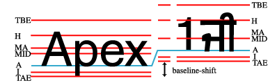
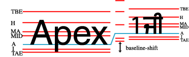
The third baseline alignment property is the 'baseline-shift' property. Like the
properties other than the "dominant-baseline" property, this property does
not change the baseline-table or the baseline-table font-size. It does shift
the whole baseline table of the parent element so that when an inner inline
element is aligned to one of the parents baselines, the position of the inner
inline element is shifted.
The fourth alignment property is the 'alignment-adjust' property. This
property is primarily used for elements, such as some graphics, that do not
belong to a particular script and do not have a predefined alignment point.
The "alignment-adjust" property allows the author to assign where, on the
start-edge of the object, the alignment point for that element lies.
In addition to the following definition of these properties, an
informative appendix: B provides usage examples
of these properties.
'dominant-baseline'
| Value:
| auto | use-script | no-change | reset-size|
ideographic | alphabetic | hanging | mathematical | inherit
|
| Initial:
| auto
|
| Applies to:
| inline-level elements
|
| Inherited:
| no
|
| Percentages:
| N/A
|
| Media:
| visual
|
The 'dominant-baseline' property is used to
determine or re-determine a scaled-baseline-table. A scaled-baseline-table is
a compound value with three components:
- a baseline-identifier for the dominant baseline; it can be qualified as
the 'dominant' baseline-identifier (or 'dominant baseline' in short); the
baseline-identifier is basically an 'alignment-baseline' value.
- a baseline-table which contains definition for additional
baseline-identifiers related to various scripts,
- and a baseline-table font-size.
Some values of the property re-determine all three values; other only
reestablish the baseline-table font-size. Values for the property have the
following meaning:
- auto
- If this property occurs on a block or inline-block element, then the
value of the baseline-identifier depends on the value of the 'script' property. If the value
of the script property is 'auto, the baseline-identifier is 'alphabetic' for
horizontal 'writing-mode' values and 'central' for
vertical 'writing-mode' values. If the value of the
script property is other than 'auto', the baseline-identifier value is based
on that script. The 'writing-mode' value, whether horizontal or
vertical is used to select the baseline-table that correspond to that
baseline-identifier. The baseline-table font-size component is set to the
value of the 'font-size' property on this element.
Otherwise, if this property occurs on an inline-level element, then the
baseline-identifier and the baseline-table components remain the same as
those of the parent element. The baseline-table font-size also remains the
same as the parent's one, unless the computed 'baseline-shift' value actually
shifts the baseline; then the baseline-table font-size is set to the value of
the 'font-size' property on this element. If there is no parent element, the
dominant-baseline components are set as for the block elements.
- use-script
- The dominant baseline-identifier is set using the computed value of the
'script' property. The
'writing-mode'
value, whether horizontal or vertical is used to select the baseline-table
that correspond to that baseline-identifier. The baseline-table font-size
component is set to the value of the 'font-size' property on this element.
- no-change
- The dominant baseline-identifier, the baseline-table and the
baseline-table font-size remain the same as that of the parent.
- reset-size
- The dominant baseline-identifier and the baseline table remain the same,
but the baseline-table font-size is changed to the value of the 'font-size' property on this element. This
re-scales the baseline table for the current 'font-size'.
- ideographic
- The dominant baseline-identifier is set to the 'ideographic' baseline
using the baseline-table and baseline-table font-size of the parent, the
baseline table is changed to correspond to the 'ideographic' baseline, and
the baseline-table font-size is changed to the value of the 'font-size'
property on this element.
- hanging
- The dominant baseline-identifier is set to the 'hanging' baseline using
the baseline-table and baseline-table font-size of the parent, the baseline
table is changed to correspond to the 'hanging' baseline, and the
baseline-table font-size is changed to the value of the 'font-size' property
on this element.
- alphabetic
- The dominant baseline-identifier is set to the 'alphabetic' baseline
using the baseline-table and baseline-table font-size of the parent, the
baseline table is changed to correspond to the 'alphabetic' baseline, and the
baseline-table font-size is changed to the value of the 'font-size' property
on this element. (The 'alphabetic' baseline is the standard baseline for
Roman scripts.)
- mathematical
- The dominant baseline-identifier is set to the 'mathematical' baseline
using the baseline-table and baseline-table font-size of the parent, the
baseline table is changed to correspond to the 'mathematical' baseline, and
the baseline-table font-size is changed to the value of the 'font-size'
property on this element.
If there is no baseline-table in the nominal font or if the baseline-table
lacks an entry for the desired baseline, then the user agent may use
heuristics to determine the position of the desired baseline.
5.5. Aligning the
alignment point of an element:the 'alignment-baseline' property
'alignment-baseline'
| Value:
| baseline | auto-script | before-edge | text-before-edge | after-edge |
text-after-edge |
central | middle | ideographic | alphabetic | hanging | mathematical |
inherit
|
| Initial:
| baseline
|
| Applies to:
| inline-level elements
|
| Inherited:
| no
|
| Percentages:
| N/A
|
| Media:
| visual
|
This property specifies how an inline-level element is aligned with
respect to its parent. That is, to which of the parent's baselines the
alignment point of this element is aligned. Unlike the 'dominant-baseline'
property the 'alignment-baseline' property has no effect on its children
dominant-baselines.
Note: The 'alignment-adjust' property specifies how
the alignment point is determined and defaults to the baseline with the same
name as the computed value of the alignment-baseline property.
Except for 'auto-script', all baseline values refer to the respective
baseline-identifier components of the dominant-baseline of the parent, and
glyphs within the element are aligned similarly to the element itself. The
description for 'auto-script' covers these points specifically. The property
values have the following meanings:
- baseline
- The alignment-point of the element being aligned is aligned with the
dominant baseline of the parent.
- auto-script
- If the element 'script' property value is 'auto', the alignment
point of each glyph is aligned with the baseline-identifier of the script to
which the glyph belongs. If the element 'script' property value is other than 'auto', the
alignment point of each glyph is aligned with the baseline-identifier
specified by the 'script'
property. The baseline-identifier position is determined by using the
relevant information related to the parent element dominant-baseline set. The
alignment point of the element itself is aligned as for the 'baseline' value.
- before-edge
- The alignment point of the box is aligned with the 'before-edge' baseline
of the parent.
- text-before-edge
- The alignment-point of the element being aligned is aligned with the
'text-before-edge' baseline of the parent.
- after-edge
- The alignment point of the box is aligned with the 'after-edge' baseline
of the parent.
- text-after-edge
- The alignment-point of the element being aligned is aligned with the
'text-after-edge' baseline of the parent.
- central
- The alignment point of the box is aligned with the 'central' baseline of
the parent.
- middle
- The alignment point of the box is aligned with the 'middle' baseline of
the parent.
- ideographic
- The alignment-point of the element being aligned is aligned with the
'ideographic' baseline of the parent.
- alphabetic
- The alignment-point of the element being aligned is aligned with the
lower baseline of the parent.
- hanging
- The alignment-point of the element being aligned is aligned with the
hanging baseline of the parent.
- mathematical
- The alignment-point of the element being aligned is aligned with the
mathematical baseline of the parent.
The values: before-edge, text-before-edge, after-edge and text-after-edge
all works relatively to the writing-mode property values. For example
'before-edge' means 'top' in an horizontal writing mode and 'right' in a
vertical writing mode.
Note. The reason why 'baseline' is the initial value
instead of 'auto-script' (called 'auto' in the similar XSL property) has to
do with the fact that most fonts today are designed with an alignment point
located at the 'alphabetical' level, even for glyphs belonging to non Latin
scripts. User agents have to deal with that constraint, and therefore they
use the 'baseline' value as initial.
5.6. Setting the
alignment point:the 'alignment-adjust' property
'alignment-adjust'
| Value:
| auto | baseline | before-edge | text-before-edge | middle | central |
after-edge | text-after-edge | ideographic | alphabetic | hanging |
mathematical | <percentage> | <length> | inherit
|
| Initial:
| auto
|
| Applies to:
| inline-level elements
|
| Inherited:
| no
|
| Percentages:
| refers to the 'line-height' of the element
|
| Media:
| visual
|
The 'alignment-adjust' property allows more
precise alignment of elements, such as graphics, that do not have a
baseline-table or lack the desired baseline in their baseline-table. With the
'alignment-adjust' property, the position
of the baseline identified by the 'alignment-baseline' can be explicitly
determined. It also determines precisely the alignment point for each glyph
within a textual element. The user agent should use heuristics to determine
the position of a non existing baseline for a given element.
Values for the property have the following meaning:
- auto
- For each glyph corresponding to textual information within the element,
the alignment-point is the intersection of the start-edge of the glyph box
and the block-progression-direction position of the alignment point from the
font. Padding, border or margin do not affect that alignment point. The
alignment point of the inline-level element itself is at the intersection of
the start-edge of the first inline box and the baseline identified by the
'alignment-baseline' property if this
baselines exists in the baseline-table for the element dominant-baseline. If
the inline element is an inline block, the alignment point occurs on the last
line of the inline block element. If that specific baseline does not exist,
the user agent may use heuristics to determine where that missing baseline
would be. For other inline box content like images, the user agent will use
heuristics to determine the position of the alignment point. For example when
the resulting baseline is 'alphabetic' or 'ideographic', it is expected that
the alignment point will be at the intersection of the start-edge and the
after-edge of the inline box, including its respective margin. If the
resulting baseline is 'hanging', the intersection of the start-edge and the
before-edge of the inline box, including its respective margin should be used
instead.
- baseline
- The alignment point is at the intersection of the start-edge of the
element and the dominant-baseline of the element.
- before-edge
- The alignment point is at the intersection of the start-edge of the
element and the 'before-edge' baseline of the element.
- text-before-edge
- The alignment point is at the intersection of the start-edge of the
element and the 'text-before-edge' baseline of the
element.
- central
- The alignment point is at the intersection of the start-edge of the
element and the 'central' baseline of the element.
- middle
- The alignment point is at the intersection of the start-edge of the
element and the 'middle' baseline of the element.
- after-edge
- The alignment point is at the intersection of the start-edge of the
element and the 'after-edge' baseline of the element.
- text-after-edge
- The alignment point is at the intersection of the start-edge of the
element and the 'text-after-edge' baseline of the
element.
- ideographic
- The alignment point is at the intersection of the start-edge of the
element and the 'ideographic' baseline of the element.
- alphabetic
- The alignment point is at the intersection of the start-edge of the
element and the 'alphabetic' baseline of the element.
- hanging
- The alignment point is at the intersection of the start-edge of the
element and the 'hanging' baseline of the element.
- mathematical
- The alignment point is at the intersection of the start-edge of the
element and the 'mathematical' baseline of the element.
- <percentage>
- The computed value of the property is this percentage multiplied by the
computed 'line-height' of the element (this includes the margin for replaced
elements) . The alignment point is on the start-edge of the inline box. Its
position along the start-edge relative to the intersection of the
dominant-baseline and the start-edge is offset by the computed value. The
offset is opposite to the shift-direction (positive value) or in the
shift-direction (negative value). A value of '0%' makes the dominant-baseline
the alignment point.
- <length>
- The alignment-point is on the start-edge of the inline box. Its position
along the start-edge relative to the intersection of the dominant-baseline
and the start-edge is offset by the <length> value. The offset is
opposite to the shift-direction (positive value) or in the shift-direction
(negative value). A value of '0cm' makes the dominant-baseline the alignment
point.
5.7. Repositioning
the dominant baseline:the 'baseline-shift' property
'baseline-shift'
| Value:
| baseline | sub | super | <percentage> | <length> | inherit
|
| Initial:
| baseline
|
| Applies to:
| inline-level elements
|
| Inherited:
| no
|
| Percentages:
| refers to the 'line-height' of the parent element
|
| Media:
| visual
|
The 'baseline-shift' property allows
repositioning of the dominant-baseline relative to the dominant-baseline. The
shifted object might be a sub- or superscript. Within the shifted element,
the whole baseline table is offset; not just a single baseline. For sub- and
superscript, the amount of offset is determined from the nominal font of the
parent.
Values for the property have the following meaning:
- baseline
- There is no baseline shift; the dominant baseline remains in its original
position.
- sub
- The dominant baseline is shifted to the default position for subscripts.
The offset for this position is determined by the font data for the parent
nominal font as adjusted by the dominant baseline-table font-size of the
parent element. If there is no applicable font data the User Agent may use
heuristic to determine the offset.
- super
- The dominant baseline is shifted to the default position for
superscripts. The offset for this position is determined by the font data for
the parent nominal font as adjusted by the dominant baseline-table font-size
of the parent element. If there is no applicable font data the User Agent may
use heuristic to determine the offset.
- <percentage>
- The computed value of the property is this percentage multiplied by the
computed 'line-height' of the parent element. The dominant-baseline is
shifted in the shift-direction (positive value) or opposite to the
shift-direction (negative value) of the parent area by the computed value. A
value of '0%' is equivalent to 'baseline'.
- <length>
- The dominant-baseline is shifted in the shift-direction (positive value)
or opposite to the shift-direction (negative value) of the parent area by the
<length> value. A value of '0cm' is equivalent to 'baseline'.
Note. Although it may seem that 'baseline-shift' and
'alignment-adjust' properties are doing
the same thing, there are important differences. For 'alignment-adjust'
the percentage values refer to the 'line-height' of the element being
aligned. For 'baseline-shift the percentage values refer to the 'line-height'
of the parent element. Similarly, it is the 'sub' and 'super' offsets of the
parent that are used to align the shifted baseline rather than the 'sub' and
'super' offsets of the element being positioned. To ensure a consistent sub-
or superscript position, it makes more sense to use the parent as the
reference rather than the subscript element which may have a changed
"line-height" due to "font-size" changes in the sub- or superscript
element.
Using the "alignment-adjust" property is more suitable for positioning
elements, such as graphics, that have no internal textual structure. Using
the "baseline-shift" property is intended for sub- and superscripts where the
positioned element may itself be textual. The baseline-shift provides a way
to define a specific baseline offset other than the named offsets that are
defined relative to the dominant-baseline. In addition, having
"baseline-shift" makes it easier for tool to generate the relevant
properties; many formatting programs already have a notion of baseline shift.
5.8. Vertical
alignment: the 'vertical-align' property, relation with
the baseline alignment properties
'vertical-align'
| Value:
| auto | auto-script | baseline | sub | super | top | text-top | central |
middle | bottom | text-bottom | <percentage> | <length> | inherit
|
| Initial:
| auto
|
| Applies to:
| inline-level and 'table-cell' elements
|
| Inherited:
| no
|
| Percentages:
| refers to the 'line-height' of the element itself
|
| Media:
| visual
|
This property affects the vertical positioning inside a line box of the
boxes generated by an inline-level element. The following values only have
meaning with respect to a parent inline-level element, or to a parent
block-level element, if that element generates anonymous inline boxes; they
have no effect if no such parent exists.
Note. Values of this property have slightly different
meanings in the context of tables. Please consult the section on table height algorithms for
details.
- auto
- Align the dominant baseline of the parent box with the equivalent, or
heuristically reconstructed, baseline of the element. If the box doesn't have
a baseline, align the bottom of the box, including its margin with the
parent's dominant baseline. If the inline box has several lines (inline block
element), use the last line baseline. If there is no parent or if there is a
change of flow orientation between this element and its parent, the dominant
baseline is set to 'alphabetic' for horizontal flow and 'central' for
vertical flow.
- use-script
- Align the script preferred baseline of the element (determined by first
visible character in the element after reordering) with the equivalent
baseline of the parent element.
- baseline
- Align the 'alphabetic' baseline of the box with the 'alphabetic' baseline
of the parent box. If the box doesn't have an 'alphabetic' baseline, align
the bottom of the box, including its margin for replaced elements, with the
parent's 'alphabetic' baseline. The dominant baseline is set to 'alphabetic'
if there is no parent or if there is a flow orientation change between this
element and its parent, otherwise it is set to 'no-change'.
- central
- Align the vertical midpoint of the box with the central baseline of the
parent box.
- middle
- Align the vertical midpoint of the box with the baseline of the parent
box plus half the x-height of the parent.
- sub
- Lower the baseline of the box to the proper position for subscripts of
the parent's box. (This value has no effect on the font size of the element's
text.)
- super
- Raise the baseline of the box to the proper position for superscripts of
the parent's box. (This value has no effect on the font size of the element's
text.)
- text-top
- Align the top of the box with the before-edge of the parent element's
font.
- text-bottom
- Align the bottom of the box with the after-edge of the parent element's
font.
- <percentage>
- Raise (positive value) or lower (negative value) the box by this distance
(a percentage of the computed 'line-height' of the element). The
value '0%' means the same as 'baseline'.
- <length>
- Raise (positive value) or lower (negative value) the box by this
distance. The value '0cm' means the same as 'baseline'.
The remaining values refer to the line box in which the generated box
appears:
- top
- Align the top of the box with the before-edge of the line box.
- bottom
- Align the bottom of the box with the after-edge of the line box.
The 'vertical-align' is not a shorthand for the baseline alignment
properties as setting them has no effect on the vertical-align property. But
setting the vertical-align property can be seen as a macro of these alignment
properties as it will set them as follows:
| vertical-align value
| alignment-baseline
| alignment-adjust
| baseline-shift
| dominant-baseline
|
| auto
| baseline
| auto
| baseline
| auto
|
| baseline
| baseline
| auto
| baseline
| alphabetic (if no parent or
different flow from parent)
no-change (otherwise)
|
| sub
| baseline
| auto
| sub
| auto
|
| super
| baseline
| auto
| super
| auto
|
| top
| before-edge
| auto
| baseline
| auto
|
| text-top
| text-before-edge
| auto
| baseline
| auto
|
| middle
| middle
| auto
| baseline
| auto
|
| bottom
| after-edge
| auto
| baseline
| auto
|
| text-bottom
| text-after-edge
| auto
| baseline
| auto
|
| <percentage>
| baseline
| <percentage>
| baseline
| auto
|
| <length>
| baseline
| <length>
| baseline
| auto
|
Editor's note: There are the following differences
with the XSL definition:
-
The initial value of alignment-baseline is baseline instead
of 'auto-script' (value called 'auto' in XSL). This reflects user agent
current practice.
-
'vertical-align: baseline' maps to
dominant-baseline:'alphabetic' or 'no-change' (instead of auto)
-
'vertical-align: auto' (proposed as new initial value) maps
to 'dominant-baseline:auto'.
Editor's note: It is tempting to make vertical-align
a shorthand property of the four other alignment properties, there are
however several issues:
-
Vertical-align is a simple enumerated property, changing it
to a shorthand would create issues from a DOM point of view.
-
The names of the values of the individual properties are not
designed to be used in a single shorthand notation, unless a strict sequence
is enforced, like having dominant-baseline first, followed by alignment-base,
alignment-adjust and baseline-shift. The usage could be cumbersome.
'text-indent'
| Value:
| <length> | <percentage> | inherit
|
| Initial:
| 0
|
| Applies to:
| block-level elements
|
| Inherited:
| yes
|
| Percentages:
| refers to width of containing block
|
| Media:
| visual
|
This property specifies the indentation of the first line of text in a
block. More precisely, it specifies the indentation of the first box that
flows into the block's first line box. The box is indented
with respect to the starting edge of the line box. User agents should render
this indentation as blank space.
Values have the following meanings:
- <length>
- The indentation is a fixed length.
- <percentage>
- The indentation is a percentage of the containing block width.
The value of 'text-indent' may be negative, but there may
be implementation-specific limits.
Example(s):
The following example causes a '3em' text indent.
P { text-indent: 3em }
7. Line breaking
7.1. Types of line
breaking
In documents written in Latin-based languages, where runs of characters
make up words and words are separated by spaces or hyphens, line breaking is
relatively simple. In the most general case, (assuming no hyphenation
dictionary is available to the UA), a line break can occur only at whitespace
characters or hyphens, including U+ 00AD SOFT HYPHEN.
In ideographic typography, however, where what appears as a single glyph
can represent an entire word and no spaces nor any other word separating
characters are needed, a line breaking opportunity is not as obvious as a
space. It can occur after or before many other characters. Certain line
breaking restrictions still apply, but they are not as strict as they are in
Latin typography.
(As a side note, Thai is another interesting example with its own special
line breaking rules. Since Thai words are made up of runs of characters, it
resembles Latin in that respect. But the lack of spaces as word delimiters,
or in fact any consistent word delimiters, makes it similar to CJK. Thai,
like Latin in the absence of a hyphenating dictionary, never breaks inside of
words. In fact, a knowledge of the vocabulary is necessary to be able to
correctly break a line of Thai text.). Finally, the Unicode character: U+200B
ZERO WIDTH SPACE can be inserted in such scripts to specify an explicit line
breaking opportunity.
A number of levels of line-breaking "strictness" can be used in Japanese
typography. These levels add or remove line breaking restrictions. The model
presented in this specification distinguishes between two most commonly used
line breaking levels for Japanese text, using the 'line-break' property.
In ideographic typography, it is also possible, though not always
preferred, to allow line breaks to occur inside of quoted Latin and Hangul (Korean) words without following the line breaking
rules of those particular scripts. The model proposed in this document gives
the author control over that behavior through the 'word-break-CJK' property.
Finally, additional word breaking opportunities are controlled by
'word-break-wrap' and 'word-break-inside', allowing emergency word breaking
for long words and hyphenation. All these properties are also available
through the 'word-break' short hand property.
Line breaking is also covered by a Unicode Technical Report (TR#14),
available from the Unicode Web site. It
contains a detailed recommendation and corresponding data for each Unicode
character.
7.2. Line breaking: the
'line-break' property
'line-break'
| Value:
| normal | strict | inherit
|
| Initial:
| normal
|
| Applies to:
| all elements
|
| Inherited:
| yes
|
| Percentages:
| N/A
|
| Media:
| visual
|
This property selects the set of line breaking rules to be used for text.
The values described below are especially useful to CJK authors, but the
property itself is open to other, not yet specified settings for non-CJK
authors as well. (This is an area for future expansion.)
- normal
- Selects the normal line breaking mode for CJK. While the UA is free to
define its own line breaking restrictions for the 'normal' mode, it is
recommended that breaks between small katakana and hiragana characters be allowed. That is the preference
in modern Japanese typography, that is especially desirable for narrow
columns. Japanese katakana words tend to be long, and
it is more preferable to allow line breaks to occur among such characters
than to have excessive expansion due to justification.
- strict
- Selects a more restrictive line breaking mode for CJK text. While the UA
is free to define its own line breaking restrictions for the 'strict' mode,
it is recommended that the restrictions specified by the JIS
X-4051 be followed. That implies that in this mode, small katakana and hiragana characters are not
allowed to start a line.
In Japanese, a set of line breaking restrictions is referred to as "Kinsoku". JIS X-4051 [JIS] is a popular source of reference for this behavior using
the strict set of rules. This architecture involves character
classification into line breaking behavior classes. Those classes are then
analyzed in a two dimensional behavior table where each row-column position
represents a pair action to be taken at the occurrence of these classes. For
example, given a closing character class and an opening character class, the
intersection in that table of these two classes (the first character
belonging to the opening class and the second belonging to the closing class)
will indicate no line breaking opportunity. The rules described by JIS X-4051
have been superseded by the Unicode Technical Report #14 mentioned earlier.
Note that both values, 'normal' and 'strict' imply that a set of
line-breaking restrictions is in use. In fact, there appears to be no valid
line breaking mode in CJK in which line breaks can appear just anywhere among
ideographs.
'word-break-CJK'
| Value:
| normal | break-all | keep-all | inherit
|
| Initial:
| normal
|
| Applies to:
| block-level elements
|
| Inherited:
| yes
|
| Percentages:
| N/A
|
| Media:
| visual
|
This property controls line-breaking behavior inside of words from a CJK
point of view. Possible values:
- normal
- Keeps non-CJK scripts together (according to their own rules), while Hangul and CJK (including the
Korean Hanja characters) break
everywhere or according to the rules of the 'line-break' mode. Note however that the
behavior of non-CJK scripts can be superseded by using the value 'emergency'
in the 'word-break-wrap' property, or the value 'hyphenate' in the
'word-break-inside' property.
- break-all
- Same as 'normal' for CJK and Hangul, but non-CJK scripts can break anywhere. This
option is used mostly in a context where the text is predominantly using CJK
characters with few non-CJK excerpts and it is desired that the text be
better distributed on each line. The UAs may however limit the break
everywhere behavior for script using clusters like Thai.
- keep-all
- Same as 'normal' for all non-CJK scripts. CJK and Hangul are kept together. This
option should only be used in the context of CJK used in small clusters like
in the Korean writing system.
The following example shows a paragraph style where all non-CJK scripts
can break anywhere.
P.anywordbreaks { word-break: break-all }
'word-break-wrap'
| Value:
| normal | emergency | inherit
|
| Initial:
| normal
|
| Applies to:
| block-level elements
|
| Inherited:
| yes
|
| Percentages:
| N/A
|
| Media:
| visual
|
This property controls the wrapping behavior for words. It allows a word
to be split arbitrarily at the end of a line if the word cannot fit in a
single line. For example, this deals with the situation of very long words
constrained in a fixed with container with no scrolling allowed. Possible
values:
- normal
- A word should always stay in a single line. Note however that this can be
superseded by using the value 'break-all' in the 'word-break-CJK' property,
or the value 'hyphenate' in the 'word-break-inside' property.
- emergency
- This allows a breaking opportunity to be created even if other analysis
have failed to detect another one. For example, this deals with the situation
of very long words constrained in a fixed with container with no scrolling
allowed.
'word-break-inside'
| Value:
| normal | hyphenate | inherit
|
| Initial:
| normal
|
| Applies to:
| block-level elements
|
| Inherited:
| yes
|
| Percentages:
| N/A
|
| Media:
| visual
|
This property controls the hyphenation behavior inside of words. Possible
values:
- normal
- A word should always stay in a single line. Note however that this can be
superseded by using the value 'break-all' in the 'word-break-CJK' property,
or the value 'emergency' in the 'word-break-wrap' property. Moreover,
explicit hyphenation characters (hyphen, soft hyphen, etc...) still create
line breaking opportunities.
- hyphenate
- Words can be broken at an appropriate hyphenation point. It requires that
the user agent have an hyphenation dictionary for the language of the text
being broken. Setting this value activates the hyphenation engine in the user
agent.
The 'word-break' property is a shorthand property for setting
'word-break-CJK', 'word-break-wrap' and 'word-break-inside', at the same
place in the style sheet.
All word-break related properties are first reset to their initial values
(all 'normal'). Then, those properties that are given explicit values in the
'word-break' shorthand are set to those values.
For example, the following rule:
P { word-break: emergency }
is equivalent to:
P { word-break-CJK: normal }
P { word-break-wrap: emergency }
P { word-break-inside: normal }
8. Text Wrapping,
Whitespace Control and Text Overflow
The 'white-space' property in CSS2 actually controls two independent axes:
whether or not to wrap text when it reaches the flow edge of its containing
block box, and whether or not to collapse white space present in the source.
Two new properties are introduced in CSS3 to represent these independent axes
to allow independent author/user control over white-space. The 'white-space'
property is redefined as a shortcut property which sets the values of these
two new properties.
8.1. Space collapsing:
the 'text-space'
property
'text-space'
| Value:
| normal | honor | inherit
|
| Initial:
| normal
|
| Applies to:
| all elements
|
| Inherited:
| yes
|
| Percentages:
| N/A
|
| Media:
| visual
|
This property controls whether or not white space in text stream is
collapsed, or kept as is.
- normal
- collapse white space present in the contents of the element.
- honor
- keep white space as is present in the contents of the element.
render/layout each white space character as is appropriate for that
character. Carriage returns in the source cause line breaks. The 'text-align: justify' and 'text-align-last: justify' property values are ignored.
8.2. Text wrapping: the
'text-wrap' property
'text-wrap'
| Value:
| normal | none | inherit
|
| Initial:
| normal
|
| Applies to:
| all elements
|
| Inherited:
| yes
|
| Percentages:
| N/A
|
| Media:
| visual
|
This property controls whether or not text wraps when it reaches the flow
edge of its containing block box
- normal
- wrap text as appropriate for the text content. Starting and ending space
and tab characters are ignored. The specific line breaking algorithm is
determined by the 'line-break' and word-break' properties.
- none
- do not wrap text content. Text content longer than what will fit within
its containing block box overflows past the flow edge of the content box.
'white-space'
| Value:
| normal | pre | nowrap | inherit
|
| Initial:
| normal
|
| Applies to:
| block-level elements
|
| Inherited:
| yes
|
| Percentages:
| N/A
|
| Media:
| visual
|
This property declares how whitespace inside the element
is handled. Setting a value on the 'white-space' property set the respective
values on 'text-space' and 'text-wrap'.
| white-space
| text-space
| text-wrap
|
|
| normal
| normal
| normal
|
| nowrap
| normal
| none
|
| pre
| honor
| none
|
Example(s):
The following examples show what whitespace behavior is
expected from the PRE and P elements, and the "nowrap" attribute in HTML.
PRE        { white-space: pre }
P          { white-space: normal }
TD[nowrap] { white-space: nowrap }
Conforming user
agents may ignore the
'white-space'
property in author and user style sheets but must specify a value for it in
the default style sheet.
Text overflow deals with the situation where some textual content is
clipped when it overflows the element's box in its text advance direction as
determined by the writing-mode property value. This situation may only occur
when the 'overflow' property has the values: hidden, scroll and auto (in the
latter case only when the UA behavior results in content scrolling).
Text overflow allows the author to introduce a visual hint at the two
ending boundaries of the text flow within the element box (after and end).
The hint is typically an ellipsis character "...", although the actual
character representation may vary. An image may also be substituted. Setting
a non empty string (or an uri for an image) for either text flow boundary
enables the presentation of the hint. If both hints should appear, only the
'after' hint is rendered. Initially, only the end of line hint is shown
(correspond to the right of any over flown lines for left to right primary
text advance direction).
The text-overflow is divided in properties: 'text-overflow-mode' that controls the
presentation of hint characters, 'text-overflow-ellipsis' that
controls the values of the hint characters presented at the box boundaries
and a shorthand property: 'text-overflow'.
'text-overflow-mode'
| Value:
| clip | ellipsis | ellipsis-word | inherit
|
| Initial:
| clip
|
| Applies to:
| all block-level elements
|
| Inherited:
| no
|
| Percentages:
| N/A
|
| Media:
| visual
|
- clip
- clip text as appropriate for the text content. Glyphs representation of
the text may be only partially rendered.
- ellipsis
- an ellipsis string is inserted at each box boundaries where a text
overflow occurs. The values of these ellipsis strings is determined by the
'text-overflow-ellipsis' property.
The insertions take place at the boundary of the last full glyph
representation of a line of text.
- ellipsis-word
- similar to 'ellipsis', but the insertions take place the boundary of the
last full glyph representation of a word within the line of text.
The hint characters only replace textual information. If the clipping
occurs on a replaced element, standard clipping occurs.
Although the property is not inherited, overflowing children blocks that
are either statically or relatively positioned and do not have a specified
width or height will be hinted as specified by their parent
text-overflow-mode property value. Consider the following example:
<div>
<p><span>I didn't like the play,</span> but then I saw
it under adverse conditions - the curtain was up.
<div class="attributed-to">_Groucho_Marx_</div>
</p>
</div>
Here is the style sheet controlling the overflow situations:
div { width:100px; border: thin solid red; overflow: hidden;
       text-overflow-mode:ellipsis;font-size:14px }
span { white-space : nowrap; }
div.attributed-to { position: relative;left:8px }
This will result in the content of the span to be partially visible and
the ellipsis will be shown, the inner div which is relatively positioned will
only show a partial ellipsis as it is offset by few pixels: 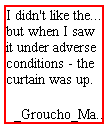
Other children blocks, like absolute positioned blocks, or blocks with
specified width or height won't show hinting. For example, setting the p
element of the previous figure with the following style:
p { width :100px; margin-top : 50px; margin-left : 50px; }
will result on no ellipsis shown for its content (because it has a
specified width and furthermore the text wrapping occurs in the 'hidden'
overflow area of its parent element). This would be shown like this: 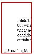
In other words, the text-overflow-mode only affects the textual content of
a block element which participate in its own inline flow.
'text-overflow-ellipsis'
| Value:
| [<ellipsis-end> | uri [, <ellipsis-after> | uri]?]?]?] | inherit
|
| Initial:
| "..."
|
| Applies to:
| all block-level elements
|
| Inherited:
| no
|
| Percentages:
| N/A
|
| Media:
| visual
|
- <ellipsis-end>
- controls the value of the hint characters presented after the text flow
within each line of an element box. It takes as value a text string. An empty
string disables the hint. The initial value is '...'. In a horizontal text
flow ('writing-mode' = 'lr-tb), the hint string
would appear on each line of the element box where the text overflows on the
right.
- <ellipsis-after>
- controls the value of the hint character presented after the text flow
within an element box. It takes as value a text string. An empty string
disables the hints. The initial value is empty. In a horizontal text flow,
the hint string would appear on the right side of the last line. If
<ellipsis-after> is non empty and would appear at the same location
than <ellipsis-end>, only <ellipsis-after> is shown.
- uri
- And uri can replace any of the string value and set an image to be used
as the hint indication. Being specified is equivalent to a non empty string
for the respective ellipsis.
The font-size used for the ellipsis characters is the element font-size.
'text-overflow'
| Value:
| <'text-overflow-mode'> || <'text-overflow-ellipsis'> | inherit
|
| Initial:
| not defined for shorthand properties
|
| Applies to:
| all block-level elements
|
| Inherited:
| no
|
| Percentages:
| N/A
|
| Media:
| visual
|
This property is the shorthand for 'text-overflow-mode' and 'text-overflow-ellipsis'.
9.1. Letter
spacing:the 'letter-spacing' property
'letter-spacing'
| Value:
| normal | <length> | inherit
|
| Initial:
| normal
|
| Applies to:
| all elements
|
| Inherited:
| yes
|
| Percentages:
| N/A
|
| Media:
| visual
|
This property specifies spacing behavior between text characters. Values
have the following meanings:
- normal
- The spacing is the normal spacing for the current font. It is typically
zero-length. However, this value allows the user agent to alter the space
between characters in order to justify text.
- <length>
- This value indicates inter-character space in addition to the
default space between characters. The value is added to the advance width of
each spacing characters or group of characters that are clustered in single
grapheme unit (like in Thai, Khmer, etc.), including the last character of
the element. Characters which are joined together by effect of applying a
cursive font to them, or by standard typography rules (Arabic script,
Northern Indian scripts like Devanagari) have the valued added to each
spacing characters. Combining characters (not spacing) do not get any
letter-spacing effect, only the combination of the base character and its
combining characters does.
- For justification purposes, user agents should minimize effect on
letter-spacing as much as possible (priority to word-spacing
expansion/compression as opposed to character-spacing expansion/compression).
- Values may be negative, but there may be implementation-specific limits.
The justification algorithm may further modify the inter-character spacing.
Because of the visual disruptive effect of modifying letter-spacing on
writing systems which used joined characters, like for example Arabic, the
usage of this property is discouraged in those cases.
There are cases like Japanese or Chinese writing systems where
justification will change all letter-spacing effects as there is no other
opportunity in the line to expand or compress the character content in order
to fit the line span.
Character spacing algorithms are user agent-dependent. For example, the
spacing will not occur necessarily between each characters, but instead
between each glyph that constitutes either a letter or a cluster unit.
Furthermore this property should not be used for scripts and/or fonts that
link characters together (cursive fonts for Roman scripts, all Arabic cases,
Indic scripts with headline like Devanagari, etc...). Character spacing may
also be influenced by justification (see the 'text-align' property).
Example(s):
In this example, the space between characters in BLOCKQUOTE elements is
increased by '0.1em'.
BLOCKQUOTE { letter-spacing: 0.1em }
In the following example, the user agent is requested not to alter
inter-character space:
BLOCKQUOTE { letter-spacing: 0cm } /* Same as '0' */
When the resultant space between two characters is not the same as the
default space, user agents should not use ligatures.
Conforming user
agents may consider the value of the 'letter-spacing' property to be 'normal'.
9.2. Word spacing:the
'word-spacing'
property
'word-spacing'
| Value:
| normal | none | <length> | inherit
|
| Initial:
| normal
|
| Applies to:
| all elements
|
| Inherited:
| yes
|
| Percentages:
| N/A
|
| Media:
| visual
|
This property specifies spacing behavior between words. Values have the
following meanings:
- normal
- The normal inter-word space, as defined by the current font and/or the
user agent. If the inter-word boundary is delimited by one or several
white-space characters, they should be visible. If there are no characters,
the user agent doesn't have to create an additional character advance width.
- none
- There is no inter-word space. All white-space characters are treated like
zero-length characters.
- <length>
- This value indicates inter-word space in addition to the default
space between words. Values may be negative, but there may be
implementation-specific limits.
Word spacing algorithms are user agent-dependent. Determining word
boundary is typically done by detecting white space characters. There are
however many scripts and writing systems that do not separate their words by
any character (like Japanese, Chinese, Thai, etc...), detecting word
boundaries in these cases require dictionary based algorithms that may not be
supported by all user agents. Word spacing is also influenced by
justification (see the 'text-align' property).
Example(s):
In this example, the word-spacing between each word in H1 elements is
increased by '1em'.
H1 { word-spacing: 1em }
Conforming user
agents may consider the value of the 'word-spacing' property to be 'normal'.
9.3. Punctuation
trimming:the 'punctuation-trim' property
'punctuation-trim'
| Value:
| none | start | inherit
|
| Initial:
| none
|
| Applies to:
| block-level elements
|
| Inherited:
| yes
|
| Percentages:
| N/A
|
| Media:
| visual
|
This property determines whether or not a full-width punctuation mark
character should be trimmed if it appears at the beginning of a line, so that
its "ink" lines up with the first glyph in the line above and below. In some
scenarios, it may be preferable for the author not to allow leading
punctuation marks to be trimmed, for example when it is more important that
the glyphs tend to line up vertically. In other scenarios such an effect is
desirable, for example when it is more important for the author that as much
text as possible fits on a single line.
Possible values:
- none
- Leading punctuation is not trimmed.
- start
- Leading punctuation is trimmed.
(Note that this property may in the future be expanded to cover other
punctuation behaviors for other types of punctuation as well, not just
wide-cell.)
'text-autospace'
| Value:
| none | [ideograph-numeric || ideograph-alpha ||
ideograph-space || ideograph-parenthesis]| inherit
|
| Initial:
| none
|
| Applies to:
| all elements
|
| Inherited:
| yes
|
| Percentages:
| N/A
|
| Media:
| visual
|
When a run of non-ideographic or numeric characters appears inside of
ideographic text, a certain amount of space is often preferred on both sides
of the non-ideographic text to separate it from the surrounding ideographic
glyphs. This property controls the creation of that space when rendering the
text. That added width does not correspond to the insertion of additional
space characters, but instead to the width increment of existing glyphs.
(A commonly used algorithm for determining this behavior is specified in
JIS X-4051 [JIS].)
This property is additive with the 'word-spacing' and 'letter-spacing' [CSS2]
properties, that is, the amount of spacing contributed by the
'letter-spacing' setting (if any) is added to the spacing created by 'text-autospace'. The
same applies to 'word-spacing'.
Possible values:
- none
- No extra space is created.
- ideograph-numeric
- Creates extra spacing between runs of ideographic text and numeric
glyphs.
- ideograph-alpha
- Creates extra spacing between runs of ideographic text and
non-ideographic text, such as Latin-based, Cyrillic, Greek, Arabic or Hebrew.
- ideograph-space
- Extends the width of the space character while surrounded by ideographs.
- ideograph-parenthesis
- Creates extra spacing between normal (non wide) parenthesis and
ideographs.
<SPAN style="text-autospace:none">[ideographs]1997[ideographs]</SPAN>
would appear as:
while:
<span STYLE="text-autospace:ideograph-numeric">[ideographs]1997[ideographs]</span>
would appear more like:
This property controls all kerning effects. Some kerning effects are based
on information located explicitly on fonts (pair-kerning). Others are based
on context and typical ink placement within characters and don't rely on font
information. Pair kerning is used mainly for Latin, Greek and Cyrillic
scripts, while contextual kerning is more common in East Asian context. A
typical example of pair kerning is the pair 'Wa'. A good example of
contextual kerning is the pair '[[' (when using the wide width variant).
Possible values:
- none
- no kerning is enabled
- pair
- enables pair kerning
- contextual
- enables contextual kerning
This property controls the font size threshold, above which pair kerning
would be active (if enabled).
10. Text decoration
10.1.
Introduction
Until CSS2, the only text decorations available were available through the
'text-decoration' property exposing
itself various effects underline, overline, line-through, etc... and the
text-shadows property. However the text-decoration property has some
limitations stemming from its syntax, which allows for multiple 'text-decoration'
formatting effects to be specified at the same time but it precludes finer
control over each of those formatting effects. More specifically, it offers
no way to control the color or line style of the underline, overline or
line-through.
CSS3 extends the model by introducing new properties allowing additional
controls over those formatting effects. CSS3 also makes turning these
formatting effects on or off possible without affecting any other 'text-decoration'
settings.
Furthermore, to reflect the usage of underline in East Asian vertical
writing, a new control is offered on the underline positioning, this allows
the underline to appear before (on the right in vertical text flow) or after
(on the left in vertical text flow) the formatted text. The property is
called 'text-underline-position'.
The 'text-decoration' property itself is now
a shorthand property for all these new properties.
These properties describe decorations that are added to the text of an
element. If they are specified for a block-level element, it
affects all inline-level descendants of the element. If they are specified
for (or affects) an inline-level element, it
affects all boxes generated by the element. If the element has no content or
no text content (e.g., the IMG element in HTML), user agents must ignore these properties.
Finally, user agents may chose either to average thickness and positions
of the 'line' text-decorations based on the children text size and baselines,
or to process each children separately. The following figure shows the
averaging for underline: 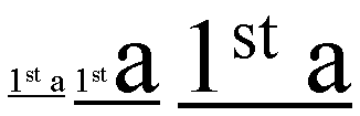
On these 3 segments of underline text, the underline bar is drawn lower
and thicker as the ratio of large text increase for the each consecutive
underlined text segment.
Note: Typically the underline superscript text
segments are averaged, while the subscript segments are not.
'text-underline-style'
| Value:
| none | solid | double | dotted | thick | dashed | dot-dash | dot-dot-dash
| wave | single-accounting | double-accounting | inherit
|
| Initial:
| none
|
| Applies to:
| all elements
|
| Inherited:
| no
|
| Percentages:
| N/A
|
| Media:
| visual
|
This property specifies the underline style. Possible values:
- none
- no underline
- solid
- solid line underline
- double
- double line underline.
- dotted
- dotted underline.
- thick
- single line underline using a greater line width.
- dashed
- dashed underline style.
- dot-dash
- underline style consisting of a dot-and-dash pattern.
- dot-dot-dash
- underline style consisting of two-dots-and-a-dash pattern.
- wave
- wavy underline.
- single-accounting
- single line drawn below the bottom of the character, rather than just
below the baseline.
- double-accounting
- double line drawn below the bottom of the character, rather than just
below the baseline.
'text-underline-color'
| Value:
| auto | <color> | inherit
|
| Initial:
| auto
|
| Applies to:
| all elements
|
| Inherited:
| no
|
| Percentages:
| N/A
|
| Media:
| visual
|
This property specifies the color for the underline.
The initial value 'auto' means that the color of
the underline is determined by the 'color'
property.
'text-underline-mode'
| Value:
| continuous | words | inherit
|
| Initial:
| continuous
|
| Applies to:
| all elements
|
| Inherited:
| no
|
| Percentages:
| N/A
|
| Media:
| visual
|
This property specifies the mode for the underline, that is whether the
underline is continuous or whether it appears only under words and not
whitespace. Possible values:
- continuous
- this value means that the underline is continuous.
- words
- this means that only non-whitespace text will be underlined.
'text-underline-position'
| Value:
| auto-pos | before | after | inherit
|
| Initial:
| auto-pos
|
| Applies to:
| all elements
|
| Inherited:
| no
|
| Percentages:
| N/A
|
| Media:
| visual
|
This property sets the position of the underline when set through the
text-decoration property. It can appear either 'before' (above in an
horizontal flow) or after (below in an horizontal flow) the run of text in
relation to its baseline orientation. This property is typically used in
vertical writing context where it may be desired to have the underline appear
'before' the run of text. This results on having the underline appearing on
the right side of the vertical writing column. Possible values:
- auto-pos
- In horizontal inline progression, the underline if set will appear after
the text. In vertical inline progression, if the language is set to Japanese,
the underline if set will appear before the text.
- before
- the underline if set will appear before the text.
- after
- the underline if set will appear after the text.
'text-underline'
| Value:
| <'text-underline-style'> || <'text-underline-color'> ||
<'text-underline-mode'> || <'text-underline-position'>| inherit
|
| Initial:
| not defined for shorthand properties
|
| Applies to:
| all elements
|
| Inherited:
| no
|
| Percentages:
| N/A
|
| Media:
| visual
|
This property is the shorthand for 'text-underline-style', 'text-underline-color', 'text-underline-mode' and 'text-underline-position'.
'text-line-through-style'
| Value:
| none | solid | double | dotted | thick | dashed | dot-dash | dot-dot-dash
| wave | inherit
|
| Initial:
| none
|
| Applies to:
| all elements
|
| Inherited:
| no
|
| Percentages:
| N/A
|
| Media:
| visual
|
This property specifies the line-through style. Possible values:
- none
- no line-through
- solid
- single line line-through
- double
- double line line-through.
- dotted
- dotted line-through.
- thick
- single line line-through using a greater line width.
- dashed
- dashed line-through style.
- dot-dash
- line-through style consisting of a dot-and-dash pattern.
- dot-dot-dash
- line-through style consisting of two-dots-one-dash pattern.
- wave
- wavy line-through.
'text-line-through-color'
| Value:
| auto | <color> | inherit
|
| Initial:
| auto
|
| Applies to:
| all elements
|
| Inherited:
| no
|
| Percentages:
| N/A
|
| Media:
| visual
|
This property specifies the color for the line-through.
The initial value 'auto' means that the color of
the line is determined by the 'color' property.
'text-line-through-mode'
| Value:
| continuous | words | inherit
|
| Initial:
| continuous
|
| Applies to:
| all elements
|
| Inherited:
| no
|
| Percentages:
| N/A
|
| Media:
| visual
|
This property specifies the mode for the line-through, that is whether the
line-through is continuous or whether it appears only through words and not
whitespace. Possible values:
- continuous
- this value means that the line-through is continuous.
- words
- this means that only non-whitespace text will have the line through it.
'text-line-through'
| Value:
| <'text-line-through-style'> || <'text-line-through-color'> ||
<'text-line-through-mode'> | inherit
|
| Initial:
| not defined for shorthand properties
|
| Applies to:
| all elements
|
| Inherited:
| no
|
| Percentages:
| N/A
|
| Media:
| visual
|
This property is the shorthand for 'text-line-through-style', 'text-line-through-color' and
'text-line-through-mode'.
'text-overline-style'
| Value:
| none | solid | double | dotted | thick | dashed | dot-dash | dot-dot-dash
| wave | inherit
|
| Initial:
| none
|
| Applies to:
| all elements
|
| Inherited:
| no
|
| Percentages:
| N/A
|
| Media:
| visual
|
This property specifies the overline style. Possible values:
- none
- no overline
- solid
- single line overline
- double
- double line overline.
- dotted
- dotted overline.
- thick
- single line overline using a greater line width.
- dashed
- dashed overline style.
- dot-dash
- overline style consisting of a dot-and-dash pattern.
- dot-dot-dash
- overline style consisting of two-dots-one-dash pattern.
- wave
- wavy overline.
'text-overline-color'
| Value:
| auto | <color> | inherit
|
| Initial:
| auto
|
| Applies to:
| all elements
|
| Inherited:
| no
|
| Percentages:
| N/A
|
| Media:
| visual
|
This property specifies the color for the overline.
The initial value 'auto' means that the color of
the line is determined by the 'color' property.
'text-overline-mode'
| Value:
| continuous | words | inherit
|
| Initial:
| continuous
|
| Applies to:
| all elements
|
| Inherited:
| no
|
| Percentages:
| N/A
|
| Media:
| visual
|
This property specifies the mode for the overline, that is whether the
overline is continuous or whether it appears only over words and not
whitespace. Possible values:
- continuous
- this value means that the overline is continuous.
- words
- this means that only non-whitespace text will be overlined.
'text-overline'
| Value:
| <'text-overline-style'> || <'text-overline-color'> ||
<'text-overline-mode'> | inherit
|
| Initial:
| not defined for shorthand properties
|
| Applies to:
| all elements
|
| Inherited:
| no
|
| Percentages:
| N/A
|
| Media:
| visual
|
This property is the shorthand for 'text-overline-style', 'text-overline-color' and 'text-overline-mode'.
'text-decoration'
| Value:
| none | [ underline || overline || line-through || blink ||
<'text-underline'> || <'text-overline'> ||
<'text-line-through'>] | inherit
|
| Initial:
| see individual properties
|
| Applies to:
| all elements
|
| Inherited:
| no (see prose)
|
| Percentages:
| N/A
|
| Media:
| visual
|
This property describes decorations that are added to the text of an
element. If the property is specified for a block-level element, it
affects all inline-level descendants of the element. If it is specified for
(or affects) an inline-level element, it
affects all boxes generated by the element. If the element has no content or
no text content (e.g., the IMG element in HTML), user agents must ignore this property.
Values are a combination of the properties part of the shorthand
description (text-underline, text-overline and text-line-through) and a set
of explicit values as following:
- none
- Produces no text decoration, is equivalent at using:
-
{ text-underline: none; text-overline: none; text-line-through: none; }
- underline
- The textual content of the element is underlined, is equivalent at using:
-
{ text-underline-style: solid; }
- overline
- The textual content of the element has a line above it, is equivalent at
using:
-
{ text-overline-style: solid; }
- line-through
- The textual content of the element has a line through the middle, is
equivalent at using:
-
{ text-line-through-style: solid; }
- blink
- Text blinks (alternates between visible and invisible). Conforming user agents are
not required to support this value.
The color(s) required for the text decoration are initially derived from
the 'color' property value, but can be modified
by using the individual properties. In addition if a text decoration style
only exists for some of the text decoration, the result is that the other
decoration styles remain at their initial value, for example, in the
following example:
P { text-decoration: "single accounting" blue; }
The content of the P element will be underlined in blue with 'single
accounting' underlining style. No other text decorations have that style, so
they remain at their initial value (none).
This property is not inherited, but descendant boxes of a block box should
be formatted with the same decoration (e.g., they should all be underlined).
The color of decorations should remain the same even if descendant elements
have different 'color' values.
Example(s):
In the following example for HTML, the text content of all A elements
acting as hyperlinks will be underlined:
A[href] { text-decoration: underline }
'text-shadow'
| Value:
| none | [<color> || <length> <length> <length>? ,]* [<color> || <length> <length> <length>?] | inherit
|
| Initial:
| none
|
| Applies to:
| all elements
|
| Inherited:
| no (see prose)
|
| Percentages:
| N/A
|
| Media:
| visual
|
This property accepts a comma-separated list of shadow effects to be
applied to the text of the element. The shadow effects are applied in the
order specified and may thus overlay each other, but they will never overlay
the text itself. Shadow effects do not alter the size of a box, but may
extend beyond its boundaries. The stack level of the shadow
effects is the same as for the element itself.
Each shadow effect must specify a shadow offset and may optionally specify
a blur radius and a shadow color.
A shadow offset is specified with two <length> values that
indicate the distance from the text. The first length value specifies the
horizontal distance to the right of the text. A negative horizontal length
value places the shadow to the left of the text. The second length value
specifies the vertical distance below the text. A negative vertical length
value places the shadow above the text.
A blur radius may optionally be specified after the shadow offset. The
blur radius is a length value that indicates the boundaries of the blur
effect. The exact algorithm for computing the blur effect is not specified.
A color value may optionally be specified before or after the length
values of the shadow effect. The color value will be used as the basis for
the shadow effect. If no color is specified, the value of the 'color' property will be used instead.
Text shadows may be used with the :first-letter and :first-line pseudo-elements.
Example(s):
The example below will set a text shadow to the right and below the
element's text. Since no color has been specified, the shadow will have the
same color as the element itself, and since no blur radius is specified, the
text shadow will not be blurred:
H1 { text-shadow: 0.2em 0.2em }
The next example will place a shadow to the right and below the element's
text. The shadow will have a 5px blur radius and will be red.
H2 { text-shadow: 3px 3px 5px red }
The next example specifies a list of shadow effects. The first shadow will
be to the right and below the element's text and will be red with no
blurring. The second shadow will overlay the first shadow effect, and it will
be yellow, blurred, and placed to the left and below the text. The third
shadow effect will be placed to the right and above the text. Since no shadow
color is specified for the third shadow effect, the value of the element's 'color' property will be used:
H2 { text-shadow: 3px 3px red, yellow -3px 3px 2px, 3px -3px }
Example(s):
Consider this example:
SPAN.glow {
    background: white;
    color: white;
    text-shadow: black 0px 0px 5px;
}
Here, the 'background' and 'color' properties have the same value and the 'text-shadow' property is
used to create a "solar eclipse" effect:

Note. This property is not defined in CSS1. Some
shadow effects (such as the one in the last example) may render text
invisible in UAs that only support CSS1.
11. Document grid
11.1. What is document
grid?
It is very common for the glyphs in documents written in East Asian
languages, such as Chinese or Japanese, to be laid out on the page according
to a specified one- or two-dimensional grid. The concept of grid can also be
used in other, non-ideographic contexts such as Braille or monospaced layout.
The diagram below represents a fragment of horizontal text on a page with
mixed wide-cell and narrow-cell glyphs that a Japanese user intended to be
laid out on a grid which resulted in 9 glyphs per line (gray grid lines shown
for clarity):
The grid affects not only the placement of the glyphs, but it can also
modify the behavior of several other layout-related behaviors, such as indent
size, margins or paragraph alignment.
One can distinguish between three types of grid: a strict one,
used mostly in Chinese, but also occasionally in Japanese (a.k.a. "genko"), a loose one, frequently used in Japanese
and sometimes in Korean, as well as a fixed one, potentially useful
for non-ideographic text, such as Braille or mono-spaced layout in general.
The grid type entails a set of layout rules that determine how much
flexibility the UA is allowed to have when laying out a line of text.
Different grids can be defined for different parts of the document.
The grid can be selectively disabled in either dimension on fragments of
text.
Line grid can be disabled for individual paragraphs. If line grid is
disabled for a paragraph, the lines of the paragraph are laid out just as if
no line grid were specified. The glyphs in a paragraph with line grid
disabled still follow the character grid, if one is specified.
The CSS model described in this section exposes the necessary grid
parameters the author needs to control.
'layout-grid-type'
| Value:
| loose | strict | fixed | inherit
|
| Initial:
| loose
|
| Applies to:
| block-level elements
|
| Inherited:
| yes
|
| Percentages:
| N/A
|
| Media:
| visual
|
Specifies the type of grid to use. Each grid type entails a different set
of rules for rendering contents when a grid is enabled and specified.
Possible values:
- loose
- Grid type used in Japanese and sometimes Korean, where a constant width
increment is applied to all glyphs as follows:
- wide-cell (as well as narrow-cell Kana) glyphs get
a spacing increment equal to the amount specified by 'layout-grid-char'.
- the other narrow-cell glyphs (except for connected glyphs and glyphs
formatted with a cursive font) get half the increment applied to wide-cell
glyphs (though the UA is free to select a different amount).
- all other glyphs (i.e. connected), do not get any spacing increments at
all, i.e. they behave as if there were no character grid set.
The diagram below illustrates this type of grid:
In this mode, if only wide-cell glyphs or exact narrow-cell glyphs (like
some katakana glyphs) are
used, the result may effectively look like a strict grid. However,
since all other width adjustments are active (text justification, character
width adjustment, text autospace, etc), the end result is typically a loosely
aligned grid layout. Apart from the start of the text flow, the grid will
appear as 'broken' as soon as non ideographic characters appear in the flow.
- strict
- Grid type traditionally used in Chinese, as well as occasionally in
Japanese (a.k.a. "Genko") and Korean. This mode
applies in the following ways to the various character sets:
- each wide-cell glyph (as well as narrow-cell kana) that can fit within a single grid space is
rendered in the horizontal center of the grid space. The width of the grid
space is determined by the 'layout-grid-char' setting.
- consecutive narrow-cell and connected glyphs are treated as a single
strip, which is then placed in the center of the smallest number of grid
spaces necessary for it to fit in. They behave as if the 'layout-grid-mode'
property were set to 'none' or 'line' around them. If a line break occurs
within such a strip, the strip is treated as two separate strips whose
individual placement follows the same rules as those for a single strip.
- non-breakable objects (e.g. images) and wide-cell glyphs that for some
reason are wider than a single grid space, are each centered within the
smallest number of grid cells necessary for it to fit in.
The strict mode disables all special text justification and glyph width
adjustment normally applied to the contents of the element.
If a line break opportunity cannot be found in a text run going over the
line boundary, then that text run will be pushed down to the next line and
the last part of the previous line will be left blank.
Here is an example of mixed text in strict grid:
- fixed
- This type of grid can be used to achieve mono-spaced layout. The layout
rules are simple: all non-connected glyphs are treated as equal, that is
every glyph is centered within a single grid space by default. Runs of
connected glyphs are treated as strips the same way as in 'strict' grid.
Justification or any other character-width changing behaviors are disabled.
For example:
'layout-grid-line'
| Value:
| none | auto | <length> | <percentage> | inherit
|
| Initial:
| none
|
| Applies to:
| block-level elements
|
| Inherited:
| yes
|
| Percentages:
| relative to element total line height (see prose)
|
| Media:
| visual
|
This property sets the line grid value for an element. If the text layout
flow of the element is horizontal, this property can be thought of as the
"vertical" grid size or grid height. In other words, it always determines the
line spacing increment, regardless of the layout flow mode. Its effect is
visually somewhat similar to the effect of applying a 'line-height' value
to an element. As for the 'line-height' property, 'layout-grid-line' has an
effect relative to the block-progression-direction. It affects the height in
horizontal flow modes, and the width in vertical flow modes (the layout flow
mode is controlled by the 'writing-mode' property).
Note that in order for this property to have an effect, 'layout-grid-mode'
must be set to 'line' or 'both' (the latter is its initial value).
When this property is set to anything other than 'none', a line of text is
vertically centered within the grid row and baseline-aligned by default. If
the computed line-height is larger than the grid space, then the whole line
box is centered within the smallest number of grid rows necessary for the
line box to fit in. The starting alignment point is moved accordingly. This
is illustrated below, where a represents the numerical
'layout-grid-line' value, b and c are half the difference
between the computed line-heights and either the layout-grid-line value or
twice the value respectively.:
Possible values:
- none
- No line grid is specified.
- auto
- The grid line size is determined by the computed line-height.
- <length>
- Size of the line grid's unit space (a.k.a. "line pitch").
- <percentage>
- Size of the line grid's unit space relative to the logical height of the
parent element. If the parent has no explicit height, it is treated as
'auto'.
As for regular line-height computation, the ruby box is treated
especially. In a similar fashion to the line-height determination process,
only the ruby base element is considered for centering purpose, however the
above and/or the after space should be sufficient to fit the ruby text above
and/or after the base text within the grid-line space. If this is not the
case, the grid-line size needs to be increased in multiple of grid rows until
the whole ruby box fits.
The following mark-up:
DIV.section1 { writing-mode: lr-tb; layout-grid-line: .5in }
would make each line of text in a horizontally laid out
section of a document to be rendered within 0.5 inch of vertical space. It is
also equivalent to having a line-height of 0.5 in, as shown below:
If the section's layout flow is vertical, then 0.5in is
the width of each column of vertical text. This time, the 0.5in value applies
to the 'width' of each cell:
If the author preferred a specific number of lines (20 for example) to
appear in an element, he would use a percentage value:
DIV.section1 { layout-grid-line: 5% }
11.4. Character
grid value: the 'layout-grid-char' property
'layout-grid-char'
| Value:
| none | auto | <length> | <percentage> | inherit
|
| Initial:
| none
|
| Applies to:
| block-level elements
|
| Inherited:
| yes
|
| Percentages:
| relative to element line width (see prose)
|
| Media:
| visual
|
This property affects the dimension perpendicular to that controlled by
'layout-grid-line'. It controls the
character (or "horizontal", if in horizontal layout) grid size for an element
if the 'layout-grid-type' property is set to
'strict' or 'fixed'.
However, if 'layout-grid-type' is 'loose', then this
property sets the size of the increment added to each wide-cell glyph, and,
indirectly, of that added to each narrow-cell glyph, as per the description
in the specification of 'layout-grid-type'. Its effect in 'loose'
grid is somewhat similar to the effect of the 'letter-spacing' property. The
'layout-grid-line' property has an effect relative to the
block-progression-direction. It affects the width horizontal flow modes, and
the height in vertical flow modes (the layout flow mode is controlled by the
'writing-mode'
property).
Note that in order for this property to have an effect, 'layout-grid-mode'
must be set to 'char' or 'both' (the latter is its initial value).
Possible values:
- none
- No character grid.
- auto
- The width of the widest glyph in the element's font is used as the
character grid.
- <length>
- Width of the grid's unit space.
- <percentage>
- Width of the grid's unit space relative to the logical width of the
parent element. If the parent has no explicit width, it is treated as 'auto'.
DIV.section1 { layout-grid-char: .5in }
would make each glyph in a horizontally laid out part of a document
rendered within 0.5 inch of horizontal space:
If the section's layout flow is vertical, then 0.5in becomes the vertical
distance between consecutive characters in a column:
If the author preferred a specific number of glyphs (5 for example) to
appear in a line, he would set the character grid to a percentage value:
DIV.section1 { layout-grid-char: 20% }
'layout-grid-mode'
| Value:
| none | line | char | both | inherit
|
| Initial:
| both
|
| Applies to:
| all elements
|
| Inherited:
| yes
|
| Percentages:
| N/A
|
| Media:
| visual
|
This property selectively enables or disables the two dimensions of the
grid. Possible values:
- none
- No grid is active in either dimension.
- line
- only line grid is used. Character grid is disabled. This is the value
recommended for use inline to disable horizontal grid on runs of text and
turn them into "strips" that are laid out within the grid as a single unit,
regardless of the nature of the glyphs contained within it.
- char
- Only character grid is used. Line grid is disabled. This is the value
recommended for use on block-level elements, such as paragraphs, for which
the line grid is intended to be disabled.
- both
- Enables the grid in both dimensions (if both are specified). This setting
is necessary to fully enable layout grid on an element. This is the initial
value.
11.6. Layout-grid: the
shorthand 'layout-grid' property
'layout-grid'
| Value:
| none | [<mode> || <type> || [<line> [<char>]? ] ]
| inherit
|
| Initial:
| not defined for shorthand properties
|
| Applies to:
| all elements
|
| Inherited:
| yes
|
| Percentages:
| allowed on <char> and <line>
|
| Media:
| visual
|
The 'layout-grid'
property is a shorthand property for setting 'layout-grid-mode', 'layout-grid-type',
'layout-grid-line' and 'layout-grid-char' at
the same time in the style sheet. Using the value 'none' on the shorthand property sets the 'layout-grid-mode' to
'none'. Using the value "none none" sets both the
'layout-grid-mode' and 'layout-grid-line' to
'none', and using the value "none none none" sets
the previous properties as well as 'layout-grid-char' to 'none'.
The first numerical, percentage or 'auto' value specified sets 'layout-grid-line'.
If a second numerical, percentage or 'auto' value is present, it sets 'layout-grid-char'.
For example:
DIV.section1 { layout-grid: both strict .5in 20% }
The 'layout-grid' property above is set to have the 'layout-grid-type'
set to 'strict', 'layout-grid-mode' to 'both', 'layout-grid-line' to
0.5in and the 'layout-grid-char' to 20% of the parent
width.
Notes:
- The reason why <line> precedes the optional <char> is that in
Japanese, character grid, though possible, is not required. In horizontal
Japanese text, line grid is often used without character grid.
- The initial value of the shorthand property, although not defined, can be
assumed as the following:
{ layout-grid: both loose none none }
as derived from the initial values of the contained properties. The 'none'
values make the grid inactive. Setting any other values on the 'layout-grid-line' or
'layout-grid-char' will make the grid
active in either or both of these modes.
- Since the effects of 'layout-grid-line' and 'layout-grid-char'
are dependent on the value of 'layout-grid-mode' , it is possible to
create a situation where providing a value for those 2 settings will not have
any effect. For example in the following setting:
DIV.section1 { layout-grid: strict line .5in 20% }
the 20% 'layout-grid-char' setting will not be active. However changing
'layout-grid-mode' later to either 'both' or 'char' would make it active.
This amount of control is very useful for scenarios in which the same grid
dimensions are used across the entire document, but the various dimensions
are occasionally selectively disabled or enabled for fragments of text.
11.7. The 'gd' length unit
The existence of a grid in an element makes it possible and very useful to
express various measurements in that element in terms of grid units. Grid
units are used very frequently in East Asian typography, especially for the
left, right, top and bottom element margins.
Therefore a new length unit is necessary: gd to enable the
author to specify the various measurements in terms of the grid.
For example, consider the following style:
P { layout-grid: strict both 20pt 15pt; margin: 1gd 3gd 1gd 2gd }
This way, all P elements would effectively acquire a 15pt top
margin, a 60pt right margin, a 15pt bottom margin and a 40pt left margin.
If no grid is specified, the gd unit should be treated the
same as the em unit.
Editor's note. This should be moved to the Unit definition
module.
12. Miscellaneous
text formatting
12.1. Capitalization: the 'text-transform'
property
'text-transform'
| Value:
| capitalize | uppercase | lowercase | none | inherit
|
| Initial:
| none
|
| Applies to:
| all elements
|
| Inherited:
| yes
|
| Percentages:
| N/A
|
| Media:
| visual
|
This property controls capitalization effects of an element's text. Values
have the following meanings:
- capitalize
- Puts the first character of each word in uppercase.
- uppercase
- Puts all characters of each word in uppercase.
- lowercase
- Puts all characters of each word in lowercase.
- none
- No capitalization effects.
Although limited, the case mapping process has some language dependencies.
Some well known examples are Turkish and Greek. See HTML [HTML40] for ways to
find the language of an HTML element. XML uses an attribute called XML:LANG,
and there may be other language-specific language-specific methods to
determine the language.
The case mapping rules for the character repertoire specified by the
Unicode Standard 3.0 can be found on the Unicode Consortium web site: http://www.unicode.org.
Conforming user
agents must support case mapping rules according to the Unicode
Standard 3.0 for all characters specified by that standard. Note that the
conformance rule is more stringent than the ones specified in earlier
versions of CSS.
Example:
In this example, all text in an H1 element is transformed to uppercase
text.
H1 { text-transform: uppercase }
12.2. Punctuation
wrapping: the 'punctuation-wrap' property
'punctuation-wrap'
| Value:
| none | start | end | both | inherit
|
| Initial:
| none
|
| Applies to:
| block-level elements
|
| Inherited:
| yes
|
| Percentages:
| N/A
|
| Media:
| visual
|
This property determines whether a punctuation mark, if one is present,
may be placed outside the content area in the padding or margin area, at the
start or at the end of a full line of text. Allowing a punctuation to 'hang'
at the end of a line is is a common practice in East Asian typography. It is
the responsibility of the style writer to create meaningful padding and
margin areas to allow effective rendering of the punctuation. It should also
be noted that compression may occur in the line, including compression of the
punctuation characters independently of this effect.
Possible values:
- none
- Punctuation is not allowed to be placed outside the content area.
- start
- A leading punctuation, if present, may overhang at the start of the
content area. It is placed in the padding or margin area.
- end
- An ending punctuation, if present, may overhang at the end of the content
area. It is placed in the padding or margin area.
- both
- A punctuation, if present, may overhang at either the start or the end of
the content area.
Here is an example where overhanging is not allowed:
In the following example overhanging is allowed at the end of the content
area.
Note: User agents should follow the convention of the scripts
for trimming either only the first lines or all lines. For example, in Roman
text, only a punctuation appearing at the starting point of the first line
may be placed outside the content area. It would look improper in other
lines. The following figure shows a correct usage. 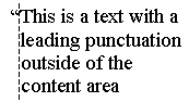
12.3. Combining
text:the 'text-combine' property'
'text-combine'
| Value:
| none | letters | lines | inherit
|
| Initial:
| none
|
| Applies to:
| all elements
|
| Inherited:
| no
|
| Percentages:
| N/A
|
| Media:
| visual
|
This property controls the creation of composite characters (a.k.a. "kumimoji") or lines (a.k.a. "warichu").
Possible values:
- none
- No composite characters are created.
- letters
- Combines glyphs to fit within the space of a single wide-cell glyph, by
reducing them in size and stacking them next to and/or on top of each other.
This effect is not directly defined in the JIS [JIS] but
is commonly used in Asian typography.
No more than 5 glyphs can be combined at a time. If more than five are
included inside of the element with this property setting, only the first
five should be combined. The rest should be rendered as regular text. The
following texts shows the arrangement for 2, 3, 4 and 5 characters:
The following mark-up:
SPAN.kumimoji { text-combine: letters }
could make the following 4 characters appear as one (shown in blue for
clarity):
- lines
- Combines the glyphs so they fit into two lines of equal length and
height, whose combined height is equal to or slightly greater than the height
of the line they appear in, according to a special set of rules [JIS]. The combined lines appear inline with the surrounding
text. This combination is restricted to two lines as specified by the JIS.
This is the typical usage found in Asian context for this feature.
The following mark-up:
SPAN.warichu { text-combine: lines }
would make the enclosed text look like the following (shown in blue for
clarity):
Note that "warichu" is allowed to break across
lines, though the exact algorithm to accomplish that can be non-trivial.
Also, Warichu text is usually enclosed within
parentheses. Those parentheses are inserted by the author.
13. Properties index
| Property
| Values
| Initial
| Applies to
| Inh.
| Percentages
| Media
|
| 'alignment-adjust'
| auto | baseline | before-edge | text-before-edge | middle | central |
after-edge | text-after-edge | ideographic | alphabetic | hanging |
mathematical | <percentage> | <length> | inherit
| auto
| inline-level elements
| no
| refers to the 'line-height' of the element
| visual
|
|
| 'alignment-baseline'
| baseline | auto-script | before-edge | text-before-edge | after-edge |
text-after-edge | central | middle | ideographic | alphabetic | hanging |
mathematical | inherit
| baseline
| inline-level elements
| no
| N/A
| visual
|
|
| 'baseline-shift'
| baseline | sub | super | <percentage> | <length> | inherit
| baseline
| inline-level elements
| no
| refers to the 'line-height' of the parent element
| visual
|
|
| 'direction'
| ltr | rtl | inherit
| ltr
| all elements, but see prose
| yes
| N/A
| visual
|
|
| 'dominant-baseline'
| auto | use-script | no-change | reset-size| ideographic | alphabetic |
hanging | mathematical | inherit
| auto
| inline-level elements
| no
| N/A
| visual
|
|
| 'glyph-orientation-horizontal'
| <angle> | inherit
| 0deg
| all inline-level elements
| yes
| N/A
| visual
|
|
| 'glyph-orientation-vertical'
| <angle> | auto | inherit
| auto
| all elements
| yes
| N/A
| visual
|
|
| 'kerning-mode'
| none | [pair || contextual] | inherit
| none
| all elements
| yes
| N/A
| visual
|
|
| 'kerning-pair-threshold'
| auto | <length> | inherit
| auto
| all elements
| yes
| N/A
| visual
|
|
| 'layout-grid'
| none | [<mode> || <type> || [<line> [<char>]? ] ]
| inherit
| not defined for shorthand properties
| all elements
| yes
| allowed on <char> and <line>
| visual
|
|
| 'layout-grid-char'
| none | auto | <length> | <percentage> | inherit
| none
| block-level elements
| yes
| relative to element line width (see prose)
| visual
|
|
| 'layout-grid-line'
| none | auto | <length> | <percentage> | inherit
| none
| block-level elements
| yes
| relative to element total line height (see prose)
| visual
|
|
| 'layout-grid-mode'
| none | line | char | both | inherit
| both
| all elements
| yes
| N/A
| visual
|
|
| 'layout-grid-type'
| loose | strict | fixed | inherit
| loose
| block-level elements
| yes
| N/A
| visual
|
|
| 'letter-spacing'
| normal | <length> | inherit
| normal
| all elements
| yes
| N/A
| visual
|
|
| 'line-break'
| normal | strict | inherit
| normal
| all elements
| yes
| N/A
| visual
|
|
| 'max-font-size'
| <font-size> | auto | inherit
| auto
| all elements
| yes
| element's computed 'font-size'
| visual
|
|
| 'min-font-size'
| <font-size> | inherit
| 0
| all elements
| yes
| element's computed 'font-size'
| visual
|
|
| 'punctuation-trim'
| none | start | inherit
| none
| block-level elements
| yes
| N/A
| visual
|
|
| 'punctuation-wrap'
| none | start | end | both | inherit
| none
| block-level elements
| yes
| N/A
| visual
|
|
| 'script'
| auto | none | <script> | inherit
| auto
| all elements
| yes
| N/A
| visual
|
|
| 'text-align'
| start | end | left | right | center | justify | <string> | inherit
| start
| block-level elements
| yes
| N/A
| visual
|
|
| 'text-align-last'
| auto | start | end | center | justify | size | inherit
| auto
| block-level elements
| yes
| N/A
| visual
|
|
| 'text-autospace'
| none | [ideograph-numeric || ideograph-alpha || ideograph-space ||
ideograph-parenthesis]| inherit
| none
| all elements
| yes
| N/A
| visual
|
|
| 'text-combine'
| none | letters | lines | inherit
| none
| all elements
| no
| N/A
| visual
|
|
| 'text-decoration'
| none | [ underline || overline || line-through || blink ||
<'text-underline'> || <'text-overline'> ||
<'text-line-through'>] | inherit
| see individual properties
| all elements
| no (see prose)
| N/A
| visual
|
|
| 'text-indent'
| <length> | <percentage> | inherit
| 0
| block-level elements
| yes
| refers to width of containing block
| visual
|
|
| 'text-justify'
| auto | inter-word | inter-ideograph | distribute | newspaper |
inter-cluster | kashida | inherit
| auto
| block-level elements
| yes
| N/A
| visual
|
|
| 'text-justify-trim'
| none | punctuation | punct-and-kana | inherit
| punctuation
| block-level elements
| yes
| N/A
| visual
|
|
| 'text-kashida-space'
| <percentage> | inherit
| 0%
| block-level elements
| yes
| as described
| visual
|
|
| 'text-line-through'
| <'text-line-through-style'> || <'text-line-through-color'> ||
<'text-line-through-mode'> | inherit
| not defined for shorthand properties
| all elements
| no
| N/A
| visual
|
|
| 'text-line-through-color'
| auto | <color> | inherit
| auto
| all elements
| no
| N/A
| visual
|
|
| 'text-line-through-mode'
| continuous | words | inherit
| continuous
| all elements
| no
| N/A
| visual
|
|
| 'text-line-through-style'
| none | solid | double | dotted | thick | dashed | dot-dash | dot-dot-dash
| wave | inherit
| none
| all elements
| no
| N/A
| visual
|
|
| 'text-overflow'
| <'text-overflow-mode'> || <'text-overflow-ellipsis'> |
inherit
| not defined for shorthand properties
| all block-level elements
| no
| N/A
| visual
|
|
| 'text-overflow-ellipsis'
| [<ellipsis-end> | uri [, <ellipsis-after> | uri]?]?]?] |
inherit
| "..."
| all block-level elements
| no
| N/A
| visual
|
|
| 'text-overflow-mode'
| clip | ellipsis | ellipsis-word | inherit
| clip
| all block-level elements
| no
| N/A
| visual
|
|
| 'text-overline'
| <'text-overline-style'> || <'text-overline-color'> ||
<'text-overline-mode'> | inherit
| not defined for shorthand properties
| all elements
| no
| N/A
| visual
|
|
| 'text-overline-color'
| auto | <color> | inherit
| auto
| all elements
| no
| N/A
| visual
|
|
| 'text-overline-mode'
| continuous | words | inherit
| continuous
| all elements
| no
| N/A
| visual
|
|
| 'text-overline-style'
| none | solid | double | dotted | thick | dashed | dot-dash | dot-dot-dash
| wave | inherit
| none
| all elements
| no
| N/A
| visual
|
|
| 'text-shadow'
| none | [<color> || <length> <length> <length>?
,]* [<color> || <length> <length> <length>?] |
inherit
| none
| all elements
| no (see prose)
| N/A
| visual
|
|
| 'text-space'
| normal | honor | inherit
| normal
| all elements
| yes
| N/A
| visual
|
|
| 'text-transform'
| capitalize | uppercase | lowercase | none | inherit
| none
| all elements
| yes
| N/A
| visual
|
|
| 'text-underline'
| <'text-underline-style'> || <'text-underline-color'> ||
<'text-underline-mode'> || <'text-underline-position'>| inherit
| not defined for shorthand properties
| all elements
| no
| N/A
| visual
|
|
| 'text-underline-color'
| auto | <color> | inherit
| auto
| all elements
| no
| N/A
| visual
|
|
| 'text-underline-mode'
| continuous | words | inherit
| continuous
| all elements
| no
| N/A
| visual
|
|
| 'text-underline-position'
| auto-pos | before | after | inherit
| auto-pos
| all elements
| no
| N/A
| visual
|
|
| 'text-underline-style'
| none | solid | double | dotted | thick | dashed | dot-dash | dot-dot-dash
| wave | single-accounting | double-accounting | inherit
| none
| all elements
| no
| N/A
| visual
|
|
| 'text-wrap'
| normal | none | inherit
| normal
| all elements
| yes
| N/A
| visual
|
|
| 'unicode-bidi'
| normal | embed | bidi-override | inherit
| normal
| all elements, but see prose
| no
| N/A
| visual
|
|
| 'vertical-align'
| auto | auto-script | baseline | sub | super | top | text-top | central |
middle | bottom | text-bottom | <percentage> | <length> | inherit
| auto
| inline-level and 'table-cell' elements
| no
| refers to the 'line-height' of the element itself
| visual
|
|
| 'white-space'
| normal | pre | nowrap | inherit
| normal
| block-level elements
| yes
| N/A
| visual
|
|
| 'word-break'
| <'word-break-CJK'> || <'word-break-wrap'> ||
<'word-break-inside'> | inherit
| see individual properties
| block-level elements
| yes
| N/A
| visual
|
|
| 'word-break-CJK'
| normal | break-all | keep-all | inherit
| normal
| block-level elements
| yes
| N/A
| visual
|
|
| 'word-break-inside'
| normal | hyphenate | inherit
| normal
| block-level elements
| yes
| N/A
| visual
|
|
| 'word-break-wrap'
| normal | emergency | inherit
| normal
| block-level elements
| yes
| N/A
| visual
|
|
| 'word-spacing'
| normal | none | <length> | inherit
| normal
| all elements
| yes
| N/A
| visual
|
|
| 'writing-mode'
| lr-tb | rl-tb | tb-rl | tb-lr | bt-rl | bt-lr | lr | rl | tb | inherit
| lr-tb
| all elements
| yes
| N/A
| visual
|
|
14. Profiles
There are 3 modules defined by this chapter:
CSS1 text model:
CSS2 text model:
CSS3 text model:
The CSS1 text module is made of the following properties/values:
The following table describes the CSS2 text module. Because all properties
have added the 'inherit' value and have a media type, all CSS1 properties
have been specified below as well. The properties added are: 'direction', 'text-shadow' and 'unicode-bidi'. In
addition the 'text-align' and 'vertical-align' have new values: <string> and
<length> respectively. Finally 'vertical-align' also applies to table-cell
elements.
The CSS3 module add the following properties:
- Text layout flow: 'glyph-orientation-horizontal',
'glyph-orientation-vertical',
'writing-mode',
'script',
- Text alignment and justification: 'min-font-size', 'max-font-size', 'text-align-last', 'text-justify', 'text-justify-trim',
'text-kashida-space',
- Baseline alignment: 'alignment-adjust', 'alignment-baseline', 'baseline-shift', 'dominant-baseline',
- Line breaking: 'line-break', 'word-break', 'word-break-CJK', 'word-break-inside', 'word-break-wrap',
- Text wrapping, white-space control and text overflow: 'text-overflow', 'text-overflow-ellipsis', 'text-overflow-mode', 'text-space', 'text-wrap'
- Text spacing: 'kerning-mode', 'kerning-pair-threshold', 'punctuation-trim',
'text-autospace',
- Text decoration: 'text-line-through', 'text-line-through-color', 'text-line-through-mode', 'text-line-through-style', 'text-overline', 'text-overline-color', 'text-overline-mode', 'text-overline-style', 'text-underline', 'text-underline-color', 'text-underline-mode', 'text-underline-position', 'text-underline-style'
- Document grid: 'layout-grid', 'layout-grid-char', 'layout-grid-line',
'layout-grid-mode', 'layout-grid-type',
- Miscellaneous: 'punctuation-wrap', 'text-combine',
It also modifies the following properties as described:
15. Glossary
- "Bopomofo"
- 37 characters and 4 tone markings used as phonetics in Chinese,
especially standard Mandarin.
- "Hangul"
- Subset of the Korean writing system.
- "Hanja"
- Subset of the Korean writing system that utilizes ideographic characters
borrowed or adapted from the Chinese writing system. Also see Kanji.
- "Hiragana"
- Subset of the Japanese writing system consisting of phonetic characters
to represent Japanese words. Also see Katakana.
- Ideogram, Ideograph
- Character in the Chinese (or East Asian in general) writing system that
represents a thing or an idea but not a particular word or phrase for it.
- "Kana"
- Syllabic subset of the Japanese system of writing that can be used
exclusively for writing foreign words or in combination with kanji.
- "Kanji"
- Subset of the Japanese writing system that utilizes ideographic
characters borrowed or adapted from Chinese writing. Also see Hanja.
- "Kashida"
- Arabic elongation character.
- "Katakana"
- Subset of the Japanese writing system consisting of phonetic characters
used to represent Roman words. Also see Hiragana.
- "Kinsoku"
- Japanese term for a set (or sets) of line breaking restrictions.
- "Kumimoji"
- Composite character consisting of up to 5 characters that are reduced in
size and combined to fit within the space of a single character.
- Logograph, Logogram
- Character in the Chinese (or East Asian in general) writing system that
represents an entire word.
- Ruby
- A run of text that appears in the vicinity of another run of text and
serves as an annotation or a pronunciation guide for that text.
- "Tate chu
yoko"
- Run of horizontal text inside of a column of vertical text; frequently
used in East Asian documents for displaying certain numbers, such as years.
- "Warichu"
- A run of text of reduced font size that appears inside of a line of text
as two lines of equal height and length
Appendix A: Vertical Layout Effect on CSS
Properties
Note that the contents of this section are currently under discussion
among the XSL, CSS&FP and I18N Working Groups.
In general, the existing [CSS2] properties that imply
directionality or position are absolute, i.e. "left" means "left" and "top"
means "top" regardless of the writing mode of the page. The purpose of this
appendix however is to list the exceptions to that rule and clarify
ambiguities. If a property does not appear in this list, it is intended to be
interpreted as absolute, i.e. it does not rotate when the layout mode
changes.
| CSS Property
| Effect in vertical layout
|
| 'background-attachment'
| relative (logical) in the way that if it is set to 'scroll',
then the scrolling of the background will occur in whatever direction the
scrolling of the text occurs.
|
| 'clear'
| [see note]
|
| 'direction'
| relative (logical), i.e. ltr implies top-to-bottom character
progression in vertical layout
|
| 'display'
| relative (logical), i.e. the values that are directional
(table-) are relative to the element orientation as specified by the writing
mode.
|
| 'float'
| [see note]
|
| 'font-size'
| relative (logical) i.e. the dimensions of each character
rotate with the character
|
| 'font-size-adjust'
| relative (logical) i.e. the dimensions of each character
rotate with the character
|
| 'font-stretch'
| relative (logical) i.e. the dimensions of each character
rotate with the character
|
| 'layout-grid-char'
| relative to the line direction
|
| 'layout-grid-line'
| relative to the line direction
|
| 'letter-spacing'
| relative (logical), i.e. this controls the amount of spacing
between consecutive letters, regardless of whether one follows the other
horizontally or vertically
|
| 'line-height'
| relative (logical), i.e. this controls the "height" of a
line if horizontal, or the "width", if vertical. In other words, this
controls the size of the line in the dimension perpendicular to the baseline.
|
| 'list-style-position'
| relative (logical) i.e. inside/outside do not imply any
particular direction. Therefore the positioning of the list bullet that this
property controls takes place in the dimension parallel to the baseline.
|
| 'marker-offset'
| relative (logical) i.e. the distance specified here is in
the dimension parallel to the baseline
|
| 'orphans'
| relative (logical) i.e. this property counts lines,
whichever way they are oriented
|
| 'overflow'
| relative (logical) i.e. if it is set to 'scroll', the
scrolling of the contents will occur in whatever direction it is necessary
for it to occur.
|
| 'page-break-after'
| relative (logical), since the property does not imply any
particular direction. It implies a page break after the element, i.e. in the
direction in which the next line of text would appear relative to the
previous one.
|
| 'page-break-before'
| relative (logical), since the property does not imply any
particular direction. It implies a page break before the element, i.e. in the
direction in which the next line of text would appear relative to the last
line of the element.
|
| 'quotes'
| relative (logical), the concept of open-quotes and
close-quotes is already used in CSS. Note that the quote glyph may vary
depending on the glyph-orientation.
|
| 'text-align'
| 'left' and 'right' are physical in horizontal inline
progression and UA dependent in vertical inline progression. 'start' and
'end' are always relative.
|
| 'text-decoration'
| relative (logical), i.e. underline and overline are parallel
to the baseline. Underline appears on the left side of a vertical column and
overline appears on the right
|
| 'text-indent'
| relative (logical), i.e. it affects the amount of spacing
before the first letter in a paragraph in the dimension parallel to the
baseline
|
| 'unicode-bidi'
| relative (logical), i.e. it affects glyph progression
regardless of layout
|
| 'vertical-align'
| relative (logical), top and bottom values maps to before and
after-edge values in baseline alignment properties
|
| 'widows'
| relative (logical) in the way that this property counts
lines whichever way they are oriented
|
| 'word-spacing'
| relative (logical), i.e. this controls the amount of spacing
between consecutive words, regardless of whether one follows the other
horizontally or vertically
|
Editor's note: Clear and float are two properties where the
name of the values are really misnomer. 'top' and 'bottom' which have been
proposed are pretty much meaningless in a vertical flow. Interpreting them in
a relative meaning is also problematic. The editor is suggesting to:
-
add 'start' and 'end' values to the float and clear
properties
-
do not add 'top' and 'bottom'
-
say that the behavior of 'left' and 'right' is UA dependent
in vertical inline progression
-
'left' and 'right' are deprecated, 'start' and 'end' should
be used instead.
-
see the description of the text-align property as the
problem and the solution are very similar.
Appendix B: Usage of baseline alignment
(informative)
The following appendix shows some examples of baseline alignment,
exercising the related properties .
A simple example of alignment is shown in the following figure. The figure
shows the presentation of two inline elements, one inside the other. These
inline elements make up the content of a line in a block where the
writing-mode is "lr-tb" and the font is "Helvetica". The structure of the
example is as follows:
<p><span class="outer">Apex <span class="inner">Top</span></span></p>
with the style being defined as:
p { writing-mode: lr-tb; font: Helvetica; }
span { alignment-baseline: auto-script; }
The other baseline alignment initial values apply. Since a horizontal
writing-mode is in use, the dominant-baseline-identifier is set to
"alphabetic" and the baseline-table is taken from the nominal-font for the
block in which the line appears, which, in this case, is Helvetica.
In the figure, the positions of the baselines relative to the current font
size are shown as red (staff) lines. These lines are labeled with
abbreviations of the names of the baselines (e.g., TBE for
"text-before-edge"). The baseline identified by the
dominant-baseline-identifier (A) is shown in blue. There is a break in the
staff lines to separately show the inner inline element. This is not
necessary for this example, but this distinction will become important in
subsequent examples.
The "alignment-baseline" property is the primary control on the
positioning of an inner element with respect to its parent. The initial value
of the "alignment-baseline" property is "baseline". This aligns the
dominant-baseline of the inner inline element with the dominant baseline of
the outer inline element. This is shown by the short blue line that connects
the two separated staffs (A) in the figure.
The glyphs that are in the content of the two elements are aligned based
on the script to which the glyph belongs. Since this example only has Latin
glyphs, they are aligned to the "alphabetic" baseline.
In the next figure, the content of the inner inline element is in
Gurmukhi, the script of the Punjabi language. The Gurmukhi syllables are read
as, "guru". Rather than use Unicode values for these characters, they are
symbolized by placing the Latin transliteration in italic type. The structure
of the example becomes (assuming the same style):
<p><span class="outer">Apex <span class="inner">guru</span></span></p>
The only change from the previous example is that the glyphs of the
Gurmukhi script are aligned to the "hanging" baseline of the inner inline
element. The alignment of that element itself, with respect to the outer
inline element, is unchanged. The "hanging" baseline position is computed
from the font-table part of the dominant-baseline set of the parent element
(in this case the outer inline element which is getting itself the set from
its parent, the block element).
In the next figure, fragments of the text of the previous examples make up
the content of the outer inline element. The inner inline element has a
change of font-size, however. The structure is:
<p><span class="outer">Apguru <span class="inner">Exji</span></span></p>
with the following style:
p { writing-mode: lr-tb; font: Helvetica; }
span { alignment-baseline: auto-script; }
span.inner { font-size: .75em; }
In this example, the alignment of the inner inline element itself does not
change, nor does the alignment of the smaller glyphs inside the inner
element. The Latin glyphs are still aligned to the "alphabetic" baseline and
the Gurmukhi glyphs, which are pronounced "ji" are aligned to the "hanging"
baseline. Note also that just changing the "font-size" property did not
change the baseline-table in effect in the inner inline element.
The next figure is equivalent to the previous example with the Gurmukhi
character replaced by ideographic characters. These are aligned to the
"ideographic" baseline.
To change the scaling of the lines of the baseline table, it is necessary
to use the "dominant-baseline" property on the inner inline element. The
value of "reset-size" causes the baseline-table font-size to be reset from
the font-size of the element on which the "dominant-baseline" property
appears. The next figure shows the effect of this, using the structure:
<p><span class="outer">Apguru <span class="inner">Exji</span></span></p>
with the following style:
p { writing-mode: lr-tb; font: Helvetica; }
span { alignment-baseline: auto-script; }
span.inner { font-size: .75em; dominant-baseline: reset-size; }
The alignment of the inner inline element, with respect to the outer
inline element, is still determined by aligning the dominant baselines
(alphabetic). But, the baseline-table of the inner inline element has been
rescaled to the font-size of the inner inline element. Hence the smaller
glyphs align with each other.
But, what if it is more important that the small Gurmukhi glyphs align
with the large Gurmukhi glyphs than having the Latin glyphs align. There are
at least two ways to achieve this. The structure:
<p><span class="outer">Apguru <span class="inner">Exji</span></span></p>
with the following style:
p { writing-mode: lr-tb; font: Helvetica; }
span { alignment-baseline: auto-script; }
span.outer {dominant-baseline: hanging }
span.inner { font-size: .75em; dominant-baseline: reset-size; }
is illustrated in the next figure. The "hanging" baseline becomes the
dominant baseline and the initial value of the "alignment-baseline" property
causes the (newly) dominant "hanging" baselines to be aligned as is shown by
the connection of the blue baselines.
It is also possible to achieve the effect of the above figure without
changing the dominant baseline. Instead it is sufficient to explicitly
specify that the inner inline element is aligned on its "hanging" baseline.
This is done by:
<p><span class="outer">Apguru <span class="inner">Exji</span></span></p>
with the following style:
p { writing-mode: lr-tb; font: Helvetica; }
span { alignment-baseline: auto-script; }
span.inner { font-size: .75em; dominant-baseline: reset-size; alignment-baseline: hanging; }
The only change this approach would make in the above figure is to color
the "hanging" baseline red and keep the "alphabetic" baseline as the (blue)
dominant baseline. This baseline in the inner inline element would not (as it
does not in the above figure) align with the "alphabetic" baseline in the
outer inline element.
Another baseline alignment property is the "baseline-shift" property. Like
the properties other than the "dominant-baseline" property, this property
does not change the baseline-table or the baseline-table font-size. It does
shift the whole baseline table of the parent element so that when an inner
inline element is aligned to one of the parents baselines, the position of
the inner inline element is shifted. This is illustrated in the next figure.
The structure which creates this figure is:
<p><span class="outer">Apex <span class="inner">1ji</span></span></p>
with the following style:
p { writing-mode: lr-tb; font: Helvetica; }
span { alignment-baseline: auto-script; }
span.inner { baseline-shift: super; }
Because the whole set of baseline-table staff lines are shifted to the
position of the superscript baseline: it does not matter to which baseline
the glyphs in the superscript are aligned. The European number "1" is aligned
to the "alphabetic" baseline and the Gurmukhi syllable "ji" is aligned to the
"hanging" baseline.
It is more common for the font-size of the superscript text to be smaller
than the font-size of the text to which it is appended. Consider:
<p><span class="outer">Apex <span class="inner">1ji</span></span></p>
with the following style:
p { writing-mode: lr-tb; font: Helvetica; }
span { alignment-baseline: auto-script; }
span.inner { baseline-shift: super; font-size: .75em; }
Because changing the font-size on a superscript (or subscript) is common,
this is the one case where changing the font-size does cause the
baseline-table font-size to be reset when the "dominant-baseline" property
has its initial value. After the rescaling, the default alignment to the
dominant baseline positions the inline element for the superscript to the
dominant baseline position in the shifted baseline-table of the parent
element.
Acknowledgements
This specification would not have been possible without the help from:
Ayman Aldahleh, Stephen Deach, Martin Dürst, Laurie Anna Edlund, Ben
Errez, Yaniv Feinberg, Arye Gittelman, Richard Ishida, Koji Ishii, Masayasu
Ishikawa, Michael Jochimsen, Eric LeVine, Chris Pratley, Rahul Sonnad, Frank
Tang, Chris Thrasher, Masafumi Yabe.
References
- [CSS2]
- Cascading Style Sheets, level 2 (CSS2) Specification, W3C
Recommendation
- Bert Bos, Hĺkon Wium Lie, Chris Lilley and Ian Jacobs, 12 May 1998
Available at: http://www.w3.org/TR/REC-CSS2
- [HTML4]
- HTML 4.0 Specification, W3C Recommendation
- Dave Raggett, Arnaud Le Hors and Ian Jacobs, 18 December 1997, latest
revised 24 December 1999
Available at: http://www.w3.org/TR/REC-html40
- [ISO 15924]
- International Organization for Standardization. ISO 15924:1998. Code
for the representation of names of scripts. Draft International Standard.
- [SVG 1.0]
- Scalable Vector Graphics (SVG) 1.0 Specification
- John Ferraiolo, 03 March 2000
Available at: http://www.w3.org/TR/SVG/
- [UNICODE]
- The Unicode Standard Version 3.0
- The Unicode Consortium, Addison-Wesley, 2000. ISBN 0-201-61633-5
Additional technical reports (including TR#14) available at: http://www.unicode.org/
- [JIS]
- Line composition rules for Japanese documents
- JIS X 4051-1995, Japanese Standards Association, 1995 (in Japanese)
- [RUBY]
- Ruby Annotation, W3C Working Draft
- Masayasu Ishikawa (and others), 17 December 1999
Available at: http://www.w3.org/TR/ruby
- [XSL]
- Extensible Stylesheet Language (XSL) Specification, W3C Working
Draft
- Stephen Deach, 27 March 2000
Available at: http://www.w3.org/TR/xsl
Changes from Previous Working Draft
| Section
| Comments
|
| 2. Text layout
|
- writing-mode: minor changes concerning baseline alignments (central
instead of ideographic)
- glyph-orientation-vertical and glyph-orientation-horizontal now use the
<angle> unit instead of the <quadrant>. Added text about various
levels of conformance.
- added a 'script'
property, makes description of other properties (like text-justify and
especially baseline-alignment) easier to describe and also more aligned with
XSL
|
| 4. Baseline Alignment
|
- Pretty much a full rewrite, based on the XSL CR text.
- 4.1 (baseline information provided by fonts) is derived from XSL section
7.7.1
- 4.2 (baseline identifiers) is derived from XSL section 7.12 intro
- All properties description have been intensively edited to better match
XSL definition, the minor differences are show at the end of the
vertical-align description.
|
| 7.4 Text overflow
|
- Simplification of the property, it now only deals with end of textual
flow (after and end)
- Provided images to illustrate special cases.
|
| 8. Text spacing
|
- Added 'none' to word-spacing + minor editing
|
| 9. Text decoration
|
- Text-decoration is now a shorthand of all other properties
- Changed all text-...-style initial values to 'none'
- correct color to say that 'auto' value is determined by color property
|
| 10. Document grid
|
- Better description of grid-layout-line in respect to inline-box alignment
- Added text about ruby case (similar to what is done with line-height)
|
| 11.2 Punctuation wrap
|
- Added text and picture about non East Asian case
|
| 11.4 Text fitting
|
|
| 13. Profiles
|
- New section, describes CSS1 and CSS2
|
| Annex B Usage of baseline alignment
|
- New section, derived from XSL 7.12 intro
|
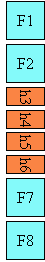
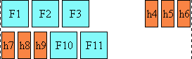
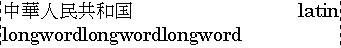
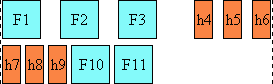
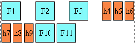
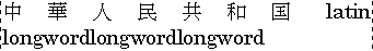
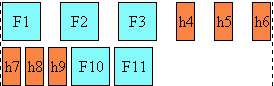
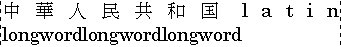
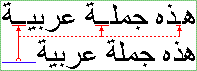
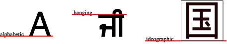
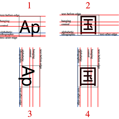
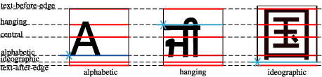
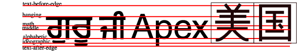
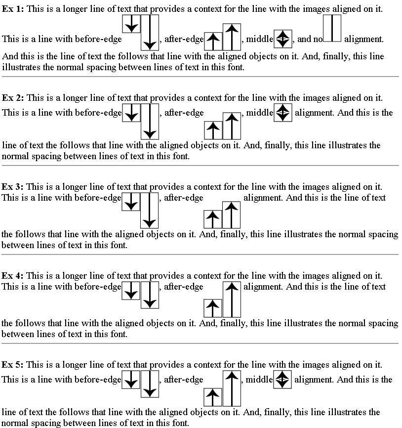


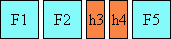
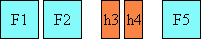
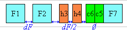
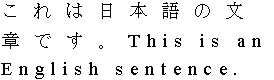
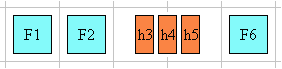
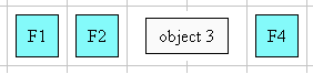
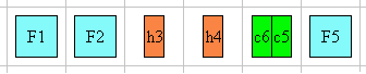
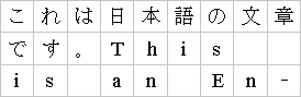
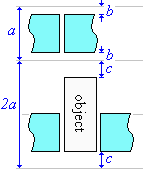
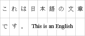
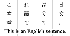
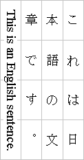

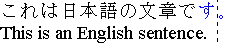