 . There is a minimum of white space, and headline fonts are often condensed. Margins are minimal, and the overall impression is "dark". See also figure 22.
The Electronic Broadsheet
A general problem when formatting news articles is that not all information is available when one needs it. For example, when selecting which headline font to use, it is, among other things, important to know how wide the article will be. To know the width of an article the formatter must know the number of columns. Before it selects the number of columns, the formatter should know what headline font is to be used--we're back where we started.
Another dilemma one faces when formatting text is legibility vs. word density. Newspapers use a high word density while legibility suffers. A good example is the front page of NYT [Merill 80]
. There is a minimum of white space, and headline fonts are often condensed. Margins are minimal, and the overall impression is "dark". See also figure 22.
The Newspace project receives approximately 3000 articles a day from around 10 different sources. The articles all come in electronic form, but there is no established standard format. Therefore, they are first transferred into a common intermediate ASCII-based format developed for the Newspace project.
This file format is the starting point for the formatting process that ends in the rendered pixmap displayed on the screen.
All soft fonts used in the Electronic Publishing group are derived from 320x320x1 pixel master fonts, which corresponds to a pointsize of 230 on the 2k display. Two proportionally spaced font families are available; Helvetica and Century-Schoolbook. They come in roman, italic and roman bold variations and can be scaled to any size. Ideally, the formatter should have access to any point size. This scheme would require either large amounts of disk storage capacity (Helvetica 160pt. uses more that 3Mb of storage space) or an excess of processing cycles. Unfortunately, none of the above are available. Instead, the current implementation keeps a limited set of soft fonts in memory at all times. This minimizes both processing and disk transfers, while providing a variety of typefaces, both for headlines and body text.
To improve legibility and appearance, the formatter kerns all text. Two-dimensional kerning tables have been computed by other members of the Electronic Publishing group. The simple algorithm that generates the data works well with smaller fonts, but could be improved for bigger fonts and certain letter combinations.
When choosing the best headline font, the formatter takes into account the following factors:
* article priority: important articles need bigger font sizes to attract deserved attention.
* the width of the article (i.e., the number of columns): there has to be room for the selected font, but the white space should be kept to a minimum.
* content: articles with a "soft" content often get a serif font as headline, while "hard" news stories uses sans. This rule is not absolute and is not enforced by all publications.
* variety: using only one headline font in a newspaper would result in a boring page and the headlines would fail to attract attention.
The final decision is made through a simple voting system where each factor has weighted votes.
Besides selecting the font, the formatter also selects the number of lines to split the headline string into. Most newspaper headlines occupy one or two lines--sometimes three or four. See section 8.9 for a description on the algorithm used to stack the paragraphs.
Studies show that upper-case text (all-caps) is less legible than lower-case text, and this is also true for headlines [English 44]
On the other hand, left-aligned text (flush-left / ragged right) is by most considered easier to read [Parker 90]
Eric Gill, in a classic essay promoting good taste, human involvement and typographic arts, strongly objects to the common practice of using justified columns:
"Now uneven space is in itself objectionable--more objectionable than uneven length of lines, which is not in itself objectionable. We make no objection to uneven length of lines in blank verse or in a handwritten or typewritten letter."
"But even spacing is of more importance typographically than equal length. Even spacing is a great assistance to easy reading; hence its pleasantness, for the eye is not vexed by the roughness, jerkiness, restlessness and spottings which uneven spacing entails, even if such things be reduced to a minimum by careful setting." [Gill 36]
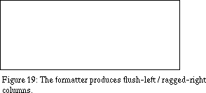
Since legibility is a major concern, more so than word density, the formatter produces left-aligned lines.
Hyphenation is another a technique that can decrease legibility. Most typographers take it for granted, and, for an unknown reason, readers seem to accept split words. Since the formatter is not allowed to split paragraphs there is no reason why it should split words. Therefore, line lengths in The Electronic Broadsheet vary more than in most publications and there has been reactions to the ragged right margins. To settle these issues, a user study should be performed as an extension to this project
As described in part one of this thesis, the ideal paper contains much information that is currently not available from the electronic sources, e.g. the electronic address of the author.
The maximum width of an accompanying illustration is the same as the column width since illustrations are handled as paragraphs internally in the formatter.
Odd-shaped stories are often used in newspapers to utilize all available space on a page--often because ads have cluttered the page. Odd-shaped articles cause uneven wraps of text and tend to make the design more complex. Therefore, all articles are formatted into a rectangular shape.
In order to fit the article into a grid, the height of an article is adjusted at the end of the formatting process. By adjusting the position of the headline, tags and paragraphs, the formatter fills in extra white space, if any.
The output of the formatter is the same as the input: a "datfile". The fact that datfiles handle the same information in different forms is somewhat intriguing. The icon pixmap is stored as a subdatfile of the rendered article.
The formatter always outputs the whole article. If the front page layout scheme is changed to sometimes display partial articles, the formatter will have to be changed.
Since the formatting process never breaks a paragraph, the same algorithm can be used to equalize the columns
First, let us generalize the problem into building blocks and towers. Given a set of blocks with different heights, their relative positions (we don't want the words to change position), and the number of allowed towers, how do we stack the blocks to minimize the height of the highest tower, i.e. optimize the blocks with regard to white space?
The following pseudo-code outlines the blocktimize algorithm I settled upon:
{
tower_id pre_lo, pre_hi;
tower_height pre_height, post_height;
boolean finished;
build_one_tall_tower_containing_all_blocks();
finished = false;
do
{
pre_lo=lowest_tower();
pre_hi=highest_tower();
pre_height=height_of_tower(pre_hi);
propagate_block_from_to_tower(pre_hi,pre_lo);
post_height=height_of_heighest_tower();
if (post_height > pre_height) /* no improvement */
{
propagate_block_from_to_tower(pre_lo,pre_hi);
finished = true;
}
} while(not finished);
}
The algorithm is visualized in figure 21.
When using blocktimize to split headlines, the word lengths become blocks and the lines in the headline becomes towers. If blocktimize is used to balance columns, column heights are blocks, while the columns are towers.
When formatting an article, blocktimize is called repeatedly with different number of towers, i.e. lines or columns, to find the optimal solution.
* It allows the main process to devote it's attention to events from the user and the window system.
* The soft fonts can be loaded and processed by the main process when it starts up--each formatting process will automatically be given a copy.
* The formatting process is quite complex in terms of memory allocation--by letting it die after finishing formatting the article, memory leaks can be ignored. This simplifies programming and testing, but is not acceptable as a long term solution.
* To conserve CPU cycles and virtual memory, only one formatting process run at a time. When the formatting process is finished, a signal is sent to the parent process
Generated with CERN WebMaker
8.1 Input
The common intermediate file format used as a starting point for the formatter is based on the "datfile" standard. A datfile is technically a UNIX file system directory that contains a descriptor file and a data file. When used to store news articles, the data file contains the content of the article. The descriptor file contains various information relating to the data file, e.g., the headline, author (if known) and source.8.2 Soft Fonts
All text rendered by the formatter uses soft fonts, also known as fuzzy fonts, antialiased fonts or grayscale fonts [Negroponte 80] [Schmandt 80] [Bigelow, Day 83]. Grayscale fonts introduce a new way of thinking about text on computer displays. The monitor is no longer considered a discrete device with a fixed matrix driving it. Instead, the characters are scaled onto a continuous space; any partly covered pixel by the edge of a character is quantized into a grayscale value. Soft fonts don't improve resolution, but rather, improve addressibility of the existing resolution. This is important to properly render the letter forms, as well as position the letter forms on the display. Ergonomic studies show that they are easier to read [Bender et al. 87]
 , and without the use of soft fonts on the display it would be much harder to claim competitiveness with paper.
8.3 Headlines
The purpose of the headline font is to attract attention and to give an indication of the importance of an article. For a headline to work as intended the font plays a vital part. There exists no easy algorithm to select the right font automatically. . Lower-case words contain more distinct forms and uses less space. Readers are also more familiar with lower-case text. A difference in legibility of about 20% have been shown. It is therefore tempting to transpose headlines from "uppercase sources" into lower-case. This has not been implemented, for two reasons. The process will take away some information--the sources that uses upper-case headlines (e.g. NYT) are consistent and some readers might use the case to recognize a source. Secondly, implementing the transpose function is not trivial since the all-caps text contain less information because of the smaller range of characters.
8.4 Body Text
8.4.1 Columns
Columns is another technique newspapers use to squeeze more text onto a page. By making lines shorter, leading can be minimized without the reader losing vertical position when retracing lines. Also, columns make layout easier by increasing the horizontal resolution of a page. Together with the nameplate and front page, columns are the most distinct feature of the newspaper metaphor. For these reasons, I decided to keep columns in the Electronic Broadsheet.8.4.2 Paragraphs
The formatter treats each paragraph as a unit and will not split a paragraph in parts. This idea, used by Michael Lesk in the "SuperBook" project, is another example of sacrificing real-estate for legibility. Although readers always have accepted split paragraphs, I believe the assumed improvement in legibility is worth the wasted space. It also gives pages a "lighter" look (see figure 23). See section 8.9 for a description of the algorithm used to stack the paragraphs.
8.4.3 Alignment and Hyphenation
Most newspapers and magazines set the body text justified (flush-left / flush-right). Uneven spacing between words, coupled with hyphenation, minimizes white space and maximizes word density. . The irregular line endings create a ragged margin that leaves some white space and gives the text an "open" look.
 .
.
8.5 Tags
To indicate the source and/or author of the story, a text field bounded by two horizontal lines, is added to the beginning of the first column. The design is borrowed from The Boston Globe.
8.6 Illustrations
If a picture file is listed as accompanying the article, the formatter will simply copy the image as if it was the last paragraph in the story. This simple scheme works fine in the current configuration where pictures are few, but should be reworked if pictures become an important part of the newspaper.8.7 Proportion
One goal of designers is to create pages in which the proportions of the elements are pleasing to the eye. The Greeks worked out the proportions of their temples in classical dimension, and so do some page designers today. A rule-of-the-thumb says that square articles should be avoided; a 3:5 ratio is more pleasing to the eye [Baskette86] . This ratio works well both for horizontally and vertical articles, in fact, it is important to use both to prevent a page form becoming "one-dimensional". At the same time, several influential newspapers use a vertical design and do not seem to suffer, among them are USA Today, New York Times and the Wall Street Journal.
8.8 Icons
A decimated version of the article with its described changes (see chapter 7.2) is also generated by the formatter. As discussed, the icon pixmap and headline are rendered on top of a watermark and the job is performed by the formatter.8.9 Blocktimize Algorithm
The blocktimize algorithm was initially developed to assist in laying out the headline. Multiline headlines should be equalized with regard to length to balance. The problem might seem trivial, but I have found no simple algorithm that guarantees the optimal solution.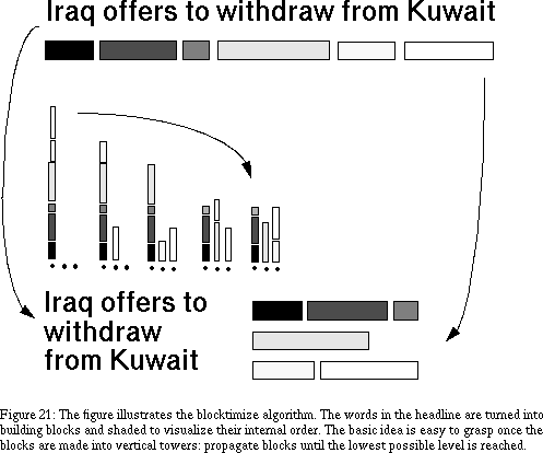
8.10 Implementation
The Electronic Broadsheet is an interactive system, while the formatting process is one that can run off-line. To keep all parts of the system on one machine while preserving interactivity, a formatting process is forked off the main process for each article that is formatted. This scheme has several advantages:
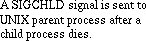 , and the parent process reads the output file that now contains an image of the formatted article.
The Electronic Broadsheet - 30 JUN 95
[Next] [Previous] [Top] [Contents]