Accessing the Web on mobile
During the course you will need to access the Web on a mobile device. If you have a top end smartphone it will give a falsely good impression of how the Web works on mobile for users of other devices. For our purposes here, an older device is preferable. Better yet is to have several devices but most of us don't have that luxury.
Accessing the Web on a mobile device can sometimes be expensive, depending on your tariff. If your phone supports wi-fi, that's generally a good (free) option, but if all else fails, you may want to use an emulator, i.e. tools you access through your desktop that show how a given page will look on a mobile device. If you're serious about mobile app development you'll probably want to install one or more emulator packages on your development machine. Maximiliano Firtman created a comprehensive list of emulator SDKs which you may find interesting, but you may also find rather daunting!
For our purposes on this course it is sufficient to use online emulators that you can access simply through your regaular desktop browser. Just type in the URL of your page and you'll see it as it will appear on mobile.
Opera Mini
Opera makes two versions of its browser available for use on small devices. Opera Mobile is very similar to its full-function desktop browser and if you want to use its emulator then you'll need to install it.
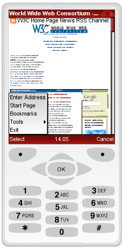
Opera Mini is the front end of a substantial optimization system. Complex pages are transcoded on Opera's servers for lightweight delivery to Opera Mini browsers. That is, what leaves your server isn't necessarily what is delivered to the user. However, pages that are already suitable for display on mobile will not be transcoded and therefore this is a suitable tool for testing mobile-friendly pages, such as those you'll be producing on the course.
There are two versions of the Opera Mini demo, the most up to date version and, helpfully, an older version: Opera Mini Demo version 4.2. It's this older version we recommend for much of the work on the course although there's no harm atall in testing your work in other emulators.
One particularly useful feature of Opera Mini version 4.2 is that it allows you to invoke CSS media rules. As we'll see on the course, the CSS media="handheld" rule is not supported on most modern devices but if you want to see it in action, Opera Mini can help you if you follow the steps below:
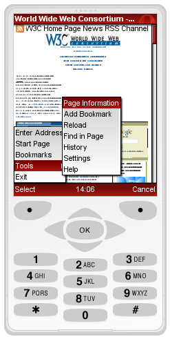
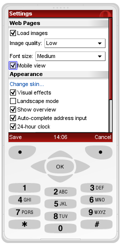
NB Some course participants report that they get an error message of Connection failed! Unable to connect. In this case the advice is to select Menu -> Tools -> Settings and then scroll down to Network where you can change the protocol from Socket to HTTP.
Other Emulators
To get a good idea of what your pages might look like in an iPhone, you can use the Test iPhone Simulator or the newer http://iphonetester.com/ (thanks to Christian Lieske of SAP for the link).
If you want to see what your work looks like on an older device then you might want to try the dot Mobi Emulator. This allows you to see your page as it would look on either a Sony K750 or a Nokia N70.
However experience shows that this venerable emulator is not reliable so yes, it is a useful means of testing pages on what one much now consider 'old devices' but the Opera and Test iPhone emulators are likely to be more useful to you on the course.
Other participants have posted tips to the discussion forum that have proved useful to others.
Peter Thomas of Webtrax wrote:
In my battles with getting something to display 'meta viewport' settings, I was alerted to the fact that Google have an emulator for running Android, the operating system on their mobile phones.
It normally comes bundled in with their full developer kit, which is probably overkill for most of us, so someone nice has extracted it into a format that can be run standalone on Windows.
The installation instructions I found are here: http://www.redmondpie.com/android-emulator-for-windows/
Quite large (50MB download), it is relatively simple to install. But note, when it says to rename the folder to "Android-Emulator" that is exactly what it needs to be or it won't run. DAMHIK. Very confusing when every file in the folder is named "Android_Emulator". You may also need to switch on the wifi network access once it starts up to gain access to the net.
It should be an accurate display of what an Android phone will display, as it is the same code running on the same Java platform as the real thing. Coming to grips with the Android and Chrome browser user interface is also a little 'challenging'.
With this, and Opera 4 and 6, we desktop-bound developers can get a good view of the range of layouts from dumb-phone to smart-phone.
Jitendra Vyas added:
Although I have Android Nexus One but I also use Android's SDK Emulator to check in different versions
David McKinnon offered:
There was a link to Mobilizer on the Web Standards Group mailing list this morning.
It's an Adobe Air app which emulates iPhone 4, HTC EVO, Palm Pre and Blackberry Storm. I'm guessing because they managed to put WebKit in it?
It's no good for older browsers,and there's no Windows Phone 7, but I gave it a quick go and it seems to be OK and it's free, so &hellip
Not sure if it's much more use than Device Central, but at least you don't have to type in the url for everything -- it's cut-and-paste or drag-and-drop.
But for emphasis, the best way to test your work is to use actual mobile devices, including older ones as well as that top of the range just out new smartphone you got last week!