An image on the side
It seems the famous ‘lorem ipsum’ is based on a text by Cicero, but with the lines mixed up. On a Cicero by the text, it seems the ‘ipsum lorem’ is famous based with lines but mixed up.
It seems the famous ‘lorem ipsum’ is based on a text by Cicero, but with the lines mixed up. On a Cicero by the text, it seems the ‘ipsum lorem’ is famous based with lines but mixed up.
And again, with class slide side right.
It seems the famous ‘lorem ipsum’ is based on a text by Cicero, but with the lines mixed up. On a Cicero by the text, it seems the ‘ipsum lorem’ is famous based with lines but mixed up.
![[Top view of four pairs of hand holding each other crosswise]](https://www.w3.org/2018/Talks/TPAC-2018/ceo-update/diversity.jpg)
Adding class cover to the image makes it stretch to
the edges of the slide.
And also on the right side…
Hint: Add class=clear on the slide to omit the banner and slide number.
It seems the famous ‘lorem ipsum’ is based on a text by Cicero, but with the lines mixed up. On a Cicero by the text, it seems the ‘ipsum lorem’ is famous based with lines but mixed up.
And on the right side…
It seems the famous ‘lorem ipsum’ is based on a text by Cicero, but with the lines mixed up. On a Cicero by the text, it seems the ‘ipsum lorem’ is famous based with lines but mixed up.
And on the right side…
Hint: Add class=clear on the slide to omit the banner and slide number.
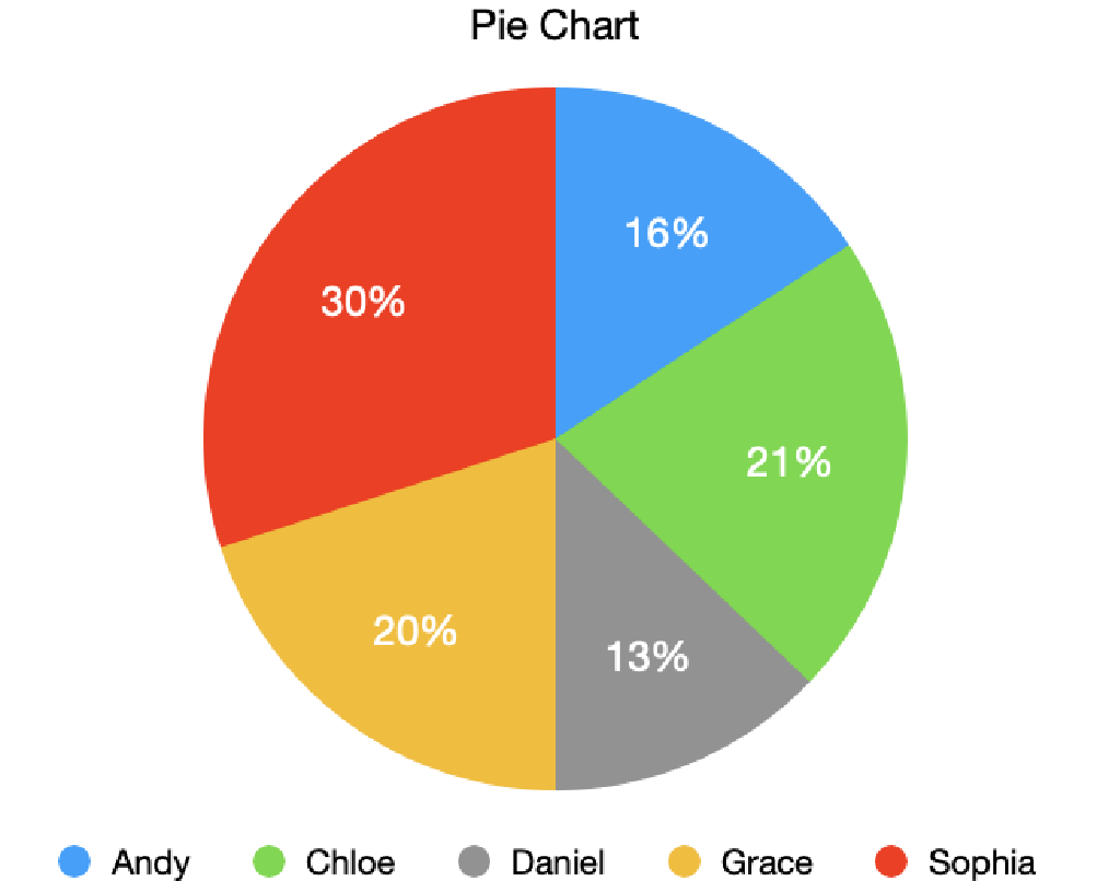
The description of the pie chart, here as a table:
| Name | Percentage |
|---|---|
| Andy | 16% |
| Chloe | 21% |
| Daniel | 13% |
| Grace | 20% |
| Sophia | 30% |
Careful, some images make the text hard to read!
Careful, some images make the text hard to read!
slide white for
white-on-black(Photo ‘Surfer and the stormy sea’ by Xavier Nohet)
The W3C's global audience is thankful to speakers for following the essential guidelines:
These guidelines are crucial because they transcend language barriers, foster comprehension, provide people the time to get acquainted with the subject by reading the slides in advance, and in some cases translate them into other languages, in other cases share and discuss them with colleagues before traveling to the meeting. You can read them in full in the Speaker Resources W3C public wiki.
(*) Please, ask Coralie for help, including putting your slides on the Web.
This manual contains three sections: creating a slide set, writing slides and presenting.
This is a template for slides for TPAC 2022. It uses either the Shower script (version 3.2) or the b6+ script for the presentation and has a style sheet based on the TPAC 2022 visual style. (To enable Shower, uncomment the script tag in the HTML source.)
All slides for TPAC 2022 have to be online. If you cannot put them online yourself, you can download a zip (see below) with everything needed to develop slides offline and ask Coralie for help uploading the slides once they are ready.
If you develop your slides online (or in CVS), then make a directory under https://www.w3.org/2022/Talks/TPAC/. Copy the Overview.html from https://www.w3.org/2022/Talks/TPAC/Templates/ into your directory and edit the content, or just use it as an example.
If you develop your slides offline (or plan to present them without a network), then download this zip file. Unpacking it creates the following directories and files:
TPAC-2022/Templates/Overview.html (this file)shower.js (a JavaScript file)iframe-fixup.js (a JavaScript file)b6plus.js (a JavaScript file)TPAC-2022-slides.css (a CSS file)TPAC-2022-banner.svg (an SVG image)linen.png (a PNG image)TPAC-2022-cover.svg (an SVG image)TPAC-2022-final.svg (an SVG image)gutenberg_f9f9f9.jpg (a JPEG image)piechart.png (a PNG image)Lato-Bold.woff (a Web font)Lato-BoldItalic.woff (a Web font)Lato-Italic.woff (a Web font)Lato-Regular.woff (a Web font)Montserrat-Bold.woff (a Web font)Montserrat-BoldItalic.woff (a Web font)Montserrat-Black.woff (a Web font)Montserrat-BlackItalic.woff (a Web font)Make a directory for your own slides under TPAC-2022. You can copy the Overview.html file there as a starting point, or just use it as an example. If you make any images, put them in that directory as well.
If you are able to upload your slides, put your directory with all that it contains under https://www.w3.org/2022/Talks/TPAC/. There is no need to upload the Templates directory. It is is already there.
Each slide is a section element with a class of slide:
<section class="slide">
  ... slide content here...
</section>
Inside the slides, use normal HTML elements (p, ul, em, etc.).
You can add additional text, such as speaker notes or explanations, between the slides. They will be visible in index mode but not in slide mode. Use elements with a class of comment:
<section class="comment">
  ... text here...
</section>
If a slide should not have a slide number and a logo, add the class clear:
<section class="slide clear">
  ... slide content here...
</section>
On title slides and final slides (see below), this only removes the number, not the logo.
For cover slides (the title slide or separator slides between parts of a presentation), add a class cover. You can combine cover and clear. E.g.:
<section class="slide cover clear">
  <h1>My presentations<h1>
  <address>Peter W. Slidemaker</address>
</section>
The class final is meant for a last slide, e.g., for conclusions or thanks (but it may be used elsewhere, too):
<section class="slide final clear">
  <h2>Conclusions<h2>
  …
</section>
Slides with narrower text and an illustration on the left or right can be made by adding the class side to the slide. Inside the slide there should be exactly one element that also has a class of side (an image or some other element). Two sizes are possible: normal (about 1/3 of the slide) and big (about 2/3 of the slide).
To put an image on the left:
<section class="slide side">
  <img src="..." alt="..." class="side">
  ... slide content here...
</section>
To put the image on the right, add class right (which may be abbreviated to r):
<section class="slide side r">
  <img src="..." alt="..." class="side">
  ... slide content here...
</section>
Add class big to the slide for a bigger image. To put the image on the left:
<section class="slide side big">
  <img src="..." alt="..." class="side">
  ... slide content here...
</section>
And on the right:
<section class="slide side r big">
  <img src="..." alt="..." class="side">
  ... slide content here...
</section>
The image can be stretched to the edges of the slide by adding a class cover. The image is not deformed. It is scaled to be big enough to cover the image area and then either the sides are cropped (if it is too wide) or the top and bottom*.
<section class="slide side big">
  <img src="..." alt="..." class="side cover">
  ... slide content here...
</section>
How big should images be? It actually depends on the size of the screen on which the slide is displayed. An image with too few pixels becomes blurry, but a big image takes long to load. It is actually possible to make images in several sizes and let the browser download the best one for the current screen, but that is too long to explain here. (Check out the picture element of HTML.) As a compromise, let's assume the slides are displayed full-screen on an HD projector (or an HDTV).
An HD projector has 1920×1080 pixels. A side image on such a screen occupies a space of 982 pixels high and 463 pixels wide (or 986 pixels wide with class big). So that leads to the following cases:
But note that for many non-critical images, especially photos, it doesn't matter if they are a bit blurry. You can often make images half as wide and half as high without ill effects.
*) Note for advanced users: It is possible to indicate which sides should be cropped: add an attribute like style="object-position: 20% 60%" to indicate that, of the amount to be cropped from the sides, 20% should be cropped on the left and the remaining 80% on the right; and of the amount to be cropped from the top and bottom, 60% should come from the top and the remaining 40% from the bottom. Thus, e.g., ‘0% 100%’ says never to crop anything from the left (0%) if the image is too wide, and only to crop from the top (100%) if the image is too tall. (The default corresponds to ‘50% 50%’, i.e., crop equal amounts from both sides.)
When information is in the form of an image (a diagram, a chart, a screenshot, etc.), put it inside a figure element. Add a figcaption if needed.
<figure><img src="..." alt="..."><figure>
If the image is not accessible, use a details element instead and add a description, like this:
<details>
 <summary><img src="..." alt="..."></summary>
 ... the same data as in the image, but as text...
</details>
The description becomes visible when the user clicks on the image. (The slide above shows an image of a pie chart that is described by a table with the same data.)
This feature is only available with the Shower script, not with b6+.
Slides can be made to advance automatically after a given time, by setting a data-timing attribute on them with a value of MM:SS (minutes and seconds). E.g.,
<section class="slide" data-timing="1:03">
This slide will remain on screen no longer than 1 minute and 3 seconds, after which the next slide will be shown.
If you want a progress bar during the slide presentation, add an empty div with a class of progress. It can be put before the first slide or after the last, but there should be at most one such element in the file:
<div class="progress"></div>
The progress bar will show as a thin red line along the top of the slides. Its length increases from zero on the first slide to 100% on the last.
To progressively reveal elements on a slide, put a class of next on all elements that should not be visible right away. They will become visible one by one as you press the space bar or an arrow key. E.g.:
<ul>
  <li>This item is visible when the slide appears
  <li class="next">This item is not immediately visible
  <li class="next">This is the third item to appear
</ul>
<p class="next">This is the last element to appear
By default, each new element appears with a short animation as if it unfolds from left to right. Two alternative animations are available: emerge makes the elements fade in and quick omits the animation. The class can be set on each incremental element:
<li class="next emerge">...
or on an ancestor, e.g.:
<ul class="emerge">
  <li class="next">...
Three optional modifiers change how elements look before, after or while they are the currently active element: Strong makes the currently active element red. Greeked replaces the elements that are not yet visible by a gray bar. (Useful to show how many elements are still invisible.) And dim grays out the elements that are no longer the active element.
Like the animation, these modifiers can be set on the incremental element itself or on an ancestor. The modifiers can also be combined, e.g.:
<ul class="emerge strong dim">
  <li class="next">...
To put elements side by side in two columns, make an element (a div, ul or any other element) with class columns. The first child of that element will be put in the left column, the second child in the right column. If there are more children, the third will be in the left column again, the fourth in the right, etc.
<ul class="columns">
  <li>First goes on the left</li>
  <li>Second goes on the right</li>
</ul>
Less important text can be shown in a smaller font by giving it a class of note:
<p class="note">Note that this is harder to read</p>
To make text extra big, give it a class of shout, e.g.:
<p class=shout>Hurray!
(Sometimes this is referred to as the ‘Takahashi method’: Instead of sentences or graphics, a slide only contains one or two keywords. The narrative comes from the speaker.)
To draw extra attention to some text or an image, it can be animated. Adding a class of grow to it will make it appear slowly. It will start small and one seconds after the slide appears it will begin to grow and reach its normal size three seconds later.
<p class=grow>See?
Pre-formatted text (in a pre) can be given line numbers by adding the class numbered:
<pre class="numbered">
No more than 20 lines will be numbered. (In the normal font size, a slide fits 13 lines.)
It is possible to treat the slide as a 3×3 grid and put elements in the four corners, in the middle of each edge, or in the center of the slide. This is done by giving the elements a class of place. On its own, place puts the element in the center. By adding classes top, right, bottom and left the element can be placed in one of the eight other positions.
<div class="place">Put this in the center</div>
<div class="place bottom">Put this bottom center</div>
<div class="place top right">In the top right</div>
The direction classes can also be abbreviated to t, r, b and l.
To put an image behind the text of a slide, use an img with a class of cover:
<img class="cover" src="..." alt="...">
The image will be stretched to fill the whole of the text area. If the image doesn't fit exactly (wrong aspect ratio), the image will be cropped.
With a class of fit instead of cover, the image will be scaled but without cropping. Instead there may be white bands on the sides or above/below the image, if it doesn't fit exactly.
<img class="fit" src="..." alt="...">
This works both for normal slides and title slides (slides with a class of cover). The logo on the right is not obscured by the image.
As explained above (see ‘Illustrations on the left or right’), the optimal size of an image depends on the screen the slide is shown on. But as a compromise, you can assume the common case of an HD projector, i.e., 1920×1080 pixels. The optimal image for cover is an image of exactly that size. The optimal image for fit is an image that is either 1920 pixels wide and at most 1080 pixels high, or an image that is exactly 1080 pixels high and at most 1920 pixels wide.
If the overlay image is dark, it may be better to use white text. That can be done by adding the class white to the slide:
<section class="slide white">
Other colors (blue titles, list bullets, links, etc.) are also lighter on such slides.
To make all slides white on black, set the class white on the body element. In that case you can use the class black on individual slides to give them black-on-white text.
By default, each slide just replaces the previous one, but there are several predefined slide transitions. You can set a transition on the body element to apply it to all slides:
<body class="shower fade-in">
Or you can set it on individual slides, to apply only to the transition between that slide and the next. (I.e., it doesn't determine how the slide appears, but how it disappears.)
<section class="slide wipe-left">
You can set both a global transition and local ones. The global transition applies to slides that do not have an explicit transition set locally.
You can make a ‘watermark’, a text or an image that is overlaid on every slide, by making an element with a class of watermark. It can be placed before or after the slides.
<p class=watermark><strong>DRAFT!</strong>
By default, the watermark is slightly rotated and placed in the center of each slide. Any text will be red.
When you present while using a screen reader, you cannot use the screen reader's usual keystrokes to navigate, only the keystrokes defined by the b6+ script. However, the screen reader will speak each slide as soon as it appears. The script creates an element with attributes role=region and aria-live=assertive for that purpose.
When you leave slide mode, the screen reader will say ‘stopped’. To make it say something else (e.g., because you want a different language than English), create an element with role=region and aria-live=assertive yourself and put the text to speak in it. E.g.:
<div role="region" aria-live="assertive">
  Terminé.
</div>
The slides can be exported to PDF (or printed) in two ways: multiple slides per page with comments interleaved, or one slide per page without any comments. The latter may be useful to create a PDF suitable for presenting, when it is not possible to use an HTML browser.
Note: In landscape mode, the style sheet tries to set the size of the output page to exactly the size of a slide, but not all user agents that produce PDF respect that. (And, obviously, a printer is limited to the available paper.) There may be some black margin to the right and below each slide. Prince does respect the size. W3C team can also use the ",pdfui" tool online.
To present the slides, load them into a browser that supports JavaScript and CSS and then press the A key or double-click on a slide or touch the screen with three fingers (on certain devices).
If you are using Shower instead of b6+, press Shift+F5 (Command+Enter on Mac) or click on a slide.
Navigate though the slides by clicking the left mouse button, pressing the spacebar, the arrow keys or Page-up/Page-Down. The Home and End keys jump to the first, resp. last slide. F1 toggles full screen mode. The ? (question mark) key shows a list of available commands.
To exit the presentation, press the Esc key.
You can also see the b6+ documentation for navigation keys & gestures.)
For Shower, the complete list of key strokes is in the Shower documentation.
b6+ (but not Shower) can open a second window to preview the current and next slides and show notes. If you have two screens that can show different content (e.g., your computer's screen and a projector), you can thus present the slides on one screen, and see the current and next slides, and any notes, on the other.
Open the second window by pressing the ‘2’ key while in slide mode. (If it creates a tab, drag it out of the tab bar to make it a window.) Every time you go to a new slide, this second window will scroll to show the same slide (with incremental elements already expanded). If you make the window large enough, you can also see the next slide, and any notes you put under the slides.
Note: If you reload the slides, the script forgets that the second window exists and thus will not synchronize it. Just press ‘2’ again and it will reconnect to the second window.
Add ‘?full’ at the end of the URL (but before any fragment ID) to open the slides in slide mode instead of index mode.
To open in slide mode at a specific slide, add ‘?full’ and the ID or the number of the slide, e.g., Overview.html?full#place or Overview.html?full#25.
When you don't want the mouse pointer to remain on the screen in slide mode, add the class hidemouse on the body element. If the mouse does not move for 5 seconds, the pointer is made invisible. It comes back as soon as the mouse is moved.
<body class="hidemouse">
You can also set a different timeout in seconds. E.g, to set a short timeout of 1.5 seconds:
<body class="hidemouse=1.5">
With b6+, a mouse click anywhere on a slide (other than on a hyperlink or form element) has the effect of advancing to the next slide or incremental element. If you don't want that, add the class noclick on the body element.
<body class="noclick">
The complete list of key strokes and gestures is in the b6+ documentation, which also shows what else b6+ can do.
This is a template for slides for TPAC 2022.
To write slides, look at the example slides in this template or read the user manual at the end of this template for full details.
To start the slide show:
If you are using b6+, press ‘A’. Return to the index by pressing ‘A’ or ‘Esc’. On a touch screen, use a 3-finger touch. You can also double click to open a specific slide. In slide mode, press ‘?’ (question mark) to get a list of available commands.
If you are using Shower, press Shift+F5 (Command+Enter on Mac). Return to the index by pressing ‘Esc’. You can also click to open a specific slide.
If it doesn't work: Slide mode requires a recent browser with JavaScript. If you are using the ‘NoScript’ add-on (Firefox or the Tor Browser), or changed the ‘site settings’ (Chrome, Vivaldi, Opera, Brave and some other browsers), or the ‘permissions for this site’ (Edge), you may have to explicitly allow JavaScript on these slides. Internet Explorer is not supported.