<Detlev> can't hear a thing - will try to start Webex again
<Chuck> scribe Chuck
<alastairc> scribe:Chuck
ac: First one should be a quick one. Our next meeting will be Jan 8, the next meetings fall on holidays (christmas and new years). At least for the Tuesday meeting. We will still have a Thursday meeting.
ac: The survey, which we've had a
few responses on.
...
ac: First one is one we started last week and we'll continue this week. Having had the discussion, we can structure it a bit more. In the survey results...
<alastairc> https://www.w3.org/2002/09/wbs/35422/technique-approvals3/results#xq22
ac: Essentially... it's best at this stage to refer to the survey results. The update to the understanding is to clear up a few issues, to determine how exactly we are dealing with states and non-text contrast.
<alastairc> Rendered version: http://htmlpreview.github.io/?https://github.com/w3c/wcag/blob/non-text-contrast-updates/understanding/21/non-text-contrast.html
ac: There was an update to non-text-contrast in pull request 550. The rendered version is here...
<alastairc> https://lists.w3.org/Archives/Public/w3c-wai-gl/2018OctDec/0177.html
ac: I think the questions that,
if we work through three questions, which are in this
email...
... That makes it more straight forward in coming to a
conclusion.
... One thing I think we decided just as we were coming up to
publication is we don't need boundaries for links and buttons
because they don't use boundaries. That was the first part of
the email.
... The second part would be where the states need to be
differentiated within the component. For example,
hover...
... We didn't decide and vote on it, but we had a decision on
hover state not being required. The rationale is that there are
other indicators (mouse pointer changing).
... When you look at the different states (visited, hover
states), my argument has been we can't require that states
can't be differentiated where they are not already.
... Hover would not suddently become a failure. That was one
aspect. However the third aspect was for the more functional
states (checkbox, programatically selected).
... We have been assuming that has been covered, but we have a
clash in success criteria text. We don't cover hover... It is
more difficult to stipulate that the other states are
required.
... We have a fundimental clash between not requiring some
states and requiring others based on the SC.
... First q. Does anyone disagree or object to us not requiring
... any objections to the conclusion that we are not requiring
states to differentiate within themselves. All of the states
should...
<gowerm> +1 for no requirement for states to differentiate at a 3:1 contrast
<Detlev> +1 agree
ac: maintain contrast, but within itself, hover doesn't necessarily have to contrast with other states (except focus, which is covered in other SC).
<laura> +1
<Rachael> +1
<JakeAbma> +1
+1
<JF> ) due to that exception Alastair
<JF> 0
<gowerm> Although I WANT to pursue a new SC for 2.2
JF: I meant to type 0. The fact that you already have an exception, raises a red flag. If it's an exception, it is...
ac: It's covered by a different success criteria.
<Brooks> +1 and I'm with gowerm - it's needed as a new SC in the next iteration of these guidelines
JF: Which makes it an exception. It's not an exception here, which means it's covered by other SC. It may not be in this SC, but it is addressed in another SC means it is related.
ac: As Mike...
gowerm: Just to clarify, we are discussing if we are going to interpret this SC on it's own to applying it to different states...
<laura> it is out of scope for this SC in 2.1.
gowerm: Whether or not it's mentioned in other SC is a different discussion.
ac: I would put it this way....
jf: Again focus visible, one of
the things we said was that by defining non text color contrast
we could finally point to a numeric value that we must meet.
Was that not part of the point of the larger discussion? Did I
miss a memo?
... One of the criticisms of visible focus was that it was
never specifically defined as not requiring a minimum contrast.
Never defined explicitly. We said "we are arriving at a 3:1, it
would apply to gaps we had".
ac: If you were using non text contrast, and it's author set, then yes. It's supplying positive techniques.
<Zakim> AWK, you wanted to ask if the hover state needs to meet 3:1 when the author supplies a hover style that is different.
AWK: I want to ask: Whether the hover state, if I change the hover state (something changes) and it's 2:1, that doesn't need to meet? Or it only doesn't need to meet if I don't make a change for the hover state.
ac: I answered in email, the component itself should if it's relying on contrast should meet 3:1... MUST. Remembering that links and buttons don't need boundaries...
<Mike_Elledge> q
ac: If you don't change it, we
don't punish small changes like that. The exception... the
other way around is if you have a visual indicator you are
using, it shouldn't not meet it in the hover state.
... You shouldn't make it disappear in the hover.
<JF> A HUGE +1 to AWK
AWK: I was thinking as a possible
way to help... if you make the hover something, that something
has to meet 3:1, not relative to the component itself but the
adjacent areas. If you make NO hover effect at all...
... If it's determined by the user agent and not the author,
that's accepted. I'm not sure what I've been thinking about
this, we've covered it a lot. Something I want to get
clarification around.
ac: It's a difficult one. If we added the requirement that people took away lots of subtle effects that isn't helping anyone.
<david-macdonald> Katie can you mute please?
mike_elledge: If you are saying that contrast on a hover situation... is the 3:1 applying to yellow highlighting and the background behind it, if so is it 3:1 on the text and the highlighting?
ac: What we are saying.. what I
propose we are not requiring hover to differentiate with the
component itself. If you hover over a component, it should
maintain contrast with it's adjacent area, the change in hover
should
... not have to meet 3:1.
mike_elledge: It doesn't have highlighting, text has to be at 4.5:1. The 3:1 is the yellow background against the page for instance? does that absolve the text from having to be 4.5:1 against the yellow?
ac: The text is not absolved.
<alastairc> q/
ac: We will call out the different in terms of focus, we have a SC that's separate. The advantage of non-text contrast is we can provide techniques of using a change of contrast to meet focus visible.
<Detlev> So there could be quite a narrow band of color combinations where hover tzo bg is > 3:1 AND text o hover is 4.5:1...
mike_elledge: at a 3:1 level.
ac: Question answered?
mike_elledge: yes
JF: We've been burning a lot of
oil on this topic. Part of the problem is that we are making it
complex. Andrew hit on where I'm at. If the author made a
change to the default style (delcaration in style sheet)
... The author must make sure contrast is being met. If author
want's to make a change to a specific state, the author is
presumed to be overriding the agent behavior, the author is
responsible.
... If you make a change, it's your responsibility to meet
color contrast. If you communicate that, you are clear on the
author requirements.
ac: I don't think it is that
simple, we have quite a few issues where people are asking the
nuanced questions. I've already had lots of nuanced questions.
You have to work out what's adjacent to what.
... It's really easy to get into a trap where it's impossible
to meet contrast across all the states.
jf: How many style sheets have you seen where the developer has declared a style for all sixteen states? If you write a sheet that addresses 1, 2 or 15 of those states.
ac: Are you enforcing contrast between those states?
jf: If you declared it in your style sheet, then you are overwriting the default, you are responsible for the contrast.
ac: It might not be intentional.
jf: Depending on how you write your css. I agree it might get complicated, not impossible.
ac: It's been coming from people who have been finding it to be impossible.
<Zakim> gowerm, you wanted to say that hover is an unusual state since IF the cursor changes shape, any author-applied styling is not _required_ to see the hover state
gowerm: I agree with John that
the main focus at the simple level is you make sure things meet
a 3:1 ratio for non text contrast. what we are voting on is if
we have agreement that 3:1 does not apply between states.
... I think John was the one that didn't agree to that. If we
can get agreement that we are not applying 3:1 across states,
but each state must meet 3:1 against adjacent color.
jf: In the use case where I hover a button, I could live with it, not happy with it. You are conveying information visually.
gowerm: The wording of the sc is
that you do not need to meet between states. Hover is a bizarre
case, except for buttons most items have some change (cursor
shape). It's not a requirement for most hover states.
... The cursor is supplying the information.
ac: Wierdly buttons don't do that by default. I got told that's part of the css spec (even though nobody does it that way).
<Glenda> no objection
ac: Probably worth a resolution. Anybody objecting to the aspect that we are not differentiating between internal states of the component?
RESOLUTION: SC 1.4.11 does not require differentiation inside the component between states
ac: <typing out
resolution>
... Last question, about the functional states. Given we've
agreed on that aspect. Unless someone can think of any logical
way around sc language that allows us to cover functional
states, we will need
... Another sc to cover checked, other kinds of states on
functional end that provide a value.
... This would require a little update to the draft of the
understanding document. The update I did assumed we could
differentiate them in that way.
<alastairc> q/
detlev: not the right time,
quickly point out that if you really want to meet a requirement
for hover to background of more than 3:1 AND a contrast of the
writing to the hover to text of 4.5:1... I have prepared an
image...
... I think you will agree that it will make it harder to
understand. I think we don't want them to apply a hover state
in constrast to the background, it will limit design options
greatly.
ac: It relates closely, the
document that was sent out showing different colored buttons
showing how requirements that the boundary .... options were
limited.
... David, are we still on point?
david: There was a question about
changing color on focus or hover is sufficient for focus
indicator... I've always passed those. If someone is making a
visual rep of the focus state to the outline or change of
colors
... would be sufficient. Is anybody in agreement with that and
2.4.7?
ac: So you are saying you've been passing..
david: If I tab to a button that is green.... I would pass that even if I didn't see the little dotted line if I didn't see the focus line itself.
ac: I thought you said hover
david: Hover or focus.
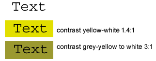
<Detlev> This is an example of hiver state having not enough (yellow to white) and sufficient (grey-yellow to white) background: http://3needs.org/contrast-ratios-hover.gif
ac: We are not trying to cover
hover with non text contrast so long as the thing maintains
contrast. For focus, if you are tabbing through, the visual
indicator of focus should have sufficient contrast.
... I was going to cover that later.
david: 2.4.7 keyboard focus indicator is that it's changing the color of the button, not an explicit indicator. These are all married to eachother. All kind of intermeshed. Just want to separate things out a bit. Does anybody not see it that way?
ac: Don't think so.
detlev: I uploaded the image. It's quite clear the second option has enough contrast. There's still 7:1 contrast between text and hover. I don't think it's better than the one above.
ac: We will come back to some of the details on how people meet that contrast. The next major thing is getting agreement that we would pursue differentiating contrast states between functional states.
<alastairc> https://github.com/w3c/wcag/issues/559
ac: detlev took the lead on putting something in github. This would mean I will make some small updates to the understanding doc based on the assumption we are not differentiation between internal states.
<gowerm> I think specific wording on hover and cursor shape change as redundant indicator should be included in Understanding
ac: I'll remove the bits that make that reference and put in a note that "it is recommend that you do sufficient contrast...."
gowerm: I think there should be specific wording on hover and cursor shape change is a redudant indicator. Hover for most components is not going to have to meet the minimum usually/anyways.
ac: We are resolving that it does NOT have to meet the minimum in terms of diffirentation between itself.
awk: Alastair, the results for the current point, radio selector, checked state indicator, those need to meet 3:1 against those environments, not against their un-checked unselected versions.
ac: That's the essential problem
of the states. It's impossible to do that differentiation.
We've got the same text against all components....
... I don't see how we can not cover hover and not visited and
then cover checked and selected. I would love to think of a
way...
awk: I agree that we kind of have to say that.
ac: Unless anyone can think of a
way of doing that, we'll put that into a wcag next issue.
... In other comments on the survey. Detlev was
agreeing...
... Detlev, you weren't proposing any specific changes?
detlev: No.
ac: The inactive vs. disabled
aspect. Going editorial...
... I did want to check my understanding of... we talk about
active and inactive controls, we don't talk about disabled
controls. Is that because read-only components fall
under...
gowerm: It's just convention that
inactive is a synonym for disabled. My solution for this...
this section is headed "active components". If we indicate in
the language that it doesn't include disabled... then it's
fine.
... for controls that are not disabled.
... I thought buttons or form fields weren't anything at all
for the discussion.
ac: I think it got added in webaim discussion or in the github thread.
<AWK> WCAG uses just "inactive" in this situation, so we should remove "disabled"
ac: That seems reasonable.
...also suggesting... couple of wording issues. That are
probably just run through separately.
... Mike I was going to suggest that you weren't sure
about...
gowerm: I read it four times and didn't get what it was about.
ac: The basic idea was...
gowerm: Image show component with dark blue background, small silver border.
ac: Trying to convey that you've
got a strong white input background, and ....
... is very sufficient. Very contrasting. If it passes 3:1 then
the border color becomes 3:1 is irrelevant because...
gowerm: I would suggest adding more text to the caption, actually using the words and colors in the text. Talk about the dark blue background, walk through what's happening in the image.
<laura> It is 12.6:1
gowerm: If that's clear to everyone else and if it's just me... but I didn't find it that clear.
ac: We can reword it. This one
will take a bit of work, because we've made some major
decisions. Thanks to everyone who put in comments.
... Hopefully for a quick and final approval.
... Any other q or comments?
Rachael: I'm working on one of
the sc... gradients, we talk about controls and more
complicated designs, testing contrast against adjacent color, I
think the gradient concept applies. Checkbox, where the check
is
... high enough inside the box but not outside the box... since
I'm dealing with a boundaries question.
ac: I think the same priincipal should apply. Any technique we apply will have to be advisory until we have the sc to enforce it.
Rachael: We are still dealing with boundaries. What about a map or a pie chart where we have varying colors against he background or border?
<laura> doesn't it fall under the gestalt principle
ac: Do you think it's worth a reference to look further down?
Rachael: I think it would be helpful.
<laura> doesn't it fall under the gestalt principle?
<gowerm> The contrast between the white input background and the input's dark blue perimeter color is sufficient. The thin gray inner border on the input is not required to meet minimum contrast with either.
ac: any other q or comments
around color contrast?
... I'll review and look at it later.
ac: Next topic which is a new technique.
ac: Privew of which is (above
link). Slight copy/paste error, thank you for those comments.
There's a typo which andrew probably already took care
of.
... I don't think that's actually covered by the success
criteria. I don't think it would be in addition to the
technique. Discussed at length.
<AWK> created https://github.com/w3c/wcag/pull/565 to implement mike gower's suggestions.
ac: Text we settled on... site
didn't prevent you from changing orientation.
... Different first sentence suggested to clarify things.
... Remains concerned that...
<laura> s/doesn't it faull under the gestalt principle//
gowerm: The way the test is set
up is that the device is set up, turn the device... there is
not a test to rotate the device during use and ensure that the
rotation is picked up by the device itself.
... You could argue that it's not necessary, but it's not
there.
<Zakim> AWK, you wanted to ask if you want to implement Mike Gower's other change suggestions in the file. and to
<gowerm> Okay, I can live with that. For folks with fixed devices, this will address as is.
awk: And that's not in there
because it is my understanding because we did not have full
working group agreement that this was required. We wanted a
failure that ...
... If you open it up in landscape and it views correctly
that's fine, but if you open it up in portrait and it displays
in landscape, that's an issue. But rotating and swithing on the
fly is not covered.
... That's why it's like that.
<alastairc> scribe:Rachael
<scribe> scribe: Rachael
Alastair: I ran across this while working on a form in Facebook marketplace.
gowerm: When we looked at native apps, we found that iphone only displays in portrait. Android reorients. With EU applying this to mobile software, I believe we will see more discussion about why this is necessary. And that is a good thing.
<AWK> iPhone plus does rotate the home screen I think
awk: Related to the example where keyboard access isn't working or when you get different content when rotated, it allows you to choose orientation but you get different functionality. What we discussed before, that would pass this SC, but if when you rotate you don't get keyboard access it would be a failure, just not of this SC.
Mike, have I already changed the text in response to your comments?
Mike: looking. Yes, the wording before explained the purpose and its been changed.
AC: Is everyone ok with publishing this technique?
<Ryladog> +1
<laura> +1
+1
<Detlev> my Nokia 6 Android phone won't adapt system view to landscape even with this option selected in settings - maybe down to device size...
<JF> +1
Any objections?
<JakeAbma> +1
<Detlev> no objections
RESOLUTION: Accept pull request 545
AC: Any more fundamental questions?
Jake: I had comments about text. If they are not clear but I think they stand alone.
AC: I think it would be better if the example has a moving animation.
Movement would better align with the SC text.
<laura> yes. a moving example would be better.
<Zakim> gowerm, you wanted to say I didn't look at the working example during my review, and agree it should be improved on. For one thing, I think it needs to be a much larger part of the
I will go back to my colleague who created this to get it updated.
<Detlev> Added a late comment, you may want to refresh survey
Mike: When we were discussing this, the participants stated that the larger amount of the screen effected, the more important this is. We should try to design it so that it takes the entire viewport and we need to include a warning.
We should get a more refined SC at the AA level. We need more research background on triggers. I will try to get some research background on this is 2019.
AC: We do need research and to understand how big is big?
<laura> That would be great, Mike.
Detlev: Reading this, does it really only apply to user agents/operating systems that have the setting to suppress animation or should authors also be required to allow it be turned off?
Should we mention that this is only for user agents where it is possible.
AC: Yes. It relies on accessibility support.
Detlev: I'm not sure which browsers suppress motion.
AC: Firefox Mac and Windows, Safari on iOS. That is it.
We could include in the resources how to turn it on? I think its better tackled at the understanding level.
<Detlev> yes
AC: I think we'll have to come back to this one since there will be a major ammendment to the example.
RESOLUTION: Leave pull request for reducing motion open
AWK: We have confirmation that we have space. We are planning on meeting at CSUN on Monday and Tuesday.
We plan to meet all day both days.
Katie: At the hotel?
AWK: I don't have the location yet but I believe its at the conference center.
<alastairc> https://docs.google.com/spreadsheets/d/15idlBl1qQTNr2SIi4Drzk1Q1vnWAi5L26GCCv6mjD2g/edit#gid=0
AC: I believe we have coverage for the AA level.
Rachael: Should there be a technique that states that adjoining colors should have a 3:1 color contrast ratio as a possible success criteria?
AC: There hasn't been a
comprehensive approach of building out these techniques so
often we end up adapting and adding techniques as we go.
... Does anyone have capacity and interest for writing some of
these?
Mike: Can some be combined?
AC: One is on focus
element.
... Text spacing. Laura - do you know the current status?
Laura: I think its redundant and you can cross it off the list.
AC: That may have gone in before the change log.
<alastairc> https://github.com/w3c/wcag/pull/543
<alastairc> Detlev would still like help with the JS ^
Detlev: I've drafted sufficient technique but there is an issue with the javascript example. There is some issues with that.
The example works but it isn't nice yet. Someone could take it up and make sure the requirements for hoverable, dissmissable and persistent are met.
Detlev: I suggest Kim but don't know if she has the time.
AC: Timeouts. We don't have any since its AAA. Does anyone have any examples?
We have a few examples. All of those would be fairly short, simple, text-only techniques.
We covered part of animation today. We have part of pointer gestures.
Detlev: Need to revisit the label in name failure.
<alastairc> https://github.com/w3c/wcag/pull/380
AC: 2.5.1 needs to have more +1s
We need to assign someone to pointer cancellation though some are drafted.
Someone just needs to take over the wiki. Its row 94
Looks like this was accidentally closed but drag, drop, cancel is ready.
Mike: for Label in name, we are finding real conflict in different areas with grouped labels. A potential conflict between screen reader users and the suggestion that the visible label is first in the list.
We are running a bunch of tests to see if there is anything solid. The visible label at the front is a suggestion, not a requirement.
AC: The other main one we're
missing is Target Size which his AAA. Does anyone want to take
this on?
... If you can add a technique, if its not assigned, please
double check that it hasn't been published already and take
one.
Detlev: Can you ensure that something is published is marked as published.
AC: We have been trying to do so but in the main listing we have some of the 2.0 items but we haven't been tracking those since they link to the already published versions. IT is the ones that have noone assigned that we are interested in.
AC: We've been focused on techniques for the last few months but we have a building backlog of issues. We want to take a moment to see if anyone has looked through these to see if some are worth a group discussion.
Don't worry about the editorial ones, dealing with display of things or text updates but things that are useful to assign to somebody to come up with a response.
<alastairc> https://github.com/w3c/wcag/issues?page=2&q=is%3Aissue+is%3Aopen
<alastairc> https://github.com/w3c/wcag/issues/503
<Mike_Elledge> Have to leave--Happy Holidays, all!
Issue 503 is around alt text. Someone has requested a review. When/if someone can take a look?
Develop a response. That may just be to say thank you, its fine or to change an understanding document. Can someone take this?
mgower: I will.
AC: The next one is 504 from detlev. We've discussed this extensively. Are you comfortable with us closing this?
Detlev: I would still like to see an example in the understanding document.
But yes you can close.
AC: Closing and adding request for examples of multiple people
John A was looking for discussion of reflow on native mobile applications. I think that is going to ICT work. It may be a case of saying it will be covered there.
There is likely noone who can be assigned to that yet.
I will assign it that label and leave it.
<Glenda> yes please
Glenda asked for understanding documents and techniques to be identified as non normative. Add a non-normative link to the normative section which would be an errata.
Glenda: Its difficult for people not familiar with WCAG to understand the normative and nonnormative sections and WCAG 2.1 made this worse.
AC: Its difficult to see in what way this would be added.
Glenda: From a usability standpoint, pages that are normative should perhaps look different and the print that states its normative should draw attention.
Its the W3C so people assume its all normative.
It leads to so many endless arguments.
AC: When I speak to people they don't know there is different documents much less how to navigate it.
+1 to make it very clear on each page.
Glenda: I am looking for clear indication on any page that is non-normative.
s/ pages that are normative should perhaps look different and the print that states its normative should draw attention. / pages that are nonnormative should perhaps look different and the print that states its nonnormative should draw attention.
MichaelC: It would be difficult to say on every page that it is not normative is very repetitive.
<JF> bite-sized chunks of information
Glenda: It is only repetitive if you think of reading techniques as reading a book. People approach documents from Google and assume that since they are on the W3C it is normative.
I get that we all know the difference but we are not the population that needs this indicator. 90% of the users need this.
This is critical
<laura> Lots of folks don’t understand the term, “non-normative”. “Informative” seems to be easier to understand.
MichaelC: We should avoid the word "must" in techniques for this issue. If I take it to the extreme, most pages would have to say non-normative.
<AWK> "must" is still appropriate in a technique - in order to satisfy a non-normative technique "must" is often needed
Glenda: We have a visual on the understanding documents. I think we need to add it in the understanding and technique and failure documents. That is where I run into this the most.
MichaelC: Can we engage education/outreach people on how to do this?
Glenda: That would be awesome.
MichaelC: Perhaps they would have a better term than "not normative" such as this is informative or this is advice.
Glenda: How do we make that next step happen?
MichaelC: I can try to remember to raise it. I suggest you start a proposal on the WCAG mailing list. Then we can forward it to EO.
Glenda: Who is currently running EO? Sharron?
awk: Sharon and Brent
Glenda: I will raise it on WCAG mailing list.
MichaelC: Ideally with a here is what I am thinking, then everyone can react to it.
I think we should do something. Just want to do it cleanly.
Glenda: I may reach out to Shannon and Brent and have an initial brainstorm then the list conversation can be a bit easier.
<gowerm> https://www.ibm.com/able/guidelines/ci162/text_spacing_71.html
Gowerm: I agree that would be really useful. To Michael's point, marking normative makes sense. I think it could be more confusing to mark everything not normative. We had this problem on the IBM checklist (see link).
<gowerm> https://www.ibm.com/able/guidelines/ci162/text_spacing_71.html
There is also a generic paragraph at the beginning of each checkpoint stating these aren't exhaustive. Language couching what techniques are. I think language at the bottom of the techniques page stating that there are other ways to meet the SC would be useful.
<JF> +1
AC: This would be good to be clearer about what is normative. It doesn't really explain that clearly. Then reversing that for technique documents.
MichaelC: In the WCAG recommendation we can't change that now. The current language is boilerplate W3C so if we stray too far, we should take it to a larger conversation. That isn't to say that we shouldn't do it. Also, I want to avoid having lengthy text before the technique.
Glenda: What I was sad about was the text at the top of the normative pages disappeared in WCAG 2.1
MichaelC: It may have occurred due to the styling tool we used which reversed the approach.
AC: I think it may have even lost that statement.
<Glenda> https://www.w3.org/TR/WCAG20/#guidelines
Glenda: If you usability test this with real humans, it will fail.
(See link) This is what I used to show people.
That sentence is not there in 2.1
MichaelC: This would be a good discussion to bring up in the redesign project for technical pages. If you file an issue there, it may not get addressed immediately but it would then be addressed centrally.
AC: Any other issues?
Please keep up on techniques but otherwise have a good festive period. We are back on the 8th.
<JF> Seasonn's Greetings to all!
<laura> thanks all. bye.
trackbot, end meeting
This is scribe.perl Revision: 1.154  of Date: 2018/09/25 16:35:56
Check for newer version at http://dev.w3.org/cvsweb/~checkout~/2002/scribe/

Guessing input format: Irssi_ISO8601_Log_Text_Format (score 1.00)

Succeeded: s/Topic 1, understanding update to non-text contrast.//
Succeeded: s/<ac complains about scribing his typing>//
Succeeded: s/faull/fall/
FAILED: s/doesn't it faull under the gestalt principle//
FAILED: s/ pages that are normative should perhaps look different and the print that states its normative should draw attention. /  pages that are nonnormative should perhaps look different and the print that states its nonnormative should draw attention./
Default Present: alastairc, Chuck, MichaelC, gowerm, stevelee, Rachael, JF, Brooks, kirkwood, JakeAbma, Laura, Glenda, Katie_Haritos-Shea, Mike_Elledge, david-macdonald
Present: alastairc Chuck MichaelC gowerm stevelee Rachael JF Brooks kirkwood JakeAbma Laura Glenda Katie_Haritos-Shea Mike_Elledge david-macdonald
Found Scribe: Chuck
Inferring ScribeNick: Chuck
Found Scribe: Rachael
Inferring ScribeNick: Rachael
Found Scribe: Rachael
Inferring ScribeNick: Rachael
Scribes: Chuck, Rachael
ScribeNicks: Chuck, Rachael
Found Date: 18 Dec 2018
People with action items:

WARNING: Input appears to use implicit continuation lines.
You may need the "-implicitContinuations" option.


WARNING: IRC log location not specified!  (You can ignore this
warning if you do not want the generated minutes to contain
a link to the original IRC log.)
[End of scribe.perl diagnostic output]