2. Notes on ARIA use in HTML
2.1 First rule of ARIA use
If you can use a native HTML element [HTML5] or attribute with the semantics and behaviour you require already built in, instead of re-purposing an element and adding an ARIA role, state or property to make it accessible, then do so.
Under what circumstances may this not be possible?
- If the feature is available in HTML [HTML5] but it is not implemented or it is implemented, but accessibility support is not.
- If the visual design constraints rule out the use of a particular native element, because the element cannot be styled as required.
- If the feature is not currently available in HTML.
2.2 Second rule of ARIA use
Do not change native semantics, unless you really have to.
For example: Developer wants to build a heading that's a button.
Do not do this:
<h1 role=button>heading button</h1>
Do this:
<h1><button>heading button</button></h1>
Or if you can't possibly use the correct element, do this:
<h1><span role=button>heading button</span></h1>
Note: if a non interactive element is used as the basis for an interactive element, developers have to add the semantics using ARIA and the appropriate interaction behaviour using scripting. In the case of a button, for example, it is much better and easier to Just use a (native HTML) button.
Note: it is OK to use native HTML elements, that have similar semantics to ARIA roles used, for fallback. For example, using HTML list elements for the skeleton of an ARIA enabled, scripted tree widget.
2.3 Third rule of ARIA use
All interactive ARIA controls must be usable with the keyboard.
If you create a widget that a user can click or tap or drag or drop or slide or scroll, a user must also be able to navigate to the widget and perform an equivalent action using the keyboard.
All interactive widgets must be scripted to respond to standard key strokes or key stroke combinations where applicable.
For example, if using role=button the element must be able to receive focus and a user must be able to activate the action associated with the element using both the enter (on WIN OS) or return (MAC OS) and the space key.
Refer to the keyboard and structural navigation and design patterns sections of the WAI-ARIA 1.0 Authoring Practices
2.4 Fourth rule of ARIA use
Do not use role="presentation" or aria-hidden="true" on a focusable element. Using either of these on a focusable element will result in some users focusing on 'nothing'.
Do not do this:
<button role=presentation>press me</button>
Do not do this:
<button aria-hidden="true">press me</button>
2.5 Fifth rule of ARIA use
All interactive elements must have an accessible name.
An interactive element only has an accessible name when it's Accessibility API accessible name (or equivalent) property has a value.
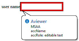
For example, the input type=text in the code example below has a visible label 'user name' , but no accessible name:
    user name <input type="text">

    or

<!-- label element used, but not associated with the control
it is supposed to label -->

    <label>user name</label> <input type="text">
The control's MSAA accName property is empty:
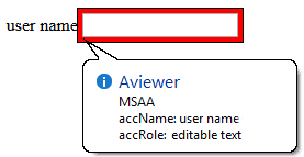
In comparison, the input type=text in the code example below has a visible label 'user name' and an accessible name. This example has an accessible name because the input element is a labelable element and the label element is used correctly to associate the label text with the input.
<!-- Note: use of for/id or wrapping label around text
and control methods will result in an accessible name -->

<label>user name <input type="text"></label>

or

<label for="uname">user name</label> <input type="text" id="uname">
The control's MSAA accName property has a value of "user name":
2.6 What does adding a role do to the native semantics?
Adding an ARIA role overrides the native role semantics in the accessibility tree which is reported via the accessibility API, and therefore ARIA indirectly affects what is reported to a screen reader or other assistive technology.
For example, this code in the HTML tree:
<h1 role=button>text</h1>
Becomes this in the accessibility tree:
What adding a role does not do
Adding an ARIA role will not make an element look or act differently for people not using assistive technology. It does not change the behaviours, states and properties of the host element but only the native role semantics.
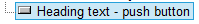
For example, this code in the HTML tree:
<button role=heading aria-level=1>text</button>
Becomes this in the accessibility tree:
But it can still be pressed, it is still in the default tab order, still looks like a button and still triggers any associated actions when pressed. That's why it is a HTML5 conformance error to change a button into a heading.
Note: Changing the role of an element does not add behaviors, properties or states to the role used. ARIA does not change the way it looks or acts in a browser. For instance, when links are used to behave like buttons, adding role=button alone is not sufficient. It will also be necessary to make act like a button, by including a key event handler that listens for the space key which native buttons do, because native buttons can be activated using the enter key or the spacebar.
2.7 Add ARIA inline or via script?
If the ARIA role or aria-* attribute does not rely on scripting to provide interaction behaviour, then it is safe to include the ARIA markup inline. For example, it is fine to add ARIA landmark roles or ARIA labelling and describing attributes inline. If the content and interaction is only supported in a scripting-enabled browsing context, i.e. Google docs (its applications require JavaScript enabled to work), it is not safe to include the ARIA markup inline.
Otherwise insert, change and remove ARIA via scripting. For instance, a collapsed section of a tree widget might look like this:
<li role=treeitem aria-expanded=false ...
When the user opens the section, it is changed to this using JavaScript :
<li role=treeitem aria-expanded=true ...
2.8 ARIA validation
The easiest method is to use the HTML5 DOCTYPE with ARIA markup and validate using the W3C Nu Markup Validation Service. ARIA works equally well with any other DOCTYPE, but validation tools will produce errors when they encounter ARIA markup as the associated DTDs have not been updated to recognise ARIA markup and it is unlikely they ever will be.
These validation errors in versions of HTML prior of HTML5 are in no way indicative of ARIA creating any real world accessibility problems nor do they mean there will be a negative user experience. They are merely the result of old automated validation tests that do not accommodate ARIA accessibility annotations.
Note: The W3C Nu Markup Validation Service support for ARIA checking is a work in progress, so cannot be wholly relied upon to provide the correct results. It is recommended that if you encounter a result that conflicts with the ARIA conformance requirements in the ARIA specification or the HTML5 specification, please raise a bug report.
2.9 Use of role=presentation
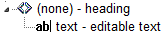
role=presentation removes the semantics from the element it is on.
For example, this code in the HTML tree:
<h1 role=presentation>text</h1>
Becomes this in the accessibility tree:
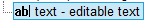
In other words, it is just reported in the accessibility tree as a text string with no semantic meaning.
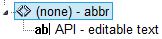
For elements with no required children, any elements nested inside the element with role=presentation preserve their semantics.
For example, this code in the HTML tree:
<h1 role=presentation><abbr>API</abbr></h1>
Becomes this in the accessibility tree:
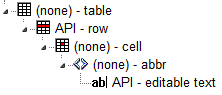
For elements with required children (such as ul or table) any required child elements nested inside the element with role=presentation also have their semantics removed.
For example, this code in the HTML tree:
<table role=presentation>

  <tr><td><abbr>API</abbr></td><tr>

  </table>
Becomes this in the accessibility tree:
Note: Any elements that are not required children of the element with a role=presentation keep their semantics. This includes other elements with required children such as nested lists or nested tables.
For example, this code in the HTML tree:
<table role=presentation">

    <tr><td>

    <table>

    <tr><td><abbr>API</abbr></td><tr>

    </table>

    </td><tr>

  </table>
Becomes this in the accessibility tree:
2.10 aria-labelledby and aria-describedby
Currently aria-labelledby and aria-describedby are more robustly supported for associating text content to a subset of interactive content elements. As of this writing they do not work correctly on links [EDITOR: add blocking bug link?], support on embedded content is unknown, but can be safely used on form controls including the many input types.
In Internet Explorer, if you use aria-labelledby with multiple id references or aria-describedby with single or multiple id references, the referenced elements must be what Microsoft terms as accessible HTML elements.
The following example of aria-labelledby with multiple references uses a span with a tabindex=-1 added. Refer to Making Non accessible Elements Accessible.
<label id="l1" for="f3">label text</label>


  <input type="text" id="f3" aria-labelledby="l1 l2">


  <p>other content</p>


  <span tabindex="-1"
  id="l2"
  >more label text</span>
Elements also become accessible HTML elements in Internet Explorer when the element has an ARIA role. For example:
<div aria-describedby="test">text</div>


  <div id="test" role="tooltip">tooltip text</div>
2.11 Using ARIA role=application
How does role="appliction" affect a screen reader?
On many popular screen readers today, most keystrokes are captured by the screen reader and not the web page when the user is in browse mode. This is necessary for efficient navigation of a page. As of this writing, when application mode is set, many screen reader stop intercepting keystrokes, and pass all keystrokes directly to the browser. Then the user won't be able to navigate the page as easily. For instance they won't be able to skip around the page by headings or read a paragraph of static text line-by-line. However, several screen readers do not behave differently when there is an application role set.
So when should I use it, and when not?
In determining when to use role=application, one should consider, among other things, the advantages of screen reader keyboard shortcuts weighed against the loss of those features. It generally should not be used, and if it is, usability testing with screen reader users should be conducted.
You do not use role="application" if a set of controls only contains these widgets, that are all part of standard HTML. This also applies if you mark them up and create an interaction model using WAI-ARIA roles instead of standard HTML widgets:
NOTE: It's not recommended that authors develop custom text input widgets. It's almost always best to use the native inputs for these.
text box. This also applies to password, search, tel and other newer input type derivativestextareacheck boxbuttonradio button(usually inside a fieldset/legend element wrapper)select + option(s)links,paragraphs,headings, and other elements that are classic/native to documents on the Web.
You also do not use the application role if your widget is one of the following more dynamic and non-native widgets. Screen readers and other assistive technologies that support WAI-ARIA will support switching between browse and focus modes for these by default too:
tree viewslidertablethat has focusable items and is being navigated via the arrow keys, for example, a list of e-mail messages where you provide specific information. Other examples are interactive grids, tree grids, etc.- A list of tabs (
tab, tablist) where the user selects tabs via the left and right arrow keys. Remember that you have to implement the keyboard navigation model for this! dialogandalertdialog. These causes some screen readers to go into a sort of application mode (implicitly) once focus moves to a control inside them. Note that for these to work best, set thearia-describedbyattribute of the element whose role isdialogto theidof the text that explains the dialog's purpose, and set focus to the first interactive control when you open it:
<div role="dialog" aria-label="login" aria-describedby="log1">


        <div id="log1" tabindex="-1">Provide user name and password to login.</div>


        ...

        ...


</div>toolbarandtoolbar buttons,menusandmenu items, and similar.
You only want to use role=application if the content you’re providing consists of only focusable, interactive controls, and of those, mostly advanced widgets that emulate a real desktop application. Note that, despite many things now being called a web application, most of the content these web applications work with are still document-based information, be it Facebook posts and comments, blogs, Twitter feeds, or even accordions that show and hide certain types of information dynamically. We primarily still deal with documents on the web, even though they may have a desktop-ish feel to them on the surface.
It is not necessary to use role=application to have control-specific keyboard shortcuts while the user is in forms (focus) mode on their screen reader. For instance, a custom control with ARIA role=listbox can easily capture all keys pressed including arrow keys, while the user is interacting with it.
In short: The times when you actually will use role=application will probably be very rare!
So where do I put role=application in the rare cases it is useful?
Put it on the closest containing element of your widget, for example, the parent div of your element that is your outer most widget element. If that outer div wraps only widgets that need the application interaction model, this will make sure focus mode is switched off once the user tabs out of this widget.
Only put it on the body element if your page consists solely of a widget or set of widgets that all need the focus mode to be turned on. If you have a majority of these widgets, but also have something you want the user to browse, use role=document on the outer-most element of this document-ish part of the page. It is the counterpart to role=application and will allow you to tell the screen reader to use browse mode for this part. Also make this element tabbable by setting a tabindex=0 on it so the user has a chance to reach it.
As a rule of thumb: If your page consists of over 90 or even 95 percent of widgets, role=application may be appropriate. Even then, find someone knowledgeable who can actually test two versions of this: One with and one without role=application set to see which model works best.
NEVER put role=application on a widely containing element such as body if your page consists mostly of traditional widgets or page elements such as links that the user does not have to interact with in focus mode. This will cause huge headaches for any assistive technology user trying to use your site/application.
For further information on the use of role=application refer to If you use the WAI-ARIA role "application", please do so wisely!
2.12 Recommendations Table:
legend
'Should authors explicitly define default ARIA semantics? ' column
- NO = the default semantics are already implemented by browsers, so the default implied role, state or property associated with an element or attribute does not need to be used. There are notes indicating under which circumstances default semantics are useful.
- N/A = there are no default ARIA semantics, but there may well be accessibility API semantics implemented by the browser.
- Yes = the default semantics are not implemented across browsers, so the default implied role, state, property, or suggested semantics (if no ARIA default) may be used.
'What Other ARIA roles, states and properties may be used?' column
NONE = the element does not support ARIA roles, states and properties. This is usually because the element is not displayed in the document.
| HTML language feature | Default ARIA semantics | Should authors explicitly define default ARIA semantics? | What Other ARIA roles, states and properties may be used? |
|---|---|---|---|
| All elements | varies | varies | Role: presentation, except focusable elements or those with the warning 'Not role=presentation' or those indicated: NONE |
a element with a href |
role=link |
NO | Roles: Any global Not |
address
| NONE | N/A | Role: |
area with a href |
role=link |
NO | Any Not |
article |
role=article |
YES note 0 | Roles: Note 0: NO if a child of an |
aside |
role=complementary |
YES | Roles: |
audio |
NONE | N/A | Role: |
base
| NONE | N/A | NONE |
body |
role=document |
NO | Any global aria-* attributes |
button
| role=button |
NO note 0a | Roles: Note 0a: YES If the Not |
button type="menu"
| role=button with aria-haspopup=true |
NO note 0b | Roles: Note 0b: YES If Not |
caption
| NONE | N/A | Any global aria-* attributes |
| NONE | N/A | NONE | |
datalist
| role=listbox, with aria-multiselectable=false |
NO note 1 | Any global Note 1: YES If There is no direct ARIA role match for description lists, so it's in appropriate to override the native role in this case unless the author is retrofitting an improper use of the DL element. |
dd, dt
| NONE | N/A | Any global aria-* attributes |
details
| role=group |
YES | Any global aria-* attributes and any aria-* attributes applicable to the group role. |
dialog element with no open attribute |
role=dialog, with aria-hidden =true |
YES | Any global Not |
div
| NONE | N/A | Role: Any Any global Note: It is recommended that any scripted widgets use the semantically neutral |
dl
| role=list |
NO | |
embed
| NONE | N/A | Role: Any global |
figure
| NONE | N/A | Role:Any, recommend Any global |
footer
| NONE | N/A | Use |
form |
role=form |
NO | |
grouping content elements not listed elsewhere:
|
NONE | N/A | Role: any Note: Although the listed elements do not have any default ARIA semantics they do have meaning and this meaning may be represented in roles, states and properties not provided by ARIA, but present in accessibility APIs. It is therefore recommended that authors consider adding a Any global |
h1 to h6 element |
role=heading, with the aria-level = element's outline depth |
NO | Any global aria-* attributes |
head
| NONE | N/A | NONE |
header
| NONE | YES | Use |
hr
| role=separator |
NO | Any global aria-* attributes and any aria-* attributes applicable to the separator role. |
html
| NONE | N/A | NONE |
iframe
| NONE | N/A | Role: Any global |
iframe (seemless)
| EDITOR: okay to override with any general grouping role. | N/A | Role: Any global |
img with alt="" |
role=presentation |
NO | NONE |
img with alt="some text" |
role=img |
NO | Role: Any Any global |
input type= button |
role=button |
NO note 1b | Role: Any global Note 1a: YES If the Not |
input type= checkbox |
aria-checked=mixed if the element's indeterminate IDL attribute is true, or aria-checked=true if checked attribute is present. |
NO note 2 |
Note 2: YES If you are using Not |
input type = color |
NONE | N/A |
Not |
input type = date |
NONE | N/A |
Not |
input type = datetime |
NONE | N/A |
Not |
input type = email with no list attribute |
role=textbox |
NO |
Not |
input type = file |
NONE | N/A |
Not |
input type = hidden |
NONE | N/A | NONE |
input type= image |
role=button |
NO note 2a | Role: Any global Note 2a: YES If the Not |
input type = month |
NONE | N/A |
Not |
input type = number |
role=spinbutton, with the aria-readonly property set to "true" if the element has a readonly attribute, the aria-valuemax property set to the element's maximum, the aria-valuemin property set to the element's minimum, and, if the result of applying the rules for parsing floating-point number values to the element's value is a number, with the aria-valuenow property set to that number |
NO note 3 | Any global Note 3: YES If It is okay to use Not |
input type = password |
role=textbox |
NO |
Not |
input type = radio |
role=radio |
NO | Role: Any global Not |
input type = range |
role=slider with aria-valuemax property set to the element's maximum, and the aria-valuemin property set to the element's minimum. |
NO note 4 | Any global Note 4: YES If It is okay to use aria-valuetext, with or without an explicit role. Not |
input type= reset |
button role |
NO |
Not |
input type = search, with no list attribute |
textbox role |
NO |
Not |
input type = submit |
button role |
NO |
Not |
input type = tel with no list attribute |
textbox role |
NO |
Not |
input type = text with no list attribute |
textbox role |
NO |
Not |
input type = text, search, tel, url, or email with a list attribute |
combobox role, with the aria-owns property set to the same value as the list attribute |
NO note 5 | Any global Note 5: YES If Not |
input type= time |
NONE | NO |
Not |
input type = url with no list attribute |
textbox role |
NO |
Not |
input type = week |
NONE | NO |
Not |
| NONE | N/A | Role: any Note: Although the listed elements do not have any default ARIA semantics they do have meaning and this meaning may be represented in roles, states and properties not provided by ARIA, but present in accessibility APIs. It is therefore recommended that authors consider adding a Any global |
|
keygen
| NONE | N/A |
Not |
label
| NONE | N/A | Any global aria-* attributes |
li element whose parent is an ol or ul
| role=listitem |
NO note 5a | Role: Note 5a: YES if |
link element with a href |
role=link |
NO | NONE |
main |
role=main |
YES | Any global aria-* attributes |
map |
NONE | N/A | NONE |
math |
NONE | YES | Any global aria-* attributes |
menu type = toolbar |
role=toolbar |
NO note 7 | Note 7: YES if Any global Not |
menuitem
type = command
| role=menuitem |
NO note 7a | Note 7a: YES if Any global Not |
menuitem type = checkbox
| role=menuitemcheckbox |
NO note 7b | Note 7b: YES if Any global Not |
menuitem type = radio
| role=menuitemradio |
NO note 7c | Note 7c: YES if Any global Not |
meta
| NONE | N/A | NONE |
meter
| role=progressbar | N/A | Any global aria-* attributes |
nav
| role=navigation |
YES | Any global aria-* attributes |
noscript
| NONE | N/A | NONE |
object
| NONE | N/A | Role: Any global |
ol
| role=list |
NO | Role: Any global |
optgroup
| NONE | N/A | Any global aria-* attributes |
| option element that is in a list of options or that represents a suggestion in a datalist | role=option, with aria-selected=true if the selected attribute is present, aria-selected=false otherwise. |
NO |
Not |
output
| role=status |
DEPENDS | Role: Any, use in conjunction with Any global Note: If |
param
| NONE | N/A | NONE |
picture
| NONE | N/A | NONE |
progress
| progressbar role, with, if the progress bar is determinate, the aria-valuemax property set to the maximum value of the progress bar, the aria-valuemin property set to zero, and the aria-valuenow property set to the current value of the progress bar |
NO note 8 | Note 8: YES if it's okay to use aria-valuetext on this (e.g. "Step 2 of 10"), with or without an explicit role. Any global |
script
| NONE | N/A | NONE |
section
| role=region |
NO | Role: Any global |
select element with a multiple attribute |
role=listbox, with aria-multiselectable=true |
NO |
Not |
select element with no multiple attribute |
role=listbox, with aria-multiselectable=false |
NO |
Not |
source
| NONE | N/A | NONE |
span
| NONE | N/A | Role: Any Any global Note: It is recommended that any scripted widgets use the semantically neutral |
style
| NONE | N/A | NONE |
SVG
| NONE | N/A | Role: Any global |
summary
| NONE | N/A | if Any global |
table
| NONE | N/A | Role: any Note 1: It is recommended to not override the Note 2: It is recommended that the Any global |
template
| NONE | N/A | NONE |
textarea
| role=textbox |
NO |
Not |
role=rowgroup |
No | Role: any Note: addition of roles does not appear to have any effect upon these unrendered elements |
|
title
| NONE | N/A | NONE |
td
| NONE | N/A | Role: any Note: It is recommended to not override the Any global |
| Text level semantic elements not listed elsewhere:
|
NONE | N/A | Role: any Note: Although the listed elements do not have any default ARIA semantics they do have meaning and this meaning may be represented in roles, states and properties not provided by ARIA, but present in accessibility APIs. It is therefore recommended that authors consider adding a Any global |
th
| NONE | N/A | Role: any Note: It is recommended to not override the Any global |
th element that is a sorting-capable th element whose column key ordinality is 1
| role=columnheader, with the aria-sort state set to "ascending" if the element's column sort direction is normal, and "descending" otherwise. |
NO |
Not |
| NONE | N/A | Role: any Note: It is recommended to not override the Any global |
|
track
| NONE | N/A | NONE |
ul
| role=list |
NO | Role: Any global |
video
| NONE | N/A | Role: Any global |
Element with a disabled attribute |
aria-disabled="true" |
NO | Use the Only use the |
Element with a required attribute |
The aria-required="true" |
NO | Use the Also use the |
Element with a readonly attribute |
aria-readonly=true |
NO | Use the Only use the |
Element with a hidden attribute |
aria-hidden=true |
NO | Use the hidden attribute in conjunction with the CSS display:none property |
| Element is natively focusable (links, buttons, etc.) | NONE | NO | Not role=presentation |
| Element is not natively focusable (li, span, div, etc.) | DEPENDS | YES | Not role=presentation
For example, |
| Element that is a candidate for constraint validation but that does not satisfy its constraints | aria-invalid=true |
NO | Only use the (Editor's NOTE) Provide link to what HTML defines what constitutes the user has interacted with the control "significantly." ARIA defines |
2.13 ARIA Role, State, and Property Quick Reference
(Reformatted and reorganized information from: Accessible Rich Internet Applications (WAI-ARIA) 1.0)
In addition to the states and properties shown in the table, the following global states and properties are supported on all roles.
Global states and properties
| Role | Description | Required Properties | Supported Properties - Global + |
|---|---|---|---|
alert |
A message with important, and usually time-sensitive, information. See related alertdialog and status. | NONE | |
alertdialog |
A type of dialog that contains an alert message, where initial focus goes to an element within the dialog. See related alert and dialog. | NONE | |
application |
A region declared as a web application, as opposed to a web document. | NONE | |
article |
A section of a page that consists of a composition that forms an independent part of a document, page, or site. | NONE | |
banner |
A region that contains mostly site-oriented content, rather than page-specific content. | NONE | |
button |
An input that allows for user-triggered actions when clicked or pressed. See related link. | NONE | |
checkbox |
A checkable input that has three possible values: true, false, or mixed. | |
|
columnheader |
A cell containing header information for a column. | NONE | |
combobox |
A presentation of a select; usually similar to a textbox where users can type ahead to select an option, or type to enter arbitrary text as a new item in the list. See related listbox. | ||
complementary |
A supporting section of the document, designed to be complementary to the main content at a similar level in the DOM hierarchy, but remains meaningful when separated from the main content. | NONE | |
contentinfo |
A large perceivable region that contains information about the parent document. | NONE | |
definition |
A definition of a term or concept. | NONE | |
dialog |
A dialog is an application window that is designed to interrupt the current processing of an application in order to prompt the user to enter information or require a response. See related alertdialog. | NONE | |
directory |
A list of references to members of a group, such as a static table of contents. | NONE | |
document |
A region containing related information that is declared as document content, as opposed to a web application. | NONE | |
form |
A landmark region that contains a collection of items and objects that, as a whole, combine to create a form. See related search. | NONE | |
grid |
A grid is an interactive control which contains cells of tabular data arranged in rows and columns, like a table. | NONE | |
gridcell |
A cell in a grid or treegrid. | NONE | |
group |
A set of user interface objects which are not intended to be included in a page summary or table of contents by assistive technologies. | NONE | |
heading |
A heading for a section of the page. | NONE | |
img |
A container for a collection of elements that form an image. | NONE | |
link |
An interactive reference to an internal or external resource that, when activated, causes the user agent to navigate to that resource. See related button. | NONE | |
list |
A group of non-interactive list items. See related listbox. | NONE | |
listbox |
A widget that allows the user to select one or more items from a list of choices. See related combobox and list. | NONE | |
listitem |
A single item in a list or directory. | NONE | |
log |
A type of live region where new information is added in meaningful order and old information may disappear. See related marquee. | NONE | |
main |
The main content of a document. | NONE | |
marquee |
A type of live region where non-essential information changes frequently. See related log. | NONE | |
math |
Content that represents a mathematical expression. | NONE | |
menu |
A type of widget that offers a list of choices to the user. | NONE | |
menubar |
A presentation of menu that usually remains visible and is usually presented horizontally. Authors SHOULD ensure that menubar interaction is similar to the typical menu bar interaction in a desktop graphical user interface.It is NOT really intended to mark up site navigation list items |
NONE | |
menuitem |
An option in a group of choices contained by a menu or menubar. | NONE | |
menuitemcheckbox |
A checkable menuitem that has three possible values: true, false, or mixed. | |
|
menuitemradio |
A checkable menuitem in a group of menuitemradio roles, only one of which can be checked at a time. | ||
navigation |
A collection of navigational elements (usually links) for navigating the document or related documents. | NONE | |
note |
A section whose content is parenthetic or ancillary to the main content of the resource. | NONE | |
option |
A selectable item in a select list. | NONE | |
presentation |
An element whose implicit native role semantics will not be mapped to the accessibility API. | NONE | |
progressbar |
An element that displays the progress status for tasks that take a long time. | NONE | |
radio |
A checkable input in a group of radio roles, only one of which can be checked at a time. | ||
radiogroup |
A group of radio buttons. | NONE | |
region |
A large perceivable section of a web page or document, that the author feels is important enough to be included in a page summary or table of contents, for example, an area of the page containing live sporting event statistics. | NONE | |
row |
A row of cells in a grid. | NONE | |
rowgroup |
A group containing one or more row elements in a grid. | NONE | |
rowheader |
A cell containing header information for a row in a grid. | NONE | |
scrollbar |
A graphical object that controls the scrolling of content within a viewing area, regardless of whether the content is fully displayed within the viewing area. | ||
search |
A landmark region that contains a collection of items and objects that, as a whole, combine to create a search facility. See related form. | NONE | |
separator |
A divider that separates and distinguishes sections of content or groups of menuitems. |
|
|
slider |
A user input where the user selects a value from within a given range. | ||
spinbutton |
A form of range that expects the user to select from among discrete choices. | ||
status |
A container whose content is advisory information for the user but is not important enough to justify an alert, often but not necessarily presented as a status bar. See related alert. | NONE | |
tab |
A grouping label providing a mechanism for selecting the tab content that is to be rendered to the user. | NONE | |
tablist |
A list of tab elements, which are references to tabpanel elements. | NONE | |
tabpanel |
A container for the resources associated with a tab, where each tab is contained in a tablist. | NONE | |
textbox |
Input that allows free-form text as its value. | NONE | |
timer |
A type of live region containing a numerical counter which indicates an amount of elapsed time from a start point, or the time remaining until an end point. | NONE | |
toolbar |
A collection of commonly used function buttons represented in compact visual form. | NONE | |
tooltip |
A contextual popup that displays a description for an element. | NONE | |
tree |
A type of list that may contain sub-level nested groups that can be collapsed and expanded. | NONE | |
treegrid |
A grid whose rows can be expanded and collapsed in the same manner as for a tree. | NONE | |
treeitem |
An option item of a tree. This is an element within a tree that may be expanded or collapsed if it contains a sub-level group of treeitems. | NONE |
2.14 Definitions of States and Properties (all aria-* attributes)
Below is an alphabetical list of ARIA states and properties to be used by rich internet application authors. A detailed definition of each ARIA state and property can be found by following the attribute links (to their definitions in Accessible Rich Internet Applications (WAI-ARIA) 1.0.
aria-activedescendant- Identifies the currently active descendant of a composite widget.
aria-atomic- Indicates whether assistive technologies will present all, or only parts of, the changed region based on the change notifications defined by the aria-relevant attribute. See related aria-relevant.
aria-autocomplete- Indicates whether user input completion suggestions are provided.
aria-busy (state)- Indicates whether an element, and its subtree, are currently being updated.
aria-checked (state)- Indicates the current "checked" state of checkboxes, radio buttons, and other widgets. See related aria-pressed and aria-selected.
aria-controls- Identifies the element (or elements) whose contents or presence are controlled by the current element. See related aria-owns.
aria-describedby- Identifies the element (or elements) that describes the object. See related aria-labelledby.
aria-disabled (state)- Indicates that the element is perceivable but disabled, so it is not editable or otherwise operable. See related aria-hidden and aria-readonly.
aria-dropeffect- Indicates what functions can be performed when the dragged object is released on the drop target. This allows assistive technologies to convey the possible drag options available to users, including whether a pop-up menu of choices is provided by the application. Typically, drop effect functions can only be provided once an object has been grabbed for a drag operation as the drop effect functions available are dependent on the object being dragged.
aria-expanded (state)- Indicates whether the element, or another grouping element it controls, is currently expanded or collapsed.
aria-flowto- Identifies the next element (or elements) in an alternate reading order of content which, at the user's discretion, allows assistive technology to override the general default of reading in document source order.
aria-grabbed (state)- Indicates an element's "grabbed" state in a drag-and-drop operation.
aria-haspopup- Indicates that the element has a popup context menu or sub-level menu.
aria-hidden (state)- Indicates that the element and all of its descendants are not visible or perceivable to any user as implemented by the author. See related aria-disabled.
aria-invalid (state)- Indicates the entered value does not conform to the format expected by the application.
aria-label- Defines a string value that labels the current element. See related aria-labelledby.
aria-labelledby- Identifies the element (or elements) that labels the current element. See related aria-label and aria-describedby.
aria-level- Defines the hierarchical level of an element within a structure.
aria-live- Indicates that an element will be updated, and describes the types of updates the user agents, assistive technologies, and user can expect from the live region.
aria-multiline- Indicates whether a text box accepts multiple lines of input or only a single line.
aria-multiselectable- Indicates that the user may select more than one item from the current selectable descendants.
aria-orientation- Indicates whether the element and orientation is horizontal or vertical.
aria-owns- Identifies an element (or elements) in order to define a visual, functional, or contextual parent/child relationship between DOM elements where the DOM hierarchy cannot be used to represent the relationship. See related aria-controls.
aria-posinset- Defines an element's number or position in the current set of listitems or treeitems. Not required if all elements in the set are present in the DOM. See related aria-setsize.
aria-pressed (state)- Indicates the current "pressed" state of toggle buttons. See related aria-checked and aria-selected.
aria-readonly- Indicates that the element is not editable, but is otherwise operable. See related aria-disabled.
aria-relevant- Indicates what user agent change notifications (additions, removals, etc.) assistive technologies will receive within a live region. See related aria-atomic.
aria-required- Indicates that user input is required on the element before a form may be submitted.
aria-selected (state)- Indicates the current "selected" state of various widgets. See related aria-checked and aria-pressed.
aria-setsize- Defines the number of items in the current set of listitems or treeitems. Not required if all elements in the set are present in the DOM. See related aria-posinset.
aria-sort- Indicates if items in a table or grid are sorted in ascending or descending order.
aria-valuemax- Defines the maximum allowed value for a range widget.
aria-valuemin- Defines the minimum allowed value for a range widget.
aria-valuenow- Defines the current value for a range widget. See related aria-valuetext.
aria-valuetext- Defines the human readable text alternative of aria-valuenow for a range widget.
2.15 Abstract roles
Do not use the following abstract roles as they do not do anything!
The following roles are used to support the WAI-ARIA role taxonomy for the purpose of defining general role concepts. Abstract roles are used for the ontology. Authors MUST NOT not use abstract roles in content.