Low Vision Issue Rationale
This page presents the rationale for decisions made during the development of the Accessibility Requirements for People with Low Vision document.
Images in 2.4.5 Color Vision
See section 2.4.5 Color Vision
Current Images
-
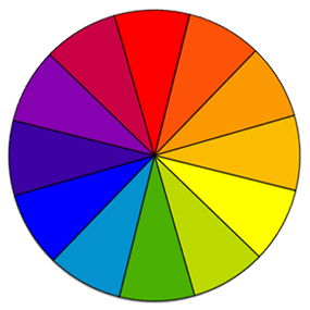
Full color perception (no disability)
-
Complete red-green disability (protanopia)
-
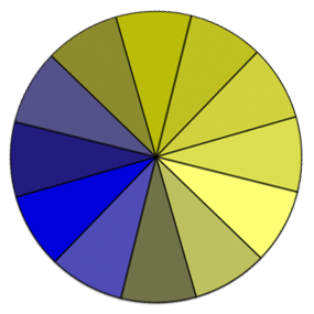
Complete blue-yellow disability (tritanopia)
-
Complete color disability (achromatopsia)
These are representations of the color wheel as seen by people with different types of color blindness.
Proposed Images
A black/white border was added to the wedges in order to achieve 3:1 or better contrast to meet WCAG Success Criterion 1.4.11.
-
Full color perception (no disability)
-
Complete red-green disability (protanopia)
-
Complete blue-yellow disability (tritanopia)
-
Complete color disability (achromatopsia)
Rationale
1.4.11 Non-text Contrast
(Level AA)
The visual presentation of the following have a contrast ratio of at least 3:1 against adjacent color(s): ...
Graphical Objects
Parts of graphics required to understand the content, except when a particular presentation of graphics is essential to the information being conveyed.
The Task Force decided to keep the original images, because users do not need to distinguish the slices from each other. The purpose is to show that colors look different to different people.
Long Description of Images for Appendix
We should link Jeanne's Color-Blindness-Table in the Appendix to provide a long description.
RESOLUTION: "Will update table, alts and images descriptions - and add appendix with detailed image descriptions." - 13 April 2016


