See Understanding Techniques for WCAG Success Criteria for important information about the usage of these informative techniques and how they relate to the normative WCAG 2.0 success criteria. The Applicability section explains the scope of the technique, and the presence of techniques for a specific technology does not imply that the technology can be used in all situations to create content that meets WCAG 2.0.
Microsoft Silverlight, versions 3 and greater
Silverlight managed programming model and Silverlight XAML
This technique relates to:
See User Agent Support Notes for SL2. Also see Silverlight Technology Notes.
The objective of this technique is to use the Silverlight "control skinning" scenario and feature set to change the visible focus indication of a control. In particular, the intent is to increase the visibility of focus indication versus the appearance of a default-styled control. This technique is useful both for the control sets that are included in the Silverlight run time or SDK assemblies, as well as for Toolkit or any third party distributed control.
The default Silverlight core controls all indicate some type of visible focus indication, through their default templates. However, Silverlight application authors can still use the skinning techniques to augment or replace the visible focus indications for controls as used in their applications. For more information on how Silverlight controls will generally supply a default visual focus indicator, see Focus Overview on MSDN.
Silverlight control skinning is enabled through a deliberate separation
of UI and logic in the Silverlight control model. Appearance of a control
is largely written in XAML. The logic is largely written in code (for
example C#) and is left unaffected when a Silverlight application author
provides a new control template "skin". The hooks that connect
the appearance and the logic are a Style property of the control (which
the author changes the value of, to refer to their new XAML resource)
and a contract of expected named entities in the XAML. The control
logic invokes the names of the entities/parts whenever control state
changes, and the expectation is that the named part provides the necessary
appearance as defined in XAML. Design tools such as Visual Studio or
Expression Blend generate copies of the default templates and parts,
such that Silverlight authors can modify the parts that they want to
change the appearance of, and still preserve the remainder of default
appearance and behavior of the control.
For the visible focus indicator technique, the author typically modifies a single visual element that renders in layout as an overlay on top of the control when it is focused, and switches the overlay to nonvisible when the control is not focused. This element is a named element that is typically referred to from within the XAML named state Focused, which in turn is hooked up to changes in the visual state.
Note that this technique assumes that the original control author provided the necessary logic event hookup, and exposed a named state associated with keyboard focus to work with. If this is not the case, or if the scenario is that a Silverlight author is defining their own control, a different technique is needed. See SL7: Designing a Focused Visual State for Custom Silverlight Controls.
Focus in Silverlight is equivalent to the larger user interface and
application concept of keyboard focus. The element that has focus is
the element within the Silverlight object tree and programming model
that has first chance to process the Silverlight key events. As a more
tangible example that is user-centric, if a TextBox has
keyboard focus, then when the user presses keys on the keyboard, the
characters associated with the user's pressed keys will appear in the
TextBox. A user interface element in Silverlight can obtain keyboard
focus in one of three ways:
The user uses the Silverlight tab sequence to traverse into the Silverlight content and to focus a specific control.
The Silverlight application's logic calls the Focus method
programmatically to force focus to a control.
The user performs some other action, for example uses the mouse
to click on a control. That control's specific logic handles the
Silverlight input event and uses that event as stimulus to call Focus on
that control. The difference between this case and the above case
is that the behavior is typically built-in to that control's runtime
behavior, and does not require each application author to call Focus in
application code.
XAML templates can be verbose; for clarity, only the parts of the template that were changed or useful for showing the structure are shown. Omitted portions are shown as ellipsis (...).
<UserControl x:Class="VisibleFocusTemplate.MainPage"
 xmlns="http://schemas.microsoft.com/winfx/2006/xaml/presentation"
 xmlns:x="http://schemas.microsoft.com/winfx/2006/xaml"
>
 <UserControl.Resources>
   <Style x:Key="StrongFocusIndicator" TargetType="Button">
...
     <Setter Property="Template">
       <Setter.Value>
         <ControlTemplate TargetType="Button">
...
             <VisualStateManager.VisualStateGroups>
               <VisualStateGroup x:Name="FocusStates">
                 <VisualState x:Name="Focused">
                   <Storyboard>
                     <DoubleAnimation Duration="0" To="1"
 Storyboard.TargetProperty="Opacity"
 Storyboard.TargetName="FocusVisualElement"/>
                     <DoubleAnimation Duration="0" To="0.5"
 Storyboard.TargetProperty="(UIElement.Opacity)"
 Storyboard.TargetName="rectangle" d:IsOptimized="True"/>
                   </Storyboard>
                 </VisualState>
                 <VisualState x:Name="Unfocused"/>
               </VisualStateGroup>
             </VisualStateManager.VisualStateGroups>
...
             <Border x:Name="FocusVisualElement"
 IsHitTestVisible="false" Opacity="0"
 CornerRadius="2" BorderBrush="#D0FF0000"
 BorderThickness="4">
               <Rectangle x:Name="rectangle"
 IsHitTestVisible="false" Margin="2"
 Opacity="0" RadiusY="2" RadiusX="2"
 Fill="#A0FF0000"/>
             </Border>
          </ControlTemplate>
       </Setter.Value>
     </Setter>
   </Style>
 </UserControl.Resources>
 <StackPanel x:Name="LayoutRoot">
   <Button Width="275">Default button</Button>
   <Button Width="275"
 Style="{StaticResource StrongFocusIndicator}"
 >Button with re-templated focus visible indicator</Button>
 </StackPanel>
</UserControl>
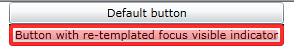
The most interesting aspect of this example is the change made to the FocusVisualElement part. Here is the original (default template) FocusVisualElement:
<Rectangle x:Name="FocusVisualElement" RadiusX="2" RadiusY="2" Margin="1" Stroke="#FF6DBDD1" StrokeThickness="1"
 Opacity="0" IsHitTestVisible="false" />
Here is the changed FocusVisualElement:
<Border x:Name="FocusVisualElement" IsHitTestVisible="false"
 Opacity="0" CornerRadius="2"
 BorderBrush="#D0FF0000" BorderThickness="4">
 <Rectangle x:Name="rectangle" IsHitTestVisible="false"
 Margin="2" Opacity="0"
 RadiusY="2" RadiusX="2" Fill="#A0FF0000"/>
</Border>
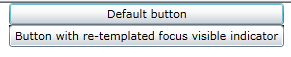
The following images show how each of the two buttons (default and reskinned) appear when focused.
This example is shown in operation in the working example of Visible Focus Template.
Resources are for information purposes only, no endorsement implied.
Note that not all Silverlight applications necessarily will start with the keyboard focus being somewhere within the Silverlight content area for purpose of Step #2. It may be necessary to press TAB several times to traverse the browser's framing user interface. Also, within the browser's display area that displays the HTML document, there might also be other HTML elements that are keyboard focusable, which are representative of HTML that falls lexically before the <object> tag that instantiates the Silverlight plug-in. So it may also be necessary to press TAB several times until these HTML elements are traversed.
Using a browser that supports Silverlight, open an HTML page that references a Silverlight application through an object tag.
Using a keyboard, tab to the element where focus characteristics are being examined.
Check that the background, border, or other noticable visual indicator of the element changes color.
Check that the changes in color for the background, border, or other noticable visual indicator are removed when the element loses focus.
#3 and #4 are true.
If this is a sufficient technique for a success criterion, failing this test procedure does not necessarily mean that the success criterion has not been satisfied in some other way, only that this technique has not been successfully implemented and can not be used to claim conformance.