This document is a list of techniques that implement the
checkpoints defined in "Web Content Accessibility Guidelines 1.0".
While Web Content Accessibility Guidelines 1.0 strives to be a stable
document (as a W3C Recommendation), the current document will
undoubtedly evolve as technologies change and content
developers discover
more effective techniques for designing accessible pages.
This document is part of a series of accessibility documents
published by the Web Accessibility
Initiative.
This is a W3C Working Draft for review by W3C members and other
interested parties. It is a draft document and may be updated,
replaced or obsoleted by other documents at any time. It is
inappropriate to use W3C Working Drafts as reference material or to
cite them as other than "work in progress". This is work in
progress and does not imply endorsement by, or the consensus of,
either W3C or members of the Web Content Guidelines Working Group.
This draft of the document comes during the Propose
Recommendation period of the "Web Content Accessibility Guidelines 1.0". This is the
first time the current document "stands on its own", i.e.,
is not closely associated with the associated guidelines.
This document has been produced as part of the W3C Web Accessibility Initiative. The
goal of the Web Content Guidelines
Working Group is discussed in the Working Group
charter.
A list of current W3C Recommendations and other technical documents
can be found at http://www.w3.org/TR.
Please send detailed comments on this document to w3c-wai-gl@w3.org.
Each checkpoint has a priority level assigned by the Working
Group based on the checkpoint's impact on accessibility.
- [Priority 1]
- A Web content developer must satisfy this
checkpoint. Otherwise, one or more groups will find it impossible to
access information in the document. Satisfying this checkpoint is a
basic requirement for some groups to be able to use Web documents.
- [Priority 2]
- A Web content developer should satisfy this
checkpoint. Otherwise, one or more groups will find it difficult to
access information in the document. Satisfying this checkpoint will
remove significant barriers to accessing Web documents.
- [Priority 3]
- A Web content developer may
address this checkpoint. Otherwise,
one or more groups will find it somewhat difficult to access
information in the document. Satisfying this checkpoint will improve
access to Web documents.
Some checkpoints specify a priority level that may change under
certain (indicated) conditions.
The checkpoints in this document are numbered to match their
numbering in Web Content Accessibility Guidelines 1.0.
This document is a list of techniques that implement the
checkpoints defined in "Web Content Accessibility Guidelines 1.0". This document is organized
as follows:
- Accessibility Themes
- This section introduces some general techniques to
promote accessibility that are independent of any specific
markup language.
- HTML Techniques
- This section explains how to implement applicable
checkpoints in HTML (refer to
[HTML40],
[HTML32])
and includes numerous practical examples.
To complement this section, an
index of HTML elements and attributes
provides information about
all elements of HTML 4.0 and all attributes that affect
accessibility directly. For each element, the index
includes links to techniques that refer to it.
- CSS Techniques
- This section explains how to implement applicable
checkpoints in CSS1 and CSS2 (refer to [CSS1],
[CSS2]).
- XML Techniques
- This section explains how to implement applicable
checkpoints in XML 1.0 (refer to [XML]).
A checkpoint map has been provided
for navigation of the techniques. For each checkpoint, the map
includes its definition (as it appears in the "Web Content Accessibility Guidelines 1.0") and links
to applicable techniques for the checkpoint. In addition,
the beginning of each section of this document lists the checkpoints
that are addressed in that section.
The following sections discuss some accessibility themes that Web
content developers should keep in mind as they design documents and sites.
When designing a document or series of documents, content developers
should strive first to identify the desired structure for their documents
before thinking about how the documents will be presented to the
user. Distinguishing the structure of a document from how the
content is presented offers a number of advantages, including
improved accessibility, manageability, and portability.
Identifying what is structure and what is presentation may be a
challenging task at times that content developers must develop a mindset for
recognizing. For instance, many content developers consider that a horizontal
rule (the HR element) communicates a structural division. This may
be true for sighted users, but to unsighted users or users without
graphical browsers, a horizontal rule has next to no meaning (One might "guess" that
an HR element implies a structural division, but
without other information, there is no guarantee.) In HTML, content developers
should
use the HTML 4.0 header elements (H1-H6) to identify new sections.
These may be complemented by visual or other cues such as
horizontal rules, but should not be replaced by them.
The inverse holds as well: content developers should not use structural
elements to achieve presentation effects. For instance in HTML, even though
the BLOCKQUOTE element may cause indented text in some browsers,
that is not its meaning, only a presentation side-effect.
BLOCKQUOTE elements used for indentation confuse users and search
robots alike, who expect the element to be used to mark up block
quotations.
The separation of presentation from structure in XML documents
is inherent. As Norman Walsh states in "A Guide to XML"
[WALSH],
"HTML browsers are
largely hardcoded. A first level heading appears the way it does because
the browser recognizes the H1
tag. Again, since XML documents have no
fixed tag set, this approach will not work. The presentation of an XML
document is dependent on a stylesheet."
Quicktest! To determine if content is
structural or presentational, create an outline of your document. Each point
in the hierarchy denotes a structural change. Use structural markup to
mark these changes and presentational markup to make them more
apparent visually and aurally. Notice that horizontal rules will not
appear in this outline and therefore are not structural, but presentational.
Note. This test only looks at the structure at the chapter
and paragraph level. To determine structure within phrases, look for
abbreviations, changes in natural language, definitions, and list items.
Checkpoints in this section:
1.1, 1.2, 3.8,
1.5, 13.10, 3.3, and
12.1, and 12.2.
Text is considered accessible to almost all users since it may
be handled by screen readers, non-visual browsers, braille readers,
displayed visually, magnified, synchronized with a video to create a caption,
etc. It is good practice, as you design a document containing
non-textual information (images, graphics, applets, sounds, etc.)
to think about supplementing that information with textual
equivalents wherever possible.
A text equivalent describes the function or purpose of content.
For complex content (charts, graphs, etc.), the text equivalent
may be longer and include descriptive information.
Text equivalents should be provided for logos, photos, submit
buttons, applets, bullets in lists, ascii art,
and all of the links within an
image map as well as invisible images used to layout a page.
Quicktest! A good test to
determine if a text equivalent is useful is to imagine reading the
document aloud over the telephone. What would you say upon
encountering this image to make the page comprehensible to the
listener?
How one specifies a text equivalent depends on the
document language.
For example, depending on the element, HTML allows content
developers to specify text equivalents through attributes ("alt" or "longdesc" )
or in element content (the OBJECT element).
Video formats, such as Quicktime, will allow developers to include
a variety of alternative audio and video tracks. SMIL, will allow developers
to synchronize alternative audio and video clips, and text files with each
other.
In creating XML DTDs, ensure that elements that might need a
description have some way of associating themselves with the
description.
Some image formats allow internal text in the data file along with
the image information. If an image format supports such text (e.g.,
Portable Network Graphics, see [PNG]) content
developers may also supply information there as well.
Since some user agents do not support new HTML 4.0 attributes or if a
person is using an older video player, or whatever technology compatibility exists,
here are some alternatives to the above solutions. Methods include:
- Inline text equivalents. For example, include a
description of the image immediately after the image.
- Links to descriptions that are part of a text equivalent (called
description links or "d-links"). Description
links should be ordinary links (on the same page or another designed
for such links) that designate a document containing a long
description. The link text should be "[D]".
Checkpoints in this section:
11.4, and 6.5.
Although it is possible to make most content accessible,
it may happen that all or part of a page remains inaccessible.
Additional techniques for creating accessible
alternatives include:
- Allow
users to navigate to a separate page that is accessible and
maintained with the same frequency as the inaccessible original
page.
- Instead of static alternative pages, set up
server-side scripts that generate accessible versions of a page on
demand.
- Refer to the examples for Frames
and Scripts.
- Provide a phone number, fax number, e-mail, or postal
address where information is available and accessible, preferably
24 hours a day
There are several techniques for linking to an accessible
alternative page:
- Provide links at the top of both the main and alternative pages
to allow a user to move back and forth between them.
For example,
at the top of a graphical page include a link to the text-only page,
and at the top of a text-only page include a link to the associated
graphical page. Ensure that these links are one of the first that
users will tab to by placing them at the top of the page, before other
links.
- Use meta information to designate alternative documents. Browsers should
load the alternative page automatically based on the user's
browser type and preferences. For example, in
HTML, use the LINK element as follows:
Example.
User agents that support LINK will load the alternative page for
those users whose browsers may be identified as supporting "aural","braille", or "tty" rendering.
        <HEAD>
        <TITLE>Welcome to the Virtual Mall!</TITLE>
        <LINK title="Text-only version"
              rel="alternate"
              href="text_only.html"
              media="aural, braille, tty">
        </HEAD>
        <BODY><P>...</BODY>
End example.
Checkpoints in this section:
9.2.
Not every user has a graphic environment with a mouse or other
pointing device. Some users rely on keyboard, alternative keyboard
or voice input to
navigate links, activate form controls, etc. Content
developers should always
ensure that users may interact with a page with devices other than
a pointing device. A page designed for keyboard access (in addition
to mouse access) will generally be accessible to users with other
input devices. What's more, designing a page for keyboard access
will usually improve its overall design as well.
Keyboard access to links and form controls may be specified in
a few ways:
- Image map links
- Provide text equivalents for client-side image map areas, or provide
redundant text links for server-side image maps.
Refer to the image map section for examples.
- Keyboard shortcuts
- Keyboard shortcuts allow users to combine keystrokes to
navigate links or form controls on a page.
Note.
Keyboard shortcuts may be handled differently by different
operating systems. The primary difference being which keys to press
to activate the shortcut. On Windows machines, the "alt" and "ctrl"
key are most commonly used while on a Macintosh, it is the apple or "clover
leaf" key. Refer to the Keyboard access for links
and Keyboard Access to Forms
sections for examples.
- Tabbing order
- Tabbing order describes a (logical) order for navigating from
link to link or form control to form control (usually by pressing
the "tab" key, hence the name). Refer to the
Keyboard Access to Forms
section for examples.
Some elements import objects whose interfaces cannot
be controlled through the markup language. For example, in HTML, applets,
and multi-media players. In such cases,
users should ensure that if the imported objects themselves do not provide
accessible interfaces, that an alternative does.
Checkpoints in this section:
14.3, 13.4, 13.8
13.5, 13.3, 13.7, and 13.2.
A consistent style of presentation on each page allows users to easily
find navigation buttons between pages, as well as find the primary
content for each page. While this helps make it easier for everyone,
it especially benefits people with learning and reading disabilities.
Making it easy to predict where the needed information is found on each page
will increase the likelihood that it will be found.
Examples of structures that may appear at the same place between pages:
- navigation bars
- the primary content of a page
- advertising
A navigation structure is the set of possible paths available for a user to take
through the content on your site. Providing navigation bars, site maps,
and search features all increase the likelihood that a user will navigate
easily to the information that they seek on your site. If your site is
highly visual in nature, the structure might be harder to navigate
through if the user can't form a mental map of where they are going or
where they have been. Therefore, provide a description that will help
users discover the mechanisms you have provided.
Content developers should use link types (reference to HTML 4.0, 6.12)
with LINK so that user agents may use build navigation structures.
(Provide example with "next", "prev", "content", and "start").
See also the section on links.
Checkpoints in this section:
14.1, 14.2, and
12.3.
- Provide a simplified text
equivalent as an alternative to the primary text. This may be helpful
to non-readers and people who have difficulty reading. Non-readers can
hear the simplified text using speech output technology. Individuals
with reading difficulties may be able to read the simplified
text. Because of the challenges of maintaining separate texts,
it is preferable to simplify only the main text and not
provide a simplified text equivalent.
-
Visual, non-text equivalents may include, for example graphics,
animations, or videos. These are especially helpful for non-readers who
can perceive visual presentations. For example, sighted deaf
non-readers may benefit from video equivalents in manual communication
(sign language). Non-readers, whether they have disability or not, may
also benefit from highly graphical equivalents.
Non-visual, non-text equivalents are very diverse. Among the most
common are pre-recorded audio of music, spoken language, or sound
effects. Such equivalents would be especially important for non-readers
who can perceive audio presentations. Presentations in the audio
medium of synthesized speech and the tactile medium of braille are
usually derived from text or text equivalents so usually require no
additional work from the developer.
Follow these writing suggestions:
- Strive for clear and accurate headings and link descriptions. Scrutinize
every heading, outline, and menu to see if the crucial words mean exactly
what is intended, and if there are more common words that would convey the
same meaning.
- State the topic of the sentence or paragraph at the beginning of the
sentence or paragraph.
- Limit each paragraph to one main idea.
- Avoid idiomatic language, technical jargon, and other unfamiliar
vocabulary and expressions.
- Avoid specialized meanings of familiar vocabulary, unless explanations
are provided.
- Avoid the passive voice.
- Avoid complex sentence structures.
- Make link phrases terse yet
meaningful enough so they make sense when
read out of context, alone or as part of a series
of links.
Because people tend to scan rather than read Web pages, the quality
of headings is particularly important. Good headings will at least get
people to a section that has the information they need. From there
they can go to a dictionary or even print out a section and ask for
help.
Grouping mechanisms in HTML 4.0 include:
All of these grouping mechanisms should be used when appropriate
and natural, i.e., when the information lends itself to logical
groups. Content developers should not create groups randomly, as
this will confuse all users.
Checkpoints in this section:
11.3.
- Instead of including links such as "Here is the
French version of this document", use content negotiation
so that the French version is served to clients requesting
French versions of documents.
- If not possible to use content negotiation, in HTML
use "type" and "hreflang".
Checkpoints in this section:
7.4, and 7.5.
Content developers sometimes create pages that
refresh or change without
the user requesting the refresh. This automatic refresh
can be very disorienting to some users. There are two types
of refresh mechanisms commonly used.
This type of refresh changes the user's
page at regular intervals. This might be accomplished by the following
HTML markup:
Deprecated example.
<META http-equiv="refresh" content="60">
<BODY>
<P>...Information...
</BODY>
Content developers should not use this technique to simulate
"push" technology. Developers cannot predict how much time a user will
require to read a page; premature refresh can disorient users. Content
developers
should avoid periodic refresh and allow users to choose when they want
the latest information.
Automatic forwarding
redirects the user from one page to another generally after
a timeout. The following HTML markup with META
is frequently
used to achieve this effect:
Deprecated example.
<HEAD>
<TITLE>Don't use this!</TITLE>
<META http-equiv="refresh" content="5;
         http://www.acme.com/newpage">
</HEAD>
<BODY>
<P>If your browser supports Refresh,
you'll be transported to our
<A href="http://www.acme.com/newpage">new site</A>
in 5 seconds, otherwise, select the link manually.
</BODY>
However, users should not redirect users with this
markup since is non-standard, it disorients users, and it can disrupt
a browser's history of visited pages. Instead, in order of preference,
authors should:
- Configure the server to use
the appropriate HTTP status code (301).
Using HTTP headers is preferable because
it reduces Internet traffic and download times, it may by
applied to non-HTML documents, and it may be used by agents who
requested only a HEAD request (e.g., link checkers).
Also, status codes of the 30x type provide
information such as "moved permanently" or "moved temporarily"
that cannot be given with META refresh.
- Replace the page that would be redirected with a static
page containing a normal link to the new page.
Note. Both checkpoint 7.4 and
checkpoint 7.5 address problems posed by legacy user
agents. Newer user agents should disable refresh and substitute a link
to new information at the top of the page.
Checkpoints in this section:
7.1 and
13.9.
A flickering or flashing screen
may cause seizures in users
with photosensitive epilepsy. Seizures can be triggered by
flickering or flashing in the 4 to 59 flashes per second (Hertz) range
with a peak sensitivity at 20 flashes per second as well as quick
changes from dark to light (like strobe lights).
For example, Indicate which is the first page of the document and
which page follows the current one. (e.g., by using the LINK element).
This section discusses strategies and techniques for testing Web
documents to determine what accessibility issues have been resolved or
which still exist. The key thing to remember in each of these testing
scenarios is that often-times we are merely replicating a condition caused
by a disability but not the disability itself. Therefore, as you read
your page with images not loaded in a graphical browser, you still may look
at it, or you may turn your monitor off, but will be able to turn it back
on again. Since we are not recreating the experience of having a disability
people might still find your page less usable than you had expected. This
is also why one of the strategies is to observe people with varying disabilities
use your page.
These tests should highlight major access issues, however and are
valuable in reducing the number of issues a page might have.
Tools that automatically check source code are useful in that they can
quickly scan your whole site and, based on syntax, tell you where issues
exist or potentially exist. Since automatic checkers consist
of a series of rules,
they may only check the syntax. Therefore, your syntax may be correct, but
you could still have access problems. For example, an automatic checker can
determine that you have alternative text, but it can not determine if it
is appropriate. Therefore, some checkers will ask you questions and step
you through more subjective parts of the analysis.
- Use an automated accessibility validation
tool such as Bobby (refer to [BOBBY]).
- Use an HTML validation service
such as the W3C HTML Validation Service (refer to [HTMLVAL]).
- Use a style sheets validation service
such as the W3C CSS Validation Service (refer to [CSSVAL]).
Validators usually report what issues to solve and often give examples of
how to solve them, however they usually do not help an author walk through
each problem and help the author modify the code on the fly. The
WAI Evaluation and Repair Working Group ([WAI-ER])
is working to develop a suite of
tools that will help authors not only identify issues but solve them as
well.
Keep in mind that most user agents (browsers) and operating systems allow
users to configure settings that change the way software looks, sounds, and
behaves. With the variety of user agents, different users will have
very different experiences with the Web.
- Test your pages with a text-only
browser such as Lynx ([LYNX]) or a Lynx
emulator such as Lynx Viewer ([LYNXVIEW])
or Lynx-me ([LYNXME]).
- Use
multiple graphic browsers, with:
- sounds and graphics loaded,
- graphics not loaded,
- sounds not loaded,
- no mouse,
- frames, scripts, style sheets, and applets not loaded
sometimes changing these settings is a matter of toggling a button
in one of the main menu on or off, or a control on the page, other times it
may require searching a few layers into user setting dialogs to find a
way to change the presentation.
- Use several browsers,
old and new. Beware that some browsers only allow one version of themselves
to be installed on a machine at a time. Therefore, it is good
to have a test machine with older version running. It is also hard
sometimes to find older versions of browsers.
- Use a self-voicing
browser (pwwebspeak, IBM Home page Reader),
a screen reader (Henter Joyce's JAWs, Artic's WinVision,
etc.), magnification software (Opera performs magnification, as does ...)
, a small display (such as on a PDA, or in x by y resolution),
onscreen keyboard, alternative keyboard, read2me.
A person reading a page with a speech
synthesizer may not be able to decipher the synthesizer's best guess
for a word with a spelling error. Grammar checkers will help to ensure
that the textual content of your page is correct. This will help
readers for whom your document is not written in their native tongue, or
people who are just learning the language of the document. Thus, you will
help increase the comprehension of your page.
Passing all of these test does not guarantee at this time that your
page is a "triple-A" site. If you are able to check all of the checkpoints
in the checklist, then you should be able to call your site "Triple-A."
Please refer to the checkpoint checklist and discussion of conformance
for more information.
If, after completing these tests and adjusting your design
accordingly, you find that your page is still not accessible, you
must create an alternative page that is
accessible.
Checkpoints in this section:
11.1.
- In general, user agents ignore HTML attributes they
don't support and they render the content of
unsupported elements.
At the time of this writing, several of the latest HTML 4.0 attributes
that may significantly increase accessibility of Web pages have not been
implemented in user agents. Therefore, authors may be asking
- Why should I use these attributes or elements if they aren't supported?
- Will using these attributes or elements break my pages as they are
displayed today?
- How will I know when to use these features if they aren't supported
today?
- Which browsers support these features? Which don't?
There are also other issues with backward compatibility. We require
that pages transform gracefully across browsers, but how can one author test
all possible browser and user scenarios? Therefore, there must be some
"least common denominator" that we can design for?
Since the data about who is accessing the Web and with which tools is
derived from people's best guesses and self-selected surveys, we have no
definitive answers. However, we can help authors look at the data for
themselves to decide what decision they want to make.
- BrowserCaps
- Although
this site has been collecting data on browser capabilities for
a number of years, the last update of their data occurred on
15 April, 1999.
However, this includes some data for the early releases of the
4.0 versions of Internet Explorer and Netscape, as well as other browsers in
use at the time. The goal of the site is to allow developers to
find information on the capabilities of a specific browser as well as
identify which browsers support a certain feature of HTML. The keepers
of the site expect to start updating their data in the near future.
[BROWSERCAPS]
- webreview.com
- webreview.com offers a few browser compatibility charts, including
the "safe list" and the "danger list." They also offer several helpful articles
about designing style sheets. [WEBREVIEW]
The following sections list some techniques for using HTML (and
some CSS) to design accessible documents and some techniques for avoiding
HTML accessibility traps. The sections are organized by topic (and
mirror the organization of the HTML 4.0 specification, [HTML40]).
Checkpoints in this section:
3.2
As discussed above, content developers should use structural markup
wherever possible (and use it as intended by the authors of W3C
specifications). Structural elements promote consistency in
documents and supply information to other tools (e.g., indexing
tools, search engines, programs that extract tables to databases,
navigation tools that use header elements, and automatic
translation software that translates text from one language into
another.
Some structural elements provide information about the document
itself. This is called "metadata" about the document -- Metadata is
information about data. Well-crafted metadata can provide
important orientation information to users. HTML elements that
provide useful information about a document include:
- TITLE: The document title. Note that the TITLE element (one
time only in a document) is different from the
"title" attribute,
which applies to almost every HTML 4.0 element.
Content developers should use the "title" attribute
in accordance with the HTML 4.0 specification. For example,
"title" should be used with links to provide information
about the target of the link.
- ADDRESS: Can be used to provide information about the creator of
the page.
- LINK: Can be used to indicate alternative documents (different
structure, different language, different target device, etc.).
- The META element can be used to describe metadata about a
document. Please refer to the section on
automatic page refresh for information on why META
should not be used to redirect pages.
Checkpoints in this section:
3.5.
Sections should be introduced with the HTML header elements
(H1-H6). Other markup may complement these elements to improve
presentation (e.g., the HR
element to create a horizontal dividing
line), but visual presentation is not sufficient to identify
document sections.
Since some users skim
through a document by navigating its headings, it is important to
use them appropriately to convey document structure. Users should
order heading elements properly. For example,
in HTML, H2 elements should follow H1 elements, H3 elements should
follow H2 elements, etc. Content developers should not "skip" levels (e.g.,
H1 directly to H3). Do not use headings to create font effects;
use style sheets to change font styles.
Note that in HTML, heading elements (H1 - H6) do not contain
entire logical sections in their content. They should be used
to begin a section of a document. The following HTML markup
shows how to create a true document "section" and control
its appearance with style sheets:
Example.
   <HEAD>
   <TITLE>Cooking techniques</TITLE>
   <STYLE type="text/css">
      /* Indent the entire section */
      DIV.section2 { margin-left: 5% }
   </STYLE>
   </HEAD>
   <BODY>
   <H1>Cooking techniques</H1>
   ... some text here ...
   <DIV class="section2">
   <H2>Cooking with oil</H2>
   ... text of the section ...
   </DIV>

   <DIV class="section2">
   <H2>Cooking with butter</H2>
   ... text of the next section ...
   </DIV>
End example.
Checkpoints in this section:
4.1, and 4.3.
If you use a
number of different languages on a page, make sure that any changes
in language are clearly identified by using the "lang"
attribute:
Example.
   <P>And with a certain <SPAN lang="fr">je ne sais quoi</SPAN>,
   she entered both the room, and his life, forever. <Q>My name
   is Natasha,</Q> she said. <Q lang="it">Piacere,</Q>
   he replied in impeccable Italian, locking the door.
End example.
It is also good practice to identify the primary language of a document.
Example.
    <HTML lang="fr">
       ....rest of an HTML document written in French...
    </HTML>
End example.
As mentioned above, structural elements add information to a
page that may be used by browsers, search engines, and other
software. Content developers are encouraged to use
structural elements and attributes whenever possible
(refer to the index of HTML elements
and attributes). Below we
discuss how to further improve accessibility by careful use of
attributes with these elements.
The proper HTML elements should be used to mark up emphasis: EM and STRONG. The
B and I elements
should not be used; they are used to create a visual presentation
effect. The EM and STRONG elements were designed to indicate
structural emphasis that may be rendered in a variety of ways (font
style changes, speech inflection changes, etc.)
Checkpoints in this section:
4.2.
Mark up
abbreviations and acronyms with ABBR and ACRONYM and use "title" to
indicate the expansion:
Example.
<P>Welcome to the <ACRONYM title="World Wide Web">WWW</ACRONYM>!
End example.
The Q and BLOCKQUOTE elements mark up inline and block
quotations, respectively.
Checkpoints in this section:
3.7.
Refer to the language example
above for an illustration of the ACRONYM element.
Example.
This example marks up a longer quotation
with BLOCKQUOTE:
   <BLOCKQUOTE cite="http://www.shakespeare.com/loveslabourlost">
     <P>Remuneration! O! that's the Latin word for three farthings.
        --- William Shakespeare (Love's Labor Lost).
     </P>
   </BLOCKQUOTE>
End example.
The HTML 4.0 specification defines the following
structural elements for miscellaneous markup needs:
- CITE
- Contains a citation or a reference to other sources.
- DFN
- Indicates that this is the defining instance of the enclosed
term.
- CODE
- Designates a fragment of computer code.
- SAMP
- Designates sample output from programs, scripts, etc.
- KBD
- Indicates text to be entered by the user.
- VAR
- Indicates an instance of a variable or program argument.
- INS
- Indicates text inserted into a document.
- DEL
- Indicates text deleted from a document.
Checkpoints in this section:
3.1.
The section on images discusses the need for images to have text
equivalents - in order to be
interpreted by people who cannot see or who have support
for images turned off.
There are other reasons to use markup rather than images:
- If style sheets are used instead, words may be magnified or read
with a screen reader.
- Words may be searched by a search engine.
- Mathematical equations won't require an elaborate
text equivalent.
For example, if MathML is used to mark up
an equation, then a person with a MathML capable browser can properly
read the equation.
Checkpoints in this section:
3.6.
The HTML list elements DL,
UL, and OL
should only be used to create lists, not for
formatting effects such as indentation.
Ordered lists help non-visual users navigate.
Non-visual users often "get lost" in lists, especially those with
several layers of embedding and those that do not indicate the
specific level of indentation for each item. Content developers are
encouraged to use UL for unordered lists and OL for ordered lists
(i.e., use markup appropriately). However, until user agents provide
a means to identify list context clearly (e.g., by supporting the
':before' pseudo-element in CSS2), content developers should
consider including contextual clues in their lists.
Please note that even for numbered lists, compound numbers
are more informative than simple numbers. Thus,
a list numbered like this:
1.
  1.1
  2.1
  3.1
2.
  2.1
is more informative than a list numbered like this:
1.
  1.
  2.
  3.
2.
  2.
[CSS1] and [CSS2]
even more so provide ways to control list numbering styles. Users may
apply list numbering styles even to unordered lists through user style
sheets.
Non-visual users may have difficulties knowing where a list itself
begins and ends and where each list item starts. Furthermore, if a
list entry wraps to the next line on the screen, it may appear to be
two separate items in the list. This may pose a problem for legacy
screen readers.
Example.
The following CSS2 style sheet shows how to provide compound numbers
for nested lists created with either UL or OL elements.
Items are numbered as "1", "1.1", "1.1.1", etc.
<STYLE type="text/css">
   UL, OL { counter-reset: item }
   LI { display: block }
   LI:before { content: counters(item, "."); counter-increment: item }
</STYLE>
Until either CSS2 is widely supported by users agents or user
agents allow users to control rendering of lists through other means,
authors should consider providing contextual clues in nested
lists. The following CSS1 mechanism shows how to hide the
end of a list when style sheets are turned on and to reveal
it when style sheets are turned off, when
user style sheets override the hiding mechanism,
or when style sheets are not supported:
<HEAD>
   <TITLE>Contextual clues in nested lists</TITLE>
   <STYLE type="text/css">
      .endoflist { display: none }
   </STYLE>
<BODY>
   <UL>
     <LI>Paper:
       <UL>
       <LI>Envelopes
       <LI>Notepaper
       <LI>Letterhead
       <LI>Poster paper
          <SPAN class="endoflist">(End of Paper)</SPAN>
       </UL>
     <LI>Pens:
       <UL>
       <LI>Blue writing pens
       <LI>whiteboard pens
          <SPAN class="endoflist">(End of Pens)</SPAN>
       </UL>
    <LI>Fasteners:
       <UL>
       <LI>paper clips
       <LI>staples
       <LI>Big lengths of rope.
          <SPAN class="endoflist">(End of Fasteners)</SPAN>
       </UL>
    </UL>
End example.
To change the "bullet" style of unordered list items
created with the LI element, use style
sheets. This way, if images are not loaded, the browser will draw a
default bullet.
Example.
<HEAD>
<TITLE>Using style sheets to change bullets</TITLE>
<STYLE type="text/css">
   UL { list-style: url(star.gif) }
</STYLE>
</HEAD>
<BODY>
<UL>
   <LI>Audrey
   <LI>Laurie
   <LI>Alice
</UL>
End example.
Avoid using images as bullets in definition lists created with
DL, DT, and
DD. However, if this method is used, be
sure to provide a text equivalent for
the images.
Deprecated example.
<HEAD>
<TITLE>Deprecated example using image in DL lists</TITLE>
</HEAD>
<BODY>
<DL>
   <DD><IMG src="star.gif" alt="Item">Audrey
   <DD><IMG src="star.gif" alt="Item">Laurie
   <DD><IMG src="star.gif" alt="Item">Alice
</DL>
Content developers should avoid list styles where bullets provide
additional (visual) information. However, if this is done, be sure
to provide a text equivalent
describing meaning of the bullet:
Deprecated example.
<DL>
<DD><IMG src="red.gif" alt="New:">Roth IRA</DD>
<DD><IMG src="yellow.gif" alt="Old:">401(k)</DD>
</DL>
Here is a better way to change list bullet styles (using style
sheets). To further ensure that users understand differences
between list items indicated visually, content developers should provide a
label before or after the list item phrase:
Example.
<HEAD>
<TITLE>Bullet styles example</TITLE>
<STYLE type="text/css">
   .newtxt { font-weight: bold;
             color: red;
             background-color: yellow }
   .newbullet { list-style : url(yellow.gif) }
</STYLE>
</HEAD>
<BODY>
<UL>
   <LI class="newbullet">Roth IRA <SPAN class="newtext">New</SPAN></LI>
   <LI> 401(k)</LI>
</UL>
</BODY>
End example.
This section discusses the accessibility of tables and elements
that one can put in a TABLE element.
Checkpoints in this section:
5.5, 5.1, 5.2,
5.6, and 5.4.
Content developers may make tables more accessible in a number of
ways:
- Provide a caption via the CAPTION element.
- Summaries, via the "summary"
attribute, are especially useful for non-visual
readers.
- Future browsers and assistive
technologies will be able to automatically translate tables into
linear sequences if data is labeled appropriately.
- Identify structural
groups of rows (THEAD for repeated table headers, TFOOT for
repeated table footers, and TBODY for other groups of rows) and
groups of columns (COLGROUP and COL). Label table elements with the
"scope",
"headers", and
"axis" attributes so that future browsers
and assistive technologies will be able to select data from a table
by filtering on categories. This markup will also help browsers
translate tables into linear sequences automatically (also called
table "serialization"). A linear sequence is usually generated by
reading a row left to right and proceeding each cell with the label
of its column.
- Provide
terse substitutes for header labels with the
"abbr" attribute on
TH. These will be particularly useful for future speaking
technologies that can read row and column labels for each cell.
Abbreviations cut down on repetition and reading time.
- Do not use PRE to create a tabular layout of text - use tables so
that assistive technologies may render them other than as
two-dimensional grids.
Most of the above elements and attributes are only available in
HTML 4.0.
This markup will allow accessible browsers and other user agents
to restructure or navigate tables in a non-visual manner.
For information about table headers, refer to the table
header algorithm and discussion in the HTML 4.0
Recommendation ([HTML40], section 11.4.3).
The following example shows how to associate data cells
(created with TD) with
their corresponding headers by means of the
"headers" attribute.
The "headers" attribute specifies a list of header cells (row and
column labels) associated with the current data cell. This requires
each header cell to have an "id" attribute.
Example.
   <TABLE border="1"
          summary="This table charts the number of
                   cups of coffee consumed by each senator,
                   the type of coffee (decaf or regular),
                   and whether taken with sugar.">
     <CAPTION>Cups of coffee consumed by each senator</CAPTION>
     <TR>
         <TH id="header1">Name</TH>
         <TH id="header2">Cups</TH>
         <TH id="header3" abbr="Type">Type of  Coffee</TH>
         <TH id="header4">Sugar?</TH>
     <TR>
         <TD headers="header1">T. Sexton</TD>
         <TD headers="header2">10</TD>
         <TD headers="header3">Espresso</TD>
         <TD headers="header4">No</TD>
     <TR>
         <TD headers="header1">J. Dinnen</TD>
         <TD headers="header2">5</TD>
         <TD headers="header3">Decaf</TD>
        <TD headers="header4">Yes</TD>
  </TABLE>
End example.
A speech synthesizer might render this tables as follows:
  Caption: Cups of coffee consumed by each senator
  Summary: This table charts the number of cups of coffee
           consumed by each senator, the type of coffee
          (decaf or regular), and whether taken with sugar.
  Name: T. Sexton, Cups: 10, Type: Espresso, Sugar: No
  Name: J. Dinnen, Cups: 5, Type: Decaf, Sugar: Yes
A visual user agent might render this table as follows:
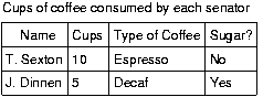 [D]
[D]
The next example associates the same header (TH) and data (TD )
cells as before, but this time uses the "scope" attribute rather than
"headers." "Scope" must have one of the following values: row, col,
rowgroup or colgroup. Scope specifies the set of data cells to be
associated with the current header cell. This method is particularly
useful for simple tables. It should be noted that the spoken rendering
of this table would be identical to that of the previous example. A
choice between the "headers" and "scope" attributes is dependent on
the complexity of the table. It does not affect the output so long as
the relationships between header and data cells are made clear in the
markup.
Example.
   <TABLE border="1"
          summary="This table charts ...">
      <CAPTION>Cups of coffee consumed by each senator</CAPTION>
      <TR>
           <TH scope="col">Name</TH>
           <TH scope="col">Cups</TH>
           <TH scope="col" abbr="Type">Type of Coffee</TH>
           <TH scope="col">Sugar?</TH>
     <TR>
           <TD>T. Sexton</TD>  <TD>10</TD>
           <TD>Espresso</TD>   <TD>No</TD>
     <TR>
           <TD>J. Dinnen</TD>  <TD>5</TD>
           <TD>Decaf</TD>       <TD>Yes</TD>
  </TABLE>
End example.
The following example shows how to create categories within a
table using the "axis" attribute.
Example.
   <TABLE border="1">
     <CAPTION>Travel Expense Report</CAPTION>
     <TR>
          <TH></TH>
          <TH id="header2" axis="expenses">Meals
          <TH id="header3" axis="expenses">Hotels
          <TH id="header4" axis="expenses">Transport
          <TD>subtotals</TD>
     <TR>
          <TH id="header6" axis="location">San Jose
          <TH> <TH> <TH> <TD>
     <TR>
         <TD id="header7" axis="date">25-Aug-97
         <TD headers="header6 header7 header2">37.74
         <TD headers="header6 header7 header3">112.00
         <TD headers="header6 header7 header4">45.00
         <TD>
     <TR>
         <TD id="header8" axis="date">26-Aug-97
         <TD headers="header6 header8 header2">27.28
         <TD headers="header6 header8 header3">112.00
         <TD headers="header6 header8 header4">45.00
         <TD>
     <TR>
         <TD>subtotals
         <TD>65.02
         <TD>224.00
         <TD>90.00
         <TD>379.02
     <TR>
         <TH id="header10" axis="location">Seattle
         <TH> <TH> <TH> <TD>
     <TR>
         <TD id="header11" axis="date">27-Aug-97
         <TD headers="header10 header11 header2">96.25
         <TD headers="header10 header11 header3">109.00
         <TD headers="header10 header11 header4">36.00
         <TD>
     <TR>
         <TD id="header12" axis="date">28-Aug-97
         <TD headers="header10 header12 header2">35.00
         <TD headers="header10 header12 header3">109.00
         <TD headers="header10 header12 header4">36.00
         <TD>
     <TR>
         <TD>subtotals
         <TD>131.25
         <TD>218.00
         <TD>72.00
         <TD>421.25
     <TR>
         <TH>Totals
         <TD>196.27
         <TD>442.00
         <TD>162.00
         <TD>800.27
   </TABLE>
End example.
This table lists travel expenses at two locations: San Jose and
Seattle, by date, and category (meals, hotels, and transport). The
following image shows how a visual user agent might render it.
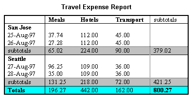 [D]
[D]
Checkpoints in this section:
5.3.
Authors should use style sheets for
layout and positioning. However, when it is necessary to use
a table for layout, the table must be accessible:
Checkpoints in this section:
10.3.
Tables were originally designed to create presentations of data. Table
markup is structural markup in that it defines the relationships between
headers and cells. Clever Web developers found that they could control
the layout of a page by using tables.
This misuse of tables is a source of problems for screen readers
that do not interpret the source HTML or browsers that do not allow
navigation of individual table cells. Screen readers will read across
the page, reading sentences on the same row from different columns as
one sentence.
For example, if a table is rendered like this on the screen:
There is a 30% chance of               Classes at the University of Wisconsin
rain showers this morning, but they    will resume on September 3rd.
should stop before the weekend.
This might be read by a screen reader as:
There is a 30% chance of Classes at the University of Wisconsin
rain showers this morning, but they will resume on September 3rd.
should stop before the weekend.
Screen readers that read the source HTML will recognize the
structure of each cell, but for older screen readers, content developers
should minimize the risk of word wrapping by limiting the amount of
text in each cell. Also, the longest chunks of text should all be
in the last column (rightmost for left-to-right tables). This way,
if they wrap, they will still be read coherently.
Note that is a problem for all tables, even those used correctly to
mark up data. This issue is being resolved by tools being created by
the WAI Evaluation and Repair Working Group ([WAI-ER]).
Until user agents and screen readers are able to handle text
presented side-by-side, all tables that lay out text in parallel,
word-wrapped columns require a linear text alternative (on the current
page or some other).
Content developers should test tables for wrapping with a browser window
dimension of "640x480".
Since table markup is structural, and we suggest separating structure
from presentation, we recommend using style sheets to create layout,
alignment, and presentation effects. Thus, the two columns in the
above example could have been created using style sheets. Please refer
to the section on style sheets for more information.
Quicktest! To get a better
understanding of how a screen reader would read a table, run a
piece of paper down the page and read your table line by line.
Rows of a TFOOT element will appear before the BODY of the document
in an HTML3.2 browser.
Checkpoints in this section:
13.1, and 13.6.
Users who are blind often jump from link to link when skimming a
page or looking for information. When they do this, only the text
of the link (the "link text") is read.
"Auditory users," people who are blind,
have difficulty seeing, or who are using
devices with small or no displays are unable to scan the
page quickly with their eyes. To get an overview of a page or to
quickly find a link, these users will often tab from one link
to the next or review a list of available links on a page. When links are not
descriptive enough, do not make sense when read out of context, or
are not unique, these users must stop to read the text
surrounding each link to identify it.
Avoid general link text, such as "click here." Not only is
this phrase
device-dependent (mouse-based) it says nothing about what is to be
found if the link if followed. Instead of "click here", link
text should indicate the nature of the link target, as in
"more information about sea lions" or "text-only version of
this page". Note that for the latter case (and other format-
or language-specific documents), content developers are encouraged
to use content negotiation
instead, so that users who prefer text versions will have
them served automatically.
In addition to clear link text, content developers may specify a
value of the "title" attribute that clearly and accurately describes
the target of the link.
If more than one
link on a page shares the same link text, all those links should
point to the same resource. Such consistency will help page
design as well as accessibility. If
two or more links refer to different targets but share
the same link text, HTML authors should distinguish the links
by specifying a different value for the
"title"
attribute of each A element.
However, there are times when the link text is the same, but
the links do not have the same destination. For example,
if a series of documents is provided in several formats, you do not
need to state the name of the document as well as the format in
every link. Instead include the name in the first link, then
only use the format type in the following links. When read in succession,
the user will hopefully be able to figure out the context due to the link
text. Use "title" as discussed above.
Example.
  <A href="my-doc.html">My document is available in HTML</A>,
  <A href="my-doc.pdf" title="My document in PDF">PDF</A>,
  <A href="my-doc.txt" title="My document in text">plain text</A>
End example.
When an image is used as the content of a link, specify a text equivalent for the image.
Example.
  <A href="routes.html">
     <IMG src="topo.html"
          alt="Current routes at Boulders Climbing Gym">
  </A>
End example.
When links are grouped into logical sets, such as in a navigation bar
(a set of links that appears on every page in a
site) they may be dealt with as a unit rather than as several pieces.
Navigation bars are usually the first thing someone encounters on a page.
For speech
users, this means taking the time to read through a number of links on every
page before reaching the unique content of a page. Therefore, grouping links
will allow a user with a user agent that can navigate by elements, to jump
over the group. This is similar to how people with vision skip reading
the links when they see the same set on each page. Since this type of
mechanism is not available today, providing a link that skips over the
links, or using a tabindex at a link just before the content begins
are strategies that work today. In the future, by grouping links,
user agents will be able to deal with them as a group.
In HTML, use the DIV, SPAN, P, or FRAME elements to group
links then identify the group with the "id"
or "class"
attributes. The following example uses P
to group the links,
"class" to identify it as a navigation bar,
"tabindex" on an anchor
following the group, and a link at the beginning of the group
that links to the anchor after the group (since not all user agents
support tabindex).
Example.
   <HEAD>
   <TITLE>How to use our site</TITLE>
   </HEAD>
   <BODY>
     <P class="nav">
       <A href="#how">[Bypass navigation bar</A>
       <A href="home.html">[Home]</A>
       <A href="search.html">[Search]</A>
       <A href="new.html">[New and highlighted]</A>
       <A href="sitemap.html">[Site map]</A>
     </P>
     <H1><A name="how" tabindex=1>How to use our site</A></H1>
   <!-- content of page -->
   </BODY>
End example.
In the following example, if the accesskey "C" is activated,"doc.html"
is retrieved by the browser:
Example.
This example uses "accesskey":
   <A accesskey="C" href="doc.html" hreflang="en"
      title="XYZ company home page">
         XYZ company home page</A>
End example.
Images include those that carry out simple animations (e.g., a "gif" image).
Checkpoints in this section:
1.1.
When using IMG, specify a short text equivalent with the "alt"
attribute. Note. The value of this attribute is
referred to as "alt-text".
Example.
<IMG src="magnifyingglass.gif" alt="Search">
End example.
When using OBJECT, specify a text
equivalent in the body of the OBJECT element:
Example.
   <OBJECT data="magnifyingglass.gif" type="image/gif">
      Search
   </OBJECT>
End example.
When a short text equivalent does not suffice to adequately convey
the function or role of an image, provide additional information in a
file designated by the "longdesc" attribute:
Example.
   <IMG src="97sales.gif" alt="Sales for 1997"
        longdesc="sales97.html">
In sales97.html:
A chart showing how sales in 1997 progressed. The
chart
is a bar-chart showing percentage increases in sales
by month. Sales in January were up 10% from December 1996,
sales in February dropped 3%, ..
End example.
For browsers that don't support "longdesc",
provide a description link as well next to the
graphic:
Example.
   <IMG src="97sales.gif" alt="Sales for 1997" longdesc="sales.html">
   <A href="sales.html" title="Description of 1997 sales figures">[D]</A>
End example.
Note. In the near future, a proxy ought to be able
to translate a "longdesc" into a d-link.
When using OBJECT, provide a text equivalent in the content of the
element:
Example.
   <OBJECT data="97sales.gif" type="image/gif">
          Sales in 1997 were down subsequent to our
          anticipated purchase ...
   </OBJECT>
End example.
Or, provide a link to additional information from within the body of the
element:
Example.
   <OBJECT data="97sales.gif" type="image/gif">
          Chart of our Sales in 1997.
          A <A href="desc.html">textual description</A> is available.
  </OBJECT>
End example.
An invisible d-link is a small
(1 pixel) or transparent image whose "alt"
attribute value is "D-link" or "D" and is part of the
content of an A element. Like
other d-links, it refers to a description of the associated image.
Invisible d-links provide a (temporary)
solution for designers who avoid d-links because
a "D" next to a graphic disrupts the visual presentation.
This practice has been deprecated in favor of using the
"longdesc" attribute.
Checkpoints in this section:
1.5, and 13.10.
Avoid ascii
art (character illustrations) and use real images instead since
it is easier to supply a text equivalent
for images. The priority of
this checkpoint depends on the importance of the information (e.g.,
an important chart).
However, if ascii art must be used provide a link to jump over the ASCII
art, as follows.
Example.
<P>
<a href="#post-art">skip over ASCII art</a>
<!-- ASCII art goes here -->
<a name="post-art">caption for ASCII art</a>
End example.
ASCII art may also be marked up as follows:
Example.
<P>
<OBJECT data="cow.txt" type="text/x-ascii-art" title="A WAI cow in ASCII art">
         (__)
         (oo)
  /-------\/
 / | WAI ||
*  ||----||
</OBJECT>
End example.
Another option is to use an ABBR element with "title".
Example.
<P><ABBR title="smiley in ascii art">:-)</ABBR>
End example.
If the ASCII art is complex, ensure that the text equivalent
adequately describes it.
Another way to replace ascii art is to use human language
substitutes. For example, <wink> might substitute for the
emoticon <SPAN title="wink smiley">;-)</SPAN>, the word"therefore" could replace arrows consisting of dashes and greater
than signs (e.g., -->), and the word "great" for the uncommon
abbreviation "gr8".
An image map is an image that has "active regions". When the
user selects one of the regions, some action takes place -- a link
may be followed, information sent to a server, etc. To make an
image map accessible, content developers must ensure that each action
associated with a visual region may be activated without a pointing
device.
Image maps are created with the MAP element.
HTML allows two types of image maps: client-side (the
user's browser processes a URI) and server-side (the server
processes click coordinates). For all image maps, content developers must
supply a text equivalent.
Content developers should create client-side image maps (with
"usemap") rather than server-side image
maps (with "ismap") because server-side
image maps require a specific input device. If server-side image maps
must be used (e.g., because the geometry of a region cannot be
represented with values of theshape
attribute), authors must provide the same functionality or information
in an alternative accessible format. One way to achieve this is to
provide a textual link for each active region so that each link is
navigable with the keyboard. If you must use a
server-side image map, please consult the section on server-side image maps
Checkpoints in this section:
9.1, 1.2,
and 10.5.
Provide
text equivalents for image maps since they convey visual information.
If AREA is used to create the map, use
the "alt" attribute:
Example.
   <IMG src="welcome.gif" alt="Image map of areas in the library"
        usemap="#map1">
   <MAP name="map1">
     <AREA shape="rect" coords="0,0,30,30"
           href="reference.html" alt="Reference">
     <AREA shape="rect" coords="34,34,100,100"
           href="media.html" alt="Audio visual lab">
   </MAP>
End example.
The following example illustrates the same idea, but uses OBJECT instead of IMG to insert the image to
provide more information about the image:
Example.
   <OBJECT data="welcome.gif" type="image/gif" usemap="#map1">
       There are several areas in the library including
       the <A href="reference.html">Reference</A> section and the
       <A href="media.html">Audio Visual Lab</A>.
   </OBJECT>
   <MAP name="map1">
     <AREA shape="rect" coords="0,0,30,30"
           href="reference.html" alt="Reference">
     <AREA shape="rect" coords="34,34,100,100"
           href="media.html" alt="Audio visual lab">
   </MAP>
End example.
In addition to providing a text equivalent, provide redundant
textual links. If the A element is used
instead of AREA, the content developer may describe the active regions
and provide redundant links at the same time:
Example.
   <OBJECT data="navbar1.gif" type="image/gif" usemap="#map1">
   <MAP name="map1">
     <P>Navigate the site.
     <A href="guide.html" shape="rect"
        coords="0,0,118,28">[Access Guide]</A>
     <A href="shortcut.html" shape="rect"
        coords="118,0,184,28">[Go]</A>
     <A href="search.html" shape="circle"
        coords="184.200,60">[Search]</A>
     <A href="top10.html" shape="poly"
        coords="276,0,373,28,50,50">[Top Ten]</A>
   </MAP>
   </OBJECT>
End example.
Note that in the previous example the MAP element is the content
of the OBJECT element so that the alternative links will only be
displayed if the image map (navbar1.gif) is not.
Note also that links have been separated by brackets ([]). This
is to prevent older screen readers from reading several adjacent links as
a single link as well as helps sighted users distinguish between
links visually.
Content developers should make
sure they include printable characters (such as brackets or a
vertical bar (|)) surrounded by spaces between adjacent
links.
Checkpoints in this section:
3.8.
When a server-side image map must be used, content developers should
provide an alternative list of image map choices. There are three
techniques:
- If an alternative list of links follows the image map, content developers
should indicate the existence and location of the alternative list.
If IMG is used to insert the image, provide this information in the "alt"
attribute.
Example.
    <A href="http://myserver.com/cgi-bin/imagemap/my-map">
    <IMG src="welcome.gif" alt="Links to this image map follow immediately"
        ismap>
    </A>

   <P><A href="reference.html">[Reference]</A>
      <A href="media.html">[Audio Visual Lab]</A>
End example.
- A newer solution, is to include the alternative links within
the body of an OBJECT element (refer to the previous
example illustrating links in the OBJECT
element).
- One final possibility is to create an
alternative page that is accessible.
Server-side and client-side image maps may be used as submit buttons in Forms.
For more information, refer to the section
Graphical buttons.
While applets may be included in a document with either the APPLET or OBJECT
element, OBJECT is the preferred method.
If OBJECT is used,
provide a text equivalent in the
content of the element:
Example.
  <OBJECT classid="java:Press.class" width="500" height="500">
        As temperature increases, the molecules in the balloon...
  </OBJECT>
End example.
A more complex example takes advantage of the fact the OBJECT
elements may be embedded to provide for alternative representations
of information:
Example.
  <OBJECT classid="java:Press.class" width="500" height="500">
     <OBJECT data="Pressure.mpeg" type="video/mpeg">
        <OBJECT data="Pressure.gif" type="image/gif">
           As temperature increases, the molecules in the balloon...
        </OBJECT>
     </OBJECT>
  </OBJECT>
End example.
If APPLET is used,
provide a text equivalent
with the "alt" attribute
and in the content in the APPLET element. This enables
the content to transform
gracefully for those user agents that only support one of the two
mechanisms ("alt" or content).
Deprecated example.
   <APPLET code="Press.class" width="500" height="500"
           alt="Java applet: how temperature affects pressure">
         As temperature increases, the molecules in the balloon...
   </APPLET>
Checkpoints in this section:
8.1
If an applet (created with either OBJECT
or APPLET) requires user interaction
(e.g., the ability to manipulate a physics experiment) that cannot be
duplicated in an alternative format, make the applet directly
accessible.
For more information about accessible applets, please refer
to [JAVAACCESS] and
[IBMJAVA].
Checkpoints in this section:
8.1 and 1.4.
- Provide a
text equivalent as for an image.
Audio and video should be accompanied by text
transcripts, textual equivalents of auditory
or visual events. When these transcripts are presented
synchronously with a video presentation they are called "captions"
and are used by people who cannot hear the audio track of the video
material. Full audio transcripts include spoken dialogue as well as
any other significant sounds including on-screen and off-screen
sounds, music, laughter, applause, etc. The following two examples
show captions, a text transcript, and auditory descriptions.
Example.
Captions for a scene from "E.T." The phone rings three times,
then is answered.
[phone rings]
[ring]
[ring]
Hello?"
End example.
Example.
Here's an example of a transcript of a clip from "The Lion King"
(available at [DVS]). Note that the Describer is
providing the auditory description of the video track and that the description
has been integrated into the transcript.
Simba: Yeah!
Describer: Simba races outside, followed by his parents. Sarabi
smiles and nudges Simba gently toward his father. The two sit
side-by-side, watching the golden sunrise.
Mufasa: Look Simba, everything the light touches is our
kingdom.
Simba: Wow.
End example.
Some media formats (e.g., QuickTime 3.0 and SMIL) allow captions
and video descriptions to be added to the multimedia clip.
SAMI allows captions to be added.
Until the format you are using supports alternative tracks, two
versions of the movie could be made available, one with captions and
descriptive video, and one without. Some technologies, such as SMIL
and SAMI, allow separate audio/visual files to be combined with text
files via a synchronization file to create captioned audio and movies.
Some technologies also allow the user to choose from multiple sets
of captions to match their reading skills. For more information see
the SMIL 1.0 ([SMIL]) specification.
Equivalents for sounds can be provided in the form of a text phrase
on the page that links to a text transcript or description of the
sound file. The link to the transcript should appear in a highly
visible location such as at the top of the page. However, if a script
is automatically loading a sound, it should also be able to
automatically load a visual indication that the sound is currently
being played and provide a description or transcript of the sound.
Note. Some controversy surrounds this technique
because the browser should load the visual form of the information
instead of the auditory form if the user preferences are set to do
so. However, strategies must also work with today's browsers.
For more information, please refer to [NCAM].
Checkpoints in this section:
1.3, and 7.3.
Video descriptions are used primarily by people who are blind to
follow the action and other non-auditory information in video
material. The description provides narration of the key visual
elements without interfering with the audio or dialogue of a movie.
Key visual elements include actions, settings, body language,
graphics, and displayed text.
For movies,
provide auditory descriptions that are synchronized with the original
audio. Refer to the section on audio
information for more information about multimedia formats.
Text transcripts, in conjunction with the full audio transcript
described above, allow access by people with both visual and hearing
disabilities. This also provides everyone with the ability to index
and search for information contained in audio/visual materials.
However, if necessary to include an applet that involves motion or
updates, content developers should provide a mechanism for freezing this motion
(for an example, refer to [TRACE]).
When necessary, a
text equivalent should be provided for visual
information to enable understanding of the page.
For example, a looping animation that shows cloud cover and precipitation for
the state of Wisconsin is included as part of a weather status report. Since
the animation is supplementing the rest of the weather report (that is presented
in natural language - text), a less verbose description of the
animation is necessary. However, if the animation appears in a pedagogical
setting where students are learning about cloud formations
in relation to land mass, then the animation ought to be described for those
who can not view the animation but who also want to learn the lesson.
See also the section on text style for
controlling blinking.
Other objects, such as those requiring
a plug-in, should also use the
OBJECT element. However, for backward compatibility with Netscape
browsers, use the proprietary EMBED element within the OBJECT element
as follows:
Example.
  <OBJECT classid="clsid:A12BCD3F-GH4I-56JK-xyz"
  codebase="http://site.com/content.cab" width=100 height=80>
  <PARAM name="Movie" value="moviename.swf">
      <EMBED src="moviename.swf" width=100 height=80
      pluginspage="http://www.macromedia.com/shockwave/download/">
      </EMBED>

      <NOEMBED>
          <IMG alt="Still from Movie"
                  src="moviename.gif" width=100 height=80>
      </NOEMBED>

  </OBJECT>
End example.
For more information refer to [MACROMEDIA].
For visually enabled users, frames may organize a page into
different zones. For non-visual users, relationships between the
content in frames (e.g., one frame has a table of contents, another
the contents themselves) must be conveyed through other means.
Frames as implemented today
(with the FRAMESET,
FRAME, and
IFRAME elements)
are problematic for several reasons:
- Without scripting, they tend to break the "previous page"
functionality offered by browsers.
- It is impossible to refer to the "current state" of
a frameset with a URI; once a frameset changes contents, the
original URI no longer applies.
- Opening a frame in a new browser window can disorient
or simply annoy users.
In the following sections, we discuss how to make frames more
accessible. We also provide an alternative
to frames that uses HTML 4.0 and CSS and addresses many
of the limitations of today's frame implementations.
Checkpoints in this section:
12.1.
Example.
Use the "title" attribute to name frames.
<!DOCTYPE HTML PUBLIC "-//W3C//DTD HTML 4.0 Frameset//EN">
<HTML>
<HEAD>
<TITLE>A simple frameset document</TITLE>
</HEAD>
<FRAMESET cols="10%, 90%"
          title="Our library of electronic documents">
    <FRAME src="nav.html" title="Navigation bar">
    <FRAME src="doc.html" title="Documents">
    <NOFRAMES>
       <A href="lib.html" title="Library link">
             Select to go to the electronic library</A>
    </NOFRAMES>
</FRAMESET>
End example.
Checkpoints in this section:
12.2.
Example.
<!DOCTYPE HTML PUBLIC "-//W3C//DTD HTML 4.0 Frameset//EN">
<HTML>
  <HEAD>
    <TITLE>Today's news</TITLE>
  </HEAD>

  <FRAMESET COLS="10%,*,10%">

  <FRAMESET ROWS="20%,*">
    <FRAME SRC="promo.html" NAME="promo" title="promotions">
    <FRAME SRC="sitenavbar.html" NAME="navbar"
       title="Sitewide navigation bar" longdesc="frameset-desc.html#navbar">
  </FRAMESET>

  <FRAME SRC="story.html" NAME="story" title="Selected story - main content"
     longdesc="frameset-desc.html#story">

  <FRAMESET ROWS="*,20%">
    <FRAME SRC="headlines.html" NAME="index" title="Index of other
      national headlines" longdesc="frameset-desc.html#headlines">
    <FRAME SRC="ad.html" NAME="adspace" title="Advertising">
  </FRAMESET>

  <NOFRAMES>
    <p><a href="noframes.html">No frames version</a></p>
    <p><a href="frameset-desc.html">Descriptions of frames.</a></p>
  </NOFRAMES>

  </FRAMESET>
</HTML>
frameset-desc.html might say something like:
#Navbar - this frame provides links to the major
          sections of the site:  World News, National News,
          Local News, Technological News,
          and Entertainment News.

#Story  - this frame displays the currently selected story.

#Index  - this frame provides links to the day's
          headline stories within this section.
End example.
Note that if the a frame's contents change, the
text equivalent will no longer apply. Also, links to a frame's
longdesc ("d-links") ought to be provided with other alternative contents
in the NOFRAMES element of a FRAMESET.
Example.
In this example, if the user reads "top.html":
<!DOCTYPE HTML PUBLIC "-//W3C//DTD HTML 4.0 Frameset//EN">
<HTML>
<HEAD>
<TITLE>This is top.html</TITLE>
</HEAD>
<FRAMESET cols="50%, 50%" title="Our big document">
    <FRAME src="main.html" title="Where the content is displayed">
    <FRAME src="table_of_contents.html" title="Table of Contents">
    <NOFRAMES>
        <A href="table_of_contents.html">Table of Contents.</A>
     <!-- other navigational links that are available in main.html
          are available here also. -->
    </NOFRAMES>
</FRAMESET>
</HTML>
and the user agent is not displaying frames, the user will have
access (via a link) to a non-frames version of the same
information.
End example.
Checkpoints in this section:
6.2.
Content developers must provide text equivalents
of frames so that their
contents and the relationships between frames make sense. Note that
as the contents of a frame change, so must change any description.
This is not possible if an IMG is inserted directly into a frame,
as in this deprecated example:
Deprecated example.
<!DOCTYPE HTML PUBLIC "-//W3C//DTD HTML 4.0 Frameset//EN">
<HTML>
<HEAD>
<TITLE>A bad frameset document</TITLE>
</HEAD>
<FRAMESET cols="100%" title="Static frameset">
   <FRAME name="badframe"
          src="apples.gif" title="Apples">
</FRAMESET>
</HTML>
Note that if, for example, a link causes a new image to be
inserted into the frame:
  <P>Visit a beautiful grove of
  <A target="badframe" href="oranges.gif" title="Oranges">oranges</A>
the initial title of the frame ("Apples") will no longer match
the current content of the frame ("Oranges").
To solve this problem,
content developers should always make the source ("src") of a frame an HTML
file. Images may be inserted into the HTML file and their
text alternatives will evolve correctly.
Example.
<!DOCTYPE HTML PUBLIC "-//W3C//DTD HTML 4.0 Frameset//EN">
<HTML>
<HEAD>
<TITLE>A correct frameset document</TITLE>
</HEAD>
<FRAMESET cols="100%" title="Evolving frameset">
<FRAME name="goodframe" src="apples.html" title="Apples">
</FRAMESET>
</HTML>
   <!-- In apples.html -->
   <P><IMG src="apples.gif" alt="Apples">
End example.
Checkpoints in this section:
10.1.
Content developers
should avoid specifying a new window as the target of a frame with
target="_blank".
One of the most common uses of frames is to split the
user's browser window into two parts: a navigation window
and a content window. As an alternative to frames, we
encourage you to try the following:
- Create one document for the navigation mechanism (call it
"nav.html"). A separate document means that the navigation
mechanism may be shared by more than one document.
- In each document requiring the navigation mechanism,
include it at the bottom of the document with the following
(or similar) OBJECT markup:
Example.
<P>
<OBJECT data="nav.html">
Go to the <A href="nav.html">table of contents</A>
</OBJECT>
Putting the navigation mechanism at the end of the
document means that when style sheets are turned off,
users have access to the document's important information first.
- Use style sheets to position the navigation mechanism
where you want on the screen.
For example, the following CSS rule floats
the navigation bar to the left of the page and makes it take
up 25% of the available horizontal space:
OBJECT { float: left; width: 25% }
The following CSS rule attaches the navigation
mechanism to the bottom-left corner of the page of the page
and keeps it there even if the user scrolls down the page:
OBJECT { position: fixed; left: 0; bottom: 0 }
Note. Navigation mechanisms or other
content may be inserted in a document by means of
server-side includes.
This section discusses the accessibility of forms and form controls
that one can put in a FORM element.
Checkpoints in this section:
9.4 and 9.5.
Refer to the section on keyboard access for more information.
Content developers should group
information where natural and appropriate. When form controls can
be grouped into logical units, use the FIELDSET element and label
those units with the LEGEND element:
Example.
<FORM action="http://somesite.com/adduser" method="post">
   <FIELDSET>
   <LEGEND>Personal information</LEGEND>
   <LABEL for="firstname">First name: </LABEL>
   <INPUT type="text" id="firstname" tabindex="1">
   <LABEL for="lastname">Last name: </LABEL>
   <INPUT type="text" id="lastname" tabindex="2">
   ...more personal information...
   </FIELDSET>
   <FIELDSET>
   <LEGEND>Medical History</LEGEND>
   ...medical history information...
   </FIELDSET>
</FORM>
End example.
Checkpoints in this section:
12.4 and 10.2.
An example of LABEL used with
"for" in HTML
4.0 is given in the previous section.
Content developers should group
information where natural and appropriate. For long lists of menu
selections (which may be difficult to track), content developers should
group SELECT
items (defined by OPTION)
into a hierarchy using the OPTGROUP
element. Specifies a label for the group of options
with the label attribute on OPTGROUP.
Example.
<FORM action="http://somesite.com/prog/someprog" method="post">
 <P>
 <SELECT name="ComOS">
     <OPTGROUP label="PortMaster 3">
       <OPTION label="3.7.1" value="pm3_3.7.1">PortMaster 3 with ComOS 3.7.1
       <OPTION label="3.7" value="pm3_3.7">PortMaster 3 with ComOS 3.7
       <OPTION label="3.5" value="pm3_3.5">PortMaster 3 with ComOS 3.5
     </OPTGROUP>
     <OPTGROUP label="PortMaster 2">
       <OPTION label="3.7" value="pm2_3.7">PortMaster 2 with ComOS 3.7
       <OPTION label="3.5" value="pm2_3.5">PortMaster 2 with ComOS 3.5
     </OPTGROUP>
     <OPTGROUP label="IRX">
       <OPTION label="3.7R" value="IRX_3.7R">IRX with ComOS 3.7R
       <OPTION label="3.5R" value="IRX_3.5R">IRX with ComOS 3.5R
     </OPTGROUP>
 </SELECT>
</FORM>
End example.
This example assigns "U" as the accesskey (via "accesskey"). Typing "U" gives focus to the label,
which in turn gives focus to the input control, so that the user can
input text.
Example.
   <FORM action="submit" method="post">
   <P>
         <LABEL for="user" accesskey="U">name</LABEL>
         <INPUT type="text" id="user">
   </FORM>
End example.
In the next example, we specify a tabbing order among elements (in
order, "field2", "field1", "submit") with "tabindex":
Example.
   <FORM action="submit" method="post">
   <P>
   <INPUT tabindex="2" type="text" name="field1">
   <INPUT tabindex="1" type="text" name="field2">
   <INPUT tabindex="3" type="submit" name="submit">
   </FORM>
End example.
Using images to decorate buttons allows developers to make their
forms unique and easier to understand. Using an image for a button
(e.g., with the INPUT element or BUTTON) is not inherently inaccessible -
assuming a text equivalent is provided for the image.
However, a graphical form submit button created with INPUT, type="image" creates a type of server-side
image map. Whenever the button is clicked with a mouse, the x and y
coordinates of the mouse click are sent to the server as part of the
form request. An example is a bird button. When the user clicks on
the tail, information about the tail is sent from the server and
displayed in a text area following the bird button.
In the Image and Image Maps
section we discuss why server-side images
ought to be avoided, and suggest using client-side image maps instead.
In HTML4, graphical buttons may now be client-side image maps. To preserve
the functionality provided by the server, authors have the following
options, as stated in the HTML4 Recommendations [HTML40]
:
If the server takes different actions depending on the location
clicked, users of non-graphical browsers will be disadvantaged.
For this reason, authors should consider alternate approaches:
- Use multiple submit buttons (each with its own image) in place
of a single graphical submit button. Authors may use style
sheets to control the positioning of these buttons.
- Use a client-side image map together with scripting.
Checkpoints in this section:
10.4 and 3.8.
Example.
Some legacy assistive technologies require initial text
in form controls such as TEXTAREA
in order to function properly.
<FORM action="http://somesite.com/prog/text-read" method="post">
     <P>
     <TEXTAREA name=yourname rows="20" cols="80">
     Please enter your name here.
     </TEXTAREA>
     <INPUT type="submit" value="Send"><INPUT type="reset">
     </P>
</FORM>
End example.
Provide a
text equivalent
for images used as "submit" buttons:
Example.
<FORM action="http://somesite.com/prog/text-read" method="post">
<P>
<INPUT type="image" name=submit src="button.gif" alt="Submit">
</FORM>
End example.
Also refer to the section on keyboard access
since this applies to form controls.
The BUTTON element does not appear and <INPUT type="button">
will appear as a text input field in HTML3.2 browsers.
This section discusses the accessibility of scripts
included in a document via tha SCRIPT
element.
Checkpoints in this section:
6.3.
Content developers must ensure that pages are accessible with scripts
turned off or in browsers that don't support scripts.
Avoid creating content on the fly on the client.
If a user is not running
scripts, then no content will be displayed since their browser will not
be able to generate it. However, this is different than displaying
or hiding content by using a combination of style sheets and scripting - since
the content exists it is just shown or hidden based on user action. If there
is no script, then the content is always shown. This also does not rule out
generating pages on the fly on the server-side then passing to the user agent.
Avoid creating links that use "javascript" as the URI. If
a user is not using scripts, then they won't be able to link since the
browser can't create the link content.
Example. This is a dead-end link for a user agent where scripts
are not supported or not loaded.
<A href="javascript:">...</A>
Checkpoints in this section:
9.3 and 6.4.
An event handler is a script that is invoked when a certain event
occurs (e.g, the mouse moves, a key is pressed, the document is
loaded, etc.). In HTML 4.0, event handlers are attached to elements
via event handler attributes
(the attributes beginning with "on", as in "onkeyup").
Some event handlers, when invoked, produce purely decorative
effects such as highlighting an image or changing the color of an
element's text. Other event handlers produce much more substantial
effects, such as carrying out a calculation, providing important
information to the user, or submitting a form. For event handlers that
do more than just change the presentation of an element, content developers
should do the following:
- Use application-level event triggers rather than
user interaction-level triggers. In HTML 4.0, application-level
event attributes are "onfocus", "onblur" (the opposite of "onfocus"),
and "onselect". Note that these attributes are designed to be
device-independent, but are implemented as keyboard specific events
in current browsers.
- Otherwise, if you must use device-dependent attributes,
provide redundant input mechanisms (i.e., specify two
handlers for the same element):
- Use "onmousedown" with "onkeydown".
- Use "onmouseup" with "onkeyup"
- Use "onclick" with "onkeypress"
Note that there is no keyboard equivalent to double-clicking
("ondblclick") in HTML 4.0.
- Do not write event handlers that rely on mouse
coordinates since this prevents device-independent input.
One way to accomplish this is with the
NOSCRIPT element. The content of this
element is rendered with scripts are not enabled.
Example.
<SCRIPT type="text/tcl">
 ...some Tcl script to show a billboard of sports scores...
</SCRIPT>
<NOSCRIPT>
   <P>Results from yesterday's games:</P>
   <DL>
      <DT>Bulls 91,  Sonics 80.
      <DD><A href="bullsonic.html">Bulls vs. Sonics game highlights</A>
      ...more scores...
   </DL>
</NOSCRIPT>
End example.
Checkpoints in this section:
3.3.
The following sections list some techniques for using CSS to design
accessible documents and some techniques for writing effective style
sheets. In HTML, style sheets may be specified externally via the
LINK element, in the document head via the
STYLE element, or for a specific element
via the style attribute.
CSS1 ([[CSS1]) and CSS2 ([[CSS2]) allow content developers to duplicate
most HTML 4.0 presentation capabilities and offer more power with less
cost. However, until most users have browsers that support style
sheets, not every presentation idiom may be expressed
satisfactorily with style sheets. We
also provide examples of how to use HTML 4.0 features (e.g.,
tables, bitmap text) more accessibly when they must be used.
See also the section on text markup.
Checkpoints in this section:
6.1 and 3.4.
Here are guidelines for creating style sheets that
promote accessibility:
- Use a minimal number of style sheet for your site
- If you have more than one, use the same "class" name for the same
concept in all of the style sheets.
- Use linked style sheets rather than embedded styles, and avoid
inline style sheets.
- Content developers should not write "!important" rules. Users should
where necessary.
- Use the "em" unit to set font sizes.
- Use relative length units and percentages. CSS allows you to
use relative units even in absolute positioning.
Thus, you may position an image to be offset by "3em" from
the top of its containing element. This is a fixed distance,
but is relative to the current font size, so it scales
nicely.
- Only use absolute length units when the physical characteristics of
the output medium are known.
- Always specify a fallback generic font.
- Use numbers, not names, for colors.
- Be sure to validate
that your pages are still readable
without style sheets.
Some examples follow.
Example.
Use em to set font sizes, as in:
H1 { font-size: 2em }
rather than:
H1 { font-size: 12pt }
End example.
Example.
Use relative length units and percentages.
BODY { margin-left: 15%; margin-right: 10%}
End example.
Example.
Only use absolute length units when the physical characteristics of
the output medium are known.
.businesscard { font-size: 8pt }
End example.
Example.
Always specify a fallback generic font:
BODY { font-family: "Gill Sans", sans-serif }
End example.
Example.
Use numbers, not names, for colors:
   H1 {color: #808000}
   H1 {color: rgb(50%,50%,0%)}
End example.
Instead of using deprecated presentation
elements and attributes , use the many CSS properties to control
font characteristics: 'font-family', 'font-size',
'font-size-adjust', 'font-stretch', 'font-style', 'font-variant',
and 'font-weight'.
The following CSS2 properties can be used to control
font information: 'font', 'font-family', 'font-size', 'font-size-adjust',
'font-stretch', 'font-style', 'font-variant', and 'font-weight'.
Use them instead of the following deprecated font elements and
attributes in HTML: FONT,
BASEFONT, "face", and "size".
If you must use HTML elements to control font information, use
BIG and SMALL, which are not deprecated.
Example.
<STYLE type="text/css">
   P.important { font-weight: bold }
   P.less-important { font-weight: lighter; font-size: smaller }
   H2.subsection { font-family: Helvetica, sans-serif }
</STYLE>
End example.
Checkpoints in this section:
7.2.
The following CSS2 properties can be used to style text:
- Case: 'text-transform' (for uppercase, lowercase, and
capitalization).
- Shadow effects: 'text-shadow'
- Underlines, overlinks, blinking: 'text-decoration'.
Note. If blinking content (e.g., a headline
that appears and disappears at regular intervals) is used,
provide a mechanism for stopping the blinking. In CSS,
'text-decoration: blink' will cause content to blink and will
allow users to stop the effect by turning off style sheets
or overriding the rule in a user style sheet.
Do not use the BLINK and MARQUEE
elements. These elements are not part of any W3C specification for
HTML (i.e., they are non-standard elements).
Content developers should use style sheets to style
text rather than representing text in images. Using
text instead of images means that the information will be
available to a greater number of users (with speech synthesizers,
braille displays, graphical displays, etc.). Using style sheets
will also allow users to override author styles and change colors
or fonts sizes more easily.
If it is necessary to use a
bitmap to create a text effect
(special font, transformation, shadows, etc.) the
bitmap must be accessible (see the sections on
text equivalents and alternative
pages).
Example.
In this example, the inserted image shows the large red
characters "Example", and is captured by the value of the
"alt" attribute.
<P>This is an
   <IMG src="BigRedExample.gif" alt="Example in big red characters">
   of what we mean.
</P>
End example.
The following CSS2 properties can be used to control
the formatting and position of text:
- Indentation: 'text-indent'.
Do not use the BLOCKQUOTE or any other structural element to indent
text.
- Letter/word spacing: 'letter-spacing', 'word-spacing'.
For example instead of writing "H E L L O" (which
users generally recognize as the word "hello" but would hear as individual
letters), authors may create the same visual effect with the
'word-spacing' property applied to "HELLO".
Text without spaces will be transformed
more effectively to speech.
- White space: 'white-space'. This property controls
the white space processing of an element's content.
- Text direction: 'direction', 'unicode-bidi'.
- The :first-letter and :first-line pseudo-elements
allow authors to refer to the first letter or line of
a paragraph of text.
The following example shows how to use style sheets
to create a drop-cap effect.
Example.
<HEAD>
<TITLE>Drop caps</TITLE>
<STYLE type="text/css">
      .dropcap { font-size : 120%; font-family : Helvetica }
</STYLE>
</HEAD>
<BODY>
<P><SPAN class="dropcap">O</SPAN>nce upon a time...
</BODY>
Note. As of the writing of this document, the
CSS pseudo-element ':first-letter', which allows content developers to refer
to the first letter of a chunk of text, is not widely
supported.
Checkpoints in this section:
2.1 and 2.2.
Use these CSS properties to specify colors:
- 'color', for foreground text color.
- 'background-color', for background colors.
- 'border-color', 'outline-color' for border colors.
- For link colors, refer to the :link, :visited, and :active
pseudo-classes.
Ensure that information is not conveyed through color alone. For
example, when asking for input from users, do not write "Please select
an item from those listed in green." Instead, ensure that
information is available through other style effects (e.g.,
a font effect) and through context (e.g,. comprehensive
text links).
For instance, in this document, examples are styled by default
(through style sheets) as follows:
- They are surrounded by a border.
- They use a different background color.
- They begin with the word "Example" (or "Deprecated
Example".
- They also end with the phrase "End example", but that
phrase is hidden by default with 'display: none'. For
user agents that don't support style sheets or when
style sheets are turned off, this text helps delineate
the end of an example for readers who may not be
able to see the border around the example.
Quicktest! To test whether your
document still works without colors, examine it with a monochrome
monitor or browser colors turned off. Also, try setting up a color
scheme in your browser that only uses black, white, and the four
browser-safe greys and see how your page holds up.
Quicktest! To test whether color
contrast is sufficient to be read by people with color deficiencies or
by those with low resolution monitors, print pages on a black and
white printer (with backgrounds and colors appearing in
grayscale). Also try taking the printout and copying it for two or
three generations to see how it degrades. This will show you where you
need to add redundant cues (example: hyperlinks are usually underlined
on Web pages), or whether the cues are two small or indistinct to hold
up well.
For more information about colors and contrasts, refer
to [LIGHTHOUSE].
Checkpoints in this section: ??
Layout, positioning, layering, and alignment should be done through style
sheets (notably by using CSS floats and absolute positioning):
- 'text-indent', 'text-align', 'word-spacing', 'font-stretch'. Each
of these properties allows users to control spacing without adding additional
spaces. Use 'text-align: center' instead of the deprecated
CENTER element.
- 'margin', 'margin-top', 'margin-right', 'margin-bottom',
'margin-left'. With these properties, authors can create space
on four sides of an element's content instead of adding
non-breaking spaces ( ),
which are non-standard mark-up, to create space around an element.
- 'float', 'position', 'top', 'right', 'bottom',
'left'. With these properties, the user can
control the visual position of almost any element in a manner
independent of where the element appears in the document. Authors
should always design documents that make sense
without style sheets (i.e., the document should
be written in a "logical" order)
and then apply style sheets to achieve visual effects.
The positioning properties may be used to create
margin notes (which may be automatically numbered), side bars,
frame-like effects, simple headers and footers, and more.
- The 'empty-cells' property allows users to leave
table cells empty and still give them proper borders on the
screen or on paper. A data cell that is meant to be empty should
not be filled with white space or a non-breaking space
just to achieve a visual effect.
Provide text equivalents for all
images, including invisible or transparent images.
If content developers cannot use style sheets and must use invisible or
transparent images (e.g., with IMG)
to lay out images on the page, they should
specify alt="" for them.
Deprecated example.
In this example, an image is used to create a carefully defined
space between words or graphics. Using only spaces for
the value of "alt"
prevents the words from running together when the image is not
loaded:
my poem requires a big space<IMG src="10pttab.gif" alt=" ">here
In this next example, an image is used to force a graphic to
appear in a certain position:
   <IMG src="spacer.gif" alt="spacer">
   <IMG src="colorfulwheel.gif" alt="The wheel of fortune">
End example.
Rules and borders may convey the notion of "separation" to
visually enabled users but that meaning cannot be inferred out of a
visual context.
Use these CSS properties to specify border styles:
- 'border', 'border-width', 'border-style', 'border-color'.
- 'border-spacing' and 'border-collapse' for tables.
- 'outline, 'outline-color', 'outline-style', and 'outline-width'
for dynamic outlines.
Authors should use style sheets to create rules and borders.
Example.
In this example, the H1
element will have a top border
that is 2px thick, red, and separated from the content
by 1em:
   <HEAD>
   <TITLE>Redline with style sheets</TITLE>
   <STYLE type="text/css">
        H1 { padding-top: 1em; border-top: 2px red }
   </STYLE>
   </HEAD>
   <BODY>
   <H1>Chapter 8 - Auditory and Tactile Displays</H1>
   </BODY>
End example.
If a rule (e.g., the HR element)
is used to indicate
structure, be sure to indicate the structure in a non-visual way as
well. (e.g., by using structural markup).
Example.
In this example, the DIV element is used to create
a navigation bar, which includes a horizontal separator.
   <DIV class="navigation-bar">
      <HR>
      <A rel="Next" href="next.html">[Next page]</A>
      <A rel="Previous" href="previous.html">[Prevous page]</A>
      <A rel="First" href="first.html">[First page]</A>
   </DIV>
End example.
Under construction.
This index lists each checkpoint and the sections in this document
where it is discussed.
Guideline 1:
- 1.1 Provide a text equivalent for every non-text element (e.g., via "alt", "longdesc", or in element content). This includes: images, graphical representations of text (including symbols), image map regions, animations (e.g., animated GIFs), applets and programmatic objects, ascii art, frames, scripts, images used as list bullets, spacers, graphical buttons, sounds (played with or without user interaction), stand-alone audio files, synthesized speech, audio tracks of video, and video.
- Refer to 3.2 Text equivalents and
- 4.7.1 Text equivalents for images
- 1.2 Provide redundant text links for each active region of an image map. [Priority 1 - if server-side image maps are used, Priority 2 - if client-side image maps are used. Redundant text links for client-side image maps are only required until user agents render text equivalents for the map links.]
- Refer to 3.2 Text equivalents and
- 4.7.6 Client-side image maps
- 1.3 For each movie, provide an auditory description of the video track and synchronize it with the audio track.
- Refer to 4.9.2 Visual information and motion
- 1.4 For any time-based presentation (e.g., a movie, animation, or multimedia presentation), synchronize equivalent alternatives (e.g., captions or video descriptions) with the presentation.
- Refer to 4.8.3 Audio and Video produced by dynamic objects
- 1.5 Replace ASCII art with an image or explain it. [Priority 1 or Priority 2 depending on the importance of the information.]
- Refer to 3.2 Text equivalents and
- 4.7.3 Ascii art
Guideline 2:
- 2.1 Ensure that all information conveyed with color is also available without color, for example from context or markup.
- Refer to 5.5 Colors
- 2.2 Ensure that foreground and background color combinations provide sufficient contrast when viewed by someone having color deficits or when viewed on a black and white screen. [Priority 2 for images, Priority 3 for text].
- Refer to 5.5 Colors
Guideline 3:
- 3.1 When an appropriate markup language exists, use markup rather than images to convey information.
- Refer to 4.3.5 Text markup rather than images
- 3.2 Create documents that validate to published formal grammars.
- Refer to 4.1 Document structure and metadata
- 3.3 Use style sheets to control layout and presentation.
- Refer to 3.2 Text equivalents and
- 5 CSS Techniques
- 3.4 Use relative rather than absolute units in markup language attribute values and style sheet property values.
- Refer to 5.1 Guidelines for creating style sheets
- 3.5 Use header elements to convey logical structure and use them according to specification.
- Refer to 4.1.2 Section headers
- 3.6 Mark up lists and list items properly.
- Refer to 4.4 Lists
- 3.7 Mark up quotations. Do not use quotation markup for formatting effects such as indentation.
- Refer to 4.3.3 Quotations
- 3.8 Provide individual button controls in a form rather than simulating a set of buttons with an image map.
- Refer to 3.2 Text equivalents and
- 4.7.7 Server-side image maps and
- 4.11.7 Techniques for specific controls
Guideline 4:
- 4.1 Clearly identify changes in the natural language of a document's text and any text equivalents (e.g., captions) of non-text content.
- Refer to 4.2 Language information
- 4.2 Specify the expansion of abbreviations and acronyms. [Priority 2 for the first occurrence of the acronym or abbreviation in a given document, Priority 3 thereafter.]
- Refer to 4.3.2 Acronyms and abbreviations
- 4.3 Identify the primary natural language of a document.
- Refer to 4.2 Language information
Guideline 5:
- 5.1 For data tables, identify row and column headers.
- Refer to 4.5 Tables
- 5.2 For data tables that have two or more logical levels of row or column headers, use markup to associate data cells and header cells.
- Refer to 4.5 Tables
- 5.3 Avoid using tables for layout.
- Refer to 4.5.1 Avoid tables for layout
- 5.4 If a table is used for layout, do not use any structural markup for the purpose of visual formatting.
- Refer to 4.5 Tables
- 5.5 Provide summaries for tables.
- Refer to 4.5 Tables
- 5.6 Provide abbreviations for header labels.
- Refer to 4.5 Tables
Guideline 6:
- 6.1 Organize documents so they may be read without style sheets. For example, when an HTML document is rendered without associated style sheets, it must still be possible to read the document.
- Refer to 5.1 Guidelines for creating style sheets
- 6.2 Ensure that descriptions and text equivalents for dynamic content are updated when the dynamic content changes.
- Refer to 4.10.4 Always make the source of a frame an HTML document
- 6.3 Ensure that pages are usable when scripts, applets, or other programmatic objects are turned off or not supported. If this is not possible, provide equivalent mechanisms on an alternative accessible page.
- Refer to 4.12.1 Graceful transformation of scripts
- 6.4 For scripts and applets, until user agents provide device-independent means to activate event handlers, ensure that event handlers are keyboard operable.
- Refer to 4.12.2 Device-independent event handlers
- 6.5 Provide an alternative presentation or page when the primary content is dynamic (e.g., when frame contents change, when scripts cause changes, etc.).
- Refer to 3.3 Alternative pages
Guideline 7:
- 7.1 Until user agents allow users to control it, avoid causing the screen to flicker.
- Refer to 3.9 Other topics
- 7.2 Until user agents allow users to control it, avoid causing content to blink (i.e., change presentation at a regular rate, such as turning on and off).
- Refer to 5.3 Text style
- 7.3 Until user agents allow users to freeze moving content, avoid movement in pages.
- Refer to 4.9.2 Visual information and motion
- 7.4 Until user agents provide the ability to stop the refresh, do not create periodically auto-refreshing pages.
- Refer to 3.8 Automatic page refresh
- 7.5 Until user agents provide the ability to stop auto-redirect, do not use markup to redirect pages automatically. Instead, configure the server to perform redirects.
- Refer to 3.8 Automatic page refresh
Guideline 8:
- 8.1 Make programmatic elements such as scripts and applets directly accessible or compatible with assistive technologies [Priority 1 if functionality is important and not presented elsewhere, otherwise Priority 2.]
- Refer to 4.8.2 Directly accessible applets and
- 4.8.3 Audio and Video produced by dynamic objects
Guideline 9:
- 9.1 Provide client-side image maps instead of server-side image maps except where the regions cannot be defined with an available geometric shape.
- Refer to 4.7.6 Client-side image maps
- 9.2 Ensure that all elements that have their own interface are keyboard operable.
- Refer to 3.4 Keyboard access
- 9.3 For scripts, specify logical event handlers rather than device-dependent event handlers.
- Refer to 4.12.2 Device-independent event handlers
- 9.4 Create a logical tab order through links, form controls, and objects.
- Refer to 4.11.1 Make controls keyboard accessible
- 9.5 Provide keyboard shortcuts to important links (including those in client-side image maps), form controls, and groups of form controls.
- Refer to 4.11.1 Make controls keyboard accessible
Guideline 10:
- 10.1 Until user agents allow users to turn off spawned windows, do not cause pop-ups or other windows to appear and do not change the current window without informing the user.
- Refer to 4.10.5 Avoid opening a new window as the target of a frame
- 10.2 For all form controls with implicitly associated labels, ensure that the label is properly positioned.
- Refer to 4.11.3 Label form controls explicitly
- 10.3 Until user agents or assistive technologies render side-by-side text correctly, provide a linear text alternative (on the current page or some other) for all tables that lay out text in parallel, word-wrapped columns.
- Refer to 4.5.2 Wrapped text in tables
- 10.4 Until user agents handle empty controls correctly, include default, place-holding characters in edit boxes and text areas.
- Refer to 4.11.7 Techniques for specific controls
- 10.5 Until user agents or assistive technologies render adjacent links distinctly, include non-link, printable characters (surrounded by spaces) between adjacent links.
- Refer to 4.7.6 Client-side image maps
Guideline 11:
- 11.1 Use W3C technologies and use the latest versions when they are supported.
- Refer to 3.11 Browser Support
- 11.2 Avoid deprecated features of W3C technologies.
- Refer to
- 11.3 Provide information so that users may receive documents according to their preferences (e.g., language, content type, etc.)
- Refer to 3.7 Content negotiation
- 11.4 If, after best efforts, you cannot create an accessible page, provide a link to an alternative page that uses W3C technologies, is accessible, has equivalent information, and is updated as often as the inaccessible (original) page.
- Refer to 3.3 Alternative pages
Guideline 12:
- 12.1 Title each frame to facilitate frame identification and navigation.
- Refer to 3.2 Text equivalents and
- 4.10.1 Title frames for easy orientation
- 12.2 Describe the purpose of frames and how frames relate to each other if it is not obvious by frame titles alone.
- Refer to 3.2 Text equivalents and
- 4.10.2 Text equivalents for frames
- 12.3 Divide large blocks of information into more manageable groups where natural and appropriate.
- Refer to 3.6 Comprehension
- 12.4 Associate labels explicitly with their controls.
- Refer to 4.11.3 Label form controls explicitly
Guideline 13:
- 13.1 Clearly identify the target of each link.
- Refer to 4.6 Links
- 13.2 Provide metadata to add semantic information to pages and sites.
- Refer to 3.5 Navigation
- 13.3 Provide information about the general layout of a site (e.g., a site map, or table of contents).
- Refer to 3.5 Navigation
- 13.4 Use navigation mechanisms in a consistent manner.
- Refer to 3.5 Navigation
- 13.5 Provide navigation bars to highlight and give access to the navigation mechanism.
- Refer to 3.5 Navigation
- 13.6 Group related links, identify the group (for user agents), and, until user agents do so, provide a way to bypass the group.
- Refer to 4.6 Links
- 13.7 Enable different types of searches for different skill levels and preferences.
- Refer to 3.5 Navigation
- 13.8 Place distinguishing information at the beginning of headings, paragraphs, lists, etc.
- Refer to 3.5 Navigation
- 13.9 Provide information about document collections (i.e., documents comprising multiple pages.).
- Refer to 3.9 Other topics
- 13.10 Provide a means to skip over multi-line ASCII art.
- Refer to 3.2 Text equivalents and
- 4.7.3 Ascii art
Guideline 14:
- 14.1 Use the clearest and simplest language appropriate for a site's content.
- Refer to 3.6 Comprehension
- 14.2 Provide visual or auditory equivalents to text where they facilitate comprehension of the page.
- Refer to 3.6 Comprehension
- 14.3 Create a style of presentation that is consistent across pages.
- Refer to 3.5 Navigation
Checkpoints in this section:
11.2.
Linear version of HTML 4.0
element index.
This index lists all elements in HTML 4.0. The first column of this
table links to the definition of the element in the HTML 4.0
specification ([HTML40]). Elements that are
deprecated in HTML 4.0 are followed by an asterisk (*). Elements that
are obsolete in HTML 4.0 or don't exist in a W3C specification of HTML
(2.0, 3.2, 4.0) do not appear in this table.
The second column indicates other W3C specifications for HTML that
included each element. The third column indicates the element's role.
The last column lists the sections in the current document where
the element is discussed. An entry of "N/A" means that the element is
not discussed in this document.
| Element name |
Defined in |
Role |
Techniques |
| A |
2.0, 3.2 |
Structure |
4.6 Links, 4.7.2 Invisible d-links, 4.7.6 Client-side image maps |
| ABBR |
|
Structure |
4.3.2 Acronyms and abbreviations, 4.7.3 Ascii art |
| ACRONYM |
|
Structure |
4.3.2 Acronyms and abbreviations, 4.3.3 Quotations |
| ADDRESS |
2.0, 3.2 |
Metadata |
4.1.1 Metadata |
| APPLET* |
3.2 |
Replaced |
4.8 Applets and other programmatic objects, 4.8.1 Text equivalents for applets and programmatic objects, 4.8.2 Directly accessible applets |
| AREA |
3.2 |
Structure |
4.7.6 Client-side image maps |
| B |
2.0, 3.2 |
Presentation |
4.3.1 Emphasis |
| BASE |
2.0, 3.2 |
Processing |
N/A |
| BASEFONT* |
3.2 |
Presentation |
5.2 Fonts |
| BDO |
|
Processing |
N/A |
| BIG |
3.2 |
Presentation |
5.2 Fonts |
| BLOCKQUOTE |
2.0, 3.2 |
Structure |
3.1 Structure vs. Presentation, 4.3.3 Quotations, 5.4 Text formatting |
| BODY |
2.0, 3.2 |
Structure |
N/A |
| BR |
2.0, 3.2 |
Presentation |
N/A |
| BUTTON |
|
Structure |
4.11.6 Graphical buttons |
| CAPTION |
3.2 |
Structure |
3.6 Comprehension, 4.5 Tables |
| CENTER* |
3.2 |
Presentation |
5.6 Layout, positioning, layering, and alignment |
| CITE |
2.0, 3.2 |
Structure |
4.3.4 Miscellaneous structural markup |
| CODE |
2.0, 3.2 |
Structure |
4.3.4 Miscellaneous structural markup |
| COL |
|
Structure |
4.5 Tables |
| COLGROUP |
|
Structure |
3.6 Comprehension, 4.5 Tables |
| DD |
2.0, 3.2 |
Structure |
4.4.1 Use style sheets to change list bullets |
| DEL |
|
Metadata |
4.3.4 Miscellaneous structural markup |
| DFN |
3.2 |
Structure |
4.3.4 Miscellaneous structural markup |
| DIR* |
2.0, 3.2 |
Structure |
N/A |
| DIV |
3.2 |
Structure |
4.6.1 Grouping and bypassing links |
| DL |
2.0, 3.2 |
Structure |
3.6 Comprehension, 4.4 Lists, 4.4.1 Use style sheets to change list bullets |
| DT |
2.0, 3.2 |
Structure |
4.4.1 Use style sheets to change list bullets |
| EM |
2.0, 3.2 |
Structure |
4.3.1 Emphasis |
| FIELDSET |
|
Structure |
3.6 Comprehension, 4.11.2 Group form controls |
| FONT* |
3.2 |
Presentation |
5.2 Fonts |
| FORM |
2.0, 3.2 |
Structure |
4.11 Forms |
| FRAME |
|
Replaced |
4.6.1 Grouping and bypassing links, 4.10 Frames |
| FRAMESET |
|
Presentation |
4.10 Frames, 4.10.2 Text equivalents for frames |
| H1 |
2.0, 3.2 |
Structure |
3.1 Structure vs. Presentation, 3.6 Comprehension, 4.1.2 Section headers, 5.7 Rules and borders |
| HEAD |
2.0, 3.2 |
Structure |
N/A |
| HR |
2.0, 3.2 |
Presentation |
3.1 Structure vs. Presentation, 4.1.2 Section headers, 5.7 Rules and borders |
| HTML |
2.0, 3.2 |
Structure |
N/A |
| I |
2.0, 3.2 |
Presentation |
4.3.1 Emphasis |
| IFRAME |
|
Replaced |
4.10 Frames |
| IMG |
2.0, 3.2 |
Replaced |
4.7.1 Text equivalents for images, 4.7.7 Server-side image maps, 5.6.1 If you must use images as spacers |
| INPUT |
2.0, 3.2 |
Structure |
4.11.6 Graphical buttons |
| INS |
|
Metadata |
4.3.4 Miscellaneous structural markup |
| ISINDEX* |
2.0, 3.2 |
Structure |
N/A |
| KBD |
2.0, 3.2 |
Structure |
4.3.4 Miscellaneous structural markup |
| LABEL |
|
Structure |
4.11.3 Label form controls explicitly |
| LEGEND |
|
Structure |
3.6 Comprehension, 4.11.2 Group form controls |
| LI |
2.0, 3.2 |
Structure |
4.4.1 Use style sheets to change list bullets |
| LINK |
2.0, 3.2 |
Metadata |
3.3 Alternative pages, 3.5 Navigation, 3.9 Other topics, 4.1.1 Metadata, 5 CSS Techniques |
| MAP |
3.2 |
Structure |
4.7.5 Image maps |
| MENU* |
2.0, 3.2 |
Structure |
N/A |
| META |
2.0, 3.2 |
Metadata |
3.8 Automatic page refresh, 4.1.1 Metadata |
| NOFRAMES |
|
Alternative |
4.10.2 Text equivalents for frames |
| NOSCRIPT |
|
Alternative |
4.12.3 Alternative presentation of scripts |
| OBJECT |
|
Replaced |
3.2.1 Overview of technologies, 4.7.1 Text equivalents for images, 4.7.6 Client-side image maps, 4.7.7 Server-side image maps, 4.8 Applets and other programmatic objects, 4.8.1 Text equivalents for applets and programmatic objects, 4.8.2 Directly accessible applets, 4.9.3 Embedding multimedia objects, 4.10.6 Alternatives to frames |
| OL |
2.0, 3.2 |
Structure |
3.6 Comprehension, 4.4 Lists |
| OPTGROUP |
|
Structure |
3.6 Comprehension, 4.11.4 Group menu options |
| OPTION |
2.0, 3.2 |
Structure |
4.11.4 Group menu options |
| P |
2.0, 3.2 |
Structure |
3.6 Comprehension, 4.6.1 Grouping and bypassing links |
| PARAM |
3.2 |
Processing |
N/A |
| PRE |
2.0, 3.2 |
Presentation |
4.5 Tables |
| Q |
|
Structure |
4.3.3 Quotations |
| S* |
|
Presentation |
N/A |
| SAMP |
2.0, 3.2 |
Structure |
4.3.4 Miscellaneous structural markup |
| SCRIPT |
3.2 (DTD) |
Processing |
4.12 Scripts |
| SELECT |
2.0, 3.2 |
Structure |
4.11.4 Group menu options |
| SMALL |
3.2 |
Presentation |
5.2 Fonts |
| SPAN |
|
Structure |
4.6.1 Grouping and bypassing links |
| STRIKE* |
3.2 |
Presentation |
N/A |
| STRONG |
2.0, 3.2 |
Structure |
4.3.1 Emphasis |
| STYLE |
3.2 (DTD) |
Processing |
5 CSS Techniques |
| SUB |
3.2 |
Presentation |
N/A |
| SUP |
3.2 |
Presentation |
N/A |
| TABLE |
3.2 |
Structure |
4.5 Tables |
| TBODY |
|
Structure |
3.6 Comprehension, 4.5 Tables |
| TD |
3.2 |
Structure |
4.5 Tables |
| TEXTAREA |
2.0, 3.2 |
Structure |
4.11.7 Techniques for specific controls |
| TFOOT |
|
Structure |
3.6 Comprehension, 4.5 Tables |
| TH |
3.2 |
Structure |
4.5 Tables |
| THEAD |
|
Structure |
3.6 Comprehension, 4.5 Tables |
| TITLE |
2.0, 3.2 |
Metadata |
4.1.1 Metadata |
| TR |
3.2 |
Structure |
N/A |
| TT |
2.0, 3.2 |
Presentation |
N/A |
| U* |
3.2 |
Presentation |
N/A |
| UL |
2.0, 3.2 |
Structure |
3.6 Comprehension, 4.4 Lists |
| VAR |
2.0, 3.2 |
Structure |
4.3.4 Miscellaneous structural markup |
Linear version of HTML 4.0
attribute index.
This index lists some attributes in HTML 4.0 that affect
accessibility and what elements they apply to. The first column of
this table links to the definition of the attribute in the HTML 4.0
specification ([HTML40]).
Attributes and elements that are
deprecated in HTML 4.0 ([HTML40]) are
followed by an asterisk (*). Attributes and
elements that are obsolete in HTML 4.0 or
don't exist in a W3C specification of HTML (2.0, 3.2, 4.0) do not
appear in this table. Attributes that apply to most elements
of HTML 4.0 are indicated as such; please consult the HTML 4.0
specification for the exact list of elements with this attribute.
The second column indicates other W3C specifications for HTML that
included each attribute. The third column indicates the elements
that take each attribute. The fourth column
indicates the attribute's role.
The last column lists the sections in the current document where the
attribute is discussed. An entry of "N/A" means that the attribute is
not discussed in this document.
| Attribute name |
Applies to elements |
Role |
Techniques |
| abbr |
TD, TH |
Alternative |
4.5 Tables |
| accesskey |
A, AREA, BUTTON, INPUT, LABEL, LEGEND, TEXTAREA |
User Interface |
4.6.2 Keyboard access, 4.11.4 Group menu options |
| alt |
APPLET, AREA, IMG, INPUT |
Alternative |
3.2.1 Overview of technologies, 4.7.1 Text equivalents for images, 4.7.2 Invisible d-links, 4.7.6 Client-side image maps, 4.7.7 Server-side image maps, 4.8.1 Text equivalents for applets and programmatic objects, 5.6.1 If you must use images as spacers |
| axis |
TD, TH |
Structure |
4.5 Tables |
| class |
Most elements |
Structure |
4.6.1 Grouping and bypassing links |
| dir |
Most elements |
Processing |
N/A |
| for |
LABEL |
Structure |
4.11.3 Label form controls explicitly |
| headers |
TD, TH |
Structure |
4.5 Tables |
| hreflang |
A, LINK |
Metadata |
3.7 Content negotiation |
| id |
Most elements |
Structure |
4.6.1 Grouping and bypassing links |
| label |
OPTION |
Alternative |
4.11.4 Group menu options |
| lang |
Most elements |
Metadata |
4.2 Language information |
| longdesc |
IMG, FRAME, IFRAME |
Alternative |
3.2.1 Overview of technologies, 4.7.1 Text equivalents for images |
| name |
FRAME |
Structure |
N/A |
| scope |
TD, TH |
Structure |
4.5 Tables |
| style |
Most elements |
Processing |
5 CSS Techniques |
| summary |
TABLE |
Alternative |
4.5 Tables |
| tabindex |
A, AREA, BUTTON, INPUT, OBJECT, SELECT, TEXTAREA |
User Interface |
4.6.1 Grouping and bypassing links, 4.11.5 Keyboard access to forms |
| title |
Most elements |
Metadata |
4.1.1 Metadata, 4.3.2 Acronyms and abbreviations, 4.6 Links, 4.7.3 Ascii art |
| usemap |
IMG, INPUT, OBJECT |
Processing |
4.7.5 Image maps |
The following is the list of HTML 4.0 attributes not directly
related to accessibility. Content developers should use style sheets
instead of presentation attributes. For even handler attributes,
please refer to the section on
device-independent event handlers for more detail.
- Other structural attributes:
- start*, value*, rowspan, colspan, span
- Other presentation attributes:
- align*, valign*, clear*, nowrap*, char, charoff,
hspace*, vspace*, cellpadding, cellspacing, compact*,
face*, size*, background*, bgcolor*, color*, text*, link*, alink*, vlink*,
border, noshade*, rules, size (deprecated according to element),
marginheight, marginwidth, frame, frameborder, rows, cols
- Other processing instruction attributes:
- ismap, coords, shape
- Other user interface attributes:
- target, scrolling, noresize
- Other metadata attributes:
- type, cite, datetime
- Event handler attributes:
- onblur, onchange, onclick, ondblclick, onfocus, onkeydown,
onkeypress, onkeyup, onload, onload, onmousedown,
onmousemove, onmouseout, onmouseover, onmouseup,
onreset, onselect, onsubmit, onunload
- Web Content Guidelines Working Group Co-Chairs:
- Chuck Letourneau,
Starling Access Services
- Gregg Vanderheiden,
Trace Research and Development
- W3C Team contacts:
- Judy Brewer and Daniel Dardailler
- We wish to thank the following people who have contributed their
time and valuable comments to shaping these guidelines:
- Harvey Bingham, Kevin Carey, Chetz Colwell, Neal Ewers, Geoff
Freed, Al Gilman, Larry Goldberg, Jon Gunderson, Eric Hansen,
Phill Jenkins, Leonard
Kasday, George Kerscher, Marja-Riitta Koivunen, Josh Krieger, Scott
Luebking, William Loughborough, Murray Maloney, Charles
McCathieNevile, MegaZone (Livingston Enterprises), Masafumi Nakane,
Mark Novak, Charles Oppermann, Mike Paciello, David Pawson, Michael Pieper,
Greg Rosmaita, Liam Quinn, Dave Raggett, T.V. Raman, Robert
Savellis, Jutta Treviranus, Steve Tyler, Jaap van Lelieveld, and
Jason White
The original draft of this document is based on "The Unified Web
Site Accessibility Guidelines" ([UWSAG])
compiled by the Trace R & D Center at the University of Wisconsin.
That document includes a list of additional contributors.
For the latest version of any W3C specification please consult the
list of W3C Technical Reports.
- [CSS1]
- "CSS, level 1 Recommendation", B. Bos, H. Wium Lie, eds.,
17 December 1996, revised 11 January 1999.
The CSS1 Recommendation is available at:
http://www.w3.org/TR/1999/REC-CSS1-19990111.
The latest version of CSS1 is available at:
http://www.w3.org/TR/REC-CSS1.
- [CSS2]
- "CSS, level 2 Recommendation", B. Bos, H. Wium Lie, C. Lilley,
and I. Jacobs, eds., 12 May 1998.
The CSS2 Recommendation is available at:
http://www.w3.org/TR/1998/REC-CSS2-19980512.
The latest version of CSS2 is available at:
http://www.w3.org/TR/REC-CSS2.
- [DOM1]
- "Document Object Model (DOM) Level 1 Specification",
V. Apparao, S. Byrne, M. Champion, S. Isaacs, I. Jacobs, A. Le Hors, G. Nicol,
J. Robie, R. Sutor, C. Wilson, and L. Wood, eds., 1 October 1998.
The DOM Level 1 Recommendation is available at:
http://www.w3.org/TR/1998/REC-DOM-Level-1-19981001.
The latest version of DOM Level 1 is available at:
http://www.w3.org/TR/REC-DOM-Level-1
- [HTML40]
- "HTML 4.0 Recommendation", D. Raggett, A. Le Hors, and I.
Jacobs, eds., 17 December 1997, revised 24 April 1998.
The HTML 4.0 Recommendation is available at:
http://www.w3.org/TR/1998/REC-html40-19980424.
The latest version of HTML 4.0 is available at:
http://www.w3.org/TR/REC-html40.
- [HTML32]
- "HTML 3.2 Recommendation", D. Raggett, ed.,
14 January 1997. The latest version of HTML 3.2
is available at:
http://www.w3.org/TR/REC-html32.
- [MATHML]
- "Mathematical Markup Language", P. Ion and R. Miner, eds.,
7 April 1998. The MathML 1.0
Recommendation is available at:
http://www.w3.org/TR/1998/REC-MathML-19980407.
The latest version of MathML 1.0 is available at:
http://www.w3.org/TRREC-MathML.
- [PNG]
- "PNG (Portable Network Graphics) Specification", T. Boutell, ed.,
T. Lane, contributing ed., 1 October 1996.
The latest version of PNG 1.0 is available at:
http://www.w3.org/TR/REC-png.
- [RDF]
- "Resource Description Framework
(RDF) Model and Syntax Specification", O. Lassila, R. Swick,
eds., 22 February 1999. The RDF Recommendation is available at:
http://www.w3.org/TR/1999/REC-rdf-syntax-19990222.
The latest version of RDF 1.0 is available at:
http://www.w3.org/TR/REC-rdf-syntax
- [SMIL]
- "Synchronized Multimedia Integration Language (SMIL) 1.0
Specification", P. Hoschka, ed., 15 June 1998.
The SMIL 1.0 Recommendation is available at:
http://www.w3.org/TR/1998/REC-smil-19980615
The latest version of SMIL 1.0 is available at:
http://www.w3.org/TR/REC-smil
- [TECHNIQUES]
- "Techniques for Web Content Accessibility Guidelines 1.0", W. Chisholm, G. Vanderheiden, I. Jacobs, eds.
This document explains how to implement the checkpoints defined
in "Web Content Accessibility Guidelines 1.0". The latest draft of the techniques is
available at:
http://www.w3.org/WAI/GL/WAI-WEBCONTENT-TECHS/
- [WAI-AUTOOLS]
- "Authoring Tool Accessibility Guidelines", J. Treviranus,
J. Richards, I. Jacobs, C. McCathieNevile, eds.
The latest Working Draft of these guidelines for designing
accessible authoring tools is available at:
http://www.w3.org/TR/WD-WAI-AUTOOLS/
- [WAI-USERAGENT]
- "User Agent Accessibility Guidelines", J. Gunderson
and I. Jacobs, eds.
The latest Working Draft of these guidelines for designing accessible
user agents is available at:
http://www.w3.org/TR/WD-WAI-USERAGENT/
- [UWSAG]
- "The Unified Web Site Accessibility Guidelines", G.
Vanderheiden, W. Chisholm, eds.
The Unified Web Site Guidelines were compiled by the
Trace R
& D Center at the University of Wisconsin under funding from the
National Institute on Disability and Rehabilitation Research
(NIDRR), U.S. Dept. of Education. This document is
available at:
http://www.tracecenter.org/docs/html_guidelines/version8.htm
- [XML]
- "Extensible Markup Language (XML) 1.0.", T. Bray, J. Paoli, C.M.
Sperberg-McQueen, eds., 10 February 1998.
The XML 1.0 Recommendation is available at:
http://www.w3.org/TR/1998/REC-xml-19980210.
The latest version of XML 1.0 is available at:
http://www.w3.org/TR/REC-xml
Note. W3C cannot maintain stability
for any of the following references outside of its control.
These references are included for convenience.
- [DVS]
- DVS
Descriptive Video Services.
- [BOBBY]
- Bobby
is an automatic accessibility validation tool developed
by Cast.
- [BROWSERCAPS]
- BrowserCaps.
- [CSSVAL]
- The
W3C CSS Validation Service.
- [HTMLVAL]
- The W3C
HTML Validation Service.
- [IBMJAVA]
- IBM
Guidelines for Writing Accessible Applications Using 100% Pure
Java are available from IBM Special Needs Systems.
- [JAVAACCESS]
- Information about
Java Accessibility and Usability is available
from the Trace R&D Center.
- [LIGHTHOUSE]
- The Lighthouse
provides information about accessible colors and contrasts.
- [LYNX]
- Lynx is a text-only
browser.
- [LYNXME]
-
Lynx-me is a Lynx emulator.
- [LYNXVIEW]
- Lynx Viewer
is a Lynx emulator.
- [MACROMEDIA]
-
Flash OBJECT and EMBED Tag Syntax from Macromedia.
- [NCAM]
- The National Center
for Accessible Media includes information about
captioning and audio description on the Web.
- [TRACE]
- The Trace Research
& Development Center. Consult this site for a variet
of information about accessibility, including
a
scrolling Java applet that may be frozen by the user.
- [WAI-ER]
- The WAI
Evaluation and Repair Working Group
- [WALSH]
- Walsh, Norman. (1997). "A Guide to XML." In "XML: Principles, Tools,
and Techniques." Dan Connolly, Ed. O'Reilly & Associates, 101 Morris St,
Sebastopol, CA 95472. pp 97-107.
- [WEBREVIEW]
-
webreview.com style sheet browser compatibility charts.