Planning/Archive/Design Ideas
Archived from Planning/Requirements Analysis on 4th February, 2015.
Design ideas
The following represent early ideas of how to present accessibility planning content in a way that allows users to contextualise it to their particular needs. These ideas are not presented within the WAI website framework. How they are accessed will need further consideration.
General
Accessing contextualised knowledge can be split into two broad phases:
- Understanding of user context
- Presenting relevant content
The approaches presented below assume that the above phases are distinct and that are ordered as such. This raises some questions:
- What questions should be asked to allow users to customize strategic planning content?
- Should all questions be asked up front or is there value in having some questions close to the content they change?
- What topics beyond those presented in Strategic Planning for Web Accessibility should be explored? For example, a Procurement topic.
- What other tools or systems have you seen that present knowledge in a customizable way?
Ideas for discussion
The following presents ideas for how opening questions might function, followed by thoughts on core content presentation.
Opening questions
These represent possible entry points into the broader information. They could be integrated into a modified planning overview page. This can be discussed further.
- Broad questions all at once
Users start the process of developing their own planning guide by answering some simple questions. The answers to questions can be used to filter Key Actions and, possibly, Topics.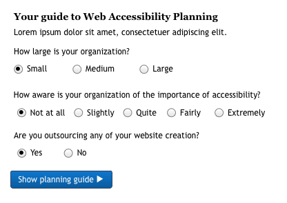
Pros: Simple, immediately engaging
Cons: May be unclear why answering the questions matters. - Broad questions presented individually with small nuggets of learning
Similar to the above but this introduces using iconography for a more engaging interface. This approach also presents initial questions individually with the opportunity of providing small bits of relevant information with each questioned answered.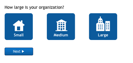
Pros: Small nuggets of relevant information reinforces faith in information being relevant. Imagery can be used to highlight other relevant information related to user response.
Cons: Additional content required to respond to questions. - Needs led choice
Rather than asking questions about the users situation, consider adding in needs lead questions.
Pros: Users may be more likely to come with a specific need rather than a general query
Cons: Confirming identification of key needs.


Core content presentation
The next options represent a more complete tool. These could follow on from initial questions as presented above. Alternatively, they may be completely standalone.
- Filter core content
Filters are presented on the left hand side. These can be used to filter the guideline information presented on the left to show that which is of interest or relevant to the user. This also suggests grouping the Key Actions by broad project phase rather than the current Topic grouping.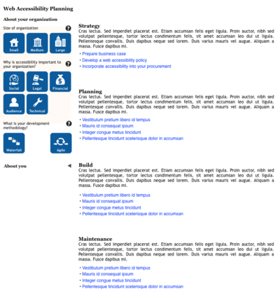
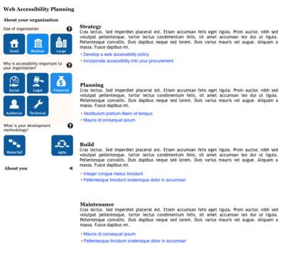
Pros: Easy to play with content.
Cons: Filters may distract from information presentation. - Use case lead content
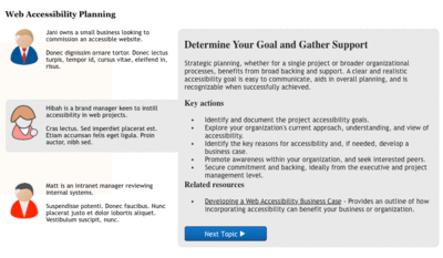
Rather than presenting the user with a series of questions, present them with a series of use cases or personas. Users can then select the most appropriate persona. They can then be lead through various topics of interest that outline what actions would be helpful for this user.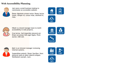
Pros: Connecting with users is much more engaging. Makes the information more real.
Cons: Additional content required to prepare use cases. If user does not resonate with any of the use cases, they may not explore. - Content by topic
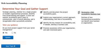
In this case the Topic information is presented one page at a time. Relevant questions are included at each stage that can be used to tailor or trim Key Actions and Resources. This approach could be preceded by one of the above presentation of general questions. Iconography could be used to identify and highlight key features of the persona.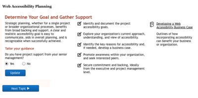
Pros: More magazine presentation, may make it more engaging. In topic questions, allow users to easily see what impact their situation or need has.
Cons: May simply be a redesign of existing content.


Other ideas
- Something like Duo-lingo (https://www.duolingo.com/) where there are stages presented as chunks within a theme
- Something like the Khan academy where there are key topics to learn about and users can explore within each topic. This may include something like a skills compass e.g. https://www.drupal.org/project/sc
- More of a “Build my guide” where users can drop in modules of content that they are interested to build their own guide to planning
- A full blown planning tool tied to a Gantt chart that users can drop their own project stages and then add in accessibility activities as well
- Accessibility planning forum
- Consider whether microlearning might be incorporated into the resource — this may be useful to consider from the perspective of a mobile view.
- Faceted navigation as a design pattern may be a suitable approach to help users pare down the information presented to them.
- Computer games help systems have a similar problems space; sections of information, more details within sections, need to keep users engaged, need to keep information succinct. Missing is the ability to filter information, although World of Warcraft help system does have a bit of that but uses search to do so. For example: http://tinyurl.com/p2w8ks7, http://www.tentonhammer.com/image/view/249595
Example user journey
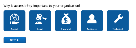
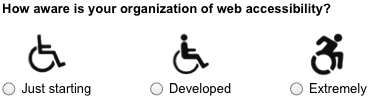
On accessing the tool the user would be asked a series of questions to better establish their current situation and needs:
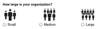
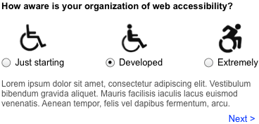
Selecting the appropriate response could present the user with a small contextualised nugget of wisdom:
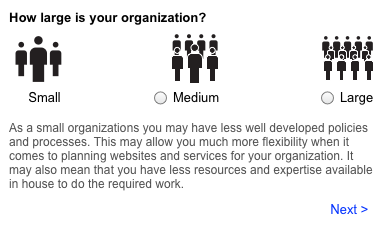
The user selects 'next' to move onto the next question and so on:
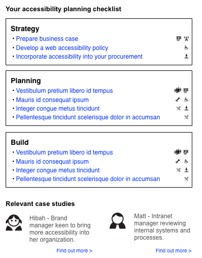
The following the series of questions the user would be presented with a final checklist of topics or considerations. The considerations would expand to provide more detailed and contextualised information. Each consideration is selected based on the users responses. So, for example, if the user indicated that they had total budget control and ultimate influence, they would have little need for any information on business case or internal promotion. Similarly, if a user is not using a third-party then they will not need information on procurement.
Additionally, there could be a back of case studies that are tagged with the characteristics used in the initial questions. The closest matching or most matched case studies could be presented to the user as additional information that might bring the situation to life.