| |
Technique 4.1.2: Modified Input
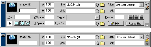
Field Order: ATAG 2.0 contains ATAG
Checkpoint 5.2 does not require that accessibility related
controls either obscure or hinder other controls. Instead, the checkpoint
emphasizes that these controls should be allotted a screen presence that
is appropriate for their importance. For example, some tools have floating
properties bars that display input fields appropriate to the currently selected
element (see Figure 3.1.2). The relative importance
of a property can be communicated to the author in several ways. (Applies
to [b]) [@@changed slightly@@]
- Reading Order: Without any other forms of organization,
most people will read interface items in a "localized" reading
order (i.e. in English, French, etc. this is left to right and top to
bottom). The higher visibility of items that occur early in the reading
order confers higher apparent importance.
- Grouping: Grouping input fields can change the reading
order and the related judgments of importance. For example, the "H"
field in the figure below, rises in the reading order due to a strong
grouping with the "W" field.
- Advanced Options: When the properties are explicitly
or implicitly grouped into sets of basic and advanced properties, the
basic properties will gain apparent importance. For example, in the
figure, below, the fact that the "alt" field appears in the
default properties, rather than the collapsible portion of the properties
bar confers visibility and apparent importance.
|
Figure
4.1.2: Example of a floating properties bar (top: maximized, bottom:
minimized). [d]
(Source: Macromedia Dreamweaver 2.0)
|
| |
Technique 4.1.3: Input
Field Highlighting: Visibility of input fields related
to accessibility may be further enhanced by visual highlighting. For example,
the fields may be distinguished from others using icons (see
Figure A-3), color (see Figure A-4), underlining,
etc. When these methods are used, it is important to ensure that that they
are consistent with the overall look and feel of the authoring tool interface
(as per ATAG Checkpoint
5.1). For example, if an authoring tool uses an icon in the shape of
a black dot to denote the required field, this convention might be extended
so that a red dot is used to denote the accessibility-related fields. An
additional consideration is that in order to meet ATAG Checkpoint 7.1, the
highlighting must be implemented so that it is available through APIs, allowing
an author with disabilities to access the highlighting through assistive
devices (MSAA, Java Accessibility API, GNOME accessibility). |
Figure 4.1.3(a):
Input field highlighting with colored input field. [d]
(Source: mockup by AUWG)
Figure 4.1.3(b): Input field highlighting
with an iconic reference to a note. [d]
(Source: mockup by AUWG)
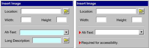
|
| |
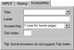
Technique 4.1.4: Grouping
Related Input Fields: In some cases, several input fields
are required to be completed in order to make a single element accessible.
Instead of dispersing these prompts over multiple dialog boxes, it may be
more effective to draw them together into one group of controls with a visible
tab or other method for accessing the group (see Figure
A-5). This can have the additional benefit of allowing accessibility-related
help information to be provided without confusion (see "Quick Tips"
in the figure, below). The downside of placing all the accessibility related
input fields in the same area is that all of them will be neglected if the
author does not see the grouping. |
Figure 4.2.4: Accessibility tab on
the input element properties dialog. [d]
(Source:mockup by AUWG)
|
   
|
If there is more than one option for the author, and one option is more
accessible than another, place the more accessible option first and make
it the default. For example, when the author has selected text to format,
the use of CSS should be emphasized rather than deprecated FONT
element. |
| |
Highlight the most accessible authoring solutions or templates when presenting
choices for the author. |
| |
Technique 4.4.1: The prompting,
checking, repair functions and documentation features can be designed
with the same fonts, text sizes, colors, symbols, etc. that characterize
other program features. (Applies to [a])
[@@changed slightly@@] |
| |
Technique 4.4.2: Ensure that author can utilize the tool's
accessible authoring features by the same interaction styles used for other
features in the program. For example, if the tool makes use of onscreen
symbols such as underlines or coloration change rather than dialogs for
conveying information, then the same interface techniques should be used
to convey accessibility information. (Applies to [a], [b])
[@@changed slightly@@] |
|
| |
Technique 4.4.3: Provide a common toolkit to design
tool functionality modules. This can be used by third party developers to
develop accessibility plug-in with the same look and feel as other parts
of the tool. (Applies to parts [a], [b], [c])
[@@changed slightly@@] |
| |
Technique 4.4.4: The accessibility features should
be designed as integral components of the authoring tool application,
not components that need to be separately executed. (Applies to [b])
|
| |
Technique 4.4.5: Include considerations for accessibility,
such as short text label and long description attributes, on the same dialog
as the source attribute, rather than buried behind an "Advanced..." button. (Applies to [b])
|
| |
Technique 4.4.6: Allow efficient and fast access to accessibility-related
settings with as few steps as possible needed to make any changes that will
generate accessible content. (Applies to [b])
|
| |
The default settings of the authoring tool should include all accessible
content production features enabled (as opposed to accessibility features
for the author). The author may have the option to disable these features
later on.
[@@covered in 4.2@@] |