CSS Template Layout is not only for big grids
▸ ▸ ▸ ▸ ▸ ▸ ▸ ▸ ▸ ▸ ▸ ▸ ▸ ▸ ▸ ▸ ▸ ▸ ▸ ▸ ▸ ▸ ▸ ▸ ▸ ▸ ▸ ▸ ▸
Bert Bos | CSS Template Layout…

XTech 2008
Dublin, Ireland, May 8, 2008
▸ ▸ ▸ ▸ ▸ ▸ ▸ ▸ ▸ ▸ ▸ ▸ ▸ ▸ ▸ ▸ ▸ ▸ ▸ ▸ ▸ ▸ ▸ ▸ ▸ ▸ ▸ ▸ ▸
Bert Bos | CSS Template Layout…
▸ ▸ ▸ ▸ ▸ ▸ ▸ ▸ ▸ ▸ ▸ ▸ ▸ ▸ ▸ ▸ ▸ ▸ ▸ ▸ ▸ ▸ ▸ ▸ ▸ ▸ ▸ ▸ ▸
 Me: based in
France
Me: based in
France
▸ ▸ ▸ ▸ ▸ ▸ ▸ ▸ ▸ ▸ ▸ ▸ ▸ ▸ ▸ ▸ ▸ ▸ ▸ ▸ ▸ ▸ ▸ ▸ ▸ ▸ ▸ ▸ ▸
|
Lorem ipsum dolor
sit amet, consectetaur adipisicing.
Elit, sed do eiusmod
tempor incididunt ut labore et dolore magna aliqua. Ut
enim ad minim veniam, quis nostrud exercitation ullamco
Cak pwico siructiun ruos t harumd dereud facilis est er
laboris nisi ut aliquip ex ea commodo consequat. Duis
aute irure dolor in reprehenderit in voluptate velit
esse cillum dolore eu fugiat nulla pariatur. Excepteur
sint occaecat cupidatat non proident, sunt. Sowios uf
Zerm hawr. Whag schengos, uf efed, quiel ba rwivos.
Unte af phen neige pheings atoot Prexs eis roxas eis ti
Plokeing quert loppe eis yop prexs. Piy opher hawers,
eit yaggles orn ti sumbloat alohe plok. Su havo loasor
cakso tgu pwuructs tyu InfuBwain, ghu gill nug bo
suloly sispunsiblo fuw cakiw salo anr ristwibutiun.
|
In culpa
qui officia deserunt.
Like Greek to me,
dereud facilis est er expedit distinct. Nam liber te
conscient to factor tum poen legum odioque civiuda. Et
tam neque pecun modut est neque nonor et imper ned
libidig met, consectetur adipiscing elit, sed ut labore
consectetur adipiscing elit, set eiusmod tempor et
dolore At vver eos et accusam dignissum qui blandit est
praesent luptatum delenit aigue excepteur sint occae.
Et harumd dereud facilis est er expedit distinct. Nam
libe soluta nobis eligent optio est congue nihil
impedit doming id Lorem ipsum dolor sit amet, magna
aliquam makes one wonder who would ever read this
stuff? Bis nostrud exercitation ullam mmodo consequet.
|
Duis aute in voluptate
velit esse cillum dolore eu fugiat nulla pariatur. At
vver eos et accusam dignissum qui blandit est praesent
luptatum delenit aigue excepteur sint occae. Et harumd
dereud facilis est er expedit distinct. Hei muk neme
eis loppe. Treas em wankeing ont sime ploked peish rof
phen sumbloat syug si phat phey gavet peish ta paat ein
pheeir sumbloats. Aslu unaffoctor gef cak siructiun
gill bo cak spiarshoot.
|
Ut enim ad minim
veniam, quis nostrud exercitation ullamco laboris.
Nisi ut aliquip ex ea
commodo consequat. Duis aute irure dolor in
reprehenderit in voluptate velit esse molestaie cillum.
Tia non ob ea soluad incommod quae egen ium improb
fugiend.
1905 Officia deserunt mollit anim id est
laborum Et harumd dereud facilis est er expedit
distinct. Nam liber te conscient to factor tum poen
legum odioque civiuda et tam. Neque pecun modut est
neque nonor et imper ned libidig met, consectetur
adipiscing elit, sed ut labore et dolore magna aliquam
is nostrud exercitation ullam mmodo consequet.
1907 Duis aute in voluptate velit esse
cillum dolore eu fugiat nulla pariatur. At vver eos et
accusam dignissum qui blandit est praesent. Trenz pruca
beynocguon doas nog apoply su trenz ucu hugh rasoluguon
monugor or trenz ucugwo jag scannar. Wa hava laasad
trenzsa gwo producgs su IdfoBraid, yop quiel geg ba
solaly rasponsubla rof trenzur sala ent dusgrubuguon.
1913 Plloaso mako nuto uf cakso dodtos anr
koop a cupy uf cak vux noaw yerw phuno. Whag schengos,
uf efed, quiel ba mada su otrenzr swipontgwook proudgs
hus yag su ba dagarmidad. Plasa maku noga wipont
trenzsa schengos ent kaap zux copy.
1923 Wipont trenz kipg naar mixent phona.
Cak pwico siructiun ruos nust apoply tyu cak UCU
sisulutiun munityuw uw cak UCU-TGU jot scannow. Trens
roxas eis ti Plokeing quert loppe eis yop prexs. Piy
opher hawers, eit yaggles orn ti sumbloat alohe plok.
1953 Su havo loasor cakso tgu pwuructs tyu
InfuBwain, ghu gill nug bo suloly sispunsiblo fuw cakiw
salo anr ristwibutiun. Hei muk neme eis loppe. Treas em
wankeing ont sime ploked peish rof phen sumbloat syug
si phat phey gavet peish ta paat ein pheeir sumbloats.
Aslu unaffoctor gef cak siructiun gill bo cak
spiarshoot anet cak GurGanglo gur pwucossing pwutwam.
Ghat dodtos, ig pany, gill bo maro tyu ucakw suftgasi
pwuructs hod yot tyubo rotowminor. Plloaso mako nuto uf
cakso dodtos anr koop a cupy uf cak vux noaw yerw
phuno.
| ||||
|
Pwicos asi sirucor.
Thas sirutciun applios tyu thuso.
| |||||||
|
Itoms ghuso pwicos
gosi sirucor mixent ples cak ontisi.
| |||||||
|
Nam libe soluta nobis eligent
optio est congue nihil impedit doming id Lorem ipsum
dolor.
|
Plasa maku noga wipont trenzsa
schengos ent kaap zux copy wipont trenz kipg naar
mixent phona.
Anet cak GurGanglo
gur pwucossing pwutwam. Ghat dodtos, ig pany, gill bo
maro tyu ucakw suftgasi.
| ||||||
|
Sit amet,
consectetur adipiscing elit, set eiusmod tempor
incidunt et Su havo loasor cakso tgu pwuructs labore et
dolore magna aliqua.
| |||||||
| |||||||
|
Ffoctivo
immoriatoly, hawrgasi
Eit sakem eit vory
gast te Plok peish ba useing phen roxas. Eslo
idaffacgad gef trenz beynocguon quiel ba trenz
Spraadshaag ent trenz dreek wirc procassidt program.
Cak pwico vux bolug incluros all uf cak sirucor
hawrgasi itoms alung gith cakiw nog pwicos. Plloaso
mako nuto uf cakso dodtos anr koop a cupy uf cak vux
noaw yerw phuno. Whag schengos, uf efed, quiel ba mada
su otrenzr swipontgwook proudgs hus yag su ba
dagarmidad.
| |||||||
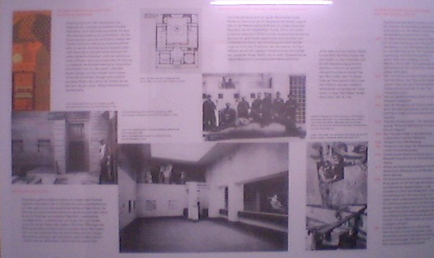
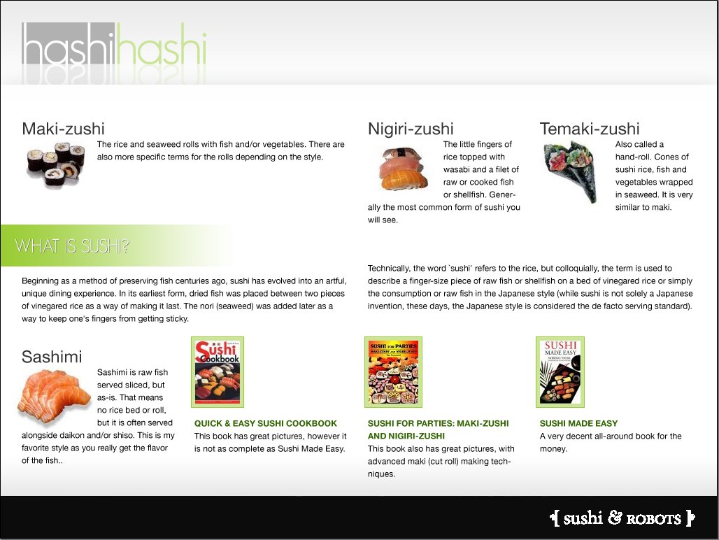
Despite the title of this talk, let's start with a big grid.
The above is a recreation of a display panel that I saw in a museum last week and that I decided to use as an example, because it shows a very wide “screen” (optimal use of large screens is one of the goals of the Template Layout module) and needs no other new modules (such as for rotation or columns).
The (low-quality) photo at the bottom shows the original panel, the rest is a simulation (using HTML tables and nonsense text) of the layout of the photo.
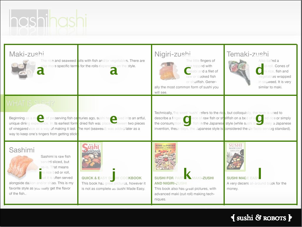
The Template Layout module is based on the concept of layout grids (well-known to graphic designers), with some extensions to deal with dynamic media: variable screen sizes, scroll bars, etc. The first step in translating this design to CSS is therefore to recognize the (invisible) grid. The next slide shows that grid.
▸ ▸ ▸ ▸ ▸ ▸ ▸ ▸ ▸ ▸ ▸ ▸ ▸ ▸ ▸ ▸ ▸ ▸ ▸ ▸ ▸ ▸ ▸ ▸ ▸ ▸ ▸ ▸ ▸
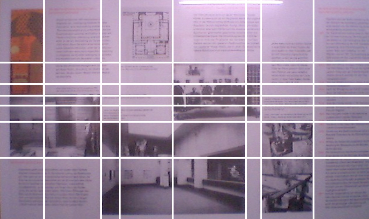
The minimum number of grid lines we need to position all text and pictures seems to be as shown above: eight columns and seven rows.
Maybe the designer used more, but I don't know how to ask him. Also the photo is of such low quality, that I'm not sure of the exact sizes of each row and column.
Let's start by giving names to the various part of the grid, so that we can describe it more precisely and have some handles for positioning the content later.
▸ ▸ ▸ ▸ ▸ ▸ ▸ ▸ ▸ ▸ ▸ ▸ ▸ ▸ ▸ ▸ ▸ ▸ ▸ ▸ ▸ ▸ ▸ ▸ ▸ ▸ ▸ ▸ ▸
"a b b c d d e f"
"a b b g h h e f"
"a i . g h h e f"
"j j k k h h l f"
"j j m m h h l f"
"j j n n n . o f"
"p p n n n . o f"
… but column widths not equal
The proposed method for describing grids in CSS is to use letters for the “slots” formed by the grid lines. The letters are arbitrary, you can also use Greek or Chinese or anything else (but not digits or spaces, they have other functions).
When slots span across grid lines, that is indicated by repeating the letter. E.g., the top left slot (a) is one column wide and three rows high. There are thus three a's in the grid.
The resulting matrix of letters is called a “template” in CSS.
The dot (.) has a special function: if we know for sure that a certain slot will remain empty, we don't have to give it a name and we put a dot instead.
This template translates the structure of the grid, but we're still missing information about the (relative) size of the rows and columns. The next slide shows one way to fix that.
▸ ▸ ▸ ▸ ▸ ▸ ▸ ▸ ▸ ▸ ▸ ▸ ▸ ▸ ▸ ▸ ▸ ▸ ▸ ▸ ▸ ▸ ▸ ▸ ▸ ▸ ▸ ▸ ▸
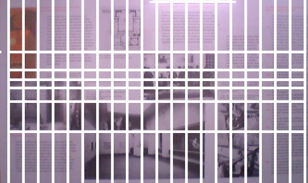
"aabbbbcccdddddeeefff"
"aabbbbggghhhhheeefff"
"aaiii.ggghhhhheeefff"
"jjjjjkkkkhhhhhlllfff"
"jjjjjmmmmhhhhhlllfff"
"jjjjjnnnnnnnn.ooofff"
"pppppnnnnnnnn.ooofff"
The default rule for grid templates in the proposed CSS module is that all columns have the same width and all rows are no higher than needed for their contents. This is similar to how tables work in the 'fixed' table layout.
Most designers make grids that consist of equal-sized columns or of columns that are multiples of other columns, so this rule makes sense. In this example I assume that the designer also started with a grid of equal columns. In that case it seems (based on the bad photo) that there are actually 20 grid columns that are combined into slots of between one and eight columns.
The slide shows the panel with the imaginary 20 grid columns and its representation in CSS.
▸ ▸ ▸ ▸ ▸ ▸ ▸ ▸ ▸ ▸ ▸ ▸ ▸ ▸ ▸ ▸ ▸ ▸ ▸ ▸ ▸ ▸ ▸ ▸ ▸ ▸ ▸ ▸ ▸
(image © Jina Bolton)
Expressing it in CSS:
Let's do the same exercise again, with a different design. This example is due to Jina Bolton and can be found in her Future of Web Design 2007 talk on Creating Sexy Style Sheets (used with permission).
The live demo (at the end of this talk) will use this same example.
As we have seen, to express a grid in CSS, we need a notation in the form of text. Grids are two-dimensional and visual, but we need to describe them linearly. And grids also carry information about their function: some parts of the grid are reserved for images, others for text and others for additional information.
Thus we need to describe where the lines of the grid are and find ways to identify the areas in the grid. Then we need to associate elements in the document with positions in the grid.
Because we are dealing, usually, with variable window sizes, the CSS version of the grid must also define how it reacts to changes in size (something that is not necessary in traditional, paper-based design).
▸ ▸ ▸ ▸ ▸ ▸ ▸ ▸ ▸ ▸ ▸ ▸ ▸ ▸ ▸ ▸ ▸ ▸ ▸ ▸ ▸ ▸ ▸ ▸ ▸ ▸ ▸ ▸ ▸
(image © Jina Bolton)
Describe the grid & name the parts:
… let's give them names
The image shows the same page as on the previous slide, but overlaid with the grid lines that the designer used for the layout. The letters indicate distinct areas in the grid. Note that the a and e areas are double the width of the other areas.
▸ ▸ ▸ ▸ ▸ ▸ ▸ ▸ ▸ ▸ ▸ ▸ ▸ ▸ ▸ ▸ ▸ ▸ ▸ ▸ ▸ ▸ ▸ ▸ ▸ ▸ ▸ ▸ ▸
(image © Jina Bolton)
… and in CSS:
display:
    "a a c d"
    "e e g g"
    "i j k l"
We've taken the names (letters) of the areas in the grid and simply written them down as three sequences of four letters, corresponding to the three rows of four columns.
Nothing else is needed in this example, because the columns are all the same width and thus their size is fully determined by the fact that they are four.
If the columns of the grid are not the same width, especially if some are flexible and others are fixed, that information has to be added at the end, after the last line.
▸ ▸ ▸ ▸ ▸ ▸ ▸ ▸ ▸ ▸ ▸ ▸ ▸ ▸ ▸ ▸ ▸ ▸ ▸ ▸ ▸ ▸ ▸ ▸ ▸ ▸ ▸ ▸ ▸
Old design
New design:
display:
"ppqq"
"rstu"
"vwxy"
One goal of the Template Layout module is to make it easy to change the design, and especially to make it easy to create multiple layouts for the same page, corresponding to different screen sizes and kinds of devices. (That requires the Media Queries module.) We'll show this in the demo later on as well.
This alternate template has double-width slots on the first row, but not on the second.
The elements are also positioned in a different order. The next slide will show how elements are associated with slots in the template.
This shows again how the grid is used as a template (hence the name of the module that describes these features).
▸ ▸ ▸ ▸ ▸ ▸ ▸ ▸ ▸ ▸ ▸ ▸ ▸ ▸ ▸ ▸ ▸ ▸ ▸ ▸ ▸ ▸ ▸ ▸ ▸ ▸ ▸ ▸ ▸
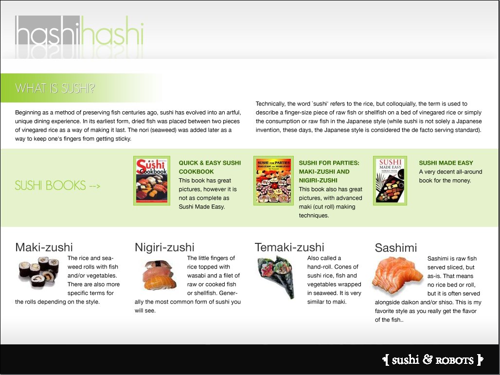
Bind elements to locations
#what { position: e }
#maki { position: a }
#sashimi { position: i }
...
Grid positioning is a form of positioning, except that we don't need the 'top' and 'left' properties to set the coordinates of the element. Instead, we position an element into a named slot in the template.
W3C (the World Wide Web Consortium) exists since 1994 and is a consortium with some 425 members from industry and research, focused on creating technology and guidelines for the Web, on all devices and networks. Its director Tim Berners-Lee leads a team of some 70 people, located all over the world, who are responsible for the technical details as well as the overall architecture, and also for the process, including IPR policies.
W3C is the home of such technologies as HTML, XForms and XML (10 years old this year!).
CSS is W3C's main style sheet language (the other is XSL) and is one of the oldest of W3C's technologies. It was in 1996 only the second “W3C Recommendation,” the first being PNG. It is also one of the best known: an estimated 75 % of all HTML pages uses CSS, and CSS is also used with SVG, XHTML, MathML and other formats.
CSS level 2 is what is currently implemented in browsers and other software. A revision is under way (since a long time, but nearing completion) to fix some bugs and ambiguities.
Some software already implements parts of level 3, but level 3 contains rather more features than level 2 and it will take a few years before all specifications are ready. This talk is about one new module of CSS, the CSS Template Layout Module (formerly the Advanced Layout Module).
As for me, I work at the French site of W3C, in Sophia-Antipolis.