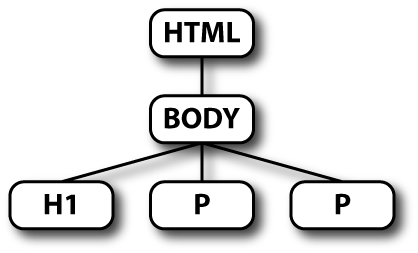
flexible body content
CWI, Amsterdam, Netherlands
the 12th of May, 2006
Part 1 – Principles
 →
→
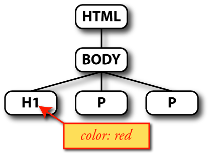
CSS annotates a tree with style properties
| file.html | + | file.css | → | opmaak |

|
| 
| ||
| (text, images, structure) | (style/layout) |
h1 { color: red }
selector { property: value }
→
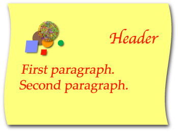
<h2>Ellipsis
Points</h2>


<h3>Their
Function</h3>


<p>Ellipsis points indicate that either
a few letters of a word or one or more words have been
omitted.


<p>Grammar calls this omission of words
ellipsis. Not every writer achieves Laurence Sterne's mastery of
ellipses. Like the em dash, ellipses frequently disguise a writer's
impotence to express himself. In most cases, they are
expendable.


<p>A poet writes:


<blockquote>


<p>I do not know what it could
mean<br>


that I am saddened so.<br>


A fable out of ancient times,<br>


it comes from nothing I have known.*


</blockquote>
From: Jan Tschichold, The form of the book – essays on the morality of good design
The poem is from Lorelei by Heinrich Heine (translated into English)
Ellipsis points indicate that either a few letters of a word or one or more words have been omitted.
Grammar calls this omission of words ellipsis. Not every writer achieves Laurence Sterne's mastery of ellipses. Like the em dash, ellipses frequently disguise a writer's impotence to express himself. In most cases, they are expendable.
A poet writes:
I do not know what it could mean
that I am saddened so.
A fable out of ancient times,
it comes from nothing I have known.*
The style in a typical browser
Ellipsis points indicate that either a few letters of a word or one or more words have been omitted.
Grammar calls this omission of words ellipsis. Not every writer achieves Laurence Sterne's mastery of ellipses. Like the em dash, ellipses frequently disguise a writer's impotence to express himself. In most cases, they are expendable.
A poet writes:
I do not know what it could mean
that I am saddened so.
A fable out of ancient times,
it comes from nothing I have known.*
body {margin-left: 25%; margin-right: 25%}
Ellipsis points indicate that either a few letters of a word or one or more words have been omitted.
Grammar calls this omission of words ellipsis. Not every writer achieves Laurence Sterne's mastery of ellipses. Like the em dash, ellipses frequently disguise a writer's impotence to express himself. In most cases, they are expendable.
A poet writes:
I do not know what it could mean
that I am saddened so.
A fable out of ancient times,
it comes from nothing I have known.*
body {font-family: Sabon, Baskerville, Didot, serif}
h2, h3 {text-align: center; font-weight: normal}
h2 {font-size: 140%}
h3 {font-size: 100%; font-style: italic}
Ellipsis points indicate that either a few letters of a word or one or more words have been omitted.
Grammar calls this omission of words ellipsis. Not every writer achieves Laurence Sterne's mastery of ellipses. Like the em dash, ellipses frequently disguise a writer's impotence to express himself. In most cases, they are expendable.
A poet writes:
I do not know what it could mean
that I am saddened so.
A fable out of ancient times,
it comes from nothing I have known.*
p {margin: 0; text-align: justify}
p + p {text-indent: 1.5em}
blockquote {margin-left: 5em; font-style: italic}
h2 {margin-bottom: 3em}
Value propagation includes all features that help to avoid having to specify all properties for all parts of a document.
Binding in CSS is done with selectors
CSS has selectors for
| Elements by name (“type”): | h1, p, em
|
| Any element: | *
|
Example:
h1 {font-size: 200%; font-weight: bold}
The universal selector (*) is rarely used on its own, usually it is part of a contextual selector.
CSS has selectors for
| Elements in context: | h1 em, li li
|
| Child elements: | body > p
|
| Following elements: | p + p
|
| First elements: | p:first-child
|
h2 em {color: red}
p em {font-style: italic}
p + p {text-indent: 1em}
<h2>An <em>example</em> header</h2>
<p>First para not indented.
<p>Second para <em>is</em> indented.
<p>Third, too.
First para not indented.
Second para is indented.
Third, too.
Shows the effect of the three rules on the previous slide.
CSS has selectors for
| (Un)visited links: | a:link, a:visited
|
| Active/hovered elements: | a:active, a:hover
|
| Elements in a language: | p:lang(fr)
|
a:link {color: blue}
a:visited {color: #90F}
CSS has selectors for (among others)
| Elements by class: | div.warning, .note
|
| Elements by ID: | p#menu, #sig
|
| Elements by attribute: | table[border], a[name="p1"]
|
p.intro {font-family: Helvetica, sans-serif}
div.warning {border: thin dotted red}
<div class="warning">... <p id="menu">...
In '.note' the '*' is omitted, it is optional.
Class selectors are, after type selectors the most often used kinds of selectors. Classes allow creating subclasses of existing elements and encoding of extra, machine readable information in HTML documents. There is now a groups of people that defines “microformats,” which are sets of classes shared by many people for specific purposes: encoding names & addresses, events, relations among friends (especially blogging friends), etc.
CSS has selectors for
| The first line of a paragraph: | p::first-line
|
| The first letter of a paragraph: | p::first-letter
|
p::first-letter {
  font-size: 200%;
  float: left}
More selectors in CSS level 3
Or: how to avoid specifying all properties on all elements
Grouping of rules:
p {color: red}
→
h2 {color: red}p, h2 {color: red}
p {color: red}
p {margin-top: 1em}
p {margin-left: 2em}
→
p {color: red;
 margin-top: 1em;
 margin-left: 2em}
Some properties also have shorthands, properties that set a number of other properties with a single rule. Examples are 'margin', 'padding', 'border' and 'font'
All properties have reasonable defaults
p {
→ margin: 0;
padding: 0
color: green
border: none}p {color: green}
Many properties automatically inherit
<body>...
 <h1>... <em>...</em>...</h1>
body {color: black}
→
h1 {color: black}
em {color: black}body {color: black}
HTML's link element. (We'll see XML later)
<link rel="stylesheet" href="foo.css"
	type="text/css">
<!DOCTYPE html PUBLIC "-//W3C//DTD HTML 4.01//EN">
<html>
 <head>
  <title>My document</title>
  <link rel=stylesheet href="styles/mystyle.css">
 <body>
  <h1>My document</h1>
  <p>...
We'll see the corresponding XML mark-up in the second part of this tutorial, together with some variations to allow multiple style sheets.
It is recommended to add the type attribute, but it is not required. The type tells the browser that the style sheet is probably a CSS style sheet, so if the browser only understands XSL style sheets, it can gain time by not trying to download this one.
It's also possible to use an HTTP header (works for any HTML or XML), but that is not widely supported. The HTTP header looks like this:
Link: <http://www.acme.com/corporate.css>; REL=stylesheet
HTTP user agents are not required to implement this.
Can put style sheet inside HEAD of HTML:
<style type="text/css">
body {background: black; color: white}
</style>
But:
body
h2 {font-size: 200%}
margin-left: 2em; width: 10em
⇒ page will be readable for every user!
Several examples already showed the '%' and 'em' units.
People with good screens and good eyes typically use smaller default fonts than people with bad screens and bad eyes. By not touching the font size for the body element, it will get the user's default size and all other sizes will be relative to this font.
Lorem ipsum dolor sit amet, consectetaur adipisicing elit, sed do
eiusmod tempor incididunt ut labore et dolore magna aliqua. Ut enim ad
minim veniam, quis nostrud exercitation ullamco laboris nisi ut
aliquip ex ea commodo consequat. Duis aute irure dolor in
![[floating image]](genie-circle-500.png) reprehenderit in voluptate velit esse cillum dolore eu fugiat nulla
pariatur. Excepteur sint occaecat cupidatat non proident, sunt in
culpa qui officia deserunt mollit anim id est laborum
Et harumd und
lookum like Greek to me, dereud facilis est er expedit distinct. Nam
liber te conscient to factor tum poen legum odioque civiuda. Et tam
neque pecun modut est neque nonor et imper ned libidig met,
consectetur adipiscing elit, sed ut labore et dolore magna aliquam
makes one wonder who would ever read this stuff? Bis nostrud
exercitation ullam mmodo consequet. Duis aute in voluptate velit esse
cillum dolore eu fugiat nulla pariatur. At vver eos et accusam
dignissum qui blandit est praesent luptatum.
reprehenderit in voluptate velit esse cillum dolore eu fugiat nulla
pariatur. Excepteur sint occaecat cupidatat non proident, sunt in
culpa qui officia deserunt mollit anim id est laborum
Et harumd und
lookum like Greek to me, dereud facilis est er expedit distinct. Nam
liber te conscient to factor tum poen legum odioque civiuda. Et tam
neque pecun modut est neque nonor et imper ned libidig met,
consectetur adipiscing elit, sed ut labore et dolore magna aliquam
makes one wonder who would ever read this stuff? Bis nostrud
exercitation ullam mmodo consequet. Duis aute in voluptate velit esse
cillum dolore eu fugiat nulla pariatur. At vver eos et accusam
dignissum qui blandit est praesent luptatum.
This sidebar is made with the 'float' property
p.sidebar {
  float: right;
  width: 30%;
  margin-left: 1em;
  border: solid red;
  padding: 0.5em}
(More examples in part 2)
Not only images can float, the 'float' property can be applied to any element. The value can be 'right' or left'.
It is usually a good idea to add a bit of margin on the side where the other text wraps around the float. In this case 1em.
A box that has a border typically needs some padding as well, otherwise the border is too close to the text.
Positioned box
div.box {
  position: absolute;
  top: 10px; right: 4em;
  width: 6em}
Positioning is relative to a CB
Consider this HTML fragment:
<DIV ID=container>
  <P><SPAN ID=w01>This</SPAN>
    <SPAN ID=w02>line</SPAN>
    <SPAN ID=w03>has</SPAN>
    <SPAN ID=w04>exactly</SPAN>
    <SPAN ID=w05>six</SPAN>
    <SPAN ID=w06>words</SPAN>
</DIV>
Make #container into a CB
Place the spans relative to it:
#container { position: relative; border: solid;
  width: 9em; height: 9em }
#w01 { position: absolute; top: 17%; left: 44% }
#w02 { position: absolute; top: 56%; left: 74% }
#w03 { position: absolute; top: 84%; left: 07% }
#w04 { position: absolute; top: 26%; left: 23% }
#w05 { position: absolute; top: 55%; left: 36% }
#w06 { position: absolute; top: 12%; left: 30% }
This line has exactly six words
Part 2 – Advanced CSS
… without CSS3 features
… of lines in a paragraph
h3, p {text-align: center}
A paragraph with text, of which all lines are centered between the margins instead of aligned to either or both margins.
… of images and blocks
img {display: block; margin-left: auto;
  margin-right: auto}
This is some text that is justified, but the image in the middle is
centered between the margins: ![[laughing laptop image]](MMI-PC-genie-r.png) The text continues after it and is
again justified.
The text continues after it and is
again justified.
<p>This is some text that is
justified, but the image in the middle is centered between the
margins: <img src="MMI-PC-genie-r.png" alt="[laughing laptop image]"> The text
continues after it and is again justified.
This paragraph is 7 em wide and centered in the surrounding block.
p.blk {width: 7em;
  margin-left: auto; margin-right: auto}
<p class=blk>This paragraph is
7 em wide and centered in the surrounding block.
Only table cells can be vertically centered…
… so turn the element into a table cell
The text of this paragraph is vertically centered.
div.container {display: table}
p {display: table-cell;
  vertical-align: middle;
  height: 100%}
In CSS3, we want to have a simple property to vertically center an element in its parent, without the need to convert the element and its parent to a table.
A document can have more than one style sheet
A feature of HTML and XML, not (yet) of CSS itself
Three kinds of style sheets:
For the common parts of all alternatives
HTML:
<link rel="stylesheet" href="...
XML:
<?xml-stylesheet href="...
The default among a number of alternative styles.
HTML:
<link rel="stylesheet" title="A name for the
style" href="...
XML:
<?xml-stylesheet title="A name for the style"
href="...
Styles the reader can choose from
HTML:
<link rel="alternate stylesheet" title="A
name for the style" href="...
XML:
<?xml-stylesheet alternate="yes" title="A
name for the style" href="...
From the CSS tips & tricks page.
First a demo: “Randoxygène site of the regional government of the Alpes-Maritimes, France [original]
And another: these slides
The media of a style sheet can be specified in HTML, XML and CSS:
<link rel=stylesheet media=print href="...
<?xml-stylesheet media=print href="...
@media print {...}
Same principle:
<link rel=stylesheet media=handheld href="...
<?xml-stylesheet media=handheld href="...
@media handheld {...}
“Liquid” = adapts to window size
flexible body content
<h2>Walking in the sand</h2>
<ul class=menu>
  <li><a href=".">Home</a>
  <li class=current><a href=".">Wet sand</a>
  <li><a href=".">White sand</a>
  <li><a href=".">North Sea</a>
  <li><a href=".">Mediterranean</a>
  <li class=contact><a href=".">Contact</a>
</ul>

<div class=main>
  <h3>Flexible body content</h3>
  <p>Lorem ipsum dolor...
  <p><img...> Irure dolor in...
  <p><img...> Tia non ob...
  <p>Plasa maku noga...
</div>
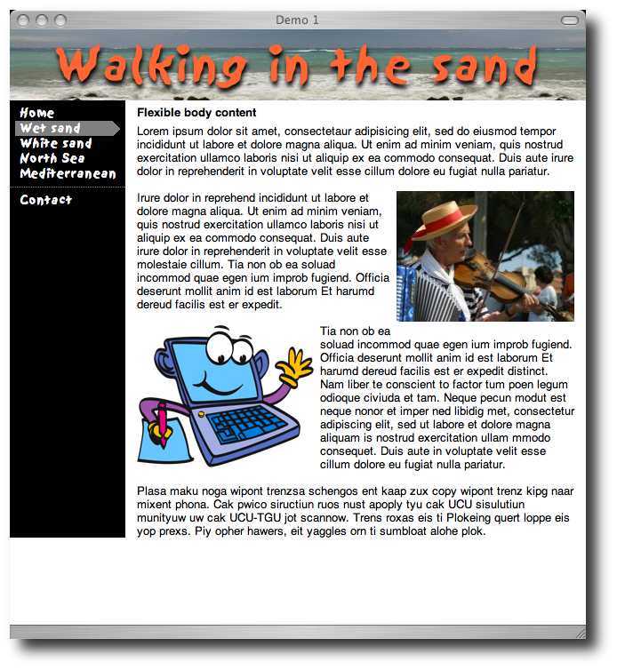
Screendump
body {display: "aa"/80px
               "bc"
               10em *
}
h2 {position: a}
ul.menu {position: b}
div.main {position: c}
(Syntax only tentative)
So...
Make sure things align to the window sides:
body {margin: 0}
Float menu to the left:
ul.menu {
  margin: 0.5em 0;
  width: 10em;
  float: left}
Make the black bar as the main text's border:
div.main {
  border-left: 10em solid black;
  padding: 1px 0 0 1em}
Top padding non-zero to avoid collapsing margins.
Make sure body isn't shorter than menu:
div.main:after {
  content: "\A0";
  display: block;
  clear: left}
h2 {
  background: url(sea.jpg) repeat-x;
  margin: 0;
  color: #F63;
  text-shadow: 0.05em 0.1em 0.1em black;
  font: 50px/80px Sand, Textile,
    Marker Felt, Chalkboard, Comic Sans,
    cursive;
  white-space: nowrap;
  text-align: center}
Line is vertically centered in the line-height. The 'nowrap' ensures the height of the element is always 80px.
The principle:
a {... normal style...}
a:link {... unvisited links...}
a:visit {... visited links...}
a:active {...during activation...}
a:hover {... mouse hovers...}
a:hover {background: red; color: white}
This link goes nowhere.
Try the image: link
#ex7a {display: inline-block;
  width: 152px; height: 52px;
  background: url(link1.png);
  overflow: hidden; text-indent: 152px}
#ex7a:hover {background: url(link2.png)}
Images  and
and 
Try the image: link
#ex8a {display: inline-block;
  width: 152px; height: 52px;
  background: url(link3.png);
  overflow: hidden; text-indent: 152px}
#ex8a:hover {background: url(link3.png)
  -152px 0}
Single image 
Level 3 will have 'border-radius' and 'box-shadow', but you can make rounded corners and shadows with level 2, too…
This box has a rounded green background and a drop shadow.
<blockquote>
 <p>This box has a rounded...
</blockquote>
And, of course, without changing the mark-up.
Make five images:

| 
|

| |

| 
|
blockquote {
  max-width: 620px;
  background: url(rs-right.png) right repeat-y }
blockquote::before {
  display: block;
  line-height: 0;
  background: url(rs-topright.png) top right
      no-repeat;
  content: url(rs-topleft.png) }
blockquote::after {
  display: block;
  line-height: 0;
  background: url(rs-bottomright.png) bottom right
      no-repeat;
  content: url(rs-bottomleft.png) }
Since our background image is 620px wide, we can't allow boxes wider than 620px, without getting gaps. That's why the 'max-width' property is there. The 'display: block' property is needed to make sure the generated content forms boxes of its own above and below the main content, instead of being inserted on the first and last line. The 'line-height: 0' makes sure there is no room for left open for ascenders and descenders above and below the images in the 'content' property.
See the tips & tricks for more details.
See demo
... <a href="#p2">...
... <p id=p2>...
Use media="projection"
or @media projection
and rules like these:
h1 { page-break-before: always }
div.slide {page-break-after: always}
See these slides for an example!
Prior to the Web, a style sheet contained the written instructions from a typographer to a printer. It often used a more or less standard form. Some printer companies provided preprinted forms that the typographer could fill in.
This tutorial assumes that the reader already knows HTML.